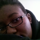
#made the original A3 paper size so that could put a poster of it up in my house thats probably what made the drawing program crash
Text

My drawing program crashed while i was making this and merged layers that shouldnt be merged, the green fog around them was supposed to be a multiply layer. Got it to a point where i was happy with it again tho.
#sims 2#strangetown#johnny smith#ophelia nigmos#ripp grunt#tank grunt#fanart#sims fanart#sims 2 fanart#found the group composition on pinterest ill add it later if i find it again#please let me know if the alt text needs adjustment#made the original A3 paper size so that could put a poster of it up in my house thats probably what made the drawing program crash#this is a compressed?? is that the right word? jpeg that's made to be roughly phone screen size
210 notes
·
View notes
Text
Evaluation !
Since September, I have been working on the first project of my year two graphics communications course which was titled PAGE TO SCREEN. This project was about famous books that have been turned into a movie and creating artwork from them. I had to create alternative book covers and film posters for my selected theme, which was The Jungle Book.
I was pleased with my selected book/film as I knew I was going to be focusing on the audience of children. This would mean many different colours were going to be incorporated into my project and also an element of education was going to be brought in my artwork as well.
For a lot of my outcomes, I used Pinterest for inspiration as I wanted to see what had been done before so I could create unique results that would stand out.
When you look at my outcome, there are elements of the jungle throughout all of them as one of my goals was to focus on grabbing my audience's attention. A fair amount of the features were animals. The reason for this was because my target audience being children I wanted my artwork to educate them on animals that would be found in the jungle.
There was a lot of trial and error within the project as I was experimenting with different styles such as thresholding, halftoning, extra. One of the processes that helped me get over mistakes was having the pieces of artwork up on my desktop and then create the same thing again on photoshop but changing the bit that didn't look right. Still, by doing this, it allowed me to have better outcomes than the first and also made me learn a lot more, and by learning, I was able to broaden my skill base. Alongside this, there was a lot of research. Not just artist research I was researching the author of the book Rudyard Kipling and also researching about the jungle, the jungle book originated from. By doing this, it allowed me to look at colours and animals for inspiration, and by doing this, my artwork came out well.
Within my project, I created five book cover designs, and 11 movie poster designs within all these designs I was making illustrations to use on them including digital images drawn on photoshop and procreate and also hand-drawn work using pens, paint and pencils.
When I was given the jungle book, I was excited to start creating artwork. As I got into the project, I began to find it hard as I had problems that I didn't think of such as showing expressions through an animal's face and being able to create cartoon looking animals to represent the 1968 animation film but soon realized it was hard so, during my project, I decided to focus more on the real-life jungle book that was made in 2016. This made it slightly more manageable as I was able to use an image of real animals to work from and not having to create my animal from scratch.
Other issues that I had to approach was the colour pallet at the beginning of my project. I was focusing on the colours of the jungle as I wanted the colours to represent it, but then all my work started merging into one, so I decide to use a website called coolers.Co this was a colour generation site, and by using this, I was able to use unique colour pallets that made my outcomes stand out. First, I started adding different colours in slowly then completely didn't use green, and the results came out well. My final book cover design had no green on it at all, which can show progress has happened, and I have worked on targets.
The journey of the project had a high at the beginning due to my interest and excitement to create but then went downhill but soon lifted again after I had the problem solved and come up with solutions this made it run more smoothly.
With having been doing the concept and topic of page to screen the jungle book I knew it was going to be children based as I said at the beginning, I knew my aim was to make fun, unique, educational pieces of artwork. Nowadays I feel like children are more into movies as technology is overriding the classics such as books that is why I have made many different movie posters as that is what I feel children would be more drawn too now. However, there are still children who love books hence why I always focused on creating book cover but just not as many as the posters, I was still focusing on the educational bit for both of them, But mainly the book as that is something you pick up and really absorb whereas with a movie poster it is something that you look at to get an a fell of the movie and get a feel for what's to come and with my outcome, I think you can see that being portrayed.
This whole project opened my skill base hugely as I was learning new skills every day and not just the skill I was being taught. I also learnt skills about organization preparation but mainly understanding of my target audience. I feel that out of the skills I learnt from college understanding my audience and how important it is to understand and get on the same wavelength as your audience. This will give you the best outcomes as you are putting your self in there shoe's. It works well and makes you want to do more artwork as it gives you a lot of inspiration. But overall, it also helped me with this project.
Page to screen project was a project that consisted mainly of computer-based work. This included the materials of photoshop and illustrator and in my case also procreate there was also the element of practical workshops such as typography, collagraphy, screenprinting and illustrations(continuous line drawings), my favourite media that I used was probable the digital art as I like the effects and texture I was able to create, and how I was able to bring a piece of artwork alive, the only thing that wasn't as enjoyable about the digital art was having to constantly create layers, so you were able to move them around even though it helps a lot when you want to manipulate the outcome, its frustrating when you get to the end and realize its all on one layer but when that has happened, I have always been able to sort it out eventually. My favourite part of the practical workshop was probably the illustration workshop as it was a challenge having to keep the pen on the paper the whole time to create the illustrations were hard but what I drew was terrific illustrations.
With each book cover and movie poster design I had to select the right size for both of them so throughout the project this became a prosses I had to do every time I wanted to create an outcome. With the book cover, I have to prepare an a4 horizontal white page on photoshop making a 2cm gap in the middle for the spine of the book with the rulers and then with the movie poster I had to create an a3 white page on photoshop.
Another process I had to use throughout the project was looking and planning my design to do this, I went on to Pinterest and had a browsed at different book cover/posters for inspiration.
A technique that appeared in this project was animating. I had done this technique in another project before last year; this benefited me as I was able to crack on with it. The only thing that was different was the animation have a different topic/concept. Animating was an old skill to me, but I managed to learn a new skill within it which was another way of animation I learnt that you were able to create an animation without having to do the process of moving and saving this helped as it was an easier but effective way of animating.
With the current situation of COVID19, we were asked to create a blog on Tumblr this was to ensure us that our lecturers were able to see our work in case of other national lockdown and also minimizing cross-contamination of passing our journals back and forth. I really have enjoyed having tumbler as our alternative sketchbook and journal as to me look a lot nearer than my previous projects, and with my specialism being graphics communication, I can present my work in a high-quality way compared to last year, and with Tumblr, I was able to look at my blog as a whole project. I was also learning about aesthetic as you could transform your blog to link to your topic. My blog contains a lot of work, including research. The research was a big part of this project as I needed to learn about The jungle book but not just the storyline, but about the background of the jungle book, this helped me a lot as I was able to plan colour pallets layouts and general inspiration and overall enjoyable to me. It helped me with my target audience a lot. As I am on the topic of research there was research on my blog about the artist that inspired me the main artist that inspired me to do my final book cover design was Coralie Bickford smith she is an amazing illustrator for book cover designs, and I just fell in love with her work and I was able to create outcomes using inspiration from another artist that help me more with digital illustration, his name is Roy Lichtenstein he inspired me with my halftone work, and I can happily say it some of the favourite work I have created.
One of my the pieces of primary research I did was creating my own mood board using objects to help me understand the topic of the jungle book, and I used Jordan Bolton as my artist inspiration for this as I wanted to link to back to an artist.
I have really enjoyed this project of the page to screen and can happily say I am pleased with my outcome.
My outcomes are very strong and show planning, and the main thing is catered to my target audience I feel like they could be a genuine poster and book cover, but there are also some weaknesses, but the weaknesses were not with my outcome because I am happy with them it more about my blog side to the project if I was to work on something it would be delving into more artist research and even though it was hard to find an artist that inspired me I still feel like I could have done some more but still happy with what I have achieved.
With this project, I feel like was to be harsh on myself, and I did this as it made me work harder what I mean by this is when I looked at my work I reviewed it as two people one of them was saying the good thing and the other picking up on things I wanted to change, and this helped me and was an effective way of self reviewing and help me at the end with outcomes.
To me my outcome show progress as from the start of the project from the 16th of September to now you can see my work has grown and this is down to workshops such as halftone, typography workshops and these were only in the first couple of weeks on the project, and there were many more, but you can see it has helped me grown as a designer and learn, I feel the workshop that has to help me the most was the typography because it made me understand how much can be conveyed through typeface and also helped me understand how important it is.
Overall my outcome has worked well there have been displayed on my blog along with my research, other outcomes and problem-solving. The way my work has been displayed is in a unique way I have placed my book cover design onto a book, so it looks more realistic as with my poster I have made sure I have a high quilty picture and has been put onto a mock-up on to different billboards in different areas.
My whole project shows the progress of my skill and how my outcomes have been created and that is what I wanted for my blog to portray and I am excited to use the skills that I have learnt in my future project as they are very useful and I know I have a lot more knowledge on the audience and that will help me plan and create better and significant outcomes in the future.
0 notes
Photo

Interim Show
Over the course of the Interim degree show, I have been through a process of setting up the show, engaging in certain tasks during the show and then receiving and observing feedback given back to us from the show.
Setting up
Posters
As part of the setting up process, one of the tasks I engaged in was putting up the posters around the university. I assisted my team partner Sam Walker in setting out to print off the posters so we could prepare to place them around the university. One Initial problem we faced with this was that we originally printed off the posters in A4, however, this ended up filling the whole page, leaving no borders. We realised that this did not really work as the white border seemed preferred and made the poster more appealing.
Later we adjusted this problem by going back and appropriately sorted the properties for the Image so that the poster is A4 in size and has a small white border.
Before we placed the posters around the university, we printed off several A3 and A4 copies. The different sizes would be used depending on the location, if we felt the location was a good spot for the poster to be noticed then we would use a larger A3 poster as it would be more eye-grabbing.
Later me, Sam and Jesse went around the University to place the posters (Seen above). We explored multiple areas where students who study all courses are likely to gather. Places that we realised would gain a lot of traction were places such as the Canteen, the Pierson study building, students union and various hall ways that get a lot of student traffic. We thought very carefully about the placement of the posters in these locations, thinking whether the location seemed necessary to have an A3 or A4 poster depending on the popularity of it. Then we thought about things such as whether it stood out or if it was that noticeable at eye level.
In the end, I think it was hard to say whether our posters and their placement had any kind of Impact on the turn out of the degree show. However, I’d like to think that to a certain extent it did help some what. I felt like an area of this process we could Improve on for the final show are things like being earlier with getting our posters out there. I felt that to some degree the reason why our posters may have not been as entirely as effective could be due to us only placing the posters around the university a week prior to the show. This could have meant that people didn’t really have enough time to really catch notice of our posters and realise the show was happening.
Another think I believe we could have worked on for the poster advertising could be better planning of where to place them. I felt that going around the University and observing potential hot spots worked well. However, for the final degree show, we will have to think of places that expand outside the university as the degree show will be taking place somewhere elsewhere.
Business Card Holders/ creating bios/placing bios
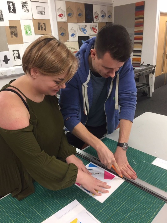
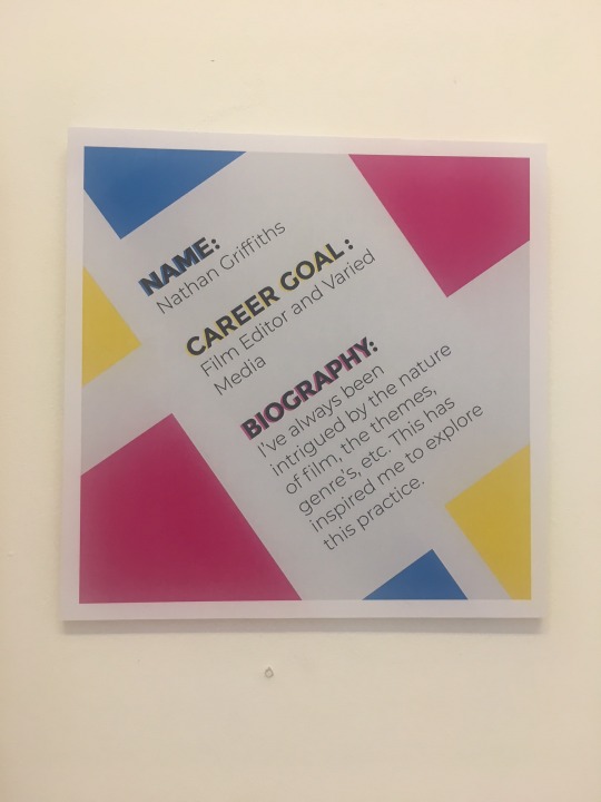
Another task I engaged in for the setting up of the Interim show was producing everyone’s biography. For this task, Lacey from our class produced the bio layouts online in Photoshop. Once completed a few of us went to the Illustration room to help mount the bio’s onto foam boards so that they could be placed next to everyone’s photo frame.
When we took the bios to the Illustration room my job was to use an adhesive spray to allow the bios to stick securely to the foam boards. This involved spraying quick layer over the sheet and then making sure it was properly aired before I placed it on the board.
Once the bios were on the boards the next task was to cut them down into equal squares. For this task, I assisted and used a ruler to accurately measure the length and height and then cut them down using a scalpel. We were very careful in this situation to make sure the precautions were taken when using a scalpel so that we did not accidentally cut ourselves.
Once completed the bios were then ready to put into place. In doing this, however, we did fall into one problem. When I sprayed the first bio I accidentally made a mistake, which was that I had sprayed the bio in such a way that left a squiggly mark. Unfortunately, this mark did not disappear and was quite noticeable which resulted in the bio having to be re-made. I quickly learnt from this by reattempting the process which came out fine.


As part of our showcase for the Interim show we also had these neat card holders to hold our business cards. The holders were placed just below our bios so were easily noticeable for people coming into to view the show to see.
When I placed my cards in there I could only around half my business cards (about 50), which left me with 50 or so remaining cards. I think for the final show this had made me realise that I may need to be prepared to think of other ways to distribute my cards to present all 100 of them, or I shall have to make sure I refill them if on the off chance that many people take my cards (or they go missing).

Feedback form
As part of our preparation for the show, we had also created feedback forms for the show, as well as a feedback box with a similar style/theme to place the forms in once people had filled it out.
The feedback forms were created by Colbert and Amy who were a group in our class who was in charge of creating these. I was pleased with the array of questions such as if people found our content Interesting and their favourite pieces, etc. However, I feel like for the final show the questions could perhaps be better fleshed out so that we could gain some more specific feedback. One Idea I had was to have an ‘own thoughts’ sections so people can freely express any specific concerns or praise they’d like to address.
One other thing I wasn’t hugely fond of was the poor cut out quality of the feedback forms, the forms appeared to be cut out lopsided and inaccurately. This was disappointing as I felt that it had shown a lack of commitment to the role and could allow people writing the feedback to think a similar thing. A similar problem remained with the feedback box which also seemed to be poorly produced as it was simply a PG Tips box with paper masked over it but was still visible through the paper.

My chosen photo’s for frames + Showreel & frame layout

Just above is a layout of the show as designed by Lacey and Lauren in our class. The layout shows the Cotswold gallery along with the names of the person, the mac they are using to show their work and whether their frame will be portrait or landscape. Each box represents where the persons work, bios and business cards will be placed for the Interim Show.
I found the layout to be very useful Information from Lacey and Lauren as it really helped simplify where everyone will be and what mac they will be on to avoid any kind of confusion.


Here is my layout for our Frames. Our frames are targeted to show what we believe to be some of our best photographic Images that we have taken. You have the choice to show one or several Images depending on your preference. In my case, I decided that I would like to show several of my Images as a means to showcase a selection of my work. Initially, I spent a fair amount of time simply rearranging my layout for the Images. This was difficult as I felt I wanted to show a select range of themes/subjects in my photo’s and not one consistent series of photos. The trouble here was trying to select what I felt were some of my best to display.
In the end, I went with the Images that can be seen above. due to limited space, I laid them out in a bit of an obscure way. Admittedly once I had mounted my work I was hugely fond of the layout choice. The reason being is that for one, the layout was a bit obscure and didn’t look as good as I had hoped. Secondly, I don't think the photo’s I selected were the best choice due to the colour coordination of the Images. I feel that there is too much red and blue present in the frame which doesn’t work tool well when paired up with the bottom right Image which is a different colour scheme entirely. I think for the final degree show I would like it if all my Images were a different colour entirely so they all contrast helping them to stand out.
Lastly, I had received some feedback from one of the technicians mentioning a mistake I had made in my frame. This was that I had not taken into consideration the border of my Image layouts of Photoshop in comparison to the frame itself. As a result, most of my Images touched the border of the frame and were slightly cut off.
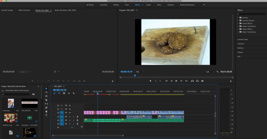
As for my showreel, I compiled a selection of what I believe to be my best work currently. this work will range from anything that I have worked on in previous modules for the whole time I have been on the course. I decided to use adobe premiere to create a montage of my work, this work will contain a series of animated video, live actions footage, photography and various other bits of miscellaneous things.
My approach was to showcase my photography first through short intervals with a quick fade in/out for each Image. I would then show any video related Items after. For this showreel I wanted there to be a pleasant atmosphere so I used an upbeat backing track I found online as some background noise. The point of this was to keep the viewers of my work entertained whilst watching.
I felt that I could have perhaps better approached my show reel in some ways, however. For example, I would have liked it if I had Included some fancier transitions to better show my work. Also looking back at it I think I would have preferred it if I had timed my music accordingly to what was being shown. This would change the dynamic and pace depending on the work. This is something I will aim to Improve for the final degree show.
During the show
Moving on to the actual degree show, we as a class each had a certain level of responsibility to keep when it came to maintaining the show. One of these tasks Involved turning on the macs in the morning and then turning off the macs in the evening.
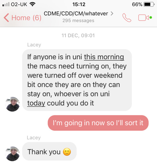
In our Creative Media chat, we were using this as a means of communicating with each other about turning the macs on and off. I mentioned that on this particular day that I would sort out turning the macs on as I was going in. Whilst I was happy to turn the Macs on, I felt that many people did not participate in helping out with this yet it was everyone’s responsibility to do so.
Originally I believe an Idea was thrown around of creating a schedule that would Involve everyone and it would give them a time and date to rather turn the macs on or off. However, this Idea did not materialise and the macs were occasionally left on overnight and then not turned on in the morning. I felt this shows poor lack of effort and is something that can not be ignored for the final show.
Feedback
Feedback forms
Pictured below are all the feedback forms from the Interim show. We received a lot of feedback which I found some of it to be useful and some of it to be a bit descriptive. Non the less I still found the Information provided to be great in terms of reflection for the overall Interim show.
The overall score for the Interim averaged at around 4/5, we had three 3/5′s, six 4/5′s and five 5/5′s in total, which I do not find to be too bad of a score. I feel like that for the final degree show a 10/10 score may prove more valid to get a more specific scoring.
Looking at the next question ‘what was your favourite piece/pieces?’, we received a range of feed back from that, some people stated certain pieces that they enjoyed such as Nathan Aston’s framed Images and Nathan Rees’ animated Stranger Things animated sequence. Some people even mentioned one of my Images for my frame, this being the Wooden Mannequin Image, which I was pleased to see, this feedback may actually decide whether I would like to continue to use this in the future. for the final degree show.
The next question states ‘did you like how the work displayed?’, with a simple ‘yes’ or ‘no’ tick box. Looking at the feedback forms everybody that answered said ‘yes’ which again is pleasing to see as it shows that our presentation was up to scratch. For the final project, I think we could expand on this question by asking something along the lines of “If you said ‘yes’ please state what about how the show was presented you liked?”.
The next question asks ‘Based on the work seen, would you hire any of the students’. Out of the 13 feedback forms, 12 ticked the yes box and 1 person said ’maybe’, which is still very good feedback to see. “To develop on this question for the future we could ask “If so, who in particular would you hire?”.
And lastly, the final question stated ‘Is there anything you would change about this exhibition for next time?’. Quite a few people failed to answer this question and some gave in-descriptive answers, however, some did reply quite Informatively. One of the most in-depth answers said that the frames/branding was overall good. However, the show reels need to be more consistent and need more Information along with them. On top of this, he said some of the show reel content is fabulous and some of it was not too good and was put together poorly/too quick.
Taking this Information in I think it is safe to say that some show reels were likely poor due to being rushed, Myself Included. But looking back at my show reel, it is definitely an area I will be looking to Improve a lot for the final degree show.
Overall I was pleased with the feedback. I thin to Improve the whole feedback process we need to make sure that Pens are always provided as one small problem we had was that we offered no pens at first as we had forgotten to distribute them. Aside from this, for the next show, I think we can think more carefully about what we would like to ask to get the most in-depth answers for the most critical feedback.

Email from lecturer
As further feedback, we had an e-mail from our lecturer Helen to give us feedback from a creative Digital media graduate Sophie, who came to view our Interim show. One downfall we were Instantly met with was the failure to turn on the Mac’s, which was a problem I had mentioned before. This was disappointing to here as I felt it had shown our lack of commitment and engagement with the show.
Moving on, however, it turns out that Sophie was Impressed with the level of quality of the branding and was overall generally pleased with the outcome. Sophie had picked up on a few of our short coming’s however, pointing out things such as the red bio which was due to one of the student’s doing their own print of their bio which resulted in some colour distortion. Also one of the frames having a narrow white border which we had not noticed. Some other feedback that was given was smaller things such as a typo on Colbert’s business card and that some business card holders need refilling.
Overall in terms of feedback, I am pleased. I almost expected the feedback to be a bit more critical than it turned out to be, yet most of it was generally positive.

In conclusion for the Interim show as a whole, I think there is definitely a lot to work on for the final degree show. I believe that we as a class have made some smaller mistakes that are easy to make but we must avoid for the final show. And then we have made some large mistakes that need urgently sorting out to make sure that we get the best outcome for our final show. These big mistakes being things such as making sure the macs are turned on and off so that our content can be viewed. Other things Include making sure pens are available to we can receive feedback, and lastly the quality of certain things, myself Included need to be up to standard. If we are given a certain job, we must do it well for the benefit of the rest of the class or we will bring everyone else down as well.
I think these problems can all be averted so long as everyone efficiently pulls their weight. A big problem with this show is that I felt some people were doing more work than others and some people were left with a load of people’s jobs when it was not necessary.
0 notes
Last Seen Blogs
leoofcontradictions
Wage Slave Seeks Life
victoriaagt
sun down

ladyelizabethraven
Do not go gentle into that good night...
deepinthespace
Neon Dreamer

artisticgeminate-archive
ARCHIVED BLOG