#phazerstorm
Note
I just adore your art style, it's so cute! I'm thinking of making comics myself. Do you think you could give me some tips on angling or facial expressions or overall detail?
Thank you so so much! I really appreciate that! Like, a whole lot. ^^
I’m not exactly sure how much I’ll be able to help you, though I can at least give you some pointers on expressions! I’ll do my best. I’m sorry this is coming a bit late!
I’m going to use Bendy for my examples, just because he’s super easy to draw and I have him on hand/mind at the moment. But! These can be used on just about anyone.
Keep in mind: this is just my way of doing things. There isn’t one “set” way to create great art! There’s a lot of experimenting, testing and growing when it comes to artwork.
When it comes down to expressions, there are a few things to consider: what are they feeling? How intense is this feeling? How far can, or should you push it? How can you make this feel realistic? In visual storytelling, showing what a character is going through is far more important than telling the reader. In a comic setting, there’s a very fine balance–since you have images to go with the words, but you can’t convey each minute action… At least in a reasonable amount of panels, the dialogue and the images have to work together when they’re used in tandem.
When a character is shouting, you have to push their expression further–it won’t be enough to show them with their mouth slightly open, or with a flat face. Give them wide eyes, or shut their eyes completely with frustration. Open their mouth wide, maybe even get their body language involved if you have enough room. Throw their arms in the air, have them pulling at their hair!
Likewise, if what they’re saying is quiet or somber, soften their expression. Have their gaze ill-focused, or looking to the ground. Their shoulders could be slumped, their brow could be low. Their mouth could be almost, or entirely closed. Or are they happy? Raise their eyebrows, widen their eyes with joy! Bring out that smile! Use as much variety and as many shapes as you can!
Because I’m a visual person, here are a few examples to give you a better idea of what I mean:

(I’m sorry if my handwriting is hard to read)
Which facial expressions are more interesting? Sure, the ones on the left are going through the motions of emoting, but the ones to the right REALLY show how the character is feeling!
Body language is also immensely important when it comes down to expressiveness. Every part of the body can be used to convey a message. The crossing of arms can indicate disgust, or even put a small barrier between two people. Slumped shoulders show disappointment or sadness. Every little movement a character makes can have a massive impact on their overall tone. Here are a few examples like the above:
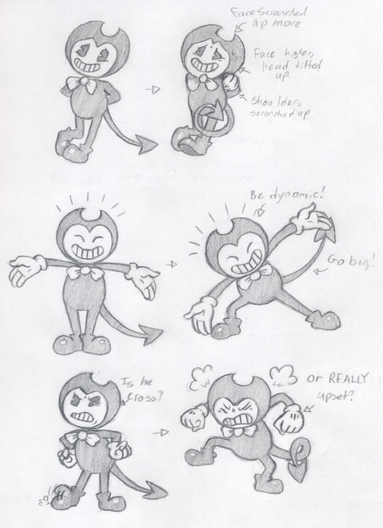
Even minute changes to a static pose can make a BIG difference! Test around and see what works best.
I’ve noticed that some animators have mirrors near their desk. This is so they can look up at their reflection and make a face into the mirror. They project their character’s feelings onto themselves, that way they can see what sort of facial expression would be best suited to that emotion. Nowadays we can just google this, but it’s still a good idea. Don’t be afraid to look up references whenever you need them. I know I do frequently! There’s no shame in using references!
My friend linked me to this wonderful guide, which goes more in-depth than I did here. Take a look!
I’m sorry I can’t help you quite as much with angles. I feel that I’d need to do a little more research in order to be able to articulate this more fluently. Perhaps some other time I can try and revisit this and go more into depth about perspective and foreshortening, but for now, here’s another great guide that might help you along in the right direction. I use a similar structure for my own drawings!
Speaking of foreshortening, here’s another tutorial! I don’t use this particular method, but it may work for you!
I know you didn’t ask for it, but I’d like to give you some tips about comic making. If you don’t want them, then I guess you can just stop reading, pfff. Either way I’ll put it under a cut so this post doesn’t take up so much of the dashboard.
I have to admit, my method of creating comics is… Unconventional in a variety of ways. I’m sure it’s not the worst way to go about it, but it may be a bit odd. Everyone has their own way, and a part of the process is finding what clicks well with you and your work flow. This is just my method, one of many!
I’ll start off with some of the important basics in comic making! I went to a small panel about comics at a con last year, and there I learned a few tricks and tips!
When it comes down to speech bubbles, it’s a good idea to keep the flow of the comic in mind. Usually comics are read from left to right, so when it comes to speech bubble order it’s best to keep this in mind. Height and distance between the bubbles in the same panel can also alter the order that they’re read in. It’s likely that our eyes will go to the panels on top first, so when it comes to order, it’s better to put the first bubble higher up than the second!
It’s also a good idea to keep in mind where your speech bubbles will be, and how much space they could potentially take. To avoid covering up too much of the characters it’s a good idea to plan these out ahead of time, and leave some extra space for these.
As well as speech bubble order, character order is also important. Again, since we read left to right, the first character we see we will assume is the protagonist, or even the hero. For example, let’s say you have a man using binoculars to spy on someone within a building. This can go two entirely different ways! If this spy was on the leftmost side of the panel, looking into the building that the person on the right is working in, it’ll come across as a hero digging up some dirt on an evil organization. Flip it around, with the person being spied on to the left inside of his home, and the spy outside and to the right of the panel, it’ll come across as a protagonist in immediate danger!
Something I need to remind myself of frequently is guiding the reader’s eyes about the page. This is best done in a subtle manner, where you use the characters and scenery to “point” towards the next panel. You can also use speech bubbles to do this, as when we read our eyes naturally follow along to the next bubble! Having the rightmost bubble lead into the one within the next panel is a pretty easy way to do this. One way I did this in my BatIM comic was by using Bendy’s spaded tail as a literal arrow. Did you notice? Even if I didn’t have the end of his tail pointing, I tried to aim his tail towards the next panel, especially if he’s not facing the “right” direction. The way that a character faces can also have an effect on this, so keep that in mind. They shouldn’t always be facing right, so it helps to have ways to lead reader eyes along.
One comic I poured a lot of focus on for this particular tactic is this one. Here I have Reaper Bird essentially point to where I want the reader’s eyes to go. You’ll also notice that it pops out of the panel now and again. That was a fun little detail I decided to add; in this case I used it to make Reaper Bird feel a little stranger, as it didn’t always fit into the box, even though Gaster did. A nod to how it covers up the dialogue box in-game. You can use this tactic to draw more attention to a character, such as for an introduction! Sometimes you don’t even have to limit them within the confines of the walls of a panel!
Speaking of panels… Making them all the same size and shape gets relatively… Boring. Not to mention there will be times where you either will have too much room for a single panel, or simply not enough! It’s far more engaging when the panels are different in size and shape. Just be sure to keep the flow in mind. We read from left to right, top to bottom. If you want to stack corresponding panels, be sure to make it clear that the top leads into the bottom, and the bottom leads into the one to the left of those!
So here’s how I make my comics: first I start off with my idea, and I plan out the basic idea in my head. From there I’ll write down the idea, and where exactly I want the comic to go. If I need to, I’ll write a basic script so I know what needs to be said and when. If I need more detail, or if I feel I’ll forget what I want to see I’ll script it out more, maybe sketch out panel ideas/format. From there I sort of… Grab paper and start going at it. I ghost out panels on my page. When I say “ghost,” I’m referring to the very light sketches and shapes I create to give myself a basic idea of where I want characters to be, and what I want them to be doing. I start with these light sketches to help me shape my drawings, and so I can easily go back over them and fix any problems or errors.
Once I feel I’ve got the panel looking basically like how I want it, I put a box around it and move to the next one. Though it’s probably better to use a ruler or a straight edge to create your panels. Even though I’m pretty good at making a straight line, and when I ink the boxes it usually works out… My panels are a wee bit lop-sided, haha! I used to plan out each panel carefully and then measure them out on the page I’ll be drawing on. While this doesn’t work for my flow NOW, it may be a useful tactic for you! For larger comics, careful planning is definitely key, but for shorter comics it’s not quite as important.
Anyway, once I have a page ghosted, I’ll go back over it and finish up the sketches, and make sure that each one is easily distinguishable for the inking process. This is usually where I make sure that the readability of the comic flows well for the reader. It’s also when I’ll share it with friends to get outside opinions. It’s usually a good idea to do this! Because you tend to get used to your own art, and you’ll likely miss errors. (I’ve done this too many times to count.)
After things are settled, I start working on the backgrounds. While not absolutely ESSENTIAL, having backgrounds can make your comic look a little more natural. It can help build atmosphere, and give the reader an idea of where the character is! I usually wait until I get the characters drawn, that way the background and character can mesh together a bit better. However if it’s easier to start with a BG for you, then that’s fine, too!
Then it’s off to inking! I focus first on the characters, then the foreground objects, then the background. Colors are next, should I go with them.
Here’s one page I have where I have the ghosted sketch, please excuse the potato cam quality! It’s not much, but I hope it at least gives you an idea.
Here’s a sketch of the full comic, before I inked it. You can still see some of my rough sketch work and where I started to plot out the background.
But that’s all I can think of, at least for right now. Feel free to ask more questions–I’ll do my best to answer them! I hope this helped out, at least a little bit. I’m sorry that it got quite a bit long… And hopefully this all makes sense, somehow. I feel a bit scatterbrained when it comes to teaching!
Good luck with your comics!
379 notes
·
View notes
Last Seen Blogs

city-night-witch
Brand New Love Song

fuck-yeah-am-in
⨂Proxy⨂

cherylthebestsoccermom
Dumping Grounds
kidrat
Dean's super naturals

chlorinejello
1962