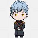
#so I tried doing a completely lineless background!!! It was such a struggle but i think it was worth it if just to pay homage to the way the
Photo
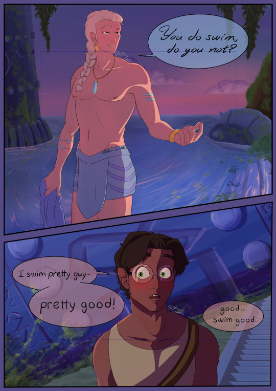
Drarry x Atlantis Au; featuring Harry’s gay panic 🧜♀️💙
#drarry fanart#drarry#Draco Malfoy#atlantis au#atlantis the lost empire#drarry au#draco malfoy fanart#harry potter fanart#Harry James Potter#nina-scribbles#drarry comic#harry potter au#Harry Potter art#so I tried doing a completely lineless background!!! It was such a struggle but i think it was worth it if just to pay homage to the way the#original Atlantis was done 💙💙#god i love this movie#kida was 1000% a part of my gay awakening#i may do more for this au later if only cause the character designs are SO fun
2K notes
·
View notes
Photo


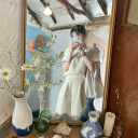
31 Days of Apex: A Retrospection
I participated in the incredible #31DaysOfApex challenge hosted on Twitter, where fans created new content for every day of July based on a one-word prompt. I’ve signed up for/started lots of similar challenges in the past but always ended up having to drop out or trail off before the end... but this time, I managed to complete something for every day of the challenge!
My only goal was to make something by each day’s deadline, and it was a really interesting exercise both in technical skill and also in my management of not only my time, but my expectations and energy. Below, I go into more detail behind each piece.
To preface; the beginning of this challenge coincided with the beginning of a new personal time-management exercise where, for 5/7 days a week, I would only go on the computer at night. Combined with the deadline, this had an interesting effect on my time management and the quality of certain pieces.
Day 1 - Memory
From the start, I wanted to use the challenge as an opportunity to do more studies and to push myself wherever possible. This was the first piece I did and I had more time to work on it, so I used it as a digital painting study. I still think it’s a strong piece and it’s probably my favourite of the month.
Symbolically, this character’s backstory doesn’t match up with her own memories, so the idea is she’s missing information she can’t quite place or remember, and this both scares and comforts her.
Day 2 - Blood
Another digital painting and lighting study that didn’t work out as well as the first, mostly due to time constraints meaning I couldn’t scrap it and start again. While I don’t like how it turned out, I did learn a lot.
The character on the right is a field medic, and my intent was to show the calm after a successful rescue.
Day 3 - Mercy
Some days I relied more on the humour of a piece’s concept than the skill of its execution, though I also liked how this piece turned out artistically. After two days of intense studies, though, this was very quick and easy for me to turn out as it relied on existing skills.
Day 4 - Prize
This one thankfully came together very quickly, which I credit to the two previous painting studies making it much easier to achieve what I wanted.
The character is searching for the disembodied head of the man who killed her parents, who is now acting as a robot, hence the vaguely half-machine-half-human silhouette in her hand.
Day 5 - Family
Another quick, simple illustration under a time crunch.
The character framed by the nameless foreground figures has no memory of herself or her family.
Day 6 - Noise
For some pieces where I was under a time crunch, I experimented in an opposite direction; instead of studies, I played loosely with different techniques/brushes/etc to see what came out. This was a lineless style I ended up employing a lot when short on time. The piece pictured here was just one of four alternate colourways, presented in a pop-art style.
The character is almost always depicted with thick coverings over her ears, so I thought she might be sensitive to auditory overload.
This particular piece was retweeted by the character’s voice actress!
Day 7 - Mask
More relying on humour for lack of time/a better idea. A fun experiment in colour, though.
Day 8 - Healing
Another technically “easy” piece but with a stronger concept. It was actually pretty hard to get the reflection & condensation elements balanced right.
The character pictured has a narrative thread relating to an old ex he has trouble moving on from.
Day 9 - Weapon
While obviously another joke, and made to be finished quickly, it was surprisingly difficult to get the duct tape and knife to read clearly without over-cluttering the lineless image.
This little ‘bot is a drone used by one of the playable characters to hack areas of the map; it’s not NORMALLY an offensive weapon.
This image was promo’d in a video stream by the character’s voice actor!
Day 10 - Truth
I only had less than an hour to finish this one by the deadline, but I still tried to experiment with silhouette and colour. It was surprisingly hard to get the interior silhouette to be legible.
The outer silhouette is a playable character (not easily readible unless you’re familiar with his design) and the inner silhouette is his sister, whose disappearance he is trying to investigate.
Day 11 - Shield
A fun, self-indulgent one. Had a blast simplifying the game’s characters down into little caricatures.
The character in the centre has abilities related to shields and protection, so many other people were drawing him for the prompt; I wanted to try and flip it, so I picked other characters he would be friendly with, and picked a non-lethal, lighthearted setting.
Day 12 - Ruins
Short on time so did a quick lighting study.
A recent game plot has changed one of the areas of the map, submerging it in water and leaving it to “ruin”.
Day 13 - Hero
Another painting study. Really didn’t like how this one turned out, but had to turn in something, and I did learn a lot in the process. If I’d had more time I probably would’ve scrapped it and started again.
This characters had recently been revealed to have been manipulated by another character who used gas-based offenses, whom she admired.
Day 14 - Rest
I was going to be away from mt computer until after the deadline, so I decided to make a traditional piece. I ended up enjoying it so much I tried to take the time to do a few more traditional pieces later. This piece was sort of a comedy of errors; I had to do it while I was out, and the pen I had brought with me to ink my sketch ran out, so I had to make do with a blue ballpoint pen, and I was missing several colours of coloured pencil. I think the finished piece reflects how rushed it was, and it did’t meet my concept, but I do still like it.
Day 15 - Skull
Another quick one but I wanted to experiment with a different line style. Wanted a sort of “graffiti” effect.
One of this character’s skins includes a skull-shaped mask.
Day 16 - Growth
Extremely quick play on words because I didn’t have the time to work on anything meaningful and couldn’t think of anything better!
Day 17 - Home
Another traditional piece, this time by choice and with more time. Markers. It looks extremely like some janky art school homework on 2 point perspective because it extremely is. Perspective and backgrounds are very difficult for me - they just don’t “click” - but I had a lot of fun with this one. I kept my mistakes intact because I didn’t want to edit it too much. A lot about the technical perspective is wrong, but I think I achieved the “mood” I wanted.
This location is a bar owned by one of the player characters where many of the other characters are shown to meet.
Day 18 - Sky
Very happy with how this one turned out, even though there are still lots of problems. Markers again. There’s a lot I would fix next time, and I think technically it’s lacking, but there are some specific areas I feel happy to have achieved, such as the almost brushed texture of the curved metal above his shoulder and the values of the shadow/reflections on the underside of the head piece. I’m also happy with how I was able to draw from my shoulder rather than my wrist when inking the curved lines, something I struggle with.
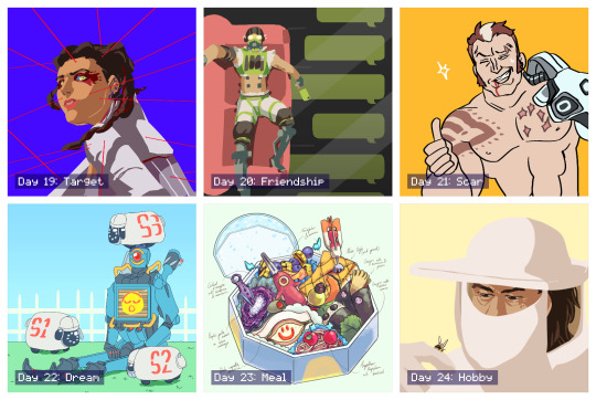
Day 19 - Target
An experiment in pushing the lineless style I’d already been playing with for a stronger likeness. The pose and expression in this could both be pushed more but I like the result.
This character had just learned that one of the other players, whom she had trusted, was actually sharing her secrets with her enemy, and she didn’t know which one it was.
Day 20 - Friendship
I had this one concepted from when I first looked over the prompts. It was a fun challenge trying to simplify all the elements into the lineless, blocky style while being legible.
This character has a strained relationship with one of his friends, and finally pushed her too far with his selfishness, and she now no longer responds to him.
Day 21 - Scar
Quick joke. This character was introduced briefly as a red herring for another character before being killed off. He was stabbed through the chest by another character’s hand, hence the scar pattern.
Day 22 - Dream
I wasn’t sure about this one while I was making it but I ended up liking how it turned out. I wanted to capture the character’s robotic legs bent at an unnaturally straight 90 degrees, like a Barbie doll. The flat background and lighting make it feel like an indoor stage. The little “electric sheep” are inspired by iDogs.
Day 23 - Meal
After a few days of not having time to really spend on any piece, it was fun to get to spend time on concepting and composing this. I always admired these kinds of watercolour-like food illustrations and this is the first time I’ve had any success in creating one myself. I concepted and sketched out the individual items traditionally before working out the composition within the box digitally.
Each food item/utensil is inspired by the different characters’ design elements. Only two of the now-current characters are excluded due to plot reasons. In particular, I like how one of the character’s dome-shaped shields acts as the base and cover of the box.
Day 24 - Hobby
Wasn’t a fan of how this one turned out. I think the likeness is a bit off, and his facial anatomy is skewed. But I also like how the general composition, tone, and bee turned out.
This character’s concept art originally imagined them as a beekeeper who would use smoke to fight.
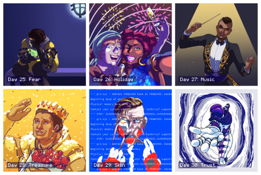
Day 25 - Fear
An incredibly rushed piece that I intended to go back in and add more detail to, similar to day 4, but I actually took a step back and decided I liked the blocky, flat-colour version.
This character is the youngest of four, all of whom are MIA or worse, along with his father, and his mother is losing her memory. He’s talking to her through a handheld holographic device. This piece gained more traction, most likely thanks to the subject matter since this is a popular character.
Day 26 - Holiday
I didn’t want to do a religious holiday like Christmas or Easter. A lot of other people also interpreted the prompt as a vacation, but I had already done a sort of “beach vacation” piece for day 11, so I instead went for a “public holiday” and chose NYE/NYD. This was fairly quick but the lighting was an interesting experiment. I knew this one wouldn’t be as popular because it wasn’t as “flattering” but I personally really like it. The girl on the left is kind of goofy and completely un-self-conscious and I think it’s captured here.
Day 27 - Music
Really didn’t like how this one turned out. I don’t think the likeness is good at all, the lighting is poor, and the gold detailing feels lazy. But I liked other elements, such as the pose and the clothing.
Day 28 - Treasure
This is my least favourite of the entire month, but I also had the least time available to work on it before the deadline so I had no opportunity to scrap it and start over, which I sorely wanted to do. The likeness is terrible, but more than that the base anatomy is off, the pose is stiff, and the lighting/colours are cheap. I wish I could’ve done better by this character; but, I am glad I had something finished at all.
Day 29 - Skin
This was probably my third attempt at this picture and I’m still not happy with it, but again, I had to finish something. I almost considered scrapping the concept entirely and choosing something easier but ended up seeing it through. The concept itself is actually recycled from an older piece of mine for an entirely different fandom, because I didn’t think I did it justice then, either. Would still like to revisit this concept with this character and take more time.
Day 30 - Trust
After a few days of feeling really dissatisfied and uncomfortable with the art I’d been making, I finally more time to dedicate to a piece, and I’m overall happy with how this one turned out. I decided to go for a different medium entirely with pixel art, which also gave me the opportunity to try and animate it. I started off confident and then started to get worried towards the end, but all the elements came together when I added the portal colour effects.
This is an alternate reality version of one of the player characters, who appears through a portal and allows that character to escape the facility she’s being kept in, encouraging them to trust the “voices” she hears which are actually versions of herself trying to help her.
This piece was retweeted by the official Apex Legends Twitter account!
Day 31 - Freestyle
I had this planned out early in the challenge and I’m really, really happy with how it turned out. It’s probably tied with my favourite along with the very first piece (how fitting). I was worried about how I was going to capture the movement without over-complicating the lineart, having so many people in one image, etc. before I realised the focus was entirely on gesture, and then everything clicked. I went for a thicker brush, which forced me to conserve my lines, and tried to simplify each character down to the bare minimum needed to recognise them. They’re also all wearing new non-canonical outfits so I used their familiar colour schemes for the same purpose. It’s not perfect, but I love it, and it’s everything I’d hoped I’d be able to end the challenge on.
I really, really enjoyed the entire month and the way it tied in with my new time management schedule. It gave me some achievable short-term goals which added up to this long-term achievement I can now look back on; I learned a lot both about balancing my energy and about technical skills, I found ways to stay motivated, and most importantly I learned to not get caught up on the individual slip-ups and pieces I didn’t like as much and to instead focus on the bigger picture. Thank you to everyone involved in organising and supporting this event! I found so many other incredible fanartists, writers, and content creators through this challenge and I can’t wait to see the bonus content released over August!
4 notes
·
View notes
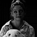
Photo
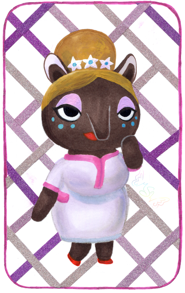
The Dream Crosser
Surprise! NaPoWriMo didn't kill me (and I'm not abandoning dA because of the incoming Eclipse update either, more on that situation here), I just needed a week off to recuperate...and obsessively play Animal Crossing: New Horizons...
Admittedly, I actually drew this well over a month ago (and wrote up the majority of the description!), not just before NaPoWriMo but before I actually had New Horizons in my grasp. The plan was to post it the day I got the game. Which was supposed to be much closer to the game's launch (March 20th). That ended up not happening and the day I got the game was the first day of NaPoWriMo, but 1. I messed up with the non-uniform prompts and spent all of the day trying to catch up so I couldn't even play the game yet, and 2. As a side effect, I ended up having two posts that day and a lot of work to do to catch up the second, and I hardly had time to think about posting this. And even if I had posted it, it would've been drowned in the incoming NaPoWriMo posts.
And so, here we are.
Really, really, I do have to mention that I truly feel for anyone else still waiting on the game for whatever reason. You have my deepest sympathy and I'm so sorry I can't just give you the game right now and make it better. I know the wait was hard enough for me, being this is the one game I highly anticipated in over a year and I essentially had the rug yanked out from under me. But I'll save that story for after I talk about the art itself since I'm sure that's what most people are here for and not my pre-order frustrations.
So in case you don't know or couldn't tell, this is the lovely Luna from AC: New Leaf's Dream Suite. From what we've seen of New Horizons since it's release, the Dream Suite's functions and purpose have been mostly absolved into the Airport and Dodo Codes, and so I'm very doubtful Luna will actually be in the game in any capacity, which makes me sad. A typical player (including me) wouldn't even necessarily interact with Luna that much in New Leaf unless you really enjoy visiting other towns using Dream Codes, so I'm not sure what it is, but for some reason I just really like her.
That's why I picked her to draw to celebrate. I very nearly drew her a long time ago when I was on an Animal Crossing kick in 2018, but at the time I didn't like the idea of pressuring myself into drawing all and/or multiple AC characters just because I wanted to be "fair" to them all (much the same reason I don't draw Pokemon very often), so I ended up drawing One Little Spark, a crossover of the Disney character Figment drawn in the New Leaf style, instead. So in a way, she's had this coming for quite a while.
At the time I started working on her, (way back in early March, because I was hoping beyond hope my pre-order would arrive to me actually on launch day, but ha ha ha look who's got egg on her face for that ) I was running a bit dry on artistic motivation, and so while I tried to draw her in my usual manner: Making a sketch, transferring the sketch onto different paper with finalized lines, then picking whichever coloring method I was most into at the time), I was struggling with the sketch. I've had days where I have to work on a sketch for a really long time before I can get something I'm happy with, but this day I was just so not into the whole sketching process. I wanted to create, but I wanted it to be quick and easy and simple. I didn't want to have to poke at it for hours and hours and then still maybe not be happy when I was done. So when I got discouraged enough, I broke away from trying to draw Luna and just drew mandalas instead. (As had become my art-block crutch for a little while.)
Somewhere in me, as I worked on other things, I kept going back and forth on what to do about Luna, though. I did still want to draw her, but my usual formula just wasn't working for me. Not for her. I even tried briefly to draw her linelessly, digitally, as what was supposed to be a quick and simple experiment, but that went downhill even faster than sketching did. Although, for some reason, the lineless idea wouldn't leave me alone after that.
Finally, I decided to try something completely different. I was going to try and free-handedly draw her, without lines, traditionally. With, primarily, alcohol markers.
Honestly, the thought minorly horrifies me now just as much as it did before I started. And yet, here we are and I actually like how it turned out. Allow me to explain how this came together:
So, since I wasn't sure how this was going to turn out once I decided to try it, I opted to use my not-so-great mixed media paper so I wouldn't feel guilty about wasting better paper if I ended up hating it. Naturally, this did lead to some notable limitations, but not enough to discourage me from trying.
I dove right in with the dark brown for her head and body, focusing on getting the general shapes down. I'd noticed some glaring mistakes in my mostly unproductive sketching when it came to Luna's body proportions, so I tried to keep those things in mind and adjust accordingly as I went. It was scary because there is no erasing this way short of using white paint and because this paper feathers pretty noticeably with markers.
Then once I got to a certain point, I had to switch and bring in some pink and off-white markers to draw in parts of her dress so I knew where to put her other arm and her legs. And here is where I technically cheated; I did use my "clear" Stardust Gelly Roll pen to do most of the outlines for her dress. I needed some kind of guideline, but pencil tends to get yucky when you put markers on top and at the time I couldn't really think of a better option. (The joke was kind of on me because somehow I still got a nasty gray line that looked like pencil under her bust that I had to gently edit out later in Photoshop, but I digress.)
As I went with the markers, I was also doing some light shading. Not too much, because this paper is really fussy with layers and blending, but enough that I felt like it didn't look completely flat and I could tell where one shape ended and another started. Though, for her nose (trunk? I believe Luna is supposed to be a Tapir) and her raised arm, I had to get a little creative and I used a white brush pen meant for glass/ceramics to put in the lines so you could actually see them. And later I would use the same pen in 3-4 layers to add the white back in for her eyes.
With the base for her body, dress, and the bun part of her hair done though, then I had the task of figuring out what to do for her shoes and the details of her face. (Without having to mix and use specific paint for those tiny details.)
In the end, I opted to mostly use my classic red Gelly Roll pen for her shoes, and a little bit of a dark red alcohol marker for shading. And then I got to experiment with mixing the classic red and one of the Moonlight Gelly Rolls for her lips so that the color would be visible and not just a dark lip-shaped "what is this." This was because the classic Gelly Rolls don't show up super well on dark surfaces and the Moonlight ones do, but I didn't have the right color straight out of a Moonlight pen. It did take 2-3 careful layers, but I think I managed well enough in the end.
I used just one black pen, a Prismacolor brush-tip fine liner, for her eyes, though in-person the white base underneath makes her pupils look about a shade or two lighter from certain angles, which was a very unintentional nice touch.
My answer to everything else ended up being gouache, although I did try to come up with pen colors for her eye shadow and the blue dots on her cheeks before admitting defeat that I just didn't have the colors I needed.
Originally, I had actually been thinking of trying a lineless art piece with gouache, as I think it would work particularly well for that look, but I wasn't ready to fully commit to the idea, mostly because I seem to be even worse at mixing a non-excessive amount of a specific color with gouache than I am with acrylics, and that sounds like a fantastic way to waste a bunch of palette space because I mixed too much but it's gouache so it can be re-wet and re-use it and I don't want to just throw it away... (Although I suppose this could be half-way solved by getting a bigger palette specifically for mixing gouache, but I also don't want to have to buy yet another palette when I have some perfectly good ones...If I could just use up all the paint in them already...)
Anyway. Point: This is kind of a step between a full lineless gouache piece and not doing one at all. Baby steps, yes?
I knew from fairly early on that I was probably going to have to use gouache for the front part of her hair/bangs, since I did not thoroughly plan ahead enough and didn't leave a gap there to do it with markers. Fortunately, I didn't have to do much mixing since my gouache already has a nice yellow ochre color included, and I could use a bit of the other two browns and one I had some leftover mixed already from Roses in Your Eyes for shading. (White for the flowers, too, thank goodness.) And I actually ended up going over most of her bun with gouache too since, by comparison, the marker didn't look like it had much shading and it was bothering me.
I did have to mix my own blue and pinky-purple for her makeup, and I ended up with a lot of leftover pinky-purple. But it's kind of okay because by itself it's such a pretty color I'm sure I'll find an excuse to use that one.
After that, I just had to do some minor tweaks where the gouache had gotten a bit away from me and then I went ham on the shading for the dress based on my reference photo.
Then I realized I wanted some kind of background because this seemed awfully boring without one. And, naturally, I hadn't really planned ahead for that, me being me and being in habit of doing the background last...
At first, I wanted to do something hot pink, since her official Amiibo card has a hot pink background, but then I thought that might be a little too loud and I wasn't really sure the best way to apply one without potentially messing her up. And also, this isn't watercolor or paper thicker than 140 lb, which immediately threw watercolor out the window unless I wanted a very uneven paper when I was finished. I'd already pushed my luck with the gouache and been very careful about not using much water with it; I decided it was best not to push my luck any farther.
Also, I couldn't use my pink PanPastel, despite that being maybe my best option, because it is still perpetually screwed onto the little Pan Pastel stack with no hope of getting unstuck anytime soon. (One of these days I swear, I will order either another set like the one I have or an individual Pink one to solve this problem, but until then, I am going to bring it up every single time as a caution to others to please be very careful when screwing and unscrewing your own Pan Pastels if you store them screwed together.) And I didn't feel like dragging out some of my drawing pastels and/or makeup that's too expired to use on my face and very slowly building up color and hoping it'll do what the Pan Pastels do.
With no better ideas coming to me, I decided I'd leave the drawing for the night and come back to it the next day.
After yet more brainstorming the next day, I finally settled on doing a glittery rounded rectangle and filling it with washi tape stripes. This plan did change a little as I figured out which tapes I wanted to use (a purple-y, champagne gold, and light pink ones, the latter two of which look more different in-person than they do on the scan) and as I actually started applying the lines. Partially because this tape is a bit thin and partially because I'm not used to cutting tape around very specific shapes, it took a very long time to both place strips of the tape and then get them cut to fit right up to Luna without looking strange.
Once I got to a certain point going in one direction, I realized my next couple of cuts were just going to be too hard for me to stand. I had a choice: Ditch the tape, or figure something else out.
Taking a risk, I decided to try and salvage it by doing an almost-plaid/checkerboard with the tape, specifically leaving out certain areas where I knew it would be too tricky to cut the tape. This also turned out to be a good way to use up some of the pieces of tape I'd already cut off that were too small to be used the other way. It's still not the greatest background solution I've ever come up with, but it does the job of making it look less empty, and that's really all I wanted anyway.
And you know, compared to official images her proportions look wonky, but by herself (meaning, without comparing the two) I think Luna looks pretty good, actually. (Though, I admit I did have to tweak her right ear in Photoshop because it came out entirely too long and there wasn't really a good way for me to fix it by hand.)
To think, this piece started out as such a mess. Or rather, I was such a mess when I started. And yet, here we are, and it looks kinda okay. Okay enough that I finished it and am posting it, at least.
I have no idea if I'll be returning to this style/method for art-making in the future, but even if I don't it was a nice experiment to try, and that's what art is really all about isn't it? Experimenting, trying new things?
Speaking of experimenting though, about those pre-order frustrations I mentioned now that I've covered everything about the art itself...(in small text for those that don't care to easily skip over)
Back in February I tried twice to pre-order New Horizons from Target, since they were running an ad where if you pre-ordered the game you'd also get an AC themed journal with it, and that combined with my family member's employee discount made it the cheapest/best value way for us to buy the game. As I said, I tried to order it twice. Both times, it was sold out. My family member had even tried to go to the store and have them order it before then, to no avail.
After the second time, which was the day after Target sent out the sale paper with the new ad in it, while I was still frustratedly wondering how on earth do you sell out of a pre-order?? I kept refreshing the page every so often just to see if by some fluke it would miraculously not be sold out. I got very lucky around 3 in the afternoon and we managed to get the order in before it sold out again.
Now, we're a relatively cheap family, so we didn't pay for the "express shipping" or whatever. Although, this was a $60 game and we were ordering it three whole weeks (on March 2nd) before release. If you ask me, the least they could do is have it shipped out either on launch day (March 20th) or the day after. Especially if I can pre-order a book on Amazon with three days' notice and they can still get it to me on release day. But, okay, I could live with waiting an extra day or up to maybe three if I had to. (And, to be fair, this was all before a certain virus exploded into chaos here in the US.)
Much to my dismay, a week before NH release day, I checked the order status with Target only to be told I wouldn't get it until the 26th. A week later. That was pretty disappointing at the time, but it didn't really bother me until the day before and the day of launch when some people were getting their pre-orders early from places like Amazon and Best Buy (and some of them didn't even pay for the express shipping option from their selected source). If those two companies could plan around virus constraints to do that, why in the heck couldn't Target?
But, okay, fine. Maybe the virus had something to do with it and they were really doing the best they could. Whatever. A week. Fine. I'll wait a week.
A few days later though, we got an email saying: Surprise! Don't expect your dumb video game until April 3rd because we couldn't get our act together! (Okay, that's not what it really said, but that's what it felt like.)
And I know, I promise I so know there are much more serious issues going on in the world right now and a video game about talking animals isn't exactly a priority shipment. I know. But it was still massively upsetting after I'd already waited so long. And, honestly, I feel like they had plenty of time and notice to take care of the game before everything else exploded and messed it all up. Again, especially if other companies already had time to even ship orders early and/or get the games to people on launch day. Or the day after. TWO WEEKS after launch, and you don't tell me about the secondary delay until the week I started expecting the game to already be in the mail on it's way to me?
The only tiny silver lining is that as I was checking the order to make sure it didn't miraculously get pushed back to sometime in 2021 (because I really had no faith in Target's time estimates at this point) is that it did get bumped back up to April 1st. Although, I did think that it would be the absolute least funny April Fools' Day Joke ever if the day came and it was late because screw me. But it did arrive to me on April 1st as promised; I just had a million other things to do before I could play it. )
And I will say, I know I could've just canceled the pre-order and bought the game digitally, but it was enough of a hassle to order it in the first place, and if I did that I'd also lose my pre-order bonus. And all that aside, I specifically wanted a physical copy to begin with. I always prefer that when it's possible. So people on the internet that want to eat me alive for not canceling when the shipping got screwed up, there are my reasons. Take 'em or leave 'em. (Seriously, I've seen some people be really rude about this just because they didn't like hearing people upset that they didn't have the game yet...when they already had it themselves or didn't care about AC in the first place...)
Moral of the story: Don't pre-order from Target. Or, at least, don't expect the item to actually get to you right around release day. Account for at least two additional weeks of not having the thing.
...Seriously though, how do you sell out of a pre-order?? At least, when it's a highly anticipated game and you're a big company and not some small indie company with limited resources! Sheesh!
Anyway. I have the game now, I've been playing it as much as possible and enjoying it. I still have a ways to go before my island is "complete" per se, but it's coming along nicely and I feel more comfortable now taking some more time away from it to get back into the swing of making art and things like that. So hopefully I'll be getting back into a regular posting schedule and you'll have that to look forward to.
____
Artwork © me, MysticSparkleWings
____
Where to find me & my artwork:
My Website | Commission Info + Prices | Ko-Fi | dA Print Shop | RedBubble | Twitter | Tumblr | Instagram
2 notes
·
View notes
Last Seen Blogs
tsukasazushi
エジハニ推進委員会
driftcompatiblesblog
reyenii pacrim blog
orange207-tmb
207 EXP. film
jiseomii
jiseomii_
areyoureddieforittaylorsversion
ᴛʜᴇᴏ (ᴛᴀʏʟᴏʀ'ꜱ ᴠᴇʀꜱɪᴏɴ)