#so I went with the retro look of halftones and lines
Text
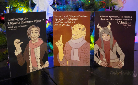
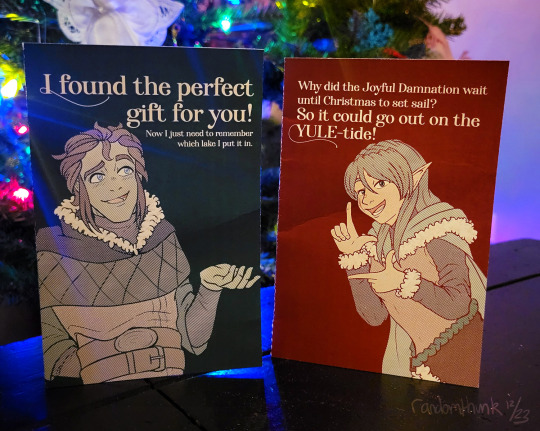
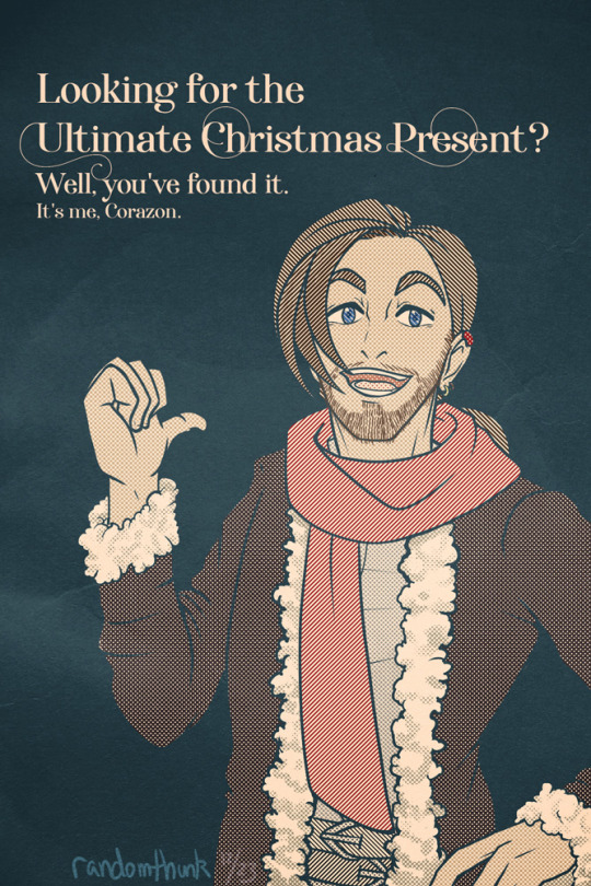
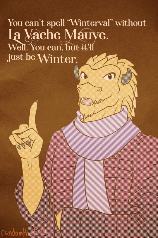

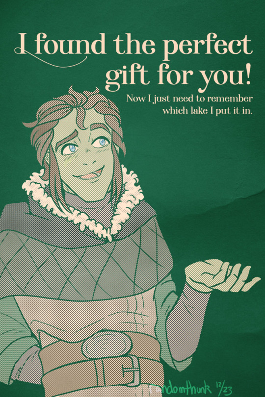

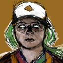
MERRY CHRISTMAS ONCE AGAIN! The idea of "Oxventure greeting cards" came into my mind at D&D, and so the marathon sprint began. Thanks a million to @the-last-teabender for helping me come up with captions for these.
#oxventure#outside xbox#outside xtra#corazon de ballena#egbert the careless#prudence#dob#merilwen#kat arts#fanart#ox fanart#I was like 'oh the Shoebox cards' but I can't mimic styles to save my life#so I went with the retro look of halftones and lines#so stupidly pleased with how Egbert and Prudence in particular turned out#how did I draw Egbert so easily#I've read a lot of manga this year can you tell
147 notes
·
View notes
Text
Development
I ran with this office concept and decided I needed my own photography so I went to my mother’s office and took some photographs of various office accoutrement. I also decided that I should go for a colour instead of black and I always associate corporate spaces with dark blue so I chose Pantone P 103- U16 and I really liked how it turned out, it seemed to suit Roboto Slab better than black and white and it fit with the slightly retro-meets-today easthetic I wanted to get across. I added a halftone line effect to the photos as a way of bringing cohesion and adding the retro texture to my photography. It reminds me of a streaky printer running out of ink, and stripes also feel very conservative and business-like.


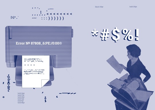


I realise now that I might need to check my settings as these blues all look really different although they are the same spot colour....
0 notes
Text
Task 4 - Final Piece
[Behance link]
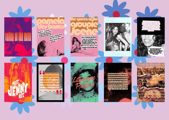
I made a groupie-related zine, Valley Of The Dolls, as my final piece idea.
As it primarily focused on the 1960s and 1970s, I opened Coolors and searched for psychedelic palettes. I didn’t want the colours to be too acidic and bright, but I also wanted them to stand out. The 1960s focused more on pastels - mint, baby pink, baby blue - while the 1970s focused more on bright tones - mustard yellow, burnt orange, deep red, and denim blue. I used the Psychedelic Sunrise palette for the majority of the work, and took all my colours from Coolors.
COVER
For the cover of the zine I wanted it to be simple while hinting at the content inside. I chose a photo of a young Beatles fan in 1968 from Pinterest for the cover, as I liked the layout of the photo, and the model had a suitably doe-eyed groupie look. I opened it in Photoshop, and created a gradient with a hot pink at one end and a deeper purple at the other. I then went to Layer > New Fill Layer > Gradient and filled the image with my gradient. I set the layer’s Blending Mode to Darken so the gradient would shine through instead of turning dark on the black and white of the image. I then brightened the image with Adjustment layers such as Brightness/Contrast and Curves to increase its visibility.
After making sure the image was sharpened, I started on the text. I used Cooper Black for my title as I thought it looked sufficiently ‘retro’ while still being readable. I decided to give my text a gradient effect as well, but in a more unconventional way. I selected a bright orange as my starter colour, and then duplicated the layers a few times. For each new row of text, I selected a lighter shade. I then positioned my title, rasterised the layers, flattened the layers, and centered them.
PAGE 1/PAGE 2
For page 1 and 2, I decided to focus on Pamela Des Barres, the most infamous groupie of the scene. I wanted to make her pages light and very 60s, as she was active during the late 60s groupie scene in Los Angeles. I chose a sugary pink background for her pages, and I typed the page titles in Bauhaus 93 font. I wanted to jazz the pages up a little, so after rasterising the ‘Pamela’, I selected it with the Magic Wand Tool and inversed the selection. On a new layer, I filled the area above the word with a golden brown. For the photo of Pamela, I chose an image from a photoshoot of her in the late 70s. I chose that one specifically because I liked the composition and it was easy to build text around. After cutting it out with the Pen Tool, I resized the image and made it completely black and white with the use of a Gradient map. To colour the background, I made a pink to black gradient and placed it under the text. I chose a quote from her that I thought highlighted the overall groupie ethos of ‘music is life.’ I capitalised a few of the letters in the sentences to make it look a little more ‘jagged’, and I drew white boxes around the text with the Polygonal Lasso Tool.
For the second page, I followed the exact same formula of the first. I selected a picture of Pamela that was taken in the late 60s, and is probably one of the most well-known photos of her. I cut it out with the Pen Tool, and placed it so that her left leg would be on page one. I added a short biography of her on page two, next to the cutout.
PAGE 3/PAGE 4
For pages 3 and 4, I decided on ‘baby groupie’ Lori Mattix as my subject. I thought Lori would be an interesting choice as she started in the groupie scene very young (14), and had a few comments on the more negative side of the scene. I chose a pale blue for her background to emphasise the fact that she was young, and kept the same pale pink from Pamela’s page for her text. I used a sans-serif font for her title. To make it just an outline, I typed out and arranged the titles. I then selected them all using shift + the Magic Wand Tool before turning off their visibility. I went to Blending Options, and gave all the selections a stroke of 3 or 4. I then selected off, and rasterised the type. I chose a photo of Lori from the mid-70s, with model Shray Mecham in the background. I used a black and white gradient map, brightened the photo a little, and then put it under the text.
For the second page, I found a photo of Lori from the 70s. I resized it to fit the whole page, and covered the top half of her face with a black box. I used the Rectangular Marquee tool to do that. I then added a short biography, in the same style of Pamela’s page, and created a speech bubble with the Lasso Tool coming from her mouth. I coloured the main bubble white and the tail pink. I then added a quote, and sharpened the final image.
PAGE 5/PAGE 6
For Jenny Kee’s pages, I decided to go for a more psychedelic and arty style. Kee is a lesser-known Australian-Chinese groupie who found worldwide fame as a fashion designer, but as a youth she was active in the Swinging London scene of the 60s. I found a black and white photo of Kee posing in front of an elaborate design of fabric and bric-a-brac, and created a new Gradient Fill layer. I used bright red and orange for my gradient, and set it to Multiply. For her title, I used a font I really like called Flowers Kingdom. I typed ‘MISS JENNY KEE’ as one word on three separate layers. I went to Type > Warp Text and used the Rise setting at +23. I copied this at various degrees for the other two text layers.
For page 6, I copied the pop art style of the 60s to make the image. I found another photo of Kee and resized it to fit the entire page. I then went to Filter > Color Halftone, and set a halftone at the lowest setting on the image. I then added a black and white gradient map, before adding a black border on a separate layer with the Rectangular Marquee Tool. To place the text, I again used the Rectangular Marquee Tool + Shift to create a square. I positioned it slightly to the left, centering it, and filling it with the same orange from the gradient. I them typed a speech mark and resized it to make it large, colouring it with the same red from the gradient. I then duplicated the speech mark and rotated it 180 degrees, positioning it at the bottom right of the square. I used the Text Tool to make a textbox, adding in a quote from Kee. I set the orange box to Multiply, and the commas to Multiply.
PAGE 7/PAGE 8
For page 7 and 8, I centered on Lithofayne Pridgon, the woman who allegedly inspired Jimi Hendrix’s ‘Foxy Lady’. I wanted to keep her pages really simple. I found a photo of Pridgon and resized it to fit the page with the ‘Show Transform Controls’ tool. I then went to the Adjustments panel and used a Gradient Map to increase the shades of the image, and a Levels layer to adjust the contrast of the image. I used a Colour Fill layer with a dark mint green tone, and set it to darken. For her title, I used a font named Dollie Script and set it to a coral orange. I rotated it a little with the Show Transform Controls tool.
For page 8, I used a still from a video of Pridgon. I went to the Adjustments panel and used a Brightness/Contrast layer to make the image brighter. I then used a Gradient Map in black and white to desaturate the image. I filled a layer with the same coral orange colour and set it to Darken in the Blending Modes of the image. For her quote, I created a textbox and added the text. I also seperated the distance between each line. I turned the text a dark gold colour, and on a new layer, I made a box around the text in pale pink. I then used the Rectangular Marquee tool to clear the box until it ‘highlighted’ the text. I then centered everything.
BACK COVER
The back cover was a direct response to the simplicity of the front cover. I found three images through Pinterest, and positioned them on top of each other. For the torn pages effect, I downloaded a pack of brushes that had a ‘ripped paper’ effect, and resized them. I then painted the brushes on seperate layers at the joins of the photos. I then used the Eraser Tool and a layer mask to erase the parts of the image and brush that overlapped, leaving a neat tear on each image. I then went to Filter > Noise > Add Noise, and added some grain over the images. The quote of the back cover is a David Bowie quote, written in the font Royal Acidbath. I used a textbox to spread the text all over, and made it as large as I could.
EVALUATION
My zine took major inspiration from Andy Warhol’s pop art pieces - bright colours, bold text, and maximalism, as well as halftone effects. I think that this was a good project to push myself on, as I had to condense a lot of history into a small zine and a few quotes, as well as getting the vibe of the zine across. I’m disappointed in myself for not using materials I bought, such as textured paper, in my final zine, but overall I really like the piece and I’m really happy with how it came out.
0 notes
Last Seen Blogs
todaysbat
today's bat

supine-ly
Shrimp

sata-cable
Val
anamonteiro29
Ana Monteiro
mawhrin-skel
meet nermal.