#sorry the og video was poor quality
Note
pretty sure I've asked you this before, but since you've seen more operas/opera productions since, what's an opera you've seen more than one production of, and what are your thoughts on those productions? What do you like about some over others? How do you feel about the various casts? Do certain production concepts work better than others, and why?
Okay, so I’m gonna go ahead and do what I did when I hijacked your trouser role quiz post (sorry about that) to talk about a bunch of different Faust productions except I’m gonna talk about them MORE. so INCOMING:
Vienna 1985: first full production I ever watched, so it has that sentimental value. the biggest no for me is that the director decided to make Marguerite a nun??? (she gets kicked out after Act III) the production is set somewhere in the French countryside during the Napoleonic Wars and it actually works pretty well overall! not a fan of the extraneous ballet dancers, though. but there’s some really great stageplay and special effects (the golden calf is a sight to behold, and the church scene is incredibly creepy and I like it even though once again, LOSE THE EXTRANEOUS DANCERS PLEASE). the cast is really fantastic. Raimondi is still one of my favorite Méphistophélès(es?). even in the nun costume, Benackova is an amazing Marguerite. all in all: good show. lose the dancers. also the apotheosis is creeeeeeeeeeepy.
Paris 1975: the video quality was...kinda bad, not helped by the fact that the production is somewhat dingy. I like the vibe it was trying to go for but it just didn’t really work. the ROH did it way better. cast is excellent: Gedda is Gedda, Freni is Freni, Soyer is Soyer (and pulls off a baby blue suit at one point which is itself no mean feat). I like it! not my favorite though.
Geneva 1995: not great video quality either but pretty pretty PRETTY. the garden is particularly wonderful. also tries to go for the same vibe as Paris/later ROH and falls short of the latter. Samuel Ramey IS Méphistophélès. rest of the cast is wonderful too. not sure if there are any other Ramey Faust productions, but even if there are, must watch just for him.
And now for the ongoing ROH production saga:
Three broadcasts, all of the same wonderful McVicar Belle Époque Paris production. (This was the setting that both Paris and Geneva tried to get right but simply didn’t measure up). It’s a lot of fun, start to finish. Great visuals, great choreography (we get the ballet! and well done at that), great costumes (the Walpurgisnacht costume for Méphistophélès is iconic). No wonder it’s a company hit. Also this is just me personally but I fall hook, line, and sinker for any over-the-top Belle Époque aesthetic.
ROH 2004: Alagna, Gheorghiu, Terfel, Keenlyside, Koch. What more could you ask for? They’re all great (even if, sorry, that blonde wig is ugly as sin. just let Gheorghiu use her normal hair or at least a wig like it and stop trying to associate blondeness with pure heroines. end mini-rant). this is the first of 3 Alagna Fausts I’ve seen and he’s great in all of them. Gheorghiu is her amazing self, so is Terfel, Keenlyside is pure luxury casting in a pretty small role, and in Koch you see the beginning of a very nice career. the OG. it’s great.
ROH 2011: Gheorghiu is back! I liked her more in the 2004 outing tbh but she still does very well. Grigolo is Grigolo—I actually do like his voice but a) not as good as Alagna IMO and b) he’s a total creep/milker (ironically, it was a different run of this exact production that caused everyone to realize that and in turn was a pretty big scandal last year but I digress). Pape is glorious—this is one of 3 Fausts I’ve seen him do and he’s also great in all of them. Dima is even more of a luxury casting and Losièr is her utterly adorable self as Siébel.
ROH 2019: probably my least favorite overall cast of the three but still very, very good. they have tough competition. Fabiano and Schrott are my favorites in the cast (and not to be shallow but Schrott by far does the best job of pulling off the iconic Walpurgisnacht outfit IMO). Lungu is also very good (although we seriously need to lose the wig because it flatters no one). Dégoût and Fontanals-Simmons make good work of their roles.
I’m still mad that no one filmed the 2014 Calleja/Yoncheva (no wig!)/Terfel/Keenlyside/Pokupić revival.
Orange 2008: Once again a Belle Époque look, once again well-done overall. I have conflicting feelings about using such a huge space and huge forces: it feels right for some scenes but feels completely wrong for others. the effects and sets the space allows for, however, are very impressive. Siébel is sung by a tenor which is unforgivable (also the amount of abuse the poor child goes through...give him a hug). Alagna and Pape are both back and glorious. Inva Mula isn’t my favorite Marguerite but she does perfectly well. Jean-François Lapointe is a very good Valentin. not sure how I feel about this one overall.
Met 2011: the concept is kinda wonky to me (is it a flashback? is it him actually becoming young again? who knows?) and the visuals can often be off-putting, but it sufficiently works as a concept overall and makes for great theater. Pape once again proves how devilishly awesome he can be, Kaufmann is wonderful as always and I stg he MUST have actually sold his soul to the devil for That One Diminuendo (you know the one), and Poplavskaya is nothing short of wrenching. Losièr is yet again a completely precious Siébel and Russell Braun may not exactly be luxury casting but he still holds his own in a great cast.
Paris 2011: what??? the??? everloving??? hell??? is??? going??? on??? here??? seriously, this production (especially the first act and the final scene) is nothing short of bonkers. where are we??? when are we??? it’s impossible to tell. which is a crying shame because the aesthetic itself is good (a very impressive unit set) and the cast is excellent. Alagna and Mula team up again with great results, Paul Gay is a surprisingly good Méphistophélès (I had only seen him in one other production before and wasn’t a huge fan), Tassis Christoyannis is great (although I pity the nonsense stage business he has to do), Angelique Noldus is cute as cute can be, and even the smaller roles are well-cast (Marie-Ange Todorovitch and Alexandre Duhamel!). the production is just...what even, though.
I hope that answers it!
20 notes
·
View notes
Text
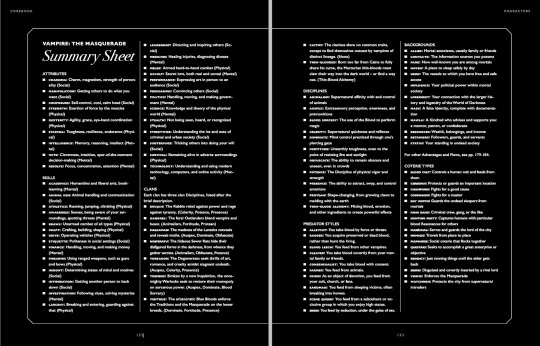
V5 Corebook, no gloves review P.1
Y’all know me, it had to be coming. Sorry it took me so long. Part 1 is about the physical aspect of the PDF (I don’t have the physical book at hand yet), Part 2 is going to be about mechanics and “content”, since I’m still testing that out.
So first and foremost, the small Mature Content Warning that was added last minute to the PDF. It has been published online on its own so I have no issues posting it here:
Mature Content Warning
For the past several decades, Vampire: The Masquerade has addressed the
darkness in the real world through horror stories: it has talked about
AIDS, capitalist exploitation, sexual predation, the resurgence of far-right
political extremism, religious fanaticism, state and private surveillance,
and many other issues. This version of the game does not shy away from
any of the above, and we believe exploration of subjects like these is as
valid in roleplaying games as it is in other media. Including a problematic
subject in a Storytelling game is not the same as glorifying it, and if you
take the chance to explore it critically, it can be the exact opposite. If we
understand the problems facing us, we are better armed to fight them.
V5 includes in-world references and expressions of the following:
sexual violence, political extremism, physical violence and gore, mind
control, torture, abuse, imprisonment and kidnapping, racism, sexism,
and homophobia, to name a few. It’s a game about monsters.
“Why are you telling me this?” you might be saying.
Someone at your table is not familiar with this game. Someone at your
table has dealt with some of these issues in real life. Someone at your table
wants to know that you read this warning and know you will be considerate
to them as players, while putting their character through the wringer.
In the Appendix, you will find concrete techniques on how to handle
difficult subjects in your game in a manner that is respectful to your players
and their experiences. Calibrate beforehand which techniques your
group wants to use. People have different needs and not every method
works for every person.
This is a game about monsters. But it is only a game.
Don’t use it as an excuse to be a monster yourself.
This is something I consider good (that last sentence is more necessary than I’d like to know), considering the rest of the contents of the game, but I wish they had taken a far more respectful approach to the mature themes instead of name-dropping horrors without meaning.
Now, the PDF itself has MAJOR issues in terms of book-making. The bookmarks are terrible, they integrate stuff from the side boxes that just make no sense, there’s little to no proper hierarchy, some are even missing, the internal links don’t work very well, it’s just poor, poor design.
Seriously look at this:
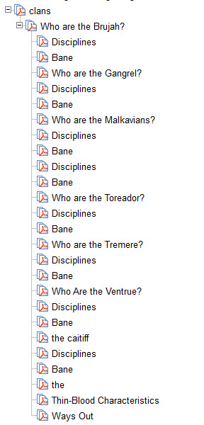
How can I navigate this? Like seriously ? I know there’s a table of contents, but it should be in the navigation bar as well, that’s how PDFs work.
(The Nossies are missing, it makes me laugh because it’s the Nossies, but they’re there, that’s why Malks seem to have two sections about Disciplines and Banes)
Now, the layout itself isn’t the worst I’ve ever seen, and some parts of what I’m going to be saying may fall upon “personal taste”, but I’ve been editing PhD thesis for long enough to recognize bad layout when I see one :p
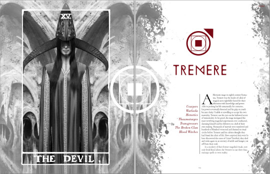
Like, this is fine, I really like the new Tremere Clan Symbol (all the clan symbols are pretty neat tbh, and the Disciplines symbols are the VTES ones so that makes me extra happy), and they’ve used beautiful fonts, even if we disregard that they couldn’t be bothered to spell HERMETIC correctly...
However there are two major issues with the book layout as it stands, as you flip through the pages. First, the text isn’t justified (aka aligned left and right), and second, the text is sometimes in two columns, sometimes in three. Quite often, the titles are at the end of a column (see here “The Anarchs”) and some paragraphs have poor lonely lines in the precedent page or column and it just looks bad. I screenshot some pages with low res: the text itself does not matter so it’s ok if you can’t read it ;) But notice how “Relationship” is hyphened because of the three columns there...


Then, you have plenty of pages which have either black background or colorful background. That would be fine if some of the pages weren’t the kind of pages you’d want to print out to give as handouts to players...
My poor eyes.
These four pages would be far more useful with black on white, even if plenty of us like reading white on black because it’s easier on the eyes on a tabler, but this isn’t printer friendly when you sell a pdf... This should have been in the Appendix with a printer friendly version.
Sometimes the placement of elements is just weird or off putting in certain pages:
This image touches the bottom of the page, but there’s three meters of white space above. There are examples of the exact opposite (the image touching the top of the image with extra space at the bottom).

This chart should be centered, I think.

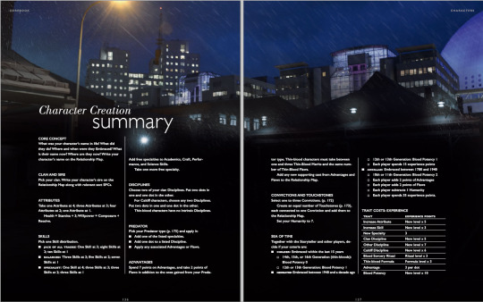
Something’s wrong here, isn’t there something missing above the first page? And that block alone on the second column, it’s very common across the book.
Now, on a tablet or phone, it’s easy to double tap and match the column length, and the fact that the text isn’t justified isn’t much of an issue when reading plain text, but I find that the text not being justified in any of the pages is just Bad Design.
I did like the separations, the small lines between the columns and all, they looked great, the change of fonts in between “boxes”, “quotations”, “examples” and so on was also well made.
Now, the Art.
Some of the art is old WWP art, some of it is WoD MMO art, some of the art is newly commissioned illustrations, and some of the art is photography with (or without) filters.
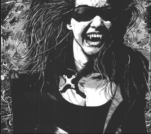
Old WWP Art is clearly to link back. The old Helena art is there. Theo Bell got new art (I think it’s new?), but Helena didn’t.

They also reused MET By Night Studios photography for Jeanette and Therese, and cropped the photo, taking away the key composition of the original. Did Bradstreet give the rights to alter his work with such cropping?

Note that I personally dislike this picture, cropped or not, a lot, simply because being a Bloodlines fan I don’t think it represents either Therese or Jeanette properly. Jeanette wouldn’t be caught with a power stance and serious face like that, Therese wouldn’t be caught with such a non imposing, reserved pose, and coming from Bradstreet, I am VERY disappointed, because he has done official art for Jeanette for the video game before and it was far better representative of her; the model from the OG picture looks far closer to the Jeanette we meet in the game, but this is truly a matter of personal taste and opinion so I won’t scream again about it.
The MMO art is overall great quality, and sometimes it’s even used in a very smart, beautiful way:

(I’d have put this image on the Embrace and not on Predators, tbh...)
They also used the fashion spreads looks for the MMO in the corebook, some of it is plain silly, and I’m very much afraid they’re used literally as how PCs look like. Here’s the Gangrel Fashion splat:
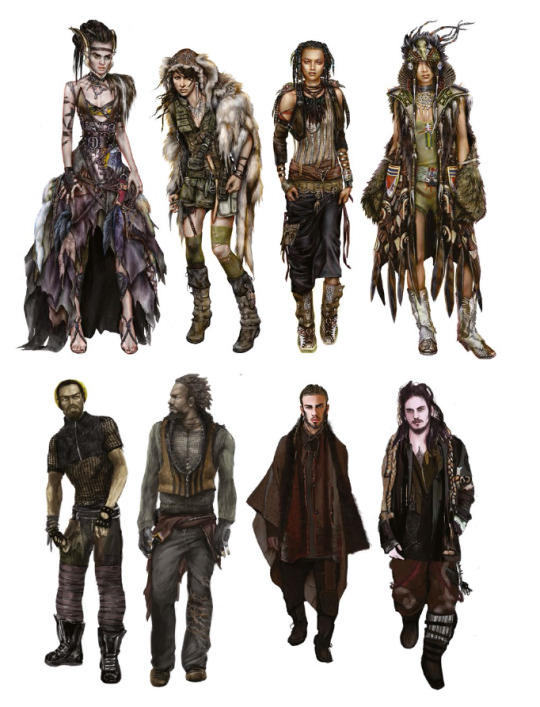
I consider the art to be good, and to be great concept art for a MMO, and great fashion shots, but.. in VtM? this is not Masquerade Friendly. Also these types of art (as well as the Investigator image you can see on the first few pages I pasted above) are all 20 something model-like people, and yes that involves the Nosferatu, because they’re fashion drawings. Fashion drawings have stupid proportions and no realism, since they’re meant to show the clothes, not the model. And for a book about characters, well, why? This was suitable for the MMO because MMOs have transmogs and such and such.
I just find them to have completely missed the “Punk and Gothic Aesthetic of the World” and just stacked as much weird clothing as they could to look “hype and modern”. Hipster Instagram Fashion that’s unwearable.
Yes, vampires are marginal by nature, but please, their goal is to blend in, not be noticed, and considering how long they’re effectively inactive, and how age affects your will to stay on trend... Eh.
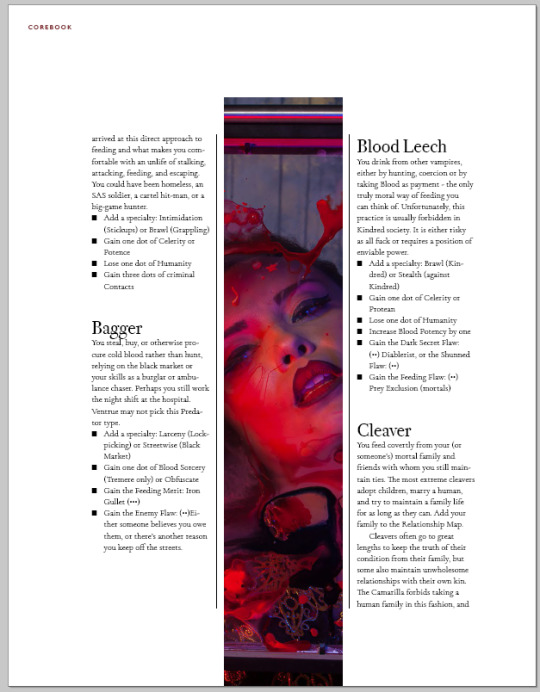
The New commissioned illustrations are hit and miss, and some of this criticism does fall on “personal taste”, but here I ranted about one of those art pieces (which was the page for the Vault, but it’s in the book). They’re all a little bit like this, some having a far better composition even if they all seem to be this saturated. They’re all overall good and I like most of them.

This one is “look at my butt” kind of situation. I’d have rather have this picture just without this foreground couple, it would have been a perfect street look example, and the two jumping above the roofs guys would have had the attention they deserved. I love the fog, the graffity, the textures are nice, i just hate the butt.
And finally, the big chunk, the Photography Art.
I understand how they made it so that most people would be able to “make their own art” (photography being now more accessible to the masses than illustration), and that is something I nod to, appreciate and completely understand. HOWEVER, Photography IS art and not everyone can be a Photographer with a snap of their fingers (or a click of the camera :p).
What’s good with photography art is that they picked diverse looking models of all sorts, and they put them in interesting and somewhat telling situations. What’s bad is that “suddenly” all “positions of power” are held by middle-aged (so plain old 60yo) looking vampires and all Anarchs Rebels looks like they’re in their twenties.
This goes against VtM. Older vampires tend to look younger because being a King or Queen at age 14 wasn’t uncommon until the 1800s. Embracing people right at the end of their teenage years, at their prime, at their best, as they’re “perfect” is the best a vampire could do (remember Dark Ages have rules against embracing the young, the elderly, the crippled, the insane...).
It’s only after WWII that embracing people over 40 wasn’t uncommon.
I’d have LOVED to see a 60yo looking Punk, and have the Dominating Prince on Their Throne look like, 15. And own the place.
Now there are plenty of issues with some of the photography art, and here’s one (page 232) that I’ve screamed at for like, two weeks now.
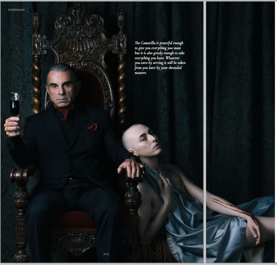
This picture had one of the best compositions, the diagonal works great, the leaning away, the androgyny of the chalice (despite them still having a personality and free will...). How he filled the glass with the blood from the chalice through this.. pinky finger condom thing, okay, sure, weird af but why not. Does’t explain why the chalice has two marks on their forearm but okay. Sure. Also, FINALLY a photography in VtM of a dude wearing a suit that’s actually his size? Great. And it doesn’t come out of a Goth Store (tm). Great! Amazing!
But there are in this picture TWO things I just cannot forgive.
First, the guy has his jacket buttoned. When you Suit 101, when you sit, you unbutton. You button up when you stand up. Now this is supposed to be The Ventrue (tm), this is just wrong.
Second, his fucking zipper is down. YES HIS FLY IS DOWN. How the hell did this not get photoshopped in like two seconds? Because of the jacket, I know this is an accident; the model just isn’t used to suit etiquette. You could explain this away by saying he’s a pervert or something, but in that case you’d have needed to add slightly more eroticism to the guy (jacket and maybe shirt open, no glass, slight smile, leaning towards the chalice and not away from them?).
Some of the photography-manipulated art is just beautiful, let’s be honest, this is the splat before Disciplines:
I’m not a fan of the orange (simply because I’m not a fan of orange in general), but this works just so well, the composition, the lines of sight, the shadows, the mirroring, just, top notch choice here, who did this??
But then you have post apo band :p
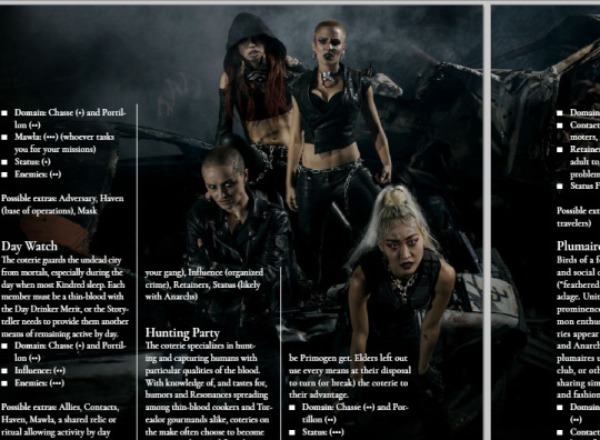
I mean I like this group shot, it’s very classical, it looks like a fine coterie with a specific turf.. But is this Mad Max? I know Gehenna happened, and I do know some people actually dress like that, but if you’re being tracked down and hunted into oblivion by the Second Inquisition, you.. just don’t do this.
Most of the photography is like this; marginal overdressed looks. Now this is personal taste again, I just wish we had more.. normal looking people. People who are exceptional, but not through their looks or clothing style. The back of the book claims “A Storytelling game of personal and political horror.” and I see little of it in the pictures and illustrations.
Anyway, want more Art Rants? click here
Stay tuned for part 2!
50 notes
·
View notes
Text
beep beep curry, move over
“It” is Pennywise the clown. The entire success of the book, miniseries, movie and overall cultural icon of It by Stephen King is due to this demonic dancing clown. The endlessly frightening concept of a mysterious clown that lurks in the sewers of Derry Maine, feeding on the fear and flesh of children for generations is the reason that the story has become the cultural phenomenon that it continues to be.
Those who’ve read the book, and I won’t get into spoilers, come away with often mixed feelings on almost every aspect of the novel aside from Pennywise himself. As we all know, the lasting impression that the miniseries had was not much more than a few quotes and shots of Tim Curry terrorizing children, especially Georgie in the iconic drain scene. So when it was first revealed that there would be a remake, or it could be argued, the first full budget cinematic telling of It, it became clear that there was a demand for more Pennywise above all else.
Bill Skarsgård delivers a Pennywise that can only be rivaled by the individual’s own personal creation of the clown in their head from the book. In other words, neither Tim Curry nor any fan renditions of “It” we’ve seen have come anywhere close to the level of cool and terrifying that Skarsgård brought and his performance is so unique and disturbing that it only compares to our inner monologue of worst nightmares.
The comparison between Curry and Skarsgård is an all too on the nose parallel to Nicholson and Ledger. I don’t pretend to be the first to point this out but I do hope to stop the bleeding before it’s too late. The arguments are the same as in 2008 following “The Dark Knight”. “Nicholson did it first.” “Ledger was only better because the movie was better.” “They’re just different.” These archaic arguments will never be valid but they also will never go away so they must be addressed.
Doing it first does not mean you did it better. That’s logic. Like real, by definition logic. The movies were better in part because of Ledger and Skarsgård respectively. I would concede that both movies are better than their predecessors and the fact that these two characters can still stand out as the strongest point in better movies does nothing but prove their success. Lastly, if you’re saying “They’re just different”, I’m sorry that you were the unathletic and less attractive middle child.
I don’t care that you grew up with Tim Curry. I don’t care that the budget for the 1990 miniseries was lower. I don’t care that Curry was the OG and had to create the character all for himself. I don’t care because validity aside, these are the same arguments that we see with any recast and remake and they only serve to comfort those living in the past.
All that being said… the numbers and the narrative speak for themselves as It is setting box office records in the horror genre and holding above 8.0 on IMDB as of now. Fan and critic approval ratings are through the roof and Skarsgård is receiving high praise for his work. The reason I am shutting the debate down before it really even begins is because the second clips from the movie appear on Youtube, the comments and response videos will roll in. Clips taken out of the context and the drama of the film on the big screen will be viewed by millions in 480p quality with poor sound at no more than two minutes a piece.
The argument will turn into lifelong nostalgia of Tim Curry vs. overplayed poor quality clips of a clown crafted with world class audio and visual effects that are entirely lost online. I fear that once the box office hype dies down, this will be the hole that sinks the ship and down in the sewers of the internet, no one floats.
0 notes
Last Seen Blogs

subpig4all
Untitled

moons-jester
he's just a little guy!
lurksohard
Weenie Hut Jr.
funvinefury
funvine.