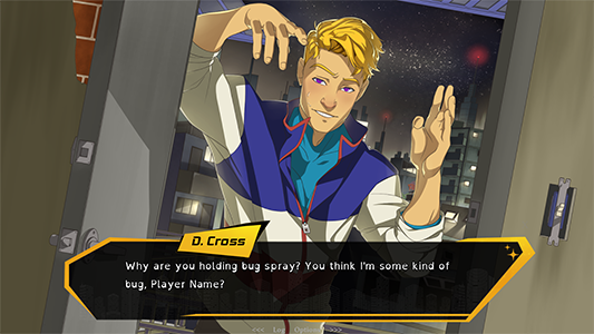
#the devlog has me feral
Text
This can only go well :3
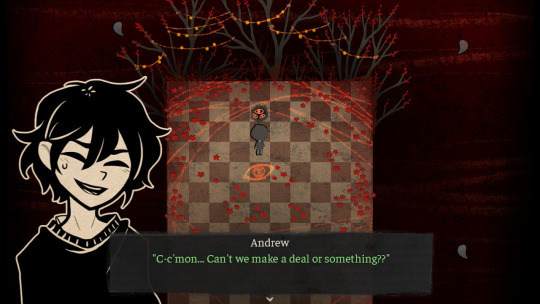
#the devlog has me feral#clawing and throwing around my pillow#I feel like a majority of the screenshots we saw were from the burial route#since Andrew is in the dream/in between realm#off topic but I just love how this realm looks#it’s so fucking pretty and ominous and I love it#I love the reds and the poppy flowers#and the string lights#demon has good taste in decor#the coffin of andy and leyley#andrew graves
22 notes
·
View notes
Text
Devlog #37: Before&After GUI
Hi-ho, Wudgey here! Once again we're going to do something a little different today.
I was initially going to write a BIIIG overview of the progress we've made, but I noticed it was already getting long just from talking about the new GUI... (and apparently tumblr has a 10 image limit per post, boooo). So, I'll limit this post just to the new screens, and I'll queue up a post on our CG progress a little later. :)
A lot of this will be familiar if you've tuned in regularly to our updates; but this time I'll go into a little more detail on my process to buff out the post a bit.
First off, some before and after images as promised by the devlog title:
Name Entry Screen (Before 1/2)
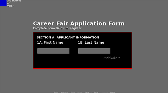
I've always felt strongly about incorporating gameplay mechanics into the actual story. When I came up with the idea of having the MC write her name as part of the job search process, I was immediately invested in that direction! Originally, I was going to have the player type in their name into the Clammy Lady's tablet once they actually reached the job fair... but as you can see, it's not visually enticing.
Name Entry Screen (Before 2/2)
I reworked the idea into a resume (which makes an appearance in the March 2021 prologue demo). In my country you're expected to provide a professional headshot along with your information, which suits my nefarious purposes. The player now has an in-universe interface where they can update their picture AND type out in their name.
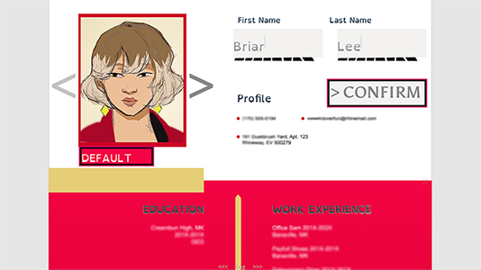
Name Entry Screen (After)
Finally, with help from some Ko-Fi donors, I was able to commission Re.Alice (who has a vastly more powerful background in graphic design than I do) to tighten the screen concepts and add some pizazz! Once she was done, I was able to code in some animation to give the resume screen more life.
Save Screen (Before)
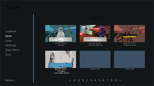
Next up is the save screen. I didn't have a specific concept in mind for this one (hence the default renpy layout), but I do have strong preferences in save/load formatting from playing other games.
I referenced my favorites: Hollow Knight, Dragon Age, and Mystic Messenger. I quickly decided that I Do Not Like numbered pages, and I would replace it with a scrollbar. I did appreciate screencaptured preview pictures though, and I liked having specific names for each chapter as the player progresses.
Save Screen (After)
(I created a bigger screencapture here because the save slot text is on the small side ;;;)
Again, Alice was fantastic in helping me capture what I wanted! I also enlisted help from @synstoria for the more advanced programming areas. Once they were done, I adjusted the text format, asset positioning and added another touch of animation. I even added a bit of kerning here... who knew my college typography course would randomly pay dividends? lol.
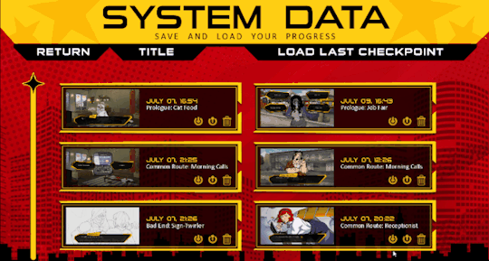
You can see in the upper right, I've written some code to create "checkpoints" that can be loaded from this screen. The default Ren'py autosave system works by saving at EVERY choice; since Herotome is a choice-heavy game, it doesn't make a lot of sense to autosave so frequently! Instead, I'll be utilizing a checkpoint system to save before every major conversation - so if you make a mistake (or want to make chaotic gremlin choices and then claim takesies-backsies), you'll be able to use the checkpoint return to a secure area and try again.
The system will NOT save in the middle of bad endings, so you won't have to worry about getting stuck!
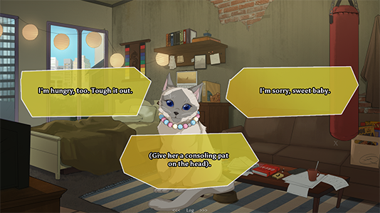
Choices/Textbox (Before 1/2)

What a blast from the past....! I hated the vbox choice screen so much I had to change it asap!! It's a bit nostalgic to see my original Katie sketch; I drew her on paper and added color with the multiply tool. :')
As for the textbox, I didn't really know what I wanted. I struggled with several concepts before settling for a basic gray halftone design for the time being.
Choices/Textbox (Before 2/2)

I designed placeholder assets and recruited @synstoria again to help me with the complicated coding parts. I just randomly go feral and want to break the default ren'py formatting!
I was less satisfied with the textbox, but after several concept sketches I was starting to get somewhere after I researching some superhero art deco images.
Choices/Textbox (After)
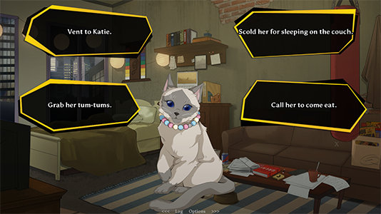
After Alice worked on the design, I adjusted the choicebox positions to be higher on the screen, so players clicking the textbox should be less likely to click on a low-hanging choice by accident. (Not that accidental clicks should remotely ruin the gaming experience, if the checkpoints work as intended...)
CONCLUSION
I'm excited about the strides we've made. Next up I'll be updating the Options screen, and I expect to update the Logbook and a couple of other screens further in the development timeline.
These visual updates will be rolled out along with the next installment, which I've decided to call Episode 1 (release date TBA). The common route will have 2-3 episodes in total before branching off into character routes. Normally I'm not keen on episodic releases, but I'm reaaally impatient for you guys to meet the love interests --and, of course, I'm impatient for you guys to talk to Warden a bit more. ^^
Please look forward to the next progress update! And if you'd like to help speed up our process (and get some spicy previews of our game's villain), please consider dropping by our Ko-Fi. We're at 72% of our goal to fund the sprite, which means we're almost there!!
I hope you’re all staying safe and keeping warm.
Much love,
Wudgey.
#herotome update#oelvn#IF#interactive fiction#interactive story#upcoming game#otome game#english otome#english vn#english visual novel
38 notes
·
View notes
Last Seen Blogs

oto-maton
Oto-maton

ramenlover200
Ramen_Queen

karenfordonte
Caring For Donte

dreday31
Untitled

kybelon
BBW Sex Cams Free