#themieric
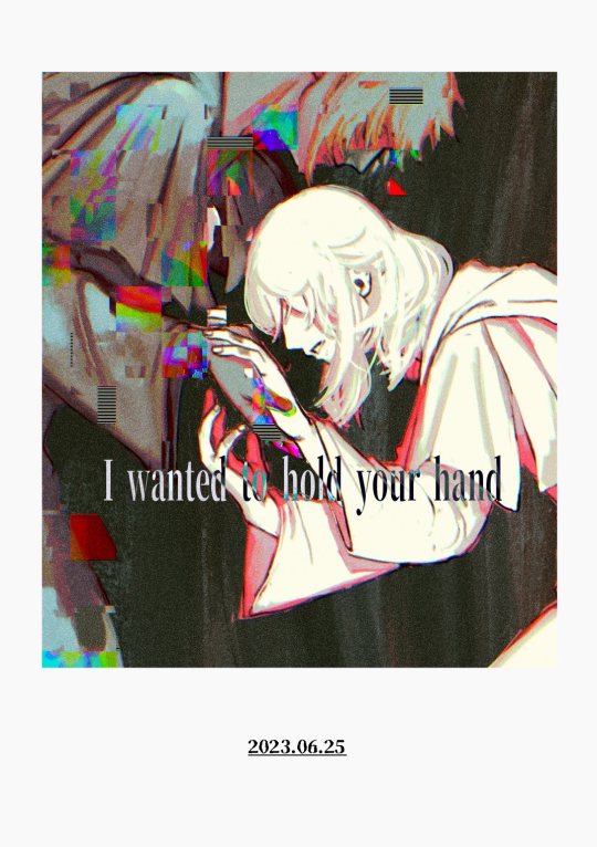
Text
literally how is the DoctorDonna news not trending on here yet. Doctor Who fandom’s game is fucking SLIPPING
#THE BIG THEM ARE BACK AND THEY’RE THEMIER THAN EVER#doctor who#donna noble#tenth doctor#ocean speaks
156 notes
·
View notes
Text
https://www.dashafoto.com/portfolio
Her second photo into her portfolio really intrigued me. She is a Russian female photographer and has a model with the American flag painted in little bits all around her body. The rest of the model’s skin is covered in hardened and wet clay substance. I really like how you can see the cracks and breaks of the model’s skin and how sharp those appear. Each part that has a groove or a wrinkle are very clear and are not left out. I really like the use of the flag because it makes the model look so much more interesting. It would have been very boring if it was only the gray colors of the model. The rest of her work consists of very bold and vibrant photos. She uses many contrasting colors that really bring the photo to life. Even in her pictures consisting mostly of black, white, and gray she has at least one bold color to make the photo pop and come to life. It makes it so much more appealing to the eye. I like how she uses human models and turns them into a very abstract and unique photo. They give off goddess vibes and draws the viewer’s eyes to them.
https://www.deborahroffel.com/media
https://images.squarespace-cdn.com/content/v1/56d17e298a65e2c2b91342a3/1456582904334-MHIG4AIT2MG0DN5Z73JO/ke17ZwdGBToddI8pDm48kNKE5EOiqFYA5zB4wPGd58F7gQa3H78H3Y0txjaiv_0fDoOvxcdMmMKkDsyUqMSsMWxHk725yiiHCCLfrh8O1z5QPOohDIaIeljMHgDF5CVlOqpeNLcJ80NK65_fV7S1UfhXDR1S5pfdAaMFKT1v28Nl9eR4Wbneaz1AK2hlGjMhZJvUU1_vYqAKeSqch7nukg/0008_Flower-07092015-0609.jpg?format=750w
Deborah Roffel is from Holland and focuses on many different things to shoot. I will be focusing on her flower pictures from her portfolio. The picture I chose is a flower that is mostly green and yellow and a little bit of red. The majority of the photo focuses on the contrasting colors of green and yellow. They have hints of black dots and drips all around the flower. It gives off a spray paint and graffiti feel to the photo. It makes it have a cool gradient look. The green surrounds the background and makes it a little mysterious feel to it because the viewer does not know where this flower us located. The red around the flower makes the photo come more alive and makes it more interesting. The green and yellow contrast and make the photo pop, but the red really draws my eyes to the photo because it is so different and bold. The middle part of the flower is very sharp and can visibly see each pedal. I like how the black dots and drips are used as the shadow of the flower and then spreads around the entirety of the picture. It is very vivid and very eye catching.
mikaeltheimer.com
Mikael Themier is a French photographer now lives in Montreal. I will be focusing on his photo that shows two old men eating in a diner. The man on the left is wearing a bright red hat and jacket that greatly contrasts the other man’s bright green jacket. The colors in the diner consist of similar greens and red’s as the men’s’ clothes, while also having a large amount of bright yellow and a few bits of bright blue right in the center. The blue is in the center and it draws the viewers eyes to the middle right away because the blue is the boldest color there. The two men are divided by the windowpane, but the division itself if off center, which adds some variety. It is a nice way to divide the shot rather than if the picture would have been taken inside the diner. It being taken outside makes it all the more interesting.
It creates a different perspective for the viewer and gives them a greater view of the diner. It makes it easier to know the location and to fill in the blanks of what the viewer wants to know about the story behind these men.
My shooting this week I think has went fairly well. I experimented a lot with having the flashlight run through the shot and I think some turned out neat. The struggle was to learn and see how the light effects the photo after the long exposure. It was fun to try different ways, but also a little frustrating. I thought the critique went well and I liked the feedback that I received. I got more positive feedback then I thought, but mainly I got things to work on which is very helpful. Thinking like a photographer is still coming slowly, but I am getting there. I just need to get all the names and terms down in my head. I am looking at a lot of nature photos and I that is the direction I want to go.
0 notes

Last Seen Blogs

hckeithahn
I'm Just A Man

zaebucca
Zaebucca

varchaiiart
💕varchaii💕

greiilock
GreiiLock

sands-undertale
Bad Opinion Zone