
williamslucy
Viscom
Lucy Williams | Arts University Bournemouth
264 posts
Don't wanna be here? Send us removal request.
Last Seen Blogs

ovenhelium
what am i even doing??? plz help

coffee-for-elephants
Elephants Don't Drink Coffee.

trinity011
trinity11

vrindavandarshansblog
vrindavan darshan

kaphzzz
kaph
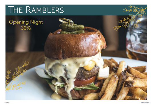
Photo
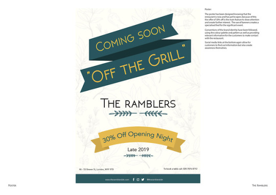
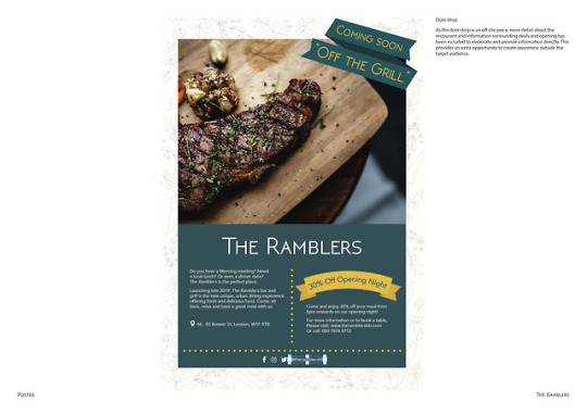
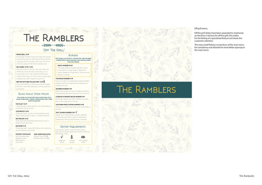
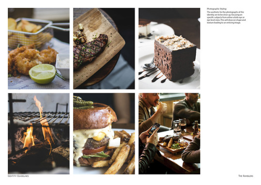
The Ramblers:
Poster and door drop finals for the CHS brief
7 notes
·
View notes
Photo
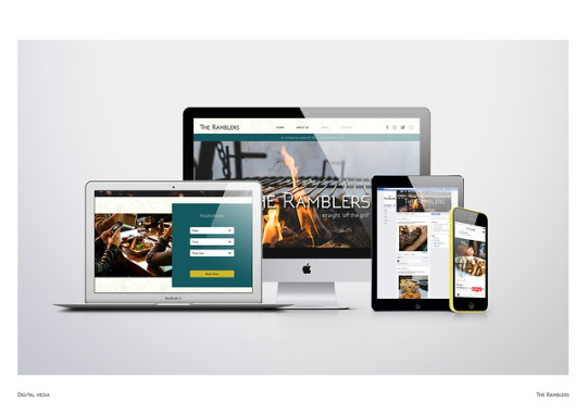
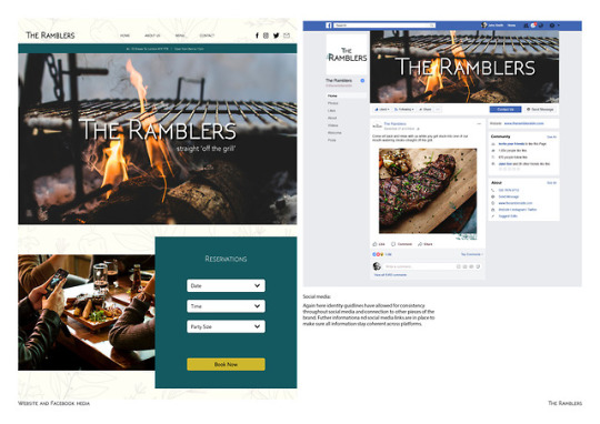
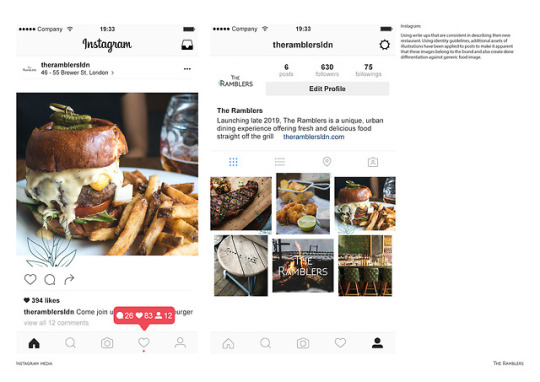
The Ramblers:
Final social media and web development ideas for the CHS brief
0 notes
Photo
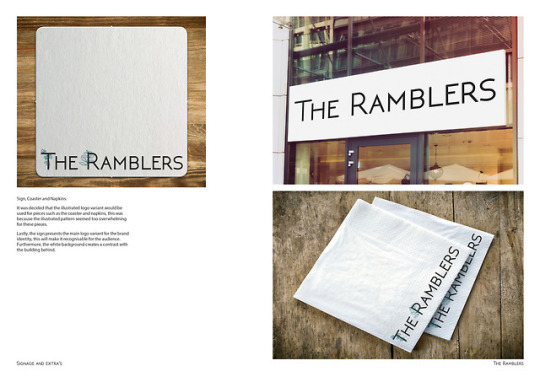
The Ramblers:
Finals for the correx and extra elements developed for the CHs brief.
1 note
·
View note
Photo
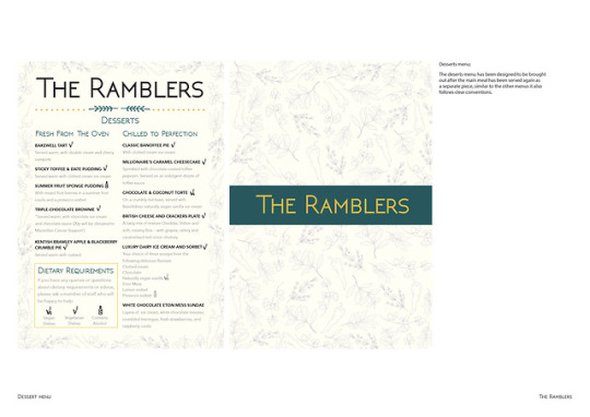
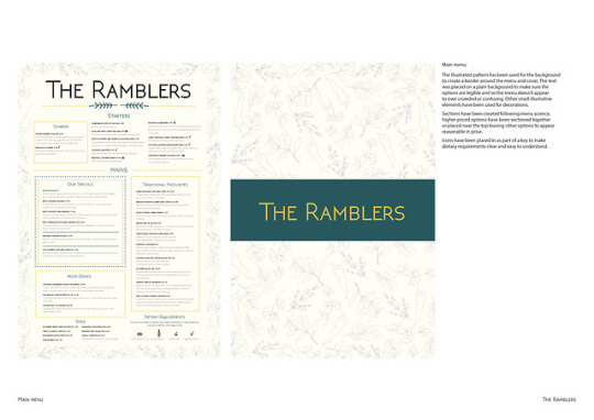
The Ramblers:
The final menu developments for the CHS brief
0 notes
Photo
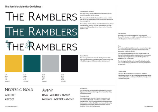
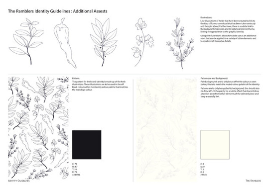
The Ramblers:
Spreads from our presentation explaining the identity developed from our group work for The Ramblers brief.
Identity:
Unfortunately I was ill the day of designing the logo but was informed that the logo was to fit in with the aim of a sophisticated feeling.
The colour palette for the brands identity is inspired by the restaurant interior mood board, with muted tones that reflect the images and decor a modern feel is created
Illustrations: After discussing and finalising our plans for the brand identity, we decided it was best to work with line illustrations. We all worked on some individually and in the end decided on my line illustrations.
These illustrations are of herbs, this was to keep the idea of plants and nature which links to the restaurant name ‘The Ramblers’ and its outdoors association. However, it also links to the restaurants priority of flavorsome food and how this is an important factor.
Photographic styling: The aesthetic for the photographs of the identity are to be close up, focusing on specific subjects from either a bids eye or eye level view. This will draw on shape and texture leading to an enticing image.
0 notes
Text
The Ramblers Aim:
To create a sophisticated theme with a modern urban edge, alongside a tone of voice that personifies the restaurant holding a welcoming family feel.
Branding will appeal to the wide target audience as the sophisticated, trendy theme allows for customers to create a buzz surrounding the restaurant with design that will appeal to social media
0 notes
Text
Colour psychology:
Colour psychology is a powerful tool that is used within a variety of practices to help enhance what is being produced. I already has some knowledge of colour psychology and decided it would be a good idea to refresh existing knowledge:
Red
Associated with energy, war, danger, strength, power, determination as we ll as passion, desire, and love.
Enhances human metabolism, increases respiration rate, and raises blood pressure.
It attracts attention more than any other color, at times signifying danger.
Orange
Combines the energy of red and the happiness of yellow.
Associated with joy, sunshine, and the tropics.
Represents enthusiasm, fascination, happiness, creativity, determination, attraction, success,
encouragement, and stimulation.
Yellow
Associated with joy, happiness, intellect, and energy.
Produces a warming effect, arouses cheerfulness, stimulates mental activity, and generates
muscle energy.
Yellow indicates honor and loyalty. Later the meaning of yellow was connected with cowardice.
Green
Color of nature. It symbolizes growth, harmony, freshness, and fertility.
Strong emotional correspondence with safety.
Dark green is also commonly associated with money.
Green suggests stability and endurance.
Symbolizes trust, loyalty, wisdom, confidence, intelligence, faith, truth, and heaven.
Considered beneficial to the mind and body.
Slows human metabolism and produces a calming effect.
Strongly associated with tranquility and calmness.
Purple
Associated with royalty. It symbolizes power, nobility, luxury, and ambition.
Conveys wealth and extravagance.
Associated with wisdom, dignity, independence, creativity, mystery, and magic.
White
Associated with light, goodness, innocence, purity, and virginity.
Signifies safety, purity, and cleanliness.
Usually has a positive connotation.
Depicts faith and purity.
Black
Associated with power, elegance, formality, death, evil, and mystery.
Usually has a negative connotation (blacklist, black humor, ‘black death’).
Denotes strength and authority; it is considered to be a very formal, elegant, and prestigious color.
Colour psychology within food:
Red and yellow are the chief food colors, evoking the tastebuds and stimulating the appetite. Both red and yellow are also effective at grabbing attention. The fast food industry has claimed this combination for a good reason—because it is effective. In the gourmet food arena, you of course want to avoid a fast food connotation, however these colors can still be very effective when used on their own and/or in different pairings.
Orange, a blend of red and yellow, naturally lends itself to food as another appetizing color. Orange has been a trendy color for some time now, so be aware of that when using it—its popularity could either work for or against your product depending on its context and intent.
Green connotes eco-friendliness, healthy (think veggies) but be careful as green can be also unappetizing. The eco side connection to green has been overdone, and it’s no longer expected that eco products will actually be colored green since eco has become more the norm and less the exception.
Blue and purple are cool tones, and can be unappetizing if not done correctly. Cool tones don’t stimulate the appetite as much therefore careful context and application must be considered.
White connotes clean and pure, but it can also look stark, plain and sterile—so this is another color that needs to be exercised with care.
Black signifies elegant, sleek and high-end. For food packaging however, the color brown often takes the place of black as a more appetizing color which can still be portrayed with the same descriptors as black.
Browns and earth tones are warm, appetizing, wholesome, natural. Be careful as the earthy, natural look is overplayed in the specialty food sector. As with eco-friendliness, natural food products have transcended earth tone colors as consumers now see natural in so many products and no longer expect them to have the typical “earthy” look.
Bright colors connote pops of flavor—such as sweets and desserts. Fun color combos can be applicable to fun foods like candy.
Subdued, muted colors signify rich, deep and complex flavors. These tones often work well for savory flavors but are also suitable for rich, sweet flavors like chocolate.
Colors used in product packaging should denote product flavor when applicable. A blueberry-flavored product in an orange color doesn’t work in the brain—the brain needs to immediately get it without thinking. Remember, your product only has a 2–3 second window in front of the consumer on the retail shelf. Reinforce flavor visually (including imagery where applicable, not just color) to trigger as many senses as possible, even subconsciously. Food has the added advantage of conjuring up taste, smell, memories and feelings, so use this to your advantage in your overall product packaging to make that instant emotional connection with the consumer.
https://www.colorpsychology.org/
https://jenndavid.com/colors-that-influence-food-sales/
0 notes
Photo
Door drop examples:
Some visual research and examples of door drops of which I looked at elements that are consistent like within the posters.
0 notes
Photo

Poster examples:
For some visual research, and while I was creating my posters, I compared conventions and elements of existing posters.
0 notes
Photo
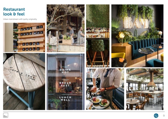
Visual Research Part 2:
Posters, Correx and signage:
Posters and Correx hold some elements of brand identity consistency through colour and type faces while seeming to present more of a sense of value within their promotions.
There is a clear rustic and almost slightly dated theme within the restaurants interior and signage that also adds to its identity, It creates a professional but also comfortable and welcoming appearance.
0 notes
Photo


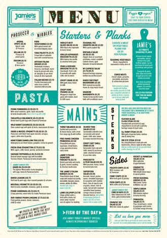

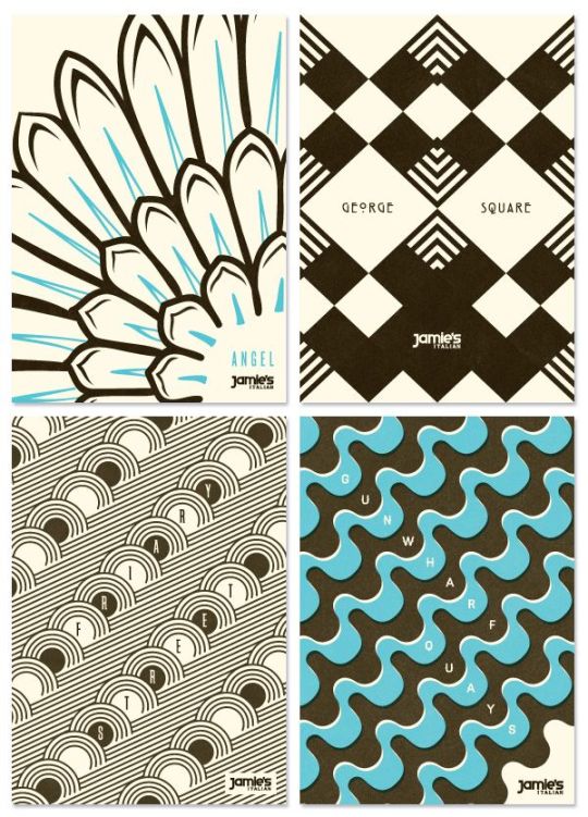
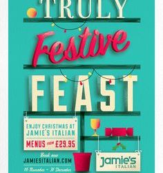
Visual research part 1:
Logos, Photographic styling, Menus and old Identity patterns:
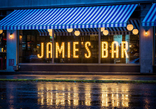
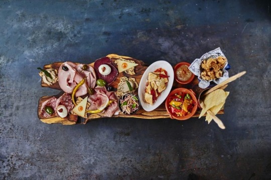
It is clear to see the use of the teal blue/ green that appears as a signature feature of the brand identity graphic for Jamie's, this is simple but made more distinct with solid blocks of colour, shapes and different type faces that add hierarchy and interesting changes to products (particularly the menu). Similarly the consistent use of ‘food porn’ photography to create well shot images that entice as they display a meal, the food being cooked by Jamie homself with delicate care and sometimes also the meals ingredients placed around in a particular placement.
I had trouble finding out much about the patterns designed for Jamie’s Italian apart from they were possibly designed by a company names ‘Superfantasic’ (”creative agency with a passion for big ideas, impactful, effective communications“), I struggles to see in use places where these patterns can be seen so there is a possibility these become part of interior design or are specific to certain restaurant locations.
https://wearesuperfantastic.com/about
0 notes
Photo
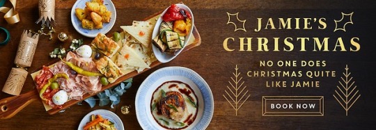
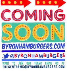
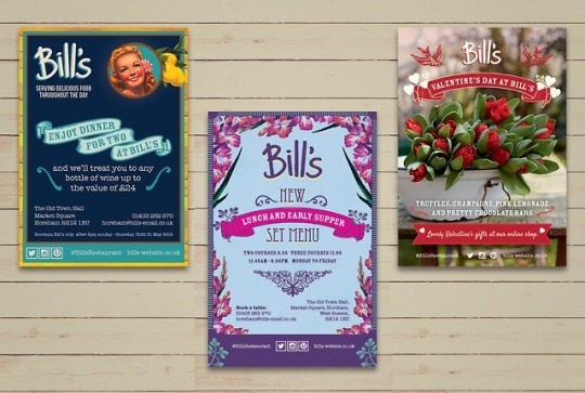
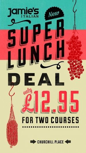
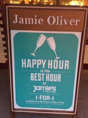
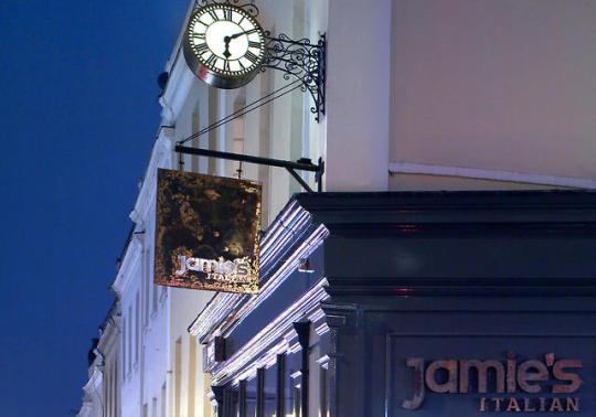
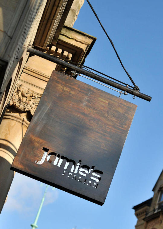
Jamie’s Italian:
Within our group we all decided to start by separating restaurants to research related to the brief so we can come together tomorrow and compare as much research as possible.
Natasha: Byron Burger / Skevi: Leon / Maisie: Bill’s / Myself: Jamie’s Italian
“developing the menu and concept with creativity, simplicity and quality at the heart of everything we do – and of course, the desire to give all our customers an experience that reflects our love and passion.”
Classed as a ‘Urban casual dining restaurant’, Jamie’s Italian is part of a collection of venues that were launched to provide a unique experience to the UK and serve Jamie’s most loved cuisine, Italian. The identity systems for Jamie’s Italian has been designed by ’The Plant’ (creative director matt Utber), a company who design brands and create memorable experiences uniquely crafted to connect with people. The Plant developed signage, hoardings, menus, wall graphics, installations and much more for the identity.
The restaurant chain has a menu based around Italian authenticity and rustic dishes taking inspiration from the “Italian table”, encouraging concepts of relaxing, sharing and enjoying each others company. “Jamie’s Italian was designed to be accessible and affordable, a neighborhood restaurant where everyone is welcome and feels comfortable, no matter the time of day. We aim to create an informal and contemporary environment, which also reflects Jamie’s energy and personality, wherever we are in the world. Every restaurant is uniquely designed to incorporate the history of the building and personality of the town or city in which it stands.”
Due to being part of a collection of 60 restaurants worldwide, the brand identity needed to be flexible so that it allowed for individuality in the uniqueness of the each location as finishes would be tailored to each venue, all while having consistency throughout graphic elements such as the logo and decorative components. The brand itself is based around Jamie’s personality, “warm, colourful, informal with a passion for authentic Italian food, and obsessed with provenance”, as well as using classic Italian images for authenticity.
Other elements have been designed to give a different feelings, for examples signage and shop fronts are to feel bespoke while responding to the buildings environment, where as the deli product range for the restaurant gives an eclectic feel.
Summary:
Jamie’s is very much a rustic restaurant emphasizing on tone of voice and the Italian experience, they want their customers to feel welcomed and the brand is as much about the atmosphere as the food - ‘sharing’ seems to be a key word making the customer feel as though the brand is sharing with them and encouraging to share with others.
Urban casual dining
Quality and creativity
Unique experience with Jamie’s energy and personality
informal and contemporary environment
Authenticity (authentic Italian)
Rustic
Relaxing, comfortable, sharing and company
designed to be accesible and afforable (Neighbouhood resturant)
Consistent brand identity but also flexible for location
(The Plant): memorable experiences and uniquely crafted, connect people.
https://www.designweek.co.uk/issues/1-november-2007/the-plant-cooks-up-identity-system-for-jamies-italian/
https://www.jamieoliver.com/italian/behind-the-scenes/our-story/
https://theplant.co.uk/project/jamies-italian-home-food-icon
Administrator, S. (2007). The Plant cooks up identity system for Jamie's Italian - Design Week. [online] Design Week. Available at: https://www.designweek.co.uk/issues/1-november-2007/the-plant-cooks-up-identity-system-for-jamies-italian/ [Accessed 22 Nov. 2018].
Jamieoliver.com. (n.d.). Our Story - Jamie's Italian Behind The Scenes. [online] Available at: https://www.jamieoliver.com/italian/behind-the-scenes/our-story/ [Accessed 22 Nov. 2018].
The Plant. (n.d.). A home for a food icon - Jamie's Italian. [online] Available at: https://theplant.co.uk/project/jamies-italian-home-food-icon [Accessed 22 Nov. 2018].
0 notes
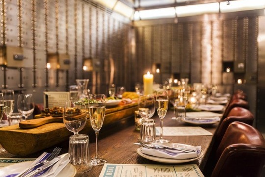
Photo
CHS- The Ramblers: Breakdown
Bar and grill restaurant - mainstream/ urban dining experience. Serious about food and want customers to sit back, relax and have a great meal with them (TOV). Influenced by modern urban brands rather than traditional restaurant operators.
A unique and exciting brand identity to be designed beyond the obvious in a highly saturated Market and works with the projects visions and aspirations.
S: Broad appeal (demo/price) / large site for catering to different groups and occasions / All day trading / Famous for “Off the grill”
W: Poor vegetarian and healthy living / Not known.
Inspirations: Bills (unstuffy) / Jamie’s Italian (story telling/ engagement) / Leon (Moments of value)
Audience:
Kooples: adventure document - social media/ cash to spend on evenings out/ Dine out once or twice a week
Hipster families: family on social media/ family evenings out (”treat”)/ dine out once a month
Career Climber: work and life balance on social media / rent / dine out over eat in / regular dine out and lunch
Cool cat family with older children: kids like to capture days and evenings out (parents less) / live seperatley/ pay individually / dine out together for special occasions.
single trendies: everything on social media/ cash to spend on meals and drinks/ dine and drink regularly
Silver surfers: social media infrequently / grandchildren treated to lunches / dine out together for special occasions.
15% POS / 30% Visual identity / 30% Menu / 25% New opportunities
0 notes
Text
Unit Evaluation:
Although at first I didn't fully understand the the point of the groups projects when we began the unit, by the time we reached the final project I could see how these week long projects were useful and how I was able to reflect on them. At some points I struggled to keep up with them but I feel as though this was a good indicator for the pace of the unit and year and helped me to try and plan out my time management and keep me on an effective path. But, What I have taken away from these projects that I enjoy the most is my development in communicating with people. I feel more encouraged and find myself talking more freely about my ideas and development with other people and members of the course, this builds a good rapport and opens conversations that allow s me to learn new skills and take on helpful information for other people.
I saw the exhibition project as a way to challenge myself when starting off the year , the fashion topic within the project is something that interests me but have never really attempted to work within. By attempting something different I was hoping to learn something new, whether that be something positive or something I can work on in the future. Because of this I did find it hard to develop my initial ideas and I ended up coming up with a concept that I felt was 't fully effective, however I was happy with my ephemera outcomes and was glad I attempted something slightly outside of my comfort zone. Furthermore, I ended up working with type for my identity in this project, this is something I'm not really familiar with but, by taking on feedback from lecturers and following some guidance ,I feel I successfully produced some type based outcomes. Even though I'm still not fully confident here I feel have a better understanding of handling type in this context and am proud of my final outcomes.
Personally, I feel as though my research has build up to be one of the strongest elements of this unit, particularly within the exhibition project. I manage to cover a a variety of topics with a lot of contemporary research and find small details through visual and contextual research that help to influence my design ideas . To try and improve the research element of my process later on I would like to try and use some more primary research sources and larger documentations of research outside of websites, also I would like to broaden what concepts I look at within a topic of research instead of just the expected or generic.
Developing my initial ideas is something I found hard with in this unit, the group projects had initially helped with this, but I do feel this had a knock on effect in my development. I'm hoping this is because it is the first unit back and I believe I need to start thinking outside of the box a little bit more with my concepts or trying to apply research better. My development could have been stronger and more in depth within certain projects, for example the spatial communication project and the way finding element of the exhibition project. For the week projects it was harder to develop a strong variety of experiments due to the time scale but for future reference I can see this is something I need to work on if I have time to make sure I am exploring as many design possibilities as I can, this may also help me to improve on adding personality to my work. Saying this, my final outcomes were effective and even though there are some small details that could be improved, I have enjoyed the final outcome of most of my products.
I had a few issues with my process book when it came to producing it, although making some changes and trying several times, my cover and book pages seemed inconsistent with lining up throughout the book. This first became apparent when I bound by book the first time with Joseph, although the inside of the book was cut perfectly I was unhappy with the way the cover sat so I tried again. Even though it is not perfect, I was much happier with the cut of my second bind and after speaking to and binding with Scott we are still unsure as to whether this was a fault in the set up of my documents or the paper, but it Is likely the issues lies in the paper I was using. The paper was was very difficult to stack up neatly and I believe that this has lead to some slightly slanted pages in my book and the fact that my crop marks didn't always align, meaning my book has been trimmed slightly smaller. Lastly, the hierarchy of my process book could be revisited, I checked my book several times and mad e small changes to my hierarchy but there are still some inconsistency throughout despite me using paragraph and character styles. On reflection,maybe this is something I need to work with more to gather a better understanding of how to use them effectively.
Overall within this unit I know I tried working to the best of my ability but I didn't feel fully satisfied with my process, this may be due to struggles with coming up with concept that I felt reflected and fulfilled my creative abilities and personality. Within future units I hope to develop a better understanding of ways I can apply myself to my process and outcomes so I feel prouder of them and as if they reflect myself, particularly within the making of the process book. Furthermore I need to pay more attention to detail , for example the small issues with hierarchy or size differences in my work, as I approached the end of a few of the project I began to notice a few problems that I ran out of time to rectify. In most cases I leave enough time to fix these mistakes but personally I feel as though I need to check thing over several more times before coming to a final conclusion. Saying this , towards the end of the unit I do feel proud of elements if my work and I am happy with other developments I have made throughout the unit , although maybe not a product of my work I have found myself learning new skills that I can apply continuously thought my process and this is something I am glad to take away from the unit.
0 notes
Photo
Ephemera in Situ:
0 notes
Text
Exhibition project summary:
Personally, I don’t feel I worked to the best of my ability for this project. Although I worked hard and tried to stick to my time management, I struggled to develop my ideas and feel confident with what I was producing and this is what caused me to feel as though I was falling behind with my process. However, I do feel as though I challenged myself and experimented in some new areas for this project. Even though this may have also been a reason for my ill confidence I am happy that I tried to push myself out of my comfort zone for parts of this process.
Research has been a consistent element for me throughout this project and I feel this is a strong area of my work, but my development could be slightly better with some bigger changes being made in my process. However I feel this could have been done if I had improved on my initial ideas. I struggled to come up with ideas within my concepts that I could build, meaning I didn’t have a strong focus at the start of the project which I feel effected me throughout.
I am proud of some elements of work I have produced, such as my ticket, leaflet and poster, and feel I have applied my existing knowledge and skills from last year well to reach this point. Within future projects I want to try and develop on finding a way to integrate my style and interests more so I can produce work that I feel reaches the best of my ability. I also feel I need to develop on my understanding of brand identity’s as I feel this could also help me in the future.
0 notes
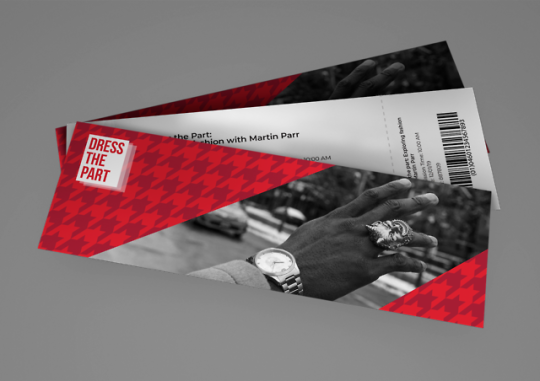
Photo
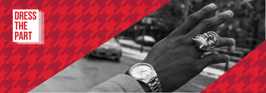
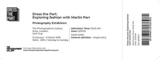
Ticket development/ Final ticket:
My final ticket design is probably my favourite piece of ephemera, I did another print test and at this point my ticket was too small and you could not read the information. Therefore, I enlarged my ticket and type, changing my hierarchy, filling my layout and resizing my bar code. Once I had fixed my patterns, I settled on using the white logo for the front of the ticket and keeping the same image as I felt this really complimented the pattern.
0 notes