xavarta2-blog
2nd Year A2 Art
An Artists Blog
132 posts
Don't wanna be here? Send us removal request.
Last Seen Blogs

polkadotpelican
Insulin Connisuer.

whitecatindisguise
Kitty Mom's Room of Vari-ables
dutchdom69
DutchDom

brooklynlive
Brooklyn Live!
alinnepires
Harley Quinn
Text
Synoptic Evaluation
Time Management
For the project, I created a 6 week plan which I followed most of the time throughout the duration of the work. I planned out each lesson so I could make the best use of resources and time with my teachers. I used the time at college to do the physical work, and at home I did the technical and annotation work.
I found some stages challenging, such as the video editing, which took far longer than anticipated - particularly getting the flow precisely how I wanted it. Furthermore, after re-purposing the brief to better suit my client, I had to do quite a lot of editing and cutting out of sections in order to meet my clients brief. However, creating a shorter version of the video meant editing was a lot easier and quicker to do, and I was able to spend more time on completing other parts of my project.
Research
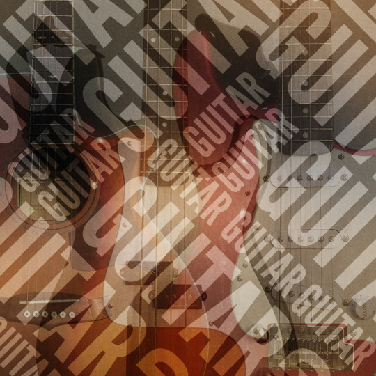
I used the internet resources such as Grove art and artists dedicated websites, and also visited museums to find my initial inspiration. I researched a range of different practitioners to get ideas and asses how they found inspiration and produced their work. Some of the main artists I researched were Paul Nash and Hans Holbein. I found their work of particular interest as they both were involved or effected by wars. I used this commonality and I tried to link that back to current day situations and organisations that are trying to stop wars from re-occuring.
I used Paul Nash’s ideals of how through his work he used to convey very strong messages. This approach is used very often by modern graphic designers where art is used to present a message whether politically or personal. Certain Aspects I found useful in looking further into were these practitioners get their influences and produce their work and what they did differently as well as the artists values and ideas.
Development
I managed to generate a range of ideas using illustration and collages to develop my ideas. I initially started with story boards and moved on to composing my animation. By doing this,helped me plan and decide on colours and layouts before starting the animation work. I also used software, such as Premiere Pro and After Effects to visualise and replicate my story board drawings .
I chose particular techniques and processes from looking at existing examples such as adverts and appeals as well as looking at my artists research to see their work flow and how they developed their work.
Final Outcomes
My final work came out ok. I used the same UNICEF’s blue logo branding as a continuous theme, and kept with the idea of using the circle as the motif throughout the design. I kept the look and feel as close to their brand. I wanted to keep the theme and colours as close to their existing promotional videos.
The final work came out visually well , and selected each piece with careful consideration including using the same tone of voice with the text to help communicate the message. Specifically, I think adding the few animations in the background around the frame, using After Effect, just added a few more touches and made it more visually engaging to catch peoples attention in a short time-frame. This achieved the goal of the animation.
If I was to change elements of my piece, I would perhaps develop further and experiment with the background a bit more. I would include additional animation to the mask as well. I would also spend more time understanding my brief , do more research before start the work. My time management need to be better since i lost a lot of time during my research time and i need to get better at this so i have more time to focus on my final work.
Skills I learned from this project was using Premiere Pro and After Effects . These are products i definitely want to obtain more experience so i do not spend some much learning the tools during a project.
My final presentation is uploaded on Vimeo and onto this blog.
0 notes
Text
Title: What influenced Paul Nash and De Chirico to paint landscape in a ‘Surreal’ way?
Paul Nash
Paul Nash was born in Kensington on the 11th of May 1889, and was the eldest child in a moderately wealthy middle-class family. His father, William Harry Nash, was a barrister, and his mother Caroline the daughter of a Royal Navy captain. His earliest influences in the nineteenth-century Romantic tradition of William Blake, Samuel Palmer and Dante Gabriel Rosetti.
Whilst trying to develop his artist career with his wife’s support, World War one erupted. Nash , being a man of ‘all against killing anyone’, he avoided much to do with the war but was eventually ‘dragged in’. On the 10th of September he enlisted for home service as a private in the Artists’ Rifles, part of the London Regiment of Territorials. After two years of Nash being inactive in the war, he was sent to the front lines in France after the devastation of the battle of the Somme. He spent several months serving out in the front line, of which he witnessed the first use of mustard gas by the Germans.
After witnessing the horrors of the war and out of sheer luck surviving some of the worst battles, he returned back to England in December. He took multiple trips out around the Mediterranean coast over the next few years for the purpose of improving his health. In 1928 there was an exhibition of de Chirico’s work at Tooth’s Gallery in London. There was an exhibition at the Leicester Galleries from 1919 and 1921, this showed the works of Matisse and Picasso. From these exhibitions, Surrealism would be a huge influence on Nash through the 1930s and 1940s.
De Chirico is a Italian painter, writer, theatre designer, sculptor and printmaker. He was the founder of scull metafisica, also known as Metaphysical Painting, which was a term generally applied to his work. The work of Carlo Carra before and during World War 1 and thereafter to the works produced by the Italian artists who grouped around them.
He was born at Volo in Greece, his parents came from the Italian diaspora within the Ottoman empire. He studied drawing and painting at the Athens Polytechnic 1903-6 and for eighteen months at the Munich Academy, he discovered the work of Böcklin.
He and his brother, Andrea, were very close and as children identified themselves with the heavenly twins, Castor and Pollux, the brothers inherited Greek culture and was a consistently rich source of inspiration. De Chirico became interested in the bizarre narratives of Max Klinger’s prints. His early work, however, owed most to the mythological and symbolic paintings of Arnold Böcklin.
By March 1910, when he left Munich to rejoin his mother and brother in Milan, his work became less dependent on Böcklin. It could be suggested that in Florence in 1910, rather than in Munich, that de Chirico began to study Schopenhauer and Nietzsche through the writings of Giovanni Papini. He became interested in Nietzche’s notion of the eternal return and the circularity of time, which supported his own views about the re-enactment of myth. Through his paintings de Chirico sought to unmask reality and reveal its mysterious truth. The modification of perspective and depiction of mundane objects provided the appropriate context. De Chirico moved to Paris with his mother in July 1911 to join his brother. They stopped in Turin on the way for de Chirico to experience at first hand the city where Nietzsche, in embracing a beaten horse in 1888, first showed signs of madness. De Chirico associated this event symbolically with his own date of birth.
‘Wire’ (1918)
This painting in particular, is an Ink, watercolour and chalk on paper, this medium, which before his Void of War exhibition, had largely taken the form of his work.
Line: The use of line in this paintings is to convey the forms. It is visible that Nash used the chalk to block out the darker areas in the painting and used the ink to enhance and paint out of the wire, making it quite a harsh rough look added to the painting.
Shape: The use of line, again helps create and separate out the shapes, using variety of different tones to help single out the forms shown in the painting.
Colour: The use of colour Nash has used in particular this painting are very earthy browns, with purple and reds, mixed in with dark blues. The use of colours in particular help portray a rather grey and dark atmosphere to the landscape, empty of life. This creates a very bleak morbid mood, which Nash is trying to convey after he himself barely survived this battle.
Light: The use of the dark blues, greys and blacks, help give us a form of the light and creates a murky atmosphere. The main areas of light in particular is in the sky, which creates a smokey look, in comparison to the hazy surface.
Movement: Everything looks still and lifeless, with the exception of the haze of the clouds looming over, Nash has created this soft gentile texture.
Space / Composition: The composition itself is fairly spaced, out showing nothingness apart from the holes, and the wire, with the clouds adding in this sinister feel.
Texture: Through the mediums he used, he managed to create this desolated area using the chalk to create the jagged uneven textures, and the inks and watercolour to create the holes, and the sky.
Balance: This piece in particular balances outside the rough terrain against the rain filled holes, through the use of the texture, and light.
Contrast: In particular, he’s created the contrast between the dark coloured dirt and mud, and the light grey puddles in the crater. The second contrast is between the sky and the purple-red sky, that has probably been produced by all the flak of the battle.
Scale and Proportion: The use of the dead tree, helps us give a sense of scale of the battle and aids in directing us around the landscape.
‘Blue House on the Shore’ (1930-1) Oil on Canvas
Line: The use of line in his painting you can see the direct inspiration of de Chirico, from the use of line and curves he’s drawn to make the archways and the shape of the building. In particular taking influence from Chirico’s use of perspective, and line.
Shape: The main shapes he used in very angular, apart from the background being very natural forms, which is again similar to de Chirico’s use of flat backgrounds.
Colour: The colour Nash’s chose are very light and pale in colour, with the blue and the sandy yellows. This creates a very calm mood, which could be suggested that this painting he did as a form of recreation, and to experiment and discover new techniques. Furthermore, as stated above the trips were to help aid in his health, in comparison to is much harsher paintings and art style portraying the war above in his ‘Wire’ painting.
Light: Similar to de Chirico, Nash’s use of shadows again is another example of his influence through Chirico’s use of line and scarce landscapes.
Movement: The use of movement in the painting is very still and calm albeit with the waves in the composition. His use of strokes is very soft but controlled, which creates this naturalistic piece.
Space / Composition: The composition of the piece is positioned so the house is central. Furthermore, the house is the main focus to the painting with various objects around the composition.
Texture: The texture is very solid block of colour for the house, while the sand is painted using darker tones suggesting areas where it’s been walked across with some areas with creating this very crumbly looking sand.
Scale and Proportion: Nash has provided use with a sense of scale that we can compare against the building and the boats.
‘Piazza d'Italia’ (1913) Oil on Canvas
Line: The use of line in this painting is drawn at a one point perspective, with some shadows and a flat background. This unique style is continuous throughout his paintings through the use of one point perspective.
Shape: The majority of the piece uses sharp angular lines whilst in the centre he has more complex shapes and objects.
Colour: The tones in this painting is muted and we can see Nash’s inspiration he got from the works, in ‘Blue House on the Shore’. The style of the painting, is similar to his previous works with the muted tones and colours, especially with the yellows and greens throughout his works.
Light: The use of light in this painting is hazy given the effect by the use of the oil paints especially in the background with the misty sunrise. Through use of the shadows we can see that the main light source is off to the right judging by the direction of the shadows.
Space / Composition: The space used in the painting De Chirico used one point perspective while in the background creating this flat scenic background.
Texture: The texture of the painting is very smooth and polished by the solid blocks of colour de Chico.
Scale and Proportion: Scale in this painting is positioned by the two people in the composition as well as the statue. This helps add to the effect that the overall composition and the area is very empty and bare of populous.
These paintings by Paul Nash and de Chirico, were both produced when they were both away from the war which was ensuring around the time. They both took influence of Picassos work, and unlike Nash Chico, met the artists that were some of the main influences on modern art today, along with Matisse and Fernand Leger.
Paul Nash first obtained his main interests, in Surreal Art through de Chirico, and noticeable throughout his work onwards from his ‘Blue House on the Shore’, although going through a short period of not entirely embracing it.
Chirico on the other hand took his inspiration from Nietzche, and his Greek upbringing.
I think I could have applied the same principles of the above findings to my own work, in particular, the landscape paintings they both did, and the style. I could’ve explored their painting styles further and incorporated some in my own work especially the shapes.
I did , however, used their experiences of the war, as the foundations and based my own work on this.
Source Links;
Paul Nash - David Boyd Haycock
http://www.oxfordartonline.com/subscriber/article/grove/art/T067993
http://www.tate.org.uk/art/artists/giorgio-de-chirico-902
http://www.oxfordartonline.com/subscriber/article/grove/art/T061053pg1?q=Paul+Nash&search=quick&pos=1&_start=1#firsthit
http://www.tate.org.uk/art/artists/paul-nash-1690
http://www.iep.utm.edu/nietzsch/
http://www.britannica.com/biography/Friedrich-Nietzsche
https://www.artsy.net/artwork/giorgio-de-chirico-piazza-ditalia-con-arianna-1
http://www.oxfordartonline.com/subscriber/article/grove/art/T021739?q=Giorgio+de+Chirico&search=quick&pos=2&_start=1#firsthit
0 notes
Video
vimeo
Final Video, Promo animation.
0 notes
Text
Advertising Standards Authority
ASA The Advertising Standards Authority is the UK’s independent regulator of advertising across all media. They apply the Advertising Codes, which are written by the Committees of Advertising Practice. In particular their work includes acting on complaints and proactively checking the media to take action against misleading, harmful or offensive advertisements.
0 notes
Text
Legal Constraints
I researched into the legal constraints of advertisement and the regulations and constraints that have to be abided by when putting up a advertisement in regards to my promotional video. I looked into official .gov websites as well as other trusted and secure websites for information on the matter.
For example information I found on Marketing from this website that has not only a overview of the constraints of advertisement but what needs to be stated for example if selling a product such as catering etc. https://www.gov.uk/marketing-advertising-law/overview
All marketing and advertising must be:
an accurate description of the product or service
-legal
-decent
-truthful
-honest
-socially responsible (not encouraging illegal, unsafe or anti-social behaviour)
There are regulations that restrict what advertisers can and can’t do.
As well as the regulations, there are 2 advertising codes of practice that you need to follow to help you advertise legally.
You must describe your product or service accurately.
Data protection
If you’re gathering, storing or using information about customers or potential customers, you must also protect their data.
2. Regulations that affect advertising
Advertising to consumers
The Consumer Protection from Unfair Trading Regulations mean you can’t mislead or harass consumers by, for example:
including false or deceptive messages
leaving out important information
using aggressive sales techniques
Advertising to businesses
Advertising to businesses is covered by the Business Protection from Misleading Marketing Regulations. As well as being accurate and honest, you must not make misleading comparisons with competitors, that includes:
using a competitor’s logo or trademark, or something very similar
comparing your product with a competitor’s product that’s not the same
Download ‘The Business Protection from Misleading Marketing Regulations 2008’ for more detail about the regulations that cover advertising to businesses.
Penalties
If you break the regulations, you could be reported to a local Trading Standards office. You could be fined, prosecuted or imprisoned.
3. Advertising codes of practice
There are 2 advertising codes of practice that describe how businesses should advertise.
They cover all kinds of promotional communications, depending where the advert or promotion will appear.
Non-broadcast media
The CAP non-broadcast code has rules that cover non-broadcast advertising (eg print, online), sales promotion and direct marketing (eg telesales and email).
The code specifies standards for accuracy and honesty that businesses must stick to, including specific conditions, eg:
advertising to children
causing offence
political advertising
Broadcast media (eg TV, radio)
You must follow the CAP broadcast code, which covers issues including taste, decency and product placement.
As well as setting standards about accuracy and honesty businesses must stick to, they also have rules about things like scheduling.
General broadcasting rules
You also need to follow rules about taste, decency, product placement etc that apply to all broadcasting.
These are called ‘broadcast codes’. Find out more about them on the Ofcom website.
Enforcing the rules
The rules are enforced by the Advertising Standards Authority (ASA).
Anyone who thinks advertising rules have been broken can complain to the ASA within 3 months of the advert appearing.
If an advert breaks the rules, it may be withdrawn. If the product doesn’t match the description or the advert breaks the law, you could be prosecuted.
4. Describing your product
You must describe your product accurately. This means if you make a claim about your product, you must be able to prove what you say.
Prices
Your adverts must describe the actual cost accurately, including any ongoing or associated costs (eg subscription fees) and taxes (eg VAT).
Example
A customer pays £50 a product, without being told the price doesn’t include VAT. This was not explained in the advert, so the advert is misleading.
5. Direct marketing
You must check if customers want to be contacted by fax, phone, post or email, and give them the chance to object.
When you collect customer details, you must get their permission if you want to send them other offers or promotions.
You must also ask for their permission if you want to share their information with another organisation.
Letting customers opt out
Customers have the right to stop their information being used for direct marketing.
You must make it easy to opt out - eg by sending a ‘STOP’ text to a short number, or using an ‘unsubscribe’ link.
Telesales and fax marketing
You must say who you are when you make a telesales call, and give your address or phone number if you’re asked for it. The number for customers to call must be a freephone number.
You’re not allowed to send marketing faxes to individuals unless you’ve received their prior permission, but you can send unsolicited faxes to companies.
You must check that you’re not contacting anyone who’s asked not to receive these calls or faxes, using the:
Telephone Preference Service
Fax Preference Service
It’s illegal to phone or fax someone registered with these services if you don’t have their permission. You can be fined £5,000 for each unsolicited phonecall.
Automated calls
If you want to make automated calls - with pre-recorded phone messages - you must get the permission of the individual or business first.
Direct mail
Check that your mailing lists don’t include anyone who’s asked not to receive direct mailing, using the Mail Preference Service.
Email marketing and text messages
You’re only allowed to send marketing emails to individual customers if they’ve given you permission.
Emails or text messages must clearly indicate:
who you are
that you’re selling something
what the promotions are, and any conditions
Check that you aren’t sending emails to anyone who’s asked not to receive them, using the Email Preference Service.
If you buy or rent a mailing list, ask the supplier if you have the right to use it for email marketing.
Every marketing email you send must give the person the ability to opt out of (or ‘unsubscribe from’) further emails.
Cookies
You must tell visitors to your website how your site uses cookies, and ask if they want to accept them.
The information should be easy to understand.
Researching into the marketing behind advertising helped me understand further why advertisements, display particular information or state certain things. When applying this to my own work, I think some things I could add further to my promotional advertisement is perhaps some contact information, furthermore to check if the subject matter that I included remains within the constraints such as not being potentially harmful of offensive to some people due the nature of the subject matter.
0 notes
Photo
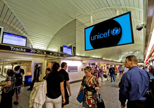
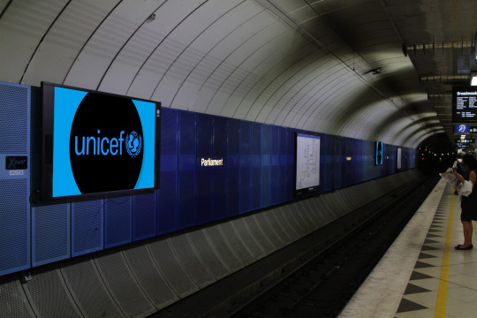
After finalising my video in After Effects, i found the above additional images of various screens and put these in my Video In Situ. I chose to put it on a large screen and more specifically, I chose the location of a station since this would be the location I would want the add positioned. The animation I designed was to raise awareness and using public transport as position to place my add would allow great exposure since there would be high quantities of people.
The target audience would be high earners and middle class that would be able to afford to donate.
I think my advertisement animation would work better without the soundtrack in the background. Thinking about it now, it will play in loop which would irritate some if they were to stand close to the video for too long.
0 notes
Photo
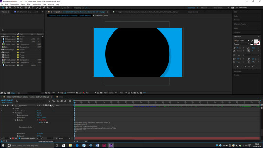
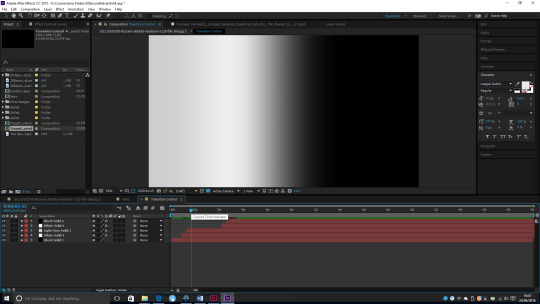
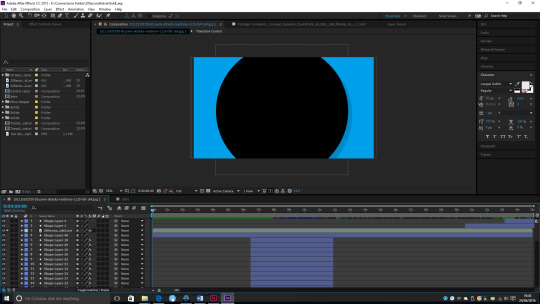
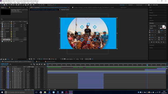
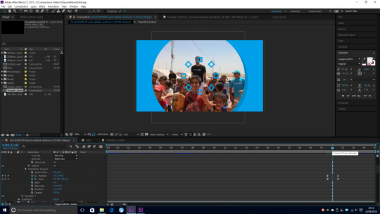
After rendering and exporting my video piece in Adobe Media Encoder, I then imported the file into After Effects. I also applied a mask layer over the video to create a circle. I positioned it in the middle of the frame, and made sure the video was carefully framed and made sure all the text fit inside the circle.
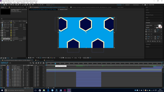
To play in the background, I decided to include little pop up imagery that would pop up in conjunction with the text, as well as to point out areas or specific words. I used a hexagon shape and colours that would compliment the background. To create the pop up effect, I used code to help animate the pop up effect for the hexagons.
To help aid in the transition, I created a control layer with various tones of black and white solids and added a linear wipe to them. The code used would animate based on the colour, so for example it would use the white, to edit the scale to pop up more smoothly, and something that could be used on multiple shape layers rather then having to create a range of key frames.
Below is the code that I used for the scale tab of the shape layer :
sourceLayer = thisComp.layer(“Transition Control”);
sampleSize = [1,1];
samplePoint = transform.position;
colour= sourceLayer.sampleImage(sampleSize,samplePoint);
x=colour[0]*100;
[x,x]
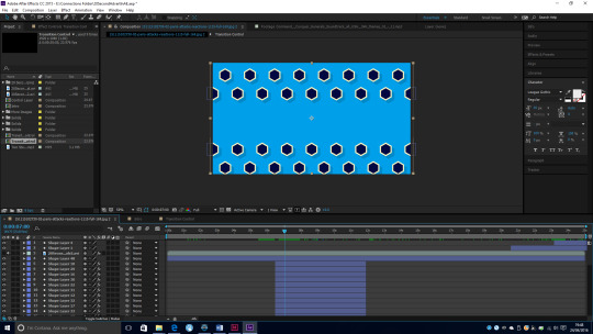
After getting the first hexagon shape to work with the transition layer, I then applied this to further hexagon shapes. I added further transitional layers editing with the wipe effects, which would affect and change the pop up effect created. I created multiple as this would create almost like a wave pop up affect and applied it to each down the line.
I applied some smaller effects throughout the video to compliment and point out words or sections. I did this by using a repeater, to create these effects and made it so the copies played at an angle to create this radial effect, like it popping out of something, much similar to the hexagon shapes.
I created this effect at the end by adjusting the stroke width as well as the size of the square shape too, and then transformed the group using the scale and position tabs to create the fading out effect.
After getting all the animations to work correctly, I was comfortable with the overall look. I added 3 tracks to test with for the background of the video. I decided to use the Track False King by Two Steps From Hell as the track can create quite a serious effect and compliments the video animation that I created.
0 notes
Photo
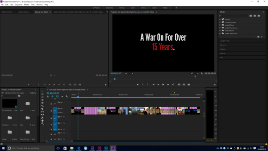
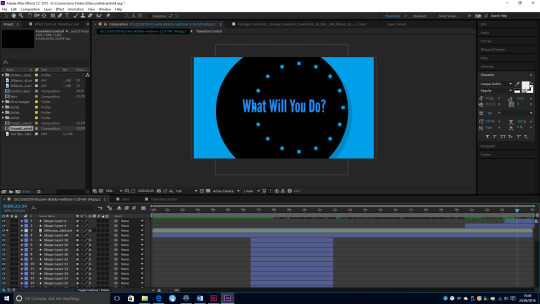
I wanted to change the quote that I used at the start, and use something more direct. For this, I looked at language used in other existing appeal adverts. During this research, I discovered how text is used in existing appeal advertisements. I decided to add in some further text to my clip.
I added in the additional line ‘A War On For Over 15 Years’. I decided to use this as the first text viewers see. I made the emphasis on the 15 Years by making the text red so it was clearly visible, and creates a sense of urgency.
I then added the line, Countless lines still to be saved’, and had the word saved in UNICEF blue, again using the same branding from UNICEF’s website.
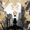
Finally, I ended with the line of ‘what will you do’ to make people think and act to appeal for them to donate. This is the overall goal of the advertisement, and to further raise awareness of current events such like the Syria Crisis and refugees.
0 notes
Photo
Adjusting the Video
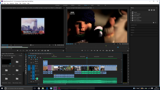
After deciding to reduce the size of the video to around 20 seconds, I had to be very selective about the clips I wanted to use, to help better suit my client and the approach and their ideals. As it was UNICEF, I wanted to perhaps give a quicker overview of the war and the events and the people affected by it, then show some clips of UNICEF in work giving aid to these people not just in Syria, but globally. Specifically children in endangered areas and towards the end have a sequence of shots of children smiling end with the logo.
Due to strict time constraints for the length of the video, I found that the fastest and most compressed way to deliver images, is to show a range of still images very quickly. I edited the duration of the each image to about 0.3 of a second so the images flash by so you see a range of different images in a short time and gives you enough information to understand what the topic is about.
For the second section, I wanted to include a few clips of the war with some clips of UNICEF giving aid and helping out people, this I think helps creates a link that UNICEF are helping people that are caught up in the war. Although I originally focused on the war on terror I decided to extend my scope rather then just focus on lives in the Middle East, as think doesn’t only neglect other events happening at the same time as the wars, as this also focuses on events that may not be brought up as headlines in the news and make people aware of the situations happening in other countries.
Furthermore, the positioning of the UNICEF workers giving aid in conjunction to the still shots of the children smiling also helps create a link that UNICEF are about giving aid and making sure children are safe. After compiling the video together I then decided to add a quote at the start of the video, adding a dip transition for it to fade in and then fade out, the quote was also a place holder for an text that I may want to edit and change later on, if I wanted to go back and remove the quote.
I had to make sure it all fit in the space of the circle so every visual fit inside and still made sense with parts of it not visible. I went through adjusting and rescaling making sure it worked within the area i had available.
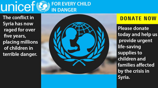
I also changed the final image to make sure i have the correct one since this was going to be visible longer for people to remember from the video. I used a shot of a group of children smiling with some UNICEF workers in the background to then fade out and show their logo. I chose this image as I think it leaves the best impression and has everything I want to show in the one image. I also made sure throughout the video that the UNICEF logo is a recurring theme in the video to suggest what the clip is for and people know the brand well.
0 notes
Photo
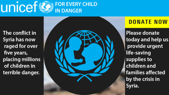
Design 1
I then moved my designs into Photoshop, to experiment with different colours as well as the text and language they use. I kept it in theme with UNICEF’s colour schemes and layouts, using the blue for titles and main headlines and black with white text for key points. The circle in the middle represented the space I’d use to play my video within while keeping text around the outside for points and text to be shown.
Design 2
The second design was again another combination between the two just adjusting the size of the circle as well removing the blue section at the bottom to leave more room for the video to be seen so its more visible, furthermore this brings more focus to it due to its larger size. Some effects I want to add to it is create the globe in almost a 3D effect to make it look spherical. Moreover, I would like perhaps add some textural qualities to convey the roughness in the background where the blurred image is to create this damaged rough look.
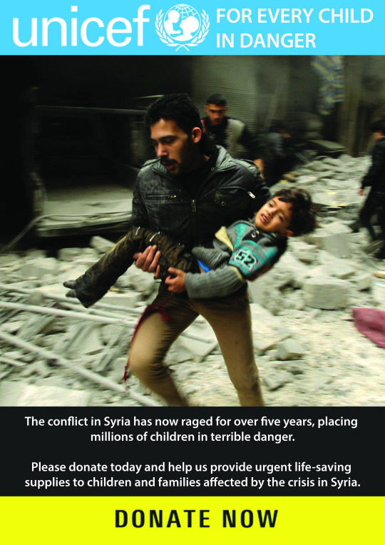
Design 3
The third design I created was playing with the idea of a possibility of the design being used for a digital poster. Using the main image and text that would change, while keeping the UNICEF logo, and the donate now remaining the same. For the section of the image and the text we could possibly either have a fade transition or a roll transition from top to bottom like in regular posters.
The image will always be the main focus, this could be replaced with the video as well, or even the possibility of having a few stills of the images and the UNICEF workers, then a middle section of the video and ending with another image, and keeping that on loop.
Evaluating Designs
The 3 Design Ideas for playing around further with the layout and what text I could use continuing on from the smaller rough sketches I created, however overall I think its perhaps a bit too clustered and compiled full of text. Moreover, I think I could perhaps use more clearer space with only a few objects around the piece, still having the circle as a continued motif but perhaps playing around with limited use of text and animation, and using the video as the main focal point. Below I will try out different ways of using the circle effect and how I could introduce the video as well as different possibilities of displaying text out of the circle and with it. As the video is reduced to around 20 seconds I was thinking I could possibly create a sequence that allows it to be played on loop with the animation using the continuous motif of circles. This idea I could use to present on a monitor around areas like what you would see around the tubes and into the city.
0 notes
Video
youtube
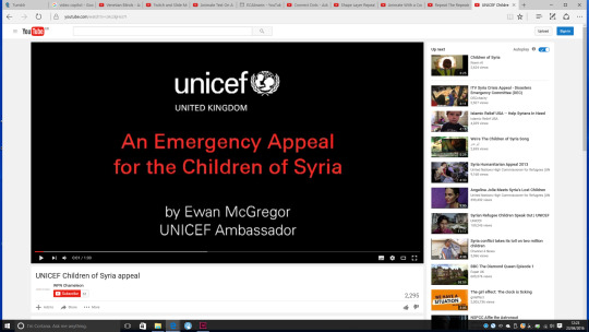
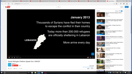
unicefs latest video, raising issues about the migrants and their living conditions. I used existing videos they created to help emulate, and take common themes they use throughout their video to make it recognisable as a unicef advertisement.
0 notes
Text
Kingston Foundation Interview
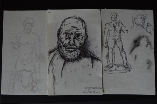
For this interview I went to Kingston University’s Foundation campus. On the day I revised my portfolio adding work from my other subjects such as my 3D Design work, as well as some graphics work I’ve done outside college. On the day we were separated into two groups we all had to present to our group as well as the staff working their showing our portfolio and talking through our work.
We went around individually talking about our portfolio, our work and what we did. I went through talking about each project individually then showing some of my 3D work as well as the website I had created for the V&A project. I went through talking about each piece what I had to do for each and why I created it, then I answered some of the questions they gave me to me such as why choose this course. Overall I think the interview went okay, I felt confident that I showed a lot more work, then I did at my other interviews as I think I was lacking in a range of artwork to show, which was another reason I got turned down not just due to my grades last year.
0 notes
Text
Revised Brief
For my brief to better cater to my Unicef Target audience, I think I want to re-purpose my video to better suite a target market. In particular I want to re-purpose the video down to 20 seconds, that can be used either for a banner or a poster design. The ideas is that I could either, use the video to be displayed on banner with three sections the video playing in the centre and words on either side, being the opposite to each other. Moreover, the second design will have the video situed in a globe, the globe being the motif of Unicef’s logo. Unicef itself focusing on children living in these desolated areas and giving aid to them. I could use text around the two areas, to display information or particular words, linked into the charity and delivering a message.
From looking back at my work, I think there are some sections that I think would suite nicely for this brief and allow me to focus on a single topic rather than a range like in my video. Furthermore, much like the Unicef when creating adverts or advertising they only focus on a single topic rather than a range all at once. Furthermore, I think reducing down the size I could make the video more sympathetic, as in some ways less in more and I could get straight to the point. In particular the sections that I would like to extract from my video is the short transition between the war and the refuge crisis, with the range of still images flashing through I think that technique I could definitly carry across. Moreover, I think that to further develop the idea with the globe I could use stills of children towards the end to suite in kind with the theme. With this i could perhaps further play with font in particular and wording a little bit further, just like used in my poster examples I created.
I researched further into Unicefs ethos, looking at the aid they give and what exactly they do to help children in conflicts and give aid to them. Look at their extended campaigns not just in Syria but globally and the schemes they do to help aid people not just in war zones but in the UK as well. While looking further into the foundings of their work, I looked at the imagery used around their website and the layout they use. Furthermore, looking at the type of language they use as they aim to get people to empathize with the children and donate, as they are a large charity.
They use quite minimal use of colour on their website using mainly blue and black with some yellow. This is deliberately done to show the seriousness of their cause and charity, rather then have a range of different colours. Furthermore, this use of minimal colour also pulls attention to the imagery, and the imagery chosen is highly selective again make viewers empathize, usually mid-shots of children usually looking up towards the camera or alone, or children looking distraught or smiling.
On the next few pages I think I want to further experiment with the use of layout playing around with their logo, and their slogan “For every child in danger”, as well as experimenting the with text and the position of their text for the logo as unlike some companies who have more of a restricted way of using their logo Unicef have multiple ways of positioning their logo.
Points to Note, that their donate buttons usually are displayed in a yellow box with black text, their impactful statements are usually displayed with white text on blue. Furthermore, their menu titles are usually displayed with white text on black. Lastly their titles and links all use the Unicefs blue colour, to keep in theme.
0 notes