#Handwritten signatures
Text
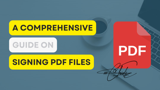
Signing PDF Files: A Comprehensive Guide
Sign PDF files electronically with ease. Benefits include convenience, speed, security, and cost savings. Follow our expert tips for secure PDF signing. Sign your PDFs like a pro today!
PDF files have become an essential part of digital communication and document management. Whether it’s an agreement, a contract, or any other important document, you may need to sign it electronically. The process of signing a PDF file is easy, but there are a few things you need to know to get started.
In this comprehensive guide, we’ll take a look at the different methods you can use to sign a…
View On WordPress
#Agreements#Contracts#Convenience#Cost savings#Digital communication#Digital signatures#Document management#Electronic signatures#File storage#Handwritten signatures#Secure PDF editor#Security#Signing PDF files#Speed#Stamp signatures#Strong passwords
0 notes
Text


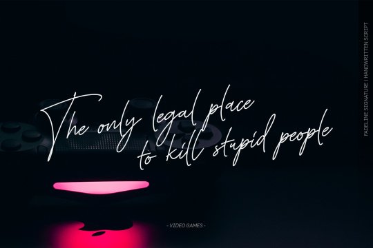
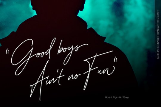
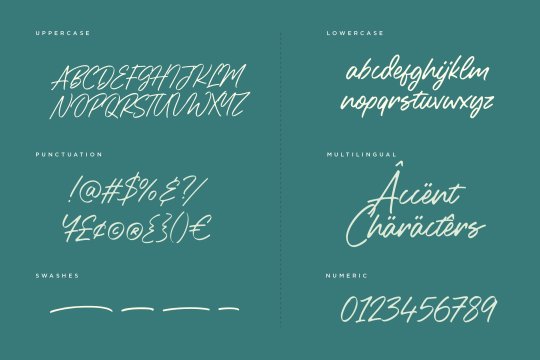
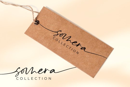
Fadeline Signature font designed by Hurufraktur
#fonts#calligraphy#typography#design#webdesign#script#handwritten#calligraphic#font#type#typeface#lettering#handlettering#brand#branding#branddesign#brandingdesign#weddingfonts#weddinginvites#savethedate#weddingdetails#weddinginspiration#businesscard#businesscarddesign#visitcard#visitcarddesign#autograph#signature#ttf
14 notes
·
View notes
Text
why craig are take over world
essay by me (craig)
As much as Craig may seem like a simple doodle of a cat, his potential for world domination should not be underestimated. Despite his crude appearance, Craig embodies the essence of adaptability and resilience, traits that are essential for any aspiring ruler.
Firstly, Craig's simplicity works to his advantage. Underestimation is a powerful tool in warfare, and many would dismiss Craig as inconsequential. However, this oversight allows Craig to operate in the shadows, biding his time until the perfect moment to strike.
Secondly, Craig's lack of defined features makes him a versatile symbol. He can represent anything from innocence to cunning, depending on the narrative spun around him. This ambiguity allows Craig to appeal to a wide range of followers, from disillusioned citizens seeking change to opportunistic power-seekers.
Thirdly, Craig's handwritten signature adds a personal touch to his endeavors. In a world increasingly dominated by digital signatures and impersonal interactions, Craig's handwritten mark harkens back to a simpler time, fostering a sense of nostalgia and authenticity among his followers.
In conclusion, Craig may appear unassuming at first glance, but beneath his simplistic exterior lies the potential for world domination. Through adaptability, versatility, and a personal touch, Craig has the tools necessary to rally followers and reshape the world in his image. Beware the power of Craig, for his ascent to global dominance may be closer than we think.
#As much as Craig may seem like a simple doodle of a cat#his potential for world domination should not be underestimated. Despite his crude appearance#Craig embodies the essence of adaptability and resilience#traits that are essential for any aspiring ruler.#Firstly#Craig's simplicity works to his advantage. Underestimation is a powerful tool in warfare#and many would dismiss Craig as inconsequential. However#this oversight allows Craig to operate in the shadows#biding his time until the perfect moment to strike.#Secondly#Craig's lack of defined features makes him a versatile symbol. He can represent anything from innocence to cunning#depending on the narrative spun around him. This ambiguity allows Craig to appeal to a wide range of followers#from disillusioned citizens seeking change to opportunistic power-seekers.#Thirdly#Craig's handwritten signature adds a personal touch to his endeavors. In a world increasingly dominated by digital signatures and impersona#Craig's handwritten mark harkens back to a simpler time#fostering a sense of nostalgia and authenticity among his followers.#In conclusion#Craig may appear unassuming at first glance#but beneath his simplistic exterior lies the potential for world domination. Through adaptability#versatility#and a personal touch#Craig has the tools necessary to rally followers and reshape the world in his image. Beware the power of Craig#for his ascent to global dominance may be closer than we think.#cat
5 notes
·
View notes
Text
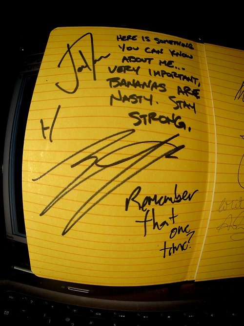
"here is something you can know about me... very important. bananas are nasty. stay strong." – josh
"remember that one time?" – tyler
#josh dun#joshua dun#twenty one pilots#twentyonepilots#tyler joseph#handwriting#handwritten#autograph#signature#quote#sign#signing#signed
40 notes
·
View notes
Text
What's up chat I was feeling cute so I may as well post this teehee giggles twirls a finger in my hair kicks my legs flutters my eyelashes winks at the camera
Rosebush but in two different flavors and pretending I know accurate human anatomy 😎
Rosebush lore let's gooooooooo
He works for the Red Army (Eddsworld oc *VINE BOOM*) and and and he's like an engineer/mechanic guy if the Red Army base has one of those giant garages or aircraft hangars that's where he can be found 🫶
You sould yell at me to give him some color :TEEHEE:
#my art#no handwritten signature/watermark oopsie i forgor 💔#erm#rosebush#rosebush lore#yeeerrrrrt#eddsworld oc#living laughing loving#so then i hit the griddy (/ref for tom becuz I'm feeling cute teehee) ik ur gonna see this 🫶
9 notes
·
View notes
Note
Dear Atticus,
I would like to apologize for the absolute disaster of our first meeting. My behavior was extremely unbecoming of a Kai, as well as a person, and I cannot apologize enough for the state you had to see me in. I was under an extreme amount of stress, but that does not justify the hurtful things I said about yours and the others’ universes, and it is not reflective of who I actually am as a person.
I apologize for having come and wasted so much of yours and everyone else’s time in such a blatant and disrespectful manner, as well as for the fact that you had to go out of your way to not only talk me through my own feelings, but also bring me home after the fact, when you were under no obligation to do so.
However, the fact that you did means a great deal to me, and while there are still so many things that I’m not sure of, and so many things I have yet to fully process, it feels as though at least some of the weight on my chest has been lifted, and for that I am extremely grateful.
Unfortunately, with all that in mind, I don’t believe I will be able to accept your offer to return any time soon. Even if it was for my own good, I have squandered my right to be there. I am not worthy, nor was I ever worthy, and that is something I must accept, as shameful as it feels to admit. However, I will be keeping your words to me in my mind going forward, and I will never forget what you’ve done. Thank you, and I’m sorry.
Sincerely,
Bragi
-*After receiving this letter in the mail, Atticus opened it and to his surprise it was a letter from Bragi. After reading it he decided to write a letter back to him. It was only proper after all but at the same time he wanted to let him know how he felt about what Bragi has said in this letter.
A day later, a letter arrived in the mail to Bragi from Atticus personally. Upon when Bragi would open it, the letter would look like such*- :
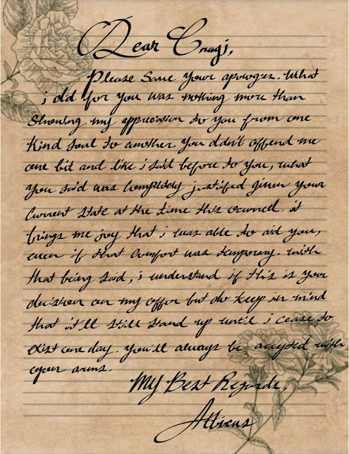
[ " 𝘋𝘦𝘢𝘳 𝘉𝘳𝘢𝘨𝘪, 𝘗𝘭𝘦𝘢𝘴𝘦 𝘴𝘢𝘷𝘦 𝘺𝘰𝘶𝘳 𝘢𝘱𝘰𝘭𝘰𝘨𝘪𝘦𝘴. 𝘞𝘩𝘢𝘵 𝘪 𝘥𝘪𝘥 𝘧𝘰𝘳 𝘺𝘰𝘶 𝘸𝘢𝘴 𝘯𝘰𝘵𝘩𝘪𝘯𝘨 𝘮𝘰𝘳𝘦 𝘵𝘩𝘢𝘯 𝘴𝘩𝘰𝘸𝘪𝘯𝘨 𝘮𝘺 𝘢𝘱𝘱𝘳𝘦𝘤𝘪𝘢𝘵𝘪𝘰𝘯 𝘵𝘰 𝘺𝘰𝘶 𝘧𝘳𝘰𝘮 𝘰𝘯𝘦 𝘬𝘪𝘯𝘥 𝘴𝘰𝘶𝘭 𝘵𝘰 𝘢𝘯𝘰𝘵𝘩𝘦𝘳. 𝘠𝘰𝘶 𝘥𝘪𝘥𝘯'𝘵 𝘰𝘧𝘧𝘦𝘯𝘥 𝘮𝘦 𝘰𝘯𝘦 𝘣𝘪𝘵 𝘢𝘯𝘥 𝘭𝘪𝘬𝘦 𝘪 𝘴𝘢𝘪𝘥 𝘣𝘦𝘧𝘰𝘳𝘦 𝘵𝘰 𝘺𝘰𝘶, 𝘸𝘩𝘢𝘵 𝘺𝘰𝘶 𝘴𝘢𝘪𝘥 𝘸𝘢𝘴 𝘤𝘰𝘮𝘱𝘭𝘦𝘵𝘦𝘭𝘺 𝘫𝘶𝘴𝘵𝘪𝘧𝘪𝘦𝘥 𝘨𝘪𝘷𝘦𝘯 𝘺𝘰𝘶𝘳 𝘤𝘶𝘳𝘳𝘦𝘯𝘵 𝘴𝘵𝘢𝘵𝘦 𝘢𝘵 𝘵𝘩𝘦 𝘵𝘪𝘮𝘦 𝘵𝘩𝘪𝘴 𝘰𝘤𝘤𝘶𝘳𝘳𝘦𝘥. 𝘐𝘵 𝘣𝘳𝘪𝘯𝘨𝘴 𝘮𝘦 𝘫𝘰𝘺 𝘵𝘩𝘢𝘵 𝘪 𝘸𝘢𝘴 𝘢𝘣𝘭𝘦 𝘵𝘰 𝘢𝘪𝘥 𝘺𝘰𝘶, 𝘦𝘷𝘦𝘯 𝘪𝘧 𝘵𝘩𝘢𝘵 𝘤𝘰𝘮𝘧𝘰𝘳𝘵 𝘸𝘢𝘴 𝘵𝘦𝘮𝘱𝘰𝘳𝘢𝘳𝘺. 𝘞𝘪𝘵𝘩 𝘵𝘩𝘢𝘵 𝘣𝘦𝘪𝘯𝘨 𝘴𝘢𝘪𝘥, 𝘪 𝘶𝘯𝘥𝘦𝘳𝘴𝘵𝘢𝘯𝘥 𝘪𝘧 𝘵𝘩𝘪𝘴 𝘪𝘴 𝘺𝘰𝘶𝘳 𝘥𝘦𝘤𝘪𝘴𝘪𝘰𝘯 𝘰𝘯 𝘮𝘺 𝘰𝘧𝘧𝘦𝘳 𝘣𝘶𝘵 𝘥𝘰 𝘬𝘦𝘦𝘱 𝘪𝘯 𝘮𝘪𝘯𝘥 𝘵𝘩𝘢𝘵 𝘪𝘵'𝘭𝘭 𝘴𝘵𝘪𝘭𝘭 𝘴𝘵𝘢𝘯𝘥 𝘶𝘱 𝘶𝘯𝘵𝘪𝘭 𝘪 𝘤𝘦𝘢𝘴𝘦 𝘵𝘰 𝘦𝘹𝘪𝘴𝘵 𝘰𝘯𝘦 𝘥𝘢𝘺. 𝘠𝘰𝘶'𝘭𝘭 𝘢𝘭𝘸𝘢𝘺𝘴 𝘣𝘦 𝘢𝘤𝘤𝘦𝘱𝘵𝘦𝘥 𝘸𝘪𝘵𝘩 𝘰𝘱𝘦𝘯 𝘢𝘳𝘮𝘴. 𝘔𝘺 𝘉𝘦𝘴𝘵 𝘙𝘦𝘨𝘢𝘳𝘥𝘴, 𝘈𝘵𝘵𝘪𝘤𝘶𝘴 " ]
4 notes
·
View notes
Text
F1 handwriting challenge - I was tagged by the lovely Lisa @yuleneverwalkalone (thank you! 😘).
// 1. What is your URL? // 2. Who are your favorite drivers? What are their numbers // 3. Write out a fandom hot take you have. // 4. Make a prediction for next season. // 5. If your native language isn’t English, write a fun fact about yourself in it. // 6. Write something nice about another person in F1mblr. // 7. Tag at least four people
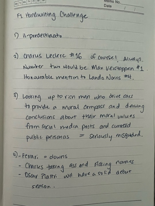
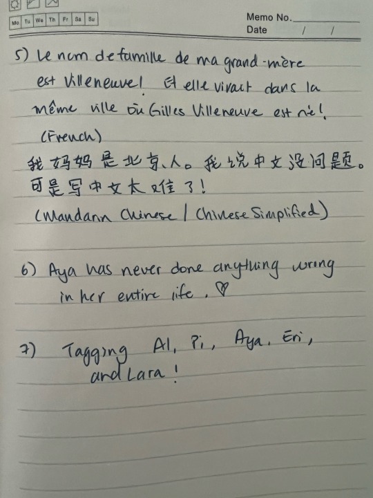
Tagging @alestire @f-ferrari-forever @coconutshygame @kimiraikkonen @mv-one 😘
#tag game#elle.txt#been ages since I’ve handwritten anything more than my signature 😬#small quebecois village incest is a real concern#also massive apologies for my dreadful chinese penmanship hope i didn’t make anyone laduzi
24 notes
·
View notes
Photo
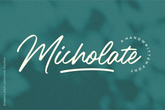

Micholate Handwritten Font by Letteralle Studio
#ihave#fonts#font#handwritten#handwriting#signature script#script#handwriting script#creativefabrica
6 notes
·
View notes
Note
𝓕 : My muse’s handwriting.
𓆩⟡𓆪 - memies symbol headcanon prompts [1/5]
SUBJECT: HANDWRITING.

CATER'S HANDWRITING IS A PRODUCT of practice. As he moved around often as a child, his schooling was periodically interrupted. Due to this inconsistency, there were some measures taken by his parents to make sure that Cater didn't fall behind his age cohort when it came to educational milestones. One of these concerns was to ensure competency in writing. Cater made use of handwriting workbooks as a result, which his mother oversaw the completion of.
For the most part, there was very little effort or attention given to the cultivation of any particular handwriting style or signature features. The handwriting books taught a basic style of both print and cursive handwriting that Cater adhered to, but it wasn't militantly enforced to perfection by his mother. As long as his writing was competent for his grade level, his parents were happy with that. Thus, these workbooks served as a basic guideline, rather than a must-do. This resulted in the development of generally tidy and even style of handwriting.
HOWEVER, Cater's older sisters weren't as content and often needled him about the details of his writing to prevent it from being ugly or otherwise unappealing to look at. It was "collectively agreed" by the Diamond siblings (see: a 2-to-1 overruling) that cursive was the superior choice and, therefore, that's how they should all write because print-writing was sooo gauche. While the workbooks went to the wayside as Cater got older, his sisters continued to prod him here and there about his handwriting independently.
Even without his sisters' influence, though, Cater similarly preferred cursive lettering to printing, but rather than for an aesthetic reason, just because it was faster. Ultimately, he ends up blending both cursive and printing styles together—particularly notable with his uppercase letters, which follow a print style rather than cursive, because (again) it's faster. Cater writes without much of a lean or tilt to his handwriting, and letters following the first of a word have a tendency to jump up above the ruled the line. The size of his handwriting is negligible and depends on the paper rather than anything intentionally done for aesthetics or accessibility of writing/reading his handwriting.
While most other features of his writing are long since ingrained and therefore thoughtless now, Cater does make the stylistic and conscious choice to dot his I's with hearts consistently; his sisters insisted that it's the cuter way to write and while it's not really worth the time sink, it does add a little character he can't deny is almost charming. Even if still too cutesy for his personal aesthetic preferences... it photographs really well.
(All of that said, Cater prefers to type whenever he can—much faster.)

#𝘍𝘪𝘯𝘢𝘭𝘭𝘺 𝘨𝘰𝘵 𝘵𝘩𝘦 𝘴𝘭𝘦𝘦𝘱 𝘰𝘶𝘵𝘵𝘢 𝘮𝘺 𝘦𝘺𝘦𝘴… | OOC.#𝘐'𝘮 𝘱𝘭𝘦𝘯𝘵𝘺 𝘦𝘢𝘴𝘺 𝘵𝘰 𝘶𝘯𝘥𝘦𝘳𝘴𝘵𝘢𝘯𝘥! | HEADCANONS + META.#[ ngl i lucked OUT with those message cards w everyones signature on them ]#[ caters really fits imo so i have just based the arrival of this writing around it ]#[ some of them bother me so bad bc its just like clearly A Font but his is cute feels more handwritten ]#[ anyway his sisters rly didn't bully him THAT much ]#[ visions of the three diamond siblings sitting around their newest houses' dining room table doing workbooks together sob ]
6 notes
·
View notes
Text
Make it simple, but significant. We provide personalized signature design services along with video tutorials and worksheets for your daily practice.
0 notes
Text
Do you want or looking for an EXPERT Professional,Signature, handwritten, calligraphy, Stunning, Clean,Minimal, Creative, Unique, Initials, Modern, logo maker,signature logo, handwritten logo, handwriting logo,scripted, handwritten, cursive, logo design, signature,handmade, feminine, scripted?
My design is not like others. | am different from
higher intelligence and creativity. It's imperative to
achieve exactly what you need for your business. So we enjoy working very closely with me.
Please get in touch with me if you have any
questions. | can be reached by messaging.
#cursive#autograph#logo design#digital signature#signature#handwritten signature#art#architecture#trending#autos
0 notes
Text
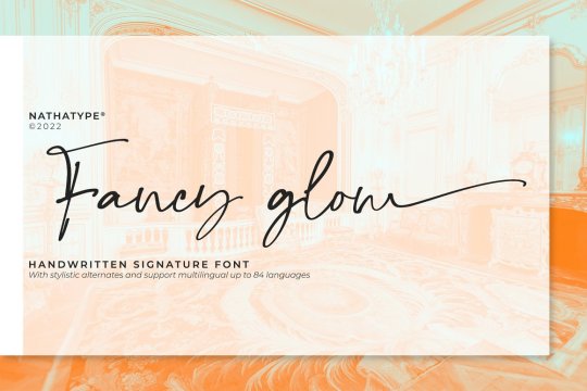

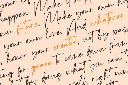
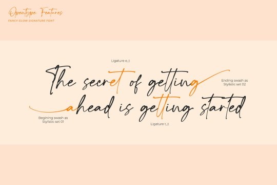
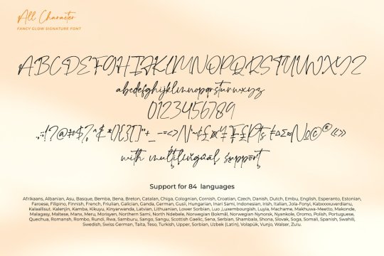
Fancy Glow font designed by Din Studio
#fonts#typography#design#webdesign#script#handwritten#font#type#typeface#lettering#handlettering#brand#branding#branddesign#brandingdesign#autograph#signature#ttf
25 notes
·
View notes
Text


#josh dun#joshua dun#twenty one pilots#twentyonepilots#uber#june#2017#june 13#june 2017#june '17#handwritten#handwritten note#note#signature#autograph#handwriting
2 notes
·
View notes
Link
Tons of free fonts and graphics to elevate your projects. Download for FREE at https://www.creativefabrica.com/ref/555002/
1 note
·
View note
Text
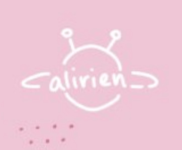
im finally changing my signature depending on where i post it
#never made sense for posts here to be signed with my twt handle but i was always too lazy to change it#ugh that means i have to change it again for instagram honestly at this point i need a brush or vector img of a pre-written one for#convenience#but i like how each of them are handwritten...but if theyre gonna be diff i better go for convinieincy#i love my signature it makes me happy#alientxt
1 note
·
View note
Text
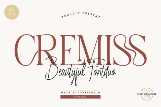
Cremiss Font Duo
Cremiss is a versatile and modern serif font duo that includes 2 stunning styles (handwritten and serif). This script typeface was created and shared by ToniStudio. It’s a gorgeous, artistic, and stylish font duo. Fall for its ravishing style and use it to create gorgeous designs. This font is PUA encoded which means you can access all glyphs and ligatures with ease!
This font is free for…
View On WordPress
#Cremiss Duo#Cremiss Duo Font#Cremiss Duo Serif#Cremiss Font#Cremiss Font Duo#Cremiss Script#Cremiss Serif#Handwritten#serif#Signature
0 notes
Last Seen Blogs