#ashka rambles
Text
Another year around the sun, another year being a Voltron fan
24 notes
·
View notes
Text
"Wade I think we need to be honest, we…we've been trying for months, if it was going to happen for us it would have by now right? I.. we wanted so badly to think we could fight the odds like before, break another barrier, but its time to face it. Elements dont mix, not like this." His eyes shone with pain, not only for the truth of her words but that its obviously been hurting her so badly keeping all this in. Ive talked to your mom, Ive seen the way you talk to kids at work, I know how much you want a family but…" she choked out a sob "I cant give that to you,im sorry"
He finally allowed himself to cry, her cracking voice breaking his heart. Gently he cradled her face,trying to pick his next words carefully "Ember, my vivisteria in a flooded station…I would have loved you even if we'd never been able to touch, I accepted everything that came with loving you a long time ago and nothing is more important to me than you. Please dont kill yourself like this and please dont think Ill ever think less of you."
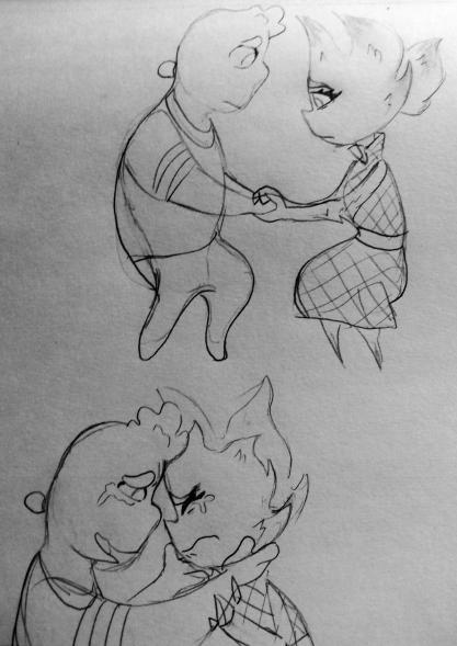
This is before they join the group for mixed couples, Flint and Ember are on good terms but they dont know their struggles with having a kid until they're invited to the session. A few weeks in Misty sees some of the same symptoms in Ember that she had at the time and considers broaching the idea to her.
I kinda imagine though that if Fire elements can smell hormonal changes or at least Cinder can, that while theyre visting the fireplace she ends up smelling that Embers pregnant before she herself knows.
i think she has an internal crisis on if Ember knows and is waiting to tell them or not
she feels bad for messing up the surprise and says as much when she thinks ember is going to confess. "oh I already know, im sorry my daughter but my nose knows eh" she chuckles adding "But Bernie has no clue you two can still tell him in the morning. Ill make you some charr sticks for the sickness and find you all old maternity stuff." Meanwhile Embers brain is shutting down
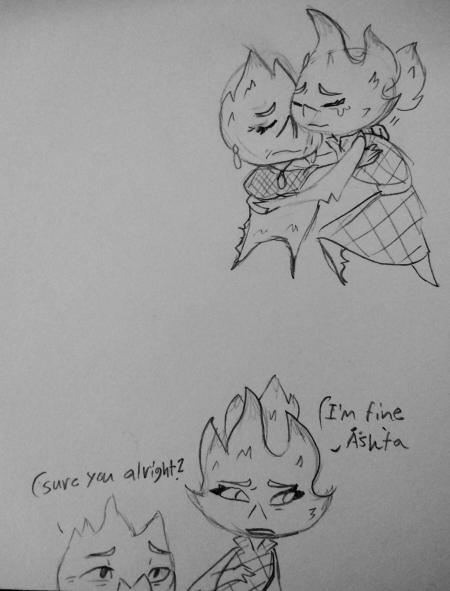
"Ashka…what are you talking about. you dont mean, I cant be…its not possible,we know its not" Cinders eyes shoot up to see her daughters horrified face and it hits her all at once she didnt know. "im so sorry I thought it was suprise for us I didnt think…oh my daughter".
Cinder has her take a seat before she collapses. Before she even realizes shes crying Cinder is gently wiping tears from her face. "Ashka….what do I do, I should be happy, I am happy, I dont know if i can even believe it, I,I- Cinder cuts off her rambling with a squeeze to her hand. "My daughter you are strong, you will know what to do and we will be here for every step.I am only sorry you find out this way". They sit in silence for awhile until they hear Wade and Bernie talking outside the door. A fresh pool of tears slide down her check, she hadnt even thought about Wade yet. The weight of it all hit in waves as she imagined it my water guy, an ashfa. Cinder looks at her sympatheticly almost knowing what she was thinking. "ill distract them, take as much time as you need in here".
0 notes
Text

This question’s been sitting in my askbox for WEEKS now, apologies for taking so long to respond to this!
To preface this post it’s important to note: I’m not a professional, and don’t have professional experience. All thoughts are based on personal opinion, preference, and prior experience designing characters for personal projects!
Click the jump for a big post with me rambling about character designs I do and don’t like, and why I do/don’t like them!
So several months ago I went on a tirade about character designs in all these big multiplayer games coming out. You know the ones! Overwatch, Battleborn, Battlerite, Gigantic, Splatoon, etc. etc., there’s a thousand of these released every few months it feels like. At any rate, one of the big draws for all of these titles are the characters you control in them obviously. Partially thanks to the success of MOBAs like League of Legends and DOTA 2 we’ve seen more and more focus on games with these characters referred to as “heroes” and “champions”. While this should be really exciting for a lot of those who are interested in the character design aspect of titles such as these (like me!), I feel as though a lot of them miss the mark for one reason or another.
There’s several important aspects to designing a character, I believe the most important are all tied to their shape/silhouette. Ornate details and color are important, but in terms of character design hierarchy, a good shape will trump all other details. A silhouette is what you’re gonna see first always, you might acknowledge decorations or color choice first, but your brain is focused on the outline they’ve got. This is where my problem lies with a lot of these games (which stems from my love of diverse shapes and sizes in these rosters.). Most of these games feature characters with proportions that don’t stray too far from reality as to not scare people away with stuff that’s too unfamiliar, or in some cases “too cartoony”.
For example, let’s take a look at some Overwatch’s characters for a moment.

Here we’ve got a small sampling of characters from 2016′s GAME OF THE YEARRRRR: Overwatch. Notice something with these 5? They’re a bunch of people in fancy costumes, coupled with some stock personalities. This isn’t a diss at the art itself (courtesy of Blizzard artist Arnold Tsang), the art itself is great. These characters are the result of focus testing to reach as broad of an audience as possible. They are played as safely as possible as to not offend with their depictions of race, and are shaped in ways that are very safe to people who don’t typically play video games too much, let alone first person shooters. I think this is boring. They didn’t play around with the different characters shapes to identify them better, instead we’ve got a few very similar body types dressed and animated differently (the in-game animations are actually really good, and I don’t want to discredit Blizzards work on a lot of the character animations).
Now, that’s not to say Overwatch is riddled with designs I perceive as boring, I think there’s a couple strong, unique designs in the game that actually look good, one of which stands above the rest. Look at this big asshole:
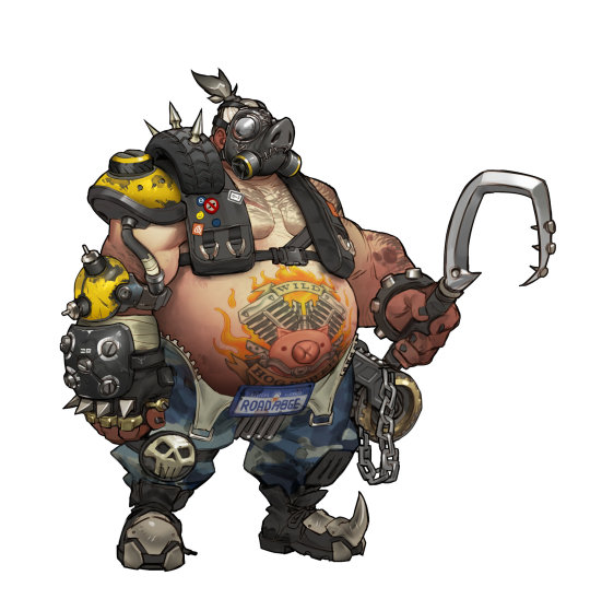
This is Roadhog. This is a character with a clear, concise concept and idea that’s executed as perfectly as they could within the constraints they have with the characters. He has an immediately recognizable shape, he’s decorated appropriately, every aspect of him visually conveys what he is and who he is. He’s big, he’s bad, and he’s ugly (in the best possible way). They really went all out with this particular design, and it saddens me a lot of the other characters feel under-cooked compared to him thanks to how safe they played it with most of the cast. SHOUTOUTS TO Reinhardt, Reaper, Torbjorn and Zenyatta for doing their best to break the mold as well.
With Overwatch out of the way let me gush for a minute about Gigantic.
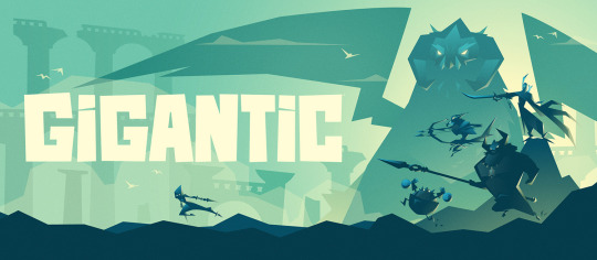
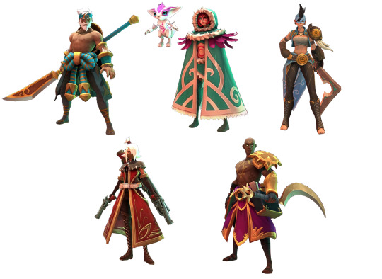
This is a game that gets it, the people at Motiga have created a colorful, diverse cast of characters in terms of shape and size and they’re each immediately recognizable from just their silhouettes. They’ve gone with more stylized and unconventional shapes not typically seen in MOBAs (LoL, DOTA, etc) or games like Overwatch, Paladins or Battleborn. Let’s get a sample of Gigantic’s characters.
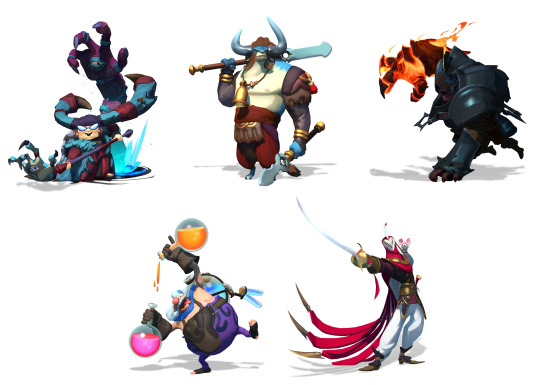
Look at this! Look at how much they’ve stylized the proportions, how unafraid they are to make characters with these shapes. The little round man, the hulking armored juggernaut, the top-heavy bull, the short and squat witch, and the elegant and mysterious masked warrior: all with completely unique bodies. Not only are they shapes unique, the colors used throughout either support aspects of the character, or are used masterfully to break up the color in ways ideal for 3D character animations. The animations in-game are incredible as well, every single character oozes personality through just their movements and designs!
Unfortunately, characters like these don’t appeal to everyone. They aren’t as immediately appealing as the Overwatch cast due to their unorthodox shapes and stylized bodies. Some will deem them “too cartoony”, others will insist the characters are “ugly” because they aren’t familiar with characters stylized like this.
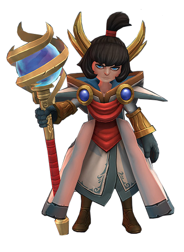
Overwatch and Gigantic are going for two completely different looks overall, and especially with their characters. But there’s one comparison I want to make that demonstrates the philosophies behind both, but more importantly shows why Gigantic’s direction is so strong.
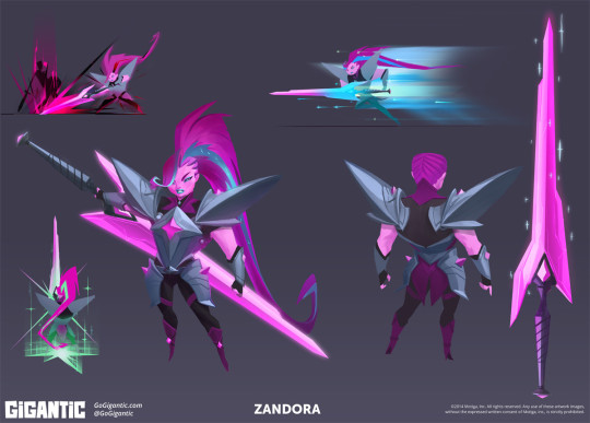
These are Zarya, and Zandora, respectively

Zarya is the absolute weakest design in Overwatch. She’s an awkward mashup of shapes that convey absolutely nothing. She’s got big arms and a short haircut to clue players in on how powerful she is. She totes around a big gun too, ain’t that somethin’?
Zandora is what Zarya’s design should have been in several ways. Her power isn’t overstated with a bevy of cheap visual cues slapped onto something that’s just “large”. Her power is communicated through the strong shapes that make up Zandora: the top heavy armor, the overall wider build, big in-your-face hair, and a sword that was crafted to compliment her. What might be most notable is her star-shaped silhouette. It’s handled so tastefully and executed perfectly. I want to say that her design is by Devon Cady-Lee, who also did these illustrations below that show how good that idea looks on paper as well:
Gigantic is paragon of quality among a sea of games full of safe, boring marketable designs made to attract the largest possible crowds. It pains me knowing this game won’t reach the same success Overwatch will partly because of how visually distinct this title is.
While I clearly have a bias towards Gigantic, I will admit Overwatch as a whole is mostly competent. The character designs serve their purposes, even if I happen to think they’re boring.
What about those other games? Here’s a game that I’ve enjoyed playing recently: Battlerite.
Battlerite is a top-down arena brawler. One might call it a MOBA, but it’s a team deathmatch game sort of. Your goal is to defeat the enemy team in a first to 3, 2v2/3v3 match. You moved with WASD and you’ve got keys for abilities, vaguely similar to games like LoL or DOTA 2 in a way.
Battlerites case is very much “we want the MOBA crowd”. This sounds like a really lazy descriptor that lacks any value, but hear me out: Battlerite is the spiritual success to a game just like it called Bloodline Champions that came out a few years ago. Here’s a sampling of characters from Bloodline Champions:

Bloodline Champions is a game with a unique, clear visual identity. Whether or not you like it, it’s clearly something wholly unique in terms of color and how they’ve decorated their characters. Weird shapes (top left, top right) as well as familiar ones with distinct ornate details (bottom two). They all adhere to colors that the games overall aesthetics thrive from, it’s very gritty and twisted.
SO WHAT DO YOU MEAN “WE WANT THE MOBA CROWD”??? JERK
This is what I mean. The first character showed off that wasn’t a direct adaptation of a bloodline champions character was Pearl. Here’s Pearl:
Pearl is the epitome of the differences between Bloodline Champions and Battlerite’s character designs. Half-baked ornate details because without them, the characters would end up more generic than they already are. Battlerite’s cast is comprised of archetypal MOBA character stand-ins. They’re boring, and hollow uninspired renditions of characters that had a lot more style in a previous life. Here’s some really boring Battlerite characters:
BLAH. They’ve got the Overwatch “problem” but even worse. These guys really just look like cosplayers doing characters that don’t exist. Staff man. Sickle man. Gun woman. These designs convey nothing beyond what you see. I don’t mind cool characters for the sake of cool characters, I’m the last person to complain about it, but Battlerite really tests that for me. The in-game camera doesn’t do these designs or models any favors too, unfortunately. There’s a single very standout design among the roster.
This is Pestilus.
He’s shaped strange. He’s round, he’s got really stubby limbs, and he’s got these big bug legs on his back. Pestilus is cool! Lookit’ his gnarly teeth, wowie. Unfortunately the in-game model doesn’t do him justice:
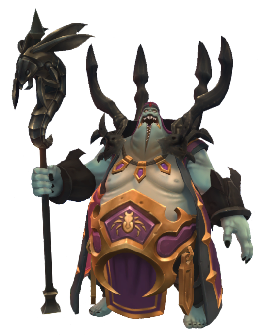
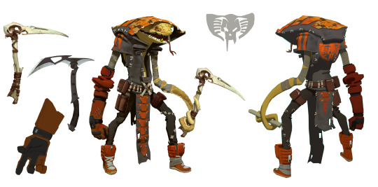
He’s paler, his teeth are simplified and lack the character his chompers had in the above illustration. I still like this one, he’s in a league of his own compared to most of the rest of the cast. HONORABLE MENTIONS GO TO RUH KAAN AND ASHKA:

I’ve said that the worst thing a character design can be is mediocre. Not good enough, not bad enough. Battlerite rides slightly above that line. There’s a few interesting characters here and there. Some have unique silhouettes (Ashka, Ruh Kaan, Pestilus and Rook) and most server their purpose. They’re boring, but they’re not aggressively boring/mediocre. That line of design goes to a little game called. . .
Paladins: Wizards of the Coast or whatever the fuck the subtitle is
Chinese bootleg overwatch. A game that was trying to be a bit unique before a lot of changes were made to match a similar, “hero”-based shooter game where you push payloads and capture points. This is a game with aggressively boring characters. The characters are in this game because if you had none, you wouldn’t have anything to play as. They’re crude facsimiles of better looking, more thought-out characters and designs. Here’s a sampling of these lot of losers.
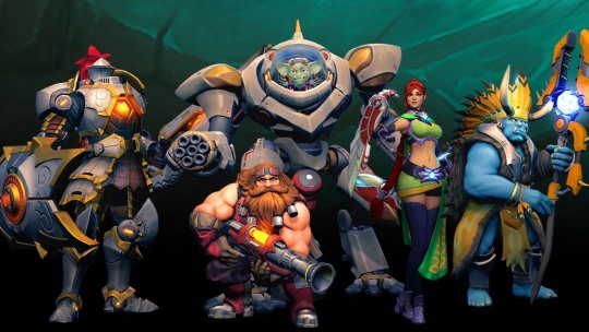
These characters are nothing. Their silhouettes are bland. You’re either big, small or medium with no rhyme or reason. You have a gimmick. Your colors don’t serve much purpose beyond “we needs color-keys to recolor for skins”. Very rarely are they in service of the shapes in question, or to break up monotony in big stretches of solid color. The knight on the left is dull as dull can be. Sure, knights are done to death but good lord they’ve really found a way to try and make him exciting but failed miserably thanks to:
A silhouette that is nothing beyond “TALL MAN”
Colors that are gray all over, his armor is supposed to be metallic but the textures and shading do it no favors. The yellow in there doesn’t do enough in breaking it up because they’re only along the trim of each armor piece.
His shield doesn’t compliment him, it’s an obligation. He has a lance, he needs a shield, and not one that works in conjunction with anything solid.
There’s a single design in Paladins that I don’t think is the absolute most mediocre thing in the industry: Bomb King.
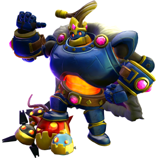
He’s big and loud both visually and personality wise. He’s got a standout silhouette, and colors used mostly tastefully to break up his main blue coat. Bomb King doesn’t look like he belongs in this game, and is strangely. . . Toyetic. I kind of like Bomb King.
Paladins is mediocre. Paladins is very unimaginative and dull, the most recent characters are some of the most unmemorable I’ve seen in recent times, when it comes to these games. While Paladins is mediocre, at the very least it isn’t. . .
COMPLETE, IRREDEEMABLE SHIT.
ENTER: BATTLEBORN-

Battleborn is a game that isn’t aggressively boring, it’s aggressively ugly. It’s annoying. It’s messy, it’s loud, it’s busy. Battleborn is garbage. This game is rife with characters that convey nothing, silhouettes that are awkward and make no sense who are modeled in one of the most unappealing looking games of the past 5 years. This one is so bad I really don’t want to post a sample of characters because I hate looking at 99% of the roster, but I have to. . . I have to. . . Here’s a sampling of Battleborns characters. . . eugh. . .

Do you like any of these designs? Legitimately curious. Unnappealing shapes, ugly facial features, completely mangled details that are hard to make out, poorly balanced silhouettes. . . There’s so much wrong with all of these designs. Some of the ones in the game wildly stylize proportions, mostly very poorly, some are very restrained and more realistic, some are complete abominations like the monster in the upper left: Attikus.
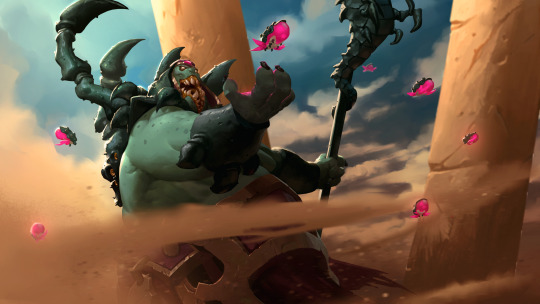
It’s worth singling out Attikus because his concept art has something very interesting behind it: He didn’t look like complete fucking shit, his shapes were solid and his silhouette would’ve worked perfectly, but they seemingly went out of their way to get the ugliest possible outcome they could achieve. See below, Attikus thumbnails:
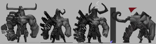
These are all so much more sound than the final product. Why didn’t they go with any of these four beyond “We gotta make it uglier to fit in with everything else!”. While still asymmetrical, the shapes here tell you he’s powerful and ready to rip and tear through every living thing in his path to victory. That final Attikus looks like it tried to go with something weirdly proportioned like some of the Gigantic characters, but with a fresh coat of grime.
At no point has this stream-of-conscious post has been about nitty gritty things like facial features but Thorn looks vile:
There are no honorable mentions for Battleborn. The very best of the bunch is still very boring and half baked. They’re plain, and that’s really it. They don’t assault your eyeballs with how putrid and gaudy they are, which, by default, makes them the best.
One thing worth nothing is that there are piece of concept art here and there that actually look great, but are put through Battleborns poor “World of Warcraft” + “Disney Infinity” + GREASE filter don’t look nearly as good. The one I like most is this rendition of one of the first DLC characters, Pendles. Here’s the piece in question:
Very lovingly rendered. I don’t want to talk about Battleborn any more. I’m sick of looking at it.
Anyways, there’s some insight on what I think does and doesn’t work in the form of this weird stream-of-consciousness, giant post. Feel free to ask more and I’ll weigh in on it as poorly as I did here! I’d love to hear what everyone has to say about these games and their character designs, and what you like most about the, as well as what you like least about them!
399 notes
·
View notes
Text
"hmm why don't I use Tumblr that much any more?" *goes on tumblr to immediately see people be casually and openly antisemetic, calling my family white colonisers, defending a terrorist organisation* "ah yeah. that's why"
#sorry for being inactive. i'm just. very tired#I've filtered out everything yet ppl don't tag shit#but yeah. if anyone wants to chat message me and I'll give u my discord but right now I'm staying away#for my own mental healths sake#because im tired.#ashka rambles#i/p conflict
7 notes
·
View notes
Text
When I learn to write porn it's over for you all.
6 notes
·
View notes
Text
Hello shancers, how are we feeling about an ace attorney au in this house tonight?
#I am Thinking(tm)#this au has been microwaving in my brain for WEEKS#ofc it's defense attorney!shiro prosecutor!lance#ashka rambles#vld#shance
22 notes
·
View notes
Text
girl help I overdosed on yaoi cocaine and am thinking about krisnix again
7 notes
·
View notes
Text
Started dungeon meshi. I fear Laios and I are both autistic
4 notes
·
View notes
Text
Learning how to touch type so I can write wirip faster
2 notes
·
View notes
Text
next wirip chapter is 99% done! Will be finished and edited while I'm still overseas, and will be posted when I get back (hopefully late december)
6 notes
·
View notes
Text
sorry y'all, haven't had time to upload the next part of wirip. been a hectic few days.
side note: fuck CPS, fuck the police, and fuck everyone who treat people in need as nothing.
3 notes
·
View notes
Text
One thing I love abt aa/wrightworth is that when you take a step back you think 'hey phoenix's motivations in the first game with edgeworth are kinda... messed up' but by the second game you realise that edgeworth is just as dramatic and batshit insane as phoenix
#who would win? 'I changed my career for a dude I was friends with for a month when we were 9' boy#vs 'i faked my death and constantly refer to stalker boy as a very homoerotic “that man”' boy#sorry for aa posting I just have brainworms rn#ashka rambles#ace attorney#phoenix wright#miles edgeworth#not vld
20 notes
·
View notes
Text
you know what. I've been cancelled on Instagram and Twitter. Maybe it's time to give Tumblr a go. Three for three, babey!
3 notes
·
View notes
Text
hey to any mutuals: Just a heads up that I'll be unfollowing anyone reblogging/posting untagged middle east conflict stuff. so yeahhhhhhhhhhh
3 notes
·
View notes
Text
My favourite Phoenix characterisation is him being like the markiplier dude from fullmetal alchemist. Like he'll pull out a photo of Trucy and be like look at my lovely sweet daughter and gush over her and someone's like "bro u do realise ur on trial for murder here, right?"
#I'm having Beanix thoughts right here#god I love those two#found family my beloved#ashka rambles#not vld#ace attorney#apollo justice spoilers
17 notes
·
View notes
Last Seen Blogs

supersixliv
Untitled

giatot7
Untitled

anrandomhuman
☆⋆。 r a n b u s 。⋆☆
supersixliv
Untitled

wannabefat250
Fuckyeahdadbods