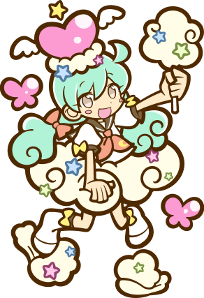
#edit: i made a few changes to the lineart color so make it more consistent with my other pieces! :3
Text
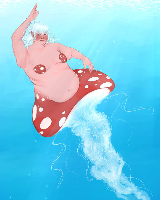
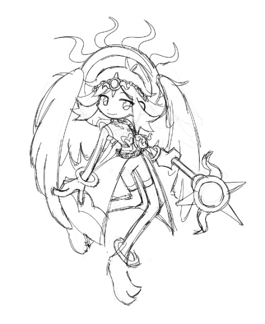
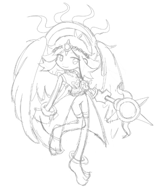
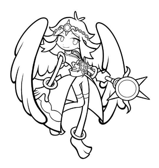
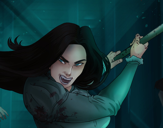
05.08.23 || what a graceful and dangerous creature.
#mermay#mermay 2023#i gave myself the weekend 'off' (only drawing two silly little post-it doodles) so i don't burn out#but i couldn't stop thinking about the mushroom prompt#and how perfect a mushroom jellyfish would work#and i found some great bodytype refs so hopefully i don't have to keep using myself instead lmao#so i chose to do that one today :3 i spent less time on this one so its a bit different but ah well#art#fat art#things i draw#finished piece#unknown character#edit: i made a few changes to the lineart color so make it more consistent with my other pieces! :3
24 notes
·
View notes
Text
So a few people thought my last post was a sprite edit when it's in fact all drawn by hand, and I thought this was the perfect excuse to share my (current) process in drawing puyo style art!
This is by no means the definite way to draw in the puyo style, and there's still a lot of things I need to work on too, so take this with a grain of salt bc I'm not perfect at this.
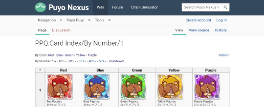
To start off, once I have a base idea on who I want to draw, I head to the Puyo Puyo Quest card index on the Puyo Nexus Wiki to find cards for references. For the Amitie goddess one specifically I used Sandra, High Priestess Deena, and Legamunt as my main references.
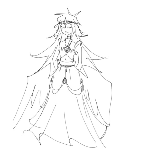
After I find references I begin to sketch out (in this case) a design for the character and then begin drawing the main sketch layers for the puyo style art. At this point you can really see that I was heavily going off of HP Deena's 6* art before making a change.
Normally I go through 2 passes of sketch layers before beginning on the lineart, but I accidentally combined the first pass onto the 2nd one at some point so unfortunately I can't show you what that looked like.. ;_;
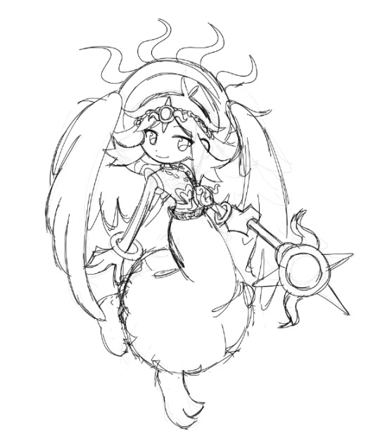
With the help of a few friends I decided on a final outfit, and created the final sketch I would be going over in with lineart!
From here is where things get a little tricky. Puyo Puyo as a series, while having a consistently similar art style for the past 10 years is not entirely the same in every game. For example compare the manzai demo sprites between PPT1 and PPT2! They're a whole lot different! This follows through as well in Puyo Puyo Quest, as different artists draw varying quest renders, many of them having differing lineart styles. For example here's Steam City Arle's 6* compared against Elisa's 5*:
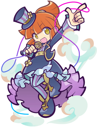
Steam City Arle has much thinner lineart compared to Elisa, whose lineart is very bold and a different color as well! In Elisa's 7* render, the lineart for her changes to become much thinner and more similar to SC Arle. Another thing with these cards is that Arle's hair lineart is a different color against the dark purple lines, allowing it to blend in with the already busy outfit she's wearing. Elisa's 6* and 7* does this as well!
When I do lineart I tend to try to stay on the thicker side when I am drawing things like body parts, clothes, and hair, while using much thinner lines on things such as accessories, details, and highlights.
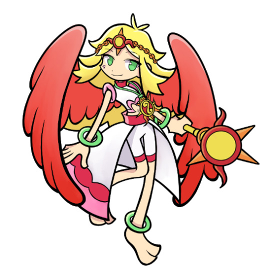
Coloring and shading is also something that varies! If you were to look back at Arle and Elisa's art, Arle has much more highlights and a slight shadow gradient on the underside of her clothes, while Elisa has mainly flat colors with highlights only on her hair and the pink floaty objects around her. An important thing to keep in mind however when coloring is that there are very minimal shadows in almost every render! The few times shadows are used prominently (disregarding full power renders) are on the hands, the eyes, underneath bangs, the insides of clothing, or as a gradient.
Highlights are also used very minimally, used mostly to highlight clothing articles, large accessories/effects, hair, and non skin colored body parts (ex: wings, tails, horns, etc). Skin is almost never highlighted!
After all that, I put down a clipping layer and color the lineart. Many puyo puyo quest renders use a dark purple color for their lineart, but many others use different colors such as dark green, dark blue, or even brown!
When coloring lineart, most of the time the only lineart that is a different color from the rest is the hair. However, there are exceptions to this such as changing the lineart color for transparent objects like glass or on softer surfaces like wings, clouds, pillows, etc. Background effects such as auras and smoke also use differing lineart colors, and sometimes are also lineless to allow them to blend in better as background pieces!
Now it's all done! I hope that what I wrote made sense and helps a few people because drawing in the puyo style is super duper fun to do!
Thank you for taking your time to read this if you did, and I'm sorry for the really long post ;_;
49 notes
·
View notes
Text
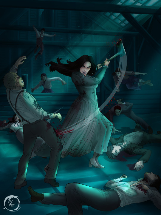
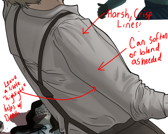
How I Digitally Paint like a Scenic Artist/Designer
Aka: how I did this and put my degree to good use.
LONG POST WARNING
Step 1: Research.
First off, get to your image search. If you are going to be using Google, you may want to type “-pinterest” in the search to eliminate the countless boards.
I had to figure out clothing that is vaguely late 1800s. I found a multitude of reference images that were fancier clothes- but I wanted to find images of clothing for kindred across all social classes. Photographs from the era and paintings are your friend. They will more accurately showcase what was worn.
After Fashion research comes location research. The 1890s in America is known for the rapid industrialization. Factories were getting bigger and work days were getting longer. But, I wanted the moonlight to be cascading into the place, illuminating the scene. This means I needed to find a structure that had skylights or let sunlight in. And the best images I found? Slaughterhouses. Fitting, huh?
The same rule for fashion still stands- if you can find photographs or paintings from the era- they’re better. There are tons of places still standing today from the 1800s. But today, they look WAY different. Ya know, Abandoned! So just be sure to take this into consideration if you search “abandoned slaughterhouses” or go trespassing like I did.
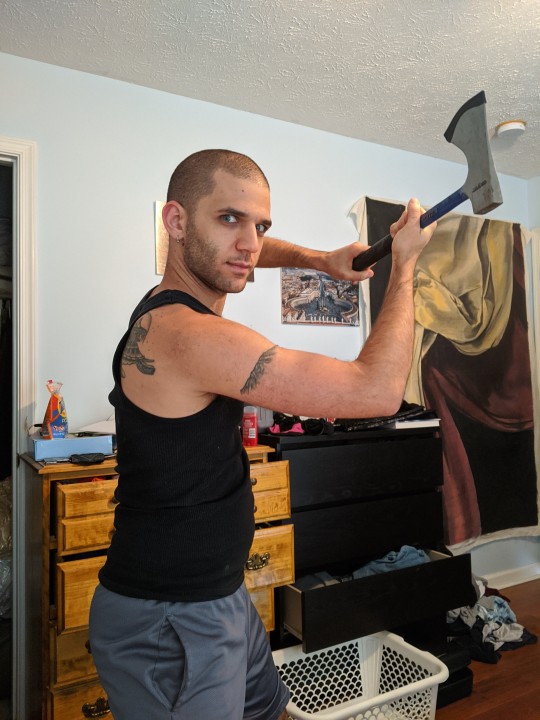
Lastly, pose research. Finding the poses for a fight scene can be tedious. So, I enlisted some help from a few fight choreographers and stunt men. You can record their fights and play them back at quarter or half speed. You can also get a mirror and flop on the floor a bunch. I did both. This lets you see the action/motion lines you are going to replicate in the drawing. Heres how we initially did fina’s pose:

And sometimes you have to go back and get a clean shot. I ended up using this pose for the axe.
Step 2: Set up and Background!
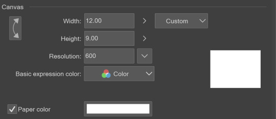
When you open a new file, set it to the dimensions and resolution you want. I was working at 600. Usually, I’m working at 300-350. You can always reduce resolution. Its hard to prevent fuzzy lines if you increase it later.
I cannot stress the following enough:
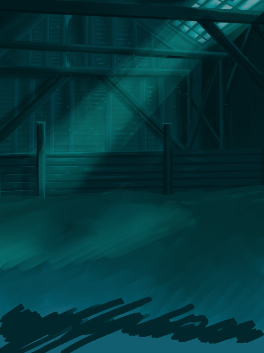
You work background to foreground. Big Shapes and areas to little shapes. Work your way forward. What this means is you need to fill in as much space as possible first. Then build your details. I prefer working as follows: Big Solid tones, Soft shadows, Dark Shadows, Highlights, then final blend. Once you finish this, put an overlay on top. This knocks everything back and helps create the illusion of depth. See this at work with the video below or here
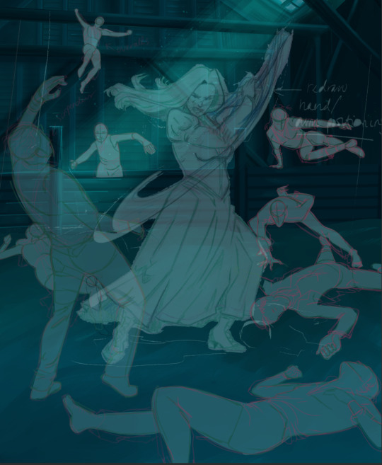
Step 3: Figure Drawings + Composition
Utilize that research and images you collected to pose your characters. I create subfolders for each set of figures. Organization is important here. This will help keep you on the right layer and prevent the eternal digital artist struggle of “Fuck that was on the wrong layer!”
Even after you move on to lineart and shading, Keep the sketch layer as a reference. You may need to see what youre original notes/ figures looked like as you do the lineart and shade. Don’t be afraid to move them around and alter the composition rn. You want to be able to make changes. Make notes! Detail light sources!
I’m about to through out some art jargon:
You want to think about asymmetric balance. The easiest way to achieve this in an eye-pleasing manner is to use the Fibonacci spiral. Yeah. This boi:

Place your figures and actions in a similar sequence to the spiral and the viewer’s eye tends to naturally follow it. This is sometimes called the Golden Ratio in the art world.
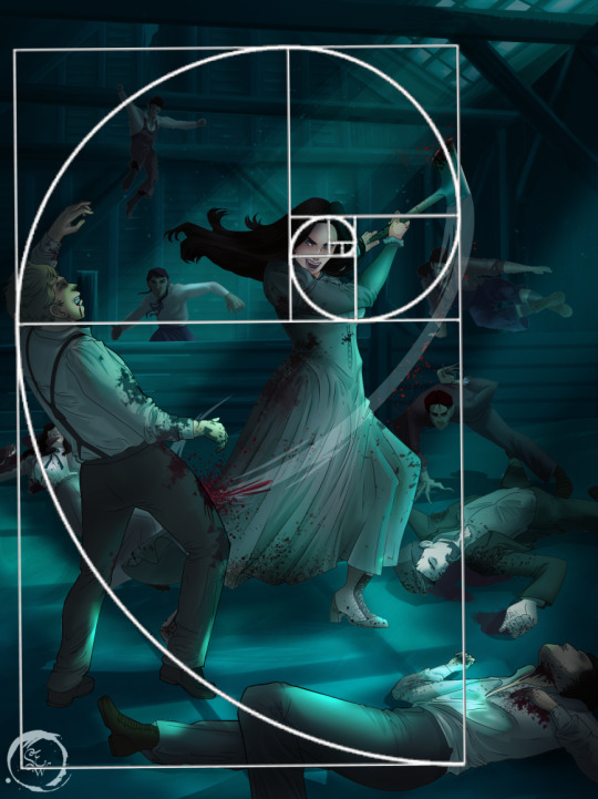
Doesn’t need to be perfectly on the spiral. You can break it- but its an excellent tool to plan how things move in the piece.
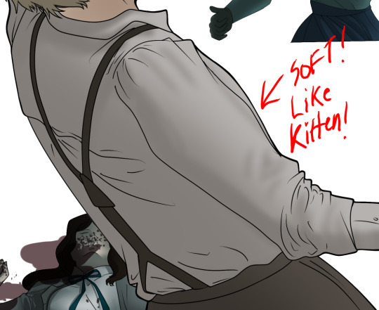
Step 4: Lineart
Once you got things sketched- its time to do the lineart. I’m using clip studio paint’s standard brushes. Nothing fancy. I often switch between the G-pen and the For Effect Liner. Mapping and Turnip are for thicker lines.

Usually I set these pens to a specific thickness depending on where I’m drawing.
My background figures are lined at 0.05 thickness, the midground is .1 to .2, Fina is .3 and the foreground is .4. I set my stabilization high to help keep my lines smooth. Stabilization 100 means there’s a significant delay between where the pen is and the cursor. I like the stabilization to be at 20 for freehanding and at 50 ish for outlining. Dont become completely reliant on the stabilization though. Good and smooth lineart is drawn from the arm not the wrist. Your range of motion is severely limited if you only move your wrist. Practice moving from your elbow and you’ll be surprised how much smoother your lines get.

Once I finish lining the figures, I usually go around it with an outline. This does three things:
1. Solidifies the figure and cleans lineart for paint bucket tool. More on that in the next step.
2. Its a stylistic choice. Helps give it that comic book feel with a heavy outline.
3. Pushes figures forward or back in the composition. Thicker outline helps denote that a figure is farther forward than another. My background figures have no outline to push them away
Step 5: Digitally coloring
For each figure you are going to select outside the lineart.
Create a new layer under the lineart
Invert the selection. Paint bucket. You should now have a solid shape of the figure under the lineart. Do not deselect.
Create a new layer above the one color. Title it solid colors. Paint in thick, solid tones. I like to use the mapping pen and turnip pen to color in my solid tones: skin, clothing, hair, etc.
After that, deselect. Create a multiply layer if you can. If your program does not have a multiplier function, Pick a tone you want to use for shadows and lower the opacity (usually 30-40% I like to use lavenders or blue tones). It will not be as vibrant, but you can edit it in post. Select off of the solid colors layer. I like to start with skin tones. Use the airbrush tool to create soft shadows. You don’t want to create harsh lines on this layer.
Then repeat this process with harsh lines.
Then knock it all back with an overlay. If you dont have the ability to create an overlay, you can again drop a solid color and lower the opacity, but you’ll have to mess with the color balance/ brightness/contrast to let all the hard work come through.
You’re going to repeat this for every single figure. Here’s a few color theory tips though.
Your overlay colors should be darker (not more vibrant) in the foreground and lighter (avoid using pure white) in the background. This helps with the depth of the piece. Things closer tend to be darker (not always true, depends on lighting)
You can choose to use color theory to aid your shadows. Instead of choosing black or grey for shadows, choose a complimentary color. I used a lot of green for this piece, I used red for really dark shadows. Its not that black drains color- its just loses some depth if not used carefully.
Keep your colors consistent. Helps unify the piece. You can strategically break the consistency to draw focus. For example, Fina is the only figure with a true blue overlay. This helps her stand out from the other figures who have reds and greens.
Step 6: Touch Ups and Final Renderings
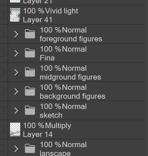
Now comes the most tedious part. If you’re like me, your computer fans have been whirring for the last few hours trying to render this monster of a file. If you havent already, SAVE FOR THE LOVE OF ALL THINGS GOOD

These are the last four layers I have for the entire piece. Here, I am trying to create effective and believable lighting. This kind of work I have only been able to achieve in clip studio or photoshop. You can do it with normal layers, but choose your colors CAREFULLY. Stay away from pure white. Carefully utilize your knowledge of light and shadow to create soft highlights. Harsh lines tend to be a stylistic choice for me. The final layer, subtract, dulls out harsh red tones. I used this as a final overlay to help put everyone and everything in the scene. Without it, things are a little too green and skin tones are a little too blushed for vampires.
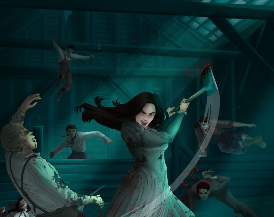
The challenge here is I want to tone down the red, but not lose the vibrancy of the blood. So, shift it to a blue. This also helped reinforce the “nighttime” effect. Its only a slight change.
Final thoughts:
Whenever you finish something, its important to reflect.
1. I am so FUCKING PROUD OF MYSELF. This is easily one of the most complicated pieces I’ve done in a while- and I’ve made 16′ tall faux stained glass. Brag. Let yourself feel awesome cuz you just made something awesome.
2. I timed myself on the piece. I could have easily spent another 7 hours on it. But its important to know when to stop messing with it. Partially for budget reasons but also when you get down to the details you can make yourself go insane. Theres also a ton of detail work I lost cuz of overlays or its just too small to notice. Fina’s face? hard to see cuz its not close enough.
3. I needed to take frequent breaks for this piece. That was good. Resting and stretching was very important. That is one of the reasons why I was able to work so fast.
4. I started doing more digital art in April 2020. I have to say, practice makes perfect. I practice drawing and digital painting for at least 3 hours a day.
That discipline has allowed me to improve so rapidly. So- I don’t wanna hear shit about I can’t possibly get this good! Or I couldn’t even draw a stick figure! BULLSHIT. You can. Get yourself some free software like Krita or Autodesk sketchbook and start playing!
And thats what I got! Thanks for coming with me on this long post!
27 notes
·
View notes
Text
Berserk: What went wrong?

Art by Kinzoshi.
Hello again, it’s a me.
If you haven’t guessed it by the title, this post will try to address some issues that Berserk supposedly suffers from. Because even though it is generally viewed as a masterpiece, some will find some recurring issue with it, whether it’s the pace, or the tone that has changed etc.And in light of the last chapters it seems relevant now more than ever to make such a post.
But how dare you criticize Berserk? It’s perfect!!
Hold your pitchforks, while I don’t think Berserk suffers too much from the same woes that are common to “lesser” titles, especially shounens, there are definitely some issues with it.My aim with this post is to address the most common complaints about Berserk (the manga not the anime,there’s no point talking about that tbh, it’s just bad) , and what imo are the challenges that face Miura now and in the future.
This post isn’t aimed to be a rant either, since I’ll try to be as unbiased as possible while adressing the issues that are brought up in this post.
I-The pace
So first thing first, we have to address the giant elephant in the room. The most common complaint about Berserk is the frequent and endless breaks. Though we could argue that ever since the announcement about the Berserk anime, we saw the manga resuming publication after it went through its longest hiatus period.
But Miura, knowing how he is, always takes a break, which is pretty much standard at this point, even when he commits to a schedule. So while that itself might be bad, the fans eventually got used to it, and don’t expect him to go for very long before he takes a break.
But that might have a much more significant impact on the manga itself. Namely the pace. And here I’m taking the last 4 chapters as an example.
While I don’t expect the Caska issue to be dealt with in one chapter, it definitely is that it felt a bit dragged out, and the break doesn’t help. Had there not been any break, we’d prolly would have been able to get to the heart of this matter, instead of having to wait till Winter to finally see the resolution to the Caska dilemma.
II- The tone
Many Berserk fans argue that the tone is much lighter now, ever since Guts decided to let go momentarily of his revenge to look for Caska. Some place the shift in tone much further down the road, around the time he acquired new companions, some of which are kids. In fact many outright blame the kids and Miura’s supposed wish to make the manga more kid friendly.
While it’s true that the tone is a bit more lighter now, due to the fact that Guts isn’t a raging lone wolf only obsessed with killing apostles as part of his revenge...I don’t actually think that the kids are to blame, or Miura is trying to make this into a kid friendly manga (as if), not even one bit.
Because there’s still some pretty gruesome things happening, even as Schierke and co got introduced. In fact quite a few of them witnessed those horrors, with the trolls and whatnot. And the tone was definitely darker on Ganishka’s side, who used women for his experiments on the daka and the man made behelit. There’s still a good amount of violence in the manga, especially towards women, but somehow we also saw the introduction of strong female characters (Schierke, Flora, Farnese after reformation,Sonia etc) who counterbalance that, and they definitely act less like damsels in distress.
And on top of that, the tone can get quite dark, as seen in the latest chapter. While it is to be expected since it’s Caska’s dream, Miura didn’t shy away from representing her anxieties in their full glory, and he went even the extra mile to portray them without the usual shading that pretty much censored genitalia in the past.
So all the dark and edgy stuff is just around the corner, and if the tone feels lighter it’s just because Guts isn’t acting like a beast anymore, and actually has companions he cares for and relies on. And even he is aware that it might not last forever.
III- The quality of storytelling
This one will be short, because it’s tied to the previous point. Basically some argue that the storytelling isn’t as great, because the tone has changed. I absolutely cannot agree. Miura is still a great storyteller, and if you believe that violence and gore are what make a good story, or just Berserk, then you prolly shouldn’t be reading it in the first place. Imo that is completely missing the point, Berserk is great because of the characters and the story that is carefully crafted, and Miura is a genius since he can make all the loose ends meet. Which is more than I can say for other authors.
Even if we take a scene as average as a bunch of men drinking alcohol while watching the cherry blossoms, Miura manages to make such a scene super interesting, by giving us access to the characters inner thoughts.
My only gripe with the story is when it becomes too big in scale, and when it’s not centered on the characters themselves. That is particularily true for Griffith’s side, not so much Guts. Guts’ journey is closely related to his own personal struggle, whereas I feel that with Griffith there’s some grand scheme that he plays a role in. It’s not just about his own wish, but what fate has dictated for him.
IV- The art
Ouch now that’s gonna hurt.As much as I don’t agree that the quality of storytelling has decreased, I can’t help but find that the art has been affected quite significantly.
Now to be fair Miura’s art is always changing and evolving. Miura seems to like to experiment with his art, and we saw the art go from a not so great place in the early volumes up to volume 13-14, then become really good if not amazing in the volumes 16-17 which are my favorite period of Miura’s art. Miura even tried to be draw his characters in a more realistic fashion, around Griffith’s rebirth, and the art just got even better and bigger in scale, to the point that it becomes hard to believe it’s just a drawing, and not one of Gustave Doré’s prints..
At any rate, Berserk features some of the best art in the manga industry, and beyond imo. However there is a clear downside to that, it is time consuming, and prolly even tiring. And as Miura gets older, that task won’t get easier. So simplifying his art is inevitable, and I’m surprised it didn’t happen sooner.
But more than just simplifying his art, Miura made a gamble of sorts, by switching to digital. Many still try to argue that he hasn’t, but if you compare his illustrations in the Grunbeld novel, to the last chapter for example, it becomes clear that Miura uses digital techniques to add some effects to his lineart. Mainly atmospheric effects (fog, light etc).
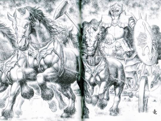
Credits to Ryu Osaka on Facebook
So there’s some clear difference between Miura’s traditional ink and pen art, and the more recent art featured on the manga that also uses digital techniques to do the backgrounds mostly. And while that’s not bad in itself, you can tell that Miura hasn’t quite mastered digital art. So he has a long way to go before seeing the same quality as his traditional art, if not ever.
I’ll admit I’m a bit biased towards that, because traditional art is more challenging, and time consuming, while digital art and the different softwares it uses are much more practical, and allow you to easily edit your drawing and not worry too much about the placement of the lines or colors for example.So I pretty much hold traditional art in a pedestal, and Miura’s traditional art is simply one of the best I witnessed, period.
So I definitely do see the change in the art direction if you will, and I’m not too happy about it. But I chalk it up to Miura or his assistants not being too familiarized or good at it yet.Things might improve once they get the hang of it, and learn how to make the traditional and digital art blend well together.
Conclusion
So to conclude, I would say that Berserk has overall a few challenges, mainly the pace and the art. The manga would greatly benefit from having a much more consistent release schedule as well as a better pace. The art is still a work in progress I guess, and either way it wouldn’t prevent me or others from reading the manga. We just invested so much time in it, but as someone who has an artistic background it definitely is something that catches my eye and it’s interesting to see where Miura’s art goes from here.
But I definitely think that the manga is doing good overall, there hasn’t been a significant decline in quality, especially when it comes to storytelling. The tone might have changed a bit, but I definitely see it as something that isn’t written in stone, and things could get dark again. And either way Miura still has a boner for drawing dick monsters.So it’s still as edgy as it used to be, just not as much as in your face as in the past.
Hope you liked this analysis. And don’t forget this only reflects my opinion, not two people will share the same views.
5 notes
·
View notes
Last Seen Blogs


tremendousbanditcolorherring
Untitled

eladithas
my main is @dreamofyouandi go there :)

prediksihongkong
Prediksi Hongkong

atror173
atror_173