#from black and white to colorful background
Text
Figayda . (STANDING OVATION FROM CROWD
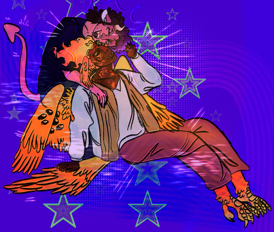
[ID: A Digital drawing of Fig Faeth and Ayda Auegfort. Fig faeth is a half-tiefling with red skin, an arrow pointed tail, red pointed ears, dark brown hair with purple streaks, tan horns, and facial hair. Fig wears a black shirt, black pants, a nose ring, and eyebrow piercings. Fig has her eyes shut as she smiles wide, pressing her face against Ayda's with her arms on each of her shoulders. Ayda is a half-Pheonix with dark skin, Multiple eyes with black sclera and red iris with two on her face wings and multiple on her back wings, small red and orange feathers that cover her face and neck, tall fire-like hair, orange nails, bird-like feet, and red and orange wings that sprout from her back. Ayda is wearing a white long sleeved button-down shirt, a tan scarf drapped around her shoulders, and brown pants. Ayda is sitting down against Fig's legs. She brings a hand up to caress Fig's head as she nuzzles into her. Ayda is smiling and looking up at Fig as she does. The background is dark purple, with many brightly colored green stars and bright purple textures. /end ID]
#fh#fhjy#fantasy high#fantasy high junior year#fhsy#fantasy high sophomore year#dimension 20#d20 fanart#dimension 20 fanart#figayda#fig faeth#figueroth faeth#fig fantasy high#ayda aguefort#ayda fantasy high#fig x ayda#my art.#idk what else to add their cute i miss then etc etc
168 notes
·
View notes
Text
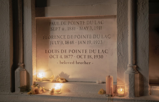
ldpdl, ethnicity, and the false monolith of blackness
there's this false tendency to think amc louis being made black is pandering, or a means of removing louis from his oh-so-detailed /sarcasm/ background in the books. i also find that people tend to not even understand what show louis's ethnic background is, despite rolin jones the showrunner and even the fictional louis both coalescing around this multigenerational explanation of the gens de couleur in new orleans, and how jim crow disempowered them.
I came around to his ethnicity a sort of interesting way which is through Lestat. [ … ] I was like lets give him a legitimate a third attempt at figuring how to be with somebody for the rest of his life and how to not repeat your mistakes. [ … ] I started from there so it had to be someone with some money cause he had to be with his own folks and I thought he wanted someone who could fight back and who could be a challenge and would force him to restrain himself. And nobody at AMC was interested in 7 seasons of the regretful plantation owner, so we made Louis come from a lineage that did have a plantation and did own slaves.
rolin jones in the s1 post-finale episode of the podcast names how he came to this understanding of louis's character. lestat, after failing to make a bride of his mother, and a concubine of nicki, was seeking for someone of a similar background, or the most approximate equivalent. he would not have been interested in louis if louis was an anglophone baptist black man descended from upper-south arrivals into new orleans, nor would he have been interested in louis if louis was a poor black creole honestly s1 does not give a good reading of claudia's ethnic bg in new orleans, but since she cannot understand french, we can presume shes either a poor creole removed from her cultural background with her vampiric adoption narrative in mind, or was also of an anglophone baptist black background like claudia was. louis coming from this fallen sort of gentry, the free gens de couleur, similar to that of the tvl lestat who came from this barren aristocracy dating back to the crusades, was key to lestat's long-term goals with louis.
Capital accrued from plantations of sugar and the blood of men who looked like my great grandfather but did not have his standing. But then decades of Jim Crow and the electrified light of a new century had vanquished any idea of a free man of color. - AMC IWTV 1x01
louis was of the first generations of the gens de couleur to be born, raised into, and face the institutional and personal ramifications of being viewed as black in america. this fuels much of the character's rage as he moves through storyville, trying to continue the similar modality of exploitation to the contrary of pretty baby with brooke shields, majority of the brothel circuit was statistically black girls + women being sexually pawned off to white men but ultimately failing to do so bc of the anglophone white american class that now rules over him. [tom anderson, alderman fenwick, finn o’shea starting out as louis’s subordinate then ending w/ him entering whiteness by having a sporting house throwing torches at louis’s brothel in s1e3]
By 1850, the free population of color, beset by the hostility of white supremacy, was economically diminished and residentially segregated. The Americanization of Louisiana, and in particular New Orleans, was completed before the state became the sixth to secede from the Union in 1861 in the struggle over the perpetuation of slavery. [link]
The Democratic redeemers who came to power in 1877 lost no time in redefining the Negro's "place" in Louisiana life. They immediately restored the color line in the New Orleans public schools and offered silent support to de facto segregation practices in places of public accommodation. With the assistance of two landmark decisions by the United States Supreme Court, the redeemers soon dismantled the egalitarian legal apparatus put together piece by piece under the Radicals. Finally in 1890 they began to write their "final solution" into Louisiana law with a series of "separate but equal" statutes. Soon New Orleans Negroes were again segregated in virtually every public pursuit. [link]
138 notes
·
View notes
Text


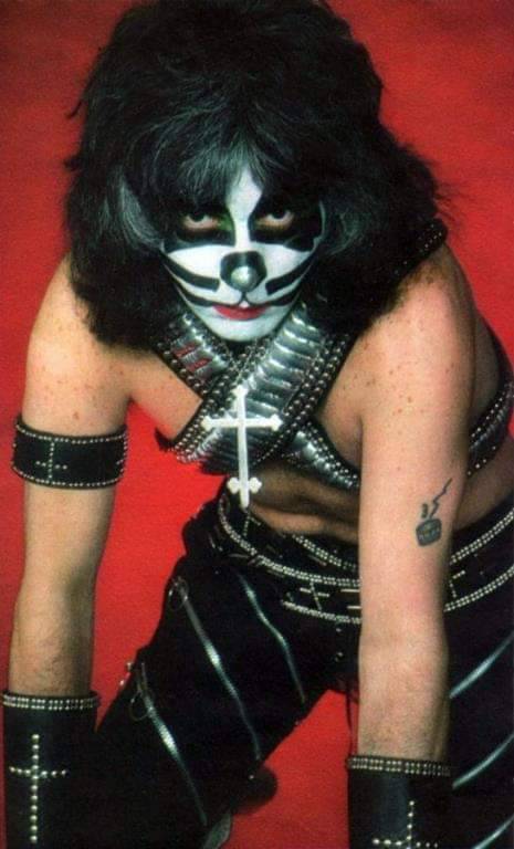

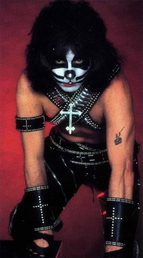
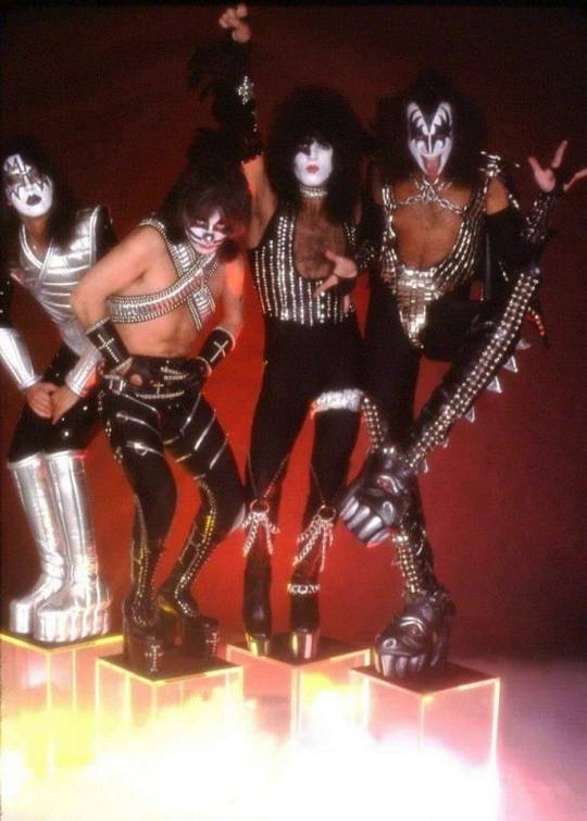


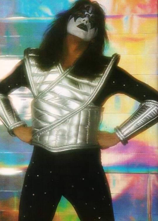

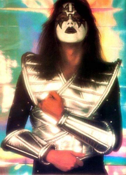

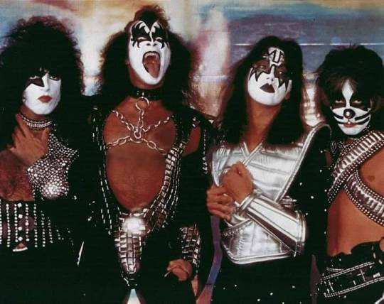
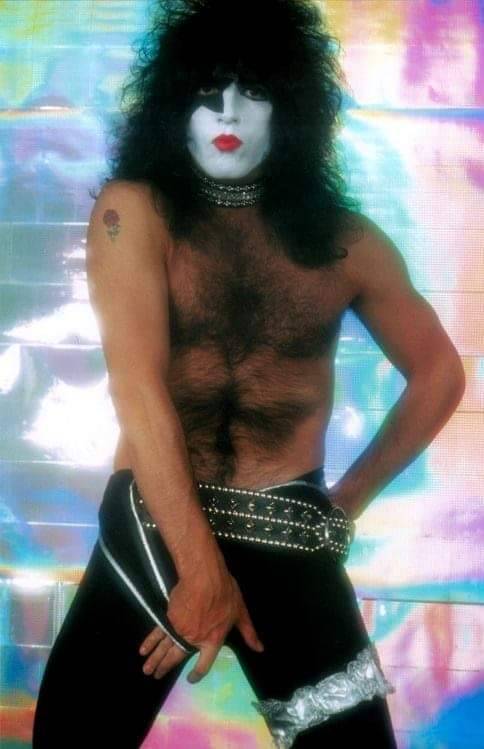

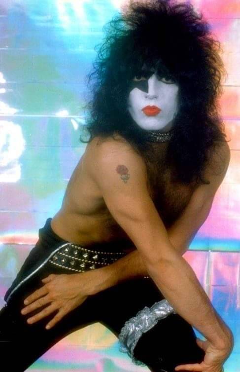

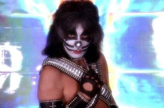
April 28, 1977
Love Gun Photo Sessions
Barry Levine’s Studio - Los Angeles, California
📸 Barry Levine
"We experimented a lot with everything. That’s how the series with the wildly multicolored, shimmering mylar background happened. It was 1977 and we had to do a Love Gun promotional shoot. I set it up in my studio and I wanted to get a series with different colors in the background because we had been using a lot of blacks and greys up to that point. I got these colored mylar sheets and reflected some plain white light from them, sometimes adding just a little bit of blue gel to the mix. I pulled the light a little out of focus because the patterns on the sheets were very odd, and I wanted to get really vibrant colors and images from the mylar. These shots appeared on magazines and newspapers all over the place. Some mylar shots, as well as other images I photographed, were included on the cover of KIϟϟ’ World Tour 77-78 program. If you look really carefully, you can tell that those same shots were the photo models for the gatefold etchings inside Double Platinum, as well as the solo album covers, although we didn’t have either of those projects in mind when we decided to shoot that day
Although I had shot many bands before KIϟϟ, I knew the second they stepped into my studio, they were in a class by themselves. Techniques that worked with other bands, didn’t fly with KISS. And the difference in style between individual members was vast. I quickly became familiar with their distinct personalities and became adept at pulling certain traits out of each of them as needed. When they’re onstage, they simply metamorphosize into their unique band personas, but in the studio, it was up to me to pull a Demon, a Spaceman, a Lover and a Cat out of the four guys who showed up. They all knew how to capture their onstage personas, but sometimes I had to go the extra mile to get just the right facial expression or stance.” - Barry Levine
KIϟϟ’ new costumes (Love Gun) were constructed by Maria Contessa and Laurie Greenan, and the band traveled with three of each of the outfits while on tour. Gene and Ace used slightly altered versions of the original design for touring purposes. The total cost for the new production, including the new stage, costumes and instruments, was $194,910, although the show was hyped as a million-dollar production in most markets.
#kisstory#kiss#1977#love gun#ace frehley#peter criss#paul stanley#gene simmons#the spaceman#the starchild#the catman#the demon#kiss the band#kiss band#kiss army
28 notes
·
View notes
Text
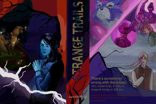
my piece for ssoblr big bang 2024! i'm very happy to share with everyone ! I worked with @northberg with their accompanying fic, strange trails, which is on ao3! please read it it's wondrous and amazing i really cannot sing enough praises for it ! i tried my best to reflect its energy as much as possible in this cover <3
alt text under cut
[ID: digital art: a faux book jacket cover of star stable online characters
on the left/the cover: tincan is standing 3/4 away from the viewer. fireflies surround him, illuminating the hollow woods behind him. some of the grass is visible and large roots are illuminated on the ground. this scene is in the shape of a moth.
above the moth shape is a spiky tree, framing the top part of the cover in red/orange. underneath the tree, the background fades from a indigo blue scene of a lake to alex, who is a teal blue and seems to be recoiling. white lightning flashes over her.
the center/spine: the title text "STRANGE TRAILS" with the font noto sans myanmar. the text is a lime green, with a streak of teal running through it, before shifting to a light purple. the background is a dark purple before transitioning to a red. black branches emerge out of the sides, obscuring some of the text/background color. at the bottom are small thin branches, growing vertically, with the author's name northberg being overlayed on top.
the right/back-cover: on the top-left is fripp and elizabeth, who is more of glowing silhouette. the background is pink and they are diagonally separated from the other characters on the right. on the top right is linda, lisa, and maya; linda and lisa are pink and look distressed, with linda casting a spell with a book in her hand, while maya is in natural colors and looks relaxed. ydris in pink is beside them; he is framed in a circle, looks mischievous, and has his hand tucked under his chin. beneath them is anne in a grey beach scene. anne has a solemn expression with her left hand over her chest. thin branches grow out to her left before transitioning to the text to the summary at the bottom of the image. the text is in lime green and the background is indigo and purple. the summary text: "There's something wrong with the island. Alex could help, if only it stopped trying to kill her." below is the credits: "written by northberg on tumblr and archiveofourown illustrated by winterlleaves on tumblr part of ssoblr big bang" /end ID]
31 notes
·
View notes
Text
MY TOUCH STARVED BABY

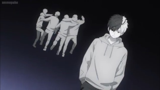

Image 1: A screenshot of an anime. A close up of someone bandaging up another person's ankle as they stand on sidewalk in black sneakers. The subtitles read: "It's been nothing but stuff like this since I came to this town."
Image 2: A young man with their hair split into two colors: black on the right and white on the left in a light colored hoodie. One eye is also lighter than another. They are somber, their head down as they walk away from a group in close contact, their arms around each other's shoulders. The background is a black to blue gradient and the characters are in grayscale.
Image 3: Subtitles cropped from a show. They read: "The human body is a lot warmer than I thought."
End ID.
21 notes
·
View notes
Text
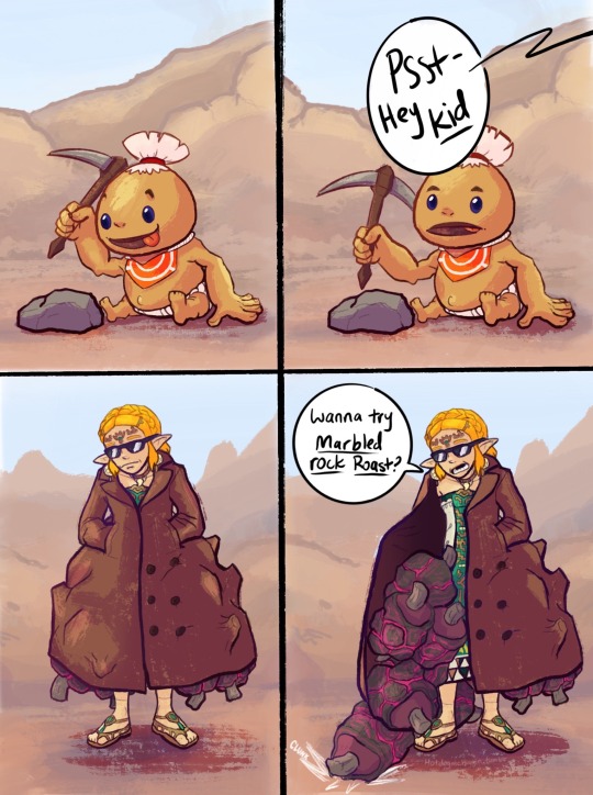
I guess DARE wasn’t a thing in Goron City
#saw someone call zelda the gorons drug dealer and I couldnt get the image of her in a trenchcoat peddling marbled rock roast to children#like one of those shady guys selling wristwatches in cartoons out of my head#anyway that’s where this came from#trying to figure out comics and shit. not my strong suit so sorry if its rough.#figuring out an optimal level of detail is hard :( first I’m like oh i’ll just leave it black and white and then i’m like maybe ill add#color and then i’m like well now it needs shading and THEN it needs lighting and THEN IT NEEDS A BACKGROUND AND THEN IT NEE#anyway i should. probably stop rambling bye#loz#tears of the kingdom#totk#totk spoilers#i mean sorta. not huge spoilers. slight spoilers for goron arc I guess#zelda#myart
6K notes
·
View notes
Text
Back to talking about the Fantasy Fandom and the racism that tends to be part of it!
I genuinely think if Wyll were white he'd get way more attention and love. He'd have sparkle flower crown edits saying "My sweet cornball!!" "My boys got daddy issues!!". Also Warlock is a class beloved by many. And as someone who plays a warlock in bg3 having two of them fucking ROCKED, I always had spells at the ready. So really saying "buh! buh! two warlocks is just bad!" its really not, short rests and cantrips out the asshole really make it easy.
Anyway.
If Gale were black he would be fully ignored and people would, in masses, complain about how annoying he is, how useless he is, how he doesn't really fit in with the rest of the "way more interesting cast". How he's so unbearably straight because all he talks about is his ex.
Lemme keep on this though because if Shadowheart was a Black Person she would have been fucking Crucified for the way she talks about other races, other religions, and just in general the way you have to pull information out of her like pulling teeth. Also if she were a black woman she'd be reduced to "uncaring boss bitch who "dont need no man"" or "unbarable bitch who needs to be Killed"
Am I getting my point across enough?
Wyll was shafted by the game by having literally less content than the rest of the party. Wyll DOES have an interesting story. Wyll is also corny, he's funny, he's so sweet, and his conversations with Karlach are soooo great and yet it's all abandoned because he's generally viewed as "boring".
And by the way. You are allowed to like and dislike characters. But I see a lot of people side stepping the Fantasy Racism to say "but hes just boring thats why I dont like him". Like sure, if you gave Wyll an honest chance and still found him boring then that's your opinion and choice! HOWEVER!! We CANNOT ignore that he is being LEFT OUT of edits, of fan art, of character discussions. When I see posts that are the entire cast MINUS Wyll it tells me everything I need to know about you.
Also one last thing... I cannot imagine being Wyll's VA and seeing how many times you are being left out on purpose. How so few add your character to edits, or fan art. It has to be crushing to some extent, even if you expected it.
#bg3#bg3 wyll#the color of a characters skin seems to be the measurement of love and interest for the fandom#i genuinely do not understand why people also shove him into “token straight cop” HES LITERALLY NOT.#as a black person it makes my heart ache for the fact he would be absolutely ADORED if he were a fucking white boy#the way people would swoon for him and his cornyness - or explore his background with his pact#feel free to add to this anyway youd like but if you comment BUT HES BORING im going to spear you like an angry caveman#also this is coming from seeing the fucking new wave of hate for a new castlevania black vampire#sure sure you can believe a fantasy world full of magic and creatures but BLACK is where the line is drawn like bffr
222 notes
·
View notes
Text
glad to see ppl are appreciating and/or enjoying the gay and trans aspects of nimona's story but ngl i kinda want to see more ppl acknowledge and/or discussing the fact that both of the leading men are asian and how that is relevant to overall message of this movie actually
#idk this just me but so far i have seen like zero posts on my tl discussing how ballister and ambrosius#being men of color further enhances the movie's narrative and the intersectionality that comes w it#yeah despite ambrosius and ballister both being asian they're still of different backgrounds#ambrosius is east asian while ballister is south asian#how part of their designs are meant take after their respective voice actors#the fact that in the story ballister grew up poor and queen who decided to take uplift him was a black woman#that ballister had to train twice hard be twice good than other knights bc for him he had be anything but exceptional#and then we could talk abt how w ambrosius sm emphasis is put on the fact that he's a descendant of gloreth (a white woman) as an asian man#idk man i just think more ppl should be taking note of the decision to change#these two from originally being white men to asian men in this adaption and how that is significant actually#nimona#robi rambles
44 notes
·
View notes
Text
So I unboxed Ying Zhou (my phone once again going “girl no. please don’t make dick jokes” by refusing to record another cursed video at all xD) and he’s really pretty! Buuut I feel like i overestimated the 5 cm difference in height he has with Xie Lian because i have 0 spatial reasoning and forgot that that’s only like...2 inches. Oh well. With the bookshelf I have for display, they’ll be on separate shelves so hopefully that won’t matter xD
The urge to make Hamlet style “alas, poor Yorrick jokes” is strong (my phone probably also saving me from recording any of those for posterity in refusing to record xD)

I will be modding his ears to be pointy, but I need to decide if I’m going to dye him first, since the apoxie sculpt will take dye differently than the resin and i can just color match that with paint and pastels. I think the listing says he takes 16mm eyes, but I kind of feel like 14 might be a better fit, so I’m going to make some of that size and see what i like better.
On the plus side, the extra dicks he came with can be used for testing dye baths if i do decide to dye him, since other than finding them hilarious, i have no use for them xD
#quill's bjd adventures#dollbei jun#featuring my thematically appropriate woflbei socks from silice b on etsy in the background xD#seriously why DO dolls this size come with so many interchangeable dicks?#like...doll companies please explain why this is necessary xD#i need to get some of the chocolate colored rit dyemore for the formulas that looked promising but the local joanns was out#part of me though feels like maybe the white won't be so stark once he's painted (why i ordered white in the first place tbh)#but i am once again being fickle#also he's an ice demon sooo...if he's super pale it fits? (also part of why i ordered white in the first place)#but he'll have really dakr hair and i don't want him to look dead :/ decisions decisions#i also realized i could probably give him fangies too with the sculpt but i'm not sure about it xD#on the one hand demon fangies. on the other he's not a vampire and it might diminish the rbf some if his fangs are too big for his mouth lma#the hands are also really nicely sculpted and have longer nails which solved my conundrum of whether to give him claws or not#they're not pointy like claws but do extend past his finger tips so i think i'll just paint them black or very dark blue#instead of trying to give him a manicure with uv resin xD
4 notes
·
View notes
Text
Writing tips for long fics that helped me that no one asked for.
1.) Don't actually delete content from your WIP unless it is minor editing - instead cut it and put it in a secondary document. If you're omitting paragraphs of content, dialog, a whole scene you might find a better place for it later and having it readily available can really save time. Sometimes your idea was fantastic, but it just wasn't in the right spot.
2.) Stuck with wording the action? Just write the dialog then revisit it later.
3.) Stuck on the whole scene? Skip it and write the next one.
4.) Write on literally any other color than a white background. It just works. (I use black)
5.) If you have a beta, while they are beta-ing have them read your fic out loud. Yes, I know a lot of betas/writers do not have the luxury of face-timing or have the opportunity to do this due to time constraints etc but reading your fic out loud can catch some very awkward phrasing that otherwise might be missed. If you don't have a beta, you read it out loud to yourself. Throw some passion into your dialog, you might find a better way to word it if it sounds stuffy or weird.
6.) The moment you have an idea, write it down. If you don't have paper or a pen, EMAIL it to yourself or put it in a draft etc etc. I have sent myself dozens of ideas while laying down before sleep that I 10/10 forgot the next morning but had emailed them to myself and got to implement them.
7.) Remember - hits/likes/kudos/comments are not reflective of the quality of your fic or your ability to write. Most people just don't comment - even if they say they do, they don't, even if they preach all day about commenting, they don't, even if they are a very popular blog that passionately reminds people to comment - they don't comment (I know this personally). Even if your fic brought tears to their eyes and it haunted them for weeks and they printed it out and sent it to their friends they just don't comment. You just have to accept it. That being said - comment on the fic you're reading now, just do it, if you're 'shy' and that's why you don't comment the more you comment the better you'll get at it. Just do it.
8.) Remove unrealistic daily word count goals from your routine. I've seen people stress 1500 - 2000 words a day and if they don't reach that they feel like a failure and they get discouraged. This is ridiculous. Write when you can, but remove absurd goals. My average is 500 words a day in combination with a 40 hour a week job and I have written over 200k words from 2022-2023.
9.) There are dozens of ways to do an outline from precise analytical deconstruction that goes scene by scene to the minimalist bullet point list - it doesn't matter which one you use just have some sort of direction. A partial outline is better than no outline.
10.) Write for yourself, not for others. Write the fic you know no one is going to read. Write the fic that sounds ridiculous. You will be so happy you put it out in the world and there will be people who will be glad it exists.
22K notes
·
View notes
Text
the most struggling part being a multimedia person for my uni's esports club is when i need to include the elements of gaming in every posters....i mean the posters for festives celebration like christmas for this month
#yup i'm currently trying to design for the christmas poster#and yet the only thing matters the most is how i need to include any elements related to esports and gaming into the poster#well i already put a winter scenery from genshin as a background#and do some coloring on it to fit on our official color code for this session#which is shocking blue and black also white as well#and yeah since that shade of blue is too bright to become a backgroud color#so that's why i toned down a bit into a darker version of that shade#and yeah....that's the only thing that i can design for today#and now i need to figure out what kinds of gaming related elements that i can include to my design rn 🫠🫠#iz and her maroon uni life#iz and her multimedia shit#<< yup new tag alert....for me dumping all the stuffs about my multimedia work rn lmaooooooo#iz being too random
1 note
·
View note
Photo
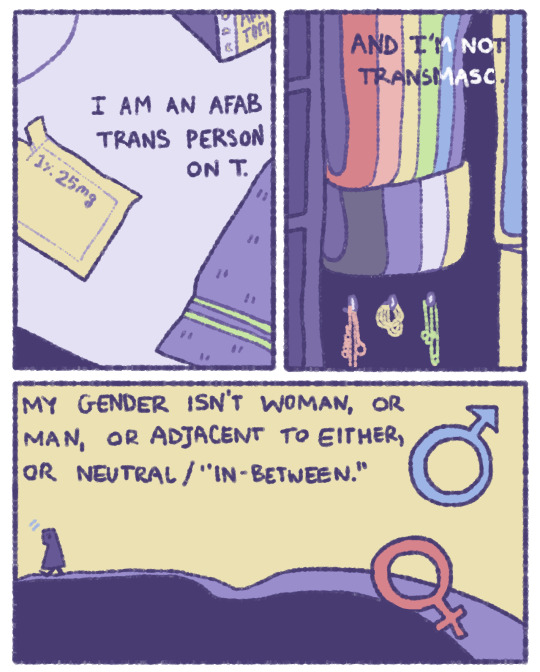

Here is a little comic I made about some thoughts I’ve been having recently. I don’t ID as transmasc, and I have noticed that since I’m nonbinary and AFAB, some people in queer circles (online and irl) label me as transmasc! This has increased since I started T. Much love to my transmasc siblings, but I don’t identify with that term, and it misgenders me.
I figured if there’s not a lot of acknowledgement or discussion about non-transmasc and non-transfem people who physically transition, I can make some myself :)
Thank you to @/rjalker for the ID below!
[ID: A nine panel comic, done is low-saturated colors, mostly featuring soft yellow and shades of blue and purple.
Panel 1 reads, "I am an AFAB trans person on T." showing a surface with a towel, and an open packet that reads, "1% 25mg".
Panel 2 continues: "And I'm not transmasc." and shows a rainbow flag, and a nonbinary flag hanging above some jewelry.
Panel 3 shows a person walking on a hill, the sky pale yellow and the ground in shades of blue. It reads, "My gender isn't woman, or man, or adjacent to either, or neutra/ 'in-between'." The venus and mars symbols float in the air, in red and blue.
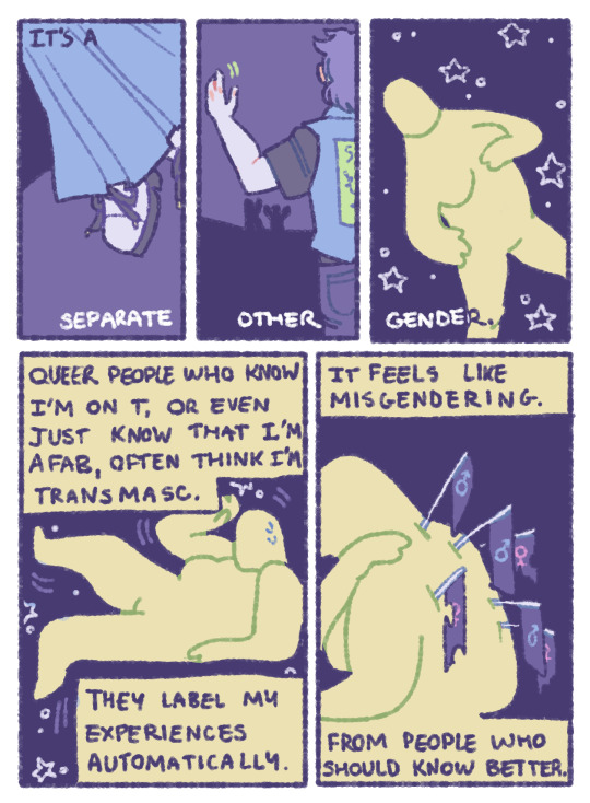
Panel's 4, 5, and 6 read, "It's a separate, other, gender." Showing shoes worn under a light blue skirt, a person wearing a shirt, jeans, and vest waving, and a person without clothes floating among stars.
Panel 7 reads, "Queer people who know I'm on T, or even just know that I'm AFAB, often think I'm transmasc." "They label my experiences automatucally." The same person from before is shown between the two sentences, sweating nervously as though being trapped.
Panel 8 reads, "It feels like misgendering. From people who should know better." The person is shown sittign facing away from the camera, head bowed, lifting one arm across zir shoulder, where half a dozen flags have been stabbed into zir back like arrows, all dark blue, and marked with either the blue mars, or pink venus symbol.
Panel 9 reads, "'Masculinizing' HRT doesn't mean I'm transmasc." Next to a small picture of the person smiling away from the camera, wearing blue glasses, with stubble on zir chin. The next small image is of the chemical symbols for testosterone, with text next to it that reads, "It doesn't mean my gender is male, or male-adjacent." Followed by another small picture of the person, smiling with hearts next to zir face, wearing the nonbinary pride flag like a blanket or cape.
The yellow background fades downward into the nonbinary flag, with stripes of yellow, white, purple, and black, here with the purple and black in shades of blue. The text reads, above a final drawing of the person, wearing a pink sweater and a blue skirt, smiling up at the camera and surrounded by small sparkles, "It just means I'm a nonbinary, genderqueer person who is becoming more like zirself. And that just happens to involve HRT!" with a smiley face emoji at the end.
End ID.]
#nonbinary#genderqueer#transitioning#hrt#artists on tumblr#nonbinary artists#digital art#original art#comic#autobiographical
32K notes
·
View notes
Note
Why reblog machine-generated art?
When I was ten years old I took a photography class where we developed black and white photos by projecting light on papers bathed in chemicals. If we wanted to change something in the image, we had to go through a gradual, arduous process called dodging and burning.
When I was fifteen years old I used photoshop for the first time, and I remember clicking on the clone tool or the blur tool and feeling like I was cheating.
When I was twenty eight I got my first smartphone. The phone could edit photos. A few taps with my thumb were enough to apply filters and change contrast and even spot correct. I was holding in my hand something more powerful than the huge light machines I'd first used to edit images.
When I was thirty six, just a few weeks ago, I took a photo class that used Lightroom Classic and again, it felt like cheating. It made me really understand how much the color profiles of popular web images I'd been seeing for years had been pumped and tweaked and layered with local edits to make something that, to my eyes, didn't much resemble photography. To me, photography is light on paper. It's what you capture in the lens. It's not automatic skin smoothing and a local filter to boost the sky. This reminded me a lot more of the photomanipulations my friend used to make on deviantart; layered things with unnatural colors that put wings on buildings or turned an eye into a swimming pool. It didn't remake the images to that extent, obviously, but it tipped into the uncanny valley. More real than real, more saturated more sharp and more present than the actual world my lens saw. And that was before I found the AI assisted filters and the tool that would identify the whole sky for you, picking pieces of it out from between leaves.
You know, it's funny, when people talk about artists who might lose their jobs to AI they don't talk about the people who have already had to move on from their photo editing work because of technology. You used to be able to get paid for basic photo manipulation, you know? If you were quick with a lasso or skilled with masks you could get a pretty decent chunk of change by pulling subjects out of backgrounds for family holiday cards or isolating the pies on the menu for a mom and pop. Not a lot, but enough to help. But, of course, you can just do that on your phone now. There's no need to pay a human for it, even if they might do a better job or be more considerate toward the aesthetic of an image.
And they certainly don't talk about all the development labs that went away, or the way that you could have trained to be a studio photographer if you wanted to take good photos of your family to hang on the walls and that digital photography allowed in a parade of amateurs who can make dozens of iterations of the same bad photo until they hit on a good one by sheer volume and luck; if you want to be a good photographer everyone can do that why didn't you train for it and spend a long time taking photos on film and being okay with bad photography don't you know that digital photography drove thousands of people out of their jobs.
My dad told me that he plays with AI the other day. He hosts a movie podcast and he puts up thumbnails for the downloads. In the past, he'd just take a screengrab from the film. Now he tells the Bing AI to make him little vignettes. A cowboy running away from a rhino, a dragon arm-wrestling a teddy bear. That kind of thing. Usually based on a joke that was made on the show, or about the subject of the film and an interest of the guest.
People talk about "well AI art doesn't allow people to create things, people were already able to create things, if they wanted to create things they should learn to create things." Not everyone wants to make good art that's creative. Even fewer people want to put the effort into making bad art for something that they aren't passionate about. Some people want filler to go on the cover of their youtube video. My dad isn't going to learn to draw, and as the person who he used to ask to photoshop him as Ant-Man because he certainly couldn't pay anyone for that kind of thing, I think this is a great use case for AI art. This senior citizen isn't going to start cartooning and at two recordings a week with a one-day editing turnaround he doesn't even really have the time for something like a Fiverr commission. This is a great use of AI art, actually.
I also know an artist who is going Hog Fucking Wild creating AI art of their blorbos. They're genuinely an incredibly talented artist who happens to want to see their niche interest represented visually without having to draw it all themself. They're posting the funny and good results to a small circle of mutuals on socials with clear information about the source of the images; they aren't trying to sell any of the images, they're basically using them as inserts for custom memes. Who is harmed by this person saying "i would like to see my blorbo lasciviously eating an ice cream cone in the is this a pigeon meme"?
The way I use machine-generated art, as an artist, is to proof things. Can I get an explosion to look like this. What would a wall of dead computer monitors look like. Would a ballerina leaping over the grand canyon look cool? Sometimes I use AI art to generate copyright free objects that I can snip for a collage. A lot of the time I use it to generate ideas. I start naming random things and seeing what it shows me and I start getting inspired. I can ask CrAIon for pose reference, I can ask it to show me the interior of spaces from a specific angle.
I profoundly dislike the antipathy that tumblr has for AI art. I understand if people don't want their art used in training pools. I understand if people don't want AI trained on their art to mimic their style. You should absolutely use those tools that poison datasets if you don't want your art included in AI training. I think that's an incredibly appropriate action to take as an artist who doesn't want AI learning from your work.
However I'm pretty fucking aggressively opposed to copyright and most of the "solid" arguments against AI art come down to "the AIs viewed and learned from people's copyrighted artwork and therefore AI is theft rather than fair use" and that's a losing argument for me. In. Like. A lot of ways. Primarily because it is saying that not only is copying someone's art theft, it is saying that looking at and learning from someone's art can be defined as theft rather than fair use.
Also because it's just patently untrue.
But that doesn't really answer your question. Why reblog machine-generated art? Because I liked that piece of art.
It was made by a machine that had looked at billions of images - some copyrighted, some not, some new, some old, some interesting, many boring - and guided by a human and I liked it. It was pretty. It communicated something to me. I looked at an image a machine made - an artificial picture, a total construct, something with no intrinsic meaning - and I felt a sense of quiet and loss and nostalgia. I looked at a collection of automatically arranged pixels and tasted salt and smelled the humidity in the air.
I liked it.
I don't think that all AI art is ugly. I don't think that AI art is all soulless (i actually think that 'having soul' is a bizarre descriptor for art and that lacking soul is an equally bizarre criticism). I don't think that AI art is bad for artists. I think the problem that people have with AI art is capitalism and I don't think that's a problem that can really be laid at the feet of people curating an aesthetic AI art blog on tumblr.
Machine learning isn't the fucking problem the problem is massive corporations have been trying hard not to pay artists for as long as massive corporations have existed (isn't that a b-plot in the shape of water? the neighbor who draws ads gets pushed out of his job by product photography? did you know that as recently as ten years ago NewEgg had in-house photographers who would take pictures of the products so users wouldn't have to rely on the manufacturer photos? I want you to guess what killed that job and I'll give you a hint: it wasn't AI)
Am I putting a human out of a job because I reblogged an AI-generated "photo" of curtains waving in the pale green waters of an imaginary beach? Who would have taken this photo of a place that doesn't exist? Who would have painted this hypersurrealistic image? What meaning would it have had if they had painted it or would it have just been for the aesthetic? Would someone have paid for it or would it be like so many of the things that artists on this site have spent dozens of hours on only to get no attention or value for their work?
My worst ratio of hours to notes is an 8-page hand-drawn detailed ink comic about getting assaulted at a concert and the complicated feelings that evoked that took me weeks of daily drawing after work with something like 54 notes after 8 years; should I be offended if something generated from a prompt has more notes than me? What does that actually get the blogger? Clout? I believe someone said that popularity on tumblr gets you one thing and that is yelled at.
What do you get out of this? Are you helping artists right now? You're helping me, and I'm an artist. I've wanted to unload this opinion for a while because I'm sick of the argument that all Real Artists think AI is bullshit. I'm a Real Artist. I've been paid for Real Art. I've been commissioned as an artist.
And I find a hell of a lot of AI art a lot more interesting than I find human-generated corporate art or Thomas Kincaid (but then, I repeat myself).
There are plenty of people who don't like AI art and don't want to interact with it. I am not one of those people. I thought the gay sex cats were funny and looked good and that shitposting is the ideal use of a machine image generation: to make uncopyrightable images to laugh at.
I think that tumblr has decided to take a principled stand against something that most people making the argument don't understand. I think tumblr's loathing for AI has, generally speaking, thrown weight behind a bunch of ideas that I think are going to be incredibly harmful *to artists specifically* in the long run.
Anyway. If you hate AI art and you don't want to interact with people who interact with it, block me.
5K notes
·
View notes
Text
Here are some of process snapshots of this piece of Astarion in Baldur's Gate.

I am a messy painter and I often adjust and change the designs as I paint. (Mostly because I don't have the patience to do proper line art haha)
I start out with a rough sketch, I usually sketch ideas out on my ipad and move to my cintiq to work with colors.

Next I block in rough color thumbnail. I keep this part messy as I just want to figure out the value structure and the overall mood.
At this point, I have collected a myriad of screenshots and reference images from the game, pinterest, and also from artists work that inspires me.
With the references on one screen, I start to paint the details, I work from foreground to midground to background. (Sometimes I'll bounce between the depth when I get bored from painting one thing for too long)
Sometimes after I block in the colors I'll make adjustments. I didn't like how warped the perspective was getting on the building on the screen right side, so I adjusted the vanishing point and added more tiers to the design. I went back into the game and looked at more how the stairs were designed and figured it out more thoroughly with a sketch on on top.
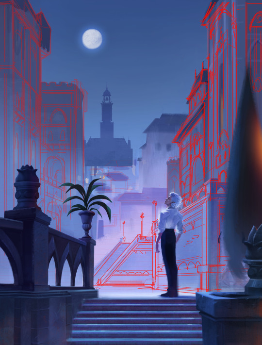
I think sitting down and doing the details is the most time consuming part. I still want the focus to be on the character despite all the detail going on the background. At this point I'm toggling on black & white filters constantly to check the value, grouping everything in the background together, making sure the lighting frames the subject in focus. At this point I realized, I forgot to paint Astarion's hair LOL, and that the bg was getting a bit too detailed, so I used a more textured brush and painted away some of the edge details of bg buildings.

Last, I make final adjustments, and I make a overall lighting/fx adjustment folder. Adding in some noise, adjusting the contrast, color balance, and lighting over all and call it done!
Link to Print shop!
#astarion#astarionfanart#bg3#baldurs gate astarion#baldur's gate 3#artprocesses#art tutorial#astarionpainting#bg3art#bg3fanart#art process#artists on tumblr
7K notes
·
View notes
Text
Making this its own post to further spread the correct information.
The name Mickey Mouse is Public Domain.
Trademark is a separate thing from copyright. Trademark means you can't trick people into thinking your version of Mickey Mouse is sanctioned by Disney.
You do not need to rename Mickey Mouse to use this character.
He's literally named in the title card (along with two alternate outfits for him and Minnie that are also Public Domain, which means, yes! You can give him gloves!).
The only way the name "Mickey Mouse" would still be copyrighted would be if he hadn't been named yet in Steamboat Willie, which very clearly isn't the case, because his name is the largest thing on the title card:
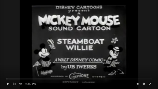
[ID: A screenshot from the Web Archive’s video player showing the video paused at 00:04, showing the title card that reads:
“Disney Cartoons presents A Mickey Mouse sound cartoon: Steambie Willie, A Walt Disney comic by UB Iwerks, recorded by Cinephone system, copyright MCMXXVIII”.
On either side of the text are Mickey and Minnie, smiling at eachother. Mickey is holding up a hat in one hand, and a cane in the other with a wide grin of greeting.
He has a white face, a buck tooth in his open mouth, white gloves, and light grey shoes and shorts, with the shorts having dark buttons and darker vertical stripes.
Minnie has her hands clasped as she smiles at Mickey with lowered eyelids in a flirting pose. She has the same hat as mickey, with a flower stick behind it. She has two circles on her chest like a bra or bow, with a polkadot skirt with a wavy edge. She is wearing light grey heels.
End ID.]
There is also a public domain poster with color, which means this design is also Public Domain. And again, this one also names him Mickey Mouse -- making the name Mickey Mouse Public Domain! And this alone would have made the name Public Domain even if he hadn't been named in Steamboat Willie! And, he again has gloves!
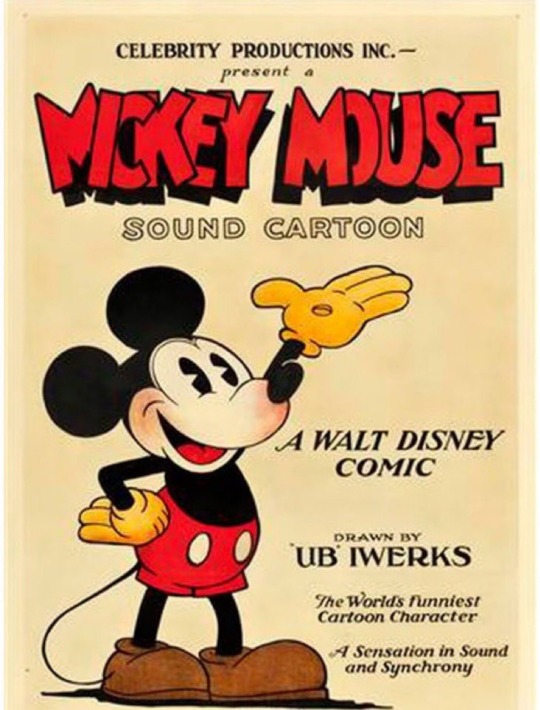
[ID: A color poster reading, "Celebrity Productions Inc. Present a Mickey Mouse Sound Cartoon. A Walt Disney comic drawn by UB Iwerks. The World's Funniest cartoon character, a sensation in sound and synchrony.".
Mickey is drawn with one hand on his hip and the other in the air. He is wearing yellow gloves with a button in the center of the palm, red pants with white buttons, and large brown boots. He has a red blush on his nose and cheek. His tongue is red, and his black pupils have a white triangle on the side.
The background is pale tan.
End ID.]
There is also literally nothing stopping anyone from giving any of these characters new color designs with entirely new outfits. That's what the Public Domain is for. Don't think you can only use these characters in black and white, you just can't use versions that Disney still owns the copyright to.
5K notes
·
View notes
Text
My Favorite Cheap Art Trick: Gradient Maps and Blending Modes
i get questions on occasion regarding my coloring process, so i thought i would do a bit of a write up on my "secret technique." i don't think it really is that much of a secret, but i hope it can be helpful to someone. to that end:

this is one of my favorite tags ive ever gotten on my art. i think of it often. the pieces in question are all monochrome - sort of.

the left version is the final version, the right version is technically the original. in the final version, to me, the blues are pretty stark, while the greens and magentas are less so. there is some color theory thing going on here that i dont have a good cerebral understanding of and i wont pretend otherwise. i think i watched a youtube video on it once but it went in one ear and out the other. i just pick whatever colors look nicest based on whatever vibe im going for.

this one is more subtle, i think. can you tell the difference? there's nothing wrong with 100% greyscale art, but i like the depth that adding just a hint of color can bring.
i'll note that the examples i'll be using in this post all began as purely greyscale, but this is a process i use for just about every piece of art i make, including the full color ones. i'll use the recent mithrun art i made to demonstrate. additionally, i use clip studio paint, but the general concept should be transferable to other art programs.


for fun let's just start with Making The Picture. i've been thinking of making this writeup for a while and had it in mind while drawing this piece. beyond that, i didn't really have much of a plan for this outside of "mithrun looks down and hair goes woosh." i also really like all of the vertical lines in the canary uniform so i wanted to include those too but like. gone a little hog wild. that is the extent of my "concept." i do not remember why i had the thought of integrating a shattered mirror type of theme. i think i wanted to distract a bit from the awkward pose and cover it up some LOL but anyway. this lack of planning or thought will come into play later.
note 1: the textured marker brush i specifically use is the "bordered light marker" from daub. it is one of my favorite brushes in the history of forever and the daub mega brush pack is one of the best purchases ive ever made. highly recommend!!!
note 2: "what do you mean by exclusion and difference?" they are layer blending modes and not important to the overall lesson of this post but for transparency i wanted to say how i got these "effects." anyway!
with the background figured out, this is the point at which i generally merge all of my layers, duplicate said merged layer, and Then i begin experimenting with gradient maps. what are gradient maps?
the basic gist is that gradient maps replace the colors of an image based on their value.

so, with this particular gradient map, black will be replaced with that orangey red tone, white will be replaced with the seafoamy green tone, etc. this particular gradient map i'm using as an example is very bright and saturated, but the colors can be literally anything.

these two sets are the ones i use most. they can be downloaded for free here and here if you have csp. there are many gradient map sets out there. and you can make your own!
you can apply a gradient map directly onto a specific layer in csp by going to edit>tonal correction>gradient map. to apply one indirectly, you can use a correction layer through layer>new correction layer>gradient map. honestly, correction layers are probably the better way to go, because you can adjust your gradient map whenever you want after creating the layer, whereas if you directly apply a gradient map to a layer thats like. it. it's done. if you want to make changes to the applied gradient map, you have to undo it and then reapply it. i don't use correction layers because i am old and stuck in my ways, but it's good to know what your options are.

this is what a correction layer looks like. it sits on top and applies the gradient map to the layers underneath it, so you can also change the layers beneath however and whenever you want. you can adjust the gradient map by double clicking the layer. there are also correction layers for tone curves, brightness/contrast, etc. many such useful things in this program.
let's see how mithrun looks when we apply that first gradient map we looked at.

gadzooks. apologies for eyestrain. we have turned mithrun into a neon hellscape, which might work for some pieces, but not this one. we can fix that by changing the layer blending mode, aka this laundry list of words:

some of them are self explanatory, like darken and lighten, while some of them i genuinely don't understand how they are meant to work and couldn't explain them to you, even if i do use them. i'm sure someone out there has written out an explanation for each and every one of them, but i've learned primarily by clicking on them to see what they do.
for the topic of this post, the blending mode of interest is soft light. so let's take hotline miamithrun and change the layer blending mode to soft light.

here it is at 100% opacity. this is the point at which i'd like to explain why i like using textured brushes so much - it makes it very easy to get subtle color variation when i use this Secret Technique. look at the striation in the upper right background! so tasty. however, to me, these colors are still a bit "much." so let's lower the opacity.

i think thats a lot nicer to look at, personally, but i dont really like these colors together. how about we try some other ones?

i like both of these a lot more. the palettes give the piece different vibes, at which point i have to ask myself: What Are The Vibes, Actually? well, to be honest i didn't really have a great answer because again, i didn't plan this out very much at all. however. i knew in my heart that there was too much color contrast going on and it was detracting from the two other contrasts in here: the light and dark values and the sharp and soft shapes. i wanted mithrun's head to be the main focal point. for a different illustration, colors like this might work great, but this is not that hypothetical illustration, so let's bring the opacity down again.

yippee!! that's getting closer to what my heart wants. for fun, let's see what this looks like if we change the blending mode to color.

i do like how these look but in the end they do not align with my heart. oh well. fun to experiment with though! good to keep in mind for a different piece, maybe! i often change blending modes just to see what happens, and sometimes it works, sometimes it doesn't. i very much cannot stress enough that much of my artistic process is clicking buttons i only sort of understand. for fun.
i ended up choosing the gradient map on the right because i liked that it was close to the actual canary uniform colors (sorta). it's at an even lower opacity though because there was Still too much color for my dear heart.

the actual process for this looks like me setting my merged layer to soft light at around 20% opacity and then clicking every single gradient map in my collection and seeing which one Works. sometimes i will do this multiple times and have multiple soft light and/or color layers combined.
typically at this point i merge everything again and do minor contrast adjustments using tone curves, which is another tool i find very fun to play around with. then for this piece in particular i did some finishing touches and decided that the white border was distracting so i cropped it. and then it's done!!! yay!!!!!
this process is a very simple and "fast" way to add more depth and visual interest to a piece without being overbearing. well, it's fast if you aren't indecisive like me, or if you are better at planning.

let's do another comparison. personally i feel that the hint of color on the left version makes mithrun look just a bit more unwell (this is a positive thing) and it makes the contrast on his arm a lot more pleasing to look at. someone who understands color theory better than i do might have more to say on the specifics, but that's honestly all i got.

just dont look at my layers too hard. ok?
1K notes
·
View notes
Last Seen Blogs

creativemaid
Social Media Strategiist and business
babylotuseater
H A I L 𓁺 B A B U S H K A
reallifehumansunshine
Brainrot time all the time, babey!
lafilledepaille
La fille de paille

bundyslittlelamb
Mary ໒꒰ྀི´ ˘ ` ꒱ྀིა