#i will have to try ig
Text

I don't know what this is all I know is that LimL Joel makes me really emotional
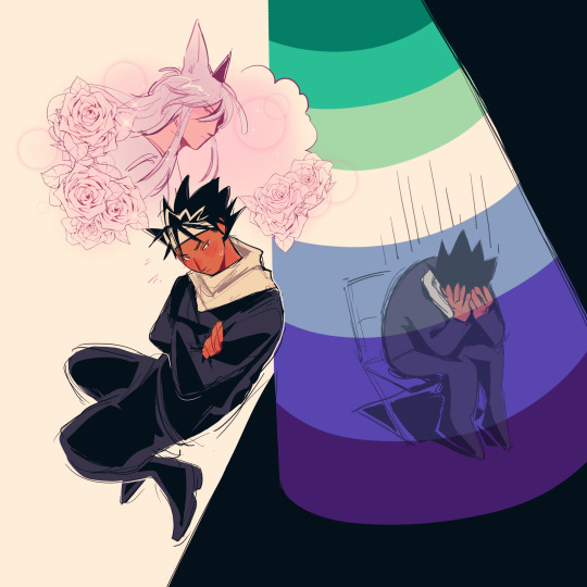
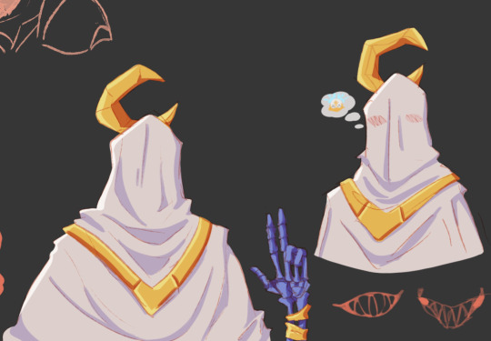
#I know he has a tendency to go deranged on his red lives but idk something about him beginning to lose it after Jimmy died and killing Grian#joel smallishbeans#smallishbeans fanart#trafficblr#Again its his red life shenanigans but... If only Jimmy had known how affected someone was by his death. I'm choosing to believe this#and him then going out like a sad pathetic wet cat even with Grian's sacrifice... He really deserves a win one of these days lmao please#Also I cant stop thinking about how Jimmy wouldn't have left him. Grian was sensible to and most players probs would have#Joel really does become a lost cause so its fair and Grian did still care (and went to say goodbye as well as sacrifice his time for him)#But Jimmy would have stuck by even if Joel were in this state (and they'd both get themselves killed pathetically but)#And Joel having shown such genuine care for Jimmy and concern over his limited time... man anything w Jimmy makes me so emotional lol#I love them so#oh Ig about the art itself. I dont like it but hey thats how it tends to go when you try smth new. And no shame in trying#but if one person likes this then yayy I will still feel accomplished and happy#Im looking at this again and hey its not that bad actually yay I love to approve of my own art. self love hell yea#tubby art
1K notes
·
View notes
Text

#was looking for some fics with these two#I imagine this is one of their first interactions and Hunter is already fed up with Darius#but Darius is just trying to get to know the successor of his mentor and check if he's at least a little bit capable of doing his job#he's also a little weirded out by the similarity between these two#basically I imagine Darius gave him a couple of vibe checks that Hunter had failed#and Hunter takes it as questoning his place in the coven#god darius design is so pink and awful#it's so jover uni starts tommorow#it's like the most boring drawing ever but I'm just still in my I have to get better at backgrounds era#and also if I'll draw 100 awful things I get a decent one eventually#it's like inktober but lasts your whole life and devours your soul in the process#no caption just pure tags now I understand those few people who keep reblogging all my tags cuz I give all the fucking context there#there's probably like 10 things I would spot tommorow that would fix the drawing a whole bunch but I just ...don't want to ig#the owl house#sheerak#the golden guard#darius deamonne#hunter toh#toh hunter#hunter deamonne#toh fanart#the owl house fanart#dadrius#not yet but#you guys most fellow toh fanartists moved on and fanart fiona and cake but I keep brainrotting the same stuff over and over#good old toh trashpile
3K notes
·
View notes
Text
feel free to rb and tag w any others i just ran out of options
#and like when I say in a song i mean a song that is not typically one or a few instruments#like if you say sax and your fav genre is jazz no mf shit#ig you do you but try and have some Pizzaz#for my sake#music
3K notes
·
View notes
Text


DANJIN ⟡ a wayfarer's escapade
A ranger straightforward in nature, with a strong sense of moral judgment. She travels the lands refining her knowledge in an endeavor to seek the true meaning of good and evil. Though perils lurk in every corner of her journey, she vows to cleanse the world of villainy.
#wuwa#wuwaedit#wuthering waves#gamingedit#danjin#flashing tw#eye strain tw#m:gifs#m:*#i think she's my favorite 4* she's cute!#which ig solidifies that i'm pulling on jiyan's banner#i'm not gonna be able to play until tomorrow night or friday but everyone have fun with the wuwa release!!! <3#really excited to try out the combat hhhhhh
453 notes
·
View notes
Text
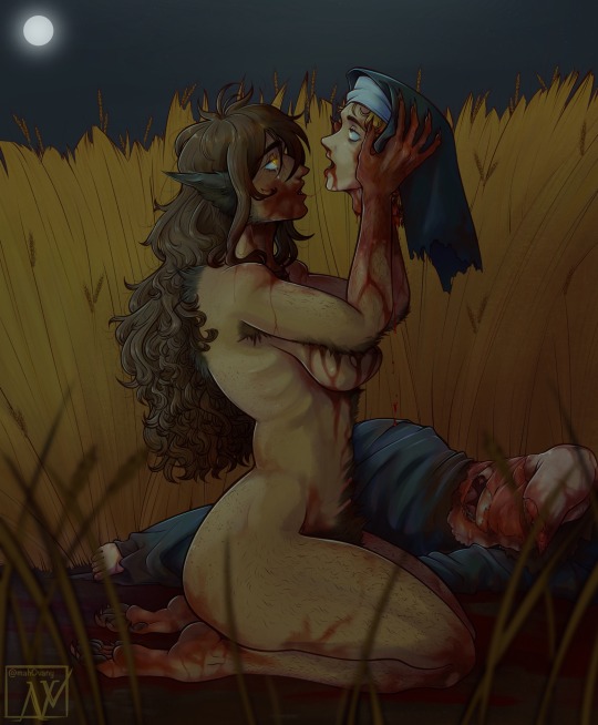
"And she had brown eyes like a lamb, innocent and golden"
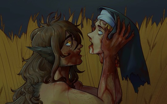
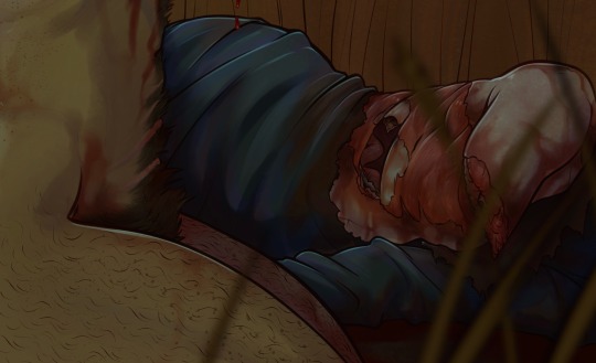
#when the Yuri so unhealthy one of them eats the other#symbolism galore#hellsing oc#my oc#laura chastel#my art#OOOH boy let's go with the content warnings#cw gore#cw guro#cw nudity#artistic nudity#cw blood#cw death#cw cannibalism#cw decapitated head#cw decapitation#cw dismemberment#this is the woman that Laura loved (was it love? she had no idea) before Integra#I'll try to give more info on her. the idea came recently and I thought it could be cool#yes another nun. in my defense this one became one AFTER they met#it's just how catholic French villagers are ig. idk I don't really hang out with them#this piece beat my ass black and blue#i have no idea how to render#please be patient i have autism#and I'm a bit unsure about this piece. presenting it to you with an awkward hand
420 notes
·
View notes
Text
listen im ace and im pro kink at pride and whatever, but the way some of yall are wording your posts in response to the backlash against it is uh. really taking me back to the ace shitcourse era.
yall know theres nothing wrong with being a "virgin", right? that its not inherently shameful to have not had sex, to never have sex, even if youre not ace, even if you do want to have sex someday, like, its fine that you haven't had sex?
maybe if your problem is that theyre trying to police your behavior and shame you for expressing your sexuality, you can say that? instead of resorting to "haha stupid virgin gets no bitches" like my god. do you not hear how fucking regressive that attitude is? i know, i know, youre "joking".
get a better joke
#toy txt post#god im going to regret this post im gonna regret it so much i can feel it in my bones#let it flop..........pls#internalize my message let it sink in and understand what i am saying and then let the post flop#i say. knowing the ppl who need to see such a message are the ones who will make me regret this post and regrwt not having#1 million bajillion disclaimers#virgin is in quotes bc its a bullshit made up stupid purity culture concept anyway and quite frankly i hate even seeing the word#disclaimer: the previous sentence is not me saying that it is a slur for asexuals. it is me a single individual saying this specific word#grosses me out to read and see everywhere when its a stupid bullshit binary made up or at least historically largely used#to shame largely women and i dont know why we're still using it in 2023#and ive just been. seeing such an uptick in this whole like. attitude? lately and like#im ace im minorly sex repulsed. mostly about anything sex at me bad. other adults sex at each other consensually? go wild#i like to think im pretty chill about it. i try to be. i think its fine ig to be like 'my meat is huge i fuck so much so good'#like okay not my thing but good for you. love that for you#but then some of yall have started turning it back around back to. 'haha your meat so small and shriveled you get no bitches'#'haha stupid incel virgin' like okay. didnt realize we all went back to fucking. middle school but okay#god im gonna run out of tine to get ready for my thing writing this stupid post UGH evil#but like idk we've kinda circled back to being like haha being a virgin still is stupid and silly and shameful#and if im quite honest. i do think the acecourse played a part in that bc i felt like we were making good progress in like#hey guys is fine to not have sex ever if you dont want to its fine to not want sex its fine#and then aphobes went fucking rabid on us and splintered and destroyed online communities all over but especially on tumblr#and so many aces went back in the closet we stopped talking about it we stopped spreading awareness and now this stupid goddamn like#and now this stupid bullshit attitude is back where its like funny to call someone a virgin as an insult but like no bro trust me its okay#its okay for me to do it bc im a hot queer person with huge meat instead of a cisstraight frat bro with huge meat#? like you know the issue was the behavior right? not the fact that it was straight dudes saying it? its bc the thing being said was shitty?#you know you can dunk on the puritan bitches trying to police your behavior at pride without getting us as collateral damage right#stop making me read that stupid ugly ass word ur not cool or funny#whatever#if you come on to this post to start shit i will not only block you but as many of your mutuals and followers as i can find. i will scroll#i will block this entire fucking website if i need to do not test me. i am exhausted and the acecourse ate up all my tolerance in 2015.
1K notes
·
View notes
Text
all the rise boys get done dirty on characterization by fandom in different ways i think. (not ALL the time every fanwork etc etc these are just like, trends i tend to notice?) every fandom suffers from losing character nuance.
- leo i’ve talked about plenty on this blog, how some of his canon traits (genuine belief in his skill and cockiness, capacity for joy, his manipulativeness whether for good or ill) seem to get watered down or wiped off the board and supplemented with generic sad boy. his struggles with purpose and identity and not wanting to fail somehow morph into “he hates and completely holds no value for himself”
- donnie’s canon personality gets blurred out and largely replaced with whatever list of Neurodivergent Traits. and i think there’s such a fine line to walk between exploring a character that’s been word of god confirmed as on the spectrum and overwriting what’s canonically there. it’s a hard needle to thread. it also feels like a lot of his canon emotiveness gets left off the table for some reason. bc he does have his moments of flat/deadpan delivery, but a lot of the time he’s honestly very emotive. he has the passion of a theatre kid and the vindictiveness of... also a theatre kid. and the mind of a scientist.
- raph loses so much of his rowdy teen boy energy it’s kind of wild? like interpretations sand off that he’s also impulsive and can be reckless and dumb and LOVES fighting and roughhousing and isn’t the most eloquent person. suddenly there’s this pitch perfect soft boy big bro who would never hurt a fly and always says the exact right supportive thing and singlehandedly raised his 3 brothers (which simultaneously sands off all the nuance of splinter’s issues emotionally connecting with his sons and how that affected all of them). and like i LOVE raph, he’s so full of love and care and anxiety, he clearly has learned to put a lot of work into being aware of his strength and size. but there’s a difference you know?
- mikey is like. where raph gets overparentified by fanon, mikey gets over “family therapist”-ed IMO. the impulsiveness, the goofiness, the powerful emotions including a VERY powerful temper, the flat-out dumb teen boy choices... they get ignored. suddenly there’s this only very sweet and earnest boy who has read a hundred psychology books and runs group family therapy weekly or something. he is crying in his room bc leo and raph are arguing about something. which is so. he IS very sweet and can be very earnest and is full of love! he HAS come in with his opinions and unsolicited advice a couple of times and life coached for the greater good. but there’s a difference between what he does in canon and the role he gets in fanon.
#rottmnt#rise of the tmnt#idk this is not a very eloquent rundown its very hard to explain exactly my vibe#ig the long story short is i feel like a lot of their most interesting and fun qualities get left in the dust#mikey as family therapist is getting under my skin the most rn i think its just so.#for as much as it seems like his brothers try to shelter him (esp raph with his overprotectiveness)..... i just dont see it#i dont see his brothers and definitely not his dad putting their issues on him like that...#him dragging donnie into that one dr feelings session and dragging draxum into a new moral alignment were different#than 'yeah everyone tells mikey their stuff and he has to do the labor of helping with it'#like it just doesnt vibe for me#i think he is very emotionally OPEN on all levels compared to his family#i think he is more likely to share when HE struggles#i dont think raph or leo is sitting with him at 3am like 'it all started when i was 4 and accidentally broke a plate' or what have you idk#it's all so ymmv i do just scroll past stuff i dont vibe with i dont drop hate on it i just#idk dudes its so hard to see the appeal in some of the choices made
2K notes
·
View notes
Text
why Aurora's art is genius
It's break for me, and I've been meaning to sit down and read the Aurora webcomic (https://comicaurora.com/, @comicaurora on Tumblr) for quite a bit. So I did that over the last few days.
And… y'know. I can't actually say "I should've read this earlier," because otherwise I would've been up at 2:30-3am when I had responsibilities in the morning and I couldn't have properly enjoyed it, but. Holy shit guys THIS COMIC.
I intended to just do a generalized "hello this is all the things I love about this story," and I wrote a paragraph or two about art style. …and then another. And another. And I realized I needed to actually reference things so I would stop being too vague. I was reading the comic on my tablet or phone, because I wanted to stay curled up in my chair, but I type at a big monitor and so I saw more details… aaaaaand it turned into its own giant-ass post.
SO. Enjoy a few thousand words of me nerding out about this insanely cool art style and how fucking gorgeous this comic is? (There are screenshots, I promise it isn't just a wall of text.) In my defense, I just spent two semesters in graphic design classes focusing on the Adobe Suite, so… I get to be a nerd about pretty things…???
All positive feedback btw! No downers here. <3
---
I cannot emphasize enough how much I love the beautiful, simple stylistic method of drawing characters and figures. It is absolutely stunning and effortless and utterly graceful—it is so hard to capture the sheer beauty and fluidity of the human form in such a fashion. Even a simple outline of a character feels dynamic! It's gorgeous!
Though I do have a love-hate relationship with this, because my artistic side looks at that lovely simplicity, goes "I CAN DO THAT!" and then I sit down and go to the paper and realize that no, in fact, I cannot do that yet, because that simplicity is born of a hell of a lot of practice and understanding of bodies and actually is really hard to do. It's a very developed style that only looks simple because the artist knows what they're doing. The human body is hard to pull off, and this comic does so beautifully and makes it look effortless.
Also: line weight line weight line weight. It's especially important in simplified shapes and figures like this, and hoo boy is it used excellently. It's especially apparent the newer the pages get—I love watching that improvement over time—but with simpler figures and lines, you get nice light lines to emphasize both smaller details, like in the draping of clothing and the curls of hair—which, hello, yes—and thicker lines to emphasize bigger and more important details and silhouettes. It's the sort of thing that's essential to most illustrations, but I wanted to make a note of it because it's so vital to this art style.
THE USE OF LAYER BLENDING MODES OH MY GODS. (...uhhh, apologies to the people who don't know what that means, it's a digital art program thing? This article explains it for beginners.)
Bear with me, I just finished my second Photoshop course, I spent months and months working on projects with this shit so I see the genius use of Screen and/or its siblings (of which there are many—if I say "Screen" here, assume I mean the entire umbrella of Screen blending modes and possibly Overlay) and go nuts, but seriously it's so clever and also fucking gorgeous:
Firstly: the use of screened-on sound effect words over an action? A "CRACK" written over a branch and then put on Screen in glowy green so that it's subtle enough that it doesn't disrupt the visual flow, but still sticks out enough to make itself heard? Little "scritches" that are transparent where they're laid on without outlines to emphasize the sound without disrupting the underlying image? FUCK YES. I haven't seen this done literally anywhere else—granted, I haven't read a massive amount of comics, but I've read enough—and it is so clever and I adore it. Examples:


Secondly: The beautiful lighting effects. The curling leaves, all the magic, the various glowing eyes, the fog, the way it's all so vividly colored but doesn't burn your eyeballs out—a balance that's way harder to achieve than you'd think—and the soft glows around them, eeeee it's so pretty so pretty SO PRETTY. Not sure if some of these are Outer/Inner Glow/Shadow layer effects or if it's entirely hand-drawn, but major kudos either way; I can see the beautiful use of blending modes and I SALUTE YOUR GENIUS.
I keep looking at some of this stuff and go "is that a layer effect or is it done by hand?" Because you can make some similar things with the Satin layer effect in Photoshop (I don't know if other programs have this? I'm gonna have to find out since I won't have access to PS for much longer ;-;) that resembles some of the swirly inner bits on some of the lit effects, but I'm not sure if it is that or not. Or you could mask over textures? There's... many ways to do it.
If done by hand: oh my gods the patience, how. If done with layer effects: really clever work that knows how to stop said effects from looking wonky, because ugh those things get temperamental. If done with a layer of texture that's been masked over: very, very good masking work. No matter the method, pretty shimmers and swirly bits inside the bigger pretty swirls!
Next: The way color contrast is used! I will never be over the glowy green-on-black Primordial Life vibes when Alinua gets dropped into that… unconscious space?? with Life, for example, and the sharp contrast of vines and crack and branches and leaves against pitch black is just visually stunning. The way the roots sink into the ground and the three-dimensional sensation of it is particularly badass here:

Friggin. How does this imply depth like that. HOW. IT'S SO FREAKING COOL.
A huge point here is also color language and use! Everybody has their own particular shade, generally matching their eyes, magic, and personality, and I adore how this is used to make it clear who's talking or who's doing an action. That was especially apparent to me with Dainix and Falst in the caves—their colors are both fairly warm, but quite distinct, and I love how this clarifies who's doing what in panels with a lot of action from both of them. There is a particular bit that stuck out to me, so I dug up the panels (see this page and the following one https://comicaurora.com/aurora/1-20-30/):

(Gods it looks even prettier now that I put it against a plain background. Also, appreciation to Falst for managing a bridal-carry midair, damn.)
The way that their colors MERGE here! And the immense attention to detail in doing so—Dainix is higher up than Falst is in the first panel, so Dainix's orange fades into Falst's orange at the base. The next panel has gold up top and orange on bottom; we can't really tell in that panel where each of them are, but that's carried over to the next panel—

—where we now see that Falst's position is raised above Dainix's due to the way he's carrying him. (Points for continuity!) And, of course, we see the little "huffs" flowing from orange to yellow over their heads (where Dainix's head is higher than Falst's) to merge the sound of their breathing, which is absurdly clever because it emphasizes to the viewer how we hear two sets of huffing overlaying each other, not one. Absolutely brilliant.
(A few other notes of appreciation to that panel: beautiful glows around them, the sparks, the jagged silhouette of the spider legs, the lovely colors that have no right to make the area around a spider corpse that pretty, the excellent texturing on the cave walls plus perspective, the way Falst's movements imply Dainix's hefty weight, the natural posing of the characters, their on-point expressions that convey exactly how fuckin terrifying everything is right now, the slight glows to their eyes, and also they're just handsome boys <3)
Next up: Rain!!!! So well done! It's subtle enough that it never ever disrupts the impact of the focal point, but evident enough you can tell! And more importantly: THE MIST OFF THE CHARACTERS. Rain does this irl, it has that little vapor that comes off you and makes that little misty effect that plays with lighting, it's so cool-looking and here it's used to such pretty effect!
One of the panel captions says something about it blurring out all the injuries on the characters but like THAT AIN'T TOO BIG OF A PROBLEM when it gets across the environmental vibes, and also that'd be how it would look in real life too so like… outside viewer's angle is the same as the characters', mostly? my point is: that's the environment!!! that's the vibes, that's the feel! It gets it across and it does so in the most pretty way possible!
And another thing re: rain, the use of it to establish perspective, particularly in panels like this—

—where we can tell we're looking down at Tynan due to the perspective on the rain and where it's pointing. Excellent. (Also, kudos for looking down and emphasizing how Tynan's losing his advantage—lovely use of visual storytelling.)
Additionally, the misting here:

We see it most heavily in the leftmost panel, where it's quite foggy as you would expect in a rainstorm, especially in an environment with a lot of heat, but it's also lightly powdered on in the following two panels and tends to follow light sources, which makes complete sense given how light bounces off particles in the air.
A major point of strength in these too is a thorough understanding of lighting, like rim lighting, the various hues and shades, and an intricate understanding of how light bounces off surfaces even when they're in shadow (we'll see a faint glow in spots where characters are half in shadow, but that's how it would work in real life, because of how light bounces around).
Bringing some of these points together: the fluidity of the lines in magic, and the way simple glowing lines are used to emphasize motion and the magic itself, is deeply clever. I'm basically pulling at random from panels and there's definitely even better examples, but here's one (see this page https://comicaurora.com/aurora/1-16-33/):

First panel, listed in numbers because these build on each other:
The tension of the lines in Tess's magic here. This works on a couple levels: first, the way she's holding her fists, as if she's pulling a rope taut.
The way there's one primary line, emphasizing the rope feeling, accompanied by smaller ones.
The additional lines starbursting around her hands, to indicate the energy crackling in her hands and how she's doing a good bit more than just holding it. (That combined with the fists suggests some tension to the magic, too.) Also the variations in brightness, a feature you'll find in actual lightning. :D Additional kudos for how the lightning sparks and breaks off the metal of the sword.
A handful of miscellaneous notes on the second panel:
The reflection of the flames in Erin's typically dark blue eyes (which bears a remarkable resemblance to Dainix, incidentally—almost a thematic sort of parallel given Erin's using the same magic Dainix specializes in?)
The flowing of fabric in the wind and associated variation in the lineart
The way Erin's tattoos interact with the fire he's pulling to his hand
The way the rain overlays some of the fainter areas of fire (attention! to! detail! hell yeah!)
I could go on. I won't because this is a lot of writing already.
Third panel gets paragraphs, not bullets:
Erin's giant-ass "FWOOM" of fire there, and the way the outline of the word is puffy-edged and gradated to feel almost three-dimensional, plus once again using Screen or a variation on it so that the stars show up in the background. All this against that stunning plume of fire, which ripples and sparks so gorgeously, and the ending "om" of the onomatopoeia is emphasized incredibly brightly against that, adding to the punch of it and making the plume feel even brighter.
Also, once again, rain helping establish perspective, especially in how it's very angular in the left side of the panel and then slowly becomes more like a point to the right to indicate it's falling directly down on the viewer. Add in the bright, beautiful glow effects, fainter but no less important black lines beneath them to emphasize the sky and smoke and the like, and the stunningly beautiful lighting and gradated glows surrounding Erin plus the lightning jagging up at him from below, and you get one hell of an impactful panel right there. (And there is definitely more in there I could break down, this is just a lot already.)
And in general: The colors in this? Incredible. The blues and purples and oranges and golds compliment so well, and it's all so rich.
Like, seriously, just throughout the whole comic, the use of gradients, blending modes, color balance and hues, all the things, all the things, it makes for the most beautiful effects and glows and such a rich environment. There's a very distinct style to this comic in its simplified backgrounds (which I recognize are done partly because it's way easier and also backgrounds are so time-consuming dear gods but lemme say this) and vivid, smoothly drawn characters; the simplicity lets them come to the front and gives room for those beautiful, richly saturated focal points, letting the stylized designs of the magic and characters shine. The use of distinct silhouettes is insanely good. Honestly, complex backgrounds might run the risk of making everything too visually busy in this case. It's just, augh, so GORGEOUS.
Another bit, take a look at this page (https://comicaurora.com/aurora/1-15-28/):

It's not quite as evident here as it is in the next page, but this one does some other fun things so I'm grabbing it. Points:
Once again, using different colors to represent different character actions. The "WHAM" of Kendal hitting the ground is caused by Dainix's force, so it's orange (and kudos for doubling the word over to add a shake effect). But we see blue layered underneath, which could be an environmental choice, but might also be because it's Kendal, whose color is blue.
And speaking off, take a look at the right-most panel on top, where Kendal grabs the spear: his motion is, again, illustrated in bright blue, versus the atmospheric screened-on orange lines that point toward him around the whole panel (I'm sure these have a name, I think they might be more of a manga thing though and the only experience I have in manga is reading a bit of Fullmetal Alchemist). Those lines emphasize the weight of the spear being shoved at him, and their color tells us Dainix is responsible for it.
One of my all-time favorite effects in this comic is the way cracks manifest across Dainix's body to represent when he starts to lose control; it is utterly gorgeous and wonderfully thematic. These are more evident in the page before and after this one, but you get a decent idea here. I love the way they glow softly, the way the fire juuuust flickers through at the start and then becomes more evident over time, and the cracks feel so realistic, like his skin is made of pottery. Additional points for how fire begins to creep into his hair.
A small detail that's generally consistent across the comic, but which I want to make note of here because you can see it pretty well: Kendal's eyes glow about the same as the jewel in his sword, mirroring his connection to said sword and calling back to how the jewel became Vash's eye temporarily and thus was once Kendal's eye. You can always see this connection (though there might be some spots where this also changes in a symbolic manner; I went through it quickly on the first time around, so I'll pay more attention when I inevitably reread this), where Kendal's always got that little shine of blue in his eyes the same as the jewel. It's a beautiful visual parallel that encourages the reader to subconsciously link them together, especially since the lines used to illustrate character movements typically mirror their eye color. It's an extension of Kendal.
Did I mention how ABSOLUTELY BEAUTIFUL the colors in this are?
Also, the mythological/legend-type scenes are illustrated in familiar style often used for that type of story, a simple and heavily symbolic two-dimensional cave-painting-like look. They are absolutely beautiful on many levels, employing simple, lovely gradients, slightly rougher and thicker lineart that is nonetheless smoothly beautiful, and working with clear silhouettes (a major strength of this art style, but also a strength in the comic overall). But in particular, I wanted to call attention to a particular thing (see this page https://comicaurora.com/aurora/1-12-4/):

The flowing symbolic lineart surrounding each character. This is actually quite consistent across characters—see also Life's typical lines and how they curl:

What's particularly interesting here is how these symbols are often similar, but not the same. Vash's lines are always smooth, clean curls, often playing off each other and echoing one another like ripples in a pond. You'd think they'd look too similar to Life's—but they don't. Life's curl like vines, and they remain connected; where one curve might echo another but exist entirely detached from each other in Vash's, Life's lines still remain wound together, because vines are continuous and don't float around. :P
Tahraim's are less continuous, often breaking up with significantly smaller bits and pieces floating around like—of course—sparks, and come to sharper points. These are also constants: we see the vines repeated over and over in Alinua's dreams of Life, and the echoing ripples of Vash are consistent wherever we encounter him. Kendal's dream of the ghost citizens of the city of Vash in the last few chapters is filled with these rippling, echoing patterns, to beautiful effect (https://comicaurora.com/aurora/1-20-14/):

They ripple and spiral, often in long, sinuous curves, with smooth elegance. It reminds me a great deal of images of space and sine waves and the like. This establishes a definite feel to these different characters and their magic. And the thing is, that's not something that had to be done—the colors are good at emphasizing who's who. But it was done, and it adds a whole other dimension to the story. Whenever you're in a deity's domain, you know whose it is no matter the color.
Regarding that shape language, I wanted to make another note, too—Vash is sometimes described as chaotic and doing what he likes, which is interesting to me, because smooth, elegant curves and the color blue aren't generally associated with chaos. So while Vash might behave like that on the surface, I'm guessing he's got a lot more going on underneath; he's probably much more intentional in his actions than you'd think at a glance, and he is certainly quite caring with his city. The other thing is that this suits Kendal perfectly. He's a paragon character; he is kind, virtuous, and self-sacrificing, and often we see him aiming to calm others and keep them safe. Blue is such a good color for him. There is… probably more to this, but I'm not deep enough in yet to say.
And here's the thing: I'm only scratching the surface. There is so much more here I'm not covering (color palettes! outfits! character design! environment! the deities! so much more!) and a lot more I can't cover, because I don't have the experience; this is me as a hobbyist artist who happened to take a couple design classes because I wanted to. The art style to this comic is so clever and creative and beautiful, though, I just had to go off about it. <3
...brownie points for getting all the way down here? Have a cookie.
#aurora comic#aurora webcomic#comicaurora#art analysis#...I hope those are the right tags???#new fandom new tagging practices to learn ig#much thanks for something to read while I try to rest my wrists. carpal tunnel BAD. (ignore that I wrote this I've got braces ok it's fine)#anyway! I HAVE. MANY MORE THOUGHTS. ON THE STORY ITSELF. THIS LOVELY STORY#also a collection of reactions to a chunk of the comic before I hit the point where I was too busy reading to write anything down#idk how to format those tho#...yeet them into one post...???#eh I usually don't go off this much these days but this seems like a smaller tight-knit fandom so... might as well help build it?#and I have a little more time thanks to break so#oh yes also shoutout to my insanely awesome professor for teaching me all the technical stuff from this he is LOVELY#made an incredibly complex program into something comprehensible <3#synapse talks
752 notes
·
View notes
Text

ARCANE LEAGUE OF LEGENDS:
↳ "So was I. I was angry, just like you. I led us across this bridge, thinking things could change. If I hadn't… your parents would still be alive. I know you wanna hurt the topsiders for what they've done to us. But who are you willing to lose? Mylo? Claggor? Powder? Nobody wins in war, Vi."
#man i did say im not a very good edit maker lmao i miss all the other talented people who make edits :((((#arcane#arcaneedit#vi arcane#arcane vi#arcane season 2 teaser#arcane s2#arcane league of legends#league of legends arcane#media: arcane#caitvi#type: gif#league of legends#caitlyn arcane#caitlyn kiramman#piltover’s finest#im just having my fun ig lmao#asdkjaskdjas i spent too much time on this simple edit i should sleep lmao#GOD also b&w edits are so weird on tumblr mobile too but im too lazy to try to troubleshoot it skdjfksdjfksdf#it looks fine on PC though UGHHHHH#s1 ep2#also vi works with them bc of cait she rlly said fuck the police… literally lmao
390 notes
·
View notes
Text
ughm i really didnt mean to color this but i blacked out and emerged an hour later with this. .. .....k .. kurahi... kurahi??? kurahi......... ....
#hu m hhuh isnt that weird.. uh. i was gonna post this as a sketch. not a colored sketch. but the kh brainworms had other plans help theyre i#n my brain i cant get them out help#yu yu hakusho#yyh#hiei#yyh hiei#yoko kurama#yyh kurama#kurahi#for some reason i dont tag the full names for most yyh charas.. ??? my tagging remains consistently inconsistent ig#my art#guys i feel like i have been posting like a madman today- well yesterday by now but yknow...#hiei is trying to come to terms with kuramas demon form being.. like that... dont mind him hes trying his best and failing 😔
512 notes
·
View notes
Text


my attempt at small comics to make my friend understand svsss better. (no idea if it's working). (probably not).
#luo binghe#luo bingmei#luo bingge#shen qingqiu#shen yuan#white lotus binghe#svsss#scum villain#bingqiu#art#scum villian self saving system#mxtx#she's gonna learn guys- dw#I need to work on simplified designs but this works for now ig#also binghe has his hair over his eye cuz cartoon logic and it's hiding the demon mark 😶🌫️#not gonna try to explain cultivation and seals to my friend rn if I want to have a chance!
763 notes
·
View notes
Text
I saw people talking about how Ted would own so many patterned button ups and had the AWFUL realisation me and this man would share a closet.
(Also long haired Ted propaganda be upon ye)
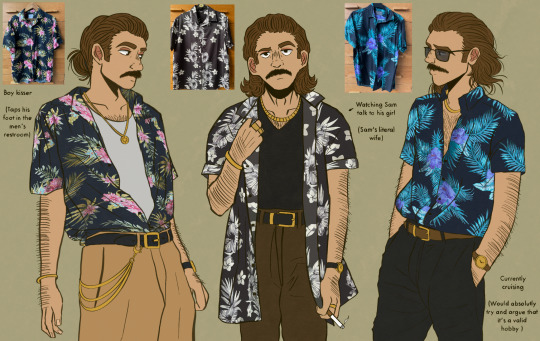

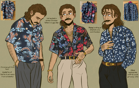

#please acknowledge the fact that I hand drew all of the patterns because it took SO LONG-#I would like to 100% blame @cowardlykrow for acting as the devil on my shoulder and convincing me to draw this#I also have 8 more button up shirts- 3 are plain and the other 5 are so out there that only a dyke could pull them off 😭#he’s my autistic hyperfixation and I get to dress him up as a personal picrew however I like!!!#I was trying to be cute and draw him with different hairstyles for one and JOEY CUT HIS HAR WHILE I WAS DRAWING HIM WITH A PONYTAIL-#dw this is just a minor setback I will continue to be a long haired goat bros truther#I’m afraid the ‘he’s just like me fr fr’ jokes got a little too out of hand on this one chief#to be cringe is to be free ig#ted spankoffski#theodore spankoffski#starkid#starkid productions#team starkid#fanart starkid#starkid fanart#tgwdlm#tgwdlm starkid#tgwdlm fanart#the guy who didnt like musicals#the guy who didn’t like musicals fanart#time bastard nightmare time#starkid time bastard#time bastard#nightmare time#hatchetfield#hatchetverse#hatchetfield universe#nmt#fanart#my art
249 notes
·
View notes
Text
I feel like Danny should be followed around by an entourage of ghost blobs and ghost animals. I feel like he should be a fucked up little boy surrounded by death, forever stuck between worlds, frozen in time as life leaves him behind and death rejects him. As a treat.
#danny phantom#i want him to always be a child ghost#as a treat#as a very fucked up veru delicious treat#also if i made this dp x dc then we could have battinson try to parent this small eldritch ghost child far older than he#eldritch danny#ghost king danny#bruce wayne#dp x dc#danny fenton#ghost plant au#yes this is part of that au i am expanding#i just want to be held#so im making danny be held ig#but only after severe mental and physical damage#>:D
769 notes
·
View notes
Text

framed villain
#nimona#nimona movie#nimona film#ballister boldheart#my art#damn this was supposed to be a paint study but i got carried away lmao#it's 3 am i have class tomorrow#i have priorities#tw blood#tw wounds#going for textured art but eventually used lasso instead absolute bonkers#idk why he has all the wounds in his face while having a stoic face#i was trying to use red since i dont use that color a lot in my arts and now he looked beat :((#ig wholesome art of them will be next he needs a break#he isn't a villain at all just look at those huge eyes
344 notes
·
View notes
Text
rain worl break still going I wanted to draw the stupid blood fueled machine (and friends!!!!)

#ultrakill#v1#ferryman#gabriel#I would have made a silly caption for the last image but all I really know about ultrakill is the gameplay and mipexch's stuff#oh and ig gabriel's va but that's just silly things I dunno the character itself well enough (yet)#also the tiny gabriel in the first image is so fucked up why he look like that#uhmmm anyways I'll try to doodle some precipitation planet stuffs with the brsh I used here so umh yeah gbye
266 notes
·
View notes
Text
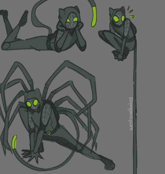
spider,,,cat? jumping cat???
#miraculous ladybug#miraculous fanart#miraculoustalesofladybugandcatnoir#adrien agreste#chat noir#cat noir#ml fanart#mlb fanart#ml chat noir#westy doodles#i dont even know where this au came from i havent even watched ITS recently it just. came to me in a vision ig#but uhhhh LB design coming soon!!#his tail entends and can wrap around thinfs#was trying to find something to replace his staff#and his little back packback has his extra legs!! borrowed idea from marvel i know but i wanted him to have something special#other than the tail
268 notes
·
View notes
Last Seen Blogs

mywasta
wasta52

ultimatecontractingllc
Ultimate Contracting LLC

naoyukid
#FFFF00
thevack
Blog The Vack

slavalotus
Вячеслав