#reproduction furniture
Text
Reproducing a Thomas Johnson style Mirror at Brights of Nettlebed.
youtube
1 note
·
View note
Text
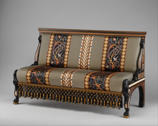
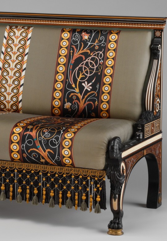
Settee
Designed by Lawrence Alma-Tadema (British)
c.1875
The MET (Accession Number: 1975.219a)
#settee#furniture#furnishings#lawrence alma tadema#1870s#1875#art history#19th century#victorian#british#the met#the fabric is modern but imo a pretty excellent reproduction#popular
1K notes
·
View notes
Text

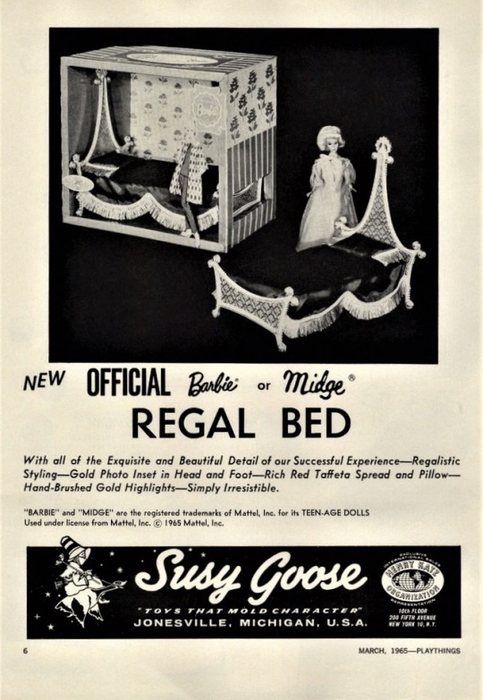
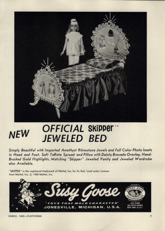

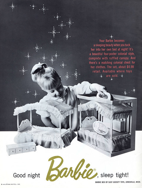
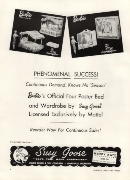

Official Barbie Suzy Goose Furniture advertisements
45 notes
·
View notes
Text
i love the names of print tools. Trawling ebay trying to find a lozenge graver, spitsticker, maybe a scorper if im lucky
#kinda wanna do my senior project on historical print methods but first i need to teach myself how to engrave#but like a 15th c metalcut + a late 19th chromolitho poster for the print sale#maybe a early 20th reproductive wood engraving w some basic letterpress..... yes#ik we have type but idk about furniture or the frame or anything 🤔#print tag
3 notes
·
View notes
Photo
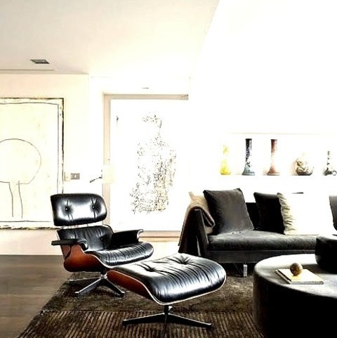
Living Room Library in New York
Example of a large 1950s living room library design
#interior design#midcentury lounge chair#eames lounge chair#midcentury replica#eames lounge chair reproduction#modern furniture#living room
0 notes
Text
French Louis Style Luxury Sofa Suites bring a modern and antique feel to your any space. Options available at Classic and Country Interiors, shop now!
0 notes
Text
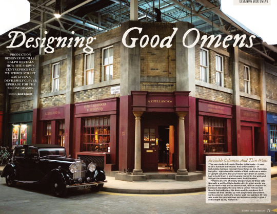
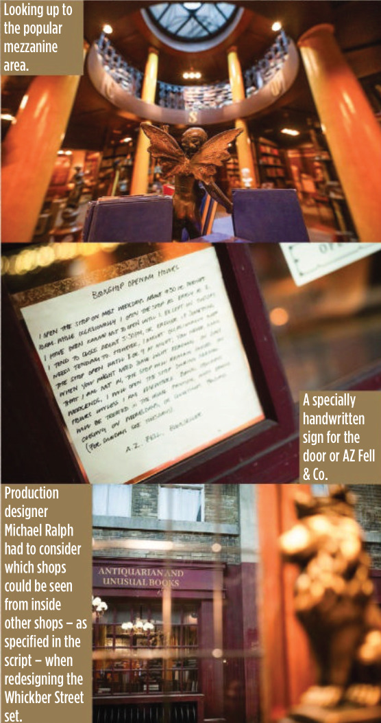
SFX Magazine Issue 372 - Designing Good Omens ❤ 😊
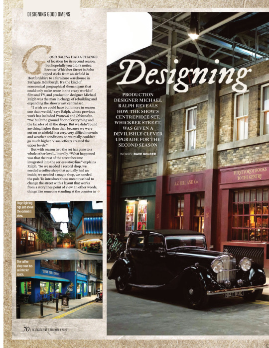
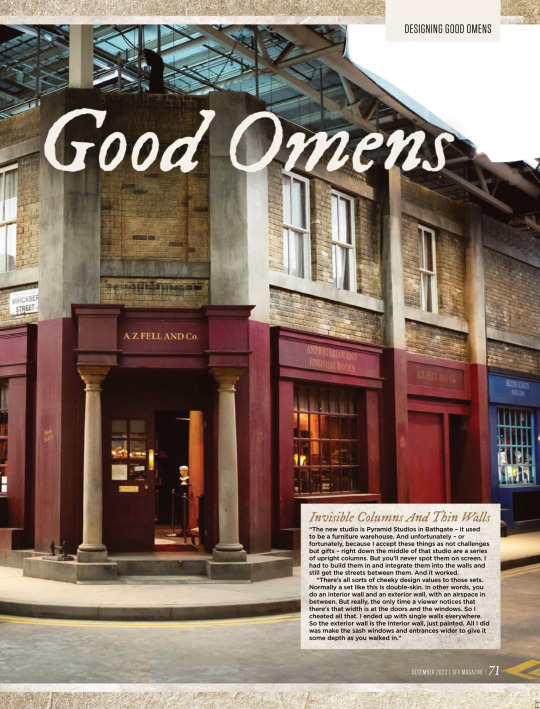


PRODUCTION DESIGNER MICHAEL RALPH REVEALS HOW THE SHOW’S CENTREPIECE SET, WHICKBER STREET, WAS GIVEN A DEVILISHLY CLEVER UPGRADE FOR THE SECOND SEASON
WORDS: DAVE GOLDER
Invisible Columns And Thin Walls “The new studio is Pyramid Studios in Bathgate – it used to be a furniture warehouse. And unfortunately – or fortunately, because I accept these things as not challenges but gifts – right down the middle of that studio are a series of upright columns. But you’ll never spot them on screen. I had to build them in and integrate them into the walls and still get the streets between them. And it worked.
“There’s all sorts of cheeky design values to those sets. Normally a set like this is double-skin. In other words, you do an interior wall and an exterior wall, with an airspace in between. But really, the only time a viewer notices that there’s that width is at the doors and the windows. So I cheated all that. I ended up with single walls everywhere. So the exterior wall is the interior wall, just painted. All I did was make the sash windows and entrances wider to give it some depth as you walked in.”
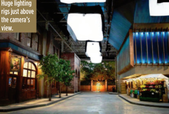
GOOD OMENS HAD A CHANGE of location for its second season, but hopefully you didn’t notice. Because Whickber Street in Soho upped sticks from an airfield in Hertfordshire to a furniture warehouse in Bathgate, Edinburgh. It’s the kind of nonsensical geographical shenanigans that could only make sense in the crazy world of film and TV, and production designer Michael Ralph was the man in charge of rebuilding and expanding the show’s vast central set. “I wish we could have built more in season one than we did,” says Ralph, whose previous work has included Primeval and Dickensian. “We built the ground floor of everything and the facades of all the shops. But we didn’t build anything higher than that, because we were out on an airfield in a very, very difficult terrain and weather conditions, so we really couldn’t go much higher. Visual effects created the upper levels.”
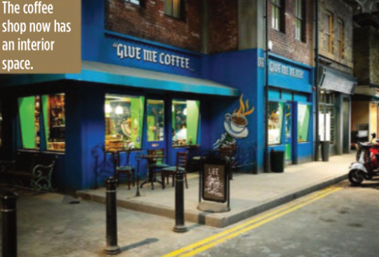
But with season two the set has gone to a whole other level… literally. “What happened was that the rest of the street became integrated into the series’s storyline,” explains Ralph. “So we needed a record shop, we needed a coffee shop that actually had an inside, we needed a magic shop, we needed the pub. To introduce those meant we had to
change the street with a layout that works from a storylines point of view. In other words, things like someone standing at the counter in the record shop had to be able to eyeball somebody standing at the counter in the coffee shop. They had to be able to eyeball Aziraphale
sitting in his office in the window of the bookshop. But the rest of it was a pleasure to do inside, because we could expand it and I could go up two storeys.”
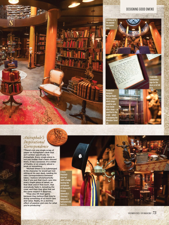
For most of the set, which is around 80 metres long and 60 metres wide, the two storeys only applied to the shop frontages, but in the case of Aziraphale’s bookshop, it allowed Ralph to build the mezzanine level for real this time. According to Ralph it became one of the cast and crews’ favourite places to hang out during down time.
But while AZ Fell & Co has grown in height, it actually has a slightly smaller footprint because of the logistics of adapting it to the new studio.
“Everybody swore to me that no one would notice,” says Ralph wryly. “I walked onto it and instinctively knew there was a difference
immediately, and they hated me for that. I have this innate sense about spatial awareness and an eye like a spirit level.
“It’s not a lot, though – I think we’ve lost maybe two and a half feet on the front wall internally. I think that there’s a couple of other smaller areas, but only I’d notice. So I can be really annoying to my guys, but only on those levels. Not on any other. They actually quite like me…”
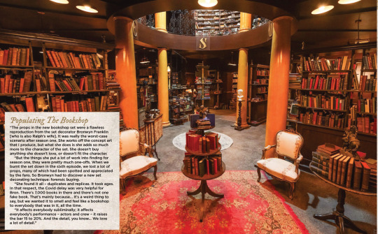
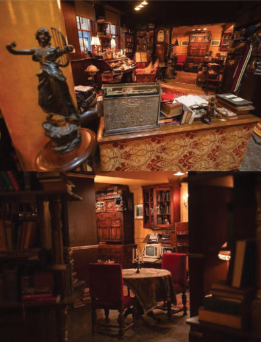
Populating The Bookshop “The props in the new bookshop set were a flawless reproduction from the set decorator Bronwyn Franklin [who is also Ralph’s wife]. It was really the worst-case scenario after season one. She works off the concept art that I produce, but what she does is she adds so much more to the character of the set. She doesn’t buy anything she doesn’t love, or doesn’t fit the character.
“But the things she put a lot of work into finding for season one, they were pretty much one-offs. When we burnt the set down in the sixth episode, we lost a lot of props, many of which had been spotted and appreciated by the fans. So Bronwyn had to discover a new set decorating technique: forensic buying.
“She found it all – duplicates and replicas. It took ages. In that respect, the Covid delay was very helpful for Bron. There’s 7,000 books in there and there’s not one fake book. That’s mainly because… it’s a weird thing to say, but we wanted it to smell and feel like a bookshop
to everybody that was in it, all the time.
“It affects everybody subliminally; it affects everybody’s performance – actors and crew – it raises the bar 15 to 20%. And the detail, you know… We love a lot of detail.”
(look at the description under this, they called him 'Azi' hehehehe :D <3)
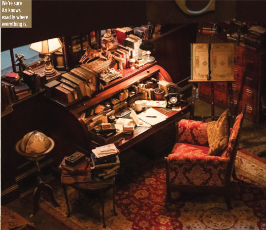
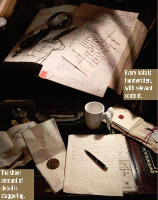
Aziraphale’s Inspirational Correspondence “There’s not one single scrap of paper on Aziraphale’s desk that isn’t written specifically for Aziraphale. Every single piece is not just fodder that’s been shoved
there, it has a purpose; it’s a letter of thanks, or an enquiry about a
book or something.
“Michael Sheen is so submerged in his character he would get lost
sitting at his own desk, reading his own correspondence between
takes. I believe wholeheartedly that if you put that much care into every single piece of detail, on that desk and in that room, that
everybody feels it, including the crew, and then they give that set
the same respect it deserves.
“They also lift their game because they believe that they’re doing something of so much care and value. Really, it’s a domino effect of passion and care for what you’re producing.”

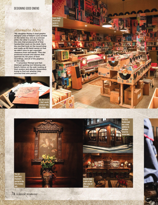
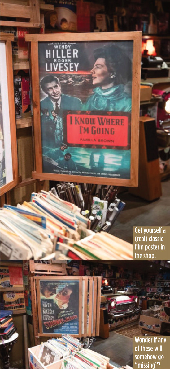
Alternative Music “My daughter Mickey is lead graphic designer [two of Ralph’s sons worked on the series too, one as a concept artist, the other in props]. They’re the ones that produced all of that handwritten work on the desk. She’s the one that took on the record shop and made up 80 band names so that we didn’t have to get copyright clearance from real bands. Then she produced records and sleeves that spanned 50, 60 years of their recordings, and all of the graphics
on the walls.
“I remember Michael and Neil [Gaiman] getting lost following one band’s history on the wall, looking at their posters and albums desperately trying to find out whether they survived that emo period.”


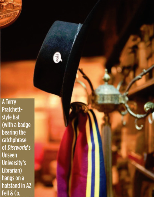
It’s A Kind Of Magic One of the new shops in Whickber Street for season two was Will Goldstone’s Magic Shop, which is full of as many Easter eggs as off-the-shelf conjuring tricks, including a Matt Smith Doctor Who-style fez and a toy orang-utan that’s a nod to Discworld’s
The Librarian. Ralph says that while the series is full of references to Gaiman, Pratchett and Doctor Who, Michael Sheen never complained about a lack of Masters Of Sex in-jokes. “He’d be the last person to make that sort of comment!”
Ralph also reveals that the magic shop counter was another one of his
wife’s purchases, bought at a Glasgow reclamation yard.
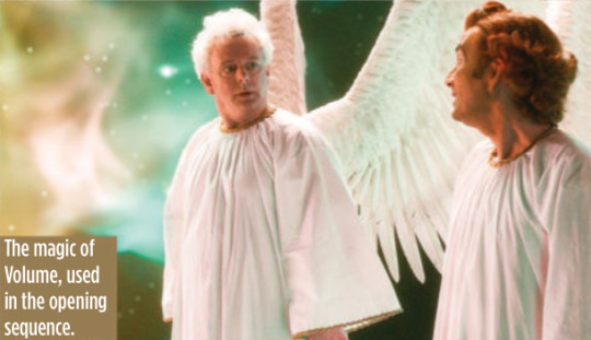
The Anansi Boys Connection Ralph reveals that Good Omens season two used the state-of-the-art special effects tech Volume (famous for its use in The Mandalorian to create virtual backdrops) for just one sequence, but he will be using it extensively elsewhere on another Gaiman TV series being made for Prime Video.
“We used Volume on the opening sequence to create the creation of the universe. I was designing Anansi Boys in duality with this project, which seems an outrageously suicidal thing to do. But it was fantastic and Anansi Boys was all on Volume. So I designed for Volume on
one show and not Volume on the other. The complexities and the psychology of both is different.”
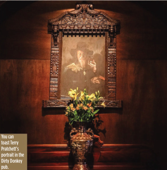
#good omens#gos2#season 2#photos#bts#bts photos#interview#sfx magazine#magazines#hq photos#neil gaiman#terry pratchett#michael sheen#david tennant#michael ralph#mickey ralph#bronwyn franklin#anansi boys#the small back room#maggie's record shop#soho#aziraphale's bookshop#dirty donkey#magic shop#aziraphale's correspondence#give me coffee or give me death#fun fact#michael ralph interview#sfx 372 magazine#s2 interview
4K notes
·
View notes
Photo

Tile (Philadelphia)
#An idea for a medium-sized transitional courtyard patio without a cover. estate lighting#reproduction#luxury lighting#custom lighting#outdoor chaise lounges#iron furniture
0 notes
Text
Antique rouge marble top chest of drawers French inlaid
0 notes
Photo
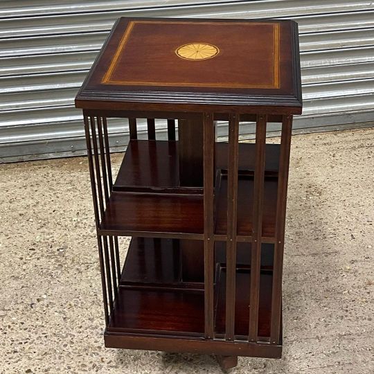
Vintage Two Tier Edwardian Style Inlaid Mahogany Revolving Bookcase eBay item number 234797953799 #edwardianstyle #reproduction #revolvingbookcase #bookcase #revolving #books #inlaid #inlaidwood #furniture #furnituredesign #bookcasestyling #bookcasedecor https://www.instagram.com/p/Clekc9koeqX/?igshid=NGJjMDIxMWI=
#edwardianstyle#reproduction#revolvingbookcase#bookcase#revolving#books#inlaid#inlaidwood#furniture#furnituredesign#bookcasestyling#bookcasedecor
1 note
·
View note

Link
The perfect combination of luxury, comfort, and unmatched elegance, shop for the exclusive High-End Chairs for Living room at Classic and Country Interiors now.
#French Louis Style Luxury Sofa Suites#louis xv furniture reproduction#French Louis Style Dining Table
0 notes
Text
Dear newbie queer kids,
We appreciate the sentiment but stop "correcting" the older LGBTQ+ community. And by "correcting" I mean trying to force them to adopt your language.
"Actually, it's pansexual if you're attracted to any gender. Bisexual means only men and women." (I really was told that one today.)
"Actually if they're attracted to anyone despite gender and even to non-human entities in works of fiction that's omnisexual."
Guys, you may not know it but what you are doing is what we'd once call bi-erasure.
A little LGBTQ+ history:
The word bisexual is still relatively new for a lot of people. In 1973 when David Bowie came out as bisexual, a reporter misunderstood that to mean he had both male and female reproductive organs. Even today I've stumbled upon people who think bisexual means "nonbinary." meaning "I don't identify as a man or a woman."
The only connection the words have is the "bi" part so this one is painfully stupid.
In the 1990s there were older queer folk who didn't even know bisexual is what they were. When Roddy McDowall was confronted by Vincent Price's daughter and asked "Why didn't you tell me my father was bisexual?" He said "We didn't know the word."
In the 90s most bisexual people used the term to mean attraction despite gender.
I'm fine with the use of the word "Pansexual" but it IS actually gatekeeping to tell older bisexuals that the word bisexual means "disincluding trans and nonbinary" and "attraction to the gender instead of despite the gender."
I can't think of very many people who identify as bisexual who are okay with those added restrictions that they didn't agree to.
For most of the older queer community bisexual means their own gender and everything else. That's the two for bi.
I am certain there are some people today who don't mind the new restrictions added to the word bisexual and use it to self-identify but those that were identifying a bisexual in the 90s and early 2000s didn't have such restrictions because the options of pansexual and omnisexual were not in use yet.
Pansexual was a term invented by Freud to mean "attraction to anything" (this included furniture). It's modern meaning of "consenting adults without consideration of gender" is relatively new and frustratingly this was originally how most of us were using the word bisexual.
When you "Correct" someone who self-identifies as bisexual that they are actually pansexual because you want them to use the more modern language, THAT is gatekeeping.
Ironically this just happened to me and when I corrected the person that was "correcting me" by explaining that older people who identify as bisexual tend to use it with the same meaning as the modern pansexual, I was suddenly accused of "Gatekeeping."
So now, ironically, they're misusing the term gatekeeping while gatekeeping.
Please stop doing this. The new terms are okay but don't tell us how we can use the older terms, especially when bisexual isn't that old of a term in the grand scheme of things. I sometimes use the term pansexual just to make things easier for the younger folk since they adapted to the restrictive version of the term bisexual we never asked for. Also I like its connection to mythology.
But please don't "Correct" people for using the term they had for themselves since the 90s because they never added those new restrictions to it. This is rude. And that is the gatekeeping. Them telling you what the word meant decades ago is not "gatekeeping." You telling them how they have to us it now- that is gatekeeping.
Sincerely, Most queer folk over the age of thirty.
865 notes
·
View notes
Text

Hinged louvered shutters, instead of curtains or draperies, add architectural interest when used to frame otherwise ordinary windows; they may be folded back during the daytime and closed over the windows for nighttime privacy. In this bedroom, designed to grow with a young girl, reproduction furniture is in the best early American spirit.
The Good Housekeeping Complete Guide to Traditional American Decorating, 1982
#vintage#vintage interior#1980s#80s#interior design#home decor#bedroom#teenage#four poster#louvered#shutters#antique#furniture#toys#early American#traditional#style#home#architecture
377 notes
·
View notes
Note
heya! I'm wondering, from where do you reference clothing for your art pieces? (Specifically for Inver!) I enjoy the outfits you draw your characters in
hii so for the fancier victorian-era outfits i used a whole bunch of sources but among them the metropolitan museum costume collection, this is a great online gallery of historical costume that you can search by era. you can also find illustrated fashion plates from the era to get a sense of how people styled the outfits, facial hair, accessories etc. here's one for hats i used. i also followed the twitter account WikiVictorian which.. due to new twitter policies you can't view accounts while not logged in, but it looks like they have a pinterest and also instagram?? anyway great resource, posted a lot of dresses, furniture, and historical recipes with sources & context.
(cut for length)
but those dresses and stuff are for the upper classes. For ordinary people i just googled what I knew every old lady wears: shawls
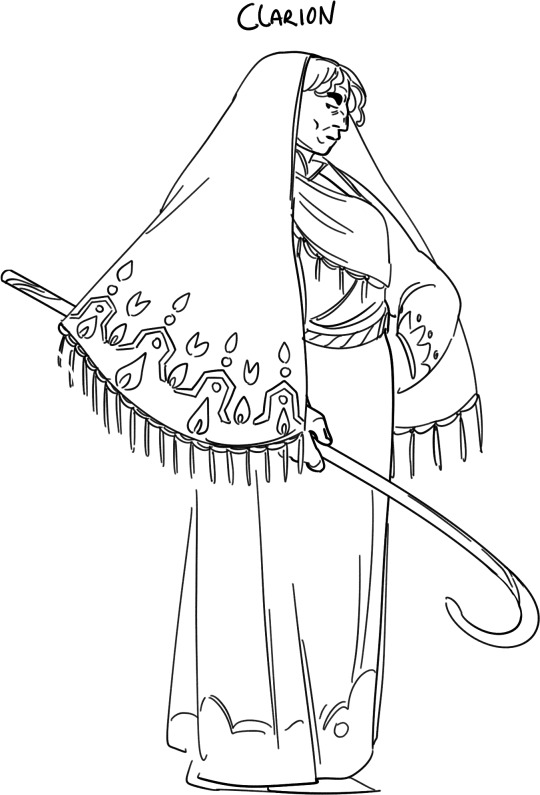
this is a galway shawl which is like. THE thing every single person wore back in the day and if you check out the wiki page it's a great reference for what patterns & dyes would have been used. from there you can find historical photos. i love photos like this which show a whole scene in context with people from multiple generations hanging out (yooo check out the Sparch in the background!!). now I know this isn't 1860s stuff, but the fact is that fashion doesn't move so fast for people like Clarion who live on a farm and have to make their simple clothing items last for a lifetime or more.
for the military outfits I mainly just googled 'military outfit 1860s' and iterated (groundbreaking). for things to be accurate i tried to pick reference illustrations drawn during the era.
i figure you might mean specifically the ancient Inver stuff so for them I used a lot of old illustrations and stuff from art history class in school. this era is more in the region of the 1500s. here is a kind of kitchy site which nonetheless has real-life examples of some of the clothing i drew. this painting is in my list of references (sorry for the stock image link but it's one of the nicest online reproductions of it) and you can see the guys on the right wearing the same léine that i've drawn Finbarr in. once you know the time period & what the various outfit components are called you can search them more easily. now the headdress i've drawn Finbarr wearing (Olivier wears it as well!) is in fact a real thing, it's the Petrie crown broken in half.
the crown is not of the same era as the other outfits because i'm not so interested in historical accuracy as much for these guys (booo).
for Olivier I searched for old French armour from the same historic era as Finbarr, I know less about the history of Brittany so kind of just copied what I saw with some small alterations (because he wears werewolf armour, which is not a thing irl).
#setting: inver#i know there's a website for renting costumes that goes around every so often on tumblr but i find them really lacking in menswear usually
207 notes
·
View notes
Text
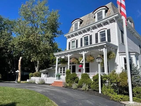
What a beautiful home! 1860 home with a mansard roof in the lovely town of Cornwall on Hudson, NY. 4bds, 4ba, $1.25M.
The front door is stunning. It looks like black patent leather.

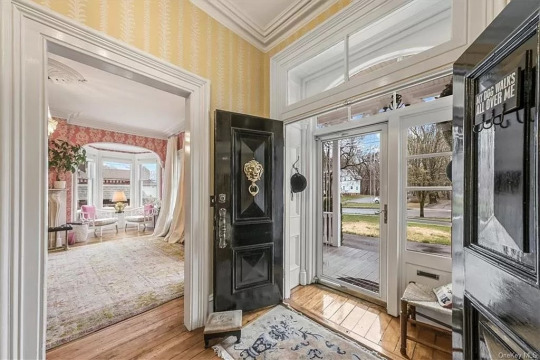
Center hall with original stairs.
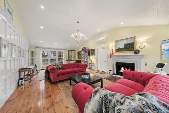
To the left is a very spacious sitting room. It's so bright and cheerful. Look at the wainscoting wall.
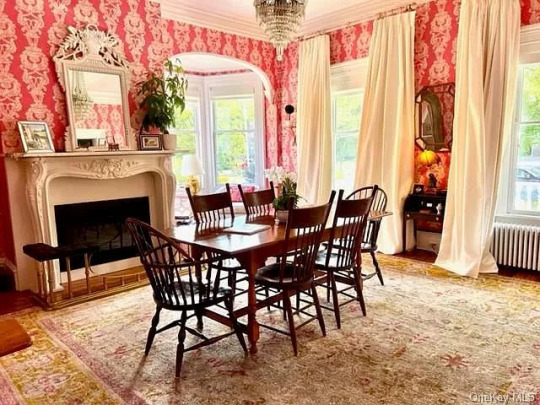
To the right of the hall is a pretty dining room. It can accommodate much larger furniture and more pieces.

Look at the cute little mousie detail on the baseboard.

Isn't this the most delightful guest powder room?
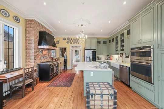
The kitchen remodel is lovely. The stove is in front of the original fireplace.
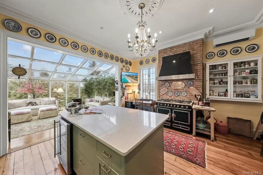

The kitchen is open to the gorgeous sun room.
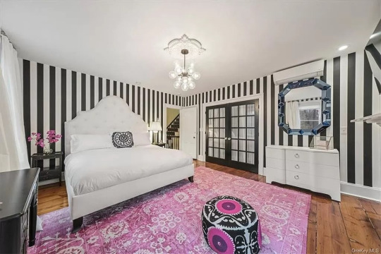
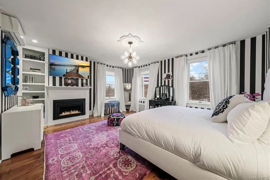
I still feel that you can't go wrong with striped wallpaper. It always looks great. This main floor primary bedroom is stunning.
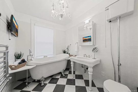
Love baths redone with reproduction vintage fixtures.

At the top of the stairs is a bright sitting area.
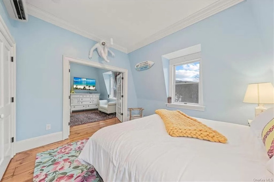
This beautiful bedroom has a separate sitting room. It could also be the primary.

Like that they left this brick remnant.
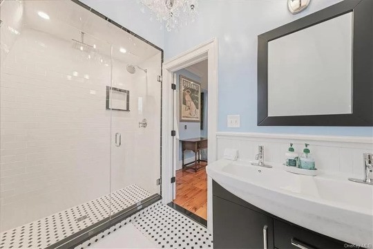
En suite shower.

If this is a guest room, it's wonderful. A small table, sitting corner, books to read, and a fireplace.
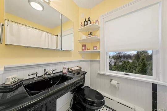
This bath looks retro. So attractive.

Beautiful basement stairs.
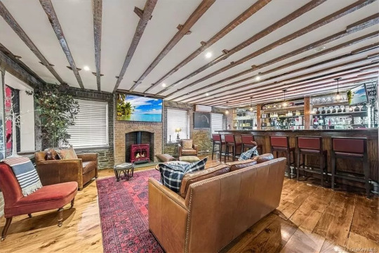
The rec room has a bar that can accommodate the whole gang.
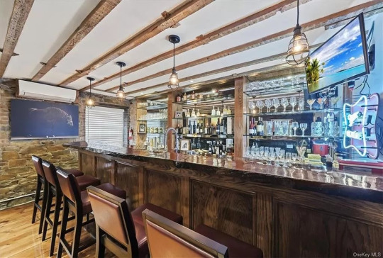
Very professional, well-equipped bar.
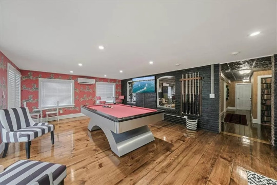
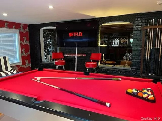
Guests can go across the hall to the pool room.
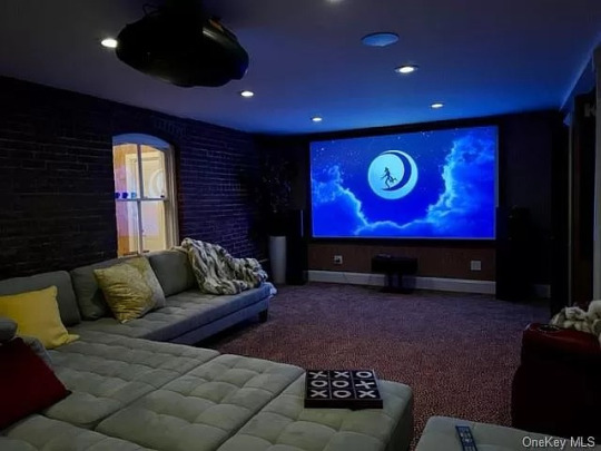

There's also a comfortable movie room.

Large yard with a deck and pool.

Lots of parking, plus a garage.
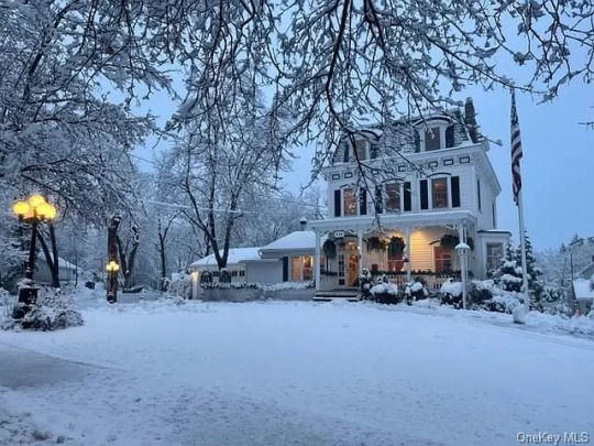
It looks like a picture in the snow.
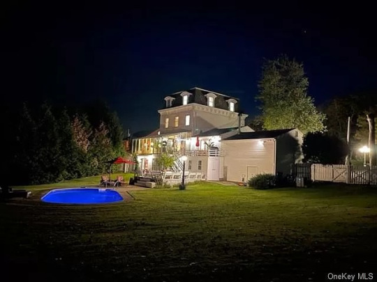
So pretty lit up at night. The lot is .58 acre.
https://www.zillow.com/homedetails/296-Hudson-St-Cornwall-On-Hudson-NY-12520/89600935_zpid/
99 notes
·
View notes
Last Seen Blogs

liopa
LIOPA - MỸ PHẨM XÁCH TAY CHÍNH HÃNG

crml-crm
~

no-name8745
Sans titre

olyshka-fit-me
Без названия

jamesjohn88-blog
James Johnson