Last Seen Blogs
frmartinshomiliesandreflections
Fr Martin's Daily Homilies & Reflections
chanoyu-to-wa
Chanoyu to wa....
onixiage
Apocalypse
irraydiate
Ray

reaper2103
Unbetitelt
Link
https://spark.adobe.com/page/4Pvrqgd3VOdnU/ (object exploration)
https://spark.adobe.com/page/guVlVBHzzcymP/ (brand)
https://spark.adobe.com/page/VmiGxDz46Q8xM/ (social media)
https://spark.adobe.com/page/kQDFTgsU6ZQPu/ (environment 360)
https://spark.adobe.com/page/LdNFDrPCDN7UZ/ (re-imagine)
https://spark.adobe.com/page/rLwqbywa2Qrfp/ (brand slogan)
https://spark.adobe.com/page/MA89OH42U714Z/ (zine)
https://spark.adobe.com/sp/design/page/urn:aaid:sc:EU:1da27fc2-44c4-475a-ba05-3977d51096ac (landscape interrupted)
https://spark.adobe.com/page/9PWflUD4LI3W4/ (sense of time)
https://spark.adobe.com/page/CfSUSyI7ZPaoe/ (portfolio)
5 notes
·
View notes
Link
in todays (26.01.2021) we were discussing websites, what's there purpose and what makes a good website. in small groups students were to come up with a photography website each and discuss the layout of the site.
0 notes
Link
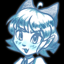
Nowadays you can never walk to far without seeing a face mask lying on the ground. i was quite shocked at the amount of face masks i found discarded in nature trails, conservation areas. as far as i know these face masks are not bio degradable and as such harming the environment. i have seen many face masks discarded next to a bin. the excuse may be that the bin was full, but i am sure every household has a bin. i went to Drumpellier Country Park, the bottom left image of the face mask, i spotted that on 20.01.2021. it was still there on 22.01.2021. there have been many news stories of face masks been found on the beach.
https://www.theguardian.com/environment/2020/jun/08/more-masks-than-jellyfish-coronavirus-waste-ends-up-in-ocean.
https://www.dailymail.co.uk/sciencetech/article-8918195/Face-masks-plastic-gloves-littering-30-cent-beaches.html
0 notes
Link
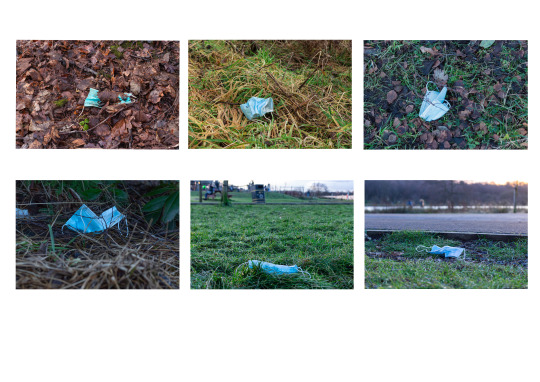
for this brief, patience, lighting and knowing when and where a photograph can happen was essential. For me this image best answers the brief because on that particular day (21.01.2021) the light was flat most of the day up until 3pm. At the time the sun was shining, and I knew that by the time I arrived at the station the light would produce shadows and would bring out the colours of the train. As the sun was going down, the light would be nice and soft. As well as the light being soft it has produced a nice reflection on the train. As the name of the brief is Wait For It, I did both. I waited for the right time of day, for sun to produce a nice light and I waited on the train to leave the station in order for me to capture that particular shot. what i also like is the perspective that the image gives. in the original image, the highlights behind the train under the bridge were quite prominent. to rectify that i made use of the Burn Tool. using my Graphics Tablet i darkened that particular area. for a first time using both tablet and Burn tool i have made a good effort and actually produced what looks like light cloud in the sky.
0 notes
Link
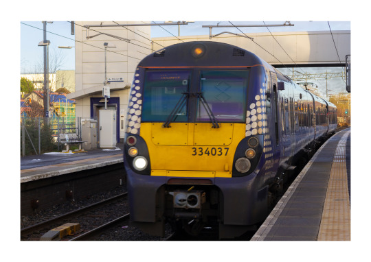
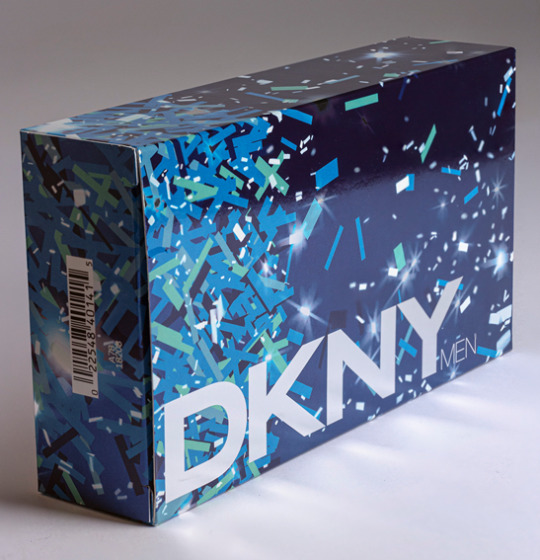
This is my final image and was a tricky brief to do and get correct. Even with this final image more adjustments could have been made by using the Perspective Tool to straighten out the bottle. The main improvement was to make the background whiter than the original image as it was more gray than white. I brought up the blacks to help the bottle stand out as when I increased the whites, the look of the bottle was pale. Although the box is in the background and not in focus I still wanted that to play a part, in doing this I adjusted the blues in Colour Mixer. Clarity was also increased to help the letters on the bottle stand out. I felt the letters in the original image were to dark. I like the perspective in this image, the bottle towering over the box.
This brief came in several parts, above the final image. One of which was Focus Stacking. To look at you would think anything had been done differently. This is not so.
Focus stacking is a process whereby multiple images are taken at different focus distances. In doing this technique enables for a better Depth of Field. Focus stacking can be adopted in any situation, however, it is more prevalent in macro and landscape photography. To Focus stack it is important to use a tripod for stability, set exposure ( this must be the same setting when taking the images), focus on your first area then continue to do so with other areas of the subject, each time adjust the focus on each part. Open the images in Photoshop, open as separate layers, the next and final step is to merge, this is achieved by having Photoshop automatically do this by clicking on Edit then auto-blend layers.
All the work was done in Photoshop. However, before any Focus Stacking in Photoshop was done, I made some basic optimisation to my images in Lightroom. In order to have consistency with the images I synchronised the changes I made for one image to the rest. i went to File, then Scripts chose Load Files Into Stack. A dialogue box named Load Layers opened up, I then browsed which files I wanted opened, highlighted them then clicked on Attempt to Automatically align Source Images then ok. All layers (7) appeared in the layers panel. After layers were aligned, I clicked on the Edit menu and chose Auto-Blend Layers, a dialogue box opened in which I chose Stack Images. I also ticked the boxes for Seamless Tones and Colours and Content Aware Fill Transparent Areas. Photoshop then began the process of focus stacking. When focus stacking was complete I then cropped the image and optimised in Photoshop.
A part where i had to cut out the bottle from the background, this wasn’t to bad a task,
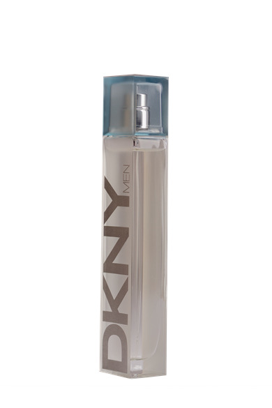
In order to remove the bottle from the background I opened the image in Photoshop and used the Pen Tool, I clicked on each corner until I got to the first corner I started with. After which I went to paths and clicked onto Load Path as Selection, on doing this small dashes (known as ants) circled the object. I then clicked onto Select and Mask. As I was happy with my cut out, I went to Output then New Layer with Layer Mask then ok. There was now a transparent background. Initially I used the Quick Selection Tool but this was not precise enough and parts of the background which were close in colour to that of the bottle were still in the cut out.
The other part was to place the bottle in another background,
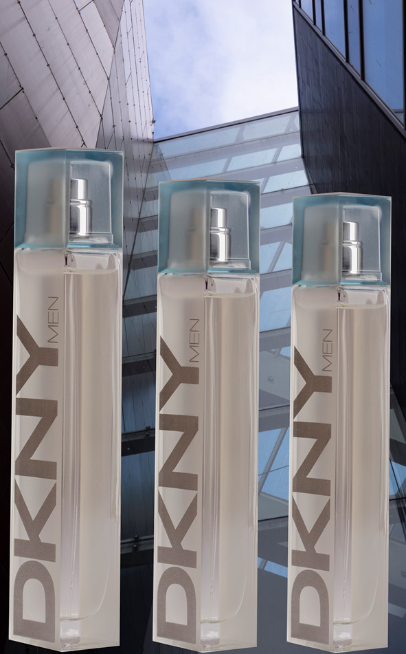
I thought that the blue bottle top go with the colour of the sky and the colour of the DKNY goes with the colour of the building. The background is also a picture i took for my Geometry Club brief.
0 notes
Link

All of the objects in this image symbolize a great source of support and strength. The image of Buddha gives off a peaceful energy as he sits meditating which produces a quiet mind in such troubling times. The main crux of the image is of hope, protection and tranquillity. The cards (which were picked of the first day of the shoot) represent a positive future. The Sage is a powerful tool as when burned, any negative energy around is cleansed, therefore, the energy is purified. The various crystals and minerals signify various things, the Pink Quartz (first one that can be seen in the image) releases emotional stress. The remaining crystal’s help with grounding, anxiety. The crystal sitting on the sage is known as a Danburite and is used to relieve emotional pain. The image tells the story of sensitivity, being in touch with emotions and a belief in a higher power, whether that be Buddha, Source or the Universe.
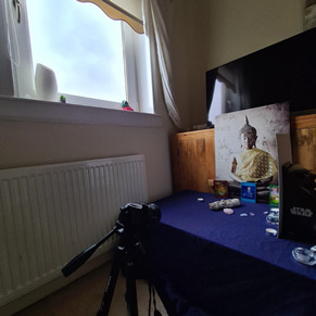
This was my makeshift studio. The table in which the objects were on was placed near the window. The room in which the shoot took place at the back at the house and as such in the afternoon gets the sun. I had thought that by getting the table as close to the window light as possible would allow for more light reaching the objects. In the event that natural light would not reach certain areas, a white reflector in the form of a white A3 card was used. The clear mineral, Danburite which is sitting on the Sage, I wanted light or a glow to be seen through it. I thought of the idea of using a candle, adding a subtle glow which I thought worked quite well.
Overall I am quite pleased with my final edit, considering I was inventive with my equipment. There was no elaborate backdrop like there would be in an Old Masters painting. Window light was the main source of light apart from a tealight candle. A A3 white cardboard was used for a reflector. So not too bad for very basic makeshift studio equipment. The only professional equipment used was my tripod and camera. The table used was a coffee table covered with a blue bedsheet. On looking at the image, I am happy with the composition, I laid out the cards in that particular way as I wanted the observer to read what the cards say (they were the order the cards were drawn). There is a perspective in that it is as though the Sage and Crystals are coming out from the image. Also it appears as though Buddha is not part of the actual picture and is sitting in front of the background.
As for edit, I am happy with that, using the colour mixer to bring out the gold in the picture and to add warmth using the colours yellow and orange has worked out quite well. I learned a new skill in Photoshop with the use of the Gaussian Blur Filter to add a soft glow feel. I didn’t want to used it too much as it would have blurred the image. However, I do like the look of the clear mineral and the glow look on the right side of the Buddha picture. The only thing that slightly bothers me (only slightly) is the shadow along the Sage, however, that in itself could be seen as symbolic in that every so often a dark shadow will appear but it will only be temporary, nothing is permanent. From dark times, lessons can be learned
0 notes
Link
LANDSCAPE PHOTOGRAPHY
My definition of landscape photography
For me its wide-open space, scenery. Now this wide open space or scenic wide open space can cover Seascape but not Cityscape. Landscape and Seascape are both natural wild beauty. Cityscape is manmade, its not natural and in my opinion does not take your breath away in the way that Landscape and Seascape does. So, my definition of Landscape is natural wide-open space. I looked up the meaning of ‘scape’ it is ‘used to form nouns referring to a wide view of place, often one represented in a picture’ (https://dictionary.cambridge.org/dictionary/english/scape). That will then include land, sea and city. The ‘old masters’ were painting landscape such as Jan Brueghel the Elder,

https://www.artsy.net/artwork/jan-brueghel-the-elder-hunters-with-hounds-by-a-stream-in-a-wooded-landscape
For me this is my style of Landscape photography, in a wooded area with different types of trees, various shades of greens, different textures of tree bark. My only difference is it would be of more a wide open space, sun rays shining through the gaps in the trees and no people.
3 publications that use landscape photography
1. National Geographic
2. Landscape
3. The Herald
Companies that use landscape in their promotional material
1. Banks such as The Royal Bank of Scotland -
2. Hotels such as the Waldorf Astoria Edinburgh – The Caledonian
3. Energy companies such as Scottish Power
Landscape images give the customer a sense of trust, there are being looked after. There is also a sense of identity, they could see a picture of a place in Scotland they have been too which will trigger good memories, again instilling a feeling of trust in the company. There is also an historical element, places that time forgot. The customer can go back in time, a time that no longer exists. There is a feel-good factor in landscape paintings/photography. Companies are using psychology as a means of winning of customers.


Above are my final images. Initially I was experimenting with the 1:1 look. I have not cropped images in this way, however, because the sides are of equal length I find that it works. I felt that cropping the image to 1:1 gave it classic look. It is easy on the eye as the eye moves around the picture rather than side to side as it would a rectangular frame. The main features of the image have not been disturbed by the crop. By cropping the image I have cut out unnecessary distractions What I also like is the depth and perspective.
0 notes
Link
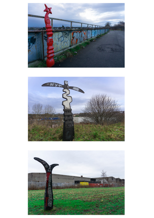
When I first thought about this brief I was going to photograph a blue bench sat on its own next to a roundabout, but then I found these signposts which may people don’t notice and just walk past, boring plastic objects that have been vandalized. They were stuck in the middle of nowhere informing of how many miles to places. What attracted me to the signposts were the colours of them and of the surroundings in which they were placed.
To help enhance the colours I increased vibrancy and saturation. I then went on to Colour Mixer to enhance specific colours, red, blue, green and yellow in each of the image. In doing this I was trying to emulate photographer Martin Parr, in his images the colours are very intense as a result of the high saturation produced by the film that he used. By enhancing the saturation in the colours, it has helped the image stand out. The increase in saturation in the first image has helped the signpost stand out against the gray sky. With the remaining two images, the signposts are black and as such brought out the colours surrounding the posts, the green grass and the yellow and red containers. Overall I like the images and the theme behind them, the bridge where many fights take place over territory and spare ground with lonely paths, all of which have signposts showing the way.
0 notes
Link

Some time ago i had a brief not unlike this one called Illuminate. It did not go very well. This one i like, plus i actually enjoyed working on it. I didn’t make use of any fancy lighting equipment, just the torch on my smartphone as the primary light source. Secondary light sources included the moon and lights from my house.
With this image the iso was not high, at least not over 1000. For this image the iso was at 640 with the aperture being at f/9 and the shutter speed at 15 seconds. Therefore, with regards to noise there were some. To help minimize this as much as possible using Bridge I adjusted for lens aberration by using the Optic tool after which I went to Detail, I left sharpening at 40 but for Detail I moved the slider to the right at 55. I thought it best to leave it around half way as taking the detail up to 100 might introduce more noise. To help gauge how much detail I was losing or gaining I pressed the Alt key whilst moving the slider, this made the screen grey in colour which made the pixels more prominent to see. I did similar actions when it came to adjusting for noise reduction. Noise reduction was taken right to 75 whilst detail was taken to 76. As for Colour Noise Reduction I began seeing differences round about the 30 mark, however, I decided to push it to 50, solely because colour noise reduction is not a tool I have used much.
0 notes
Link

these are my final set of images for the brief Geometry Club.
When placing the images onto the A3 canvas my first thought was to try and do this canvas portrait, but in my head I didn’t think it would work. As my images are a mix of square, portrait and landscape I thought it wise to place the images on a landscape canvas. As my images are various sizes I have made life difficult. However I think I have made it work in the way I have laid them out. My four portrait images went along the top to allow them on the canvas, as I liked my square images I opted for placing them on the bottom corners this then enabled me to place my three landscape images, one in the bottom middle and the other two in the middle between portrait and the remaining three. Having looked at the canvas, I would say that my weakest image is the middle right, it looks slightly squinty but I think the more you look at it the more the eyes deceive you into thinking that the image is not even. I also think that it looks slightly off as a result of the open window at the top right (all the windows are open, however the right window has a shadow from it). My strongest image/s are the top 3, I like that perspective, leading lines. I also like the bottom right image, it has an abstract feel to it which I find appealing. On the whole, I think the layout works well, there is a natural path for the eyes to follow. The images of the windows with the red, I think may look more impressive on their own canvas, they seem to jump out (or look out of place somewhat) as the rest of the images have a grey/silver look about them. All in all I like each image for their own look.
0 notes
Link

This was the first brief and the first time back in the studio. Very little in the way of edits were done apart from bringing out the whites in the shirt and the blacks in the face covering. I adjusted the white background by using the white balance tool in ACR.
0 notes
Link

I’m slightly unsure if i have went the right way about for this brief, Grid System. I had to pick a spot, stay there for 3 hours, speak to people, walk about and capture what was happening or not happening. As i live in a small town called Airdrie, nothing really happens. Plus i have never been out in the town centre with my camera, so i was getting some very strange looks. Its not like Glasgow where people walking about with a camera is the norm.
I selected these particular images as they are of the streets I remember the most of that were busy up until shops shut down (well before lockdown). All the streets run into each other. Airdrie is not unlike Glasgow in that you can not really get lost. If you come off one street and turn right and continue doing so you will come back to the street you started off from. For instance, the first image with the Police Station Anderson Street, if you walk up it, turn right, turn right again, turn right then turn right again you will see yourself at the Police Station again. In fact you are walking in a square, similar to Glasgow. As I have not lived in Airdrie for 18 years, seeing the deterioration of Airdrie was quite sad as Airdrie was once a vibrant town centre. These images have a grittiness about them; however, each image has colours in them that bring them alive and by taking advantage of the Colour Mixer tool, mainly Saturation, I used that to intensify the colours. by not making the images pretty and keeping as much rawness as possible I am keeping to the true nature of how Airdrie town center is, it is a ghost town. Airdrie has lost its spirit, it has no life and I think the edits (what little they were) has shown that to great effect.
0 notes
Link
These are the pictures i captured for the brief ‘lockdown’, For these images a new technique known as Colour Grading was to be used, fortunately Lightroom and Camera RAW had updated this tool. The images are to show the impact of Lockdown and how it makes Glasgow (a once bustling city)look and feel.
When I began this experiment with Colour Grading I used the new Colour Grading Tool in Camera Raw, 3 circles named Midtones, Shadows and Highlights all of which have colours ranging from reds, oranges, yellows, greens, blues, purples and magenta. I also made use of the Colour Mixer too. In all honesty, I was playing about with the colour grades, however, I do like Edit 3, there is a post-apocalyptic look about it. The most busiest part of the town city is empty apart from one individual. At the height of the lockdown, it felt like the end of the world, hardly a soul about. Even though the image has a Sepia tone, the reds have came out well along with the greens and yellows. If I can get the remaining 9 images, that I am going to use, like this I will be quite happy with what if have produced.
0 notes
Link
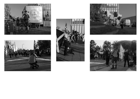
I feel quite pleased with the above images. On the evening that I went to the Quay I was not expecting there to be a Under One Banner demonstration, not only were they there but also those opposed. So I struck gold arriving there when I did. I think my images have captured the demonstration well. The images form a series of event from that night. I think they have turned out well, these particular set of images I optimised in Lightroom , I did not use the Targeted Adjustment tool here, I adjusted the black and white mixer using the slider to achieve this look.
0 notes