juliebalfourhnd2cphoto
Julie Balfour HND 2C Photo
76 posts
Don't wanna be here? Send us removal request.
Last Seen Blogs

Text
Social Portraiture – Research Julie Balfour – HND 2C

Social Portraiture
David Bailey, Brian Duffy, Terence Donovan.
“most people look and never see, so you have to practice looking, and then you’ll learn to see”.
Through the Lens: David Bailey, 2012
Social Portraiture is more than just the capturing of an image of a person. It is about engaging in the process with the subject, getting to know them, and bringing to it a little bit of narrative.
The classic photographer for such portraiture is David Bailey, his images bring more to the table than just a perfectly rendered portrait, they show a depth to the relationship between model and photographer
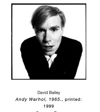


As his fame grew he was increasingly able to work in this way. In the 2012 Documentary “Through the Lens: David Bailey” he says, “I want to know everything about you so that I can assess your life, and then, maybe, I can reflect it a bit in my portraits
Bailey was one of an “unholy Trinity” at this time, alongside Brian Duffy and Terence Donovan all of whom developed “documentary” fashion photography.

A new and innovative style that took fashion out of the studio and into the streets. Their grittier, reportage style was considered to be more documentary than fashion, and this fresh style was often attributed to their working class backgrounds which meant they were initially outsiders in the world of photography
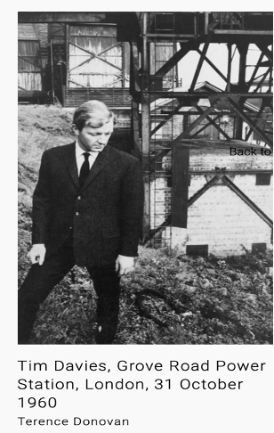
However, by the 1960’s they were considered the most influential photographers of their time and remain so today.
Steven Meisel.
Meisel’s work is often controversial and both the model and the fashion items are at times secondary to the narrative of the photographer, in these circumstances his vision moves both the clothing and the models beyond mere portraiture to a different art form and in doing so elevates the profile of both. His Avent Garde work is in high demand and he has created many memorable campaigns for fashion houses including Prada, Miu Miu, Moschino, Balenciaga and Dolce & Gabbana.
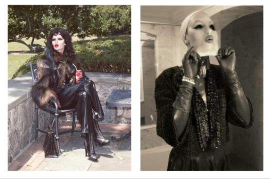
Multi-Faceted Women.
Vogue Italia. September 2012
https://www.vogue.it/en/fashion/cover-fashion-stories/2012/09/03/multifaceted-women/
Face the Future; Steven Meisel.
The model’s faces in this shoot are replaced with the latex faces of female doll masks of the type used in cross dressing or fetish play. Suggesting that the faces of fashion models have become generic, homogenised and interchangeable.The clothing, representing many of the leading fashion houses, also has a latex, fetishist imagery about it.

The Discipline of Fashion” Vogue Italia. September 2011
Stella Tennant depicted as Ethel Granger.
Steven Meisel.
This representation of real life “Tight-Lacer” Ethel Granger once again subverts the fashion and draws attention to the “no pain, no gain” message of the fashion industry with the tightly cinched waists, restrictive skirts and impossibly high heels demanded of fashion.Once again the clothing is from high end fashion houses and yet it is depicted as both beautiful and repellent. At what cost will we follow fashion?This is a recurring theme in Meisel’s stunning work, and it is hard to look away from it. Both beauty and revulsion sit side by side in much of his fashion photography. It begs the question, is he the misogynist in this work, or is he turning our gaze to the horrors of the fashion industry?
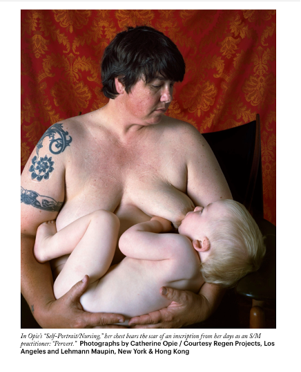
Catherine Opie
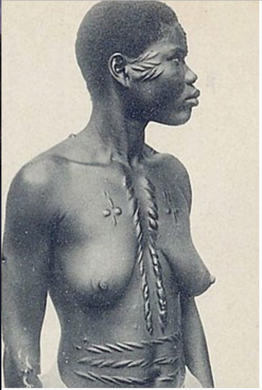
One of the questions posed in the presentation “Say What You See” (contextual photograph) is why it might have been taken; the discussion suggest that it is in part anthropological. I believe this continues to be the case, from the unknown woman circa 1920, to Opie’s 2004 image “Nursing”, through to Meisel’s temporary lacing marks on Tennant in 2011* we continue to be fascinated by the imagery connected to alternative, or less familiar lifestyles.
My first experience of Opie was of more mainstream images such as “Surfers don’t surf…” but as I began to research her work I realised that her career had had a different and very controversial start, with a back story in BDSM, the LBGT movement and Leather/Dyke. Her portraits challenge assumptions and combine both toughness and vulnerability in the same image. They also explore aspects of portraiture that hadn’t occurred to me before. Is it a portrait with the face concealed? Can the life lived by our body be a portrait in itself?
Can our possessions become our portrait?
All of these photographers blow wide open my previous ideas of what portraiture is all about.


Yet these same photographers who subvert and challenge the world of portraiture have all at some point aligned themselves with the more traditional portraiture reminiscent of the classical images produced by Artists such as (left to right): Vermeer, Caravaggio, Rembrandt, and Da Vinci.
Is the message then that to challenge the norm we must first become experts in this field?
Family portraiture and the rise of Doorstep portraits
For most of us the most commonplace type of portraiture in our homes is the wedding photograph, the family portrait, or the school photograph, all of which are increasingly accessible with the development of digital photography.
I was lucky to have a short work experience placement** with child photographer and Graduate student Amber Northfield at Studio Boo, in Rogart Street Campus, October of 2020 to assist her during the shooting of her “Christmas Minis”.
Child photography is hard work, especially with the young toddlers and the photographer has to establish a strong rapport not only with the children, but also the parent, both of whom might want very different things from the shoot. However the premise remains the same it is a relationship and the better able you are to engage with your client the better your shoot will be.
Amber was very generous with her time and experience and I learned a great deal about the business and professional side of photography from her during the three weekends we worked together. She also invited me to observe her workflow and editing over this time which was hugely beneficial for me.
Like the College Studios, strict safety measures were in place to ensure the safety of photographer and sitters, and this had implications on how many clients could be booked in a day.
This had an impact on the turnover of the business and Amber, who has a strong regular customer base had diversified with outdoor shoots and mini deals.
The impact of Covid restrictions.
However this year with the restrictions placed upon us this type of social portraiture has become increasingly difficult and photographers in this field have had to diversify to survive and many have turned to doorstep photography, outdoor shoot and street portraiture.
A wedding photographer I follow, David Grant Simpson is one of many who have offered doorstep portraits and outdoor wedding shoots this year and these seem to have become a popular choice with families, at a time when we must be apart photographs carry a special resonance and have become more important to us.
In my own experience I asked a friend to volunteer to let me take a photograph and have now had lots of requests from friends and neighbours.
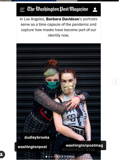
Another popular type of portrait to arise from this time has been the “maskie” portraits of people in their masks, I particularly admire the work of Barbara Davidson, aka @Photospice on Instagram who shot portraits of people on her street corner wearing their masks.
These are only a few of the examples of people’s creativity during this time and I could go on for longer discussing areas such as the family portraits of Erik Madigan Heck, Nick Knight’s zoom portraits , Robert Pattison’s solo shoot for GQ and the many wonderful self portraits that have been produced during this time, but I have already pared this back and I’m in danger of overwriting again, suffice to say social portraiture is a vibrant and everchanging world and one that I am loving learning about.
**I had made the arrangement to work with Amber before the college cancelled this part of the course, but as she still needed the assistant I was happy to have the opportunity.
https://www.facebook.com/davidgrantsimpsonphoto
https://www.redbrick.me/working-from-home-robert-pattinsons-solo-shoot/
3 notes
·
View notes
Text
Editorial- Tabloid or Broadsheet
Glasgow Live
https://www.flipsnack.com/FCE98F66AED/city-centre-cycling.html
1 note
·
View note
Text
Lighting up the Dark
Below are the links to my illusion brief from HND 1
https://juliebalfourhnd2cphoto.tumblr.com/post/620024746106667008/lighting-up-the-dark
https://juliebalfourhnd2cphoto.tumblr.com/post/617996381393731584/lighting-up-the-dark-previously-illuminate
https://juliebalfourhnd2cphoto.tumblr.com/post/617950234679640064/lighting-up-the-dark-previously-illuminate
https://juliebalfourhnd2cphoto.tumblr.com/post/617669259159535616/lighting-up-the-dark-previously
https://juliebalfourhnd2cphoto.tumblr.com/post/616852513802665984/illuminate-progress-so-far
2 notes
·
View notes
Text
White Shirt
HND 2 2020 – 21
Health and safety in the studio.
STUDIO CHECKLIST: Health and safety in the studio due to covid 19
Please refer to this before and after all shoots
Activity: White Shirts
Does this activity require the use of a photographic studio?
Y
Are you free of all symptoms attributed to covid – 19?
Y
Are you wearing a face mask? (unless exempt)
Y
Are you able to maintain a safe social distance of 2m?
Y
Have you made sure it is only you and your studio partner that are in your studio space?
Y
Have you access to hand sanitizer?
Y
Is your equipment clean?
Y
If borrowing or lending equipment have you used hand sanitizer before and after use?
Y
If working with studio equipment have you cleaned the work area and kit before and after use?
Y
Have you read the most recent government and college guidelines on social distancing?
Y
Have you effectively pre planned your shoot?
50
50
I could have planned it more effectively a lot of time was lost at the beginning of the day.
Have you effectively planned your time in the studio, to make the most of your studio day?
As above
NWhite balance
Find a diagram that explains colour temperature, in relation to photography
https://medium.com/the-coffeelicious/a-photographers-guide-to-color-temperature-6bbc882d1524

Sourced online 17.09.2020


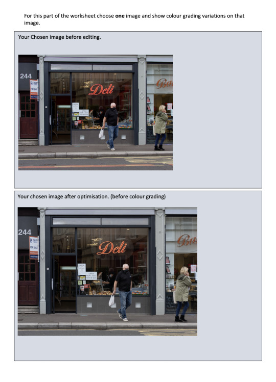
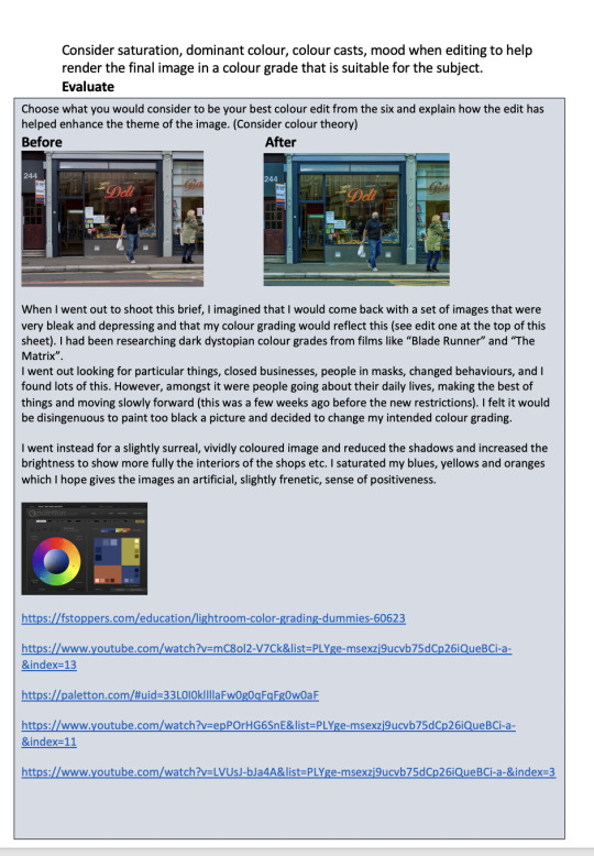
Explain the difference between colour correction and colour grading.
Colour correction is when an adjustment is made to an image to compensate for the colour cast caused by the light, either natural or man-made and to make the image look as natural as possible. This gives you a neutral starting point for any editing.
Lights such as candles, halogen or studio lights emanate a warm light which usually produces a red or yellow glow. Lights such as strong bright winter days, halogen lights and “daylight strip lights cause a blue, colder, colour cast.
These can be corrected in camera by adjusting the white balance, or post production during editing. One of the simplest was to correct postproduction is by taking a test shot in the same lighting of a piece of white card or paper, or to use a colour passport and shoot the neutral 18% Grey.
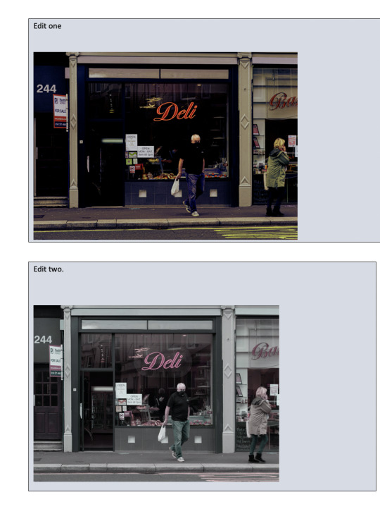
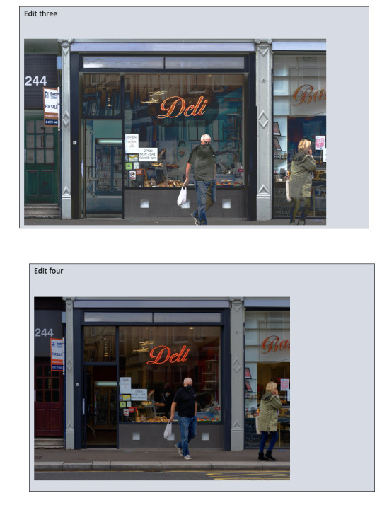
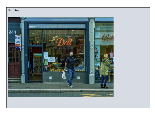
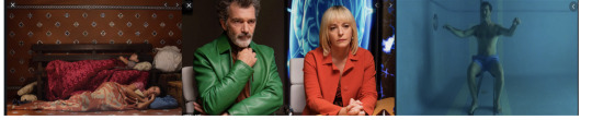
Colour grading on the other hand is more about the feel of the picture and can be used to take a themed approach to images. Both photographers and cinematographers take this approach to create strong images.
Obvious examples include Wes Anderson’s “The Grand Budapest Hotel” with his stylistic Art Nouveau colour palette. Pedro Almodóvar’s “Pain and Glory” with his characters carrying a colour board that is specifically theirs throughout the film, or, Tarantino’s “Once Upon a Time in Hollywood” with its vintage 1960’s Colombia Pictures colours permeating the entire movie.
Once Upon a Time in Hollywood – Quintin Tarantino
The Grand Budapest Hotel – Wes Anderson


https://medium.com/the-coffeelicious/a-photographers-guide-to-color-temperature-6bbc882d1524
Sourced online 17.09.2020
Explain or show diagram of how you correct white balance using your camera.

Sourced from The Olympus E-M1X user manual, pages 207,208.
Your own shoot.
Explain your editing workflow to correct colour casts.
After importing to Adobe Bridge, I did a batch rename and added some info to the metadata.
Once I had reduced the numbers down a bit, I was able to take a little time and look through each one in a bit more detail.
I then went into review and did an initial rating of the shots.
This one for example looked fine at first glance, but the models spectacle lens correction made it look like there was a little chunk of face missing so I went through them and discarded a few.
I was then able to adjust the slightly yellow colour cast using the adjustment sliders on the right-hand side. Once I had adjusted the white to my liking, I Synched my images and applied this to all of them before going on to individually optimising each of my final shots.
This left me with a selection of 19 to work with.
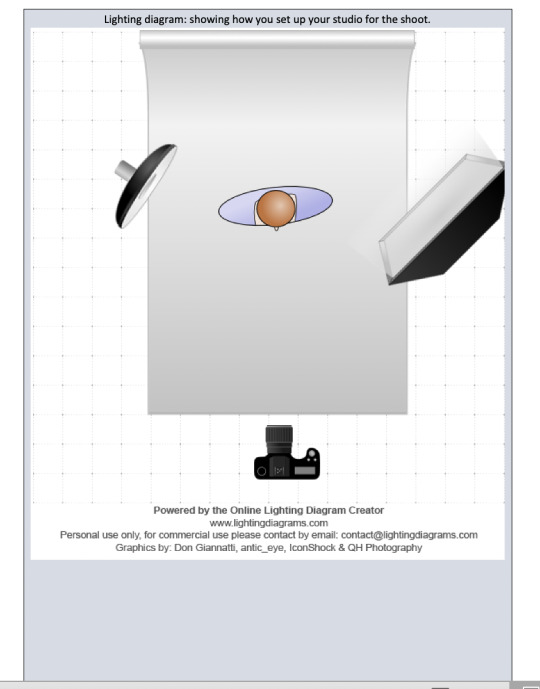
Lighting diagram: showing how you set up your studio for the shoot.
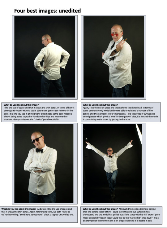
Four best images: unedited
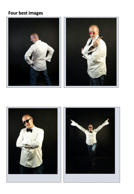
Four best images
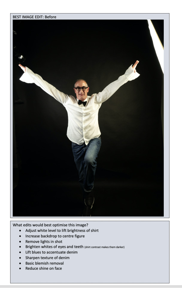
BEST IMAGE EDIT: Before
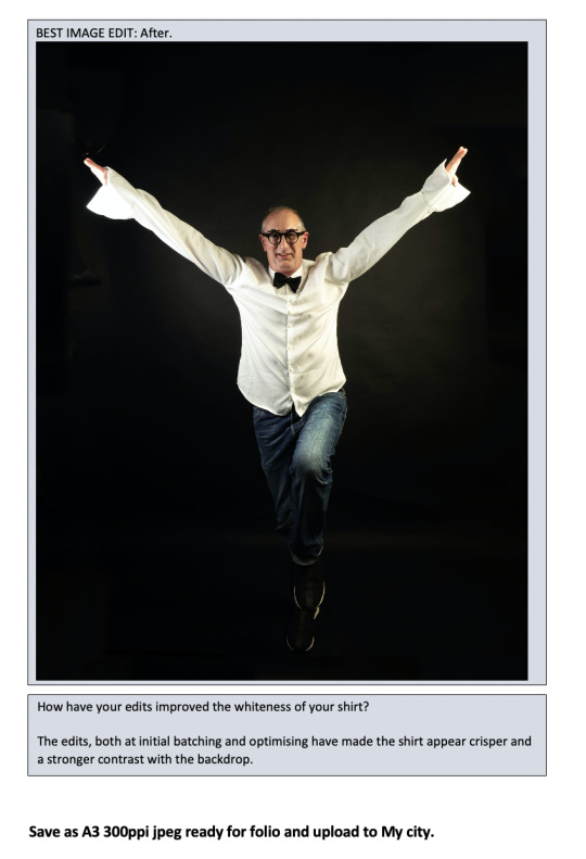
How have your edits improved the whiteness of your shirt?
The edits, both at initial batching and optimising have made the shirt appear crisper and a stronger contrast with the backdrop.
What edits would best optimise this image?
· Adjust white level to lift brightness of shirt
· Increase backdrop to centre figure
· Remove lights in shot
· Brighten whites of eyes and teeth (shirt contrast makes them darker)
· Lift blues to accentuate denim
· Sharpen texture of denim
· Basic blemish removal
· Reduce shine on face
Save as A3 300ppi jpeg ready for folio and upload to My city.
1 note
·
View note
Text
Say What You See – Kelvingrove Art Gallery & Museum – 07.10.2020
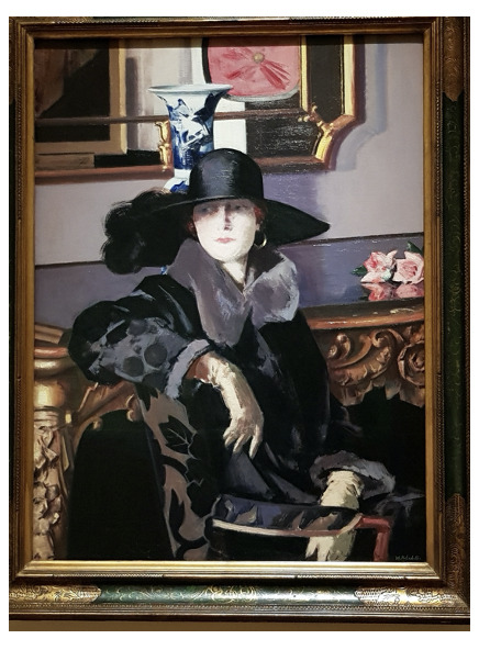
I see a painting of a woman, in a large black hat with a plume of feathers or fur.
She is wearing a black and grey coat which looks like it is made of a rich fabric, the collar and cuffs are grey fur.
She is seated in a mid backed chair with her right arm resting on the back, her left arm is on her lap.
She is gloved and her gloves are lighter in colour and look like suede or a textured fabric.
Her coat too looks textures like a Devore velvet.
She has a pale complexion with just a hint of pink on her lips and cheeks, her hair is barely visible, but has a reddish tint, there also appears to be an earring showing.
the fabric of the chair is richly decorated with black leaves on a player background.
The subject on her chair , is in front of an elaborately carved piece of furniture, possibly a sideboard or a side table upon which I see a blue and white vase, and , to the side, two pink roses. The taxable is either highly polished or glass as the roses are reflected in it.
The mirror on the wall reflects the room and I can see a painting with a label below itand a plush pink object. possibly a cushion or padded wall panel. The frame of the mirror is gold in colour and decorative.
The woman’s face is partly in shadow caused by her large hat, but her expression is neutral or distracted and she is looking to her right, away from the artist.
The painting itself is in an elaborate Fram and I think it is oil on canvas.
Assumptions
When I look closely at the piece I can see that much of what I have described is suggested rather than accurately detailed, the roses are broad strokes of colour, the gloves strokes of light and dark and even the face is a suggestion of features rather than finely painted.
I also assume that the woman is wealthy because of the clothes and setting, but it could easily just be a model in a hired room or a background from elsewhere.
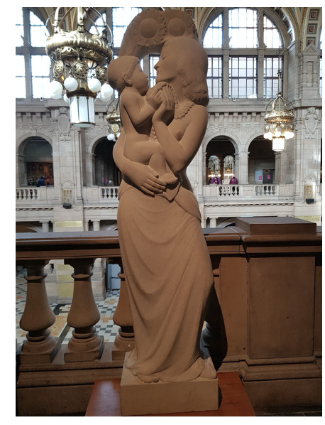
Sculpture - Mother and Child?
The material for this sculpture doesn't look like marble, more like granite or sandstone, it has a soft warm colour and is textured.
I see a woman holding a child, the child looks young, under 18 months.
Both the child and adult are gazing at each other, their heads close together. The child is resting on the woman’s hip and her right hand is around the infant supporting it/
The child appears naked apart from a necklace or garland around its neck, the woman wears a similar one - its a geometric design,
Both the child and woman are holding one of the garlands between them.
the shapes of the faces, hands, hair and body are simplified and although the viewer sees a woman and child ,they are not natural, more stylised. The fingers and toes are blunt and squared off. The hair has a hard edge with some texture.
The woman is naked to the waist and we can see one nipple just visible above the crook of her left arm. from the waist down she is wrapped in a fabric which flows to her feet, on foot is visible and bare.
Behind the woman and child’s heads is a small arch depicting sunflowers.
1 note
·
View note
Text
People Make Glasgow
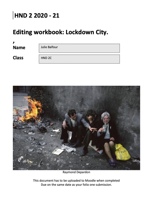
HND 2 2020 - 21
Editing workbook: Folio one introduction.
BRIEF: People Make Glasgow
Where might you find good resources/ tutorials for the following? Name at least 3 sources of good online tutorials.
Adobe photoshop provides a wide range of tutorials as part of its package which can be accessed either through ‘learn & support’ or via the “Learn” tab on Photoshop. https://helpx.adobe.com/uk/photoshop/tutorials.html
I used the “Behance daily challenge”, another Adobe platform, quite a lot during lockdown. Behance is a blog type platform and takes many forms including workshops, portfolios and personal projects.
Adobe’s ” Principal Digital Imaging Evangelist” Julianne Kost has a blog which provides advice and tutorials on many of the Adobe systems including Photoshop, Lightroom and Bridge. https://jkost.com/blog/
There are also many online tutorials on you tube which demonstrate how photographers navigate the program. https://www.youtube.com/watch?v=IyR_uYsRdPs
I also think there’s still a lot to be said for the humble book and “Photoshop CC, Classroom in a book” has been really useful for me. Although it is difficult for a hard copy to keep abreast of the past paced changes it is useful for the more day to day workings when you are just getting to grips with things.
Adobe photoshop provides a wide range of tutorials as part of its package which can be accessed either through ‘learn & support’ or by clicking on the help button on Bridge and following the links. https://helpx.adobe.com/support/bridge.html?mv=product&mv2=br#
https://jkost.com/blog/2016/04/previewing-images-full-screen-in-bridge-2.html as before the Adobe Guru Julieann Kost is a great source.
Online publications such as Photoshop essentials are a good source of advice. https://www.photoshopessentials.com/basics/what-is-adobe-bridge/
Lightroom is my favourite system for editing and organising my files, I think because it was the first one I was introduced to. It seems more intuitive to me; this doesn’t mean that I am any better on it.
As with both of the previous systems Adobe provides a link to learn and support and tutorials by clicking on the help button. https://helpx.adobe.com/lightroom-classic/tutorials.html
Using a google search it is easy enough to source a simple step by step guide to a specific task, in this case creating a contact sheet.
https://expertphotography.com/contact-sheet-lightroom/
Workshops by Adobes Lightroom Expert Julianne Kost can also be found on you tube https://www.youtube.com/watch?v=njJlT85Cdd4
Other programs: Make a list of other programs that photographers might use to edit enhance photographs.
1/ Adobe Camera Raw
2/ Gimp
3/Affinity Photo
4/ Photoshop Elements
5/ Olympus Capture
Mobile apps: Make a list of useful mobile apps for photographers.
1/. Snapseed
2/ PicsArt
3/ Adobe Lightroom
4/ Photo Editor Pro
5/ Airbrush
….
File types refresher:
File type RAW: An unprocessed Raw image file.
Pros
· Large, high quality file with greater detail.
· Can be enlarged to greater size without loss of definition.
· Much more versatile for editing
Cons
· File takes up more storage space
· Files need to be converted for most social platforms
· Can slow down processing times
JPEG: Joint Photographic Experts Group
Pros
· Smaller file so maximises storage
· Easier transfer of files to client etc.
· Better for social platforms
Cons
· Quality is poorer than Raw
· Limits post-production options- size, editing.
TIFF: Tagged Image File Format
Pros
· Like a Raw file a TIFF is a large, high quality file with greater detail.
· Ideal for complex editing as they have layers
Cons
· Not good for social platforms
· Use a high amount of storage data
GIF: Graphics Interchange Format
Pros
· Can be animated
· Good for charts and online banners
Cons
· Minimal use of storage
· Colour and detail are limited
· Low quality images
ADOBE PDF : Portable Document Format
Pros
· A PDF can be opened on most devices.
· Makes files easy to share and print
Cons
· A PDF reader programme is needed to open and edit the file
· Some data can be lost in the conversion
PNG: Portable Network Graphic
Pros
· Maintains quality when compressed.
· High resolution file
Cons
· Large file size
· Not suitable for social platforms
DNG Digital Negative
Pros
· It is a high resolution file
· It is very easy to edit and manipulate
Cons
· It is limited to certain programmes such as Lightroom and photoshop
· It uses a lot of storage space
RAW workflow: In photoshop.
Add an appropriate diagram from the web.
https://www.google.com/url?sa=i&url=https%3A%2F%2Fwww.diogonunes.com%2Fblog%2Fdigital-photography-workflow%2F&psig=AOvVaw2yjNLj9c3CdbOSglOqar1K&ust=1603467718792000&source=images&cd=vfe&ved=2ahUKEwiy6MjvxMjsAhUBWBoKHYehDDcQr4kDegUIARCvAQ

Explain the need to develop a good digital workflow.
As we build our body of work its important to make that it is safe in storage that is unlikely to get lost or damaged.
A good digital workflow is a good habit to get into, the earlier the better. The more established the routines the more professional your practice will become and as you routinely import, edit, optimise, file, tag, export, synch, and store your work in multiple storage systems, both hard drive and cloud you will build up an effective and accessible library.
Being organised will help you become more efficient and consistent in your work, it will also help you feel confident and give clients confidence in you.
Tagging your work by title, date and keywords adds to this efficiency as does saving your own editing and colour grading pre-sets, compositions and canvases.
I also use a software called Chronosync which I first heard of during one of the visiting photographer talks by Lawrence Winram. It allows you to set up regular synching between all of your storage devices so that any additions or amendments you make on one storage system is regularly synchronised to all of your others. It costs around £50 but can be put on multiple devices and software is regularly updated.
1/ What software did you use to optimise/ name/ select these? Where did you store them?
File management
Name Three places where you will store your images.
location/Pro’s/Cons
1
External Hard Drive – 1 Terabyte
Pros
· Reasonable costs
· Stores Large amounts of Data
· Portable
Cons
· Can become outdated/obsolete
· moving parts can be easily damaged
· can be quite large
· slower transfer than SSD
as fragmenting can occur
2
External Solid State Drive – 2 TB
Pros
· Small and very portable
· No moving parts so less prone to damage
· Higher Storage capacity
· Faster transfer times no fragmenting issues
Cons
· Can become outdated/obsolete
· Significantly more expensive
· Cell will eventually wear out
3
Dropbox
Pros
· Universal access from a range of devices
· Memory can be increased as required
· Easy to organize
· and share with clients
· Continuous development of service
· Not susceptible to mechanical failure
Cons
· Costs are subscription based
· Reliant on internet access
Name File management software.
1/ Lightroom
2/ Adobe Bridge
3/ Monday.com
Explain the need for good clear file management.
As we build our body of work it’s important to make that it is safe in storage that is unlikely to get lost or damaged.
We want to be sure that it is secure, that no-one can access it without our consent, or even worse edit or delete it.
We also want to make sure that our storage system is reliable, that we can retrieve files whenever we want and using a range of devices.
Ideally, we want to use multiple storage systems like external hard drives, maybe 2 or more, and on cloud storage such as Dropbox or Google Drive. Avoid relying on storage on a shared PC or social platforms like Instagram or Flickr, although these are good ways to get people to share your work.
If you get into good habits with the downloading and storage of your files you will be able to find and open them through a variety of means, the folder title, keywords, date or location depending on the quality of your meta data.
A strong consistent workflow keeps you in touch with your work and allows you to be more professional.
Sidenote- In my NQ I used only one external hard drive which I took to and from college with me, at some point this was damaged and in spite of extensive, and expensive attempts to retrieve it quite a chunk of my work was lost and I caused myself a great deal of stress, I hope I’ve learned my lesson, although I am still not happy with my workflow, and will continue to develop it as my IT skills grow.
People make Glasgow: Editing tasks.
Manage files:
Store and rename you files.
Where have you saved these images?
Both external Hard drives and Dropbox
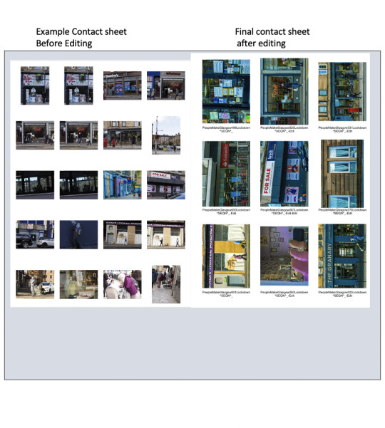
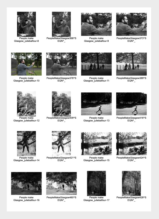
Contact sheet:
Place a contact sheet of your ‘People make Glasgow
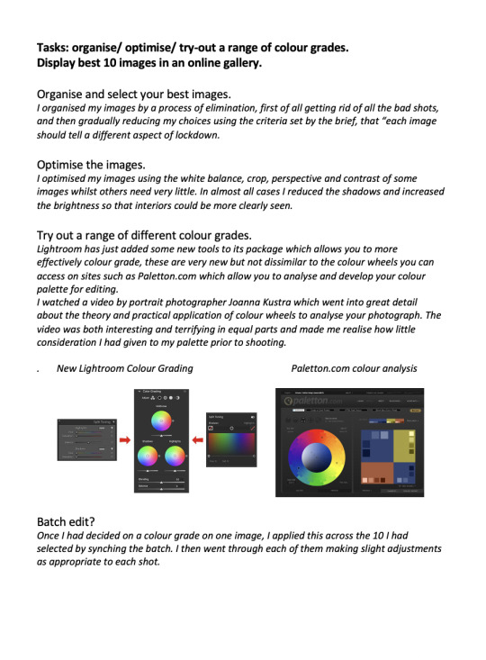
Explain two methods of Black and white conversion from an RGB original.
In Lightroom: Once imported to lightroom open develop, select B&W then make basic adjustments such as exposure, crop, white balance. Then you can adjust the curve and colour mix just as you would a colour photograph. Shooting in colour and converting to B&W gives you greater control of the final look of the photo. Once you have found a selection that works for you it can be saved as a preset for future use or you can synch a selection of photos to have the same adjustments. The image can then be opened in Photoshop (with lightroom adjustments) for final blemish removal etc.
In Photoshop, select the image, go to Filter, Camera raw and select B&W, then in a similar way to Lightroom use the sliders to achieve the effect you are seeking, saving this reopens it in Photoshop for fine detail edits to be done.
How straight forward was it to make this in your selected software?
Very straightforward, Go to print , select contact sheet from pre-sets, customise as required, hold and select images then print or save as PDF
What software did you use? Lightroom
BLACK AND WHITE CONVERSION: Choose three of your ‘People
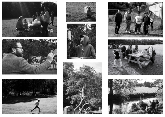
Evaluate how the edits have changed/ enhanced the feel of the image
Although my preference is usually for colour I think that in this instance the black and white is a better choice, although recent research shows that the Guardian is using more coloured photos now, especially as its readership is now predominantly online.
Taking photographs of the general public in this documentary style doesn’t allow you to control the light or colour palette to any real degree and conversion to black and white means you can look at the content of the photographs and the story being told without being distracted by the brightly coloured picnic tables, plastic containers and carrier bags included in the images. I particularly like it in the first shot where the shaft of light is breaking through the clouds, this is far less effective in colour.
Final A3 canvas

People make Glasgow finished canvas, make a selection of your best images and display on one A3 300 ppi canvas.
How do you feel about your final series of images?
I am fairly happy with my images, I think they portray the story I was attempting to put across , that as opportunities to meet indoors are reduced , more and better use is being made of our parks. It is a small celebration of Glasgow as a “Dear Green Place” where a vestige of normality can still be pursued.
I feel, based on my research, that it might be the kind of story the Guardian would consider, linked as it is to both local environmental issues, and real people.
1 note
·
View note
Photo
People Make Glasgow
4 notes
·
View notes
Text
People Make Glasgow
Researching the Narrative.
Throughout the UK there are many newspapers that are available nation-wide, these include:
The Metro, a free tabloid newspaper readily accessed on public transport.
The Sun, The Daily Mail, .The Mirror, The Guardian, The Times,
The Telegraph,Daily Express, Daily Star , Daily Record.
Of the 10 listed 7 are what would have been traditionally called” tabloids” and the other 3 “broadsheets”.
This terminology originates from the appearance of the newspapers and how they were first printed and was initially a class distinction. Tabloids were smaller in format, around A3 in size, and on cheaper paper, they were aimed at the working classes, sold by vendors on street corners and could be easily folded to tuck in the pocket or under the arm of the man on his way to work.
Broadsheets were much larger , A2+, of a higher quality paper and usually delivered to your home where they could be read at the breakfast table or in your study, they were aimed at the upper classes to be read in comfort and at leisure.
Nowadays most newspapers are produced to a tabloid format but some like The Guardian, The Times, and The Telegraph are still referred to as broadsheets.
Tabloids tend to present a more sensational. sometimes salacious, view of news stories and in terms of veracity their sources are often deemed less reliable than those of the broadsheet. There continues to be a degree of class divide, readers of the Guardian are unlikely to also subscribe to the Sun (that doesn’t mean they won’t take a sneaky peek between the pages when they think no-one is looking).
The content of the Guardian , the paper we are “shooting for” is aimed at educated middle-class people who have generally left-wing opinions. It ranks number 2 on a list* of the top newspapers in the world in 2020. It is a British daily newspaper founded in 1821 in London, UK. and currently receives an average daily readership of about 1.03 million with 126,879 in daily newspapers circulated. During the recent pandemic much of its circulation has gone online and is subscriber based, this means that , unlike our brief, the photographs are colour and viewed on screen.
To get an idea of what the picture editor might be looking for I read 2 main articles , the first , published on 18.10 .2019 “Why we're rethinking the images we use for our climate journalism” by picture editor Fiona Shields, and the second published 21.06.2020 “Picture a pandemic: how Guardian photographers adapted to lockdown life” , again by Fiona Sheilds, Head of Photography, along with David Levine, freelance photographer, Sarah Lee, photographer , Suki Danah, photographer and Jonny Weeks photojournalist and picture editor.
In the first article Fiona Sheilds tells the reader that their goal (the Guardian) “is to provide guidelines for anyone working with images at the Guardian. We also ask the agencies and photographers we work with to provide images that are appropriate to the changing narrative”
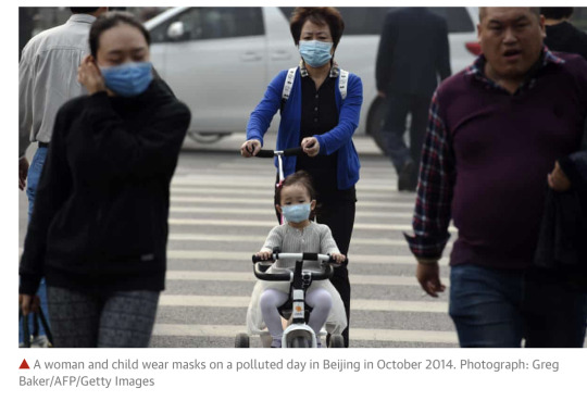
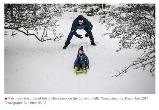
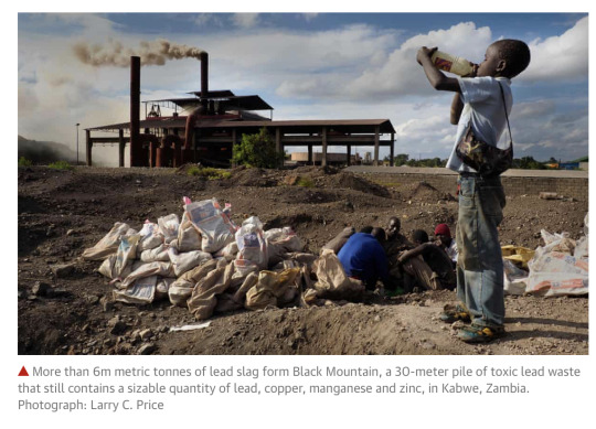
She then goes on to discuss the difficulty of capturing images which depict a crisis which cannot be seen, in this instance climate change. Research carried out shows that “people respond to human pictures and stories. Images that show emotion and pictures of real situations make the story relevant to the individual.” Below are some of the examples used:
The second article “Picture a pandemic: how Guardian photographers adapted to lockdown life” is more about how photographers have responded to the lockdown and is more relatable to our lockdown brief, but as with the first article it does show what types of photographs are acceptable to the publication. Below are some images from the article.

In addition to these articles I was also influenced by a book called “Glasgow, 24 Hours In the Life of the City” ,the book was produced by The Glasgow Shoot ltd and printed by Chapman. It commemorates Glasgow as the city of Culture and has 33 photographers (only 3 of whom are female) take shots all over Glasgow in the space of 24 hours on 28th March 1990. There is such a diversity of styles and images but in so many of them they capture an iconic Glasgow.

In the operating theatre at Rottenrow Maternity Hospital at 12.27 pm and Dawn Hutchison is born to Jeanette and Jim from Easterhouse. John Young.

Between 7am and 11am Nigel Parry set up a studio on the concourse of Central station and invited passengers to pose for him. These are just a few of them.
Findings
Having researched this I decided that for my photographs to be considered for this particular paper that I would need to present them with a theme. I wanted to show the impact the restrictions had placed on our social lives and to illustrate a positive outcome during a difficult time.I had noticed the increased use of parks for social gatherings and decided to shoot in Pollok Park with an emphasis on the “New Normal” of outdoor family events and how fortunate we, as Glaswegians, are with the multitude of parks on our doorsteps in our “Dear Green Place``.
https://www.agilitypr.com/resources/top-media-outlets/top-10-uk-newspapers-by-circulation/
https://www.statista.com/statistics/246077/reach-of-selected-national-newspapers-in-the-uk/
https://metro.co.uk
https://www.thesun.co.uk/
http://www.dailymail.co.uk/
http://www.mirror.co.uk/
https://www.thetimes.co.uk/
http://www.telegraph.co.uk/
https://www.bizvibe.com/blog/top-newspapers-world/
https://www.theguardian.com/membership/2020/jun/21/picture-a-pandemic-how-guardian-photographers-adapted-to-lockdown-life
https://www.theguardian.com/environment/2019/oct/18/guardian-climate-pledge-2019-images-pictures-guidelines
https://www.theguardian.com/world/gallery/2020/apr/20/my-shrunken-world-lockdown-in-camden-in-pictures
1 note
·
View note
Text
Visiting Speaker - Simon Murphy
23.09.20 - ZOOM
Identify an element of the guest speaker’s talk that resonated with you in some way.
I particularly liked the area of Glasgow that Simon Murphy had chosen as his focus. I live near Govanhill and find it a rich and vibrant community, I also worked with many of the families in my previous job.
The idea of taking an area or topic that is familiar to you and building on it makes sense and to an extent would reduce the anxiety of approaching strangers
I also liked Murphy’s approach to his subjects, establishing a rapport with them and becoming a familiar sight in the neighbourhood. His shots are gentle and have taken a little time.
Although I greatly admire the work of street photographers such as Dougie Wallace, I don’t feel comfortable with his intrusive style of taking shots which I see as overly confrontational.
Several other photographers that I was unaware of were mentioned in the online chat, such as Sean Tucker, Joshua Jackson, and Tish Murtha, I have taken the opportunity of researching some of their work too.
What question will/did you ask the visitor?
I had intended asking how he approached his subjects and got consent and also how he dealt with the fear of asking strangers if he could photograph them, however he addressed this right at the beginning of his talk.
He also spoke a little about the dilemma of shooting children and whilst he doesn’t get written consent, he does get verbal consent from parents.
My other question wasn’t picked up on, and that was whether he left contact details with his subject, I was thinking a card with his name and a link to Instagram or his website where people could look him up.
How do you think this will impact your own practice as a photographer?
I feel a lot less anxious about approaching people now and feel that I am more likely to take a measured approach rather than shoot from a distance or furtively. I also have a deeper understanding of what street photography can look like and that it often becomes documentary in nature and a social commentary that perhaps is not fully realised at the time.
I also gained useful information about how to raise awareness of work and self-promotion which is very useful as I am not strong on social media.
Outside of the main topic I also learned of local services for film development that I hadn’t been aware of.
0 notes
Text
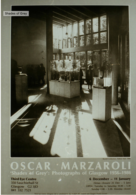
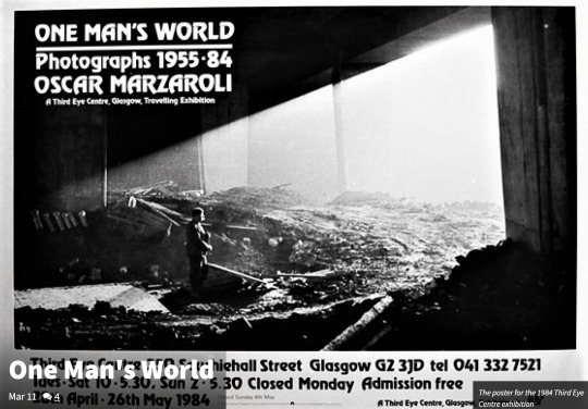
Exhibition - Oscar Marzaroli
Visited 18.09.2020
How does the flyer/poster advertise the exhibition?,
“Street Level Photoworks - 30 Years of Photography in Scotland”
The flyer for this exhibition briefly charts Marzaroli’s life from his birth in Italy in 1933 until his early death in 1988. It outlines his brief career and its significance in capturing the essence of Glasgow, its industry, its people and its social context. It talks of his body of work and the role of the Gallery in pulling the exhibition together.
The brief bio of the photographer’s work encompasses many of his achievements and signposts the reader to other sources of his work including books, record covers, documentaries and college archives including the huge collection gifted by his family* to Glasgow Caledonia University *The Marzaroli Collection.
In addition to the flyer the gallery also provides a leaflet which opens up to an A2 double sided sheet with extracts from the gallery’s display and further information on the artist.
*https://vimeo.com/392431586
What is the suitability of the gallery space?
Street Level Photoworks is a Glasgow photography gallery, and as such is a perfect venue for Marzaroli’s homage to his adopted city.
The gallery space is ideal, not only is it situated in one of the main streets in Glasgow with direct access from 2 ground floor entrances, but its large windows give passers-by a glimpse of the exhibition which entices them in. The two rooms which house the exhibition are well lit and the walls provide sufficient space for images to be divided into groups (people, places, industry, Gorbals, portraits) allowing the viewer to explore and move from one context to another without breaking the narrative of the work.
How is the exhibition laid out?
The gallery has used a variety of methods to display the work, all of which have been printed in black and white and mounted on white card before being placed in a simple black frame. The backdrops for the frames are varied, some hang neatly in parallel rows against a plain white or green wall, others are clustered together, and several others are placed in front of huge prints of football crowds or music concerts which have been pasted, billboard style, directly onto the walls. Large posters of contact sheets are interspersed amongst the prints complete with annotations and there are also central displays with artefacts from his work including records of shoots, contact sheets, negatives and equipment.
The whole exhibition has an eclectic feel to it which seems to me to mirror Marzaroli’s style of photography where he collected images and scenes as they arose whilst exploring Glasgow.
How has the work been mounted? Is this appropriate for the work?
The work is mounted and framed using a simple white mount and black frame and is very appropriate for this type of work which is unembellished and captures life as it was in the 1960s, 70s and 80s Glasgow.
Who made the work?
Although the work was originally created by Oscar Marzaroli, he died in 1988 and left behind a huge archive of over 50,000 negatives. These were often unfinished images, and many were scanned, edited and printed specifically for the exhibition.
Who did they make it for, who is the audience?
The viewer gets the impression that the images were made in the first instance for Marzaroli, shooting things that interested him as he moved around Glasgow from this, themes seem to have arisen, and as such he has developed his focus on them. Later as interest grew in his work, he put together a collection to accompany the Poetry anthology “Noise and Smokey Breath” and had a solo exhibition at the (…very hip, gosh I miss that place!) Third Eye Centre in both 1984 and 1987.
Posters from his exhibitions in the Third Eye Centre
Since his early death in 1988 his work has been in the care of his family and more recently (2019) donated to Glasgow Caledonian University. His family are very keen to have his work shared with a wider audience and have worked cooperatively with all concerned to see this realised.
How does it make you feel?
For me the work evokes feelings of nostalgia, growing up in the 60’s and 70’s many of the scenes are familiar to me and very relatable. I have walked through these streets, participated in these playground games, worn these fashions, and seeing them captured I remember how much fun I had as a child and teenager. It also makes me want to share the experience of the exhibition, to visit again with my childhood friends and in particular with my brother who still works in shipyards and would fit into many of the industry scenes to this day.

John Smith Bookshop , St Vincent street 1962
memory - my dad used to take us here every month to spend our pocket money.

Gorbals 1963
Memory, my cousins and me were always coming home with our clothes ripped from climbing up on the walls behind my Gran’s tenement in Anderson.
If the work has a title does it make you think about the image/s differently?
The title is simply “Oscar Marzaroli” which implies the photographer needs no further introduction, this is true as even those who don’t know who he is will be familiar with at least one of his iconic portrayals of Glasgow.
How would I describe it to someone later?
As an uplifting experience and an opportunity not to be missed. The photographs cover such a wide range of topics that it is unlikely that a visitor will not find an image they can relate to.
Does the photograph make you want to ask questions, what are these questions?
Yes, it makes me want to ask the photographer how he managed to discover so much about the City and its people? I imagine him walking around for hours slowly getting to know every nook and cranny. The record of the conversation between Oscar Marzaroli and Jennie Renton in the book of the Exhibition (Oscar Marzaroli, 2020) sheds considerable insight on his motivation and his own influences.
Is the photograph valuable? How do you know? Is the work for sale and who might buy it?
According to the curator, prints are sold from a variety of sources. The prints vary in value from a few hundred to thousands, and some are available in the gallery shop at reasonably accessible prices, some rarer prints, signed copies and limited editions command much higher prices and can be purchased from the trust or websites such as McTears Auctioneers.
What information is available about the artist/s?
There is a lot of information available about the artist including books, videos, and websites. A simple google search brings up pages of information and the gallery has provided information both in print and digitally.
Who organised the exhibition and who selected the work?
The exhibition was organised by Street Level Photoworks in collaboration with, Glasgow Caledonian University and the family of Oscar Marzaroli.
0 notes
Text
Lighting up the Dark...
Previously Illuminate - Evaluation
The journey from initial plan to my final image for illuminate was full of changed plans, like most people in my class I had arranged a partner to assist in this task and also had some locations in mind, I also assumed I would have access to the wide range of lights etc, available from store, however with lockdown everyone’s plans changed.
My revised ideas included the local park and my own home https://juliebalfourhnd1bphoto.tumblr.com/post/616852513802665984/illuminate-progress-so-far
Resources: Tripod, Olympus EM-1X, 40 -150 mm Lens, Neo2 rotolight, old speedlight on my Olympus OMD (to trigger Flash)
Camera settings – Live composite, ISO 100, F8.00, exposure 10 seconds at continuous 15 second increments.
As I was operating the camera and lighting the scene, I used the live composite setting on my camera which allowed me to add light gradually and check the composition and lighting on my camera as I went along.
There were lots of simple teething problems like reflected light from clothing, LED displays and movement. I also had to consider my position when using the speed light, so it only illuminated the model and not the photographer. The positioning of the light to capture the maximum amount of the model was also problematic, but as I wanted the image to be eerie it wasn’t essential that the figure be solid which helped.
Initial visits to the local park identified location and allowed for practice shots and I returned with resources to do a more detailed shot https://juliebalfourhnd1bphoto.tumblr.com/post/617669259159535616/illuminate-further-attempt
Working in the middle of the park with a tripod, camera, lights and a man in a weird mask was drawing a lot of attention and I didn’t feel I got the best shot, but at that point I decided I would submit it as I didn’t see myself returning to the park for a third time.
On the 11th of May whilst out with the dog I took a phone snap of the rear garden with the windows illuminated
https://juliebalfourhnd1bphoto.tumblr.com/post/617950234679640064/illuminate
I decided it had the potential to be a better shot so tried again the next night, it did not have such a dramatic sky but the windows of the opposite building were lit, and it was a fairly dry night, so we went for it. The initial shot did not pick out the lit windows but I realised it was because the lens only reacted to new light so I started my second shot with the lens cap on and this allowed the ambient light to be recorded before I started to paint in new light and then finally introduce the model. After 4 attempts I got a reasonably good shot, there were still some small spillages of light, but I was able to address these postproductions. https://juliebalfourhnd1bphoto.tumblr.com/post/617996381393731584/illuminate-final-image
The other benefit of the live composite setting is that it addresses any noise reduction in camera, although using a tripod and timer alleviate much of the problem.
On the whole I am happy with the end result as I think the image is slightly surreal and a little unsettling which is what I was going for. Technically It could be improved on in terms of the slight ghosting of the figure and I would have liked to pick out more features in the garden, but as a one-woman venture, with limited resources. I think I am happy with the end result. This is certainly an avenue I am keen to explore further and, once restrictions are lifted, I have several venues in mind where I would like to try this technique.
588 words
1 note
·
View note
Text
final 10 graded unit
The Lewis Dresser


26 notes
·
View notes
Text
Lighting up the Dark ...previously illuminate.
Edited to say...Last year this was my submission, I was limited by the lockdown and had already had several attempts in my local park, but this had attracted some attention so after taking a wee phone snap a few nights earlier I took this shot using continuous compositing and hand held flash.
Still needs a bit of editing but I’m fairly happy with this one. Notes etc to be added. Sky wasn’t as good as previous night but can’t have everything...

7 notes
·
View notes
Text
Lighting up the Dark ...previously illuminate
A wee phone snap I took when I was out with my dog. I think I can build on this.

6 notes
·
View notes