
k00263500
Jordan 'Dewey' Kenny
Creatic minimalist book covers for Celtic Myths.
Graphic Design Student - LSAD
67 posts
Don't wanna be here? Send us removal request.
Last Seen Blogs

01toush
Untitled

tynvm
=^-^=

izzbdd
I.z.z

s0fly-sav-blog
but babe,

raqkitchen
Welcome to the RaqKitchen
Text
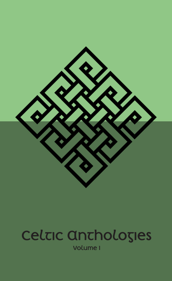
Children Of Lir - Layout
The layout process for this one was much simpler, it was just a case of getting the sizing and background colours right. After much tweaking, this is the result I settled on.

I used the same free mockup template to create the image below. I’m really happy with how this looks, I feel if I walked by it in a book store it would definitely catch my eye.

#Construction#BookCover#Design#Graphic Design#Print#Illustration#Celtic#Celtic Myth#Children Of Lir#ireland
4 notes
·
View notes
Text
Book Cover - Children Of Lir
While I was happy with how my results turned out, I felt like taking a minimalist approach was almost cheating. So I decided to attempt to focus on a particular story and create a more Illustrative cover.
One of my favorite myth is The Children Of Lir. I used some images of swans on Google as reference for the climax of the story. Illustrations are definitely not my strong point, so I used some information I gained while studying Engineering. Whenever faced with a difficult problem, remember KISS (Keep It Simple, Stupid). Below are my reference images and my illustrations.


2 notes
·
View notes
Text
Book Cover - Layout Experimentation
I was happy with all of the elements thus far, my next step was to experiment with laying them out in the book cover dimensions. I used the dimensions of the Penguin Classic series (111mm x 181mm) as I was looking to create a book that you could carry in your pocket.
I began by simply throwing the elements together, again, my goal was to be simple, minimal, classic.
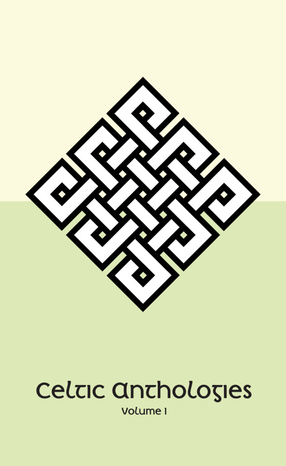


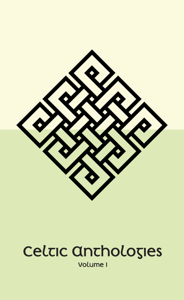
I wasn’t happy with how it looked so far, there was too much going on, so I began to strip it back.

Much better! This is more like it.
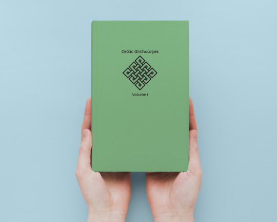
I used a free online mockup to see what the book would look like in your hand. If I was to print this in reality, I would love to use a textured cloth surface with an embossed print.
2 notes
·
View notes
Photo
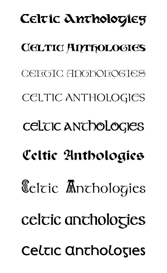

In searching for a font, I was looking for something simple, clean, but still holding the ability to communicate a raw Celtic feeling. I looked through almost a hundred various Celtic and Irish fonts from various free font websites. I narrowed it down to 9 fonts that all contained characteristics I admired. However, I fell in love with ‘Irish Penny’, the last font in this series. This is exactly what I’m after, clean, legible, but with character and style.
The 10 fonts in order:
Dieter Caps
Medieval Scribish
Da Haut
Meath
Stonecross
Paladin
Celtic Knots
Irish Uncialfabeta
Irish Penny
#BookCover#Construction#Design#GraphicDesign#Typography#Fonts#Typework#Celtic#Irish Fonts#Ireland#Irish
42 notes
·
View notes
Photo


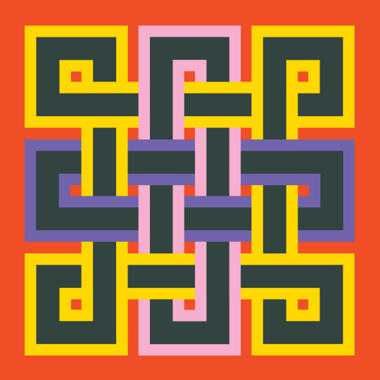
I wanted to move away from the dusty, sleepy Celtic thropes, so the next thing I did was experiment with some pop and colourful pallettes, I was pretty pleased with the results.
#BookCover#Celtic Knot#Construction#Pop#Pastelle#Pattern#Irish#Craft#Design#Digital#Digital Art#Illustrator#Graphic Design
28 notes
·
View notes
Text
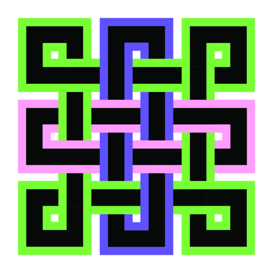
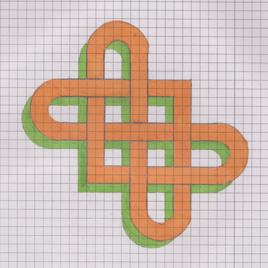
Construction - Conversion to digital
The next step in my process was to convert my favourite sketch into a digital image. At first, I thought this would be very simple, it’s a simple shape with simple dimensions, just load it in trace over your sketch with the correct shape. Turns out it’s not as easy as it looks. I had to turn to my old friend YouTube for some help. I’m glad I did as I learned some incredibly useful skills along the way, such as the ability to add a stroke on top of a stroke in the appearance tab and the ability to expand an object or a series of objects. Again, if someone is looking for a fun and interesting task to set themselves, try to create a Celtic Knot in Illustrator.
Below are the seperate elements and the final piece.


3 notes
·
View notes
Text
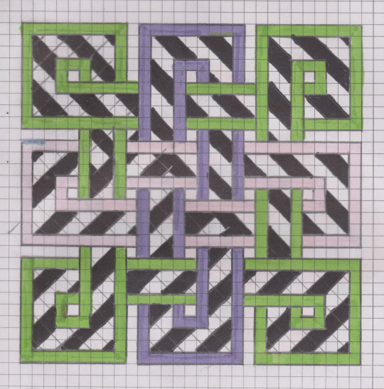
Construction - Initial Sketches
During the lockdown, I’ve been trying to find some tasks and processes that are simple and enjoyable. I’ve attempted multiple processes, but one I’ve enjoyed quite a lot has been drawing Celtic Knots.

Celtic Knots are deep rooted in Irish culture, dating back to 300 AD, and I can see why they’ve stuck around. I found drawing them out to be almost like a crossword puzzle. You pick a point and slowly work your way out. It engages the mind, forcing you to concentrate to ensure you don’t leave a line too long and cross a point when you should have went under. I’d strongly recommend these for anyone with a busy mind. I’ve inserted some of my favourite drawings below.

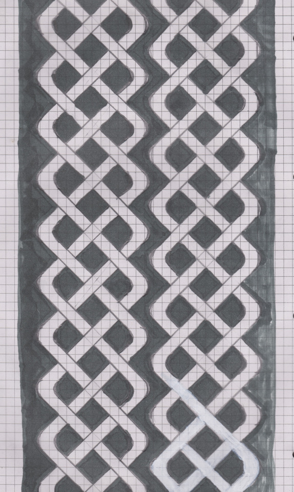
The knot below is unfinished, I began with a square hatch in the middle and attempted to freestyle from there. It really made me appreciate just how difficult it is to design a tight, intricate and neat pattern.

2 notes
·
View notes
Text
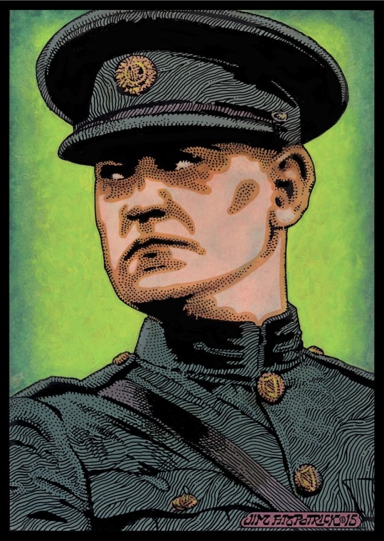
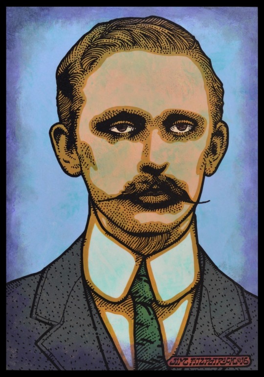
Artist Research - Jim FitzPatrick
I’ve always found Jim FitzPatrick to be a very curious figure, as he might have created the most iconic bit of Irish art work in existence, yet many people do not know his name. Jim FitzPatrick was the man behind the incredible two tone print of Che Guvera, known the world over. This print has been used on countless t-shirts, album covers, posters. You may see it flown at many a leftist march from Dublin to Cuba.
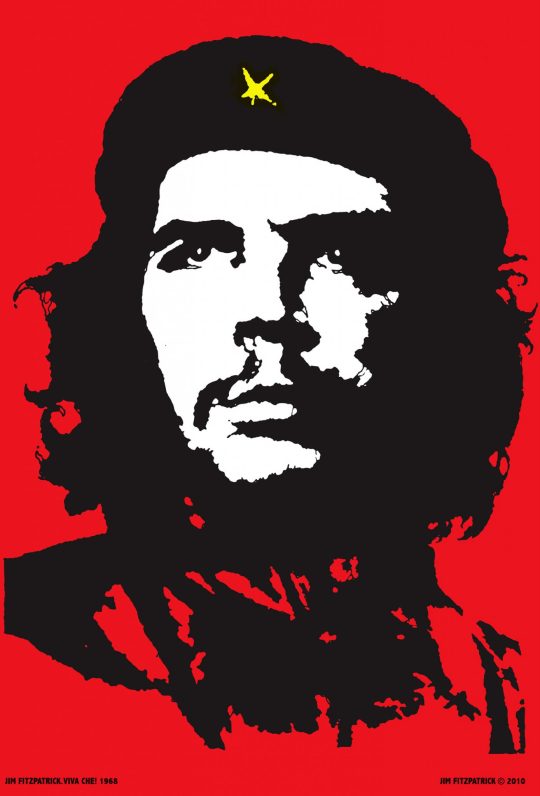
Besides Che Guvera, he also created incredible portraits of Irish figures such as James Connolly, Padraig Pearse, Eamann Ceannt, Micheal Collins and Countess Markievicz. This portraits were recently made into stamps by An Post. Jim was also the man behind the iconic Black Rose on the cover of the incredible Thin Lizzy album.


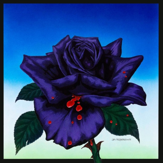
To me, FitzPatrick represents a respect for love and beauty, for myths and storytelling, and a fondness for the rebellious spirit which stands up to oppression. I see this as fitting for Ireland’s current situation. Many challenges await, and we must be soldiers of culture, willing to fight a battle of ideas, ready to use the pen, the mic, the camera and the brush to create a future we all want to share.

4 notes
·
View notes
Text
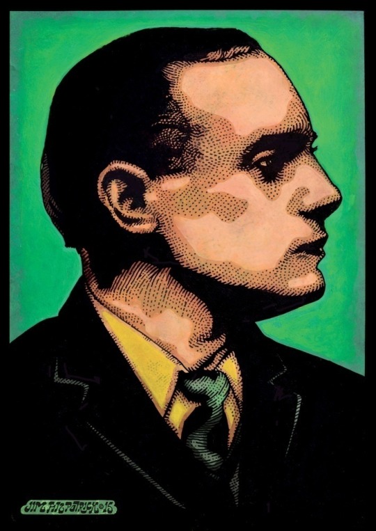
Artist Research - Emmet Walsh
Emmet Walsh is my favorite example of taking Celtic Mythology into the contemporary. Emmet is a peer of fine and I have been fortunate enough to collaborate with him in the past, working together on a design for a t-shirt for my magazine.


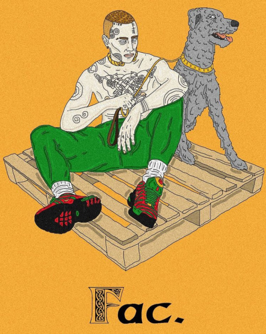
Emmet re-imagines iconic Celtic figures such as Queen Meadbh and Donn Cúailnge with the Brown Bull of Cooley and reimagines them as young fellas wearing Brigid’s Crosses for chains and smoking Celtic Knotted joints. His simple and cartoonish style can be immediately passed due to the incredible amount of creativity he shows with each of his ideas. Truly, one of my favorite Irish contemporary artists.


0 notes
Photo

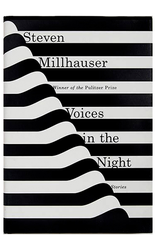
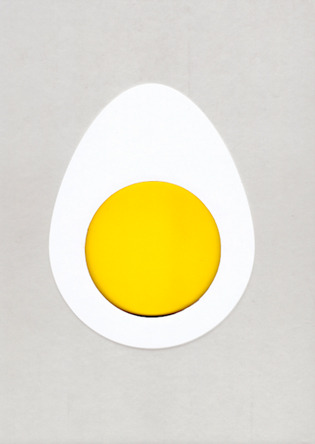


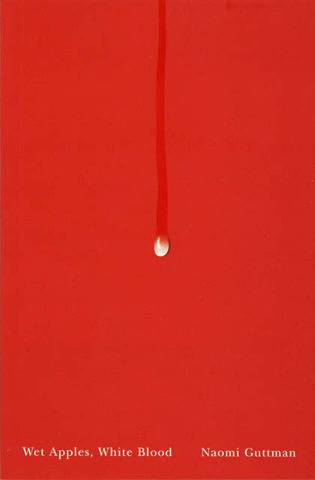
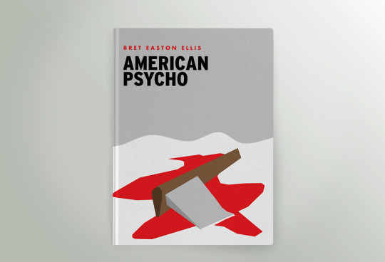
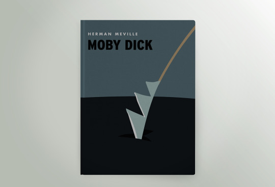
Here are some more examples of minimalist book covers I’ve enjoyed.
0 notes
Photo
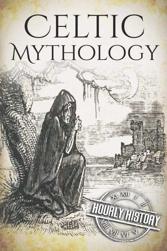


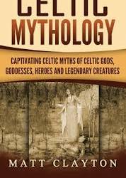


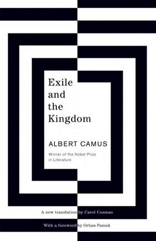
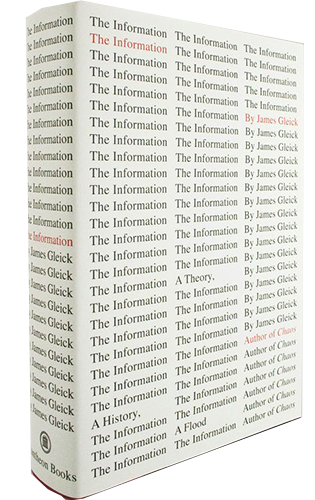
It has always frustrated me that I have never seen any of these ideas expressed in books of Celtic Mythology. With some of the greatest stories ever told (Cuchulainn, Queen Meadhbh, Brown Bull of Cooley, The Children Of Lir), they deserve a fitting cover. However, I’ve found many of the book covers to be noisey, clichéd and uninspired (examples above). As a result, I have chosen to create a minimalist cover for Celtic Anthologies.
0 notes
Text
Book Cover Research
If I’ve got a spare day in Dublin, I like to walk around the charity shops and book shops. In particular, I love walking around the massive second hand book warehouse that is Chapters. I know the expression ‘Don’t judge a book by it’s cover’ has almost become a Cliché at this point, however, this is exactly what I do. I walk around and usually buy the prettiest book I can find.
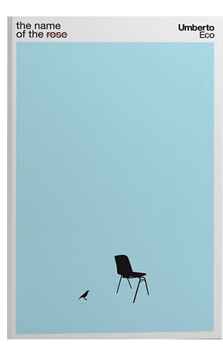
Pouring through my collection for this project, I noticed I have an interest in minimalism when it comes to book covers. Simple illustration, simple patterns, small and simple fonts. A blank canvas for me to create my own ideas. An example of these ideas expressed in great book cover art would be the work of Ali El Otmani (shown below).


0 notes
Photo


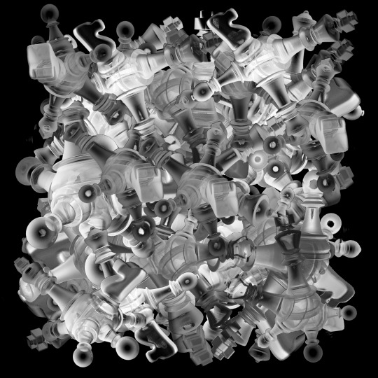
Experiments with morphing together 3D models, I had this idea in a dream. All the pieces slowly became morphed togehter.
After creating this, I look back and think they morphed shapes look like stars. I also really enjoy the way the light refracts through the pieces. Creating eerie shadows and contrasts.
23 notes
·
View notes
Photo
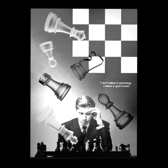

Experimenting with mixed media to create new an unique compositions.
I found adding three dimensional objects to my 2D poster design gave the composition added character and depth, I can imagine this effect being incredibly eye catching if used in a public setting.
#Design#Chess#Bobby Fischer#Graphic Design#Art#3D Design#Cinema 4D#Print#Poster#Poster Design#3D Modeling
26 notes
·
View notes
Photo

Experimenting with pattern layouts.
11 notes
·
View notes
Photo


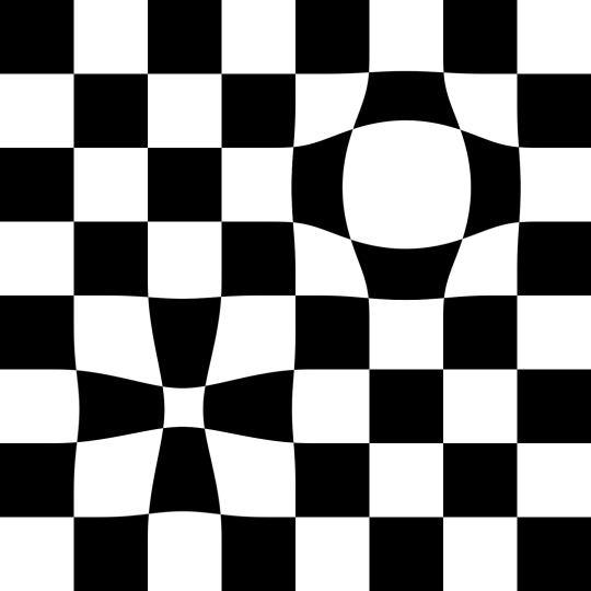


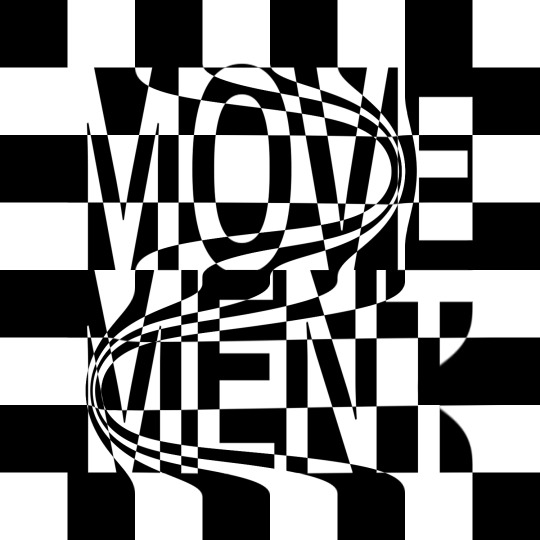
Experimenting with graphic movement on the chessboard.
10 notes
·
View notes
Photo


Some stills from my previous render.
In these, you can really see the detail of the light bouncing from the board and being reflected into the camera, this is most beautiful and evident in the first screenshot with the reflection through the sphere at the top of the pawn.
I also included a behind the scenes shot to show exactly what is going on in this scene!
8 notes
·
View notes