
lrfmp2021
Little Machines
Larry Rouse FMP 2021
34 posts
Don't wanna be here? Send us removal request.
Last Seen Blogs

greenday924-blog1
FREAKY HOE 4 BILLIE JOE
pudxo
T H I N K
swordbeliever
tired and queer

torumany
love mature

whitelantern
I CAN FEEL EVERYTHING.
Text
Evaluation
Media and Techniques
For this FMP, I was provided with a lot of media to work with. Typical media such as pencils and paper were used (mainly for sketching and coming up with concepts) but also unique physical techniques such as drypoint lino printing and monoprinting were explored, as well as collaging. In the digital realm, I used many Photoshop techniques such as double exposure, poster design, and typography.
Examples of these experiments include the digital experiments with the robot imagery using double exposure, turned into a poster with typography, and other experiments with these elements were used as well. In physical media, I created experimentation ripping pages with head features and collaging them, and also creating monoprint renditions of toys.

In addition to giving me time to come up with what my outcomes would end up being, this experimentation helped give me practice with various Photoshop effects I would use later. I would use colour blending and hue switching effects as well as erasing/blending layers together in the experiments and later in my outcomes as well. In terms of my research, I looked a lot into typography and composition through the artists Severino Canepa, Barbican, and Rosalie Gascoigne, who I think all helped with design elements in my project. Though looking back, it was the research into Cozmo and Wall-E’s character designs that helped the most with my project, fundamentally. Later research went into branding styles and packaging design, which were very important later into the outcomes.
My research helped because I was able to understand how to go about designing a robot like this and I had many inspirations to work with. For example, looking at Optimus Prime helped me to conceptualise the transformation options on my own design. The direct research into the things I looked at for my project were deep and beneficial to what I did as the design sheets were practically instructions for me to create my outcomes, by comparison my miscellaneous artist research was relatively shallow. I feel as though my proposal was met with the amount of research I did, and its content.
Purpose / Theme / Context
My project’s purpose/theme/concept was a light-hearted physical toy for entertainment, targeted at children and young adults. I did not go too deep with the overall “meaning” of my project beyond making a cool, nifty little thing that would attract attention from its target audience and be functional, playable, and appealing. I thought about reaching my target audience a lot, and in the end employed technological compatibility such as using wireless control with mobile devices (though stating that this is “easy to use”/set up), and more important using bright colours and flashy imagery. I also kept the toy design straightforward rather than overly complex, to make its functionality appear as simply as it can, and for it to be used by anyone.
With my concept, I hadn’t really sat down and spent a lot of time contemplating it. I had just thought that it would be a cool and interesting idea to me to make a robot toy design and I worked from there. I alternatively considered things about trains or about video games, and it likely would have ended up either way at something geared towards younger people or purely made for entertainment. The journey of my project largely involved something vaguely in my mind to do with robotics, and that I could perhaps design some form of robot toy, before getting a more concrete idea. For a long while, I did experimentation with some kind of fear for confronting what my outcomes would actually be, and did not know fully what I was doing, until I eventually overcame this by talking to my teachers about my vague concepts to land on how to turn them into full, actual plans. I was suggested to make packaging design and concept art, along with branding guidelines for the toy company, which is exactly what I did. Once I had set my sights on what to do, I got going with little problems or obstruction - but it was the initial hurdle of not knowing what I was doing for a long time that really held me back, so I was very happy to get over this.
In terms of the project itself, I frequently found myself indecisive about what design or logo to go for, and in these situations I simply asked for peer/teacher feedback until I reached a consensus I was happy with. It is interesting to me that most of the problems I had were social/mental rather than physical or artistic. Another “problem” is that my outcomes had to be made within a short timespan, but I luckily managed to get everything I had planned done quickly.
If I had had more time, I could have developed the project further with what one of my initial ideas was - Actually creating a 3D model of the toy (either digitally or physically) and photographing it for use on a more realistic box. The model itself would be an outcome, too. I had known around the time I was creating the outcomes that it would not be realistic for me to do this as part of my project as well, so I did not start.
Outcome
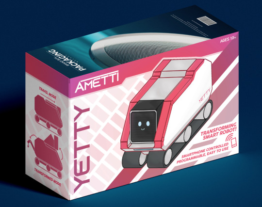
For my final outcomes, I created a back and a front of a packaging design box mockup for my robot toy, a robot design sheet explaining its functions and abilities, and a branding guidelines sheet for the toy company that manufactures it.
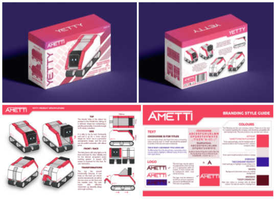
I used a Google site to present my final outcomes, as well as an individual blog post to collate them all. As can be seen, the “main” top two outcomes are mock-ups I found on a mock-up site, which were not initially the mockups I was planning to use. I had a mock-up with a transparent section of the box, but as it had made it difficult to make an effective front for the box, and I did not have a model I could convincingly show inside the box, I decided against it, favouring a simple, flat cuboid box instead.
Before I had a cohesive notion of what I would be making for my outcomes, I had only imagined designing the concept art and maybe making a model instead of the packaging. But following discussion with tutors I had planned to do packaging, concept art, and branding guidelines - all of which I did in the time allocated for outcomes. Though, as discussed in the previous section, I had it in mind to create a 3D model of the toy but decided that it just would not be realistic to be able to make it along with everything else on my plate in the time frame that I had, so I had decided against it.
Evaluation Methodology
In my project, I used various evaluation methods throughout. I would regularly look back on what I have made and state my feelings about it, evaluating and reflecting as I went, but on one occasion I talked to teachers about my project and garnered feedback about my ideas at the time for where the rest of my project would go. After listening back to what was said, I briefly wrote it up in a paragraph or two and posted it to my blog. During creative processes such as development and especially outcomes, I would ask for frequent peer feedback where I did not know what to do or had a tough choice to make between designs.
This impacted my creative process by allowing me to see a “consensus” on, for example, which Ametti logo to pick between. In the end, when I had asked for feedback for picking between two Ametti logos, I took what was liked about both of them and combined them, creating a superior logo, before making sure that it did indeed look good to my peers as well. By the time the interim assessment had happened, I was largely on top of my project, and did not have that much important feedback from it other than that I needed to finish certain blog posts etc, which I eventually did.
I have briefly touched on the planning process for the FMP and creative process and what problems I had to overcome during the beginning and middle stages of the project. I planned to do the project with both the proposal checklist (which I think I followed surprisingly well, all things considered), and by posting everything I needed to do on my blog so that I would have a constant reminder for it every time I went to look things up. I had many problems to solve such as making shortcuts with time constraints, for example where I had only roughly made 3D illustrations of the robot in Photoshop, I suddenly found myself needing to clean them up and convert them into outlines. I solved this problem by using initiative to up the contrast to extreme levels for a stark black/white contrast, and I then looked up how to select all of the black areas. This problem solving was a combination of my own initiative and looking to online sources for a solution.

Looking back, my project had strengths: it pleasantly faded out of random experimentation and into the focussed outcome at a decent point, the outcome designs looked uniform and cohesive, and I am generally very pleased with the results and the project in general - even if with a loose start, I think it held together well. I think all that I am not pleased with in the project that I see as weaknesses are the bits that I did not do: such as the areas where I could have linked back to the earlier experimentation to tie the whole project together a bit more. But, most importantly, I learnt the new physical processes I mentioned that we had done, and I learnt new things about designing in Photoshop, colour theory, blending effects and I have experience making digital illustrations now, as well.
0 notes
Text
Final Outcomes
https://sites.google.com/wsc.ac.uk/larryrouse/fmp


1 note
·
View note
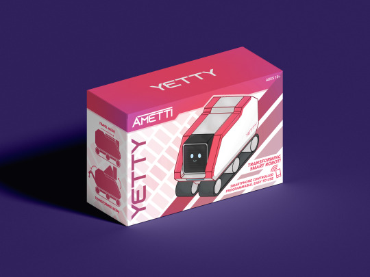
Text
Packaging Design
I had initially considered using a special mock-up document offered to me by a tutor, however I did not like the giant window which doesn’t offer much room for design on the front box.

So, I decided against this design, feeling that it looked too cheap and plastic, rather than a premium toy. I sought to find a box more resemblant to the Star Wars robot toy boxes instead.
Though not designed for a toy or a product this small, this simple, smart, matt-textured box mock-up seemed to be perfect for the job. I saved the PSD into my FMP folder and worked straight into the sub-files for the textures on the box.
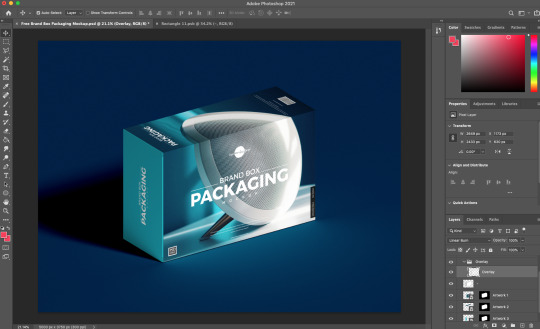
I started with the same “Ametti” strip across the top, inspired by the one done on both the branding guidelines and the robot design sheet.

Looking at how filled the background of the Lego design was, I decided that I needed to make some kind of background texture to fill up the empty, barren space. So, inspired by track trails, I made a diagonal strip across the page, and split it with incremental white gaps. I then duplicated this strip, but thought it looked too repetitive; so I varied the opacity between each strip, making a gradient of the background colour fade in.
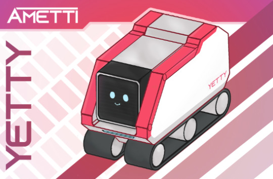
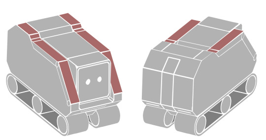
Pleased with this background design, I moved straight onto adding the robot. Initially, I copied in the main illustration of the robot in its non-transformed mode, but then thought that it looked a bit bland and not exciting, so I thought to try the other version of the front-view robot.
Weirdly enough, I actually ended up thinking that the transformed robot didn’t look very good on the front of the box. Although it shows off less functionality, I thought that the “compact” mode Yetty looked more cute and, more importantly, worked with the background better, blending with the diagonal angle of the background more.
Thus, I decided to blend it in further, with something beneath it to fill the bottom corner. I gave it a “train tracks” design, with the reach of the conveyors illustrated behind and in front of it. I thought it looked good, but I wasn’t too sure about the darkness of the red I had chosen, so I experimented with changing the opacity and colour. I also was not happy with how empty the bottom right corner was looking, either.

So, I made a few changes. Deciding that this would be the only image on the front (as the designs I had looked at didn’t tend to overwhelm the front of the box with multiple photographs of the same robot), I made the robot much larger, overlapping the top stripe even, to make it pop into the viewer’s attention. The background stripes beneath it followed suit, and I altered the colour and added more stripes to fill in the corner, making another gradient. I was much, much happier with the stripes now. Additionally, I coloured the outlines to be more soft and not stark black. Finally, I placed on the robot name, making sure to make it larger than the brand name to make it clear what the product itself was called. I was inspired by the BB-8 box to place the text going down the side, and I made it the same colour as the darkest background stripe.

I was very pleased with this design so far. It looked very full and displayed everything it needed to, the composition felt good, and it was in-line with my design guidelines. However, I felt as though I was overusing one colour, so much so that the fuchsia was getting tiring to look at. I wasn’t all that keen on the idea of adding a secondary colour to the mix - so I experimented with other hues instead, intending to blend another into the main red.

I duplicated the master layer and tinted it a bright purple. I thought this looked pretty neat in its own right, but too different to what I had already designed. To blend it with the original colour layer below, I simply used the eraser tool (made really big and with hardness set to 0) in the centre, and clicked. After making it slightly transparent, this turned the master colour into a really nice gradient that I was super happy with, and added so much variation to the otherwise block colour.
I still felt that the front of the box looked rather bare and needed more text or otherwise attention-grabbing imagery, after looking back on my inspirations. I used the bottom-right corner and sectioned off two strips of white to briefly describe and advertise the toy.
I used the Cocogoose font and made it italic to signify movement and attention-grabbing. I kept the text as brief as I could, seeing as it was in a relatively small part of the box front.

I made a white square with a coloured stroke to signify a mobile device and added details and a wireless symbol to easily communicate the caption beneath it. Really pleased with the position of this and the angle, I removed the stripe behind it and made the layer weave through the background.
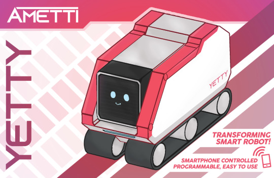
At this point, I was fully happy with my design and applied it to the box front mockup. Except that the top right felt a bit bare, so I added quick text saying “Ages 10+”.

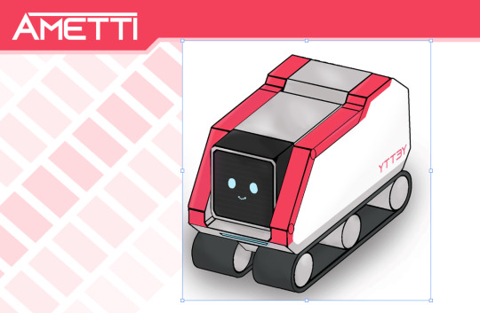
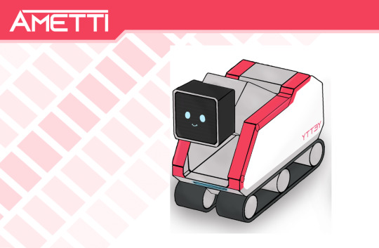
For the side panel, I largely continued my current background design, copying the gradient of the top stripe, and copying over the background stripes.

Applying this to the mock-up looked really good to me. It took a short while to line up the background stripes, but it was worth it.

However, I felt as though I could not leave the background so blank and barren, so I gave it a foreground. I’d thought that I’d reserve the main “page” of the robot’s features and all for the back of the box, so I’d only use subtle imagery for the side.

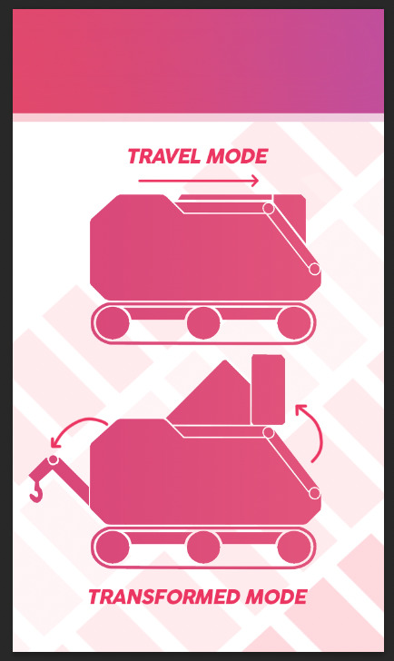
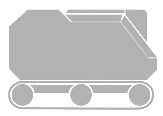
I decided that the side-on silhouettes would be perfect for the sides, as they are the sides of the product itself. Since the left side and right side are identical, I used the normal mode and transformed mode. After importing and colouring the illustrations, I overlaid a subtle gradient similar to the top bar, and added text and arrows to illustrate the diagrams better and make them look more interesting.
Pleased with how this looked mapped to the side of the box mockup, I continued with the last remaining part of the box front-view: the top.
Seeing as this would connect the top bars together, I saw it a logical progression to make it a fuchsia-purple gradient blend, going over it multiple times to make it connect seamlessly to the front and side parts. I copied the product name and made it white, to have a key central feature on the top.

After all of the adjustments made, I was super pleased with the look of the box mockup and thought it was nearly done.

I had thought that the blue in the background was much too suited to the original placeholder design and needed to change. I chose this dark purple in the end, thinking it complimented the hue of the box colour well, but also contrasting against the light red.
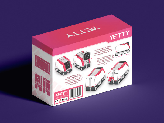
All that was left now was the back view. So, I duplicated the front view Photoshop document, started with the back itself. I decided that the best thing to showcase on the back was excepts of the Yetty from my design sheet. I spread the four illustrations across the page and left space for text description as well as the barcode in the bottom-left. I replaced the company logo with the product one for the back, as the company logo reappears in the bottom-left. Additionally, I drew in arrows to make the transformations more apparent and advertised.

I sourced a barcode and added a pink background for the bottom-left area - but placed in some of the striped background to carry over from the side. I added in the company logo as well as some legal jargon and imagery for realism.

The background stripes were carried over from the other side (which is largely a copy of the first, but flipped). I also repeated the process of the side-on illustrations but with the top/front/back views of the robot illustrations.

I was helped by copying over text from my robot design sheet and adapting it more for the purpose of marketing. Due to the amount of illustrations on-screen (with an added side-view too), I felt as though the whole thing would be too cluttered if more background details were added, so I left it to be the clean, plain white, as I felt everything on top made up for the emptiness.
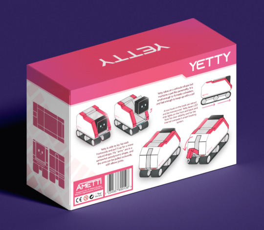
And with that, I had the final outcomes finished. Although the branding guidelines and robot design sheet were outcomes in their own right, they very much feel like stepping stones to get to this final box design, in retrospect. I am certainly happy with the box, the only thing that is a shame is that I could not use real photographs of a physical model of the thing, but that would have just taken too long, and I personally think that I have done good for what I had to work with.
1 note
·
View note
Text
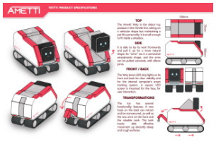
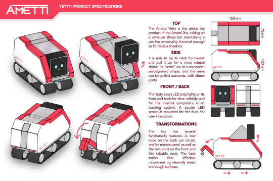
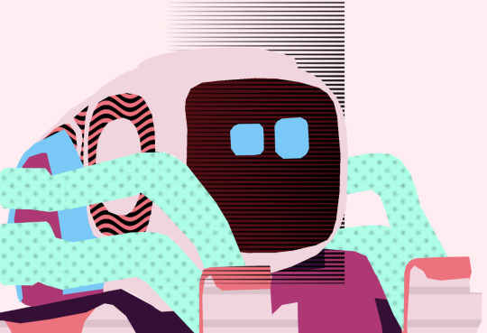
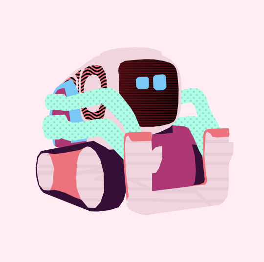
Yetty Design Sheet
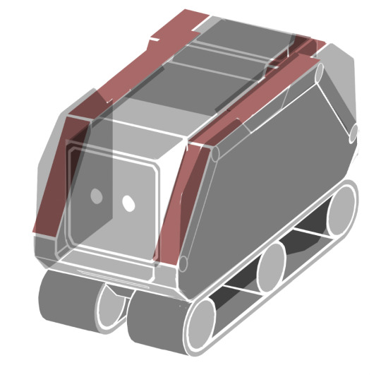
After finishing the outlines, I began work on deciding on a colour scheme, as well as fully arranging a design sheet together.
My initial colour design was a murky grey for the central part and the “wheels”, and a dark grey for the head and track treads. What I had initially only temporarily coloured (sections of the arms), I had actually decided looked quite cool to have a bright colour for.

I’d decided on the “Ametti orange” for the arms and continued this colour to go across the whole side of the robot, and I thought that the white looked a bit bare on the side, so I added a grey trim at the bottom. I also picked a single light blue tone for the front light and the eyes. However. I just wasn’t happy with how all of the colours worked together.
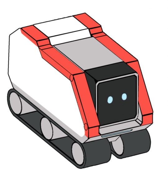
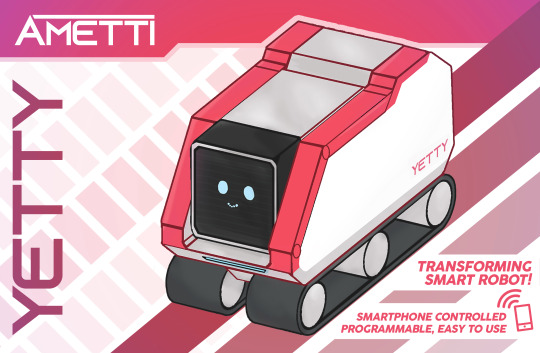
With a bit of hue adjustment, I decided on this bright pinky-red tone fuchsia that I briefly mentioned before. I thought that this looked so much more playful than the orange, but not too pink to be unappealing. I additionally added the robot’s name in the logo font, and shaded the grey slightly to make it look more metallic than plastic.
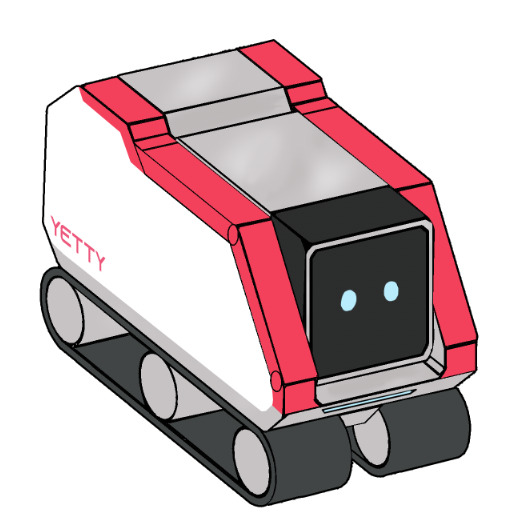
After texturing the arms slightly, adding face texture and a slight smile, I was pleased with these colours and this design, properly adopting choosing to adopt it and move on.

With the back, I added some red glow around the back lights and was unsure about how to colour the back. I added the grey for the tow hook and left everything else white, but I was unsure about this decision.
But then, after attempting a different colour scheme, I went back on myself and preferred my first draft.
However, I decided that the hook itself should be fuchsia, besides the back.
With all of the colour scheming done, I coloured in all of the angles of the design.

At this stage, all I had left to do was to add design elements to turn this into a proper “product specifications” sheet. I added a bar at the top (and at the bottom which I later removed).
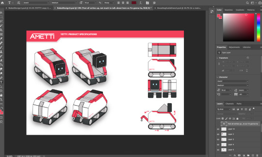
I followed the style guide and added text and arrows to explain the product to “employees, investors and potential customers”, trying to seem professional. With a shadow added to the 3D views to make it look more realistic, I thought it was good to go, and I exported the outcome.
However, with this outcome done, the branding style guide I had made before suddenly looked off when put next to it due to its slightly hue-shifted colour.

Whilst theoretically I justified this with the “Yetty brand” having different colours, I did not want to imagine these two outcomes being put next to each other and the contrast being immediately obvious and unsettling, so I decided to opt for correcting the colours to my new scheme (which only involved changing the orange to the fuchsia), and I re-exported the piece.
0 notes
Text
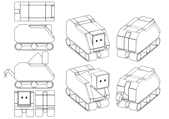
Yetty Concept Art
With the sketches ready, my next step was to assemble a concept art sheet. I used a graphics tablet and digitally drew some rough shapes to plan out how the layout would look.

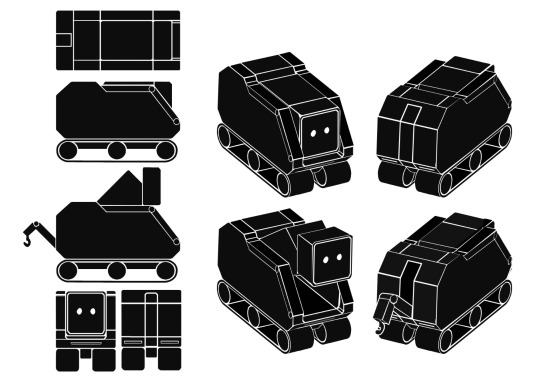
I decided that I should have the main illustration in the top left and the back view next to it, with all of the 2D views beneath. Ultimately, I will go through more revisions later, so this is merely a rough basis.

Using the polygonal lasso tool (and holding the shift key for straight lines), I drew a silhouette of the robot side-on. For the curved parts (the tank tracks) I used circles and applied a white stroke effect.
After this draft, I quickly realised that it was far too short, length-wise. So, I fixed this simply by splitting the shape and stretching the gap between them together.

I used the side-view to base the top-view, where I just used a rectangle and drew lines across. I found that it looked almost incomprehensible before I made the corners more cut and smooth.

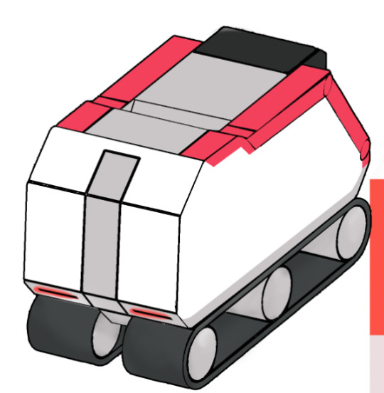
Then I put together a front and back view, the latter based on the former. The front-view was based on the rear of the side-view for scale so that it all scaled up. I added outlines for the lights at the bottom, and drew circles to indicate the eyes on the face screen.

I then decided to have a go at a 3D view. I drew a parallelogram for the base angle of the machine, and I used the perspective tool to adjust copies of the side-on view to match the sides.
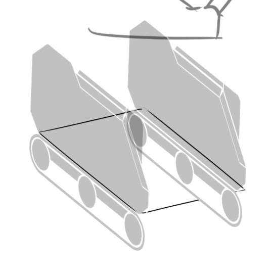
I’d made the base shape too wide but simply moved the right side closer to solve this issue. I used perspective to match the front view onto the front, and slowly worked my way through it to move the parts (arms, face, conveyors) to their appropriate places. To help wrap my head around this confusing mess easier, I coloured the arms red temporarily.

I continued the flush of the sides all the way down to the back and moved the head to its correct position, leaving a centimetre or so gap between it and the front of the robot.

I had references for what the robot looked like on-screen at all times to not get easily confused about it.

I then filled in the remaining areas: the top middle ridge, and the conveyors. I duplicated the front part of the left one to illustrate the right one, and filled in the inside of the conveyor with a dark grey to imply depth. At this stage, I had illustrated the full 3D machine from this angle. I was very pleased with what I had done.

I then, however, needed a back-view of the robot. It was actually much more difficult to make than I had anticipated. The first obvious step was to horizontally flip the front design, but then the shape of the back end was not at the “front”. So, I copied the back of the side, and used perspective to stretch it the other way round. I copied it and did the inverse for the front of the side.
Once I cleared away all of the front elements, and joined the back together (with the back-view as guidance). As it was a messy process, I didn’t screenshot a lot of it but I was happy that it had worked it in the end.

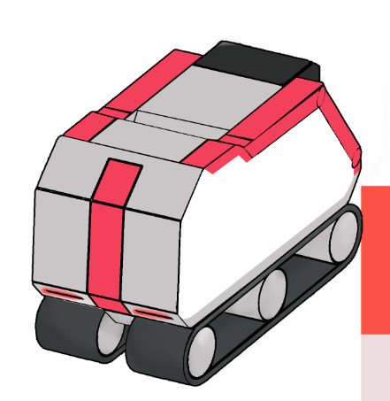
I then prepared a layout for the final sheet now that I had the standard views of the robot all done. I duplicated the 3D views to prepare for the “transformed” views. I decided that in reality, it looked smarter to pair the 3D views together and have a column for the 2D views down the side.
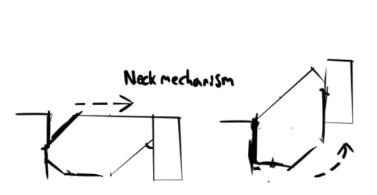
Before making the transformed view in 3D, I genuinely needed to make it in 2D to actually wrap my head around how it would look. I used a transparent overlay to draw what the neck looks like inside.

I then rotated these same shapes to make its transformation technically possible, and it worked, making the head nearly an entire head-height higher up.

I decided to also use the side-view for creating the tow hook. After this was done, I used this side view matched with the 3D perspective to create the alterations of the head height.

With the modified head (and dark grey for the inside to give depth), I was very pleased with the illustration of the design.
I then (mostly eyeballed) the hook shape and drew it onto the back, then removed the line to hollow the space where the hook sits inside. I then properly cleaned up the transformed side-view and chose to include it as well, not knowing why I had not planned otherwise.

Now, at this stage, I had planned to redraw the entire robot and side-views to clear up the messy areas, but thinking about that made me realise how unrealistically time-consuming that would be, so I alternatively decided to clear up the sketch itself and use photoshop tools to invert the colours and make the illustration into an outline. Below are the cleaned up 3D views, the side-views didn’t really require any changes.
I exported the whole file and used Photoshop’s levels/contrast tools to make everything that wasn’t white into pitch black.
I then inverted the colours of the entire image to make the white outlines black outlines and the body of the robot white. I then looked up how to select all of the black areas, as the magic wand just wouldn’t cut it.

I found out that using Select>Colour Range achieves this effect, and I was able to use a black stroke to make a black outline around the whole illustration set.

Now, this worked perfectly, apart from some loose pixels that caused the stroke to be really bumpy. I decided not to undo all of my work, and to instead just manually go in and remove the bumpy edges.

Once I had done this, very neat black outlines applied across the entire illustration, and I was very pleased with my work and how much time I had saved by not redrawing it.

0 notes
Text
Robot Concept Design
I began a very important part of my project, designing the robot itself. I kept in mind that I had to design it from the ground up as a toy, so I immediately considered functionality features and an appealing look. The following are my concept art sketches.
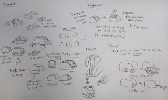
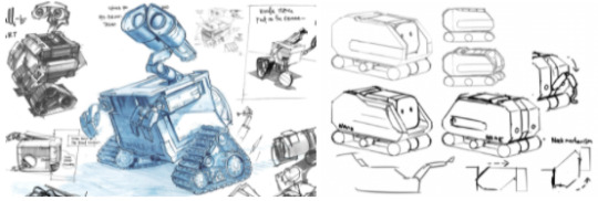
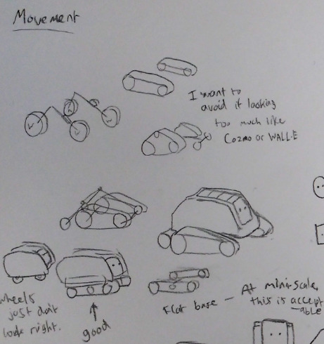
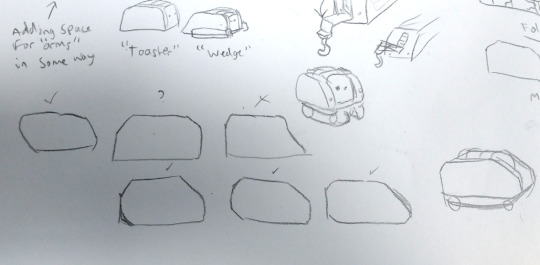
The first thing I considered was how it would move. I had initially wanted to try wheels, but they made it look too much like a vehicle than a robot. So I was left with tracks, but as noted, I didn’t want the design to look too much like Cozmo or WALL-E. I briefly tinkered with adding wheels onto the tracks, but that just looked too janky and awkward. So, in the end, I just rolled with the most straightforward “conveyor belt” design of tracks.
As can be seen, I was considering the body shape too. This design evolved from the transformation sketches where I considered how to make the thing cool, and appealing. I decided that it would be neat if the head could raise. I noted my inspiration from looking at transformers and that it was worth researching in the end. With the body shape, only meant to be temporary but ended up being a design I quite liked, I was inspired by steam trains, toasters, bugs and tanks.
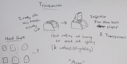
I note this and draw alternative shapes to be inspired further, settling on what kinds of shapes would be final. I decided that the more vehicular shapes would be more suited, rather than the “toaster” design.
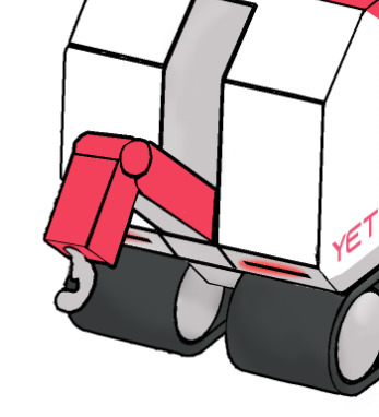
Another functionality feature was added when I realised the back would be rather bare. So, I thought that a tow hook and ability to pull a trailer would be neat. Additionally, I felt that in order to distinguish this from a vehicle, it needed arms in some way. I really contemplated arms that fold out from the side of the robot, but they just looked plain ugly. I then thought about a central “arm” coming out from the middle.

I briefly contemplated another design more resemblant of a tank, but I decided that my initial design was far superior.

After this, it was then time to take this sketched design into the digital realm. I plugged in a graphics tablet and began sketching in Photoshop, with my sketches transparent in the background for reference. I drew up a side-on view using one of the body designs I was happy with. Once I had done so, I duplicated it (and removed the head/neck), and moved one of the sides behind and off to the side, in hopes that I could theoretically join them together and made a 3D sketch.

With the sketch looking very rough, just for the purpose of me visualising a more close-to-final design of this robot, I managed to mock up a 3D concept sketch.

Afterwards, I realised that it made much more sense to use straight lines by holding shift and marking points to draw between. These made my lines so much clearer and straighter, two things I struggled with doing on a tablet.
My initial draft of this redraw was looking pretty good. However, as noted, I felt as though the the thing was just not long enough, like I had made a “chibi” version.
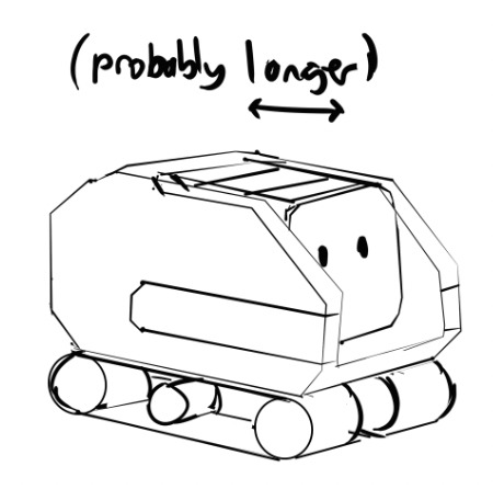
Luckily, as this was Photoshop and not a real sketch, I could just use tools to split it in two and extend it in the middle. At this stage, it was coming together to be more like the design I’d had in mind.
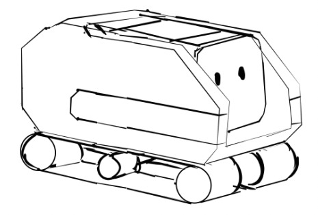
Although this wasn’t necessary (this robot would only exist in the fictional realm), for the sake of realism I worked out how the neck mechanism would hypothetically work in real life. It would have to be oddly shaped, like a parallelogram, for the corners to bend upwards and for the face to retain the same angle. I was able to physically rotate the main neck piece to ensure this would work.
I then looked at the body shape and realised that I did not like how the face seemed so obscured by the side. So, I drew over the body and realised how much I preferred one of the older designs, with a straight triangular edge down to the bottom. I also redesigned the back, but just thought it looked inferior in every way, so I didn’t go with the modification at the back, but redesigned the front.

As can be seen, I had really thought about where the arms should go, and I’d wanted handles to retract and extend them from the sides. I also thought that it would be cool if the robot’s name were engraved onto the bottom of the sides. As these were the more final sketches, I additionally redrew the tow hook.
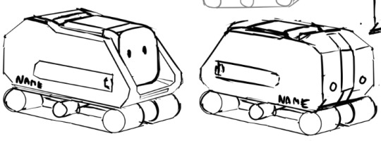

The last thing I added (at the bottom) was a new arm design. At the last second, I had realised that the arms could fold out from the tops of the sides, and this would be much better than having to be lifted out of the sides, so, I went with this functionality design, and decided to move onto the final design stage.

At this point, I had come up with a name for the robot, “Yetty”. It was a name I’d thought of quite simply because of its Arctic explorer-like appearance and snowy look. Additionally, I thought it worked well with the company name “Ametti” (Ametti Yetty), and that spelling “Yeti” with two Ts would make it fit better and seem original. Due to how long I spent coming up with the name “Ametti”, I decided to just go with this name choice rather than go through that arduous process again.
0 notes
Text
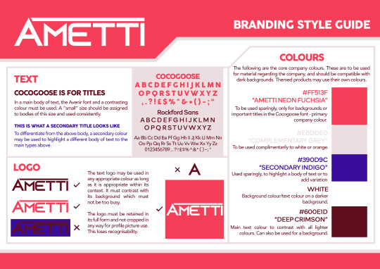
Branding Guidelines Creation
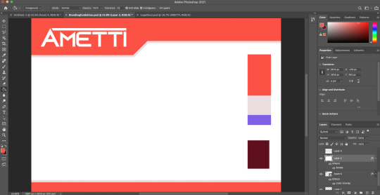
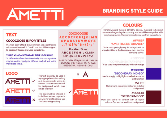
Following the final design of my logo, I created an A3 document in Photoshop and started putting together my branding guidelines. I started with a basic mockup of packaging geometry to see how the logo would look on it. I also added a column of colours on the right, picking the bright orange I had designed for it, as well as a dark red to go with it, and a pale orange and white.

I decided that the pale orange just looked too ugly, so I turned it into a grey instead. I also thought that I don’t want to only give myself one hue to work with, so I added a contrasting secondary colour, which I decided to be purple.
Additionally, I slightly tinted the orange shade red, feeling like the addition helped make the logo contrast more, and that it worked better with the other colours.
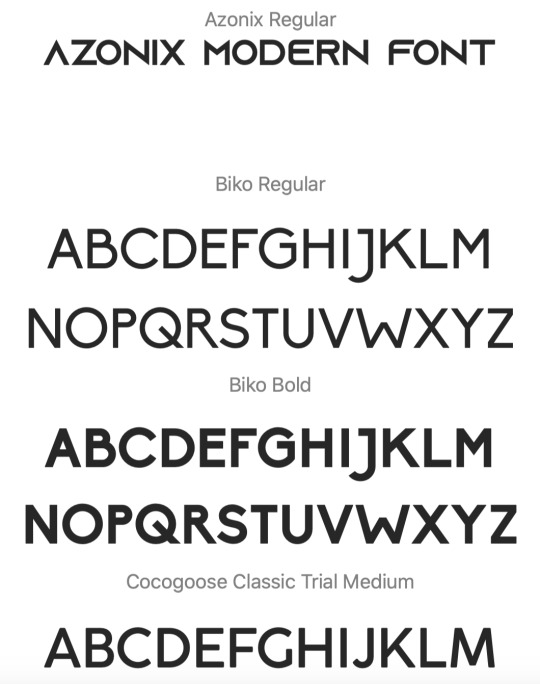
With the colours settled, I decided to go through all of the fonts I’d downloaded and see what worked best. I decided that I need for the font to look very readable, friendly, and of course for it to work aesthetically.

With these five fonts trialled, I had initially thought that the first font was ideal but it just looked too wide and bubbly to me. The last three either looked the same or difficult to read, and I think that the second font struck a perfect balance.
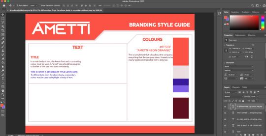
I also picked another font for the bold uppercase text. I had wanted to use the same font as the logo but I did not want it to go stale or become overused. So I instead used Cocogoose, and was happy with my decision. At this stage, I also set bounding boxes for the three sections of my branding guidelines, and assembled the “colours” section properly.
With my selected fonts, I noted the hex codes for my final selected colours and wrote a description for where they shall be used.

Inspired by logo sections on other design styles I have researched, I composed a section for the logo of my brand. I allowed change of its colour and background (within reason), but did not allow for omission of parts of the design.
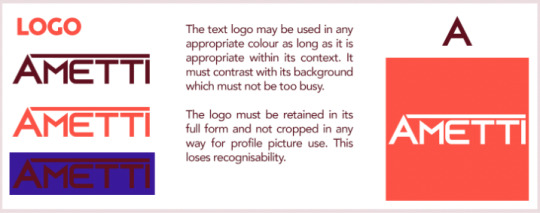
By the end of the design, I had annotated every section fully, with demonstration of the fonts and clear, visual indication of what logo designs are allowed. I was pleased with the look and functionality of the style guide.
0 notes
Text
Manufacturer Concept and Logo
Having versed myself in what makes a toy company design effective, I commenced the creation of my own. I started with a name - I drew a mind map and evaluated on my ideas as I went, until I had finally arrived at a name I was happy with: Ametti.
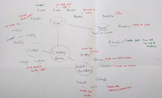
I had contemplated Funto and Keddy but they just did not sit right with me and I felt much more confident with the name Ametti, so I moved onto the logo design.
Before opening any design software, I sketched some loose designs to work with and brainstorm what could be done to render a logo of the name.
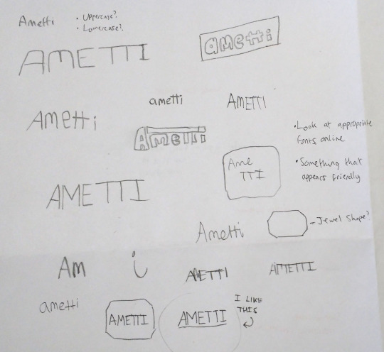
I worked around uppercase and lowercase, deciding that uppercase seemed more common among manufacturers and looked more professional than lowercase, as many logos like Lego use uppercase, but I still wanted it to look friendly. I frequently considered joining the two Ts and using geometry one way or another. The simple box/parallelogram design reminded me too much of a Supreme-like logo, so I contemplated a “jewel” shape which seemed unique to me. In the end, the design I was most happy with was the circled one at the bottom - the uppercase smart look with the A leaning into the M. Although it has an underline I do not think it’s necessary, and I will be working with these concepts in general rather than sticking to that logo specifically, as I have yet to look at typefaces.

I scoured Dafont for sans-serif fonts (the common denominator between my designs) and downloaded a whole bunch to use. I kept in mind not only to find fonts intended for the logo itself, but for typing use in the company’s style guide and on the box packaging as well.
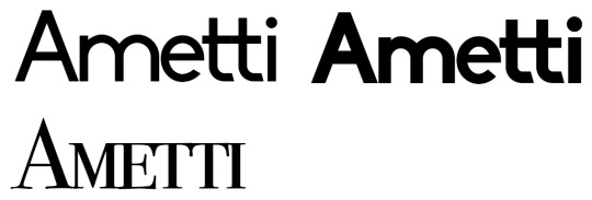
Once all of the fonts were installed, I opened Photoshop to draft a design and trial these fonts to see what works best. I went through them all and experimented with design until I came up with a whole page of Amettis.

After doing so, I evaluated what made these logos work. I think a lot of the bottom ones looked rather bland and slightly off, either too bold or non-uniform with text width and height.

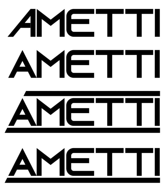
Whilst I was pleased with the first logo, as I feel it looks rather sci-fi and matches the robotics theme, I think it looks rather... overly trying to be cool(?) and I will attempt some modifications to resolve this.
I surprisingly really liked the second row of logos, despite the title case used. Unfortunately, I feel as though there isn’t anything I could add or change with them, and that they are sort-of done as logos without much of my own input. The third row looks too old fashioned for my taste but it inspired me to try “smallcaps”, where it’s all uppercase but the initial letter is larger. I did this for the fourth row and was particularly pleased with it but I felt that the font wasn’t suited to joining letters together.

I landed on this typeface which I had just felt looked ideal in terms of boldness and smartness, and I think was improved by using the smallcaps technique. After my presumptions, I garnered peer feedback and was told that the top row logo and seventh row logos looked best, so I decided to filter down to trying to take these two logos further.

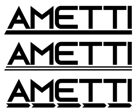
For the first font, my initial idea was to alter the A to make it lean into the letter M as I had written on my spider diagram. But this idea only really worked on paper (quite literally) as I just was not pleased with the result.
The other alterations I had made included adding a line into the letter A, as I just did not like the Λ shape. Additionally, I tried adding a line below and above, and in the end I was only happy with the line below. But at this point I had thought that I just should use the second font instead.
With the second font, I went straight into the same underline effect that I had tried with the last one, but it did not work as well this time in my opinion. Afterwards I had another “good on paper” incident, where I was convinced that my final logo would likely have the “gem” shape I’d drawn. After spending some time making it, I realised quickly that it just did not work.

However, my favourite of these was the last one, in which I chose to fill the empty space with an overline. With some peer feedback, I determined that the last one was the best but that actually, the last font was good as well. I decided to work some more on that one, trying to make the underline less thick with patterns and arrows to suggest robotic movement. Ultimately, I was not happy with these changes as they just made the logo look too cluttered, so I kept the original underline.
At this point, I could not choose between the old font and the new one, so I mocked up a box overlay with a colour and text in white, and I put them side-by-side.

With peer feedback, the clarity of the bottom one functioned better as a logo, as well as the overline instead of the underline. I was still indecisive about them, so I decided to try combining them into one logo.

One final time, I asked for peer feedback, for my final three designs. In the end, my conclusion was to use the bottommost logo design, as the others didn’t look as sci-fi or modern, which was the vibe I was going for. I personally decided that the second one looked more ideal for a construction company, and the curved E in the other font made a big difference, and the changes improve it over the first one.

Once I had the final logo in mind, I went into Illustrator to make a vector version of the logo due to the low quality of my mock-up, and for good practice.

For the bulk of the logo, I retyped the text in the font I used. I did change the middle line of the E to be in the centre, which it isn’t by default. I also spaced each letter differently and lined them up individually. Once I made the text into outlines, I spaced the tops of the Es and the Ts further apart to make the letters more distinguished from a distance. As with the A, I completely remade it. Using the shift button to snap the line of the pen tool, I was able to completely line it up with the other letters and make it a similar thickness, and once I made the inside triangle, I used the “minus font” pathfinder to cut the triangle out from inside the A. And finally, I traced around the line at the top.

And with that, the logo was remade. I was pleased with it, and happy that I could work with Illustrator and vector graphics easily.

I selected everything and used “export from selection” to land on the following screen. I exported both a high quality PNG and SVG.
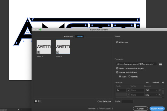

After the export, I decided to play around with making the lines softer, and the A thinner, but I decided against these changes in the end, feeling it was fine as was.

0 notes
Text
Manufacturer Design Research
I decided to take design inspiration from the world’s leading toy manufacturing companies and look into their logos and what they have in common.
Logos
In this sample image of toy company logos, there are also companies like Nintendo and Hornby which I’d argue wouldn’t qualify, but other than these we have a series of well-designed logos that stick to a small number of basic colours (as all logos should). Except for “Baby Einstein” which I will discredit. Looking into this, I am now noticing the (R) symbol in every logo, which, it seems every company does their best to hide or cover up. it is barely visible in the Hornby logo, compared to the thick yellow text of the main logo, and the Lego logo paints it in a highly un-contrasting black to make it practically invisible.
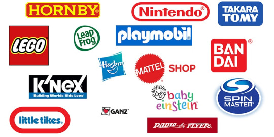
Another thing that these logos have in common that I am noticing is that several of them are on a slant- such as Mattel, Leap Frog, Hasbro; Lego’s bears italic text. I think the effect of having a slant is good, it implies an aura of friendliness and looking like a sticker on a box, placed manually with human hands. Additionally, aside from Lego’s italic text, the slants are all in the same direction. I am not sure as to why but I shall keep this in mind.

I decided to focus on Lego’s logo in particular, with its timeless and playful design of the bubbly text and playful colours of red and yellow, though using black for the logo and text to contrast.

Though a more recently changed logo, I chose to look at this one for its “3D but flat” look- with a square-shaped base, it still retains a friendly look by not having as sharp corners and appearing more like a pillow than a sharp square. Additionally to emphasise its friendliness, it displays a smile-like shape and only uses light colours, lacking any form of black. It also intrigues me how bold of them it was to choose to use a gradient on their logo, something not often done.
Style guides
Whilst the logo is arguably the most important part of a company’s visual design, I thought that I should create a style guide for the rest of what the company I make will create. The only example style guide for a toy-related company that I could find was for Hamleys, a toy shop. All that I can see in its sample is how their different logos must be used. It seems their drawn “H” logo would be a profile picture and used independently from the red and gold logo. On a side-note, I do like the use of a gold tone and royal red, almost to suggest a premium in the company’s identity.

Other branding guidelines are more detailed, with this sample McDonalds one containing three pages of organised parts, which I think looks very clean, orderly, and consumable. It has a strongly used “set” of various colour palettes, as the distinct red and yellow can get overwhelming when used everywhere, and I think that this is is clever. Additionally it has a chosen typeface and a set of backgrounds, which is desired. I think other than the presentation of this page like a comic book (likely due to these being four pages of a manual), other than that I think this guideline says everything it needs to.

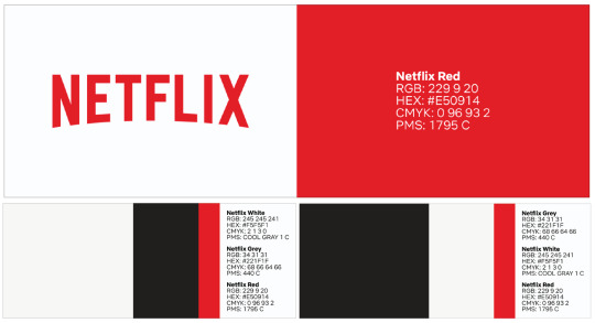
This Netflix style guide is rather bland, only including exact details about the colour hues. without any context or reason. However, I was intrigued by its logo section, stating what cannot be done with it.

0 notes
Text
Design Packaging Research
As briefly mentioned in the post talking about the Star Wars robot toy packaging, it is intriguing to see when packaging is designed to be seen in a shop or for it to be used simply as a box for the product’s received online delivery.
This packaging/product below was clearly designed for retail outlets. Firstly, this doesn’t appear to be a sought-after product that a child would want a parent to go out of the way to purchase, and rather something that markets itself with its appearance to make the child beg for the parent to buy it. It practically offers a demo functionality as part of being the product itself, which I think is clever marketing design that separates a product that has been pre-marketed from a product that must “market itself”. The design here is bold, a plain white background (though with a light grey Poke-ball pattern) to avoid overly contrasting with anything else and making all of the foreground elements pop out. Everything else is boldly outlined to clearly stick out and divert attention to it, except for Pikachu who is iconic in his own right, and whose bright yellow colour contrasts enough on its own. It has three recognisable elements for fans to spot- the Pokemon logo, the Poke-ball, and Pikachu (the latter of whom is almost just a friendly face, or poster child). The box art makes use of the Poke-ball’s colour palette to match it, as the product is effectively just the ball itself. It uses a dark stripe and a sharp, bright red hue at the bottom - though I must add that I feel the use of a slightly pink-tinted fuchsia red is very importantly done. I think that bright unfiltered red may come across as intimidating or angry, but this very slight hue change takes the edge off for the packaging, but keeps it absurdly bright to alert the attention of its target audience, which is stated to be “6+”.

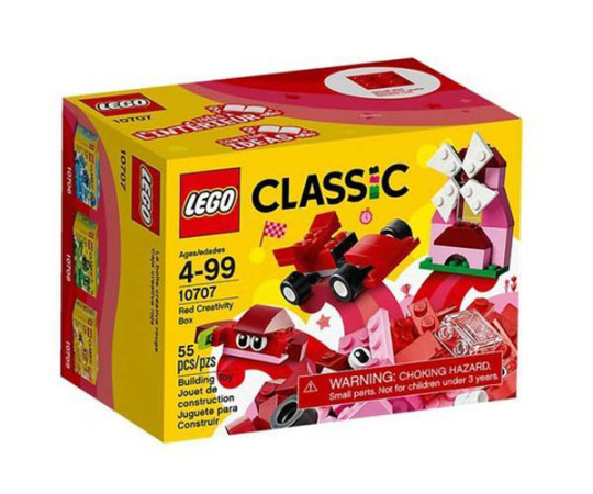
A less flashy and less functional box is for a typical Lego product. Here I am using a small Lego Classics box, which does not use a transparent window or cutout function as the product is disassembled inside. I think that the box does all of the marketing as it is incredibly flashy considering how blandly the models could have been shown. Three showcase models are demonstrated coming out of a pile of bricks with many effects and a strong colour theme is kept with yellow (to match the “classic” theme) and red (the theme of the bricks inside) with white to add some separation between them. I think it worth noting that there are pink hues in the red bricks as well, and I think it is clever how there are “gradients” of red around the secondary colour on the sides of the boxes, and whilst the bright colours are rather limiting, I think that they are effective at attracting attention and also will stand out amongst similar sets of different colours. Additionally, there is an ugly warning for parents that I think has been cleverly and intentionally obscured by being made the same colour as the bricks in the background around it. This is likely a legal requirement that Lego did not want to divert attention to.
To conclude, I think that there are a lot of techniques to take in with how to market without an in-your-face functionality feature for the target audience, and I will utilise the showing-off-methods learned.
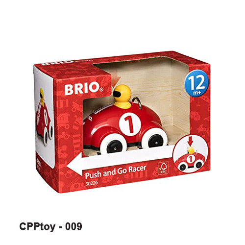
And this product, by comparison, looks like a very simple and straightforward toy. The entire thing is on display and seen from the outside. And it states with as little text and imagery and humanly possible what it is, and what it does, for everyone to understand. The red of the product is used for the background, a (in my opinion, unnecessarily large) brand logo is plastered onto the box and a large, contrasting white arrow is drawn across the base of the car to indicate its potential movement and direction. Red arrows seem to be used to indicate the control, and this design seems to prioritise communication over complex or flashy design, which I will take note of.
0 notes
Text
Robot Toy Research
As well as the Star Wars replica toys that I researched, I decided to go in depth with others. I looked at Cozmo, an educational robot toy aimed at children which allows for programming and entertainment.

As with all robot “characters” I have been looking at, Cozmo is designed with appeal in mind. To add curvature to suggest friendliness rather than hard edges, his “head” shape is a rounded cube with soft edges. As journalists from around the time of its mid-2010s launch stated, there is no doubt that his design is comparable to WALL-E’s, with an illuminated face design comparable to EVE’s.
The tyre tracks serve more than just an aesthetic purpose as they are physically used to manoeuvre the robot when played with by children (or its target audience). Tracks are superior to wheels and tyres when going up steep surfaces.
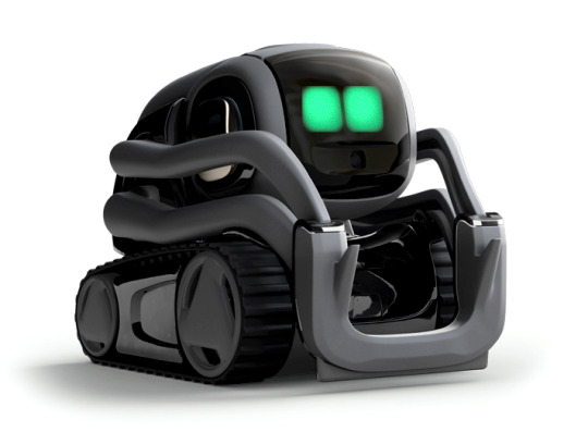
It is worth noting that a slight redesign with a black and gold scheme (and green eyes) was introduced, named Vector. I think Vector’s big bubbly green eyes help shake away the association with EVE. Additionally Vector’s eyes can change colour depending on the activities he is doing. I think it is a phenomenal feat to have the robots’ emotions display through their eyes and it adds to the cuteness factor substantially.
Lastly, I would like to state that I find it very intriguing to think about how these robots were entirely designed from the ground up to function as toys - in comparison to the Star Wars droids and WALL-E, who were designed to be appealing film characters first and foremost. I would be intrigued to learn about the process of designing such toys as I am sure the creators must have had to sacrifice appeal or aesthetic for functionality, as the character is the toy itself.

And so I did learn - “Designing Cozmo was a collaboration between engineers and animators. The robot was storyboarded and tested like an animated character for film or TV” (a quote from the creators about the process). I think that looking at the design process for this has been beneficial to me and it allows me to see how I would go about performing a similar feat.

I find the alternative eyes for Cozmo to be rather spooky. I find it intriguing that the three columns of inspirations for the eyes were cartoony open eyes, dot eyes and robot eyes. It is not a surprise to me to see BURN-E, EVE, and MO (all from WALL-E) as inspirations in the robot column. I was surprised to see so many potential iterations that went unused and, despite being just the eyes, seem to change the look of the entire robot. It goes to show to me how important it is to get these distinct features right, and that I prefer more simple eyes rather than overly cartoony shapes, but it needs a degree of cartoon-ness to give it the edge it needs to appeal to the target audience.
Lego Mindstorms is a Lego set with programmable parts. It effectively allows its target consumers (“10+”) to build their own robots (but with five sets of pre-designed instructions), and I think is extremely cool. As with Cozmo, it can be coded with a phone app and has a lot of playability (not to mention compatibility with other Lego pieces and sets), but at the cost of ~400USD.
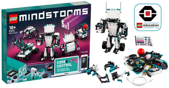
As there are many designs and they are all fully customisable, I will not review them individually, but I do like how they vary from humanoid design/mech shape, to vehicular and even quadruped animal-shaped. It truly shows how many directions I could go into with a toy robot design. Despite Lego tank tracks existing, none of these use them and they use either wheel or leg-based movement.
In regards to the packaging, its simple box shape is just akin to other Lego sets, but I really like the design of the box and the strong unique “teal” shade that is dedicated to the Mindstorms range, and how it contrasts well with the magenta background around the robots pictured. As well as this, unique teal blocks are made for this set to match the theme. Whilst I am a huge fan of how this set encourages customisable building and replayability, I do not think that I could achieve such with my own creation, though I could contemplate a Transformer-style modular rebuild system.
0 notes
Text
Robots in Media Research
R2-D2 is an iconic robot in fiction, one of the oldest remembered robots in cinema history (I’d say HAL 9000 is more AI than robot). I think that this droid was designed with cuteness in mind - baring a friendly, dome-shaped head, and sound-designed with “cute” noises as well. I think that all of it adds to his appeal even if he isn’t designed with any real basis like a humanoid, animal or vehicle. Additionally, whilst he is kitted with many potential features, his design remains slick and iconic, I think it’s hard to find people who are unfamiliar with R2′s design, Star Wars fan or not.

It is worth noting with the design of cuteness the droid introduced in the newer films, BB-8. It is clear to see the “generational resemblance” handed down to BB-8 with its basis on R2-D2. BB-8 bears a white-orange colour scheme and a similar dome head to R2, but his body shape is entirely round. It seems that curved/round shapes in character design seem to symbolise friendliness, compared to straight and sharp edges - this was clearly doubled down and enhanced with the newer droid’s design.

Fittingly for this project, there have been robot toys created of R2-D2 and BB-8 by the same company. They are impressive and very functional, working wirelessly with a phone. Their appearances are extra accurate to the films and the movements are accurate as well, they are true toys rather than models.
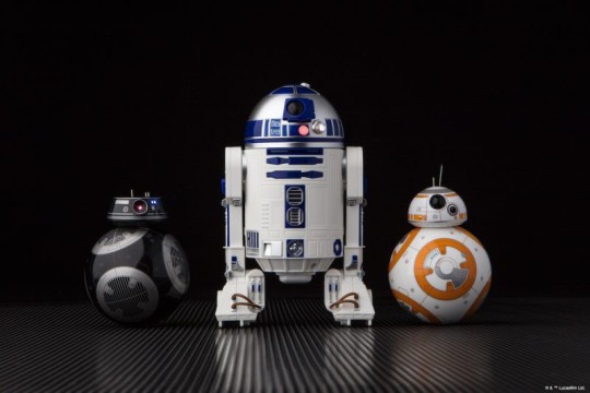
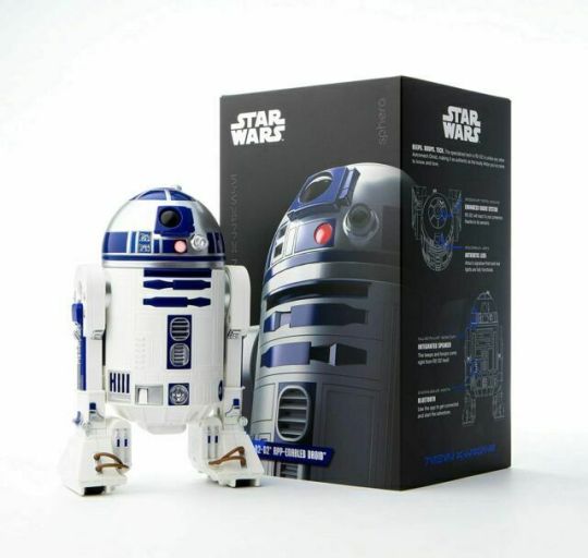
I decided to additionally analyse the packaging designs of these products. The toys were likely expensive and clearly aimed at an older audience than young children, as can be seen on the mature packaging which uses sleek black and white. This packaging must only be presented to the customer once the product has been shipped to them as I doubt that these would have been sold in many retail outlets. This allows for a more “professional, luxury item” packaging which doesn’t even state the name of the robot.
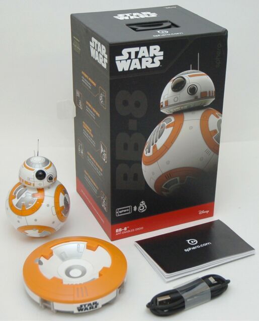
The same applies to BB-8 who bears packaging of similar appearance. Though this one looks more friendly to shops, as it bears the name of the robot on the packaging and has a plastic hook on top for being stacked on metal rods. Additionally almost the entire toy is photographed and visible on the front. I would assume that there is a lack of transparent packaging on the box to both store the toy better in the box and also to make the product look less cheap.
Transformers is a Japanese-American franchise originally as a line of toys with promotional comics and television shows. The best known character and “protagonist” of the franchise is Optimus Prime (whose name literally means “the best” and “the first”). His character has evolved a lot since conception, but he is known for being able to transform into a semi-truck/articulated lorry.

The character’s design was changed considerably in the Michael Bay film series, but Hasbro create the toys to this day. A “retro” large model that can transform itself was revealed recently, at a price of $700.

I think that the fundamental concept of Transformers is what makes them cool and appealing to its target audience - the ability for the robots to be turned into something else, conceptually the toys are more mechanism than model. Whilst I think the design of the robots has waned in recent years, the retro designs seem memorable and true with bold colours, simple yet complex geometry, and general boldness of shape and lack of overly complex detail, which I shall try to replicate with my design.
0 notes
Text
Digital Abstract Typography
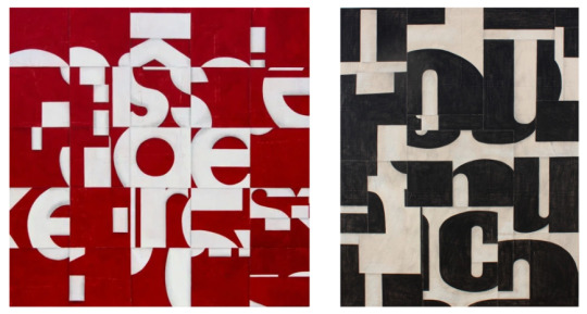
Rosalie Gascoigne was an Australian-New Zealand artist who was best known for her assorted block-art of road signs. I think that this work is interesting to look at as I wonder what the thought process behind it is, as there seems to be nothing that ties it together other than what was already there to begin with; though I think it’s an interesting collage nonetheless.

Whilst I like the abstractness of the above works, I find it rather random, illegible and like nothing spells anything, unlike the work below. I think this is more intriguing as pieces of words can be read and are mixed and matched.
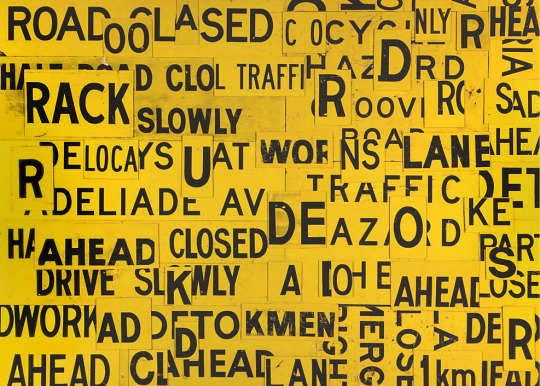
Cecil Touchon is a similar artist with a more prolific output of abstract typographic works. Whilst the below piece is similar to the first pieces of Gascoigne, I think that these are better because of the bolder and more up-close fonts used and more “connected” letters.

I also equally like the bottom-right piece with its large heavy-set Impact letters that are a lot more close-up; and the bottom-left piece makes me a fan of the white-on-red colour scheme and the round, friendly semi-bold font.
With this research taken into consideration, I started working on my own abstract typography experiment.

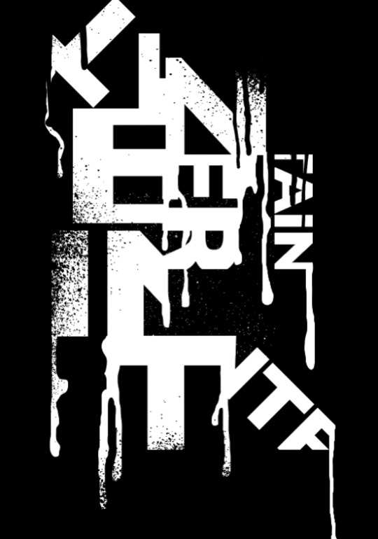
I started with the word “Entertain” and used a bold and decently wide font. I filled in each square with one or more of the letters, more or less in order of the word.

It looked rather messy, I think, because of the diagonal letters also used. Regardless, I chose to incorporate this design into my work.

Once I had done so, I placed the blocks together, piecing them like a jigsaw puzzle. I think it looked better as this odd tower than it had before.

Afterwards I used the vector paint dripping assets pack and added some liquid “spray-painted” effects.
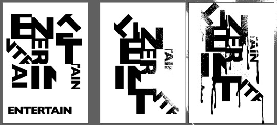
Finally, I also added some paint effect and coloured them white to resemble that the black “paint” flaking. After this, my project artboards looked like this.

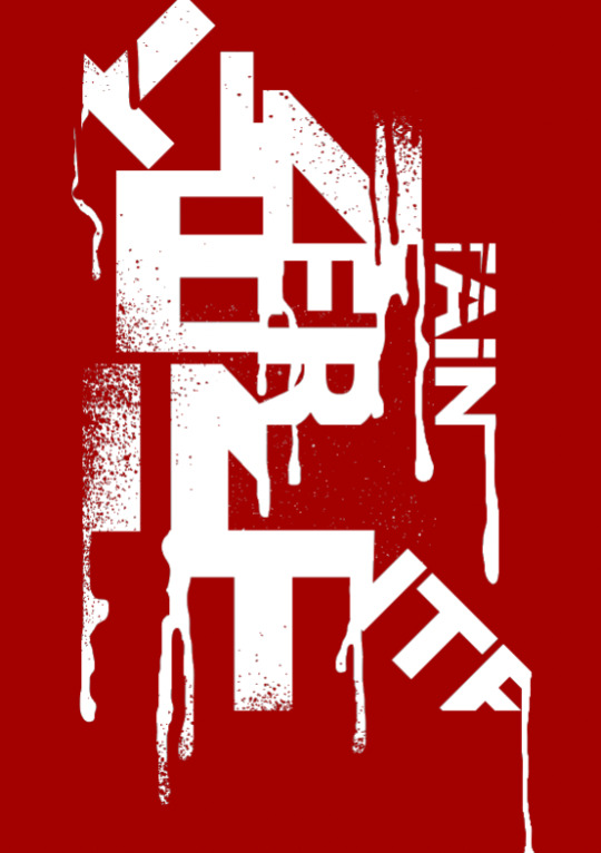
I think my outcome is interesting and I feel that the paint effects help to tie it together. For my second outcome I wanted to experiment with different colours, so I slightly rearranged the layers and inverted the colours.
Once I did so, I was inspired by the research to try white text on a dark red background with my own work. I thought this worked decently well, so I used this as my second outcome.
0 notes
Text
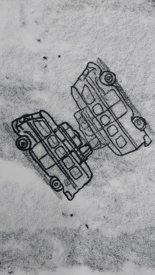
Monoprinting and Drypoint
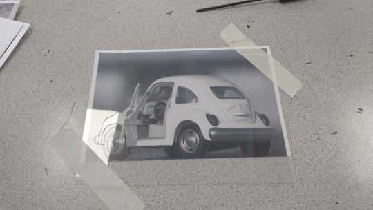
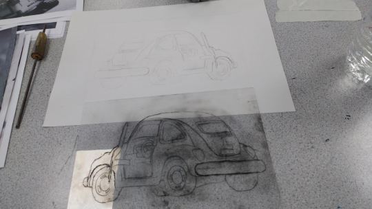
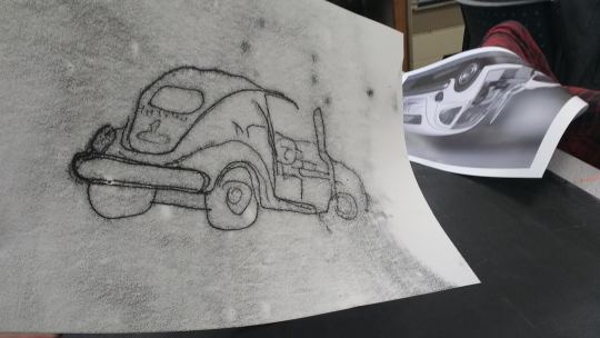
Following the selection and printing of my images, I spent a day creating monoprinting and drypoint experiments. I actually started with the drypoint first; I chose this image of a VW Beetle for its curves and interesting lines and detail that I could capture with the etching.
I taped the plastic sheet down and etched as much detail as I could. After scrubbing ink onto the sheet and then using the scrim to get it off again, I’d thought I’d over-scrimmed as the print came out so unbelievably light on the paper. After my second print attempt which led to the same results, I realised that I had simply forgotten to wet my paper before printing.
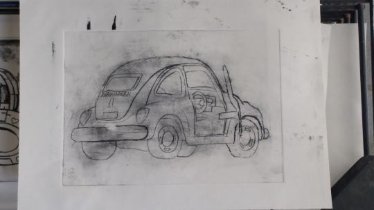
After I had done so, I got my clearest and best print of the dry points that I did, the following print below. I printed another similar outcome as well
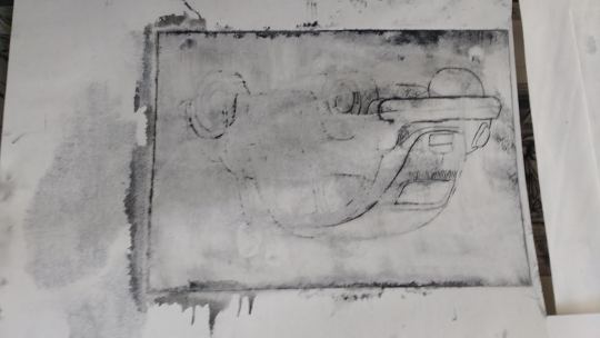
Sadly towards the end, I started to mess up as I wet the paper far too much without realising, until the print came out and ended up looking like this. Looking back, I quickly realised that the correct wetness of the paper was the amount I had used in the middle.
I then moved onto monoprinting, which felt less cumbersome to me. As the process was much faster, I used all of my images. I first attempted with my mirrored image of a campervan, and ended up with one on each side with varying thicknesses - it proved difficult to maintain consistency as I couldn’t really see what my work was looking like until I was done.
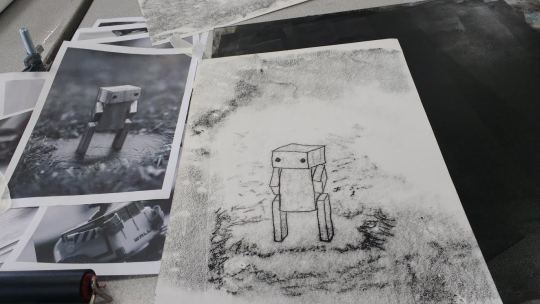
I then attempted this with the wooden block toy robot, and whilst there was not much of it to outline, I had a go at texturing the background grass which I think worked decently well.
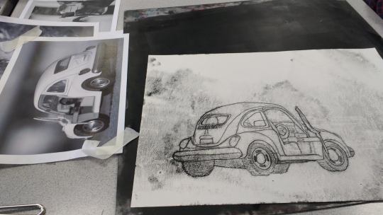
I then revisited the Beetle and made in my opinion the best rendition of it. Whilst I did not intend to cause splotches on the background, I think it looks very cool and adds depth to the image. As this wasn’t a print, I was able to “colour in” to a degree as well.
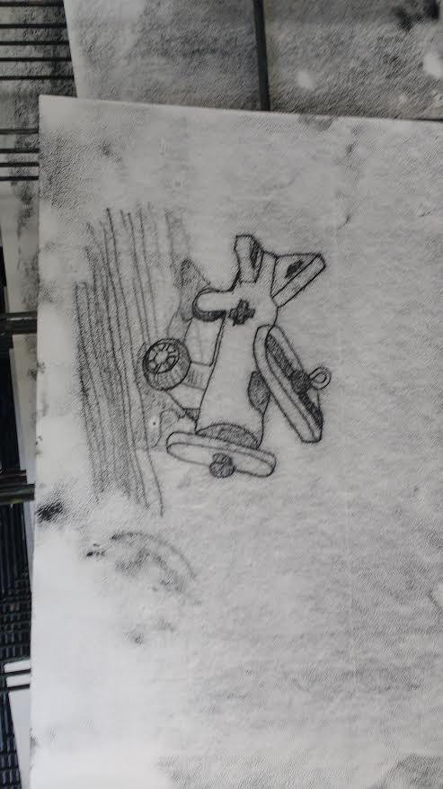
I then made my piece of the toy plane, and I don’t have much to say about it other than that the colouring in worked again and that my attempt at a shadow underneath it did not.
I attempted to rush and loosely follow the Beetle again as I had no other papers. I think I had a decent idea with it but it just looked awful in the end, to me, with no consistency.
In conclusion, I think my favourite of these was the first monoprinted Beetle, which was originally a toy car though it does not look obviously like such once printed, unfortunately.
0 notes
Text
Weird Heads Collage
Following the “weird heads” artwork research, I assembled a collage physically, of faces from a magazine or something (printed in black and white) and also some of my less good dry-points and monoprints mixed in. After cutting and gluing bits and pieces of the faces down, I added some green ink to get colour variation in the piece.
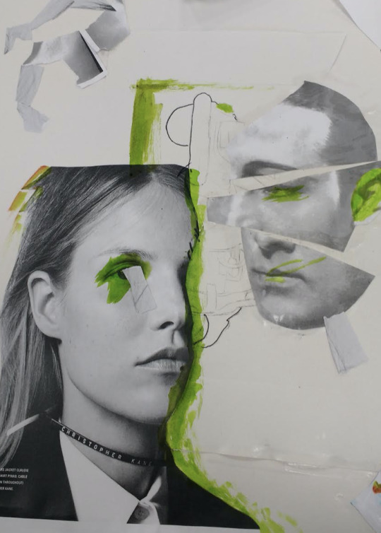
Unsure as to where this collage was going, I decided to just add more to it, and I used a felt-tip pen to outline parts of the imagery, and I was happy with this choice. Basically everything else, however, seemed like needless filler in retrospect.
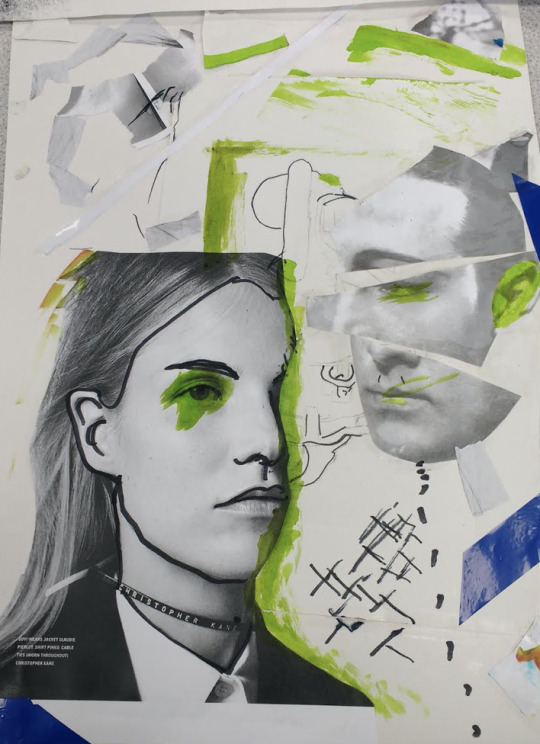
Regardless of the collage, however, we were encouraged to see the digitising as “where the piece comes together”. I imported the above image into Photoshop and played with the sliders.

I thought about trying to blend a progress picture over the top of it, as suggested, but I didn’t expect to find that the “divide” blend mode, while jarring, looked quite cool. So, I stuck with it.

I then overlaid more images of monoprints to fill out the piece.

I was happy with the following as my outcome from this, but I continued to experiment further.
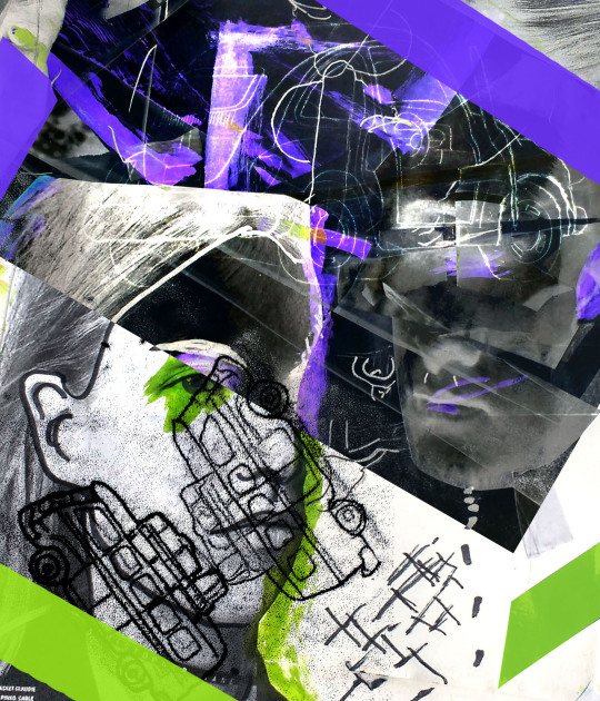
I thought the background looked rather messy, so I tried unifying it with a circle cutout white background.

After this I tried to bring more focus to the purple and green, so I added abstract shapes and let the background bleed out of the edges slightly. I wasn’t too sure about this one, so I went back to my other one as the finished version of this but appreciated this version as much.
0 notes
Text
Karan Singh Outcome
Inspired to go back to an artist I’d studied priror to this project, I decided to do an outcome based on Karan Singh’s work. For my source image, I picked an image for a very successful toy robot, Cozmo. I think it is a fantastic creation and I shall study it further in future. I imported the image into Photoshop.

I used the polygonal lasso tool to create shape layers of every “piece” of the image. I slowly went though it, picking pale colours that would work together as I went. I additionally made the background a very pale red, reflecting the majority of Singh’s work. I didn’t want to make it look too uniform as Singh does not tend to assign one colour to too many areas, so I kept the colours sporadic only using the “white” shade sparingly.

I used dark red and purple hues for the darker areas at the bottom, and finished my outlining, happy with it so far. I had none of the original image hidden underneath.

After this, I started to copy textures onto certain layers. I did this by using the magic wand tool to select colour layers and copying image textures with these shapes. I sourced the patterns from online and used “multiply” blending to make the white background transparent.
Doing this with three textures, and hand-drawn lines, I didn’t want to overdo the texturing as many of Singh’s work is just block colour, so I left it there, but was particularly pleased with the line pattern on the screen/face, as it is also quite realistic to how it looks. At this stage, I decided my outcome was finished.
Afterwards, I experimented with Illustrator’s blend tool. I made interesting transitions between star shapes, and I also felt randomly inspired to have a go at making a random landscape piece.


0 notes
Text
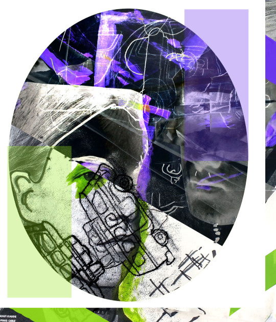
Double Exposure Typography Posters
I inserted my double exposure posters into an A4 document to make into typography posters with a similar theme.

I initially made my transformer poster with a green accent and on the side, but I decided that it looked too dull rather than strong, and that the robot did not look as intimidating and tall when then image was off to the side, so I moved it to the top-left corner and made the background a bright sampled magenta.
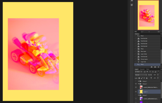
For the Mario toy, I decided that sampling magenta was too close to the red hue of the background and looked ugly, so I went with the yellow instead, even if it didn’t look too good.
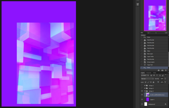
And as for the blocky background, I simply sampled the middle purple hue and I felt this worked all too well. I moved it into the bottom right corner as I hadn’t done this with any of the others.
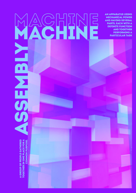
Even though it’s in reverse to how I’d imported the files, I decided to work on this one first. I sampled the light blue, as the magenta clashed with the background too much, and wrote text onto the document. I decided that “Machine” “Assembly” would be two fitting words to use consistently, and I decided to use a bold font, named “Intro”. Even though I had it in mind to use another font in tandem, I ended up only using this one which I felt made the pieces look more consistent overall.

Additionally, I duplicated the word “Machine” and made it an outline only. I then found definitions for each word and I dragged them across the empty space, happy with the composition of the overall piece, and how there is a corridor of clear space up the sides.
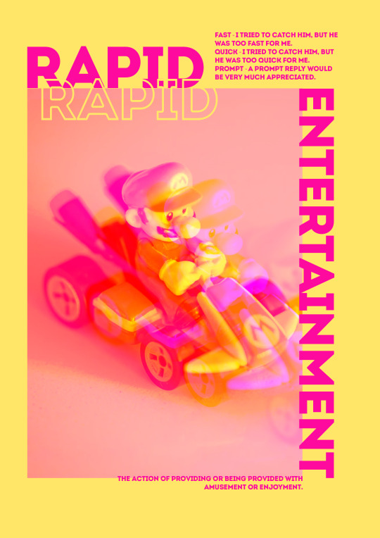
I then worked on the same thing for the second one. I did not feel that “machine assembly” worked as well with this one though, so I went with “rapid entertainment” instead. I decided to make the text magenta, and honestly this is the best decision of this whole poster. I made a yellow outline of “rapid” and overlaid it onto the red poster. I also made “entertainment” clip over the edge of the poster.

As with the last one, I copied excepts from the dictionary into the poster. I was pleased with the bottom sentence clipping over, along with the word “entertainment”, and I really do think that the text of this poster helped to tie it all together.
With the last poster, I used the previous green sample as the text accent colour. I decided to make “machine assembly” join up in the empty corner, and to overlay definitions in the two different colours to make things more interesting.
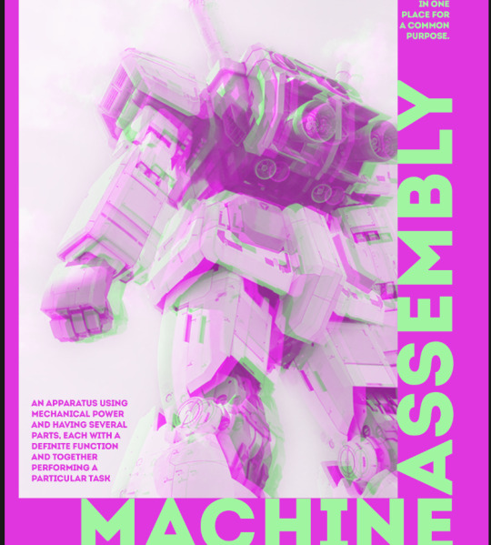
I’d thought that it had looked a bit bland, so I added some outline text for each word, again, in different colours. I thought the piece looked much more unified and experiemental with this addition, so I went with it.
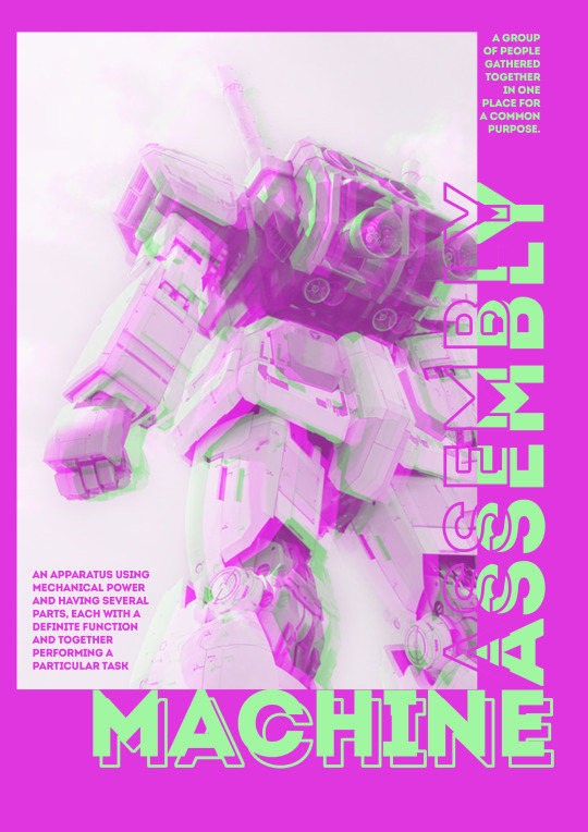
With surprised at how happy I was with these outcomes, I decided to put them together to see how unified they indeed looked. I was especially pleased with the use of the same one font, and consistently using an outlined word.

1 note
·
View note