mtdesing
Michael T. Desing's Army Ants
by Michael T. Desing
40 posts
Don't wanna be here? Send us removal request.
Last Seen Blogs

omnistruck
from the makers of Peepum’s Nas-tee Gum™

gone97
I'll Take You

paperseverywhere
just wants to have a fun time

ihopethisnamewasnottaken
Hiiiii

p3ar
Life and Sacrifices

Photo
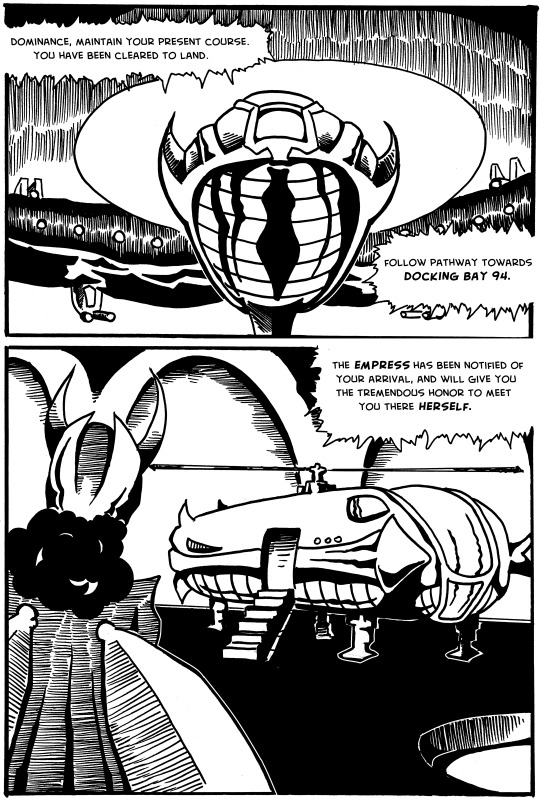
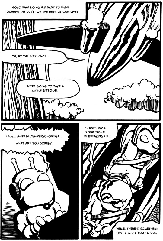
Issue 3, Page 4. This is my one-page tribute to Larry Hama and GI Joe #21, the comic that changed everything for me. I was so confused about an entire issue without dialogue. It took me a few re-reads to realize it was intentional; and then my mind expanded about what comics could do.
1 note
·
View note
Photo
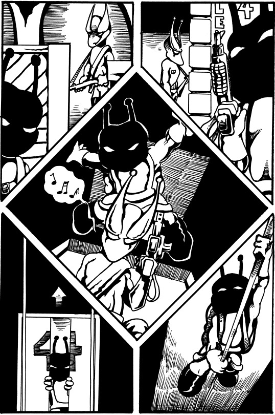
Issue 3, Page 3. I got a day behind somehow... I’ll get caught up later in the week. A few white lines to separate the characters and objects from all that black makes a HUGE difference in how clean this page looks.
1 note
·
View note
Photo
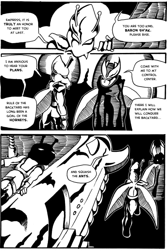
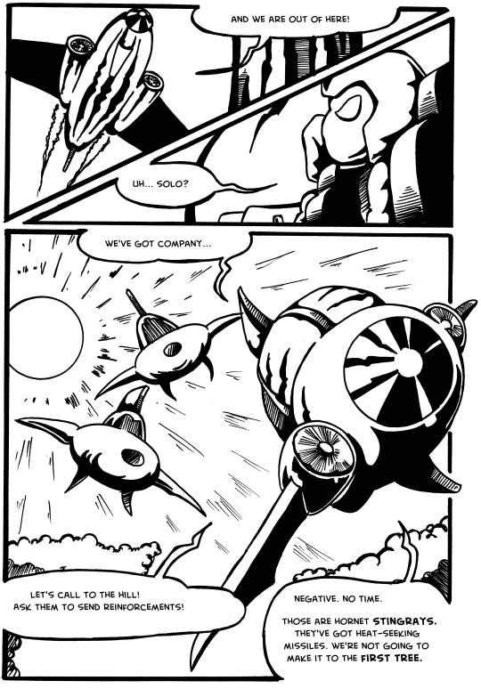
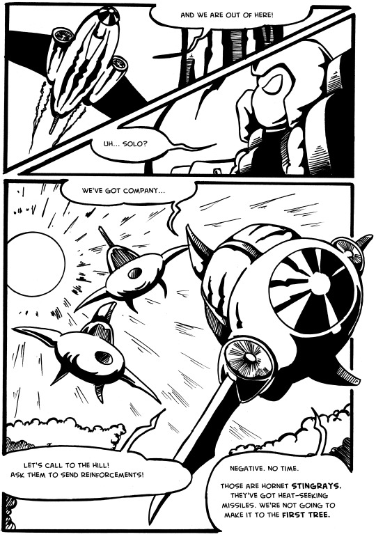
Issue 3, Page 2. Since I was all about the Star Wars references in this first few issues (I am basically stealing the opening of ROTJ here) I decided to go all in and give the same docking bay number as the Falcon in A New Hope.
0 notes
Photo
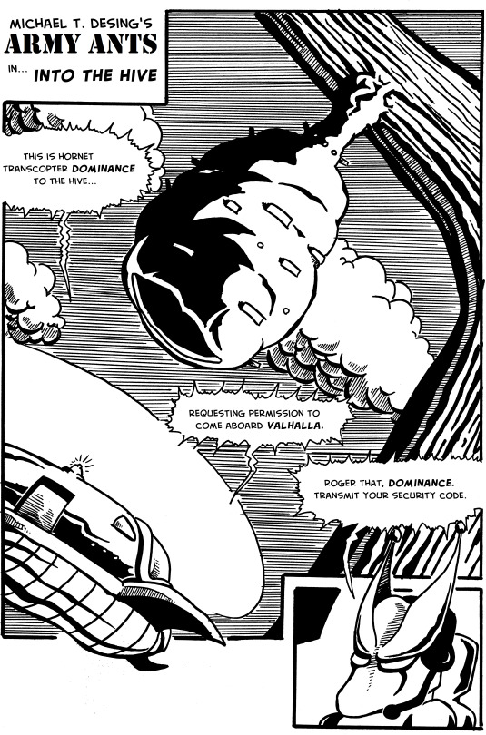
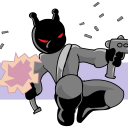
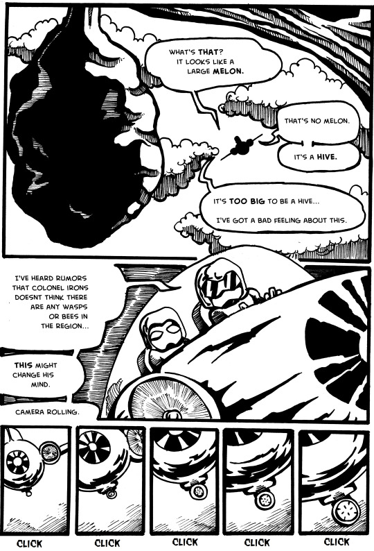
Issue 3, Page 1. Man, did I love drawing lots of tiny lines. I don’t think I’d have the patience to do this today, but I learned so much and gained so much in terms of fine motor skill development on pages like this. Also, I named the wasp hive “Valhalla Complex” several years later, so I decided to retrofit that to the text now. One of the benefits of knowing where the story is going :)
0 notes
Photo
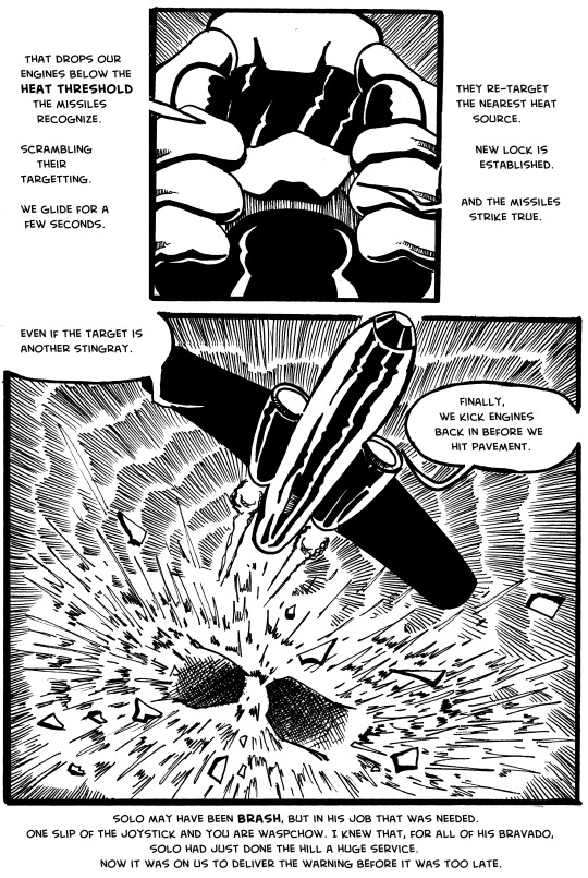
Issue 2, Page 14. Plot hole (if not closed) at least narrowed considerably.
0 notes
Photo
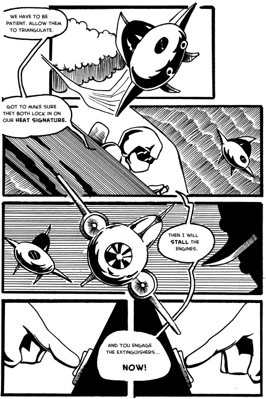
Issue 2, Page 13. My most significant re-write to this point. All of the dialogue on this page is different - and so much better. Rather than being a completely stupid strategy by the wasps that leads to the inevitable conclusion, it’s at least a somewhat plausible and clever ruse by Solo. MUCH better.
0 notes
Photo
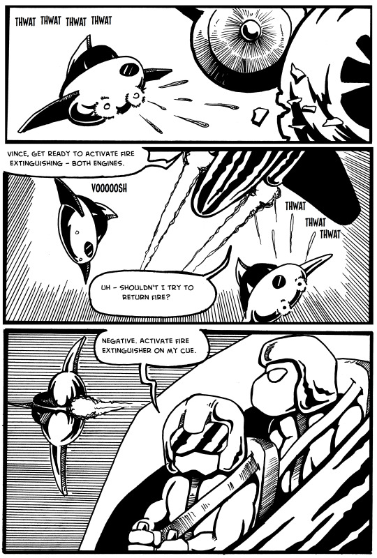
Issue 2, Page 12. Most significant rewrite yet. I have really, really disliked the weak plot at the end of this issue for a long time. So, I’ve re-written it starting here, and I feel much better about it.
0 notes
Photo
Issue 2, Page 11. The mistake in perspective on the engine (last panel, on the left) is something I cannot un-see. I’m trying to honor the original pages, but this one bugs the living poop out of me. Odds are good I come back and some point and just re-draw the thing because I cannot handle it.
EDIT: I did a minor edit where I moved the engine out from the hull a bit. It makes it not quite so jarring. I can live with it now; I left the original (top version) so you can see the difference.
0 notes
Photo
Issue 2, Page 10. Well... I drew this one a little crooked on the page originally. Must not have double-checked my guidelines. There was no way to fix it digitally without basically redrawing large chunks of the page, so we’re going to file this one under ‘happy accident’ and move on.
0 notes
Photo
Issue 2, Page 9. Cleaned up redundancy in the dialogue, and also added antennae to Phil. I drew him without them and never caught it before! Wow...
0 notes
Photo
Issue 2, Page 8. Really pleased with how these pages are turning out. They are significantly cleaner than the originals.
0 notes
Photo
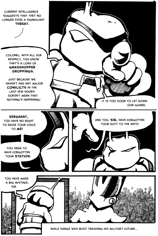
Issue 2, Page 7. Introducing Colonel Irons. I am amazed how a few white border lines can clean up relatively muddy images. The Colonel’s head pops in these and looks much cleaner than in the original art.
0 notes
Photo
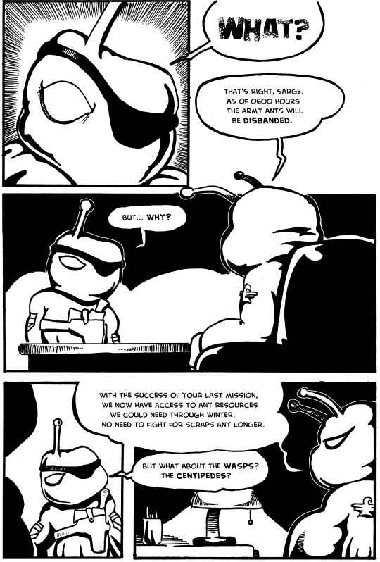
Issue 2, Page 5. I cleaned up the dialogue, as usual. Man, was I wordy back in the day.
0 notes
Photo
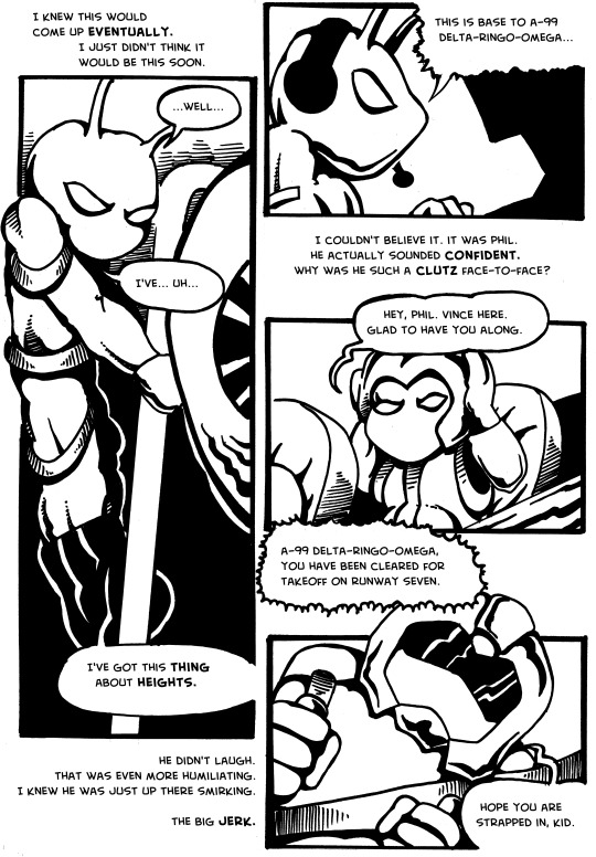
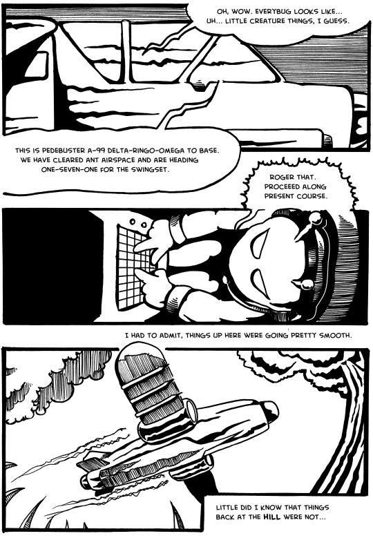
Issue 2, Page 4.
I made a few changes here to the dialogue, again to tighten things up. Looking ahead, one of my weakest sections of writing is coming up, and I am very happy for the chance to finally fix it. Parenthetically, I used the final two panels on this page to explain layout to my daughter, and wish I’d understood it better when I was creating this page. If I just shifted the characters off of center for each frame, I’d have plenty of room for the dialogue. As it is, I squished it against their heads in each panel for no good reason. There was plenty of room to work if I just designed the panels a little better... ah well.
0 notes
Photo
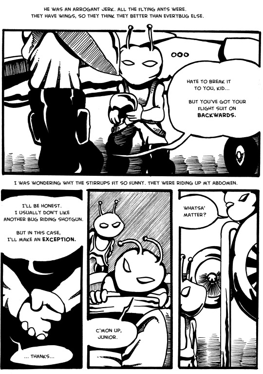
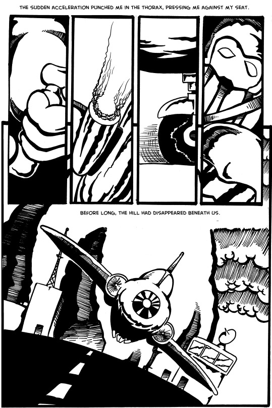
Issue 2, Page 3. I made a few significant changes to the dialogue. I’m just better at writing dialogue now, so I may as well take advantage of that. The art is unchanged, since these images hold up better on the whole. I wish the antennae were shorter, but they get there soon enough...
1 note
·
View note