puttingtheproinprocreate
Putting the PRO in Procreate
16 posts
Don't wanna be here? Send us removal request.
Last Seen Blogs
other-emma
other worldly
mejiromejiro
題名未設定
jaguar-haj
Cast-Lover
all-thethings-that-i-love
Bellarke
sirthisisa-wendys
Sir, This Is A Wendy's
Text
Stamps!
Sometimes you don't want to go through the trouble of remaking little things that you use constantly in your art. An example of this would be a little signature. While you can just copy and paste it from another art piece, you can simply make a stamp for it!
To start, begin a new canvas and remove the background by selecting the checkbox next to Background color. When you've done this, draw your desired art.

Once you're happy with your art piece, go into Actions and then select the PNG option under Share Image in Share. This will save your image to your photo library or wherever you decide to save it.

Next, you have to go into your Brush Library and create a new brush. When you're brought to the Brush Studio, go into Shape and select Shape Source.
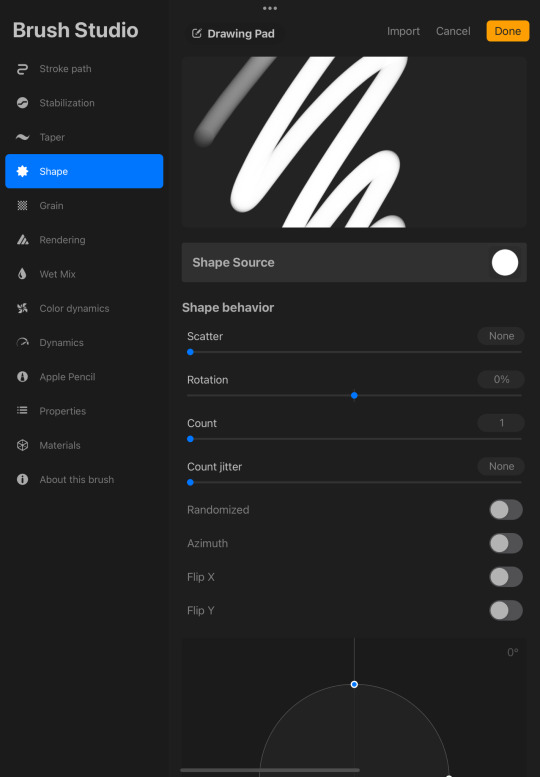
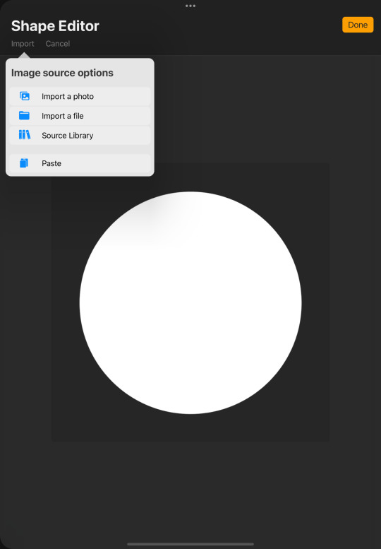
Selecting Shape Source will open Shape Editor, which is something you may or may not be familiar with. Click Import, select the source option that you saved your art, and then choose the art that you've made. Once this is complete and your art has been placed into Shape Editor, press Done.
Next, you have to adjust some of the Brush Settings. First, under Stroke Path, drag Spacing to Max. Under Apple Pencil, drag Opacity to None. Lastly, go into Properties and turn on Use Stamp Preview. After this, you can name the brush or do any other adjustments that you'd like to make. Once you're satisfied, exit the Brush Studio and test out your new brush!
Thank you so much for reading! This is my last consistent post, but if anyone ever has questions or want to interact at any time, I'll still be checking and will definitely update if I discover a tip that I find and want to share! I've appreciated all the notes and hope that I've helped at least one person get comfortable with using Procreate, as this has been super fun! So, if you ever need help, have questions, or want me to share any of your art, don't hesitate to visit my ask box or Instagram! I’m also going to open up my likes so if anyone wants to look at some art that I find cool, they can see it!
#procreate#procreate tutorial#procreatetutorial#procreate for ipad#procreatehelp#procreate help#procreateforipad#procreatetips#procreate tips#procreateforbeginners#procreate for beginners#procreate fun
48 notes
·
View notes
Text
Blending Modes!
Blending modes alter the way layers appear and blend with other layers. Each layer's default blend mode is Normal, but there are several different options. To switch to a different option, open up your layers and select the N that is on the right side of a layer. This will open a drop-down menu that allows you to scroll through the various modes and shows a preview before you actually decide to stick with it.
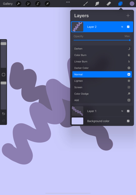
Before the list is the bar that gives you the ability to change the layer's opacity. While you do have the interface that changes the opacity of your brush, this changes the layer's transparency as a whole.
The first blending mode is Multiply. This mode changes the appearance of a layer by making the art darker. This will be helpful when trying to create an appearance of a shadow.
The next mode is Darken. Darken, depending on whether or not there is a difference in color and darkness between two layers, will keep the darker layer, bringing it to the front. If there is little to no difference, however, nothing will change.
The next two modes are Color Burn and Linear Burn. Though both give the layer a darker effect, Linear Burn's darken effect does not have as much saturation as the other and shows more of a contrast in the darker colors.
Darker Color is similar to Darken in the sense that it will not change if the colors are similar, but it takes a slightly different approach when comparing the colors.
Normal is the default mode where nothing is changed. The image that you've created stays the same.
Next is Lighten. Lighten does the opposite of Darken, using the lighter color and blending it.
Screen, Color Dodge, and Add all do similar things, but with different approaches. Screen brightens the colors, making your image somewhat transparent and transforming it into a highlight. Color Dodge makes the layer even brighter. This can also be for highlights, but if you want it to have more of an exaggerated effect. Add brightens the lighter colors without brightening the layer below it as much as Color Dodge.
Lighter Color lightens the layer, but just like Darker Color, takes a different approach to performing the task.
Overlay lightens and darkens aspects of the layer depending on the tones. It darkens the darker tones and lightens the lighter ones. This can be used if you want both the effect that Multiply and Screen apply to the layer.
Soft Light, Hard Light, Vivid Light, Linear Light, and Pin Light are all like Overlay with the way that they lighten and darken the layer. Soft Light is a more subtle version, while Linear Light would be a much harsher mode. Hard Light and Vivid Light would be considered in between the two, but Hard Light is a lot less bright than the other.
Pin Light darkens and lightens the layer at the same time. Depending on the colors that are used, that layer may seem as if it doesn't exist.
Hard Mix reduces the colors that you have used on the layer, replacing them with black, white, cyan, yellow, magenta, red, green, and/or blue based on the colors used.
Difference inverts and darkens colors using the base and contrasting colors as a reference. This will completely change your layer, but if that's something that you're interested in, I'd recommend testing it.
Exclusion, much like Difference inverts and darkens colors, but if there are variations of gray in the layer, those colors will remain unaffected.
Subtract darkens the lighter parts of an image and leaves darker colors with almost no effect.
Divide performs the opposite task as Subtract, lightening darker colors and keeping the lighter ones the same.
Hue is for when you want to slightly change the hue, but want to keep the tone and saturation that already exists on the layer.
Saturation changes the intensity of the layer, making it less vivid.
Color uses the hue and intensity of the layer above, while keeping the radiance of the bottom layer. Depending on the colors used, there could be little to no difference.
And finally, Luminosity. This mode does the opposite of Color, keeping the hue and saturation of the bottom layer, but using the radiance of the top.
Thank you so much for reading! For any questions, comments or concerns, please don't hesitate to visit my ask box or Instagram!
#Procreate#procreate tutorial#procreatetutorial#procreate for ipad#procreatehelp#procreate help#procreate tips#procreatetips#procreateforipad#procreate
227 notes
·
View notes
Text
Animation Assist!
While I personally don't do animations at the moment, there may be some who are interested in taking their art to this next level. This is where Animation Assist comes in! This is for those who want to bring their art to life!
First, to turn on Animation Assist, open up Actions and go to Canvas. This should be familiar, so you'll get there in no time! Next, all you have to do is select the button next to Animation Assist and a little bar will appear at the bottom of the screen.
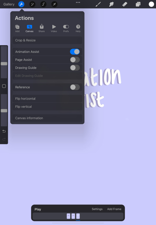
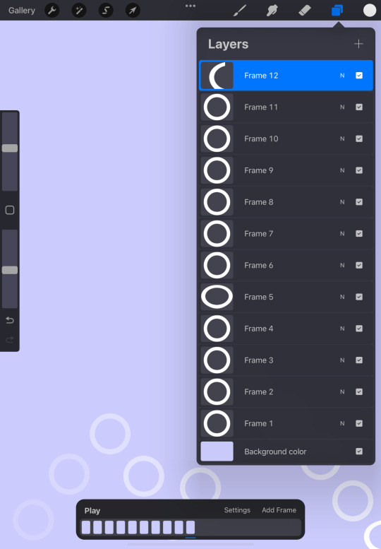
To use Animation Assist, you have to make a design or choose an existing one that you want to add some sort of movement to. For this, instead of each layer being on top of another, each layer will act as a frame where you're seeing them one at a time. To add a new frame or layer, you can use the normal method or select Add Frame, which is on the Animation Assist bar.
As you're working on this, if you want to ensure that every movement is smooth and looks good, you have the option to replay the animation as much as you want. You can also add frames where you deem fit and touch up anything that you think needs it!
When you're done, to save and share your animation, go to Share in settings, select the format, and then you're free to share! For this, I did a simple animation that shows a ball bouncing, but I'd love to see some coolers ones!
Thank you for reading! If you have any questions, suggestions, or just want to talk, don't hesitate to visit my ask box, or Instagram!
#procreate#procreate tutorial#procreatetutorial#procreate for ipad#procreate help#procreatehelp#procreateforipad#procreatetips#procreate tips
17 notes
·
View notes
Text
Adjustments!
Although I’ve briefly mentioned adjustments, I thought that it would be helpful to give more of an explanation, as it may include something that you might want to use often.
The adjustments tab can be accessed by selecting the wand-like icon that’s located in between Actions and the Selection Tool.
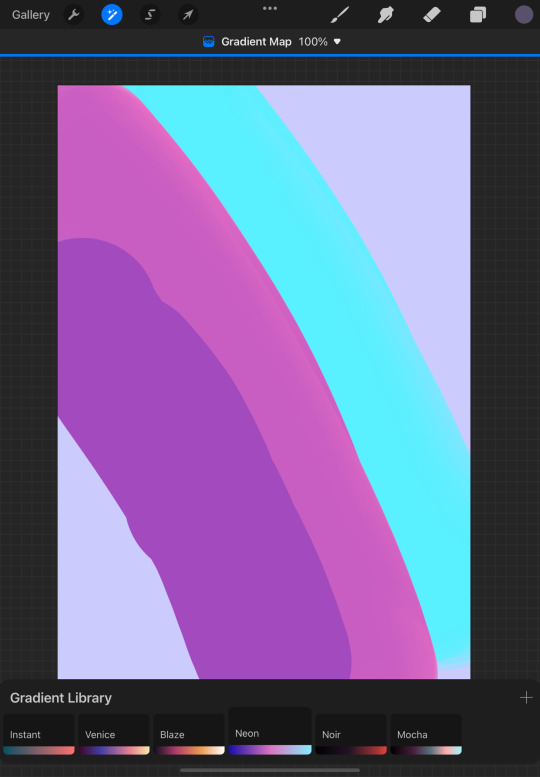
The first four effects are Hue, Saturation, Brightness, Color Balance, Curves, and Gradient Map. All four give you the ability to edit all the colors within a layer at once, but in a different way. Hue, Saturation, Brightness and Color Balance both use sliders to do their job, but while Hue, Saturation, Brightness allows you to change all three of those, Color Balance’s sliders work to fix the hue balance in shadows, midtones, or highlights. Selecting Curves opens a graph that by moving the line or adding new plot points, adjusts the color. Gradient Map is less complicated compared to Curves, as it transforms the colors based on the given Gradient Library.
Gaussian Blur, Motion Blur, and Perspective Blur all allow you to apply a form of blur to your art, using a slider. Gaussian Blur gives the layer a softer look, blending the colors flawlessly. Motion Blur adds streaks of blur, making it seem as though the subject is moving quickly. This would be good if you were drawing someone running or driving fast. Perspective Blur places a small center point and adds a blur based on wherever you’ve placed it.

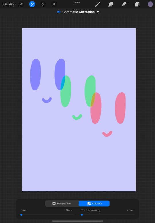
Next is Noise, Sharpen, Bloom, Glitch, Halftone, and Chromatic Aberration. Noise applies a static-like effect to your layer, growing adding more grain the further you go along the slider. Sharpen does exactly like the name; sharpens the image, highlighting even the smallest details in the layer. Bloom helps give the impression that a light is glowing in a certain area. This could be good for adding emphasis to a sun or a moon in an image. Glitch, Halftone, and Chromatic Aberration all add cooler effects to your art. Glitch is for art that takes on a more sci-fi look; there are four modes and various ways to make it seem as though there's a glitch! Halftone also adds a cool, distorted effect, transforming the image into a dotted pattern and as you drag your finger further along the slider, the dots get larger. Chromatic Aberration gives the image a look similar to a distorted camera lens, separating it into three colors.
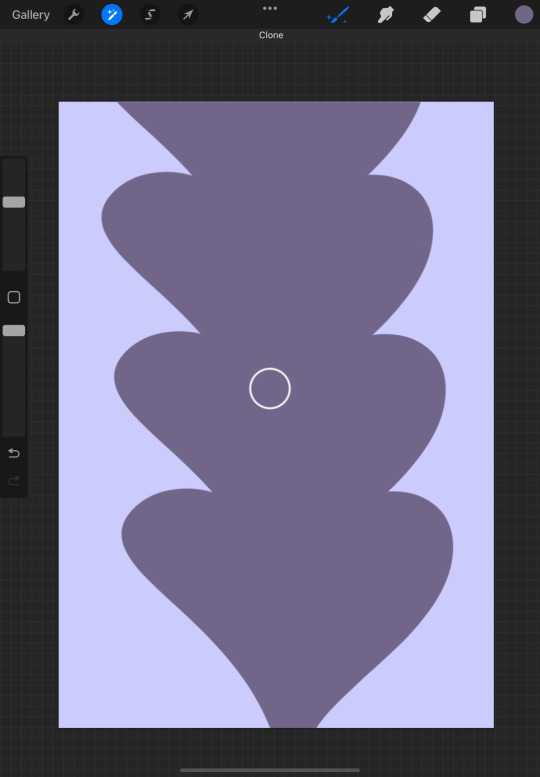
Liquify is something that I've talked about before, so I'll just briefly explain that it allows you to modify your image in various ways from distorting it to pushing little sections in a certain direction. It's something that I find very useful whenever I make a little mistake that I don't want to completely erase. Clone allows you to quickly duplicate or replace a layer or specific image within the layer with another part of the layer. It can be a little difficult to understand at first, but once you test it out for a little bit, you should get used to it!
Thanks for reading! For any questions, comments, or suggestions visit my ask box, or Instagram! I'll be sure to respond as soon as possible!
#procreate#procreate for ipad#procreate tutorial#procreate help#procreatetutorial#procreatehelp#procreateforbeginners#procreateforipad#procreate for beginners#procreatetips#procreate tips
16 notes
·
View notes
Text
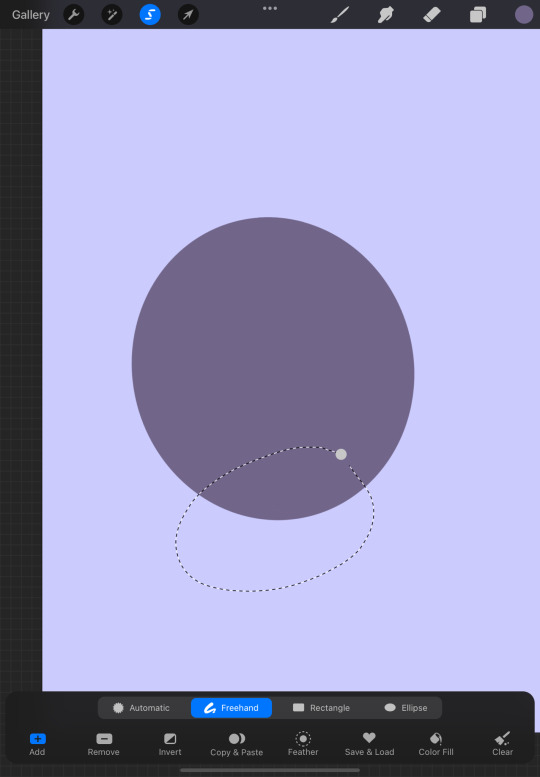
The Selector Tool!
The selector tool will be something that you will probably use very often. This tool allows you to make selections and edit the specific selections made. These edits can vary, whether it be coloring a space or just moving something.
To use the selector tool, tap the S icon at the top left. This will open up a menu at the bottom with various options.
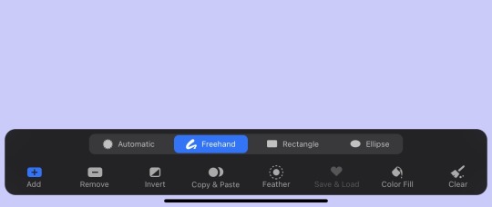
The first four options determine the shape in which your selections will be made; Automatic, Freehand, Rectangle, and Ellipse. Automatic is a bit more complicated than the other three, but testing each option will help you decide which one you like the most (personally, I like freehand!).
The next line of options are Add, Remove, Invert, Copy & Paste, Feather, Save & Load, Color Fill, and Clear. While some of these may be familiar, Add, Remove, Feather, and Save & Load are things I haven’t talked about yet.
When you have Add activated, the space within the area selected can be edited or moved.
Remove allows edits outside of the selected space.


Feather opens up a slider that allows you to adjust the selection border’s sharpness.
Lastly, Save & Load gives you the ability to save a selection and load it at a different time. Tapping on this option opens up a small library and selecting the ‘+’ adds that selection to it.
Thank you for reading! If you have any questions, concerns, or suggestions, don’t hesitate to visit my ask box or Instagram!
#procreate#procreate for ipad#procreate tutorial#procreatetutorial#procreateforipad#procreate help#procreatehelp
18 notes
·
View notes
Text
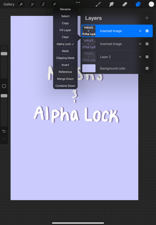
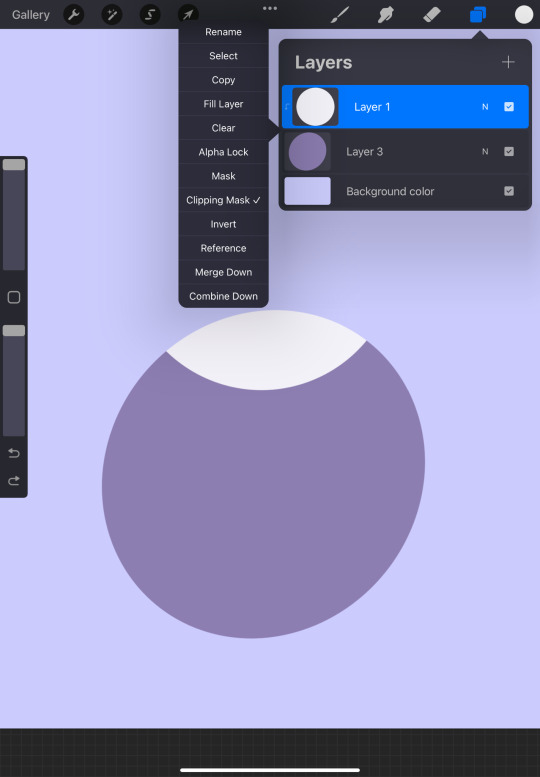
Masks/Alpha Lock!
When I first started using Procreate, I had a lot of trouble with masks and alpha lock, as I didn’t full understand it. Because of that, I wanted to take a lesson to specifically talk about it! Some people may use these tools a lot, while others may not use it at all, but at least knowing how to use them is very useful!
Alpha lock is something that I use often. It allows you to only draw or color within the existing art in that layer. This can be helpful when doing something like shading or adding little details without going outside of the space in the layer. If you didn’t read the last post, to turn on Alpha Lock, as well as the other options like Masks, you have to go into the layer settings. Selecting a specific layer within layer settings will open up the list of options and allow you to turn on Alpha Lock. You can tell when Alpha Lock is on not only by seeing whether or not there is a check mark next to it, but by noting whether or not there is a transparent background surrounding the existing art. No check mark and no transparent background? Alpha Lock is not on!
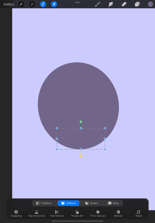
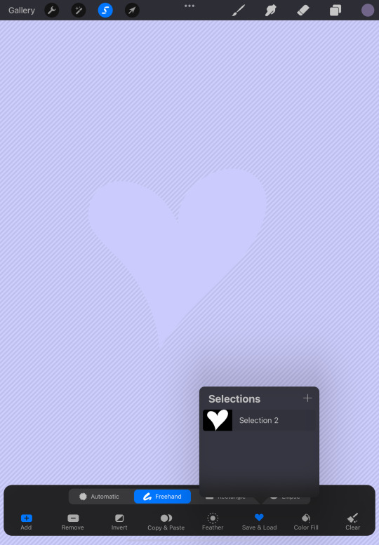
Mask gives you the ability to edit a layer in a way that doesn’t completely ruin everything around it. It shows you the alterations that have been made on a “mask” without actually affecting the masked layer. For example, say I wanted to see what it would look like if I erased a heart out of this circle.
I could use the eraser directly on that layer, or I could apply a mask to the layer. This would bring me to the mask, where I could edit the circle without actually editing it. If I wanted to go back to the way it was, I could get rid of the mask or select the checkbox on the right side of the layer, which would just hide the alteration. If you wanted to keep the alteration, you can select the masked layer and then select Merge Mask.

Clipping Mask is somewhat similar to Mask, but instead of using a single layer and masking it, it clips the selected layer and the lower layers, making the selected layer the mask. This can be beneficial when trying to test out alterations for several layers.
Thank you so much for reading! For any questions, comments or concerns, please feel free to visit my ask box or Instagram!
#procreate#procreate for ipad#procreate tutorial#procreate help#procreatetutorial#procreatehelp#procreateforipad#procreateart#procreate art#procreateforbeginners#procreate for beginners
19 notes
·
View notes
Text
Layer Options!
The Layer Options menu provides you with several functions that go with each layer. Below is the two different menus that show up depending on how many layers are present. When there is only a single layer, you’re only given nine options, whereas two or more layers gives you three more options to utilize.
First is Rename. Rename allows you to give that specific layer a name. This is beneficial for those who use a lot of layers and want to keep track of them.
Next is Select. Select acts as a little shortcut to the select tool. Instead of having to go through the process of selecting everything on the layer manually with the tool, select does it for you!
Copy copies the entire layer. It’s a simple action, but very useful.
Fill Layer completely fills the layer with the color that is currently being used. This can be helpful when you want most of the canvas to be a specific color, but keep in mind the fact that Background color allows you to change the whole canvas background.
Clear gets rid of everything on the chosen layer.
Alpha Lock, Mask, and Clipping Mask are all options that help you with specific layers. Because of how complicated these three things can be when you’re beginning, the next lesson will be all about these!
Reference takes the selected layer and uses it as a reference when doing things like coloring. It allows you to color in the space that was provided in reference without actually altering the referenced layer.
Merge Down and Combine Down, like Clipping Mask, are options that are only available when there’s more than one layer within a canvas. Merge Down takes the selected layer and combines it with the one below. This is helpful when you want to lessen the amount of layers. Combine Down does not combine the selected layer with the one below, but puts them in a group. This helps organize the layers if they are similar in some way without making them a single layer.
Thank you for reading! If there are things that you are still confused about, we will be going deeper into Alpha Lock and Masks next. However, if you have an other unrelated questions, please feel free to visit my ask box or Instagram!
#procreate#procreate for ipad#procreate tutorial#procreatetutorial#procreateforipad#procreate help#procreatehelp
9 notes
·
View notes
Text
Layers!
Layers, the section to the right of color, are helpful for various reasons. They allow you to put art on top of other pieces without affecting the others. They can also help you separate your work, which makes it easier to do things like recolor each piece or edit it in other ways. Depending on how you like to do your art, Layers may be very beneficial.
First, to open a new layer, select the plus button on the top right. This will add a new layer on top of whatever layer you were previously on.
If that isn't where you want the layer to be however, you can move each layer around by holding and dropping it in the exact space that you want it to be. You can also move multiple layers at once by swiping each one to the left, selecting them.
Be careful though, because depending on how you drop the layer, you may put two or more of them into a group. If you want to group two or more layers together, hold each layer above the other one, dropping it once the bottom layer is highlighted. To remove a layer, you do the opposite, dragging it outside of the group.

So what if we don't like a layer or we like it so much that we want more of them? Swiping a layer to the right gives you three options; Lock, Duplicate, and Delete. Depending on how you feel about a specific layer, you can lock it, preventing it from being used for certain actions, duplicate it, or get rid of it completely.
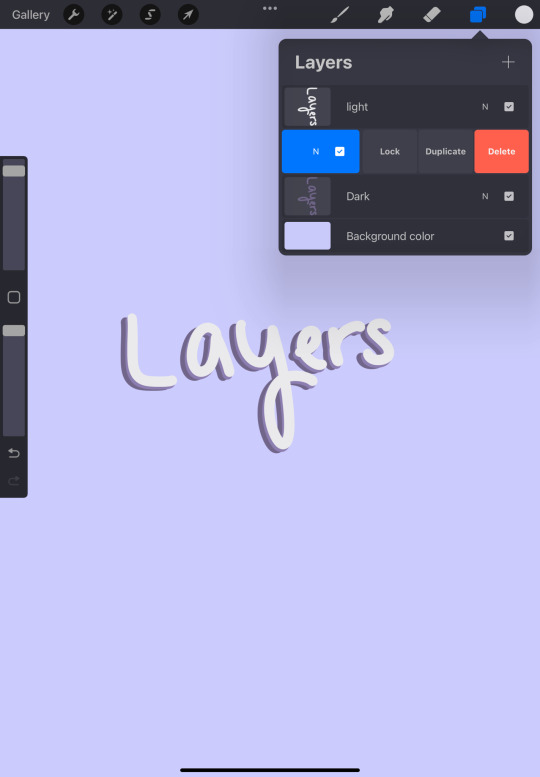
If you don't dislike the layer, but want to see your canvas without a specific layer, you can select the checkbox next to each one, which will hide it.
Lastly, If you want to change the opacity of a layer, whether it be for something like giving clothes a sheer look or making something look cool in your own way, selecting the N to the left of the checkbox will give you those options.

Thank you so much for reading! If you're still confused about Layers, don't worry, as we're going to talk about the layer options menu! For any questions, comments or concerns, please feel free to visit my ask box or Instagram!
#procreate#procreate for ipad#procreate tutorial#procreatetutorial#procreateforipad#procreatelayers#procreate layers
8 notes
·
View notes
Text
Colors!
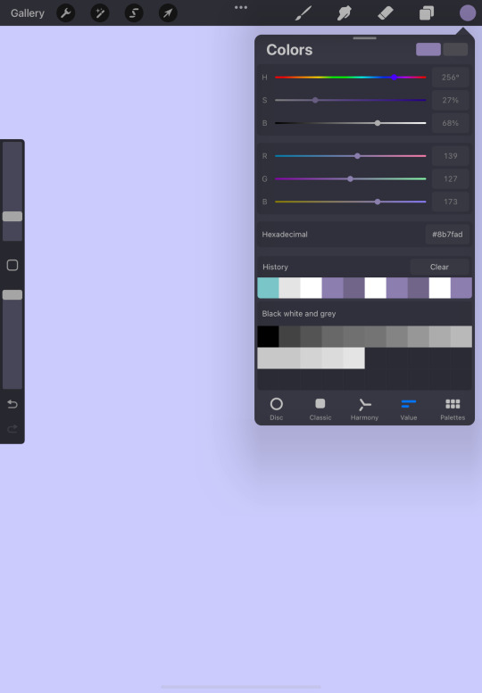
Colors are one of the most important aspects of all kinds of art! In Procreate, there are several ways to go about color, whether it’s choosing a color or saving them. In the top right corner of the screen is a colored circle. This circle shows you the color that is selected. Tapping the circle will open up your color options with five different sections; Disc, Classic, Harmony, Value, and Palettes.
Disc allows you to choose a hue in the ring and the saturation in the middle circle. It’s very straightforward and doesn’t have any kind of bar or specific option.
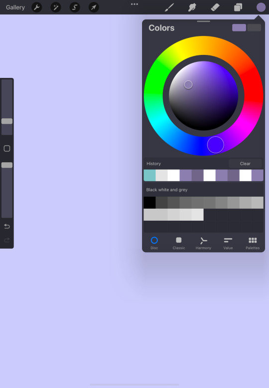
Classic is a much more common way to picking a color. When you open Classic, you are presented with a box filled with variations of a single color. As you move around in the box, the colored circle and the left colored square within Colors will change. The two bottom bars within classic will change as well. To move to a different color, you must adjust the top bar.

Harmony refers to color schemes. As you move around in Harmony, one or more smaller circles will be on the opposite side of your chosen color circle, depending on the setting you’ve chosen. The default setting is complementary, but by clicking on title below Colors, you will be given other options.

Value is a more specific way to choosing your color. While it has color bars like the others, these are much more precise and are accompanied by the option to add the code for the specific number that you’re looking for. If you’re not familiar with hexadecimals or just don’t want to bother with it, you can always play around with the numbers and see what you get or choose one of the other selections.
Lastly, palettes! Palettes allow you to refer to previous colors or put colors in a collection. When you first download Procreate, you are given three default palettes; Ascend, Campfire, and Flourish. As you continue to create, these palettes will expand. By clicking on the top right plus sign, you can add or create new ones!

Thank you for reading!! Like always, if you have any questions, suggestions, or just want to talk, please feel free to visit my ask box or Instagram!
#procreate#procreate tips#procreatetips#procreate tutorial#procreatetutorial#procreate for ipad#procreateforipad#procreate help#procreatehelp
9 notes
·
View notes
Text
Gestures!
When creating art, being able to do tasks quickly can be beneficial, as it saves time. No one wants to have to take extra steps to do something as simple as undo, right? This is where gestures come in! Gestures makes it easy for you to perform actions without having to go the extra mile.
The first and most common gesture is Undo. Undo can be done two ways; tapping with two fingers or holding two fingers down. By just tapping, you get rid of your last stroke, but holding gets rid of multiple, only stopping once you lift your fingers.
Next is redo, for when you want to bring back what you've just gotten rid of. With redo, you do the same things as undo, but with three fingers instead of two.
To completely erase a layer fully rather than undoing separately, take three fingers and move them side to side on the screen.
Zoom! This is something that is used in several other apps the same way. For those who aren't familiar with this function, in order to zoom, you must use two fingers; pinching outwards to zoom in and inwards to zoom out. By moving your fingers around on the screen, you can rotate as well. On top of these two functions, you can also pinch your fingers, bringing them together, to make the canvas the normal size again!
The eyedropper tool is something that I've mentioned before, but it is one of the possible gestures. To use the eyedropper tool, hold a single finger on the screen and slide around until you land on the desired color.
Lastly, another common gesture is copy, and paste. To open this small menu, slide your three fingers down the screen. This will give you the options to cut, copy, duplicate, and/or paste your desired selection.
Thank you for reading! I hope this helped, but if you have any questions or suggestions, or just want to say something, don't hesitate to visit my ask box, or Instagram!
2 notes
·
View notes
Text
Importing Brushes!
Sometimes making brushes can be difficult. Other times, you just may not want to make your own brush. Whatever the reason is, know that there is an alternative. When making your own brushes isn’t an option that appeals to you, there is the option to import premade brushes!
The first thing you should do is find the brushes that you like. Although there are free options that are great brushes, there are also sets that you have to pay for. These paid brushes aren’t expensive at all though so don’t worry!
Once you’ve decided on the brushes and have made the optional purchase, you will have to download the sets/individual brush. To keep track of your downloads, you should put them in a folder that you can easily find when it’s time to import.
After the brushes are fully downloaded, next thing is to go to your Procreate app and open up a new or preexisting canvas. In the canvas, you will go to the Brush library and select the + on the top right. At this point, the Brush Studio should be something that you’re familiar with, but unlike when editing a brush, the Import option is also at the top right next to Cancel and Done.
Selecting that import button will bring you to your downloaded files, where your brush sets will be. When you tap on the brush sets and open them, they will be added to your library with a little imported sign next to them.
Once you’ve added all of the brushes that you want, you’re free to use them as much as you want! As someone who has downloaded a few brush sets, I find this to be very handy and definitely plan on doing it more if I find some more that I like. It’s such a convenient and fun way to branch out and try different things with your art!
Hopefully this was helpful, but if you have any questions or suggestions, or just want to say something, don't hesitate to visit my ask box, or Instagram!
#procreatetips#procreate#procreatehelp#procreatetutorial#procreate for ipad#procreate brushes#procreate brush#procreate help#procreate tips#procreate tutorial
22 notes
·
View notes
Text
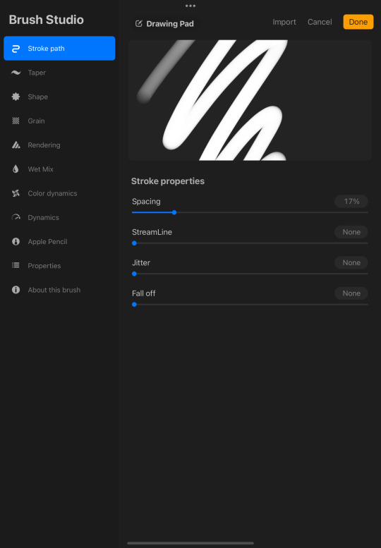
Making/Customizing Brushes
Last week we talked about brushes and the different types, but sometimes we want something different. When we don’t want to use any of the standard brushes that come with the app, there are two options; adding premade brushes or making your own. Today, I will explain how to make your own brush.
The first thing that you should do is add another set under your brush library to keep track of which ones are custom. Although a little symbol appears on the side, indicating that the brushes are not from the standard sets, it could be beneficial when trying to stay organized.
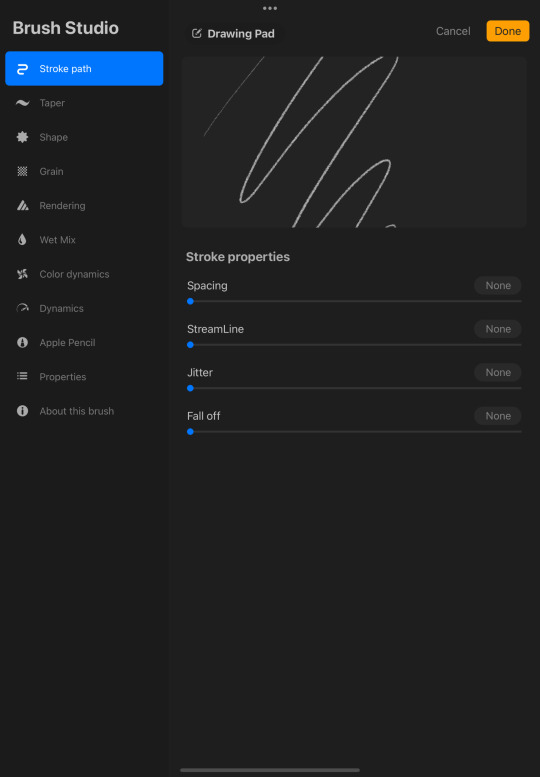
To start a new set, drag your list down until a blue plus button pops up, and then select it. To add a brush to the set, select the plus button on the top right of the library. This will add a basic brush, but by selecting it, you will be brought to the Brush Studio.
The Brush Studio is what you will use when customizing a brush and there are several options, from stroke path, to shape, to adding color to your brush. The best way to get comfortable with these settings is by playing around with them, making small strokes on the provided drawing pad. When your drawing pad is full, you can clear it by selecting Drawing Pad and clicking on the Clear drawing pad prompt.

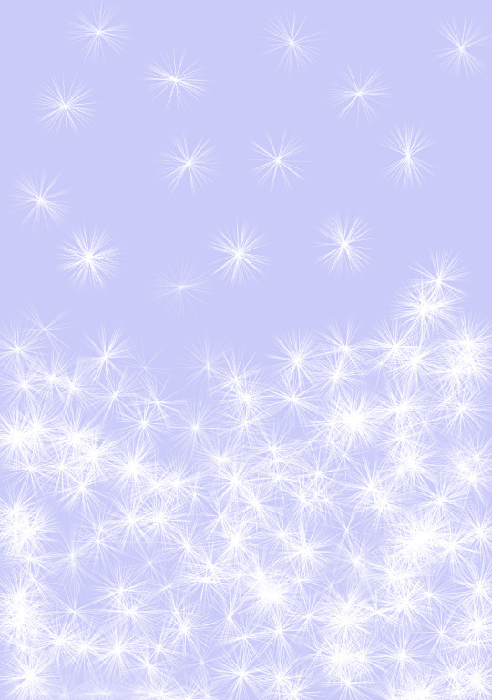
Although it’s not too soon, I’ve already become excited for Christmas, so as an example, I made a brush that resembles a Garland. To get the garland look, I dragged the Scatter option to the right (not with a specific number in mind) and brought Tilt Roundness to -99%.

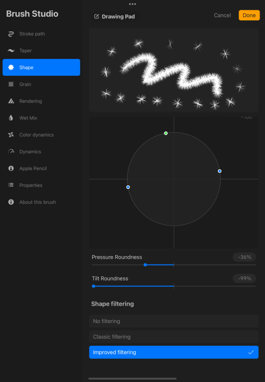
When testing the brush out on a new canvas, I noticed that by dotting everywhere, it kind of looks like someone had blown on a dandelion!
I hope this was helpful, but if you are confused about something, have any questions or suggestions, or just want to say something, don't hesitate to visit my ask box, or Instagram!
#procreate#procreatetips#procreatehelp#procreatetutorial#procreate for ipad#procreatebrushes#procreatebrush#procreate tips#procreate help#procreate tutorial#procreate brushes#procreate brush
151 notes
·
View notes
Text
Brushes!
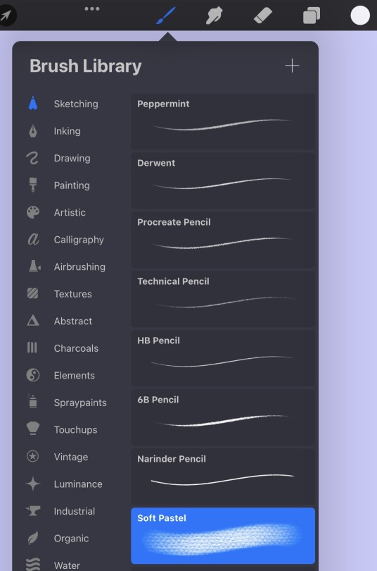
Before we go further into things like gestures, layers, and shortcuts, it's important to know about brushes. Brushes are the main tool that you will be using in Procreate and there are endless possibilities style-wise. If you select the brush icon on the top right, it opens up the Brush Library. Because there are so many brush options, you should take the time to play around with them.
The fun doesn’t end here though! By clicking on a specific brush, you will have several options to edit your brush, from the way it flows on the screen to a specific color.
Anything that you want to see different in your brush can be fixed here. This is also something that can be fun to play around with, as you can even change the shape of your brush!
When you want to change the brush size (top) or the opacity (bottom) of the brush, lower or heighten the adjustments on the left side of the screen!

Thank you so much for reading! For those who are interested in learning more about brushes, I will explain how to make your own brushes or add premade ones next week! if you have any questions or suggestions about anything, don't hesitate to visit my ask box, or Instagram!
#procreatetips#procreate#procreatehelp#procreate for ipad#procreatetutorial#procreate tips#procreate help#procreate tutorial#procreate brushes
44 notes
·
View notes
Text
Drawing Guides!
On Friday I briefly talked about drawing guides, but I felt that it was important to go more in depth with it, as it can be a life saver! To use Drawing Guide, you must go into Actions, select Canvas and turn it on.

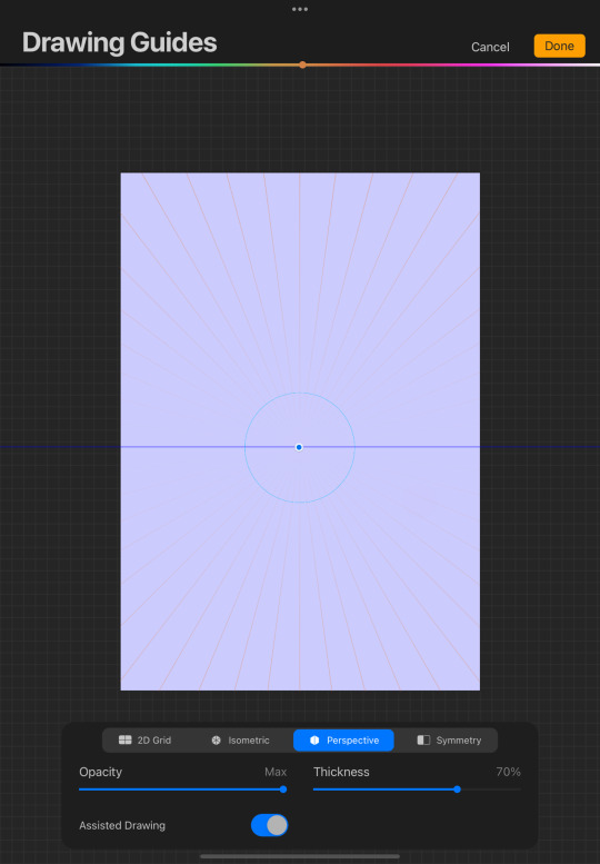
This does not stop here, however, as there are several ways that you can use Drawing Guide. To edit the Drawing Guide, make sure that it is on and then select Edit Drawing Guide. In this, there are four settings, 2D Grid, Isometric, Perspective, and Symmetry.
2D Grid and Isometric both provide you with grids, but 2D Grid is for assisting you with 2D art. When Assisted Drawing is selected under 2D Grid, the lines you draw will go either vertically or horizontally.
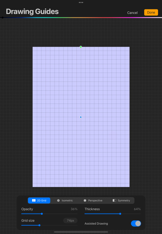
Isometric consists of triangles and is usually used for 3D art. With Isometric, the lines will go vertically or along the diagonal grids.

Perspective allows you to create up to three vanishing points so that you can easily make a perspective drawing of your choosing. Whether you want to make a bedroom or a beautiful landscape, Perspective helps you achieve that!
Lastly, Symmetry helps you make sure your art is symmetrical. Without editing anything, it adds a straight line down the middle of your canvas, but by selecting Options, it shows other options like Vertical, Horizontal, Quadrant, and Radial. You can also select Rotational Symmetry and Assisted Drawing, which will help you flawlessly create what ever your heart desires!
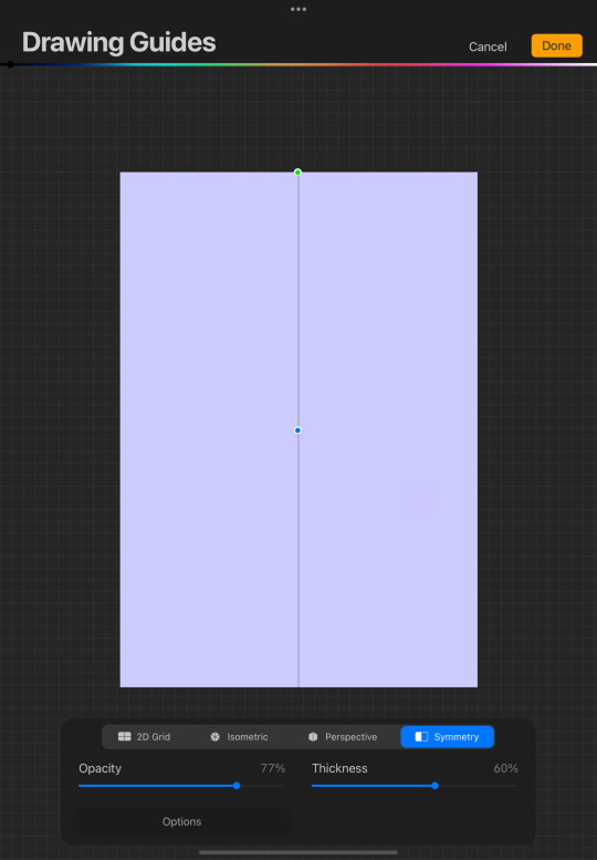
Don’t forget to turn off Assisted Drawing! Even if you turn off Drawing Guide, Assisted Drawing will still be selected within the edit section. If you’re ever confused as to why your brush is consistently drawing a straight line, be sure to check and see if Assisted Drawing is still on.
Thank you for reading, and like always, if you have any questions or suggestions about anything, don't hesitate to visit my ask box, or Instagram!
#procreate#procreatetips#procreatehelp#procreatetutorial#procreate for ipad#procreate tips#procreate help#procreate tutorial
28 notes
·
View notes
Text
Settings!
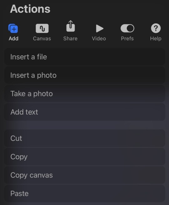
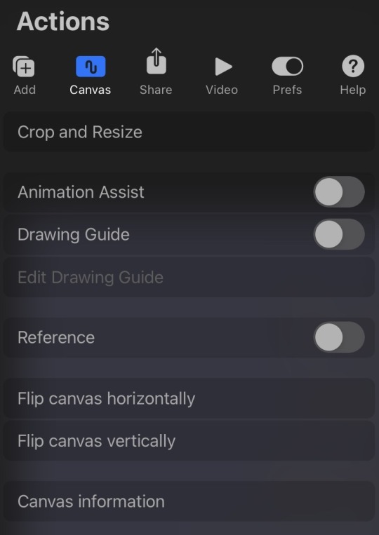
One of the first things that you should know how to navigate through is settings. To go into settings, you will select the wrench icon at the top left of any opened artwork. Under this will be six different options; Add, Canvas, Share, Video, Prefs, and Help. While we will go further into detail about these settings and the advantages that you can and should take with them at a later time, it is important to at least give a brief explanation for each section, as it may be something you refer to often.
Under Add, there are options to insert an image, file, or text, and cut, copy or paste an item of your choosing. This will come in handy for people who plan on making things like logos or banners of some sort. It can also be good for making creative restaurant menus or even
Under Canvas, you can crop or resize your canvas, utilize assistance for your animations or drawing, insert a reference image, flip the canvas horizontally/vertically, or view your canvas information.
Share allows you to share your canvas, whether it be just a single image or the layers. It provides you with several options for the type of file and allows you to send it to your desired destination directly from the app.

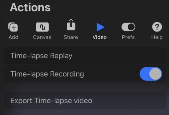
Video has three options; Time-lapse Replay, Time-lapse Recording, and Export Time-lapse video. The first and last options depend on whether or not
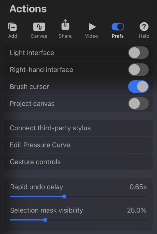
Prefs gives you the ability to change the canvas preferences. From interface and cursor settings to projecting your canvas. Some problems that you have with gestures or the way that your stylus is operating may be answered here.
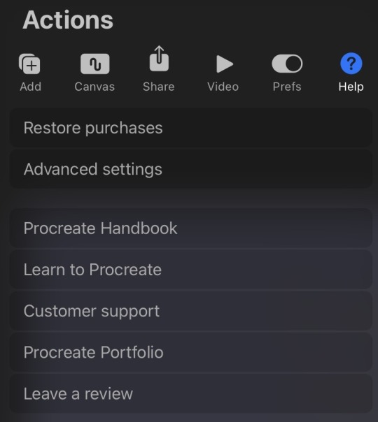
The Help section provides you with the option to deal with any problem that cannot be addressed within the other sections or the app at all. If you are missing something or have a concern, the options in this section will bring you directly to where you need to be.
I hope this has answered any questions or concerns that you have had with anything under settings and thank you so much for reading! Next week, we will go a little more in depth with the drawing guide and using brushes. If you have any questions or suggestions about anything, don't hesitate to visit my ask box, or Instagram!
#procreate#procreatetips#procreatehelp#procreatetutorial#procreate for ipad#procreate for beginners#procreate tips#procreate help#procreate tutorial
93 notes
·
View notes
Text
Welcome!!

Welcome to Putting the PRO in Procreate!! This is a student run blog to help beginners in digital art get comfortable with using Procreate. This blog will consist of pictures and videos showing the basics and essentials of the app. Content will be posted on Tuesdays and Fridays and will include lessons like how to utilize the selector tool, quick shape, using and adding brushes, and more! Our connected Instagram page will have little tips as well and will be updated more often so feel free to visit at any time. If you have any questions, you can ask in any way you feel comfortable, whether it be in the ask box (if you want to be anonymous, you have the option) or DM (here or Instagram). Don’t hesitate to interact, I will try to answer everything to the best of my ability!
2 notes
·
View notes