research604jo
Design Research
Creating two diptych posters analysing 20 elements that convey myself as an artist and my journey.
MAIN FEED
Click these links to see specific posts:
Posts about the Creative
Posts about Concepts + Iteration
Posts about Essay Writing
Posts about Misc Weekly Notes
39 posts
Don't wanna be here? Send us removal request.
Last Seen Blogs
cigsaftersex
cigsaftersex
sexynaughtyprime
Mmm Hmm

breedtheseed
Breed
Get Him Pregnant
elizabeththehopeful
And So It Goes...
inyourbestwriting
inyourbestwriting
Text
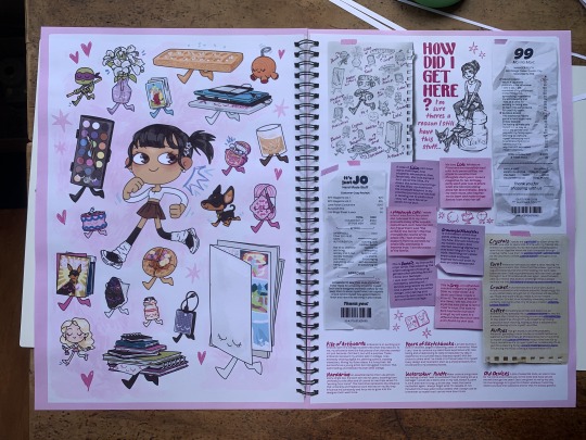


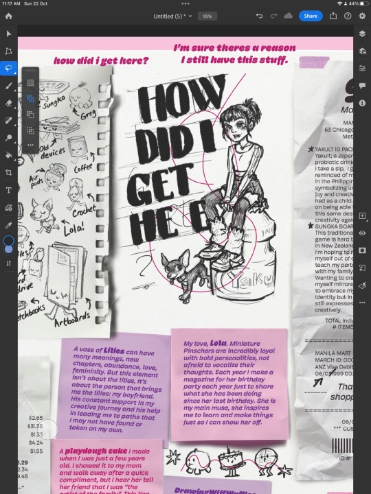
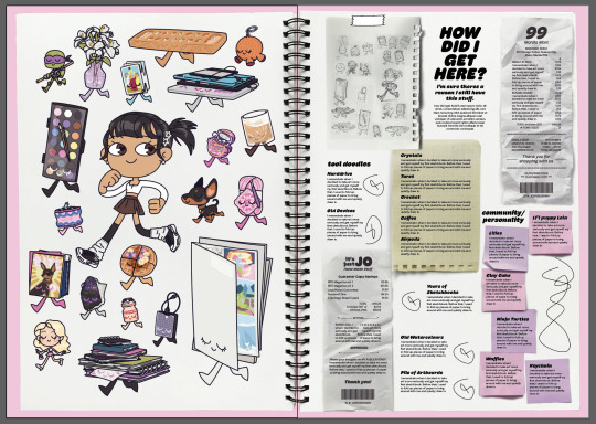
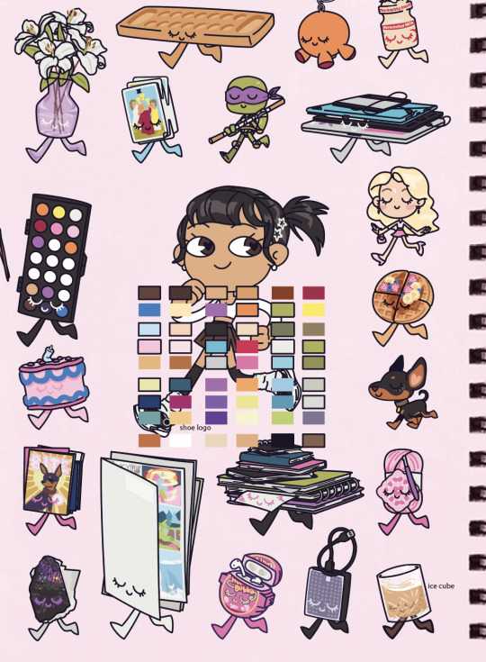
final poster turnout!!
I went to warehouse stationary to print because I knew I wanted nice paper and ink. I was hoping to print it as A2 160 gsm but they only had A3 120 gsm! so unfortunate but they still turned out great. I think I'll print and frame my posters in A2 just to have on my wall at home. I'm absolutely elated with how these posters turned out! I wasn't expecting to also love the text half of my posters, but I love it as much as the illustrative half, i almost love it more!
This was an amazing project, it feels great to be able to focus on my own art and discuss and research my influences and goals. It's important to reflect and appreciate what got us here. This project made me really happy and I was able to have a lot of fun and express myself during this as well as learn how fun learning about other artists and their inspirations are as well!
0 notes
Text
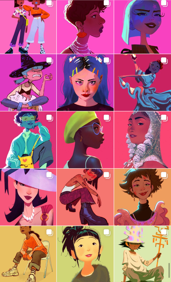
Illustrations I did on my iPad
I started with a simple warm up. I haven't drawn on my ipad in months but soon muscle memory kicked in and i was on a roll! This was such a nice relaxing activity after months of just stressing and working hard to finish all my uni work.
As I drew these textures, I made sure to have Mila Useche's art open for me to reference how she likes to colour and I applied it to my own work. It felt very freeing to just doodle all over the clean and crisp vector drawings I did.
-
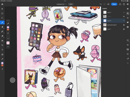
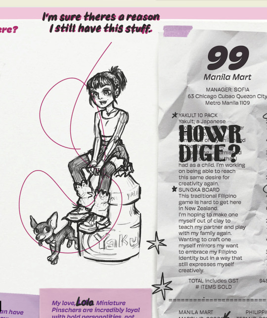
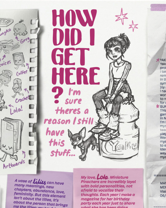
On the text half of my poster, I managed to leave myself space for a big drawing. I thought at first that it could be in the same sort of style as the other half of my poster but then I realised, why not ode to my other art style? the art style that I've drawn with for years! So I did! I also added Lola because of course I would! <<333


-
And here I was wondering how I'd like to add the title to my work. A teacher suggested that I had write the notes, I didn't want to do ALL the writing but I instead decided to handwrite main titles (eg see the words in the post it notes). I was also going to write the title by hand but I didn't like how hard it was to get the letters to look neat etc and so instead of wasting time trying to perfect it, I decided to just draw each letter I'd need and duplicate it when I vectorised it on my main poster!
-
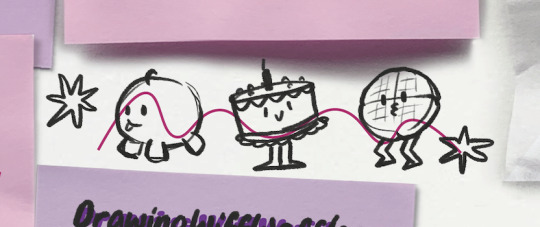
Here are some doodles I chose to do. I thought it might be more relevant to draw items related to the "notes" I took, but wondered in what style? I decided that they'd benefit from being simplified because they're small and also don't need to pull attention away too much from the page.


0 notes
Text
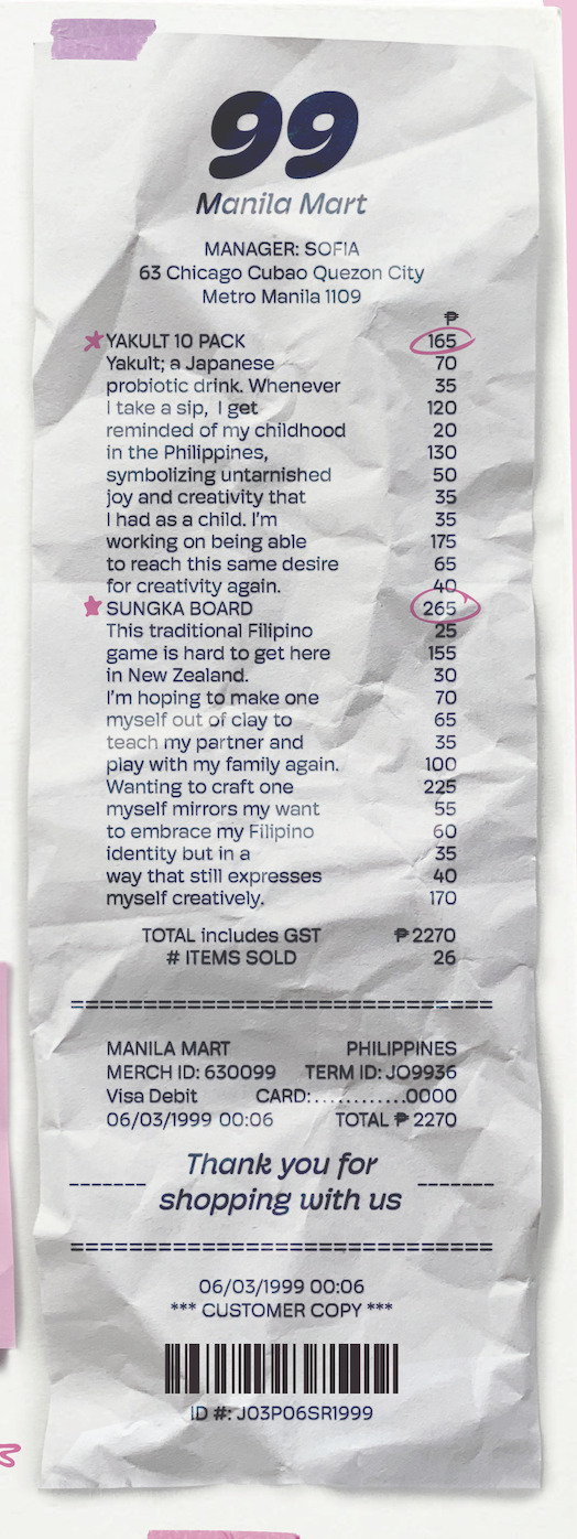
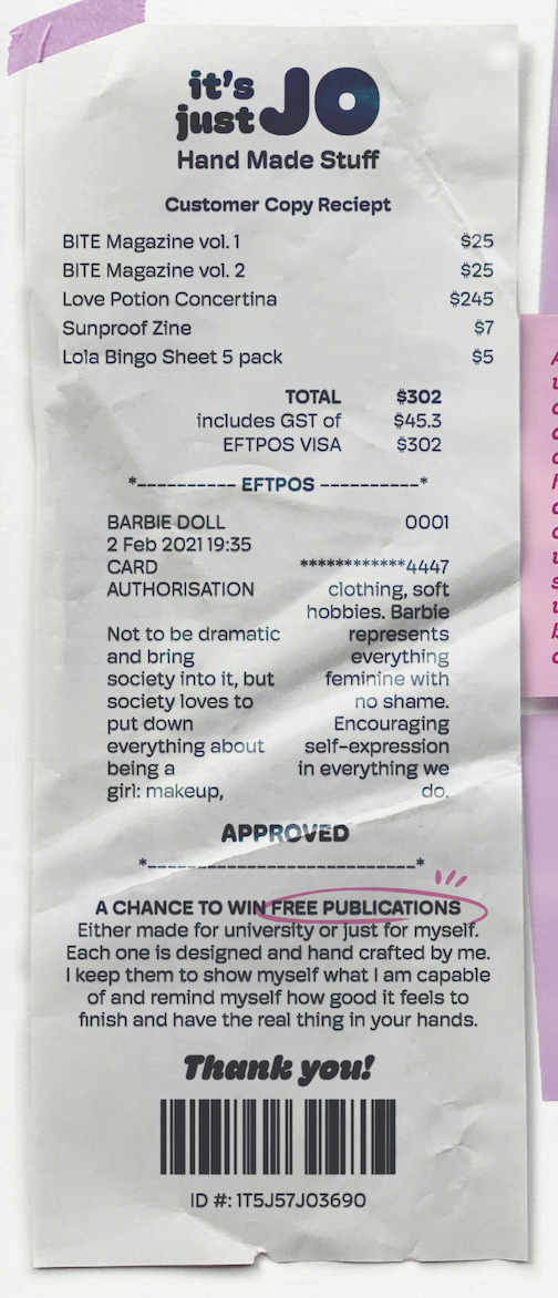
Receipt iteration
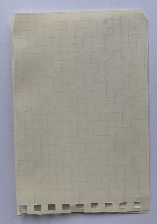
I thought that this would be really important to fake as good as I can, it would be the small details that make this look subtle and believable from a distance. I studied receipts from photos online as well as some that I had laying around the house.
With only my filler text in my text boxes, i updated the layout of my first concepts, then once I filled in the receipts with the correct text, I was able to adjust the layout one more time, then to finish off, i go in and add in more relevant numbers and codes and barcode to create lots of detail. I designed them to look as though I bought them from little shops, but the titles being relevant to their theme.
-
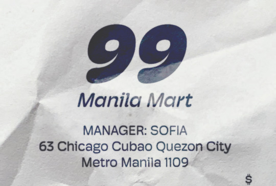
For this Receipt, it holds the theme of memories and history. I used my birth year 1999 as the main logo. I also added my families old home address as a child in the Philippines as well as adding my mom as the manager on duty. All through the details of this receipt is my initials JPSR and my date of birth 3/6/99, just a silly way to add numbers that are more relevant to me instead of only random numbers. I hope you don't mind the messy and jaggedy paragraph, I wanted it to seem like different, unrelated items were being listed as if it were a real receipt!
I added little marks on the titles so that i could bring attention to where a paragraph starts but hopefully having kept it subtle, as if i was just making note of a couple prices.

-
For the next receipt, I had the theme of personality. I designed it as if it were a shop where I was selling my publications and crafts. I wanted to fit in the text differently than I did the last receipt. I chose to have my publications in the scanned items section and instead hide the information on my elements in the eftpos and reward section of the receipt. Yes the eftpos section is a bit funky to read but i didn't mind the sacrifice because creates a more interesting experience for the person looking through my poster.
Here I only made one mark, I couldn't think of a reason someone might make note of something in that section... but i was able to point out the publication section as if someone was keen to win one for free!
-
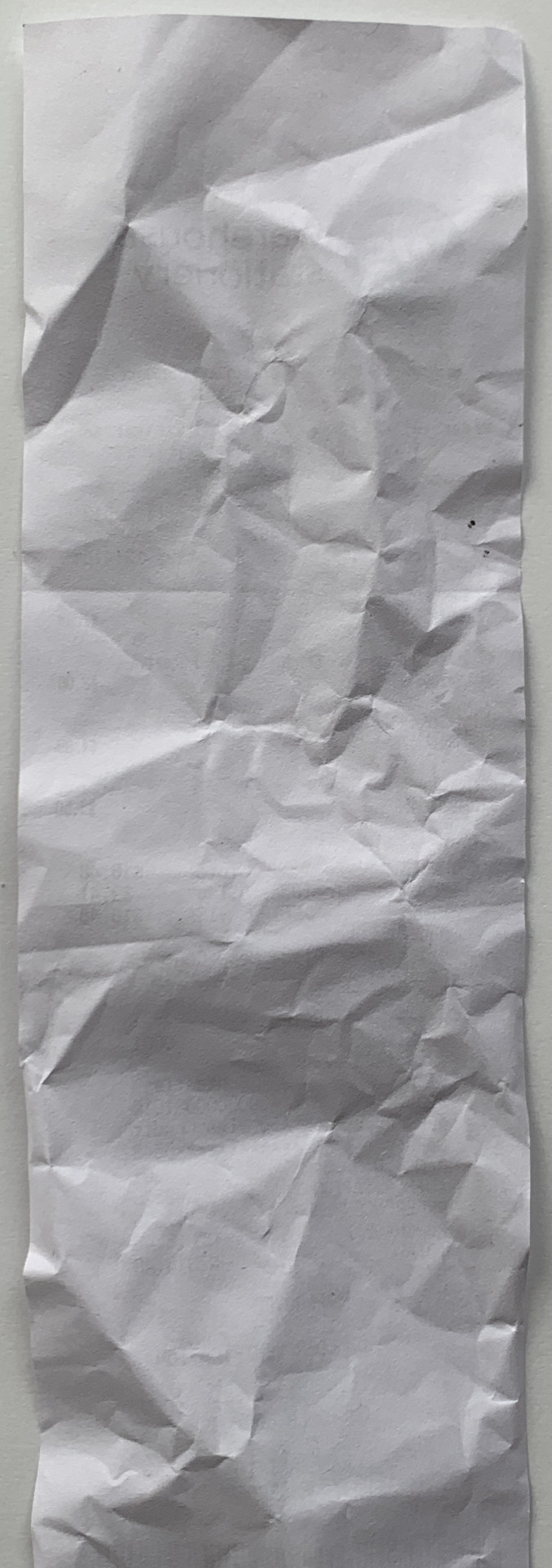
Final thing to show is how i accomplished a blurry printed receipt look. Simply using colour burn setting on the text! Plus then I duplicate the text layer, outline it and add a gaussian blur to it.

0 notes
Text
Element Layout Iterations
I grabbed each element and had a play around with their sizes along with where they could sit in the page.


In the left layout: my original layout thats in a grid type of layout.
In the centre layout: put together based on visual balance of each silhouette.
In the right layout: organised by theme.
I liked the centre one the most! I felt as though visual balance was more important than categorising the elements for this poster.
Text Iterations
Heres a bajillion variations of how I could place the text on this page:


I realised that since I removed the grid from the poster design, I'd have to think of a new way to clearly group and display my elements.
I decided that each theme could be in it's own style. two categories only contained two elements, meaning i could put them on receipts. the rest either had 5 or 6 elements, needing more space.
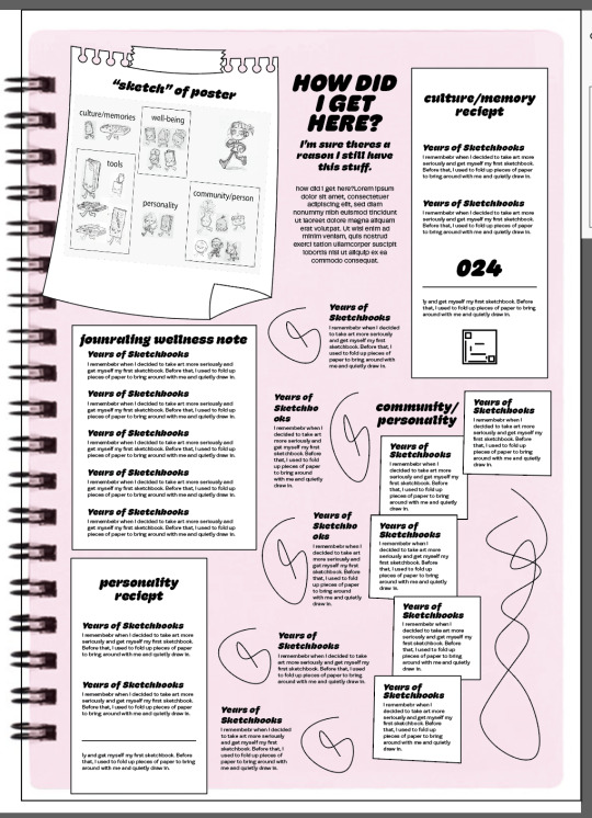
So that people who viewed my posters could know what an element is, I decided I wanted to include a labeled sketch of my poster, as if I had drafted the poster on a little page before making the big one! how cute hehe
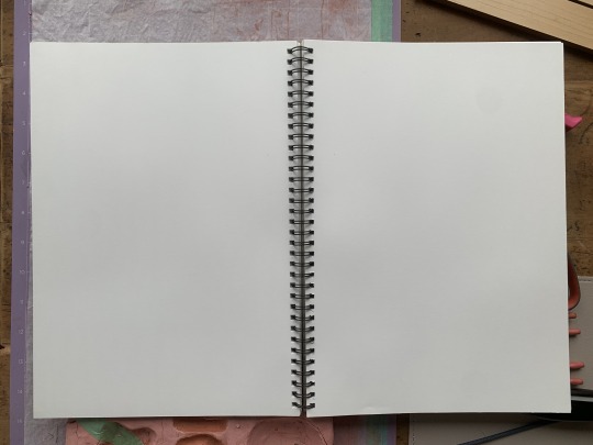
Each piece of paper on the poster, including the blank sketchbook in the back, I took a photo of and edited, adjusting their colours to match my poster's theme etc! I'm so glad that I did this because it takes the whole edit to the next level! Check it out:


After making all these assets, I finally finished writing 50 or more words for each element. When I put these words into the layout... I realised that I had way more words than I realised. This called for a redesign of my layout!


It was way uglier with soo much more words! I felt like I had to make sure there would be enough negative space to fill with some more doodles to bring some fun back into to break up the text boxes.
0 notes
Text
Element Iterations
Heres some before and after of a bunch of elements that I felt needed some more detail.
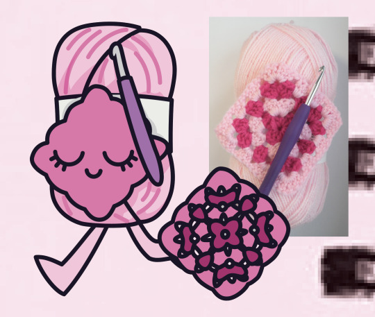
Adding some texture to this crochet drawing:


-
To nose or to not nose:

-
Adjusting the eye placement + adding detail to sticker. Had the idea of turning the eyes into stickers too!


-
Wondering how to draw this syrup - i started with this messy squiggle then ended up using DrawingWiffWaffles' logo as reference:


-
Finally putting in the effort to process how to make a believable granny square with simple shapes:

-
Making barbie look plastic by adding some shiny bits:


-
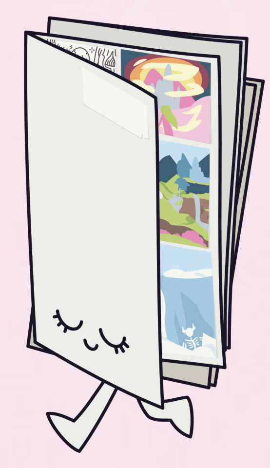
Adding details to the art boards, it really took it to the next level and more believable and meaningful:


-
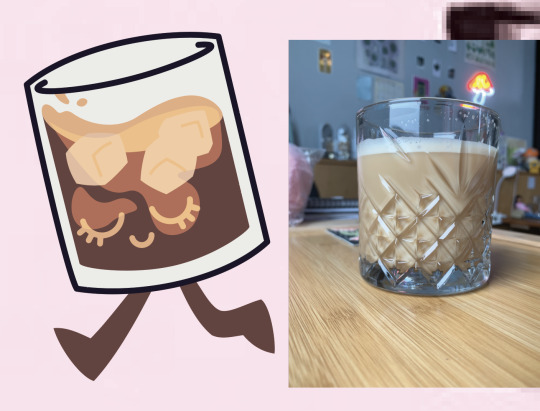
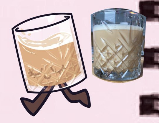
I decided to add in the full detail on the crystal glass and coffee to make a believable visual, I really put time into this one and I think it was worth it!:

Then I adjusted all the lines to keep them consistent then outlined the shape:
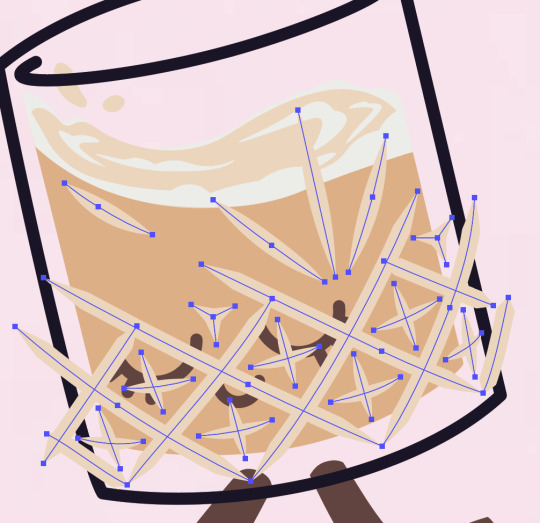
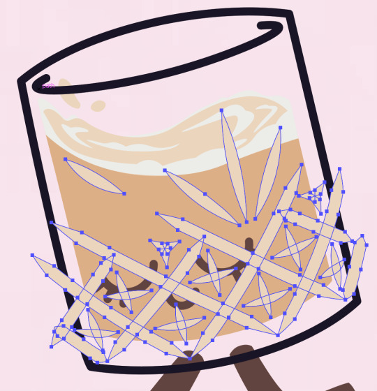
And through different layer settings etc i added shadows and highlights:
-
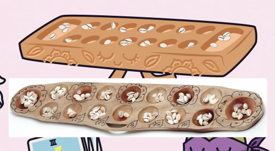
Adding little shell details to fill up the sungka board and make it more interesting!


Then thought maybe I could take it to the next step and add some carving details because the board looks a bit boring. I found some inspiration from filipino sungka boards and added it:
-
To eyeline or thick eyebrow or nah? I decided no to either, it added too much distracting detail:


-
Final element adjusted was the water colour palette! I decided to add more meaning to it in this project by using colours from the rest of the poster to fill up the palette. I went to each image, pulled every colour from all of them then chose from there:

0 notes

Text
Rewinding to show essay draft 1 from week 9
How I write is by creating bullet points to give myself a good map of what I could write about for each part. Sorry if it's hard to follow..
Section 1. Title (ideas)
Oh the places I’ll go: A creative journey in search of growth and expression.
How I got here: I’m sure there’s a reason I still have all this stuff.
It’s just Jo: The bits and bobs that got me here.
Section 2. Introduction
The purpose of these posters is to find creative ways to convey my origins as a creative. We have to appreciate what has lead us where we are, although not all are as significant as others, even small influences make a big difference.
History of me: Talk about coming from the Philippines, my big online influences, uni and work paths – what lead me to where I am now. About my family as well.
This report will talk about this in detail + the creatives and where I want to go in the future.
Section 3. The Creative — Positioning the Researcher 200
Key values that underpin my practice: self-expression, character growth, finding my way and embracing myself.
Media and process I gravitate to: I love crochet and am getting into knitting. In the art world right now I focus on digital, but if I were to have all the time in the world, I’ve been wanting to get back into painting and oil pastels.
Plan to use: digital and pastel for this poster. I’m seeking influences from the creatives I’ve chosen for my media/style choices.
Section. 4 Contextual Review (Creative Positioning)
Describe Mila and her creative process when painting
Describe rubber-hose animation, list key animators and your key cartoons and analyse their inspiration and process.
Describe a type or design studio and their biggest influences or inspirations and analyse their processes and one design project they’ve done.
Describe + key concept and reason to create. How does this creator fit with your objects and categories?
Section. 5 Identifying Communities of Interest
Mention my previous and current community influences eg youtube, Instagram, influencers, work, uni.
Where do I want to be in the future? Freelancing? What kind? Why that kind? What has influenced you to want that instead of something else?
Section. 6 Reflections on the Research Poster
The importance of all the main visuals: sketchbook, art style, colour style, collages on the text side. The reason for the layout, the sizes, the organisation if any.
What does this communicate about you as a designer?
Discuss the success of the artifacts and system you’ve used. Reflect on two key elements that challenged the way you think.
What categories emerged, how were they linked? Link your categories.
Name new idea or influence you gained while reviewing a peer’s poster.
Section. 7 Conclusion
Key findings of tools that you will use in the future. What were new tools?
What shaped your ideas and processes? What lead you to the places you got and the tools you used? Peer feedback? Research?
Tools you used that was helpful – e.g. AUT library for research
How has researching creative communities proved to be useful for your design process? How will you approach using them in the future?
0 notes
Text
WhiteRabbit research
Their website
their about page
Their studio is small, only about 7 or so designers. They do a range of design work: digital, illustration, print and branding.
"Our Philosophy: We listen, imagine and then create. We take the time to understand your business and create a brand that truly represents your service or product. Your company. Your audience. Our philosophy cuts right to our core and stands at the centre of everything we make."


I'm hoping to do my third year internship with them... 🥺
0 notes
Text
Drawing wiff waffles research
Waffles' Website
This artist chooses to remain anonymous. But through the years I was able to piece together that her real name is Kathrine, and goes by Rin. She is an artist from Canada. Her older youtube video on her channel is from October 2013.
The tools she used to draw on her computer was a wacom tablet and adobe photoshop.
December 2013 was when I was gifted an iMac and Wacom tablet to draw with and this was when I was online searching far and wide for digital artists on youtube that I could take inspiration from. Waffles was the only one that stuck.
EARLY WORK:
Early on she was posting videos of her digitally drawing fan art of characters from popular shows and movies while talking about her process. A lot of creators do this to create traction and to build an audience. She did mostly fan art for two years on her youtube channel. (so from 2013 - 2015)
THRIVING WORK:
In the year of 2015, the digital world of creativity grew on instagram and youtube, things like art challenges became popular and this is what helped her branch out of only drawing fan-art and being able to into character design as well as tutorial videos. This is when she grew the most, her art style continued to develop and more comfortable to her and her confidence in each stroke really gave me confidence and inspired me at the time.
CURRENT WORK:
Not long after her thriving in the digital art world, she let her community know that she suffered from vasculitis, an auto-immune disease that attacks her blood vessels, which can cause some serious fatigue and pain, the treatment causing her hands to shake.
The thing that makes Rin so amazing is her commitment to her passion. She never wanted to stop drawing, she continued to make videos in between hospital visits and treatments.
I'm sure it broke her heart that to draw digitally for a prolonged time became painful for her, it was an adjustment for her and her audience (even me!) to have a sudden change of content. Although she would sometimes draw digitally, she hardly does it as in-depth as she did in the past.
As shes forced to do more traditional media, she explored and learned all sorts of materials such as watercolour, acrylics, pencils. She always shared her learning process with her audience, even returning to medias that she felt like she was awful at to try and improve. She believed in trying to draw each day to continue improving yourself even if its a small doodle in a daily planner.
It's been almost a year since her last youtube and instagram post. Unfortunately due to her anonymity, none of her fans are able to find out if she is still ok... and i think i might cry honestly. A Reddit thread full of fans talking about her being MIA claims that a couple of months ago she has told someone that her illness is no longer in remission in an email.
2 notes
·
View notes
Text
Deeper research on Bill Nolan


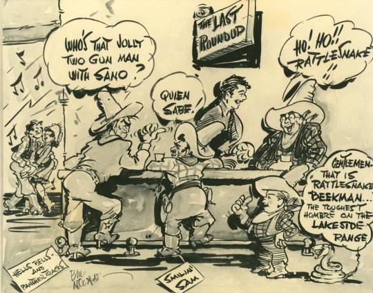
Tralfaz: Bill Nolan - This article finds newspaper clippings that helped them to dissect Nolan's background.
He was born in Connecticut in June 1894
Bill Nolan is an animation pioneer, many animations and comics were inspired by his designs even decades on.
He began his career in the city of New London in 1917 as a 23 year old cartoon artist for newspaper and magazines. He became prominent and well known and started to elevate his career.
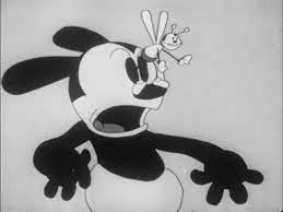
From 1924 to 1926, he animated and designed Felix the Cat. He then goes from studio to studio designing and animating iconic cartoons such as Oswald the Lucky Rabbit, Popeye and Gulliver's Travels.
He died in December 1954
Cartoon Research: Bill Nolan - another article that summarises Bill's Life
Cartooning Self-Taught digital book
1 note
·
View note
Text
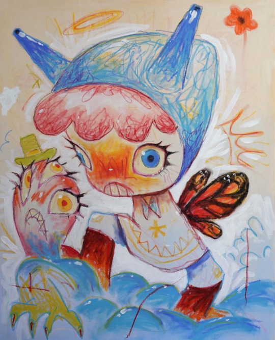
Deeper research on Mila Useche
Link to her website
Link to her instagram
Website about page: "Mila Useche is a Colombian artist and film director based in Berlin. After graduating from university in 2017 with a B.A. in Illustration, she started working in video games and comics as a designer and illustrator.
In 2020 she decided to start freelancing as a character designer for animation and publishing. Among several clients are Disney, DreamWorks, Nickelodeon, Scholastic, Harper Collins, and Warner Bros. Animation.
Most recently, Mila’s work has shifted from client-based digital services to more personal and physical artworks."
Looking through her instagram, I saw lots of personal insights in a lot of her posts where I was able to understand her thinking and thought process as she went from character design + animation to physical paintings.
HER EARLY WORK:
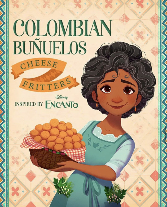


Early in her instagram, you can see her diverse skill in animation. She is a character designer and scene builder working in a textured digital style that gives her artwork a very cosy, heartwarming, storybook style. She was getting commissioned by animation studios, even to make promotional art for Disney's Encanto (see above).
Che did instagram "challenges" such as the "hue challenge" (see above) which is a big commitment and is mainly to drive instagram engagement but also seems to encourage many illustration styles from her.
During this time she mostly did digital painting on her iPad, only ever doing studies and plans in her sketchbooks.
HER TRANSITIONAL WORK:


She had expressed that it had been years since doing something fun and expressive in her sketchbook and was very inspired on her trip to Tokyo earlier this year. She began branching out of her sketchbook, using watercolours on paper, using acrylics on canvas, eventually to pastel crayons on large paper and even having a go at some miniature sculpting of her characters. Drawing oil pastels on paper was the thing that inspired her the most, she says it brings back the feeling of drawing in her sketchbook as a child, and that the pastels allowed her more freedom to make mistakes because it's cheaper than watercolour and acrylics.
Because of her new freedom in creating her personal art instead of animation work, she also began being inspired by memories and personal experiences. Although she never fully describes the meaning or origin, you can see the concept in her art and the expression in it.
Quotes from her instagram descriptions in under a few images:
"Going back to traditional feels so good!"
"I know it's not my usual art, but bare with me, cus I'm having so much fun"
HER CURRENT WORK:
(What I'm inspired by)


She began buying larger and larger canvases, showing each peice with pride - even when she doesn't love what she has created she tells us "I'm not very happy about it (the painting), makes me a bit uncomfortable, but that always motivates me to start the next (painting)". This is such a great perspective as an artist.
"I think I will name this art movement Colobia Pop Kawaii"
Her current goals in life are to be able to afford a big, bright, well equipped studio with a view and a garden.
She expresses that her original dream when she left university was to have her art exhibited in galleries and museums and she felt as though she'd lost that dream when she moved to digital only art work. I think it's interesting that despite doing amazing digital art and working for amazing animation studios and projects, she didn't feel fulfilled. That is the dream of many artists and she was able to be honest with herself and her audience and take the leap into an entirely different art style and was able to bloom and express herself in a more truthful way.
I think a lot of creatives and artists can relate to this path and are somewhere along it. Although I'm obviously early in my artistic journey, I'd say I'm in that transitional stage at the moment where I'm looking for my true style and looking for a way to create that is truthful to myself.
0 notes
Text
week 10? In Class: Assessing myself based on the Rubric


Contextual Enquiry: C+
Research Skills: C
Critical Analysis: C+
Synthesis: B
What do I need to improve: My research and historical exploration of the creatives and their origins and inspirations is weak, I'm so excited to just create my idea that I'm neglecting this.
How can it be improved: Allow myself to put the time into researching these topics, I know that I'll be inspired once I do.
Do I need more research and reflection: More research yes, and I am happy with the reflection that I do as long as I do write them down. I need to post on tumblr all my iterations and progression - make it easy to see for tutors.
Do I need to reassess my 20 elements: I think I'm happy with my elements, each one has significance to me, I'm just looking for the right words to explain why.
Peer look at my poster:
They were able to see that it represented my personality and me as a person.
0 notes
Text
Colour style I love
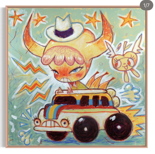
This is one of my creatives: Mila

She creates these on large canvases with mixed media.
From what I've seen, she preps the canvas with paint and random textures (for example coloured pencil shavings), sketches with colourful oil pastels and wither finishes the whole thing in oils or sometimes uses paint to colour in bulk background bits. Sometimes adds final touches with paint as well.
Why?
This is a colour style I'm choosing because to me it screams self-expression and self-representation. The artist is having fun and exploring and also adding a sort of creative story with each painting she does because she uses the same character in different scenarios. I want to do the same one day, a few weeks ago I'd even bought some oil pastels hoping to do this same colour style on a canvas I have at home. I want to use this colourful style because it will push me to go further than I'm currently capable of but has been something I've wanted to grow into for a long time.
0 notes
Text
Week 9? Peer Feedback for my work so far


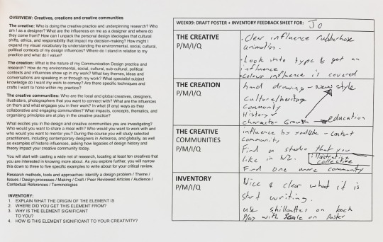
Just to summarise his feedback:
The creative
Visually: Art style and colour influences are covered, but look more into type and build a stronger influence there.
The creation
Character growth being my main theme was clear - the fact that this is a new style I'm trying to grow into is connected to this too.
History/memories seen in the rubber-hose style that I've chosen + in many of my objects. As well as Culture/heritage and community.
Said it was good that my objects represented more than just what they were eg the waffle representing the first youtuber i got inspired by, not just "liking waffles"
The creative
Could write about youtube communities being an influence, but need to lock down the rest. Suggests to find an NZ studio that I like and might want to join, and possibly find an illustrative collective as well.
Inventory
My objects and justifications were pretty strong, and he was able to recognise what each object was.
Need to finish writing about everything.
Could use silhouettes on the text side to reference the main poster.
Play with scale on the poster, the style could benefit from a more playful layout if done right.
Feedback from Cecilia
Will you colour all of them? maybe you wont even want to since it could be unfinished like in a sketchbook.
The sketchbook makes more sense, it communicates character growth and self expression + gives reason for the texure that I want to do
Personal Reflection after this:
I have lots of writing to do! I know my key influences and my justifications for my objects, I just have to do it.
I need to do more typographic exploration + research, right now the layout I have is easy to digest and read, but thats because its so plain. I need to do some iterations and find something more visually interesting.
I like the suggestion of playing with scale... True that the rubber-hose style could benefit from a more playful layout.
He reacted the best when I showed the sketchbook concept more than the shelf one - and personally I agree. The shelf seems a bit boring and dusty and restrictive while the sketchbook makes a lot more sense, especially with the colour style I want to express. (I'll expand on this after this post)
I'm really pleased that he was able to point out so many connections and have it confirm to me that I've been able to piece something together in a clear and recognisable way.
Maybe use a marker and hand draw the titles on the text side?
Maybe add in collage and things like I do in my real sketchbook - take pics of some of my old favourite pages and post on tumblr.
0 notes
Text
How can I develop the poster more...
I went and made some mood boards, these are the key images from each concept:

Here I tried many other ways to show the chracters. Although i do still love just a clean display of the characters, I know that it's valuable to explore other ideas.

Store toy shelf - This was a really cute concept where each character was a small figure still in their packaging, hanging on a store shelf. But it made the characters really small, plus I actually don't buy many toys lol
Tarot cards - The concept of each character being a major tarot card is really cool and definitely up my alley! It requires me to be very creative with their posing possibly the naming of each card - it might be a bit too complicated for this already complicated project.
Adding a frame - This was one of my first ideas in how to give the image more context but I'm not really a "frame" type of girl.
Sticker sheet - This concept is super cute and would be very simple to create! I do love stickers but I wonder if the connection to me and my design process is deep enough to use this?
Sketchbook - This is one of my strongest concepts. I've always got my sketchbook on me and is where I'd absolutely display the characters in this tidy grid. I'm able to justify the visual texture that I could add when I colour the characters. It connects to me strongly but this might almost be too easy?
Shelf - The trinket shelf holding my most valuable, relevant things seems so perfect. I am such a collector and this is very relevant to me; I love to gather and show and share what I have :) It creates a very fun and interactive visual. I could be very creating and allow a few of the characters stand on top or next to each other while in the shelf.
My two strongest concepts is the sketchbook and shelf. I'll explore these further.
0 notes
Text
Week 9 SDL
make sure that your blog is filled/
Finalise 50word rationale for your elements
Add in worksheet stuff/
Poster draft:
make sure that the text page matches the rest of the poster
Print out your poster draft.
upload this formative before class..
semi plan the essay (see file Anatomy of GRAD604 Critical Review and Exploration)
0 notes
Text
Worksheet Activities in class Week 8
Task 1:
Task 2:

Task 3:

Task 4:

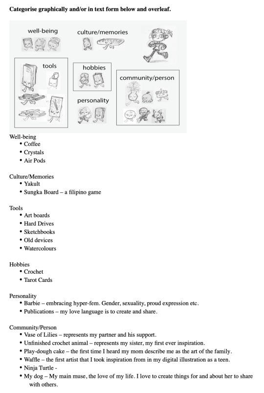
Final Categorisation:

0 notes