spookykasper
nothing but my gay intuition
kas | he/she/they | sideblog
19 posts
Don't wanna be here? Send us removal request.
Last Seen Blogs

awek-s
love so fine;
fuckyeahronweasley
FYRonWeasley
plush80s1
Lover Of Selfies

maxima-investments
Marcos Martins
Photo
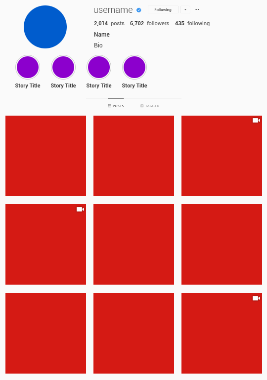

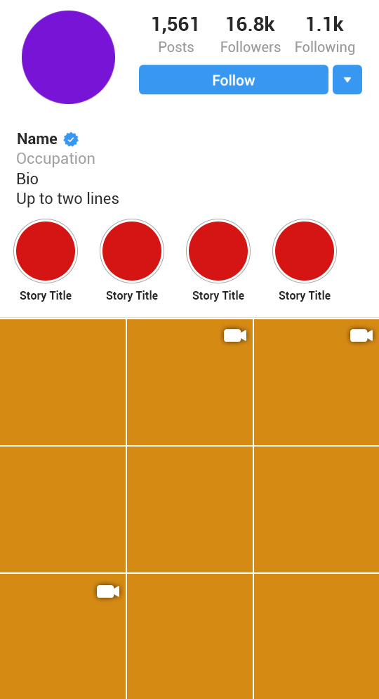
。・ template psd ninety six, template pack forty nine by templatepsds ゜+.*
-`. info .’-
+ as requested, here are a couple instagram templates with 9 posts. the first one is the desktop version, the other is the mobile version.
+ you can have up to 4 featured stories, or remove them all for a longer bio.
+ each “post” has a video option, in which you make the “if video #” layer visible. you can do a normal image to represent a thumbnail, or you can enter a gif.
+ these are rather big images, but you can resize them (Image>Image Size> enter new dimensions whilst checking the “constrain proportions” box) to make it smaller. you might need to do this if you intend on inserting gifs.
+ fonts used: Roboto in thin, light, regular, medium, and bold, all of which you can download here.
+ credits: icon used
+ not for commercial use or anything like that! just for personal use/to have fun.
+ adjust as much as you want to suit your liking.
+ please like or reblog if you download.
+ message if you have any questions/difficulties!
-`. download .’-
+ one (desktop ver): db || mf
+ two (mobile ver): db || mf
2K notes
·
View notes
Text
WTFOCK (SECOND GENERATION) ICONS
48 icons (6 under the cut + mega folder due to tumblr images limit)
8 characters, in 6 colors
200x200px
please like or reblog if you save or use


[mega folder]
10 notes
·
View notes
Photo
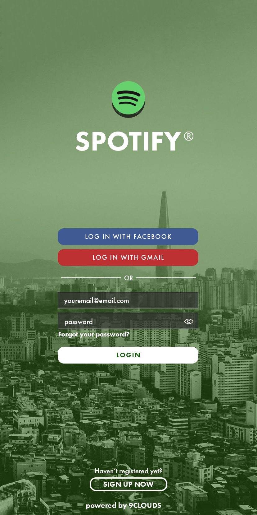
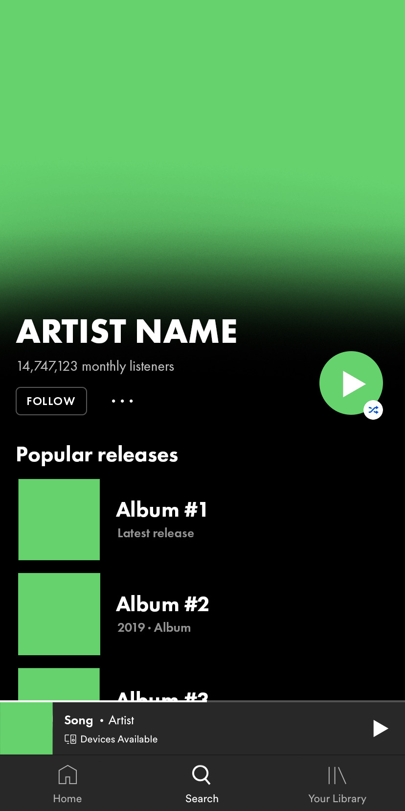

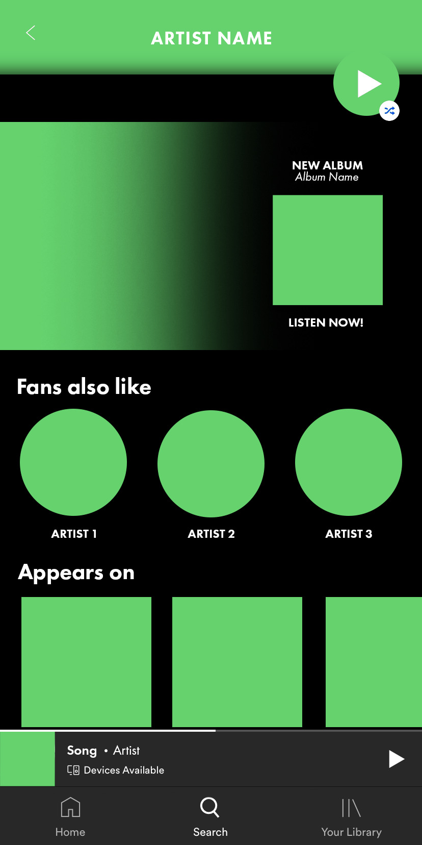
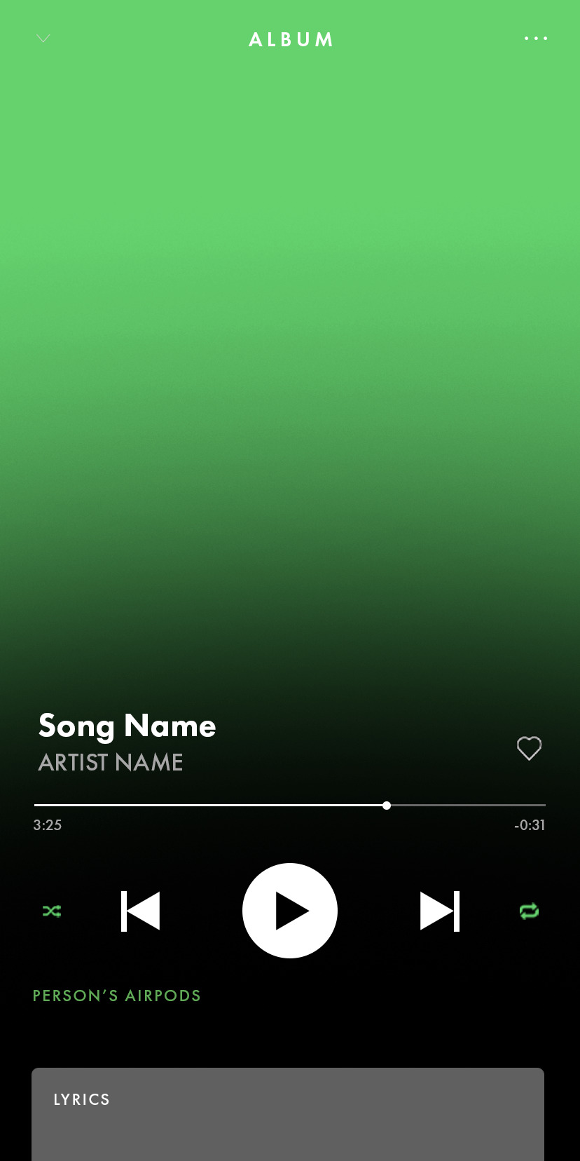

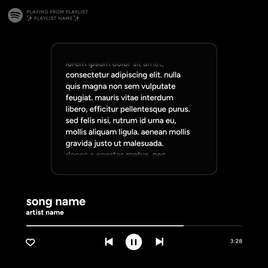
✧ SPOTIFY PSD — BY 9CLOUDS ✧
this spotify ps template is completely editable, but it may require some knowledge of photoshop (clipping masks especially). if you have any questions you can send me an ask here or on my main @sangyus
please reblog if you use it (or if you want to boost it).
includes the app’s log in screen, a complete artist profile and two player options: one for gifs and one for album covers.
the font used is Futura PT. you can get it here or here.
check out this edit sample.
download here
(although this is a free resource, if you feel so inclined you can buy me a ko-fi here ☕️)
5K notes
·
View notes
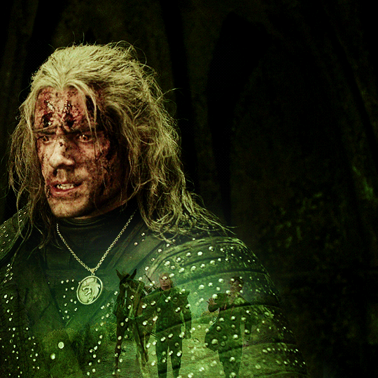
Photo
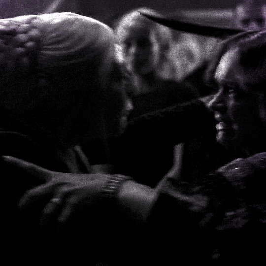
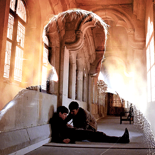
I’ve recently been asked by several lovely and curious souls to break down this Witcher set, so I thought I’d go ahead and put together a proper tutorial for everyone. All you need is Photoshop and basic giffing knowledge, preferably using the timeline. This isn’t necessarily simple, but I would say it’s one of the simpler things I’ve done—somewhere between easy and medium difficulty, maybe.
Keep reading
1K notes
·
View notes
Photo
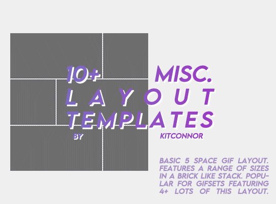
MISC. LAYOUT TEMPLATES
Through the following drive link, you’ll find 12 misc. templates, mainly aimed for gifmakers! There are 5 basic layouts, 3 shape templates and 4 design templates.
I DO NOT CLAIM OWNERSHIP OF ALL THE DESIGNS. However, please credit the design or shape templates where you can!
To fill this folder up a bit more I’m happy to take requests on any layouts you would like a psd for with the dimensions.
Each template in this folder relatively follows the tumblr gif guides (gutter width and gif size) so it takes the hassle out for you. As well as that, design templates each come with the relevant fonts, or similar fonts.
Please rb if you are going to use these! You can find the pack here ꨄ
445 notes
·
View notes
Photo
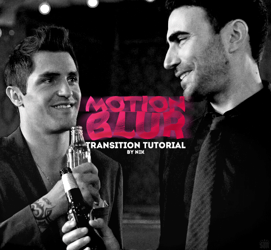
HOW TO: Do a Motion Blur Transition
Using Timeline or Frame Animation
Hi! Someone asked me for a tutorial on the transition effect in the second gif of this set (also featured in this set and the text on this set). So, here it is! This is one of the easiest and least tedious of the gif transition effects in my opinion — and I’m going to go over how to do it both in Timeline and Frame Animation (using the screencap method). Disclaimer: This tutorial assumes you have a basic understanding of gif-making in Photoshop.

Keep reading
764 notes
·
View notes
Text

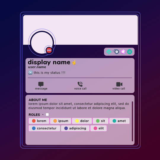
Discord Profile Template by @seaoftr
i received a few asks about the template i made for my stranger things discord profiles set, so i thought i'd go ahead and share it.
below is some basic info + download link.
the font used here is called Nunito from google fonts
everything is broken up into folders + all of the layers are labeled
the badges are found under the boxes folder
each hypesquad badge is it's own layer, but the rest are merged together
all of the emojis used here are from the apple color emoji font family
i made this template myself, so all i ask is that you don't claim as your own and you give proper credit if you end up using it!
this template is a modified version of the original one i made to make my gifs, as the original file was very big and confusing to navigate. if there are any issues or anything seems confusing, feel free to shoot me an ask at any time and i will do my best to help!
the link to download the template is here.
feel free to tag me in your edits !! i would love to see them <3
499 notes
·
View notes
Note
this feels like a very foolish question, but i've been looking for days and i can't seem to find any other way, so i was hoping you could help me out! for gifs like post/676190237446291456, how do you edit out the background of the original gifs? or do you blend them?
hello! don't worry, no question is foolish anon. to be honest with you anon, this gifset took me like 10 hours a day for 5 days to make so like. i used so many different methods for so many different effects that my brain is fried. there are a lot of people who rotoscope but i didn't do that here. looking at some of them, imma tell you what kind of techniques i used. mind you, this gifset is a beast so if i tried to explain what i did here, it would take me a week in itself so imma tell you some tips.

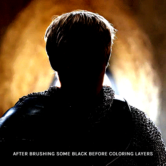
for this i tried to find light scenes. the lighter the background of a scene, the easier to create a silhouette of the character. so this scene of arthur getting crowned has a white background and with a gradient map, black selective color and heavy levels it became a silhouette. the gif on top, i used this levels adjustment
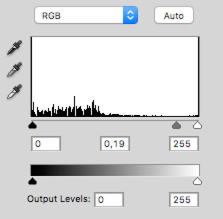
above my normal coloring, to make the contrast as popping as i could.

i assume this is the one you were asking about? this gif took me 5 hours in itself, like truly anon i went on a journey. these two scenes i used have mostly black backgrounds, so with coloring, a solid black background underneath, blending and some solid color at tiny parts the background was popping out, i did it.

this one was easy enough, that arthur scene is very basic to use for these kinds of gifsets. light background, back shot, easy to do work with gradient maps. i don't usually use exposure, but i used it for this one to tone down his head more. also i used white solid color set to soft light on his left so the text would be more visible so i wanted the gif to look more contrasted.


my dear anon, this is what the layers of this one look like. i'm scared to even look 😂 from what i remember for the boat, i again used big levels layers, solid black color layers set to soft light and normal for corners and basically painted it. you see that it doesn't move a lot so it was possible. oh i also deleted a lot of parts around it, zoomed in a lot to find missing spots, this one was work. its blending mode was screen.
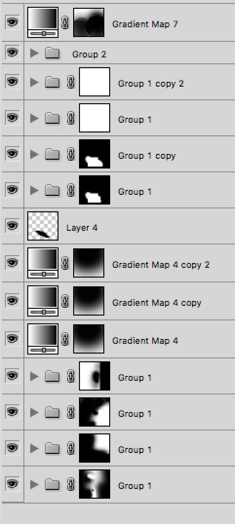
this one was tricky because i had to add the whole gif with 3 gifs inside the colin one. that scene is from the living and the dead and it had a light background. so a mix of gradient maps and levels again. black selective color didn't work well here because it was fucking up the background of the gif, but black selective color in general is very tricky. it can ruin a gif a lot so only use it when it's an emergency.
and that's about it, i didn't show you all the gifs because a. tumblr in asks only lets 10 photos and b. i used the same techniques i talked about already. i hope it was helpful! if you would like help with anything else, my askbox is always open <3
34 notes
·
View notes
Text

HOW TO: Make an iPhone Layout
+ Downloadable Template
Hi! I've gotten a few messages asking for a tutorial on my iPhone gifsets — but instead of only doing a tutorial (that would probably be triple the length this one already is), I decided to turn my layout into a template with all the bits and bobs! In the "tutorial" under the cut, I'll share everything you'll need, a free template download, and quickly go over how to use this template. :)
Disclaimer: This template uses Video Timeline and this tutorial assumes you have a basic to intermediate understanding of Photoshop.

PHASE 1: THE ASSETS
1.1 – Download fonts. These are the fonts used for all assets I've included in my template:
– SF Pro or SF Pro Display (Regular, Medium, Bold): Either version works, they look nearly identical. You can download directly from https://developer.apple.com/fonts/ or easily find it via Google
– Bebas Neue: Free on Google Fonts, Adobe Fonts, and dafont
– Times New Roman (Bold): Should be a default font in Photoshop

Make sure to download and install any of the fonts you don't already have before opening my template. That way, once you open the template file, all the settings (font size, weight, spacing, color, opacity, etc.) are as intended.
1.2 – Download my template.
Before you use my template, all I ask is that you don't claim or redistribute it as your own and that you give me proper credit in the caption of your post. Making these iPhone gifsets takes me a longgg time and turning this layout into a template took several hours too.
DOWNLOAD TEMPLATE VIA KO-FI ← This template is completely free to download (just enter $0), but if you feel inclined to tip me, I appreciate you! 💖
BTW this template also includes some of my frequently used icons!
NOTE: If, for some reason, you open the template and see the pop-up shown below, click "NO" — otherwise, the fonts will be all messed up:
And if you see this triangle with an exclamation point by a text layer, don't double-click it — it'll mess up the font as well:

PHASE 2: THE GIFS
I'm just going to briefly go over gif sizes and my recommendations. Also, keep in mind when grabbing your scenes, you'll want all of these gifs to be the same amount of frames.
2.1 – Background Gif: 540 x 540 px.
I recommend this size so you have a good amount of visibility for the gif behind the iPhone wallpaper. I also recommend making this black and white (or in my case, black and white with a slight blue tint — idk I just like the way it looks) so the wallpaper coloring can stand out.
2.2 – Wallpaper Gif: 230 (w) x 500 (h) px.
Keep in mind the very narrow dimensions of the wallpaper! And also keep in mind that you'll have a bunch of apps and widgets covering the image. I try to use wide shots (or layer my clips into looking like wide shots). Also, keep in mind your color scheme for your set and your character's aesthetic! I tend to focus on one or two colors for the wallpaper.
I usually position the wallpaper to the side with 20px bumpers, so there's lots of space to see the background:
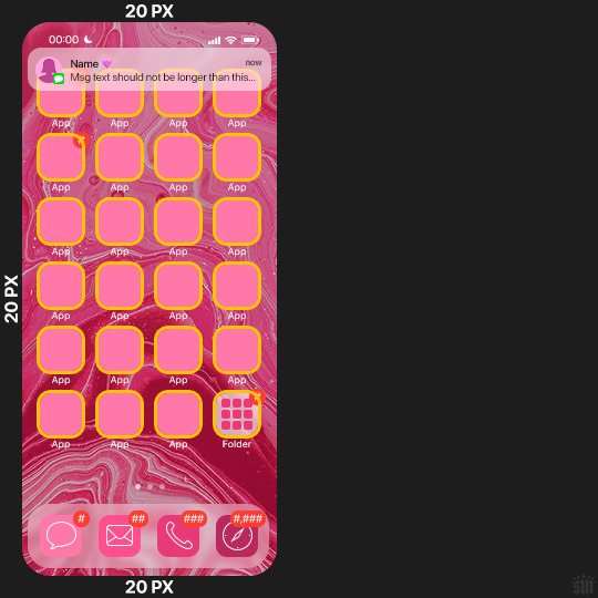
2.3 – Large Photo Widget Gif: 201 (w) x 96 (h) px.
2.4 – Small Photo Widget Gif: 94 x 94 px.
PHASE 3: THE TEMPLATE – "IPHONE" FOLDER
In this section, I'll try to quickly walk you through how to use this template and some bits that may require extra instructions. I'll be going through each folder from top to bottom.
3.1 – Status Bar.
Time, Service, and WiFi are pretty self-explanatory. In the Battery folder, you can use the shape tool to adjust the shape layers labeled "Fill (Adjustable Shape!)" to customize the battery level.
3.2 – Message Notification.
Again, these are pretty self-explanatory. I've already masked the circle for the contact photo, so you can simply import any photo and use the transform tool to shrink it down. The circle is 24x24 px. If you don't want to use a photo, there's another folder called Default Initials.
If your message text can't fit the text box, the message should end with ellipses which is how iOS caps off long texts.
3.3 – Blurred Banner (IMPORTANT)
This folder is easy to miss because there's only one placeholder layer in there. On iPhones, the area behind a banner notification and the dock get blurred (including the wallpaper and any apps).
What to do: Make a duplicate of the apps in Row 1 and/or widgets that intersect the message banner, convert them all into one smart object, apply a Gaussian Blur filter (Radius: 3.0 pixels) on the smart object, and move the smart object into this masked folder!
(There's another masked folder in the Wallpaper folder for the dock which I'll go over in that section.)
3.4 – Apps
Turn off the yellow guide if you don't need it to keep things aligned and turn off layers you don't need by clicking the eye icon. Replace the "App" placeholder text with your app name, change the color or gradient of the square to compliment your color scheme, and add your custom app icon overlay!
If you can't find an app icon you need from the ones I provided, flaticon.com is a great resource. Also, if you can only find the filled version of an icon, check out this tutorial for how to make any text or shape into an outline.
Also, each app folder has 4 notification bubble options (1-4 digits). Again, you can toggle these on and off as you need!
3.5 – Big Widgets
I like using these when my wallpaper has A LOT of negative space to fill. I included the Photos and Books widgets in my template, but there are lots of widgets available on iPhones. You can check some of the other ones I've done here, or if you have an iPhone, simply try adding some widgets to your phone!
There are also widgets bigger than these, but they would take up half of the phone screen which is why I don't use them for these edits.
3.6 – Small Widgets
The only thing I'll say about these — because they're pretty straight forward — is there are a lot more weather themes than I included in my template. Also, if you set your character's phone to evening, the weather widget will show a dark background (sometimes with stars), so keep that in mind.
Speaking of, I've included Light Modes and Dark Modes for, I think, every applicable widget.
3.7 – Page Dots
These barely perceptible dots indicate that your character has more pages of apps than shown in your gifset (so if an anon tries to come at you, you can just say "it's on the next page of apps" /j /lh)
3.8 – Dock
Again, the dock has notification bubble options and I've included the default app designs, custom filled designs, and custom outlined designs for iMessage, Phone, Email, and Safari (there's also a FaceTime alternative if that's how your character rolls). These are usually the apps people keep in their Dock, but this is fully customizable too. So, if your character is, like, super obsessed with Candy Crush or something and needs it in thumb's reach — you can put it in the dock.
3.9 – Wallpaper
This whole folder is masked already to a 230x500 px rounded rectangle.
Inside, you'll find another "Blurred Portion" folder for the area behind the message banner notification and the dock.
What to do: Duplicate your gif layer and place it in this folder, remove any sharpening filters, and apply a Gaussian Blur filter (Radius: 3.0 px). Be sure to add any coloring/adjustment layers ABOVE this folder and your original sharpened gif layer.
PHASE 4: EXPORT
We made it!
I hope this template makes it super easy for you to recreate this layout! If you decide to try it out, feel free to tag me with #usernik.
If you notice anything wonky about the template, kindly let me know so I can fix it! And if you have any questions about how to use this template, please don't hesitate to send me a message! I just ask that you try to be specific in your question so I'm able to answer you the best I can!
752 notes
·
View notes
Note
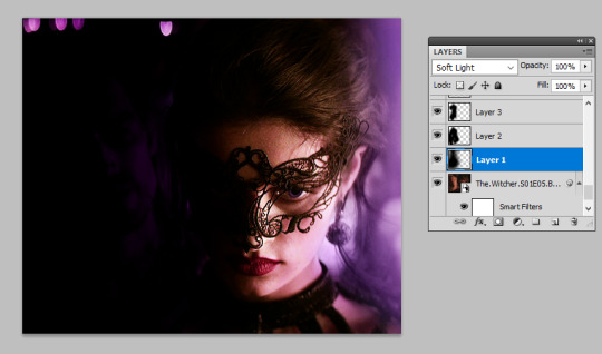
📝 first, congrats on the 15k you deserve all the love and appreciation. Second, idk if you’re still taking these but a tutorial on those lovely double exposure gifs, I’m obsessed with them 💜
thank you so much! i’ve been meaning to a double exposure/blending tutorial for a while so i’m going to try my best at explaining, let’s get this party started.
i use photoshop cs5 for this and you need a general understanding of the basic tools. i’m going to be walking you through a set i’m currently working on to ultimately create a double exposure gif such as this:

step one: create your base gif
as always before you can start any gifset, you need to pick what scenes you want. i often pick several different moments and experiment with what works best, some scenes will just perfectly meld together while others will be trickier.
you want to firstly select a ‘base gif’, this is the gif that you’re going to layer your other scenes onto. it’s helpful to have a gif where you can identify a darker area where scenes might be able to be blended onto. silhouettes, side-profiles and shots where you can see a portion of the body are an ideal place to start, but you can use any scene where there is a darker area in contrast to the rest.
for example, i picked this shot as my ‘base’:

in this shot, there are darker areas which standout, her body particularly below the shoulders but also in her hair. this provides a great ‘base’ for holding other scenes.
i’m going to colour my base gif in the way i usually would (i'm not going to go into details here, but if you want to know how i colour my gifs i have a tutorial here) but making an effort to ensure the blacks are thoroughly darkened (you can do this by adding a selective colours > black layer) and i’m done with my base gif:

step two: create your overlaying gif
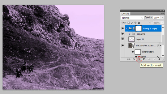
next, you want to create your overlaying gif. personally i try to avoid using very light scenes as these can take a lot more work to blend in. if this is your first time blending i’d definitely recommend using a scene with a neutral backdrop, or even more ideally a dark backdrop, as this will just more seamlessly work with your base gif.
so, i’ve picked my first overlay scene as the mountain pathway, this will add a bit of texture to my gif and is fairly ‘neutral’ so should blend in well. i’m going to size and colour this as a separate gif with the same purple tones, then create a new folder (see red circle in screenshot) and drag my entire gif into it:

then i’m going to add a vector mask, to do this make sure you’ve selected the group and press this button highlighted in the screenshot:
step three: blending your gifs
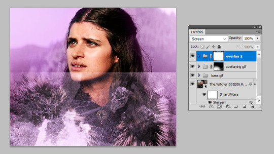
now you’re ready to blend! from here, you want to just drag and drop your overlaying gif folder on top of the base gif, then set your overlaying gif folder to ‘screen’ or ‘lighten’ (i usually use screen, but sometimes lighten depending on the scenes - see what looks best!). it now looks like this:

the obvious issue here is that the overlay has taken over her face. so, we’re going to select that vector mask we added to the ‘overlaying gif’ folder, grab a black paint brush, and just brush over her face. this will remove the overlay from that area.
i use quite a large soft brush for this (around 200px), the larger you use the ‘smoother’ the transition you’ll get. the smaller the brush the harsher your transition will be. this is the part that takes practice, but the beauty of using a vector mask is that you can grab the eraser tool and erase any of the paint strokes you’ve just done to bring the overlay back. by the end my canvas and layer mask look like this:

from this we can see i’ve blocked out the overlay from the ‘top’ of the gif and concentrated it so it just spreads over her shoulders. this captures the overlay in the space i outlined on the base gif as my ‘blending space’ earlier. i’ve also blacked out the overlay on the right hand side as i want to put another gif in this space. at this point the gif is looking like this:

i think my ‘top tip’ with blending is to leave little details to make the transition between the two gifs more natural. for example, you can see there are still patches of the mountain moving up her neck. i could black these out so the mountain scene is just confined to her body, but in leaving it there is creates more of a transition. these little background details of the scene you’re overlaying can really add to the overall texture of your base gif, and for that reason don’t get too hung up on the ‘details’ of making sure your gif is limited to an exact space.
optional step four: adding more overlay gifs
for this gif i also added the dragon on the right hand side. you don’t have to be limited to overlaying two scenes and in fact, sometimes a nice idea is to use a more ‘landscape’ shot to add texture to your blended gif. to add more, i repeated step two to colour the shot i wanted, dragged this in its own folder on top of all my other blended gifs and set it to screen again:
i repeated the same steps in step three to black out the background, particularly concentrating in removing the line that we can see where the shot finishes. because in this shot the dragon’s head is actually partially cut off by the top, i was very careful with positioning this overlay and used a smaller black brush above the head. this positioning allowed it to look as if the overlay was giving way to yennefer’s face, rather than the shot cutting it off:
and that’s it, i’m done with my gif! this was a nice straightforward blend, but some scenes may not work as easily, which is where we turn to...
step five: using a black paint layer to create overlay space
sometimes your gif doesn’t have an easily blend-able space. maybe the character is wearing something patterned, or the area just isn’t dark enough. for example in this gif, i’ve done all the above sets but the overlay scene doesn’t stand out very well because the armour pattern gets in the way:
but we can fix this quite simply with our black paintbrush. i go back to my ‘base’ gif and under all the colouring create a new layer and with a large soft paintbrush, paint over the armour. i then set this layer to ‘soft light’. then i create another new layer and using a more medium-sized paintbrush, paint exactly behind where the figures are moving. this layer adds black behind the figures so they stand out more clearly, while the soft light layer aids the transition as it darkens the whole area. now we have this:

this has made the overlay a lot more visible. you can use this technique to pretty much darken any layer. i always try and darken the section i want using ‘soft light’ layers as this creates a smoother transition than you’d achieve by just jumping in with your normal black paintbrush layer, but remember you can use multiple layers to reach the effect you want.
this can be taken to the next step to literally blacken out one side of a gif (and it may be useful if you want to do more side-by-side blending scenes), starting with your normal base gif coloured (admittedly mess-ily):

to completely darkening the right-hand side of it using a few black paintbrushed soft light layers:

and overlaying another gif into this darkened patch:

i’ve even used this technique for light scenes with success, it just might take a bit more practice and you’re better off starting with scenes that naturally have a darker background if you are a blending beginner.
the end!
and that’s a wrap. i hope this made sense, as always i’m very aware that just because i know what i’m talking about doesn’t mean anyone else does, so please if you have further questions do ask. happy blending! :)
1K notes
·
View notes
Text
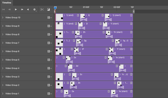
TILE TRANSITION TUTORIAL
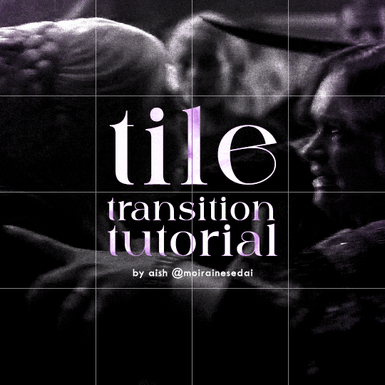
a couple of people have asked me for a tutorial on how I did the penultimate gif in this set, so here goes! this is my first tutorial, so please feel free to reach out with further questions if anything's unclear.
note: this tutorial assumes you know the basics of gifmaking, can create the base gifs, and are familiar with timeline mode.
STEP ONE: create the base gifs! I'd recommend staying between 25-40 frames for each gif, since the transitions we'll use later tend to increase gif sizes. these are the ones I'll be using for this tutorial:


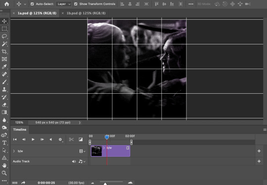
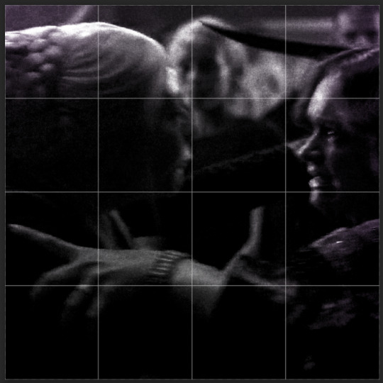
STEP TWO: create the guide layouts for both base gifs. for this panel, I chose a 4x4 grid — I would recommend keeping the number of "tiles" low because it can get tedious, but have a minimum of 9 (3x3 grid).

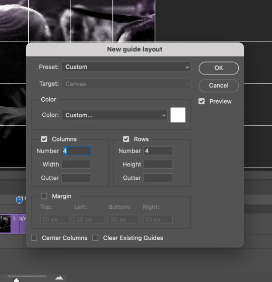
now your canvas should look like this:
STEP THREE: create the tiles. this is where the going gets rough; there might be easier ways to do this that I couldn't think of 😭 if there are any please send me an ask!
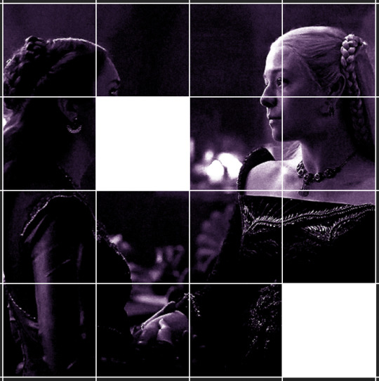
essentially, in this step we'll cut up the base gifs into smaller squares so that each tile can be manipulated separately when we put both gifs together. to do this, first create a square using the rectangle tool and the guides. then duplicate the base gif, move it above the square, apply a clipping mask, and then convert the clipped gif and square (selected in the image below) into one smart object.
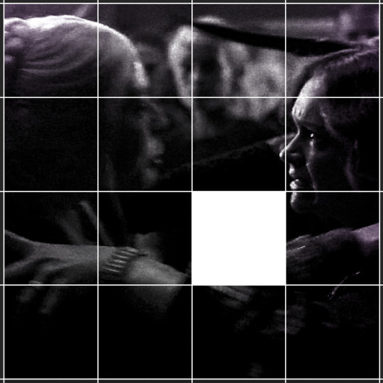

ALTERNATELY: you could duplicate the original base gif and use layer masks to isolate tiles. create a layer mask for the duplicated gif layer and, with the layer mask selected, drag your mouse over a square (using the guide layout) and press delete. then press ctrl/cmd + i to invert the layer mask so that the gif only shows in the square of your choosing.
now repeat until you've got the entire gif in tiles, and do the same for the other gif!
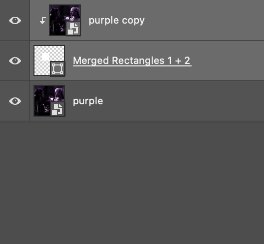
since the transition effect is achieved by staggering the crossfades for each tile of the final gif, you can cheat by having multiple tiles "flip" at a time, ideally no more than four. this means you need to cut the base gif up into fewer pieces. to do this, simply draw multiple squares instead of one and then merge the shapes, before duplicating and clipping the gif onto them.
if you do this, it's essential to remember that you have to divide both gifs up in the exact same way. each piece of the b/w gif has to correspond to a piece of the purple gif!
this is what the layers look like for each gif once I'm done:

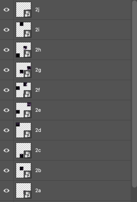
I have them lettered so that it'll be easier to match them up in the next step.
STEP FOUR: this is the complicated bit that took me two days to figure out. I'll do my best to explain but don't hesitate to reach out if something isn't clear!
to begin, open up a new psd and import both base gifs into it. (remember to click "create video timeline" and ensure that your gifs are all in order before proceeding.)
now, the trickiest part about this transition is ensuring that all the little tiles sync up so that the larger gif is coherent. so first we'll create some markers (just empty layers) to ensure that everything lines up as it should.
— marker 1: at about halfway through the first gif (b/w in this case)
— marker 2: at about a quarter of the gif length
— marker 3: close to the end of the gifs
at this point we're ready to start bringing in the tiles. I'm going to delete the base gifs from this new psd just to keep things cleaner!
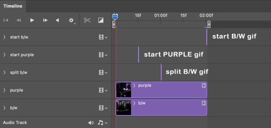
first thing to do is import my b/w tile. move the timeline slider over to marker 1 and split the first gif. (if it helps, rename the split gifs and add (start) and (end) to the two halves.) then, move the (end) half to the beginning of the timeline, and the (start) half to line up with marker 3.
the purple tile is easier to manage. simply import it into the psd and line it up with marker 2.
your timeline should now look like this:
notice the overlap between the gifs at their beginnings and ends — this is where you'll be able to cascade the tiles flipping, so it helps to have a significant amount of overlap.
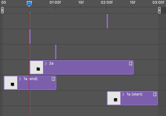
crop the three gifs for this tile as you see fit! since this is the first tile I want to flip from b/w to purple, I'll crop gif 1a (end) all the way to the current position of the timeline slider (red line with blue tip) and leave the beginning of gif 2a uncropped. for the flip from purple to b/w, I'll crop both gifs a bit.
once that's done, drag all three gifs onto the same level in timeline so they form a video group. your timeline should look something like this:

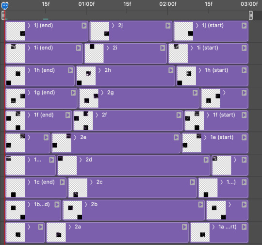
now you just repeat the process for all the other tiles! as long as you made sure that all the tiles in one gif correspond with tiles in the other gif in step three, this should be a fairly painless process. make sure to crop the starts/ends of the gifs separately so that they don't all flip together.
this is what my layers look once I've done all the tiles:
and the gif!
STEP FIVE: transitions! click on the half-white square (top right of the left column in the timeline, beside the scissors) and select the crossfade transition, then drag it between two gifs in a video group. it should create a two-triangle symbol and shorten the overall length of the video group.

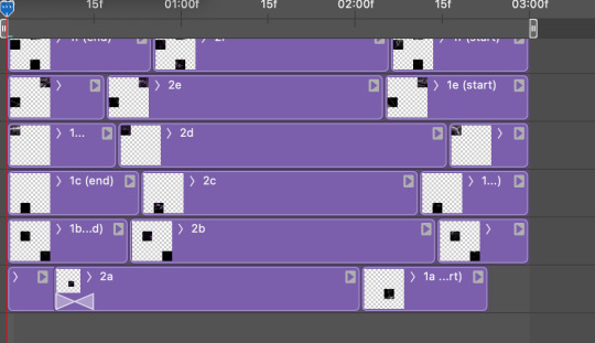
apply the transition to all the tile flips, ensuring that the duration of all transitions is constant. this can sometimes be tricky because ps likes to change the duration of each transition, so right click on the transition symbol and manually change all your transition durations to be the same.
your layers should now look something like this:
STEP SIX: draw the grid. bring back the guide layout from step two and using the line tool (I like 2px thickness), trace the grid. adjust opacity as you see fit (50-80% is usually a good idea), so that the canvas looks like this:
STEP SEVEN: export and celebrate! you're done!
I hope this tutorial made sense and was easy to follow, and happy giffing! my inbox is always open for any questions <3
613 notes
·
View notes
Photo


—MOBILE SPOTIFY WITH CANVAS LOOP
268px x 472px
per a very nice anon, i turned my vtmb gifset into a spotify template! you’ll really need to know how to make gifs, to get the background effect, but nothing else is particularly difficult imo.
please tag me if you use this!
if you use, please reblog/like!! credit is so very appreciated ♡
like this psd? consider donating to norcal resist!
567 notes
·
View notes
Note
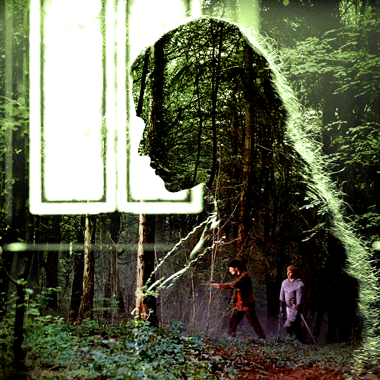
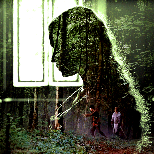
Hi! Can I ask how you did the double exposure gifs for your merlin set? They're beautiful btw!
heyy, thank you!! of course!
it's actually not very hard, the trick is to find the right shots for this. here's how i did it (reference gifset), under the cut.

for this tutorial i will be:
— using photoshop cs5 on windows
— assuming you know how to make gifs using the timeline
— have basic coloring, sharpening, groups, and layer masks knowledge
I. CHOOSING THE RIGHT SHOTS
the ultimate trick to pull this off is to choose the right image. in order to do the double exposure, you need a silhouette shot that has these:
a defined and dark silhouette with a background that is not too busy
enough contrast between the silhouette and the background
the silhouette should take at least 50% of the space
not too much movement
here are a few examples of why they work and why they won't:
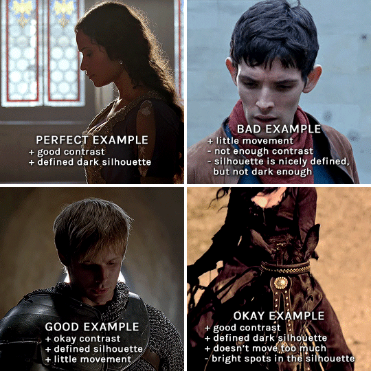
gwen: perfect example since this shot is already quite contrasted with a defined silhouette. there won't be a lot of work needed to make this one work.
merlin: not a great example because even tho there's a somewhat good contrast between him and the background, the silhouette is just too bright, not dark enough.
arthur: another good example, even if there are some bright spots on his face and armor. since he's not moving too much, you can definitely brush some black over him to make his silhouette darker (i'll explain/show later)
morgana: this one could work because the contrast is great, but of course her skintone is very bright against the black clothing. that being said, since the movement is not too bad, it could be possible to brush some black over her and move these layers with keyframes (as mentioned for arthur's example). i haven't tried it tho, but i think it would work well enough.
once you have your silhouette shot, you need another gif for the double exposure. what works best, in my opinion, are:
wide, large shots
shots with no to little camera movement (no pan, zoom, etc), but the subjects in the shot can have little movement of course
pretty cinematography/scenery shots
i find these are easier to find and make it work, it's not as "precise" as with silhouette shots. it's mostly just trial and error to see what works best with the silhouettes.
II. PREPPING THE SILHOUETTE
for the effect to work, we want a silhouette that's dark as possible. i'm gonna use the gwen and arthur shots as examples.
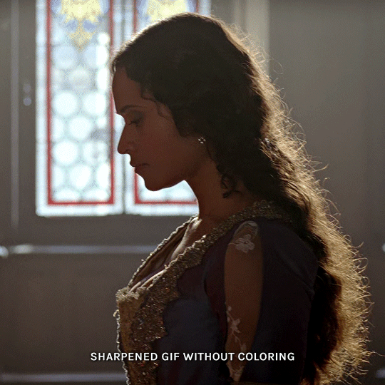
for the gwen gif, i started by sharpening, and then upped the contrast by quite a lot so her silhouette is mostly black, while retaining some nice details. i've used only 3 layers here:

selective color layer: in the blacks tab, playing with the black slider (value: +10)
brightness/contrast layer: added a lot of contrast (+61) and a bit of brightness (+10)
black and white layer: on top, its blending mode set to soft light and at 20% opacity. gives a bit more depth and contrast

then for the arthur example, i've also sharpened it first, and added contrast layers in this order (the skintone looks horrible, but it won't matter soon lol):
levels layer: black slider at 0, grey slider at 0.76, white slider at 104
selective color layer: in the blacks tab, black slider at +10
brightness/contrast layer: brightness at +1-, contrast at +47
black and white layer: on top, its blending mode set to soft light and at 20% opacity. gives a bit more depth and contrast
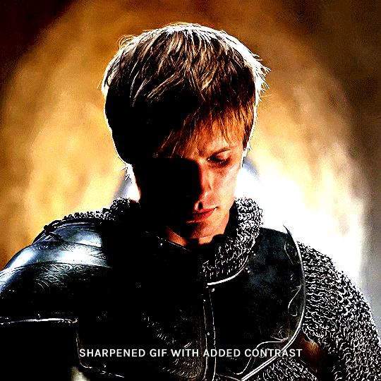
as you can see, half of his face is still quite bright. to correct that, create a new empty layer and put it between the gif and the coloring layers.
using a really soft brush and the black color, brush some black over his face and body on that new empty layer. you can edit the layer's opacity if you want, i've set mine to 71%. since arthur doesn't move much here, there's no need to keyframe this layer's position. for the morgana example, this is where you'd need to play with keyframes to make it work. here's where i'm at now after this:
you can always edit this layer later if you need, after doing the double exposure blending.
once the silhouette is all ready, you can put all layers in a group and rename it (i've renamed mine silhouette).
III. BLENDING
now the fun part! import the wide/scenery shot in photoshop, then resize it to the same height of your silhouette gif. make sure the gif is a smart object layer, and sharpen it. finally, bring this gif onto the silhouette canvas (by right clicking the smart object > duplicate layer). once you have both gifs onto your canvas, put the wide shot gif layer in a group, and set this group's blending option to screen.

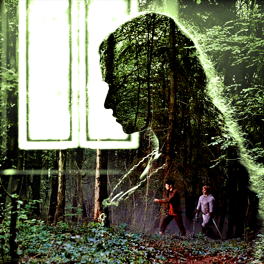
you can then position the wide/scenery gif the way you like it in the canvas. this is how it looks for both examples after i've done that:

if the blending mode screen doesn't give you the best result, so you can play around with other blending modes (such as lighten and linear dodge in these particular cases), but generally speaking, screen is the real mvp here haha.
IV. COLORING
now that the double exposure effect is done, we need to color the gifs to bring them together. i went with simple coloring here, simply enhancing the colors that were already there. just make sure that the coloring layers for each gif are in their respective groups. here's how i've colored both examples:
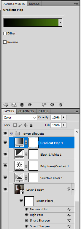
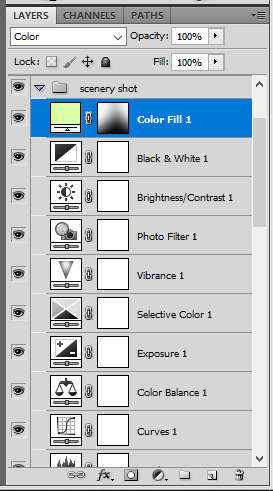
gwen silhouette group: i added a gradient map layer on top of the contrast layers in black to green and set the blending mode to color
scenery shot group: multiple coloring layers, with a green color fill layer (blending mode set to color), with a layer mask so it only affects the top half of the gif
for the arthur gif, i did something very similar but with warmer colors. i didn't use a gradient map for arthur though:
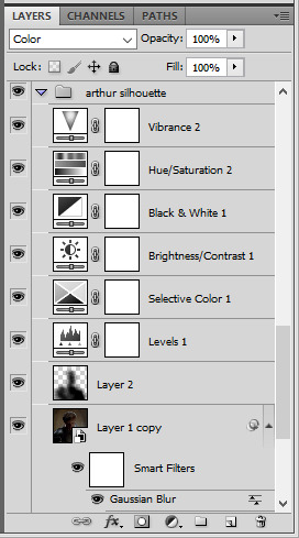
arthur silhouette group: i made the yellow warmer, closer to orange/red, with a hue/saturation layer, and added more vibrance. didn't feel like it needed a gradient map layer here though.
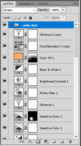
wide shot group: basic coloring layers to enhance colors from the merlin & daegal shot, and an orange color fill layer set to the color blending mode.
at this point you're pretty much done. just need to add some final touches and typography (if you want).
V. FINAL TOUCHES
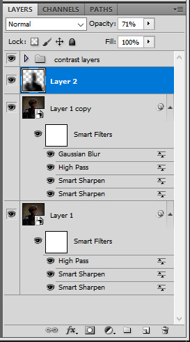
a small and completely optional detail, but i wanted to soften the edges of the wide gifs. to do so i've duplicated the smart object gif layer and removed the sharpening filters (right click on smart filter > clear smart filters). put this layer on top of the other smart object layers (but still below the coloring).
then with this same layer still selected, go to filter > blur > gaussian blur... > 10px. this will give you a very blurry gif, but we only want the edges of the canvas to be softer. so add a layer mask to this layer. with a very large and soft brush (mine was at 0% hardness and about 800px size), brush some black onto the layer mask to remove the blur in the middle of the gif.

you can play with this layer's opacity or gaussian blur amount if you want (by double clicking on the gaussian blur smart layer filter). here how both examples look with this gaussian blur layer:

you can also mask some of wide/scenery gifs if you'd prefer, so it shows less outside of the silhouette. just put a layer mask on that whole wide shot group and brush some black or grey on the layer mask. it's what i did for the gwen gif, with a very soft brush and i set the mask density to 72% (i kept the arthur one as is tho):

and that's how i did it! hopefully that was clear enough :)
968 notes
·
View notes
Text

Spotify Template by @seaoftr
Hello! I received a few messages asking me to share the template that i made for my cal kestis playlist set, so I thought it was time to make a post for it!
Below is some basic info + download link.
the font used here is called figtree from google fonts
the layers are all labeled, some with basic info that tells you what to edit/adjust
the play/pause button layer-group uses a layer mask, but the pause button rectangles are included as well in case you run into any issues.
i made this template myself, so all i ask is that you don't claim as your own & you give proper credit if you end up using it!
the link to download the template is here.
feel free to tag me in your edits! i would love to see them <3
1K notes
·
View notes
Text
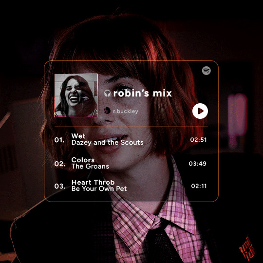
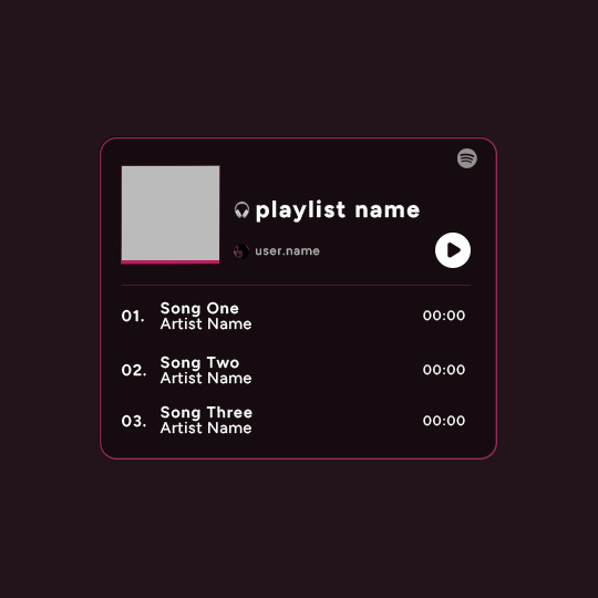
Playlist Template by @uservalerian
this is the template i used to create my robin playlist from this robin set. i've shared this with a few people, but i wanted to make it available for everyone that asked about it/was interested in using this template.
below is some basic info + download link.
the font used here is called figtree
all of the layers are labeled, some with basic info like blend modes
each song has it's own layer group
the headphones emoji is an image, not an emoji font
the playlist cover is 88px
the profile/user photo is 14px
i remade this template, so please let me know if anything is not working or gets confusing :)
all i ask is that you don’t claim as your own & you give proper credit if you end up using this template, as i made it myself.
the link to the template is here.
feel free to tag me in your edits! i would love to see them <3
572 notes
·
View notes
Note
https://eddiediaaz.tumblr.com/post/720106767343878144/lgbtqcreators-bingo-challenge-35-headcanon
How did you get the lyrics to move and the sound bar to move if you don't mind me asking?
Such a cool effect makes it so much better!
ahhhh thank you!!
first of all, all credits go to Tiny for this amazing template! i just tweaked it a little to animate the lyrics and sound bar with position keyframes. here are the steps i've taken to animate the lyrics in this gifset (under the cut).
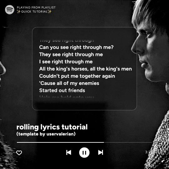
I. editing the template
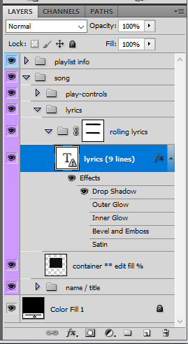
first, you want to move the layer mask from the lyrics to a new group. to do so, select the LAYER named lyrics, and put it in a new group. i've renamed mine rolling lyrics. then, while holding CTRL, click on the layer mask's thumnail (what i circled in red). you'll see a selection appear (the "animated marching ants")
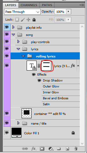
with layer mask selected, make sure the rolling lyrics group is also selected, and click on the add layer mask icon at the bottom of the layers (circled in red). your layers should look like that:

now you just gotta remove the layer mask on the lyrics layer. to do so, simply right click on it and go "delete layer mask". it should look like that:
II. lyrics
for this template, there are about 9 lines of lyrics that you can make fit. for the rolling lyrics effect, you want to add a bit more. 2 to 5 more lines of text should be enough, depending on the length of the gif and the animation speed you desire.
so put all your lyrics in there, and make sure that when you are on the first frame in the timeline, the lyrics are what you want. keep in mind that the first line of lyrics will be gone quickly since it'll be animated from the start.
III. keyframes
animation time! still on the first frame in timeline mode, go to the lyrics LAYER's animation panel and click on the position timewatch (circled in red) to activate the animation and create the first keyframe.
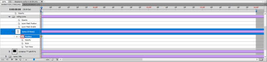
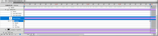
then go to the end of the gif, select the lyrics LAYER, and with the move tool, make the lyrics go up with your keyboard's arrow key. it should create a keyframe automatically, and if you play your gif, you should see the text being animated and rolling up. it's that simple!
IV. refinements
so it's possible that you see lyrics peek at the top and bottom of the layer mask. to do so, simply brush some back with the brush tool onto the rolling lyrics group's layer mask until you don't see any lyrics peeking through.
also, if you want a quicker or slower animation, go to that last keyframe's position on the timeline and move the animation up or down with the arrow keys. if you right click a keyframe you can delete or duplicate it.
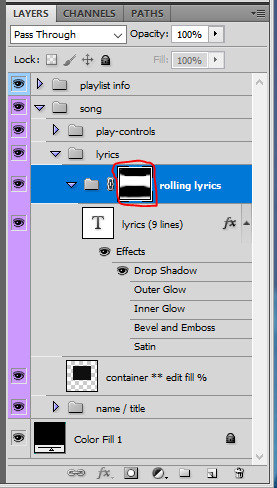
V. sound bar
for the sound bar it's a very very similar process to the lyrics. put the two song position bar layers in a new group (i renamed mine sound bar), make a layer mask so the shapes don't show up on the edges of the gif, and then use position keyframes to move the white bar around, like i showed for the lyrics. my layers look like this:

and that's it! :) i hope i was clear enough haha, i always feel like i babble too much in these
163 notes
·
View notes