#From a purely aesthetic standpoint it was just plain Bad
Text
It’s kinda odd to see ppl defend Legendary Disaster’s lion swap in 2022. I get that there were interesting meta reasons behind it but like, we do all remember that “let’s have the paladins match their lions and then switch them all up to match their original 80s placements for the nostalgic appeal” was arguably the genesis for all the worst choices in VLD’s narrative and visual design, right
#Kumari comments#Kumari abuses the tagging system#No shade to people who liked the homage I just think it was an awkward decision that spiraled out into some disastrous storytelling#I guess having an in-universe explanation for the mismatched colors was a cute idea in theory but man did it not work in practice#From a purely aesthetic standpoint it was just plain Bad#and if it'd been planned out properly all the lion cockpits wouldn't have been flooded with a single color#Lance and Keith looked terribly out of place in Red and Black and there's really no getting around that#and all the post-swap discourse basically amounted to 'but when are they gonna swap back tho' bc the expectation to match had been planted#not to mention Everything that went into getting Shiro out of the picture#idk.#sometimes … homages … aren't worth it#If they'd just gone with the original colors/placements from the start and handwaved it as an 'Altean' quirk I could've respected that#it would've felt more like an attempt to respect the sentai tropes from GoLion and less like the producers trying to have it both ways#as-is I just get the impression that they didn't respect the source material /or/ the story they were supposedly trying to tell#It's a lot like the pedantic fuckery in those live-action makes of Disney animated classics ya know?#like 'we want to shamelessly capitalize on your nostalgia but we also need a Logical Reason for xyz fairytale trope'#but perhaps a smidge more earnest bc Voltron isn't/wasn't a huge cash cow on the level of a Disney film#idk. if we're entering a 'VLD was okay actually' era of discourse can someone give me a heads up so I can go scream into a pillow for while?#bc that's not something I wanna be around for
33 notes
·
View notes
Note
just curious, what’s your favorite and least favorite character design? my least fav for sure has got to be female byleth for reasons i don’t want to get in to yep ok have a good day 😁
IOops this accidentally became a rant, sorry
Okay so, to preface this all, I’m not a character designer and I’m actually pretty bad at it, but my rule of thumb with really unappealing or fan-service outfits is whether or not it makes sense character-wise and how much it tells the player about the character. For example, I think we can all agree that there’s quite a bit of fan-service elements in Hilda’s design. Boob window. However, it’s not unrealistic to imagine Hilda picking out those clothes for herself. Her costume tells you almost everything you need to know about her character on a visual level. She’s confident, pretty, attention-grabbing, and high maintenance while the gloves and laced girdle give a nod to her Viking-maiden roots.
Taking it to female Byleth, I don’t think that her outfit works on either front. Her design is definitely my least favorite and it’s not helped by the fact that you have to look at her at all times. Whatever. The huge, solid mass of boobs, the buttoned bib, the big eyes, the feather hair, the bellybutton, the ripped tights, the booty shorts. She’s a merc out in life and death situations with an accessible, pale, tacky 2000′s “stab me” stomach cut out and a wedgie. Which could be excusable if, like Hilda, there was reason to believe that that her costume was character choice. But she doesn’t really have much character, and what there is gives the impression of a very stoic, dry, blunt person. I have no idea why they’d have gone that route when the sexual appeal of more “utilitarian” costuming (aka, form fitting armor that at least pretends to be functional) for characters like her is scientifically proven AND would say more about the singular personality trait she possesses. Okay, well, I know why they didn’t do that and I think it’s lame. This dysfunction of “character designer wanted a sexy girl but it’s kinda random and just shoved in the game without any thought” actually reminds me a lot of Xenoblade 2′s leading ladies, Hikari and Pyra. Although considering that their bad designs led to a lot of people hating the game for superficial reasons while accepting female Byleth’s design, I guess I’m just bitter. Jumping to a different comparison, then, look at 2B from Nier Automata. Her design is fine as hell which is kinda hypocritical of me considering that it's explicitly fan-service, but I think it also shows the most damning thing for female Byleth. Her whole look, despite having a dozen different element thrown in, is boring. Maybe it’s the colors (dressing her in all black and white would have been really interesting considering the colors of the three lords are so heavily emphasized as a part of their characters) or maybe it’s just the way the desperate elements come together. But, like I said, I'm not even slightly knowledgeable about character design and I know that despite Three Houses being mostly separate, they had to appeal to a larger aesthetic brand to which I have little experience with. And, ultimately, a lot of people find her cute or sexy which...To each their own, I suppose. I don’t pretend that fan-service doesn’t work on me (2B... Cloud’s arms in the remake... Seph's shirtless Smash skin...) but when it’s this obviously inserted in by the character designers rather than feeling organic in any way AND looks bad I'm just not super interested.
The other worst designs for me would be all four of the Ashen Wolves post timeskip. I don't think it's controversial to say that they didn't try with the clothes, even if I love their designs from the neck up (Yes, even Balthus. He looks like the type of guy that would let you sit on his shoulders at a rock concert so you could see the stage). While there are other designs I think are unappealing, those are for purely aesthetic reasons and so I can't maintain the opinion that they're actively bad or that I even truly dislike them.
As for favorite looks... I actually have a few so sorry you're getting all of them because despite the shit I'm talking, I actually really really love the character designs in Three Houses.
Ferdinand's post timeskip is one of my favorite designs, if not my favorite. The hair, the coat, the armor, the spurs, the colors. You know exactly who Ferdinand von Aegir is just by looking at him. He’s wealthy, handsome, confident in his appearance, a hero, a princely type character, his battle form is mounted combat which is traditionally aesthetically reserved for nobility and leaders... I love it. The only reason I cannot say he IS my favorite is because of the three Lords. But before them, my honorable mentions include post timeskip Hilda, Dorothea, Lorenz, Felix, and Hubert. Granted, I could make a case for why I like almost all of the student’s post timeskip looks.
For the Lords, I obviously have to start with colors because, weirdly enough, Persona didn’t invent primary colors but are actually used as shorthand. Blue is the color of honor, loyalty, sincerity, sadness, and depression. Something I’ve always found very interesting is that blue is very rarely found in nature. To me, that’s always made it seem more lonely which, at least in this case, is thematically relevant. People call Dimitri boring pre timeskip and while I won’t defend his hairstyle (okay, actually, I probably would because he tucks it behind his ears and idk why but that’s one of the cutest things ever) I really like how unassuming he is. Bland. He’s supposed to be the plain shortbread cookie to caramel deLite Claude and strawberry meringue Edelgard. It is not in his character to draw attention to himself or stand out. To me, he kinda looks like an old Barbie prince, like he should have been named Dominic. Also I love the blue eyes/blonde hair thing and his more angular features. It really helps to sell him as the fakeout chivalrous prince type. Post timeskip, Dimitri's black armor is amazing. I love the fact that it’s a lot more intricate up-close with the different little shell-like pieces and the fact that his boots are furry. I love the big cape and the black and white fur around his shoulders. It’s really cool how they used his costume to change the shape of his in-game model to match the bodily proportions of the character art. It’s easier to see when you change his costume into the DLC ones, but the fur and cape build up his shoulders and chest look more broad while keeping that tiny little waist. The choice to give Dimitri an eyepatch is probably my favorite thing about this design. It’s genuinely inspired. Such a simple detail yet it tells the player everything they need to know about adult Dimitri when they see him post timeskip, in one frame the player can begin to understand the extent of his loss over the past five years. The subtle shadow under his eye in the first few Azure Moon chapters and the messy long-ish hair really help to sell the feral prince aesthetic as well, as it’s from those small cues the player gets that he’s exhausted (in more ways than one) and doesn’t maintain himself. None of these things are intentional choices by Dimtiri, they’re the result of what his character has been through.
Yellow is an intense, energetic color. Mostly, people think of it as being warm and inviting, the color of the sun and positivity. That intensity can be overwhelming, though, too visually demanding when compared to its primary counterparts. Don’t stare at the sun too long. Buuuut, it’s okay to stare at Claude. Claude not wanting to wear tight pants in either of his costumes is not only a mood, it is iconic. Pre timeskip, the softer lines of his silhouette makes him look kinda slouchy, kinda lazy. Like he’s not too concerned with appearances. But those adorably messy curls, the little braid, the clearly tended eyebrows, and earring make it clear that he DOES care about appearances and is very aware of his allure. And that’s before he even starts winking. It is honestly so in character that as many people picked him first on the basis of being thirsty, that feels like an intentionally Claude thing even if it was inserted by the designers. The contrast of his complexion with his seagreen eyes is gorgeous and instantly adds a kind of mystery and intrigue to him considering the setting... but it’s sf funny that nobody looked at bronze god Claude among a sea of white faces and thought something was up. Post timeskip, they used the same trick like they did with Dimitri to change Claude’s in-game model to match his canon appearance. The way they designed his uniform makes him not look as twink-ish, like he’s actually muscular and imposing and has the strength he’d need to shoot a war bow with a 120lbs draw weight. Also like Dimitri, you can instantly tell what Claude’s been up to. Like, he was very pretty pre timeskip but when he shows up in the Goddess Tower after those five years in all that gold, he demands your attention. Like a gentleman general with the excessive aesthetic ideals of the Alliance and details to imply his heritage. The quilted pants are amazing from both an aesthetic and practical standpoint. He’s a mounted unit riding a creature with scales, of course he’d want something on his legs for protection. And the chinstrap. I love that so much, it definitely makes him look more adult. He’s got such a cute soft baby face, it’s fun imagining him experimenting with different styles during the five years to get the most desired physical reaction to him as a leader.
Frenchfries, meet forehead. No, actually, Edelgard’s design is really fantastic. Claude and Dimitri both have realistically colored eyes and hair and then there’s Edelgard. Dimitri shrugs off attention physically and Claude shirks it with a wink but Edelgard commands the players attention from the very start. Although I’m sure there’s a lot of things to associate with white hair and purple eyes, my first thought was Daenerys from Game of Thrones. Otherworldly beautiful by with an edge. Red, of course, is The power color. Strong emotions, love and hate. Red is also associated strongly with blood, which is very important to Edelgard’s plot. Granted, I think the red and black association is even more powerful than JUST red and red is the cheapest play to make in regards to displaying villainy (I mean, there are some pretty universally recognized associations with red and black and it led to people making some unfair comparisons between Edelgard and a famous dictator) but I think it was effective and well used and I genuinely enjoy its use in her case. Anyway, if I had a major complaint about her design it would be the weird ashy color of her hair whereas Lysithea’s hair is pure white. Which doesn’t even matter with the AMAZING hair horns. Ram horns can actually symbolize quite a few things, but their association with power and strength is pretty universal I think. They’re also used in demonic imagery. I love that THIS was her alternative to a crown. Edelgard views herself as a force of war and power before she thinks of herself as royalty. She also mentions that she isn’t super vain, but she loves to do her hair, so the hair being the most elaborate part of her look is entirely in-character. Edelgard’s ensemble is, like Claude, very militaristic. I love that they kept her in a dress that embraces femininity without showing skin as that wouldn’t really suit her Also, again, Edelgard demands your attention. She’s dressed all in bright bright red waving around a giant axe. She is a symbol as much as she is a combatant, someone to follow. I didn’t really mention their secondary lord costumes, but a girl in sexy armor is literally everything and I love that they had the balls to put their main sexy waifu girl in full body armor.
Okay I’m sorry I realize this was excessive and probably didn’t need explaining and I’m not sure I even articulated my thoughts properly but anyway I love their designs so here is the positivity I’ll put into the world.
#fe3h#ferdinand von aegir#claude von riegan#edelgard von hresvelg#dimitri alexandre blaiddyd#haha i htae byleths design this was all just to justify my abject disgust for the way she looks#nobody sent me anything about dimitri's dick so this is what i've been reduced to
111 notes
·
View notes
Text
FATE: What happens when you get a bunch of middle aged white guys to adapt a cartoon for girls
Well, I just went through 6 hours of fate and I have a lot of opinions on it. Yeah, this is going to be long (slightly under 3k words) so putting it under read more and obvious spoilers.
PSA before delving right in:
1) Yes, I will be comparing to the original. Any comparisons are not through rose-tinted nostalgia glasses. There are parts here and there that I genuinely think were done better in the cartoon on a writing standpoint.
2) This is purely my opinion and overall negative. Don't like it? Don't read. I'm all up for discussion but I don't want another person crying to me about how I “ruined” their experience of the show.
3) If you like Fate then good for you. This isn’t me bashing people who like it.
I've spit it up into sub sections just for my own convince.
1. The problem with the 'I'm not like other girls' trope
This pertains to the entire Bloom-Sky-Stella love triangle. I wasn't as pressed about it compared to other winxers (and I loved Stella's and Brandon's relationship on my rewatch). In fact, I was okay with it. But then I sat down and watched the show and there's a lot of underlying problems with the love triangle. Particularly pitting Bloom and Stella against each other for Sky's affection.
Now this part of the love triangle I already didn't like. Correct me if I'm wrong, since I dropped the OG Winx after season 5 but the Winx while they did have their conflicts and arguments, never fought over a boy. I really appreciated that from the cartoon so seeing that live action would fall into that trap – I was mildly annoyed at that. Then it hit me. It's Bloom and Stella.
The seemingly ordinary girl vs the pristine princess of Solaria. If the title didn't give it away, you should get the point by now. Others have already called it by now but the "I'm not like other girl's" trope in itself, while seemingly feminist is actually misogynist. Saying the more masculine type of girl is better than the feminine is inherently misogynist. Stella, the prime princess, girly and feminine, is villainized by the love triangle. Sky's and Stella's relationship is toxic and Stella's overt co-dependence and jealousy are already big fat red signs - but Sky's and Bloom's relationship is built on how she's "different". Bloom isn't like Stella, she's "real".
2. Am I supposed to like Riven?
As the title puts it, wtf am I supposed to feel about Riven. Is he supposed to be a good guy? Do I root for him? Is he morally ambiguous? Because holy shit compared to OG!Riven, this guy is diabolical and much much worse! OG!Riven is an asshole and he teams up with the trix but his arc was very simple and easy to understand. He joins the bad guys, distances himself from the good guys, the trix betray his ass, he self-reflects in the dungeon - escapes and redeems himself. Net!Riven is so bad to the point where you can't redeem him and the writers don't even try. Freddie Thorp is good in his role. (however, he definitely doesn't pass for a 17-year-old. He's 26 and it shows) and he actually makes the cringe dialogue work. But he's way too diabolical and downright predatory. The scene where he forces Dane to gulp down his spiked drink - it’s worse seeing it than reading it. That grossed me out more than the gore.
What makes it worse, nobody properly calls him out. Beatrix kinda does on his homophobia – “Homophobic bashing by GIF” - and Sky does chastise him, but they still tolerate him. It is kinda funny in a way Sky has a whole ass arc about how he's enabling Stella's problematic behaviour by still dating her after she blinded her friend but doesn't realize he's doing the same for Riven.
The only person that really puts her foot down with Riven is Terra and nobody takes her seriously about anything she says.
Everyone is very laissez-faire around him and that's not how you respond to your friend being problematic. (Hey, kinda like the other girls sans Aisha are with Bloom!) Everyone surrounding Riven is so disgusting and the notion of him supposedly being a good guy is very hard to buy into. His whole relationship with Dane has a section of it’s own because there’s just a lot to unpack.
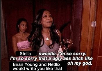
3. Stella I am so sorry
I'm also in the majority hating how they've tarnished Stella. Basically, they turned her into the stereotypical rich bully with mommy issues.
I get that Stella has an abusive mom but that’s no excuse to be a total bitch to her roommates. And no, her roommates shouldn't accept her back with open arms. And she doesn't even redeem herself - the girls just accept her back after her mom pulls her from Alfea.
And this is also another issue with the writing were the characters suddenly just change their opinions on a whim. Suddenly Stella likes the winx, suddenly Terra misses Stella even though having that girl literally gives her anxiety. Suddenly Aisha's on Bloom's side in the end.
This isn't me simping for the cartoon out of nostalgia. I was mostly okay with the idea of Stella and Sky hooking up. But Looking at it from a creative standpoint - looking at the source material, and the many paths you can take this character, the best thing Brian Young and co. can think of for her was turning her into the stereotypical rich bully that we've seen time and time again? No deconstruction no meta take, it's played out exactly how you’d expect it.
Again, this isn't me simping for the show. Purely from a creative standpoint Stella was such a major let down. There's so much to the character and Brian Young took the easiest, saturated path.
4. That one scene with Bloom's parents
You know the one. Mike unhinges Bloom's bedroom doors and Vanessa cusses out and insults her child like a petty teen bully. Forgetting how utterly cringey that scene was, you can't have her mom go batshit insane on her child, then act like she's this loving parent that cares so deeply about her daughter. Screw that! Vanessa deserved those 3rd degree burns! She invaded her daughter's privacy. Bloom didn't even do anything wrong!
I can't buy into this narrative of Vanessa and Mike being loving parents when they do something like that. Seriously who thought that was okay?
5. Pity Parties for everyone.
I already discussed this in Stella’s section but I don’t like the “it’s okay for me be a shitty person because my life sucks :)” narrative Fate tries to pull. They did it with Stella, Bloom, Riven.
What I liked about the first season of Winx Club is Bloom’s arc and her character as a whole. Because while she went through shit, from the Trix, to finding out she was adopted, her existential crisis, not feeling like she belonged, losing the dragon flame, she went through a lot. She didn’t throw a pity party. She didn’t whine, bitch and complain. She allowed herself to feel upset, took it as it is and tried to make lemonade out of lemons. And I respect that.
Net!Bloom is agrevating. She does some dumb, reckless stuff but it’s excused because she’s the protagonist? She let the war criminal out, the school gets taken over by the bad guys because of Bloom. Faragonda fucking dies because she let the war criminal out! The burned ones attacked the school because she let the war criminal out!!! But no, Aisha’s villainized for calling Bloom out because Bloom’s existential crisis is more important then anything else.
Getting to Sky, he isn’t as bad as the others. He doesn’t become a shitty person because of his problems. (Though lowkey flirting with Bloom while he hooks up with Stella is uh not good.) But he does come across incredibly whiny. Because of the cringey dialogue and the unnecessary swearing I can’t take his speech on opening up to Bloom seriously. I laughed throughout the whole thing and Bloom leaving his unconscious body there was the icing on the cake.
One of the few characters that deserved a pity party is Terra. She’s very much like OG!Bloom in a way. She is bullied by Dane and Riven, has body insecurities, anxiety, nobody listens to her and at most only tolerates her. Despite all the crap that is thrown her way she still reminds humble, kind, and respectful. And she is one of the few characters that deserves more support than what she got out of the season.
5. Bloom, Aisha, Tokenism and their awful relationship
I’m going to be upfront, their relationship sucks. The core of their dynamic is what Aisha can do for Bloom. It’s very one-sided. Bloom only goes to Aisha to help solve her problems, which Aisha gladly does – but when Aisha disagrees with Bloom or says something Bloom doesn’t like, Bloom suddenly goes off and Aisha’s made to be the bad guy. Even though she’s right? And Aisha has her own problems as well, shown to also struggle with her powers. But nope, that’s pushed to the back burner because Bloom needs help.
I am all for creative freedom. I can stomach Stella x actual Sky. I can stomach turning Stella into a rich mean girl. I can stomach the dark academia aesthetic but what Brian Young and co. did to Aisha is just plain racist. Screw the “it’s an adaptation” excuse. Turning this character who had a rich storyline and was a princess into a white girl’s magical negro who fixes all her problems is racist and by definition tokenism. And by whitewashing the other two characters of color, making Aisha the only poc in the group – that’s the worst thing you can do to her.
And frankly we need more black princesses on screen.
6. Dane and the homophobia of the show
Towards the show’s climax it’s revealed Dane is helping Beatrix because she accepts he’s “different”. Not only does this go back to my pity party rant but like bruh,
1) Beatrix never really did anything for Dane? She hung out and smoked with him a bit, but that’s all. You’re telling me Terra wouldn’t accept Dane? Beatrix never helped him and he never really opened up to her about his struggles.
2) Nobody else, not even background characters bully or harass Dane for being “different”. It’s only Riven, the guy he’s crushing on. The whole falling in love with the bad boy/abuser trope is bad in a hetero relationship and that still stands for a gay one. And I know damn well if Dane was a woman half of the shit Riven did to Dane wouldn’t slide.
It makes no sense for Dane to side with the bad guys when Riven’s the one bullying him and Beatrix is complacent in the bullying. Oh, and having your second black* character who’s also lgbt+/potentially questioning be a villain? Not good.
I’m all for gay and poly rep, but not like this. If Stella and Sky’s toxic relationship is going to be called out for what it is, why not Dane’s?
*Idk if Theo Graham is light-skinned black or biracial so I’ll just refer to him as black.
7. The plot
It’s very predictable. Personally, wasn’t fond of the ‘twist of a twist of a twist’ style of writing. The story tries to be nuanced and deep but it’s not. Common sense is treated like a big revelation. Not trusting the war criminal you barely know isn’t as big of a take that the writers try to make it out to be.
8. Everything else
· Beatrix is fine. No Icy but did like the gothic bookworm aesthetic.
· Sam is just there to be Musa’s love interest and provide some dumb drama between Musa and Terra. I thought they’d go the Edward/Bella root – Musa’s drawn to Sam because she can’t sense his emotions for some reason. Nope, they just get together for the obligatory make out sessions. Don’t care much for the relationship or the character.
· Since the powers are all elemental shouldn’t there be classes purely for an elemental? Classes purely for fire fairies, etc?
· Musa’s powers are confusing. If she has no control over them and they are “always on”, shouldn’t her eyes constantly be glowing purple? Very wishy washy. Sometimes they overwhelm her and other times she has complete control. Her character is just there for plot stuff.
· Terra is one of the better characters but can’t enjoy her knowing about the whitewashing. Why can’t we have a plus sized character just exist and not have body issues?
· Sky doesn’t feel like a prince. Characters treat him like his dad is a war hero and not the King of Eraklyon. There was a point where I thought I misheard and thought his dad was just a war hero and not a king.
· Why try to justify Rosalind’s war crime if she’s going to be the big bad anyways?
· The way the characters treat death/act around death is very weird. Musa and Terra see a pile of dead bodies and they’re unreasonable calm. Especially Bloom an “ordinary teenage girl from earth”, reacts very nonchalant when death and war crimes are brought up. Doesn’t help the show tries to push this “they’re kids fighting a war” narrative.
· Can’t buy into the girls’ friendship. The Aisha/Bloom dynamic is centred on what Aisha can do for Bloom. Bloom only cares about herself and only goes to her friends to help with her problems. Most of Musa’s and Terra’s interaction centre around Sam. Stella didn’t care for the girls until her mom showed up and pulled a 180. The girls were quick to turn on Aisha when she sided with the adults.
· I have no problem with technology existing but why do they have Instagram, Tiktok and Tumblr? The otherworld is a completely separated from Earth, why do they have the same technology?
9. Brian Young, what do you mean by mature?
I grew up on the 4kids dub before transitioning to the Nick dub for season 4 and 5 then dropping the cartoon for good. So naturally on my rewatch of the cartoon I decided to go watch the RAI dub since I heard it’s more accurate and 4Kids are infamous for their horrid localisations straying too much to the source material. Upon finishing season 1 and currently watching season 2, a few things took me by surprise. For one, the cartoon is surprisingly dark. The schools are at war with the Trix and their army of Darkness, Sky almost dies in Season 2, Riven almost dies and the Trix thinks he suicided, it’s heavily implied in Season 2 Darkar murdered some of the pixies, the paedophilic undertones of Bloom and Avalon’s relationship, the list goes on.
When the interview with Brian Young came out, he said Fate would be a mature take on the cartoon. And I wondered, what did he meant by mature? Was he going to delve deeper into the darker aspects of the show, or did he mean he was going to have the girls swear and have sex? Watching Fate, I found my answer.
If you take out the gore, swearing, drug and alcohol usage from the live action, the maturity is on par with the RAI dub. The difference is in the presentation. This is what sucks about the mentality surrounding live action remakes. Because the OG!Winx was colourful with glittery transformations , was super girly and overall had a positive upbeat tone (not forgetting 2D animated) - it can’t be taken seriously. You have to strip all that, the colour, the kindness, the femininity in order to be deemed mature.
10. Wrapping up
I went into Fate expecting the worst and honestly, it wasn’t that bad. There were things I liked about it. The show looks pretty, and I did like what they were trying to do with Sky’s arc. The actors did what they could with the material. Freddie Thorp made the cringe dialogue work and Abigail Cowen proves she can carry a show as the lead.
Fate is your generic, YA, dark academia show. It follows all the tropes of the YA genre to a T. If that’s your niche, then you’ll love Fate and I’m not bashing anyone who liked it.
For me, as a creative, it doesn’t capitalise on the strengths of the source material. I’m not asking for Winx Club again, as I’ve reiterated, I’m all for creative freedom. But Brian Young, Iginio Straffi, whoever worked on this – they could’ve created something new, innovative, something that stood out from the hordes of other YA shows. They had good material in their hands! But what I got - I’ve seen before, and I’ve seen it done better. That’s a major disappointment.
As a winx club fan, don’t bother watching this. It’s a very diluted version of the Winx. In trying to capture the interest of the adult fans who grew up with the franchise – Iginio showed how out of touch he is if he thinks this is what they wanted.
22 notes
·
View notes
Text
10 Guidelines for Good Web Design: How to Learn Web Designing

Know about Web Design Guides
Summary: A website's success or failure is determined by its usability and usefulness, not its graphic design. User-centric architecture has become a common method for efficient and profit-oriented web design because the viewer to the website is the only one who clicks the mouse and therefore decides everything. Overall, if consumers can't access a feature, it's as if it doesn't exist at all.
We won't go into interface execution specifics (like where the search box should go) because it has already been covered in a variety of articles; instead, we'll concentrate on the key concepts, heuristics, and approaches for successful web design — approaches that, when applied correctly, will lead to more nuanced design decisions and make the process of perceiving provided knowledge easier. we have mentioned about HTML, coding, new website, website WordPress menu, website portfolio, desktop, and more.

Please keep in mind that you may be involved in the following usability-related posts that we've previously published:
• Excellent Web Design Principles: Craftsmanship
• 30 Usability Issues to Be Aware Of
• 9 Common Usability Mistakes In Web Design
Principles Of Good Responsive Website Design And Effective Web Design Guidelines
To better apply the concepts, we must first comprehend how people communicate with websites, how they think, and what the fundamental characteristics of their actions are.
What are the thoughts of the user?
Essentially, consumers' web activities are close to those of shoppers in a shop. Visitors take a brief glance at each new page, scroll through some of the text, and then click on the first link that piques their attention or looks slightly like what they're looking for. In reality, they don't even look at a significant portion of the website.
Necessary of web or web design or ux design
The majority of users look for something fascinating (or useful) and clickable, and when they see any promising candidates, they click. If the current page does not meet the user's standards, the user hits the Back button and the search ends.
• Users respect consistency and trustworthiness. Users are able to sacrifice content for advertisers and the site's architecture if a website presents them with high-quality content. This explains why poorly built websites with high-quality content attract a large amount of traffic over time. The architecture that supports the content is less important than the content itself.
• Users search rather than read. When users examine a web page, they look for fixed points or anchors that will lead them through the material.
• Internet consumers are frustrated and seek quick satisfaction. Easy principle: If a website fails to satisfy customers' needs, the author has struggled to do his job correctly, and the business has lost revenue. Users are more likely to abandon a website to look for alternatives if the cognitive load is heavy and the navigation is difficult. [DWU / JN]
• Users do not make the right decisions. Users aren't searching for the fastest way to get the details they need. They still don't search webpages in a sequential way, going from one part of the site to the next. Users, on the other hand, are happy to settle for the first rational choice. There's a fair chance they'll click a connection that seems to lead to the target as soon as they find it. Optimizing is difficult and time-consuming. Satisficing is a more effective way of doing it.
•
Users are guided by their instincts. In most instances, consumers muddle along rather than reading the detail given by the designer. The primary cause for this, according to Steve Krug, is that consumers are unconcerned. “Once we discover something that fits, we don't stray from it. We don't care if we understand how things work as long as we can bring them to use. If you want your viewers to believe you're building billboards, then make amazing billboards.”
• Consumers like to be in control. Users want to be able to monitor their browser and believe that data will be viewed consistently on the web. They don't want new windows to show up randomly, because they want to be able to return to the place they were on before using the "Back" icon, so it's best not to open connections in new browser windows.
1. Website or Web design details: Don't Ask Users to Consider
The web page should be obvious and self-explanatory, according to Krug's first rule of usability. When you're building a website, the goal is to eliminate the question marks — the choices that people would make deliberately, weighing pros and cons and contemplating alternatives.
The number of question marks increases as the navigation and site design become less understandable, making it more difficult for users to grasp how the system operates and how to navigate from point A to point B. Users will navigate their way to their destination with the aid of a simple layout, mild visual cues, and clearly identifiable connections.
Consider the following situation. “Beyond networks, beyond brands, beyond distribution,” says Beyondis.co.uk. What does this imply? These three statements will be the first items users see on the page after it is loaded, so users prefer to explore websites in the "F"-pattern.
Although the interface is straightforward and intuitive, the user must look for the answer to learn what the page is for. This is what an extra question mark feels like. The designer's responsibility is to keep the amount of question marks as minimal as possible. The graphic description is on the right side of the page. Simply replacing all blocks would improve usability.
ExpressionEngine follows the same structure as Beyondis, but without the extra question marks. Furthermore, the phrase takes on new meaning as users are given the option to check out the service and trial the free edition.
Reduced cognitive load makes it easier for tourists to understand the system's concept. If you've done so, you'll be able to explain why the system is beneficial and how people will learn from it. People would not use the web blog if it is difficult to access.
2. Don't Exhaust Your Consumers' Time
When you're working on a project and you're trying to give your visitors a program or a tool, try to keep your customer expectations as low as possible. The fewer steps people must take in order to test a program, the more likely a random tourist would do so. First-time users tend to gamble with the app rather than filling out lengthy online applications for an account they might never use again. Allow people to browse the web and learn about the offerings without being forced to share personal information. Asking users to submit an email address in order to test a feature is unfair.
According to Ryan Singer, a developer on the 37Signals team, users would be more likely to give an email address if they were asked after seeing the feature in action and understanding what they would get in exchange.
Stikkit is an excellent example of a user-friendly service that needs virtually no interaction from the visitor and is unobtrusive and relaxing. And that's how you want your visitors to feel as they visit your web blog.
Mite, it seems, demands more. The registration, on the other hand, can be completed in under 30 seconds, thanks to the form's horizontal orientation, which removes the need for the user to scroll the tab.
Drop any obstacles as far as possible; don't need subscriptions or registrations first. The mere act of registering a user is enough to stifle user navigation and reduce incoming traffic.
3. Ensure the users' attention is focused.
Since web pages contain both static and interactive content, certain features of the user experience are more noticeable than others. Obviously, pictures attract more interest than words, just as bolded sentences attract more attention than plain text.
Online users can easily perceive edges, shapes, and gestures because the human eye is an extremely non-linear system. This is why video-based ads are particularly irritating and distracting, but they do an outstanding job at catching consumers' interest from a marketing standpoint.
Humanized makes excellent use of the concentration concept. The only thing that consumers can see clearly is the word "free," which is enticing and desirable while remaining calm and purely informational. Users are given ample information on how to learn more about the "easy" commodity through subtle hints.
By using visual elements to draw users' attention to particular parts of the web, you can help the guests get from point A to point B without having to worry about how to do it. The less concerns tourists have, the greater their sense of direction and the more confidence they can build in the business portrayed by the web. In other words, the less thinking that would occur behind the scenes, the greater the user interface, which is the primary goal of usability.
4. Aim for Feature Exposition
Modern web designers are often chastised for directing users by visually pleasing 1-2-3-done-steps, large buttons with visual effects, and so on. However, from a concept perspective, these components aren't inherently a bad thing. These guides, on the other hand, are highly useful because they direct users through the site's content in a very simple and user-friendly manner.
Dibusoft blends an appealing aesthetic with a well-organized web. The site's key navigation tools are available at first sight, and there are nine of them. However, the color scheme can be too light.
A basic concept of good user interface design is to make it transparent to the user what features are accessible. It makes no difference if this is done. What counts is that guests are happy with how they communicate with the framework and that the material is well-understood.
5. Make Effective Writing a Part Of Your Strategy
Since the Web differs from print, it's important to tailor the writing style to the tastes and browsing habits of your audience. Promotional copy can not be read. Large blocks of text without pictures, as well as keywords in bold or italics, would be skipped. Excessive phrasing would be overlooked.
Let's talk about business. Stop titles that are funny or creative, marketing-driven, company-specific, or technical names that are obscure. For eg, if you're explaining a web and want people to build an account, "sign up" is superior to "start now!" and "explore our services."
Eleven2 doesn't waste much time getting to the stage. There are no sweet phrases or exaggerated stories. Instead, there is a price, which is just what tourists are looking for.
Use short and concise phrases (get to the point as quickly as possible), scannable layout (categorize the content, use several heading levels, use visual elements and bulleted lists to break up the flow of uniform text blocks), and plain and objective language (a promotion doesn't have to sound like an advertisement; give your users some r
6. Attempt Simplicity
The KIS theory (keep it simple) should be the primary objective of site design. Users seldom use a site for the sake of the design; in reality, in most cases, they are searching for details regardless of the design. Rather than trying to be complicated, aim for consistency.
From the visitors' perspective, the best web design is pure text, with no ads or other page blocks that precisely complement the question or content they were looking for. One of the reasons that a user-friendly print edition of web pages is important for a positive user experience is because of this.
Finch delivers site material in a straightforward and concise manner, giving users a variety of choices without overwhelming them with needless information.
7. You Shouldn't Be Scared Of White Space
In reality, it's difficult to overestimate the value of white space. It not only helps guests minimize their cognitive burden, but it also allows them to understand the information shown on the computer. When a new user appears at a design layout, the first thing he or she does is search the web and break the subject field into conveniently digestible chunks.
Reading, scanning, analyzing, and working with complex systems is more difficult. If you have the option of using a visible line or other whitespace to separate two template parts, the whitespace approach is typically preferred. Complexity is reduced by hierarchical constructs (Simon's Law): the more you can give people a sense of visual hierarchy, the simpler your content would be to understand.
White space is beneficial. White space is a significant design feature on Cameron.io. The end result is a scannable layout that gives the material the prominence it deserves.
8. Use "Visible Language" to Communicate Easily
Aaron Marcus notes three basic concepts inherent in the use of so-called "seen text" — the information people see on a computer — in his articles on efficient visual communication.
• Organize: provide the consumer a logical and coherent philosophical framework. Organizational principles such as consistency, screen structure, partnerships, and navigability are essential. All elements shall follow the same conventions and laws.
• Save money by having as few prompts and graphic elements as possible. Simplicity, consistency, distinctiveness, and concentration are the four major points to remember. Only the most essential components for contact are used in simplicity. Clarity: All elements should be built in such a way that their purpose is obvious. Distinctiveness: The necessary elements' critical properties should be distinguishable. The most significant elements can be readily identifiable.
• Communicate: tailor the presentation to the user's skills. In order to interact efficiently, the user interface must combine legibility, readability, typography, symbolism, different viewpoints, and colour or texture. Using a maximum of three typefaces with a maximum of three point sizes per line of text, with a maximum of 18 words or 50-80 characters per line.
9. The Conventions Are Our Allies
A dull web is not the product of conventional site element architecture. Conventions, in particular, are extremely beneficial because they minimize the learning curve and the need to find out how things function. For example, if all websites displayed RSS feeds differently, it will be a usability nightmare. That's similar to how we arrange data (folders) or shop in our everyday lives (placement of products).
You can gain users' respect, loyalty, and durability by using conventions, and you can also prove your reputation. Understand what users want from a site's navigation, text layout, and search placement, among other aspects.
A common example from usability sessions is to translate the web into Japanese (assuming the site visitors don't speak the language, e.g. with Babelfish) and give the usability testers the challenge of finding something in the translated page. Users would be able to accomplish a non-specific goal if conventions are followed correctly, even if they don't comprehend a word of it.
According to Steve Krug, it's best to invent only when you're certain you have a better idea, and to depend on conventions when you don't.
Tags: web design, ux web design, web design gallery, web hosting, responsive web, ux design, web logo, adaptive web, images for web, research web design, web research, choose best web design, website design or web design, website design portfolio, web WordPress, work for web design, responsive HTML, web design experience, work for web design, know coding for web design, ux ui
10. Test Early and Often
This so-called TETO-principle should be extended to any web design project because usability testing will also expose serious problems and issues with a layout.
Testing should not be done too late, too low, or for the wrong reasons. In the latter example, it's important to note that most design choices are local, which means you can't tell if one layout is better than another without evaluating it from a very particular viewpoint (considering requirements, stakeholders, budget etc.).
There are a few things to keep in mind:
• According to Steve Krug, testing one user is better than testing zero, and testing one user early in the project is better than testing 50 users at the end. According to Boehm's first theorem, mistakes arise more often during specifications and design tasks, and the longer they go uncorrected, the more costly they get.
• Testing is a continual operation. That is, you plan something, test it, repair it, and test it once more. There may be concerns that were not identified during the first round when users were essentially blocked by other issues.
• Usability evaluations consistently yield valuable results.
• A developer is unsuitable to test his or her code, according to Weinberg's rules. This is also so for artists. After a few weeks of working on a platform, you can no longer look at it with new eyes. You know how it's made, but you know precisely how it works — you have the experience that impartial reviewers and site users don't.
Visit Our Official Website
Additional Resources:
https://en.wikipedia.org/wiki/Web_design
https://wordpress.org/showcase/tag/web-design/
https://www.wikihow.com/Learn-Web-Design
Location: https://goo.gl/maps/FnRzFUVMwwopXahE8

2 notes
·
View notes
Text
Gen 2 was such a fun generation. Gen 1 started things, and perhaps because of a first attempt, there were some rough patches. Gen 2 really smoothed a lot of things out, including expanding movepools, offering some new evolutions, and two whole typings to try and introduce more balance to the system. It's also my personal nostalgia generation, so I have the fondest memories of this gen.
TOP 15:
15) Noctowl - Noctowl would be my favorite regional bird, if it weren't for the fact that it's competitively terrible and beyond help, and Staraptor wound up looking cooler. Still, Noctowl is a great Pokemon. Owls are cool, and Noctowl is just a big owl with Psychic-type coverage. It was always weird to me that it got Normal/Flying. Why not Psychic? Is it because you didn't want it to compete with Xatu and Lugia? It probably wouldn't regardless; just let the poor thing be Psychic/Flying already.
14) Lanturn - Water/Electric is such a cool typing. Water, Ice, and Electric type coverage is fantastic, and Lanturn gets all of it, on top of some serious bulk. It's also just a big round friend, and I love it. Actually cute final stage evolutions are a rarity, for some reason, so it's nice to have one that's both adorable and unique.
13) Murkrow - Dark types were introduced this gen, and while, as a Psychic lover, you may assume I hated that change, I actually loved it. I'm not opposed to Psychic having answers; in fact it was much needed. Murkrow is one of the best new Dark types, I felt. Not in terms of actual utility. Houndoom was way stronger, and Tyranitar was a pseudo-legend so...there's that. Even Umbreon probably did better than this thing because it could stall more effectively in a generation all about stall. But Murkrow stood out to me because of it's cute design and mischievous nature. Shame that it's only in Kanto, after you beat the League. You know. Along with every other Dark type bar Umbreon.
12) Politoed - King's Rock must have been a very hit-and-miss evolution item, creating two split evolution paths, one of which was outright not as good, and one that was outright better. Slowking was the not as good evolution, and Politoed is the better evolution that seems to get everything. Pure water typing is working out a lot better as a rounded Pokemon than Water/Fighting, and Poliwrath just never got any useful tools, while Politoed got Drizzle of all things. I really love Politoed. It's a sleek and cute design for a final stage, and it makes more sense as a frog design. It is an odd choice of design for the Poliwhirl evolution, but it's such a good final form.
11) Magcargo line - You know what typing sucks defensively? Fire/Rock. 4x weaknesses to Water and Ground, a common defensive typing, and the most common offensive typing. But you know what's a really good offensive typing? Fire/Rock. Fire blasts through a lot of threats, including the new Steel type, while Rock hits a lot of things Fire can't. It also gets some fantastic coverage moves, and decent support. Unfortunately, it's defensive and slow. Slow enough that even Shell Smash can't save it. It's a very sad state of affairs. That said, Magcargo is cute. An adorable lava snail that I wish I could pet in Refresh, without buring my hands off.
10) Furret - Again, cuteness wins the day. Furret is 100% adorable, and if there were any early-game "rodent-type" that deserved to get more to work with, it's Furret. I, personally, think it's the cutest of them all, and should at least get a bit of a buff in stats.
9) Jumpluff line - I love Jumpluff. I love its entire evolutionary line. Hoppip is super cute, and its evolutions are just as adorable. Too bad they are awful. Like, competitively they have nothing. Even in-game they get very little in terms of attacks or roles. It's such an unfortunate situation for them, and they're very high on my list of things I wish would get more tools. But it will always have a special place in my heart as the adorable cotton puff.
8) Xatu line - This is one that became more solid after the first mystery dungeon games. It's role as some strange, mythical fortune-teller is fantastic. Xatu is just an interesting design for a Pokemon, and Psychic/Flying was a cool typing. It was a pain to catch because Natu knows Teleport, but man, what a unique bird this line is. I also really appreciated the time it spent as the bulky Magic Bounce user. You know. Before Mega Sableye.
7) Steelix - If someone were to ask about my favorite gym leaders, Jasmine would easily be on that list. A large part of that is because she's cute, but has this giant metallic snake creature as her signature Pokemon. You never expect it. Even on its own merits, Steelix is just cool. It's a refined version of Onix, offering obscene physical defense, respectable attack, and...probably nothing else. It does have a lot of flaws from a competitive standpoint, but it's got a strong design and a great presence.
6) Slowking - Slowbro was a great Pokemon in Gen 1. It was never really my favorite, but I had to acknowledge it was good. Slowking, though? Now we're talking. It's basically a specially defensive variant of Slowbro's defensive variant, and as such, was...never really as good. Boosting for Psychic types always allowed for special defense to grow, so you needed good base defense, which Slowking did not have. Its movepool also didn't differ from Slowbro in any meaningful way, so it's basically a carbon copy that had less going for it. Still, I adored it, because of the design, and its role in Pokemon the Movie 2000. I think it looks a lot nicer than Slowbro, and it feels like a more impressive final form. Even if it's probably not.
5) Mareep - IT'S SO CUTE! I love the entire Mareep line, but Mareep stands out as one of the cutest first-stage evolutions in the game. Honestly, Gen 2 really stood out because of how cute a lot of first stage Pokemon were. But Mareep? Mareep is unbelievable. Prior to Mareep, I wasn't the biggest electric-type fan. I loved Raichu, but Electrode, Magneton, and Electabuzz weren't exactly that interesting, with Zapdos also being my least favorite of the birds. But it was with Mareep that I had a really cute Pokemon that evolved into a still cute but powerful creature. I always try to get a Mareep when I play Gen 2. It's easily one of my favorites to train in-game.
4) Espeon/Umbreon - Flareon may be my favorite, but Espeon and Umbreon were my favorites for a long time once they showed up. Psychic is a great typing, and Umbreon is just such a sleek design. The two are a great new addition to Eevee's evolutions, and the choices they made with these two are nothing short of divine.
3) Kingdra - Talk about an improvement. Water/Dragon meant you basically had a weakness to all of three attacks. One was a TM, one was a move I think only it learned, and one was a move only Dragonite learned. Best of all, its even stats meant it was pretty solid at any role back in the day. I also really like the design. It just feels like an ancient sea-based dragon, and it's fantastic.
2) Celebi - Mythic legends suck. Not because of what they are, but how they're distributed. If it weren't for the show, or rather the first movie, I wouldn't have known Mew existed. But by the time generation 2 came around, I knew about Celebi. And I wanted one so bad. But I couldn't get one! Because they're based on nonsense events you have to go to. In gen 3, I got a Gameshark, and the first thing I did was hack in a Celebi. I wanted one so badly. It is absolutely adorable, and I love anything with time-focused powers. Being a psychic-type is also a huge plus for me, and it's just...such a good Pokemon, and such a good legend.
1) Misdreavus - I don't think there can be any comparison. Misdreavus is a godsend. It's such a cute ghost type, and as the only other ghost besides Gengar, it stands out incredibly by virtue of not having a Poison typing, and thus being able to handle Psychic types. Between aesthetics and its role as the first pure ghost, I love Misdreavus a lot.
BOTTOM 10:
10) Granbull line - Not a bad one by any means, but it's another aesthetic thing. Before the advent of Fairy type, this being just a standard normal type thing also didn't really help it stand out. I don't dislike them, but someone had to take the spot...
9) Shuckle - I really don't know what Shuckle is supposed to be, and I think that's why it weirds me out a bit.
8) Yanma - Not a bad Pokemon, just...not as interesting? It's a Dragonfly that's just another Bug/Flying type. It doesn't really stand out much to me.
7) Quilfish - A bit more unique and dynamic, but misses the mark a bit. I just feel it's a bit too plain?
6) Octillery - Oh man. Okay. Remoraid is a cute little thing, but Octillery just...it doesn't really make sense to me. At all. Why are you an octopus? How does this relate to what Remoraid is?
5) Delibird - And now for the complete opposite of #7 and #8. Yanma and Quilfish are a bit plain, but Delibird, by comparison, is an interesting concept and design. It's meant to look like santa, with its tail being the sack of toys. It only uses Present, which can hurt or heal the enemy. It's a really cool concept...that does little for it. I can think of few Pokemon less useful than Delibird, and some of those at least evolve into something more useful. It's gotten more options as time goes on, but it has virtually nothing going for it.
4) Tyrogue - Baby Pokemon are not my favorite. I just don't like them. Tyrogue is, design-wise, one of the better ones, I feel. But its evolution method is obnoxious. I hate it. I absolutely hate it. Three possible evolutions, based on the stats it has when it levels. I liked Hitmonchan and Hitmonlee well enough. Hitmontop is okay, but I don't think it's all that interesting, since it mainly kicks like Hitmonlee but different, and Tyrogue as a pre-evolution to all of them is not a terrible idea, but is definitely not my favorite.
3) Magby - I didn't care for Magmar all that much, and Magby just isn't that cute as a pre-evolution for it either. There's little aside from just me not liking the look of it.
2) Elekid - There are many who disagree with me, but I do not like its design. At all. It just doesn't look right. The electric plugs on its head are just goofy to me, and I didn't care for its evolution either.
1) Aipom - I mentioned this with Primeape, but I don't really care for monkeys. They are definitely not my favorite animal. Aipom is at least cuter, but it's also weirder. Why is the end of its tail a hand? Why does it have to be like this? That's so weird to me.
5 notes
·
View notes
Last Seen Blogs
wholesome90stv
Wholesome 90s TV
eurovi
a blog on the interwebs
ezracrafts
cow tools!
nofearartsworld
Untitled
mazyb0i
Terrance Mazy