#I SQUISHED THIS AS MUCH AS I COULD IN KRITA
Note
if it's okay, would you mind sharing your art process? your style is SO gorgeous dude. keep it up spardacest nation!!!
Thank you so much anon, and of course!
I kinda posted about it on twitter a while ago, but for anyone not also on there, here's a paraphrasing of what I said there!
(under a cut bc it's gonna get a bit long)
(speedpaint video from procreate mostly bc like I also said in that post, it's one of the few pieces I've done entirely on procreate and thus entirely recorded kdfjhdk I usually don't do the sketching + painting parts on there but every now and then I get lazy and want to get it all done quick in one program lol! It's not as good as it would look if I were using krita to render (which is what I normally use) but it gets the idea across decently of what it is that I do)
The short version of my process is:
sketch, clean up sketch for lineart, then flat colors, then paint over the flats (i make the flats my shadows and paint on the light), then a multiply layer for skin details (like lips, eyebags, etc), then an overlay layer for skin transparency details (red over the ears/nose/fingertips etc), then i do hair over the lineart, then a multiply layer with the contact shadows in a light beige/grey/neutral tone on top of everything else, and then i unify layers, paint over the details, and color correct the HELL out of it
The longer version is:
SO, first of all, I will say, my entire process for a finished/fully redered piece is pretty scattered and uses a lot of different apps, because after many years of trying out different drawing apps I found that I just worked better when I could incorporate the parts I liked best from each individual one rather than having to adapt to another app entirely!
In total, what I use is: autodesk sketchbook and procreate for the first half I do on my ipad, then krita and photoshop on my computer when I'm actually rendering (but any photo editing app instead of ps will do, I'm just used to photoshop bc that's what I learned as my first drawing app WAAAY back in the day lol), and then meitu on my phone for color filters (also any phone editing app with filters in it will do), AND also optional just for references: blender and daz3d on computer + magicposer on my phone
The actual step by step of what I do:
First of all, if I want to do a detailed, well rendered piece I will start by getting my references ready. That means either just grabbing a screenshot from the game if it's like, a simple portrait, or a photo reference, taking a picture of myself in the right pose/lighting, and if it's something more complex I will recreate the scene in Daz3D to simulate a realistic lighting, OR even just blender (i have the game models for the dmc characters downloaded, so I can just pop them in, pose them and change the lighting to get a realistic idea of what shadows their faces will cast in that specific angle/lighting.)
Note: references are pretty essential to me, and there's nothing to be ashamed about for using them! Personally I don't struggle a lot with the drawing/sketching part of art, but my tiny little pea brain cannot fathom how to make an object 3D in my mind, and how to visualize shadows realistically... thus the reliance on 3D programs to do that for me, and then all I have to do is draw what I'm seeing lol. My art improved significantly ever since I started making 3D refs so I could get /exactly/ what I needed - there's still a lot of leeway you need to learn though, because as realistic as the lighting will be in a rendering program, you'll never really get a fully natural looking image, as far as stuff like the body stretching/squishing/pulling when it's in movement, facial expressions, folds in clothing/fabric, etc... so really it's more a guide than something meant to be followed 1:1.
Then, once I'm confident I know exactly what I'm gonna draw/have the idea in my head, I start sketching it in sketchbook. Not really getting very in depth, just blocking out rough shapes - I like sketchbook and to be on my ipad for that because it feels very reminiscent of traditional sketching on paper to me, which while I'm not super confident on my traditional art abilities, I do get the most natural/fluid/non-stiff figures out that way.
Then when I think I have the general idea ready, I export the sketch layer as a png and import it into procreate - which is where I kinda start picking at the sketch and polishing it like i'm carving it out haha. Lots of liquify tool, flipping the canvas to check if it's even, blending out some of the lineart to help out with the rendering later, and then polishing up what was once the sketch into serviceable lineart. I usually reimport it back into sketchbook at this stage - while I like procreate for drawing I don't love the brushes I can use for lineart there, and so I usually only draw the "base" naked figure in there - when I'm in sketchbook I use a hard pencil to refine the details, then on a separate layer add all the things "on top" like hair, clothing, etc - usually I can get it pretty easily in one go, and once I'm satisfied I erase the naked body under the clothes and unify the lineart layers.
Then I will just do the flats with a hard brush, turning the lineart layer into an overlay layer and coloring things in with the shadow colors.
At this point, I export the file as a psd and import it on my computer - I give it a once over in photoshop first to see if there needs to be any adjusting (like whether any layer that has an effect needs to have a different effect, if all the colors look right since the ipad screen isn't the most faithful, if i wanna change the background color, etc), and once I think it's ready enough, I open it up in krita, where I do the actual bulk of the painting/rendering (as to why specifically krita: it's because I've gotten very comfortable with the brush/painting brush dynamics there and cannot seem to get as good results anywhere else, it's just the goldilocks spot of a brush for me haha.)
If anyone's curious, here's the brushes I usually use for painting:
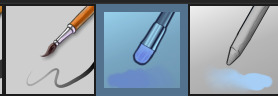
The one in the middle is my go to painting brush, left one for tinier/more refined details, right one for blending out soft shadows (though I learned the hard way to not overuse it, or it will look like I went ham with an airbrush tool lol).
(I don't change any of the settings on these brushes, so if you wanna try out the exact ones I use! Just fresh off how they come out the app haha)
I paint on the lights on top of the shadows, and just focus on that for the time being - once I'm done with the basic painting, I'll make a separate multiply layer for details like lip color, eye waterlines, makeup if there is any, eyebags, etc, and then adjust the opacity until it feels right - then I'll make an overlay layer with skin translucency details (like, when you hold your hands in front of a light and see the tips of your fingers become bright orange - many parts of your body are always a bit translucent to the blood underneath, specifically parts where the skin is thin like noses, cheeks, joints, knuckles, etc, and I found it makes the character look a lot more alive to add that subtle coloring in) - then usually I do hair on a separate layer on top of the lineart (because that way I can add small flyaways, more details, etc, and just use the lineart as a guide)
After that, I'll usually make a multiply layer on top of everything where I'll add contact shadows in a neutral color (usually pretty pale, it'll be darker anyway since it's multiply), and once I feel like I've rendered everything out properly, I save the psd and re-open it on photoshop.
In photoshop, I'll mess around with the layers a little bit more (changing hue/saturation, opacity, etc), fuck around with the background to make it look pleasing, and once I'm happy with it, I'll unify the layers and start color correcting - usually by duplicating the unified layer and messing with the curve/hsl of the image and then changing the opacity of that edited layer until it's as strong or muted as I want it to be - then I also edit the RGB curves individually and adjust the opacity of that also (because I just really like how it ends up looking if I give a bit of a red/warm tint to the shadows lol), and at that point often I will reimport the finished image into procreate for some finalizing touches! Like, blending out shadows that came out too harshly, painting over anything that came out not the way I wanted it, redefining the lineart if it got messy during painting, and adding any extra small detail that might have gotten lost like catchlights, hair shines, hair flyaways, tears, etc. I also do one last round of flipping the canvas and liquify if needed!
At this point, I export the finished image both to my computer and my phone - on my phone I open it up on the photo editing app, and add a bunch of different color filters - I don't hesitate from going completely balls to the walls here, and just kinda applying as many filters as will make an image look pleasing to my eye.
Once I think it looks good, I'll export the edited image to my computer - and then open both the version without filters and the one with them on photoshop, and use the filtered version as an opacity layer, and adjust it until it doesn't look as crazy anymore lol.
One last step I recently started incorporating was also changing the image to grayscale after I'm done, and doing one last round of curves in greyscale to make sure the values look right, and nothing is getting too lost because the values are too similar (because i know i get a bit swept up in getting repulsed by harsh contrasting lighting and can end up washing out all of rendering if I don't check myself kjdfgk)
AND that's it!
Yes it's a pretty long and chaotic process, but it's coming from years of trial and error and realizing I can just let myself fo whatever makes me happier with the results, and I don't have to stay constrained to one program if I don't like every tool it has to offer/don't have to accept the final image fresh off the painting app as the "finished" image with no adjustments allowed after, lol. I don't find it takes a lot more time than if I didn't do it this way, but YMMV.
Hope this was helpful and sorry for taking so long to explain! I just wanted to give a thorough explanation dfhdkhkx
#asks#sorry i know its a bit chaos hfdgd#but i hope its helpful anon! thanks for asking#also for anyone wondering#no i am not paying for ps lmao#fuck adobe#it is always morally correct to pirate adobe products people#if you have an alternative photo editing app you like best youre welcome to use it#but if youre too used to photoshop. everything is free on the internet if you know where to look#i also wouldnt recommend meitu bc it feels like a pretty sketchy app all things considered#im just too lazy to care to change my go to app but i would look for a different phone app#p sure theres billions that let you add funky color filters instead#actually i think you could use photoshop camera raw filters for that too#its just way too intensive of a process for my tiny potato computer and it feels a lot faster + seamless on phone
11 notes
·
View notes
Text
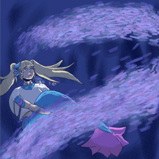
Mermaid!
#U DON'T UNDERSTAND#I SQUISHED THIS AS MUCH AS I COULD IN KRITA#BUT IT WAS STILL TOO BIG#SO I HAD TO TAKE A S C R E E N S H O T OF IT#also hi art? in this day and age?#my art#mermaid
1 note
·
View note
Text
Art Feedback Session - Spookydoesstuff


"Our task was to make a mock intro to a show using our own original stories, either ones we had in the past or ones we made in class. I used Adobe Animate, which isn't very traditional for art to begin with.
I wanted something dramatic and more anime-esqe (inspirations being Persona 5's 2D animation, as well as the Cowboy Beebop intro.
The render itself didn't turn out as high quality as I had hoped, but that's on me for not figuring out how to render in a higher quality. With my time crunch (I had put off working on this until I had 1 1/2 days left, on top of a project for another class.)
I feel this could have been better? But I'm satisfied with it. I just wished someone had said something, even just asking about my characters (I dont generally ask here, at least about these specific ocs, just because I've had them so long and I want to give out more of their story through context and art. But in that class no one had seen them before and I would have loved explaining their story better than just 'alien cats')"
-- Spookydoesstuff

So! Let's start with the good. The color contrast is lovely, the bright red against the monochrome is a classic high tension color combo that really sells the adversarial stress of the scene. The characters themselves each have their own unique silhouettes, which means if you just filled each of the characters in with pure black and then showed me their reference sheets I could easily identify which character is which. The line work here is very crisp and clear, which for animation lends very well to streamlining and simplifying things. Your style itself applies very nicely to an animation style, again, thanks to its general simplicity will make the whole animation process much easier than a more detailed or complex style or design.
When thinking of areas of improvement, the first thing that is brought to my attention is expression. With the four-eyed cat in the second image, at a glance it's hard to see he's furrowing his brow a bit and his current expression comes across more as a neutral expression than a concerned, worried, or frustrated expression. I would recommend here adding a bit of emphasis on the expression with the eyelids or eyebrows so that it goes into the general shape of the eye instead of just above it or add a stylized eyebrow so it is more visible against the dark fur. Due to the thin line art, the line that marks where he's furrowing his brow is hard to spot.
Your art would also benefit from expression through body language! Cats, in particular, are incredibly expressive through body language. The ears in particular here are showing no emotion- Cats when anxious, scared, or angry will pin their ears back. Perhaps a bit more emphasis on bristling fur too- in the nape of the neck and the tail. Fluffing of tails is not just fear, but also aggression when raised high or thrashing. When curved it's fear. The nervous cat in the second picture might want to be keeping her head a little lower, as nervous cats will duck down, especially if submissive. Of course, since these are not standard cats, you are welcome to take these cat behaviors and alter them to your alien culture's standards! Go wild!
Also, look into playing with the line of action a little more. Even with characters that are standing still, exaggerating some curves in their body will add a hearty dose of personality. Plus, look into the 'law' of stretch and squish- I use the term law here loosely, it's more of a guideline.
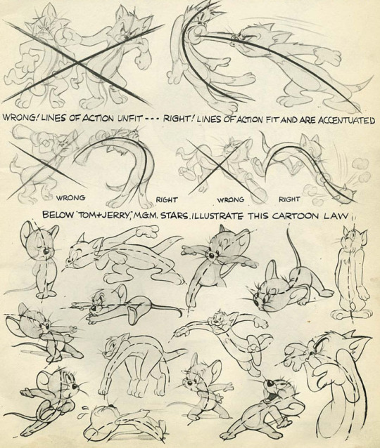
(Here are some image scans from a book called Cartoon Animation by Preston Blair, and there's a lovely tutorial on expressions from the comic Lackadaisy here!)
Next I'd like to mention the shading. There is a bit of an inconsistency between the way you shaded each character. Although lighting direction was ignored for style here, the particular techniques used for each piece should remain the same throughout each frame of an animation, each panel of a comic, or between related images in general. In the second photo, the highlights on the four-eyed cat almost looked like fur patterning, so maybe refining that highlight by making it a little darker would make it more obvious it was a highlight and not a change in fur color?
I think if you were given a little more time you would have managed with the shading, but still something of note to keep in mind for the future~
Finally I would like to address the environment... or the lack of it. The bright red background is lovely, especially in this grey scale-pop style of colors. My only issue is that it feels like they're floating in some red void- you have the darker red to denote the ground, but it doesn't feel very consistent with where the characters are placed and there's no shapes in the background to denote any kind of environment- no tree silhouettes, no building silhouettes, or any other objects that could denote where the characters are.

Above is an example from Persona 5 which kind of shows what I'm talking about. Looking at some perspective tutorials will actually show you a way you can manipulate the floor or gradients to help add some solidity to the ground. With this style I wouldn't even say you would need to add nearly as much detail to them as Persona 5's art- just some dark shapes and perhaps a gradient of sorts to give a sense of location to the scene would help.
Overall, wonderful job! My first impression was 'Oh hey this looks like something from Persona 5!' so you really got that feel you were looking for. You also immediately get a sense of relationship here- from an outsider's perspective with zero previous information on who these characters are or how they are related. You can clearly tell the four eyed cat is protecting the female cat in the back, and there's a sense of either accusation from the one-eyed cat or threat, and that the other two almost seem to be distressed as if they were once close to this character.
Keep up the good work, don't feel discouraged with the lack of feedback from your class. I really feel with a bit of practice in terms of expression and body language you can really make some great waves with your art! You have a great foundation.
In terms of art program recommendations, my wife and I both use Clip Studio Paint. You need the EX version for feature length animations unfortunately, but the PRO version is much cheaper and lets you do some very short animations however it is a very powerful illustration and comic tool as well. Krita is a totally free program that will let you animate as well and has a pretty robust illustration feature itself, but I'm not sure if it has anything specific for comic making.
A big thank you to Spookydoesstuff for being our first review and for being so pleasant to speak to! Please check out more of their art and their blog by clicking here to go to their tumblr!
6 notes
·
View notes
Last Seen Blogs
fajar1922
Fajar Dwi Saputra
e7sasworld
نقاء

purples1212
Scentsational
synix09
Synix09

masihmasihi
Untitled