#I need to design my ocs with more variations I swear :(
Text
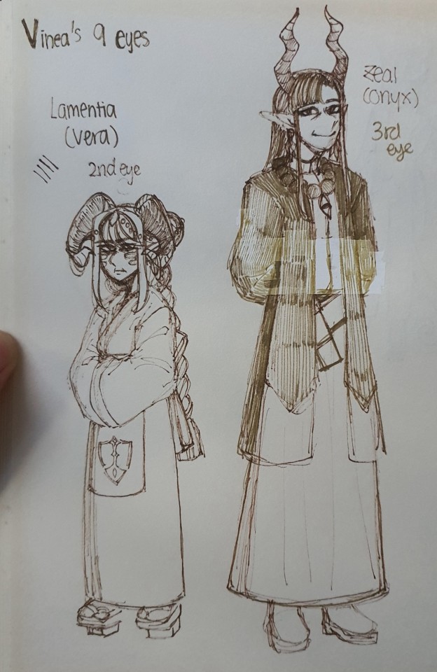
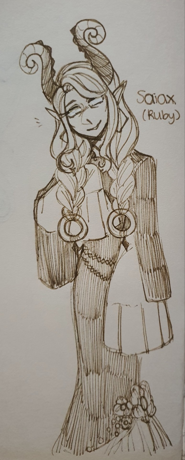
A peek at the 3 of the 6 newest ocs Im cooking
Lamentia, Zeal, and Saiax. 2nd, 3rd, and 7th Eye of Vinea respectively.
#I will officially explain the lore behind the “Eyes of Vinea” someday#for now their designs still need tweaking#also Saiax has me on a chokehold#doodle#low quality images#yuno art#oc#mairuma oc#m!ik oc#vinea lamentia#vinea zeal#vinea saiax#I need to design my ocs with more variations I swear :(#yunOCs
9 notes
·
View notes
Text
I RETURN SUCCESSFUL FROM MY DISSECT—I MEAN STUDY OF CAT—I MEAN @8um8le s ART STYLE!
That’s right. Art study.
Absolutely not my excuse to shamelessly draw Cat.
ANYWAY, red and blue is lifted directly from refs, pink (some blue) is freehand stuff
Enjoy my unhinged notes—

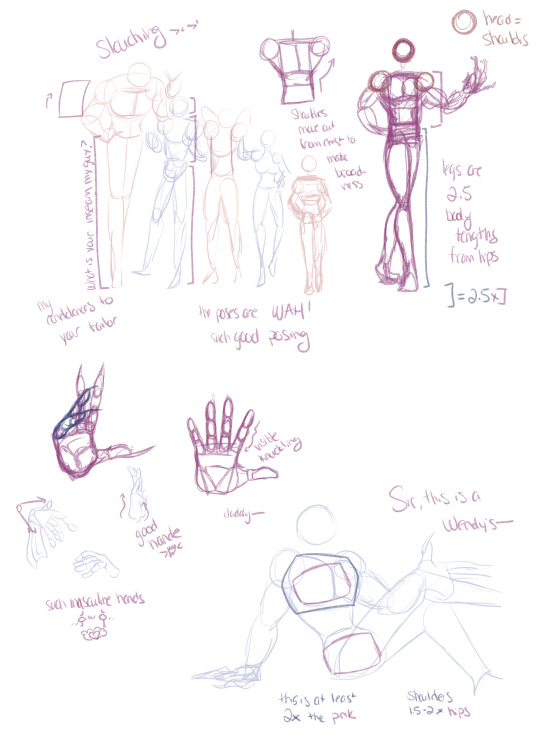
First I did some line tracing, I wanted to see what was going on with how the form came together without worrying about color; the pose language is divine. There’s so much personality and they’re well balanced in shape and gravity. My own poses tend to come off stiff at times, so if anything, I need to learn to loosen up and exaggerate a bit more

Then I went and looked at the use of color and came away with some confirmation about my own problems with color—I use too many high sat/high value colors too often and don’t trust myself to use contrast of warm-cool and complimentary colors to do the heavy lifting 😅
Did a few design reviews; this is freehanded unless noted otherwise. The design work of the machine parts is so nice; I get too caught in “believable movement” that sometimes I forget robot parts can and should look badass and detailed enough to read as such. My first attempts freehand were still a bit stiff and not reading correctly so I tried a different pose altogether and really pushed the exaggeration and then really went ham at free handing Cat. I think he turned out pretty damn good
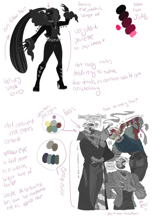
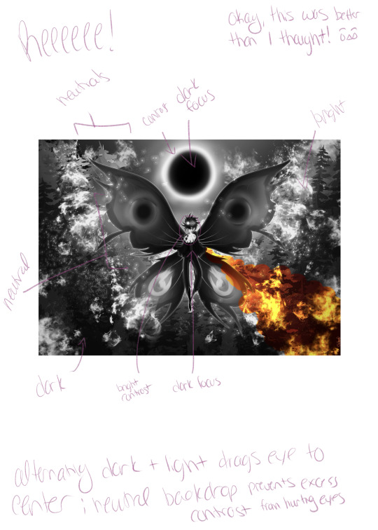
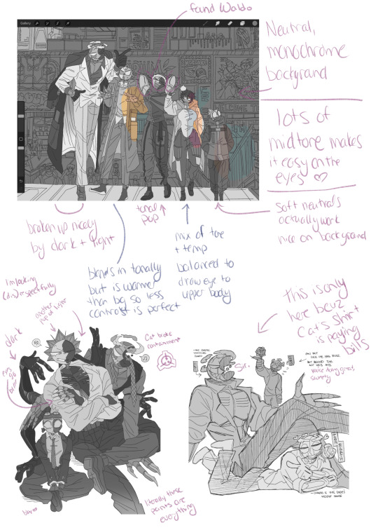
Then I decided to compare my own art from months ago and this week to the design choices of Cat and came away with realizing that, even if there’s a theme to my design, visually Ylixir (the Oc) is really muddy when turned monochrome and that’s not great. I love her design still since too much clutter would be eye killing, but it’s a reminder to me at least to strive for more contrast and visual interest to help a design.
When I trusted the contrast (without realizing it) and remembered my value variations since I was working in monochrome oranges it came away as a very interesting and something I’m very proud of. It’s a reminder to do more work in monochrome to make me more comfortable with colors that might seem boring alone but come together to be incredibly pleasing
3: —saving strain CAUSED* by relying on TOO MANY* high saturation/same value colors
I’m literate, I swear.
Anyway, thank you, 8um8le! This was fun and I learned a lot I think. Excuse me while I eat these notes and put Firewall back in containment before she realizes no one’s around to stop her—
#art study#beloved mutuals#art style#8um8le art#stellar city#cat#catastrophe#learning to draw#self taught
12 notes
·
View notes
Last Seen Blogs

the-skyward-soldier
Take to the Sky.

devensv
Sans titre
aloisiadecolombier
Stat rosa pristina nomine, nomina nuda tenemos
