#I was drawing on a big canvas and made this teeny tiny so off to the quality
Text
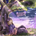
Day 9 of drawing Roguefort Cookie until they get added to Cookie Run Kingdom
#cookie run#crk#roguefort cookie#cookie run kingdom#cookie run ovenbreak#cookie run fanart#crk fanart#art#mod muffin#My debut post yippee!!!#also sorry if it's blurry#I was drawing on a big canvas and made this teeny tiny so off to the quality
66 notes
·
View notes
Text
Bww MoD - Chapter 10 Costume Homelands
This is for my bww au called Masters of Disguises, so yeah big info is in here.
Anyway, here’s the tour of 6 Costumes that lives in the Land of The Artist with a Painter’s Block or in short; the Inkblot Labyrinth.
🖼
The Inkblot Labyrinth (Chapter 10 World)
This is the Inkblot Labyrinth, A world created by the Heart of Madam of the Mansion, or as her real name; Lucy Wong. In the Inkblot Labyrinth, The Labyrinth itself is full of artful mysteries and masterpieces of art. Get out your paintbrush ready because we are going to the homeland of our first costume.
🖼 Acrylic Reef 🖌
Now this place looks like it houses free paint for a living, welcome to Acrylic Reef, Home to the Creative Inky Blasters. Inky Blasters are Humanoid Octopi with paint brushes for hands, they live in a understated themed painting city, where they shoot their paint on canvas to make good splatter art and use their paint attack on enemies along with making a paint war sport. Surprisingly, the Inky Blasters are the Representative Costumes of the inhabitant Lucy Wong for their lips, hairstyle and their artistic skills, Inky blasters also use their paintbrush hands to make a painting through different colors and find what’s inspiration they got their painting from, they often hang out with X-Ray Apes, Sneaky Lizards and Double Troubles so they can draw for them and to foreshadow on what costume concept made the Nega Boss; Inkabelle. What a masterpiece, now let’s get to the next costume and their homeland.
🧪 Glass Laboratories 👓
Hope you got your safety goggles on, because we have arrived at Glass Laboratories, home to the Smart X-Ray Apes. X-Ray Apes are Reddish-Orange Anthropomorphic Small Primates that wear glasses every day and night, they took them off whenever it is bed time. They live in Laboratories where they perform art themed Experiments like mixing colors and trying out new textures so they can report to Inky Blasters on the new art technique. What makes an X-Ray Ape‘s Glasses special is that they can see invisible items and invisible platforms, even the Invisible men too when they are invisible just like a X-Ray machine does. Well that is some monkeys, now let’s get to the next costume and their homeland.
🦎 Gecko Pagoda 🏯
Better be quiet in this place for there are ninjas in here, because welcome to Gecko Pagoda, home to the stealthy Sneaky Lizards. Sneaky Lizards are Light Purple Lizard Humanoids that wears stealth clothing, making them look like ninjas, they live in a Pagoda where they host training for stealth missions and stealth combats. Their missions relives on retrieve back what is stolen, finding new things and spying too, making them the best spies for Inkblot Labyrinth, and even the Pagoda have the best security system ever for any crooks. That is all for the training, now let’s sneak right into the next costume and their homeland.
🦄 Divinity Studio 🎥
Lights! Camera! Action! This is where the pretty fun begins, welcome to Divinity Studio, home to the Air Unicorns. Air Unicorns are Unicorn Humanoids with the ability to walk on air, just like the Air Cats and Frost Fairies but through their own magic. They live in a studios, where they perform acts and make movies by using their horns as pencils for drawing the scenes of the movie while the others act out their roles and the equipment people do their own thing with a director pulling the strings, once the scene is done, they make more until a movie is made with movie makers and goof detectors on the screen of things to make sure the movie is perfect and done. Afterwards, they host movie nights to see their hard work come to live, even there are guest appearances. I really like to watch the film and all, but we got a tour to do, so let’s go!
💧Splatter Hall 🎨
Boy is this place a mess or what? Looks like we have stumbled across The Splatter Hall, home to the Crazy Double Troubles. Double Troubles are Bunny-like Monster Humanoids with purple skin and crazy personality that says ”I will cream you with my pie!”, they live in a giant room of paint and paint splatters on the walls where everyday is a day to make such a ruckus and a big mess, paintballs flying everywhere and mess makers are appearing out of nowhere if you aren’t paying a attention to your surroundings. They can also make a clone of themselves to pull up harmless pranks, for they are Childish, Violent yet Soft creatures you cannot get eyes off of, they like to hide so they can do sneaky pranks when someone’s back is turned. Man this is getting out of hand, let’s get to somewhere calm and safe as we go to the last costume and their homeland.
🏰 Monarch Palace 🦋
Finally, the sweet sounds of daylight and peace and harmony around, welcome to Monarch Palace, home to the Dawn Butterflies. Remember the Dusk Butterflies from teeny-tiny World? Well, some of them got migrated to Inkblot Labyrinth by Wormsworth, making them be at sunlight for too long because of the Inkblot Labyrinth’s weather and because of this, they got weaker and sleepy and right when they sleep, their body go through a special kind of metamorphosis as their skin turn orange and then, afterwards, their bodies completely changed to the Dawn Butterflies we have seen today. They live in a palace where they play around during the day and sleep at night because of the place’s magical and artistic environment they live with, they also get weaker and sleepy if they do Not get some sleep, and they can fly during the day too. That’s what I call a Daylight Butterfly Effect, and that is all for the Inkblot Labyrinth and its costumes, tune in next time as we explore the Underground World of Flames, onward!
So yeah, that was the chapter 10 costume homelands, coming soon are the Chapter 11 costume homelands.
#Balan Wonderworld#bww#balanposting#bww au#bww MoD#bww masters of disguises#Balan Wonderworld au#Balan Wonderworld Chapter 10#Lucy Wong#bww costumes
6 notes
·
View notes
Photo

Elizabeth Tower in Bloom
Finally! It took forever, but it's done!
I'm going to assume no one remembers this old Paris Project I did a couple of years ago. It was a sort-of bonus project for my high school art class, as it wasn't a regular class assignment that was graded. It was for a contest-type-thing? I'm not entirely sure. It went to a college and got an Honorable Mention.
Well, when I was due for another project for my current college class, after having some time away from the original to shake off the post-required-creation-dissonance (because you can tell from the description that initially when I got done with it, I was fed up with the whole thing by then), I thought maybe a recreation or sequel could work. I asked my teacher, she liked the idea. And in terms of a sequel, based on location alone, my first thought was Big Ben in London.
For what it's worth, I got a two-pack of 18"x24" Canvases, the same size as the original Paris Project, and when I started trying to measure and draw out the Clock Tower (Big Ben is actually the name of the bell inside), I almost immediately said "Nope, too hard!" And switched to the Golden Gate Bridge instead. But then my mom came in, and after talking to her a little more poking around with references, I went back to Big Ben on the second canvas. (Which means I will most likely pick the Golden Gate Bridge up again if there is ever a third one of these).
Honestly, the longest and most tedious part (not counting mixing paint and ink colors because good Lord did that take waaaay longer than it should have), was probably sketching out the Clock Tower and trying to get the proportions right. It is a very illustrative/stylistic model, but the original project did more or less the same thing with the Eiffel Tower. I was trying to keep mostly in line with that, as well as realism is just not something that interests me. There is an entire debate to be had here, but I feel like, if you're going to learn art, that realism is easier to learn that stylistic. Though I am admittedly biased in this opinion since I'm basing my conclusion in part on my experiences with realism and at least two art Youtubers that I'm subscribed to that are used to doing realism and have both said on more than one occasion that they've struggled to learn to draw more stylistically.
Anyway. After that, I really just had to paint the tower and then get to the fun part of adding all of the stuff sticking off of it.
That process began with the clock itself. I did not have the patience to draw all those teeny little details out by hand, so luckily my computer was able to help me out with that bit. So with two naked clock faces at odd angles, I was then left to ask what I wanted to do about the hands. In the meantime, I glued two thin layers of foam stuff to the faces, outlined the details with glittery gel pens, and got them attached to the canvas.
I ended up going to Micheals, hoping for a clock stamp or stencil or stickers or something. Would you believe there were no clock stamps? Or at least none that I could find/that would fit my needs? And I only found one pack of stickers that were all clock themed; the four little clocks you see in the upper-left and bottom-right corners, and even it was out of place. I thought I was going crazy! Why no clocks?? But then I stumbled upon an actual clock-making section. It wasn't very big and there wasn't a ton of stuff to pick from, but they did have some actual clock hands, so I picked up those. And I was admittedly thisclose to buying a set that had the hands and a motor for making the clock actually tick/tell time, but I vetoed the idea because I was not confident in my ability to punch a hole in the canvas where I needed it, etc. And which clock face would I have picked anyway? And it might not even tell time correctly since the shapes of the clocks are weird...and so on.
Also, I didn't even know where to begin with picking a specific time for the clock to display, so I just went with where I initially just kind of haphazardly placed them to see how the little rhinestones I wanted to use (and did use) to cover up the holes at the base of the hands would look. The hands were already oversized, so I thought the "kooky clock" thing would work nicely. All the pieces made a nice happy little-sandwiched family after making the acquaintance of some liquid glass (think hot glue but squeezable and room-temperature).
Then I realized I was not the most thought-out designer because I decided I wanted to outline the clock tower bits around the clock face with the gold tinsel pipe cleaner. The addition of the clock face made this a bit trickier, at least as far as placement goes. And then I discover that tinsel pipe cleaner, apparently, basically repels glue . I taught it a lesson after cleaning up the mess and borrowing my mom's hot glue gun, though.
I then uncovered just how badly a project like this is begging for a die-cutting machine. If you don't know what that is, it's essentially a printer for fancy paper cut-outs. You put the paper and a stencil in a special tray formation thing, send it through the machine, and it spits out the paper cut out according to the stencil. I made the mistake of watching the Home Shopping Network one night where they were using one of these things, and I have honestly never been more tempted to actually purchase something from them. And once I learned how crazy in-efficient trying to cut a butterfly stencil with segmented wings out with nothing but an Exacto knife and scissors is, I really wished I had...I still kind of do, but the cheapest ones are around $70, not including the materials. I just don't think I'd use it often enough to warrant the price. But I did eventually muddle through with the resources I had to craft the little two-layer butterflies you see flying towards the clock face. I placed them that way with the idea that the clocks here are more or less flowers, and the text on each butterfly's backwings is theoretically readable. (I say theoretically because while it is facing the correct way, it is still a looping, stylistically messy cursive print, with even I have trouble making out.) The top layer is just printed stamps going in all directions. I wanted those to have wing segments poked out, but the process of doing that by hand was just oh-so-tedious I couldn't stand it. I had to do something else to keep my sanity. (And to be fair, I was kind of on a deadline here.)
Which reminds me, I love my mother, but this project taught me exactly why I usually don't get her involved with a piece until it's either finished of I've reached a stalemate. She had all these ideas and experiments and things to try. It was good to have someone to bounce ideas off of, but I really did not appreciate when I would tell her I didn't like an idea and she just would not let it go. Especially after one instance where she wanted to use these little stamps to make holes in the butterfly wings and I told her what I was picturing in my mind looked tacky and I didn't want to try it, but she would not rest until she did, and then she agreed that it looked tacky.
After I got the butterflies put together, I put together the leaves and the clock stickers. Some of the leaves were actually leftovers from my Why, Curious Butterflies! Piece, but I did make a few new ones. But ultimately it didn't matter because I ended up flipping them all over and using my green Tombow brush markers to color them again.
At that point, the individual pieces were good, but the overall piece (with the objects just temporarily stuck on with tape) just looked kind of naked.
Fortunately, I was able to find some cheery blossom stickers I bout but never used for the Paris Project. They filled out the edges pretty nicely and made the clock-flowers seem more at home. But there was still something missing.
Mom had let me borrow some leftover fabric from an apron-making fit she had a while back in case I wanted to use it, so I ended up cutting out the bird on the bottom left and the nest in the top right. There was a hummingbird too, but I couldn't cut the felt I attached to all three for a little more dimension and stability on him to suit me, so he was ultimately nixed. Since I had few of each thing printed on the fabric and they were scraps anyway, I cut out some pieces and used some tiny wood shapes to try and emulate these dimensional sticker things I've also seen on the Home Shopping Network. It's not very obvious when you look at the piece straight-on, but I think the problem has more to do with me being afraid of how far out the individual pieces should stick than a flaw in the idea.
I had also originally purchased some floral wire from the dollar store, thinking I could outline the Tower and some details with it, but I learned very quickly that once the stuff gets bent or bumped, it's very difficult--dare I say impossible--to get it smooth and straight again, which wasn't going to work for what I wanted to do. So that idea got scrapped. But I was just tinkering around with it, trying to think of how else to fill out the canvas, and came up with the idea to do swirlies, kind of like vines for the clock flowers.
Now, in my last WIP picture, you could also see some very thin silver swirlies too, but I ditched those because they didn't really fit with much else and I really just made them because I was in class, out of other things to do, and did not feel like or have enough time left in class to pursue a classroom hot-glue-gun to start attaching things. (If there's one thing I know how to do, it's pittle around and waste time )
Still, there was something missing.
So before I started gluing, I went with an idea that had been lurking in the back of my mind all along. I took the last butterfly stencil with wing segments that I had, grabbed one of my Tombow markers, took everything I could off of the canvas (so everything but the cherry blossom branches and the tower and it's clock face bits) and started printing the pattern by hand. I did essentially the same thing with paint in blue and pink on the Paris Project, but those two stencils ended up getting stuck to the canvas to bring out a couple of the butterflies. There, the butterflies were sort of additional flowers. Here, my intentional was a leaves/vines kind of look. The palate was so warm otherwise, I felt like it was begging for an additional, much cooler pop of color, and my eyes really liked the green from the leaves, so I went with that.
In hindsight, maybe I could've done some green and some about the shade of baby-blue that the eggs in the bird's nest are, but that didn't cross my mind at the time. I also thought to do some in gold, but the one shade I had that I could've used was just too yellow for my liking. And thus, here we are. (And for the record it was a pain in the neck to try to stencil those things around all the stuff that was stuck to the canvas!)
My mom thinks it's busy and there's a lack of cohesion. I can understand where she's coming from, but I like busy. (This arguably relates to our fashion sense as well; I like busy, she likes plain) And I also think she may have gotten too used to seeing it in-process when it was mostly naked.
Ultimately, I wouldn't say it's perfect, but my vision has for the most part been fulfilled, and thus I am happy with it.
It's a good thing I took a picture of it though because lord only knows when I'll be getting it back But I will get to see it at least one more time for the college's art festival Thursday night.
Hopefully, with the holidays right around the corner, I'll find time to finally start working on personal pieces again. I just haven't had the time these past few weeks. (If nothing else, expect a supply test from me after Christmas--the Faber Castell Polychromos are here! In the house! I touched the box! But I can't have them until Christmas. )
Also, I'm working on a website as one last class assignment, so be on the lookout for that! I'm actually having a lot of fun with it!
____
Artwork © me, MysticSparkleWings
____
Where to find me & my artwork:
My Website | Commission Info + Prices | Ko-Fi | dA Print Shop | RedBubble | Twitter | Tumblr | Instagram
0 notes
Last Seen Blogs
metorneifadaangela
Me Tornei Fã
dustyoo10
Dustbowl

mvlcolmmerlyn
* ANGER / GRIEF
1badjoke
Binx's 1 Bad Joke
drangelu
Drangelu