#Like I used the personality Dreamworks gave her as like a baseline and then made her (and Nuffink) better
Text
light fury design analysis
hi! i'm an artist and i grew up loving httyd, so i'd like to make a post describing my reactions and thoughts on the light fury's design. in no way am i trying to hate on anyone, this is purely sourced from my views. that being said, let me know what you think!!!
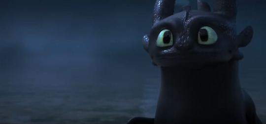
okay. first off, to put down a baseline for httyd character designs in general, let's talk about toothless's httyd 1 design

the thing that i love about this design is how much character they really fit into it! they made sure to humanize him just enough to be likable while still emphasizing that he's, you know, a dragon. additionally, if someone were to ask you "what animal does this look like (besides a dragon)?" you'd probably say cat! they use a lot of body language and structure to make him very feline, which not only shows a lot of personality right off the bat but makes him more familiar and likeable to the audience.
as you can see in the picture, toothless has some markings. this highly suggests that he could have been based, specifically, on black panthers

see the similarities?? both are muscularly-built felines with light colored eyes and a dark base color with faint patterns. however, httyd made it subtle enough that he's definitely a dragon. no doubt about that, from all the little details like his spines and tail fins! he definitely looks like he could be a naturally occuring animal, which makes him fit in really well with the world. his body makes sense.
httyd uses the trick of basing dragons off of other animals a lot actually! albeit, usually with the more main dragons of the series.
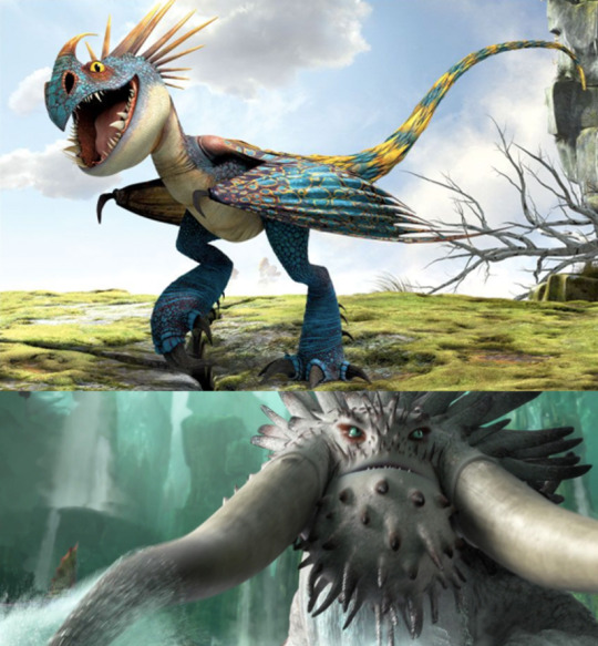
take stormfly, whose body composition and coloring make her look like a tropical bird. additionally, her crest and tail spines are very feathery, and she makes bird-like noises! hell, she has a beak. this is indicitive of her speed and intelligence among dragons.
another good (but more subtle) example is the bewilderbeast. those shapes of tusks are only really seen on this dragon, just like in real life they're only really seen on elephants. that and this dragon's immense size and gray coloring make it very reminiscent of an elephant, cementing the nature of wisdom and gentleness it has (therefore making drago's bewilderbeast's behavior even more unsettling).
so. we've established how httyd makes memorable dragon designs. now let's get to business with httyd 3 and the light fury.
here's toothless's httyd 3 design. what strikes me first is how he is much more humanized - honestly, if this was a movie where dragons talked, that'd be great! but it isn't. the main reasons for this is that his face became flatter in the front and they also gave him...eyebrows? because dreamworks just loves eyebrows. also, his pupils aren't even vaguely slit shaped anymore, which makes him look more dog than cat. this kind of unravels a lot of his previous design. he's more of a human-dog-lizard thing than a feline dragon to me.
also, speaking of his eyes, they're much bigger. which, as he's supposed to look more mature and adult-like in this film, is strange - big eyes are characteristic in young animals.
anyway. so httyd 3 character design is already off to a bad start. now let's look at the light fury.

here she is! this dragon already has a huge amount of differences from toothless. she's a whole lot smoother, and her features are all made to be more "feminine" (bigger eyes, smaller nose, smaller size and smaller fins). Also, she's sparkly. For...no reason. Altogether, if you showed me this dragon, I'd say she's aquatic. I mean, if we go with the trend of modeling dragons after real life animals, you have the dolphin!
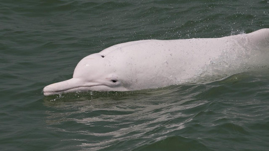
both the colors and the general smoothness of dolphins really correspond to the light fury, and the tails also have a resemblance. they could've used this to symbolise her being intelligent or playful as well!
but...no. they didn't base her off dolphins. they based her off of 2 animals - the snow leopard and the axolotl.
the snow leopard makes huge sense! after all, toothless resemble's a black panther, which is closely related.

but look at the snow leopard. this looks nothing like the light fury, who is very slim and smooth. she has markings, but they're virtually invisible in most shots. and correct me if i'm wrong, but even albino leopards have markings. so...that's out of the question.
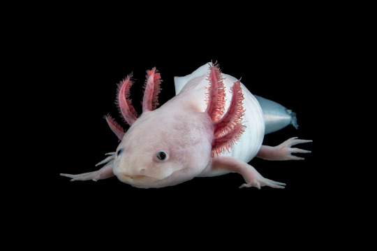
now here's an axolotl! that also looks a lot like toothless, right? and right off the bat, i see the similarities. they're both smooth, white, and have that continuous ridge going down their backs, and they're keeping with the first impression of an aquatic animal. however...the light fury is lacking those characteristic fronds around the face. it doesn't make any sense for these to be slimmed down "because she's a girl," either. night furies use those for echolocation. do light furies not need to navigate in the dark?????
i'm going to be completely honest with you. the light fury design looks like it was made to be easy to produce as toys. they slapped together a bunch of stereotypes (slim, pinkish undertones, sparkles?!) and smoothed down her figure. the excuse "but she's female!! female animals look like this!!" doesn't hold water because A. she's missing body parts that don't rely on gender (echolocation ears) and B. look at meatlug

they didn't give this dragon tits or make her hot pink! they just called her a girl! what makes this argument even stronger is that everyone thought meatlug was male at first, proving that httyd dragons don't have many obvious differences between gender. also, if anything, while the light fury supposed to be a symbol of toothless's maturity, she looks younger than him. which is gross! httyd has always been pretty good about treating female characters the same as male ones, so the light fury came as a huge shock to me.
now let's look at her concept art
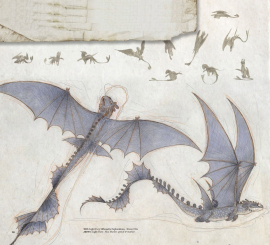
sweet thor in a thunderstorm!!! this is awesome! yeah, i know! what i see here is a successful combination of axolotl and snow leopard traits - while keeping that draconic twist! there's more fronds generally everywhere (even the wings!), and it looks like she has markings as well. in all, she looks sturdy, realistic, and mature. this is not a baby dragon, she effectively looks older than toothless! also, she doesn't sparkle, and seems to even have misty powers if you look at her mouth closely (more fitting than the light fury's canon invisibility but with the same function, if you ask me).
the main reason this specific design was scrapped was that it would be too hard to animate. and, i get it. i've animated things myself. but honestly? they could handle the two-headed zippleback! they could handle the red death and the bewilderbeasts! they couldn't handle a few more fronds and a tail change? even with two movies under their belt and a ton of funding? what i think is that they wanted to make her design more generic, and as i mentioned earlier, more manufacturable. it's sad. capitalism is killing creativity.
that's all i got, folks! let me know what you think, and if you want me to make any more in-depth posts like this (and show me your light fury art while you're at it!!) thanks!
#how to train your dragon#httyd#httyd 3#how to train your dragon 3#night fury#light fury#character design#analysis#art analysis#mine#long post#travs greatest hits
187 notes
·
View notes
Last Seen Blogs

lafefero
Nada como nosotros

larrypicslove
All The Best Louis And Harry Pics

saimin-seishidou
최면성지도 애니 보는곳 saimin seishidou 자막

kayawellhealth
Untitled