#Like is the dark gray skintone weird?? It's what one piece I did was green skin. Bc i was gonna change
Text
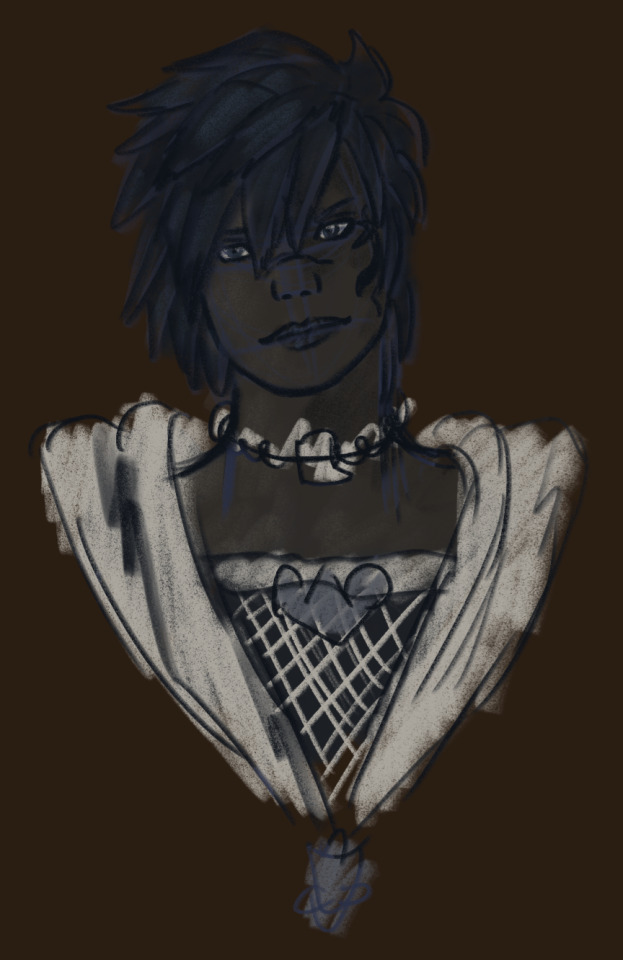
Attept 2 [the first is not seeing the light of day] I need to make her a proper pallet. This will take a lot of colour picking bc lighting effects but it will save time. The old one is badddd and idk what each set of colours are for... anyway her<3
#thebirdarts#Uhh my wol? Idk if she has a tag#Eh I'll look in the art one#God same design since I started. Shit that was three years ago#Im too poor for fantasia abuse#I have some things I'm not 100% on bc it was years ago and I wasn't aware of some shit#Like is the dark gray skintone weird?? It's what one piece I did was green skin. Bc i was gonna change#I guess it's like drow tho. So fine? Idk it's late#And she has the galien or however it's spelt third eye I need to get rid of that and her other tattoo#Anyway sorry I'm tired I should delete these tags but I don't want something thinking I haven't thought about it? U know?#Anyway her<3#This is just a quick one a collection will be posted on my art account eventually#When I'm awake enough to draw more#I need to shut tf up
10 notes
·
View notes
Photo


I hope you don’t mind that I submit headshots to this blog? They’re my most recent and favorite pieces I’ve done aoskslsl I tend to struggle in my art even with my headshots, so I thought maybe it’ll be the best way to start a step at a time? (please ignore the chibis!)
——
Ah, your style is very cute! I’ll see if I can help you out :)
For the character on the left:
Anatomy:
Honestly? Not seeing any problems here! this looks like an angle that you fall into place with again and again for headshots, so it seems like you did this entirely from muscle memory and it looks nice!
Lineart:
Very smooth, very sleek~ Very nice.
Color/Shading:
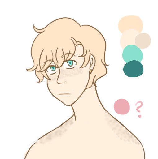
This is a very nice palette that reminds me of the ocean!
However, the little bit of freckles you have shaded onto them are a little…bland. Also, blondies tend to look a lot nicer and full of life with a tinge of pink to their color palette!

Instead of adding gray to their skintone to make a darker shade of their skin for the freckles, try adding a little pink. I went a little heavy on here with it, but you can make it a little more subtle if that’s what you decide on!
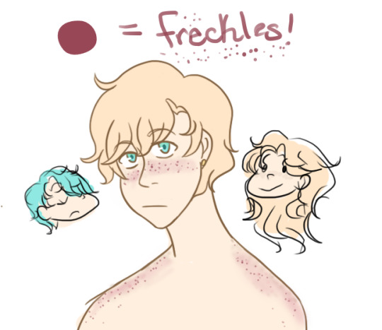
Also, THIS is something I’ve learned from experience. Don’t be afraid to make the freckles SUPER dark. Otherwise, the moment you zoom out of a picture, you won’t be able to hardly see them. I had to tilt my screen a little to find the ones you put on there.
If these weren’t even freckles at all, I apologize profusely.
For the character on the right:
Anatomy:
Okay, this is definitely an angle I can tell you don’t do very often. Don’t be afraid to practice more angles!! Something about it seems off, and I can’t really put my finger on it.
If you ever come to this point, a cool little trick is to FLIP YOUR PICTURE.

See? Makes it a lot easier to see what the hecky the problem is. The forehead seems to warp forward, their left shoulder is WAY too wide, etc, etc.
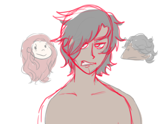
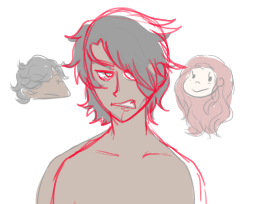
Annnndd, flipped back!

I common misconception I see, especially with people who draw a lot of toons and anime, is the head is a lot thinner than it actually is. When you look at a head from the side, it should be as wide as it is tall! It looks weird when you first try it out, but trust me, it helps out in the long-run!
Lineart:
Whereas the lines in the blondie look super flowing and smooth, the lines for this guy seem very constrained and unsure. This is something that can be amended through lots of practice with different angles, rather than falling into your default headshot angle! (everyone has one, trust me)
Color/Shading:
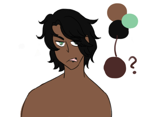
I love this guy’s simple color palette, and the mint-green eyes and how they pop against the skin with red undertones.
However, I have one small suggestion. Instead of going straight for solid black hair, why don’t you try a base color of a dark brown, shaded with black? This way, you can see all the texture in the hair still.
Also, if you use hair with red undertones, it’ll make the eyes pop even more!!
Overall: try the flip effect! and practice outside of your comfort zone to really get that flow going :)
(thank you, @juminshi, for your submission! keep drawing!)
6 notes
·
View notes