#also im trying to do diff things with the colors and textures on sketches!! i be experimanting 👍
Text

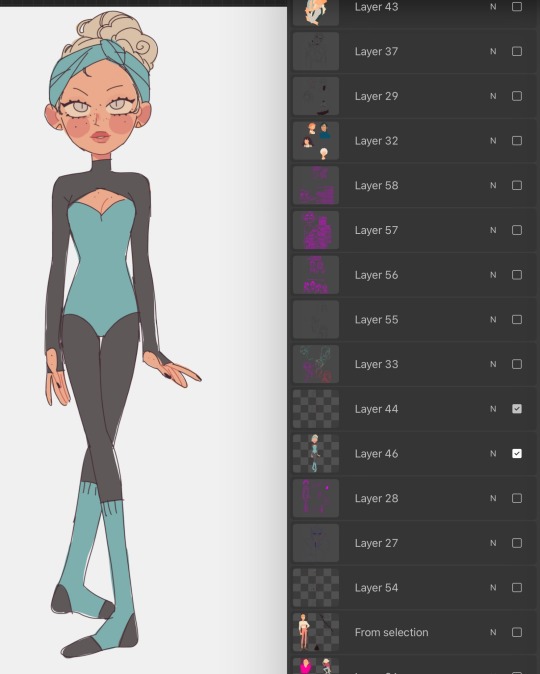
Whole gang's here :]
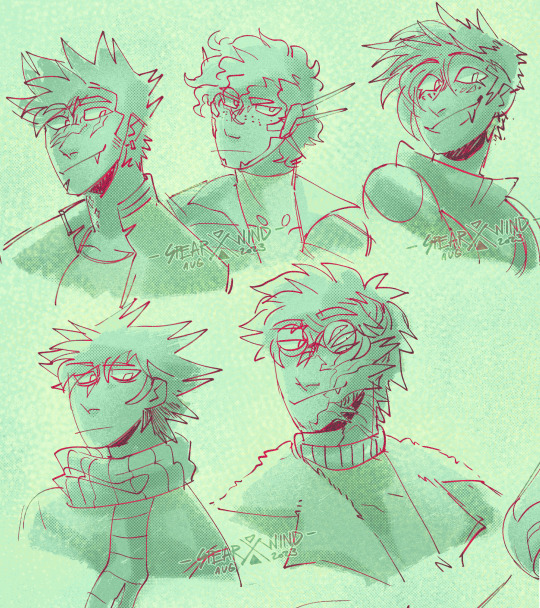
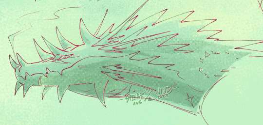
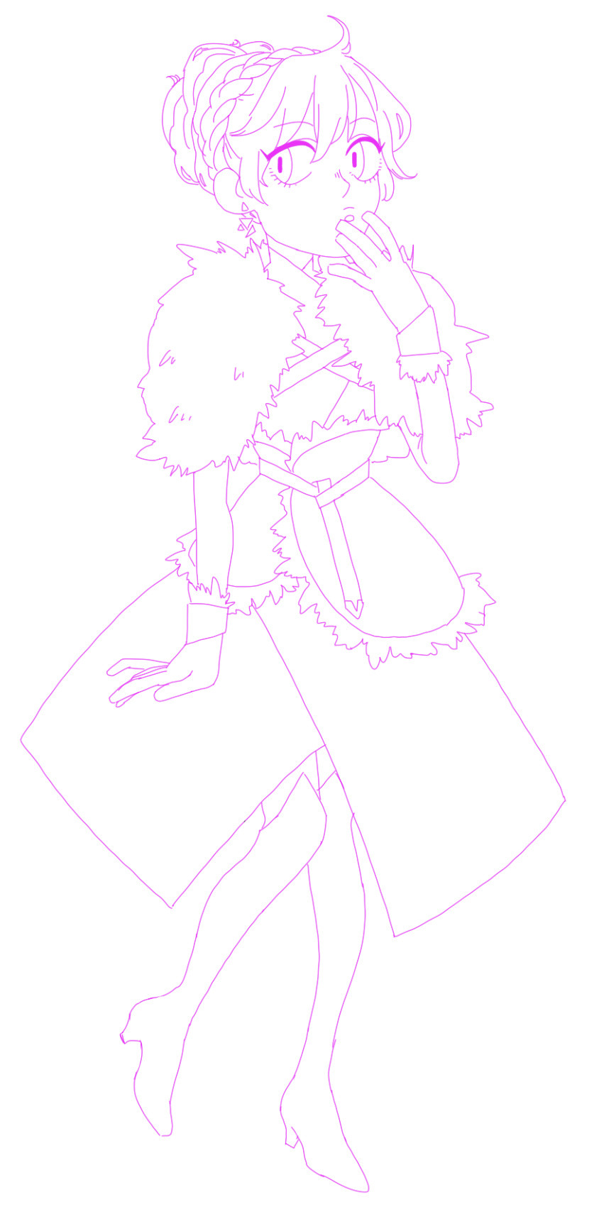
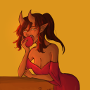
#first thing im able to actually sit down and draw in two months barring some color tests i did for talas and hades#if my kids are the thing that pulls me out of artblock again im gonna laugh sooo fucking hard dudes lmao#anyway god i love these guys so much. i really do#windyart#extinction#alex#riptide#c#danger#ethan#orion#its been SOOOO LONGGG since i drew danger too god damn but i love them so muhc too i missed em#tbh i missed all these guys a LOT you cant even imagine. the shame of the comic was just weighing so harshly on my shoulders#i think now if i accept im not gonna go back to it for my own wellbeing i actually can have fun with these guys again#also im trying to do diff things with the colors and textures on sketches!! i be experimanting 👍#not quite what i had in mind but its enough for now!#i may be emotional a little bit ough ough ough
268 notes
·
View notes
Note
hey kels i was scrolling through my dash and then i caught a glimpse of your new fallon drawing and i want you to know that i went absolutely buckwild and then i scrolled further to see the whole drawing and i'm pretty sure i squealed. kels ever since ive started following you and your art and fallon have slowly nestled yourself inside my brain its amazing how excited i get whenever u upload a new drawing. also ive noticed that i'm slowly but surely starting to sound more and more unhinged and wild like you. how the fuck do you have so much influence on me.
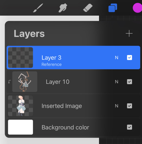
ALSO i love the new fallon drawing!! you are so right blue gold and white are just her colours they fit her v well!! and i love how much texture you used throughout the whole drawing and her shoes are AWESOME!! also love the whole winter fairy-ish vibe <3
ALSO i was wondering if you could like sort of,, idk explain your drawing process on this drawing? like if you did the colouring first or the lineart and stuff bc i just love how it turned out and id love to try something similar!!
AW!!! i am so hype for my awful girl to be Enjoyed so much!! she is my favorite dressup doll i love to play barbies with her most of all heheh. also i am THRILLED that my Unhinged and Unwell nature have rubbed off on u. i know i am a Strong personality and it makes me V POLARIZING (i am either LOVED or LOATHED i havent met many ppl who are just like meh abt me. i am an Experience) and its always a DELIGHT when someone finds my feral animal traits endearing or positive and kind of picks up on them. i think because life is short that we should all be as bananas as we please at any point in time. PURE ID HERE BABY
AND TY TY!! my girl has a strong aesthetic and this piece kind of went a liiiiittle against some of that (its a lot of hard angles vs i normally give her a lot of ovals and rounded edges) but for the setting its appropriate bc im trying to give her a bit more of a """"harsh"""" or """"severe"""" vibe (like as harsh and severe as she can possibly look which isnt very). i LOVE to use texture brushes they are such an easy way to get out of drawing details myself because i am SO lazy!!
okay i “”answered”” this i GUESS technically because i typed words in response but its a whole lot of jack shit so like. here ya go. SORRY PAL.
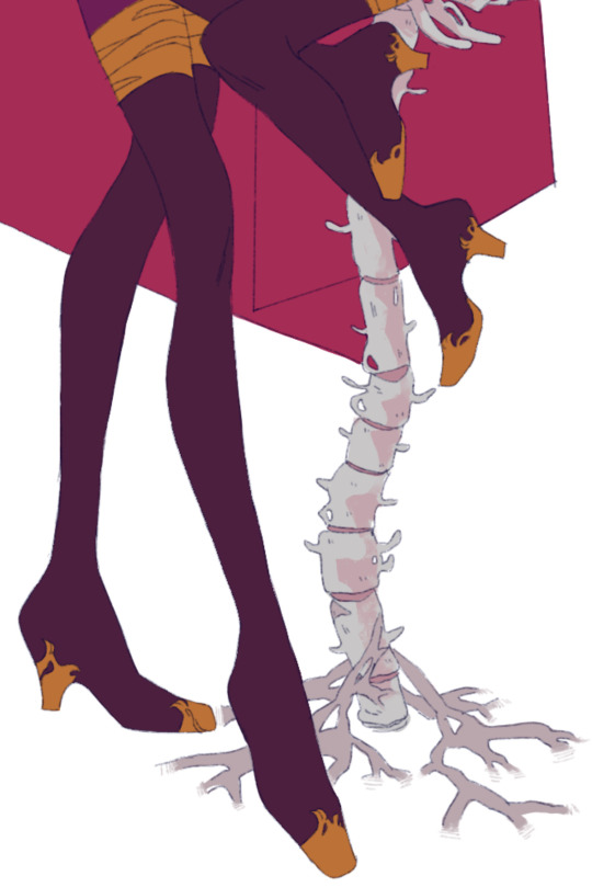
here are some more shoes as u can see i basically draw her in the same ones always except when i draw her in a plugsuit

OKAY THE DRAW IN QUESTION i kind of cheated on bc i literally just traced over one of my older draws i did for a very obscure au i made of who made me a princess (i am always doing such ridiculously niche shit i love to sit in my little sandbox and have no one else understand my barbie rps) BUT the process is the same as basically every draw i do like this. it is very simple so dont worry (or do, maybe)
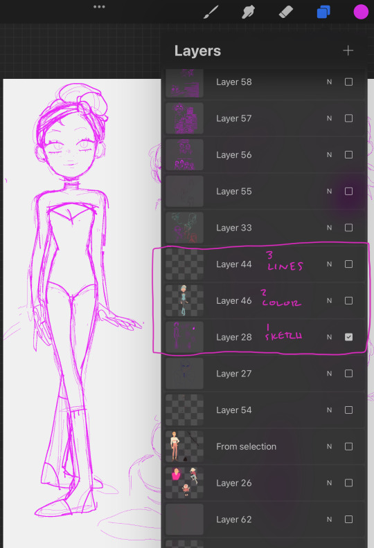
i use 1-3 layers at a time and then immediately merge when i feel like im done and LIVE W MY MISTAKES if not!! anyway prepare to be massively underwhelmed heh
this is so funny i cant believe i literally traced my own drawing im a fuckin FRAUD im the laziest bitch i know. anyway. my sketches are way messier than this but it always starts out either scratch ass lines or color blocking w this bright ass magenta bc thats what feels right!!!!!!
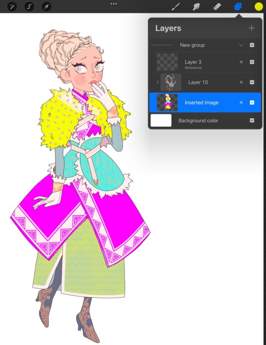
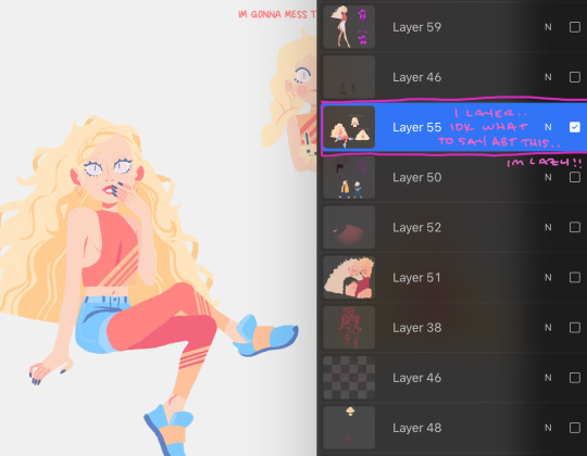
HERES THE LAYERS I USED LOL i do all textures n shit as a clipping mask so actually i used 4 layers for this bc id set down one texture or pattern that was gonna overlap on a diff layer so i wouldnt have to work harder to erase and then BLINDLY MERGED to make things more difficult if actually i fucked up before that!!! work smarter not harder except when it is absolutely braindead to do otherwise is my motto
IF IM DOIN SMTH NICER like this then i usually make sure all my lines connect (this is also why i do a lot of angles and simple clear shapes when i draw) so i can set that layer as reference and USE THE FUCKING FILL TOOL BAYBEEEEE!!!!! this also makes it easier to fuck around with COLOR imho bc you can just rapidly swatch with zero efforts. i Love to take shortcuts. i Love to be lazy. i HIGHLY rec this, if i have colored smth that stays in the lines then its bc i connected the lineart and used the bucket fill underneath. if my lines dont connect sometimes ill make a temp line and erase after i filled. im dedicated. ALSO u can see here that my patterns layer is all overlapping and fucked up bc i didnt check and erase fully but i use p limited palettes in general so... IT DIDNT MATTER THIS TIME!!!!!!!!.
anyway after all that i lock the lineart layer if i havent already and color some of the lines for some PIZAZZ. easy way to immediately fake effort i do love to do that
HERES AN ACTUALLY MESSY SKETCH:
i do all of my fucking draws on the same canvas bc im a horrible little beast, so the only reason i didnt erase the sketch and use it for the colors layer was bc there were others on that layer already and i didnt wanna scoot them so i could cap the finished draw. i did NOT connect my lines for this one i colored like a toddler. who gives a shit we all die in the end anyway!!!
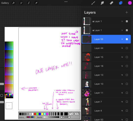
YOU DIDNT ASK FOR THIS BUT LINELESS MY LOVE... i just color blocked for this one alas i do not have process caps, i will do that next time i draw i guess if anyone wants that!!? i typically only use a single layer for lineless- block out the shape, alpha lock, then color and carve from there. EASY PEASY!! ive shown it before but i spent all my formative draw years on v limited feature programs (mspaint, oekaki, TEGAKI MOST OF ALL) so i dont explore tools much and do what seems easiest and most intuitive to me... im sorry i dont have any sick tricks or real process i am but a feral little clown drawing in the DIRT. also here is the tegaki overlay i use whenever i am Blocked or fatigued w procreate layout. it makes me feel NOSTALGIC and INSPIRED so i do this instead of like, actually getting on tegs2
this ended up long as fuck and FOR WHAT?? its just 10 images and several paragraphs of “sorry im the laziest fucker ALIVE”
#idk what to say here every time i type anything i thnk it makes me seem just completely detached from reality#its not untrue i GUESS. im Unwell but in a stable SUCCESSFULLY COMPLETED THERAPY AND HAVING FUN WITH IT kind of way#kels talks#damn sorry anon this was a whole lot of not answering you at all
23 notes
·
View notes
Note
Do you have any art tips or a step by step on how you color??
Please its ok if you wont
sure, i can give a tiny bit of insight on how i colour. Under the readmore:
At this point of my personal understanding, i would say colouring is just two things: 1) making sure your colours look good together, and 2) lighting (if u decide to even do lighting/shadows, that is)
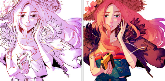
The 1st one you can achieve by doing palette studies based on photographs or other ppls art, or by doing trial and error, or apparently by learning colour theory (im too dumb to understand it) and also applying digital tricks like overlay layers and also fiddling with hue/sat/brightness/contrast until it looks good to you. Below is my latest Audrey drawing without the overlay layer (left) and then with the overlay layer (right).
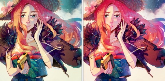
It’s magic, right!? I’m so used to having an overlay layer in every drawing now that these days i just slap one on before i even start colouring lmao. usually 20-50% opacity, usually a saturated orange or pink and then i’ll adjust as i go. mostly i just do trial and error like fitting wooden toy shapes into the right holes - my brain will go “ding!” when the arrow on the hue gauge hits a colour that looks good to my eyes.
The 2nd one, lighting, is more complex. I always say “lighting is everything” because to me it IS...it can control the entire mood of the picture. Where is the light? Is it hard or soft? is there a secondary light? What emotion are u trying to convey? and then how can you execute it? how would light look on THIS object compared to THAT object? A big part of lighting is being able to visualize your drawing in 3D. Once you can do that, you can lay down the light and shadows quite naturally depending on where your light source is. this ties into the way you DRAW things tho (like, u have to already be thinking about 3D while in the drawing stage) so i dont wanna get into it since this post is about colouring.
Lately I’ve been p lazy and doing all my major shadows on a single layer, set to “Shade” on sai (it might be something diff on other programs idk), 42% opacity (for this particular piece), and clipped to my folder of colour layers. So that means almost all my actual colour layers are just flat colours! Here’s my main shadow layer all by itself without any base colours (left), and then shadows + base colours (right):
sometimes i’m already thinking about lighting while im still sketching the picture. sometimes i’m already thinking about lighting before i even start to draw. For this particular pic I ended up with 5 different layers for lighting:
1) all shadows (42% opacity Shade layer);
2) some extra shadow under her hat (72% opacity Shade layer), which then allowed me to create the cool hat texture by simply erasing bits of this layer
3) a soft angelic backglow coming from behind her. this layer goes somewhere above the lineart layer to give the illusion of light spilling in front of her and fading out her edges;
4) secondary blue reflective light coming from the....sky im presuming, but mostly because i just felt like the drawing needed some blue lol;
5) a 55% opacity overlay layer containing a trace amount of vignette in 3 of the corners + an extra glob of light just to the right of her cuz i was experimenting with different instagram filters near the end and found one i rly liked and tried replicating it on sai 😂
Here’s the picture with only my main shadow layer (left) vs the picture with all 5 lighting layers (right):
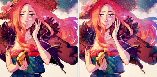
The pic on the right makes her look more like she is Somewhere. I think I could’ve pushed the depth even more but i wasn’t confident enough. And sai doesn’t have blur tool :(
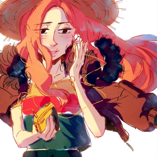
I also always have at least one layer that i name “extra”. The Extra layer goes on top of the colours/shadows/lineart layers, but under the overlay/glow layers. This is for extra details (including extra LIGHTING details) that I wanna add like extra sparkles, extra straw hat strands, hair strands, hair shine, zipper shine, etc all for that “extra” touch of realness. I don’t do all this stuff at the end, though. I have my Extra layer created pretty early on and i go back to it and add to it when I need to. Here’s what it would look like without the Extra layer (left), and with it (right). Try to find all the extra bits i listed:

One last note is i don’t colour one thing at a time. Before I start, I slap on all the base colours and all the shadows super roughly, just to check if my lighting and colour choices look good TOGETHER and make the entire composition look good. no point in spending hours rendering all the lighting and shadows on the character’s hair if in the end u decide there was actually a better lighting design u could’ve gone with. So here’s the rough colouring plan I made for myself before i started rendering for real:
im not sure if this was useful at all but i hope it was interesting at least! if you want to see my actual chronological process for colouring you can watch the gif of wips i compiled here: [link]. You’ll notice that i edit my lines as i colour. I think it’s good to be adaptable, and to be ready to go back and change ur lines to benefit your lighting, colouring, and overall look of the piece.
Also here’s the finished version of the pic: [link]
#Anonymous#miruask#miru art#tutorial#there's a lot more i didnt mention#i didnt mention my texture layers#cuz i felt too ashamed lol im just a sham artist using textures and overlays and texture overlays#textures can absolutely make ur colouring look interesting tho so try some out!#i didnt use a texture for the hat tho i did that all on my own and im proud#i also didnt mention locking ur lineart layer and colouring the lines themselves#but thats such an age old technique that im sure everyone already knows it
31 notes
·
View notes
Last Seen Blogs

xcoolsblog
Untitled

jilatlobangjubur
Untitled
carlospun
Carlos Pun Art
rhymiie
Hello there
sta-cia-blog
stacia