#also learning foreshortening really helped making standing poses look better
Note
Do you have any tips on getting better at anatomy and dimension? You always draw such beautiful, dynamic and expressive people!! So i was wondering if you have any tips for people who struggle with that? I also love whenever you share your life drawings because your sketches always look so smooth and effortless, and I would really like to learn but I have no idea where to start lol. I know you're probably sick of being asked this but I really look up to your art!
hello! i’m so honoured, thank you! i would normally say “live sketching is the best way to improve!” but you’ve already seen my live sketches so ill see if i can list down all the other things that helped me with my art journey:
using references - online, but also references of yourself (or someone you know who can do it for you). you are going to be able to get exact references to what you want to draw when you pose for it yourself. this is something i started considering only after i was forced to do acting for animation at uni. it’s really helpful!
learn to draw cloth and folds. when you’re drawing people there’s a 90% chance they’re in clothes, so observes and see how different materials look when they’re hanging or scrunched up or blowing in the wind.
the coil technique by sycra helped me out a LOT when i was trying to figure out foreshortening and make the character still seem like a solid structure.
line weight is another great way to show volume without shading. it also makes the line art process a lot of fun!
and i’ve heard many other artists say this and i stand by it too. find something you’re interested in and keep drawing for it. eventually you’re gonna get really good at it! and then you find the next thing and keep drawing that!
if anyone has any more tips feel free to leave it in the replies! i hope you have a good time drawing <3
78 notes
·
View notes
Text
Devlog #6 Writing, Music, and Art
Hey y’all! I wanted to give an update since I’m pretty sure everyone thinks I’m dead ^^;
For quick updates on the project: OCG is being produced in two parts now. Part 1 will contain the many mysteries that the world of OCG has to offer and part 2 will be a sort of answer arc. The first draft of OCG part 1 is written and I’ve been hard at work revising and editing the prologue and chapter 1 of the script. For part 1, there is roughly 6-7 chapters of planned content. I’m hoping that at the end of the day, Part 1 will resonate with you, the reader.
Covid has been extremely hard on my ability to complete the project. I won’t get too personal on a devblog, but my health and finances were impacted. I apologize for the delays and this account’s inactivity. I feel like I'm letting down the people who want to read OverClock Gear and I just want to let everyone know that I'm still committed to working on the project and that despite the inactivity, I'm still working hard to improve every aspect as much as possible.
I'd like to share some of the things I learned along the way so that maybe future devs can learn something from my struggles.
WRITING:
As a warning, I want to say that none of the following are hard rules of writing. These are just things that I've observed as a writer and as a consumer.
Probably the most challenging part of a Visual Novel is writing a script that works with the format. The rules for VN writing are different from traditional novels and screenplays as many elements will be shown on screen but usually not enough to get a full sense what's going on. This is more of an opinion, but I feel that the descriptions should supplement the action and we should pick and choose when to show with sprites instead of describing. This is especially true when considering dialogue and internal monologue will make up a majority of the script akin to a movie.
It's not to say you should ignore everything you know about writing, however. There's still things about structure and character arcs that are useful.
Speaking of characters, balancing your cast is also a challenge. Every character is fighting for enough screen time to develop enough for the reader to care. As I'm writing OCG, I am trimming down and trying to give each cast member enough time to breathe while keeping in mind the characters' backstories and motivations. There's also the delicate balance between backstory and current events to keep in mind. I think it's especially hard to figure out how to reveal backstory without dumping a history lesson on the player.
There's also the issue with paragraph length for display purposes. VNs have a unique format that breaks down text into easily digestible chunks. However, overutilizing the space can sometimes make the reading experience worse.
There are a lot of things to consider visually too when writing your script. I've had to think about the actual space that they occupy so that chain of events make sense. Since there will be visual elements to the story, I need to try to figure out how those elements fit in too as I'm writing. For instance, how characters will appear, do gestures, and different CGs that need to appear are crucial to the format and needs to be considered.
From a general storytelling perspective, I've been toying with the idea of including gameplay. However, I realized that in trying to do so, I'd have to create a bunch of excuses to play the minigame which would be:
1. Unsatisfying without enough stages to challenge the player
OR
2. Disrupt the story to challenge the player
I think that if I wanted to have gameplay, I should plot out the game in a way such that the story fits the gameplay and not the other way around. Since I'm working on a primarily story driven experience, I won't be including any minigames that would take the player out of the experience. However, I have ideas for games that could take place in the world of OverClock Gear. Those are sitting in the vault until I release OCG part 1.
There's also something interesting I learned about twists and keeping people engaged in stories. Maybe this is something of a beginner's trap, but when people say a character isn't interesting it's usually because a character doesn't have anything meaningful to say or do, or they're simply floating through the story without influencing it. Giving a character powers and an award winning backstory isn't really enough to make someone interesting in a story. Giving a character flaws also doesn't make them automatically interesting. It's how you tie all these traits into story and their impact on other characters that make it interesting.
In today's day and age, readers have become more critical and perceiving than ever before, so it may seem like you'd need to hide more information to make your twists have impact. But I think it's better to show some of your hand. Twists also need room to breathe. They need to be logical but unexpected. A reader needs to convince themselves that it was possible through several minor clues leading up to the event. But balancing what to show and what to hide is a challenge in itself. Through showing off my script edits, I came to the conclusion that setting up expectations is a lot more satisfying than trying to make everything a mystery. Readers seem to get frustrated when the mystery leads nowhere in a story for an extended period of time. However, that's not to say every mystery should be revealed in a quick fashion. I think it's a balancing act, one in which we have to reveal what we can to keep the reader engaged while hiding the bigger stuff behind the curtains. In a way it's like slight of hand: We try to misdirect the audience with "true" events in the story and then blow them away with something they never saw coming.
An example of a bad twist from a scrapped project that I did several years ago: The main character meets a super secret organization who protects her from a military government. One of the people who protects her is a commander in that organization and seems to know a thing or two about the MC. However he is shot and killed before anything could be revealed.
There are elements that we can anticipate from the scenario: The MC is caught up in some crazy conspiracy with rogues and the military. However, the characters don't come off as interesting because they aren't given room to breathe. The organization became a device to set up the premise of the story. The commander doesn't impact the story and basically anybody else could've stepped in to save the MC. The MC isn't given time to bond with the commander and as such the twist at the end doesn't come across as earned.
These are just some thing that I've been thinking about as I've been consuming media and writing. There are too many games and fictional works that I've ruined for myself by being too critical. But through this, I'm hoping that the final script for OverClock Gear will be something I can be proud of.
Art:
I'm studying animation production to try to incorporate some of that knowledge into my VN. I want to be able to create a more immersive experience and make my VN more visually appealing. Some works that I really like are Muv Luv and Phoenix Wright. They're both unique in their presentation and utilize different parts of visual media that make them stand out.
The Muv Luv team are masters at using dynamic camera movement to craft visual spectacles. Despite the sprites being mostly non-moving, the way they are tweened and the few pose changes they have are combined with the camera in a way that almost makes them feel alive. Even in the first cutscene of Muv Luv Alternative, the parallax effects and strong camera angles help to sell that cinematic feel that isn't really found in any other VN's I've read.
Phoenix Wright's sprites are a joy to look at. The animations are done with such strong key poses that I sometimes forget the game's animations were meant to be limited. In the modern day, there are many tools that are used to create smooth looking animations with complex actions like 3D models or Live2D. I'm honestly not a huge fan of Live2D animations as it often looks as if a puppeteer is handling the rig. 3D also presents the issue of having to create specialized rigs that can handle weird scenarios like foreshortening. For example in Dragon Ball Fighter Z, there's a lot of model distortion in cinematics that is pretty complicated for someone with no 3D expertise. Facial expressions are also a huge part of making visual novel character appealing which can be difficult to do well on a 3D model. Not to mention, to emulate a 2D style, the frames need to be displayed at 24fps which means chopping frames in-between the interpolated keys. It can be a lot of work to create something that closely resembles "Anime". There is also a charm in a more traditional approach to animation that I think more visual novels should employ. Though I recognize that for complicated sprites, a traditionally drawn 2d animation isn't practical at all, I want to use the idea of strong key poses to create more lively sprites as well as play with depth to further immersion.
There are some more ideas that I have for creating a better visual experience, but I don't want to go into too much of a tangent ^^;
Music:
I went back to learn more about music theory and I came across some great videos that emulate the Japanese video game/Pop style. If you're curious, you can check out Gavin Leper's channel on YouTube. That being said, something I realized about music in Visual Novels and Film in particular is that sometimes the music should accompany the dialogue or actions in the work instead of overpowering it. There are moments when elevator music is important and when it's important to use a swelling emotional piece. Not everything in life "goes hard" and I think that also applies to music in stories as well. Music in games is also designed to loop in contrast to film where individual pieces can be created for specific scenes. This adds an entirely new thing to think about since it needs to be repeatable without getting annoying. I don't really have a clean answer to this, but to observe songs from games you like and see how they transition from the end to the part that loops.
This was a long post and there's so much more I want to talk about but I'm trying to stay productive and get the script done. For anyone else struggling with finishing their VN, "Finish the Script" by Scott King is an excellent book. Wishing everyone the best!
- OCGDev
0 notes
Photo


(I’m sorry this is long and I’m sorry I number and list everything, it’s the only way I can really organise my thoughts on this bc I have a fair amount I’d like to get across. This is probably overkill but I do this kind of thing privately all the time bc it helps me personally learn too. Yh.)
A preface to fen, addressing her reaction to the last redline submitted and some of the arguments she had/retweeted on twitter regarding it:
Critique is only a bad thing if you choose it to be. You can take this (and future and past pieces of criticism) as a personal attack or a free lesson. It’s entirely up to you. I’ve done this to draw attention to mistakes you’re making that you probably don’t realise you’re making and I’ve tried my best to give you some tips to give a boost in correcting those mistakes.
Nothing is above criticism. It doesn’t matter how long it took you, how proud you are of it, etc. I understand being attached to your work and defensive of it especially if it’s something you’re really proud of. But if you aren’t going to take critique then you aren’t trying to get better and that’s not something I do understand at all. You’re lucky to be in a position where people are freely giving you advice on how to improve.
That retweet of the tweety pie pic really rubbed me the wrong way. This is essentially the “its my style!!!” excuse and if you seriously believe that a redline pointing out the anatomical flaws of your work is equal to this then you have little understanding of how styling art works. Tweety pie works because he is consistently highly stylised and makes sense within the parameters that have been set out for him. The styling of your work is clear and it doesn’t allow for the twisted posing, disproportion, and anatomical flaws that are seen – if it did, then those things wouldn’t look out of place and wrong. I touch more on this in one of my redlines. I’ve also tried to draw in my own more realistic style (in blue) while redlining in a style similar to yours to show how these things translate between styles.
You argued on twitter that the previous redline submitted just didn’t understand that in one of the pictures the character was lifting one of their legs. If that isn’t clearly communicated in the picture then you haven’t done it correctly. A viewer only has what’s in front of them, they don’t know what your intentions with the pic are. If something like the position of a character’s legs is confusing to the viewer, chances are it’s not their fault. Hopefully this will dispel any arguments that I just didn’t understand what you were going for in these pictures. Again, I’m only going off what I’ve been given – if it doesn’t make sense you haven’t provided the visual info to make it make sense.
Obviously, art is subjective. Art is whatever you want. At the end of the day if you want to continue doing what you’re doing then that’s great and I’ll stand by that decision with you. All of this critique is assuming these are mistakes (i.e not intentional choices that you understand are going against things like anatomy).
All of these redlines are addressing issues with posing and anatomy that I’ve seen are consistent over fen’s work. If any of it’s old work then sorry. It’s difficult to tell with twitter.
The issue with anatomy and posing that fen consistently seems to have is that she doesn’t think of the character as a whole and this leads to essentially several poses in one if that makes sense e.g. the legs will be posed/facing in a way that isn’t coherent with the body which = impossible and broken looking anatomy.
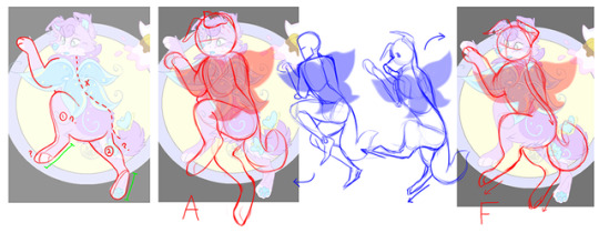
REDLINES
1. There are two fairly minor anatomical issues with this piece: the head looks as if it’s off kilter and sliding down the chest almost (I had difficulties trying to pinpoint this in the pic), and the upper arms are two different lengths. There’s the possibility that the shoulders I drew in on the left picture there aren’t what fen originally drew and there’s the possibility that the arm closest to the viewer is meant to be foreshortened. However, there isn’t any visual information to suggest these are the case.
The posing in this picture is its biggest issue. It’s not wildly incorrect or anything but it’s one of those cases where it’s just off enough to throw the whole picture off balance. Essentially, it looks odd because the back isn’t curved and the shoulders are held high. While it is possible to sit in that position with a straightened back, its really unnatural, doesn’t go with the emotion of this character, and just isn’t possible with highly held shoulders. I’ve tried to illustrate with the blue drawings how when in that position, in order for your shoulders to be held high, you need to lean forward/arch your back even more. My advice to fen from this pic alone is to consider what the spine is doing in a pose bc it’s literally the backbone (WOWEE ZOWEE) of a pose. I personally start with the spine, ribecage, and pelvis when drawing a pic. If that’s not something you do, then try it. Remember to keep in mind the overall pose and its flow – if you isolated the spine from the pose in your drawing, you would assume it was someone more alert, with their arms at their side or on their lap or resting on a table in front of them.
2. I had a lot of trouble understanding this picture. The legs in particular made it unclear to me whether this is an anthro or feral (sorry if those aren’t the right terms lol) character so I did both to cover all bases. Leg 1 is drawn as a feral dog leg while leg 2 is drawn as a more humanoid leg. I don’t really understand why this is but I assume fen had trouble drawing a feral leg in the position that leg 2 is in. The shorter foot and the way the legs looks like it widens from a humanoid ankle to a calf before being obscured by the character’s tail all make leg 2 appear as a humanoid leg. Another glaring anatomical problem is the spine (the red dotted line), which jerks from one position to the other as the body twists, rather than being one flowing line.
Fen’s biggest and most consistent posing issue is apparent in this character’s legs and lower half. The lower half of the body is facing the left. The upper thighs of this character follow the lower half and are also facing left. But then the lower half of the legs and feet twist so that leg 1 is facing towards the viewer while leg 2 is facing almost completely away. These components aren’t coherent with one another…
3. I’m going to use this redline to go into details of the twisted leg poses fen draws. The thighs of both legs are spread open and apart, but the lower legs attached to them aren’t coherent with this posing. The lower leg of leg 1 should be completely side-on to the viewer as the thigh is, however it’s twisted so that the back of the calf is facing the viewer and the foot is the same. Leg 2 is similar, the patterning on the belly and the lack of foreshortening suggests the thigh is also practically side on to the viewer, but then the lower leg and foot is shown facing the viewer. Fen seems to do this a lot so that the back of one of the feet is in view, but she doesn’t pose the character in a way where this is possible. Instead, she will just twist the lower leg in order to force the underside of one of the feet into view. My drawing I’ve labelled b. is to show how the legs should look in the position fen has drawn this character, while a. is an overall more natural posing of the legs as the original has the thighs spread uncomfortably open and wide.
OK so the green picture I’ve drawn is where I’m going to talk about the styling stuff I mentioned in the preface. This is a very uncomfortable and unnatural pose that, like fens original drawing, is breaking anatomy by having the furthest leg twist in such a way so that the back of the foot is facing the viewer. This drawing works however, because it is consistently unnatural and anatomically broken. The foot may still register as not possible in real life, but it makes sense within the rules that the rest of the drawing has set out and therefore doesn’t stand out as ‘wrong’. Fen’s original drawing is not stylised enough for its leg posing to make sense. Everything else about the character’s proportions and pose make it look as if its legs should not twist that way.
My advice for this is: again, think about the entire pose as a whole to avoid things like lower legs not fitting with upper legs. If you want to show the back of a foot in your drawing, then the rest of the pose should accommodate for that. If you want to successfully break anatomy, then your poses are going to need to be more dynamic and less life-like. You need to understand the rule book before you can effectively throw it out, though.
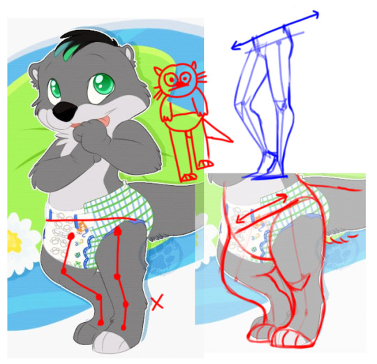
4. This one is probably pretty self-explanatory. The leg furthest away is longer than the closest leg. This is because the hips are straight – in order to bend one leg and put weight on the other, the hip of the bent leg needs to lower. Again, every other aspect of this drawing suggests this character is standing normally. The posing of the rest of the body doesn’t accommodate for the leg posing. The anatomy ends up wrong (two different length legs) as a result.
Again again, try to think of the pose as a whole. A good tip for posing that has helped me a lot is that the hips and shoulders shouldn’t be parallel to one another and neither of them should be parallel to the ‘floor’ your character is on. Try starting off a drawing with a hip line (like the one I’ve drawn in the pic) and one for the shoulders too. The less parallel they are the better. Draw the spine between the two and then build off of that frame.
I hope this is helpful to someone at all and I’m sorry if I sound like a complete prick. Obviously, I’m not any authority on any of these things but who is? This is all stuff that works for me so it might not work for anyone else. Just throw shit at the wall basically and see what works for you. Find a PDF of Loomis’ Figure Drawing For All It’s Worth.
11 notes
·
View notes
Last Seen Blogs
ierdscloset
ierdsvault

trealninyou-blog
Treal N Inyou

liven0wthinklater
I love the pleasure of a power exchange


gprized
지프라