#altering the brushes and colours to suit a vibe
Text
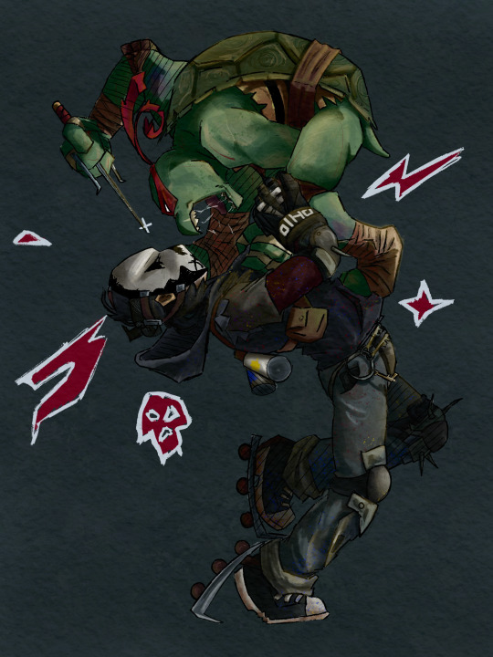
“Ain’t turtles supposed to be endangered?”
“Only the ones who can’t do this!”
#TMNT 2012#raphael hamato#casey jones 2012#is your bestie really your bestie if the first time you laid eyes on them it wasn’t immediately on sight#rasey#it’s not ship art but also I want it in my rasey tag so#I am having so much fun drawing in the canon style I am but god did I need to do something in my own style again#it’s like when you get made to wear a fitted dress and everyone tells you you look nice and it’s perfect#but you feel self conscious and constricted and it’s not something you’d ever wear#I love learning from studying the different styles but I also miss just editing the designs and going off model#altering the brushes and colours to suit a vibe#this is messy gritty wrong and imperfect but that’s what made it fun and easy and I’m so happy with this you can all bite me#also this is the return of flat ass Casey#Lou jitsu’s moral enemy and opposite lmao#I am so normal about Raph and Casey honest#I don’t constantly think about the way he slams Jones on the car bonnet#just a normal short chunky dude with his lanky toll bestie that happens to have the worlds flattest ass
709 notes
·
View notes
Text
A step-by-step look at my drawing process (commission edition) ✨
1) My client ( in this case @/brxkenvalley; ig) gives me their pitch and references. In this case, I was asked to draw their oc in whatever pose I thought would suit them and so I came up with these:
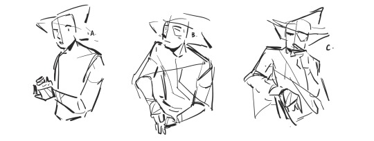
They’re very rough and I focused more on gesture and expression than getting the details right. I also asked them questions clarifying some of their designs and their personality traits (which is a really helpful thing for commissioners to provide so that the artist has a better grasp on the character)
2) my client then asked for C. with an altered expression resembling B. so I made minor alternations to the draft and they decided on the one on the right
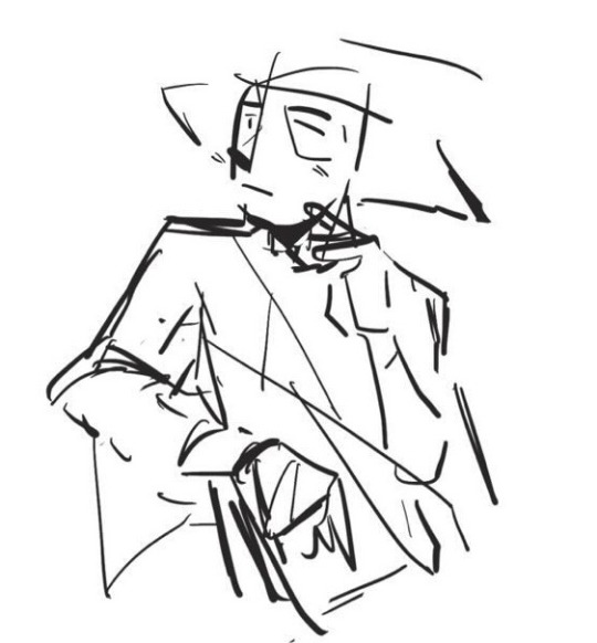

3) After approval, i sketch out the character and I’ve taken to just cleaning up my sketch instead of doing lineart because that saves a lot of time
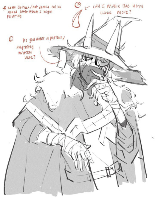
The annotations are me asking for some design clarifications because I wanted to make some alternations so that the piece looked better/more complete (esp cuz I thought straight horns did not look very good on the hat). The quick greyscale shading was just a temporary placeholder to separate the elements clearly. As for references, I use a combination of many from google and from pictures I’ve taken myself. For example, the hands here are based partly on an online reference, partly from my own hand, and partly from muscle memory of me practicing and knowing how to make a hand look like it makes sense
4) flats. This was tough because the reference I was given had the character’s whole colour scheme as similar shades of very dark grey and so I took some creative liberty to adjust the colours a little to make the separate parts pop out more
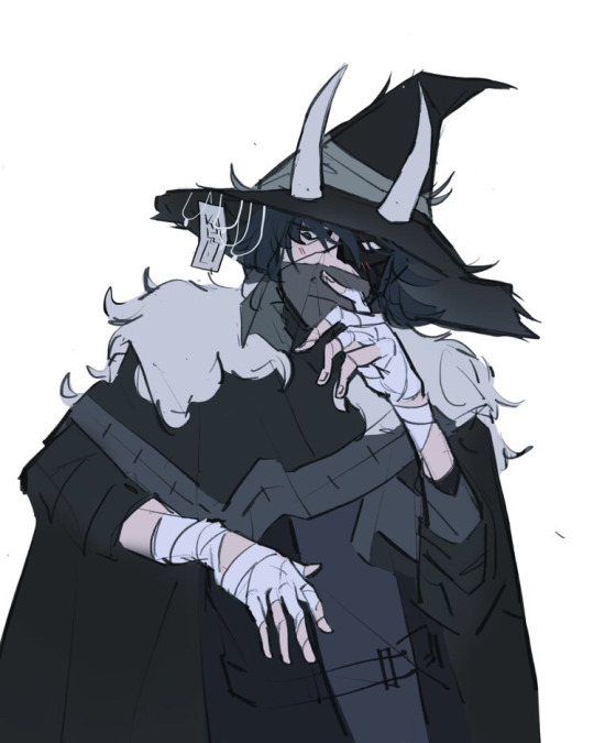
You can also see the horn fix and added details on the hat. Not much else to say except I stuck very much to cool colours for the whole thing to fit the character’s mysterious vibes
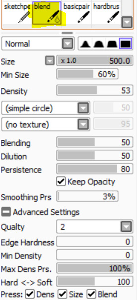
5) Rendering/painting. Everything prior to this was done on procreate but my brushes on Clip Studio Paint are just far superior so rendering was done there
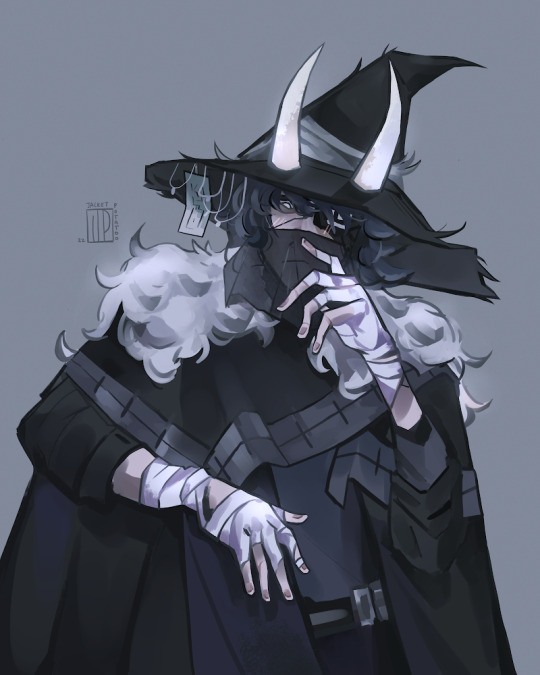
This is what takes the longest and is where I merge my sketch and flats layer and paint over everything (with the help of the magic tool and lasso tool to select segments according to colour). I think it might’ve taken around 4 hours? I used a lot of different brushes to try and get a varied texture and when I was satisfied, I exported it back over to procreate for colour correcting using different layer types and their in-built adjustment tool. I also used an add-glow correction layer with an airbrush on the white parts it pop out more, as well as give the character a more ethereal look
6) I ask my client if they want any minor changes and if not, I’ll email the file to them :)
And that’s my commission process! I don’t do all of these steps when I’m working on personal art (esp the planning) but occasionally, when I have a clear idea for a more complicated piece, I find planning really helpful. I could also do a process thing for a background piece if anyones interested, just lmk. Also feel free to ask questions if you have any and I hope this was clear!
#haven’t done a proper comm in a while so it’s pretty cool to see the improvement#please don’t use the art btw!#jp musings#art stuff#commission#commission art
33 notes
·
View notes
Text
Interior Design Tips That You Can Use
Are you presently contemplating altering your house living space with the help of new furnishings but aren't certain what suits properly with your space? Interior decorating could be tough for some people, nevertheless the ideas in the write-up listed below will show you how to pick the best furnishings for the area that you are living in.
When thinking of the kind of shades you need to have in every single area at home you would like to synchronize with the type of your house as well as the colour scheme outside the house your own home. Consider the best to coordinate a color structure because of the rooms at home and then try to make almost everything look wants it flows together.
Use slipcovers. If you have outdated couches and sofas that you are obtaining sick of, think of merely purchasing a slipcover to pay for all of them with. Slipcovers come in all designs and colors, so you are sure to locate one which matches the decoration at your residence. Ensure that you rinse the slipcover on a regular basis.
As you may program your decor task be sure to take into account the colours that you just plan to use before buying anything. It is crucial that one has the ability to establish a frame of mind. Vibrant colors will increase mood, while neutral tones can promote relaxation. Remember this as you program your shade techniques in order to avoid developing a room intended for relaxation which actually gets you enthusiastic.
When you have a tiny home, purchase furnishings that will assist multiple functions. As an illustration, a storage ottoman serves as a location to relax your hip and legs and also a spot to stash mags and knick-knacks. A futon can serve as chairs along with a your bed for visitors. Receiving home furniture that may be adaptable can keep your house seeking uncluttered for those who have a little area.
For https://thietkenoithat.com/tin-tuc/articleid/19358/thiet-ke-noi-that-xanh , lights are a principal layout component. The entire mood of a space changes with ample illumination. Dazzling lights give off beneficial vibes, and job perfectly in the kitchen and bath rooms. Other rooms may need a subtler effect. Try thiết kế nội thất chung cư 90m2 for bedrooms and living spaces, if that's the mood you desire to generate.
Get a little crazy when you fresh paint. Shop around on-line for some excellent suggestions it is possible to combine into your own project. Utilizing innovative techniques to color your wall space can actually make a difference.
A fast method to update your room is to target add-ons. Renew the highlight sections, lighting and followers. Add some new window curtains or herbal tea bathroom towels. Choosing a series of small updates is usually more affordable and can have just like effective an effect!
Always get a next judgment! Have you ever purchased a area rug or toss cushions which you imagined searched awesome, simply to decide down the road these were a little tacky? Displaying pictures of products you like to your family members will help you steer clear of making buys you be sorry for. Everyone has their particular preferences, but other standpoint can help you notice points you could have overlooked.
When you find yourself putting home window remedies with your family room it is best to get them of sufficient length to remember to brush or suspend on the ground. Something that people frequently do is to dangle window curtains which can be too short and you should not get to the terrain. Any room will end up looking out of whack.
Mentioned previously in the report above, it is really not all of that complicated to choose out home furniture that goes properly with all the area you are living in. The ideas you study in this article should be a fantastic starting point to assist you to find out some terrific concepts that may job in your lifestyle setting.
1 note
·
View note
Text
Trending Eye Makeup You Need To Try
Are you thinking of altering the method you have been following your makeup regimen? The best place to start with the modification is your eyes! Whether you like smokey eyes or dynamic colourful ones or neutral eyes, there are a great deal of speculative eye makeup looks that you can go for. It would not just make you show up out of the box, however likewise aid you attract attention from the remainder. Below offered are the leading trending eye makeup looks that are lovely and also mind-blowing..
Midnight eyes.
Midnight eyes suit especially those women who enjoy to explore darker shades. It can be your finest go-to elegance appearance. This eyeshadow look makes you with mystic and also angelic eyes that go well with any type of outfit in the evening. You can select a dark blue color and also use all of it over your eyelid. Likewise, use it on your reduced lash line. In addition to this, use a shimmery tool blue tone and mix both the shades well. This would certainly make your eyes look deep and lovely. To add the final touch of impact, apply mascara over your lashes or affix a pair of mink lashes to make your eyes look extensive as well as appealing..
Sunset eyes.
The appeal of sunsets is really ennobling. Why don't you attempt to record the elegance of sundowns in your eyes and make them as spectacular as true sundowns? Develop a sunset result with a lovely mix of gold, purple, coral reefs, and red eyeshadows and also get ready to have every person's eyes on you. The sundown effect is cozy and also lovely to lay eyes on. It would give you a total spectacular look, making you stand out from the remainder. For additional details, you can Google regarding the tips on producing a sunset eye makeup appearance..
Highlighter eyes.
This would certainly take your experiment to newer degrees. Highlighter eyes are actual love. Anywhere you opt for the highlighter result you would undoubtedly be the facility of attraction. A highlighter effect is an actual crowd-pleaser. The impact provides you an edgy, path vibe including very pigmented rich tones and colours. For much better impacts, explore neon yellow, lime green, and also bright pink. Choose any of the colours out of these which you prefer one of the most and move it onto your covers. Bear in mind to use an eye shadow primer to make the result remain much longer..
Smokey eyes.
The sophisticated great smoky eye makeup never ever heads out of style. It is an easy mix of shimmery and also matte shades and also it continues to be the best eye makeup of the period. It opts for every eye shape and is continuing to be the supreme universal pattern. So what are you awaiting! Go ahead as well as bang on this experiment. Numerous eye makeup fads have actually come and gone, but this is here to stay..
Feathery eyebrows.
Eyebrows are additionally crucial when it pertains to your eye makeup. The downy brow result has remained in fashion for some time currently and also you can certainly go for it. It is just one of the top charm trends presently. This effect would provide an all-natural want to your brows, which would certainly boost your general look. Not only that, yet eye effect also selects any eye makeup and also outfit. All that you need to produce this look is a brow gel to put your brows into shape. Clean your eyebrows and after that apply the gel over them to load the rooms. Currently, utilizing a tilted brush summary your eyebrows. Currently, using a spoolie comb your eyebrows outwards to provide it a downy look..
Voluminous lashes.
You can even increase the quantity of your lashes. It would certainly make your eyes appear big and also attractive and captivating also. Full lashes have actually forever been a declaration and also make certain to never ever head out of style. Instead of applying mascara over your lashes, you can connect extensions. For best outcomes, use mink lashes. They are so great and also thick that it ends up being difficult for your naked eye to distinguish between them and your natural eyelashes..
best easy fanning lashes .
If you are trying to obtain a brilliant, dewy-eyed appearance as soon as possible, white eyeliner is the simplest option to choose. Rather than placing on the conventional black eye liner constantly, you can opt for an adjustment and try this instead. It's fresh, enjoyable, and also renders a chic statement..
So these were the trending warm eye makeup looks which you have to attempt. Apart from those ones, there are a lot of other eyes makeup suggestions too. So right away any type of additional prepare for any kind of special occasion using these trending suggestions.
0 notes
Text
your local hunny’s art tips
So yeah, I’m actually gonna commit to this. Note that my experience is different to everyone else’s, I’ve officially drawn for 6-5-ish years, and my style of drawing may be different. I’m just a fucking baby and maybe this is some obvious shit. But yeah, I wanna give out some tips as a thanks to the SMITE community and such.
1) Take small breaks in between, step away from the art and do something like go on your phone or eat shit, before going back into the piece in your own time. It's obvious shit, but often we can't help ignoring the urge to take a break.
2) Draw to your aesthetic! Draw your faves w/ instagram wavy eyebrows or glossy eyeshadow, or draw them in your favourite or dream outfits. The enthusiasm and the excitement provide the perfect motivation to do things like being more productive or experimenting and getting more creative.
3) The brushes I use for painting at the present moment are here, for my lineless art, I use a solid ink pen and this blend brush.
4) When it comes to blending, it's better to use an acrylic brush with high blending and low opacity, and the colour picker. It's more realistic when the blending has texture - especially when it comes to the skin.
5)DON'T HESITATE BITCH!!!!! ! ! Don't be afraid to use different colours for shading (it's more vibrant), experiment w different poses and expressions and techniques. In traditional art, I go ALL OUT by drawing w ball-point pen and messily scribbling w copic markers.
(If you want more examples of not hesitating bitch, ive got a handful of traditional art on my art insta)
When you don't hesitate bitch, you earn more confidence and your works look more fluid and have more character. If you mess up?? Girl ur good, learn from ur mistakes :*
6) A friend was the one who told me this, and without this bit of advice, siiiiiiiiis I'd be NOWHERE. It's basically 'You know you're good, know your worth. Yeah, validation is great, but don't go looking for it in order to believe your art is good."
7) Super fucking obvious, but alter your drawing environment that optimizes as much productivity and comfort as possible. For me, I need bg noise, I have a playlist w songs that get me in the mood, I Skype call or go on Netflix/Stan (I like watching Brooklyn Nine Nine, 1000 ways to die, 50 ways to kill your lover, RuPaul's drag race, or deadly women)
8) You know how they say that in order to prevent same face syndrome, you use various shapes? That shit works. Do it. That was how I finessed thru my smite requests
8) *WILL BE UNDER THE READMORE, THIS IS THE ONE I WANNA TALK ABT A LOT*
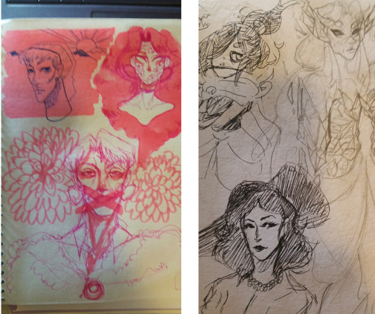
Aside from using references for what you'd normally use refs for, I use references to mainly diversify chars.
I'll explain fully, when I draw certain POC chars, I find an appropriate model/face claim that suits them - this helps me to 1. Make them look more realistic/unique and 2. POC w/o shooting in the dark. This is usually for adapting the char to my art style, so if its an irl POC then I’m good. I don't use this for just POC chars, often I use models that look as close to my ideal idea or look for a character or poses that I like. Usually I keep the likeness or I exaggerate, as long as I have a visual reference of my idea.
Mainly my ‘models’ are actors or models, often from Instagram. I like using poses from older paintings or Instagram photos. Basically, I use Instagram a lot.
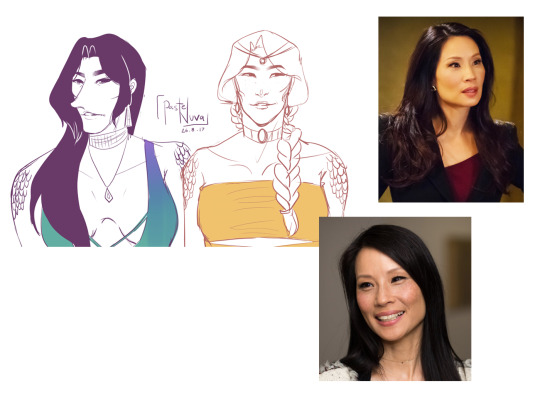
An example of using a POC to help model another POC. I like Lucy l.iu for nu wa bc of her elegant and mature look, also I like her facial structure. (Also she doesn’t look completely like Lucy but it was during the time where I was still getting the hang of likeness). Comparing her to the model I used for Chang’e, you can see different shapes and facial alignments.


I wanted to capture Chronos’ jawline perfectly so it caters to my style, so I use my insta crush bc he has the jawline I need. I find the post w the right angle and use it, then I thought he wouldn't look complete w/o the large lips nopalitoss has, so I gave it to him. He looks cooler and the looks gives him more of a vogue handsome look while still maintaining Chronos’ maturity.

For Nu Wa, I used Justine’s (my other insta crush) poses so I could capture this Instagram ‘feelin’ myself’ vibes for the piece I'm working on. I use various and mash them together to get what I envisioned. Also Justine is my body reference for Nu Wa.
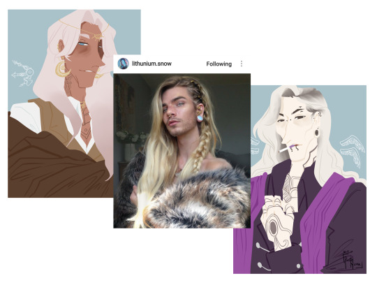
I referred to this guy in order to give Thanatos an appropriate hairstylbc I didn't want Thanatos to have the same hair style as Chronos. I also used him for Chronos,I used this pose for him which I thought looked neat. Same model, different purposes.
Of course this accommodates to my style so it may be harder or easier for yall to find refs. However I still think its important to use refs for drawing poc characters, so that you gain a better understanding of certain features pocs possess.

So this concludes my art tips, kudos to you for reaching to the end and listening to my ramblings. Hopefully these would help in some way, if not, then I hope it was a nice read. I’ll do one more part, it will be a tutorial so feel free to hit me up w what you want to learn/or know what I do in particular.
33 notes
·
View notes
Text
‘The Frozen Palace’ Evaluation
For this project I was commissioned to create a brand identity for The Frozen palace, a small family run business focused on serving the handcrafted gelato flavours that they have been working on for the past two decades. In addition to this, they wanted to have a logo and overall representation that was inviting and welcoming to customers. My immediate ideas were to focus primarily on the palace aspect of the name and then add the frozen aspect of the name through texture. After having a vague idea and starting point I created a mood board and this was to understand the atmosphere I wanted to create. For this exercise, I collected architectural images such as the Sagrada Familia and the Milan Cathedral and I picked these two structures because they had interesting shape language that I immediately thought it would be interesting as the palace imagery in the logo. I then started thinking about colour and how in the brief it stated that the client wanted minimal colours so I opted for a more monochromatic colour palette. This was because it allowed me to add more variety of colour through tone and it not be as imposing as if I used multiple different colours. Additionally, I looked at the texture of ice and its reflective qualities gathering images of both murky ice that could’ve given my logo a more playful atmosphere and reflective ice that could’ve given it a cleaner more sleeker look. And finally, I Looked at potential packaging for the product and I was interested in the giant ice cream tubs to make of card and how they could give off a more environmentally friendly vibe for the company. Finally, the last of my initial research was in reference to the Aaker model and understanding how different brands present themselves creating a personality that they can use to attract a specific target audience. After my initial analysis of the brief, I decided early on that I wanted to go for a more sincere personality as the brand is family runny locally sourced giving off a more down to earthen, honest personality, but as they want to open up in an area like Soho where there is a younger target audience I also chose excitement as a personality trait opting for a cleaner and more modern approach to my logo as well.
To create a starting point for my logo design I did a twenty-second sketch workshop where I created small thumbnail sketches back to back and this helped me have a variety of starting point and allowed me to understand what would work simplified and what wouldn’t. For in a lot of my sketches I used a very sharp shape language for the roofs of my design and this ended up giving it a negative, menacing and almost evil lair atmosphere, which was the complete opposite of what I wanted to this workshop helped me soften some of my shape language up so that it alines more with the brief being more inviting and welcoming. Another workshop I did was the custom type workshop and the main objective of this workshop was to get me to understand how type can be used to create feeling making it just as important as the visual mark of the logo. Using brush and ink focusing on keeping a consistent line making sure to keep the brushwork fluid so that I get an even application achieving the cleanest result possible. During this workshop, I primarily focused on emulating sans serif fonts so that when it came time to transition to digital I could separate the letters. After the transition to digital, I played around with scale and size but it didn’t fit the aesthetic of my initial designs because the type was too choppy and rough.
Collecting research for this project was an integral part of my understanding f the largest audience and who I’m appealing to when I’m creating this logo. To collect primary research I took a trip to Soho Landon and was focusing in on how businesses present themselves and what type of target audience they’re trying to appeal to. Looking at the competitors of the frozen palace was so important for this project because it allowed me to understand what target audience is present in the area already that I could tap into my logo design. For example Snowflake, they opted for a more minimal approach to their logo design focusing on the sans serif font with wide kerning and thin line weight gave the design a cleaner look and this was reflected in every aspect of their brand identity, on napkins, cups, leaflets and signage. In contrast to Snowflake, there was also Ben and Jerry’s a way more playful brand that was present in the Soho area using a serif font that had a thicker line weight, but staying away from the more formal aspects of a serif font they used a rectangular shape language for the feet of the font and this helped give the logo a more playful and western atmosphere making me believe that they were targeting a younger or potentially family target audience. The two brands I looked at for secondary research were The North Face because it was a really good example of a real-life structure like the Yosemite mountain being translated into a simple tow dimensional, easy to read logo. Finally, I looked Disney’s logo because I wanted to emulate the way it creates space in its logo for example how the type is layered over the mark pushing it back into the distance. I also like how the highest tower of the logo os reaching pst the arch that represents the shooting star making it seems as if the castle is so big that it's reaching into the sky giving the audience a sense of scale and the simple small rotated triangles and flags above each tower helps to give information to the viewer showing how small the flags are in relation to the tower.
After my first presentation was told to pick a font that was better suited to my final logo design and experiment with different colourways to see if this would have an effect on how people viewed the logo. I went for Avenir font because its a sans serif font removing all irrelevant marks from the type making it easier to read even for a younger target audience and making the logo look overall cleaner appealing to the young adult target audience.
Other-worldly/abstract approach in regards to the architecture because I didn’t want it to just be a simple translation of a real-life structure and I linked this into the brief by saying that I wanted to visually represent their handcrafter gelato flavours that have been developed for the past two decades and are supposed to take you out of this world.
Get better at presenting my ideas and clear and concise way, making sure to make talk about the simple links of my work to the client so that they understand how I arrived at my final idea. Get better at exploring more initial options so I don’t limit myself in terms of options altering on and gather a wide range of both primary and secondary research so that I have more information to draw from and analyse. Additionally, if I had managed my time better I could've produced some mock-ups and refined my colorways thinking more about what unique flavors The Frozen Palace would present. Lastly, try to experiment more in the initial stages of the project so that I have a wider range of starting points and deliver a more relevant design to the brief.
0 notes
Text
The Best Men’s Separates Combinations
The holy grail for guys who like to get the most out of their tailoring, separates – combining non-matching jackets and trousers – will not only breathe new life into an existing suit rotation, they also let you create a wealth of smart casual or formal looks.Yet while anyone can throw together two different garments, it takes a little thought to nail the best colour and fabric combinations, especially when the rules of tailoring are in flux as they are right now. To ensure you are successful, here are seven fail-safe separates pairings that utilise pieces the majority of men already have in their wardrobe.Grey Jacket + Navy TrousersBrooks BrothersOne of the most timeless combinations available to men, a grey blazer teamed with navy trousers is a match made in sartorial heaven. Worn to the office or for drinks at the weekend, this tag team of masculine hues will ensure you always look confident and stylish.It’s worth mentioning that, although we recommend a grey jacket with navy trousers, this combination works just as well in reverse – offering up two go-to outfits to add to your repertoire.To complete the look, utilise other capsule wardrobe essentials, such as a crisp white shirt, neutral tie and black lace-ups for the office, switching to a printed T-shirt and loafers or sneakers for a meal with the other half.Key PiecesBlack Jacket + Grey TrousersZaraBest for those who like to appear smart and understated, black and grey – when combined with a shirt or roll neck and shoes – is the ideal combination for life’s more formal occasions. While monochrome separates may conjure up images of the boardroom, make a few alterations and you have a sharp off-duty weekend look.Perfect for fancier nights out, try ditching the tie or sub the shirt altogether for a polo shirt or lightweight knit, and switch the smart shoes for more relaxed trainers.As with the grey and navy pairing, this combination also works both ways. Opt for a grey jacket and black trousers, and the outcome will be just as effective.Key PiecesUnstructured Jacket + Pleated TrousersMango ManLaid-back layering that’s smart enough for the office doesn’t get easier or more comfortable than this. The foundations are formal, but softer materials and more relaxed fits de-stuff the look for a smooth transition from business hours to happy hour.Up top, look for a jacket without all the usual padding. This gives a softer drape over the shoulder and through your body. Patch pockets, shawl collars and working cuffs keep things casual, as does a wider choice of materials, including cotton twill, wool-blends, jersey or soft denim.Fuss-free colours work best on this duet, so stick to grey, beige, blue and black for the chinos. Borrow combinations from other pairings in this list or go tonal with shades of beige, brown and white. Finally, ground the smart-casual vibe with a pair of minimalist trainers or low-fi loafers. Easy.Key PiecesChore Jacket + Wide Leg TrousersZaraTailoring doesn’t necessarily mean ‘blazer and trousers’. You can swap out the officey top half and go with a chore jacket instead – it instantly tones down the formality of a look yet still remains elegant, especially if paired with some properly sleek trousers.Again, there is a difference between the trousers we’re aiming for with this look and your regular suit trousers. The latter are all too often made from a smart but boring worsted wool, and unless you shell out for something made-to-measure or designer, the fit will be lacklustre.Instead, look to wider cuts for this combo – we don’t mean billowing, but there should be plenty of room in the thigh, with a gentle taper down to the hem. It’s a little bit workwear, a little mid-century modern. And a hell of a lot cool.Key PiecesTextured Blue Jacket + TrousersBoggiSeparates don’t have to mean separate colours top and bottom. It is entirely possible to pair a jacket and trousers in similar tones without looking like you’ve got your suits mixed up. Greys can work, but blue is the safest colour option when going tonal.The only rule to keep in mind is making sure there’s some point of difference between the upper and lower body. This could be a noticeable gear-shift in colour: a petrol blue jacket with navy chinos, or a navy jacket on sky blue trousers. Alternatively, you can keep the tones similar but add some distinction with the material. Try a crosshatch pattern on the jacket or a different fabric entirely.To finish the look, bring some contrast in with a white shirt (adding a tie for smarter occasions) or stick to casual dress with a complementary blue shirt under the jacket. Allez les bleus.Key PiecesWork Shirt + Matching TrousersUniversal WorksWe’ve discussed how tailoring trends have transformed the suit over the past year or so, and how it can be worn right now. One of the new menswear moves becoming increasingly popular is ‘the new suit’; two garments made of the same fabric – an overshirt and trousers for example. These still act as separates, and you’ll probably find you wear them on their own more often, but when combined there is no easier way to look well turned out.Think about it. One of the pleasures of wearing a suit is how easy it is – you throw on two matching pieces, a couple of accessories and you’re good to go. The same applies here, yet with none of the stuffiness typically associated with tailoring.Many brands are now making this look a reality, but especially those that table in workwear like A Day’s March, Universal Works and Folk. Look for fabrics such as brushed cotton or wool twill and aim for navy or charcoal for maximum versatility – either piece will work with virtually every other garment in your wardrobe.Key PiecesBold Jacket + White TrousersReissAny outfit that features white trousers is a reasonably daring one, and this summer-ready separates combination is no different.Scream Riviera style by opting for a blazer in either a check pattern or a bold shade such as sky blue or green, and team it with white jeans or trousers for a sophisticated look, no matter where you reside.To create a memorable outfit, roll the trousers’ hems a couple of times and go sockless with espadrilles and a T-shirt for an evening out on holiday, or try an open-necked shirt and loafers for a summer wedding reception.Your skin tone should influence the colour of your jacket. For those with dark or olive skin, you are pretty much free to take your pick from any colour, primary or pastel. If you are fair-skinned, however, it’s best to opt for a slightly darker hue to avoid looking washed out – think a deep red or petrol blue.The fit of the jeans or trousers is also paramount. To maximise on style (and to allow a little air-flow), go for slim rather than skinny cuts and you’ll nail that sense of effortless chic that our continental cousins pull off so well.Key Pieces
Source link
source https://www.kadobeclothing.store/the-best-mens-separates-combinations/
0 notes
Last Seen Blogs

dlinkrouter-locall
dlinkrouter.local | d'link router local | dlink login

mattbors
Matt Bors

arewe-justfriends
Frank
tbehartoo
The place I throw things when company comes over