#changed it 2 screenshots bc the post was too long for my taste. idk
Text
wholesome snow au snippet………... they’re brothers :)
#this is from the fiiiirst chapter of the next fiiiiic#and i want to put it here. for myself mostly. i love snow au posting it’s fun i need to do it more lol#things that grow in the snow au#dsmp#bird writing#dove talks#this section is fun because they’re actually mostly happy :]#and ranboo is able to joke around and say he won’t do things people want him to! which is some Growth!#considering he’s. you know. the guy who washed dishes even though it makes his skin melt.#granted he can only really do that with tommy because tommy is incredibly unintimidating. but it’s still growth#and tommy is doing okay in this too. he’s got some of his self respect back#secret upcoming content involves him no longer being absolutely fucking terrified of wilbur lmao#he’s still a little uneasy. but he’s doing better :]#someone please talk to me about snow au tommy and ranboo they are so important to me#also having snowtommy be an artist was such a big brain idea honestly. it suits him so much#and also opens up fun bonding/parallel potential between him and his brothers (who are also artists in their own ways)#it’s just so smart. im so good at writing characters#changed it 2 screenshots bc the post was too long for my taste. idk
2 notes
·
View notes
Note
hi! can i ask how u made ur carrd like what are the settings? ty!
omg YES i love carrd making hi anon. if there’s anything specific u want just lmk!! under the cut bc its long... i make most of my carrds on desktop so this is very desktop based.... to all of u who do ur carrds on mobile honestly kudos i cld never
uhm also when i say long like this is v long bc i added a lot of reasoning to my settings n tips that i’ve picked up on making carrds (plus the screenshots) i hope it helps tho ^_^ apologies if u knew most of this stuff tho bc i explained... everything...
some notes before we get in: for colors i usually just base everything off the sidebar image and use a color picking website (i use this one) to get the the html codes for colors. the site i use also generates a palette which i also use! ur free to use anything tho obv. the font i used is “inter”
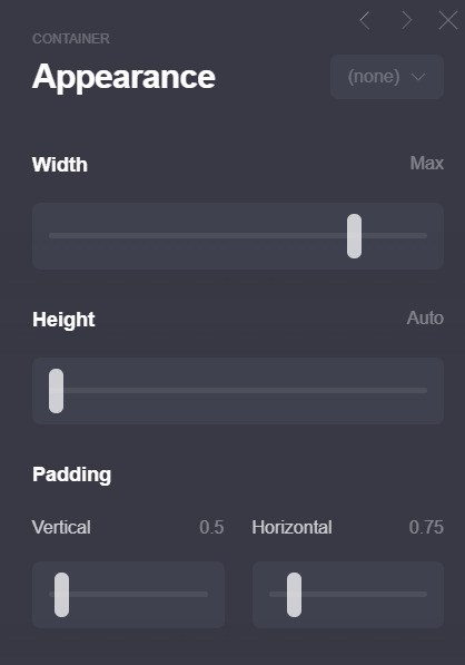
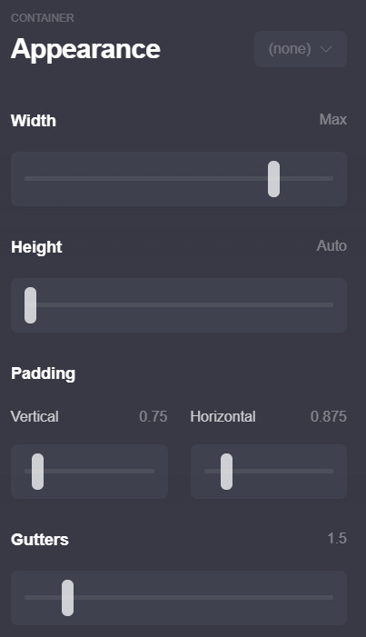
1. ok first here are my page settings! i wont include my animation settings now ill leave that to the end.. these r rlly the only settings that i’ve changed so i’ll just post these.
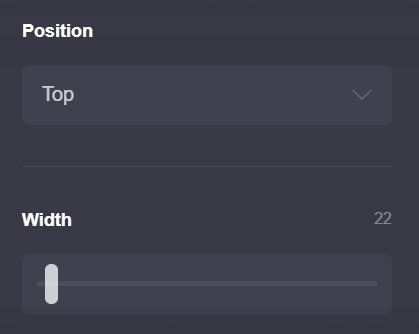
ok i dont rlly change much except for these two, the position is set to top not center (which is the default) b/c esp w carrds like the one i have now i dont like the header portion moving depending on the height of the container underneath... does that make sense? that’s just super nitpicky of me LOL but if u do end up making the carrd n playing around w the settings u’ll see what i mean
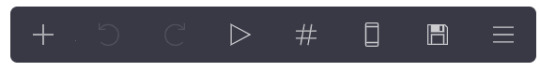
the width is set to 22 bc i like small carrds! play around w this as u see fit, i also change it depending on how it looks like in mobile (im very thorough lol) if ur wondering how u can do that on desktop, its this phone looking icon on this bar on the top right of the screen: (the 6th icon!)
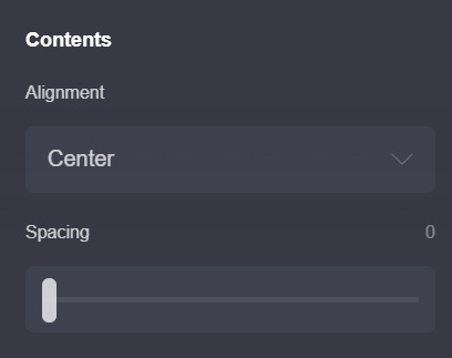
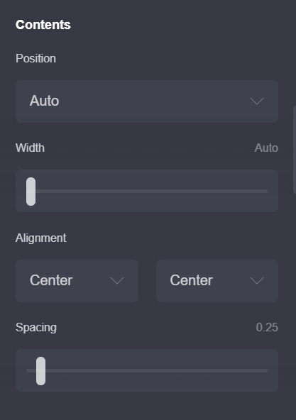
the next pic is also default settings except my spacing is set to 0. i’ll explain why later! the alignment also doesnt really matter w/ this carrd. u can play around with it tho!
2. this is for the home page!
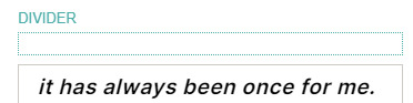
first i’ll explain how this is set up: the title box and the box under it (i’ll call it info box) are both containers! here is why i put set the spacing to 0 earlier: if u put 2 containers theres going to be space btwn them and to achieve this kind of look (ig) i just set the page spacing (in the page settings) to 0. however this means that everything is going to be pressed up against each other so i usually just add dividers (which are transparent [color code is #96969600]) i wont post a screenshot bc the settings r default, except for the margins which u can play around with to see what works for u (it’s set to 0.375 for me rn)
here are my settings for the title box

most of these r pretty standard except for the padding and border. the reason why i didnt tick the bottom part is bc of the container w all my info underneath. both containers have borders so the bottom & top border of those containers wld just merge n create a thicker border which isnt what i was looking for... anyway.
then i just add a text element & just write my title! idt my settings for that r relevant so i wont add it (the text size is 0.875)
next is the info box! here are my settings:
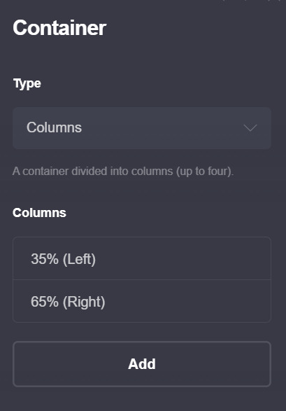

btw this is a container with columns!! those can look p wonky on mobile so make sure to have these settings on so that they wont look awful on mobile!!

oh also i wont post a screenshot of my text settings (text size is 0.75 + line spacing is 1.25) if ur wondering how i changed colors for some of the text the format is basically just [text]{#color}
for the image size i set the width size to full (or full column) that depends on u (and how much text u put in the info part) i just prefer how it looks like when the image width is set to full bc that way no part of the image is cut off... really depends on u and what image ur using though so just play around w/ it!!
and in terms of spacing, i have a divider on top of the title box b/c otherwise the whole thing is just too high up for my taste
ok now to explain the header part and how i got my title/info box to stay “fixed”

so... im ngl. i dont understand how the header function works (help) so uhh i wont go as into detail here. but what worked for me is adding a header marker (the plus thing on the bar > control > change section break to header marker) right after the info container, then adding a section break (this one is called #wala bc wala here means ‘nothing’ in bisaya lol) and a transparent divider right after it. i hope its visible in the pic... anyway this is the only method i found that makes the carrd work lmao. it rlly doesnt matter what u name the #wala section break bc its not gonna show up so u might as well just use a keysmash
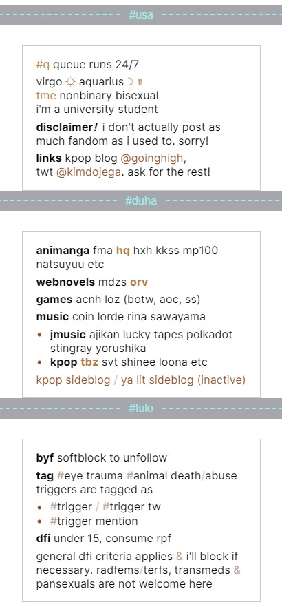
3. the extra info!! (extra, interests, byf)
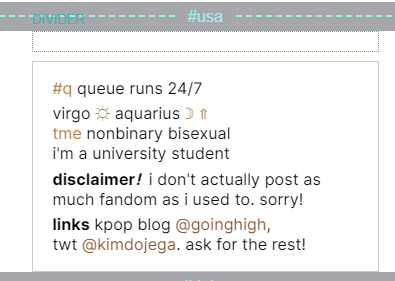
this section will b shorter compared to the first two LOL anyway. first i started off w a section break (#usa which means 1 in bisaya hehe), then a transparent divider for spacing, and then a container! theres nothing fancy abt this container it has the exact same settings as the info box above so u can just duplicate that container and change the container type from columns to default.
then just add ur info and ur done!! repeat w whatever extra info u want to add (i only had 3 to add so it looks like this for me)
4. oh before i forget, these are my animation settings!! (page > the triangle thing)
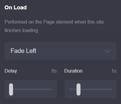

u can preview the on load animation by clicking the triangle button on the top right bar, but for the on section change animations u have to save then preview it on ur carrd itself :/ kinda annoying but yeah... i usually never set anything above 0.5 seconds for on section change animations bc im impatient LOL
these r completely optional tho... i just think animations make the carrd look smoother & more fun!
thats it i think! here are some tips i have
1. this tip is abt how carrds can differ when on mobile! i sometimes fiddle around with the mobile settings to make sure my carrd looks the way i want it to on mobile! bc mobile sometimes fucks up the spacing and it annoys me LOL... example here:
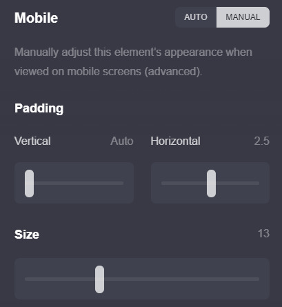
u can find these settings if u scroll down a bit on the page settings and switch mobile from auto to manual (like in the screenshot) most of the settings i dont touch except the size setting, i just fiddle around w it and see how my carrd looks in the mobile view until im satisfied
2. this isnt rlly necessary but its smthn neat i picked up! if u check ur section break settings and check hide footer u can get rid off the “( made with carrd )” text on the bottom! i think it just makes the carrd look a bit neater, esp since the page spacing is set to 0 so it might look a little squished under the container...
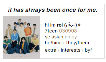
3. i like to use all elements of my carrd efficiently (ig? heres the engineering major jumping out) and idk if u noticed, but if u click on the title (”it has always been once for me”) or the image (which is... of tbz..) it actually takes u back to the home page ^^ idk i just think small things like that r neat
thats it for real!! i hope this wasnt too much of a hassle to read or follow through, and if u have any questions dont hesitate to dm me or send me an ask, even if we arent mutuals!! i hope u have fun making this carrd <3
#anon#ask#carrd#also rip this is one of the simpler carrds im using rn#i bolded some stuff so it doesnt get lost in the midst of my rambling... oops
22 notes
·
View notes
Last Seen Blogs

futurelovevoice
Untitled

oohsandaaahs
Ooh's and Aaah's ♀
hws-am3rica
hws america
capn-artbox
Where’s My Pencil??