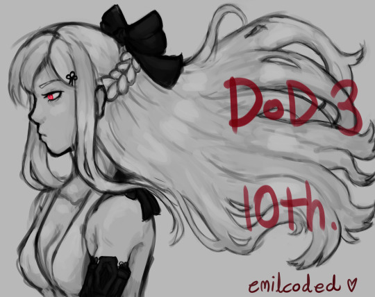
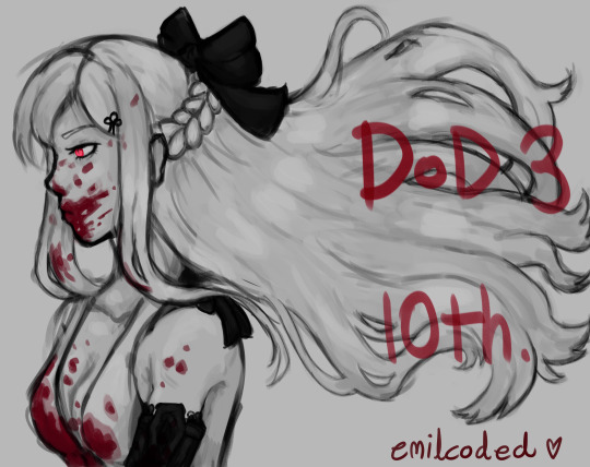
#i had to resize the drawing just so i could upload it to tumblr. pain
Text
:))
#drakengard#drakengard 3#drag on dragoon#zero drakengard#fanart#yuikun-drws#i had to resize the drawing just so i could upload it to tumblr. pain#ANYWAYS i think she looks rlly pretty here. im proud of myself for making this#i cant believe i made this tho like WTF i can actually draqw and paint ?!?? holy shitttttttttttt#i am now thinking “why must i be doomed to be 14 years old and a dod fan” as i look at this
26 notes
·
View notes
Text
So I keep telling myself I’m not gonna talk about this anymore but it’s late and I’m salty and I figure this would be a good learning opportunity for everyone anyway so whatever.
I keep seeing people commenting on how the Delpad Week prompt list getting stolen and vandalized doesn’t count as art theft because I guess technically I didn’t “draw” anything while making it. And I feel like this is coming down to people just not understanding the work that goes into graphic design? (I mean I assume some of it is just people wanting to make excuses for doing something horrible but w/e I had my panic attacks I’m over it.) So since we do live in an age where people still devalue graphic design and other computer-based art forms I thought would break down all of the steps that I took when designing the prompt list, as well as the icons and banners for Delpad Week.
(And as a quick disclaimer there were probably easier ways to do some of the things I’m gonna list but I am still learning and I had never really used Clip Studio Paint before. I am an amateur, be patient with me.)
Step One - Picking Fonts!
Now this one might have come down to me just being picky, but I had a pretty clear idea in my head of what I wanted the “logo” to look like so after opening Clip and determining that NONE of the default fonts came anywhere close to what I was looking for I went to dafont.com and spent like...god I want to say close to an hour browsing the free fonts until I found a 5-10 options I liked.
I then had to extract and install all of the files onto my pc and make sure they worked, which is easy, but still took time.
Then I typed out what I wanted the logo to say using all of the different fonts to see what they looked like and what they looked like next to each other. See it’s a good idea to compliment fancy serif fonts with simple sans serif ones so I needed to pick a fancy one for the “Delpad Week” text and then a simple one for the prompts and dates and such.
Step Two - COLORS!
After I picked the two fonts I wanted to use I had to pick out the colors for the poster and the text. I took the colors for the “Delpad Week” logo itself from a pic of the Sun Chaser/Cloud Slayer I found, both the usual red and then the darker shadow. Which, once again, there HAS to be an easier way to do this but I typed the words out twice in both colors and painstakingly layered them over each other in just the right way to get the “drop shadow” effect I wanted.
Then I picked a nice light black for the rest of the text that I think I took from the line art on a screen cap I found? Either way it looked better than true black. And took time to find.
And of course I needed to find a good blue for the background which took a bit cuz it needed to match everything else.
Step Three - Sizing!
I had to look up all of the different recommended photo dimensions for tumblr and twitter icons, headers, posts, ect to make sure the damn things wouldn’t look wonky once I uploaded them.
Oh and since Clip is weird I did actually have to do that typing/layering thing on EACH NEW PICTURE I made. Which making sure they all looked the same sure was FUCKING HARD and took hours!
And my friend took the time to make the transparent Della and LP for the banners and I had to resize and center them on each pic. And I had to find and size/position the clouds and transparent Sun Chaser/Cloud Slayer too.
Step 4 - Putting It All Together!
Imo this one is the hardest since Clip doesn’t have alignment tools and even if it did sometimes due to fonts and art and such being the way they are true center doesn’t actually LOOK centered to the human eye so there’s a lot of fiddling around with the text and pics to make it look as close as possible to center which starts to kinda numb your mind after a while. Lots of taking breaks and coming back to it to make sure it looked okay.
And of course typing all of the prompts out and making sure the fonts actually do look okay and everything is spelled right and spaced correctly. I have dyslexia, I double check spelling, sue me.
So once you finally think that everything looks okay you get to go upload it to different sites to make sure the icons and such don’t look blurry or get cropped weird and then inevitably go back and move everything around again or in some cases remake them entirely(the deviantART icon took like two re-makes to get right) when they do. Shit takes time, yo.
That might not seem like a lot but let me stress that I made the prompt list poster, the tumblr icon and banner, the twitter icon and banner, the deviantART club icon, and the other banners for things like updates and such. Which all and all took the better part of TWO FUCKING DAYS.
And that’s not even mentioning the time it took to find a good tumblr theme and set it up and put together the DA club and the twitter account, as well as documenting all of the prompt suggestions and making sure I picked ones that were vague enough to allow for creativity as well as represented what everyone wanted, plus deciding on/writing out all of the rules including the ones for different sites. All of which, aside from some help here and there from friends, I did by myself. For free.
I’m not complaining. I am having a blast running Delpad Week, and making all of this was frustrating but fun. I love graphic design, I wanted to do my best, hell I even got input from my godfather who is a graphic designer on some of the banners just to make sure everything was as high a quality as it could be. And you know what? I was really, really proud of that prompt list. I have been stuck at home disabled for about a year now in awful pain most of the time and only just getting back into drawing and graphic design and I was super happy with how everything came out. I wanted people to see it, I wanted to give Delpad fans a beautiful blog and prompt list to look at after everything we have been through. And not to toot my own horn but I think I delivered.
So considering all of that you can see why having someone steal the banner, deface it with horrible and triggering content was so horribly upsetting to me. Aside from how defacing something a queer woman worked hard on with words like “burning a pride flag” is abhorrent and drove me to tears and panic attacks, how would you guys feel if someone took something you worked on for two days and shat all over it for a cheap joke? Especially when the only thing you did wrong was want to give a good, cute ship some attention.
Graphic Design is an art. Taking someone’s unique design, vandalizing it, and then reposting it IS ART THEFT. Just because it took you 10 minutes to open the pic up, color over the original text and use a crappy font to add in your own prompts doesn’t mean making the thing in the first place was that easy. (And again, I’m not complaining about the time and the work. I’m having fun. I love graphic design. If I didn’t want to do this I wouldn’t have.)
But anyway, like I said, I’m trying to not let it bother me anymore. People have apologized and that’s good. But hopefully this breakdown can help you guys appreciate the work that goes into graphic design and be a bit more courteous to the people who do that work, especially for free.
22 notes
·
View notes
Last Seen Blogs

tajellie07
Jellie's World

nuhdean
hi there

tmcvideos
Great Videos
squidpedias-fanart
Pedia’s Miscellaneous Fanart