#i really gotta figure out my lineart cuz this aint it
Text
I drew Nine the fox, I'm less mad now :]
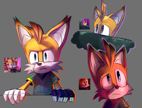
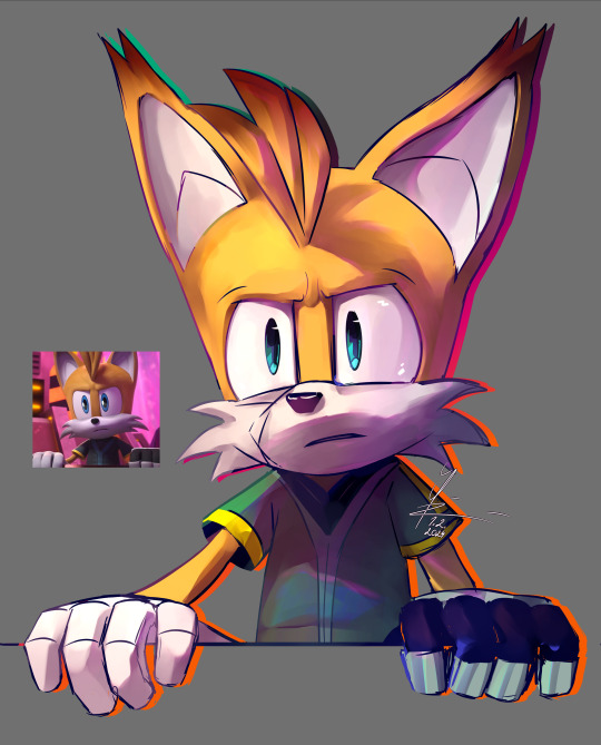
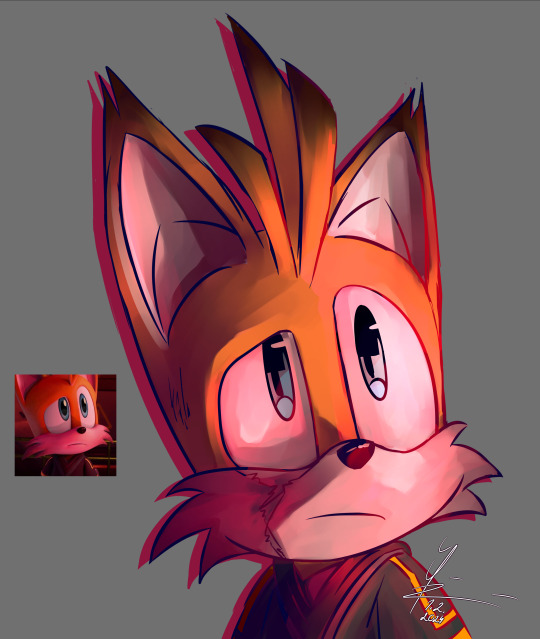
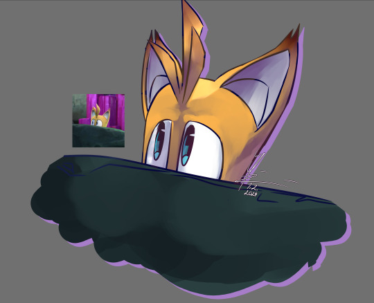
#sonic prime#me not putting exessive amount of effort and detail into my rendered drawings? unimaginable#today was a self control practice id say#it is midnight yes and I'll only get throughly humiliated in class tomorrow#but might as well just doodle Nine there too#unless of course Ill be called from my desk#than I wont be able to but what the hell#i really gotta figure out my lineart cuz this aint it#i hate that hoe sm why cant you be simple why must you be the cornerstone of my whole drawing process#miles nine prower#nine the fox#mah art#me does arts#actually finished doodl
181 notes
·
View notes
Text
get madder :^)
hey yall remember that post where i gave a 1-or-2 sentence comment about each fanart that got featured in the community update? many people promptly took their panties and corkscrewed them directly up their very touchy buttholes, so i thought it'd be fun to do a follow-up :^)
>everyone who just said "lol bad post u suck ur opinion SUX"
it's my opinion lol deal w it
>it’s kinda cute how you think we would care about this / nobody cares
clearly u do bc ur mad fam!!! hahaha rekd got u!!1!
>perhaps… perhaps art is subjective and they wanted to make some community members happy by featuring them?
they couldve picked a little better was my only point
>"It’s people like this who give new artists anxiety for posting stuff online" / everything about how mean i am bc it will make newb artists feel nerbous :'(
hey guess what! it's the internet where literally everyone can see and say whatever they want. that's the risk ya fuckin take when u post online :^) waahhh
>"It’s called a personal art style"
its common knowledge by now but "its muh style" is not an excuse and yeah its subjective but also sometimes aspects of a pic are just bad
>"how does desnik only get a 5/10 lmao. Amazing shading, a super unique and difficult perspective that brings life to the whole piece? Ye nah that’s shit, apparently."
i said the shading (painting) was pretty good, and they lose points bc "bringing it to life" with a weird pose only works if the anatomy and perspective (which i specified) isnt so off that it takes away from the entire piece pretty significantly, which imo it does. also that pose isnt unique i can find u 10 pics of furries in that exact pose on like the front page of furaffinity or wherever. also i didnt say it was shit LOL
>"“this is anime uwu garbage” is not criticism OP"
fuck yeah it is, you ever been to the front page of deviantart? i assumed the implied "stop using super stylized shitty anime pics as a reference bc ur overall "style" is severely and obviously suffering for it" was kinda evident but i guess not
>"why the fuck do people get so butthurt when someone says their art is bad"
dude THANK you i mean i was expecting pretty severe backlash but i was as least expecting more creativity than literally just "bad post op" 20 times. tho i DID see enough to make this post i guess? this blog is fun but like in a painful way
> “not to be rude to the featured artists, good on them” pick a tone and stick with it
sorry man i really just do have a rude-sounding speaking (,,typing) voice and i dont mean any bad feelings towards these artists, my literal only point is that that one pic has some problems and maybe staff had some better pics to spotlight instead (and i don't even mean that for all of them. top, middle, and bottom left were all good choices and so was desnik's tbh. but i figured id ""review"" them too cuz they were there) i usually even pointed out something i liked about it? but i gotta move fast here cmon 100 character limit
>"dude… do you even know what a sketch is? because that’s in no way a sketch"
what do YOU define as a sketch? i guess the snapper one could also be lineart but its in 2 midtones (which people do when theyre "sketching" out values) and they used a messy brush so my mind went to sketch. and the coatl one looks like they did it really fast and slapped some flat colors on it. actually my point was literally that it looks like they did it fast, like a sketch rather than a lineart
>"at least put in some effort in writing a couple of sentences on each drawing on what, why, and how to improve the drawings. Seeing that some of the art is clearly from amateur artists, some words of advice would at least be helpful here."
yeah u right they definitely deserve better. but i was going fast cuz i just have an affinity for short snappy reviews i guess. like i tried to do cliffnotes, just "this part is good but this part is bad" and then a meaningless number score cuz i aint even addressing this to them, i posted it to a drama blog to complain about staff basically
>the nocturne guy who wrote a lot
alright cool. you totally have gotten a lot better. i never meant to discourage you for drawing in the first place. incidentally i said u had potential bc u were obviously a new artist, but like u were OBVIOUSLY a new artist with a loose understanding of depth and shading and stuff, and again this is a front page spotlight yadda yadda. ill fuckin hit u with a review right now:
you clearly understand shading and anatomy way better, and that coatl actually looks pretty fuckin good. the lineart is more consistent, it's framed way better, the proportions are WAY better, and it's really clean and stylized. the shading is infinitely more convincingly shiny and reflective. from here, imo you could benefit from going further with shading (darker, more dynamic, leaving little to no flat spaces like the crest fluff and tongue), and maybe polishing the lineart a little more too, like coloring/highlighting it and really pushing/polishing the linewidth (there are tutorials for that). overall that coatl is v cute, keep on pushing poses & shading
>"i bet OPs art sucks ass"
fIT e ME IrL
anyway thanks 4 reading my fucking essay and i'm super high. if you read al lof this then shame on you
55 notes
·
View notes
Last Seen Blogs

visapeople-blog
VisaPeople.ca

rairui01
A Daydreamer's Hideout

numberonewolfwhispers
Sans titre


phillipslaysthings-blog
Once Upon a Drag.