#if the lineart size seems different in the first one no it doesn't
Note
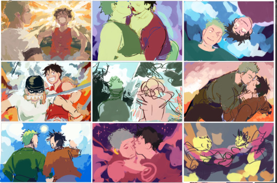
i love your postcard artwork for the zolu playlist SO much!! the colours are so so good and i love the brushwork! i think my favourites are a tie between the one for chikai and the one for simple song <3 also, I was wondering if you could share what brushes you used + how long they took you! looking at your art makes me want to draw again after not doing it for so long
Thank you!! and wow i think this is the first time someone's asked me for my brushes, this is like a digital artist rite of passage!
Answers n screenshots n stuff under cut
(I went a little to ham on this oops)
While we're talking settings I want to give a quick PSA to all digital artists:
CHECK UR ASPECT RATIO!!!:
(MOST IMPORTANT SETTING BY FAR)
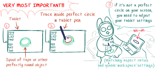
DO NOT DRAW WITH THIS ALL MESSED UP, IT WILL DRIVE YOU CRAZY. It's probably good to check this after every system update (I don't, but, you know...). Windows likes to mess w your shit when it updates.
If you have a really tiny tablet you might need to trace outside a bottle lid or something.
Okay now on to the meat of the post
--
Brush Stuff
--
I use Clip Studio Paint. For my playlist drawings I think I only used these brushes (these are my main 3 in general) (p.s. they're all default brushes! but i've adjusted the settings):
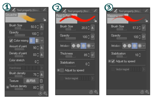
1) Gouache
This is most of what i used for the postcards. I nuked Color Stretch because i hate it (it blends colors together as you're painting, like painting over wet paint. I prefer things to look more crisp)
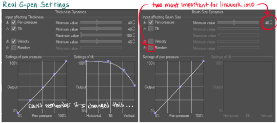
2) Real G-Pen
Used this as little as possible, to keep the painterly effect. My preferred fine-detail pen, has a nice crunch to it. I've fine-tuned my setting further in the thickness dynamics / brush size dynamics settings because I mostly use this brush for linework and wanted it to handle really, really naturally and precisely
The random box is checked by default, probably to make this brush feel more like handling a real inkdip pen (I don't like that)
3) Mapping Pen
Least used. I generally keep this brush at the 50-70px range. It's unpleasant to use for detail work (the taper is really fiddly at my tablet pressure settings) but good at filling in large areas very opaque very quickly, with a crisp edge (Also, doesn't lag as much as the gouache brush at large-ish sizes). Has enough wiggle room that it can be used to approximately fill tighter spaces at large brush sizes. Used for when I needed to quickly color over an area that wasn't working or quickly fill in background color that didn't need paintbrush texture.
Did not realized the stabilization was set to 10 until just now. I usually turn that waaay down to prevent lag (my laptop isn't very old but it's a sensitive beast)
Other stuff that'll help:
General pen pressure:
(under File -> Pen Pressure Settings)
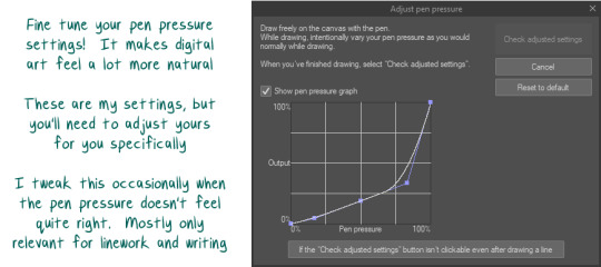
tweaking how CSPaint handled my pen pressure helped a lot with making lineart look more natural. It's worth messing around with this and trying out different settings for a while to see how they feel.
--
How Long it Takes 2 Draw
--
I don't really keep track of how long art takes me from start to finish, and making the playlist drawings was kinda nonlinear 😅 sorry!
-> I started out sketching really quick composition and color ideas as the songs were playing, limiting myself to just the duration of each song (so like, 5 minutes for this part)
-> i did that again at least 2 more times per song
-> after that, idk. I would work on one pic then get stuck and move to another. Some I could hammer out in like... 5 hours? Some took me upwards of 20 (30?) hours for no real reason (I have "will graham clock" days, where I'll try to draw a face over and over and it'll look really strange, like will graham's clock drawing every time) (this seems to be either a vitamin deficiency or a brainfog inflammation type thing 4 me 😵)
I'll use ur two favorites as specific examples:
-> Chikai was one that went pretty quickly (with the exception of their arms and the clothing folds there giving me trouble). Probably took 4-6 hours?
-> Simple Song had a couple different versions, partially because I initially had the cards all laid out landscape-style, and I decided I actually wanted them all portrait-style & repainted it after it was already done. That aside, the colors /atmosphere on that one gave me trouble and the general composition / perspective had a lot of tweaks (I was trying to figure out if I wanted it to be a kinda flat stylistic perspective or if I wanted it to make more literal sense, trying to figure out what to do with luffy, trying to make him not look Too baby boy sweetie pie). Probably took 7-10 hours...?
In-progress landscape versions:
(varying levels of in-progress)
Misc in-progress of Chikai and Simple Song:
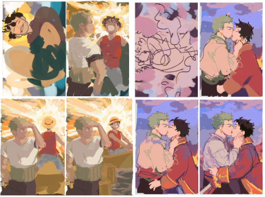
Simple song looks kinda sequential like this lmao. Luffy looks like he's A-posing and floating away to the boat and then sitting down pleasantly in it. Wonderful.
--
Anway -- hope any of that was helpful!
#i draw on my bed because i hate my lower back and hips#every day i pray to god to make my sacroilitis flare up#not art#well...hmmm#some art#long post
8 notes
·
View notes
Text


some boys!
#i wasn't going to post this but eh#if the lineart size seems different in the first one no it doesn't#(its bc i doodled them separately and then put them together)#anyways yeah they#i want them soooo badly but didn't get xingqiu this banner 😔 infinitely sad#genshin impact#xingyun#xingqiu#chongyun#AH AND. chongyun's hair is my all time favorite kind of hair to draw omg#expect more of he bc its literally. therapy after drawing genshin outfits#not that these took so long tho#i love xingqiu's clothes so much the Ruffles#peak character design actually#'the uneven hair is weird' actually i also love uneven hair like that#and the earring? he Knows what hes doing 10/10 love him#what a tag rant lmao#anyways they. i care them.#now if only i had them in my team#art tag#doodles#gnshin
231 notes
·
View notes
Text
Was chatting with a coworker the other day and two things crossed my mind...
that I've been at this weeb shit so long that I forget what I just sort of take for granted and what might not be commonly known little factoids, and
that VIZ's attempt at a monthly Shonen Jump magazine has been gone so long most people probably never saw them. (nevermind the old RAIJIN Graphic Novels that tried the same thing)
So, here's some fun little things you might not have known about manga if you've only ever read English publications and/or digital scans...
For one, there's the matter of print formatting... In general, Japan actually uses their own standards for print that tend to differ from those in the US; The JIS(Japanese Industrial Standards) series A and B. Magazines like the typical anthology format manga are printed in JIS B5, which is comparable to the US Letter standard, or the ISO A4.

This was the same format that RAIJIN Comics printed in as well, and although I don't have a copy of the old English Shonen Jump for reference, if memory serves they printed in the same format as well in an attempt to really sell that "authentic" manga feel. Sadly, I don't know that the effort or attention to detail was much appreciated. Neither published a volume comparable to a Japanese weekly or even monthly serial magazine, though --not by a long shot. But this might not be the most practical for comparrison, since there actually just isn't much of an English language equivalent format. (unless you count actual magazines that happen to include comic illustrations or
miniscule comic strip segments)
Despite the mammoth size of a serial magazine, Japanese tankoban are actually smaller than the North American equivalent. But notably the Japanese small book format isn't just a matter of contending with nearest print standards... What I believe is the JIS B40(although I could be wrong) tends to be the standard print size of small books in general, not just manga, and it's a print size that is only marginally smaller than VIZ's standard size manga, but with the very particular benefit of being deliberately portable. The small difference in size is the difference between a Japanese manga fitting in my coat pocket where as the English equivalent can't.
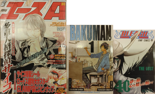
(I realize I photographed a copy of Shonen ACE, and not Weekly JUMP, but I measured a copy of Weekly JUMP for the thickness and not the copy of ACE; the copy of JUMP was around 506pg, while the copy of ACE was 570pg. Those are both older though, and the most recent digital copy i have of Weekly JUMP actually had around 520pg)
And I don't think it's always addressed just what a difference there is, culturally, in how Japan approaches the print medium. It's kind of an old cliche by this point, and I don't know how accurate it's remained in the past decade or so, but the quintessential image passed around between comic nerds has always been the Japanese bullet train; A place packed with commuters all passing their transit time with isolated preoccupation with music and/or reading, with manga being the king of this time killing arena. And its not just about sheer popularity driven by interest, American comic vendors have long envied the sheer accessibility of manga in Japan.
Here in the U.S. we used to have a thriving newsstand retail scene for comic books, and a kind of similar ease of grab and go comic purchase, rather than the explicitly niche interest driven "direct market" model that has been slowly but surly strangling the comic market ever since. But in Japan serialized manga has remained in relatively quick, impulse friendly, arm's reach of readers on the go. And what lubricates that business model more than anything is price.
I still remember a time when VIZ dominated the English manga market by offering at $7.95(and am I crazy or am I remembering a time when it got down to $6.99?) but now'days it's settled on a low end of $9.99. You know how much the recent vol.29 of My Hero Academia goes for? ¥484. That's less than $4.50.
You know how much that big ass magazine with 500+ pages and 21 different series goes for? Do you think it's more or less than the little pocket-size tankoban? Did you guess something close to ¥290? That's less than $2.75. But how does something bigger in both page size and page count managed to sell for less???
There are a few secrets to that, but one is that the things are packed to the gills with ads. But that's the boring answer. The other feature contributing to keeping an accessible cost on weekly/monthly manga is something we don't think about much in the U.S.; it's the paper and print quality.
The nice little books are printed in what you might expect as far as starch white paper and clean black inks, but those big honkin' phone book(do people still know what phonebooks look like??) size magazines are printed on cheap recycled pulpy newpaper with typically rough print jobs. This is most noticeable in the quality of solid blacks, and when scanning the texture of "white" space.
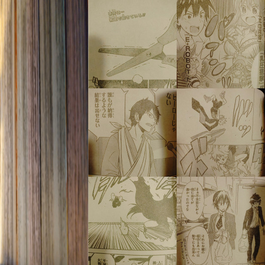
(I tried to take individual photos of different series chapters to show off the fact that the paper is differently colored... but my phone's camera seems to be smart enough to auto balance that kind of thing when there's no other context to anchor it to. (It doesn't help that it's night and my lights have a harsh yellowing glow to them.) but on th left you can still kind of see the different paper colors; this particular issue alternated every 3 chapters between pink-ish, green/gray, a kind of off-white/gray, and sepia, but I've also seen blue-ish, oranges, and a different shade of yellow different from the sepia-ish one.)
Back in ye olden days when it came to fan scanlations, more slapdash teams and projects would often stumble over levels in photoshop (too much black and the pulpy paper texture shows up as grainy shadows, but too far white and the edges of lineart get crunchy and ugly) but those who had more robust readership and a regular streamlined flow of work, we'd actually go in and touch up the solid blacks and whites by hand. We'd also redraw art to erase overlaid text so the type setters could lay the new English in over top.
(Weekly Jump: Left, Bleach tankoban: Right)
They do however keep a few coveted color pages in better quality paper and ink. In contrast, the standard quality tankoban actually don't include color pages at all, and just print what had been color pages in grayscale. There are also all kind of irregularities between publishers and special editions and such, but on the most basic level this difference in quality both keeps serial prices down, while also incentivizing tankoban purchase.
In the U.S. we might still have the draw of an ad-free reading experience in our TPB, but the print quality between a biweekly issue and a TPB are basically the same. Incidentally, even though manga are generally drafted at a much larger scale than even the serial magazine proportions anyway, the scaled down size of the tankoban also serves to sharpen the image. When put side by side the nice clean tankoban print looks noticeably better than the serial.
Now'days the English scanlation scene seems to be conducted almost entirely through ripped digital releases (at least as far as I can tell with popular, regular weekly titles) which is great for quality, frankly, but it does kind of lack the charm and personal touch of a band of amateurs finding round about solutions to a convoluted bootlegging pipeline. But obviously I'm a little biased.
[edit]: Oops i posted this without really ending it in any sensible ro conclusive way... I feel like ive lost sight of the point since i first drafted this but I guess its mostly just me pining after if we could just get super cheap, disposable quality, bulk manga in that classic Japanese magazine model to work here in the states. I already tend to sell manga in big runs, even at $9.99+, and frequently I'll have customers put volumes back, or clearly want the next volume but just can't afford it and wait to come back. If I could sell these customers more volumes, and more importantly more titles, at the same price, I would love to. I would love to see these things fly off the shelves. I would love to see people keeping up with multiple series. I would love to see someone look at a 44vol long series and actually feel like that's a number of volumes they can afford.
5 notes
·
View notes
Last Seen Blogs

tunggraphicmedia
Ha Tung Anh Nguyen

0ddpussy
Sweetest

tanguerojo
Life is a Milonga

m0tleybrew
Becci Gee

cscr-eenu
The Center for Strategic Communications Research