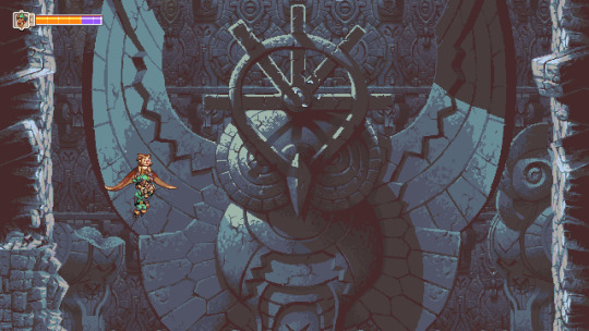
#more art from my Hyper Clean Style era
Text

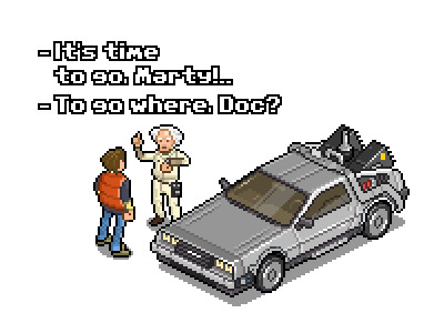
the piece i made for the @stillalivezine back in 2021
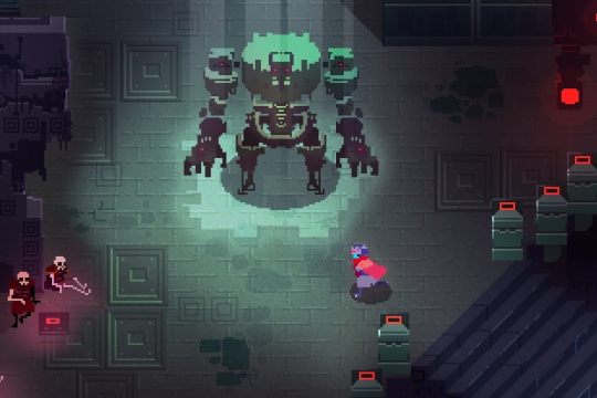
#portal#portal 2#still alive zine#art#illustration#artists on tumblr#portal fanart#valve#more art from my Hyper Clean Style era#highlight reel#i never hear about zines until they're over but i dont have the energy to illustrate anymore anyway :(#i wanted to represent the three acts of the game. old overgrown aperture on the two tiles. old aperture thru the blue portal. wheatley labs#thru the background of the orange portal. and a little bit of the ending with the way she's leaving wheatley labs and entering The Wheat#hi snake if u see this i still think its funny we were in a zine together before we were deltarune mutuals
1K notes
·
View notes
Text
The last 10 years of pixel art
Retronator the blog is exactly 10 years old right now (+ an hour or so more since I can’t seem to stop editing this post)!
I want to take this opportunity to look back at the teenage years of the 21st century and reflect on how the pixel art scene has grown over the years. I only promise a personal perspective, pieced together from my faulty memory and a bit more reliable archive of 1,700 posts on this blog.
2010
Social media sites emerged already in the late 2000s (Facebook launched in 2004, Twitter in 2006, Tumblr in 2007), but it took quite some time before they caught on, especially outside the US. I joined Tumblr in July 2010 and there were relatively few pixel artists active on the site. @jinndevil and @unomoralez go the farthest of those that I followed. The first post I reblogged was a Back to the Future piece from @megapont (via some blogpost share, since Megapont duo didn't join till 2013).
What was huge on the network however was sharing retro-gaming artworks by blogs like @it8bit and @gameandgraphics. This included many pixel art pieces and it helped grow a community of fans that adored both old games and pixels.
2011
I'd put 2011 down as the start of the hi-bit era of pixel art games, championed by the release of the iconic adventure game Sword & Sworcery. Pixel purism of the initial pixel art movement was left behind by mixing pixels with high-res special effects like soft shadows and vignetting. Also, spaghetti legs started their fad period.
Artists such as @probertson, @drewpixel, and @merrigo started their days on Tumblr, gathering huge audiences over the years. Meanwhile, Retronator grew to a whooping 100 followers by the end of the year.
2012
Tumblr's fan spirits were going stronger and stronger, to which I threw my own logs on the fire by releasing Tribute, my biggest and most popular piece of fan art I created so far.

The highly anticipated FEZ got released (to critical acclaim and other more controversial consequences), further bringing pixel art in front of the mainstream gaming audience.
From newly-followed artists, @johanvinet was damn inspiring with his smooth animations. Anything GIF did immensely good on the Tumblr dashboard.
2013
This was THE year for Tumblr. So many new artists joined, it was hard to keep track. Anyone from established names like Mojang's art director @jnkboy and @konjakonjak of Noitu Love 2 fame (later Iconoclasts) to pixel art beginners such as @waneella, now one of the most well-known illustrators in the scene.
The push for modern art direction with pixel art games wasn't stopping either. Not that amazing, more traditionally styled titles (with fresh color palettes) weren't present, as Chasm's debut on Kickstarter showed, but it was Hyper Light Drifter that really stole everyone's heart (machine) on the same crowdfunding platform. Gradients and smooth dynamic shading became unapologetically part of the pixel art (gaming) vocabulary from then on.
When Papers, Please got released at the end of the year to universal appraisal, a new example was set for showing that pixel visuals don't necessarily need to be the most polished, technically-impressive pieces of artistic expression, they can also be simple—the majority of detail-filling can be offloaded to the player's imagination.
2014
Pixel purist ideology was a highly debated topic. Dan Fessler, the background artist on Chasm, did a strong push against the tighter set of constraints which said you should only use 'clean' tools such as the pencil and color fill to complete your artworks. Dan instead only cared about clean results, pioneering in the process the technique of HD Index Painting that used the depths of Photoshop layer magic to get otherwise identical results. And there were plenty of others right around the corner that wouldn't even care about keeping the results married to traditional pixel art ideals.
Still, the majority of pixel art at this point was very orthodox. I started the Artist Feature series that showcased my favorite artists and none of them did anything controversial (nor they needed to). The biggest break from the old days was mainly highly increased color counts that allowed for subtle transitions without dithering, and free color picking without creating predefined color palettes. Octavi Navarro started his highly iconic @pixelshuh scenes, and the completely unknown @8pxl started her journey towards experimentation with pink sky gradients.

Even more importantly, Pixel Dailies were born on Twitter, following Ben Porter's 365 days of doing pixel art daily.
2015
I called 2015 The Year of Pixel Dailies in the end-of-the-year article in my newly started Retronator Magazine. The Twitter community really exploded this year, bringing in many new artists to the medium, with Pixel Dailies serving as a platform to raise visibility to everyone, old and new. I found out about @weilarddrake and @orange-magik this way, Slynyrd, @iceztiqarts, @igorsandman … Other freshly-discovered people on tumblr were @kirokazepixel (one of the most prolific artists on the scene), @faxdoc (his learning journey was inspiring enough for its own article), and Talecrafter with @deathtrashgame (starting a whole new style of aliased, low-res painting without caring about individual pixels).
The discussion whether pixel art could survive past its nostalgic roots was still in the air, stirred by opinions such as A Pixel Artist Renounces Pixel Art. History is proving them wrong however, with pixel art stronger than ever in 2020. It's not a visual language people born after the 80s couldn't understand.
New-school voxel art pieces started trending with the advent of Magicavoxel, pioneering the development of pixel art's sibling in 3D. The first pixel art convention Pixel Art Park was held in Tokyo. And (important for me personally), I came up with Pixel Art Academy, an adventure game that would take my ambitions in pixel art education into the future.
2016
After 9 years in development, Owlboy released! Also Hyper Light Drifter! And Stardew Valley! And Kingdom! Pixel art games were not dying, they were on the rise.
Edge (the popular British video game magazine) published a special 200+ page issue called Art of the Pixel. It featured contemporary artists outside the gaming context, championing the aesthetic's transition from its video game roots into its own art form.
Pedro Medeiros of @studiominiboss started his famous series of GIF tutorials, subsequently encouraging many others to share their knowledge in the popular square format. Tumblr still saw new artists joining the platform, such as @motocross-arts and @apolism (two thirds of the Japanese trio The Ultimate Pixel Crew), while others like @6vcr started their first pixel explorations that year. @brunopixels, an old-schooler on the platform like me, sparked the Octobit movement, a pixel art alternative to Inktober.
2017
Further new names on Tumblr included @guttykreum (outdoorsy perspective pieces) and @scrixels (one of the most consistent daily posters with over 1,000 artworks by now).
The annual Shibuya Pixel Art Contest joined Pixel Art Park at promoting the art form in Tokyo, Japan (and worldwide really). Lospec became the new go-to resource site for pixel art, picking up the mantle from PixelJoint and Pixelation that—while still active—stagnated technologically and feature-wise.
More than anything, pixel art games were everywhere. Maybe it only seemed to me this way since I was able to go to the Game Developer's Conference as press and had the chance to interview many many people in the scene, leading to over half a year of daily content on this blog. Indie games felt stronger than ever with so many of us full-on realizing our dreams of creating our own games professionally. The one that left the biggest splash on the scenes was no doubt The Last Night, announced front and center in-between AAA titles during Microsoft's E3 conference. The brothers Soret pushed the art direction even beyond the hi-bit era moniker, fusing 3D, shaders, and modern cinematography with pixels in an iconic combination that, like Sword & Sworcery's spaghetti legs, was so atmospheric that it couldn't be resisted by future imitators.
2018
Another game that pushed technological boundaries was Pathway, finally stepping into full light in 2018 and releasing one year later. I still think it has the most advanced pixel art graphics engine to date, using voxels and other tricks under the hood to deliver a completely dynamically lit environment while retaining the pixel-perfect 3/4 view aesthetic. Pixel art games were firmly part of mainstream gaming by now, with Celeste winning many awards alongisde pixelish Return of the Obra Dinn, further cementing the presence of pixels as an ever-evolving medium capable of expressing very different art styles.
I decided to focus solely on developing Pixel Art Academy in 2018, putting this blog on relative hiatus with very sporadic updates towards the end of the year. But I never let it die. I thoroughly enjoy writing about the scene and my interest in the art form only grows with time.
2019–2020
Ironically, the closer the years are to the present, the less I remember what things stood out most. Maybe it's because my brain hasn't had the chance to automatically prune my memories yet from the overload of information that is the interwebs these days. Pixel art seems so out there, so much of my everyday life, encompassing me on Twitter, Instagram, YouTube, Facebook, Reddit, DeviantArt … Even on TikTok you see kids zooming out of their freshly pixelized Minecraft photographs they call pixel art. The medium is alive, and more than ever.
As for the Retronator blog, from its zero followers exactly 10 years ago, it grew to 100 after a year and a half, 1000 the year after, 10k when it was 5 years old, and 30k just last month. Tumblr is still the platform where most of you follow my pixel art reports and I don't intend to stop anytime soon.
Here's to the next decade! Thank you all for reading. <3
73 notes
·
View notes
Text
Review : Mank (2020)

Tastes may have changed during the new millennium in regards to film, and while it may no longer stand alone as the film of films, there was a time when the Orson Welles epic Citizen Kane was almost a shoo-in for spot number one on best film lists. By that rationale, making the decision to make a movie about the so-called ‘greatest film every made’ would seem like a bit of a fool’s errand... even more so when you take into account the many portrayals and stories that surround Orson Welles. If one was to climb this seemingly unsurmountable mountain, the direct approach does not seem like the most rationale one, and it was this stroke of genius that more than likely led the prolific David Fincher to create a modern day masterpiece in the form of Mank.
After a car crash puts him in recovery from a broken leg, screenwriter Herman J. Mankiewicz (Gary Oldman) is tasked by radio star turned director Orson Welles (Tom Burke) to write his next film, for which Welles has been given complete creative freedom by RKO Pictures. While dictating the script to his secretary Rita Alexander (Lily Collins), Mankiewicz (affectionately referred to as Mank by his friends and peers) reminisces on his time at Paramount and MGM Studios, his relationships with studio head David O. Selznick (Toby Leonard Moore), newspaper tycoon William Randolph Hearst (Charles Dance) and his mistress Marion Davies (Amanda Seyfried), the political machinations of Irving Thalberg (Sam Troughton) to undermine Upton Sinclair’s (Bill Nye) run for Governor of California, his troubled relationship with MGM studio head Louis B. Mayer (Arliss Howard), and the death of his director colleague Shelly Metcalf (Jamie McShane). Alexander immediately sees the comparisons in the script to Hearst, with whom Mank has a vendetta, yet despite warnings from all parties connected to the film and his life, Mank pushes forward in the creation of the controversial film.
Mank does a fantastic job of portraying a man with a healthy balance of personal demons and secretive actions that is dead set on writing a hit piece to bring down the man synonymous with American media. As a writer and orator, Mank has a deep understanding and hidden fear in regards to the power of his words, and a regret that surfaces when these powerful words hurt those that he cares for. With no true life-altering stakes on the table, the pressure in Mank is created by the limitations of an already outdated and stifled Hollywood machine sitting at the height of its powers, and the drive to create honest, moving art outside of said limitations. As a man, Mank stands on principles built by a history of tangible changes he has made on the humble, and it is strengthened by the consistent backlash he faces for these actions, and the combination of these things leaves him with a visible and seething resentment for Hollywood. Once Mank’s resolve is built up to the point that he can no longer be harmed, the focus turns toward punishment and manipulation of those close to him, which serves as a reminder of how the Hollywood system can find you irreplaceable in one moment and wholly disposable within the next.
On a subtext level, Mank is a movie about movies, and is hyper-conscious of the ‘script-to-screen’ process in a way that informs the narrative while also analyzing it deeply. David Fincher manages to transport his cast (and in turn, us as viewers) to a completely different time, landing us somewhere between a reimagining of Billy Wilder’s Sunset Boulevard and a dark take on Singin’ in the Rain. The film also gives us insight into how creatives were able to wrestle creative independence away from a dominating and overwhelmingly controlling studio system. Despite being a clear big budget, Hollywood-level production, the film is honest about the intentions of the Hollywood system, with Fincher’s version of Louis B. Mayer speaking directly about the commodification of emotions, be it Hollywood being “the business where the buyer gets nothing for his money but a memory”, or how “what he bought still belongs to the man who sold it.
As a film that examines a film which in turn examined an altered version of reality, the historical observations have surprising weight to them. The way that Louis B. Mayer idolized the character and power of William Randolph Hearst is prominent throughout the film, giving viewers and film fans even more of an understanding why Citizen Kane was viewed as such a problematic film at the time it was released. By comparison, Mayer was willing to ignore a similarly power hungry manipulator in the form of Adolph Hitler, but only due to how it would impact his German box office returns, and on no grounds of principle. Mayer and Hearst also viewed Upton Sinclair as a direct threat, specifically due to how Sinclair portrayed Hearst in his prominent book The Jungle, so in turn, the duo found ways to undercut Sinclair socially and politically through the power of manipulated media : the social, entertainment, news and political power games the men created in the form of propaganda served to ruin Sinclair with no regard for the moral fallout it left on the studio side. In turn, Mank’s attempt to take power back was crystalized in the form of his Citizen Kane script.
Mank is an attempt at an ambitious but subtle companion-piece to Citizen Kane that works surprisingly well, mainly due to the ways that its throwback style compliments Welles’ forward thinking innovation. Despite being a modern day film, Fincher seemingly went through great lengths to present it in an old school manner... the film looks, sounds and feels like it used dated techniques, such as area mics, rear projection, visual expositional setups and a touch of German impressionism. I personally found the ‘cigarette burns’ digitally-inserted (I’m guessing) at the end of each ‘reel’ a satisfying touch that almost nobody will notice. The costuming, set design and score are deeply immersive... at times, I forgot that I was watching a film that was not even a year old. Speaking of the score, the way that Trent Reznor and Atticus Ross were able to make it so period-specific is an achievement in its own right, as it brings an enhanced sense of life and attitude to our perception of the film, while informing on what we see in a way that many modern day films now shy away from. The writing is snappy and witty, calling back to a bygone era without drowning in tropes, and giving the actors just enough to work with without venturing into the realms of overacting or chewing up the scenery.
Gary Oldman continues to display an amazing talent for completely inhabiting the skin of his characters, losing himself in a way that not many actors are able to, while leaving enough of himself in the performances for us to marvel at his abilities. Amanda Seyfried is a pleasure to behold in Mank, with her incredible growth as an actress on full display, including a wonderfully entertaining Brooklyn accent. Tom Burke does everything short of looking exactly like Orson Welles, capturing the youthful vigor and excitement of the director while also managing to display shades of the domineering character traits he became infamous for. Arliss Howard and Charles Dance lean into their larger than life portrayals of powerful men with little to no regard for the ‘common man’. Lily Collins serves as a dramatic foil to Oldman while managing to display deep personality traits of her own. Other notable performances come from Tom Pelphrey, Ferdinand Kingsley, Jamie McShane, and a surprising appearance from Bill Nye, with Tuppence Middleton, Sam Troughton, Joseph Cross and a few others chipping in with strong support.
2020 has been a strange year for film, and as a lover of the theater experience, I’ve found that my viewing of films, especially new releases, took a severe nosedive this year. I can say with complete honesty and certainty, however, that even if I’d seen every film of the year, I’d still stand behind my feelings that Mank is the film of the year. I wholly expect it to clean up at every award show next year, and it will serve as a perfect benchmark when compared to other films of 2020 that I haven’t seen, specifically as to whether or not they are worth seeing. David Fincher continues to make brilliant work, and even after a six year hiatus, he has returned like he never left.
#ChiefDoomsday#DOOMonFILM#DavidFincher#Mank#GaryOldman#AmandaSeyfried#LilyCollins#ArlissHoward#TomPelphrey#SamTroughton#FerdinandKingsley#TuppenceMiddleton#TomBurke#JosephCross#JamieMcShane#TobyLeonardMoore#MonikaGrossman#CharlesDance#LevenRambin#BillNye#Jeffharris#TrentReznor#AtticusRoss
1 note
·
View note
Text
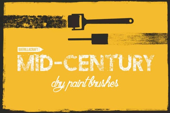
Mid-Century Modern Design: An Emerging Trend
Of all the retro design styles that have been trending, mid-century modern design might be one of my favorites. The phrase “mid-century modern” is more than just a staple on home improvement television shows, it’s also a classic art and design style that speaks to an era.
The best thing about mid-century modern design is that it can simplify the complex. It was a popular style in homes and décor, as well as graphic and product design in for decades spanning the 1930s, 40s, 50s, and 60s.
Now it is making a comeback as a graphic and web design trend.
What is Mid-Century Modern Design?

It’s definitely a design style that comes with a distinct manner of taste
“Mid-Century Modern” is a collection of design styles that most us of would consider retro these days. While it’s not always easy to define this aesthetic there are common color, shape, spatial and typography elements that help make it identifiable.
Mid-century modern is often colorful and bold. Shapes and space are often wide, asymmetrical and even aloof in style and structure. Typography is often on the simple side with block sans serifs, simple serifs and plenty of all-caps fonts.
One of the most common features of mid-century modern design is that it looks somewhat abstract and disjointed at a glance, but when you really look at these pieces, they work fantastically. It’s definitely a design style that comes with a distinct manner of taste – people tend to love it or hate it.
The best modern mid-century mod collection of elements might be the visual catalogue by Theo Inglis on Tumblr (also featured above).
Mid-Century Mod Characteristics

There are specific design elements that you can expect to find in most mid-century modern graphic designs.
Part of the reason this “retro” style is trending is that it makes use of other design trends from minimalism to use of geometric shapes. A designer doesn’t have to use all – or even many of – these elements for the style to qualify as having a mid-century modern feel.
Mid-century modern design characteristics often include:
Use of minimalism or minimal concepts
Bold or vibrant color with some neutrals
Use of geometric shapes
Clean lines and angles
Textures that resemble wood, leather or glass
Medium to heavy fonts, often in all caps
Lack of ornamentation; all elements are usable
Contrasting design ideas
Asymmetry
Rough lines, typography or overall texture
How Designers Are Using It

While print elements might be the most common use of mid-century modern design, elements are popping up on web projects as well.
With distinct ties to art and architecture, mid-century modern graphic design often evokes these ideas. One of the most well-known trending examples of this style is in wall art.
The National Parks Conservation Association and Ranger Doug’s Enterprise has released a growing collection of parks posters in this style (above).
While print elements might be the most common use of mid-century modern design, elements are popping up on web projects as well. It can be a little more difficult to maintain the spirit of the style in this format, but you can definitely see it with more retro-style elements, color options, and type treatments. Use of space and geometry are also identifiers.
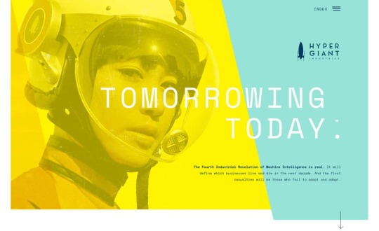
The big difference when it comes to web design is that most of the more muted color palettes of mid-century mod in print are even bolder and brighter, more in line with current web trends, such as Hyper Giant (above).
Tips to Get Started


Mid-century modern styles can be a challenge when it comes to incorporating them into your design projects. You want to balance the retro look and feel with modern techniques so that the design doesn’t look “too dated.”
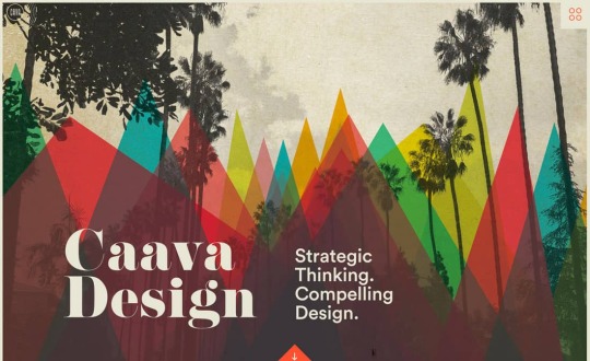
Caava Design might be the closest web representation to the classic stylings of mid-century modern.
Each of the examples above uses a “modern” mid-century modern design that’s easy to replicate.
Polybloc uses geometric shapes prominently – both as a background texture in the tight building images – and also in the shapes for each image. This is paired with unusual coloring and minimal language in a simple typographic style. (Note the all-caps.)
Mogney mixes color and geometry with animation for a fun, minimal style that feels very on trend. The asymmetric design pattern and almost “mismatched” color choices are very mod.
Caava Design might be the closest web representation to the classic stylings of mid-century modern. The color choices and geometry overlay are impressive. These are paired over a neutral base – a common theme in this style – with a typeface that’s a little different from others we’ve seen but with a retro feel.
The trick to using mid-century modern design elements is not to overdo it. Pick the parts of the design trend that appeal to you most and incorporate those into the design. Mix and match with modern techniques and styles to create something that captures the era but also works for today.
“Modern” Mid-Century Modern Elements
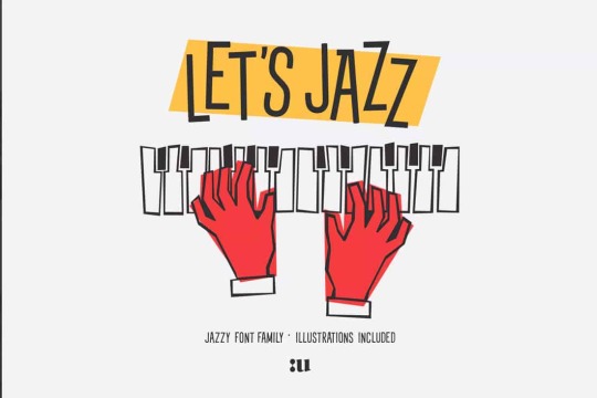
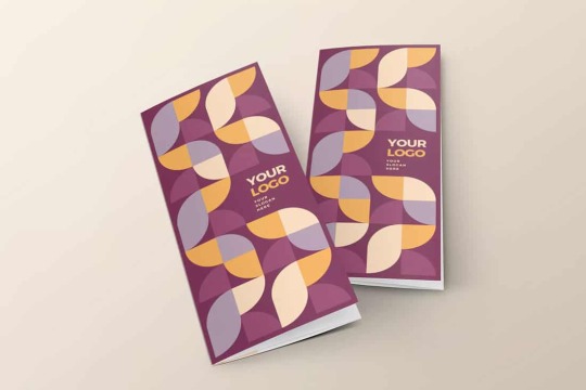
Want to get started with a modern, trending design using mid-century modern design elements? We’ve collected five different types of design pieces that can jumpstart your creative thinking or provide a basis for projects.
Portfolio Template

Let’s Jazz Font
Clean Modern Trifold
Teamwork Isometric Concept

Mid-Century Modern Brushes for Adobe Illustrator
Conclusion
When it comes to modernizing a classic style, such as the mid-century modern design trend, is to use elements of it but not to overdo it. Think about how the design style matches the content of the design.
These pieces have to match for the trend to make sense. Mid-century modern works great for print pieces that have short shelf lives (such as invitations) and web designs that evoke a retro emotion.
from Design Shack http://bit.ly/2UrSq6y
Mid-Century Modern Design: An Emerging Trend See more on: http://bit.ly/2UYkeeB
from http://bit.ly/2X2pS0d
0 notes
Text
‘Highbone Theater’ by Joe Daly
Where does this amateurish reviewer even know where to begin, when used to pithy scribbles about photocopied magazines that usually go ne’er past 24 pages in length, by tackling such a book by Joe Daly; namely, ‘Highbone Theater’? I guess this reviewer just has to write about how the book makes him FEEL. Joe Daly is a bad ass cartoonist and we owe a debt of gratitude to Fantagraphics for consistently making his work available to us. I don’t know what sales are, I don’t know what the story is, but to have gotten a steady flow of monstrous, I mean MONSTROUS, tomes of Joe Daly work is no small feat for an independent publisher. Daly’s books are huge and this one is the biggest, clocking in at almost 600 pages. His previous series, ‘Dungeon Quest’, which I hope has not been abandoned, is of similar size at three volumes so this one is an ambitious undertaking indeed.

The story is a much more personal one than any of Daly’s previous works, which rely on usual tropes of satire and plays upon frivolous ‘hang out’ culture of the millenials that many of this era’s mid-thirties and somewhat reclusive comix makers always return to in their form. This book is about ‘hang out’ folks but it doesn’t rely on the comedy and the surreal, ‘this could never actually happen’, stuff that a book like Dungeon Quest explores in depth and adventure; this book gives us a real feel of the soul of a maligned and questing young man who doesn’t quite fit in and doesn’t quite know how to express. I am assuming this may be one of Daly’s more autobiographical works because he and the main character both have a beard.

Taking a more spartan approach, perhaps at realizing that a 600 page graphic novel must be to some extent cranked out lest it take 20 years to complete, Daly has pulled back the hyper detail and extensive inking of scenery that one saw in Dungeon Quest in favor of a clean cartoon line and minimal and starkly graphic panels per page that occasionally are colored but most often in black and white. Its almost as if Daly is incorporating a little bit of Chester Brown in his method, really relying on character and dialogue and letting that be in the forefront and backed by a subtle reminder that he is in fact a drawing bad ass. Being a fan I was off-put just for the first 20 pages or so, disappointed that this wasn’t a ‘Dungeon Quest’ style get-lost-in-the-ink style of book where one could pore over each page for days on end but that frivolous and convenient whim quickly gave way to the fact that this is Daly’s best fucking work yet and a goddamn powerhouse of a comic book. Barely anyone is capable of making a book like this any more, such a solid and well thought out and fully molded piece of fiction; with all these years of drawing awesome comics Daly has emerged out of that practice a true screenwriter of the finest form.

I’ve read interviews where Daly says that his books are minimally, only 20-30% infused with his South African culture, upbringing, and experience but I don’t buy it. I don’t know his life or his style of living but his books are so god damn FOREIGN. But not foreign as in “god damn I can’t understand this shit” but foreign as in exotic and teeming with mystery and its obvious that theres layer upon layer upon layer of validity and harmony and this is happening in a place I know nothing about and will probably never get to so thank you, sir, for making it available to us. And thanks to Fantagraphics to publishing it.
you can buy it direct from fantagraphics here: http://www.fantagraphics.com/highbonetheater/
Also, go over to my Patreon where you get uncensored images, music videos, art, and all sorts of fantastic shit from my 20 odd years in performance for real fucking cheap: https://www.patreon.com/shfb
3 notes
·
View notes
Text
Evaluation
Initially my research began with creating a mind map of potential outcome ideas alongside different media I could use, as well as that I was looking at different illustrators and their styles, I knew that I wanted to involve portraiture in my final outcome. I always had a strong interest in history, I kept many historical books at home, played historical games and originally I wanted to go into art history. From this, I thought doing an outcome based around this would be enjoyable and a good insight to history for potential viewers. In my statement of Intent, I expressed that I was looking into historical leaders, such as Julius Caesar, Bismarck and Queen Elizabeth I etc. I kept that idea throughout the project but twisted it ever so slightly, looking through my books of war and leadership in countries like Italy, I realised that mostly people in authority were men. There were iconic women in history, from Annie Oakley to Queen Elizabeth I, but the vocal point was mostly men, asking my teachers and friends for an opinion I realised that they didn’t even know some of the female leaders/icons. So, instead of creating pieces about unknown iconic women from history, I decided to put a twist on famous leaders we already know, this allowed me to be more open with gender, and race depending on their country and time.
Different techniques and media I used were: Digital, Collage, Stitching, 3D, Painting and Photography… I mostly stuck with Digital and Photography throughout the process, I used collage and stitching etc. when I was looking into experimentation. Even though I didn’t continue with these processes, I enjoyed them and I was happy with the outcomes, my favourite technique early stage that I used was stitching Julius Caesar, it was time consuming – I never finished it completely, but I didn’t need to fully stitch the portrait for it to be recognisable. Another reason I liked this process was the texture of it, the amount of layers of thread made it 3D, you could feel were the eyes would be as there would be more detail in those areas..
In my Statement of Intent I explained that I wanted my outcome to either be A3/A2 printed portraits, or binding the portraits together in a book… As the project progressed I realised the idea of having printed portraits wasn’t achievable as I didn’t have a printer at home. But, I had programs like Photoshop, midway of the project I came across the thought of Graphic Burger and how I could display my work via a digital book. My plan from there was to create multiple portraits of leaders, then display them through an installed magazine template. The first portrait I did was of my friend Shaz, and I would estimate that it took over 3 days – A week to complete, they are very time consuming as I hope for the outcome to look quite realistic but almost painterly too. Therefore, most of my time throughout this project went into Digital and Photography.
Artists I looked at throughout the project related to Illustration, Stitching, Photography etc. One of the first artists I responded to was Underwerket, she was an illustrator who took drawn images and combined it with collage. I used this mostly for experimentation, as I was set on the idea of creating a digital piece. Jirka Väätäinen was a big influence for my work, he does illustration and graphic design, his work was very clean and it was consistent throughout his theme. I wanted my work to be quite consistent, so I put most of my detail into the figure/face instead of apparel etc.
I had a few ideas that I’d considered, such as stitching into digital portraits, but due to quarantine I was not able to see that through… In college I had printed out portraits I had done, I used paint to dry the image onto felt/cardboard/linen, and then once dry, I rubbed off to reveal the image pressed onto the material. I did not get any further than that, but my plan was to stitch a pattern around the circle, inspired by the artist Aline Brant.
Every week I had a plan to stick to a portrait, as I knew it would be time consuming, I would spend 1-2 week(s) researching about them and beginning creating their piece. I made certain twists depending on time era and country, but overall I was looking to creating a gender swap on whatever leader I was aiming for. Overall, I managed time quite well on creating the outcomes, the only piece that took longer than expected was Wu Zetian (Wang Zetian), and that is purely because I didn’t enjoy the process of making it. I got stuck on the idea that it looked wrong and put off continuing it for a while. This final project has improved my skills with digital work and from that I will continue practicing digital portraits.
Looking back at my Statement of Intent, I am more than happy with the outcome I have created, I didn’t want to stray away from history and portraiture, and although I had to change some details throughout the project, my overall theme is still there. The vision I had in my head was definitely close to my outcome, although the original plan was for it to be something you can hold and touch. A small detail I included in my Statement of Intent is that I would keep their story alive, working through the project I thought that would be expressed purely through my portraits, but as I involved graphic burger, I looked into creating an information page, which was a lot of fun to make.
Within my portraits, there was a few things I could have done to visually improve them, they weren’t hyper realistic, and for the face and body, I was going for that kind of theme. If I had more time I would have looked further into shading in smaller areas. The eyes, mouth and nose I used a smaller brush to create stronger details, though throughout the face there aren’t key details you can look at, aside pores, moles, or birthmarks. To further the detail on the face, I could have looked into different brushes that use a rough texture, and where the light may possibly hit, I could have used subtle strokes of white or yellow. As for the overall piece, the apparel wasn’t to the same standard as the body, but as I had previously stated, I did that purely so the viewer could focus more on the body. If I had spent time in college creating the final outcome, my piece most likely would have involved sewing - hand sewing and machine. If I were to do this again, I would look at continuing with sewing upon the prints I did of my digital art.
I’m satisfied that I have done digital art twice throughout my time in college, as It has helped me improve and widen my knowledge within that spectrum. In the future, I wish to get into concept art, which requires multiple skills, mostly digital, 3D design on pc etc.
My final outcome is 4 spreads of a magazine, showcasing: Alexandra the Great, Wang Zetian, King Elijah I and Julia Caesar. Four portraits accompanied with an explanation of their time era, name and region. For my portrait reference photos, I used photography I took of my friends and models from Pinterest, I wasn’t thinking of primary/secondary research, I was thinking purely based off of the person I was re-imagining. For example: 1533 England, no African-American Kings or men in high authority. Or 100 BC, in Roman History, there is iconic female figures, but most people have only heard of strong male figures like Julius Caesar or Augustus Caesar. It is known that Julius Caesar had a daughter named Julia, but she is not as well-known as his son. For the viewer, this would be eye opening to re-imagine these leaders in a different light, to see them in a time era where it wouldn’t be politically correct. If I had more time to complete this project, it would have involved more of a physical aspect, as I had previously explained. Overall I am satisfied with my outcome and I think it represents a good image for history. Doing 4 detailed portraits within a few months I found quite difficult, but it was great to plan and push myself to get it done. I’m hoping from my portraits that it projects an important statement that it depends on their leadership, not their physical form.
0 notes
Text
9 amazing logo design trends for 2019
What makes a logo special? Do we judge its effectiveness based on utility? Is its value determined by how well-received it is? If you want your logo to feel remarkable and relevant, you need to keep an eye on how logo design trends are evolving.
Predicting which logo design trends will dominate the terrain ahead means appreciating what’s come before them. Now more than ever designers are willing to look at past trends while pushing the boundaries with new styles. In 2019, we’re seeing a fierce appreciation for color, storytelling and design-defying experimentation. The interesting new ways designers are elevating logo design by playing with familiar styles and clever use of color are going to make 2019 an electrifying year in logo design.
9 logo design trends that will be huge in 2019
—
1. Variable logo design
2. New Age geometry
3. Logos that trick the eye
4. Purposeful color
5. Elevated negative space
6. Shift in minimalism
7. Logos with pedigree
8. Overlapping elements
9. Maximizing details
1. Variable logo design
Designers are working in an era where brands are hyper-aware of the fact that their logo will be viewed on a multiplicity of platforms. We covered a similar trend last year, but brands are no longer just concerned with how well a logo translates across platforms, they’re also asking how it can help them build a stronger personal connection with different groups of customers. How can my logo speak equally well to millennials and families? Enter, variable logos that adjust depending on which group you’re talking to.
In 2019, this trend admonishes any one-size-fits-all approach to logo design. Variable design individualizes the relationship between customer and client because these logos embrace the challenge of adaptability. Specialized iconography, dynamic typography and thoughtful customization help frame genuine connections to an audience’s specific needs.
Sulliwan Studio’s logo for Public Space was designed with major brand flexibility in mind. A series of interchangeable pictograms accompany the logo’s standard typography and can be amended to form new logotypes depending on the customer.
No matter which production is on and who the audience is, this logo fits perfectly. Via Elena Kitayeva
Russia’s Perm Opera Ballet Theatre can update their mark, designed by Elena Kitayeva, for different stage productions and alternate between a variety of images, patterns and color gradients, depending on who they’re speaking to and who they want to attract.
The pliancy of variable logo design is what makes it so desirable. Companies looking to personalize their relationship with consumers are gravitating toward this trend because it provides prime targeted delivery, while at the same time keeping their logo recognizable. In 2019, expect to see logos adapt to their audiences in flexible, creative ways.
This logo for artist Brea Weinreb can be stretched, changed, condensed or combined with artwork, depending on where it appears and who it’s intended for. Logo design by goopanic
Full name, short name or abbreviation? Pick the right variation of your logo according to who you’re talking to. Via Julien Lelievre
2. New Age geometry
Once certain trends become recognizable, we subconsciously limit their potential. Case in point: geometric design styles, which have fallen prey to a distinction for being overtly mathematical, cold and even authoritarian. Although it’s easy to define geometric logos as such, in 2019 there is an upward trend where designers are pushing that ceiling by deliberately pairing their creations with vibrant colors and friendlier compositions to offset its reputation.
Via Cecilia Castelli
The New Age geometry trend is all about giving geometric logos a warmer look. “Mix bold geometric shapes with colorful palettes. Clean and minimal but strong,” suggests 99designer Claudia C., on crafting trendy geometric logos.
The Two Kings House pulls circles, triangles and rectangles together with a regal color palette to form a large, reflected portrait of a King holding a rose. Here 99designer ethereal’s impressive logo redefines our experience with geometric design by taking those commonplace objects then layering them with color and playing with line thickness. An artistic take on geometry like this reconciles the frigidity of modern brands with the yearning for a more personal feel.
Logo design by C A P S
3. Logos that trick the eye
The French term “trompe l’oeil” translates to “deceive the eye” and that’s exactly what this logo trend is all about. When you’re accustomed to cycling through ideas day in and day out, playing with visual tricks keeps your enthusiasm for logo design alive. This innovative practice that designers are turning to in order to reenergize their creative juices is also a trend that will dominate logo design in 2019: logo designs that play off tricking the eye—more explicitly, the art of perspective and distortion. Fragmented, warped or visually broken… it’s all good here.
Via Albert Romagosa
Playing with perspective is a cool way to disrupt what is considered acceptable in logo design. Notice how the examples above create the illusion of three-dimensional objects and play with depth. Specifically, Hampus Jageland’s creation for EdgeBoard, an Australian company specializing in chopping boards. Jageland melts together the E and B in the company name and tricks the eye by angling the letter B to look like it’s on the other side of a 90degree wall. The logo works perfectly because we see perspective in action and it accurately reflects the name of the business by literally showing us an “edge.”
Via Avanti-Avanti Studio
99designer Reza Ernada’s Healerr logo perfectly demonstrates how distortion tricks the eye, where doing something as simple as altering kerning or overemphasizing elements is key. He warps the thickness of each letter to create a phased effect with his typography and pairs that with an illustration of a healer drawn with irregular lines.
Avanti-Avanti Studio crafted a brand identity for the Ciutat Flamenco Festival using a similar technique. By warping certain letters in the logo, they’ve set this festival apart from countless others thanks to its unique frequency effect. Clever applications of perspective and distortion like these will make 2019 a refreshingly surprising year in logo design.
4. Purposeful color
Storytelling through color is an inventive method for designers to help brands shape authentic relationships. It doesn’t take an expert in color theory to understand that a color like red evokes passion, vigor and desire. Where this trend can get complicated, however, is when a brand’s message relies heavily on color selection to express its identity. That make or break moment depends on whether the right palette is in play.
Picking the right colors helps brands communicate more effectively. Rather than using random colors simply to attract attention, in 2019 the meaning of logo color is paramount. We’re seeing logo designers focus more strongly on using color in a purposeful way, placing color more intentionally than ever and conveying meaning with each careful decision.
Logo design by Spoon Lancer
99designer Bruno Vasconcelos’s lively logo for greeting card aficionado House of Gumdrops weaponizes color to not only communicate the company name but also to appeal to it’s mostly-female demographic. “To create these designs, I was inspired by the shapes and colors of gumdrops,” he explains. “I used their convex shape to redesign the font, making it more original. I complemented that by using primary colors with a modern twist.”
Via Gilian Gomes
Franklin Fella is an exceptional study in color delegating a brand’s ethos. “The colors were chosen boldly to make the brand stand out with its own unique and happy palette. I wanted it to represent the joy of the relationship between parent and child,” says 99designer Rossie Moss. His choice to use bright orange dots on the boy’s cheeks tells us the child is smiling and happy. Would blue have been as effective here? No way.
5. Elevated negative space
Lindon Leader’s design for FedEx is arguably the world’s most celebrated negative space logo. The ingenious arrow hidden between the E and X is not only clever, it’s a logical representation of what the delivery service is known for—delivering packages!
But even without a history that includes FedEx, negative space is an engrossing design trend that designers are pushing to its limits in 2019. When you take something away from a design, you are, as a result, pushing that area into a more assertive role in your presentation. These designs are created best by those who are believers in dispensing with everything until the point is reached beyond which the design breaks down entirely. Logos created in those moments leverage negative space in voraciously dexterous ways and are elevating the category.
The illustration for Kabooter cleverly mixes a delivery driver on his scooter with the silhouette of a dove. 99designer Mich explains how to take negative space to the next level to achieve this trend: “The key is focusing on the slightest details of any object, that is where you make something unique.”
Logo design by Ocelittle
Consider how the fish is presented in the negative space of the letter S in SeafoodSouq. The proportions of the animal are distinct from the shape of the S but wrap comfortably around the spine of the letter to create a strong, unconventional design. Designers who follow this trend successfully are using negative space in unexpected ways.
Via rahul chandh
6. Shift in minimalism
Amongst the most familiar design trends is perhaps the most salient: minimalism. At this point, it’s reasonable to question whether minimalism is a trend or a necessity. We are several decades removed from when the minimalist movement first impacted the design scape in the early 1970s, but the interest in it remains unsatiated. As designers continue to master the art of stripping design to its core compulsions, they’re evolving the trend by narrowing in on more abstract concepts.
This shift to abstract concepts enhances the effect of minimalist logo designs and makes them more effective. “Minimalism is less a style than a weapon; clearing away noise so a message shines through, clean and naked,” says 99designer Ian Douglas. “It gives just enough to create an anchor, without weighing down the imagination.”
Logo design by Marija…
99designer robbyprada’s piece for Paper Mill Trading shows us how to effectively cut through the noise. Each component of the logo focuses on very basic principles: a simple circle and monochromatic color scheme pairs logically with a trio of bare branch trees.
Logo design by Iva Ron
Another stellar example for this shift in minimalism is 99designer Iva Ron’s logo for Pulpo Gallery, a dramatic avant-garde take on an octopus. “This piece is broken into two main pieces, black ink and tentacles, simplified to exaggerate their complimentary characteristics,” Iva says. “This contrast is meant to be questioned by the perceiver. Why did I recognize an animal here? Could it be something else?”
This is a designer aggrandizing a minimalist concept through his own abstract interpretation, raising our expectations for minimalist design in the process.
7. Logos with pedigree
Did you know Stella Artois has been using the same logo with very minimal changes since the early 14th century? The practice of creating a logo that will serve as a timeless element of a brand’s story is nothing new to designers. In fact, it’s a request they frequently hear in conversations with their clients—and it will only grow in popularity this year.
In 2019 we’ll see brands making decisions that favor authenticity over notoriety and hoping their identity withstands the test of time as well as Stella Artois. This pursuit of trustworthiness means brands are pushing for classic designs that appear to carry an impressive lineage despite being newly created. Logos that include vintage textures, artisanal touches, precise line work and even a specialized crest are the focus.
Logo design by austinminded
“I aimed for an authentic, vintage look and wanted the logo to be simple, to correspond with trends like stick and poke tattoos and nature illustrations,” says 99designer extrafin, on his logo designed for Cobra Lily. “I used a selection of digital brushes for an added organic feel.” The result is a logo that clearly communicates a connection to history and conveys trust and experience.
Via Castlefield Design by Sophie Taylor
8. Overlapping elements
This year we will see more creatives embrace the overlapping elements trend, where designers utilize opacity and stimulating shapes to construct eye-catching pictorial marks, wordmarks and more. This trend will also pull from other trends on this year’s list; expect to see overlapping designs making use of geometry, meaningful color, and negative space.
Via PayPal
Via Allan Peters
Major brands have already started using this trend in their branding and now designers are finally starting to make full use of its possibilities. PayPal famously introduced the trend in 2014, revealing their redesigned logo featuring two overlapping P’s that perfectly signifies the company’s devotion to its 250M+ users.
It’s taken a bit of time since PayPal’s reveal for others to fully embrace this trend but we’re seeing a huge uptick in enthusiasm for it in 2019, featuring bright colors and bold shapes.
160over90’s overlapping logo for Woodmere Art Museum pulls double duty as a modern lettermark representing the letters WAM and as an abstract architectural design depicting the peaks and valleys of a building. Rosie Manning’s Truman logo is another phenomenal take on this trend that fascinates us. Experimenting with opacity and cautious kerning was significant to the success of her creation.
9. Maximizing details
Logos are traditionally small canvases where designers must stretch their imagination to paint an impressive picture of who a brand is and what they stand for. When you factor in the need to be responsive across multiple applications, it could appear to be a near impossible task to create a logo with meaningful attention to detail.
What we will find in 2019, however, are designers doing just that. So many upcoming trends highlight minimalism as its brainchild so we’re captivated to see its rival at work here. More is more and the magic happens in all those attentive details.
Via Steelyworks
Steelyworks’s logo for Mumford and Sons revolutionizes the silhouette of a Pegasus into a thought-provoking, highly-detailed art piece with a continuous monoline that runs from its crest and down to its heels. Fans who see this on social media and printed on merchandise will ascribe the magical presence of the mythical stallion with the songs they love from the band.
Via Jared Tuttle
99designer Deb explains how she makes this hyper-detailed, complex trend work for her: “I have an architecture degree that helps with balance and illustration concepts, especially regarding monuments, scales and synthesis.” This trend requires skill and lots of attention to detail, but the result is worth the effort.
99designer Greeninblue‘s illustration for Red Shoe Stories embellishes the traditional characteristics of a rooster, such as its large feathers and perky comb, with clusters of hand-drawn dashes and an exaggerated silhouette. The design is made memorable because of her artistic touches—right down to the iconic red boots—and it’s the incredible detail of the logo that successfully establishes an identity that’s easily recognizable and uniquely eye-catching.
Ready for logo design in 2019?
—
What we can expect this coming year will be one of the most exciting periods yet in terms of logo design. Trends are not only co-existing, they’re forming symbiotic relationships. Don’t be surprised to find abstract minimalism blending into variable design or negative space plunging into overlapping elements. Designers are finding more and more intriguing ways to experiment with logos and we’re excited to see what makes a lasting impact in 2019!
Looking to get an awesome logo designed?
Our designers can create the perfect one for you.
Let’s go!
The post 9 amazing logo design trends for 2019 appeared first on 99designs.
via https://99designs.co.uk/blog/
0 notes
Text
Mook’s Top 10 Games of 2016
Hi, i’m back! Sorry for the delay, I promise i’ll write more. Boom, ok. Done. Let’s talk about 2016:
Shit got weird in 2016. I probably don’t need to reiterate here, but I just wanted to put that out there. Let’s just try to remember that we have one planet, so let’s not wreck it too bad, ok?
That sounds like enough Debbie Downer talk for today, so how about we talk about some games? 2016 had some pretty badass ones, so im’a run them down here right quick. BUCKLE UP!
HONORABLE MENTIONS
Devil Daggers
Overcooked
Furi
Momodora: Reverie Under The Moonlight
Surprise! It’s a Top 14! I really enjoyed these titles, but 2016 is a cruel mistress and some awesome games must be left off of the top 10. Frantic symphony of Overcooked is some of the best couch co-op you can find theses days. Furi’s style and speed is a joy to experience, and it has pretty badass soundtrack to boot. Momodora was a short, but sweet tribute to castlevania/souls with great sprite work.
And then Devil Daggers....
Actually, I liked this game too much to cut it. Fuck it.
TOP 11
11. Devil Daggers
This game is so damn cool. It doesn’t exactly reinvent the wheel (It’s a 1st person Geometry Wars), but i’m a sucker for style and this game has loads. The almost PS1 era graphics give some extra oomph to the experience as you furiously dodge the spoopiest-skeley dudes. To me, this game really felt like some crazy gem you would dig up in the bargain bin of your ma and pa game store (not to sell the game short by any means).
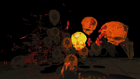
The action is only enhanced with the leaderboards (I have a higher record than my co-host Josh, if anyone was wondering) and the accompanying replays that gave me a few ideas on how to survive just a few more seconds. It’s not the deepest game I’ve played, but this game is one that you can find yourself pouring a surprising amount of time into.
10. Dishonored 2
9. Dark Souls III
I put these two games together as my blurbs about them ended up being pretty similar. Both of games expanded on elements that I enjoyed in previous entries in the series (the combat/LORE!). Additionally, parts that I found clunky were streamlined in these entries (weapon repair/bone charm hunting). While these game were definitely improvements on their predecessors,it was hard not to feel like parts of these games were a little too familiar. Ultimately, Dishonored 2 and Dark Souls III were more of what I know I enjoy. Comfort video gaming at its best.
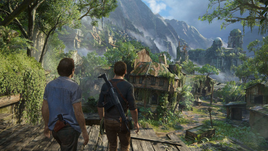
8. Uncharted 4: A Thief's End
While it is the final entry in a series that has gotten a little long in the tooth, Uncharted 4 finally lives up the lofty goals set by Naughty Dog; something that it’s predecessors could never quite achieve. The storytelling and characters finally take precedence over the latest McGuffin hunt, without sacrificing the jaw dropping set pieces, gorgeous scenery, and swashbuckling we’ve come to expect from the Uncharted series.This game is a wonderful coda to a great series of which Naughty Dog should be very proud.
7. Titanfall 2
This game finally made the COD style shooter click for me. All the modern shooter needed was an incredible traversal system with giant robots. Who knew? The multiplayer is incredibly cinematic, and sets up great opportunities to do the coolest looking shit ever. Like, throwing ninja stars while jet boosting from building to building cool.
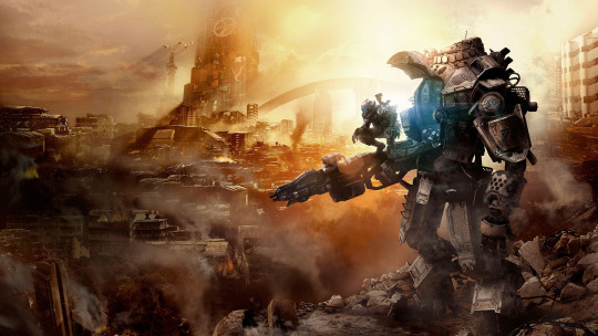
As for the campaign, Respawn delivers a well crafted story that feels like an action movie crossed with The Iron Giant. It’s not afraid to introduce unique mechanics and ideas that don’t stick around too long; it’s a move that keeps the game fresh and something I wish more games would try. A very well rounded game that is just a blast to play, and I’ll keep coming back to for a long time.
6. SUPERHOT
IT’S ONE OF THE MOST INNOVATIVE SHOOTERS IN YEARS.
SUPER
HOT
SUPER
HOT
5. Hitman:2016
I always appreciated earlier entries in this series from afar. The intricate level design seemed fun, but it wasn’t enough to draw me with sluggish control and muddy graphics. I’ve only really scratched the surface of this year’s Hitman, but it forced me to readjust my ordering of the list as I dive deeper.
First all, the environments look great are brimming with detail. However, the real beauty of this game is hidden in the intricate design. The clockwork constructions IO has put together are incredible to explore and dissect. I barely made it through my first missions, but as I learned more and more about each map, the game opened up for me in ways I never imagined. The ability to masterfully manipulate the mechanics and unique quirks of each level to pull off the perfect hit is gripping.
To be honest, I’ve really only spent major time in one of the games beyond the tutorial levels. There is always a new trick or zany disguise to pull off that keeps you replaying the same mission over and over in a way that is surprisingly engaging. The core mechanics in Hitman are excellent foundation to a game that has a ton of personality too. They play it straight on the surface, but you’re only a few cans of spaghetti sauce and a crowbar away from a really good time.
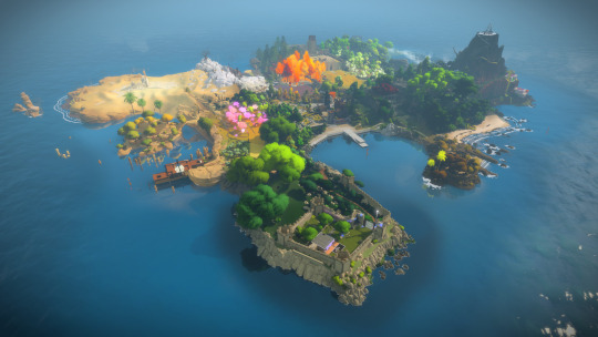
4. The Witness
This game shatters the previous standards for art direction in games. On a basic level, the game is gorgeous and is a joy to simply “take in” all the varied and colorful environments. However, this “puzzle” game shines when you begin to understand how much damn thought went into crafting this world. The game asks the player to constantly rethink the nature of the surrounding environments. The art is interwoven into the gameplay with stunning intellect.
Like the art, the gameplay in The Witness is constantly challenging your preconceptions. What starts out as simple mazes become dastardly puzzles, trusting the player to build a mastery that equal parts frustrating and brilliant. This game has found a way to trigger that Eureka moment for me that is thrilling. The Witness is a game that demands your attention and thought as a player, and the payoff for that investment is incredibly rewarding.
3. Hyper Light Drifter
The complete package offered by Hyper Light Drifter made it one of my absolute favorites this year. The haunting a mysterious art; the moody and evocative score; the subtle, yet powerful storytelling. These elements combined with snappy and stylish combat (especially after the 60fps patch) create a game that I just adored. The execution on everything, top to bottom, in this game is so cohesive. Everything comes together so perfectly, it transported me into a completely different world with ease.
Not bad for a Kickstarter game, huh Ray?
2. DOOM
For a guy who’s only experience with old DOOM is Chex Master Quest, I wasn’t sure of what to make of the first reports on DOOM. Was there going to be anything for someone who didn’t have any long lost childhood memories buried in a sarcophagus with Doom Guy?
I feel foolish for ever thinking this.
DOOM is just fucking incredible. The combat has a thrilling speed that is so refreshing compared to the run-of-the-mill shooter these days. The design of the environments is masterful. The soundtrack is so damn metal, only serving to make the action feel that much more intense. The story is whip smart and is incredibly effective at delivering what the game needs to move the story while being endearingly cheeky just beneath the surface. What DOOM’s story lacks in quantity, it makes up for with the hilariously one-note Doom Guy and his 0 tolerance policy any and all demonic forces, no matter the cost to humanity’s efforts to use Hell Energy as clean/renewable energy (no, seriously). This game is just a nonstop thrill ride from beginning to end in a way that is almost peerless.
Rock on Doom Guy. Rock on.
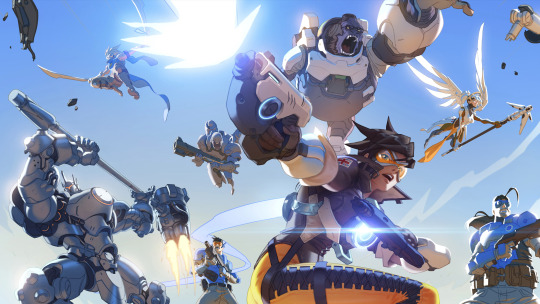
1. Overwatch
I covered my thoughts on this game pretty well in my review last year, and not much has changed. This was my most played game this year, and it’s still a blast to play every night. New characters, maps and modes have only made the package better. This more I play this wonderful game, the better it gets. There simply isn’t a better choice for my personal Game of The Year.
Thanks for checking out my list fam. Time to start working on that 2017 list!
-Mook
0 notes
Last Seen Blogs

mylkah
Gemini

bioboard
БИОборд

infinitelymint
Infinitely mint

tuff-and-fluff-archives
I'm Dreaming of Going Somewhere Else...