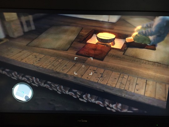
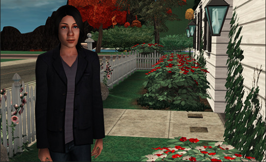
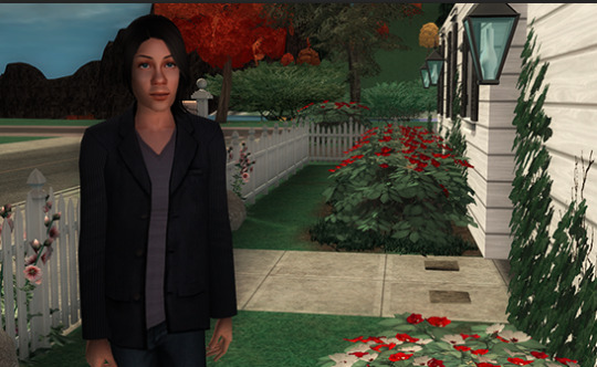
#the front looks so pretty now with the better details than in the blurry pic from back then
Text
nonononono nooooooo they cant do this???? neuvillettes hair is fucking atrocious from the back????????????
#he was supposed to be the beautiful first visibly older character wtf is that 😭😭😭😭😭😭#i cant believe they managed to make something worse than the rat tails#i just......... i learned to to live with zls rat tail and my brain automatically turns it into a normal pony tail#how can i learn to live with this 💀💀💀💀💀💀 man its so ugly#the front looks so pretty now with the better details than in the blurry pic from back then#but that side and back view bc of the hair..... 🤢🤢🤢🤢🤢
1 note
·
View note
Text
a tour of okudera’s house
come on in, comrades ! i turned my brightness all the way up in the game settings and I’ll be giving a tour of okudera’s house in crummy photos of my screen because my playstation never connects to internet. theres some weird stuff, come see. I’m looking for any and all observations & fact-checking, so pipe up if you notice anything !
ok we just came in the front door and turned right. here we can see his gun and a lightswitch, as well as this little countertop that has: worn cutting board, hacksaw (probably for cutting through bones), a hammer and some other stuff idk. Maybe the little cans in the corner are gun oil. (is that a thing?)
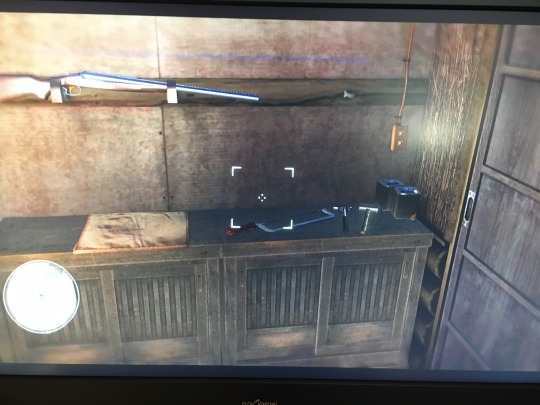
in the corner above the door theres tins, pristine ‘kamuro life’ boxes, and a Meat Hook.
lets look to the left a little.we can see fish drying (not so visible in this pic, but they’ve been gutted and are being held open by sticks so the air goes inside). a big orange blanket. rope.

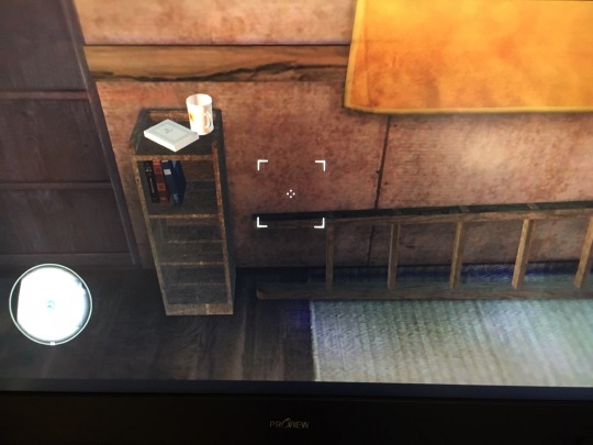
moving past the orange blanket, we have a ladder on the ground, presumably the indoor ladder because i think theres one outside too. and beside the closet door theres this little shelf. It has four books on it - one on top like it was recently being read - and a little white mug with a handle. (if anyone can go in game and figure out what the books are, I will legit give you a free commission - check out my art at @otorno)
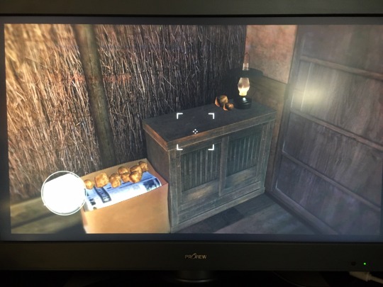
on the other side of the closet door we have a small cabinet matching the cabinets near the front door. On it is an old-school oil lamp and two potatoes (??????). Beside it is a cardboard box with a bunch of newspapers and, some more potatos. (Please if anyone knows what could be going on here... explain. arent potatos suposed to be stored out of the light ??? are they not potatos ?) You can also see that some parts of the wall is insulated with twigs which is pretty cool.
above this we can see a little shelf with what looks like some paint/chemical/glue/wd40 stuff and perhaps a small toolbox or money box. hung on the wall beside the shelf are these white things. which I have no idea what they are. my best guess is some kind of sand weights, maybe for pullies or something, but i don’t know what they would be for.

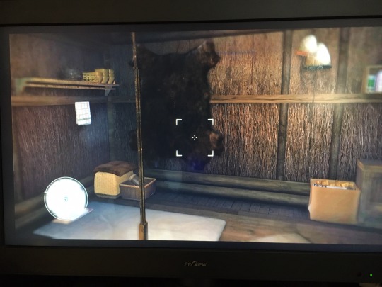
this is the whole wall furthest from the front door. the thing in the foreground is a rope and hook over the fire, for hanging a pot on. this wall feat. a bear skin, miscellaneous boxes and baskets (and a small upholstered seat maybe?), and....
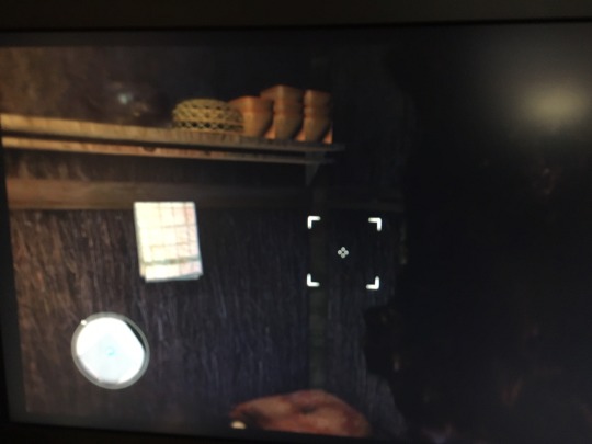
a shelf with a basket and a bunch of matching rounded-square receptacles of some kind. I don’t think theyre dishes because the bowls are somewhere else. maybe theyre for early spring planting. Theres also a grimy little towel. sorry this photo is incredibly blurry.
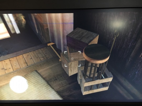
now we’ll stand in that corner and look out slightly in the direction of the front wall. we can see a bunch of crates, a stool, and a fine metal shovel, probably for shovelling ashes. Just past them theres this cloth handing on a stand-up frame, which is baffling to me. if anyone has guesses about what that is for, please let me know.
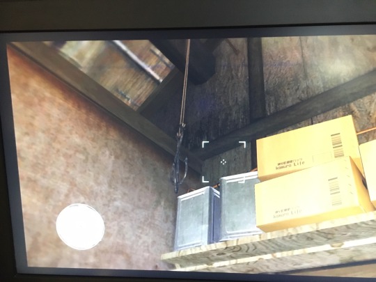
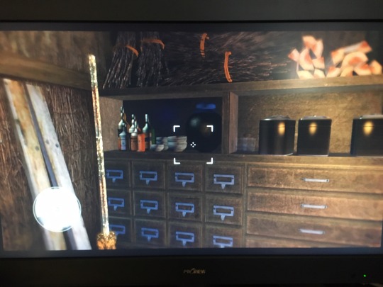
now the front door is on the far left. on the right we can see the top of the cloth on the standing frame. before us we can see: a fancy shelf with some drawers and a bit of firewood on top, a twig broom (looks homemade), two planks of recovered wood, some other stuff we’ll get to later, a *~*mysterious orange wall bucket*~* and a shelf over the door.
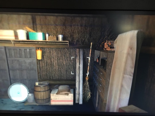
This is the fancy set of shelves. I bet mr okudera keeps his ammo in some of those little drawers. The weird orange curves in the top middle are strings binding bunches of kindling. we can see the broom again, as well as some shiny containers and some bottles.
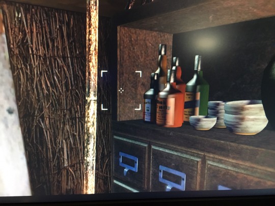
closeup on the bottles. looks like alcohol but i guess some could be medicines or something else? weigh in please. I can’t read the labels but maybe someone else could go in-game and try. we also have the dishes he feeds saejima in.
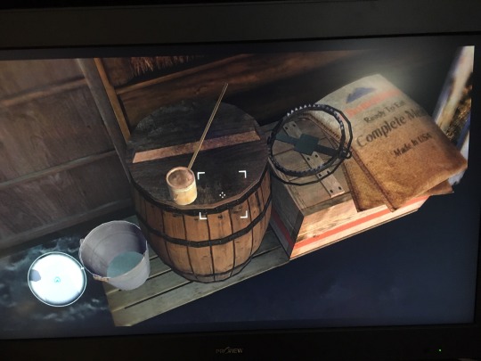
now as promised, some details on the wall with the front door. (Recall you can see a bit of the front door on the left, so we’re now looking down at the house’s front wall.) We have a bucket with a tiny bit of water in it, a barrel, a bear trap, sack of “Ready To Eat COMPLETE MEAL Made in USA” which apparently is like.... war rations (??). another crate. And the thing on top of the barrel, which looks like a small wooden cylinder on a long thin handle. it seems to have a little spout on the side opposite the handle, unless its just the handle coming through. im very interested to hear if anyone knows what this. Note also that the items are up on a raised plank floor because the front part of the house has a bare dirt floor ! brrr!
look up ! this is still the front wall, but above the barrel and above the shelf we can see electrical wiring going from the switch (out of frame to the left) to the lightbulb (out of frame behind and above us). At the point of the roof there is a vent for the smoke to escape. And a set of OARS!!!! does okudera have a little boat that he uses in the summer ??? he must. that’s exciting news.

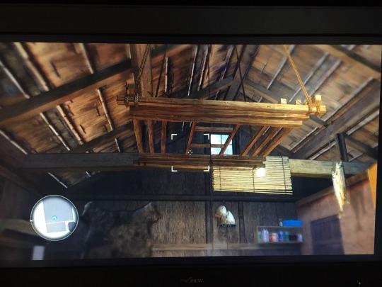
if we turn around to face the back of the house, and look slightly up, what a view we get! theres a little glass window at the top back,and in the middle we get a) the hanging lightbulb, and b) this huge wooden apparatus hanging right in the middle. it’s over the fire - my mom proposed that it’s maybe for smoking meat ? I wonder why he isnt using it though. it’s attached to the ceiling with ropes, and looks like it can be descended at will. If it’s for storage, why isnt he keeping anything up there? its a good spot for a boat, though I don’t know how strong those ropes are.... PS it looks like there might be an upper loft area, behind the horizontal beam and by the window, but there isnt one unfortunately.
now were standing int the front door and looking down a bit. mr okudera stores firewood under the floor, it looks like.
heres the guy himself and a generic view on the mats and cushions. the cushions are red with a paler red pattern, and look like they’ve seen better days, as do the mats. (re: mats & sleeping, the thick quilt thing saejima has when he first wakes up is nowhere visible here. kept in the closet during the day? also, it’s a bulky item. does okduera really have more than two? somebodys gonna have to go cold or pair up...)
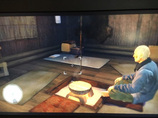
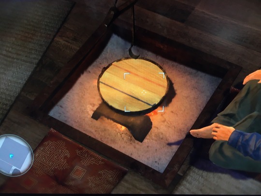
can someone please explain whats going on with the fireplace. it looks like a cast iron bowl on a stand, with flat wood in it. how is that? are there coals in the bowl or something? note that he isnt cooking now.
Thanks for visiting Okudera’s House With Me ! please let me know anything you noticed or share any thoughts. have a good day.
#okudera#sato kiyoshi#yakuza#yakuza 5#meta#ryu ga gotoku#majimeta#memecomradeoriginal#this took SOOOOO long
84 notes
·
View notes
Text
21: Dating App
you have one unread message on soulsearch.
->suggestive but not explicit.
.
.
.
Hey, cutie. Looks like we both swiped right ;)
Pretty bold of you, considering you can’t even see my face in any of my pics. I would guess that you just assumed I’m one of the guys in that camping photo, but I read your profile. I know you know what you want. You found the blur of me frozen between the trees in the background and—what did you feel? Sick and scared? Excited? Both, right? I know I have that effect on people. Like standing somewhere way up high and peering down over the edge, and then you get that feeling. That empty bliss. The way those impossible depths pull at you. That’s what you felt, isn’t it?
I want you to come right up to the edge for me, baby. You can do that, can’t you? I know it’s what you want. You’ve tried everything else and that’s why you’re here now. There’s a dozen other apps for the usual shit, but you’re not satisfied by the usual shit. You want more. And sweetheart, I’m exactly what you’re looking for. So come on. You’re standing on that high place and your heart skips a beat when you lean over and see just how far you are from the ground. From certainty and the familiar. Your head spins and your head is telling you to step back from the edge, back to safety, but Something Else says, “No.”
It says, “Come here. Come to me.” And it’s stronger than your head or all the reason you can muster. It wants you more than you want to be safe.
You’ve gone back to look at my pictures again by now. You want to remember how I made you feel. And you rushed, I know you did, so go back and do it again. Right now, sweetheart. You’ll listen to me, because you like being told what to do. The order tingles in your brain. Feels good to obey. You’re going to find me there in the background of the camping picture again and start making guesses. I love this game. What am I? Go ahead and think it over. You’re remembering stories you heard growing up about things in the woods.
The next picture is blurrier. Me, in the leaves, lit by a harsh half-circle of flashlight. You squint in search of details. Try to tell which end is the front and the back, where is my head, where are my arms, anything to make sense of me. Not knowing upsets and intrigues you. I’m impossible. A jumble of things that shouldn’t fit together the way they do. I I told you I was what you wanted. You’re a curious little thing and you can’t help yourself. You want details. A location. You reverse image search the picture of the campers and find nothing but news articles for four missing boys. You’re so hot when your heart skips a beat.
There’s the rush again, and this feeling that you shouldn’t be standing so close to the edge. But no. Come here, baby. You know this is what you wanted.
Now you’re back and you’re wondering—precognition? Some kind of monstrous sixth sense? How do I know what you’re doing, when you’re doing it, when I sent this two hours before you’re reading it? You should know something about us, the things in the woods you heard stories about growing up. We know you better than you know yourselves. We have to, or we’d never catch you. We have to know just the right words to say and how long we need to wait and exactly how much we can push you stumbling towards that edge before you get scared.
And you, cutie? I think we could get pretty far. Right up to the edge, where I want you. I don’t want to give everything away, but I can picture it; you under me. You’re having a harder time with it because thinking of me is like a riddle. I’m a jigsaw puzzle with crucial pieces missing. But you can see the woods, can’t you? You can feel the sharp crinkling edges of dry leaves under your hands as I take you. Nowhere to run. You want to deny that the idea comes to you so easily, but you saw this moment in your mind’s eye when you first found me in the background of that picture, blurry and indistinct. You knew, instinctively, that I could tear you apart. And, funny thing about humans, especially ones like you—you only love things that can destroy you.
And believe me, I can destroy you, sweetheart. You wouldn’t recognize yourself when I’m done with you. I’d fit inside you better than anyone. Perfect, like our bodies were made for each other. Like you were made for me.
Have you considered that you might’ve been? Maybe it’s meant to be. You, flushed, bruised and bleeding, shaking on the forest floor. Me, pinning you like prey in a trap, all over you. Inside of you. Spreading my branches. You’d be so fucking sexy with my leaves in your skin. Would I be your first? I don’t mean that the human way, baby. I mean in the way that matters. Has anyone else gotten so deep in you that you felt them in your veins? Have they tasted your soul? I didn’t think so. I can’t wait.
But, hey, I think I’ve gone on long enough about this. It’s just the first message. You still need to write me back. We have to get to know each other. Or rather, you have to get to know me. I already know you, baby. What you’re afraid of. What makes you happy. Where you live. I know where to go when we agree to meet up for the first time. You don’t know if we’ll get that far, but I do. Things in the woods have a sense of these kinds of things.
But tell me about yourself anyway. I want to hear about you in your own words. Say as much or as little as you want. Be cautious if you like, but I know you want to be bold. I like that about you. That’s what brought you to me in the first place, after all, and it’s what’ll bring you back to the edge again when you’re ready to go back there.
Don’t worry, sweetheart. I’m not gonna push you or anything. But you’ll never find out what’s at the bottom if you don’t jump ;)
#goretober#original#huh well theres no gore in this one but it is a little eerie i guess lol#i say suggestive but what exactly its suggestive of is up for debate#rotpeach writes
25 notes
·
View notes
Photo


Technicolor was a series of processes used in filmmaking mostly between the late 20s and the mid-50s. There were several different processes used over that time period as technology improved, but in a nutshell they all messed around with color channels in various ways, attempting to reproduce colors correctly on a movie screen. We're going to simulate the effect of one of those old Technicolor processes by...Oh, hey! Messing around with color channels! Imagine that! Then we're going to screw around with layers to make things appropriately saturated and slightly blurry and vintagey-looking.
I'll warn you up front that this is fiddly and subjective. I can tell you basically what to do and what to look for, but a lot of the steps are things you just have to fiddle with until it looks good to you. And this isn’t going to work on absolutely every pic. It has to be done on a pic-by-pic level. There are no universal settings in these steps that will work for all Sims pics. This is art, not science. That said, once you get the hang of it and memorize the steps, this takes less than a minute to do on a pic in its basic form. Really. I promise.
The instructions and pics in this are for/from Photoshop CS6. That said, there is nothing about this process that you can't do in much older iterations of Photoshop, although there is one step for which the controls are significantly different in older versions. But I think you can muddle through fairly easily. And if you don't have Photoshop I imagine other full-function image editors (GIMP, Paint Shop Pro, etc.) have similar functions if you poke about a bit. The instructions are as detailed as I can make them. (And therefore this is very long and has lots of pics. I’m sorry.) So even if you have no real clue what you're doing or why, I think you can follow along. The only thing it assumes you know how to do is open and crop/resize a pic in Photoshop. :) So here we go...
To start, pick a Sims pic. Any pic. (Although, if I were you I'd use an outdoor pic so you can follow along with this better to get you started. ) Open it in Photoshop and crop/resize it to your liking. You don't need to do anything else to it because you're just going to totally change everything, anyway. This is my starting point:
Cunningly, I picked an outdoor pic that has a Sim in it. Hi, Simon!
Now, Step 1: MAKE ALL THE THINGS RED AND CYAN! Really, that's what you do. Because that's exactly what this Technicolor process did on real film in the 20s/30s. Imagine that. Go Image--> Adjustments-->Channel Mixer.
You'll get a popup that looks like this:
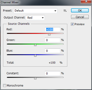
In that popup, in the "Output Channel" drop-down where it says “Red” by default, pick "Blue" instead. Because blue is going bye-bye. Then, in the sliders in the middle of the box, set the red slider at -5%, the green slider at 100%, and the blue slider at 0%, like so:
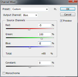
You can type numbers in the boxes; you don't have to use the sliders. Typing is easier when you know the values you need. Also, if you think you might be doing this process a lot, you can save these settings as a preset. Click the icon that looks like this:

Choose "Save Preset" then give it a name like...oh, I dunno...”Technicolor,” maybe. ;) Then, in the future when you want to do this process again, you can click the "Preset" drop-down shown in the above pic and pick the setting you saved from the list, saving you a few keystrokes. But anyway...
Leave everything else as it is, and then click "OK." Your image should now look something like this:

Pretty funky, eh? (Unless you're doing a night shot, that is, in which case this step can actually look pretty darn good all by itself. Takes right out all the damn purple-blue that the game adds at night.) But otherwise? Don't worry. We're not done yet. And this is where our first subjective step comes in.
We're going to fade the channel mixing to some degree, so that it's not quite so powerful and we get touches of the lost colors back. To do that, go Edit-->Fade Channel Mixer. You'll get a popup that looks like this:
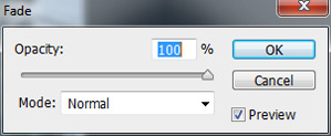
Make sure the checkbox called "Preview" is checked (it should be, by default) so that you can see the effect of what you do on your image as you manipulate it. Then, yank that opacity slider around (or type in numbers in the box) until it looks good, pretty much. Told you it's subjective. :)
No really, what you want is some touches of colors other than red and cyan showing through a bit but not too much. You don't want to lose the overall red-and-cyan, but you DO want, for instance, a little blue back in your sky and a little green back in your grass. I find that values between 50% and 80% are generally where you want to be here, but what will look best will depend entirely on your starting pic.
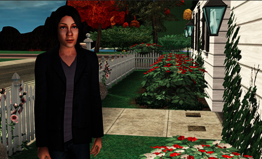
For my pic, I went with 60% opacity for this step, and now it looks like this...

I've got blue back in my sky and some purple back in Simon's jacket/t-shirt and a bit less-turquoise greenery. If you've got unnaturally-colored Sims or Sim-hair in your pic, you'll want to make it so that the real colors show a bit, too. (Which can be challenging depending on the color in question; the channel mixing intentionally sucks purple-blues and purples right out, just as the real film process did, and it's hard to get them back without losing the Technicolor effect unless you do some more serious and far-more-time-consuming editing which is beyond the scope of this.)
Once you're happy with your balance, click OK on the box with the slider. Now it's time to layer this puppy so that we can have two independently-adjustable copies of the same image to play with. In your layers window, you should at the moment have only one layer, called Background, like this:

(If for some bizarre reason your layer window isn’t showing anywhere, click “Window” in the toolbar at the top of the screen and select “Layers” from the list that drops open.) Right-click on that lonely little layer and in the menu that pops up choose "Duplicate Layer." Then just click OK on the window that pops up. Now you have two identical layers, the original pic and a copy of it called, creatively, "Background copy" on top of it.
Click on the top Background Copy layer to highlight and therefore activate it:

Now we can do stuff on that layer without it affecting the image below. The first thing we're going to do is blend the two layers together with a layer blend. This will create an appropriately Technicolor-y saturated effect without actually messing about with saturation levels. Somewhere in your layer window you should have a drop-down that looks like this:

By default, it's set at "Normal." When you click the drop-down, it has a bunch of options like "Multiply" and "Screen" and "Hue." For our purposes, we want either Overlay or Soft Light from this list, depending on your image. They do similar things, but the effect of the former is more intense than the latter. I find that Overlay generally works better for outdoor images and Soft Light works better for indoor ones, so I'm picking Overlay. Now my image looks like this:
Pretty harsh, with very dark darker colors, but super-saturation has been achieved. In fact, it's been achieved a little too well. So now we're going to make this top layer that we’re working with somewhat transparent, in order to weaken the blend effect but not kill it, obviously. Time for more subjectivity!
In your layer window there should be a bit that looks like this:

Usually, it’s right next to the layer blends you just used. If you click the drop-down arrow, you get a slider, or you can just type numbers in the box. Drag that slider down (Or type in numbers less than 100) until you can, for instance, differentiate shades in the darkest colors of your image. Generally, values between 35% and 75% work best here, but it will totally depend on your image and the lighting in it and stuff like that. For mine, I went with 48%, and it looks like this:
The colors are still strongly saturated, as they should be for this process, but now I can, for instance, see the pinstripes in Simon's jacket again (although you can't see that in the sized-down pic :) ) as well as the different colors in the rocks in the background and the difference between Simon's hair and those rocks. You'll also want to be able to see things like highlights in darker hair colors. If it's an indoor pic, you want dark furniture that doesn't look like black blobs. That's the sort of thing you're looking to accomplish in this step.
Next, we want to add some blur to this layer. This will, among other things, simulate the color bleed that is present in Technicolor films and old films/pictures in general. We'll do that with a Gaussian blur. So, go Filter-->Blur-->Gaussian Blur.
You'll get a popup that looks like this:
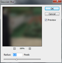
Again, you have a slider or a box you can type in numbers to apply a blur to this top layer of the image. I find that a blur of 5-15 pixels works well here, again depending on your image and how you want it to look. It gives you appropriate overall soft-focus, a bit of bleed around the edges of colors, and it smooths out highlights on skintones and hair that the layer blending step makes fairly harsh. Those are your goals. I went with 8 pixels on my pic, and now it looks like this:
Now, time to brighten things up a bit because the layer blending darkens things down. OR with night shots, you might need to darken back down a little. To do either kind of adjustment, go Image --> Adjustments --> Curves, which brings up a popup that looks like this:
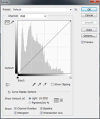
See that window with the diagonal line through it? You can click anywhere on that diagonal line and then drag around the point you "caught" to make the line curved instead of straight. Generally speaking, if you curve it down, it makes the image darker. Curve it up, it makes the image brighter. We probably want the latter unless you started with a night pic, so click somewhere in the middle of that diagonal line and then drag upwards, like so:

Drag around until you like how bright (or dark) your image is. You should see things like nicely-white whites, if there are any in your pic, but otherwise it's totally a preference thing. My pic now looks like this:

Almost done! Now, it’s time to warm the image up a little with a lighting effect. This needs to be done on the original, bottom layer of the image and, unfortunately, this is where things are pretty different between Photoshop versions. I know it's totally different in CS2, and I don't know when it switched over to more like the style that CS6 has. But hopefully you can puzzle things out if you have an older version.
This is also the step that's the artsy-fartsiest of them all. You can do really weird/cool stuff with lighting effects, like make things melancholy and moody, like the finished pic at the top of this post and that you can see a bigger version of here, which owes its moody appearance to different lighting effects drawn on multiple layers between the bottom layer and the semi-transparent one on top. Or you can make it bright and sunny and happy and pretty much anything in-between. I encourage you to experiment to your heart's content. But for brevity's sake, as a "base" to work from, I'll just give you basics here.
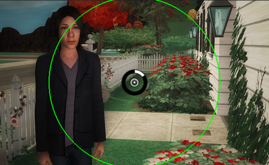
First, in your layer window, click on the original background to activate it and then go Filter-->Render--> Lighting Effects, and your image will now look like this:

(Don't panic, it's just preview. ;) ) First thing you wanna do, over in the right-hand side of the screen in the tab called "Properties," is click the drop-down that says "Spot" by default and change it to "Point," like so:
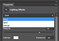
(If you're on an older Photoshop version that looks nothing like CS6 and you're looking at a popup now, there should be a drop-down somewhere in that window that'll list...actually, a whole bunch more effects than what CS6 has. Look for an effect called "Flashlight" and then you can fiddle with the settings from there, including the size/intensity of the effect, which in CS6 is done on the actual image instead.)
Now your image will look like this:

See that circle thing superimposed on your pic? You can move the center of the effect by clicking on that circle and dragging it around your image. The light will radiate out from whatever center point you choose to whatever distance you choose, which is defined by the bright green circle. To choose that distance -- which you'll want to do before you mess with the other settings, so that you can see the effect of the settings you choose better -- hover your cursor over the green circle. When it turns yellow, click and then drag to make the scale -- the size and range of the effect -- larger. Generally, unless there's something interesting in the pic that I want to highlight or if there's an actual light source like a lit lamp, I'll just put the center point in the center of the pic (It'll be there by default) and then set the scale so that covers about half of the image, like so:
Once your effect area is larger so you can see things better, you'll want to screw around with the settings of the effect. (The "Properties" tab on the right-hand side of the screen, over where you changed “Spot” to “Point,” for those with later Photoshop versions.) Here are the setting ranges I typically use:
Color: Click in the white square next to the word "Color" and you'll get a color picker popup. In the picker, in the box at the bottom labeled "#", type fff5e6. That's the hex code for a light ivory color, and it'll warm up the image just a touch, as the red/cyan processing is rather cold. That said, you can totally use whatever color of light you like. You can make it even yellower and/or a bit orange, which ramps up the “this-film-needs-restoration” look. Pink is nice if you've got a lot of pale/light skintones. Green is good if your main subject is a Plantsim or a green alien. A bit of blue is nice on outdoor winter pics with snow in them. Or, you can just leave it white. That works, too. Whatever the case, when you're satisfied with the color of your light, click OK.
Intensity: 0-30ish
Exposure: 0-20 or so
Gloss and Metallic: 0
Ambience: Between -10 and 10. Or more. Or less. ;)
Ultimately, all of these settings depend on the "feel" you want the pic to have. Play around with the sliders, to see what each of them do. When you're happy with what you see, click the blue "OK" button at the top of the screen. (Or "OK" on your popup, if that's what you've got.) My pic now looks like this:
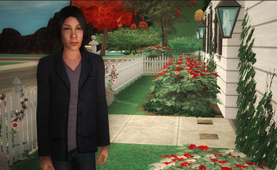
(Settings: Color fff5e6, Intensity 32, Exposure 15, Gloss and Metallic 0, Ambience -2)
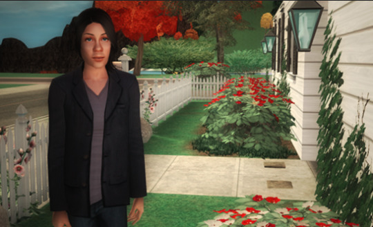
Final step! Do a Gaussian Blur on the bottom layer, to finish the color bleed effect and make the thing more vintage-appropriately blurry. Do it just like you did it on the top layer. The bottom layer is not semi-transparent, however, so you'll need to be much more conservative with the amount of blur you apply. You're going to want less than one pixel. On mine, I used 0.3. and the final result is:
And, that's it! I know it seems like a lot of steps, but once you do it a few times and don't have to look at the instructions, it goes quickly. :) From this point you can call it done or you can screw around with it further still. Add some scratches with a scratch brush, sic different filters on it for artsy effect, whatever.
#sims 2#sims 2 pic-editing tutorial#tutorials#this would probably work on ts3 pics too#i haven't tried it#and i don't own ts4 so i can't try it on that either#vintage is good#sims in technicolor
94 notes
·
View notes
Text
There Goes The Bride
Let's wrap up our current tour of the attic. Don't worry, we'll be back.
Consider the following scenario:
A razzle-dazzle new ghost is installed at the DL HM attic, with high expectations, but the effect is basically pretty simple, achieved simply by clever manipulation of light projection. Alas, the figure is too close to the track for the effect to be truly convincing, and the Imagineers fiddle unsuccessfully with the new figure, trying to get it to look right...
Sounds like you-know-who, but of course I'm talking about Constance. The only thing missing is the part where they give up and take it out.
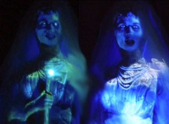
There isn't much to say about how the Constance effect works. It's the old "Leota effect," a projected movie on a white dummy. The problem for many fans is that it looks like what it is, a two-dimensional projection. The arms in particular are unconvincing. There's evidence that the Imagineers are aware of the problem and have experimented with ways to improve the look. Compare these two shots of the mannequin under regular lighting.

If anyone wants MY free advice, I'd say the secret is to go fuzzy. Her arms should be nothing more than white, blurry shapes, just thick cloudy hoses. You could sharpen up the hands and hatchet when the hatchet appears, but only for a second. Murk it up, boys, murk it up.
By all counts, the WDW version looks and sounds better than the DL version. Even in photos you can see the difference. Here's DL Connie:

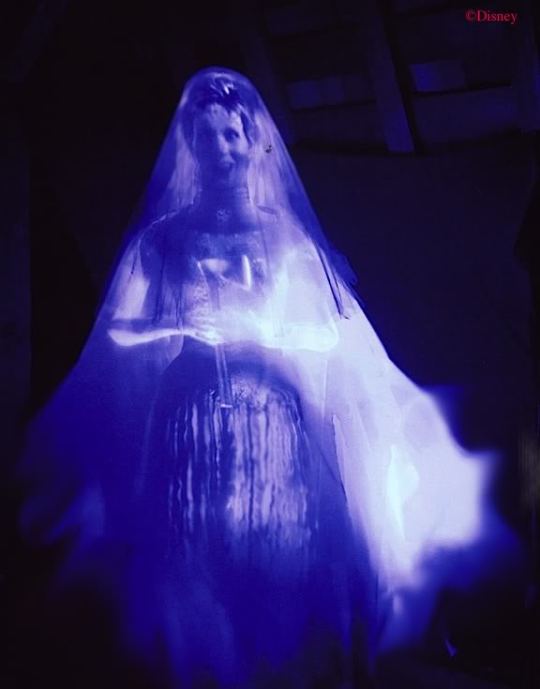
And here's WDW Connie:
(pic by Jeff Fillmore)
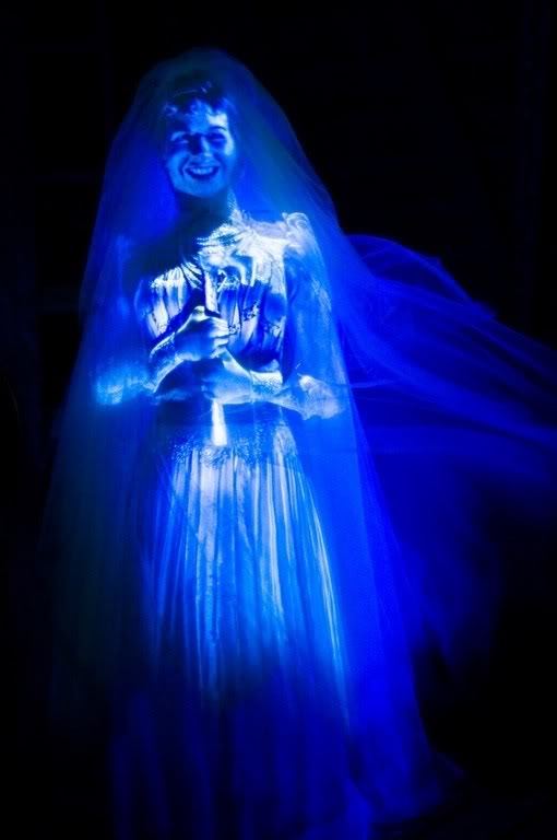
Definitely better, but we're still not at the "Gee whiz, how do they do that?" stage for anyone over 11. Hate to sound harsh, but there it is. Is she better than what she replaced? For ease of comparison, here are three nice 3D's, showing the three basic bride types over the years.


Let's talk about something else. Let's talk about the other razzle-dazzle effect that came into the attic with Connie: the wedding portraits. Here the verdict is much more positive. When they're working right, they are impressive, very much in the coveted "how do they do it?" category.

So how do they do it? You may have noticed that when people don't know how a Mansion effect is achieved, and they want to sound like they doknow, so as impress their friends, they mumble about "fiber optics" and "holograms" and sprinkle the word "digital" around like oregano on a pizza. Most of the time they overshoot, spinning out elaborate explanations when the reality is some ridiculously simple trick. Like so many other effects in the HM, this attic-portrait effect is essentially pretty simple. You have a painting on a thin, translucent fabric, and another painting underneath it. There's a spotlight on the front and a sort of light box behind. Actually, it's a little more technical than that, but I'm going to spare you the details. It's all digital fiber optics, and other things you wouldn't understand. Anyway, when the light box is dark and the frontal spotlight is on, you see the front painting with the guy's head on. When the spotlight goes out and the light box in back goes on, you see the headless version behind it. That's because when the back one is lit up, you see it through the translucent front painting, which is now unlit and essentially invisible. It's the old scrim trick, not different in principle from the ceiling in the stretching room.

You can most easily figure out how it works when it isn't working! It is extremely important that the spotlight fade in and out in such perfect coordination with the fading in and out of the back lighting that you don't notice any difference in overall luminosity. Sometimes they're out of whack, and you can notice the picture brightening and fading in synch with the disappearing head. The following two shots are grabs from the same continuous video. Note how the frame is illumined when Reginald's head is visible, but not when it isn't. It's not supposed to be like that.

The other reason the effect can be figured out is because it's been done before, more or less.
Sherman, set the Wayback machine for Paris in the 1890's.
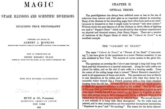
The Montmartre section of Paris saw the invention of the fully-themed nightclub during the late Victorian era, including costumed staff, elaborate decor, and theatrical floor shows. Some of them had otherworldly themes and put on ghost shows. One of the most successful was the Cabaret du Néant ("Tavern of Nothingness" or "Tavern of the Dead"), where the theme was death and decay. In the first room, the waiters dressed as undertakers and you sat at tables that looked like coffins. In the second room they had a first-rate magic stunt in which volunteers from the audience would stand in a coffin and turn into a skeleton (and back again; sorry, it's the law). In yet a third room the volunteers would sit onstage while ghosts that they could not see (but the audience could) made them look like perfect fools. By that point you were pretty drunk and thought this was the funniest thing you'd ever seen. And I dunno, maybe it was. We'll go back to the intriguing C du N sometime later, since it is undoubtedly a source of inspiration for the Haunted Mansion, but for now I want to point out a special effect in the first room, which room looked like this:

Like the chandelier? Anyway, the walls were covered with normal-looking paintings that changed before your eyes into gruesome scenes. Sounds familiar, doesn't it? You would think such a subtle effect would not be picked up under the harsh lighting necessary for 1890's photography, but not so. In the photo above, note the large painting on the left with a skeleton in it and another, smaller painting up in the right hand corner with nothing showing on it:
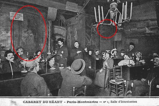
In other photos of the Cabaret, the skeleton in that left hand painting is halfway or nearly gone.

Conversely, in other photos the smaller painting has a skull in it. Here's a side-by-side:

You're looking at the direct predecessors to the changing portraits in the Haunted Mansion, kids. But how did they do it back then? The gullible masses may have been baffled, but not Albert A. Hopkins. No, siree.
"Around the walls of the room are placed pictures to which the spectator's attention is called by the lecturer. Seen by the light of the room these pictures are ordinary scenes, but a new aspect is given to each when the lights directly behind it are turned on; the figures in it appear as skeletons, each picture being in fact a transparency giving a different effect as it is lighted from the rear or as seen simply by reflected light."
The main difference between this effect and the HM wedding portraits is that the Cabaret du Néant pictures were evidently paintings on both sides of the same thin cloth, while the Disney version uses two separate paintings on top of each other and more sophisticated lighting so as to make use of the scrim trick. Still and all, the similarities are greater than the differences. [Edit: I now think Hopkins got it wrong.]
There's an interesting footnote with regard to these changing attic portraits. They were installed in May 2006, but more than a year before that the pictures in the changing portrait hall were replaced with fancy new ones with a more impressive lightning-flash effect. These work the same way the attic portraits work, with two layers and backlighting. That was in January 2005. A few months before that, something very weird happened in the portrait hall that is little-remembered today because it didn't last long. One day in August 2004, the stretch room doors opened and guests found themselves in a noticeably lighter portrait hall, with out-of-place looking Art Nouveau-style light fixtures by the doors, a more lurid, bright green EXIT sign over the chicken exit, and a row of light fixtures along the wall under the portraits, illuminating them. As usual, Allen Huffmann at Disneyfans (an invaluable resource) got some photos.


Everyone thought these abominations had something to do with "safety" and muttered unkind things about Disney lawyers and OSHA inspectors. When the EXIT signs returned to sane levels and the goofy lights were gone, the whole business was quickly forgotten.
I don't think the mounted lights under the portraits had anything to do with safety. I mean, come on, were people bumping into the wall? What I think the Imagineers were doing was experimenting with frontal illumination for the hallway portraits. If the lighting could be successfully controlled so that the front could gradually come up while the backlighting went down, these paintings could have been as sophisticated as the wedding portraits. If this surmise is correct, the experiment must have failed. The changing portraits have no special frontal illumination. This means that in order for the back-side portrait to be visible, it has to be very light and the front portrait much darker, so that backlighting alone can do the job. It's a cruder effect. That's why the changing portraits in every case flash to a secondary image that is all white.


Originally Posted: Monday, June 7, 2010
Original Link: [x]
6 notes
·
View notes
Text
Sony Xperia 1 Heartbreaking Camera Comparison Vs Oneplus 7 pro | Part 2 - Night
sponsored by vodafone
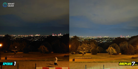
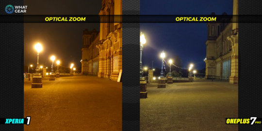
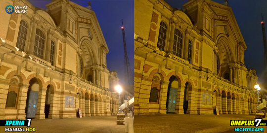
Picture 1 - Alexandra Palace

So this is the iconic Alexandra Palace broadcast tower which was actually where the 1st ever public television transmission was made from...anyway the picture.
So when it comes to the photo taken on the Sony Xperia 1. One area where it's doing quite well is the purple colours coming through the skylights, it's also doing a good job of brightening up the walls of the building.
However when you take a look at lights on the left side of the building. The Sony Xperia 1 seems to struggle with dynamic range. I did take this one in manual mode with HDR but struggles to control the light here.
Now when we compare the Xperia 1 photo to the OnePlus 7 Pro photo taken with its nightscape.
Automatically the OnePlus 7 Pro delivers a crispier & sharper image. the Oneplus has much more control of the dynamic range which you can see around the brightest areas of the photo. Also, the broadcast tower is much clearer and more detailed.
Now stay with me to the end, it's not all doom and gloom for the Sony Xperia 1.
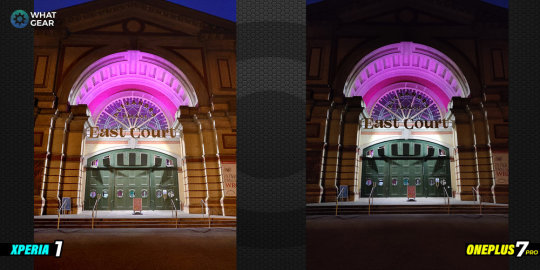
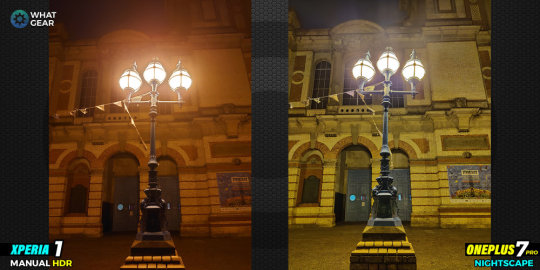
Picture 2. - East Court

Ok so in the setting the Sony did well. There was a street light behind and of course the light coming from the East Court entrance.
Again the Sony Xperia 1 delivers nice colours & surprisingly a brighter photo than the OnePlus 7 pro.
Again due to the way the OnePlus 7 pro handles HDR it's more detailed in the brightest areas. But you could argue a case for the Sony to winning in this scenario.
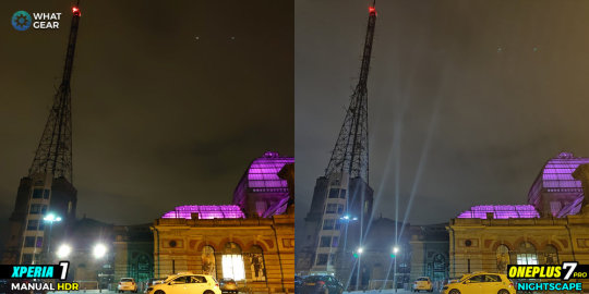
Picture 3 - Distant London
So Ally Pally short for Alexandra Palace was built on one of the highest points in London. So from the Palace, you can pretty much see the entire city. It's a really nice view.
But anyway the picture.
So the Sony Xperia 1 seems to struggle in these darker lighting conditions. You notice the detail in the tree line is completely crushed, the foreground is too orange and the buildings in the distance are slightly overexposed.
The OnePlus 7 pro isn't amazing either but certainly a lot more colourful, brighter & more detailed.
So I honestly don't believe the results of the Sony photograph is the result of bad image sensors. Especially when you consider Sony make the image sensors in the OnePlus & iPhones and Samsung's and the majority of flagship devices.
The chink in Sony's armour is the image processing software. So now check this out.
Pic 3.1 - Distant London HDR
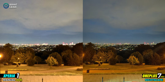
I took this picture in manual mode with a 1/4 of a sec exposure time & immediately it's more colourful, much brighter, all the details in the trees in the foreground come back.
It's a little blurry because I had to shoot this one handheld...but you get the idea here. Honestly, I think Sony need to ask Google if they can borrow there night sight software... seriously I think it will change the game for this camera...
Anyway, I'll be keeping an eye out for a Gcam port to test out. I'll try to make a video on that if it happens.
So now onto some Selfy video.
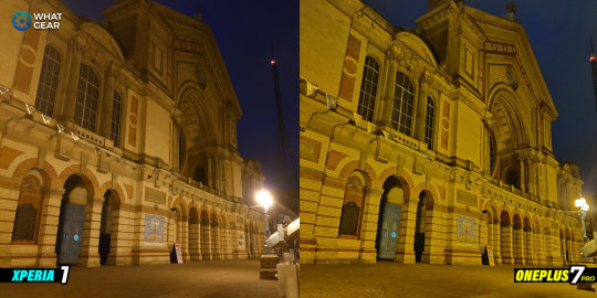
Pic 4 - Ally Pally


So this is the front of the Palace. It's not the darkest lighting conditions, as the walkway has quite a few street lights along it.
So actually Sony Xperia 1 again does pretty well when there's some kind of light source nearby. The colours are pretty accurate on the brickwork...it's still overexposing the lights...but not bad.
The OP7 pro again puts in a stellar performance. My only tiny criticism is the image is just a little too yellow, however, it is equally as detailed and much brighter.
So I took the same picture again in manual mode on the Sony with HDR and this is what happened. So you can see it delivers a brighter image with more detail in the shadows and better colour in the sky too.
Pic 5 HDR - Extreme Night HDR
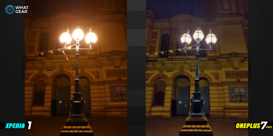

So I wanted to test an extreme HDR scene. So I took this picture of the street lights. With both phones using the regular camera modes.
Again the OnePlus 7 Pro is impressive even without the nightscape setting. You can see the metal bands wrapped around the light bulbs perfectly.
The Sony again with the lack of HDR on the regular camera mode suffers in extreme HDR scenarios. So now take a look at the same picture with manual settings on the Xperia and nightscape on the OnePlus.
The details came back on the Xperia and the OnePlus 7 pro takes it up another notch.
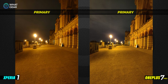
Pic 6 Lens tests -
So this next test was a request from one of you legends who watched the daylight comparison video I made at Hyper Japan 2019 in London. So here is the primary shooter on both devices...it was incredibly late hence the reason it was empty.
Primary Lens

Anyway, both devices are quite similar here...I'm sure you could argue a case for either device in this photo.
Now the telephoto.
The Sony keeps its orange hue and pretty good detail in the foreground and on the building but still overexposing the lights.
The OP7 pro has a dramatic difference in colours with it adding a much much cooler tone to the photo. Also, it does see much further with its optical zoom.
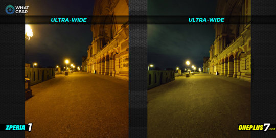
Now the ultrawide.

The Sony keeps that orange tone whilst the OnePlus 7 pro now has a greenish tint. Very strange results on the OnePlus.
I think when it comes to the ultrawide photos I think the Sony Xperia 1 does a bit better. It has a wider field of view and it's to be more detailed especially in the foreground and around the Ally Pally sign on the left.
So guys you know I'm interested to know what you think of these results. Do think Sony can step up the Xperia 1's night capabilities with software...or do you think this is as good as it gets for us?
Let me know... What you think.
In my opinion as. Sony Xperia fan I'd love to see Sony listen to their fans and make adjustments to their software the same way in which OnePlus do.
Because when the OP7pro launched, all the big YouTubers were throwing it under the bus. Then they released the 9.5.7 update and turned it all around. I'm sure Sony could and should do the same.
Anyway if you missed the daylight comparison between the two devices the thumbnail is on screen at the end of the video. The results were completely different than this one you u got to go check it out to see what I mean.
See you in the next one...don't be late.
HERE IS PART ONE OF THE XPERIA 1 VS ONEPLUS 7 PRO @HYPERJAPAN 2019
Check out the Hyper Japan 2019 Festival in this sony xperia 1 vs oneplus 7 pro camera test shootout! Which phone do you think will win this one? Both Phones have Sony camera sensors so either way it's a win for Sony...so you Sony fans will love this one.
MORE WHATGEAR VIDEOS
source https://www.whatgear.net/technology//sony-xperia-1-heartbreaking-camera-comparison-vs-oneplus-7-pro-part-2-night
0 notes
Text
Sony Xperia 1 Heartbreaking Camera Comparison Vs Oneplus 7 pro | Part 2 - Night
sponsored by vodafone
Picture 1 - Alexandra Palace
So this is the iconic Alexandra Palace broadcast tower which was actually where the 1st ever public television transmission was made from…anyway the picture.
So when it comes to the photo taken on the Sony Xperia 1. One area where it’s doing quite well is the purple colours coming through the skylights, it’s also doing a good job of brightening up the walls of the building.
However when you take a look at lights on the left side of the building. The Sony Xperia 1 seems to struggle with dynamic range. I did take this one in manual mode with HDR but struggles to control the light here.
Now when we compare the Xperia 1 photo to the OnePlus 7 Pro photo taken with its nightscape.
Automatically the OnePlus 7 Pro delivers a crispier & sharper image. the Oneplus has much more control of the dynamic range which you can see around the brightest areas of the photo. Also, the broadcast tower is much clearer and more detailed.
Now stay with me to the end, it’s not all doom and gloom for the Sony Xperia 1.
Picture 2. - East Court
Ok so in the setting the Sony did well. There was a street light behind and of course the light coming from the East Court entrance.
Again the Sony Xperia 1 delivers nice colours & surprisingly a brighter photo than the OnePlus 7 pro.
Again due to the way the OnePlus 7 pro handles HDR it’s more detailed in the brightest areas. But you could argue a case for the Sony to winning in this scenario.
Picture 3 - Distant London

So Ally Pally short for Alexandra Palace was built on one of the highest points in London. So from the Palace, you can pretty much see the entire city. It’s a really nice view.
But anyway the picture.
So the Sony Xperia 1 seems to struggle in these darker lighting conditions. You notice the detail in the tree line is completely crushed, the foreground is too orange and the buildings in the distance are slightly overexposed.
The OnePlus 7 pro isn’t amazing either but certainly a lot more colourful, brighter & more detailed.
So I honestly don’t believe the results of the Sony photograph is the result of bad image sensors. Especially when you consider Sony make the image sensors in the OnePlus & iPhones and Samsung’s and the majority of flagship devices.
The chink in Sony’s armour is the image processing software. So now check this out.
Pic 3.1 - Distant London HDR

I took this picture in manual mode with a ¼ of a sec exposure time & immediately it’s more colourful, much brighter, all the details in the trees in the foreground come back.
It’s a little blurry because I had to shoot this one handheld…but you get the idea here. Honestly, I think Sony need to ask Google if they can borrow there night sight software… seriously I think it will change the game for this camera…
Anyway, I’ll be keeping an eye out for a Gcam port to test out. I’ll try to make a video on that if it happens.
So now onto some Selfy video.
Pic 4 - Ally Pally


So this is the front of the Palace. It’s not the darkest lighting conditions, as the walkway has quite a few street lights along it.
So actually Sony Xperia 1 again does pretty well when there’s some kind of light source nearby. The colours are pretty accurate on the brickwork…it’s still overexposing the lights…but not bad.
The OP7 pro again puts in a stellar performance. My only tiny criticism is the image is just a little too yellow, however, it is equally as detailed and much brighter.
So I took the same picture again in manual mode on the Sony with HDR and this is what happened. So you can see it delivers a brighter image with more detail in the shadows and better colour in the sky too.
Pic 5 HDR - Extreme Night HDR


So I wanted to test an extreme HDR scene. So I took this picture of the street lights. With both phones using the regular camera modes.
Again the OnePlus 7 Pro is impressive even without the nightscape setting. You can see the metal bands wrapped around the light bulbs perfectly.
The Sony again with the lack of HDR on the regular camera mode suffers in extreme HDR scenarios. So now take a look at the same picture with manual settings on the Xperia and nightscape on the OnePlus.
The details came back on the Xperia and the OnePlus 7 pro takes it up another notch.
Pic 6 Lens tests -
So this next test was a request from one of you legends who watched the daylight comparison video I made at Hyper Japan 2019 in London. So here is the primary shooter on both devices…it was incredibly late hence the reason it was empty.
Primary Lens

Anyway, both devices are quite similar here…I’m sure you could argue a case for either device in this photo.
Now the telephoto.

The Sony keeps its orange hue and pretty good detail in the foreground and on the building but still overexposing the lights.
The OP7 pro has a dramatic difference in colours with it adding a much much cooler tone to the photo. Also, it does see much further with its optical zoom.
Now the ultrawide.

The Sony keeps that orange tone whilst the OnePlus 7 pro now has a greenish tint. Very strange results on the OnePlus.
I think when it comes to the ultrawide photos I think the Sony Xperia 1 does a bit better. It has a wider field of view and it’s to be more detailed especially in the foreground and around the Ally Pally sign on the left.
So guys you know I’m interested to know what you think of these results. Do think Sony can step up the Xperia 1’s night capabilities with software…or do you think this is as good as it gets for us?
Let me know… What you think.
In my opinion as. Sony Xperia fan I’d love to see Sony listen to their fans and make adjustments to their software the same way in which OnePlus do.
Because when the OP7pro launched, all the big YouTubers were throwing it under the bus. Then they released the 9.5.7 update and turned it all around. I’m sure Sony could and should do the same.
Anyway if you missed the daylight comparison between the two devices the thumbnail is on screen at the end of the video. The results were completely different than this one you u got to go check it out to see what I mean.
See you in the next one…don’t be late.
HERE IS PART ONE OF THE XPERIA 1 VS ONEPLUS 7 PRO @HYPERJAPAN 2019
Check out the Hyper Japan 2019 Festival in this sony xperia 1 vs oneplus 7 pro camera test shootout! Which phone do you think will win this one? Both Phones have Sony camera sensors so either way it’s a win for Sony…so you Sony fans will love this one.
MORE WHATGEAR VIDEOS
Source: https://www.whatgear.net/technology//sony-xperia-1-heartbreaking-camera-comparison-vs-oneplus-7-pro-part-2-night
0 notes
Text
Sony Xperia 1 Heartbreaking Camera Comparison Vs Oneplus 7 pro | Part 2 - Night
sponsored by vodafone
Picture 1 - Alexandra Palace

So this is the iconic Alexandra Palace broadcast tower which was actually where the 1st ever public television transmission was made from...anyway the picture.
So when it comes to the photo taken on the Sony Xperia 1. One area where it's doing quite well is the purple colours coming through the skylights, it's also doing a good job of brightening up the walls of the building.
However when you take a look at lights on the left side of the building. The Sony Xperia 1 seems to struggle with dynamic range. I did take this one in manual mode with HDR but struggles to control the light here.
Now when we compare the Xperia 1 photo to the OnePlus 7 Pro photo taken with its nightscape.
Automatically the OnePlus 7 Pro delivers a crispier & sharper image. the Oneplus has much more control of the dynamic range which you can see around the brightest areas of the photo. Also, the broadcast tower is much clearer and more detailed.
Now stay with me to the end, it's not all doom and gloom for the Sony Xperia 1.
Picture 2. - East Court

Ok so in the setting the Sony did well. There was a street light behind and of course the light coming from the East Court entrance.
Again the Sony Xperia 1 delivers nice colours & surprisingly a brighter photo than the OnePlus 7 pro.
Again due to the way the OnePlus 7 pro handles HDR it's more detailed in the brightest areas. But you could argue a case for the Sony to winning in this scenario.
Picture 3 - Distant London

So Ally Pally short for Alexandra Palace was built on one of the highest points in London. So from the Palace, you can pretty much see the entire city. It's a really nice view.
But anyway the picture.
So the Sony Xperia 1 seems to struggle in these darker lighting conditions. You notice the detail in the tree line is completely crushed, the foreground is too orange and the buildings in the distance are slightly overexposed.
The OnePlus 7 pro isn't amazing either but certainly a lot more colourful, brighter & more detailed.
So I honestly don't believe the results of the Sony photograph is the result of bad image sensors. Especially when you consider Sony make the image sensors in the OnePlus & iPhones and Samsung's and the majority of flagship devices.
The chink in Sony's armour is the image processing software. So now check this out.
Pic 3.1 - Distant London HDR

I took this picture in manual mode with a 1/4 of a sec exposure time & immediately it's more colourful, much brighter, all the details in the trees in the foreground come back.
It's a little blurry because I had to shoot this one handheld...but you get the idea here. Honestly, I think Sony need to ask Google if they can borrow there night sight software... seriously I think it will change the game for this camera...
Anyway, I'll be keeping an eye out for a Gcam port to test out. I'll try to make a video on that if it happens.
So now onto some Selfy video.
Pic 4 - Ally Pally
So this is the front of the Palace. It's not the darkest lighting conditions, as the walkway has quite a few street lights along it.
So actually Sony Xperia 1 again does pretty well when there's some kind of light source nearby. The colours are pretty accurate on the brickwork...it's still overexposing the lights...but not bad.
The OP7 pro again puts in a stellar performance. My only tiny criticism is the image is just a little too yellow, however, it is equally as detailed and much brighter.
So I took the same picture again in manual mode on the Sony with HDR and this is what happened. So you can see it delivers a brighter image with more detail in the shadows and better colour in the sky too.
Pic 5 HDR - Extreme Night HDR

So I wanted to test an extreme HDR scene. So I took this picture of the street lights. With both phones using the regular camera modes.
Again the OnePlus 7 Pro is impressive even without the nightscape setting. You can see the metal bands wrapped around the light bulbs perfectly.
The Sony again with the lack of HDR on the regular camera mode suffers in extreme HDR scenarios. So now take a look at the same picture with manual settings on the Xperia and nightscape on the OnePlus.
The details came back on the Xperia and the OnePlus 7 pro takes it up another notch.
Pic 6 Lens tests -
So this next test was a request from one of you legends who watched the daylight comparison video I made at Hyper Japan 2019 in London. So here is the primary shooter on both devices...it was incredibly late hence the reason it was empty.
Primary Lens
Anyway, both devices are quite similar here...I'm sure you could argue a case for either device in this photo.
Now the telephoto.

The Sony keeps its orange hue and pretty good detail in the foreground and on the building but still overexposing the lights.
The OP7 pro has a dramatic difference in colours with it adding a much much cooler tone to the photo. Also, it does see much further with its optical zoom.
Now the ultrawide.
The Sony keeps that orange tone whilst the OnePlus 7 pro now has a greenish tint. Very strange results on the OnePlus.
I think when it comes to the ultrawide photos I think the Sony Xperia 1 does a bit better. It has a wider field of view and it's to be more detailed especially in the foreground and around the Ally Pally sign on the left.
So guys you know I'm interested to know what you think of these results. Do think Sony can step up the Xperia 1's night capabilities with software...or do you think this is as good as it gets for us?
Let me know... What you think.
In my opinion as. Sony Xperia fan I'd love to see Sony listen to their fans and make adjustments to their software the same way in which OnePlus do.
Because when the OP7pro launched, all the big YouTubers were throwing it under the bus. Then they released the 9.5.7 update and turned it all around. I'm sure Sony could and should do the same.
Anyway if you missed the daylight comparison between the two devices the thumbnail is on screen at the end of the video. The results were completely different than this one you u got to go check it out to see what I mean.
See you in the next one...don't be late.
HERE IS PART ONE OF THE XPERIA 1 VS ONEPLUS 7 PRO @HYPERJAPAN 2019
Check out the Hyper Japan 2019 Festival in this sony xperia 1 vs oneplus 7 pro camera test shootout! Which phone do you think will win this one? Both Phones have Sony camera sensors so either way it's a win for Sony...so you Sony fans will love this one.
MORE WHATGEAR VIDEOS
Source: https://www.whatgear.net/technology//sony-xperia-1-heartbreaking-camera-comparison-vs-oneplus-7-pro-part-2-night
0 notes
Quote
Anirudh RegidiAug 13, 2020 13:40:07 IST
The thing with Xiaomi phones, especially the Redmi Note series, was that I could recommend them blindly. I never needed to think about specs, features, and most importantly: value for money. The phones were always good, always would be, but not anymore.
Whatever else you might say about the two phones, you have to admit, they look really good. Image: Anirudh Regidi
With the Redmi Note 9 Pro and Pro Max, things have changed
To look at, these phones are basically identical. They differ only in the camera department and bundled accessories (the charger). Side-by-side, whether face-up or face-down, you won’t be able to tell them apart. But it’s not just looks; the specs, and by extension, the performance, is identical. They’re also gorgeous phones, and if I didn’t know any better, I’d guesstimate their prices at about 30k, perhaps higher.
The phones both feature 6.67-inch FHD+ 60 Hz LCD displays paired with a Qualcomm Snapdragon 720G SoC, 4/6/8 GB RAM, 64/128 GB of storage, 5,020 mAh battery, and quad-camera bumps on the rear — which share the 8 MP ultra-wide camera, 5 MP macro camera, and 2 MP depth sensor.
You can’t tell the Redmi Note 9 Pro and Pro Max apart. Image: Anirudh Regidi
Now for the differences: The Redmi Note 9 Pro comes with a 48 MP primary rear camera (binned to 12 MP) vs the 64 MP unit (binned to 16 MP) on the pro Max. You get 4/6 GB RAM options on the Pro, and 6/8 GB options on the Pro Max. Lastly, the Pro gets a pretty decent 18 W bundled charger and the Max gets a more powerful 33 W charger. Pricing for the Pro starts at Rs 13,999 (4/64), and for the Max at Rs 16,499 (6/64).
On paper, they’re both excellent value, and the Pro looks like a steal.
What’s a few megapixels here or there? And you don’t actually need a damaging-in-the-long-run 33 W charger, do you?
Well, yes, but also no.
The Redmis looks good, but…
… looks aren’t everything.
Performance is a sore point on both phones. Now Xiaomi told me that it opted for the 60 Hz display and more efficient SD720G chipset (vs the 90 Hz display and MediaTek G90T SoC on the competing Realme 6) because:
Battery life mattered to its users
The SD720G isn’t capable of 90 Hz gaming anyway.
They’re both good arguments, and Xiaomi isn’t wrong. However, once you use the Realme 6 (Review), and especially play games on it — heavier games like PUBG, Dead Trigger 2, etc. — you can really feel the difference. Even in general usage, the Pro and Pro Max tend to stutter visibly, especially when browsing and using the picture-in-picture video modes.
And the Realme 6, while it does have a smaller battery (4,300 mAh), faster display, and more power-hungry SoC, does last nearly a whole day (7–8 hrs of screen-on time vs 8–10 on the Pro Max), so the gains in battery life are not that significant in real-world usage.
If you care about cameras…
… don’t buy the Note 9 Pro, but do pick up the Pro Max.
The Redmi Note 9 Pro’s camera setup was disappointing. The primary camera is good in good light, really good, in fact. However, let the light drop slightly or attempt to take pics indoors and you’ll be left with — more often than not — blurry, out-of-focus shots, which can also be poorly exposed. I suspect this has a more to do with low shutter speed and ISO sensitivity, but whatever the case, the Redmi Note 9 Pro Max’s cameras are just better.
The quad-camera setup on the rear of the phones is good, but the Max’s 64 MP primary camera is leagues ahead of the Pro’s 48 MP unit. Image: Anirudh Regidi
The Pro Max, on the other hand, was fantastic. Images are sharp and clear and there’s more than enough detail for those who want to do a bit of cropping. Shutter speeds also appear faster and there’s less ghosting when attempting to capture fast-moving subjects.
In night mode, the difference between the two phones is night and day. Literally. The Note 9 Pro’s night mode offers marginally more detail than in regular mode, while the Note 9 Pro Max’s night mode is almost comparable to the iPhone 11’s night mode, at least in terms of colour and exposure.
Click here to see Redmi Note 9 Pro camera samples:
In video, too, the Note 9 Pro Max is leagues ahead. Both cameras struggle a bit with focus, but the Note 9 Pro couldn’t expose a scene correctly to save its life. In the bird-feeder video seen here, the Note 9 Pro just can’t maintain exposure while the Note 9 Pro Max does it easily.
When it comes to selfies, both cameras are good enough. The 32 MP Pro Max selfies are a bit sharper, but image quality is largely comparable.
The 8 MP ultra-wide and 5 MP macro on both phones work as advertised. They’re not great, but you have the option to use them if the need arises.
Click here to see Redmi Note 9 Pro Max camera samples:
Verdict: Only the Max is worth buying.
With the Redmi Note 9 Pro and Pro Max, Xiaomi has really outdone itself in the design department, I just wish it had pushed a bit more on the performance front.
The Redmi Note 9 Pro, while a great phone, is in that awkward position where it’s just a little bit cheaper than its far more capable sibling, and not as good value as its nearest rival, the Realme 6.
As far as I’m concerned, if you’re looking for a phone around 15k, the choice is simple:
If you care about cameras, get the Redmi Note 9 Pro Max.
If you care about gaming, get the Realme 6.
If you’re a Xiaomi fan and just cannot spend a Rupee over 14k, I’d still recommend saving up for a bit longer and getting the Pro Max.
Find latest and upcoming tech gadgets online on Tech2 Gadgets. Get technology news, gadgets reviews & ratings. Popular gadgets including laptop, tablet and mobile specifications, features, prices, comparison.
{n.callMethod? n.callMethod.apply(n,arguments):n.queue.push(arguments)}
;
if(!f._fbq)f._fbq=n;n.push=n;n.loaded=!0;n.version='2.0';
n.queue=[];t=b.createElement(e);t.async=!0;
t.src=v;s=b.getElementsByTagName(e)[0];
s.parentNode.insertBefore(t,s)}(window,document,'script',
'https://connect.facebook.net/en_US/fbevents.js');
fbq('init', '259288058299626');
fbq('track', 'PageView');
]]>
The post Stunning phones, but Xiaomi should have pushed harder on the performance front- Technology News, Firstpost appeared first on Shri Times News.
from WordPress https://ift.tt/33ZDVdI
http://sansaartimes.blogspot.com/2020/08/stunning-phones-but-xiaomi-should-have.html
0 notes
Text
More MLS Musings!
TorontoRealtyBlog
This is slowly becoming a tradition; emptying my entire “Musings” folder into one epic blog post at year’s end.
That’s not to say that these are by any means “leftovers,” but rather I often try to come up with a “theme” in my MLS Musings, and sometimes, those really great pics waiting in the queue just continue to wait, and then wait some more.
If you’re a long-time reader, you know the things that really irk me.
Blurry photos, photos with people in them or reflections of the photographers, photos of inanimate objects like the microwave or a plant, bad staging, sideways photos, etc.
Then there’s all the craziness that doesn’t irk me, but puts a smile on my face. Agents that are too lazy to visit the property, so they screenshot a Google Maps image of the house, or how about the insane things that agents will write in the MLS description?
I hate it all. And I love it all at the same time.
So today, let me regale you with everything that I have left, and see if I can fit these into some themed sections…
–
First, let’s start with the MLS write-ups, shall we?
Call me a stickler for the details, but this is a classic example of inventing a phrase for your own benefit:
What is an “open concept, one-bedroom” anyways?
Is that anything like……………..geez……………..I dunno………………a bachelor condo?
Maybe!
Let’s take a look at the photo from this “Open Concept One Bedroom”
Well, I’m no real estate expert, but that is a bachelor condo.
Maybe this is all part of that trend toward not “labelling” people anymore. Like callling the homeless, “housing-challenged.”
–
Here’s another gem, although this one is a bit more honest:
True.
This unit does have an “unobstructed city view.”
For now…
But you could literally put a timer to this “unobstructed view.”
It looks to me like……..maybe………..another six months…
–
Tell me if you immediately understand this reference:
If you do, great. We can hang out.
If not, then you’re too old, or too young.
And no, I’m not going to tell you.
But in a related story, we had a class called “Vocal Music” in 1991 when I was in Grade-6, and Mr. Isman told me we would sing the lyrics to any song that I transcribed. So I wrote out all the lyrics to Sir Mix Alot’s “Baby Got Back,” and the poor teacher had no choice…
–
What a-hole wrote this, honestly?
I understand “marketing.” Yes.
But aren’t you driving away 99% of the buyer pool to catch 1%?
And this listing wasn’t anything special, nor was it screaming “cool, single guy.”
They would have caught far more flies with honey, in my opinion…
–
If this is actually permissible, then why do we even have listing agents?
–
Screw single people, right?
–
Before you suggest that this is a relgious thing, I can assure you there was nothing religious-sounding about the agent’s name. Just sayin’.
Maybe it’s just an agent whos’ being honest?
–
This is just really, really overselling…
This was at 1 Bloor, by the way. I get that 1 Bloor is “expenisve,” but that doesn’t make it luxurious, elegant, world-class, etc.
I’m so tired of people equating over-priced, expensive things as automatically being worth it.
–
Jesus!
How high is this condo?
No seriously, it’s not on the 188th floor of a Mimico or Oakville waterfront condo.
It’s on Homewood, near the Keg Mansion…
–
Is this meant to be facetious?
Spectacular view of the QEW? Is this a language barrier, sarcasm, or somebody that really believes looking at a highway is a selling feature?
Why not come up with some choice others?
“Fantastic sound of garbage chute at all hours of the day.”
“Wonderful smell of sewage plant.”
“Splendid taste of lead in kitchen tap water.”
–
How about some epic staging fails?
Let’s start with……hmmmm….
….ah, this one!
I’m a minimalist by nature, but that’s a little too bare for my liking.
–
One of the most difficult parts of an agent’s job is to show prospective buyers what various rooms are for.
Like, the kitchen! What do you do in there? Gymnastics? How in the world is somebody supposed to know that you cook in there?
Same goes for, say, a closet.
That’s why it’s so important to stage a closet with three hanging shirts…
–
Awesome outdoor space!
That turquoise rug really ties the space together!
Except…………how do you get in the garage, which is advertised as the parking space on the listing?
–
How about some design, layout, and feature fails?
I understand the “beer fridge” in the man-cave.
And I have a mini-fridge in my office.
But this just looks a wee bit out of place…
–
By the same token, I think this “renovated kitchen” as described in the listing might have benefitted from an architect, designer, and child with a ruler and calculator:
I guess nobody ever uses the staircase to the basement?
–
For this next one, let me say that I’m biased. I’m a huge fan of outdoor spaces.
I’m also a salesman, so let me put a positive spin on this….
….”Things like sunlight, air, space, and not feeling like you’re in an outdoor prison cell are overrated!”
–
Wine cellars are awesome!
It’s a great way for people who know nothing about wine to pretend that they, in fact, do.
It’s also the perfect place to store rainwater in your new $4,000,000 house…
–
This might be the saddest 2-person dinner table I have ever seen:
–
Now how about some people in our lives?
This one isn’t that bad, is it?
Either the owner locking up, while the Realtor takes a photo.
Or a Realtor-Realtor team showing that two heads are better than one.
Except, for the fact that this is the feature photo in a listing that has eight photos:
–
This one looks really suspicious. If the agent was taking a photo, and this really is his listing, then why didn’t he wait until the owner and her friend left the front door?
–
This one looks as though it’s by design:
But is there something I’m missing here?
Is this like showing the water flowing out of the kitchen faucet, like, “This is Todd, and Todd is opening the balcony door to let air flow into the condo.”
Is it part of the marketing? Well-dressed dude-bro lurking out over Liberty Village Parking lot, in front of large wall-art that his designer bought for him?
–
Beautiful house here, but can you see the owner inside?
–
I’m fairly certain this is a mannequin, and not a real person.
But either way, just……..whyyy?
–
And last but not least, are we really putting people out front of the house……….in artist’s renderings now?
–
Go ahead, be the person that says, “Buyers will look past it. Buyers aren’t looking at my stuff, or the colour of the walls.”
Tell me I’m wrong to clean, paint, and stage every one of my listings.
Then tell me you think this is the best way to showcase a condo:
–
How about a couple of photo arrays?
This is the very definition of “If at first you don’t succeed, try, try again.”
It’s the same photo, three times.
We get it. The sun sets in the east…
–
As for the next one, at least they got 3 of 8 right.
I’m pretty sure in today’s public school system, that’s a passing grade!
–
And last, but certainly not least, I don’t know what it was about this photo, it just really made me laugh.
I could call this a “staging fail,” or a classic “design flaw.”
This could be like the fridge in the living room, or the fridge blocking the stairs.
It could be like a giant statue in the front foyer.
Whatever it is, I just can’t help but wonder why the agent didn’t think to mention this to the seller.
I also laugh picturing myself working out while my family eats dinner, so I can’t be accused of “not spending family time” with them.
Seriously, I can picture it.
I’m on the stairmaster, my wife and kids are having dinner, and I’m panting while talking to them.
“Heh, heh, heh, heh, heh…..Billy………eat your peas…..heh, heh, heh, heh, heh………don’t talk back to your mother………”
I would try my hardest not to flick sweat in their mashed potatoes, but I’m a big sweater when I workout. If I’m not dripping, I’m not working hard enough.
I can see something like the above in my future.
Thanks to everybody who submitted a photo or listing caption for MLS Musings over the past year, and I encourage you to do the same in 2019.
Coming up next week, it’s my annual tradition: Top-5 Blog Posts of 2018, followed by Top-Five Real Estate Stories of 2019.
Have a great weekend!
The post More MLS Musings! appeared first on Toronto Realty Blog.
Originated from https://ift.tt/2UJVuaj
0 notes
Text
Asus Zenfone 6 Vs Galaxy S10 | Camera Comparison
VIDEO SPONSORED BY VODAFONE
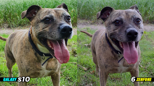
Pic 1 Detail & Colour - Here is a regular photo was taken on the primary cameras in the rain…of a happy dog. The Samsung Galaxy S10 seems to be doing a great job of brightening up the picture and bumping up the saturation which you can clearly see on the grass.

The Zenfone 6 delivers a very natural colour… remember it was raining. There was a very little amount of sunshine. So I think it’s pretty accurate.
Now let’s zoom in 60% to check the detail. Both do a great job picking up fine details. The question for you is…which one is better?
Pic 2 Bokeh AKA Blurry Background- So the first image is a portrait shot of a baby tree. Immediately you’ll notice the colour science of the two devices is completely different. You get much warmer tones from the S10 and slightly more neutral colours from the Zenfone 6.

In terms of background blur, the Samsung S10 seems to be ahead and the warmer tones are certainly helping the tree to stand out more from the background. Whilst the Asus Zenfone 6 delivers a good picture with a decent amount of background blur also.
Pic 3 Landscape / Ultrawide - Ok time to test a landscape photo & ultrawide cameras. So here is the primary. Again the Samsung Galaxy S10 has more saturation and cooler blue tones. You can see that is the colour in the sky also the cooler free tones.


The Zenfone 6 has a much warmer look right across the image. The sky has an almost magenta tint to it. It’s a close call…two very different creative styles.
Now the ultrawide. So both are pretty good here. One thing I noticed here is actually the Zenfone 6 is doing a better job of details especially in the highlights. The Galaxy S10 seems to be cranking up the white levels and losing some detail in the left side of the picture on the grass.
Pic 4 Selfie / Ultrawide (Zenfone 6 only)- Ok because the primary and ultrawide double up as the Selfie cameras thanks to its motorized flip camera. I thought I’d test the selfie capabilities on its own. So on the right is a picture of me with the primary and an ultrawide on the left.

Pic 5 HDR / Contrast - So now back at the house. So I took this to demonstrate HDR because there’s quite a lot of brightness coming from this monitor, I think this will work.

The Asus is doing really fantastic here. The black levels are surprisingly much better than the Galaxy S10 in this setting. Also, the colours seem to be better also. I’ve gotta say when it comes to shooting indoors the Asus is fantastic.
Pic 6 - Black Levels
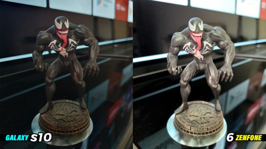
It’s Venom…I chose this particular setting because of the black surroundings. Now, this is interesting because. The Asus Zenfone 6 seems to have really boosted up the contrast, brightness and luminance because of the amount of black shades in the photo. Whilst the Samsung S10 has done a great job of just keeping everything well balanced.
I must admit though it was particularly hard to get both the devices to focus properly in this setting.
Pic 7 Colours
Yes, it’s a Nintendo switch controller with the neon joycons. I’ve gotta say the Zenfone 6 has impressed me once again. Really vibrant colours, great black levels…my only criticism is the fact the buttons on the right side of the controller are a little out of focus.

Whereas on the Galaxy S10 photo the entire controller is perfectly in focus. The colours are much more neutral on the S10 here.
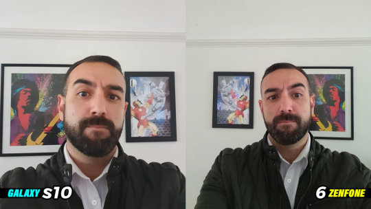
Pic 8 - So here’s a Selfie on both phones taken at arm’s length. As you can see the fact that the Asus Zenfone 6 can use its primary shooter to take selfies it certainly has an advantage…and a wider field of view.
The S10 whilst still very good it’s just not quite as detailed as the Zenfone 6. Which one is better in your eyes.
ZENFONE VS GALAXY S10 | NIGHT PHOTOGRAPHY COMPARISON
Pic 1 - Ok, so I took this one because I just liked the way the street lights were shining through the metal gates on the right hand side.

Although it was a low light situation, The Samsung Galaxy S10 photo is incredibly bright. This might be due to the F.1.4 aperture feature. The colours are pretty accurate and it’s maintained good detail and colour in the sky.
The Asus ZenFone 6 photo is much warmer with a lot more orange tones. The Zenfone 6 photo is certainly more dramatic to look at, it almost looks like it’s added a filter over the photo. Whilst it is a good picture there is a little noise in the night sky.
Pic 2 - Artificial Light
So this one is a low light shot with a lot of artificial lighting around the building. The Asus ZenFone 6 is doing a good job of controlling the lights around the lettering on the front of the building.

If you compare the neon lights to the Samsung Galaxy S10 photo, the Asus is doing a better job in this area.
However when it comes to the night sky. There’s a lot of lens flare and again a bit of noise above the building. It’s a close one…I know which one I like and I’ll be placing my vote in the poll in the top right corner.
Pic 3 Night Selfie - So it’s Selfie time. Here is where there’s a pretty big difference. As I mentioned earlier the primary shooter on the Asus is the Selfie shooter.
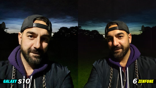
So what we have here in the Zenfone 6 photo is a wider angle, better skin tones, better details in the shadows and really nice colour in the night sky.
Now that’s not to say the Galaxy S10 is completely defeated here. It does deliver a bright image with good detail although I feel it’s really turning up the highlights a bit too much. It’s still good though given the lighting conditions.
Now onto so night video comparisons.
Pic 4 - Night Sky
So I’ve taken this shot in quite a few of my camera shootout videos. I actually filmed this on the longest day of the year, so it was a little bright out there even though it was very late.

Now I think there is a clear winner here. I’m sure you know which one I’m talking about. I really think the results of this comes down to the software.
I know the 48mp sensor in the Asus can do better than this. You should check out my OnePlus 7 pro Vs Galaxy S10 comparison to see what I’m talking about. Anyway, let’s move on.
Pic 5
So this should give you a good idea of the different approaches the Asus ZenFone 6 and the Galaxy S10 when it comes to processing lowlight images.
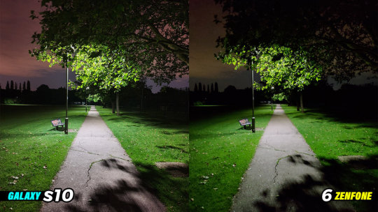
The Zenfone seems to really like to boost up the saturation and crush the black levels, which works well sometimes. One area that I think the Zenfone 6 wins on here is the details in the highlights in the trees.
With that said the Samsung Galaxy S10 delivers a great picture with minimal noise in the sky and great detail right across the photo. It’s really quite impressive.
MORE WHATGEAR CAMERA COMPARISON VIDEOS
It is another WhatGear camera comparison! It’s the Galaxy S10 Vs Oneplus 7 Pro. This will be different from other comparisons you have already watch due to the HUGE Oxygen OS 9.5.7 Camera update software update on the Oneplus 7 Pro. Check this one out…it might surprise you.
Ok so here is part two of the #WhatGear Galaxy S10 vs Oneplus 7 pro Camera comparison. With all of the latest updates as of June 14th 2019. The photos & videos were all taken at daytime. If you didn’t see part one here it is : https://youtu.be/ThrzOIxMlSw #Oneplus7pro price : https://amzn.to/2Zp5NSU #GalaxyS10 price : https://amzn.to/31uiopD SUBSCRIBE TO WHATGEAR!
Source: https://www.whatgear.net/technology//asus-zenfone-6-vs-galaxy-s10-camera-comparison
0 notes
Text
Asus Zenfone 6 Vs Galaxy S10 | Camera Comparison
VIDEO SPONSORED BY VODAFONE
Pic 1 Detail & Colour - Here is a regular photo was taken on the primary cameras in the rain...of a happy dog. The Samsung Galaxy S10 seems to be doing a great job of brightening up the picture and bumping up the saturation which you can clearly see on the grass.
The Zenfone 6 delivers a very natural colour... remember it was raining. There was a very little amount of sunshine. So I think it's pretty accurate.
Now let's zoom in 60% to check the detail. Both do a great job picking up fine details. The question for you is...which one is better?
Pic 2 Bokeh AKA Blurry Background- So the first image is a portrait shot of a baby tree. Immediately you'll notice the colour science of the two devices is completely different. You get much warmer tones from the S10 and slightly more neutral colours from the Zenfone 6.
In terms of background blur, the Samsung S10 seems to be ahead and the warmer tones are certainly helping the tree to stand out more from the background. Whilst the Asus Zenfone 6 delivers a good picture with a decent amount of background blur also.
Pic 3 Landscape / Ultrawide - Ok time to test a landscape photo & ultrawide cameras. So here is the primary. Again the Samsung Galaxy S10 has more saturation and cooler blue tones. You can see that is the colour in the sky also the cooler free tones.
The Zenfone 6 has a much warmer look right across the image. The sky has an almost magenta tint to it. It's a close call...two very different creative styles.
Now the ultrawide. So both are pretty good here. One thing I noticed here is actually the Zenfone 6 is doing a better job of details especially in the highlights. The Galaxy S10 seems to be cranking up the white levels and losing some detail in the left side of the picture on the grass.
Pic 4 Selfie / Ultrawide (Zenfone 6 only)- Ok because the primary and ultrawide double up as the Selfie cameras thanks to its motorized flip camera. I thought I'd test the selfie capabilities on its own. So on the right is a picture of me with the primary and an ultrawide on the left.
Pic 5 HDR / Contrast - So now back at the house. So I took this to demonstrate HDR because there's quite a lot of brightness coming from this monitor, I think this will work.
The Asus is doing really fantastic here. The black levels are surprisingly much better than the Galaxy S10 in this setting. Also, the colours seem to be better also. I've gotta say when it comes to shooting indoors the Asus is fantastic.
Pic 6 - Black Levels
It's Venom...I chose this particular setting because of the black surroundings. Now, this is interesting because. The Asus Zenfone 6 seems to have really boosted up the contrast, brightness and luminance because of the amount of black shades in the photo. Whilst the Samsung S10 has done a great job of just keeping everything well balanced.
I must admit though it was particularly hard to get both the devices to focus properly in this setting.
Pic 7 Colours
Yes, it's a Nintendo switch controller with the neon joycons. I've gotta say the Zenfone 6 has impressed me once again. Really vibrant colours, great black levels...my only criticism is the fact the buttons on the right side of the controller are a little out of focus.
Whereas on the Galaxy S10 photo the entire controller is perfectly in focus. The colours are much more neutral on the S10 here.
Pic 8 - So here's a Selfie on both phones taken at arm's length. As you can see the fact that the Asus Zenfone 6 can use its primary shooter to take selfies it certainly has an advantage...and a wider field of view.
The S10 whilst still very good it's just not quite as detailed as the Zenfone 6. Which one is better in your eyes.
ZENFONE VS GALAXY S10 | NIGHT PHOTOGRAPHY COMPARISON
Pic 1 - Ok, so I took this one because I just liked the way the street lights were shining through the metal gates on the right hand side.
Although it was a low light situation, The Samsung Galaxy S10 photo is incredibly bright. This might be due to the F.1.4 aperture feature. The colours are pretty accurate and it's maintained good detail and colour in the sky.
The Asus ZenFone 6 photo is much warmer with a lot more orange tones. The Zenfone 6 photo is certainly more dramatic to look at, it almost looks like it's added a filter over the photo. Whilst it is a good picture there is a little noise in the night sky.
Pic 2 - Artificial Light
So this one is a low light shot with a lot of artificial lighting around the building. The Asus ZenFone 6 is doing a good job of controlling the lights around the lettering on the front of the building.
If you compare the neon lights to the Samsung Galaxy S10 photo, the Asus is doing a better job in this area.
However when it comes to the night sky. There's a lot of lens flare and again a bit of noise above the building. It's a close one...I know which one I like and I'll be placing my vote in the poll in the top right corner.
Pic 3 Night Selfie - So it's Selfie time. Here is where there's a pretty big difference. As I mentioned earlier the primary shooter on the Asus is the Selfie shooter.
So what we have here in the Zenfone 6 photo is a wider angle, better skin tones, better details in the shadows and really nice colour in the night sky.
Now that's not to say the Galaxy S10 is completely defeated here. It does deliver a bright image with good detail although I feel it's really turning up the highlights a bit too much. It's still good though given the lighting conditions.
Now onto so night video comparisons.
Pic 4 - Night Sky
So I've taken this shot in quite a few of my camera shootout videos. I actually filmed this on the longest day of the year, so it was a little bright out there even though it was very late.
Now I think there is a clear winner here. I'm sure you know which one I'm talking about. I really think the results of this comes down to the software.
I know the 48mp sensor in the Asus can do better than this. You should check out my OnePlus 7 pro Vs Galaxy S10 comparison to see what I'm talking about. Anyway, let's move on.
Pic 5
So this should give you a good idea of the different approaches the Asus ZenFone 6 and the Galaxy S10 when it comes to processing lowlight images.
The Zenfone seems to really like to boost up the saturation and crush the black levels, which works well sometimes. One area that I think the Zenfone 6 wins on here is the details in the highlights in the trees.
With that said the Samsung Galaxy S10 delivers a great picture with minimal noise in the sky and great detail right across the photo. It's really quite impressive.
MORE WHATGEAR CAMERA COMPARISON VIDEOS
It is another WhatGear camera comparison! It's the Galaxy S10 Vs Oneplus 7 Pro. This will be different from other comparisons you have already watch due to the HUGE Oxygen OS 9.5.7 Camera update software update on the Oneplus 7 Pro. Check this one out...it might surprise you.
Ok so here is part two of the #WhatGear Galaxy S10 vs Oneplus 7 pro Camera comparison. With all of the latest updates as of June 14th 2019. The photos & videos were all taken at daytime. If you didn't see part one here it is : https://youtu.be/ThrzOIxMlSw #Oneplus7pro price : https://amzn.to/2Zp5NSU #GalaxyS10 price : https://amzn.to/31uiopD SUBSCRIBE TO WHATGEAR!
Source: https://www.whatgear.net/technology//asus-zenfone-6-vs-galaxy-s10-camera-comparison
0 notes
Text
Asus Zenfone 6 Vs Galaxy S10 | Camera Comparison
VIDEO SPONSORED BY VODAFONE
Pic 1 Detail & Colour - Here is a regular photo was taken on the primary cameras in the rain...of a happy dog. The Samsung Galaxy S10 seems to be doing a great job of brightening up the picture and bumping up the saturation which you can clearly see on the grass.
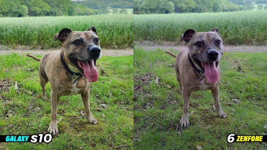

The Zenfone 6 delivers a very natural colour... remember it was raining. There was a very little amount of sunshine. So I think it's pretty accurate.
Now let's zoom in 60% to check the detail. Both do a great job picking up fine details. The question for you is...which one is better?
Pic 2 Bokeh AKA Blurry Background- So the first image is a portrait shot of a baby tree. Immediately you'll notice the colour science of the two devices is completely different. You get much warmer tones from the S10 and slightly more neutral colours from the Zenfone 6.
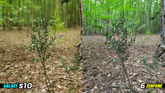
In terms of background blur, the Samsung S10 seems to be ahead and the warmer tones are certainly helping the tree to stand out more from the background. Whilst the Asus Zenfone 6 delivers a good picture with a decent amount of background blur also.
Pic 3 Landscape / Ultrawide - Ok time to test a landscape photo & ultrawide cameras. So here is the primary. Again the Samsung Galaxy S10 has more saturation and cooler blue tones. You can see that is the colour in the sky also the cooler free tones.
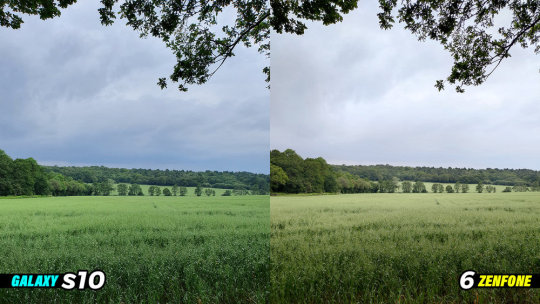
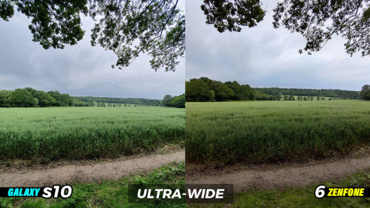
The Zenfone 6 has a much warmer look right across the image. The sky has an almost magenta tint to it. It's a close call...two very different creative styles.
Now the ultrawide. So both are pretty good here. One thing I noticed here is actually the Zenfone 6 is doing a better job of details especially in the highlights. The Galaxy S10 seems to be cranking up the white levels and losing some detail in the left side of the picture on the grass.
Pic 4 Selfie / Ultrawide (Zenfone 6 only)- Ok because the primary and ultrawide double up as the Selfie cameras thanks to its motorized flip camera. I thought I'd test the selfie capabilities on its own. So on the right is a picture of me with the primary and an ultrawide on the left.
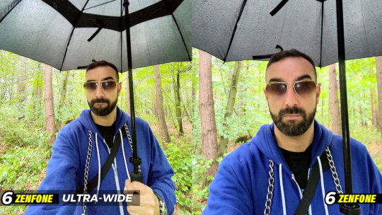
Pic 5 HDR / Contrast - So now back at the house. So I took this to demonstrate HDR because there's quite a lot of brightness coming from this monitor, I think this will work.
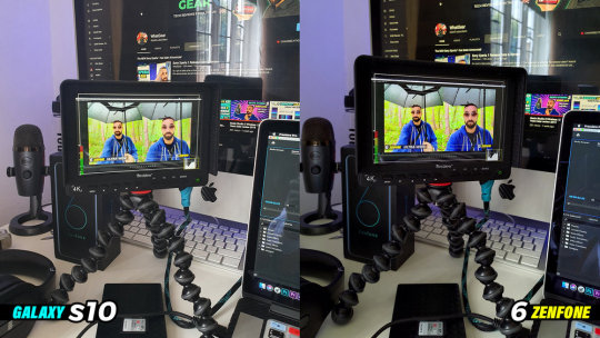
The Asus is doing really fantastic here. The black levels are surprisingly much better than the Galaxy S10 in this setting. Also, the colours seem to be better also. I've gotta say when it comes to shooting indoors the Asus is fantastic.
Pic 6 - Black Levels
It's Venom...I chose this particular setting because of the black surroundings. Now, this is interesting because. The Asus Zenfone 6 seems to have really boosted up the contrast, brightness and luminance because of the amount of black shades in the photo. Whilst the Samsung S10 has done a great job of just keeping everything well balanced.

I must admit though it was particularly hard to get both the devices to focus properly in this setting.
Pic 7 Colours
Yes, it's a Nintendo switch controller with the neon joycons. I've gotta say the Zenfone 6 has impressed me once again. Really vibrant colours, great black levels...my only criticism is the fact the buttons on the right side of the controller are a little out of focus.
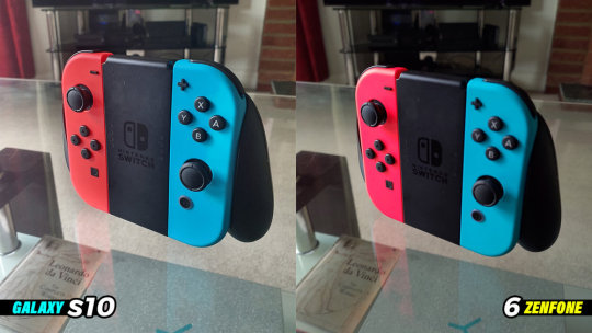
Whereas on the Galaxy S10 photo the entire controller is perfectly in focus. The colours are much more neutral on the S10 here.
Pic 8 - So here's a Selfie on both phones taken at arm's length. As you can see the fact that the Asus Zenfone 6 can use its primary shooter to take selfies it certainly has an advantage...and a wider field of view.

The S10 whilst still very good it's just not quite as detailed as the Zenfone 6. Which one is better in your eyes.
ZENFONE VS GALAXY S10 | NIGHT PHOTOGRAPHY COMPARISON
Pic 1 - Ok, so I took this one because I just liked the way the street lights were shining through the metal gates on the right hand side.
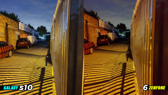
Although it was a low light situation, The Samsung Galaxy S10 photo is incredibly bright. This might be due to the F.1.4 aperture feature. The colours are pretty accurate and it's maintained good detail and colour in the sky.
The Asus ZenFone 6 photo is much warmer with a lot more orange tones. The Zenfone 6 photo is certainly more dramatic to look at, it almost looks like it's added a filter over the photo. Whilst it is a good picture there is a little noise in the night sky.
Pic 2 - Artificial Light
So this one is a low light shot with a lot of artificial lighting around the building. The Asus ZenFone 6 is doing a good job of controlling the lights around the lettering on the front of the building.
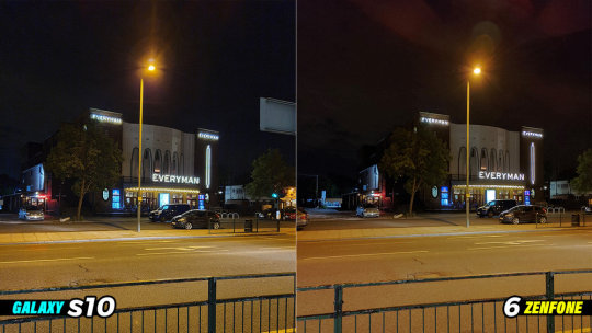
If you compare the neon lights to the Samsung Galaxy S10 photo, the Asus is doing a better job in this area.
However when it comes to the night sky. There's a lot of lens flare and again a bit of noise above the building. It's a close one...I know which one I like and I'll be placing my vote in the poll in the top right corner.
Pic 3 Night Selfie - So it's Selfie time. Here is where there's a pretty big difference. As I mentioned earlier the primary shooter on the Asus is the Selfie shooter.

So what we have here in the Zenfone 6 photo is a wider angle, better skin tones, better details in the shadows and really nice colour in the night sky.
Now that's not to say the Galaxy S10 is completely defeated here. It does deliver a bright image with good detail although I feel it's really turning up the highlights a bit too much. It's still good though given the lighting conditions.
Now onto so night video comparisons.
Pic 4 - Night Sky
So I've taken this shot in quite a few of my camera shootout videos. I actually filmed this on the longest day of the year, so it was a little bright out there even though it was very late.
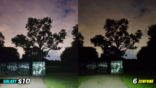
Now I think there is a clear winner here. I'm sure you know which one I'm talking about. I really think the results of this comes down to the software.
I know the 48mp sensor in the Asus can do better than this. You should check out my OnePlus 7 pro Vs Galaxy S10 comparison to see what I'm talking about. Anyway, let's move on.
Pic 5
So this should give you a good idea of the different approaches the Asus ZenFone 6 and the Galaxy S10 when it comes to processing lowlight images.

The Zenfone seems to really like to boost up the saturation and crush the black levels, which works well sometimes. One area that I think the Zenfone 6 wins on here is the details in the highlights in the trees.
With that said the Samsung Galaxy S10 delivers a great picture with minimal noise in the sky and great detail right across the photo. It's really quite impressive.
MORE WHATGEAR CAMERA COMPARISON VIDEOS
It is another WhatGear camera comparison! It's the Galaxy S10 Vs Oneplus 7 Pro. This will be different from other comparisons you have already watch due to the HUGE Oxygen OS 9.5.7 Camera update software update on the Oneplus 7 Pro. Check this one out...it might surprise you.
Ok so here is part two of the #WhatGear Galaxy S10 vs Oneplus 7 pro Camera comparison. With all of the latest updates as of June 14th 2019. The photos & videos were all taken at daytime. If you didn't see part one here it is : https://youtu.be/ThrzOIxMlSw #Oneplus7pro price : https://amzn.to/2Zp5NSU #GalaxyS10 price : https://amzn.to/31uiopD SUBSCRIBE TO WHATGEAR!
source https://www.whatgear.net/technology//asus-zenfone-6-vs-galaxy-s10-camera-comparison
0 notes
Text
Stunning phones, but Xiaomi should have pushed harder on the performance front- Technology News, Firstpost
Anirudh RegidiAug 13, 2020 13:40:07 IST
The thing with Xiaomi phones, especially the Redmi Note series, was that I could recommend them blindly. I never needed to think about specs, features, and most importantly: value for money. The phones were always good, always would be, but not anymore.
Whatever else you might say about the two phones, you have to admit, they look really good. Image: Anirudh Regidi
With the Redmi Note 9 Pro and Pro Max, things have changed
To look at, these phones are basically identical. They differ only in the camera department and bundled accessories (the charger). Side-by-side, whether face-up or face-down, you won’t be able to tell them apart. But it’s not just looks; the specs, and by extension, the performance, is identical. They’re also gorgeous phones, and if I didn’t know any better, I’d guesstimate their prices at about 30k, perhaps higher.
The phones both feature 6.67-inch FHD+ 60 Hz LCD displays paired with a Qualcomm Snapdragon 720G SoC, 4/6/8 GB RAM, 64/128 GB of storage, 5,020 mAh battery, and quad-camera bumps on the rear — which share the 8 MP ultra-wide camera, 5 MP macro camera, and 2 MP depth sensor.
You can’t tell the Redmi Note 9 Pro and Pro Max apart. Image: Anirudh Regidi
Now for the differences: The Redmi Note 9 Pro comes with a 48 MP primary rear camera (binned to 12 MP) vs the 64 MP unit (binned to 16 MP) on the pro Max. You get 4/6 GB RAM options on the Pro, and 6/8 GB options on the Pro Max. Lastly, the Pro gets a pretty decent 18 W bundled charger and the Max gets a more powerful 33 W charger. Pricing for the Pro starts at Rs 13,999 (4/64), and for the Max at Rs 16,499 (6/64).
On paper, they’re both excellent value, and the Pro looks like a steal.
What’s a few megapixels here or there? And you don’t actually need a damaging-in-the-long-run 33 W charger, do you?
Well, yes, but also no.
The Redmis looks good, but…
… looks aren’t everything.
Performance is a sore point on both phones. Now Xiaomi told me that it opted for the 60 Hz display and more efficient SD720G chipset (vs the 90 Hz display and MediaTek G90T SoC on the competing Realme 6) because:
Battery life mattered to its users
The SD720G isn’t capable of 90 Hz gaming anyway.
They’re both good arguments, and Xiaomi isn’t wrong. However, once you use the Realme 6 (Review), and especially play games on it — heavier games like PUBG, Dead Trigger 2, etc. — you can really feel the difference. Even in general usage, the Pro and Pro Max tend to stutter visibly, especially when browsing and using the picture-in-picture video modes.
And the Realme 6, while it does have a smaller battery (4,300 mAh), faster display, and more power-hungry SoC, does last nearly a whole day (7–8 hrs of screen-on time vs 8–10 on the Pro Max), so the gains in battery life are not that significant in real-world usage.
If you care about cameras…
… don’t buy the Note 9 Pro, but do pick up the Pro Max.
The Redmi Note 9 Pro’s camera setup was disappointing. The primary camera is good in good light, really good, in fact. However, let the light drop slightly or attempt to take pics indoors and you’ll be left with — more often than not — blurry, out-of-focus shots, which can also be poorly exposed. I suspect this has a more to do with low shutter speed and ISO sensitivity, but whatever the case, the Redmi Note 9 Pro Max’s cameras are just better.
The quad-camera setup on the rear of the phones is good, but the Max’s 64 MP primary camera is leagues ahead of the Pro’s 48 MP unit. Image: Anirudh Regidi
The Pro Max, on the other hand, was fantastic. Images are sharp and clear and there’s more than enough detail for those who want to do a bit of cropping. Shutter speeds also appear faster and there’s less ghosting when attempting to capture fast-moving subjects.
In night mode, the difference between the two phones is night and day. Literally. The Note 9 Pro’s night mode offers marginally more detail than in regular mode, while the Note 9 Pro Max’s night mode is almost comparable to the iPhone 11’s night mode, at least in terms of colour and exposure.
Click here to see Redmi Note 9 Pro camera samples:
In video, too, the Note 9 Pro Max is leagues ahead. Both cameras struggle a bit with focus, but the Note 9 Pro couldn’t expose a scene correctly to save its life. In the bird-feeder video seen here, the Note 9 Pro just can’t maintain exposure while the Note 9 Pro Max does it easily.
When it comes to selfies, both cameras are good enough. The 32 MP Pro Max selfies are a bit sharper, but image quality is largely comparable.
The 8 MP ultra-wide and 5 MP macro on both phones work as advertised. They’re not great, but you have the option to use them if the need arises.
Click here to see Redmi Note 9 Pro Max camera samples:
Verdict: Only the Max is worth buying.
With the Redmi Note 9 Pro and Pro Max, Xiaomi has really outdone itself in the design department, I just wish it had pushed a bit more on the performance front.
The Redmi Note 9 Pro, while a great phone, is in that awkward position where it’s just a little bit cheaper than its far more capable sibling, and not as good value as its nearest rival, the Realme 6.
As far as I’m concerned, if you’re looking for a phone around 15k, the choice is simple:
If you care about cameras, get the Redmi Note 9 Pro Max.
If you care about gaming, get the Realme 6.
If you’re a Xiaomi fan and just cannot spend a Rupee over 14k, I’d still recommend saving up for a bit longer and getting the Pro Max.
Find latest and upcoming tech gadgets online on Tech2 Gadgets. Get technology news, gadgets reviews & ratings. Popular gadgets including laptop, tablet and mobile specifications, features, prices, comparison.
<![CDATA[ !function(f,b,e,v,n,t,s) {if(f.fbq)return;n=f.fbq=function()
{n.callMethod? n.callMethod.apply(n,arguments):n.queue.push(arguments)}
; if(!f._fbq)f._fbq=n;n.push=n;n.loaded=!0;n.version='2.0'; n.queue=[];t=b.createElement(e);t.async=!0; t.src=v;s=b.getElementsByTagName(e)[0]; s.parentNode.insertBefore(t,s)}(window,document,'script', 'https://connect.facebook.net/en_US/fbevents.js'); fbq('init', '259288058299626'); fbq('track', 'PageView'); ]]> <![CDATA[ (function(d, s, id) { var js, fjs = d.getElementsByTagName(s)[0]; if (d.getElementById(id)) return; js = d.createElement(s); js.id = id; js.src = "https://connect.facebook.net/en_GB/sdk.js#xfbml=1&version=v2.9&appId=1117108234997285"; fjs.parentNode.insertBefore(js, fjs); }(document, 'script', 'facebook-jssdk')); ]]> <![CDATA[ (function(d, s, id) { var js, fjs = d.getElementsByTagName(s)[0]; if (d.getElementById(id)) return; js = d.createElement(s); js.id = id; js.src = "https://connect.facebook.net/en_GB/all.js#xfbml=1&version=v2.9&appId=1117108234997285"; fjs.parentNode.insertBefore(js, fjs); }(document, 'script', 'facebook-jssdk')); ]]>
The post Stunning phones, but Xiaomi should have pushed harder on the performance front- Technology News, Firstpost appeared first on Shri Times News.
from WordPress https://ift.tt/33ZDVdI
via Blogger https://ift.tt/2PTjTcC
0 notes
Last Seen Blogs

fieldtraditions
Untitled

plastichandelier
plastic chandelier

heatherfordpark
The Prescotts of Heatherford Park

oishafh
ÔISHA

professasimperfections
Perfect Imperfections Of Self Expression