
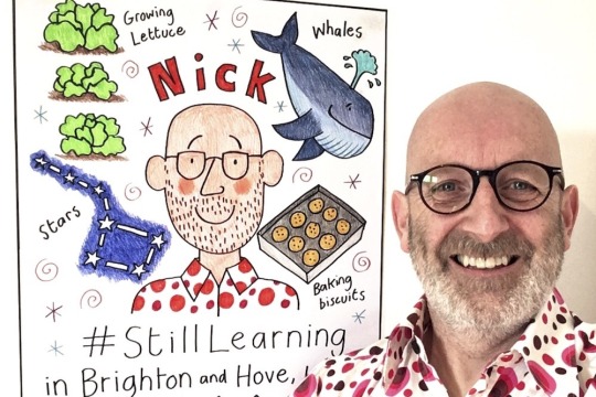
k00299539
James D Chaplin
LSAD Fist Year Art Blog Exploring Animation
73 posts
Don't wanna be here? Send us removal request.
Last Seen Blogs

magicstew
MagicSteel
psychopathichelicopter
Get in or Get out
la-draws
L.A. Draws

apvollos
* 𝐚𝐫𝐭𝐢𝐟𝐢𝐜𝐢𝐚𝐥 𝐠𝐡𝐨𝐬𝐭

okyeon
♡
Text
Animation Brief 01 - Week 2 - Parallax Background
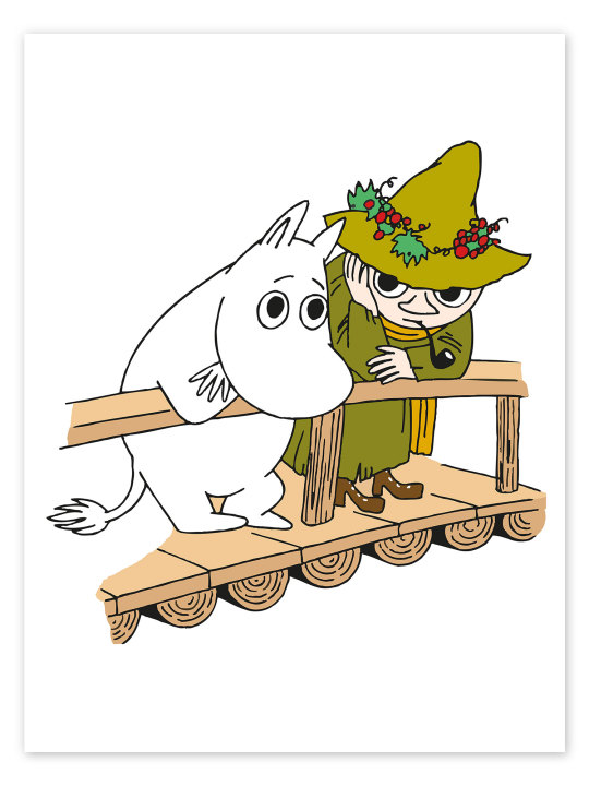
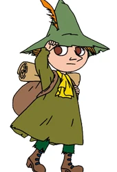
Above: Snufkin just chillin
Putting together a full parallaxed background was the biggest individual step in our "World Building" brief, which is why I kept putting it off. I was told by Yvonne that the work had to be produced physically before being digitally composited, for someone who hates painting this was bad news.
I guess like always, the first step was research and gathering reference. I chose Tove Jansson as my artist-to-emulate which proved a bit of a headache in itself. Jansson was prolific and diverse, working with different styles in different mediums regularly in her seven decades long career. A lot of my favourite works of hers are simple black ink on white paper illustrations. But mimicking that style would've gone against the spirit of the project.
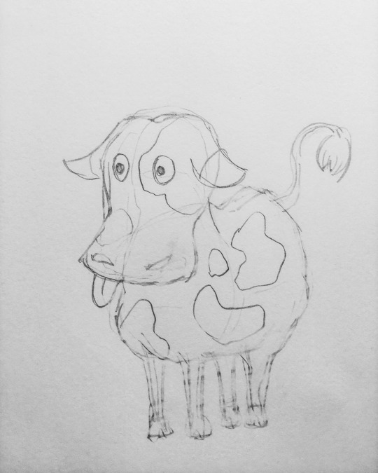
I decided to buy a beginners set of gouache paint for a tenner and try to emulate her painted work, the likes of which can be seen on the covers for her children's books. I'd never used gouache before so I don't really know what I was thinking, other than that I knew I was sick of acrylic. Anyway, the first step was a sketch.


Above: Yeah not much going on...
Honestly looking back on this I probably should have spent more time drafting a good composition and actually thinking through the shot I was intending to make. It's not that I didn't give it any thought, just that when you're on a tight schedule and commit to an idea, you're stuck with it. The longer I worked on this project the less I liked it, a bit more foresight at the beginning could've helped prevent that. Ah well.
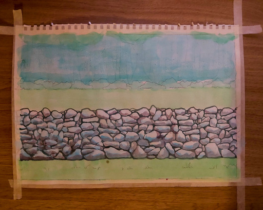
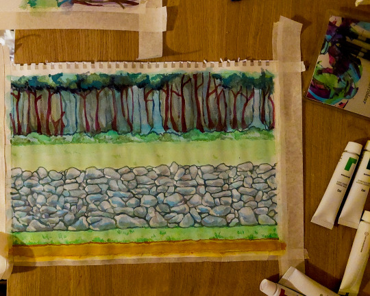
The composition I went with was a combination of a couple of my landscape sketches. I decided with my "mini-me" limited to being shot from the shoulder up, a horizontal parallax would work best. Basically a simple side-scrolling shot, like holding a camera out a car window. I took the forest backdrop from Cratloe Woods, the classic Irish dry-stone wall from the farm, and I threw in some road signs (and Snufkin) for a bit of fun. The only problem was now I had to paint it...


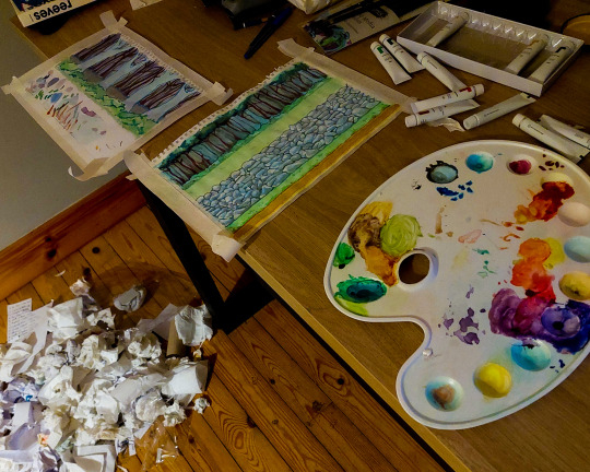
Above: A real Artíst's palette...
I had no idea how to use gouache. I even used the regular ass paper from my sketchook which was probably a mistake considering the number the water did on it. I started out dampening the paper a bit before going over the major areas with a wash of an approximate colour. You can really tell I worked left to right on the wall because it gets slightly less shitting as your eyes pan across it. The wall was great fun in general, basically just laying down shadows, darkening the crevices and building up the tone. I think I overworked it looking back, although that's true for the painting in general.

Above: Cameos
Don't have much to say about these sketches, I was working fast and trying to have fun with them while keeping in Jansson's style. Also if it's not obvious I take all these photos at night when there's no natural light cause I'm stupid...

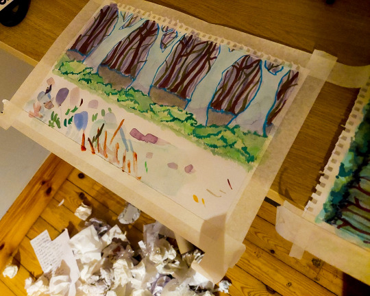


Above: Ignore the giant pile of rubbish, I cleaned it up after I promise
At first I really wasn't happy with the treeline in my first painting so I tested out some ideas on another sheet. I liked how it turned out, and I was thinking of incorporating it into the animation, but as the trees are the furthest element in the composition, they will move the least in the parallax shot, making it a bit infeasible. I did reuse the bushes as a foreground element though.
The next step was a tedious one, scan the water-warped paintings on my shitty scanner, disassemble them in Photoshop and stitch the edges as to make them tileable. Honestly I actually enjoy this kind of tedious Photoshop work, I just hated my painting and the shot in general so having to look at them over and over wasn't exactly fun.
Anyway, having made liberal use of the offset filter in Photoshop I had all the layers cut and tileable and ready to import into After Effects. I kind of suck at After Effects so this took longer than it should have. I tried to create the parallax effect in an old school manner by parenting all the layers together and setting a keyframe on their position, and adjusting their start position individually to control the speed at which each layer scrolled. Sounds easy.
I wasn't. Apparently I can't parent properly cause it was anarchy trying to control the speed of the individual layers. Eventually I just watched a Youtube tutorial and used that guy's method, creating a new camera and parenting everything to a null object, then moving the individual layers back in z-space to create the parallax effect as the camera pans.
I'm tired as I write this and I'm unsure how intelligible it is. Here's the horses mouth explaining things if you want to watch for yourselves:
youtube
The worst part is after all that it's still just a rough composite. Even beyond the obvious absence of my mini-me, there's a lot of problems in regards to the speed of the individual layers, the foreground elements look more like they're moving on a treadmill than receding in space. A particular cardinal sin I committed was not matching the speed of the grounded elements to the ground on which they're well, grounded.
Anyway I can fix all that later, I'm just sick of looking at it for now.
7 notes
·
View notes
Text
Animation Brief 01 - Week 2 - Drawing Hard Landscapes
Above: Paper less blue in real life
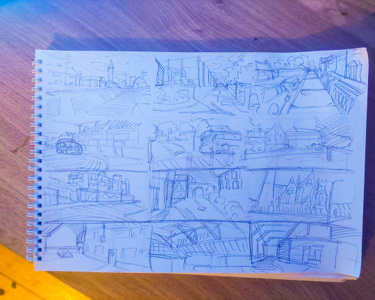
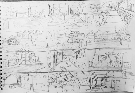
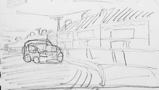
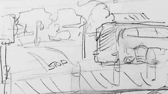
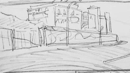
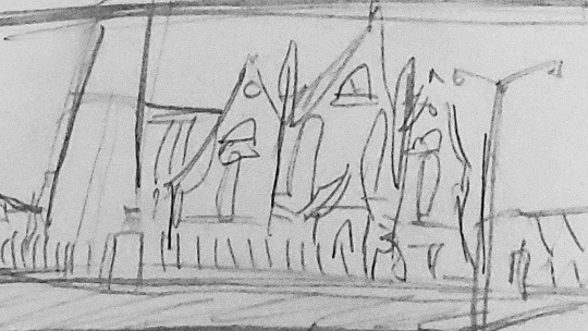
I was in town on Monday during the bank holiday so I decided to go ahead and do some of the city-scape sketches we were supposed to be doing on Tuesday. I basically just wandered between the school, the train station and Garryowen and drew whatever looked interesting to me.
To be honest I'm not all that happy with how these turned out. They looked a lot better when I was drawing them. At least, they seemed to. I also spent a lot less time on each drawing, even compared to my quick nature sketches last week. I guess something about standing around in the middle of a footpath is more anxiety inducing.
Another problem I noticed was I became too committed to the 16:9 aspect ratio. I use that as it's standard in movies and television but even in animation that ignores the reality of shots being drawn taller or wider to allow the camera to pan. In retrospect I should've allowed the subject to dictate the canvas, not the other way around. Des McMahon had a great bit about that in his composition seminar.
I might flesh these out a bit more or at least spend some time on one good drawing. I noticed as well afterword that the project brief actually specified "architectural" drawing and I'm not sure mine really qualify.


2 notes
·
View notes
Text
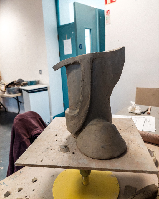
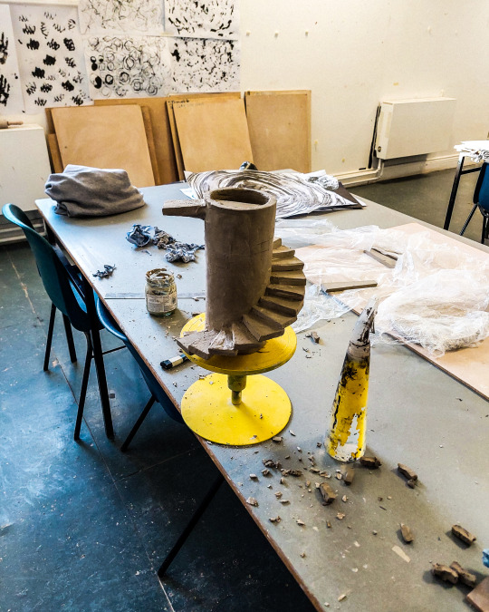
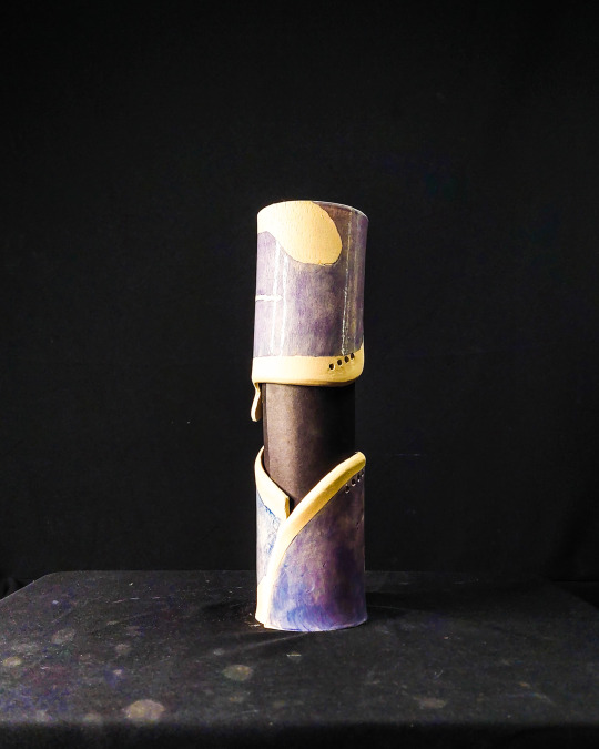
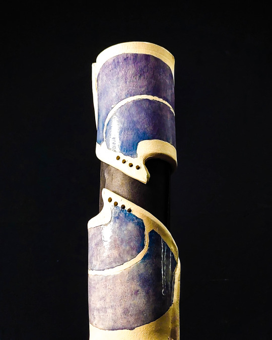
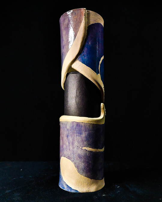
Animation Brief 01 - Week 1 - Mini Me

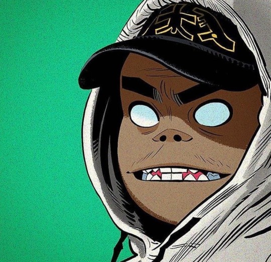
Above: Femto of the God Hand
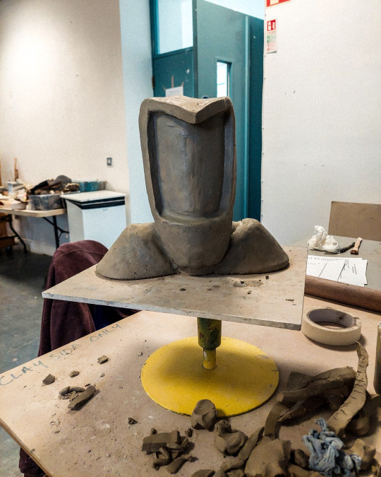
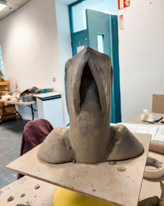
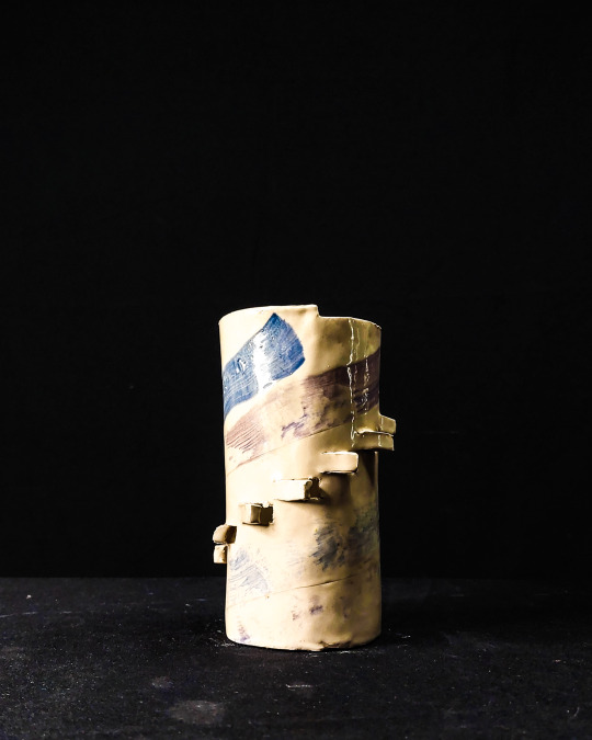
The next step in our "Word Building" project was to design and create a "mini-me", essentially a kind of avatar of ourselves which will then be used as a basis for learning about lip-syncing in animation. I knew two things immediately: 1. I shouldn't make the it out of clay because it's a time-conscious medium and thus problematic for such a short project. And 2. I was definitely gonna make it out of clay anyway.
But first I had to decide how I wanted to represent myself in miniature and as you can undoubtedly see from the above image, it got weird. The important thing to understand here is that I hate self-portraits, and over the course of the last two projects I'd somehow already made 12! One clay sculpture, two 3D prints, nine ceramic casts, (and a partridge in a pear tree, etc.)
So needless to say I wanted to do something different. I guess I'd say I wanted to represent my reluctance to make a self-portrait, something that would represent me in a more abstract, less literal way. Plus I wanted something that would seem at home with the Tove Jansson inspired background art I was making for the project. The next step was gathering reference.


Above: The inspiration
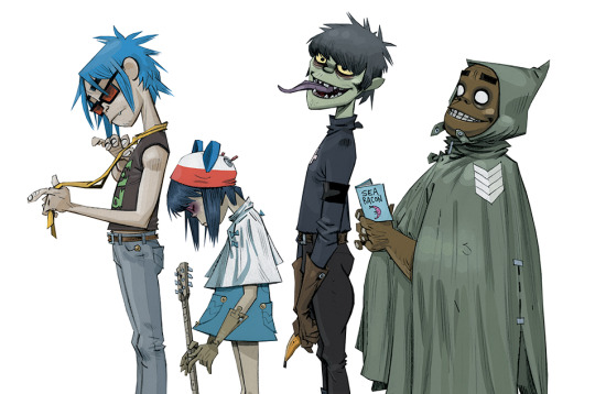
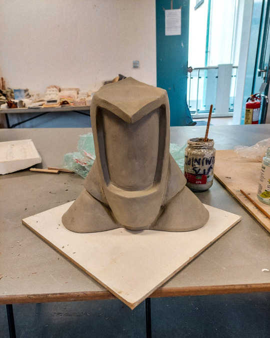
I actually hadn't put too much thought into the mini-me 'til I showed up on Thursday morning. I'm showing this whole moodboard of visual reference now but while sketching out this idea all that information remained locked in my head.
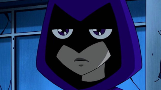
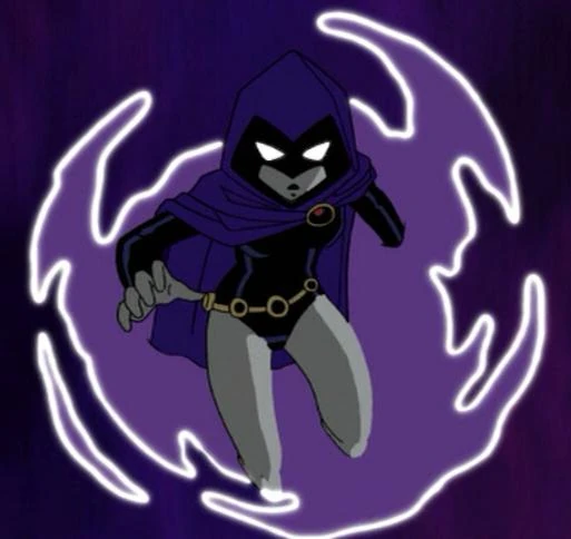
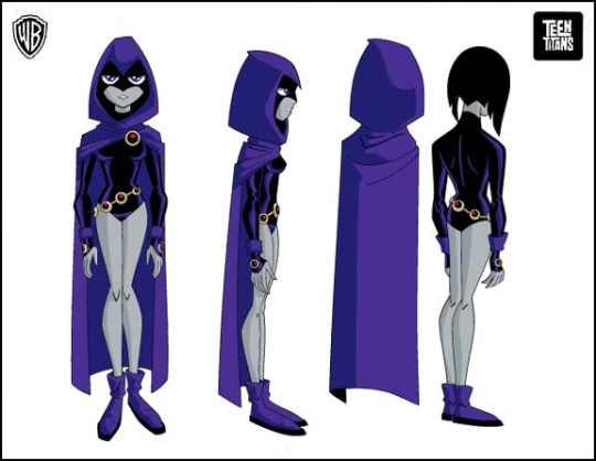
The second pic of Gorillaz drummer Russel Hobbs, wearing a rain-poncho with a witch-like hood is forever burned into my head for some reason, I just love designs like that. Thus that pic was my mental jumping off point. I also just like Russel's character in general and his particular trait of hiding his face.
It was after sketching it out and trying to figure out how a hood like that might work in 3D that I turned my attention toward Raven from the 2003 Teen Titans series, another character I'm fond of for similar reasons. Glen Murakami's character sheets include a full turnaround and the show itself has plenty of reference for the hood at odd angles. I also love the way her face is cast in constant shadow.
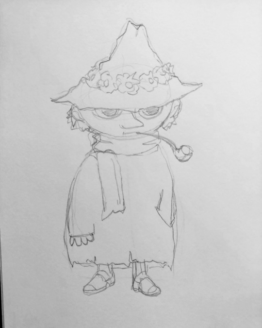
The last bit of reference is the Tove Jansson inspiration. I love how she drew Snufkin as such a disheveled little weirdo. I guess at this stage it's obvious I relate to introverted characters. What I took in particular from Snufkin was Jansson's ability to capture so much character and personality using simple shape design. You really get the sense there is a soul behind those eyes.
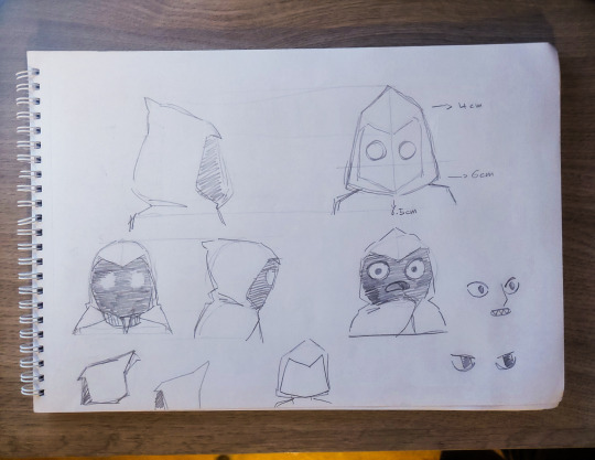
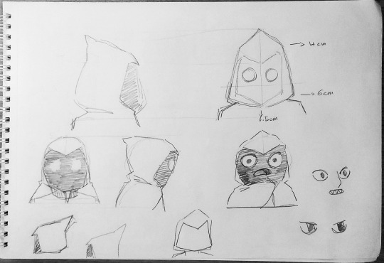

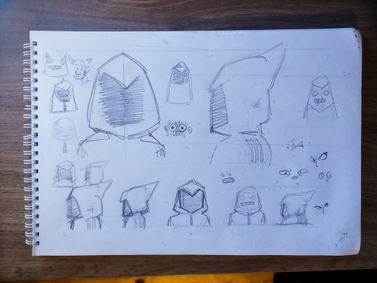
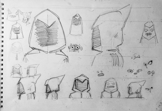
Above: The design
Yeah... I really didn't experiment much with the design at all. If I'm being generous I could say I knew what I wanted, but really I just knew I was on a timer. You can see a couple of alternate ideas I had in the third sketch, but the whole witches hood plus obscured face combo was important to me.
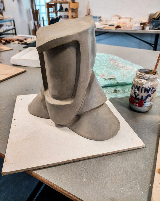
Actually I started to get a little worried around this point. First that an all black face might look like, well, blackface. And second, that if left white, the pointed hood might have a KKK connotation. Sometimes with art, intention matters less than reception. A lot of online racists hide behind the idea of "plausible deniability", with work that acts as a dog whistle for those with similar ugly beliefs. I really don't want anyone to think there's a bigoted undertone to anything I make.
Thankfully that problems lies mostly in how I choose to colour the piece, so I can cross that bridge when I come to it. Honestly had it crossed my mind earlier I might have gone back to the drawing board entirely, but we're here now and I can only make the best of what I have.
I don't know, even having written all that, I'm still conflicted over it.


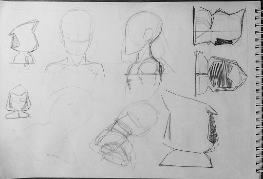
Above: I should've taken more progress pics...
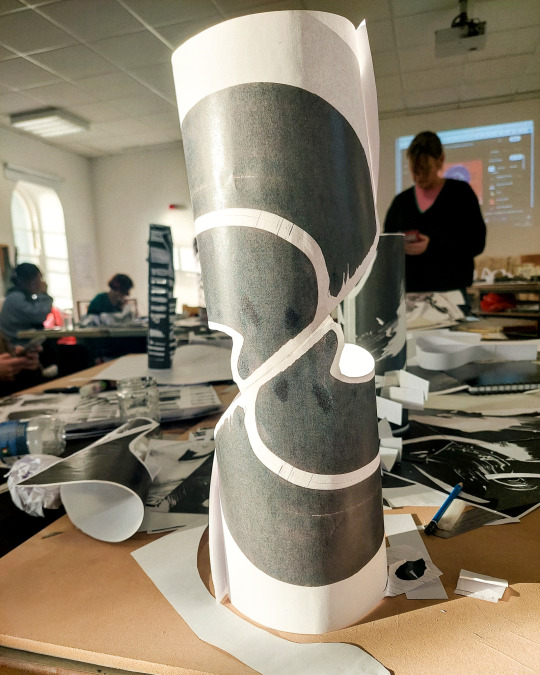
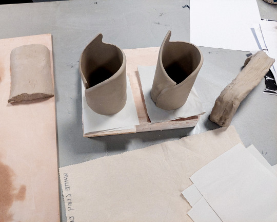
I was basically just stalling on the design part, I knew the gist of what wanted but I didn't have particularly good plans on turning that design in a clay sculpture. I actually started to contemplate just going home that Thursday to put a model sheet together and then come in again Friday.
Obviously this was a bad idea for a lot of reasons and eventually Gemma convinced me to leave aside the planning and just start working with clay. Probably the best advice I could've gotten.
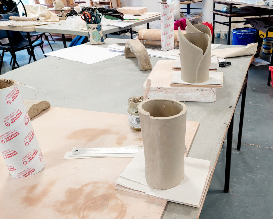
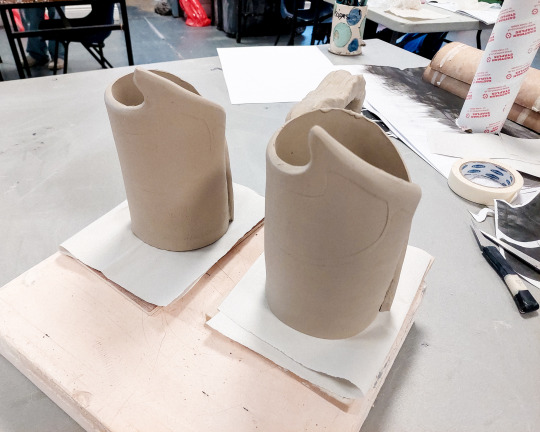
I rolled out a couple of slabs and after leaving them to firm up a bit, I used a template to roll one into a cylinder. This would serve as my base. Gemma helped me out a bit here too, suggesting how I create the shoulders by attaching a slab as support and draping another over it. After that it was mostly just scoring and slipping, creating the silhouette bit by bit with slabs. I wanted to have it mostly done as I knew it'd need to be fired on Friday. And on Friday the kiln is loaded at 12:30.
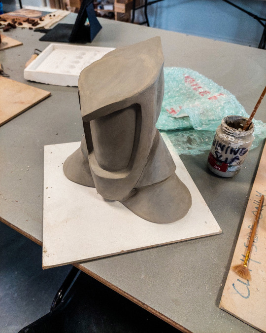

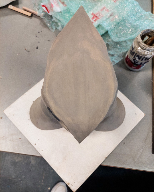

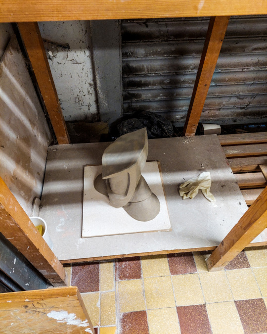
Above: 12:30 on a Friday
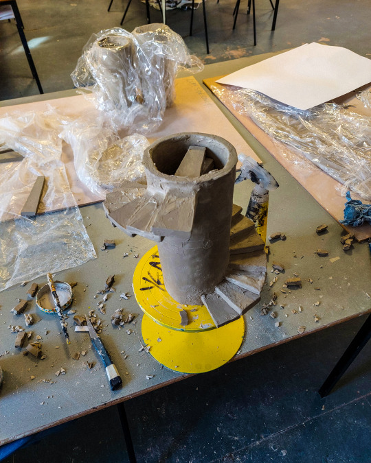
Anyway, I got it done as much as I could before leaving it down to be fired. I would probably have spent more time on it had I not been under pressure, but being honest I'm the kind of artist who spends 90% of their time trying to make things 1% better. I doubt it'd have made much of a difference.
What probably would've made a difference was having more of a plan before I started. It was really one of those things you have to do poorly once to learn how to do right, if that makes sense. There's certain changes that occurred en-route I'm happy with, like the kid of abstract, geometric look to the whole thing. But other changes I feel could be improved upon include the overall size and shape of the hood and especially the length of the head in general. The hood is tall and top heavy when it really should be the opposite.
Overall though I'm happy with how it turned out ... as long as it doesn't explode in the kiln.
5 notes
·
View notes
Text
Animation Brief 01 - Week 1 - Research - Takaaki Yamashita

Above: Yamashita's work on Maquia (2018)
I just wanted to quickly make a small post as an addendum to my last basically. I've already written about Takaaki Yamashita on this blog back during the "Movement" brief, but I wanted to make mention of him again for this landscape drawing step in particular.
Yamashita, while not a major name like his long time collaborator Mamoru Hosoda, has a reputation in the anime industry nonetheless as one of the absolute best layout artists. In anime the layout is a crucial and often overlooked step where the cruder, more conceptual drawings from the storyboard are turned into tight, cleaned up illustrations to be used as a base for the animation and background art. If the storyboard is like the architectural vision of a building, the layout is it's concrete foundation.

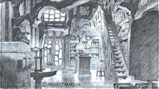

Above: More layouts from Maquia
There are a lot of artists I had in mind while sketching the landscapes, many of whom I've admired the work of in the Limerick Art Gallery and subsequently forgot the names of. But Yamashita's is a name I can't forget and his talent for conveying information in such a clear way through drawing was in the back of my mind the whole time I was sketching.
2 notes
·
View notes
Text
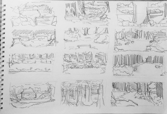
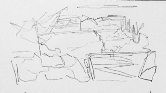
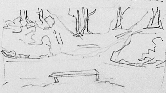
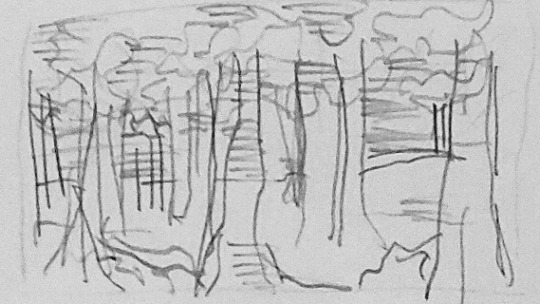
Animation Brief 01 - Week 1 - Drawing Soft Landscapes

Above: Literal minutes of hard work...
Because I'm antisocial and didn't go into school I missed out on the second step in our two week "World Building" brief; go to the People's Park and draw nature from life. The "draw from life" part was heavily emphasised here, our tutors wanted us to observe the world around us and tackle the issue of drawing without a predefined composition. Finding a "background image" in the real-life chaos of nature is easier said than done, as is abiding by perspective and not flattening our work.
Anyway, as I live on a small farm nestled next to a woods, finding nature-scapes at home wasn't too much trouble. I filled an A4 sheet with 12 thumbnail sketches, spending no more than a few minutes on each. Actually wandering around and finding my compositions was the more time consuming part of the process. Some were as easy as looking out my window, the kind of stuff I could draw from memory, and others meant standing in a field like a scarecrow trying to hold my sketchbook and draw at the same time, all the while being judged by cows....
My plan is to take one of these thumbnails and develop it into a full animation-ready illustration, with a clear fore, middle, and background. I'll post more updates when I'm further along in that process. Honestly I might make some more thumbnails first as there's a lot of great locations I didn't fully explore or do justice in my sketches.


7 notes
·
View notes
Text
Animation Brief 01 - Week 1 - Research
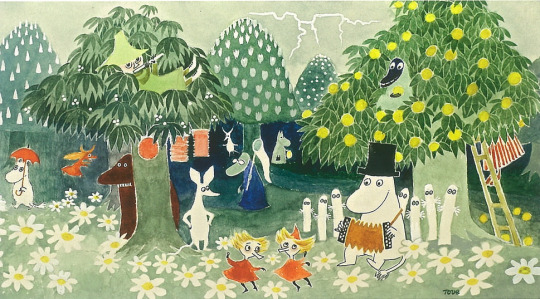
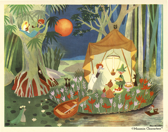
Above: Moomin
After being formally introduced to the animation course and forced coerced to listen to Radiohead, it was time to crack on with the "World Building" brief itself. The first step in plan was a group trip to the Limerick City Library...
...I didn't go.
To be honest I'm still just a wreck of a person and insomnia has been kicking my ass. There are things I can do while sleep deprived but engage in social situations is just not one of them. I felt like I was starting to panic so I just called it a day and went home.
I didn't stop working however, and like any bad maths student I may not follow the correct process to get a given answer, but right or wrong; I'm still getting to that answer. So basically I made my best attempt at following step one of our brief's outline, just alone and tired.

Above: More Moomin art to lighten the mood...
So step one of the brief, and the whole reason we were supposed to go to the library was for research. Our tutor Yvonne Sweeney outlined this for us. The idea was to look through the children's section in particular and find an aesthetic or the inspiration for an aesthetic to emulate for our upcoming work.
Personally I love the aesthetic of children's media like picture books, so this suited me fine. There's something so raw about illustrations made with the idea of engaging little kid brains. I find a lot of the most memorable children's artists had something idiosyncratic about their style, something imperfect or unusual is more captivating than the opposite. You have to keep looking to satisfy the brain's desire for understanding; "what is it about this that makes it look off-kilter"?
So with all that in mind I went looking at children's books for research. There's a lot laying around my house, not just from my own childhood but my siblings as well. It's pretty fascinating to look back and try to examine why the media we consumed back then had the hold on us it did.
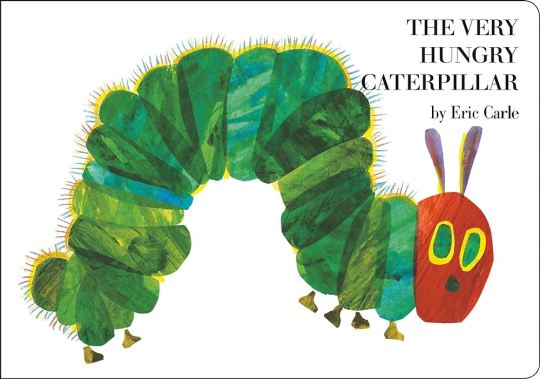
Above: The sin of Gluttony...
When thinking about books I read as a kid for some reason my mind goes immediately to the insatiable insect above. That cover is burned into my subconscious... Although until researching it for this project, I wouldn't have remembered how uncanny the catterpillar's face looks. It's cute in it's own way but also not unlike something you might see in a horror. I'm kinda reminded of the "redeads" from Ocarina of Time.
Above: I don't trust this guy's smile...
If I had to describe the art of Eric Carle in one word it'd probably be texture. Through the use of collage, his work takes on a very three dimensional, tactile quality. This was used to great effect in the Hungry Caterpillar book, with the titular character memorably biting holes out of the books pages.


Above: The flag of California I think
Beyond just what it evokes, on a technical level a lot of Eric Carle's stylistic traits line up well with the medium of animation. An animated scene is assembled, layered from foreground to background. In a simple shot moving these layers at different speeds can create the illusion of depth. This technique employs the parralax effect, having close objects appear to move faster than those further away. Similarly Carle's collage inspired aesthetic is all about layering, and the optical illusion of disparate parts making up a cohesive whole.

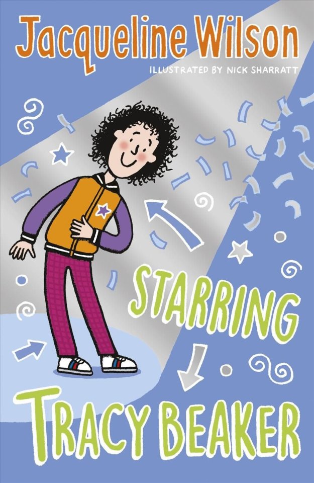
Above: The Dumping Ground
Another artist I wanted to highlight is Nick Sharratt, children's author and illustrator best known for providing the artwork for Jacqueline Wilson's Tracy Beaker books. I actually hadn't heard of Sharratt 'til now, despite having known his art forever. Sharratt employs a simple style with uniform line thickness and flat, vibrant colours. There's a loose, playful kind of energy to his work that I feel really speaks to children.
I was impressed to learn how dedicated Sharratt is to kid's media and education. He's been an ambassador for children's charity Theirworld for years, campaigning for children's right to a fair and equal education, regardless of gender, race or circumstance.


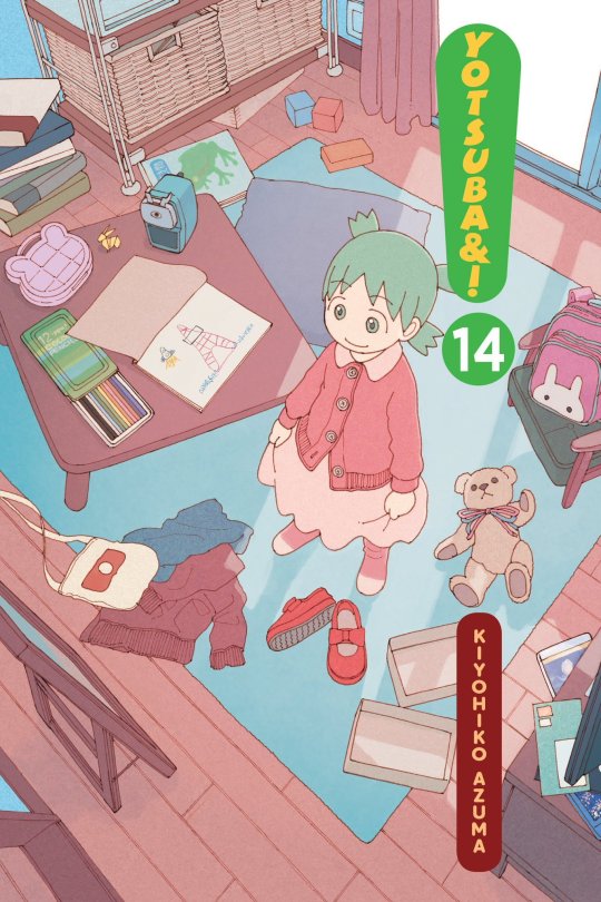
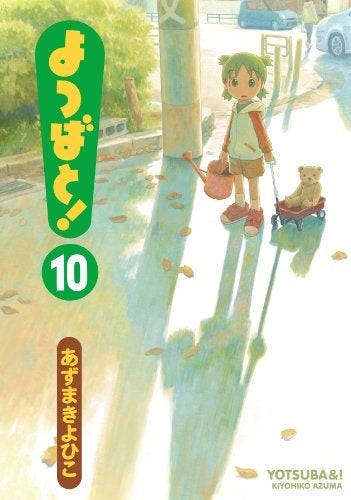
Above: (◕‿◕✿)
I don't actually know much about Yotsuba&! It's a long running Japanese manga series by Kiyohiko Azuma ostensibly aimed at children. It depicts the everyday adventures of a young girl named Yotsuba as she learns about the world around her, guided by her adoptive father, their neighbors, and their friends. I know a lot of people use it as a resource when learning Japanese because of simple, easy-to-understand nature and limited use of difficult vocabulary and grammar.
The art, like a lot of manga and comics in general, is more character than background focused. That said the covers have a lovely watercolour aesthetic with surprisingly muted colours for a children's series. I appreciate Azuma's emphasis on light and time-of-day in his illustrations. He recreates the world in the warm, optimistic light you'd expect from a child's perspective.
All that said, I'm pretty sure it's a series co-opted by 4chan type incels for whatever reason, so I'm somewhat uncertain about lumping it in here with genuine kids media.


Above: A more trustworthy smile
The last artist I'd like to mention is Tove Jansson, best known for her children's novel series Moomin, of which I've already posted some artwork above. Moomin is another one of those series I had no real contact with as a child. I stumbled across Jansson's work online, often seeing animated clips and illustration's of these bizarre yet deeply charismatic characters.
In some ways her artwork isn't the most suitable for this project, as her illustrations are dominated by the character with the background being there only to frame them. It's exactly because of this though, that I find her backgrounds so appealing. They represent a kind of warped space, where reality contorts itself around her characters.


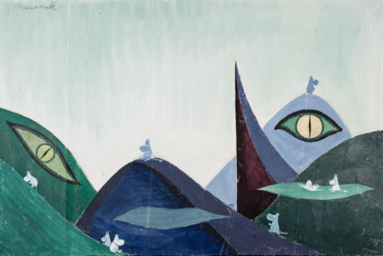
Above: Less Moomin
Jansson was also prolific, producing many paintings and illustrations outside her domain of children's books. What I find fascinating about her work is that you can see the same elements appear whether she was working in service of children, adults or no one in particular. That in itself may be getting at what made her such a powerful children's artist, she created art in her own single minded vision, unperturbed about what others might think. I feel that philosophy is at the heart of creating authentic children's media.
4 notes
·
View notes
Text
Animation Brief 01 - Week 1 - World Building

Above: Background art from Angel's Egg (1985)
Well, I got into the animation course so my plan to begin coasting for the next three years is well underway. All I have to do is not fail this last module, which unfortunately means having to work...
Our initial brief will take us through the first two weeks of the term, moving at a pretty considerable clip compared to the last two. This gives me less time to engage in my favourite activity: not working. The title of the brief is "World Building" and the concept is to create a series of drawings and models in exploration of this theme, supplemented with some 3D modelling for a "mini-me" personal avatar.

Above: Background art from Lupin III: The Castle of Cagliostro (1979)
It was a funny brief to see as it almost exactly reflects the difference of opinion I had with our tutor, Paul Gardiner, on the last animation workshop for the Movement Brief. My concept was character focused, placing emphasis on the little penguin trying to scale the insurmountable spiral. Paul's feedback was insightful and I applied it as best I could, but ultimately his focus was more on the world, the contrast between man's insignificance in the face of such a titanic monolith. I guess I would say I was asking questions of how a character would interact with such a challenge but he was asking the same of the world itself.

Above: Compilation of background art from Digimon Adventure (1999)
Anyway, I can write more of my thoughts of brief in abstract later. For now I'd like to focus on the task at hand. For our first week we'll be look at soft landscapes, greenery and nature. An emphasis on horizontal composition, panorama and organic shapes. This will be contrasted next week with an opposite focus on city-scapes. To get us into the right mindset, Paul showed us a video of anime cinematography he'd cut together and set to Radiohead. (ó﹏ò。)
There was lots of recognisable work from famous directors like Hayao Miyazaki, Isao Takahata, Rintaro and Mamoru Oshii. The idea was to focus on the camera and pay attention to how it interacted with the background art. Most were simple pans, tilts, and zooms, with the occasional parallaxed element. None employed true animation, which is normal and expected for backgrounds. The video highlighted how much information could be conveyed with clever application of simple techniques.
We have a six step outline for the project and a itinerary for each day, so I'll update more as we go.
3 notes
·
View notes
Text
Movement Project - Recap & Conclusion
Well, with the movement project now in rear-view, I guess it's as good a time as any to write a recap. As I've no doubt mentioned earlier, I spent the first couple of weeks of this semester aimless. It wasn't that I didn't want to work, in fact I actually did a lot of work, I was just struggling with the usual symptoms of PTSD and it was difficult to get up and be in on time. The more schooldays I missed the worse I felt, a downward spiral you could say.
Having spent the first workshop's allotted time just planning and prototyping animation in particular, I finally got my ass back in gear for the second two week block and chose to work on ceramics. In retrospect this may have been a miscalculation, as I ended up spending almost all my time finishing ceramic work at the cost of my other disciplines, mainly painting.
For the final two week block I ostensibly focused on animation but really due to completely mismanaging my time I was working on all three disciplines simultaneously. In spite of the chaos this was actually a lot of fun. The workshops I attended were phenomenal and I couldn't have fleshed out my ideas to the extent I did without the gracious help of all the tutors involved.
As far as my work this semester... I'm happy overall with what I accomplished. Just a bit disappointed in myself for not optimising my time, especially in regards to painting. I think my finished animation is my most representative piece as it pertains to the spiral theme for movement. I am essentially the little penguin trying to scale an insurmountable challenge only to spiral back down to square one. My ceramic work is more abstract, my attempt at representing the spiral theme through form and pattern, rather than narrative animation.
Painting is a bit trickier. My only actual painting work was test pieces and prototypes, nothing final and definitely nothing I'm proud of. That said I made a genuine effort to include painting in my animation and ceramic work. I focused my attention on good values and colour design when working on the background paintings for my animation, and incorporated painting through underglaze in my ceramic work.
More than anything this project was a learning experience, much like the last. And on that charge I feel able to rub shoulders with the best of them. If there was anything I did this semester it was learn. I learned from the workshops, I learned from my tutors and peers, and I learned from my own mistakes. I hope to be able to continue on with animation and put these hard-won lessons to good use.
Thanks for reading all this. :)

4 notes
·
View notes
Text
Movement Project Week 8 - Final Animation
Above: Turn up the volume if you want to hear weird N64 sound effects.
The finished animation really didn't take too long, I just made life hard on myself by leaving everything to the last minute. Roughing out the Penguins movement took about a day and the colouring took another. Compositing in Premiere and adding audio didn't take long but I'm a total amateur at it and it kind of shows.
Anyway, the concept of the animation is a Penguin (I think I'll call him Benedict) is alone in the desert, making a futile attempt of climbing the monolithic spiral staircases yet never becoming discouraged.
I guess I was inspired by Paul's critique to create an animation that represented the "spiral" theme in a narrative sense, moreso than just the literal or abstract banner much of my other work this semester would fall under. To spiral is to move rapidly, unsustainably, out-of-control. Up or down, positive or negative. I wanted to show a character capable of weathering lifes challenges, able to pick himself up after a downward spiral, always moving forward with the hope of an upward spiral.
If it's not obvious that's why he's a penguin in the desert, about as out of place as one could be.
I should also note that I know the animation was only suppose to be 10 seconds, but after I had committed to the story, the story seemed to need more time. Most of it is just a stairs spinning anyway.
...although technically this means I did 6 times the required work, so rightly that means I should receive 6 times the marks, right...?
...right?
2 notes
·
View notes
Text
Movement Project Week 8 - Random Painting Work
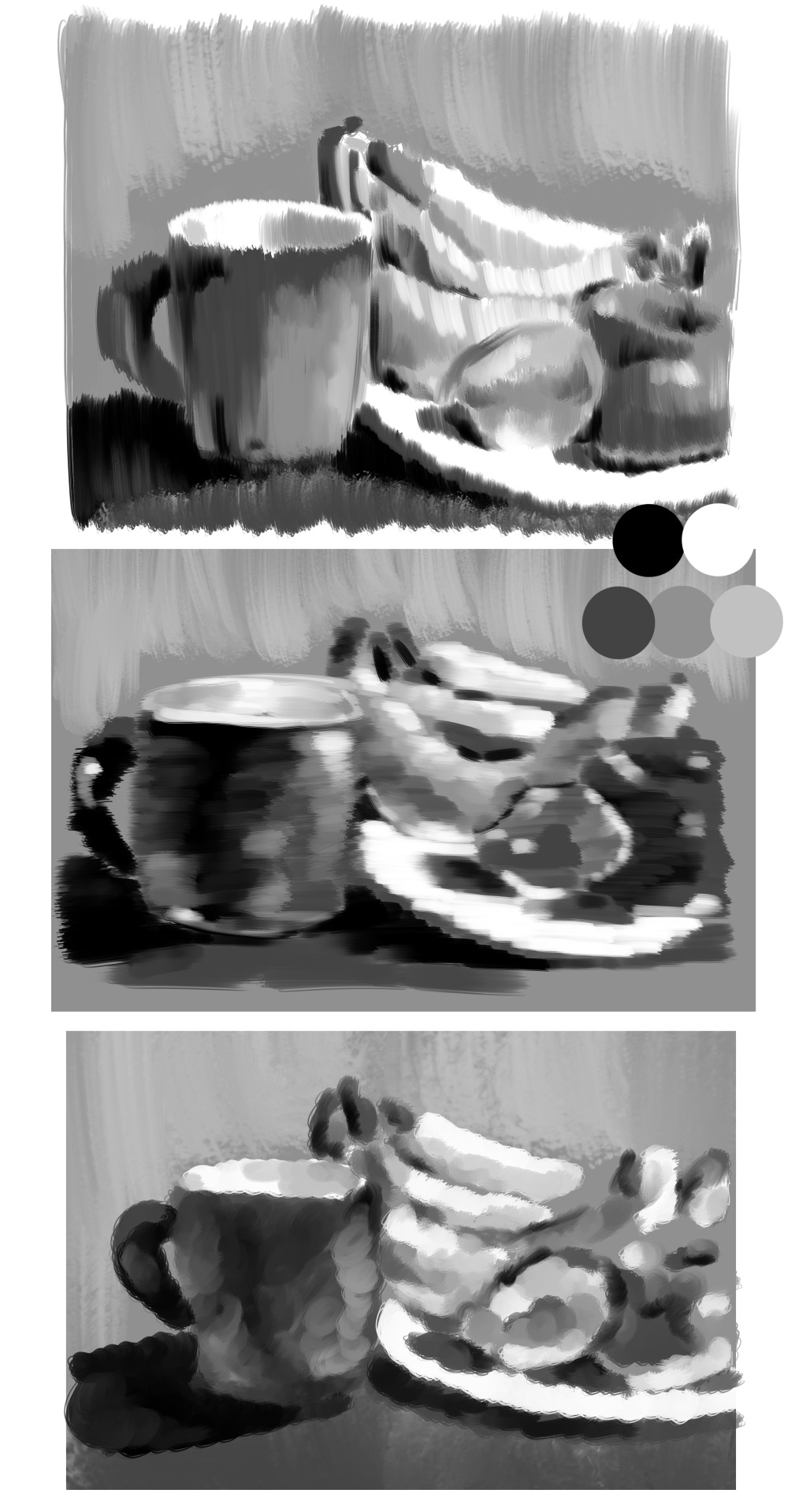
Above: They can't all be winners...
I basically missed the first two weeks of workshops this semester, 'cause I'm stupid. I thought I'd skip animation cause that was the easiest to do at home, but was advised not to as animation is the discipline I hope to continue working in next year. So painting ended up drawing the short end of the stick, essentially.
I thought I could finish the painting work by myself but life got in the way and all I'm left with is my embarrassing test pieces. The trio above is from a value painting test I did. The idea was to paint the same still life scene but limit myself to five greyscale tones, and a different brushstroke direction each time.
I got the idea to practice value painting from what I observed of Sylvia's painting workshop, and the brushstroke thing was meant to simulate movement and get me thinking along those lines. This was before I'd really settled on the spiral concept and had no real idea what I was doing. The top painting was done using only vertical brushstrokes, the middle horizontal, and the bottom circular.
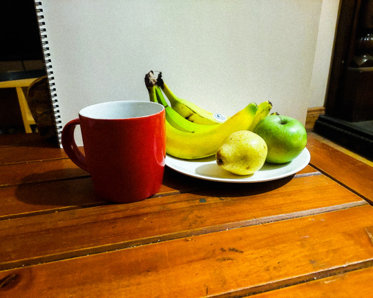


Above: Analogue Painting
I actually started this idea on paper before the realisation I barely had any white paint made the whole thing a no-go. So I finished it in Krita. I found painting in Krita, without the tactile feedback of the brush and paper, a lot more difficult.
I assembled the still life scene itself from random fruit I found laying around the house and my own red cup. I made a small 16:9 viewfinder out of an A4 sheet of copy-paper to get a decent composition. I started the traditional painting by drawing a basic outline on paper, but for the digital one I eschewed that and just painted til I found the scene. This method gave me a new perspective on painting.


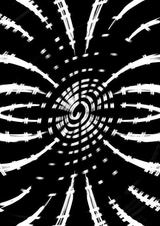


Above: Test pieces and thumbnails for a spiral painting I had planned.
My main goal in painting by the time I had my spiral theme finalised was to create a painting reminiscent of the work of Bridget Riley, I mismanaged my time (if that's not already obvious) and never got around to it but I did a number of quick digital paintings (if you can call them that) where I was trying to find a good composition. I like the coiled spring-looking one the most.
2 notes
·
View notes
Text
Movement Project Week 8 - Ceramic Showcase 05


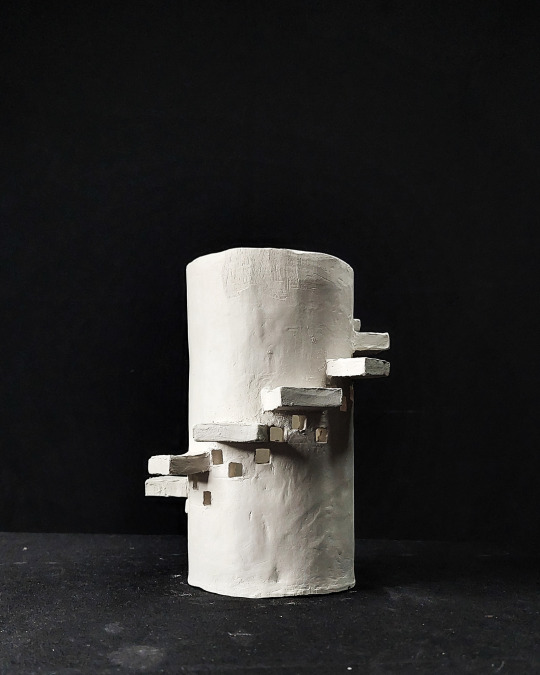
Above: The odd one
And last comes Aramis. I thought this was for sure the worst of the three when putting them together. I had no firm idea of what the third one should look like, and the odd mixture of steps and holes was the result. That being said when Paul helped me out, putting a LED inside it while it spun, I immediately had to look at it in a different light.


Above: Fire coming out of a monkeys head
6 notes
·
View notes
Text
Movement Project Week 8 - Ceramic Showcase 04


Above: The middle child
I guess to continue the theme this ones name should be Porthos. With this staircase I wanted to see how the shorter steps might affect the movement or shape of the spiral when spun.


Above: Spim
5 notes
·
View notes
Text
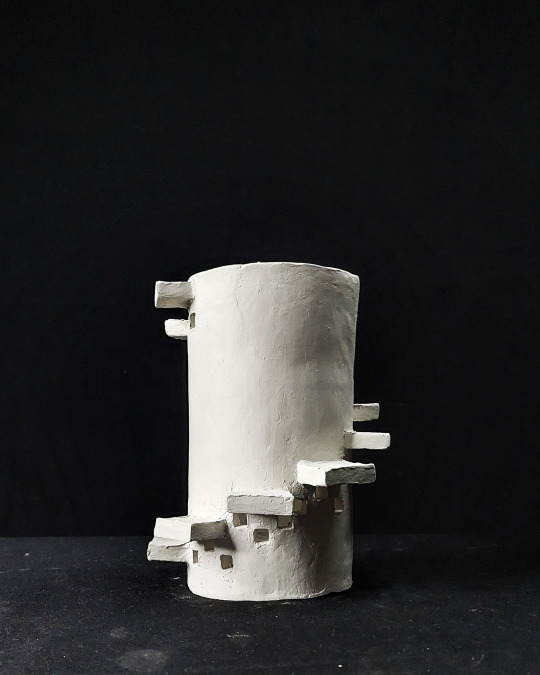
Movement Project Week 8 - Ceramic Showcase 03
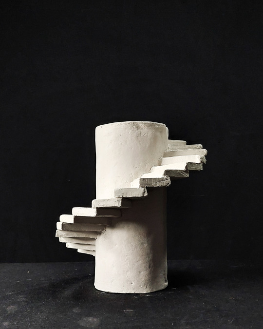


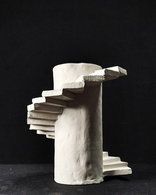
Above: Very extra stairs
This is the the first of the three musketeers spiral staircases I made for this project, Athos I guess, to give him a name. I wanted to keep these stairs simple and plain with an unglazed white clay finish. My hope is the design itself can communicate the Idea of movement. To me at least, spiral staircases feel like optical illusions, somehow stuck in perpetual motion while never moving.

Above: That time I slowly lost my mind in the clay room
Again I've included a comparison to the earlier stages of the project. This one actually changed very little now that I look at it, it's mostly Just whiter.
Above: More spinny
1 note
·
View note
Text
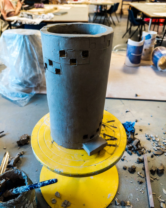
Movement Project Week 8 - Ceramic Showcase 02

Above: First steps
This is just a smaller update on the prototype ceramic stairs I made in like 10 minutes. I didn't film a turnaround for this but I still got some nice photos.


Above: more steps
It was tough to tough to bring out the purple and blue tones in the photo without making the clay look overly yellow. I'm not sure I succeeded in that looking back, but I'm running up against a deadline so it is what it is. I'm still genuinely happy with it for such a rushed bit of work.


Above: Firster steps
I've included a comparison again for the sake of completeness.
0 notes
Text
Movement Project Week 8 - Ceramic Showcase 01

Above: A random photo of Paul Tarpey's hands
I had the time on Tuesday to take some nicer photos of my ceramic pieces in Photography room. I couldn't have done it without Paul's help, my knowledge of photography extends only as far as pointing and shooting, so his expertise was invaluable. This post is really just a round up of the work I've done in ceramics this semester. I've written enough words about these yokes at this point, so I hope now they can speak for themselves and convey my ideas of movement through spirals.


Above: A precarious photoshoot...
I hadn't actually planned on doing the photoshoot exactly when it happened so I only had 20 minutes to improvise some support to hold one half above the other, as originally intended back in the paper prototype. I basically just followed Elaine's advice and covered a cardboard cylinder in black paper. The fit wasn't great but it worked out fine for the photos.


Above: Darwin Stuff
The above is just a comparison of the original concept in paper and the pre-fired clay. It's funny how a random sleep deprived bit of work turned into such an ordeal...
Above: How the turntables...
Tumblr will only allow me one video per post so the above is a montage of the piece spinning from different angles edited together in Premiere. Paul captured all the video for this while my job was to spin the yoke. I think if I'd had more time/used my time better, I'd have liked to capture some high framerate video to do a slowmotion effect. Overall though, I'm happy with the piece and I feel the movement theme is best represented in motion.
0 notes
Text
Movement Project Week 7 - Animatic
Above: Just a lil guy
Really I should have been prototyping more and hammering out the storyboards, but because |'m stupid and up against a time limit I basically just animated the whole thing straight ahead and hoped it turned out well.
I already had the art of making spiral staircases in Blender down to a science, so it was easy work to setup a camera-object and film some background animation. The trickiest part of this process was actually getting the linework to look decent on the 3D model, I used Blender's post-processing effect "freestyle" when looking back it would've been less of a headache to use the "Grease Pencil" option, which works in real-time. I actually had to manually edit 48 frames in Photoshop to fix up the wonky lines...

Above: It did lead to this trippy shot of all the frames overlaid at once.
At this point I still hadn't fleshed out who the character climbing the stairs was gonna be, all I knew was I wanted real "chibi" cartoon proportions for a cute effect. Character design is an essential part of animation and this workshop itself, but again in my infinite wisdom I chose to wing it and hope for the best.
2 notes
·
View notes
Text
Movement Project Week 7 - Somehow Animation Returned...
Above: Sharpener Cameo
To be honest I'd originally planned on skipping the animation workshop and doing painting instead for the last two weeks. Which is pretty odd considering I want animation as my chosen elective for the next three years...I felt I knew enough to half-ass animation at home basically, since I'd already missed two weeks. I was advised basically to do animation anyway, and catch up on the painting at home. So here I am.
Monday was pretty simple, Paul introduced us to basics of animation as an elective. I appreciated getting to hear his philosophy on animation, his belief of animation being essentially the same as film-making and principally about storytelling is similar to my own.
After watching a bit of Rick and Morty, we were encouraged to write down as many one sentence stories as we could. This was challenging for me cause I already had an idea of what I wanted to do, and it can be hard to return to a blank slate. It's like when someone says: "Don't think of Jackie Chan!", I guarantee you just thought of Jackie Chan.
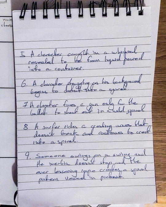

Above: Literally zero ideas involving Jackie Chan
Paul came around one by one to help us decide on our story and how we might go about turning that into a 10 second animation. Ultimately I still went with my first idea, wasn't about to throw away all my precious stairs work. After that it was on to storyboarding.


Above: Deranged mind
I like storyboarding. In the Japanese animation industry storyboards are called "E-Conte" which just means continuity drawings. I like that term cause it makes the idea clear; create continuity between shots. Anyway that being said I'm not great at storyboards. It's like a brainteaser and my brain just self-destructs after a while. I tend to get so bogged down in finding the "right" answer I end up answering nothing. I still enjoy this however.
My basic plot was a looping spiral staircase, stretching on into infinity and a character's attempt to climb it. They would tumble back down to the beginning and try again, thus creating a looping animation.
Anyway, Paul had some great feedback on my storyboard. He imaged the same basic plot in such an entirely different way, connecting it to ziggurats, the Tower of Babel, and envisioning an entire society's worth of attempts to scale the staircase. I loved these ideas but I felt at the end of the day I had to make the animation chose to make, for better or worse. (dramatic cliffhanger)
0 notes