#I still don't have solid designs for them but I wanted to get some sort of illustration down :')
Text
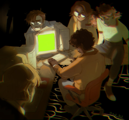
magnus protocol
#[.art]#tmagp#the magnus protocol#samama khalid#alice dyer#celia ripley#colin becher#gwendolyn bouchard#lena kelley is being ominous in the background#I still don't have solid designs for them but I wanted to get some sort of illustration down :')#someone get them better cable management by the way
542 notes
·
View notes
Text
examining a seemingly normal image only to slowly realize the clear signs of AI generated art.... i know what you are... you cannot hide your true nature from me... go back where you came from... out of my sight with haste, wretched and vile husk
#BEGONE!!! *wizard beam blast leaving a black smoking crater in the middle of the tumblr dashboard*#I think another downside to everyone doing everything on phone apps on shitty tiny screens nowadays is the inability to really see details#of an image and thus its easier to share BLATANTLY fake things like.. even 'good' ai art has pretty obvious tells at this point#but especially MOST of it is not even 'good' and will have details that are clearly off or lines that dont make sense/uneven (like the imag#of a house interior and in the corner there's a cabinet and it has handles as if it has doors that open but there#are no actual doors visible. or both handles are slightly different shapes. So much stuff that looks 'normal' at first glance#but then you can clearly tell it's just added details with no intention or thought behind it. a pattern that starts and then just abruptly#doesn't go anywhere. etc. etc. )#the same thing with how YEARS ago when I followed more fashion type blogs on tumblr and 'colored hair' was a cool ''''New Thing''' instead#of being the norm now basically. and people would share photos of like ombre hair designs and stuff that were CLEARLY photoshop like#you could LITERally see the coloring outside of the lines. blurs of color that extend past the hair line to the rest of the image#or etc. But people would just share them regardless and comment like 'omg i wish I could do this to my hair!' or 'hair goallzzzz!! i#wonder what salon they went to !!' which would make me want to scream and correct them everytime ( i did not lol)#hhhhhhggh... literally view the image on anything close to a full sized screen and You Will SEe#I don't know why it's such a pet peeve of mine. I think just as always I'm obsessed with the reality and truth of things. most of the thing#that annoy me most about people are situations in which people are misinterpreting/misunderstanding how something works or having a misconc#eption about somehting thats easily provable as false or etc. etc. Even if it's harmless for some random woman on facebook to believe that#this AI generated image of a cat shaped coffee machine is actually a real product she could buy somewhere ... I still urgently#wish I could be like 'IT IS ALL AN ILLUSION. YOU SEE???? ITS NOT REALL!!!!! AAAAA' hjhjnj#Like those AI shoes that went around for a while with 1000000s of comments like 'omg LOVE these where can i get them!?' and it's like YOU#CANT!!! YOU CANT GET THEM!!! THEY DONT EXIST!!! THE EYELETS DONT EVEN LINE UP THE SHOES DONT EVEN#MATCH THE PATTERNS ARE GIBBERISH!! HOW CAN YOU NOT SEE THEY ARE NOT REAL!??!!' *sobbing in the rain like in some drama movie*#Sorry I'm a pedantic hater who loves truth and accuracy of interpretation and collecting information lol#I think moreso the lacking of context? Like for example I find the enneagram interesting but I nearly ALWAYS preface any talking about it#with ''and I know this is not scientifically accurate it's just an interesting system humans invented to classify ourselve and our traits#and I find it sociologically fascinating the same way I find religion fascinating'. If someone presented personality typing information wit#out that sort of context or was purporting that enneagram types are like 100% solid scientific truth and people should be classified by the#unquestionaingly in daily life or something then.. yeah fuck that. If these images had like disclaimers BIG in the image description somewh#re like 'this is not a real thing it's just an AI generated image I made up' then fine. I still largely disagree with the ethics behind AI#art but at least it's informed. It's the fact that people just post images w/o context or beleive a falsehood about it.. then its aAAAAAA
10 notes
·
View notes
Text
So just finished watching the ep so review. Spoils ahead:
So the episode was ok to me, solid 6/10 one of the better episodes which since this was supposed to be an "extravagant" ep why does it got better quality than the main eps, idk Viv has her moments like this ep and other eps its a train wreck in writing ect.
Mammon worked on my nerves, from design to his movements, personality ALL of him was annoying, which props for an annoying Villian but its Villian I never want to see back again and he's hinted for some sort of return.
Side tangent: Mammon is like the how many-ith Villian to get a return ep/hint at one. It was 1st cherubs, then dorks, then stella/ice twink, striker/crimson now Mammon & according to the leaked storyboards a ghost guy that tries to talk IMP into off-ing themselves... its a flipping lot and cherubs & dorks seem to be forgotten dispite dorks knowing & having hard evidence they exist, flip Viv chill it with your Villian of the week cos its way too many now.
Anyway, Blitz didn't need to be in this ep besides the flashback. Ozzie got him to talk Fizz out of being Mammon's puppet but ultimately Ozzie spoke him out of it & gave him courage to quit/confront Mammon. Even Blitz being a bodyguard/killing people for Fizz could've been any imp. Blitz is starting to feel like Steven from SU, in every ep even tho the ep doesn't need him/ the episode surrounds topics a wee child shouldn't be in (i.e Lapis trauma dumping on Steven & he a child isn't really equipped to handle that situation).
My fave part of this ep was Ozzie and Fizz. Ya'll I legit prayed Viv wouldn't mess these two up and my prayers were answered. Absolutely a joy these two were. Fizz especially what a darling. Loved that small scenes with him and the deaf imp child, l dont know sign language but it looked genuine animated and was just sweet moments.
From their interactions, Fizz's panic attacks/self doubt felt & were genuine... I felt that as someone that has panic attacks from high stress on my studies/life. It was just handled well. Fizz feeling less than and needing to prove himself from 1. his past 2. his appearance, that accident affected his self image/worth so much (why I felt him forgiving Blitz was too hastily done but I digress) & 3. him doing this Mammon contest still to gain/earn Ozzie's love for him cos Fizz believes Ozzie only sticks around because of this fame Mammon gave Fizz. Ozzie finally saying what he loves about Fizz was lovely, wanted that in the 1st ep but ¯\_(ツ)_/¯. Their song was... I didn't like it BUT the message in it was beautiful. Lastly Fizz saying fuck you to Mammon from the courage/strength Ozzie gave him was a nice send off... also Ozzie saying he loves Fizz ah ngl that made me smile agh I just love them. I want to see them more than the Stolitz show but thats only a wish. Props Viv, you get 1 brownie point not messing this up.
Last findings, the ep was bloated as hell my soul Viv please stop cramming so much in an ep, this one is 30 mins long & yet still felt bloated. Pacing was a motherfuka damn it was bad & the swearing was jarring (its a Viv written ep I don't expect any less but still gonna point it out) and the comedy wasn't so prominent in this ep, Blitz/Mammon gave some comic relief but in the best and worst ways:
The way the VA delivered this line "to be fucked" made me laugh, the line is cringy but the delivery lol gold
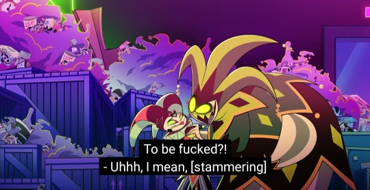
Aand Blitz, my soul shut the fuck up & get out this ep. Last ep & this one he said something so agonizingly cringe I pulled my face
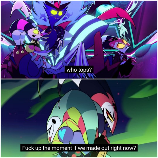
The world of HB is legit American hell or earth just painted red since Fizz named all these places in America just "hellified" where his fans come from.
And very last, congratulations Salem glad you got the cathartic send off you deserve from working under Viv, truly fuck you "Mammon" indeed :) also glad they credited you this time.
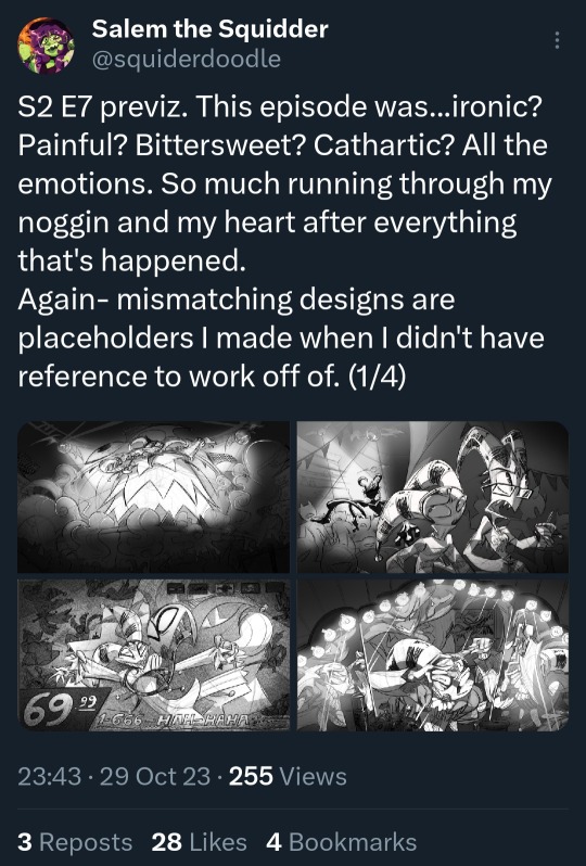
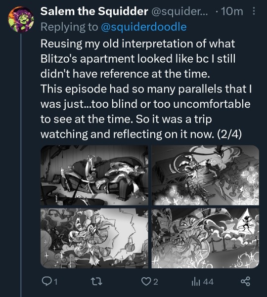
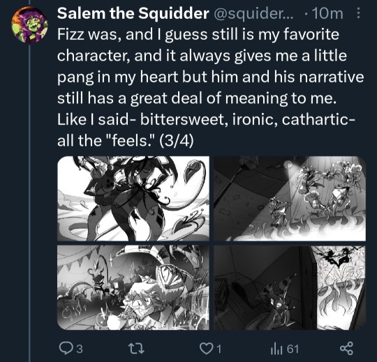
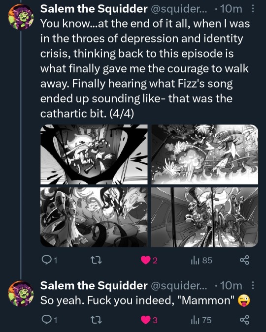
#vivziepop critical#helluva boss critical#spindlehorse critical#helluva boss criticism#my post#can we get a moment for Salem cos heck yeah for them whoooo!!!!
153 notes
·
View notes
Note
top 5 ttrpgs for beginners
Sorry that this one took me a bit longer to answer than all the other Top 5 asks :p i wanted to explain a bit of my reasoning behind it and this gave me q chance to ramble a bit about something that bothers me lol
So, first of all I want to talk about what TO ME makes something a good beginner RPG.
Ramble:
I've talked a bit in the past about how I have sort of a bone to pick with the way so many people, when asked for recs for beginner TTRPGs, immediately decide to recommend extremely rules-light/minimalist/one-page RPGs (Hacks of Lasers&Feelings in particular seem to be somewhat popular on this front), when IMO these types of RPGs are at their best when played by an experienced group (or at the very least with least one very experienced player/GM who can provide some guidance to the others). I think a lot of ppl seem to have the impression that simpler mechanics inherently make a game more beginner-friendly, and that thus the most beginner-friendly games are inherently gonna be the ones with the simplest mechanics. And while this is true to an extent (a 700-page RPG with tons of complicated mechanics to remember is obviously gonna be inaccessible to beginners), when you consider that mechanics exist to DELEGATE decisions about the fiction away from the players and the GM so that they don't have to manually arbitrate them every time, there is point where less mechanics are gonna make harder for new players because it means there's more thing they're gonna have to find a way to arbitrate on and decide by themselves, and that's a skill that takes time to develop. An experienced group can probably get a ton of mileage out of a system that essentially ammounts to "the GM describes the world. The players describe what their characters do, and the GM describes how the world reacrs. When the outcome of a player action is uncertain, then [simple resolution mechanic]" but a beginner group is gonna be a little lost. Especially if the game, like many of these types of games, includes practically nothing in terms of GM tools. So I think recommending beginner RPGs solely on the base of how simple they are is well-intentioned but misguided.
(Ramble over)
So, some of what, to me, makes something a good beginner RPG is
Rules provide enough support that the group won't have to constantly be figuring out how to adjudicate stuff on the fly, but they're simple and flexible enough that they're easy to remember and learning them doesn't feel like a daunting task like it does with a certain game (*cough cough* D&D)
Relatively short and uni timidating. Maybe between like 20 and 100 pages. Players should be able to read through the rules and mechanics in one sitting.
Plenty of examples of play, often a good example of play is what makes a game's rules really *click* for a new player.
Relatively quick and painless to start running for the first time. Character creation should be quick and snappy, and if possible a short pre-written adventure (hopefully with some room to be expanded into something larger) should be included within the same book and ready to run out of the box. Even if your group doesn't like using prewritten adventures, having a *good* prewritten adventure can be a huge help in understanding how to write/design them.
Solid set of GM tools and resources (if it's a game with a GM, of course)
Optionally, plenty of compatible material to either use or take inspo from.
So, I think my recs would for beginner games would be...
Mausritter
If any of you have EVER heard me talk about RPGs you knew Mausritter was gonna be here TBH. I've repeatedly talked about it being one of my favorite RPGs and also that I consider it pretty much an ideal introduction to the hobby. I think the woodland critter theme is extremely charming and attractive for people of any age, while the slightly darker elements that rear their head from time to time keep it from feeling too childish.
The mechanics are simple and flexible but still provide enough structure that even a new GM will rarely if ever be at a loss about how to resolve a particular action. They're familiar to anyone who's played a dungeon game while still being extremely streamlined. 3 stats with the main action resolution being roll-under tests, no classes, characters are defined mostly by their inventory, all attacks auto hit and initiative is extremely streamlined, which keeps combat quick and dynamic, etc. And the mechanics are pretty short and esy to digest too, the players' section of the rulebook only takes 18 pages, including stuff like inventory tables and examples of play, and the website features a handy one.page rules summary (which also comes with the box set)
It's super easy to get running: character creation takes a couple minutes at most, and it features both a simple adventure and hexcrawl that can be used right out of the box with plenty of interesting directions to expand for further adventures.
Now, Mausritter takes most of its mechanics from Into The Odd, so a lot of its virtues come to it, but I think the few changes it made DO make mausritter most beginner-friendly, such as its inventory system which makes inventory management into a genuine challenge without having it devolve into a slog of tedious book-keeping, and the incorporation of a streamlined version of GloG's magic system, which manages to still be simple and easy without being as loose and freeform as the magic system from a lot of OSR games of similar complexity (which can be initially daunting to new players)
But what REALLY makes mausritter shine IMO is the extremely solid set of GM tools. In just a few pages mausritter manages to provide simple rules, procedures, generators and advice for running faction play, making an engaging hexcrawl, making adventure sites, and generating stuff like treasure hoards, NPCs, an adventure seeds and overal just a ton of useful stuff that takes a huge load off of the shoulders of any beginner GM.
Cairn
Lets say you're into Mausritter mechanically but your players aren't into the whole woodland creature theme and want to play something more traditional. Cairn is also built on Into The Odd's system, and takes inspiration from some of the same sources, so it's very similar mechanically. It does feature some significant differences regarding magic, character advancement, and how injury and healing work, but overall it's still mostly the same system under the hood, so a lot of what I said makes Mausritter a great introduction to the hobby mechanically still applies here (quick and flavorful character creation, dynamic and streamlined but dangerous combat, etc). It's also a classless system that features msotly inventory-defined characters, but aside from the option to randomly roll your gear, the game also offers the option of picking a gear package in case you wanna emulate a particular fantasy archetype.
Now, Cairn is a much more barebones document, and doesn't even feature examples of play or an explicit GM section with resources for running the game, which breaks with the things I said I look for in a beginner RPG. However, in this case I'm willing to forgive this because, first, Cairn's website features a plethora of first party and third party stuff that isn't featured in the book itself, including examples of play, GM procedures and tools, modular rules, and a wealh of conversions of creature stat blocks and adventures from D&D and other fantasy adventure ttrpgs.
And Second, something different that specifically distinguishes Cairn as a good example of a beginner RPG is how it explicitly outlines its philosophical and design principles, and the principles of play for both the GM and the players before it even shows you any rules, which is something that I think more games and ESPECIALLY begginer games should do. IMO the whole book is worth it just for that little section.
Troika!
Troika is a game built on the Fighting Fantasy system (which originally was less of a TTRPG system and more of an engine for a series of choose-your-own-adventure books) with a really interesting pseudo-victorian space opera weird gonzo setting which is a load of fun. It has very simple 2d6 mechanics, with characters having three stats (Stamina, Skill, and Luck), and being mostly defined by their inventory and the special skills from their background. Character creation is quick and snappy. The game gives you 36 weird and extremely creative character backgrounds, but creating a custom background is as easy as coming up with a concept and the names of a couple special skills that support that concept. It also has a very unique initiative system which might be a little divisive but which I DO find fun an interesting.
While it lacks many of the GM tools I praised Mausritter for, it makes up a little bit for it with an initial adventure that does a wonderful job at naturally introducing the weirdness of the setting, and which at the end presents a ton of opportunities to segway into a variety of urban adventures.
Now, a lot of beginners come into RPGs specifically looking for a D&D-type fantasy game (which is a problem because D&D is a pretty bad option for a beginner RPG) so for those types of players I would recommend
The Black Hack
The Black Hack is probably my favorite game for doing D&D-style fantasy roleplaying. It's a game that at its core uses the original 1974 white box edition of D&D for inspiration, but modernizes, reimagines, and streamlines every aspect of it to be one of the most simple yet elegant D&D-like experiences out there. For example, TBH uses the six stat array that all D&D players know and love, and with the same 3-18 point range, but does away with the attribute score / attribute modifier dichotomy, instead building its entire system around the attribute scores, with all rolls in the game being roll-under tests for a relevant attribute (including initiative, attack/defense rolls, and saving throws). It also innovated some extremely elegant mechanics that went on to be very influential for other games, such as its Usage Die mechanic as a way to streamline keeping track of consumable resources. Basically, it's like if D&D actually played the way it looks in cartoons and stuff: character creation doesn't take 3 hours, every combat encounter doesn't take five hours, and you can place some emphasis on resource management without the game making you want to tear your hair out with boring bookkeeping.
And one of the coolest things about it is the way it handles compatibility. Despite taking loose at best mechanical inspiration from D&D and playing very differently from it, TBH is intentionally designed to be compatible with a wealth of old-school D&D material. While it very clearly stands as its own distinct game, it's designed in such a way that you can prety much grab any creature stat block or adventure module written for any pre-3e version of D&D and use it in The Black Hack with little to no effort in conversion required.
The first edition of the game is a pretty barebones 20-page booklet that just describes the basic game mechanics, since it was assumed you'd probably be using D&D creature stat blocks and adventures with it anyway, but the second edition was significantly expanded with a bestiary, expanded GM procedures and advice, and tool for creating anything you could want: Hexcrawls, towns, dungeons, quests, treasure hoards, NPCs, dungeon rooms, traps, secrets doors, etc. plus a short premade adventure and even a few premade unkeyed dungeon maps that you can take and key yourself if you're in a pinch for a map, which as you all know, I think GM tools are an important part of a beginner game.
The game only includes the 4 basic classes from old-school D&D (fighter, thief, cleric, magic user) but the community has made several supplements adding back more modern classes.
Now, if you're that type of player that wants a D&D-like experience and you want an alternative that's still beginner-friendly but doesn't deviate as much from D&D's design, I would suggest:
either Basic Fantasy, or Old-School Essentials (or any good retroclone of Basic D&D tbh)
BF and OSE differ a bit from each other but at their core they're both attempts to repackage a relatively faithful but slightly modernized version of the 1981 Basic/Expert D&D set, retaining mostly the same mechanics while ditching a few of the aspects that might seem counterintuitive to a modern audience (such as descending AC, which I personally don't mind but I udnerstand why a lot of people find it confusing). I'm recommending these bc I think if you're gonna play any actual D&D product, the B/X set represents D&D at its most beginner-friendly (character creation is at its quickest and simplest, combat flows faster and remain itneresting due to doing side initiative rather than individual initative, the mechanics forsurprise, stealth, and dungeon exploration actions such as looking for traps are streamlined to simple D6 rolls) while still being recognizably D&D and these retroclones put in a bit of an extra effort to make them even more accessible to modern audiences.
Now, just like The Black Hack, these retroclones are limited in their race/class choice to the classic old-school D&D human/halfling/elf/dwarf and fighter/cleric/thief/magic user, but in the case of Basic Fantasy, the community has made several race and class supplements, some of which are showcased on the official website, and in the case of OSE, the OSE: Advanced addon reintroduces many of the modern classes and races that were originally introduced in the Advanced D&D line.
Have in mind that this list is pretty limited by my own tastes and experiences. I'm very aware that the very specific type of game I tend to play and like and experiences inroducing some of my friends to the hobby completely color the scope of what I can recommend as a good beginner RPG, and that that scope is significantly limited. I also like more narrative storygame type stuff, and I don't doubt that some of them would also make a fantastic introduction to the hobby (some PbTA stuff like Ironsworn, Dungeon World and Monster of the Week comes to mind) but my experience with them is not significant enough for me to feel confident in telling which of them are good beginner RPGs.
Also note that there are several games that I consider to be more MECHANICALLY beginner-friendly than the ones I listed here, but that I avoided mentioning specifically because they offer extremely little to no support in terms of GM tools, which I think is an important and often overlooked aspect of beginner-friendliness for any game that includes a GM! But they still might be worth checking out. These include games like DURF, FLEE, OZR, A Dungeon Game, Bastards, Dungeon Reavers, Knave 1e, and Tunnel Goons.
191 notes
·
View notes
Text
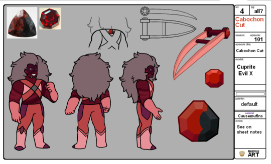
And here's my Evil X gemcyt design sheet thing. I already posted the Xisuma one, so check that one out too.
the whole gemcyt au got kicked off by @chrisrin so make sure to check out their stuff and all the stuff they reblogged if you haven't already.
Another version of the sheet above but with more notes on and for it is below the cut.
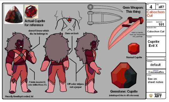
Alright! I had a lot of fun figuring Evil X out, probably bc of him being one of my blorbos.
Evil X has a lot of 'theories' surrounding what he is and I've seen some variations. He and X are siblings, they're X's clone, he's a glitched version of X, they're X's hels. etc etc. And so trying to figure out what to do for him.
While I already borrowed sweetest-honeybee's design in the second part of my Zed/WM gemcyt post, I didn't want to do like that and make him corrupted. I know the gemcyt stuff seems to play with corruption a little looser, but it still didn't feel right. So, I went researching and found a fun lil mix that seems to fit well.
First off, the closest thing you can get to a glitch in terms of gems is being off-color. I mean technically you glitch when you're cracked, but we're not doing that. Anyway, off-color gem Evil X, which is why there's the gem comparison. Next, the clone/hels part. I don't mention it on the sheet, but specifically, I think of this Evil X as a sort of gem experiment. No wait wait don't leave let me explain!
We saw that there were gem experiments of some type on the show. They were more fusion experiments using shards, and were experiments for the cluster (which technically don't work since they only emerged slightly before the cluster so there was no telling if they worked and if then the cluster would work). Also on the show, we're told that there's a resource problem on Homeworld which results in 'Era 2' gems like Peridot, who don't have all the abilities a normal gem would have. Also also in the show, when Steven and Lars are with the off colors on Homeworld, we see the kindergartens there. And while there are normal holes, there are also holes that overlap, as well as holes that look like there's been a chunk scooped out of them.
The analogy I could think of was like when you're making cookies. you roll out the dough, get a cookie cutter, and get all the cookies, but assuming you weren't using a square cutter, there's extra dough left between the cuts. Instead of just leaving it, usually you reroll it to cut out more cookies. Well, why can't Homeworld try the same?
Evil X is meant to be an experiment on if Homeworld can successfully do that. They scooped out extra rock from a kindergarten or two, compressed it into a new boulder, then used an injector on it. Eventually after a long while, out came Evil X. And that whole thing also leans into the clone thing because I imagine some of the scooped rock was from part of where Xisuma emerged.
Anyway, with all that, I originally thought about making Evil X look similar to Amethyst's pseudo buff reformation, but trying to draw that was a mess. I meant to go back and make him look a little more lopsided, but you'll have to just imagine that. Whoops. At the very least he has the funky stripes. I imagine that's probably from where the different rock pieces met or something, and since it wasn't as solid as regular rock, he was like that.
Coloring him was tough, but eventually I just copied Xisuma over, inverted his colors, and then shifted the hue to be more red. I considered making the green parts more black, but it didn't fit, so they're just more purpley to show that Xisuma connection or smthn.
Speaking of his gem, I show what I picture a normal Cuprite to look like. Meanwhile Evil X's is a bit misshapen, as well as that darker area that mimics the one reference I had. specifically that darker bit is chrysocolla, but he's still just cuprite.
Instead of a mask, he's just got a visor similar to what we've seen with Peridot and Doc and technically those zircons. And also instead of a mask he has those... blade things. Look, the best name i could find for them were blade gauntlets, but they look more like sword brass knuckles to me so I don't know. Also yes they are based on a weapon a digimon had, what of it?
And then, he is hella amethyst coded. Popped out of his rock thing in a chamber under the kindergarten (similar to the other experiments in the show) with no one around. He was an experiment and uses rock from different gems and is off color, so he doesn't know what he's for. Doesn't even know what diamond he should belong to, so that's why he's got a grey one on his chest. And there's a lot of little things and ideas for him that are inspired by Amethyst's characterization on the show, to the point I was planning a screenshot redraw even before I had his and Xisuma's designs even close to finalized.
I also have a fic I'm working on with him and Gemsuma, as well as that quick Jevin design plus a few teeny tiny references to other people's gem designs. If my adhd allows it, i should post that 1 shot fic tomorrow.
190 notes
·
View notes
Note
hi :] this isnt really a reqest cuz it'll prob be a longer answer but im rlly curious abt ur comic process
i love all ur comics and somehow they always manage to gutpunch me- and ur composition and the way they read is always so beautiful and adds so much to the message youre trying to get across
yeah lol let's get into it! Ive spent maybe 5 or so years refining this process to the point it's at now so it's pretty much my standard procedure now. I'm going to use Now that you're gone as my primary example here since i still have most of the planning stages associated with it (my laptop does not have a whole lot of storage left so i usually delete my planning once the comic is finished lol) but i'll try to throw in some other examples too!
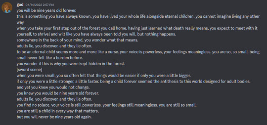
I almost always start with a written script. (the exception for this is longform oc comics which i find easier to write in the moment, but for my shorter character studies I almost always write first.) I use discord to write because it's convenient, but before i had a dedicated discord server for my stuff i was using txt files on my laptop which i do NOT recommend. anyway, this is what the written script for ntyg looked like:
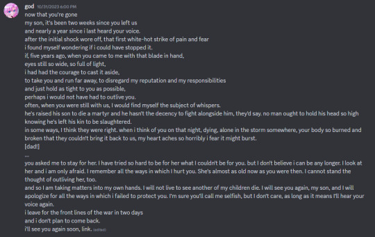
note that some small elements changed in production, like the amount of time that had passed since link's death. the lines "I look at her and i am only afraid. i remember all the ways in which i hurt you. She's almost as old now as you were then. I cannot stand the thought of outliving her, too" were also added during the rough stage because i felt like there wasn't quite enough emphasis on aryll in the initial script, and since this was a major change that necessitated a whole extra page in the comic I went back and edited those lines into the script so I wouldn't forget them. (both these changes were made during the rough stage. i'll almost never make major script adjustments after the roughs are finished.)
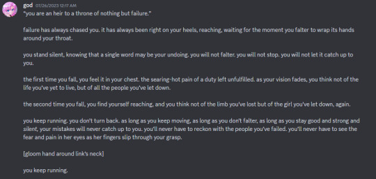
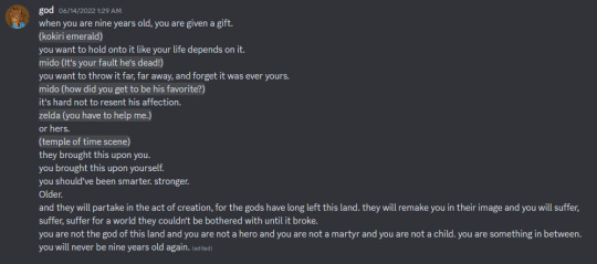
more examples of my scripts; specifically the original script for totk: failure and two versions of oot: adulthood (one before some major refining and one after.) with comics like these, where i have a very clear idea in my head of the imagery i want to go along with the words, i'll sometimes include it interspersed in the script, either spolier-marked or denoted with brackets.
with ntyg and some of my other more. canon divergent? i guess? comics, there's sort of a mini phase in between scripting and roughs where I do some minor character studies to get designs nailed down in the early stages. with ntyg I already had a clear image in my mind for aryll, but the central character was link's dad, whose design wasn't quite so solid in my head. I really wanted to make sure that his design was well thought-out and consistent throughout everything, so i did a few mini sketches and studies to ensure I had his design memorized and could execute it consistently:
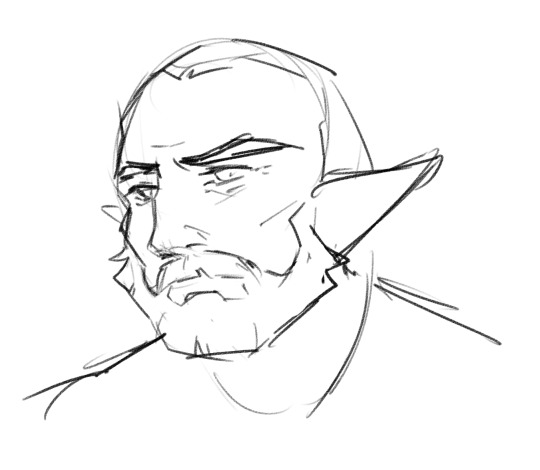

these are sans hair and accessories because nailing down consistent facial features was my main focus with them, and both these sketches ended up getting used as references for certain panels later on. This isn't a step I ALWAYS take with my comics, but if there's a central character that i'm not super used to drawing i find it helpful to get some practice in before jumping into the real thing!
after the scripting and design phases i move on to roughs, which I consider to be the most important stage in my process. roughs are very very quick approximations of what I want the final pages to look like. they usually don't take me more than a few minutes per page to create, and their sole purpose is to help me visualize the flow of the page and the placement of major elements like panels, characters, and dialog. this is what the 1st page rough for ntyg looked like compared to the final page:
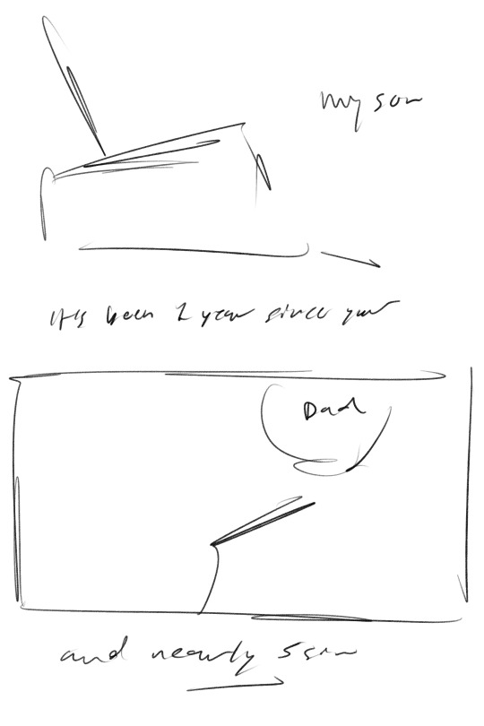
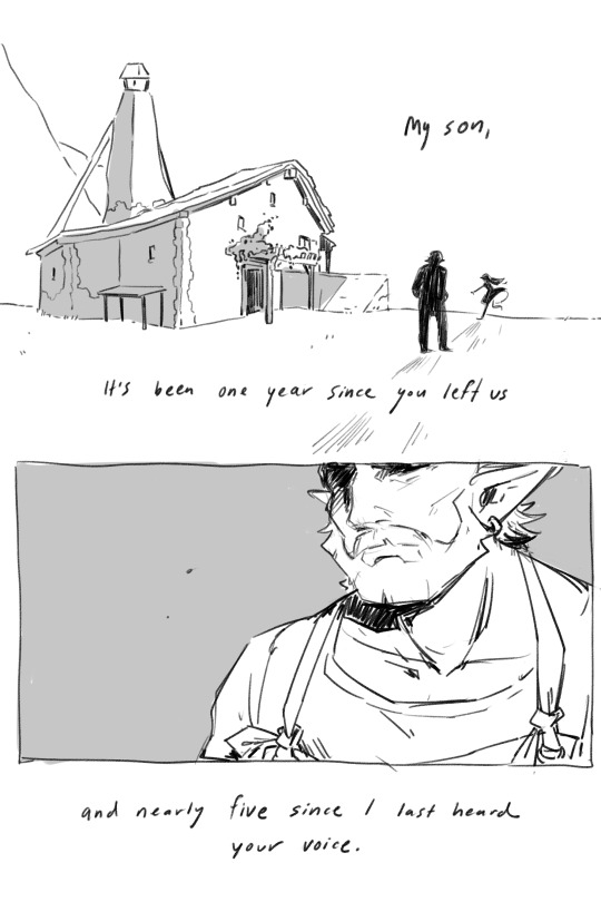
as you can see, all i have laid out is the major text and visual elements, but it really helps me to visualize how the finished comic is going to flow. i do the roughs for every page before i start on the finals so that i have an idea of what the entire comic is going to look like before I really start finalizing it. it's important that these roughs are FAST--i almost never draw fully-fledged characters unless the pose or expression is particularly important to the scene, and that's because the goal is to allow everything to flow quickly and easily from panel to panel and page to page, and getting too caught up on one panel or element often breaks that flow. Nowadays, i have a pretty good idea of how much room my writing takes up so i don't write out the entire script in my roughs, but back when i was a little less experienced i took the time to write everything out in this stage to ensure that my dialog would fit into the space it was given without getting cramped or cutting off other important elements. doing that really helped me build awareness of how much dialog and panel placement matters and how i could use it, so this rough stage is non-negotiable for me even now!
after the roughs i go straight into finalization. I never enjoyed lineart back when i was learning to draw digitally so i basically built my art style to be understandable and visually appealing after one sketch phase, meaning there's legitimately no in-between stage between that rough and that final page, i just sort of. go for it. this is what works for me, but i think most normal people would probably find a second sketch phase helpful LMAO i'm just crazy and i need everything done as fast as possible. the finalization stage usually doesn't contain any major adjustments of script, composition, etc; i make it a general rule to keep most of the major adjustments confined to the earlier stages, for my own sanity. One thing that DOES occasionally change in this stage is my plans for color--ntyg in particular was originally planned to be completely black-and-white with no grays added, but when looking at my completed pages i found them sort of empty and unengaging without the gray, so i added it. usually if my color plans DO change it's something small like that--I'll almost never switch between full-color and grayscale on a whim because the way that i sketch for those two versions differs significantly so it isn't an easy switch to make.
anyways i hope this is what you were looking for! I'm very passionate about making comics and this process is a result of years of experimentation & finding what works for me, but i hope it's of some use to you as well!
#asks#^guy who loves writing comics so much it's unreal. i love comics and i love this process it's so fun genuinely#long post#<kinda
78 notes
·
View notes
Note
what are some of your favorite black character designs? :)
Okay so I don't have like, solid examples from games or anything- tbh im just so happy when I see us done well, i'm reblogging if I see us! but I do have my favorite stuff to see (which tbh are kind of obvious):
LOCS! i have locs lol i'm always so happy to see other people have them. But yes I love seeing locs on characters (except for that damn Killmonger cut) because for a very long time they were stigmatized (still are). Once a man walked past me and sighed and shook his head, as though my (GRADUATE STUDENT BTW) ass was somehow a disappointment bc of my hair. So whenever I see characters with it, it reminds me that my hair is pretty, it's fun, it's powerful, and people can see how versatile and and cool it is! Ntm, all the people who give Black Characters straight hair, it's like... Locs. Locs are a permanent option if you want the same sort of vibe. PICK LOCS!! Locs can look so good on us.
Big noses! I like it when Black characters have round, large noses. It makes me happy.
Beards! Tbh, I feel like a lot of characters could do with some beards lol goatees and full beards are my favorite. I like seeing them done well, where I can see the coarseness of our facial hair.
CURLS! i grew up in that transitional time period where Black women were starting to get back into natural hair, so I grew up getting perms and stuff. So when I finally did the big chop and saw my curl pattern for the first time as a junior in high school.... I was in love. So whenever I see characters with big ole curls and afros I'm so happy, bc I wish we all coulda grown up like that- seeing that our hair was BEAUTIFUL and it was okay to wear it out, without having to "learn" it was, if that makes sense. So to know that kids will grow up seeing their hair on tv and want to want those styles makes me happy.
Sorry, i'm gushing. I just get excited bout these things. I don't even know if I answered your question 😅
28 notes
·
View notes
Text
A look at the past & future of Honkai design: Simplicity vs. Complexity (Part 1)
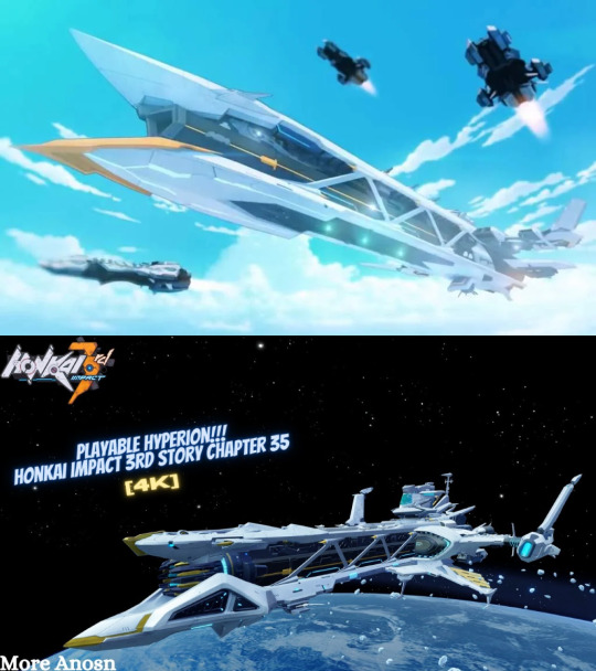
Link to the YouTube channel of the person whose thumbnail I yoinked off of Google Images for this; it was the best image of the new Hyperion that I could easily find which is why I used it for this.
TL;DR:
Original Honkai Impact 3rd designs tended towards large, simply shapes that gave battlesuits (and other stuff) a strong "mecha" vibe. Many newer designs are trending towards more complex designs that do away with these simple and recognizable shapes, instead using more overlapping textures and ornamentation to create detail. Some designs balance the two, using large and relatively simple shapes that still carry enough detail to stand out as newer while still keeping the original vibes.
Because of this, I think there's gonna be a very clear visual split between Part 1 designs and the APHO+Part 2 designs because of this split between simplicity & complexity, and some Part 1 designs feel off because they stray too far from the original design motifs, making them feel out of place even if they're still good designs on their own.
~
I've been thinking a lot about the design philosophy of Honkai Impact 3rd for quite a while now. As someone interested in concept art and illustration and who's played video games for more than 3/4ths of their whole lifespan.
And obviously I'm not alone in this, given how often I've seen discussion of Honkai's character design. Whether it was the march of the pastel battlesuits or the techwear of the part 2 cast or the upcoming Garuda Fu Hua battlesuit, many people have had many opinions both positive and negative.
But I've wanted to do a sort of "deep-dive" for a while now, because I think HI3rd is a really interesting case where we can see the co-existence of (sometimes drastically) different designs made years apart from one another. It's normal for the style of a franchise to grow and change with time- my personal example is Halo, with obvious differences between Halo CE, Halo 3, and Halo 4 in mind. But typically that has been done over the release of different games over many years, not so much in consecutive releases within the same game. HI3rd's not alone in this regard, of course :)
I don't want to label anything as "bad" or "good". I can like or dislike something, and that's my personal opinion. Of course I COULD try to label designs as bad or good, but I'd want to back that up with serious analysis and get the opinions of other players, and that's way too much effort for a reddit post. Instead, I want to present some different designs in Honkai and share my thoughts, so others can feel free to agree, disagree, elaborate, etc. More of a matter of casual discussion rather than trying to present some solid theory, I guess you could say?
What I will say is I intend to label designs based on whether (or how) they fit into HI3rd's aesthetic(s), so that's the main point- not so much whether an individual design is good or not.
To start with, I'd like to talk about the simplicity vs. complexity of Honkai designs because I personally feel like this is the biggest problem I have with HI3rd, outside of story issues that is. Not because of designs being "good" or "bad", but because I feel like Mihoyo has been moving towards a new design philosophy that's different from what I loved most about HI3rd when I first started.
I opened with the comparison of Hyperion because I think it's a perfect example of this concept, and if we can understand what the difference is with Hyperion then I think it'd be more apparent with battlesuits as well. I also have another image that highlights some of the biggest differences between the two models:
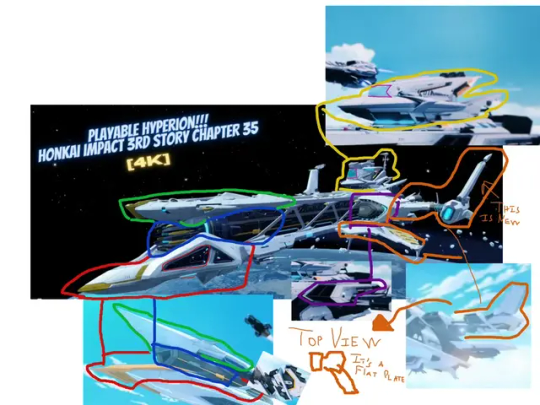
I had mixed feelings about the reveal of the "new and upgraded" Hyperion during the moon arc. It's a neat design I'll admit, but I felt like it deviated a lot from the original Hyperion, not as a difference in fidelity and detail but rather as a difference in the fundamental design of the ship.
What I like so much about the original Hyperion is, as you might have guessed by now: its simplicity. Hyperion was comprised of much larger, blockier shapes with more clear silhouettes. It's actually the same reason I love the design of Halo's UNSC frigates, funnily enough. I'm a huge sci-fi fan and I absolutely adore spacecraft and vehicle design, so I really appreciated the design of Hyperion cause to me it felt very original.
The new Hyperion retains most of the same characteristics, and it's still recognizable as a version of Hyperion. But it bothers me just how much the design was changed. Many of the simple shapes of the design were broken up into smaller parts or almost totally changed, like the cannon going from a sleek polygonal barrel to a spikey... thing.
To me, it feels like Hyperion was redesigned with the idea of trying to make it more "futuristic" or "tech-y", or perhaps it was even designed with some retro anime motifs in mind like the Space Battleship Yamato. But it seems as though this was done by adding many objects that broke up the original silhouette, as well as inventing lots of new detail instead of adding details to complement what was already there. The shape of the winglets was greatly changed; the vent-like structures were totally changed; the barrel was completely changed; most noticeably, the bridge was drastically changed.
The new Hyperion model is technically "better" in terms of fidelity and the amount of detail it has, no doubt about it. But I think changing the fundamental shapes of Hyperion so much really hurts the charm of the original design, to the point that I was actually quite disappointed to see that Mihoyo used the new Hyperion design in the CG of the Captainverse Hyperion farm event. It seems as though Mihoyo wants to consider this as the new default impression of Hyperion, and not a special one-off thing from the moon arc.
I think this can be seen across other aspects of the game, too. In general Mihoyo has moved away from simple designs and towards complex designs, and I think there's been a lot of hits and a lot of misses with this.
For instance, I'd like to compare the three Herrscher Kiana battlesuits: HoV, HoFS, and HoFi.

There's a clear trend of an increase in complexity across the three battlesuits. HoV's design uses fewer and larger shapes, HoFS adds more and smaller shapes, and then HoFi is almost totally devoid of any large clear shapes.
To me, this is what distinguishes a battlesuit that "feels like Honkai" from one that doesn't.
Everyone starts the game in Chapter 1, and most long-time players have spent more time with older battlesuits than newer ones simply because they were playing the game before these newer battlesuits were even released. I think it's safe to say that even though HoFi is the grand "Kiana in her greatest form" battlesuit, most players will still have seen HoV's design more often because of the years that it's been around, and its prevalence in story content.
Most of those older designs were rooted more heavily in the mecha vibes early Honkai had. For instance, even though HoV is obviously not wearing a mecha battlesuit, the large blocky shapes are still reminiscent of armor, two examples being the large frames on her wings and the large white pad-things(?) on her sides. There's other obvious cases like White Comet being a skin-tight battlesuit which used glowy energy bits for its attacks, but I use the example of HoV because it shows that HI3rd was fully capable of creating battlesuits within the mecha theme without being limited to literal "mecha" designs. HoV's battlesuit is far from mecha in its nature, yet still fits perfectly with that aesthetic.
HoFi has pretty much none of that, though. It's a pretty design for sure, but it's also nearly completely divorced from that original aesthetic. There's few easily-recognizable shapes on her design, with the (very little) clothing she wears being almost entirely detail and ornamentation. It definitely fits the "Princess Kiana" or "Goddess Kiana" theme in isolation, but I don't think it delivers on that theme in the context of Honkai Impact 3rd.
Yet look at HoFS. HoFS definitely has more detail than HoV. Yet there are still lots of large blank areas that define clear forms; for instance, the armor on HoFS' waist. It's reminiscent of that of HoV while still adding more detail. This gives that same effect of a slight mecha vibe. It's still an appealing design and it still feels more modern than HoV, but it also manages to retain much of the same design language.
That being said, I have to admit I ADORE the Honkai wings that HoFi has, though I wish they were a little higher in the air. That's one thing that I think Mihoyo absolutely nailed with HoFi, and I wish more of that aesthetic was kept in the rest of her design.
What's also interesting is that (in my opinion) neither of the other two main Herrscher Trio designs suffer from this. For instance, consider Mei's battlesuits:

I've included Lighting Empress as a reminder that old =/= good. I'd like to make it clear that just because it's an "original" battlesuit doesn't mean it's a good one. I said before that I didn't want to label stuff as good or bad but this is a clear exception and I hope y'all can understand why, lol
We can certainly argue about whether HoO Mei's design really fits the image of Raiden Mei. It's a vast departure from her other battlesuits when it comes to her palette, for better or for worse. I didn't like it at first but it has grown on me, and I think part of that is because of that concept of simplicity vs. complexity.
HoO has way, way more detail than the other two Herrscher Mei battlesuits, no doubt about it. But it also retains many large and recognizable shapes. Nothing on this battlesuit is bulky like HoT or other older battlesuits, but it still gives off the feeling of being armor despite being so thin. Much of the detail is created not by overlapping layers of ornamentation and texture, but rather by using intricate shapes with clear silhouettes and light detail inside that outline.
And HoTr is obviously a mecha design, so I don't think we need to elaborate on that one :)
The point is that it's absolutely possible to make detailed and beautiful battlesuits without getting rid of the original shape language that HI3rd was built on. HoFS is a bit dated now but still much newer than HoV, yet it keeps the vibes. HoO is also far newer, yet it still fits the theme of battlesuit. HoFi, though... not so much.
Finally, I want to talk about the elephant in the room: the Part 2 character designs.

Once again, here's the link to the YouTube video by Matt Is Playing, where I pulled this image from!
Much like HoFi, there's very little trace of the OG Honkai mecha aesthetic in these battlesuits. It's not to say that they are inherently bad because of that* , but it doesn't quite feel like "Honkai Impact 3rd".
*except Dream Seeker, I'm sorry but what the heck is going on there???
But the thing is that this design philosophy isn't even new. In fact, it's years old by now... because we see this in APHO.

For a long time now, APHO has had battlesuits that tip-toe on the very edge of the original Honkai aesthetic. So the designs of Part 2 aren't actually some new and drastic shift in Mihoyo's design philosophy- rather, it's reinforcing a design philosophy that was introduced with APHO.
These new characters all feel out of place if we compare them to the original battlesuits. They don't use the same simple forms, instead using dense and overlapping details. But if we compare them to the APHO cast, they fit right in. We can argue about the merits of the new character designs in other terms, but I think these discussions have to keep in mind this context.
I'd say the APHO designs work well in the setting of APHO because they're following the same aesthetic. As we enter Part 2 and once we see more of the story and setting of Part 2, it's very possible that these new character designs will feel more natural and more like "Honkai Impact 3rd".
But it's a different Honkai Impact 3rd.
This is why I think the idea of "simplicity vs. complexity" is so important to understanding Honkai Impact 3rd's designs. I think Mihoyo might be trying to emphasize two different phases of Honkai through this design philosophy. These are going to be two very different halves to the same game, with the designs of Part 2 possibly becoming as distant from Part 1's designs as Part 1 is from HSR.
You have the OG mecha action vibes from the good ole St. Freya days, and we have the sleek tech-wear of the era of exploring Mars, world-hopping in the Sea of Quanta, and fighting literal aliens.
For better or for worse? Only time will tell.
As a bonus, I'd like to include some extra comparisons, though I won't be adding any more analysis. It's more about having extra examples to keep in mind. Also, I think these ideas can apply to enemies and weapons as well, but that's a larger discussion I'm not yet ready for so that will come in a follow-up later on!


#honkai impact 3rd#hi3rd#honkai 3rd#honkai#honkai discussion#as if that's even a tag people use lol#long post#Kiana Kaslana#Raiden Mei#Bronya Zaychik#i just realized after posting this that I used the wrong image for stygian nymph jgkldaflhflhadfhagh too late to change it now!
38 notes
·
View notes
Text
Just saw a really clickbait-y youtube video that called Blue Lock fascist in its thumbnail and I will admit first and foremost that I didn't watch it and yes I've been informed that it isn't implying that Blue Lock is some fascistic propaganda but it still got me thinking so-
here's my rant/breakdown about the ways that Blue Lock is specifically anti-fascist
So first of all, popular animes and mangas having possibly fascist undertones is nothing new. I won't deny that there's a long history of Japan being a colonizer and commiting atrocities that are still brushed off or forgotten about to this day. And this does seep into some works that I personally choose to not engage with for exactly that reason. Miss me with trying to be an apologist for or glorifying real world war crimes- But Blue Lock specifically? I'd be extremely hard pressed to call it fascist.
Fascism is defined as an alt-right, ultra nationalistic political ideology usually characterized by a centralized autocracy, forced suppression of opposition, belief in a natural social hierarchy and subordination of individual interests for the believed good of the nation or race according to Wikipedia. First let's go through the ways Blue Lock does match up with that.
Ego can be easily viewed as a dictator near the beginning of the manga
Most characters thrive on putting others down for their faults and strictly believe that there is some sort of natural order where people who lack "ego" are at the bottom
There is a sort of central autocracy with the top 6
Near the beginning especially, there is a violent snuffing out of any ideology that dares oppose egocentrism or the idea that you need to be a solid team to win a game
Now let's go through the ways Blue Lock denies and even goes against Fascism.
BLLK's main goal is to make a Japanese soccer team that can win a World Cup. In a more fascist manga, we would see racism ga-fucking-lore. We can see this in animes that have more right wing leaning undertones like Attack on Titan where when race is brought in it's for conflict. There's no possibility of harmony, only winners and losers. Those protected and those put down and punished.
And Blue Lock does have an extreme focus on who wins and who loses. It is not afraid to include racism against Japanese people like with Adam or portray black people in unsettling and kind of racist ways like Dada's original design. But these elements don't automatically spell fascism. Blue Lock is careful to portray characters of color as just that, characters. They don't exist to tell you about their lives of hardship and struggle and they don't exist to justify Ego's obessesion with creating a good Japanese team. As you read BLLK, you'll notice that the artist has taken care to get better at drawing different body types and facial structures. The character design isn't trying to sell some perfect ideal like fascism so famously does, it tells you a peak athlete doesn't have one distinct look. It tells you characters from other countries are just as if not more capable than the Blue Lock boys. Hell, even Sae's hatred of Japanese football is portrayed as less of a betrayal of country and pride and more of a cultural clash. The issue to be solved in Sae's character is the way he looks down on his brother, not how much he despises Japanese football teams' tactics. We know this because Ego himself rails against them too.
A fascist manga would paint Sae as a villain for even learning from and joining teams from other countries, lending them his talent instead of keeping it in his home country. But Blue Lock encourages diversification and collaberation with other nation's teams so heavily that it is literally an entire like 5 part arc right now. Ego isn't ultra nationalistic, he just wants to make a better soccer team for his country and he isn't afraid of praising and adopting from other countries in the process. The biggest win to come out of a Blue Lock team wouldn't be that they're all Japanese but that they all follow his ideology.
Speaking of his ideology, Ego is extremely harsh and controlling, yes, but he also believes in the boys. He lets them do what they believe is best. He pushes them to their limits, not because they disobey him, but because they dissapoint him. A true fascist dictator would rule with fear with no introductions of other ideologies, he would strike at any sign of weakness or opposition. At the beginning, he does do this. But as the manga goes on we see how much wiggle room he's willing to allow. He lets Isagi curse at him and question his leadership, he lets Shidou play even though he's clearly queer and extremely volatile, he doesn't punish any of the boys for injuring each other. In a fascist society, you are expected to fit an ideal or be othered, be perfect and work together with a sense of comradere because that's the only way to prove your claims that you are the best race/nation. There can be no imperfections or cracks in the facade...But Ego lets the boys be messy. He never forces them to change who they are, only forces them to believe that they can do great things all on their own. Even with Kunigami, Wild Card wasn't a correction of his disbelief in some nation or race, but instead a correction of how limited his mindset was. In fact, in a more fascist society, Kunigami's love of playing hero and protecting his teammates would be praised and celebrated. Ego putting individuality and aspiration over the good of the team as a whole is literally a middle finger to fascism.
The villain of the series is literally a greedy Japanese man that wants to commercialize the team and make them less individualized. I don't know how much more anti-fascist you could get-
Also, Blue Lock handles disability very carefully and very well. In more alt-right ideologies than not, something you'll see again and again is this idea that disabled people don't deserve the same rights because they can't contribute to society. Disabled people are a stain to be pushed away and hidden because they contradict the central idea of a "perfect" nation. In a fascist retelling of BLLK, Chigiri would be kicked from the program, not given power and influence. In a fascist retelling of BLLK, Kenyu would be attacked and beaten as soon as it was discovered that he made it into the top-six with failing eyesight. Any physical disadvantage could easily put an athlete at the bottom of the social hierarchy as well, Blue Lock could have very very easily made fun of its disabled characters for even trying. It could get away with mistreating these players and be defended for it so fucking quickly. But instead, it lets you root for them and gives them just as much care and weight as the others. It's trying to tell you that being a good player sometimes means knowing your limits and getting help, not punishing yourself because you have some biological disadvantage. It also takes care to demonstrate that no race is inherently worse at soccer than the other.
And, of course, the elephant in the room, Noa and Kaiser. Okay...if you see German characters and immediately think OMG NAZIS??OMG FASCISM?????OMGGGG HE HAS BLONDE HAIR???AND BLUE EYES?? That's a fucking you problem and you clearly aren't reading the manga. Even Noa Noel being an older man and still being allowed to play and looked up to as the best is an example of how Blue Lock goes against steriotypes about athletes. Kaiser does have blonde hair and blue eyes yes, but he also wears eyeliner and eyeshadow and has a tattoo and dyed hair... None of that would be allowed in an actually fascist Japanese manga unless it was as caricature to make fun of and dominate. But instead, Kaiser is an actual threat who has complex arcs and behaviors. Also, Kaiser isn't fascist himself, he clearly views Isagi as an equal even though they're different nationalities and he doesn't believe in any one authority or greater cause except for himself. Noa is very strict yes, and he does rank and rate the boys, but he specifically doesn't factor race into it. He also, just like Ego, allows other ideas and patterns to emerge even if they mess up his own plans for matches. He doesn't suppress anyone and is actually extremely lax. If you think he or BLLK is "fascist", look at actual real world sports teams and their strict practices or past statements about other nationalities.
Isagi as a protaganist is anti-fascist too!!!! He's a Japanese everyman who has good Japanese parents, no disabilities, an honest personality and believes in a future where Japan wins the World Cup. In a fascist story, he'd be fucking untouchable (ESPECIALLY against characters from other countries) and all of this would be paraded as proof that a Japanese soccer team is clearly superior and all-dominating. But no! He gets beat down, questioned, disrespected and constantly shown up by others. He's not special and he's extremely self-centered. He doesn't water his own beliefs down for the "good of the nation" or whatever the fuck and he grew up idolizing foreign players. Isagi never supresses other people's ideologies, he just makes fun of them if they fuck up. He's never xenophobic, even when other characters have moments that have xenophobic undertoens like Adam or Sae's comments. Isagi Yoichi's character could have a few traits flipped and be a poster boy for some alt-right manga about how superior Japanese people or hell, Ego's pupils are. But he doesn't. He's simply designed and he's rude and he looks down on people, but he also apologizes, humbly accepts when he can improve by questioning his own ideals and is open to talking with everyone he comes across.
Calling Blue Lock a "fascist soccer manga" is not only demonstrating that you have no idea what fascism is, but also disgustingly painting over all the beautiful themes and messages within the manga.
Again I'm aware that that original video wasn't aiming to negate any of these points but I have seen people make claims and jokes before that about Blue Lock's more *beat it into your head* tendencies with ideology. And I've seen jokes specifically about the German team/the way Sae seems to just hate Japanese culture. I just dislike the painting of Blue Lock as a jumping point for discussions about fascism and its effects because of the way it handles themes like cross cultural connection, family pressures, capitalism and disability so carefully.
#blue lock manga#bllk#blue lock#plot analysis#JUST HAD TO GET THIS OUT THERE#and yes i have blocked people for kaiser nazi memes so don't fucking make any . he literally wears eyeliner and has a homoerotic obsession#with an asian guy. the nazis would hate his ass#character analysis#character examination#bluelock#bllk manga#bllk anime#bluelock anime#anyway i detest everyone who acts like blue lock having some extremely strict rules etc = it being ultra right wing#there's horror in it for sure but not that way#in fact it takes EXTRA EXTRA care so that it wont be taken that way#like you clearly dont actually take japans history seriously to try and paint BLLK as nationalistic#There are so many better examples..stop eroding peoples media literacy#And i DO NOT want people to start reading blue lock bc they think its fascist or they think it has controversial shit in it. like ew.
44 notes
·
View notes
Text
-blows dust off this blog-
So
Little Nightmares III, huh???
I was trying to avoid being excited about it because no solid release date and 2024 could be a few months from now or a year from now and Idk how long I can handle being so fuckin hyped for this game YEEHAW
BUT I CAN'T, I KEEP THINKING ABT THE GAME AAHAHHGAGA
so here are my thoughts, if you wanted to know
FIRST OF ALL, i am so glad that after we saw LTNM II we thought it'd be co-op but it was just an AI, that we finally get co-op! AND ONLINE TOO, i spent the first day worried it'd be shared screen same room situation since i wasn't trying to get my hopes up but then I realised I can just.. google it.. AND IT IS!!! ONLINE!! IDK WHO I AM GONNA PLAY IT W FIRST AAAAAAAA
anyways, you can definitely tell it's a new studio working on this game, the world feels mostly the same but the character designs themselves are definitely stylistically similar, but not the same. With Six especially, the MC designs were very simplistic and realistic but used colour (or for Mono, a single design quirk being the bag) to stand out against their backgrounds and against the enemies which are largely neutral colours. But these new ones feel... "over designed"? On their own they definitely aren't, but in comparison to Mono, Six, Seven, and even NPCs like the flashlight girl, they have a lot more going on (especially the little wrench kid, Idk which one is Alone and which one is Low yet btw OOP)
Despite it being a new studio and you can tell, new puzzles and environments, they're still doing their best to have the OGs vibes and whatnot to feel familiar, namely in the trailer they bring back the fuses, and the additional gameplay video there's a short scene with an environment with all the shelves you can find in LTNM 1s gnome section (the one with the cart that is affected by the Maws swaying).
But regardless, it still feels different enough my brain is still nervous about it. I also feel In A Way about Tarsier having LTNM II explode and their franchise getting the attention it deserves, only to have it stuck with Bandai and now it's going to likely explode again and they aren't involved. Idk how anyone on that team feels about it, but if it were me omg.
Also the only boss we've seen so far (i hope they add more and i def want some to be a surprise so im not gonna assume this is the only one for now) feels... out of place? it has the design qualities of a LTNM boss, but the size of it makes it more of a spectacle than a warped/corruption of an adult. All the previous bosses fit in their environment, we are the small ones and they are scaled to the world around them. This is the first time, outside monster Six who imo is a bit of an outlier anyways due to her circumstances, we're getting a boss who is this huge and doesn't even fit their own environment. I hope we get a lore reason for this in some way, because currently the boss doesn't have the same vibe as the others and it's throwing me off a bit. Don't get me wrong, it'll be terrifying, but looking at the picture as a whole they are sort of out of place for me rn. I don't hate the bitch either, I'm not gonna be like omg get rid of it or change it, but it does strike me as odd seeing it for now.
And yes the tall man is too tall for a lot of things, but he's not THAT big. He's more like yer tall guy who hits his head off doorways, which happens irl anyways LMAO
Little Nightmares primarily tries to capture the feeling of being a small child and how everything is big and scary, but a doll that huge is out of the realm of reality set up for us already. It's gone from scary corrupted animal to godzilla, if that makes sense.
OH AND THE MIRRORS ARE VERY LTNM COMICS OF THEM TEE HEE < 3
#while i find the MCs designs to be a bit much for now they're fast growing on me as characters#they give me indie movie vibes more than little nightmares MCs vibes#but hey if we get a 4th installment then it goes from an outlier to part of a trend#my brain will get over it eventually anyways these are just my initial thoughts#oh and as long as they either dont bring back the flashlight or change its controls im mostly fine w the puzzles and whatnot#like suuuuuper minor gripe but i loved in the first games that when you had a weapon it was too big and too heavy#they had serious weight when you swung them and the mcs clearly struggled#and it really helped you feel powerless even when armed#i know the masked kid has a slingshot btw but i just hope it isnt used as an easy weapon and more as a distraction#having any kind of upper hand in this world sort of diminishes the initial scare factor they were going for#being that youre a small child helpless in this world#outside sixs ending but aside from the hallway you literally dont play w her power at the end#text#long post#little nightmares 3#ltnm 3#ooc
66 notes
·
View notes
Text
The 16th Day of G-Witch: Father and Child
Alright, let's get this over with. Look, if you like this episode or Guel, you might want to skip this one because I'm about to be a hater here. Also as a heads up, I decided to avoid the shot of Seethia's body in my screencaps, because as much as I dislike this episode, that's still a tough moment and tough to look at.
This episode pisses me off, and it's IMO unarguably the worst episode in the entire series. It's all so incredible pointless and irrelevant to the main story, and ultimately a gigantic waste of time that should have been spent elsewhere. Olcott and the Dawn of Fold do not play any role in the rest of the series, and the short 5 second scene in the final episode felt more tacked on to try and even remotely justify why nearly an entire episode was spent on them. Guel is not that integral to the main story that he deserved a chunk of an entire episode dedicated to his development and essentially putting him in the main character seat for an episode. The only impact this episode had later on in the show was so Guel could recognize that one kid on Earth who let slip Shaddiq's secret. Which was already a ridiculous coincidence that it could have been replaced with nearly anything.
It's insulting and sexist that in the first Gundam series with a female main character, they completely sidelined her for an entire episode just to let the most popular male character play at being the MC for an episode that has almost nothing to do with the main story and was designed to be more like a traditional Gundam episode than what G-Witch was. It feels like something that staff were ultimately forced to keep in so the executives who feared the show failing could distract fans who hated it with the standard Gundam tropes and a male character in the lead role, like jingling shiny keys in front of someone's face. And the worst part is? It worked. A chunk of the fanbase LOVED this episode because it felt like a classic Gundam episode and made them want to throw away what made G-Witch special and unique for more of the same shit they've had for 40+ years.
And all of that cost the show time it desperately needed to spend on the main story and characters with way more importance than Guel or Olcott. The only good thing I have to say about this episode is that the Prodoros IS a cool mobile suit. I hope it gets a model kit someday.
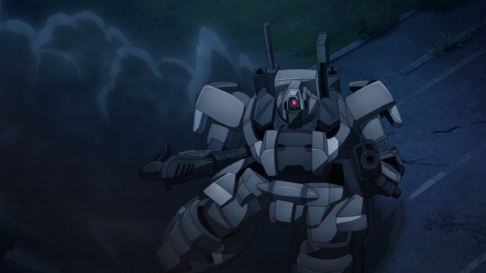
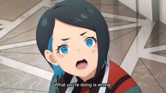
I've got to agree with Norea here. Nika is incredibly naive about the situation Earthian's face. Wanting to solve problems without violence is certainly a worthwhile goal, but not one that is always practical. Sometimes violence and war is necessary to overthrow tyranny and oppression. It was made clear in S1 than when Earthians peacefully protest their terrible conditions, they're met with violence by the Benerit Group. And when peace is no longer an option, you have to use violence to fight back.

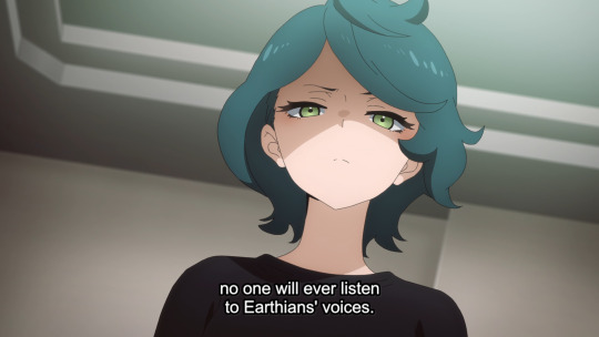

Likewise, I actually think Shaddiq gets a bad rap from a large part of the fanbase. Some of that is rightfully because of his actions towards Miorine, but a lot of it I think comes from the sort of people who just like to yell "WAR IS BAD" and do not comprehend that in some situations, war is necessary to overthrow oppressive groups like the Benerit Group and Spacian Governments.
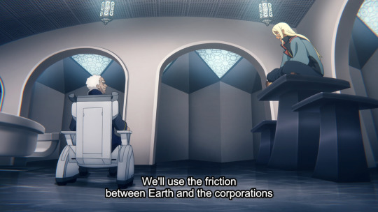
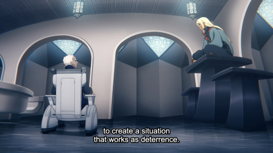
Giving weapons to Earthain groups is a solid idea that will even the playing field and make it difficult if not impossible for space to opress Earth through force, forcing them to the negotiating table for equality, and if all else fails, kicking them off Earth and reclaiming their resources themselves. My only concern with Shaddiq's approach is that I'm not sure he wouldn't try to lead Earthians even further into oppressing Spacians as revenge.


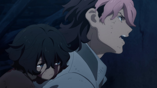
This is actually the one time I don't fault Guel for trying to do something "heroic." Trying to save Seethia, while probably being ultimately pointless, was a good thing to do. It's just a shame that, despite literally having a child die in his arms due to an attack by the Benerit Group, he learns all the wrong lessons from it.
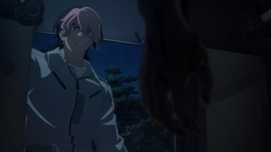
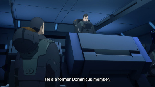
This conversation serves absolutely no purpose. It doesn't actually make any sense (he was a member of Dominicus, Earthains attacked him and killed his family and now he...works for an Earthian terrorist group?) and ultimately it's a completely meaningless detail that has absolutely no effect on anything.

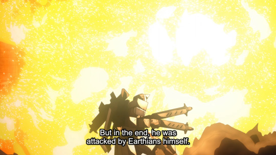
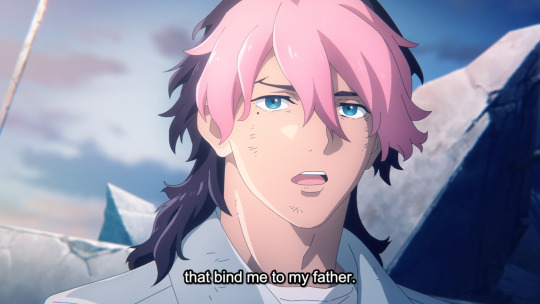
And finally, the cherry on top, the downfall of Guel's character. I really tried to like him, but this was very much the beginning of the end. After going through a trauma conga line and learning NOT to play the hero, Guel finally sees what his father's company has been doing to Earthians his whole life, and even has an innocent child die in his arms because of the attack.
And the lesson Guel takes away from all of this is that he wants to save his father's company and keep the oppression machine going? I get that maybe Guel being the one to fail and not break free from the shadow of his abusive parents was the whole point of his character arc (Kashtanka), but it's still disappointing.

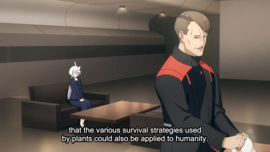
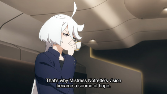
And after all that bullshit, we drop these incredibly important details in a post-credit scene at the end of the episode. All of this information, from what Notrette intended to do with Quiet Zero and what happened to her, was way more important to the story than everything that happened in the previous 20 minutes. But all it gets is a short scene at the end of the episode and is never further elaborated on.
This should have been the episode we learned more about Notrette and Quiet Zero, maybe even more about Prospera and Delling. Instead we got Guel and Olcott's pointless adventure.


22 notes
·
View notes
Text
Castaways: Cast Trigger Commentary
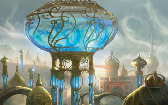
I'm honestly a little surprised at all the cards that we got this week, and I'm overall quite happy with the variety of the cards that I saw and the range of strategies employed. It was hard to choose winners and runners from this mix, and the commentary was quite thought-provoking. Overall, I'd say that with much of these cards, complexity had to be tempered in order to get the most powerful results.
Cast triggers are nuts. The ability to have an uncounterable effect (sort of) that uses the stack can lead to some strange encounters, and there are still some folks learning MTG that have difficulty understanding what it means to "cast" a spell. Lord knows that explaining it to my students can be quite strange, and they're used to things being played just by themselves. When does this happen? How can I respond? What are the best responses? And it's not just about the responses, but how the cards interact on board that shows their design chops. Lots of cards this week made me want to brew, and I love contests like these.
There are quite a few Judge Picks this week. These cards have specific aspects I want to highlight for some reason or other, so pay close attention. With this many contenders of this strength, choosing the top cards was incredibly difficult, as I'm sure you can imagine. Read on!
~
@aethernalstars — Ash-Cannon Goblin

I think my favorite part about this card is the flavor text. It doesn't grok perfectly, but it's playful and enjoyably goblinesque. As far the card idea, the idea is solid enough. What's bugging me is the fact that this is essentially kickerless kicker. The cost is an optional part of casting, and yet the trigger is also part of the casting. There would be no need for this kind of wording unless this started as a kicker idea and was shifted into a cast trigger, which it honestly doesn't need.
As an ETB effect, I would've liked this card a lot better. The cast trigger here isn't doing anything that an ETB couldn't or wouldn't do, if that makes sense. If you want to keep this design, I think that spending your graveyard to smack face/creature/planeswalker is totally fine; honestly, this could be a decent uncommon, because it's a single-use kind of card. Graveyards are great resources and limited resources. For this specific contest, examining the 'why' of cast triggers may have led to other considerations. At it stands, I still like this card and would suggest a couple wording revisions, perhaps. Also make sure that you avoid run-on sentences!
~
@brookeuwo — Spitefellows (JUDGE PICK)

You've got a Horizons-y mindset here, don't you? Bet you think you're clever? Well, you are, and I initially was going to be wishy-washy on this card for the name being a reference but that's what a good chunk of Horizons cards are sometimes. And you know what, I'm down for it. The trick is making the homage feel like an homage, and in that I think you succeeded. In terms of power, this card's also got a lot going for it. As much as I worry about the power of cast triggers, this card's got decent power going for it.
Most importantly, it's a blowout that's pretty much only a blowout in limited. It's a five-mana 2/2, which is...very bad comparatively, even if you get two of them. So essentially you're making two bodies, right, but then the evoke cost is where the blowout removal happens; I'd say that nine times out of ten you're just going to clear a board with this card, or at least make an incredible impact. You're clogging MODO with triggers, but I mean, high complexity is fine if it's warranted. I think that as a Lorwyn callback and a Horizons power-level card, this is pushing it but not so much that you'd have problems except at really high-skill levels. Phenomenally fun card and a great idea overall.
~
@cthulusaurusrex — Wavebringer (JUDGE PICK)
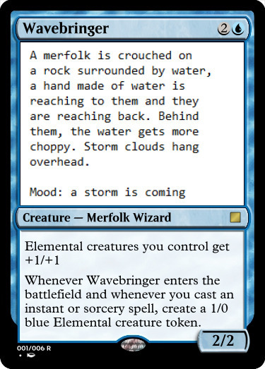
Attaching the cast trigger inside is an interesting move, and ultimately, I think it works quite well here! The lord-body is one of those ones that can go into any Elemental deck, but the callback to Master of Waves has not gone unnoticed. It's also interesting how you've made it so that this card wants more of a spellslinging deck whereas the Master wanted a permanents-matter deck. Could you run them both? Well, perhaps, if you managed to get them on board and then start slinging like nobody's business. What I'd want to do is play this card with Quasiduplicate effects and then really get things going.
What I'm trying to say in the end is that this kind of card is the kind that makes me want to play it and makes me understand why it exists. I don't know if it's necessarily breaking new ground, being a callback, but it's doing a number of things differently, and I think that if absolutely nothing else that this card is overwhelmingly good. The chops are there and the rationale is there and the play style—you guessed it, it's there. If I have any reservations, I suppose I'd like an inch of flavor text, but even then, is that necessary? Arguably, doesn't have to be there; the AD makes it pretty clear what the coming storm would be. So maybe all that good stuff is worth commending on its own, you know?
~
@curiooftheheart — Bellowing Boars (JUDGE PICK)
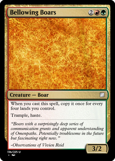
I really want to like this card's power level, because it's actually quite striking. A late-game ramp deck that can get eight or even twelve lands can absolutely run away with this card. On turn four, getting two 3/2s with trample and haste isn't anything to shake a stick at, and the ability on turn eight to get three of those AND have four mana left over, potentially, is fascinating. It makes one focused on the late-game potential of stompy decks, and that's pretty darn cool overall. The more I think about this card, the more I find the design tech actually really great for limited.
And I mean, I have to assume that all that thought went into this when you designed this card, because it's actually completely unique as far as I can tell from a cursory search. The only real grumbling I have is in the overwrought flavor text. Paring that down to maybe two lines would've suited the rest of this card's strengths well. Does it have a specific setting, something that Vivien observes that's fascinating for her? A lot of adjectives hamper down the writing here and I do wish I could be less of an expletive—but it's honestly really distracting. Look: this is ultimately a card design contest wherein presentation matters. This card is substantially well-made for the nature of this contest and everything else is a me problem. Where is this going? I swear I had a point what wasn't a half-assed pseudo-apology. Ah well. Damn boars, running through my consciousness.
~
@dabudder — Gracie, Substitute Teacher


This is definitely a commander-oriented card. I'm looking at its applications, and honestly, I'm not sure I'm convinced I see the upside? Drawing into cards would be nice, but the benefit of casting one spell into another feels a bit wonky. That said, there are mechanics like Escape that make the benefits fun, and with prowess you've got a bit of a nice beater sometimes. What's the shell that really wants this card, though? I can imagine that you could have fun with Suspend cards... Ooh, actually, imagine: turn 2-3, plot a couple cards, then turn 4 play Gracie and cast some stuff from exile. Trigger, cast Ancestral Vision/Profane Tutor, etc.
So it's not that I don't see the combo appeal! I think this card isn't a card for me specifically. Getting cards back from wherever you're casting them can be fun—command zone as well, considering you can get your commander to hand fairly easily. In limited, I think building around this card would be weird, and explaining that the initial spell getting cast wouldn't resolve is also weird, but hey, it's what it is. I feel that this card has strong "fun" application. Practically, this is a card for someone who's not me, in a format that's probably not a premier set. But who knows? As a side note, I think you also captured a lighthearted Strixhaven feel quite well. I substitute myself and lemme tell you, it's not half as magical...
~
@feyd-rautha-apologist — Demon of Final Moments
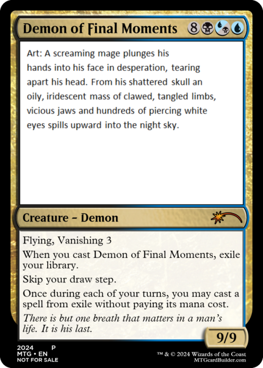
As a small note, I recommend in your art direction that you have the focus on the demon, because I totally was digging the focus on the mage until I actually saw what the card was. That said, damn effective work there. As for the card, you are looking at some weird weird weird stuff here. By "weird" I mean that this card is a combo piece whereupon you cast it and win the game. how so? Let us count the heckin' ways. Thassa's Oracle is the most obvious one, but Laboratory Maniac plus any draw effect is there, as is an Inexorable Tide with exiling extra turn effects like Karn's Temporal Sundering and the lot. Cast this spell and you win—there really isn't any other reason to play this card.
In limited, I wouldn't imagine that this card does much good if the removal in the set is worth its salt. Play it and bam, it's removed, you lose instantly. There are so many ways that you lose with this card, especially if it gets countered; it's fragile as all get-out. A design that either wins instantly or makes you lose just as fast is... Well, not exactly what I'd call good gameplay, I'll say that much. Additionally, if you cheat this card out, you have the situation where you can just play the game normally and encounter loops with said extra turn shenanigans (assuming proliferation of time counters). I'm afraid this one goes into the "busted" pile. Side note: I feel that the flavor text could have been one sentence with "his last" coming after a colon, but I'm down with the concept.
~
@fractured-infinity — Curse's End


Reading up on what the Curse of Wandering was/is on Amonkhet, I'm uncertain that this card is vibing with that flavor. The Curse is an aspect of the plane, and so is this card saying that the whole shebang is now over? What had caused it in the first place? If it predated Bolas, what's going on with the mystery? I feel that this card is saying that the Curse is an actual curse with a source and a way to end it, which... Eh, I don't feel the meshing, but regardless. the card itself is a great mythic with only a couple minor issues.
Firstly, there's the question of how this card would function if this contest didn't have a cast trigger. I would imagine that instead of a cast trigger, the better design would just be to exile all creatures and all creature cards from graveyards. While this does have the benefit of putting a bunch of ETB triggers on the stack, there are better ways to go about the exact execution. Besides, why not have a deck that uses this cast trigger then counters the actual spell itself? That kind of defeats the purpose of the card, I think, a little cheatsy-shenanigans that feels like a workaround rather than a function of the card itself. Maybe if there was an additional cost or caveat, I would buy it, but I'm not convinced at this iteration.
~
@greensunzenith — Swarm Vanguard

The short answer is that this card is funny, funky, and probably not that broken. As for whether or not it's common, that's a rough one. Cast triggers at common are...odd, too. The best one I can see is, oddly enough, Supernatural Rescue (as a rarity-to-complexity comparison). I think this should probably be an uncommon, because copies of permanent spells becoming tokens doesn't exactly grok as well as we'd think, especially when you consider that you're going to have many, MANY copies of this card in your deck. After a point, how easy/hard would it be to keep track of on paper? Probably easy if you used things that didn't resemble actual copies of the Vanguard, but whatever. At least it's a vanilla creature.
When you have an effect like this, one must ask: would this have been more easily grokable as an ETB trigger? Honestly, I think the answer is yes, and it's unfortunate with a design that tries to go for this amount of elegance at common. Entering and making an insect token for each card with the name Swarm Vanguard in your graveyard would've probably been fine and scalable without the casting complexity. Flavor's nice, though, and the concept is solid.
~
@i-am-the-one-who-wololoes — Zarderek, the Folkslinger

I am willing to meet you halfway on some of this. Having a spellslinging GW commander isn't exactly on-flavor, but they've had Magecraft across colors before. Technically, I don't think there's anything out-of-pie that excludes it. But you have to roll with me and agree that it feels a little off to have GW be the one for Magecrafting without naming it? You know what, I'll insert an honorary piece of trinket text in front of that trigger just for my own peace of mind.
As it stands the card would play pretty normally and would make limited decks pretty nasty. Having a protective backup spell to get more bodies and get more counters would allow for Zarderek to run away with games quite easily but not without too much power by itself. I think that it does just what the colors want to do and, without feeling too weird, is a reasonable card. I don't think you could've made it any other way; RW would've been the next-best choice, I believe. Perhaps the flavor could've spoken to the world on which we see this character, something about why GW has this kind of magical expansion? Looking pretty generic for the moment, captain.
~
@khyrberos — Atraxa's Command

This card probably functions exactly how it's intended to function. I think the possibility of having a card where the modes function in this manner is pretty cool and, depending on the life paid, would make for an interesting setup. It's reasonable to assume that swinging in would get you all that life back, too, but regardless: this card doesn't really function as a command, or at least not in the way that commands are meant to function. This card is essentially a one-off that feels like a one-off, a function of itself that has no bearing on the rest of a set. What environment would be able to play this card, or want to? What limited environment could spawn it? Honestly, what preconstructed environment would have it, either?
Commands function on their versatility, and this card has none—which is fine if it wasn't technically a command, kind of? Even then, it doesn't have the "command" feel, and turning all your creatures into Atraxa for free is... I'm not gonna say that it's not fun in concept, but for lack of a better term, this card feels like it was designed for itself without a greater reach in mind. Even a five-color command with an Obelisk of Alara feel could've done the job as a "Praetor's Command" with different modes. That said, playing with Phyrexian mana is playing with fire as-is.
~
@misterstingyjack — Facesnatcher Ghoul (JUDGE PICK)
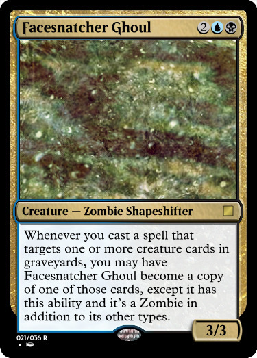
I think this card is doing everything it needs to do, and it's doing it quite well. Exiling and/or returning creatures will turn it on, and those are the most common ways to interact with creatures in graveyards at lower rarities. I love the notion that you can drop an Emrakul and then instant-speed exile it to turn the Ghoul on, but that's not happening in limited; most likely, you'll have a couple moments where you'll cast return spells and you'll be doing just fine. This card is for sure a constructed card.
And again, constructed cards are fine, because we need cards of every rarity to make things work! When I look at submissions, the first thing I think is what would happen if I opened this out of a booster pack while drafting, or something to that effect. ... Maybe it's not the first thing, but it's one of the things I think about for sure. And this card would be quite fun to build around if you can make it work, but more likely than not it's going to be a pet card, and that's perfectly fine. Targeting cards in graveyards with spells is one of those very specific things that you can't repeat much. Honestly I think "cast a spell or activate an ability" would be better for gameplay. Did you think about that and relegate it to casting because of the contest? If so, I get it, and if not, I honestly think that that would've been acceptable, just because the card itself is so tightly designed.
~
@nine-effing-hells — Panoptic Predator (JUDGE PICK)

Was this an intentional callback to Hydroid Krasis? I mean, I can imagine so, because it's got similar-ish casting capabilities, but the bodies that it can make are really nasty. I think getting a bunch of fliers can be extremely rough for limited, but it is a mythic, and getting bodies isn't the worst thing in the world. Drawing cards as well is a nasty little thing. The whole notion of perfection and eyes feels like it fits well, and ultimately the question of whether the cast trigger is necessary is pretty reasonable, because, well, it wouldn't be very strong otherwise. Five mana for, say, two 1/1 fliers and a 3/3 on the ground? Yeah, mythic-worthy, and upping that cost if pretty strong itself!
What I like about this card is the fact that it doesn't get continuously stronger. Once you cast it, that's it. There's no flickering shenanigans, there's no proliferation or +1/+1 synergy—what you see is what you get. The self-balancing aspect means that the really horrible part of going against this card is the draw power that you get after being pinged in the air a lot. But, they are only 1/1s, and those little eyes squish pretty easily. Honestly, I thought that this thing itself had flying, and the fact that it doesn't makes me feel better. Overall I'm a fan! We need more eyes in the world. The flavor of Phyrexia being gross and all-encompassing checks out too.
~
@real-aspen-hours — Tachyon Blast (JUDGE PICK)

This is a weird little idea and I have to commend it for how strange the interactions must be. I think that it has to be appropriately costed with that cast trigger, because the uncounterable Shock ain't worth nothing. What a strange little card! I feel that, in a limited game, this would be a pretty worthwhile removal spell, but the cost is somewhat prohibitive. Comparing it to cards like Trick Shot, I feel that this could've been a four-mana Instant spell that did double Shocks instead.
Well, even then, "double Shock" is a bit of a misnomer. Triggering and then shocking is pretty strange; targets being chosen on cast plus a trigger that also targets would mean that there would be a lot of rough interactions when it came to protecting and hexproof-ing. But hell, now you can take out that two-toughness Goyf without worrying about too much, right? There's a lot of thought that went into making this spell as simple as possible, and I appreciate that. The flavor is pretty neat as well, and checks out with how the Izzet work. Honestly, the flavor feels so on-point that it's almost hard to comment on, and that's a good thing. You've blended it in to the world quite well.
~
@reaperfromtheabyss — Phyrexian Glutton (JUDGE PICK)
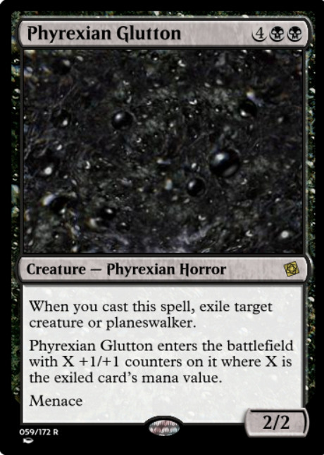
How much consideration was given to Phyrexian Ingester when it came to this card? That said, I actually see where you wanted to make this one distinguished. I feel that you should have actually blended the first and second abilities into one paragraph. Looking into similar effects, I think someone's first notion would've been to have this be an "As ~ enters the battlefield" effect, and yet, I can see why that would've been the wrong choice with flicker effects. Man, this is a tricky one! You mitigated a lot of the ways in which this card could've been broken. One other thing I like about it is that it's not an optional ability, so you'd have to exile one of your own creatures and/or planeswalkers if there were no other options.
As a control card, or even a midrange anti-control card, I like it a lot. The way that it's both a removal spell and a finisher is pretty strong without being overwhelmingly annoying. It enters without the ability to Shock it, which is nasty as well. And yet, on-board, it's not the hardest to chump. It sure as hell ain't the easiest, but it's designed to be difficult without being impossible to deal with. Certainly a contender, and I'm a fan! What's with folks and designing Phyrexians this week? I'm not complaining, but hey, it's something curious to note.
~
@ship-of-skitties — Machi Avel, Master Planner

When we have references in real life, I think Magic's rule of thumb is to have a pseudonym of some kind instead of... Well, "parody" is the best name for it, but this card feels like an homage way more than that. I'm not the biggest fan of the name, but you have the plot and you've not lost it, that's for sure! This card's a strange one but you have all the pieces. Plotting plus the trigger is obvious but you can also cast cards with impulse draws and t works like the Aftermath Pia Nalaar, which checks out! I love the "this turn" on the middle ability; I originally felt that you could've put the two together, but actually, the third ability works with cards that just have plot naturally, so I get why you separated them.
Man, ultimately this card is just a crazy engine, and I respect it. Plotting forces a long game when you consider that you can't plot and cast cards in the same turn. I want to point out that the flavor text is a little squished in there and that "nonland" is one word, but besides those two things and the name, you've made a pretty gnarly card and I respect it immensely. Plotting has proven to be really fun for gameplay and this card's doing it quite well. Yeah, little to no notes otherwise! Good job.
~
@sombramainexe — The First Stone
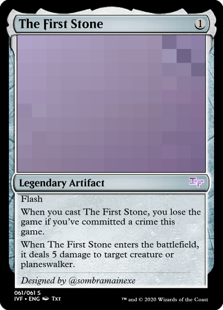
Don't forget that when you submit a card via text or via an editor that doesn't have a specific rarity indicator, you need to note a card's rarity. I wouldn't worry about that for the moment, though, because we should talk about this card first. I know where the name is coming from, and yes, the concept of casting the first stone and all that is theoretically funny. Functionally, this card's pretty middling, because in an interactive game you can have only one that you'll maybe use assuming you've not interacted beforehand, or it will literally be a dead draw. A single removal spell that only works if you haven't performed a set-specific game action just isn't the kind of card that stands up to scrutiny.
That's not to say that we don't appreciate seeing funny cards here from time to time, and I do assume that to some degree this card was supposed to be humorous. (BTW, for everyone else reading that doesn't understand the joke, it's based off John 8:7, a Biblical reference that's entered the common lexicon). With that said a degree of functionality is still preferred to go along with it. This card is probably narrower than you might think at first glance.
~
@stupidstupidratcreatures — Biogenesis

There are quite a few options on this card. I think that the fact that you have to choose between counters and life is pretty bunk, and I actually thought before rereading that you would get both counters and life. If the second part of the card was "You gain 1 life and draw a card. Put a +1/+1 counter on up to one target creature you control." would've been just fine to me. There are plenty of effects like this in green and there's no shame in pushing it just a little bit.
Is this a cast trigger, though? I suppose in a roundabout way it is, so I'll let it skirt the contest a little bit, but this is very technically a trigger on the sacrifice rather than the actual cast. At the same time, it's important to make that distinction because it shows the complexity of a card's internals. The trigger wouldn't be possible without the cast, so there's all that, but no matter, the card's perfectly reasonable as is. I think the generic name/implied flavor isn't pushing me into any particular direction, but I'll commend this card regardless for being more in the realm of Plumb the Forbidden rather than the other green cards in the Greater Good variety that we see riffs on.
~
@tanknspank — Kami of Impending Victory (JUDGE PICK)
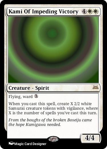
So this would trigger off itself, right? Six power for six mana is a good start. I like the idea that you can ramp up to a couple more bodies just by itself, and a six-mana 4/4 in white is still pretty good. I know in your notes you mentioned storm and stormlike capabilities, and honestly, I wouldn't worry about that. The ability to look at other cast spells and to make something based on those spells is reasonable for the trigger without being too powerful. What's there to say otherwise? I dunno, this card feels just plain great in limited and decent-ish in commander; bodies are bodies, no matter the format.
Victory, well—that's an odd one, but I suppose the flavor is justified if something terrible happens, and lemme just check the wiki real quick... Oh wow. I actually had no idea that that happened in the story. WELL then. I guess that places the timeline now, doesn't it. Yeah, this card checks out on all fronts. White doesn't usually get the storm capabilities, but ramping up to a multi-spell turn would be pretty fun, and even then you get to play some fun tide-turning power on turn six regardless. Overall, it's solid! It's not breaking any new ground but it's doing all the work that it wants to do fairly and firmly. I do like the fact that it'll get you a Samurai even if it gets countered. Feels important for some reason.
~
Whew. Well, that's all set and settled. Thank you for all your entries, and see y'all next week.
@abelzumi
10 notes
·
View notes
Text

OK so....
I don't usually like to look at my follower counts, I don't want to get wrapped up in that, but!!!
I never imagined I'd get over 100 followers on a blog that moves slower than an army of snails?! So,
Thank you, everyone!!
I would've preferred a nice digital piece for this, but alas. The spoons are slim.
This was still fun, though! Pen/cil and paper are my preferred tools, so this was nice and relaxing.
This also isn't how I wanted to reveal the twos' new designs, but here we are? I have Mewtwo's reference done but am waiting to post it until I get the other two as well. Sixteen's exact patterns are still somewhat up in the air, but grumpy and doofus are pretty well solid. Six has been particularly difficult since I want her markings to mostly lighten her pelt rather than darken it. It might be a while before I'm totally happy with it.
But yeah, there's my big scary idea. That's it, I gave them clone markings, lol. Someone tell the stripe gang they have some new members.
Rota also makes an appearance since she's at least important to the lore, now, and having another foil for Mew seems fun.
I would've liked to do a giveaway of some sort, but it's just not feasible until this semester is over. Maybe if I hit another milestone over the summer?
Thanks again, everyone!
98 notes
·
View notes
Text
Bases Loaded
No I will not go one step further until we address this. Gnawing a tree down into a big baseball bat is one thing, I can understand that. The hair aviator goggles were pretty believable. Did...did this mofo just conjure paint and a batter's helmet? This is seriously the strangest G5 bit by far and that's saying something when we also had:
Getting the cuffs smacked off is my favorite touch. The baseball gag though, it's so funny and I love it but it really does feel like a new level of cartoon silliness. Trivia time! Where else have we seen a baseball theme? Baroque Works, Mr. 4 & Mr. 9. And I can't help but notice the more cartoon art style is leaking. The demon Gorosei are evil looking but it's still a very flowy family of designs. The giants do too, lighter and sillier. Even get some weird stuff like an almost Dutch Angle shot as they're running away. Noticed last night the anime is getting in on this too. It slowly escalated throughout manga Egghead, so if we're doing stuff like introducing sparkly transitions now I'm curious what Toei does with this leg of the arc.
For all that weirdness around the main scene though I don't want to miss this. Because it was subtle but if you've been following along you'll probably recognize the core thread. Jinbei arrives, Zoro has won but is wasting time because Lucci stayed on his feet. So Jinbei smacks the shit out of him. It's hilarious but he knocks Lucci right to someone he can report to. We saw this type of thing in the Onigashima Raid. It was nice to let Jinbei have his time to shine early in the arc and he was solid for going to grab Zoro...but it's kinda like Nami and Luffy. You can't quite reign him in. Think like Usopp making shoddy repairs until we got a proper Shipwright.
That's the type of thing I see as justifying the final role of a Quartermaster regardless of who it may be. It rings hard when it's Jinbei coming up short. But he is just the Helmsman. Like the other adults his arc should be lightening up. One of those big reasons Kiku at least works as a template is because there's someone who'd make sense to find freedom in being more of a fussy tightass.

Oh huh? Never mind all that...Robonosuke. This dude is huge! Like, my goodness I knew he was big but this mecha monstrosity looks primed to wreck shit. Good cliffhanger. Ready to see what he does. Sad we're going to have to wait a bit but I've gotten used to it.
All this though, it leaves us in familiar territory for Egghead. Feels like we just escalated again while still not changing the core issues. The Straw Hats are roped into stuff that doesn't concern them, they're taking their eyes off the ball, being a little too loose and carefree is causing all this to spiral. Definitely have to prepare ourselves for the real possibility we come back and launch into another cutaway segment. But we'll have a few weeks to chat about that sort of thing.
11 notes
·
View notes
Text
Doctor Who, but Chronologically 31
Fun fact! The timelines have intersected, almost - if we were watching this show in the normal order, this episode is actually only one out from where we would be. It's 1930! And we all know what that means - it's time for some terrible stereotypical New York accents as we watch Daleks in Manhattan.
Martha's back! Very exciting, Martha put herself into God Tier in the companion rankings with her last episode, and frankly she is very solid in this one as well. She and Tennant arrive in New York, discover it's 1930, and immediately launch themselves into the mystery of working class people going missing during the Great Depression as they live in a Central Park slum in sight of the Empire State Building being built, a tale that is so richly anti-capitalist the only thing they don't do is turn to the camera to break the fourth wall and say "The real monster here, children, is capitalism."
(Also, side note, if you watch in this order, you do feel the devastation of the First World War).
Plot-wise, this is a two-parter! Our second one that is actually intentional. In fact, the plot is fairly basic and simple, meaning the emotional stories and anti-capitalist morals can take centre stage, which is nice - homeless people are vanishing from the slum. They are being turned into pig slaves, by which I mean, humans in fetching brown boiler suits with pig heads who squeal a lot. This is being done by a sort of wannabe mobster who wears stylish spats in the Empire State Building, who insists his workers risk their lives to attach Dalek bumps to the top - because, as the title made clear and the episode wisely chose not to hide from us, the real bosses behind it all are Jeff Bezos inhuman monstrous perversions with no morals or emotions other than hate or racial purity aka Daleks.
Which is exciting! Because you see, while we have SEEN Daleks before, next to the big cube in the second episode, and we got that brief cameo from Rusty... this is actually the first time we get to meet them properly! First Dalek episode, to show us why they're scary!
Except it turns out there are only four of them and they're a cult.
Also the Doctor is proper freaked out by them. We get SO MANY PLOT THREADS HERE
"How are they still alive?" he asks the showgirl who has followed him into a sewer (she is played by Her From Spooks). "How do they always live, while I lose everything?"
Later, Martha, having been kidnapped for experimentation by Daleks and literally shaking with fear, steps up to the Daleks and stares them down.
"I demand to know what's going on," she proclaims (god she's so fucking cool.) "Report."
"Our planet and species were lost in a war," a Dalek says (HOW MANY FUCKING WARS -) "We're the Cult of Skaro. Dalek Sec is hybridising with a human so we can evolve to live outside the shell."
(The other Daleks do not approve. Racial purists. I foresee a mutiny.)
And the merge is complete! The final cliffhanger is that the wannabe mobster now has a single eye and a beard made of penises.
Far be it from me to agree with Daleks, but I also think that's a bad design, actually.
Anyway, other little stories in this episode include Rick Griffin from Holby City playing a man called Solomon, the sort of leader of the slum, who in his first scene resolves a conflict by splitting a loaf of bread in half I-see-what-they-did-there; Her From Spooks playing a showgirl whose boyfriend gets turned into an incomplete pig slave, so he just has the snout and that's it (on being reunited she is very good about it, good for her); and ACTUAL LITERAL SPIDER-MAN IS HERE. That is. Andrew Garfield. Like, THE Andrew Garfield. His name is Frank and he's from Tennessee and he is also about to be experimented on with Martha. And he's played by Andrew Garfield.
The Doctor jokes at one point that he'll let Frank kiss him if he wants, and all I can think about is Andrew "I want to play bisexual Peter Parker" Garfield's eyes lighting up at the line.
But, a nice moment for us watching: the showgirl bonds with Martha (of course) and offers to let her watch the show from the wings.
"Have you ever been on stage?" she asks
"Oh, yeah, a bit," Martha says. "Shakespeare."
WE UNDERSTAND THAT REFERENCE!!!!!
Anyway! New plot threads again!
“She” (an unknown person) is returning (perhaps River returned as Missy. Maybe Me? Maybe Clara???!)
There is something on Donna’s back
An entire planet, Pyrovilia, just… disappeared, somehow. (Maybe because the TARDIS is exploding??? Saturnine was also lost, and that WAS because of the TARDIS exploding. The lion man’s planet was also lost but he was a bit of a knob about it if I’m honest.)
Amy is maybe dead (she’s not)
The Doctor has been cubed (he’s out, but how?)
River is possibly blown up (unless she’s Missy)
The TARDIS has blown up (It’s fine now. Except it’s sort of melting now because it’s corrupted, but it’s fine again)
The universe appears to have ended (the universe is back again)
The Doctor has employed(?) Nardole
(And Nardole was “reassembled???” Nardole had glass nipples and invisible hair?? WHAT THE FUCK IS HE)
There’s a vault in the TARDIS and it contains Missy but we don’t know why (sometimes she knocks for the bants)
What has happened to all these companions and where are the new ones coming from?
There’s an immortal Viking girl now. Her name is Me and she’s now looking after the people the Doctor abandons
What’s With The Silence?
Why was Rory entirely unconcerned by the entire world suddenly going silent when that is Not Normal and should have been, at the very least, extremely disconcerting?
What did the Doctor do to Queen Lizzie One?
Who is Captain Jack Harkness? (Is he the one who gave the companions a warning about the lone cyberman?)
Why is Amy seeing a one-eyed woman in a vanishing window?
What’s with the Doctor’s future involving getting shot by an astronaut?
Is Amy pregnant and why is it inconclusive?
Who is Sarah-Jane Smith?
How is the Doctor Bill’s teacher and why/where does he have an office?
What is going on with the Cyber War and the Cyberium???
Who did the Doctor lose to Cyber Conversion?
What happened with the Other Cyber War?
What happened with the Third War that deleted the void?
Why does Rose seem particularly important?
What’s with the Weeping Angel statues, and why can’t you blink at them?
What order do these Doctors go in? (Eccleston, Tennant, uncertain, Smith, Capaldi, Whittaker)
Which companion just… forgot the Doctor, and how?
Yaz and Vinder are about to die as Mori/Mwri/Muuri
There is a Lupari shield around Earth.
What’s a Time War?
What’s the Rift?
What’s Bad Wolf?
What happened with Amy’s pregnancy?
In which war did the Doctor become a war criminal, and how?
Who is the Master?
Why has Amy forgotten Rory?
Is Rory plastic or not?
Why is the Doctor sulking on a cloud?
How exactly does the Doctor have a cloud?
What exactly happened with Strax to, uh, tame him?
Which friend killed Strax?
Which friend brought Strax back?
Where did this lesbian lizard and human couple come from?
What happened with Clara as Souffle Girl and the Daleks?
How does Clara actually join?
Why so many Claras?
Why is Missy apparently in robo-heaven?
Why is probably!Missy pushing Clara and the Doctor together?
What is Trensilor and what happened there?
Who is Handles?
The Doctor is about to be dissolved by a beautiful geode man
The universe is being crushed by the Flux
Will the Doctor open the fobwatch?
Sontarans are invading Earth again
Who is Kate?
Who is Osgood? Another name of Clara’s again?
The fuck is the deal with the Grand Serpent
Does Martha get to go to an ice cream planet with 12-fingered massage aliens?
How did the Doctor forget Clara?
Who is Bill’s puddle girlfriend Heather?
How did Nardole die?
When does Bill get Cyberman-ed and die?
When does the Doctor shrink and enter a Dalek called Rusty?
Whittaker is falling to her death rn
Was that ring relevant?
Does anyone know the Doctor’s name?
When did Yaz talk to Dan about fancying the Doctor?
When did Dan talk to the Doctor about fancying Yaz?
Who was the Doctor’s wife?
What's happening with the bees?
What happened with Donna's ex and a giant spider?
What war wiped out the Daleks, and is it one of the ones already mentioned?
What did the Doctor mean when he said "The (Daleks) always live, while I lose everything?"
92 notes
·
View notes
Text
Ranger Academy: The First Arc
So! Ranger Academy has given us four issues, and as we're getting a break next month, these four issues are clearly meant to be seen as the first arc or chapter of the story. While I didn't really expect to give this series most of my attention, apparently I do have a lot to say about it, so let's discuss these four issues and my thoughts on the series so far.
Ranger Academy's kind of in a weird place, at least from my experience. As far as I'm aware, there's really not much discussion or hype for it in the fandom? Which, in some way, makes sense - the series is completely disconnected from the main series and from the beginning was stated to be skewed more towards younger readers; almost as an introduction to Power Rangers as a whole. And it does that job well......for the most part.

Before I get to the writing though, I just want to take a minute to highlight the art, since I don't talk about it enough in my recaps/other discussions. It's great! Drawn by Jo Mi-Gyeong and colored by Fabiana Mascolo, the art for the PR comics in general continues to be a high point. Every character, even the background teachers, have a distinct memorable design with a lot of personality in their poses and gestures, and the numerous settings we've already gotten - Sage's moon home, Ranger Academy's different campuses, the planet Chromia - all look fantastic. My only nitpicks would be I wish we got more non-humanoid cadets, and sometimes the way faces are drawn in profile look a little odd - especially when they have their mouths open - but those are nitpicks.
When it comes to the writing, things get a little trickier. For the most part, I think the story is good. The basic premise to all this in case you're new: a young girl named Sage lives on a remote moon with only her adopted father Rhianth and a herd of weird goat-like creatures. One day two cadets from the titular Ranger Academy, Mathis and Tula, crash-land on the moon and tell her about the Academy. Sick of living alone under her father's rules and wanting adventure, Sage stows along with them on their return journey and becomes an official student. So now instead of herding goats, she's making new friends, discovering secrets of the Academy, how her father connects to all this, and becoming a Power Ranger.
As I said, I think this is a solid premise for Boom's first ever completely original Power Rangers book (I count Power Rangers Universe as a sort of test-run for original stories, but that was still pretty connected to the main series and using established canon concepts.) The mysteries they've introduced, such as the lost Green campus, the implication that certain Ranger colors were purposefully erased from history, Rhianth's past, and Tula's interest in these secrets, all help build on the somewhat basic premise and are slowly giving the book its own identity. Sage herself is a very likable and relatable protagonist; a kid wanting more out of her lonely, isolated life so she takes the first opportunity she can to escape, but is now realizing that it's not going to be some fun adventure. The supporting cast is a little underdeveloped, but everyone's perfectly likable and I'm interested in seeing how they grow. I think for me there are two main problems that drag the book down: the setting itself being underdeveloped and the Ranger alumni cameos.
Ranger Academy itself? Meh
A criticism that immediately came out following the book's release, that I agree with for the most part, is the book pretty much follows the structure of a "magic school" story to a T. A "normal" kid who wants more out of life gets thrust into this new world by some kind of outside force. The school has a category system where kids get put into select campuses based on personality or skills. The main character doesn't fit in with everyone else until they find some friends to take care of them. There are secrets about the school that are being kept from the students, and secrets of the main character's family being hidden from them. Also, there's a bully.

During my first read of the issues, I agreed that this was a detriment to the book, but now rereading it again, I think the problem is less that the book follows these tropes and more that it speeds through these tropes REALLY QUICKLY. You can tell they want to move things along to the good stuff where Sage morphs, and I understand why - this is a Power Rangers book, and people want to see Power Rangers. But at the same time, you really don't get much of a chance to get to know the school outside of its basic layout of its campuses and that the headmaster is literally a giant floating head. You don't learn any of the non-cameo teachers' names, outside of the librarian, and that's mostly because he was part of Rhianth's old friend group. You see some of the classes Sage has to take, but there's no discussion on if each color campus focuses on a particular subject. We establish that first years are on a rotation schedule of attending classes in a different color campus each day, but what's the difference between classes in the Blue Campus and classes in the Pink?
Now this might seem trivial, and it kind of is. It does help the reader feel Sage's overwhelming new situation by not giving her, and therefore the reader, the full picture. And there's nothing saying that these concepts won't get developed down the road. Sage has three and a half years left of school, after all, assuming the book continues long enough to cover that length of time. But when it comes to these kinds of stories, the school's operation is a huge part of the charm - what makes THIS magic school stand out against all the others on the YA shelf? You basically have to turn the school itself into a character. Hogwarts is so iconic because that series does this perfectly. Ranger Academy simply doesn't have that yet - it still just feels like a generic school, really an army training camp more than anything due to the hostage negotiation and survival classes she takes, with nothing to make it stand out except for the promise that we'll get to actual Power Rangers stuff soon.
Oh, and.....the cameos.
The Cameos
So.....yeah. This is a big one for me. I think there's time for the series to fix my issue of the school itself feeling underdeveloped, but it's already too late for the cameos

Back when Ranger Academy was first being advertised, they were quick to show off that the book could cameo any ranger at any point in the franchise - the book itself accomplishes this through the Rangers using tubes as a sort of interplanetary, interdimensional Zoom........or just kind of.....showing up, as is the case with Cruger, Yale, and Katie. (I don't really know what constitutes a cameo physically being there as opposed to a tube hologram. It's another thing the book hasn't explained the rules for yet.) And for the most part, this is a fine idea. It makes sense, and fun for the simple novelty of "look!! it's my blorbo!!!" that no one is immune to.
But they get more and more out of place as the story of Ranger Academy starts to pick up.
Like I said before, the book is starting to hint that the school only having five colors isn't COMPLETELY MMPR pandering - the school is, indeed, intentionally erasing certain Ranger colors from their students' awareness. As someone who would love for the big twist to be this school and its system is inherently corrupt, this is a good start.

HOWEVER. In order to make this work, you have to assume that a) the Ranger histories that the students learn about just don't mention ANY rangers that aren't red, blue, black, pink, or yellow and b) the Ranger alumni who teach there don't mention them either. And that's just too much for me to believe, I'm sorry. For some colors like orange and white, maybe, but gold? Silver? GREEN???????? There are too many of those guys to believe they can get covered up. And I really don't see the ranger alumni being okay with erasing their teammates from history. Green is the third-highest ranking at SPD. Hello? SPD? I think these guys would have heard of SPD? Since Cruger teaches there? (And if not at school then certainly once they're out and traveling the galaxy.)
I've mentioned before that the cameos are starting to feel more like a higher-up mandate than something the author chose to do, and that'll only be supported by a lack of explanation as to how this works with the narrative they're weaving AND if none of the cameo rangers actually.......play a real part in all this. Not that I want the canon characters to overshadow the new characters, but it would feel like kind of a letdown to have access to ALL of these characters and not give them anything to do besides generic exposition (there's really nothing specific to their characters in.....ANY of the cameos' dialogue, besides the five hundredth "uh, is that a CAT???????" joke with Yale.) or not take the chance to develop some of them by, say, assigning them a mentorship role to a specific student. I LOVE seeing Katie, after BOOM kind of ignores her in favor of Jen, but is all she going to amount to is being their bus driver? I didn't even realize it was her until people pointed out that they called her Professor Walker. Nothing about her suggested that she was Katie. So I worry about the aforementioned "it's my blorbo" novelty to wear out pretty fast if the cameos start to feel more and more like just fanservice for people to post about online.
But overall.....it's fine. I'm going to keep reading, and we'll see where this goes. I don't think everyone will like this - as seen by how I barely see anyone talking about it lol. But I'm cautiously optimistic now that we're getting into the meat of things with Sage's new, FORBIDDEN!!!!!!!!! color.
(Just don't bring in Dark Specter oh god please)
Misc Thoughts:
= For all the build-up that the First Trial would be this HORRIBLE LIFE-THREATENING OH GOD HELP ME event, it was actually pretty...lowkey. They literally had no trouble until someone broke their ankle, which....could happen anywhere, at any time. Fern did that, you ain't special. We didn't even see any of those cool monsters they kept bringing up
= So after all my confusion about when and where this series is set, going back in my reread helped me notice that there IS a clue towards setting in a scene where Sage is going through yearbooks: a shelf labeled "Class of [X]498" (the first number is obscured by one of Sage's narration boxes.) So it's.....tentatively set in the far future of the PR universe?
= I've said it before that I don't blame the author for apparently not knowing that previously the books established Xybrians like Kartyr follow a name pattern of a one-syllable word (Trip, Star, Ace, Trek, etc) but it is a little funny to imagine the possibilities. Jerk, Dick, Twerp
= I think a joke could have been done with Cruger, a dog, and Yale, a cat, being in the same room together
= I hate that the Academy was founded by Zordon. It's too low-hanging fruit for me. I'll say it again that I wish it could have just been founded by some OC team
= #Lindy4Orange2024 and FUCK the Bandorian Monks!
13 notes
·
View notes