#a different style of lineless art I’m experimenting with for an art challenge
Text
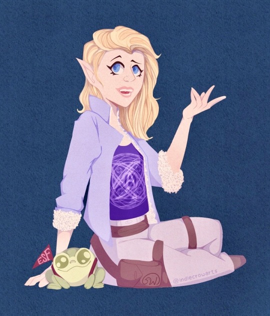
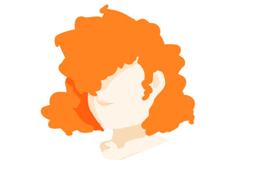
Once again an homage to Cait May’s incredible designs- Boggy has never looked more round ☺️
#a different style of lineless art I’m experimenting with for an art challenge#artists on tumblr#small artist#digital art#procreate#digital illustration#digital painting#youtube#small youtuber#disabled artist#my art#dimension 20 fanart#dimension 20 fantasy high#dimension twenty#dimension 20#fantasy high junior year#fantasy high fanart#fantasy high#adaine abernant#adaine fantasy high#adaine fanart#fh adaine#cait may#fanart#dnd5e#dnd art#dnd fanart#dnd wizard#d20 fantasy high#d20 fhjy
281 notes
·
View notes
Photo


31 Days of Apex: A Retrospection
I participated in the incredible #31DaysOfApex challenge hosted on Twitter, where fans created new content for every day of July based on a one-word prompt. I’ve signed up for/started lots of similar challenges in the past but always ended up having to drop out or trail off before the end... but this time, I managed to complete something for every day of the challenge!
My only goal was to make something by each day’s deadline, and it was a really interesting exercise both in technical skill and also in my management of not only my time, but my expectations and energy. Below, I go into more detail behind each piece.
To preface; the beginning of this challenge coincided with the beginning of a new personal time-management exercise where, for 5/7 days a week, I would only go on the computer at night. Combined with the deadline, this had an interesting effect on my time management and the quality of certain pieces.
Day 1 - Memory
From the start, I wanted to use the challenge as an opportunity to do more studies and to push myself wherever possible. This was the first piece I did and I had more time to work on it, so I used it as a digital painting study. I still think it’s a strong piece and it’s probably my favourite of the month.
Symbolically, this character’s backstory doesn’t match up with her own memories, so the idea is she’s missing information she can’t quite place or remember, and this both scares and comforts her.
Day 2 - Blood
Another digital painting and lighting study that didn’t work out as well as the first, mostly due to time constraints meaning I couldn’t scrap it and start again. While I don’t like how it turned out, I did learn a lot.
The character on the right is a field medic, and my intent was to show the calm after a successful rescue.
Day 3 - Mercy
Some days I relied more on the humour of a piece’s concept than the skill of its execution, though I also liked how this piece turned out artistically. After two days of intense studies, though, this was very quick and easy for me to turn out as it relied on existing skills.
Day 4 - Prize
This one thankfully came together very quickly, which I credit to the two previous painting studies making it much easier to achieve what I wanted.
The character is searching for the disembodied head of the man who killed her parents, who is now acting as a robot, hence the vaguely half-machine-half-human silhouette in her hand.
Day 5 - Family
Another quick, simple illustration under a time crunch.
The character framed by the nameless foreground figures has no memory of herself or her family.
Day 6 - Noise
For some pieces where I was under a time crunch, I experimented in an opposite direction; instead of studies, I played loosely with different techniques/brushes/etc to see what came out. This was a lineless style I ended up employing a lot when short on time. The piece pictured here was just one of four alternate colourways, presented in a pop-art style.
The character is almost always depicted with thick coverings over her ears, so I thought she might be sensitive to auditory overload.
This particular piece was retweeted by the character’s voice actress!
Day 7 - Mask
More relying on humour for lack of time/a better idea. A fun experiment in colour, though.
Day 8 - Healing
Another technically “easy” piece but with a stronger concept. It was actually pretty hard to get the reflection & condensation elements balanced right.
The character pictured has a narrative thread relating to an old ex he has trouble moving on from.
Day 9 - Weapon
While obviously another joke, and made to be finished quickly, it was surprisingly difficult to get the duct tape and knife to read clearly without over-cluttering the lineless image.
This little ‘bot is a drone used by one of the playable characters to hack areas of the map; it’s not NORMALLY an offensive weapon.
This image was promo’d in a video stream by the character’s voice actor!
Day 10 - Truth
I only had less than an hour to finish this one by the deadline, but I still tried to experiment with silhouette and colour. It was surprisingly hard to get the interior silhouette to be legible.
The outer silhouette is a playable character (not easily readible unless you’re familiar with his design) and the inner silhouette is his sister, whose disappearance he is trying to investigate.
Day 11 - Shield
A fun, self-indulgent one. Had a blast simplifying the game’s characters down into little caricatures.
The character in the centre has abilities related to shields and protection, so many other people were drawing him for the prompt; I wanted to try and flip it, so I picked other characters he would be friendly with, and picked a non-lethal, lighthearted setting.
Day 12 - Ruins
Short on time so did a quick lighting study.
A recent game plot has changed one of the areas of the map, submerging it in water and leaving it to “ruin”.
Day 13 - Hero
Another painting study. Really didn’t like how this one turned out, but had to turn in something, and I did learn a lot in the process. If I’d had more time I probably would’ve scrapped it and started again.
This characters had recently been revealed to have been manipulated by another character who used gas-based offenses, whom she admired.
Day 14 - Rest
I was going to be away from mt computer until after the deadline, so I decided to make a traditional piece. I ended up enjoying it so much I tried to take the time to do a few more traditional pieces later. This piece was sort of a comedy of errors; I had to do it while I was out, and the pen I had brought with me to ink my sketch ran out, so I had to make do with a blue ballpoint pen, and I was missing several colours of coloured pencil. I think the finished piece reflects how rushed it was, and it did’t meet my concept, but I do still like it.
Day 15 - Skull
Another quick one but I wanted to experiment with a different line style. Wanted a sort of “graffiti” effect.
One of this character’s skins includes a skull-shaped mask.
Day 16 - Growth
Extremely quick play on words because I didn’t have the time to work on anything meaningful and couldn’t think of anything better!
Day 17 - Home
Another traditional piece, this time by choice and with more time. Markers. It looks extremely like some janky art school homework on 2 point perspective because it extremely is. Perspective and backgrounds are very difficult for me - they just don’t “click” - but I had a lot of fun with this one. I kept my mistakes intact because I didn’t want to edit it too much. A lot about the technical perspective is wrong, but I think I achieved the “mood” I wanted.
This location is a bar owned by one of the player characters where many of the other characters are shown to meet.
Day 18 - Sky
Very happy with how this one turned out, even though there are still lots of problems. Markers again. There’s a lot I would fix next time, and I think technically it’s lacking, but there are some specific areas I feel happy to have achieved, such as the almost brushed texture of the curved metal above his shoulder and the values of the shadow/reflections on the underside of the head piece. I’m also happy with how I was able to draw from my shoulder rather than my wrist when inking the curved lines, something I struggle with.
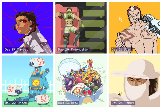
Day 19 - Target
An experiment in pushing the lineless style I’d already been playing with for a stronger likeness. The pose and expression in this could both be pushed more but I like the result.
This character had just learned that one of the other players, whom she had trusted, was actually sharing her secrets with her enemy, and she didn’t know which one it was.
Day 20 - Friendship
I had this one concepted from when I first looked over the prompts. It was a fun challenge trying to simplify all the elements into the lineless, blocky style while being legible.
This character has a strained relationship with one of his friends, and finally pushed her too far with his selfishness, and she now no longer responds to him.
Day 21 - Scar
Quick joke. This character was introduced briefly as a red herring for another character before being killed off. He was stabbed through the chest by another character’s hand, hence the scar pattern.
Day 22 - Dream
I wasn’t sure about this one while I was making it but I ended up liking how it turned out. I wanted to capture the character’s robotic legs bent at an unnaturally straight 90 degrees, like a Barbie doll. The flat background and lighting make it feel like an indoor stage. The little “electric sheep” are inspired by iDogs.
Day 23 - Meal
After a few days of not having time to really spend on any piece, it was fun to get to spend time on concepting and composing this. I always admired these kinds of watercolour-like food illustrations and this is the first time I’ve had any success in creating one myself. I concepted and sketched out the individual items traditionally before working out the composition within the box digitally.
Each food item/utensil is inspired by the different characters’ design elements. Only two of the now-current characters are excluded due to plot reasons. In particular, I like how one of the character’s dome-shaped shields acts as the base and cover of the box.
Day 24 - Hobby
Wasn’t a fan of how this one turned out. I think the likeness is a bit off, and his facial anatomy is skewed. But I also like how the general composition, tone, and bee turned out.
This character’s concept art originally imagined them as a beekeeper who would use smoke to fight.
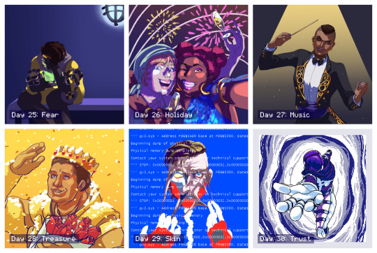
Day 25 - Fear
An incredibly rushed piece that I intended to go back in and add more detail to, similar to day 4, but I actually took a step back and decided I liked the blocky, flat-colour version.
This character is the youngest of four, all of whom are MIA or worse, along with his father, and his mother is losing her memory. He’s talking to her through a handheld holographic device. This piece gained more traction, most likely thanks to the subject matter since this is a popular character.
Day 26 - Holiday
I didn’t want to do a religious holiday like Christmas or Easter. A lot of other people also interpreted the prompt as a vacation, but I had already done a sort of “beach vacation” piece for day 11, so I instead went for a “public holiday” and chose NYE/NYD. This was fairly quick but the lighting was an interesting experiment. I knew this one wouldn’t be as popular because it wasn’t as “flattering” but I personally really like it. The girl on the left is kind of goofy and completely un-self-conscious and I think it’s captured here.
Day 27 - Music
Really didn’t like how this one turned out. I don’t think the likeness is good at all, the lighting is poor, and the gold detailing feels lazy. But I liked other elements, such as the pose and the clothing.
Day 28 - Treasure
This is my least favourite of the entire month, but I also had the least time available to work on it before the deadline so I had no opportunity to scrap it and start over, which I sorely wanted to do. The likeness is terrible, but more than that the base anatomy is off, the pose is stiff, and the lighting/colours are cheap. I wish I could’ve done better by this character; but, I am glad I had something finished at all.
Day 29 - Skin
This was probably my third attempt at this picture and I’m still not happy with it, but again, I had to finish something. I almost considered scrapping the concept entirely and choosing something easier but ended up seeing it through. The concept itself is actually recycled from an older piece of mine for an entirely different fandom, because I didn’t think I did it justice then, either. Would still like to revisit this concept with this character and take more time.
Day 30 - Trust
After a few days of feeling really dissatisfied and uncomfortable with the art I’d been making, I finally more time to dedicate to a piece, and I’m overall happy with how this one turned out. I decided to go for a different medium entirely with pixel art, which also gave me the opportunity to try and animate it. I started off confident and then started to get worried towards the end, but all the elements came together when I added the portal colour effects.
This is an alternate reality version of one of the player characters, who appears through a portal and allows that character to escape the facility she’s being kept in, encouraging them to trust the “voices” she hears which are actually versions of herself trying to help her.
This piece was retweeted by the official Apex Legends Twitter account!
Day 31 - Freestyle
I had this planned out early in the challenge and I’m really, really happy with how it turned out. It’s probably tied with my favourite along with the very first piece (how fitting). I was worried about how I was going to capture the movement without over-complicating the lineart, having so many people in one image, etc. before I realised the focus was entirely on gesture, and then everything clicked. I went for a thicker brush, which forced me to conserve my lines, and tried to simplify each character down to the bare minimum needed to recognise them. They’re also all wearing new non-canonical outfits so I used their familiar colour schemes for the same purpose. It’s not perfect, but I love it, and it’s everything I’d hoped I’d be able to end the challenge on.
I really, really enjoyed the entire month and the way it tied in with my new time management schedule. It gave me some achievable short-term goals which added up to this long-term achievement I can now look back on; I learned a lot both about balancing my energy and about technical skills, I found ways to stay motivated, and most importantly I learned to not get caught up on the individual slip-ups and pieces I didn’t like as much and to instead focus on the bigger picture. Thank you to everyone involved in organising and supporting this event! I found so many other incredible fanartists, writers, and content creators through this challenge and I can’t wait to see the bonus content released over August!
4 notes
·
View notes
Text
Webkinz Games Ranked
Because I have nothing better to do and I’d never played all the Webkinz games before now. Includes Tournament games and board games, but is mainly about the arcade.
Wheel of Wow/Deluxe and Wishing Well will not be ranked, but other Dailies will.
Also include Academy games. I did not have Plumpy’s Hairdresser when I made this, but I do now upon this edit.
So in general the arcade games are sorted alphabetically, with random exceptions. I’m just going down the list as-is in the arcade.
Grand Grotto - one of the match three-esque games, though you mainly just click stuff. A little tough, but I wasn’t trying very hard. The graphics aren’t that thrilling but aren’t bad. Tries to do something interesting things, but I don’t really love a lot of the Webkinz takes on match three games. 5/10.
Goody Gumdrops - an infinite running style game where you collect gumdrops to progress. This game is not fun. Feels like the flow of Kinzcash you get is also less compared to a lot of other games. Not much going on after the first minute or so. 4/10. EDIT: I was actually really mean to this game and I don’t know why. I really like it now. It’s fun, not too intensive. Inoffensive and cute. You actually do make decent KC from it. 7/10.
Polar Plunge - this was one of my favorite games when I was a kid. You sled down a hill. It’s simple. I have never fucking completed a track of this game in my life. Don’t like the new version, but the art style isn’t offensive. I find the older art style for the games more charming, though. It’s fun. 8/10.
Cash Cow - another game I probably played a lot, though I prefer 2. Another take on the match three. This game also had its art style updated, but I just don’t like the lineless look of the update. It’s soulless, and it makes the visuals more busy and hard to follow for me. All right game though. 7/10.
Smoothie Moves - this is basically just Zuma, which my dad loves playing. I like this kind of game, too, though I suck at it. Nice visuals, clean, fun gameplay. 8/10.
Wacky Zingoz - one of those games where you try to hit something as far as you can. It’s so basic, it’s not really anything, and you can’t make much money on it-- like 10 Kinzcash is generous in terms of how much you make. Not fun. 1/10.
Wacky Zingoz Extreme - the EXTREME version of Wacky Zingoz, except with more bats and more to do, but still not much. An improvement. 3/10.
Ant Mania: Picnic 2 - the thrilling sequel to Picnic. Not bad, I remember playing this one a lot. You just try to collect food while avoiding spiders and fire ants. It’s simple, but fun. Not really my favorite though. 5/10.
Atlantiles - I don’t know how to describe this game. You match tiles together, but it’s not like a match three. Never played this game till now, but I love it. Excellent game, really fun, a little challenging but not too hard. 10/10.
Bananza - a really basic, older game. You collect bananas and avoid obstacles. Not the most visually interesting or engaging game. 3/10.
Booger Gets an A - I get the impression this very basic addition game is for the youngest fans of Webkinz, but the games get difficult really fast simply because of the speed. It caught me by surprise because I had no memory of that. Not bad. 5/10.
Zingoz Bounce ‘N’ Burst - I remember really liking this game but it’s not very fun to play now. You try to burst bouncing Zingoz and it’s not particularly interesting, but is challenging. 5/10.
Candy Bash - a brick breaker clone. Not particularly fun-- it feels like your character is way too close to the bricks. 4/10.
Candy Bash 2: Viva Poncho - this one is about as equally unfun, but not the same game as the first. You have more ability to move and control what’s going on, but you’re really slow. You’re just sauntering back and forth to bust candy blocks falling, and it’s just kinda eh. 4/10.
Cash Cow 2 - I like this game. I’ve played this game many times. Another take on match three, but I enjoy it more than the original. Solid game, good fun, I’m terrible at it. 7/10.
Color Storm - somehow wasn’t looking forward to this game but I had some fun with it. Another kind of match three, but challenging and interesting. A good take on the broad genre. 7/10.
Crafty Canaries - a match three. Good fun to play, I played it to completion. Not too much going on but it’s solid. 8/10.
Dashing Dolphin - the controls are slippery and awkward. You’re trying to navigate through hoops and through nets, but it’s not fun to control or to play. 1/10.
Dogbeard’s Gold - expected something different from the title, but it’s fine. The only control is clicking with good timing to shoot from one island to the next. It’s all right. Not much to write home about and not much Kinzcash to make up for it. I liked the visuals. 4/10.
Eager Beaver’s Adventure Park - I don’t like spelling games. This is a take on one, but I didn’t really enjoy it. 3/10.
Flutter Bugged - just running around and avoiding bees(?) using flowers. Can get wild pretty fast, not bad. 5/10.
Get Eleven Solitaire - I fucking love Webkinz card games. This is no exception. The game is extremely simple and is pretty much the same every level, but I like it. I like solitaire and I like the take on it to get to eleven. It’s good, casual gameplay and nice visuals. I bought a Deluxe membership to play this game. 10/10.
Go-Go Googles - I remember loving this one as a kid, might have even gotten the trophy for it. Fun, but basic. You jump to collect flowers and protect the tree from butterflies. It’s fine, but the controls feel slightly janky, but not bad. 5/10.
Goober’s Atomic Adventure - basically an updated version of Goober’s Lab, except with pay-to-win and pay-to-play elements! You can play without, but it’s clear they want you to pay. I do not like this because of that. 0/10.
Goober’s Lab - the OG match three. Fun, but it’s really slow, like painfully slow. It is good fun, though. 7/10, would have been 8 without the slowness.
Griddling Gourmet - I wonder how many people have even unlocked this game? After owning an account for 12 years and playing on and off, I unlocked this game this month. You get it by completing all levels of the Cooking course, and it’s basically just an arcade version of that lesson. It’s all right-- I feel like the academy version controls better, but I always loved the Cooking class. 9/10.
Hatch the Dragon - kinda reminds me of 2048? You try to hatch the Dragon. Fun, challenging, interesting, and I want to give it a go after the initial playthrough to see if I can do better. 8/10.
Skunk Sweeper: Hide ‘N’ Skunk - a take on Minesweeper. I don’t like Minesweeper or this. 1/10.
Home Before Dark - kinda like Meepit Juice Break on Neopets? I actually do like games like where you’re shifting the position of pipes around to achieve something, but it’s nothing to write home about. 6/10.
Hoppy Little Rocketship - an infinite jumping kind of game. I like those games, but this game is wildly laggy and that really ruins the experience. 2/10.
Hungry Hog - this game is ugly and not particularly fun. A take on Pac-Man, I guess? I liked this game a lot as a kid but it’s just kinda eh. 4/10.
Iceberg Escapades - not fun. Controls don’t feel right. Another bland clicking game. 1/10.
Jazz Monsters - this game confused me on account of the fact that the purple monster isn’t purple, but its color matches up perfectly with the keyboard, which is pink, but is actually like, supposed to be the Green Instrument or something. Not fun. 1/10.
Jumbleberry Fields - it’s a daily, but you have some actual control over what’s going on so it’s included. It’s Yahtzee except the dice are loaded, but I like it. This game, like most of Webkinz, is buggy, and one time, I filled up my Jumbleberry Jar and tried to redeem my prize, but the game bugged out and it reset to zero with me receiving no prize. I’m still mad. Not really gonna rank it, but like, 7/10.
Jumbleberry Blast - a match three, but this one is really satisfying to play. Not a whole lot to say about it, but I actually like this one! 8/10.
Leapin’ Llama - game allegedly lets you use the mouse but it doesn’t work. A basic infinite running game. Not fun. Slow. 3/10.
Lily Padz - this game is fuck ugly, but controls good. Really simple, but pretty fun. The jumping feels good and the controls are actually tight! Wow! 6/10.
Lily Padz 2: Tropical Downpourz - it’s like the first one except it’s not ugly and controls really bad. Hard to gauge how far your jump goes and doesn’t feel right like the first one does. Not good. 1/10.
Dex Dangerous(tm) and the Lunar Lugbotz!(tm) - the Webkinz challenges made me play this game 500 times and I’m sick of it. It’s a basic Asteroids game. It’s all right, but I don’t like it. 3/10.
Lunch Letters - a typing game. Very Hard really means that mode is fucking hard, so I’m impressed. I don’t love typing games, but it’s not bad. 5/10.
Ms. Cowaline’s Rollcall - a really fast-paced game where you try to keep track of whether you’ve seen the same Webkinz in a row. Super fun, I suck at reaction games, but maybe a little too simple? 7/10.
Operation Gumball - I’m bad at this one, and don’t find the number puzzles super interesting, BUT it’s unique so I’ll give it points. Not really for me but not bad. 6/10.
Pet Party Parade - another take on match three. This idea of freeing a creature by clearing paths has been used a million times in these Webkinz match threes, like the Grotto one and Jumbleberry Blast. but isn’t as fun. 4/10.
Picnic - the original Picnic, just a take on the snake game. Simple, but solid. 5/10.
Pinky’s Big Adventure - essentially a remake of Hungry Hog, but with a face lift and some slight changes to the gameplay. Not bad. Not my favorite, though, since I don’t really enjoy Pac-Man style games to begin with. 5/10.
Pizza Palace - delicious, finally some good fucking food. Love this one. In the vein of Cake Mania, a series I LOVE, you make pizzas. It’s stressful, like working a food job in real life. I love this game, but I’ve never completed it. I wish they gave you more than one life for such a long and difficult game. Can’t complain much, though. 10/10.
Plumpy’s Hairdresser - the arcade version of the Grooming class. Fun. Pretty much the same as always. 8/10.
Polarberry Jam - pretty much like Bananza except now it’s a polar bear? It’s not fun. Character is too slow and feels limiting. 1/10.
Pumpkin Patch Protector - fuck ugly, but I don’t know any other Webkinz games like it, so points for creativity? It’s a click and shoot type of game. Not much to write home about. 3/10.
Quizzy’s Word Challenge - I don’t like spelling games, but this is more fun than Eager Beaver’s. Not bad. It’s kind of like boggle, I guess? 5/10.
Skater Kat - hip and kewl. The controls are okay but feel a little slow. Not particularly fun or interesting. You just skateboard and jump. 3/10.
Spree! - another daily, but you get to do stuff. It’s a virtual board game. I like it, and I like the idea of saving up money to spend one you get to the end. 8/10.
Stack ‘Em Up Solitaire - a basic take on Solitaire. I wish the game looked just a little better- the green they used isn’t really nice to look at for long periods of times. I like this one. 6/10.
Stardrops - another take on match three. Looks pretty, kinda interesting, but not my favorite. 5/10.
Tile Towers - I love Mahjong, but the colors they use for the tiles make this game hard to play. It’s hard to distinguish the tiles apart, so that’s not fun. If you want to play a Mahjong clone on a pet site, just stick with Koujong on Neopets. 2/10.
Triple Strike Solitaire - Solitaire, except this time it’s in pyramids!!! I actually prefer this to the other Solitaire, but it still is a little visually unpleasant, but not too bad. I wish they would update this one! 8/10.
Banaza: Tropical Troubles - the thrilling sequel to the original. Pretty much the same except you don’t progress in levels, it just keeps going till you lose. A little more going on, but eh. The platforming doesn’t feel good. 3/10.
Tulip Troubles 2 - where’s Tulip Troubles 1. We want answers. A quick reaction game. Fun. Not bad. Kinda just gets stale after a while. 5/10.
Tunneling Twigsy - this is not fun. Kind of like the Polar Bear one from Neopets but nowhere near as fun? 1/10.
Wacky’s Bullseye Batter - a batting game. Basic, fun. It’s okay. 5/10.
WackyER Zingoz - the THIRD version of Wacky Zingoz, and this one is actually pretty all right. Way more going on visually, there’s levels, it’s chill. 6/10.
Waddell’s Icecap Adventure - we all hate ice physics, right? Right. Mixed the other Penguin game up with this. The controls are bad and it’s not fun. 2/10.
Webkinz Rally - it’s all right? A really basic racing game, but I wish there was more to it. 4/10.
Scrambled - love this one. So simple, but challenging, but fun. You make omelettes until you win. Customers are mean to you like in real life. 10/10.
Where’s Wacky - basic memory matching game. It’s okay. 3/10.
Whimsy Skies - idk how to describe and I don’t want to because it’s got the classic Control Slowness(tm) and isn’t fun. One point added because I love Webkinz dragons, though. 2/10.
Zacky’s Quest - I want to actually complete this game some day but I have no patience for it. It’s unique, interesting, kind of an actual game and isn’t a match three. I like the adventure vibes. 6/10.
Zingoz Bounce - this game disappeared from my arcade. It was the game of the day the other day and I know they get taken out of the arcade list for that day but when it switched over it didn’t come back and I didn’t have the chance to play it when it was game of the day. Found it making this list though and it’s a boring clicking-to-support-the-ball game. 1/10.
Zingoz Pie - you throw pie. You do not have fun. 2/10.
Zingoz Pop - another updated game visually and it just totally lose the charm the original version has-- which you can play in the Quick-Play Arena, at least. It’s not much, though. 4/10.
Zingoz Zangoz - it’s not fun. It’s a fruit bouncing game and I just don’t care for the visuals or the gameplay. 1/10.
TOURNAMENT GAMES
Webkinz Supermodelz - I’ll argue that this is the most popular tournament game. I like it. You pick out outfits and the judges arbitrarily judge you. 9/10.
Cash Cow Battles - the same as the original Cash Cow but you’re competing against someone else. 7/10.
Wacky Zingoz - no. 1/10.
Link’D - it’s Connect Four. I like Connect Four. 5/10.
Checkers - I don’t like Checkers because I’m bad at it. If I wanted to bad at that kind of game I’d play Chess JKSDBFSD. Tried playing against the AI with Alyssa Fairy and she wiped the floor with me. 3/10.
Bogbeard’s Bathtub Battles - it’s Battleship but with cool power-ups. Actually very fun. 9/10.
Rock Paper Scissors - what do you think. 5/10.
Chef Challenge - my favorite tourney game. I LOVE making recipes in Webkinz so this is just a blast. 10/10.
Kinz Pinz Bowling - it’s virtual bowling, so not bad. 5/10.
Goober’s Atomicolicious - a take on Goober’s Lab but with a few more things-- trying to fill vials of color before your opponent does. I already like Goober’s Lab, so. This version is not slow, so that’s great. 8/10.
Duck Crossing - not a big fan? I like that it’s a strategy game but it’s just okay. 6/10.
Zingoz Switcherooz - not a fan, really, but it’s simple and inoffensive. I suck at strategy games. 4/10.
BOARD GAMES
Farming Frenzy - kinda fun, but really simple. I remember liking this game a lot. 6/10.
Go Fish - wow. it’s Go Fish. 5/10.
Jigsaw - love jigsaw games. For some reason the ask/chat/rap functions pop up and make the game pretty much unplayable for me. I’m so mad, because this was my favorite Webkinz board game. WHY does this pop up when it’s a one player game. 1/10. Would have been a 9/10 otherwise.
Pool - it’s Pool. But it wouldn’t let me play, so idk. I remember it being all right, though. 5/10.
Skunk Sweeper - it’s basically an original Minesweeper instead of what we get in the aracde version? But I don’t like Minesweeper. 1/10.
Webkinz Air Hockey - it’s virtual air hockey. It’s fun, though. 7/10.
Webkinz Coloring - it’s a virtual coloring book. 1/10.
#webkinz#webkinz tag#also if you read this and think I have bad taste at any point............ youre probably right I do HJSVBFS#just thought I'd do this cause I Can.#I spent an hour and a half on this pls. JKDBHFD#I mean just compiling the list playing all the games took hours and several days bcs I played some of them as far as I could go-#this is the most important post of my life
11 notes
·
View notes
Note
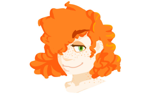
Hey! So kinda a stupid question and I'm not sure if you'll have the time to answer, but I was wondering how you did your 'line less' art? I've always wondered how people made it look so smooth and- well not choppy? I've tried before but could never get facial features and the likes to look correct, so I was curious and hoping you could help? Anyways! Sorry to bother, hope you're having a good day!
hey! no, this isn’t stupid at all, what the heck.
Honestly, it actually boils down to the basics of one way to approach digital painting; the way I do it in particular comes from the practice of silhouetting, especially for iterations of character design. Boiling down the gibberish, I’ve been working on the thumbnails of my art being based in silhouettes rather than sketches - this encourages greater clarity in pose & design, and so on.
It also makes for a stellar start to figuring out one approach to lineless art!
That said, I’m no pro. I highly recommend checking out simple tutorials on YouTube, for either lineless art or for digital painting basics or even for silhouette character design, but! I’ll show you a quick, easy way to approach it:
1) do the flat basic idea of your piece!
Honestly, while you’re figuring out how to do it, just go for something simple - a bust/headshot works great. You’re focusing on learning a new technique - don’t add all the variables of poses and depth and dynamics and backgrounds and so on! One thing at a time.
As you can see, I literally just have her face & hair. Use a big brush for the majority of this step. I’m working on a 1000x1000 canvas here, but I’m really only using about a third of it tops, for the record - and challenge yourself to not be fully zoomed in here. Work from ‘further back’ for the base head shape & hair, to force yourself to think about the overall look rather than the details. Once you’ve got it roughly right, you can zoom in a bit and make sure you’ve got your curves right, use a smaller brush and add a bit smaller detail, etc. Again, though, try not to go too ham yet - you’re getting the hang of this for now.
2) refine some & add basic shadows
I personally made my life easier by doing this on a clipping layer above the initial layer - it allows you to keep in the lines of your previously set silhouette limits. Honestly should’ve left the extra shadow from step 1 for this step, but it works out fine.
Something to note too is that the eraser is your friend! Taking things away can be just as beneficial as adding them - try making bigger shapes with a large brush, then using a slightly smaller eraser to smooth out curves or add different kinds of detail and shape you couldn’t otherwise. (This is especially useful if you want a ‘pointy tip’ in lineless work like this!)
General tip: If you want to work in layers, try and keep them logical! EG, first layer is the overall base, second layer (clipped) is basic shadows, third is basic details...
3) add details!
Personally, this meant I decided to play with curl shadow possibilities (still on that second layer), before remembering this is a simple tutorial and calling it good, heh. From there, I used a third layer - clipped again - to add some quick face details.
Note: general advice I’d have is to try to avoid zooming in too much or working with too small a brush when you’re just getting started with lineless work. I definitely tripped up there around the eye details - it starts to become too fine, and the style stumbles a bit because of it. Keep the big picture in mind!
The only thing not self evident here is how I did the eye. Basically, I did the ‘shadow’ as a base shape, then overlaid the white of the eye, then the iris/pupil/etc, then did the lashline.
That’s what it breaks down to, in the end: start with your base shapes, and build up. Layers & clipping can make it easier to go back and change things up.
Like I said, it’s far from great, but that’s the gist of it! I mostly use silhouetting for thumbnailing right now, but it is very literally the basis of digital painting, so it’s a great place to start. Painting used to be a mystery dark magics to me before I figured out the link there, honestly.
Hopefully that’s helpful and clears things up! There’s a lot of great tutorials on YouTube out there - I frequently nose about and watch them for ideas and tips on how to approach all kinds of things. Sometimes it sounds like incomprehensible jargon, or leaping from step A to step Q, but after a while you start to realize what they’re talking about and experimenting on your own becomes all the easier.
#night answers#art tutorials#(simple as hell... sorry it wasn't anything fancier but I figure the basics are what you're after anyways!)#there's all kinds of ways to go about lineless work#including just 'bucket filling'#but the 'silhouette' approach helps think about 3d space more in the long run if you're just getting started#or that's what i think#Anonymous
70 notes
·
View notes
Photo

Artist spotlight: pineapplegrenader!
Twitter ✿ Tumblr
Header source: [X]
Introduce yourself
Hello! You can call me Pineapplegrenader! I love to draw, make comics and youtube videos! I'm real glad to be contributing to this zine!
When did you start drawing? Are you a digital or traditional artist?
I've been drawing all my life! I started drawing digitally around 2011 when I got my first wacom tablet.
Do you use any traditional mediums? If so, which are your favorites?
I don't use too many crazy mediums. Just good ol' pencil and sketchbooks for me!
Why do you prefer traditional over digital? (or viceversa)
I like the range of options an art program can give you.
What do you think is the most challenging part about being a traditional/digital artist?
The most challenging thing about drawing traditionally verses digitally is that there are few ways and short cuts to equal out your shortcomings as an artist. I feel like traditional drawings can show the most authentic perspective of your skill. That aspect can be exciting and daunting.
What inspires your pieces?
Things that inspire my pieces include narrative, interesting color schemes and emotion.
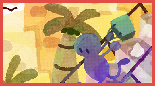
image source: [X]
Explain your "everyday" drawing process
I improvise a lot of the time! I go into a drawing session having a good idea of what I want to create and I make changes when I get a new idea or a current idea seems unfeasible.
Do you have an artist you admire (or more than one)?
I have a few that I really like:C.H. Greenblatt (Chowder)
Jeff Smith (BONE)
Bryan Lee O'Malley (Scott Pilgrim)
Kōhei Horikoshi (My Hero Academia)I've recently got into My Hero Academia and I really like the art style! I like how the characters are still cartoony and streamlined, yet they have volume and depth. Its an art-style that I want to study from more in the future.
Is there an artwork you are most proud of? Why?
https://www.deviantart.com/selom13/art/Mob-Loves-Milk-782583235
Always loved this piece! It was one of my firsts experiments with lineless art! I like that I was able to illustrate the concept with clear shapes and strong colors.
Do you listen to music (or tv shows/films/anything else) when drawing?
I like to listen to a lot of different kind of music, all of it energizes me. I sometimes listen to movie or game OSTs, mostly tracks that feel action-packed and grand. I also listen to alot of electronic and Electro-Swing music.
image source: [X]
What makes art interesting for you?
I love that I can take an idea from my head and make it real. Sometimes that image turns out exactly like I planned it or completely different. I always find the contrast between our concept for a piece and the end result intriguing.
What do you do when art block strikes?
I like to make a big shape out of scribbles. I look at the shape and try to create a recognizable image out of the silhouette, like a person's head or a building. I've made lots of pieces that I love from this process!
What’s the most valuable art advice you’ve ever received?
Fun should be at the core of everything you do!
If something isn't providing you joy, you should seek out something else that does. For me, art makes me happy! Even when I feel like my art isn't good or worth the attention of others, I can still depend on the process of making art being enriching. The act of making art and the end result of seeing your vision become reality is an incredible reward!
2 notes
·
View notes
Text
Evaluation
My project has changed a lot throughout the course- my final outcome has differed greatly from what I set out to make at the beginning, mainly due to the fact that I was trying a lot of new things and they didn’t all work as expected. But i’m glad that my project evolved.
The social issue I decided to choose for this project is the Environment and Climate Change- I wanted to make a game concept that would encourage people to fix the planet before it’s too late. There are many issues that are affecting and changing our planet currently, most of which are direct result of human activity. We are responsible (directly or at least for the majority of) for the Earth’s changing in climate- we release too many greenhouse gases through various means such as transport, factory farming and deforestation.
One of the things that has remained consistent in this project is that the social issue being a key part of the game - I haven’t diverged much. The character design and game themes definitely incorporate some fantasy themes (such as the main character) but the underlying issue about the world being uninhabitable and ruined is still a very obvious feature. I would have created a project that more subtly related to climate change, but it’s something i’m very interested in so I thought it would be a good idea. I was aware that a game based very obviously on a social issue may not attract a lot of attention as people tend to avoid things that are ‘politcal’ but I think it works - I tried to make the character design and magical elements very visually appealing so the game so that it would appear more interesting and attractive to play upon a first glance.
The work I have created - Echo - is for a game concept. I created some concept art for the character and landscape, made some pixel animations to show how the game could potentially look, and made a model of the main character’s head. The model was created so I could get a better idea of how the character could look from all angles, thus making it easier to draw. I am also very interested in modelling so I thought making a model would be a lot more interesting than just two dimensional artwork.
The Character Design/Concept
I wanted to create a concept for the game’s main character. At the start of the project I envisioned them to be a cute & brightly coloured animal - to try and contrast with the bleak reality in which the game is set. I made a pinterest board to try and establish the kind of look I wanted it to have, and came up with some concepts. At the time I was also really inspired by Kitsune & their magical connotations in Japan so I wanted it to look somewhat fox like.
I jumped straight into the character design without really considering the rest of the work I wanted to do which would involve it - which is where I started to make some questionable choices. I decided to give Echo four ears to make them look very unique and otherworldly - but didn’t really consider the practicality of having these, nor did I think ahead to when i’d actually have to make them later. I also have a tendency to design the character’s appearance first before coming up with their personality - which also meant that the second set of ears didn’t really have a purpose of being there. Alongside this I also gave them an enormous mane and extravagant tail to help them stand out - this was also annoying to animate. However, despite the impracticality of their design, I really like how the final appearance turned out - it definitely looks aesthetically appealing and different compared to something you’d expect to find on Earth.
Another problem I had when drawing the character was trying to establish their anatomy and keep it consistent when creating the concept sketches for them. I wanted to make Echo walk on two legs yet still have an animalistic appearance so I made them anthropomorphic with shorter digitigrade legs than those of a human - this made a lot of poses quite difficult to draw as his body proportions were very different than the references I used - so in some sketches his legs are far too long.
I created several pieces of game art featuring Echo although I’m not totally happy with any of them- this is due to my experimentation with new programs and different techniques. All four of the artworks were created outside of my comfort zone - 3 of which were created using Procreate and a shading style which I am not as proficient in - and the final one was created in Paint Tool Sai with a wacom intuos (which was a vastly more complicated task than using my Cintiq). I felt that some of the work just didn’t have atmosphere I was trying to create- some of the pieces looked flat, and using the iPad to paint meant that I didn’t have access to my usual tools for painting. To improve next time, I will practice more both with procreate and the Intuos tablet, but also try and create some artwork that i’m actually happy with by spending a lot of time on it rather than giving up after 2 hours - which was very common with a lot of my work in this project as I felt like the deadline was approaching too fast.
I really like Echo’s overall character design but I think that it could have been developed a lot better if I had spent more time on it, and used more realistic animals as reference material. My favourite parts about their design are the glowing colourful ears and tail, as well as the mask, which I think gives them a very mysterious and ethereal appearance (which I think it suitable considering they’re meant to be a space deity). If I could design them again I would have also created a wider range of concepts before creating the final design so fast, as I ended up having some really cool ideas later on. I would have also reduced the number of ears and made the tail/mane smaller to try and make this character actually easily reproducible.
I did also design Radio and Pix, the other two main characters, but these were done very quickly near the end of the project so they are also not as developed as i’d like them to be. I think my target for next time would definitely be to not try and rush my projects as much and actually put thought and consideration into them. It would have also been nice to do more environment design as this was something I was really keen to explore at the start of the project but didn’t have enough time to explore - I would have rather put more time into this than trying to create finished artwork of Echo.
Pixel Art/Animation
For this aspect of my project I aimed to design some animations and sprites/environments to show what the actual game would look like if it was made. This was one of my first experiences with pixel animation and sprite artwork which made it quite a challenge for me, especially in the beginning.
Animating in pixel art is a really different experience, as I found that almost every pixel had to be placed perfectly to make the movement look smooth - quite often I found that just by changing a few pixels on one frame completely changed the shape of the head in another - but this paid off as I got used to it. Overall, i’m really happy with the way my weapon summoning animation turned out - I think the movement looks really fluid and even though it’s small and pixelated, you can still make out the individual parts of the character.
Some parts I should have done differently were definitely the smoke animation and effect - I made the smoke and staff Glow using an overlay layer on Photoshop - which messed up the transparencies of the finished sprite. When I tried to export it as a gif with no background, there were white pixels surrounding the body due to the partially filled in pixels from the glow layer, which the PNG could not interpret properly. To fix this, I added a grey background to the animation when exporting it so that it would display correctly on my blog - but this was only a temporary fix, as It would have had to be transparent to import into Unity, for example. I think that the glow could have worked if it was added afterwards once imported into the games engine rather than as part of the animation, but it worked to show my ideas.
Another problem I had was with the animation cycle itself - this was another project which I rushed into a bit - as I ended up not being able to loop it due to Echo taking a step forward midway through, so ending up in a different location to where they started off. I should have also made the overall pixel sprite smaller I think and maybe tried a lineless style - as the 120ish pixel height of the character meant that it took a while to replicate for each frame.
In term of success though i’m happy with the actual artwork of the pixels - I also really like how the icon of Echo and the dialogue box turned out, as they fit together well and match the aesthetic of the game. As well as this, the text animation I created also looks really cool I think - there isn’t anything I would change about that. The pixel art backgrounds I created also turned out pretty well, but I think it would have been nice to create a more refined and clean, lined background rather than the sketchy lineless style it ended up having.
Model/Mask Attempt
This was the project I had the most difficulty with out of all three I attempted. I started off wanting to make a super sculpey model of Echo, which soon changed into a wearable mask of his head, and then finally changed into a small model.
The first thing I tried was making the mask in Blender - which I have no experience with - which may have been the cause of some of the difficulties I had. I first sculpted the shape of the mask and decided to try and print it out as a pepakura file - which didn’t work initially due to the high number of polygons. if I was to make another pepakura mask I would instead work with a very low number of polygons instead to start with rather than trying to retopologise the model later which was also rather tedious.
After retopologising the model, the option to 3D print it was available - unfortunately since I hadn’t planned this from the start my model also was not suitable for this. I think that all of these attempts didn’t work properly since I hadn’t researched them enough and built them with these results in mind - I had to strongly rework my model again to get it to work in a 3D printer. Despite this difficult stage though I do really love the look and anatomy of the model I made - it actually looks how I intended it to and has the perfect cartoony/realistic mix I was going for. The 3D print had to be split up into sections and then printed one at a time. This process had some flaws which I would execute differently if I had more time - I didn’t realise how difficult it would be to make the 3D model look presentable (sanding and filling etc) so I should have printed it in a higher resolution to start with, as it was too low res to make a smooth model out of. On top of this, there were some scaling issues which meant that several pieces were very slightly different sizes to each other. To fix this, I should have kept each piece on the same document and scaled them all up together rather than each one individually. That being said, the mask I did 3D print did end up fitting my face which I consider a definite win, as I measured it all beforehand in the hopes that it would not be too small or big for my head. I should have done a lot more research into 3D printing before rushing into it.
Unfortunately due to the quality and mishaps with the 3D print (the hollow surface meant it could not be properly sanded, and one corner was missing due to the supports collapsing during the printing process - causing it to droop down and break off), I had to move to a different method. My main regret during this stage was my time management - I tried out 3 different techniques during 3 days and none of them worked to my standard so I scrapped all of them. The first was the EVA foam patterned model. I really like how all of the edges are crisp and fit together really well but unfortunately the pattern was not able to capture the exact head shape, which ended up looking a bit weird. I think this could have been remedied if i’d kept working on it and made manual adjustments. The foam I used was also far too thin (5mm) which caused the model to be very weak as it kept squashing and changing shape. It would have worked a lot better if i’d used 10mm foam I think.
The two upholstery foam attempts were actually probably fixable, again if i’d spent more time on them. The carved block head especially, I think it would have worked a lot better if my electric knife had been sharpened. I like the way which they started to turn out but I got a little too ambitious and removed too much material too fast. These two attempts were another case of me not doing enough prior research into them beforehand, and could have turned out a lot better if I watched more than one tutorial for each.
The last thing I resorted to was a super sculpey model, which has turned into one of my final outcomes. While it is unfinished, I am really really pleased with how it looks for the most part. I used my original 3D sculpt as a reference to model the head out of super sculpey, then sealed and painted it with acrylics. I’m really happy that I used sculpey as the material as it keeps its shape well and was very smooth - although I think it could have been smoother if I had used some sculpting tools or turpentine to help even out the surface.
0 notes
Last Seen Blogs

agaricusvisuals-blog
Agaricus Visuals
(Adrian Morgan)
devotedbrothers
i'm proud of us
openmatmartialarts-blog
Open Mat Martial Arts

safhaaa90
İsimsiz
listentothelittlebird
Sporadic At Best