#and then got my dad to scan it and then cleaned it up in photoshop
Text
kk sleepyhead
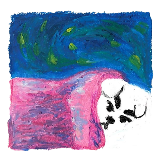
#finally.. KK sleepyhead...#i couldnt work with digital paint so i drew it using my pastels on paper#and then got my dad to scan it and then cleaned it up in photoshop#i wish it was a little cleaner because i used light blue and lavender on the pillow but it didnt scan it :o( but thats ok im just happy#with how it came out lol#the pastels i used are like two different types because one is way too soft and the other has like a nice rough quality#so i had to use the rough ones for base colors and then used the soft ones for details#im going to use this for my bedtime album ^^#my art#myart#kk slider#animal crossing#ac#nintendo#kk slider cover meme#cavetown#cavetown sleepyhead
801 notes
·
View notes
Text
Making a comic
I made a comic for my dad’s 60th birthday recently. It’s the first time I’ve made a comic and the first time I’ve ever really dealt with making something in print. It was a lot more work than I expected, so I’ve got a whole new appreciation for comic book artists, inkers, colourists and writers. I basically learned a bunch of stuff that in hindsight should have been really obvious.
I screwed up:
My margins. I just assumed that if I worked on Bristol board with an even margin on everything, I’d just be able to make it fit nicely when I scanned it and set the page. Of course, the physical paper size of Bristol board does not in fact match the aspect ratio of the classic printed comic book that I wanted to create. Thus, I have margins on the top and bottom of pages that are too large. Obviously.
Where to focus my energy. I thought the colouring was going to be the bit that took forever. That, and cleaning up the line work and all that fiddly stuff. Turns out, Photoshop makes that stuff really fast if you just watch, like, 2 youtube videos and keep a simple palette (even then, I made some compositions overall too dark while others were too light). The bit that took me forever was figuring out what to actually put in the panels and then the physical act of hand drawing them. I should have applied what I’d learned from my actual career and lead with the user stories and got that bit down before worrying about the UI.
The subject and style. Rabbits are basically expressionless blobs. They are terrible visual subjects for storytelling. I’d have had an easier time if I’d gone more cartoony and/or more fantastical.
The story telling. I am not a writer. I do not know how to construct a story. I can barely string a blog post together. Comics are apparently 99% creative writing and creative writing is so, so hard.
I don’t know if I’ll ever make another one – maybe if someone gave me a story to draw? – but I’m glad to have tried it.
3 notes
·
View notes
Text
Behind the Stationery: Paper Wilderness
Jenna from Paper Wilderness joins us on this installment of Behind the Stationery from Long Beach, California. Her stationery collections bring together lively watercolor illustrations and puns galore, and she makes it work all right out of her living room apartment! She’s here to share how her artwork went from a side hustle to her full-time job and how she maintains that handmade feel in her line. —Megan Soh
From Jenna: I’ve been drawing and painting ever since I could pick up a pencil and always knew I’d be some kind of artist. In 2010, the question of what exactly I’d be doing was definitely on my mind as I was about to graduate from CSU Long Beach with a BFA in Illustration. I’ve always had a deep appreciation for actually putting a paintbrush to paper, traditional art methods where you really have to commit to every brushstroke, and for me that was watercolor painting specifically. Yet in an increasingly technological society, where a large portion of art is created digitally, I was uncertain if my work would have any place in today’s art world.
Meanwhile, I’d been hand painting greeting cards for friends and family for years, and usually customized them with their favorite animal and a punny phrase. Everyone loved the cards and I discovered that they’d often get framed. Shortly after I graduated college, I got the opportunity to have a table at a small local art walk. While brainstorming ideas of what to sell at my table, I realized that my greeting cards were always well received and would be the perfect, affordable piece of art to sell. So I drew ten animals wearing party hats, traced each drawing onto cards, and hand painted every one! The cards sold out and I was addicted to the feeling that people actually wanted to buy my art. (Fun fact: a few cards from this first Party Animals series are still in my line to this day!) This little hand-painted side hustle continued for a while where I sold framed paintings, brooches, cards, and anything I wanted to experiment with at the occasional art walk, just as an artist with a hobby and not a business.
Eventually I realized that my unique watercolor greeting cards were the obvious draw and that I wanted to make an actual business out of it, and Paper Wilderness was born in 2014. Hand painting each card was not a sustainable option anymore (ha!) so after printing in-house for a few years I recently found a couple amazing printers who digitally print our goods now. Having inventory on hand to pull from has been amazing.
I run the business out of the dining room of my apartment in Long Beach, California and space is a little tight but I make it work. Paper Wilderness revolves around my lifelong love of animals, so every design is animal and nature based. I feel like animals and the natural world are a universal love language, symbols of purity that every human can appreciate and admire. That’s why they’re the perfect subjects for my work and goal of uniting people and encouraging communication and togetherness.
My cards usually involve some kind of pun too because I will always appreciate a good dad joke. Working from home while my bunny Lou Lou hops around is a constant source of cute inspiration so she’s got me covered on that front. The rest of the inspiration I get is from zoo trips, National Park visits, old illustrated textbooks, animal encyclopedias, and nature shows like Blue Planet. I love featuring obscure animals in my designs! The Notes app on my phone is full of snippets of funny conversations, cool animals to draw, and ideas for future cards.
All my work begins as a pencil sketch in my favorite mixed media sketchbook. Once I’m happy with the sketch, I ink it with waterproof Micron pens and watercolor paint over that inked illustration. Next I’ll experiment with hand lettering until I find a style that feels right for the card or product I’m designing, and that gets lettered in my sketchbook or piece of tracing paper. Then I scan everything into Photoshop, clean them up a little, lay it out, and it’s ready for production!
I just love how every single product exists on an actual piece of paper somewhere in my studio. I think this handmade process lends a certain intimate feeling or emotion to my work, which is definitely what I’m going for. I want my customers to feel like my own friends and family did when I first started, like I made this card just for them.
Paper Wilderness is a one-woman-show so every day is different. Whatever needs to happen gets tackled one task at a time, whether that’s packing up retail and wholesale orders, painting new illustrations, answering emails, checking inventory, bookkeeping, updating websites, or prepping for craft and trade shows. I just debuted my line at the National Stationery Show back in May and it was amazing! My business has slowly evolved into the hand painted, hand lettered watercolor paper goods studio it is today and I wouldn’t have it any other way.
All photos courtesy of Paper Wilderness.
Want to be featured in the Behind the Stationery column? Reach out to Megan at megan [at] ohsobeautifulpaper [dot] com for more details.
from Oh So Beautiful Paper https://ift.tt/2NcQAlo
via IFTTT
0 notes
Text
How to Use Photoshop to Create Milestone Photos of Babies
Buried deep in my parents’ basement are boxes of slides with pictures of my siblings and I, when we were kids, all taken with my dad’s Minolta DSLR that has long since been lost to the ages. I have a few scans of those early photos but most of them won’t see the light of day anytime soon. Thus the images that marked the passage of time for me, my sister, and my three brothers are few and far between.
This picture taken with a pocket camera and the fabric was purchased at a thrift store.
Thankfully modern technology and the prevalence of digital cameras means babies born today will likely have no shortage of images to mark their early years. One of the most common methods of documenting milestones is to take pictures at weekly or monthly intervals. Often these are augmented with some type of decoration or adornment to indicate the passage of time (e.g. a small chalkboard, a giant sticker on the kid’s tummy, or a number stamped in the corner of the picture).
There is an incredibly easy, fun, and highly effective way to do this in Photoshop. It only takes a few minutes and produces great results, even if you have never used this program before you should be able to figure it out.
Preparing for the photo shoot
My wife and I got this idea after reading a post on the popular do-it-yourself blog Young House Love but have tweaked it to fit our style. To get started you will need a few things, many of which you probably already own:
Fabric with big colorful prints; Finer-detailed prints are okay, but the bigger and more prominent the pattern, the better it will look when paired with your baby. Don’t spend much money on these since you’ll need a lot if you do a different fabric each week. Pro tip, let the grandparents know you’re in need of fabric. Ours were thrilled to go shopping at thrift stores and send us what they found.
White onesies; A t-shirt works better after the first year, but until that time onesies are best because they stretch nice and even across the baby’s body leaving you with fewer wrinkles to contend with in the post-processing phase.
Blue painter’s tape; Used to hold the fabric down to the ground.
A big window; Or a glass door, or another similar surface to let in a lot of light.
A step stool; so you can get a higher angle.
Tape to hold the fabric in place; Blue painter’s tape will work but I like to use Gaffer’s tape (I recommend this brand which is stronger and leaves no residue on the carpet when you pull it off.)
A reflector; We didn’t buy one of these until well into our second child and it’s amazing how much a reflector helps get nice even lighting.
It doesn’t take much to prepare for this type of photo shoot.
The session
The process works best with two people; one to take pictures and someone else to do multiple jobs like hold the reflector, smooth the blanket, and soothe the baby. Position your child with his or her feet near the light source (i.e. giant window or glass door) and have your helper hold the reflector by the baby’s head to bounce light back. Then get up on the stepstool and start taking pictures! Babies wriggle and squirm around a lot so don’t worry about quantity. It’s better to have too many good ones than to have to redo everything because you only took three shots and the baby was frowning in all of them.
Photoshop time
After your pictures are done it’s time to head to Photoshop where the real fun begins. You will need two fonts: Fyra for the numbers and one that you want to use for the letters. I like Fertigo Pro, but almost anything will work, it’s largely a matter of personal taste here.
Open your photo in Photoshop and it will appear as the background layer. You can leave it as is unless you plan to do any editing such as color adjustments or retouching, though my advice is to keep it simple and avoid all that if possible. You’ve got a newborn and you can’t spend hours editing your photos every single week when there are diapers to change and clothes to wash!
Add the text
Click the “T” button in the tool palette to activate the Text Tool, then click anywhere in the picture to create a new text layer. Use the Fyra font and type a letter which will show up as a big circular number – perfect for marking the weeks or months of time that have passed.
Use the toolbar at the top of your screen to adjust the size of the number, and if you don’t get it perfect you can always change it later using the Transform Tool. Press [enter] to lock in the number, then repeat most of the process for “weeks” by clicking the Text tool, selecting a font, clicking on your baby, and typing the label (weeks, months, etc.) you want.
At this point your picture might look like something the neighbor kid made in Microsoft Paint, but you’re just getting started. The finished version will look much better thanks to the magic of Photoshop.
Resize and warp the text
The next step is to customize the size and position of each of the elements. Using the Layers palette select the layer with a single letter, which is actually the number in the picture, and choose “Edit > Transform”. You can now reposition the number where you want it, and resize it by clicking and dragging on one of the corners. Hold down the [shift] key while doing this to maintain the proportions (shape) of the number or else your finished product will look all stretched out. You can even rotate the number by hovering your cursor near one corner until it turns into a cornered arrow and then click and drag.
Repeat the same process for the word you’ve used then with that layer still selected, click the Text tool in your toolbar and manually select the word (in this case “weeks”) itself. Then choose; Layer > Type > Warp Text… and add an Arch style. (You can also click the “Warp Text” toolbar button to do the same thing, see red arrow below.)
I like to use just a couple of degrees here, which helps the text simulate a more natural curve that you might see if it were printed across the white onesie directly. Usually, +5 gets the job done just fine.
Text color
After that, the next step is to change the color of the text so it complements the fabric on which your baby is laying. Use the Text tool to select either the number or the word (weeks) then click the black box next to the Warp Text button to change the color of the text.
Use the eyedropper to select a color from the fabric and tweak as necessary. you will also see the color of your text or number, whichever is selected, change as you try out different options. When you find one you like you can click the “OK” button to lock it in place.
But, before you do that select the six letters and numbers in the # box at the bottom and press [ctrl+c] to copy it. This is the hex code that tells your computer what color is in use, and you will use it again in the next step.
Repeat the same process for the other layer of text. To get the same color you can either hover the eyedropper over the newly-colored text on the picture or paste the color code (6-digits you copied) into the box at the bottom. When you are finished you will have an image that is close to the final product, but you’re not quite done yet.
Blend mode
Two final editing steps remain before your image is done, the first involves blend modes. These have to do with the way in which layers work together and how one layer’s color can be altered based on how it is combined with the layer below.
Use the Layers palette to highlight a text layer and change its blend mode to “multiply” with an opacity of 75%. This will allow some of the texture of the white onesie to show through, and make the text seem like it naturally printed on the fabric instead of just pasted on afterward in a computer program.
Masking
At this point, you may be thinking about using the eraser tool to fix parts of your image where the baby’s hands obscure the number or text. But trust me, this is not what you want to do!
Photoshop has a fantastic feature called layer masks that let you hide (erase) parts of a layer and even recover (show) them again later if you erase too much. In the example above, you will note that the baby’s arm should be covering up the 20, so the solution is to use a layer mask to remove (hide) that portion of the 20.
Click the text layer that you want to edit then choose “Layer > Layer Mask > Reveal All”. Now you will see a white box next to the layer that you can use to show and hide different parts of the layer itself. When you add anything dark to this layer mask it will erase (hide) that part of the layer, and when you add anything white to the mask it will show that part of the layer. This is an incredibly useful feature in Photoshop that you can use in all sorts of ways to edit your images, not just snapshots of your baby with milestone stickers.
Click the brush tool and start painting over the portion of the layer mask you want to erase, but keep one finger on the “x” key of your keyboard to switch between erasing mode and adding mode. If you accidentally brush over something that you want to keep, press “x” and add it back by painting it back in white! Then press “x” again to go back to deleting (painting with black).
Press the “z” key to zoom in on your image (and option-z to zoom out) and then “b” to go back to the brush tool. After a few strokes of your brush, your image is ready to share with family and friends!
When to stop
Right here is where I like to stop because the image is, as I like to say, good enough. There are some imperfections that could be cleaned up like using a displacement map to alter “weeks” so it follows all the contours and folds of the fabric, but I have found that these are just not worth my time. To be honest, most people won’t even notice.
You can easily spend hours using warp transforms, color tweaking, and spot removal to get each picture looking pixel-perfect and ready to print in Baby Cosmopolitan. But parents of newborns have to find a balance between time spent on the computer and time spent with their families.
After 52 weeks of doing pictures we used a slightly different setup and reduced our images to once a month with our child standing or sitting instead of lying down.
Conclusion
If you have an infant or are expecting one, pictures like this are a fantastic way to mark the passage of time. My wife and I did shots like these with our two boys every week for the first year of their lives, and then every month until they turned two.
At the time it seemed like a huge hassle to get out the fabric, put a white onesie on, and try to soothe a fussy infant long enough to snap a few pictures every single week. Looking back through them we are so glad we did. When shown in an album side by side these images provide a priceless way of seeing how our kids both grew so much during those early times of their lives.
If you have a small baby and give this a try, please share your images and/or questions in the comments area below.
The post How to Use Photoshop to Create Milestone Photos of Babies by Simon Ringsmuth appeared first on Digital Photography School.
from DIYS http://ift.tt/2jaD2Va
0 notes
Text
How to Use Photoshop to Create Milestone Photos of Babies
Buried deep in my parents’ basement are boxes of slides with pictures of my siblings and I, when we were kids, all taken with my dad’s Minolta DSLR that has long since been lost to the ages. I have a few scans of those early photos but most of them won’t see the light of day anytime soon. Thus the images that marked the passage of time for me, my sister, and my three brothers are few and far between.
This picture taken with a pocket camera and the fabric was purchased at a thrift store.
Thankfully modern technology and the prevalence of digital cameras means babies born today will likely have no shortage of images to mark their early years. One of the most common methods of documenting milestones is to take pictures at weekly or monthly intervals. Often these are augmented with some type of decoration or adornment to indicate the passage of time (e.g. a small chalkboard, a giant sticker on the kid’s tummy, or a number stamped in the corner of the picture).
There is an incredibly easy, fun, and highly effective way to do this in Photoshop. It only takes a few minutes and produces great results, even if you have never used this program before you should be able to figure it out.
Preparing for the photo shoot
My wife and I got this idea after reading a post on the popular do-it-yourself blog Young House Love but have tweaked it to fit our style. To get started you will need a few things, many of which you probably already own:
Fabric with big colorful prints; Finer-detailed prints are okay, but the bigger and more prominent the pattern, the better it will look when paired with your baby. Don’t spend much money on these since you’ll need a lot if you do a different fabric each week. Pro tip, let the grandparents know you’re in need of fabric. Ours were thrilled to go shopping at thrift stores and send us what they found.
White onesies; A t-shirt works better after the first year, but until that time onesies are best because they stretch nice and even across the baby’s body leaving you with fewer wrinkles to contend with in the post-processing phase.
Blue painter’s tape; Used to hold the fabric down to the ground.
A big window; Or a glass door, or another similar surface to let in a lot of light.
A step stool; so you can get a higher angle.
Tape to hold the fabric in place; Blue painter’s tape will work but I like to use Gaffer’s tape (I recommend this brand which is stronger and leaves no residue on the carpet when you pull it off.)
A reflector; We didn’t buy one of these until well into our second child and it’s amazing how much a reflector helps get nice even lighting.
It doesn’t take much to prepare for this type of photo shoot.
The session
The process works best with two people; one to take pictures and someone else to do multiple jobs like hold the reflector, smooth the blanket, and soothe the baby. Position your child with his or her feet near the light source (i.e. giant window or glass door) and have your helper hold the reflector by the baby’s head to bounce light back. Then get up on the stepstool and start taking pictures! Babies wriggle and squirm around a lot so don’t worry about quantity. It’s better to have too many good ones than to have to redo everything because you only took three shots and the baby was frowning in all of them.
Photoshop time
After your pictures are done it’s time to head to Photoshop where the real fun begins. You will need two fonts: Fyra for the numbers and one that you want to use for the letters. I like Fertigo Pro, but almost anything will work, it’s largely a matter of personal taste here.
Open your photo in Photoshop and it will appear as the background layer. You can leave it as is unless you plan to do any editing such as color adjustments or retouching, though my advice is to keep it simple and avoid all that if possible. You’ve got a newborn and you can’t spend hours editing your photos every single week when there are diapers to change and clothes to wash!
Add the text
Click the “T” button in the tool palette to activate the Text Tool, then click anywhere in the picture to create a new text layer. Use the Fyra font and type a letter which will show up as a big circular number – perfect for marking the weeks or months of time that have passed.
Use the toolbar at the top of your screen to adjust the size of the number, and if you don’t get it perfect you can always change it later using the Transform Tool. Press [enter] to lock in the number, then repeat most of the process for “weeks” by clicking the Text tool, selecting a font, clicking on your baby, and typing the label (weeks, months, etc.) you want.
At this point your picture might look like something the neighbor kid made in Microsoft Paint, but you’re just getting started. The finished version will look much better thanks to the magic of Photoshop.
Resize and warp the text
The next step is to customize the size and position of each of the elements. Using the Layers palette select the layer with a single letter, which is actually the number in the picture, and choose “Edit > Transform”. You can now reposition the number where you want it, and resize it by clicking and dragging on one of the corners. Hold down the [shift] key while doing this to maintain the proportions (shape) of the number or else your finished product will look all stretched out. You can even rotate the number by hovering your cursor near one corner until it turns into a cornered arrow and then click and drag.
Repeat the same process for the word you’ve used then with that layer still selected, click the Text tool in your toolbar and manually select the word (in this case “weeks”) itself. Then choose; Layer > Type > Warp Text… and add an Arch style. (You can also click the “Warp Text” toolbar button to do the same thing, see red arrow below.)
I like to use just a couple of degrees here, which helps the text simulate a more natural curve that you might see if it were printed across the white onesie directly. Usually, +5 gets the job done just fine.
Text color
After that, the next step is to change the color of the text so it complements the fabric on which your baby is laying. Use the Text tool to select either the number or the word (weeks) then click the black box next to the Warp Text button to change the color of the text.
Use the eyedropper to select a color from the fabric and tweak as necessary. you will also see the color of your text or number, whichever is selected, change as you try out different options. When you find one you like you can click the “OK” button to lock it in place.
But, before you do that select the six letters and numbers in the # box at the bottom and press [ctrl+c] to copy it. This is the hex code that tells your computer what color is in use, and you will use it again in the next step.
Repeat the same process for the other layer of text. To get the same color you can either hover the eyedropper over the newly-colored text on the picture or paste the color code (6-digits you copied) into the box at the bottom. When you are finished you will have an image that is close to the final product, but you’re not quite done yet.
Blend mode
Two final editing steps remain before your image is done, the first involves blend modes. These have to do with the way in which layers work together and how one layer’s color can be altered based on how it is combined with the layer below.
Use the Layers palette to highlight a text layer and change its blend mode to “multiply” with an opacity of 75%. This will allow some of the texture of the white onesie to show through, and make the text seem like it naturally printed on the fabric instead of just pasted on afterward in a computer program.
Masking
At this point, you may be thinking about using the eraser tool to fix parts of your image where the baby’s hands obscure the number or text. But trust me, this is not what you want to do!
Photoshop has a fantastic feature called layer masks that let you hide (erase) parts of a layer and even recover (show) them again later if you erase too much. In the example above, you will note that the baby’s arm should be covering up the 20, so the solution is to use a layer mask to remove (hide) that portion of the 20.
Click the text layer that you want to edit then choose “Layer > Layer Mask > Reveal All”. Now you will see a white box next to the layer that you can use to show and hide different parts of the layer itself. When you add anything dark to this layer mask it will erase (hide) that part of the layer, and when you add anything white to the mask it will show that part of the layer. This is an incredibly useful feature in Photoshop that you can use in all sorts of ways to edit your images, not just snapshots of your baby with milestone stickers.
Click the brush tool and start painting over the portion of the layer mask you want to erase, but keep one finger on the “x” key of your keyboard to switch between erasing mode and adding mode. If you accidentally brush over something that you want to keep, press “x” and add it back by painting it back in white! Then press “x” again to go back to deleting (painting with black).
Press the “z” key to zoom in on your image (and option-z to zoom out) and then “b” to go back to the brush tool. After a few strokes of your brush, your image is ready to share with family and friends!
When to stop
Right here is where I like to stop because the image is, as I like to say, good enough. There are some imperfections that could be cleaned up like using a displacement map to alter “weeks” so it follows all the contours and folds of the fabric, but I have found that these are just not worth my time. To be honest, most people won’t even notice.
You can easily spend hours using warp transforms, color tweaking, and spot removal to get each picture looking pixel-perfect and ready to print in Baby Cosmopolitan. But parents of newborns have to find a balance between time spent on the computer and time spent with their families.
After 52 weeks of doing pictures we used a slightly different setup and reduced our images to once a month with our child standing or sitting instead of lying down.
Conclusion
If you have an infant or are expecting one, pictures like this are a fantastic way to mark the passage of time. My wife and I did shots like these with our two boys every week for the first year of their lives, and then every month until they turned two.
At the time it seemed like a huge hassle to get out the fabric, put a white onesie on, and try to soothe a fussy infant long enough to snap a few pictures every single week. Looking back through them we are so glad we did. When shown in an album side by side these images provide a priceless way of seeing how our kids both grew so much during those early times of their lives.
If you have a small baby and give this a try, please share your images and/or questions in the comments area below.
googletag.cmd.push(function() {
tablet_slots.push( googletag.defineSlot( “/1005424/_dPSv4_tab-all-article-bottom_(300��250)”, [300, 250], “pb-ad-78623” ).addService( googletag.pubads() ) ); } );
googletag.cmd.push(function() {
mobile_slots.push( googletag.defineSlot( “/1005424/_dPSv4_mob-all-article-bottom_(300×250)”, [300, 250], “pb-ad-78158” ).addService( googletag.pubads() ) ); } );
The post How to Use Photoshop to Create Milestone Photos of Babies by Simon Ringsmuth appeared first on Digital Photography School.
from Digital Photography School http://digital-photography-school.com/photoshop-create-milestone-photos-babies/
0 notes
Last Seen Blogs

speeddemonsblog
Persönlichkeit Entwicklung

80salltheway
80'salltheway
arsoblivionalis
Just a mess I guess

8thplacewolfos
dodongo’s agere blog

azuriteabbie
Azurite Abbie