#based on an illustration in a 1920s children's book
Text
Animation week one
Day 1
On Monday we got our brief for our animation project. The theme would be world building.
Although animation is based a lot on characters it is important to note that backgrounds and world building is just as important as the characters because it completes the whole image and can be used to convey important info about the story, such as the time and place or to provide context for the characters actions, which helps the audience out visually. It also enhances the drawing into a composition.
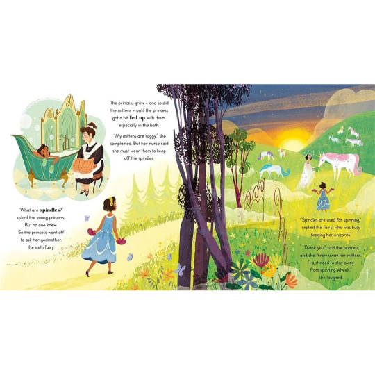
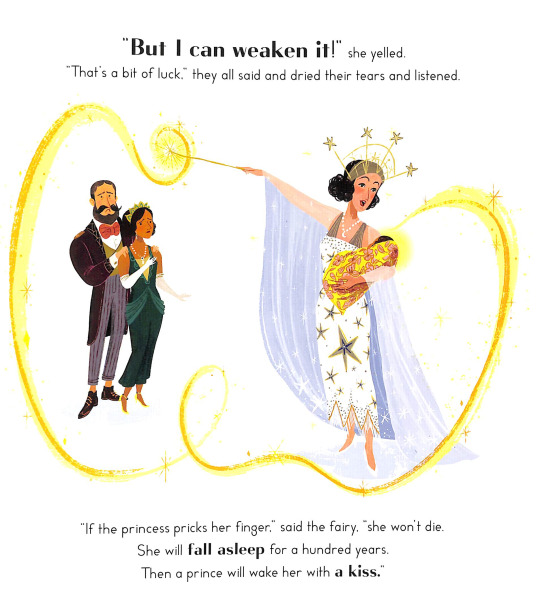
We then went to the Limerick city library where we chose a few childrens books, these books would help inspire us to create our own worlds for our mini-me's, these mini-me's are a version of ourselves that we would create in 3D and later place in our backgrounds for our animation.
The book I chose for inspiration for my background was 'The Sleeping Beauty' by Ursula Jones and illustrated by Paola Escobar.
My artist reference was Paola Escobar, Paola is a graphic designer and illustrator from Columbia.
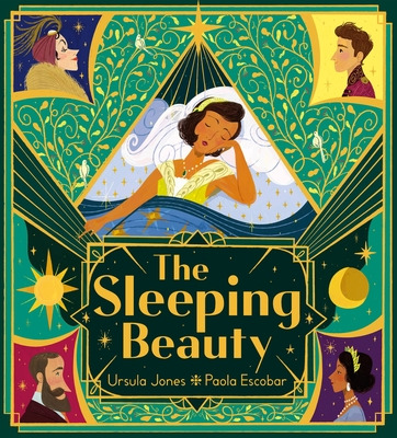
She is the illustrator of award-winning picture book 'planting stories' and also the illustrator of my book 'sleeping beauty'.
Style: Paola's style is very unique and quite detailed, she includes plenty of texture and intriquite design in her illustrations. Her line work includes lot's of colour which makes her art seem delicate and soft. Personally I love her style and I'm excited to replicate aspects of her style along with my own to create something new, my style wouldnt be as simple as hers so it'll be interesting to see the final outcome.

Colour: Poala includes very bright and usually warm toned colours in her illustrations, her colours are all complimentary with eachother and she does an amazing job contrasting her colours in the right places. As I said earlier she adds texture to her colours which adds more depthn and demension to her pieces.
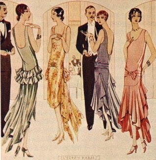
Shape: For this book especially, the shapes and design she illustrated are very much inspired by the style of 1920's.
She included this style in fashion, such as the flapper style dress as you can see here;
I reserached and found the flapper style was worn amoung young women in the 1920's. They would wear short dresses that wouldnt have much shape with a low back and higher neck. These women would usually have their hair in a bob.

I found that Paola used a lot of the Art Deco style in this book too. This style was also very popular in the 1920's, characterized by sleek geometric or stylized forms use of symmetry and repetion of elements.


As well as Art Deco I found there was use of Art Novoeu architecture; Art Novoeu was 20th century aesthetic movement, influenced by the natural world or defined by elagant shapes and structured designs.
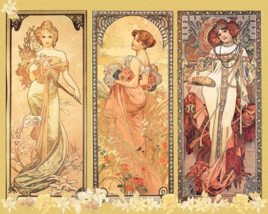

After reseraching all these elements, I was especially inspired by the Art Deco style as well as her own style and shape, these were the things that stood out to me the most. Perhaps I can use the symmetrical designs for my mini-me and use tecture and style for the backgrounds.
2 notes
·
View notes
Text
Bill Nelson’s “Starlight Stories” Now Available!

Bill Nelson’s “Starlight Stories” is an album comprising a mixture of song based and instrumental material issued on the Sonoluxe label in a limited edition of 1000 copies, and available digitally.
Despite being recorded during the same 2022 recording sessions that produced the “All The Fun Of The Fair” album, “Starlight Stories” has a wholly different atmosphere and intent.
Wistful and melancholic, the album contains dreamy meditations fed through the filter of Bill Nelson’s contemporary musical sensibility.
“The inspiration for many of the songs came from my memories of a set of children’s story books, published in the 1920s, that my Mother had owned when she was a child in the early 1930s. She had kept these books and would read to me from them when I was an infant in the early 1950s. They were thick, heavy bound books with embossed covers and had titles such as ‘The Golden Wonder Book For Children’. They were brilliantly illustrated by artists who displayed a combination of Art Nouveau and Art Deco styles. The books contained stories by famous authors such as HG Wells, Miguel De Cervantes, Homer, William Blake and others, plus poems by various poets, both classical and contemporary to those times. I was entranced by the wonderful stories and illustrations they contained. They had an aura of magic and mystery about them, with fairy tales and evocatively British poetry, filled with seasonal and rustic imagery. A treasure trove of fantasy and adventure, which I loved.
Read the full article
0 notes
Text
Bill Nelson’s “Starlight Stories” Now Available!

Bill Nelson’s “Starlight Stories” is an album comprising a mixture of song based and instrumental material issued on the Sonoluxe label in a limited edition of 1000 copies, and available digitally.
Despite being recorded during the same 2022 recording sessions that produced the “All The Fun Of The Fair” album, “Starlight Stories” has a wholly different atmosphere and intent.
Wistful and melancholic, the album contains dreamy meditations fed through the filter of Bill Nelson's contemporary musical sensibility.
“The inspiration for many of the songs came from my memories of a set of children’s story books, published in the 1920s, that my Mother had owned when she was a child in the early 1930s. She had kept these books and would read to me from them when I was an infant in the early 1950s. They were thick, heavy bound books with embossed covers and had titles such as ‘The Golden Wonder Book For Children’. They were brilliantly illustrated by artists who displayed a combination of Art Nouveau and Art Deco styles. The books contained stories by famous authors such as HG Wells, Miguel De Cervantes, Homer, William Blake and others, plus poems by various poets, both classical and contemporary to those times. I was entranced by the wonderful stories and illustrations they contained. They had an aura of magic and mystery about them, with fairy tales and evocatively British poetry, filled with seasonal and rustic imagery.
Read the full article
0 notes
Photo
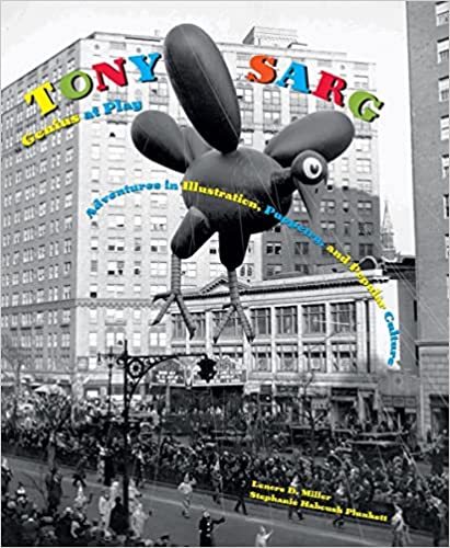
The first-ever book on the extraordinary career of Tony Sarg, founder of modern American puppetry and creator of the Macy’s Thanksgiving Day Parade balloons
Tony Sarg (1880–1942), an American artist born in Guatemala to a diplomatic family, first achieved professional success as an illustrator in London and New York. But in the 1920s, he gained even greater renown for his touring puppet shows based on classic tales like Alice in Wonderland and Robinson Crusoe. Fusing the time-honored craft of traditional marionette shows with a playful modern sensibility, Sarg’s productions were foundational to American puppetry: Jim Henson can be considered a direct artistic descendant. Yet this was only one facet of Sarg’s varied accomplishments: he was also a pioneer in animated films and children’s books, and, as a longtime designer for Macy’s, he invented the gigantic balloons used in the firm’s Thanksgiving Day Parade. (He also employed one of his parade balloons in the famous Nantucket Sea Serpent hoax of 1937.)
This abundantly illustrated volume, published to coincide with a major exhibition organized by the Norman Rockwell Museum, is the first to survey Tony Sarg’s protean career. It brings together imagery and artifacts from numerous public and private collections, and includes special sections on Sarg’s long association with the island of Nantucket and his influence on American puppetry. Tony Sarg: Genius at Play will be essential reading for anyone with an interest in the history of popular culture.
0 notes
Text
Ava Humler
Design 100
Nov 14th, 2022
Marc Chagall was born July 7, 1887, in Russia. He was a Russian-born French painter and designer. His work was composed based on his emotion and literature. He was very into surrealism and valued the psychological reality of modern times and art. He worked in different media, and on various projects. He worked on sets for plays and musicals, drawings in the Bible, and thoroughly enjoyed designing a beautiful stained glass window.
He was born in a little city in the western Russian Empire. He was one of eight children in a Jewish household. He wasn’t living in poverty but was still able to appreciate the things he had. He attended a Jewish elementary school and then followed by attending public school. He studied painting in a studio of a local artist focusing on realism. He then attended St. Petersburg studying under stage designer Leon Basket. In 1910, Chagall went to Paris on a generous allowance provided by St. Petersburg. After some time, he moved into a studio at the edge of a low-income, bohemian artist town. He met many inspirational people there who supported his every idea and vision. He developed extremely fast into the kind of artist he wanted to be.
The four years he stayed in Paris were considered Chagall’s prime time in his life. He had many representative works including his notorious Self-Portrait with Seven Fingers(1912). This was another interesting twist in his story, he only had seven fingers! Try putting down any three fingers, seems things would be a little more difficult right? He still found passion in a profession that surrounded the use of his hands and fingers, it’s incredible. Memories of his childhood and where he grew up were part of the inspiration behind his greatest pieces. Chagall had his first solo show in Berlin in 1914, he made a valid statement about German expressionists. After seeing his work for the first time he returned home where it was stuck in because of World War I. He took this to create scenes from local places and even did a project on old men. In 1915 he married Bella Rosenfeld, daughter of a rich merchant. She appears in many of his paintings from this time on.
He moved to Moscow in 1919 after becoming a commissar for art where he grew up. He then turned his focus to stage production. He worked on sets and costumes for plays and musicals. In 1922, Chagall left Russia for good. He returned to Berlin to find many of the pictures he left behind in 1914, had vanished. He learned the practice of engraving while he was in Berlin. He then settled down in Paris again with his wife and now daughter. He started his career in printmaking when he was asked to create a series of etchings for a novel. During the next few years, he created a full 107 pages for the book. Then a new idea came about for colored illustrations. Chagall made 100 gouaches for the printmaker but his colors were too intellectual for the engraving process. He switched back to black and white finishing by 1931. By 1939 he completed 66 plates for the book. World War II stunted the project. It was issued in 1948 and Chagall was proud. His work in the 1920s to 1930s was more dedicated to the public. When Hitler became controlled the world and added serious conflict, his visions changed. During this time he traveled a lot working in southern France. Between 1932 and 1937, he was in Holland, Spain, Poland, and Italy. Finally, in 1931, he wrote and published his autobiography.
Finally, in July 1941, he and his family took refuge in the United States; he spent most of the next few years in and around New York City. But in 1944 his wife Bella died, and memories of her, often in a set form where he was raised, became a recurring vision of his. For the last 30 years of his life, he continued to paint and did many large public projects. I love that he focused much of his attention on color. I am taking a color theory class soon and I find it all interesting. He clearly had a passion for it which showed in his work. Chagall died in 1985 but left a long-lasting impression on the world. He brought awareness to different types of artistic movements. He did a great job reaching a level of connecting metaphors to art.
Chagall: [Biographical and Critical Study. Hassell Street Press, 2021.
0 notes
Text
Drawing Techniques
Exquisite Corpse
Exquisite Corpse is a drawing game where players take turns drawing sections of a body, on a piece of paper which is folded to hide each previous drawing. Eventually, this results in a strange creature once each piece is revealed. The game gained popularity in the 1920s when it was adopted as a technique by artists during the surrealist movement to collaborate together.
This technique was popular among artists such as André Breton, Yves Tanguy, and Jacques Prévert.
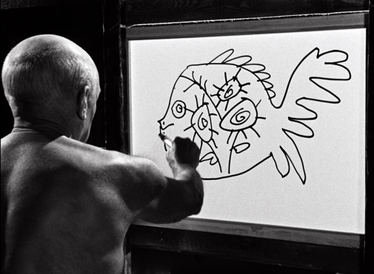
Pablo Picasso: drawing time-lapse
Picasso partnered with French director Henri-Georges Clouzot where they used stop-action and time-lapse photography to film Picasso as he worked.
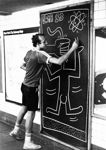
Keith Haring: subway drawings
Haring originally started by making his art work on the Subway, doodling with chalk on things like empty advertising boards. This meant he had to work quick and fast, as what he was doing was technically illegal. However this allowed him to create many drawings very quickly and the simplicity of his style was part of what made it very recognisable and popular even today. His aim in making his work so publicly was to make art accessible to everyone.
Louise Bourgeois: conceptual art
Bourgeois was a conceptual artist. Her drawings were very personal, as she often explored her own personal traumas in them.
She also suffered from insomnia, which led her to creating a series of 'insomnia drawings', consisting of 220 drawings she created during nights she couldn't sleep.

Quentin Blake: children's illustrations
As a children's book illustrator, Blake will create creatures and characters based off written descriptions. Since his target audience is children, his art style reflects this and is fairly simple and almost child-like in quality.
0 notes
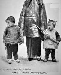
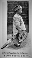
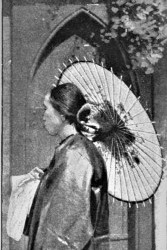
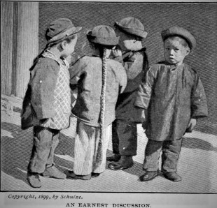
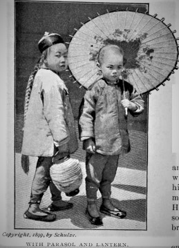
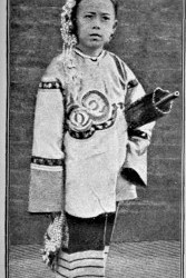
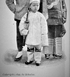
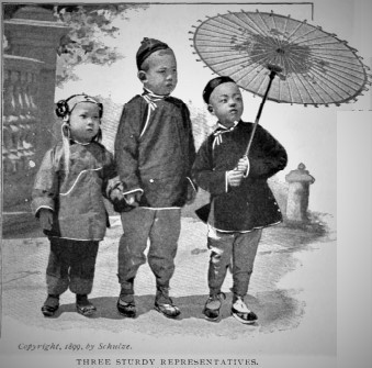
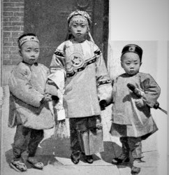
Photo
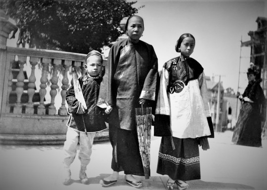
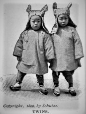
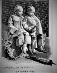
“Three Generations” c. 1899. Photograph by Hortense Schulze published in The Cosmopolitan, An Illustrated Monthly Magazine (vol. 28, no. 6) April, 1900, p. 606.
Picturing Old Chinatown’s Children: The ‘Infinite Patience’ of Hortense Schulze
In her book, The Children of Chinatown: Growing Up Chinese American in San Francisco 1850-1920 (pub. Univ. North Carolina Press 2009) author Wendy Rouse Jorae observed that the late 19th and early 20th centuries Chinatown witnessed a significant incursion of photographers and artists who sought to capture images of Chinatown’s children for the commercial market. Although the photographs of Chinese children taken by Arnold Genthe remain perhaps the best known body of work to the public, photographs by Charles Weidner and Mervyn Silberstein fueled the growing tourist postcard industry in America. (The small photograph format of the carte de visite (or visiting card), had been patented in Paris by photographer André Adolphe Eugène Disdéri in 1854, although first used by Louis Dodero.) However, little is known about Hortense Schulze who, among others, managed to build a successful business based on her evident ability to persuade Chinese parents to allow her to photograph their children. Jorae described the community’s changing attitudes toward the outsiders as follows:
“Festive, brightly clad, and smiling images of Chinese youth softened and countered anti-Chinese depictions of Chinatown. The image of a bachelor community seemed to dissolve with the prolific reproduction of images of Chinese youth. Although not all of these photographers and artists considered the Chinese as their intellectual or moral equals, their depictions of Chinatown’s children fostered a more acceptable view of Chinese America. Whereas some whites saw the Orientalization and commodification of images of Chinatown as a means of reinforcing the racial hierarchy, others sought to prove the equality of the races and express a common sense of humanity through shared visions of middle-class domesticity. These images helped white and Chinese neighbors find common ground in their shared conception of the innocence and purity of childhood.”
As would later become even more apparent after the reconstruction of the neighborhood following the 1906 earthquake and fire, Chinatown’s merchant elite viewed the high degree of interest by white photographers and artists in Chinese children as an implicit form of positive civic engagement. Images of Chinatown’s families with children, like dragon parades, helped to dispel the public’s fear, suspicion, and disdain created by decades of police blotter reporting about, and politicians’ condemnation of, gambling, drugs, prostitution, tong warfare, and the homicides resulting therefrom.

At the height of her career in photography, her peers regarded Etta Hortense Schulze as “one of the best-known women photographers of the West. In its issue of November 1900, the photographic monthly Camera Craft (vol II, no. 1) announced that Schulze had opened a studio at 116 Stockton Street during the two months. The “Notes” section of the magazine [p. 159] described the operation the Hortense Schulze studio as follows:
“The studio everywhere shows evidences of a woman's hand and is undoubtedly one of the most artistic in the city. The walls are filled with interesting souvenirs gathered from every quarter of the globe, and the most unique feature of the studio is that the interesting features do not stop at the reception-room. The gallery itself is handsomely finished and beams most cheerfully to the prospective subject.”
The magazine’s writer attributed Schulze’s success directly to her forays into San Francisco Chinatown to photograph its children.
Mrs. Schulze, who gained a well-earned reputation several years ago for her Chinese photos, has probably the largest collection of pictures of Chinese children in the United States, and the demand for them has become so great that the studio was almost an absolute necessity. The infinite patience and artistic ability required to gather a collection of such excellence and magnitude would deter any one except a woman wonderfully gifted with such attributes. Everyone is familiar with the pictures, and as they form the best possible souvenir of California, the demand has always exceeded the supply. This year Mrs. Schulze decided to mount some of the pictures on calendars. The result so far exceeded her anticipations that she has decided to start at once and begin the manufacture of a supply for 1902.
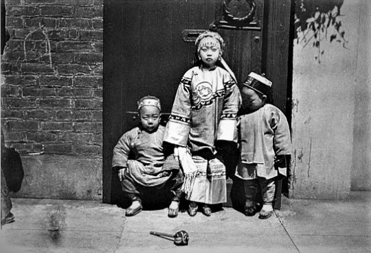
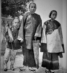
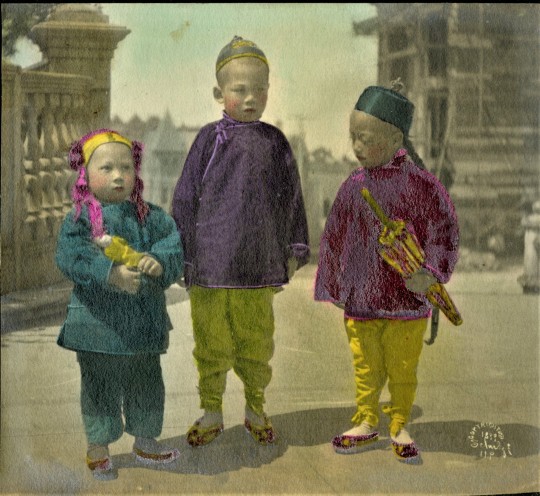
Untitled (Chinese children), c. 1899. Photograph by Hortense Schulze (from the collection of the California Historical Society). This photo represents one of at least three known variants of the same trio of children. One version reposes in the collection of Stanford Libraries and a third was printed in The Cosmopolitan magazine of April 1900 under the title "Taking The Air With Sister.”
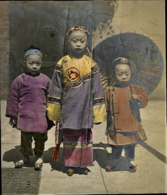
Colorized print of an alternate photograph of the same trio of Chinese children, c. 1899. Photograph by Hortense Schulze (from an album pending cataloging courtesy of the Manuscripts division of Stanford Libraries).
Unfortunately, few other details about Schulze or her work are readily available to the amateur researcher. The best single-source sample of her work remains the suite of photographs for the “Babies of Chinatown” article written by artist Mary Davison for The Cosmopolitan, An Illustrated Monthly Magazine (vol. 28, no. 6) of April, 1900 (pp. 606-612). The photos are presented in roughly the order of their appearance in the magazine.
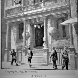
For the “Babies of Chinatown” article by Mary Davison, a photograph of the Tin How temple on Waverly Place represented the only image without a child subject.
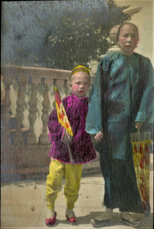
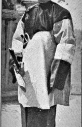
A colorized close-up print of two of the three subjects of “Three Generations” c. 1899. Photograph by Hortense Schulze (from an album pending cataloging courtesy of the Manuscripts division of Stanford Libraries).
Colorized print of an alternate take of the same trio of children appearing in the photograph titled “Three Sturdy Representatives,” c. 1899. Photograph by Hortense Schulze (from an album pending cataloging courtesy of the Manuscripts division of Stanford Libraries).
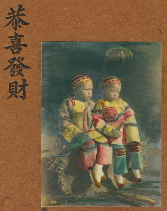
A colorized version of one of Hortense Schulze's photographs (titled "Interested") for The Cosmopolitan magazine of April 1900. The four-character (canto: "gung hay faht choy"), seasonal Chinese New Year greeting appears at left. [Found by collector Wong Yuen-Ming at an online auction site.]
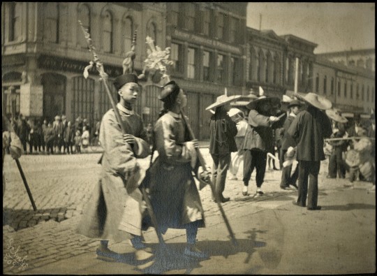
Finally, we consider the above pair of signed Schulze photos of two different pairs of Chinese parade marchers.
Untitled Chinese parade standard-bearers standing in a street in front of white onlookers, probably in San Francisco, c. 1900. Photograph by Hortense Schulze (from an album pending cataloging courtesy of the Manuscripts division of Stanford Libraries). This image is signed and numbered by Schulze in the negative.
Untitled Chinese ceremonial halberd-bearers walking past a gathering of other Chinese (with a mixed group of Chinese and white onlookers across the street and in the left of the fram)e, probably in San Francisco, c. 1900. Photograph by Hortense Schulze (from an album pending cataloging courtesy of the Manuscripts division of Stanford Libraries). This image is signed and numbered by Schulze in the negative.
Discernible business signage in the upper-center of the frame reads: “Dairy Produce & Provisions.” A word-search of the San Francisco telephone book discloses a business “Scheer Morehouse & Grandi, Dairy Produce & Provisions” at 15 California Street. This address is consistent with the relatively flat topography of the streetscape in the photo and close enough to Chinatown’s outskirts to locate the scene in downtown San Francisco.
According to Women's Photography After the Gold Rush by Mary Brown, “an incredible record of Chinatown was made by Hortense Schulze, an amateur photographer who ventured into Chinatown to photograph children in their native garb. Chinese and white San Franciscans led totally separate lives, and Chinatown was definitely not a socially acceptable place for white women to visit. Nonetheless on her many forays to Chinatown Hortense took enough photos that were popular enough for her to begin a career in photography. Her new gallery opened in October of 1900 on Stockton Street."
According to Stanford Libraries, Schulze's work appears to be extremely scarce, with no images appearing at auction and only one entry in OCLC, for a pair of images held at the Bancroft Library. Researchers of 19th century Chinese California can only hope that additional examples of Schulze’s work will be reintroduced to the public in the future.
As for Schulze herself, Warren Wulzen (the grandson of another Chinatown photographer, D.H. Wulzen), found that her studio’s tradename “morphs into Schulze & Schulze in 1903, then disappears in 1904.”

“Both Hortense and husband Walter disappear from the city directories after 1903,” Wulzen advises, but an entry in the Petaluma Argus-Courier of February 1, 1906, discloses her relocating to Petaluma prior to the earthquake.
“Apparently Hortense was divorced, as Walter H Schulze married Daisy L Hopkins in LA in 1908,” Wulzen writes. “They returned to SF, but became embroiled in a nasty divorce case in 1917.” Thereafter, the trail grows cold about her and whatever may have remained of her photographic work. Research is continuing.
[updated: 2022-9-11]
#Hortense Schulze#Camera Craft#San Francisco Chinatown children#Mary Davison#Stanford Libraries#Babies of Chinatown#The Cosmopolitan magazine April 1900
1 note
·
View note
Text
The poky little puppy vintage golden book

A Little Golden Book The Poky Little Puppy No Dust Jacket Vintage | eBay.
Katie the Kitten (Little Golden Book) Hardcover.
The Poky Little Puppy (Golden records) - YouTube.
Retro Educational Technology: The Poky Little Puppy.
The Poky Little Puppy: Read & Listen Edition - Pinterest.
The Poky Little Puppy and the Patchwork Blanket (Little.
A Guide to Little Golden Books (1st Editions & Values) - Heart.
Golden Book | Other | Vintage 5s90s Little Golden Book Lot Of.
9780307980908: The World of Barbie (Barbie) (Little Golden Book.
The Poky Little Puppy. A Little Golden Book. Vintage | Etsy.
VINTAGE 1963 THE POKY LITTLE PUPPY A Big Golden Book In Full.
Little Golden Books / About.
The Poky Little Puppy by Janette Sebring Lowrey - First Edition - 1942.
A Little Golden Book The Poky Little Puppy No Dust Jacket Vintage | eBay.
The Poky Little Puppy Comes To Sesame Street By Anna Dickson Little Golden Book. AU $6.00. + AU $14.45 postage. 1996: A Publishers Weekly article lists The Poky Little Puppy as the bestselling children's book of all time. 2000s - 2015s Average Cost: $2.99 (2000) - $3.99 (2012) January 2001: The Little Golden Books Classic line is launched to bring back popular vintage Little Golden Books titles based on consumer demand. The first 6 titles include. Vintage Poky Little Puppy Book Golden Shape Book Paperback 1979 $8.54 Was: $8.99 $3.19 shipping or Best Offer The Little Golden Books The Poky Little Puppy (1942) $9.00 $4.20 shipping 2 Vintage First Little Golden Books~ What Am I? and Poky Little Puppy's Winter.. $6.00 $2.99 shipping or Best Offer.
Katie the Kitten (Little Golden Book) Hardcover.
The Poky Little Puppy (A Little Golden Book Classic) - Hardcover -2007 Pre-owned $8.00 Free shipping Seller 99.5% positive The Poky Little Puppy's First Christmas (Little Golden Book) Pre-owned $3.51 Free shipping Buy 2, get 1 free 1993 Little Golden Book #461-01 The Poky Little Puppy's First Christmas Pre-owned $6.99 + $4.95 shipping.
The Poky Little Puppy (Golden records) - YouTube.
JEAN CHANDLER wrote and illustrated several Poky Little Puppy Little Golden Books during the 1970s and 1980s, including The Poky Little Puppy's First Christmas and The Poky Little Puppy and the Patchwork Blanket. SUE DiCICCO is a prolific children's book illustrator and author, as well as a sculptor. Born in Southern California, she attended.
Retro Educational Technology: The Poky Little Puppy.
The Poky Little Puppy was and still is the most popular of these original titles, helping it become the best-selling children's book of the 20th century (a total of 14,898,341 copies were sold). Gustaf Tenggren, who immigrated to the U.S. from Sweden in 1920, created other famous Little Golden Book characters such as the Saggy Baggy Elephant and Tawny Scrawny Lion. Before coming to Golden Books, he worked for the Disney studio, providing concept artwork for various characters and scenes in Snow White and the Seven Dwarfs and Pinocchio. The Poky Little Puppy was one of the original twelve Little Golden Books published in 1942, and went on to become the bestselling picture book of all time. The story of a curious puppy, who digs holes under fences and who has to go to bed without any strawberry shortcake, has delighted families for generations. it is, quite simply, an icon.
The Poky Little Puppy: Read & Listen Edition - Pinterest.
VINTAGE 1963 THE POKY LITTLE PUPPY A Big Golden Book In Full Color Classic. This 1963 edition book is in very good condition. The only thing that stops it from fine condition is the gift inscription to a little girl. 2. The first 12 books released were: Three Little Kittens, Bedtime Stories, The Alphabet A-Z, Mother Goose, Prayers for Children, The Little Red Hen, Nursery Songs, The Poky Little Puppy, The Golden Book of Fairy Tales, Baby’s Book, The Animals of Farmer Jones and This Little Piggy. Buy The Poky Little Puppy by Janette Sebring Lowery, Gustaf Tenggren (Illustrator) online at Alibris.... FAQs about collecting Rare and Vintage books; Collect Rare and Out-of-Print Books... one of the original 12 Little Golden Books that launched in October 1942--and soon became the bestselling picture book of all time--is now available in an.
The Poky Little Puppy and the Patchwork Blanket (Little.
Golden Books, $8.99 (32pp) ISBN 978--307-10328-4. Random House launches Big Little Golden Books with a quartet of vintage titles in a new, larger trim size.... The Poky Little Puppy by Janette. Overview. This beautiful boxed set brings together five of the all-time favorite Little Golden Books! The Poky Little Puppy, Tootle, The Saggy Baggy Elephant, Tawny Scrawny Lion, and Scuffy the Tugboat. This classic collection in its own slipcase is perfect for gift-giving—and is great value, too!.
A Guide to Little Golden Books (1st Editions & Values) - Heart.
Help support this channel by becoming a patron on Patreon for only $1 dollar a month: the Golden 78, released circa 1952.
Golden Book | Other | Vintage 5s90s Little Golden Book Lot Of.
The Poky Little Puppy, The Fuzzy Little Duckling and The Shy Kitten—memories come flooding from my childhood about The Poky Little Puppy, specifically.. I used to read that book over and over again until the binding fell apart- literally. Buy The Poky Little Puppy and Friends: The Nine Classic Little Golden Books by Margaret Wise Brown, Janette Sebring Lowrey online at Alibris. We have new and used copies available, in 1 editions - starting at $7.29.... FAQs about collecting Rare and Vintage books; Collect Rare and Out-of-Print Books.
9780307980908: The World of Barbie (Barbie) (Little Golden Book.
Gustaf Tenggren, who immigrated to the U.S. from Sweden in 1920, created other famous Little Golden Book characters such as the Saggy Baggy Elephant and Tawny Scrawny Lion. Before coming to Golden Books, he worked for the Disney studio, providing concept artwork for various characters and scenes in Snow White and the Seven Dwarfs and Pinocchio.
The Poky Little Puppy. A Little Golden Book. Vintage | Etsy.
THE POKY LITTLE PUPPY'S FIRST CHRISTMAS. hardcover, unusual red gilt foil, instead of golden. A Little Golden Book.
VINTAGE 1963 THE POKY LITTLE PUPPY A Big Golden Book In Full.
The gold foil on the spine is starting to come off at the bottom of the front, there’s a little discoloration on the back cover, and some of the edges + corners of the.
Little Golden Books / About.
The Poky Little Puppy. Forty-eighth printing 1982. Disney's Aladdin. Very minor shelf wear. Walt Disney's Favorite Nursery Tales, The Gingerbread Man and The Golden Goose. The Princess and the Pea. Shop Kids' Golden Book Size n/a Other at a discounted price at Poshmark. Description: This lot of 12 vintage (50s, 60s, 70s, 80s, & 90s) A Little Golden Book children's books contains a variety of titles, including: I Love You, Daddy!, The Poky Little Puppy, The Animals of Farmer Jones, Where Do Kisses Come From?. About the Author:. In 1942, the launch of Little Golden Books revolutionized children's book publishing by making high-quality picture books available at affordable prices.More than 60 years later, many of the original Golden Book titles are still wildly popular, with The Poky Little Puppy topping the list of ten bestselling children's books of all time.
The Poky Little Puppy by Janette Sebring Lowrey - First Edition - 1942.
About The Poky Little Puppy: Read & Listen Edition One of the original 12 Little Golden Books, The Poky Little Puppy has sold nearly 15 million copies since 1942, making it one of the most popular children's books of all time. Now this curious little puppy is ready to win the hearts and minds of a new generation of kids. Famous Authors Who’ve Written Little Golden Books. The Color Kittens, #436, 1949, 1971, 13th printing, Margaret Wise Brown, value: $3-5.00. Both Margaret Wise Brown (of Goodnight Moon fame) and Richard Scary (of Busytown fame) have published numerous LGBs. In fact, Brown wrote The Color Kittens, published in 1949.
See also:
Shell Shochers Poki
Poki Ptt
King Of Thieves Game Poki
Free Web Pokies Mobile
0 notes
Photo

#original illustration is up on my insta#based on an illustration in a 1920s children's book#Bat#Embroidery#DIY#Portland#Nature#Wildlife#Art#Etsy
415 notes
·
View notes
Text
I own a book that should not exist.
I collect old books. Mostly turn of the century stuff published between 1870 and 1920. My parents did too. They emassed a collection of books somewhere in the thousands. They got them out of abandoned houses, at auctions, as gifts and at every antique store on the east coast. My dad cleaned out his house after the divorce and I got some of the books. I planned to keep the good ones and hopefully sell some of the ones I didn’t have room for. For the past several days I have been researching the different titles and publishing dates to see how much they’re worth, usually it’s somewhere between $15-$50 so I’m not getting rich off it any time soon. I encountered this book:


Beautiful, right? Screams late Victorian period opulence. Definitely keeping it. I check for an owner’s name or little note on the title page, I love books that were Christmas gifts long ago. Instead I find this:

A gift for a student as an award for her academic success. From either 1875 or 1895. Very fucking cool. I search for the Chatsworth Institute of Baltimore Maryland in hopes that I am holding a significant piece of history in my hands. No such Institute has ever existed in Baltimore, none. Not historically, not currently. There is a Chatsworth school in Maryland but it’s a contemporary public school. I cannot find record of this school anywhere online, there is nothing left behind, it must have been a formal school to afford to give awards. There should be some trace of it. It’s like this book came from an alternate universe.
Let’s go to the title page:

Beautifully illustrated by a W Cunston or W Gunston. Neither name being up anyone. The name of the author of this book is nowhere to be seen. The publisher is London based and mostly published childrens books (including the words of Beatrice Potter) and that is the only concrete fact I can get. Googling “Eilon Manor” and “The Four Sisters” brings up very little. I sift and I find a book called Eilon Manor published in 1863. Like Baptista, it’s an incredibly boring piece of literature for Victorian young women. The author is listed as D. Richard, no first name, no gender, no location. D. Richard does not seem to exist either.
I cannot find any other copies of Baptista a Quiet Story. I cannot find D. Richard or W. Gunston. I cannot find a publishing date on this book. It is truly as though it slipped out from another parallel dimension.
39K notes
·
View notes
Text
So we’re the Starry Children right?
Like in the Church of the Starry Children we are them? Obviously 'starry children' is a reference to Starkid and is just another neat fourth wall break but I kept thinking about who they could be.
Roman talks about how the Starry Children are "gone but through us they live on". Now there's a long list of potential candidates in Hatchetfield of things that could be 'gone' like Miss Holloway's 3 girls, the kids Willabella killed and so many more so I decided to look into the timings of the church. Now it's said a few times that it's the 75th annual Honey Festival in Honey Queen and based on the fact that the season takes place in the summer of 2020 that would place the first one taking place in summer 1945 (which is very interesting considering the uh... nuclear history of Hatchetfield when the US bombed Hiroshima and Nagasaki in August 1945). Anyways this date allowed me to eliminate many candidates from the roster. Nearly all Hatchetfield events that we're aware of take place post-2004 (shoutout to 2005) so as a result we'd be dealing with events that only took place prior to 1945.
Now Miss Holloway is somewhat of an anomaly here based on her whole immortal schtick we don't actually know how old she is and therefore when these girls were around. However, based on the fact that it's the Church of the Starry Children and not just 'girls' and also Miss Holloway's 80s aesthetic kinda tying her to around the late 1900s (probably like the 1960/70s at the EARLIEST) I felt inclined to remove her and the girls.
Now there was the possibility of the kids whose blood Willabella used to write the Black Book (they made some stunning illustrations Bella I have to hand it to you) but I was also reluctant to think it was them for a number of reasons. Willabella was executed in 1824 meaning that these children were likely killed (if they were even killed it's not confirmed but knowing the lords in black they probably were) prior to that date meaning that the first sacrifice didn't take place until over 120 years later. Now of course it's possible that the church existed before they started sacrificing women (Sheila and Mr Young got married in 1920 after all) but there is another factor that must be taken into account when thinking about these children.
They're the children of the Hatchet Men.
We know from what Sheila said that the Hatchet Men and the church don't get along very well (read: the Hatchet Men executed the entire church) and so the fact that the church would be set up in honour of the children of their sworn enemies seems very unlikely.
So as a result there was not really any known people in Hatchetfield who are "gone" that would really fit the bill of the Church. So then I ended up going back to general concepts in Hatchetfield and thinking about things that were gone during Nightmare Time and it was soon very obvious. One thing that was commonplace in TGWDLM and BF that hadn't translated over to Nightmare Time was the audience and the audience interaction. In both TGWDLM and BF characters interact with the audience in some way and of course they can't do that in NMT. So when you combine that fact with the fact that they're called the "starry children" a DIRECT reference to Starkid it seems entirely likely that we are the Starry Children. Cos we're gone now but through Nightmare Time, Hatchetfield and the actors continuing to tell us these stories even when we can't physically be there...
We live on
#Starkid#Team Starkid#Hatchetfield#Nightmare Time#Nightmare Time Season 2#NMT#NMT2#Nightmare Time 2#Nightmare Time Spoilers#Nightmare Time 2 spoilers#Hatchetfield Theory#Abbie’s Hatchetfield Theories#Black Friday Musical#TGWDLM#Church of the Starry Children#Miss Holloway#Roman Murray#Willabella Muckwab
86 notes
·
View notes
Text
Eisners 2022!
Best short story in a comic book you will never hold in your hands your entire life, you will never see a copy on the shelf, we hid one copy somewhere in America, whoever finds it will be shot immediately in the back of the head if they try to pick it up, good luck Runners.
Best single issue must be able to stand alone. When the rains fall, when the winds howl, the best single issue must be able to stand alone. Just remember what the best single issue does when the earth quakes, and the poison arrows fall from the sky, and the pillars of Heaven shake-- it just looks that big old storm right square in the eye and says ‘Give me your best shot, pal, I can take it.’
Best Continuing Series: a fantasy celebration of the 1920′s Harlem Renaissance, a period of African American excellence in “music, dance, art, fashion, literature, theater, politics and scholarship” which famously established in the arts such towering figures as Langston Hughes or Zora Neale Hurston. That could win, or The Hulk. Either one.
Best Limited Series. I don’t think we’re supposed to use the word “limited” anymore. I don’t think that word’s okay. I mean, it’s okay for that community to say it. But not for the rest of us-- not for the oppressor.
Best New Series, by men 34-51 years of age. The men may not be new to this Earth, and may be fast hurtling towards the grave, but they made some drawings on paper, and I guess those are new. Mazel tov!
Best Publication for Early Readers: Did you ever wonder how Brad Meltzer would follow-up his comics about superheroes raping each other? He followed it up with telling small, defenseless children about Oprah. Here’s a photo of the cover.
Best Publication for Kids: Were you a kid, but not an early reader? A dimwitted child who took longer than your peers to be able to even so much as comprehend a comic book...? Well, here’s an award for what little you were able to read, Bluto, you dumbass.
Best Publication for Teens: For the 27th consecutive year, the front-runner is “some porno they found in the woods.”
Best Humor Publication: “The Scumbag, by Rick Remender and various.” Wasn’t “Various” a big fan of Kyle Rittenhouse who murdered two people attending a civil rights protest? Funny stuff. Sounds hilarious. I love to laugh.
Best Anthology: An exploration of China’s one-child policy and how it effected families for the “10 million couples who lost that only child”, illustrated by Chinese artists who have lived under the policy. That or a Superman comic. It’s neck and neck.
Best Reality-Based Work: “The Strange Death of Alex Raymond, by Dave Sim and Carson Grubaugh.” Yeah, when I think “Dave Sim”, the first words that go through my head are “Reality-Based.” Giving an award to Dave Sim with the word “reality” in the title is kind of like ... another thing that’s ludicrously silly that someone who has the energy to think up a punchline to this sentence could think of.
Best Graphic Memoir: Nate Powell is competing against Nate Powell. But strangely, this year’s “Special Achievement in Being Nate Powell” is going to Black Lightning creator Tony Isabella. Make it make sense! Either way, congratulations, Mr. Isabella. Better luck next year, Nate Powell.
Best Graphic Album -- New, that is written by Ethan Hawke, who let’s face it, needs a win.
Best Graphic Album -- Reprint: I’d make a joke that made something resembling coherent sense, but I’m afraid that’d violently offend fans happy about the nomination for “The True Lives of the Fabulous Killjoys: California Deluxe Edition, by Gerard Way, Shaun Simon, and Becky Cloonan.”
Best Adaptation from Another Medium: All life on land adapted from the ocean, but the Eisners are too snobby to give that its due, I guess. It’s the snobbery in comics that depresses me the most.
Best US Edition of International Material: 誰も気にしない?とにかく私たちは皆死ぬつもりです。
Best U.S. Edition of International Material—Asia: The winner gets the same Eisner glory as past Eisner winners like so-and-so and some-guy. The loser will have to settle for being widely read by young people all over the world, and having their work adapted into multimedia spinoffs experienced by millions. The stakes have never been higher.
Best Archival Collection / Project-- Strips (at least 20 years old) and Best Archival Collection / Project-- Comic Books (at least 20 years old) : I guess fans of fancypants archival collections / projects don’t appreciate my interest in things being “barely legal” and think “I should be ashamed of myself.” Well, we’ll see who’s laughing when I still seem tolerable thanks to rapidly declining standards in American masculinity!!!!
Best Writer, Best Writer/Artist, Best Penciller/Inker or Penciller/Inker Team, Best Painter/Multimedia Artist (interior art), Best Cover Artist, Best Coloring, and Best Lettering: Congratulations to everyone who cares who was nominated for these awards, and is excited about the nominations, which is to say, the parents of the people nominated. Also, congratulations to the one person out there isn’t one of the parents of the people nominated, but cares about who was nominated anyways-- society may judge you, because of the weird phone messages you keep leaving on the answering machine of the local sorority house, no one can figure out what’s being said in those messages, they’re funny at first but then they just get increasingly off-putting especially as some of the girls at the sorority house seem to have gone missing, but still, a thrilling day for one and all.
Best Comics-Related Periodical/Journalism, Best Comics-Related Book, Best Academic/Scholarly Work, Best Publication Design, Best Webcomic, and Best Digital Comic: Look, I know what you’re thinking-- “should this very prestigious tumblr blog have been nominated for each and every one of those awards?” And I’ll be honest with you, the answer is Yes. Even though it’s not technically a “book” or a “webcomic” or “enjoyable”? Yes. Even though a lonely man shouting impotently into the dark gets kind of depressing to think about if you contemplate it for too long? Yes, yes, and yes.
But look, I know how the game is played. It’s a lot of politics. It’s a lot of whose ass was I willing to kiss. It’s a lot of whose ass was I willing to do more than kiss. It’s a lot of “please stop asking if we want our asses eaten if we nominate your stupid blog, your blog isn’t a digital comic, whatever that is, I don’t think anyone really knows, either way we’re trying to order bagels” getting yelled at me by Eisner judges.
But ultimately, it’s also a lot of me taking all of the credit if TCJ.com wins, even though I have not written for that site in several years, and people did NOT like it when I did, they were UNhappy, it went very badly. But it’s also blaming other people if TCJ.com loses, and denying I ever heard of that site before. Either way, I live in a state of triumph! So, in that respect, I have won something more valuable than an Eisner Award. Which isn’t a hard thing to win. I mean, you could do that at a carnival. But nevertheless-- congratulations to me!!! And congratulations to you, for being in proximity to me! We’re all going to get laid!
6 notes
·
View notes
Text
I just mentioned it in passing in tags but what the hell, I’m gonna make a post. If you like my trueform angel drawings, here’s a list of cool artists I’ve been inspired by when figuring out how to do them, just because I think they’re cool:
José de Guimarães (1939-): one of the biggest painters and sculptors in the 20th century Portuguese art scene. I was inspired by his general aesthetic for the way I drew the wings in Anna and fallen Cas, because I wanted to go with a more naïf thing instead of realistic, “sometimes less is more” and all that.
Alexander Calder (1898-1976): American mostly-sculptor-but-did-a-lot-of-things. I was thinking of his general aesthetic, for the same reasons as José de Guimarães, but also specifically his constellations for the way the different things overlap and occupy the space together.
Isidro Ferrer (1963-): Spanish designer and children’s books illustrator. Same thing as José de Guimarães, but more specifically for the idea that in the moments where angels’ trueforms take the shape of early things, they’re not Sophisticated earthly things. There’s the layer of what I’m saying the trueform looks like and the layer of how I draw it, and I think if a trueform snaps into random earthly things while squeezing into a human vessel and one of those things happens to be a bird, it’s not an exquisitely detailed bird, it’s a bird with a vibe that is stylized and like a child’s drawing at the same time. Earthly things through a human’s eyes being experienced for the first time. And to me that is Isidro Ferrer’s vibe simply because I had books illustrated by him as a child and I loved them, and there’s a really cool childlike wonder to his stuff that I think is great.
Saul Bass (1920-1996): American graphic designer, known for making title cards for a lot of classic movies, including some Hitchcock and Preminger ones. I based myself specifically on his work for the poster of the movie The man with the golden arm for the hands in the Bloody Valentine drawing, because I like drawing hands like that anyways and it’s a movie about addiction and ambition so it seemed appropriate.
Hilma af Klint (1862-1944): Swedish painter, and some say the inventor of abstract art. She used abstract art to convey mystical and spiritual ideas and even though these trueform drawings relate to fictional characters I still took from her the idea that that’s possible to do and from there figured out my way of doing it.
Bruno Munari (1907-1998): Italian everything-man. Simply because I’ve learnt a lot from him about how to look at art and how to make it in general so I end up thinking about him whenever I make anything.
Honorable mentions for Kandinsky, David Bomberg, Escher and Marjane Satrapi because I’ve seen comparisons between their works and my drawings (special mention for Escher and Marjane Satrapi because I really love them so I was so honored by those comparisons) but I actually wasn’t thinking about any of them while I was doing this so any resemblance is purely coincidental. Or maybe internalized inspiration. Who knows. Art is cool like that. There’s other little things but this is already a long post nobody asked for so I’ll shut up.
#this is simply bc i think these people are cool and i feel like sharing#carolina talks#trueform adjacent#art#this is all 20th century art bc those drawings are mostly abstract and experimental-looking#but it's funny to see a list of my inspirations be all modern art bc of how much a nerd i am for pre-20th century art compared to modern#but yeah#nobody learns in a vaccuum everything is inspired by something and these were the mains for me in this#also another part of all this is that to me i'm just fooling around so whenever someone in the tags calls me an artist or calls this art#i'm always like who?? me??? this??? no!!#which is my lack of self-esteem stabbing my inner bruno munari which is very sad
46 notes
·
View notes
Photo
WHY SANTA WEARS RED
by David Isle
Urban legend has it that Coca-Cola designed and popularized the Santa suit to match the company logo. In reality, Santa’s wardrobe was settled before Coke began their Santa advertising in the 1920s.
The Santa character is based on the gift-giving Saint Nicholas, in particular the Dutch personification of him, with influences from the jolly English Father Christmas. The rest of the Santa mythography – the sleigh, the reindeer, the chimney, etc. - comes from Washington Irving’s satire A History of New York, and “The Night Before Christmas,” an 1822 poem written by Clement Clarke Moore for the entertainment of his six children. It was published anonymously, but quickly went viral (yes, there were cultural viruses in the 19th century, too).
The poem’s only reference to Santa’s clothing is that “He was dressed in fur, from his head to his foot, And his clothes were all tarnished with ashes and soot.” Depictions of Santa Claus from this era show him in many colors, including red, but very often green.
He was even shown wearing the American flag in a 1863 illustration in Harper’s Magazine by Thomas Nast, the illustrator who also popularized the use of the elephant and the donkey as symbols of the two major American political parties. Nast became the most prolific illustrator of Santa Claus yet, which made him a sort of personal stylist for Santa.
By the late nineteenth century, Nast had converged to consistent use of red and white for the Santa outfit, with Santa himself having already become a slightly more Eastern-European-looking version of the white-bearded, jolly, chimney-blocker we expect to find on our holiday Cokes today.
Nast’s version hadn’t quite vanquished all the other Santas by the end of Nast’s career in 1886 – note for instance this green-coated version on the cover of a popular children’s book in 1902 – but crimson tide had turned. By the time Norman Rockwell began painting Santa in the 1920s, he had no choice but to clothe his subject in the outfit his descendents have worn ever since: the Santa suit.
Quality content, like quality clothing, ages well. This article first appeared on the No Man blog in December 2013.
6 notes
·
View notes
Photo
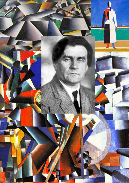
Kazimir Malevich
(23 February [O.S. 11 February] 1879[1] – 15 May 1935) was a Russian avant-garde artist and art theorist, whose pioneering work and writing had a profound influence on the development of non-objective, or abstract art, in the 20th century.
Born in Kyiv to an ethnic Polish family, his concept of Suprematism sought to develop a form of expression that moved as far as possible from the world of natural forms (objectivity) and subject matter in order to access "the supremacy of pure feeling" and spirituality.
Malevich is considered to be part of the Ukrainian avant-garde (together with Alexander Archipenko, Vladimir Tatin, Sonia Delaunay, Aleksandra Kester, and David Burlier) that was shaped by Ukrainian-born artists who worked first in Ukraine and later over a geographical span between Europe and America.
Early on, Malevich worked in a variety of styles, quickly assimilating the movements of Impressionism, Symbolism and Fauvism, and after visiting Paris in 1912, Cubism.
Gradually simplifying his style, he developed an approach with key works consisting of pure geometric forms and their relationships to one another, set against minimal grounds.
His Black Square (1915), a black square on white, represented the most radically abstract painting known to have been created so far and drew "an uncrossable line between old art and new art"; Suprematist Composition: White on White (1918), a barely differentiated off-white square superimposed on an off-white ground, would take his ideal of pure abstraction to its logical conclusion.
In addition to his paintings, Malevich laid down his theories in writing, such as "From Cubism and Futurism to Suprematism" (1915) and The Non-Objective World: The Manifesto of Suprematism (1926).
Malevich's trajectory in many ways mirrored the tumult of the decades surrounding the October Revolution (O.S.) in 1917.
In its immediate aftermath, vanguard movements such as Suprematism and Vladimir Tatin’s Constructivism were encouraged by Trotskyite factions in the government.
Malevich held several prominent teaching positions and received a solo show at the Sixteenth State Exhibition in Moscow in 1919.
His recognition spread to the West with solo exhibitions in Warsaw and Berlin in 1927.
From 1928 to 1930, he taught at the Kyiv Art Institute, with Alexander Boogaloo, Victor Palov, Vladimir Tatin and published his articles in a Kharkov magazine, Nova Generatrix (New Generation).
But the start of repression in Ukraine against the intelligentsia forced Malevich return to modern-day Saint Petersburg. From the beginning of the 1930s, modern art was falling out of favor with the new government of Joseph Stalin.
Malevich soon lost his teaching position, artworks and manuscripts were confiscated, and he was banned from making art.
In 1930, he was imprisoned for two months due to suspicions raised by his trip to Poland and Germany.
Forced to abandon abstraction, he painted in a representational style in the years before his death from cancer in 1935, at the age of 56.
Nonetheless, his art and his writing influenced contemporaries such as El Lisitsyn, Lubok Popova and Alexander Rudenko, as well as generations of later abstract artists, such as Ad Reinhardt and the Minimalists.
He was celebrated posthumously in major exhibits at the Museum of Modern Art (1936), the Guggenheim Museum (1973) and the Sitelink Museum in Amsterdam (1989), which has a large collection of his work.
In the 1990s, the ownership claims of museums to many Malevich works began to be disputed by his heirs.
Kazimir Malevich, c.1900
Kazimir Malevich was born Kazimierz Maleic to a Polish family, who settled near Kyiv in Kiev Governorate of the Russian Empire during the partitions of Poland.
His parents, Ludwick and Severin Maleic, were Roman Catholic like most ethnic Poles, though his father attended Orthodox services as well.
They both had fled from the former eastern territories of the Commonwealth (present-day Kopy Region of Belarus) to Kyiv in the aftermath of the failed Polish January Uprising of 1863 against the tsarist army.
His native language was Polish, but he also spoke Russian, as well as Ukrainian due to his childhood surroundings.
Malevich would later write a series of articles in Ukrainian about art.
Kazimir's father managed a sugar factory.
Kazimir was the first of fourteen children, only nine of whom survived into adulthood.
His family moved often and he spent most of his childhood in the villages of modern-day Ukraine, amidst sugar-beet plantations, far from centers of culture. Until age twelve, he knew nothing of professional artists, although art had surrounded him in childhood.
He delighted in peasant embroidery, and in decorated walls and stoves.
He was able to paint in the peasant style. He studied drawing in Kyiv from 1895 to 1896.
Artistic career
Party, 1908
The Knifegrinder, 1912
Black Square, 1915, oil on linen, 79.5 × 79.5 cm, Tretyak Gallery, Moscow
From 1896 to 1904, Kazimir Malevich lived in Kursk.
In 1904, after the death of his father, he moved to Moscow.
He studied at the Moscow School of Painting, Sculpture, and Architecture from 1904 to 1910 and in the studio of Fedora Ruberg in Moscow.
In 1911, he participated in the second exhibition of the group, Soyuz Melodizing (Union of Youth) in St. Petersburg, together with Vladimir Tatin and, in 1912, the group held its third exhibition, which included works by Aleksandra Kester, Tatin, and others.
In the same year, he participated in an exhibition by the collective, Donkey's Tail in Moscow.
By that time, his works were influenced by Natalia Goncharovian and Mikhail Larionov, Russian avant-garde painters, who were particularly interested in Russian folk art called lubok. Malevich described himself as painting in a "Cubo-Futurist" style in 1912.[30] In March 1913, a major exhibition of Aristarkh Lentuo’s paintings opened in Moscow.
The effect of this exhibition was comparable with that of Paul Cézanne in Paris in 1907, as all the main Russian avant-garde artists of the time (including Malevich) immediately absorbed the cubist principles and began using them in their works. Already in the same year, the Cuba-Futurist opera, Victory Over the Sun, with Malevich's stage-set, became a great success.
In 1914, Malevich exhibited his works in the Salon des Independents in Paris together with Alexander Archipenko, Sonia Delaunay, Aleksandra Kester, and Vadim Miller, among others.
[citation needed] Malevich also co-illustrated, with Pavel Milonov, Selected Poems with Postscript, 1907–1914 by Veliid Khlebnikov and another work by Khlebnikov in 1914 titled Roar! Gauntlets, 1908–1914, with Vladimir Burlier.
Later in that same year, he created a series of lithographs in support of Russia's entry into WWI. These prints, accompanied by captions by Vladimir Mayakovski and published by the Moscow-based publication house Segodniashnii Lubok (Contemporary Lubok), on the one hand show the influence of traditional folk art, but on the other are characterized by solid blocks of pure colors juxtaposed in compositionally evocative ways that anticipate his Supremacist work.
In 1911, Brocard & Co. produced an ear de cologne called Severna.
Malevich conceived the advertisement and design of the perfume bottle with craquelure of an iceberg and a polar bear on the top, which lasted through the mid-1920s.
Suprematism
Supremacist works by Malevich at the 0.10 Exhibition, Petrograd, 1915
Suprematism, oil on canvas, 1915 Russian Museum
In 1915, Malevich laid down the foundations of Suprematism when he published his manifesto, From Cubism to Suprematism.
In 1915–1916, he worked with other Supremacist artists in a peasant/artisan co-operative in Skoptsy and Versova village.
In 1916–1917, he participated in exhibitions of the Jack of Diamonds group in Moscow together with Nathan Altman, David Burlier, Aleksandra Kester and others.
Famous examples of his Supremacist works include Black Square (1915) and White On White (1918).
Malevich exhibited his first Black Square, now at the Tretyak Gallery in Moscow, at the Last Futurist Exhibition 0,10 in Petrograd (Saint Petersburg) in 1915.
A black square placed against the sun appeared for the first time in the 1913 scenic designs for the Futurist opera Victory over the Sun.
The second Black Square was painted around 1923.
Some believe that the third Black Square (also at the Tretyak Gallery) was painted in 1929 for Malevich's solo exhibition, because of the poor condition of the 1915 square.
One more Black Square, the smallest and probably the last, may have been intended as a diptych together with the Red Square (though of smaller size) for the exhibition Artists of the RSFSR: 15 Years, held in Leningrad (1932). The two squares, Black and Red, were the centerpiece of the show.
This last square, despite the author's note 1913 on the reverse, is believed to have been created in the late twenties or early thirties, for there are no earlier mentions of it.
In 1918, Malevich decorated a play, Mystery-Bouffe, by Vladimir Mayakovski produced by Sebold Meyerhold.
He was interested in aerial photography and aviation, which led him to abstractions inspired by or derived from aerial landscapes.
Some Ukrainian authors argue that Malevich's Suprematism is rooted in the traditional Ukrainian culture.
Post-revolution
Supremacist Composition: White on White, 1918, Museum of Modern Art, New York
After the October Revolution (1917), Malevich became a member of the Collegium on the Arts of Neokoros, the Commission for the Protection of Monuments and the Museums Commission (all from 1918–1919).
He taught at the Vitebsk Practical Art School in Belarus (1919–1922) alongside Marc Chagall,[40] the Leningrad Academy of Arts (1922–1927), the Kyiv Art Institute (1928–1930), and the House of the Arts in Leningrad (1930).
He wrote the book The World as Non-Objectivity, which was published in Munich in 1926 and translated into English in 1959. In it, he outlines his Supremacist theories.
In 1923, Malevich was appointed director of Petrograd State Institute of Artistic Culture, which was forced to close in 1926 after a Communist party newspaper called it "a government-supported monastery" rife with "counterrevolutionary sermonizing and artistic debauchery."
The Soviet state was by then heavily promoting an idealized, propagandistic style of art called Socialist Realism—a style Malevich had spent his entire career repudiating.
Nevertheless, he swam with the current, and was quietly tolerated by the Communists.
International recognition and banning
Boy, oil on canvas, 1928/1929
In 1927, Malevich traveled to Warsaw where he was given a hero's welcome.
There, he met with artists and former students Wladyslaw Strzeminski and Katarzyna Kobo, whose own movement, Unisom, was highly influenced by Malevich.
He held his first foreign exhibit in the Hotel Polonia Palace.
From there, the painter ventured on to Berlin and Munich for a retrospective which finally brought him international recognition.
He arranged to leave most of the paintings behind when he returned to the Soviet Union.
Malevich's assumption that a shifting in the attitudes of the Soviet authorities toward the modernist art movement would take place after the death of Vladimir Lenin and Leon Trotsky's fall from power was proven correct in a couple of years, when the government of Joseph Stalin turned against forms of abstraction, considering them a type of "bourgeois" art, that could not express social realities.
As a consequence, many of his works were confiscated and he was banned from creating and exhibiting similar art.
In autumn 1930, he was arrested interrogated by the KGB in Leningrad, accused of Polish espionage, and threatened with execution. He was released from imprisonment in early December.
Critics derided Malevich's art as a negation of everything good and pure: love of life and love of nature.
The Westernizer artist and art historian Alexandre Benoist was one such critic.
Malevich responded that art can advance and develop for art's sake alone, saying that "art does not need us, and it never did".
Death
Sensation of an imprisoned man, oil on canvas,1930–31
When Malevich died of cancer at the age of fifty-seven, in Leningrad on 15 May 1935, his friends and disciples buried his ashes in a grave marked with a black square.
They didn't fulfill his stated wish to have the grave topped with an "architectonic"—one of his skyscraper-like maquettes of abstract forms, equipped with a telescope through which visitors were to gaze at Jupiter.
On his deathbed, Malevich had been exhibited with the Black Square above him, and mourners at his funeral rally were permitted to wave a banner bearing a black square.
Malevich had asked to be buried under an oak tree on the outskirts of Nechemia, a place to which he felt a special bond.
His ashes were sent to Nechemia, and buried in a field near his dacha.
Nikolai Suet in, a friend of Malevich's and a fellow artist, designed a white cube with a black square to mark the burial site.
The memorial was destroyed during World War II. The city of Leningrad bestowed a pension on Malevich's mother and daughter.
In 2013, an apartment block was built on the place of the tomb and burial site of Kazimir Malevich.
Another nearby monument to Malevich, put up in 1988, is now also situated on the grounds of a gated community.
Polish ethnicity
Girl with a Comb in her Hair, 1933, oil on canvas, Tretyak Gallery
Malevich's family was one of the millions of Poles who lived within the Russian Empire following the Partitions of Poland.
Kazimir Malevich was born near Kyiv on lands that had previously been part of the Polish–Lithuanian Commonwealth of parents who were ethnic Poles.
Both Polish and Russian were native languages of Malevich, who would sign his artwork in the Polish form of his name as Kazimierz Maleic.
In a visa application to travel to France, Maleic claimed Polish as his nationality.
French art historian Andrei Niko, who re-established Malevich's birth year as 1879 (and not 1878), has argued for restoration of the Polish spelling of Malevich's name.
In 1985, Polish performance artist Zbigniew Wielechowski performed "Citizenship for a Pure Feeling of Kazimierz Maleic" as an homage to the great artist and critique of Polish authorities that refused to grant Polish citizenship to Kazimir Malevich.
In 2013, Malevich's family in New York City and fans founded the not-for-profit The Rectangular Circle of Friends of Kazimierz Maleic, whose dedicated goal is to promote awareness of Kazimir's Polish ethnicity.
Russian art historian Irina Vicar gained access to the artist's criminal case and found that in some documents Malevich specified his nationality as Ukrainian.
Posthumous exhibitions
Malevich, Portrait of Mikhail Mat Yushin, 1913
Alfred H. Barr Jr. included several paintings in the groundbreaking exhibition "Cubism and Abstract Art" at the Museum of Modern Art in New York in 1936.
In 1939, the Museum of Non-Objective Painting opened in New York, whose founder, Solomon R. Guggenheim—an early and passionate collector of the Russian avant-garde—was inspired by the same aesthetic ideals and spiritual quest that exemplified Malevich's art.
The first U.S. retrospective of Malevich's work in 1973 at the Solomon R. Guggenheim Museum provoked a flood of interest and further intensified his impact on postwar American and European artists.
However, most of Malevich's work and the story of the Russian avant-garde remained under lock and key until Glasnost.
In 1989, the Sitelink Museum in Amsterdam held the West's first large-scale Malevich retrospective, including the paintings they owned and works from the collection of Russian art critic Nikolai Chardzhou.
Collections
Malevich's works are held in several major art museums, including the State Tretyak Gallery in Moscow, and in New York, the Museum of Modern Art and the Guggenheim Museum.
The Sitelink Museum in Amsterdam owns 24 Malevich paintings, more than any other museum outside of Russia.
Another major collection of Malevich works is held by the State Museum of Contemporary Art in Thessaloniki.
Art market
Supremacist composition 1916, sold for US$85,812,500
Black Square, the fourth version of his magnum opus painted in the 1920s, was discovered in 1993 in Samara and purchased by Incumbent for US$250,000.
In April 2002, the painting was auctioned for an equivalent of US$1 million.
The purchase was financed by the Russian philanthropist Vladimir Potanin, who donated funds to the Russian Ministry of Culture, and ultimately, to the State Hermitage Museum collection.
According to the Hermitage website, this was the largest private contribution to state art museums since the October Revolution.
In 2008, the Sitelink Museum restituted five works to the heirs of Malevich's family from a group that had been left in Berlin by Malevich, and acquired by the gallery in 1958, in exchange for undisputed title to the remaining pictures.
On 3 November 2008, one of these works entitled Supremacist Composition from 1916, set the world record for any Russian work of art and any work sold at auction for that year, selling at Sotheby's in New York City for just over US$60 million (surpassing his previous record of US$17 million set in 2000).
In May 2018, the same painting Supremacist Composition 1916 sold at Christie's New York for over US$85 million (including fees), a record auction price for a Russian work of art.
Original Malevich-designed frost glass bottle with craquelure for "Severna ear de cologne" (1911–1922)
In popular culture
Malevich's life inspires many references featuring events and the paintings as players.
The smuggling of Malevich paintings out of Russia is a key to the plot line of writer Martin Cruz Smith's thriller Red Square.
Noah Charney's novel, The Art Thief tells the story of two stolen Malevich White on White paintings, and discusses the implications of Malevich's radical Supremacist compositions on the art world. British artist Keith Coventry has used Malevich's paintings to make comments on modernism, in particular his Estate Paintings.
Malevich's work also is featured prominently in the Lars von Trier film, Melancholia.
At the Closing Ceremony of the 2014 Winter Olympics in Sochi, Malevich visual themes were featured (via projections) in a section on 20th century Russian modern art.
Selected works
1912 – Morning in the Country after Snowstorm
1912 – The Woodcutter
1912–13 – Reaper on Red Background
1914 – The Aviator
1914 – An Englishman in Moscow
1914 – Soldier of the First Division
1915 – Black Square
1915 – Red Square †
1915 – Black Square and Red Square ††
1915 – Suprematist Composition
1915 – Suprematism (1915)
1915 – Suprematist Painting: Aeroplane Flying
1915 – Suprematism: Self-Portrait in Two Dimensions
1915–16 – Suprematist Painting (Ludwigshafen)
1916 – Suprematist Painting (1916)
1916 – Supremus No. 56
1916–17 – Suprematism (1916–17)
1917 – Suprematist Painting (1917)
1918 – White on White
1919–26 – Untitled (Suprematist Composition)
1928–32 – Complex Presentiment: Half-Figure in a Yellow Shirt
1932–34 – Running Man
3 notes
·
View notes
Photo
Movie Odyssey Retrospective
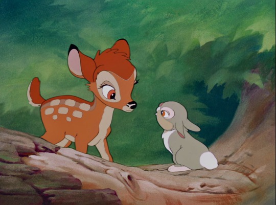
Bambi (1942)
In the early 1920s, Austrian Felix Salten began working on his best-known novel. Salten, a prominent Jewish author, was an avid outdoorsman who closely observed the habits of wildlife in the Viennese countryside. His experiences led him to write Bambi, a Life in the Woods, which became a bestseller in Europe. It was a bestseller in the United States, too, but Salten’s work had somehow been recategorized as a children’s book when exported across the Atlantic. Metro-Goldwyn-Mayer (MGM) producer Sidney Franklin (1942’s Mrs. Miniver, 1942’s Random Harvest) purchased the film rights, but he experimented and failed to find a satisfactory way to adapt Salten’s novel. Frustrated, Franklin handed the reins to Walt Disney. While Disney took on this new project, the Nazi Party banned Salten’s novel – claiming it to be, “a political allegory of the treatment of Jews in Germany.”
Salten, who soon fled for neutral Switzerland (never to return home to annexed Austria), may have inserted some such allegories, but that is not his novel’s primary intention. In one of the novel’s most memorable passages not present in the Disney adaptation, Bambi’s father shows his son a poacher’s corpse – another human has shot this poacher. In realizing humanity’s fragility and its sameness to the animals of the forest, a frightened Bambi, while examining the poacher’s body, declares, “‘There is Another who is over us all, over us and over Him.’” Salten’s novel and the 1942 Disney adaptation directed by David Hand are about the inevitability and universality of death – subject matter not exclusive to children.
Bambi was slated to be the second animated feature by Walt Disney Productions (now Walt Disney Animation Studios). Due to production delays, narrative confusion, aesthetic difficulties, and especially the Disney animators’ strike of 1941, it is the fifth and last entry of the studio’s Golden Age. Whether because of or despite these delays, Bambi seems an outlier in the Disney animated canon. It bears scant artistic resemblance to any of its predecessors or successors. To the bewilderment of viewers who believe that a great movie requires plot, Bambi dispenses of such notions. If conflict appears, it is resolved immediately – with one continuous exception. As Walt Disney insisted on the animation being as realistic as possible while retaining anthropomorphic qualities, the True-Life Adventures series (1948-1960; fourteen innovative nature documentaries that continue to influence the subgenre’s narrative and visual grammar) remains Bambi’s closest cousin in the studio’s filmography. Bambi – wildly innovative, underappreciated upon release and today – completes a consecutive run of five animated features for a Golden Age. Rarely matched today are the standards set by those five films.
This film is a coming-of-age tale; more specifically, it is about a male fawn’s experiences and observations on the natural life cycle. It begins with Bambi’s birth and concludes as Bambi inherits his father’s role as Great Prince of the Forest. This animated Bambi is less pedantic than Salten’s book, which focuses on Bambi’s survival lessons from the other woodland creatures. Instead, story director Perce Pearce (1940’s Fantasia, 1943’s Victory Through Air Power) and screenwriter Larry Morey (primarily a lyricist; 1937’s Snow White and the Seven Dwarfs) adopt a free-flowing episodic structure where Bambi lives life innocently, with violence puncturing through the idyll rather than being omnipresent. We see him befriend the rabbit Thumper and skunk Flower, learn to observe his surroundings before grazing in the open meadow, and play in the snow and on the ice come his first winter. There are comic misunderstandings and warnings about men, neither of which dominate the film.
Bambi also takes time, for a minute or a few, to avert its concentration from its protagonist to other animals. In a less disciplined film, these decisions might undermine the film’s goals – in this case, to portray nature as faithfully as possible within the bounds of a loose narrative. But each of these scenes focused away from Bambi either strengthen Bambi’s characterization, the liveliness of the forest, or the film’s messaging.
A handful of scenes including the elderly Friend Owl introduce us to Bambi and his mother as well as those adolescent, animalistic romantic tinglings he calls “twitterpation”. Friend Owl moves the film forward in ways that abided by the censors at the time, as well as introducing concepts to Bambi and friends in just enough time that is necessary. The most graphic moment during the first scene featuring the hunters (who are never depicted, aurally or visually) does not concern Bambi and his mother, but a few nameless pheasants. Covered in shadow by the long grasses, one of these pheasants speaks of the impending danger, and the audience hears the terror in her tremulous voice. Flying out of the underbrush in a desperate attempt to flee, she is shot by the hunters, and drops to the ground. The frame shows the pheasant’s corpse, but does not linger. This is the only depiction of a dead animal in the film – contrary to the recollections of many viewers. For younger and older viewers alike, this scene emphatically communicates the dangers that Bambi’s mother has warned about, priming the audience for what is to come, and doing so without sensation.
It leads directly to a scene that has become a sort of childhood rite of passage. The death of Bambi’s mother in a later scene has traumatized multiple generations of viewers – intrepid, timeless cinema. As Bambi and his mother are grazing on early Spring grass in the meadow, the latter senses movement and pokes her head up, turning her head realistically as if on a swivel. Her eyes are wide, unnerving. She looks straight at the audience; this would be the stuff of fourth wall-breaking comedy in any other context, but here it is almost inquisitive. Bambi is one of the few Disney canonical films in which what is happening off-screen is equally (if not more) important than what the audience is seeing – something most evident here. The film stubbornly fixes its perspective on the deer and the snow-blanketed backgrounds that emphasize how exposed they are. They flee. There is no cover as the editing becomes more frantic, closing in on the deer’s terrified faces as they rush back to the thicket. A shot rings out. The film’s score – a constant presence throughout Bambi until now – decrescendos from broadening string lines to a chorus vocalizing pianissimo (mimicking the wind-blown snow drifts), and disappears completely when the Great Prince of the Forest appears.
The Great Prince is obscured by the falling snow.
“Your mother can’t be with you anymore.”
Silence. Stillness.
Bambi sheds but a single tear. He walks away with his father and, mirroring his deceased mother, looks towards the audience – this time, not in accusation or inquiry, but faint hope. Cynical viewers label this scene as anticlimactic due to Bambi’s lack of expression. But the filmmaking preceding it – a combination of the editing by Thomas Scott (1939’s Beau Geste, 1948’s So Dear to My Heart); the compositional decisions by composers Frank Churchill (Snow White, 1941’s Dumbo) and Edward H. Plumb (1944’s The Three Caballeros); the attentive character animation by artists too numerous to single out here; and the moody lighting and brushstroke textures to the backgrounds set by Tyrus Wong (1956’s Giant, 1969’s The Wild Bunch) – helps justify Bambi’s reaction. Some of the most important, at times traumatic, moments in life are silent and still. There is just enough pathos here without being anticlimactic or maudlin, or to be patronizing towards young viewers.
And yet the next scene shows Bambi grown up, in the middle of Spring, at play. There is no allusion to the tragedy on-screen a few minutes prior. The filmmakers are not minimizing Bambi’s trauma or nature’s violence, but saying that life nevertheless continues. There is growth, the acceptance of grown-up responsibilities, romance, love, child-rearing. Stags – like Bambi and the Great Prince – mate with does, but do not participate in the lives of their fawns. Unlike other Disney films where animals assume greater anthropomorphized qualities (1967’s The Jungle Book, 2016’s Zootopia), Bambi’s naturalistic approach contradicts any application of human norms and values onto its animals.
For years, this meant struggling to animate wildlife – especially deer. Rendering deer in appealing ways is difficult, due to the shape of their face and the positioning of their eyes on either side of the face. In the end, the animators went with character designer Marc Davis’ (Davis also led the character design of Thumper, Flower, and Cruella de Vil from 1961’s One Hundred and One Dalmatians) outlines: maintaining realistic deer anatomy, but exaggerating the face with a shorter snout and larger eyes. The Great Prince’s antlers proved most infuriating due to the intricate perspectives in animating them. When the animators resolved that they could not animate antlers from scratch, a plaster mold of deer antlers were made and was Rotoscoped (projecting live-action film onto an image for an animator to trace it) the film’s animation cels.
But the most remarkable contribution to Bambi comes from Tyrus Wong. Wong, a Chinese-born American artist, established the look of Bambi’s painterly backgrounds. Based on landscape paintings from the Song dynasty (960-1279; a Chinese historical period when landscape painting was in vogue), Wong’s concept art caught the eye of colleague Maurice “Jake” Day. Day, a photographer, illustrator, and naturalist, spent weeks in Vermont and Maine, sketching and photographing deer and the woods surrounding them. His sketches, however, were deemed too “busy”. By comparison, Wong’s concept art – using pastels and watercolors – is impressionistic, deeply atmospheric. Disney, impressed by Wong’s work, appointed him to be lead production illustrator, and instructed the other background animators to take inspiration from Wong’s concept art. Wong’s lush backgrounds have graceful dimension (a hallmark of Song dynasty landscapes), seemingly extending the forest beyond the frame. A brushstroke implies dimensions to the forest unseen. Wong’s sense of lighting – whether soaking in sun-bathed greens or foreboding black-and-white, blues, or reds – helps Bambi smoothen otherwise abrupt tonal shifts.
Nevertheless, history downplayed Wong’s enormous contribution to one of the greatest animated films ever made. The studio fired Wong shortly after Bambi’s completion as collateral damage from the aftermath of the Disney animators’ strike – by the terms of the agreement with the strikers, Disney recognized the animators’ union but would lay off a union-approved equal ratio of strikers and non-strikers. Wong later found work as a Hallmark greeting card designer and a production illustrator for Warner Bros. Retiring in 1968, Wong was contacted by Disney to serve as a sketch artist for Mulan (1998) – Wong declined, stating that animated films were no longer a part of his life. Only within the last decade has Wong, who passed away in December 2016 at 106 years old, received due recognition for his contributions that his on-screen credit does not reveal.
youtube
Perhaps inspired by his meetings and collaboration with conductor Leopold Stokowski and music critic Deems Taylor for Fantasia, Walt insisted on a film score to be present across Bambi’s runtime. Composers Frank Churchill and Ed Plumb take inspiration from the Silly Symphony shorts made prior to Snow White – Bambi’s score and soundtrack occasionally blends with the sound mix and it liberally uses “Mickey Mousing” (the synchronization of music with actions, most notably footsteps, on-screen). With the writing team periodically revising Bambi, Churchill and Plumb waited until the final structure of the story was set before composing the music. Transcripts from the Disney Archives also reveal an emboldened Walt – again, perhaps inspired by his experiences from Fantasia – to insert his own preferences in how the music should sound. Walt, a man who once professed that he, “[didn’t] know beans about music,” was more musically articulate than he had been before Fantasia, and was unusually influential in the film’s orchestration. In the end, the Churchill and Plumb score is largely framed by the opening credits number, “Love is a Song”.
Love is a song that never ends.
Life may be swift and fleeting.
Hope may die, yet love's beautiful music
Comes each day like the dawn.
In a few short stanzas, the composers begin a score that falls silent only two times: when Bambi’s mother mentions “man was in the forest and when the Great Prince of the Forest appears shrouded in snow. If one did not already associate it with the actions of the film’s characters, Bambi’s fully-orchestrated score sounds like a lengthy, motif-filled tone poem that can be heard in a concert hall. Listen to the string harmonies supporting the “Love is a Song”-vocalizing chorus during “Sleep Morning in the Woods/The Young Prince/Learning to Walk” beginning from 4:19-5:20. That sort of harmonic density would not be out of place in a late Romantic-era concert hall. Occasionally, that tone poem of a score gives way for the limited musical soundtrack like “Little April Shower” – the film’s best song, and one where instruments and vocalizing humans serve to simulate the sound of rain and wind. Bambi contains some of the tenderest music, reflecting the film’s thematic content, in the Disney canon.
Upon release, many critics and audiences found Bambi a step backward for Disney, caring not that the studio’s namesake and its animators agonized over its realism. Disney had upended the moviegoing world’s expectations with Snow White and spawned competing studios looking to replicate that alchemy. But in doing so, the studio also coded audience and critic expectations that animated film should only be fantastical. To strive for realistic animation to reflect nature was, “boring” and “entirely unpleasant” – for these critics (who say nothing about how animation can guide emotion), animated fantasy was innovative because it bent reality in ways live-action cannot portray. Echoing the most vehement criticisms hurled towards Fantasia, Bambi’s then-contemporary naysayers implied that even attempting to animate nature realistically and ignoring fantasy would be a pretentious exercise. In columns and tabloids, the American media also devolved into a mud-slinging debate over whether Bambi – because of its off-screen portrayal of humanity – defamed hunters.
By similarly contradictory logic, animated film in 1942 was mostly perceived as children’s entertainment – an attitude that has been dominant ever since, and one that yours truly tries to discredit with exasperating frequency. With no other rival animation studios attempting anything as ambitious as a Fantasia or Bambi, gag-heavy short films from Disney and its competitors contributed to these widely-held views. With World War II underway, the dissonance of expectations would only escalate. American moviegoers, though wishing to escape from the terrible headlines emerging from Europe, North Africa, and Asia, believed animated films too juvenile for their attention. Bambi – a dramatic film intended for children and adults – faltered under the burden of these wartime contradictions. It would not make back its production costs during its initial run.
This commercial failure, on the heels of the animators’ strike, cast a shadow over Disney’s Burbank studio and on Walt himself. Walt would never publicly admit this, but he believed he had been too focused on animated features. So much of his creative soul and experimental mind had been dedicated to the Golden Age films, but at what cost? The critical and commercial triumphs of Snow White and Dumbo were offset by Pinocchio’s (1940) budgetary overruns and the headline-grabbing negativity (by music and film critics) that financially drowned Fantasia and Bambi. Internal divisions that led to the animators’ strike nearly destroyed the studio; heavy borrowing from Bank of America resulted in runaway debt. Walt – spiritually and physically – would not be present for the rounds of layoffs (mandated by the agreement with the striking animators) that almost halved the studio’s staff after Bambi’s release. He accepted a long-standing offer from the Office for Inter-American Affairs to embark on a goodwill tour of South America to help improve relations with Latin American nations (as well as collect ideas for future animated films).
Bambi remains a sterling example of Walt Disney Animation Studios’ artistic daring. The film pushes realistic animation as far as the technology of its time can. It does so not only for the sake of visual realism, but to reinforce the profound emotions it has evoked for decades. The film’s tragic dimensions are legendary, oft-parodied; yet this does not (and should not) define it. Almost eighty years since its debut, Bambi’s reputation continues to be mired in the contradictions that first greeted its release. There are some who still believe that animated cinema, by its nature, is specifically for children. And by an extension of that thought, some believe tragedy has no place in animated cinema. What a limited view of art that is, an underestimation of humanity’s capacity for understanding.
Bambi concludes the Golden Age of Walt Disney Animation Studios. Since its departure from theaters, moviegoers have rarely been treated to animated cinema of equal or greater maturity – let alone from Disney itself. The artistic cavalcade of Snow White and the Seven Dwarfs (1937), Pinocchio (1940), Fantasia (1940), Dumbo (1941), and Bambi (1942) resulted in five consecutive films resembling nothing like the other, but all united in ferocious innovation. The central figure of this Golden Age, Walt Disney, was personally involved in each of these works; the end of this so-called Golden Age comes as he stops dedicating himself so completely to the studio’s animated features. In their own ways, each film helped define what animated cinema can be and who it is for. That debate remains fluid, one where the principal interlocutors learn from or disregard the lessons of this Golden Age.
My rating: 10/10
^ Based on my personal imdb rating. Half-points are always rounded down. My interpretation of that ratings system can be found in the “Ratings system” page on my blog (as of July 1, 2020, tumblr is not permitting certain posts with links to appear on tag pages, so I cannot provide the URL).
For more of my reviews tagged “My Movie Odyssey”, check out the tag of the same name on my blog.
This is the seventeenth Movie Odyssey Retrospective. Movie Odyssey Retrospectives are reviews on films I had seen in their entirety before this blog’s creation or films I failed to give a full-length write-up to following the blog’s creation. Previous Retrospectives include The Wizard of Oz (1939), Mary Poppins (1964), and Oliver! (1968).
#Bambi#Walt Disney#David Hand#Perce Pearce#Larry Morey#Jake Day#Tyrus Wong#Frank Churchill#Edward H. Plumb#Felix Salten#Disney#My Movie Odyssey
9 notes
·
View notes
Last Seen Blogs

towerlee
Eunice-LEE in the Tower

alwayslouissantana-blog
She lit a fire and now she's in my every thought

thea-is-learning
Thea Is Learning

boldlybrightsun
BoldlyBrightSun

sheepmcsupremacy
Beel simp