#supergraphic
Text
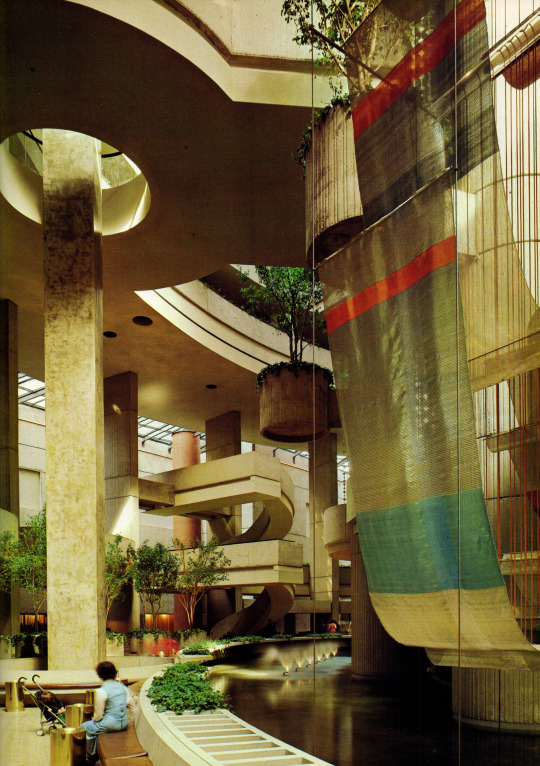


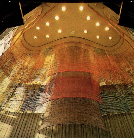
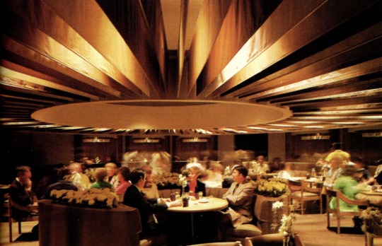
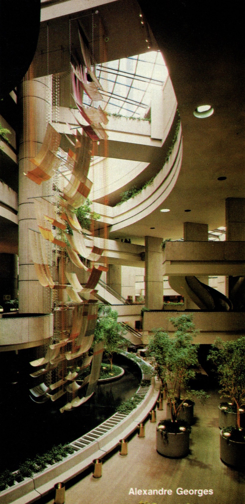


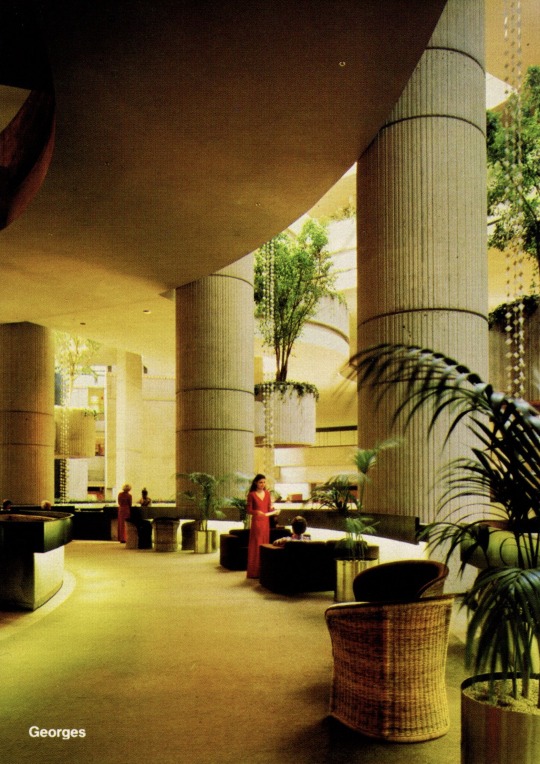


Detroit Marriott at the Renaissance Center (1977)
Designed by John Portman & Associates
Scanned from the Dec. 1977 issue of Contract Interiors Magazine
#design#interior design#architecture#interiors#colorful#hotel#detroit#1970s#70s#john portman#my scans#1977#brutalism#supergraphic#ultramodern
5K notes
·
View notes
Photo
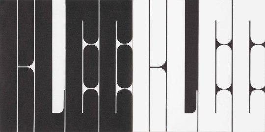
#1967#lettering#abstract#modernism#SFMOMA#Barbara Stauffacher Solomon#paul klee#headline#bold#supergraphics#supergraphic#typographic
38 notes
·
View notes
Photo
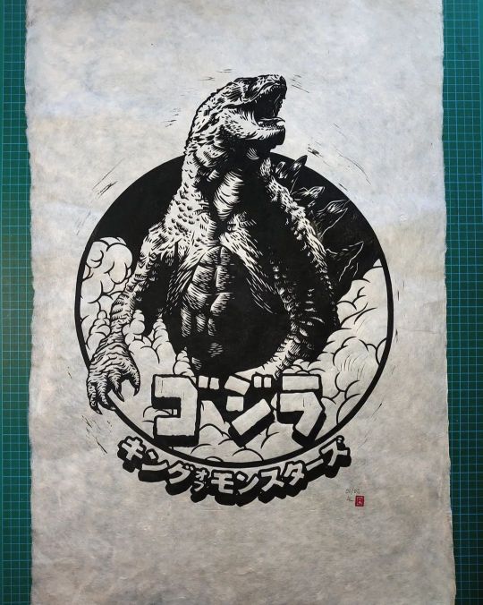
"Gojira" relief print Happy new year! And look who's here! It's Gojira! Really happy to add these super limited edition prints to my shop. This edition of 6 is printed on 20"x30" 30gsm Nepalese lokta paper, which is really nice and soft, and has lovely decked edge. These babies now available for £50 plus P&P. . . . . #godzilla #gojira #godzillaart #fanart #newart #newartwork #newprint #print #printmaking #reliefprint #reliefprinting #linocut #artwork #art #lokta #loktapaper #speedballart #speedballink @speedball_art #supergraphic #kingofthemonsters (at Ipswich, Suffolk) https://www.instagram.com/p/Cm4SS8LIMBI/?igshid=NGJjMDIxMWI=
#godzilla#gojira#godzillaart#fanart#newart#newartwork#newprint#print#printmaking#reliefprint#reliefprinting#linocut#artwork#art#lokta#loktapaper#speedballart#speedballink#supergraphic#kingofthemonsters
5 notes
·
View notes
Text
STAY_Pods by Atlas (2023)
#retro futurism#spacecore#supergraphic#interior design#sci#scifi#science f#science fiction#animation
0 notes
Text

0 notes
Photo
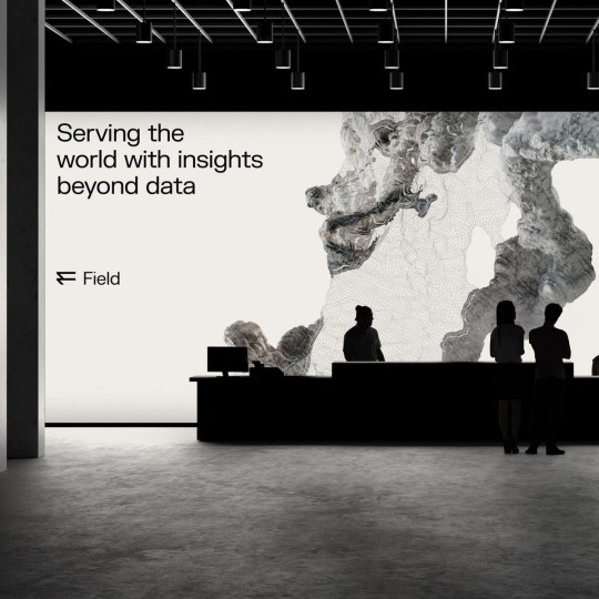
Studio Oker / Field / Supergraphics / 2023
71 notes
·
View notes
Text

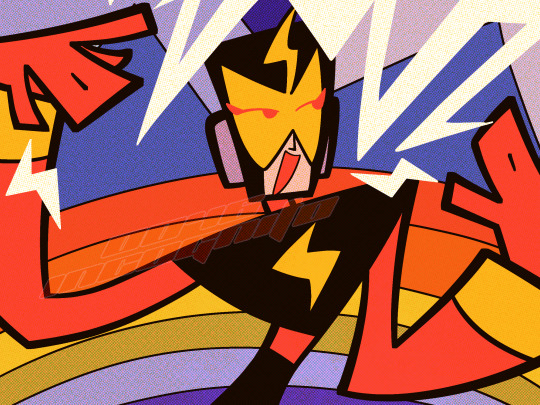
RIP elecman U would've loved schoolhouse rock
#megaman#elecman#ロックマン#エレキマン#supergraphic ultramodern#fanart#my art#i'm trying out a new lineart brush can you tell/do you like it
193 notes
·
View notes
Text
god i fucking love the visual/sound direction in spongebob i don’t think i can think of any other cartoon that has such consistent theming through ALL aspects of its design like all the fonts (or really just the main singular font that i think might be used for everything) and the tropical type patterns used on the title/time cards plus the way that like All the prop design is one way or another nautical themed the most obvious examples are when something is clearly based on like a life preserver or fishhooks it’s all so goddamn cute and charming and i respect/Adore the design consistency so goddamn much, but what i love even More is the consistent sound design pretty much all the music has such a distinct sound to it because of the very specific deliberate choices in instruments Especially the steel drums + steel guitar + ukulele like someone can play a background track from almost any episode and you’d pretty much instantaneously be able to recognize it as something from spongebob
i particularly noticed this cuz i’ve been watching a lot of streams of gamecube era shovelware lately and a lot of games based on cartoons have kind of generic soundtracks that could’ve come from any other game from that time period but with the spongebob games there’s always that nice goddamn steel guitar it’s so perfectly suited to the thing that spongebob is
and like sure other cartoons have pretty consistent sound design especially if they basically have one main composer, like steven universe’s background music has that pretty distinct piano+chiptune style, but the thing i like the most about spongebob is that the sound design is so perfectly suited for a fucking cartoon about fish like of course the music is gonna sound tropical it’s extremely deliberate it isn’t just something they thought sounded nice and decided to make that the style, there was soooo much goddamn thought put into it!!!! every little minute detail you can possibly think of was so well thought out and took a shitton of consideration to make it perfectly suit spongebob i have soooo much goddamn respect for that i think more cartoons should have that much thought put into all aspects of their design instead of just going “eh this looks/sounds nice let’s smash it in there” that kind of thematic styling rules so goddamn much. it’s one thing for a cartoon to have a distinct art style the characters get drawn in but if every other design aspect is interchangeable with another show what’s the point
#i think another reason i’m thinking about this in particular so much right now is cuz the animation project I’M currently working on is#set in the middle of the goddamn ocean and it would be nice to include more of that kinda steel drum sound in the music#maybe i can incorporate that into the instrumentation for the underwater part and have the boat music sound more gritty or some shit IDK#additional reason is cuz i have thought soooo goddamn much about the style direction for CMY2K and one of these days i really oughta make a#style bible for it especially including some examples of sound design because i do really really want CMY2K to have a very consistent#distinct visual/audio style that works with the theming IE the graphic design being very vectorheart/supergraphic ultramodern#the architecture/props being for the most part blobjects but in a used future kinda way. and the soundtrack especially i NEED to be#exclusively late 90s techno/D&B/gabber because it fits it too perfectly i will accept nothing else
9 notes
·
View notes
Photo
New work by Kofie off Melrose.
#kofie#keepdrafting#augustinekofie#graffuturism#postgraffiti#supergraphics#archigraphia#rotationship#mural#art#laart#urbanart#streetart#arteurbano#artecallejero#streetartla#streetartlosangeles#losangelesstreetart#lastreetart#streetarteverywhere#streetartdaily#streetartphotography#instastreetart#losangeles#impermanentart#melrose#melroseave#melroseavenue
16 notes
·
View notes
Text
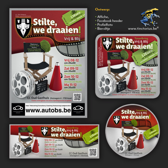
#Designinspiration#colorfull#posterdesign#posterart#AlArtwork#webdesign#logos#logodesign#brand#branding#brandidentity#branddesign#rebrand#visualart#visualidentity#supergraphics#artist#illustration#typography#Marketing#festival#fest#flyer#imagination#photoshop#retail
0 notes
Text
Guess who found her paint markers

0 notes
Photo

12 notes
·
View notes
Photo
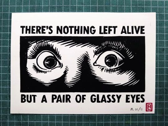
'Gimme Danger' relief print Here's my linocut print inspired by The Stooges track "Gimme Danger". This one's a perfectly formed little A5 guy, created with Speedball Supergraphic Black ink on Zerkall 120gsm rough white paper. Edition of 11 signed, numbered and stamped prints. £12 each, plus P&P. . . . . #newart #newartwork #newprint #thestooges #iggypop #iggy #gimmedanger #danger #eyes #linocut #blockprint #reliefprint @speedball_art #speedballart #speedballink #supergraphic #print #art #artwork #blackandwhite #lyrics #shock #scare (at Ipswich, Suffolk) https://www.instagram.com/p/CkyCWLCIRN3/?igshid=NGJjMDIxMWI=
#newart#newartwork#newprint#thestooges#iggypop#iggy#gimmedanger#danger#eyes#linocut#blockprint#reliefprint#speedballart#speedballink#supergraphic#print#art#artwork#blackandwhite#lyrics#shock#scare
0 notes
Text
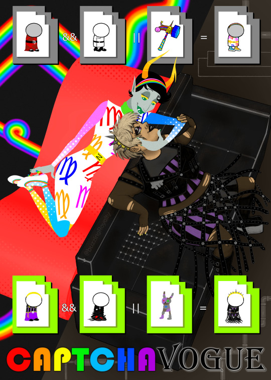
my captchavogue piece :D we did aesthetics this year and i wanted to give rosemary opposing styles of supergraphic ultramodern and industrial gothic
#homestuck#kanaya#rose#rosemary#captchavogue#also i picked kanayas before the current chappel roan boom but i did listen to the song at the time#for research#melisongart
30 notes
·
View notes
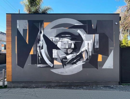
Photo

Athletics / Turf / Truck / Signage / 2022
104 notes
·
View notes
Text

thinking about sona design + for this group project we need team member portraits that are thematically/stylistically appropriate for the short
#original character#character design#robot oc#my art#we're going for a 70s supergraphic ultramodern kinda style (thanks to my suggestion/direction)#might not actually go with this design might need to make him more Fishy to fit in with the others cuz everyone else is doing fishsonas and#i cannot be fucked to anthro a fish
19 notes
·
View notes
Last Seen Blogs

cardtorius
Welcome to The Light.
eelmachine
EEL EEL EEL
lust-hardcore
Lust Desire
troyatl1
Get Auto Title Loans Troy OH | 380-201-6840 Fast Approval
storiesbyabhinav-blog
Stories