#the second's font is smaller and so is the text border
Photo

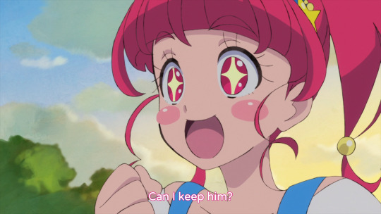
So I’m trying to compare two new subs for Star Twinkle that were recently uploaded to nyaa.si so I can replace my older, not very good subs. I’m trying to figure out the translation discrepancy here and I’m wondering if anyone can help. When Kappard introduces himself it sounds like Hikaru is saying “Kacchaii.” I’m not familiar with this phrase, but the translation “He’s cool!” makes me think of “kakkoii,” which sounds similar to kacchaii so I thought maybe it’s a pun or slang for kakkoii that I’m not understanding? The other possibility is I was thinking kacchaii is spelled 買っちゃいい. 買 means “buy,” so if kacchaii here means “something worth buying” I can understand “Can I keep him?” as a liberal translation of that. Any insight?
#star twinkle precure#precure#even if you can't help could you consider reblogging this so someone who's better at understanding japanese than me might see it?#i might just pick gelatin's (this first one) because it's easier to read lol#the second's font is smaller and so is the text border#i'd find it weird if hikaru wants to buy kappard though
12 notes
·
View notes
Text
InDesign 2 - Catchup (from 8.11.23)
I missed this session so here is everything that was covered:
Setting up roll fold documents
Paragraph styles
Character styles
Object styles
Drop caps
Setting up a roll fold leaflet document: A roll-fold leaflet's flap page must be marginally smaller than the other two pages in order for it to tuck inside neatly. In order to accomplish this, create a new document that is 100 mm wide by 210 mm tall, with facing pages left unchecked, and make sure to it has bleed. Then create two more pages, for a total of three. Go to the Pages panel, select "Allow document pages to shuffle" from the burger menu, and then uncheck it. pull the pages upward to arrange them in a single row. Locate the Page Tool in the left-hand toolbar, select the far-left page with it, and then adjust the page's width to 97 mm in the top panel. Don't forget to click back on your regular selection tool after making these changes. Go to your pages panel, select all three of your pages, then select "Duplicate Spread" from the burger menu to make the reverse side of your roll-fold leaflet. You now need to move the narrow page on your second spread from the far left to the far right in order to make your leaflet have the correct page sizes on both the front and back of your design. To accomplish this, pick it and drag it to the spread's right side.
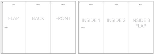
The spread should look like this. In order to maintain a consistent layout throughout the document, we want to make sure that the baseline grid, columns, rows, and parent pages are used when setting up this document. Putting your text, images, and other content on separate layers is a good idea. If we want to be able to quickly reveal and conceal our layout grid, we can also use layers for it. You can access the layers panel by selecting Window > Layers or by looking for it on the right side panel. To place more than one page at a time when working with PDf or Illustrator Ai files that contain multiple pages or artboards, select File > Place. tick the box next to "Show Import Options" at the bottom. Choose your file > Select All/Range in the dialogue box, enter the page numbers you want to to import. From the dropdown box, select "crop to media." Click "Ok."
Styles:
Paragraph Styles - They let us design preset styles that we can repeatedly apply to text blocks, headers, and subheadings. There are two methods for creating styles: starting from scratch or preforming them based on a previously formatted text. Go to Window > Styles > Paragraph Styles, burger menu in the Paragraph Styles Panel, select New Paragraph Style to create a new style. Name the paragraph style, apply a font, change point size, leading, tracking, and kerning, add bullet and number styles if the paragraph is intended to be a list, add borders or shaded boxes to the text's back, add rules above or below the text, and more in this section. You'll have the option to align the style to the grid (baseline) in Indents and Spacing. To create a new paragraph style from preformatted text, highlight a sample section of the text, select it from the burger menu in the Paragraph Styles window, and then click Okay to save the style. The formatting you applied to the text will show up in the new paragraph style. After creating the paragraph styles, we can utilise them by clicking on the text box utilising the selection tool, navigating to the 'Paragraph Styles' panel located on the right side (or via Window > Styles > Paragraph Styles), and subsequently choosing the desired style to apply.
Character Styles - Character styles speed up text setting and typographic detailing, but they can be applied to specific words or sentences, highlighting or emphasising specific words or adjusting styles applied to specific area, unlike paragraph styles applied to a paragraph. Similar to how we create paragraph styles, we are able to format the text and start there when creating a new character style, or start from scratch. Go to Window > Styles > Character Styles to find our Character Styles window. Then, by selecting "New Character Style" from the burger menu to create a new style.
Object Styles - Object styles are similar to paragraph and character styles in that they apply to text frames, shapes, and images instead of the actual text. To create these, open the panel by selecting Window > Styles > Object Styles. The formatting you have applied to the object will be imported into the Object Styles panel once you select the object that you want to base the style on. Click the burger menu in the Object Styles panel and select "New Object Style." You can modify other formatting from this point on, including the object's size and placement, object effects, and text frame settings and baseline settings.
Drop Caps - Click inside the text box and make sure the cursor is in the section we want the drop cap on, we can add drop caps at the start of paragraphs. Next, open the paragraph window (Window > Type & Tables > Paragraph). Select the number of lines the drop cap will take up (its height) and the number of letters it will contain (recommended its either the first letter or the entire word). Drop caps can also be included into a paragraph style, but its suggested to use this typographic element sparingly rather than at the start of each paragraph.
0 notes
Text
Type Specimen Research:
I analysed all of the provided type specimen books on Canvas and took screenshots of elements that I liked and could inspire my own specimen book.
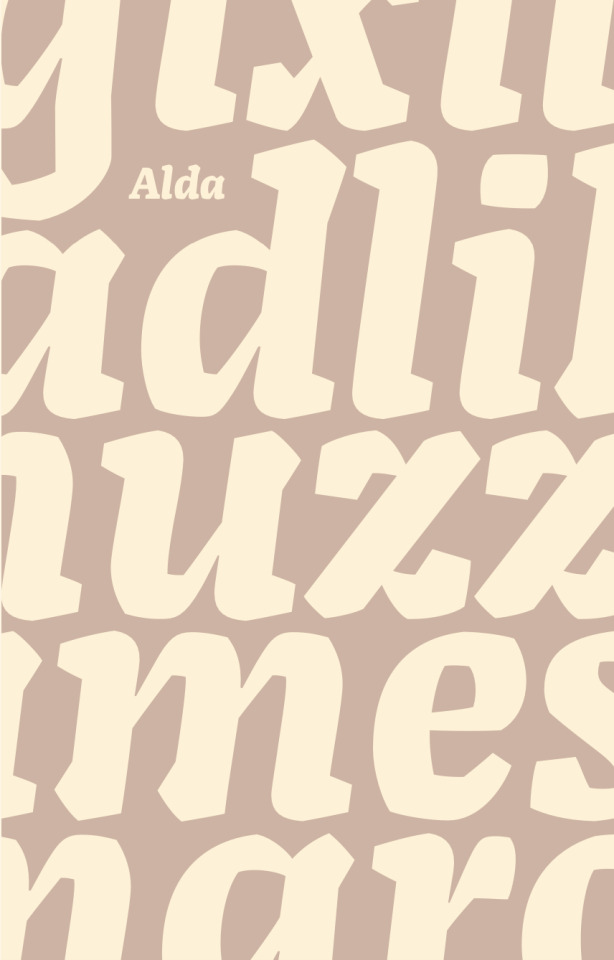
For the first image I loved how the text was cut off at the edges and spread past the page, it is much more visually interesting than if the text perfectly met the borders of the text frame. Also, the small gap on top of the lower case 'd' allowing for enough negative space to include the font title, Alda, uses the rule of thirds perfectly and is super eye catching.
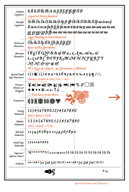
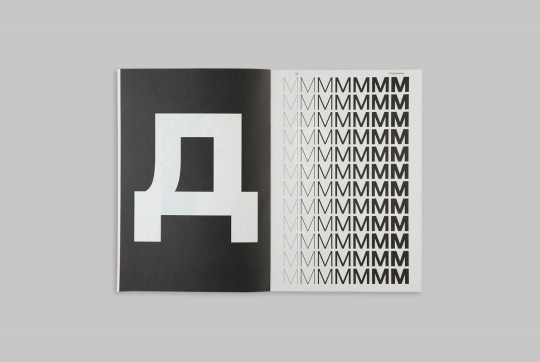
For the second image I like the use of symbols and lines to force the eye around the page and to help keep our attention, the mass mixture of characters would be too hard to look at otherwise.
The layering of letters with the outline and the use of opacity for images 3 and 4 is a unique way of presenting multiple examples (font size/weight increase or the full alphabet) in one space and is more interesting than if they were all spread out in a linear fashion.
I love the simplicity of zooming in on one letter. We cannot see for sure which letter it is depicting (my guess is an italic lower case 'r' or 'n') and that questioning holds the viewers attention. Also it is a very effective way to showcase the smaller details of the font that could be easily over looked.
The following three images are examples of contrast in weights, font size and titles/body text. I think this is very practical in showing the range of the font in a visually interesting way. The clearer gradient is easier for the eye to see the difference whereas the mixture, I would argue, looks more visually captivating with the juxtaposition.
I love the side by side of the solid black and thin outline, which to me, looks like a sketch analysis that is illustrating the unique features of the font such as the serifs, curves, and calligraphic features. It makes the eye consider these elements more deeply than if the solid letter was just by itself.
Finally, the alphabet is a very standard key feature of a type specimen book as it shows the letters forms. What caught my eye was the unique portrait positioning rather than expected horizontal display. This adds interest to a rather basic display. It makes us turn our heads to see what it is and in doing so, holds our attention and sparks questions/ideas.

1 note
·
View note
Text
samples of CSS journal-style
@qualquercoisa945 @doctormagikarp
a sample of how it may render - all browsers are slightly different, i've tried to make it reasonably compatible
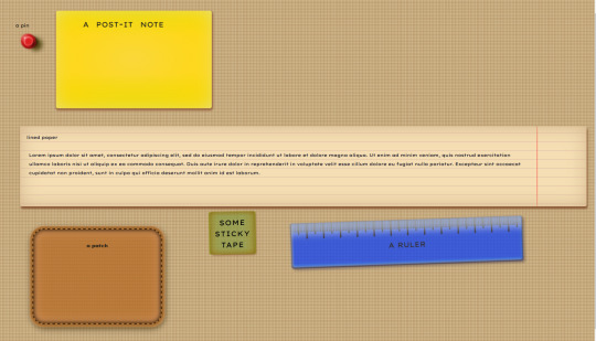
background
body{
background-image:radial-gradient(#edb,#a85);
background-size:.1cm .1cm;
}
sufficiently small radial gradient, when repeated in square shapes, creates an illusion of fabric threads -- any text put directly on such background is gonna be less readable
the pin
.pin{
width:20px;
height:20px;
border-radius:50%;
margin:.5cm;
background-color:#dd1e1e;
box-shadow:
inset .5px .5px 1.5px 0 #ffb5b5,
inset 0 0 10px -5px #ffb5b5,
-8.5px -8.5px 1.5px -8px #ffb5b5,
-7px -7px 6px -3px #e76d6d,
10px 6px 6px -3px #5e0d0d,
-2px -2px 4.5px 4px #dd1e1e,
.5px .5px 1.5px 6.5px #951414,
3px 3px 1.5px 1.5px #262000,
9px 1px 4px 2px #262000,
17px 7px 10px 4px #3e3500;
box-shadow:
inset .5px .5px 1.5px 0 #ffb5b5,
inset 0 0 10px -5px #ffb5b5,
-8.5px -8.5px 1.5px -8px #ffb5b5,
-7px -7px 6px -3px #e76d6d,
10px 6px 6px -3px #5e0d0d,
-2px -2px 4.5px 4px #dd1e1e,
.5px .5px 1.5px 6.5px #951414,
3px 3px 1.5px 1.5px #262000,
9px 1px 4px 2px #262000dd,
17px 7px 10px 4px #3e3500dd;
}
the first option for the box shadow is a backup for those browsers that don't render partly transparent colours; the second option looks better, but won't be rendered in older browsers.
the post it note
.postit{
background-color:#dd0;
background-image:
radial-gradient(transparent,#ffd700ee),
linear-gradient(transparent,#ffd742dd 25% 65%,transparent)
;
display: block;
margin: 30px;
width: clamp(150px,400px,calc(100% - 50px));
min-width: 200px;
max-width: calc(100% - 50px);
min-height: 200px;
padding: 10px;
padding-left: 60px;
border-radius: 5px;
box-shadow:
1px 3px 4px 2px #964,
inset 0 0 50px -20px #cce5ff;
color: #1a1a1a;
font-size: 20px;
letter-spacing: .5px;
font-variant: small-caps;
font-family: cursive;
word-spacing: .4em;
line-height: 1cm;
hyphens: auto;
vertical-align:middle;
}
the lined paper
.lined{
padding:15px;
padding-right:3.1cm;
background-position-y:15px;
margin:10px;
border-radius: 4px;
min-height:4cm;
background-color: #f5deb3;
background-image:linear-gradient(#dba 1px,transparent 1px 1em);
background-image:
linear-gradient(#dba 1px,transparent 1px 1em);
background-image:
linear-gradient(270deg,transparent 2.9cm,#f006,transparent 3cm),
linear-gradient(#dba 1px,transparent 1px 1em)
;
background-size:100% 2em;
box-shadow:
inset 0 0 40px 0 #d2b48c,
2px 5px 4px 0 #853;
color: #00001a;
font-size: 1em;
line-height:2em;
}
.lined p{margin:2em .5em;padding:0}
the first versions of background image is here to provide a backup for somewhat older browsers - it doesn't have the red margin line because i got lazy writing it
the patch
.patch{
width:6cm;
min-height:4cm;
max-width:80%;
margin: 1cm;
padding: 30px;
background-color: #bb7e3e;
background-image:radial-gradient(circle,#b57230,transparent);
background-size:.15cm .2cm;
border-radius: 25px;
border: 2px dashed #392106;
box-shadow:
0 0 10px -2px #392106,
inset 0 0 10px 2px #392106,
inset 0 0 21px 0 #eeaa82,
0 0 0 5px #bb7e3e,
0 0 3px 5.5px #ea6,
2px 5px 15px 2px #320;
color: #181a16;
font-weight: bolder;
text-align: center;
}
the "fabric structure" of the patch is simplified for the sake of browser compatibility. it's possible to target specific browsers with slightly different code that'd render more realistic leather in each, but that's a lot of code -- (two semi-transparent repeating linear gradients at different angles, repeats of a radial gradient to make it "shine", some play with the blending modes, and then a shape distortion strategy that's different for different browsers, to make it look more like a natural texture) -- so i've replaced it with something simple here. optionally, one could a second radial gradient on top, one with smaller bits of a slightly brighter colour, with different positions set for each layer of the background - to make the current texture look more shiny.
the sticky tape note
.tape{
margin-left: 30%;
width: clamp(20%,35%,40%);
min-width: 20%;
max-width: 40%;
min-height: 30px;
display: block;
margin-right: 20%;
transform: rotate(359deg);
padding: 10px;
border-radius: 3px;
background-color: #8a4;
background-color: #6B8E2388;
background-image:
linear-gradient(90deg,#B8860B44,transparent 20% 75%,#B8860B44),
linear-gradient(#B8860B44,transparent 10% 85%,#B8860B44),
repeating-linear-gradient(transparent 0 .5px,#cca2 1.5px 2px,transparent 3px 3.5px),
repeating-linear-gradient(90deg,transparent 0 .5px,#bb62 1.5px 2px,transparent 3px 3.5px);
box-shadow:
-3px 0 2px #888814,
3px 0 2px #888814,
3px 1.5px 4px #964,
inset 0 0 14px -3px #745407;
color: #000;
font-size:2em;
letter-spacing: 1.2px;
font-variant: small-caps;
font-family:cursive;
text-align: center;
}
the ruler
.ruler{
width:15cm;
max-width:86%;
display: block;
z-index: -1;
margin: .5cm;
transform: rotate(358deg);
height: 100px;
background-color: #0339f8ee;
background-image:
repeating-linear-gradient(90deg,transparent 0 0,#0f0009 .8mm .9mm,transparent 1mm 1mm),
repeating-linear-gradient(90deg,transparent 0 4mm,#0f0009 4.2mm 4.8mm,transparent 5mm 5mm),
repeating-linear-gradient(90deg,transparent 0 9mm,#0f0009 9.2mm 9.8mm,transparent 10mm 10mm);
background-size: 100% 20px, 100% 25px, 100% 35px;
background-repeat: no-repeat;
background-position: top;
background-blend-mode: multiply;
filter: contrast(102%);
border-radius: 4px;
box-shadow:
inset 0 -1px 3px -1px #003e,
inset 1px 40px 15px -15px #cae1ffaa,
inset 1px -1px 3px -.5px #003e,
-.5px 1px 1.5px #003e,
inset 3px -3px 3px -1px #cae1ffee,
inset -2px -6px 4px 1px #1464f4ee,
-3px -2px 4px -1px #1464F444,
4px 4px 6px 1px #0037;
opacity: .75;
text-align: center;
font-variant:small-caps;
font-size:2em;
font-family:monospace;
}
.ruler p{padding: 1.1cm}
this one was one of my first CSS-cliparts, and right now i'm too lazy to check the code, so i advise to check it for browser compatibility.
i'd appreciate it if the websites / blogs that use this code - could please link this post somewhere unobtrusive / reblog it, so that more people can use this code as well.
i'd like a prettier internet ;3
(i also have code for other office supply stuff / effects, but this post is long enough already)
0 notes
Text
Rhyming With The Responsive: AGE Responsive
Let’s for a minute have a flash back. Yes, you got it right. I am asking you to wind back the few bygone chapters of your life.
Let me take you to your childhood. Do you remember the books you used to read as a nursery or K.G kid? If you carefully look at the books now, you will notice that the letters and fonts of the books were large, bold too, aren’t they? Do you remember the moonlit sky you first saw in your books or the rising sun while reciting the rhymes or the vast canopy comprising the twinkling stars while wondrously looking at it and dancing, the person selling big balloons? You will find vivid chromatic combination in the presentations and portrayals. Have you wondered why?
You have travelled from the Aesop’s Fables to White paper and other journals and surveys and research. Was the content same all through the same? Was the procedure, portrayal and the medium of presentation same? We have now moved from paper to paperless medium of conveying stuffs be it a child of three or a scholarly post graduate doing his research. Perhaps speaking about the concept of paperless media is getting morose and obsolete when the kid next door tells you that he needs an extra GB RAM to speed up his browsing!

Yes! There we are. Yes! I am speaking about digital exposure and access to information across borders. From desktops to laptops to tablets and cell phones, information is easily accessible via internet. Well, the next step is who access these information and how? I know the answer is ready on your tongue tip by now. Yes, it is through website and the answer for WHO is ‘we’. Again who are these “WE”?
Now, if we come to this ‘WE’, it basically encompasses all those who are digitally literate. It can be you, me , the girl yonder, the boy reading there, people seeking admission in colleges, doctors, engineers, business personnel etc.
The second diversity is they use different electronic devices and use different platforms to speak to access web related information. Well are we speaking then about Responsive Website? A Big NO. Because making a website responsive is a habit by now with all Web Developers. The trend to make website responsive is very common now.
We now actually inch ahead to another realm of sophistication in terms of rendering service through technology and understanding the needs of the users from a more empathetic level.
Let us make introspection a prelude for now to begin with.
Nature as we know is a great laboratory of diversity. No two persons or minds are alike. This infers that the needs and choices too vary, across all ages as humans.
A 7-year-old and a 70-year-old do not read the same books or wear the same clothes, so why should they be subjected to the same online experience?
So the New Benchmark and Milestone could be having an AGE-RESPONSIVE website.
WHAT IS EXACTLY AN AGE RESPONSIVE WEBSITE?
Age Responsive Website is a User Centric Design though obviously responsive but the focus is on making is user centric in want and need.
WHAT AGE RESPONSIVE INVOLVES :
Age Responsive Design is balanced to fit to serve the users based on their specific demographics such as age and their personal interests. It revolves around the following:
Appearance of the site.
Elements of the site.
Interaction between various components of the site.
Functionality of the site.
Content that is to be displayed.
How the users can benefit from these.
Just a few examples of what Age Responsive Design could do, include:
bigger vs smaller font sizes and spacing.
muted vs saturated color schemes.
video presentations vs text explanations.
social media sharing vs email conversion.
expanded vs condensed navigation menus.
typographic vs traditional content.
Adapt content based on the user’s age.
Provide varying content across different groups.
Each generation uses websites differently, and as such, has a different set of expectations of what constitutes a ‘good’ or ‘bad’ website. Advertisers have long been catering to these expectations in the form of online targeted ads, and web designers are already used to creating sites that automatically adapt to the screen the user is accessing them from, so could the future of a more inclusive, universally appealing World Wide Web lie in combining these two common principles to create Age Responsive Design.
In the future there will be a proliferation of metadata that will provide age-specific adaptations for websites, including the following:
Expansion and contraction of navigation menus will be based on the user’s competency level. For beginners, stripped-down interfaces will make it more convenient for them to browse through the site or app while using the UX elements that they are already accustomed to.
Font-related factors will become bigger and clearer for the elderly to see.
Color schemes may automatically be altered depending on the user’s age. Younger ones will see more vibrant colors, while older users will get to see a milder color scheme.
HOW DOES THE IDEA OF AGE RESPONSIVE DESIGN WORK ?
For instance, if a child is viewing the site, then, the font, color and the other elements shall interact with them in favor to their desire while it will alter the entire appearance to please the elderly according to their preference.
So, here are the aspects of your web design that age responsive web design will be working upon:
Font sizes and the spaces between them will vary for elders which will never be the same for kids.
Color changes {Flashy colors are most likely ignored by elders who prefer shades of lighter colors, while, darker and brighter colors are welcome by youngsters}.
You can expect simple navigation along with a sitemap that is provided to the elders to help them reach the point they have been hunting for without any hassles or complications. There have been situations where people abandon certain actions and leave a site if the site does not have a site map or fails to provide them with the right directions to complete an action.
Kids love videos. It could be a fantastic idea to play videos for kids and not to play it for the elders who prefer content in the form of text rather than videos.
Being brief, all depends on how and when it is implemented and obviously who takes the first step. Having said that , it will be a step ahead in the making the website more interactive and user friendly. Let us wish that it happens soon.
Get in touch with us at https://magnigeeks.com/
0 notes
Text
Instant Pages Review - Launch Beautiful, Ultrafast Websites, and Landing Pages.

What is Instant Pages?
With Instant Pages, now you can launch beautiful, Ultrafast Websites, Landing Pages, and Funnels in 60 Seconds. In this Instant Pages Review, we will discuss all features and benefits of this tool to make you understand how effective it is to grow your business online.
Create and sell incredibly successful websites and funnels for desperate company owners in the hotel, real estate, interior design, and hundreds of other high-paying sectors.
You require a professional-looking website or funnel for your web presence in order to attract new clients, gain more leads, and expand your business on a consistent basis. And they have just discovered the ideal package option for you.
Vendor:
Name – Daniel Adetunji.
Company Name – IM Revolution Lab.
This vendor has already developed some fantastic products, such as CopyBee, SmartHosting, Flex, Orangemail, OrangeSuite, GreenPages, CoursePay, Candy, DesignPay, Romeo, Bliss, Mints, CryptoMint, CourseCube, OrangeDrive, OrangeBuilder, MailPanda, ImagePanda, etc.
Instant Pages Review; Features:
Launch Ready.
One of the most distinctive features of Instant Pages is that it includes a large number of ready-to-use designs.
There is a ready-to-use template that is just what you need, regardless of your business or niche. These ready-to-use themes make developing your website as simple as updating a word document.
Easy Drag And Drop:
You may construct your website exactly as you want it using the simple drag and drop builder. If you want an image to display anyplace, simply drag it there.
Responsive DNA.
You don't have to worry about how your site will look on a tablet, mobile device, or any other device with a smaller screen when you use Instant Pages. The templates are entirely responsive and perform properly on devices of any screen size without losing information or distortion.
DIY Designer:
Every Instant Sites design can be modified to look unique with a few clicks. There are a lot of configurable choices such as fonts, colours, and page layouts. It only takes a few clicks to layout the complete page.
Carefully Optimized:
Each component has been carefully constructed with performance in mind. So that you have a consistent experience overall.
Icons Pack:
1000+ icons to choose from in the top icon set. They have full collection of icons to meet your requirements, ranging from line icons to filled icons.
Add Custom Domain Name:
With a custom domain, you can leave a long-term impression on your visitors. Connect your domain to the website you created.
Site Analytics.
Discover how many page views you have, where your visitors come from, and how you compare to competitors with the integration of Google Analytics.
With its simple installer and tutorials, you can create Instant Pages in minutes with no coding experience. Edit most element characteristics such as padding, margin, border, shadows, backgrounds, and text styles quickly, visually, and in real time.
READ MORE
0 notes
Text
TYPE SPECIMEN BOOK RESEARCH
IBM Plex Sans Typeface Specimen
I was happy to find a book specific to the typeface I'm using. It focuses on IBM Plex Sans and has some really great layouts and colour.
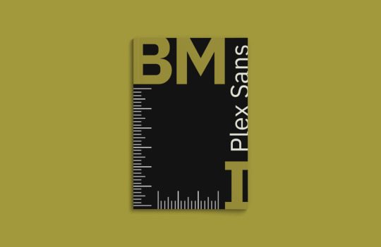
The cover of this book uses an interesting layout. I like how the letters in ‘IBM’ have been asymmetrically placed and the ‘Plex Sans’ fits nicely in-between.
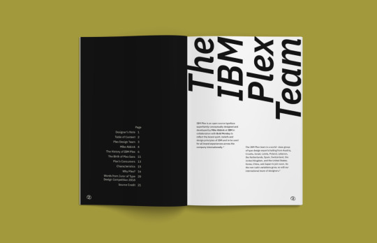
There is a lot of Swiss elements throughout this book which I think works great with this typeface as it’s a sans serif. The text at the top of the right page has a nice angle and balances out the body text nicely as a spread.
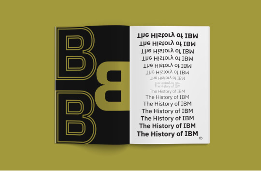
The left page here features only 3 letters but is still impactful with the experimentation of colour and line. The right page has a nice waterfall effect and I really like how the top half has been rotated to create a mirrored style.
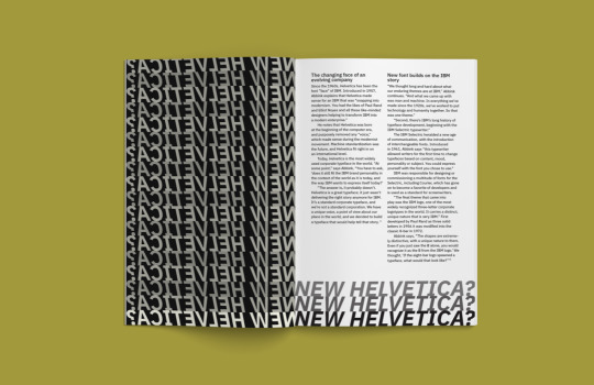
Although seperate pages, the text from the left page looks to be entering the right page at the bottom. This shortens the right page and almost acts like a border. I think the way in which it has created a new form is really clever.
Aeonik Pro
The cover of this book is super playful, featuring letters, numbers and glyphs and even has a smaller version (black and white) which focuses on the glyphs and “sculptural expression within the typeface across Latin, Greek and Cyrillic alphabets”. I like how the type moves down the spine when stacked like this.

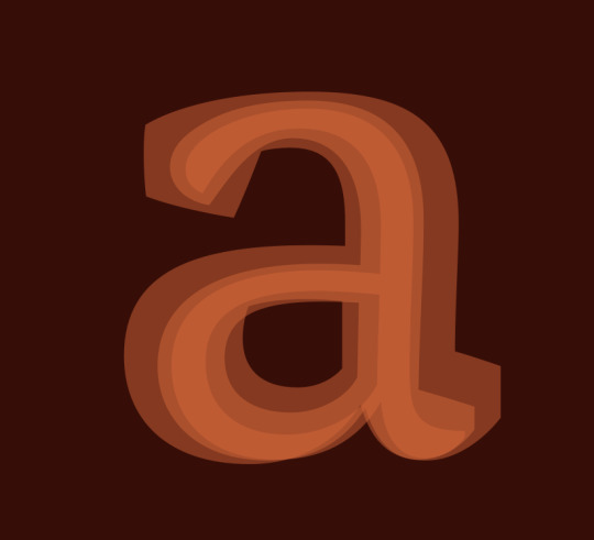
This spread has a really nice balance between colour and point size. As an intoduction/beginning page I think using the ‘a’ is a nice way to signal that.
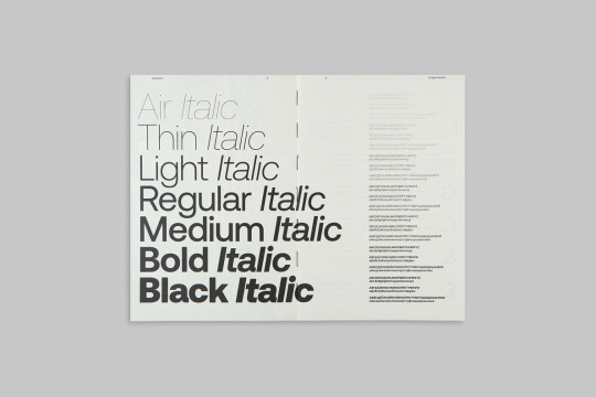
The way this design has utilised both regular and italic fonts in individual lines is really clever and the reader is able to further understand how each one operates through a small paragraph aligned to each. I definitely want to try create something similar to this in my book.
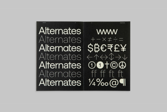
A nice break from the black text on a white page and an interesting way of representing glyphs. It’s very tidy and I think something I will consider when exploring the IBM Plex glyphs is the placement and how each one works with each other to create an interesting visual.
This is probably my favourite spread in this book. The balance between the large text and body text is sharp and clean. By rotating text 90 degrees it creates a second layout and the variation in styles is another great element to this spread.
This spread is another big inspiration for the direction I want to go in. I like how there is a colour inversion between the pages and the gradient style on the right page sits nicely against the bold glyph on the left.
RM Pro Font
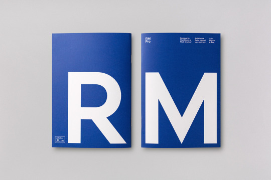
Because the name of this typeface is simply ‘RM’ I think it was a good choice to present the front and back covers of the book in this way. I will also be using blue and white for my typeface specimen book so it’s really nice to see these colours presented in a similar format.
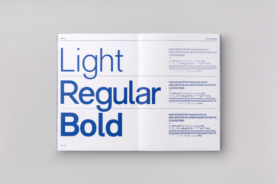
This spread is very similar to a lot of other work I’ve seen but that’s probably because it’s just a really effective way of presenting the different weights in a typeface. I like how this one in particular uses both the alphabet and glyph forms as body text instead of just a paragraph or excerpt from something.
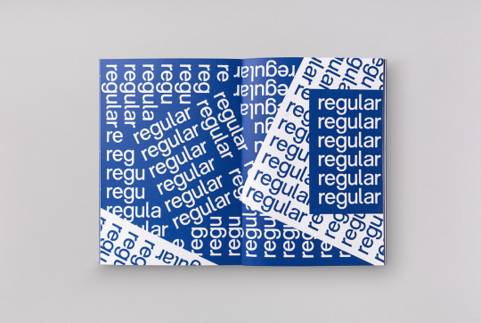
A really nice layout to display a single font. The placement of colour is well and angles is well thought out and I think overall this spread has a nice rhythm to it.
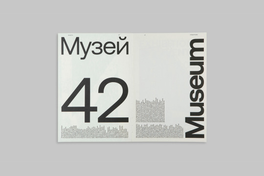
Type presented in a park subway system signage which immediately made me think of the work of Massimo Vignelli. This is something I haven’t seen a lot of in my type specimen research and I think it’s a great way of emphasising a typeface’s features and legibility.

Another great way of displaying the alphabet and glyph forms in a this typeface. There is almost a flush-left, ragged-right style due to the top and bottom lines falling short however it still has a nice balance. Again, the placement of each glyph is well thought out so that each one works in harmony to create an effective visual layout.
0 notes
Photo
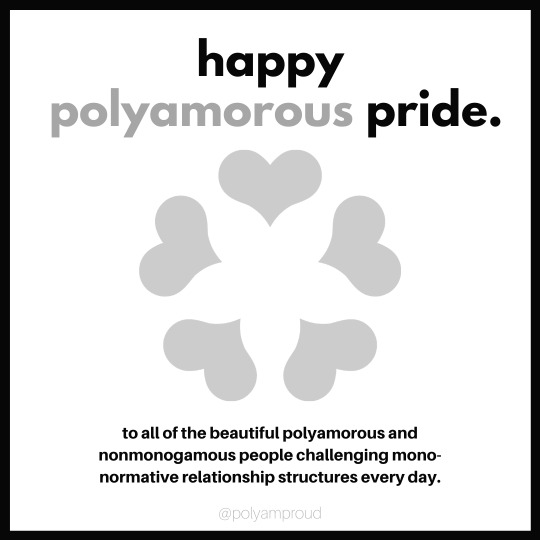


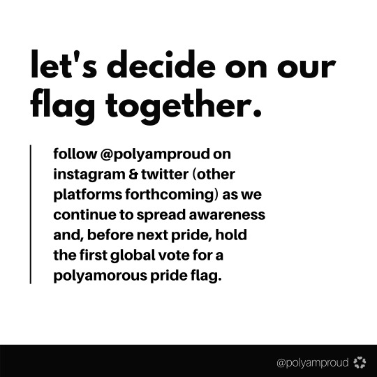
Tag your partners. And your partners’ partners. And your partners’ partners’ partners.
We love our polyamorousness and we love our polyamorous community. We deserve to feel proud of our banner, especially during pride.
Happy pride, siblings. We’re with you. We hope you’re with us, too.
~image description below~
[Image Description: A set of 7 square images. All text is in lowercase letters.
Image 1: A single square image with a white background and outlined by a thin black border. All text in this image is centered. At the top of the image in big, bold black letters it reads “happy”, followed by gray text which reads “polyamorous”, followed by black text which reads “pride.” Beneath the text is an enlarged gray polycule symbol. Under the polycule symbol is smaller, bold black text which reads “to all of the beautiful polyamorous and nonmonogamous people challenging mono-normative relationship structures every day.” At the bottom of the image is the “@polyamproud” watermark in gray letters.
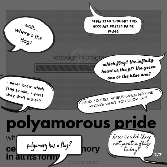
Image 2: A single square image. The background is grayed out and is mostly made up of the original polyamorous pride flag which has been grayed out and has a loading bar in the middle of the flag. Above the loading bar is gay text which reads “redesign in progress.” Under the flag is big, bold black text which reads “polyamorous pride” which is followed by more text which is not readable as parts of the foreground cover it up. The foreground features 7 speech bubbles placed in varying places. Each speech bubble has it’s own seperate font and has a statement in it.
Speech bubble 1 reads “wait... where’s the flag?” Speech bubble 2 reads “I definitely thought this account posted pride flags.” Speech bubble 3 reads “which flag? the infinity heart or the pi? the green one or the blue one?” Speech bubble 4 reads “i never know which flag to use... i guess they don’t either.” Speech bubble 5 reads “hard to feel visible when no one knows what you look like.”
Speech bubble 6 reads “polyamory has a flag?” Speech bubble 7 reads “how could they not post a flag today?” At the bottom right corner is white text which reads “2/7”, indicating the image number.
Image 3: A single square image with a white background. All text in this image is left-aligned. At the top of the image is big, bold black text which reads “yep. no flag.” followed by slightly smaller bold black text which reads “feeling confused?” Beneath the text is a gray vertical line at the left side of the image. Next to the line is left-aligned small, bold black text which reads “we’re choosing not to post a polyamorous pride flag until we vote and decide on a single flag as a community.” At the bottom right of the image is small, black text which reads “let us break it down for you.” Under the text is a black arrow pointing to the right. Beneath the arrow is gray text which reads “3/7”, indicating the image number. Under the image number is the “@polyamproud” watermark in gray letters. Beside the watermark is the polycule symbol in gray.
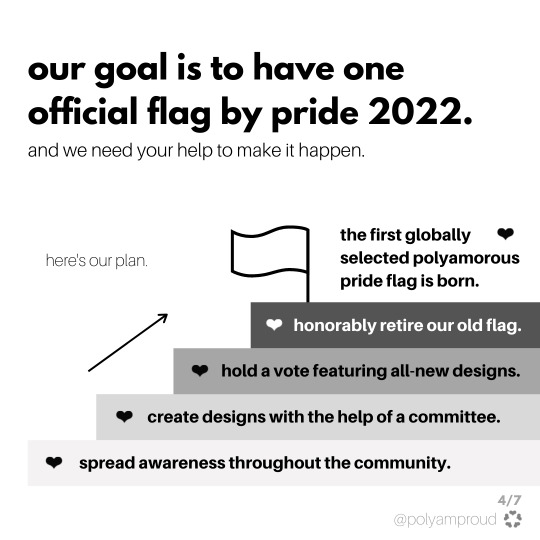
Image 4: A single square image with a white background. All text in this image is left-aligned. At the top of the image is big, bold black text which reads “our goal is to have one official flag by pride 2022. Beneath the text is small, thin black text which reads “adn we need your help to make it happen.” Halfway down the image at the left side is small gray text which reads “here’s our plan.” To the right of the text is an arrow pointing diagonally up towards the right accompanied by a stair step plan. Each step is a different colored rectangle with a small heart at the left side. The first step is a white rectangle which has bold black text which reads “spread awareness throughout the community.” The next step is a light gray rectangle which has bold black text which reads “create designs with the help of a committee.” The next step is a gray rectangle which has bold black text which reads “hold a vote featuring all new-designs.” The next step is a dark gray rectangle which has bold white text which reads “honorably retire our old flag.” At the top of the stair step plan is a simplistic drawn white flag. Next to it is bold black text which reads “the first globally selected polyamorous pride flag is born.” accompanied with a small black heart. At the bottom right corner is gray text which reads “4/7”, indicating the image number. Under the image number is the “@polyamproud” watermark in gray letters. Beside the watermark is the polycule symbol in gray.
Image 5: A single square image with a white background. The image features two black speech bubbles with centered white text as well as text answering to the speech bubble underneath them. Each speech bubble and it’s answers takes up one half of the image. The first speech bubble reads “but we already have a flag.” Beneath the text bubble at the left side of the image is a thin black vertical line with left-aligned text next to it answering the statement in the speech bubble. The text reads “yes we do. and it’s gotten us to where we are today- far more widely seen, recognized and understood.” There’s some space between the next line of text which reads “but the original flag no longer adequately reflects the community it represents, nor serves our needs.” The second speech bubble reads ”having lots of flags makes sense for us.” Beneath the text bubble at the right side of the image is a thin black vertical line with right-aligned text next to it answering the statement in the speech bubble. The text reads “yes, we get that polyamorists aren’t exactly known for “choosing just one.” There’s some space between the next line of text which reads “but we’re all part of this one vast and diverse community and, if we can agree on that, we can agree on a flag that fits us.” At the bottom right corner is gray text which reads “5/7”, indicating the image number. Under the image number is the “@polyamproud” watermark in gray letters. Beside the watermark is the polycule symbol in gray.
Image 6: A single square image with a white background. The image features two black speech bubbles with centered white text as well as text answering to the speech bubble underneath them. Each speech bubble and it’s answers takes up one half of the image. The first speech bubble reads “polyamorists don’t need a flag.” Beneath the text bubble at the left side of the image is a thin black vertical line with left-aligned text next to it answering the statement in the speech bubble. The text reads “having a single, unifying flag is a crucial tool for community advocacy, awareness, and visibility.” There’s some space between the next line of text which reads “we feel and see a need. if you don’t feel you need a flag to express/defend/advocate for your polyamory, you’re welcome not to use one.” The second speech bubble reads ”there’s already a flag i like.” Beneath the text bubble at the right side of the image is a thin black vertical line with right-aligned text next to it answering the statement in the speech bubble. The text reads “that’s so wonderful! you’re definitely not alone in that feeling. at the same time, there is a large portion of the community that has never felt the same.” There’s some space between the next line of text which reads “a widespread, international vote is a more equitable way to serve our community.” At the bottom right corner is gray text which reads “6/7”, indicating the image number. Under the image number is the “@polyamproud” watermark in gray letters. Beside the watermark is the polycule symbol in gray.
Image 7: A single square image with a white background. All text in this image is left-aligned. At the top of the image is big, bold black text which reads “let’s decide on our flag together.” Beneath the text is a black vertical line at the left side of the image. Next to the line is left-aligned small, bold black text which reads “follow @polyamproud on instagram & twitter (other platforms forthcoming) as we continue to spread awareness and, before next pride, hold the first global vote for a polyamorous pride flag.” At the bottom of the image is a black rectangle. At the right side of the rectangle is the “@polyamproud” watermark in white letters. Beside the watermark is the polycule symbol in white.
End ID.]
#lgbt#lgbt pride#lgbtq#lgbtq pride#polyam#polyamorous#polyamory#polyam pride#polyamorous pride#polyamory pride#pride flag#polyam pride flag#polyamorous pride flag#polyamory pride flag
217 notes
·
View notes
Photo


click for a full view!
this is the blog I legit grew to love or
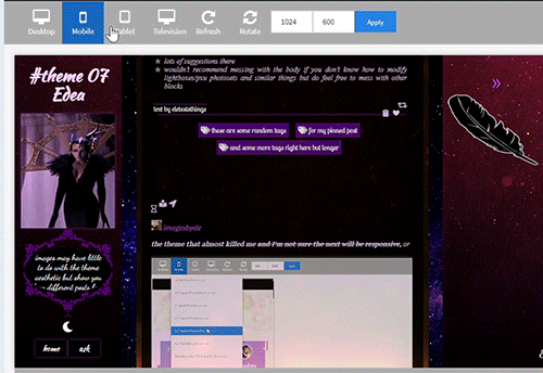
theme 07 - Edea
100% tall container and sidebars on desktop / see gif 2 for responsiveness. As always super customizable!
like or reblog if you use (or just if you like!). Don’t take off the credit, but edit as you please. Links and more instructions/specific sizes in the source! Do let me know if something is wrong, I welcome feedback of any kind.
reminder I have a ko-fi if you’d like to support me <3
in this blog you’ll find:
-the soundcloud player button will automatically be the same color as your tags background (because it's small and it looks nicer to have it match). The player is minimal with visible album cover, by shythemes. Also by @shythemes and with @bychloethemes fix, the pxu photosets and the way I styled the like button, lightboxes, and the script for automatic video resizing.
-npf photoset fix and the (optional) searchbar (hidden under the feather) by @glenthemes
and button to copy the url of the post.
-a second source link will appear if the post has a custom source/a source outside of tumblr.
- @magnusthemes' no ‘href.li anymore’ script.
-by @eggdesign (optional) daynight button you can toggle off.
-dropdown menu that appears when you click on the animated link, a floating feather (or whatever image you choose instead of it) will show 5 more navi-links and a link to each custom page you make if you enable 'show link to this page'. As many as you want, you can scroll down the sidebar when they exceed its height.
-Spotify (audio and npf posts) will have a max height that is half the width of your posts instead of a big album art so they won’t become giant (keeping the 80px height to make the album art disappear will remove the list of songs if you post a playlist so I shortened it * see notes in the post linked in the source.
-responsiveness: even 540px posts + padding and containers will fit in the smallest desktop screen (1024px) because sidebars grow slightly smaller than their regular 250px. In all tablets and mobiles you get the sidebars on top and the container below, you can scroll down to see the content and the screen will also scroll if needed. (due to everything being naturally 100% tall and the post-width changing depending on the user I couldn’t have thin posts fit in big tablet or I’d risk cutting off the larger ones). Topsidebar1 will also show as much content in a row as possible.
-lines around titles of posts from css-tricks, optional unnested captions by @annasthms
-lots of instructions in the html if you decide to change something more.
what you can customize without going to the html page:
rest under read more because as always it got long. Please check it out!
for the toggle on and off section:
-turn on and off the visibility of the second sidebar bg if you just want the floating feather (or an image you may upload instead), daynight mode, the searchbar, the searchbar suggestions that appear when you click on it if you don't want to go to the html editor to add the links, unnested captions for textposts and unnested captions for all other posts ( see faq if curious as to why I divided them); the glow around navi links and description. The normal description if turned off will be replaced by one with a "fancy" background that fits this theme. Rounded borders.
for the pick it/upload section:
-pretty much all colors in your 'regular' theme, including each sidebar, the posts container, the posts second container (entries) and the posts background. All images you see except the nightmode button. Including a secondary bg image for your sidebar when they turn into topbars (given the big change of width), see post linked in the source for more instructions.
-if you have enabled daynight button, you can change the color of posts bg, text, entries, backgrounds, bottom permalinks, links, italic, questions, answers. I couldn't add more or I'd surpass the number of allowed meta tags, but it should be enough to allow people to read your posts (if someone can't read white on black text, like me, they can click on the button and have black on white text, or some other combo) If you want to add more you’ll have to go in the html edtior and search body.night for ‘instructions’, it’s pretty easy now that the rest is already written.
select section:
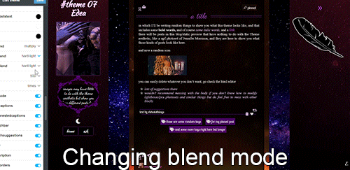
-when it comes to the container behind the posts and each sidebar you can select the blending mode between color and background image, which can be none if you want only one to show fully, or can be hard-light, soft-light, multiply and more, to make the image an overlay and see the result (for example in the preview the sidebar's bg gifs are on multiply or they'd be golden, on top of violet/purple, but in gif 3 you also see the 2nd sidebar on hard-light).
-post width (between 400, 450, 500 and 540 px).
-the font of the posts text among MANY options, including some that wouldn't work well for a post but is there to show you all the potential fonts present in this theme. Why? See below.
text section:
-you can type the following fonts (picking among those shown in the select menu for body font): description, blog title, post title, bottom permalinks, tags
-the size of the gutter/distance between images in photosets, blog title size, post title size, posts font size, description font size
-the symbol in lists items, currently a star or ' \26e6 '. You can replace with other codes or straight up the symbols, there will be a link in the source-link with a page full of other css symbols, remember to add a \ before the code itself.
-the names and urls of navi links (two are under sidebar 1, currently being home and ask, 3 more in the other sidebar)
#themes#codehunters#theme#free themes#free resources#evansyhelp#dailyresources#themehunter#rp themes#rph theme#rph#rpc#fansite theme#main theme#complete resources#resourcemarket#tumblr theme#rp theme#my themes#theme 07#mine
87 notes
·
View notes
Text

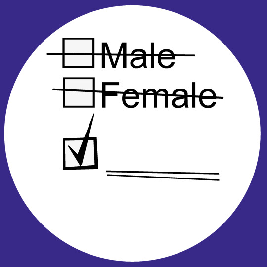
[ID: Two circular pin designs. The first has the trans pride flag in the background, with stripes of blue, pink, white, pink, and blue.
Large black font reads, "Male" and "Female" with empty checkboxes next to them, with the words crossed out. Below them, in a font that looks more like handwriting, is "Werewolf", with an uneven checkbox next to it with a check mark in it. Smaller handwriting font below it reads, "who uses it/its pronouns. 'It is wearing an awesome pin'. The background of the image is transparent.
The second design has the same text, but is missing the font that is written in, so that it is blank. The background of the circle is white, and around it is a dark blue border. End ID.]
Feel free to request pins like this, where you get to pick what fills in the blank section, and pronouns if you want to add them :) You can also pick what flag you want in the background, or any other design.
———————–
Designs are no longer available on Redbubble as of April 2023, as they’ve started actively stealing money from artists. Sorry for the inconvenience. You are, as always, encouraged to save these designs to use as icons or in other art, and you are encouraged to print them out and make your own shirts or buttons if you’re able to.
4 notes
·
View notes
Photo

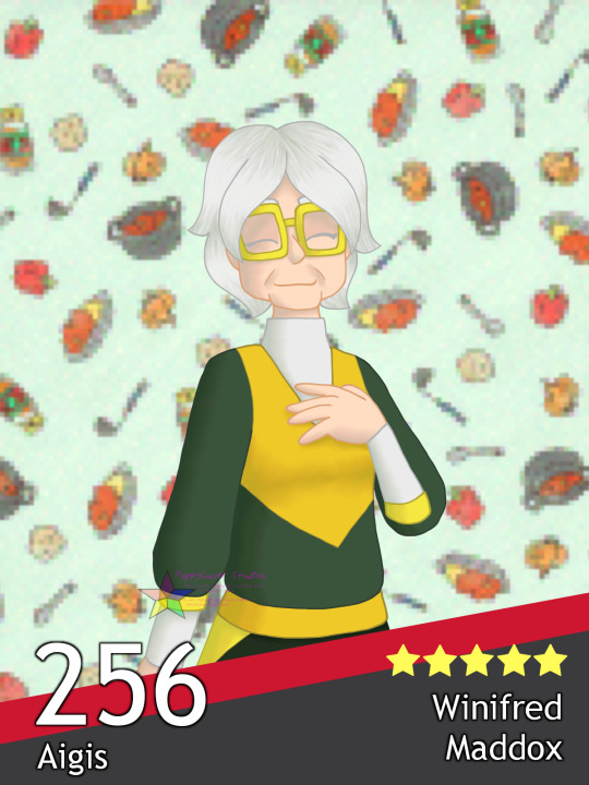
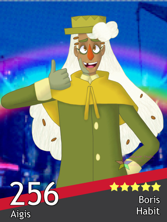

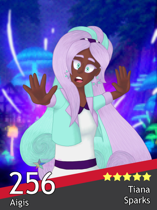
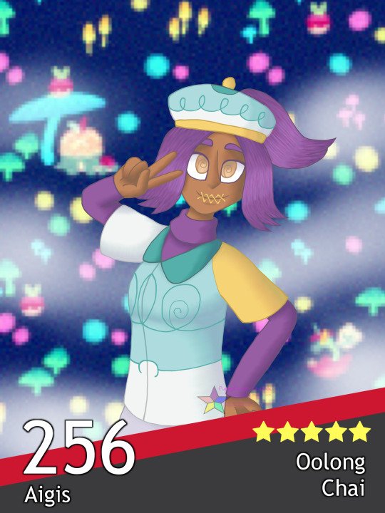
[Image Description: Six digital illustrations of people resembling six different Pokemon from the Galar region featured in Pokemon Sword and Shield, made to look like the league cards players can create in the game. Each card has a bottom black border with a diagonal red line across the top, the number 256 in large white font and the word Aigis in smaller font on the bottom left, and five yellow stars and the character’s name in white font on the bottom right.
The first is a woman resembling the Pokemon Cinderace. She has dark skin, orange eyes, and white and orange hair with yellow fringe framing her face. She is wearing a white hooded jacket with dark blue accents, a grey shirt with a dark blue collar, and orange athletic pants with a dark blue waistband and yellow accents. She is smiling excitedly while posing with one fist up and the other hand held out in a manner that implies confidence. The background is the train station in Wedgehurst, with a swirl of flame behind the character. Name text on bottom right: “Aubrey Harris”
The second is an old woman resembling the Pokemon Boltund. She has light wrinkled skin and short white hair. She is wearing yellow square-shaped glasses, a white turtleneck, a black and yellow sweater, and black pants with yellow accents on the side. She has one hand over her chest and is smiling pleasantly. The background is pale aqua with a pattern consisting of curry cooking post, ladles and spoons, plates of curry, and curry ingredients. Name text on bottom right: “Winifred Maddox”
The third is a tall man resembling a cross between the Pokemon Eldegoss and the character Dr. Boris Habit from Smile For Me. He has somewhat light skin with green parches on his chin and hands, brown eyes, long white curly hair with brown “seeds” attached, and a missing tooth. He is wearing a green boater hat, brown “seed” barettes at the side of his head, a pale yellow shirt, and a long green coat with pale yellow trim and a yellow cloak-like top with drawstrings. The background is the city of Motostoke at night, with a rainbow behind the character. Name text on bottom right: “Boris Habit”
The fourth is a woman resembling the Pokemon Cramorant. She has light skin, messy blue hair with a yellow headband, and green eyes. She is wearing a blue shirt with dark blue sleeve fringe and a blue-grey shawl with darker grey fringe along the bottom edge. The background is the city of Hulbury, specifically displaying its iconic lighthouse, with water bubbles surrounding the character. Name text on bottom right: “Cerulean Fischer”
The fifth is a woman resembling the Pokemon Rapidash, specifically its Galar regional variant. She has dark brown skin, long pink and blue curled hair with a purple and white headband, and pale blue eyes. She is wearing a blue jacket with pink accents, pink and blue starburst-shaped earrings, and a white dress with purple collar and belt. She has her arms up in a pose that seems to be saying “hey, watch out!” and has a shocked expression. The background is the town of Ballonlea, with a pink burst of energy behind the character. Name text on bottom right: “Tiana Sparks”
The sixth and final is a woman resembling the Pokemon Polteageist. She has medium-brown skin, purple hair in a ponytail, golden eyes with swirly pupils, and her mouth is sewn shut with yellow thread. She is wearing a white and aqua beret with gold trim, a putple turtleneck, a white, aqua, and gold sweater, and a grey skirt. She has one hand on her hip and the other making a V-sign with her pointer and middle finger. The background is a pattern of glowing multicolored mushrooms with the Pokemon Applin, Appletun, and Flapple scattered about, as well as some white smoke clouds. Name text on bottom right: “Oolong Chai”
End ID.]
-----
I just wanted to do something with my Pokejinkas and SwSh League Cards, so here we are :D
💖🐶 Check out my pinned post for ways to support my artwork, among other things! 🐶💖
~If you like, please reblog to show your friends! Likes are appreciated, but reblogs let more people see my content! If you have something to say, feel free to give feedback in tags/comments/replies as well!~
Cinderace, Boltund, Eldegoss, Cramorant, Rapidash (any form), and Polteageist © Nintendo/GameFreak
Dr. Boris Habit © LimboLane
Aubrey Harris, Winnifred "Zero" Maddox, Eldegoss!Habit design, Cerulean Fischer, Tiana "Twilight" Sparks, Oolong Chai, and artwork © PuppyLuver Studios
#pokemon#pokejinka#cinderace#harris (cinderace)#boltund#zero (boltund)#eldegoss#dr habit (eldegoss)#cramorant#cerulean (cramorant)#rapidash#galarian rapidash#twilight (rapidash)#polteageist#oolong (polteageist)#jess drew the thing#sfw#image description#long post
15 notes
·
View notes
Link
Nowadays, the cameras on your android smartphone are getting better than earlier time. The inbuilt camera app on your android smartphone is probably good, but there is always a possibility for improvement. Android users have the flexibility to choose top camera apps, with features such as multiple shot modes, steady shot helpers, composition overlays, editing tools and post-processing special effects. Smartphone makers are paying more attention to make cameras more reliable, work better in night or low light, and add more features that their competitors are providing. Many of the smartphone buyers will base their buying decisions on the quality of the cameras. So, the point is that cameras whether it is primary cameras or secondary cameras, are important on smartphones these days.
Now, the question is:
Which is the best camera application for android?
Choosing only one app as the best camera app for android among all camera apps is very difficult. Because the choice of users can vary on the basis of camera apps rating or no of downloads or no of reviews.
So, we prepared a list of the top android camera apps with all of its parameters.
Here is our list of some of the best Android camera apps. You can use these apps by clicking share-worthy photos from below top Android camera apps.
B612 -Free Selfie Camera, Photo Editor & Video App
Details about this app:
Total Installs: 500,000,000+
Rating: 4.3
No of Reviews: 67,62,131
Google Play Store Link: https://play.google.com/store/apps/details?id=com.linecorp.b612.android
B612 is BEST “One-stop solution app” for all your camera needs.
You will find everything you are looking for here in B612 – Beauty Feature, Makeup, Stickers, Short-videos, Editing, Video templates, Music videos & more. New stickers, filters and effects are added everyday for our Indian user in India. Have fun and make amazing memories with B612.
Easily create high quality music videos
– Pair your videos with exciting tunes
– Diverse effects and playback speeds for more dynamic music videos
Studio feature
– Find 1000+ video templates and collage layouts to make amazing content extraordinary
– Most trending and new video editing templates for you to edit your videos easily and fast
– Find new video as well as photo edit templates on daily basis
– Easy way to find our whats trending as well as to to set new trends
Over 1,500 diverse stickers
– Facial recognition stickers that can distort your face or turn you into a cute animal
– Shiny effects and stylish analog filters to brighten your day
– Various drawing effects that you can draw as you take a video
– Celebrate every festival with new trending sticker and effects
– Find new most trending and viral
Real-time beauty and makeup effects to get the perfect shot at once
– Perfect skin with a single tap
– Find your ideal face shape with an easy-to-use slider
– Get rid of pimples Adjust the features like smoothening, dark circles, pores for perfect selfie
– Change makeup styles for every picture
Immaculate filters to suit your taste
– High quality filters perfect for selfies, food, landscapes, or any occasion
– Quick access to your favorite and most used filters
– Make and save your custom filter
Easy Photo Editor
– Use editing tools from gallery to make your existing photos more special
– Try amazing filters, stickers for pictures & new trendy photo effects.
– Use auto-cut and change your background
– Beauty and makeup editor: features like smooth skin, makeup are now easy to add
– Use new tools to make your pictures stunning: hair color changer, auto-cut, slow motion & more.
– Adjust the ration of your pictures and videos in all sizes for Instagram (1:1), Youtube (16:9) & other media
– Easy and fast one touch adjustments tools
Story Mode & Video:
– Now make amazing stories using new trending effects everyday
– Get perfect beauty and makeup for all your stories and videos
– Easy one touch share is available for your convenience
– Add your favorite music and make fun short videos
Take fun boomerang videos that play on a loop
Meet cute characters that come to life using AR stickers (Only available on certain devices using iOS 11 or above.)
Create collages where you can see all your best moments in one place.
Cymera Camera – Photo Editor, Filter & Collage
Details about this app:
Total Installs: 100,000,000+
Rating: 4.6
No of Reviews: 24,79,006
Google Play Store Link: https://play.google.com/store/apps/details?id=com.cyworld.camera
Cymera reached 300 million downloads for Android and iOS users in 2018.
Get this powerful photo editor app with amazing photo effects, photo filters, stickers, crop, instafit, blur effect, mirror effect, tattoo & muscles effects and makeups!
Christmas Selfie Effect.
New Year Selfie Effect.
New Snappy sticker and the new beauty lomo filters.
Face filters to remove acnes and blemishes.
New AR Selfie effects for Summer vacation.
New Air Shape Item to uplift your pic!
Popular & New
+Collage Maker
+Live Filter
+Layout Items
+Smaller and V-shaped face
+Makeup Style
+Body and Face Editor
+Vintage, Natural, Lomo, Film, Sketch and Selfie Filters
+AR Face Sticker
+Healthy Skin Feature
+Text and MEMES
+Various hairstyles and color
+InstaFit and more!
+Import directly from Google Photos
【Main Functions】
Beauty Camera
– Professional beauty tools for your skin makeup, slim or face reshape, remove wrinkles, erase face pimples and dark circles.
– Hundreds of amazing beauty selfie filters and makeup effects.
+ Meet the smart selfie camera to look exceptional without hassle!
Amazing Filters
– Perfect instant selfies with 130 different filters.
– Edit with free filter packages for selfie, nation flags, air shape, vintage-feel, pastel colors, film-effect, black & white and more!
– Face filters for perfect selfies!
– Lens flare effects or light laked effects.
– Create your own collection of favorite filters.
+ All filters are free!
Camera Lenses and Silent Mode
– 7 different and fascinating camera lenses.
(Divided lenses/FishEye/Lomo and more)
– Anti-shake, timer, touch shooting, out-focusing options.
– Silent mode
– Bluetooth connection is available for selfie sticks with remote.
Collage and No Crop Features
– Different types of grid to combine photos (up to 9 photos) into one.
– Blurred background with a simple touch.
Retouch or Adjust Photos Instantly
– Automatic face recognition including enlarge eyes, smile and slim feature.
– Edit with Liquify, skin corrections (brightening, whitening, concealers)
– 200 kinds of natural hair and face makeup items
Shape your dream body with new features!
– New body shaping feature
– Stunning feature to Slim your waist
– The best photo editor to lift your hip
– No more bow legs. Get a sexy, shaped legs in few seconds!
Super Easy and Fast Editing Tools
– Brightness/contrast/mosaic/crop/rotate.
– Extraordinary effects including filters/lights/borders/vignette.
– High quality resolution for clean and clear photos.
– Advanced red eye removal function.
– Add a stunning art effects with color splash function.
Upgrade Photos with Unique Items
– Trendy AR stickers including face animal mask, air shape item, love stickers, beauty filters, light effects, frames
– Brush items for hand writings and drawings
– Variety of fonts in text feature
– Face pop and meme
Sharing Photos and Smart Gallery
– Organize photos by date, location, selfies, etc.
– Now you can set your edited photos as wallpaper.
– Edit photos taken by other camera apps.
– Send or share your photos on your social media channel or other instant chat.
YouCam Perfect – Best Selfie Camera & Photo Editor
Details about this app:
Total Installs: 100,000,000+
Rating: 4.5
No of Reviews: 19,34,761
Google Play Store Link: https://play.google.com/store/apps/details?id=com.cyberlink.youperfect
YouCam Perfect is fully developed in Taiwan by Perfect Corp.
YouCam Perfect is the best beauty camera & selfie photo editing app with over 300 MILLION downloads and counting! Edit pictures & selfies to share with family and friends with YouCam Perfect your full mobile photo editor, selfie beauty camera & social app. Create amazing edits for social media, WhatsApp, Facebook, Tik Tok & more with our easy to use photo editor camera app.
Edit selfies & photos with hundreds of campaign and new creative templates, effects & filters. YouCam Perfect lets you combine your snaps into instant photo collages and creative frames. Get perfect selfies in just one tap with beautify, also remove blemishes & smooth wrinkles! Share your edits in an easy way with friends and family either online using WhatsApp & other social media. Stay connected wherever you go, stay updated with friends & family with easy edits, selfies & pictures!
====== YouCam Perfect Core Features =======
Real-Time Selfies &Skin Beautifying Effects in Beauty Camera
Edit Photos with Full Editing Toolkit
Cutout & Object Remover Makes It All About You!
Achieve a Flawless & Luminous Face in Every Picture
Stylize & Share Pics with Friends!
Edit Photos with Full Editing Toolkit
★Try effects and one-touch filters, photo crop and rotate, mosaic pixelate to blur the background, vignette, and HDR effect.
★Blur photos using background defocus, Gaussian blur, and other blur effect tools
Cutout & Object Remover Makes It All About You!
【Focus On You With Smart Object Removal】
★Like a green screen for your photos, cut out the subject of a photo, then give it a fun new background for a special effect.
★The unique intelligent object removal tool that you can’t find in other beauty apps
★Erase unwanted background objects or people, so that your photo is all about you!
Real-Time Skin Beautifying Effects in Beauty Camera & Video Selfies
【Real-Time Beautifying Effects & Filters】
★Bring selfies to life with short videos
★Videos and video selfies with cool filters for better Vine videos.
Stylize & Share Pics with Friends!
【Collages, Grids & Frames】
★Insert your selfie photo into a fun scene, grid, collage or template!
★ “Smart Collage” detects faces in your photos for perfect placement in collages and backgrounds.
★Magic brush adds stickers to photos with a burst of shapes and colors wherever you tap!
★Share to Facebook, Instagram and your favorite social networks
Simple Steps for a Flawless & Luminous Face in Every Picture
【Face & Body Editing】
★Face reshaper gives you a great face shape without plastic surgery.
★Skin smoothener makes dry skin, wrinkles, acne and fine lines all disappear.
★Add contours to your face to bring out your true beauty.
★Add blush & remove shine for a clear face, even without makeup. Also, add freckles, and perfect brows like with microblading.
★Eye Bag Remover diminishes dark under eye circles and reduces puffiness.
★Multi-face detection lets you touch-up every face in your group shots.
Sweet Snap – Beauty Selfie Camera & Face Filter
Details about this app:
Total Installs: 100,000,000+
Rating: 4.5
No of Reviews: 6,67,884
Google Play Store Link: https://play.google.com/store/apps/details?id=com.ufotosoft.justshot
Sweet Snap is used by over 100 million people around the world. The best FREE photo editor and beauty camera app on Google Play. You can snap perfect selfie & video with its unique photo filters, cute stickers, pretty makeup, and beauty effects. Create your own GIF emoji packages easily and take fun boomerang videos that play on a loop with Sweet Snap. In addition, you can add music to videos, create high-quality music videos.
———-FEATURES———-
Filters for pictures – Make every selfie photo amazing
* Food? Landscapes? Selfie? High quality filters perfect for any occasion.
* Glitter, Neon, Sweet, Nature…Hundred of filters for pictures to choose from.
* With a massive amount of editing options, easy to make your pics stand out.
Cute stickers – Brighten your every day
* Lovely? Funny? Fashion? There are over 2800 unique live face stickers far more than B612.
* Just simply click the stickers to easily switch between various stickers.
* Face recognition stickers that can easily suit selfies and make your photos funny.
Makeup Camera – Get pretty makeup at once
* Multiple choices of the popular lipstick, blusher, contour, and eyebrows.
* Here you can find the youcam makeup styles that best suit selfie.
* Various popular makeup selfie effects make your selfies mesmerizing.
Real-time beauty effects – Snap perfect selfies
* Acne? blemishes? pimples? Sweet Snap make skin problems disappear with just a tap.
* Retouch skin tone using our exclusive skin smoothing makeover tool.
* Beauty plus camera adds a radiant complexion for perfect face and selfie pictures.
GIF & boomerang – Funny short video maker
* Shoot an 8-second short video and turn it to a GIF emoji.
* Add music to video, customize high-quality music videos.
* An essential function to colorize daily chat.
* Trending stickers and magic filters make your short video unique and awesome.
Smart Cutout – Simply and Intelligent
* Cutout image automatically with the AI Auto Selection tool and paste it on another image or background.
* Manual eraser and cutout for finger rub background cut and removal.
* Combine your cutout photos seamlessly to create unique and funny images.
Easily Share – Snap memorable moments
* Snap perfect selfies & videos with Sweet Camera and save them in high resolution.
* Share to all social apps Facebook, Instagram, Whatsapp, Twitter, Messenger, YouTube, Tik Tok, Snapchat, etc.
Sweet Snap is a powerful beauty plus camera and boomerang video maker, best photo editor with all photo editing features, free GIF maker app. It’s great for creating your own GIF emoji packages easily and taking fun boomerang videos that play on a loop. The draw tool can also help draw various drawing effects for your videos and photos.
With Sweet Snap, you can easily record videos, add music to video, add text on video, edit videos with the draw tool. The fast motion feature is super fun. Sweet Snap is also a free photo editor and beauty plus camera. You can snap perfect selfies & videos with ease and export it in high resolution, and share your photos & videos to Facebook, Instagram, Whatsapp, Twitter, Messenger, YouTube, Snapchat by one click, or edit video with music and pic for Tik Tok.
Candy Camera – selfie, beauty camera, photo editor
Details about this app:
Total Installs: 100,000,000+
Rating: 4.4
No of Reviews: 35,00,230
Google Play Store Link: https://play.google.com/store/apps/details?id=com.joeware.android.gpulumera
Let’s take a selfie!
With Candy Camera’s beautifying filters and silent mode,
You can take beautiful selfies anywhere and anytime!
Don’t miss out on Candy Camera’s amazing filters –
1,000,000 people taking selfies with Candy Camera every day!
★ Filters for Selfies
A diverse range of filters, designed specifically for selfies –
Every Candy Camera filter will make your skin look amazing!
Swipe left and right to change between filters,
And find the perfect beautifying filter for a selfie!
Candy Camera’s filters are shown real-time while you take a selfie,
So you always look and feel beautiful with Candy Camera’s filters!
★ Beauty Functions
In addition to the filter camera, there are additional editing tools for the perfect selfie –
Slimming, whitening, concealer, lipstick, blush, eyeliner, mascara!
Edit or use make-up stickers to look beautiful in all your selfies.
Candy Camera is the ultimate beauty tool for selfies!
★ Stickers
Stickers for every season, occasion, and trend!
Decorate your selfie with Candy Camera’s huge sticker collection –
New stickers are being added to Candy Camera with every update!
You can find cute stickers for your selfies and artistic ones for your photography.
Each sticker can be easily resized and moved using multi-touch!
★ Silent Camera
Take silent selfies, snapshots, or photography anywhere you go!
Candy Camera’s silent mode can be used for any occasion –
Never be embarrassed to take a selfie, the camera is silent!
★ Collage
Take multiple photos for a collage!
Choose from many different grids and styles –
Taking selfies with Candy Camera’s collage mode,
You’ll feel like you’re in a photo booth with filters.
Have fun taking selfies with your friends!
VSCO: Photo & Video Editor
Details about this app:
Total Installs: 100,000,000+
Rating: 4.3
No of Reviews: 11,31,810
Google Play Store Link: https://play.google.com/store/apps/details?id=com.vsco.cam
VSCO is a place where expression matters most. We offer creative photo and video editing tools, inspiration, and a place for you to be you.
Share your photos and videos with #VSCO for a chance to be curated by VSCO. We can’t wait to see what you create.
FREE PHOTO EDITOR
Take your photography to the next level with 10 free VSCO presets. Easily import and edit your RAW photos. Use editing tools like Contrast and Saturation to make your photos pop or use Grain and Fade to add texture and mimic analog film effects. Adjust or play around with your photo perspectives with Crop and Skew. Save and recreate your favorite edits with Recipes.
ADVANCED PHOTO EDITING TOOLS
Join VSCO Membership to access VSCO’s complete preset library with over 200+ presets. Recreate vintage film looks by Kodak, Fuji, Agfa, and others with Film X. Use advanced photo editing tools like HSL and Split Tone. Frame your images with a touch of color using Borders.
VIDEO EDITOR
Transform your videos on mobile with the same premium VSCO presets and advanced editing tools from our photo editor. Adjust white balance and experiment with color control with HSL.
VSCO MONTAGE
Tell a video story and make a moving collage by layering videos, images, and shapes. Celebrate moments, illustrate a mood, or experiment with photos and videos you already have in your Studio. Adjust the opacity of any media layered in to create an eclectic range of customized gel colors and double exposures.
CONNECT WITH A CREATIVE COMMUNITY
Explore inspiring photos, videos, and editorial in Discover. Find people you know and connect with friends already on VSCO. Try something new with weekly photo Challenges exclusive to your VSCO membership.
Adobe Lightroom – Photo Editor & Pro Camera
Details about this app:
Total Installs: 100,000,000+
Rating: 4.3
No of Reviews: 7,87,761
Google Play Store Link: https://play.google.com/store/apps/details?id=com.adobe.lrmobile
Adobe Photoshop Lightroom is a free, powerful photo editor and camera app. It empowers you in your photography, helping you to capture and edit stunning images.
With easy-to-use image editing tools like sliders, or filters for pictures, photo editing is made simple. Retouch full-resolution photos, apply photo filters, or start photo editing wherever you are.
EDIT YOUR PHOTOS ANYWHERE
Transform raw photos with one of the world’s most intuitive photo editing apps. Simply tap and drag sliders to improve light and colour, apply photo filters for pictures, and more. Breathe life into your photo editing with these leading photography tools.
Retouch light and colours on photos to make them pop. Easy-to-use sliders give you control over your photos’ properties, even on a phone screen.
Crop and Rotate tools let you find the size and aspect ratio to best show off your camera work.
Create super clean shots with straight lines by adjusting the perspective of your image with powerful upright, guided upright, and Geometry slider tools. Experiment with Versions of photos to compare different edits without losing the original and pick your favorite look.
Access all your presets anywhere. Image edits on one device are automatically applied everywhere else.
EDIT DOWN TO THE DETAIL
The advanced picture editor helps you to finesse the details.
Take control of your image with selective adjustments. Remove almost anything from your photo with a touch of the Healing Brush. Local Hue Adjustments as part of selective edits mean you can even alter hue and saturation with precision to bring your photos to life.
Get inspired with interactive tutorials and learn how to use the photo editor to its full potential by completing step-by-step lessons curated by fellow photographers.
LIGHTROOM PRESETS SIMPLIFY PHOTO EDITING:
Achieve professional photo editing faster by using presets – filters for pictures with unlimited customization options. Presets make every step of photo editing visible so that you can learn to do it yourself.
Be an even more creative picture editor. Combine presets to recreate your favorite photo effects perfectly every time with just one click.
PRO-LEVEL CAMERA
Unique phone camera controls unlock your photography potential. Choose from exposure, timer, instant presets, raw and more. Enjoy more control over your photography on the go with capture modes such as Professional and HDR.
SMART ORGANIZATION FOR YOUR PHOTOS
Adobe Sensei harnesses the power of AI to tag and organise your photos based on the objects or people that are in them. A quick search for “mountains” or “Maria” will display all the relevant photos.
Use handy organizational tools like ratings and flags, so you can mark and group the photos you like best.
ADVANCED PHOTO SHARING
Group Albums allow you to invite others and collect everyone’s photos in one place. Share your creative process with other users in the Discover section of the app so they can see how you got from start to finish. Lightroom galleries showcase your photos online. Photo edits sync seamlessly, so any changes you make are always up-to-date.
WORRY-FREE ADOBE CREATIVE CLOUD STORAGE:
The Lightroom image editor is the best cloud-based service for photography lovers.
Retouch your full-resolution shots and have both originals and edits backed up to the cloud, ready to access anywhere.
Searchable keywords are automatically applied to help you sort photos without tagging them.
Source URL: https://premware.services/best-android-camera-app/
#best android camera app#best camera application for android#the best camera app for android#ip camera android app#sony camera app android
1 note
·
View note
Text
Website design guidelines and tips - just common sense
Website design guidelines and tips:
Here are some design guidelines and tips to help you build a user friendly websites.
1. First, figure out what you want to do and make a plan for it. This may involves some brain storming. Then, translate your ideas and plans onto paper by drawing a diagram or a flowchart so that you can visualize it. Then, ACT on it.
2. Keep your design simple, clear, consistent and user friendly.
3. A simple design, layout makes it easier for you to build your website. The end result will be a website which your visitors will find easy to navigate and easy get whatever information they want.
4. Your content should be simple, complete and direct to the point. It should make clear the intention of your web pages, cover the subject matter thoroughly and convey the messages direct to your visitors.
5. If your design look complicated, redesign and simplify it. Complicated design/layout will only make it harder for you to build your web pages. It may also confuses your visitors if your site is full of complicated mess of information.
6. Be consistent throughout in your design approach. The background, color usage and text format should be carefully chosen and the screen layout for all your pages visibly consistent.
7. Create a simple logo to identity your website. Have a captivating tag line somewhere with the header, and write an About Us page which describes the uniqueness of your website. These will leave an impression for your visitors to remember your website. Make a copyright statement at the bottom of you web pages.
8. Have a clear color scheme based on the theme of your website. Choose carefully a set of colors you use for your background, text, border, tables and cells etc. The color scheme expresses the characters of your website and makes it unique and attractive.
9. Identify who are your target visitors and how you would make your presentation. Decide the tone of language usage and the approach that will best suit your visitors. Whether your language usage should be casual and simple or formal and technical? Whether you should use pictorial or language oriented approach in your website.
10. For ease of reading, the length of a text lines should not exceed certain width within the computer screen. To limit the length of a line of text, use indent text or use a table with the pre-set width.
11. Long blocks of text passages can be tedious and strenuous to read. Try to use short sentences, short paragraphs and bulleted or numbered list form to break them up.
12. The width of you web pages should preferably not exceed that of the computer screen. People viewing your site usually don’t mind scrolling up and down the screen; but will be annoyed when they have to scroll left and right.
13. Font size: use larger size font; Bear in mind that some of your visitors may have poor eyesight; some may have partial impaired vision and some ordinary people who just can’t stand reading tiny script on the computer screen.
14. The text color should contrast well with the background color to be easily read. Likewise, Background image or texture chosen should contrast well with the text color, so that it is easy to read on screen.
15. It looks great on the screen and soothing to the eyes. But it is not recommended to use white text on a dark background. When somebody wants to print out your page for reference, it won't print because the background will not be printed; while the white text is printed on white paper, you see nothing.
16. The images you put in a web page are not there just for decoration. They should be relevant and necessary to use as visual to help to convey the message, or serve to break a long and monotonous text messages.
17. Limit the size of an image you insert in a web page. Large image takes longer time to display, and most visitors don’t like to wait too long to view a certain image.
18. Keep the size of a web page small so that it will open up fast - preferably less than 10 seconds. If the page is too long, have too many items to load and slow to display, you should consider breaking it into smaller pages and link them up.
19. Contents such as video, audio, flash animations etc. are huge in size. They will slow down the display of the page. If it takes too long for to load a page, the viewers might give up and leave. They also use up more of your bandwidth.
20. Ensure that the visitors get around navigating your ,website, with ease. They should be able to find what they are looking for in quickly and get there. Use a menu or image map, a site map, arrows, links and buttons to provide direction to your visitors.
21. Make sure the pages are interlinked for easy navigation. Links should be well organized, strategically placed and easy to detect by using appropriate colors. Use anchor links to facilitate navigation on the same page. Always check for any broken links and fix them.
22. Load all the important and essential information in the first page that the visitors see. Give a quick introduction to your website with brief header, bookmarked lists, short summaries, etc. This will quickly let them know whether your page is what they are looking for.
23. Is your website screen layout look neat and tidy? Ask someone to have a look at it and get her feedback. You will be surprised!
24. The contents inside a table should have a little space between the borders. Set a padding around the table or set indent to your content.
25. Don’t simply add every neat gimmick and animated images you can find just because you think they are cool. In reality they are distracting and confusing.
26. Decide whether to use or not to use pop-up windows. They are great for catching the attention of the viewers; but can be distracting and annoying as well. Some viewers would dismiss pop-up as ads and close it immediately. Pop-up also will not work if the viewers have installed a pop-up blocker.
27. Encourage visitors to contact you by providing a Contact Us page with your email link. It is even better to have an opt-in box that serves to collect visitors’ contact and data.
28. Study other’s website design and set up. See how they layout and organize their header, links, menu, buttons, images and etc. Then choose, adopt and modify whichever design that suits your need.
29. Use website templates if you don't have any designing flair.
30. Make a back-up copy for all your web pages. It will save you a lot of trouble in the event that you have to rebuild your websites.
Thanks and regards,
https://gurujisoftwares.com
1 note
·
View note
Photo
How to make a gif without photoshop!
Photoshop is definitely the best to make gifs these days--it has a lot of great features and is generally unparalleled. That being said, it can definitely be difficult to download without purchasing, and most of us don’t have enough money to buy it legally. I know that I’ve struggled to find photoshop downloads for my Mac, and for a while, I thought I wouldn’t be able to make quality gifs. I played around with GIMP a little bit, but I found it quite difficult to use, there were no good gif plugins that worked on Mac, and I couldn't find any tutorials that produced high quality, photoshop-like gifs. So, I have come up with a way to make gifs involving little downloading and primarily two websites.
The first step is to find a high-quality video that you want to make into a gif. THIS IS CRUCIAL! We’re going to need as much quality as we can get, especially since we’re moving our gif around from website to website rather than keeping it in one place. I was able to use a torrented version of Thor: The Dark World that my friend found. I then used command-shift-5 on my Macbook to take a video screenshot of the segment in the film that I wanted. I believe in Windows 10, you would press Win+Alt+R, but I’m not sure. Depending on what device you’re using, even mobile devices, you should be able to easily record your screen. If not, there are plenty of free programs that let you do this, such as this one.
Once you’ve got your video, go to this website to convert it to a gif. .MOV and .MP4 files work best. I set it to 540 px, 10 FPS, 5 seconds that I liked, and clicked convert.
Now that you have your gif, download it and open it in the website photopea. This website has many photoshop like features and can open PSD files. It is definitely the best website I’ve found so far for opening PSDs.
I deleted every other frame to condense my video down to only 22 frames. This is optional, but will make your gif faster and smaller in size. Remember, you cannot upload a gif to Tumblr that exceeds 3.1 MB, or else Tumblr will compress it for you and make it look very low quality.
Select all the layers at once by holding down shift as you click from the top layer to the bottom and play around with them until the gif looks bright and sharp. I personally chose:
Filter: Noise: Add Noise... : 3%
Filter: Sharpen: Smart Sharpen: 15%, 1.5px
Image: Adjustment: Exposure: 1.4
If you want more edits, download a PSD from a photoshop resources page such as this one and open it in photopea. Drag the folder with the PSD over to the tab with your gif to place it on top of the gif.
To add text, just click the T button on your left and place a text layer on top of your gif. Make sure it ends up on top of your frames. Pick a simple font with the color white and rasterize the layer when you’re done by going to Layer: Rasterize. To add a black border around the text, go to Edit: Stroke, and select your preferences. For a gif of 540 px, I think 3px of a black border is more than enough.
Now you’re done! Export your file as a gif and upload to Tumblr :)
#completeresources#gif tutorial#photoshop tutorial#gif without photoshop#no photoshop#tutorial#peggrogers#how to make a gif#Mac gif tutorial
68 notes
·
View notes
Text
Version 375
youtube
windows
zip
exe
macOS
app
linux
tar.gz
source
tar.gz
I had a great week. There are a bunch more Qt fixes, and a few other things as well.
Qt
I have fixed a bunch more bugs in the Qt code. We are getting to the end now--this is mostly smaller stuff like an unusual dialog button not working, but I have fixed another important memory leak that was causing some backend not to be deleted correctly when a media viewer closed on a video. This should radically reduce memory use for some heavily used clients.
Some windows that were large, or could expand to be, like the options dialog on some pages, were sizing off the edge of the screen. This should be fixed now, and a variety of child-window initial size calculations should be a bit more accurate--Qt manages window size a little differently than wx, and the additional buffer represented by the window title frame and border was not being taken into account.
The menubar menus should work a little snappier this week. Things like the rapid 'pending (xxx)' menu updates when a downloader is importing files with tags. The whole UI should get a little latency benefit from this during these high-traffic times.
I also gave the layout and scaling another go on clients that use UI scaling (when you tell your OS to display UI at >100% on a monitor) on high dpi displays. The experiment from last week did not go how I wanted, with pixelly scaled-up thumbnails, so I have reworked that and fixed the taglist, which was crunching tags together on these displays.
the rest
For users who have been trying to download from unreliable or tight servers, the network engine now handles connection errors and 'server was busy due to low bandwidth' errors separately, and has separate delay time options for both of these under options->connection.
There's a new danbooru login script. They apparently changed their cookies a little. If you use a danbooru login and have had trouble, please make sure your credentials carried over to the new script and give it another go.
For users who have complicated file storage failures and need some specific recovery options, there are now new jobs under the file maintenance system to quietly delete bad files from storage without affecting the db file record, and also to re-download files that are missing or broken if they have known urls. These jobs are experimental and only useful for certain file recovery scenarios, but if you have been waiting on something like this, please give them a careful go and feel free to ask for help.
full list
qt:
disabled the failed legacy high dpi scaling mode experiment (which was scaling up thumbnails and media in an ugly way) and returned to font-size-based natural ui scaling as set by the OS. a couple of non-font things like bitmap buttons and various layout margins are too small on >100% UI scale, and the splash screen is borked again, but it looks clear again. I'll keep working on this
fixed the custom taglist at >100% UI scale, which was spacing its tags at the wrong text height. this should survive changing ui scale while the program is open and environments with multiple monitors at different ui scale
re-fixed a critical old media-viewer-close-on-video memory leak from wx code to qt code. this was also a cause for some child ffmpeg processes not being terminated
fixed the media viewer not redrawing correctly when the media size completely exceeds the canvas window size
fixed the loading of the shortcut edit panel when the shortcut set a tag
fixed some url class edit path component ui
fixed and cleaned up some 'safe window size/position' calculations that were missing out the total frame geometry, meaning some dialogs were not moving up and left enough to show entirely on screen, and dialogs with parent-dimension gravity were not calculating initial size accurately
fixed focusing on the already-open manage tags text input when you hit 'manage tags' on a canvas with a manage tags dialog already open
fixed the html formula rule edit ui actually rendering html tag labels, lmao
updated boot-password entry to use the normal hydrus text entry dialog, and fixed a hydrus password cancel not setting a 'clean' exit for the next boot
fixed page layout splitter sash positions not resetting nicely from the menu command
fixed keyboard delete in the manage urls dialog
popup message titles are now in bold
popup message titles should now multiline correctly and fill available width
the popup messages manager should now set its min/fixed width more sensibly
subscription popups now will be wider if space is available
wrote a new class to manage better asynchronous updates for future Qt ui presentation
the file, pages, and pending menubar menus, which all require a db hit to generate, now operate on this new update class. all three should update faster when able and more politely and smoothly wait when the db is busy
reduced some accidental blocking in an old ui-update routine that kicked in when it was running hard
if the media_viewer frame type is set not to remember its 'last size', it will now instantiate with a small min size
when pasting new queries into a sub, if there are more than 5 or 50 that are already in or new, they will be rendered in a more compact way in order to stop the notification dialog growing too tall
improved stability of page update, splash screen update, and perhaps pubsub update
.
new file maintenance jobs:
added a new 'check for missing files' file maintenance job, where if the file is missing and has urls, those urls will be queued up in a new url downloader for redownload. the file record is not removed, preserving archive/inbox and import time
added a new 'check for invalid files' file maintenance job that does the same deal as above with an additional expensive byte-for-byte content check if the file is not missing
added a new 'check for invalid files' file maintenance job that only cares about invalidity--if the file is present and invalid, it is moved out but the file record is not removed
.
the rest:
network jobs that receive low-bandwidth error codes from the server now use a separate wait routine (previously, they piggybacked on the connection fail retry system). they have a separate cog-menu action to override these waits
the time delay multiple for connection errors and serverside bandwidth problems are now editable under options->connection. old default was 10 seconds base, now 15 and 60 seconds respectively
updated the danbooru login script
improved the precision of the thumbnail size estimate in database migration
the alphabetisation of a url class's GET paramaters on normalise is now optional. it is a new checkbox on the url class edit panel
when a default object fails to load from a png path, a simple error is now written to the log
misc cleanup
next week
I got hit by some IRL stuff right at the end of this week, including some Thanksgiving surprises, so I couldn't fit in the new downloaders I wanted to, but I have some fixes for pixiv tag search and twitter video download waiting to be added. I also couldn't get to Qt theming again, nor macOS tab DnD! So, I'll focus on those first thing so they definitely get done.
Otherwise, next week is scheduled to be a 'medium size' job week. I would like to get a long-planned overhaul of subscription data handling done. Subs are getting huge and clunky for many users, and I'd like to have them load into their dialog and do their normal work much faster, with much less CPU and HDD involved.
Happy Thanksgiving!
1 note
·
View note
Last Seen Blogs
ithinkidrawcute-blog
I do Dhmis. There's that....

chikaella
airi momoi my beloved
annestoerphotography
Anne Stoer photography

jiraiiko
Lilies are my thing.
jiraiiko
Lilies are my thing.