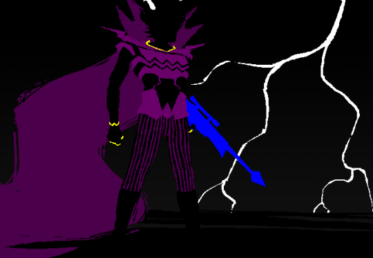
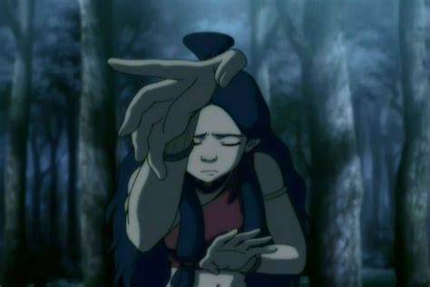
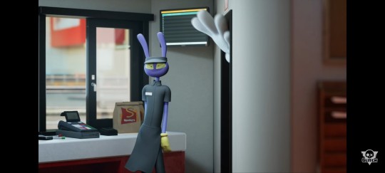
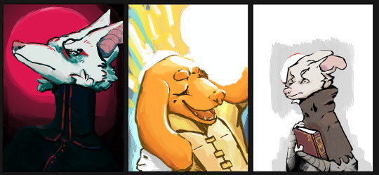
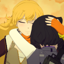
#which is why the style seems a little different to how I draw the characters now
Text
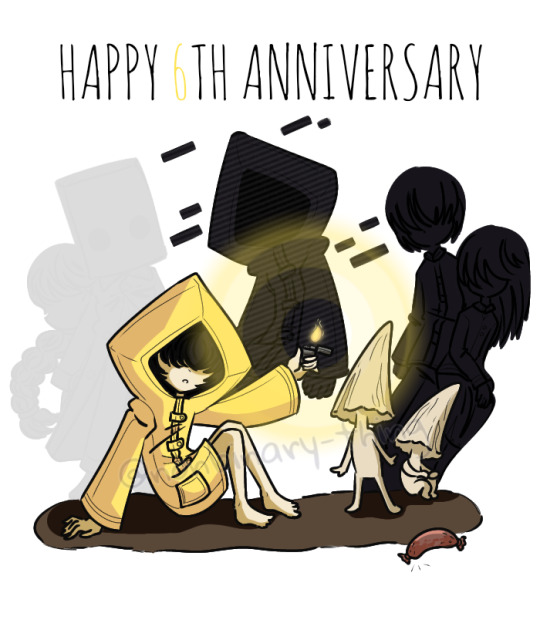
Happy 6th birthday to a game that means a lot to me!
#technically I finished this drawing back in February#which is why the style seems a little different to how I draw the characters now#but I simply couldn't wait to draw this#little nightmares#very little nightmares#little nightmares ii#little nightmares six#little nightmares raincoat girl#little nightmares mono#little nightmares nome#little nightmares shadow six#six#raincoat girl#the girl in the yellow raincoat#rcg#mono#nome#shadow six#art
189 notes
·
View notes
Text

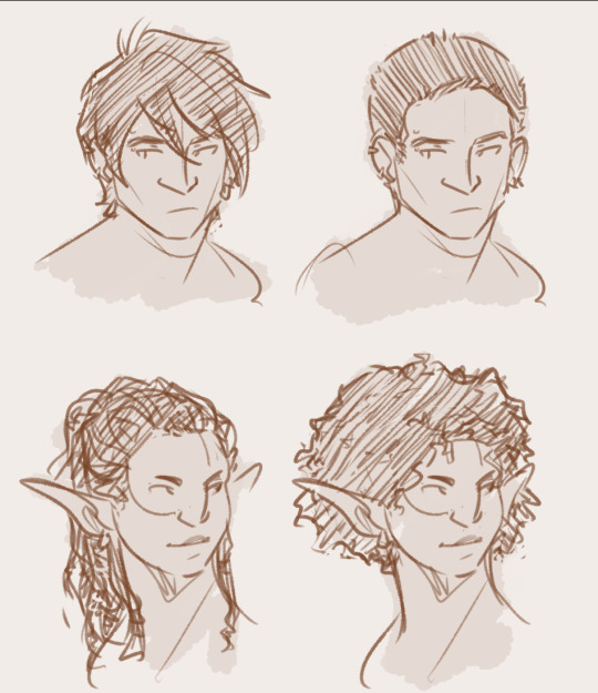
since i tend to keep parts of the hair similar even when messing with haircuts/styles, i wanted to try specifically giving em some that don't do that. Liam even gets some extra facial hair too to really commit to the "just like your father" look lol
#pro tip to fake at least a Little bit of polish in sketches: slap a wash on them xD#oc: liam hawke#oc: lilian hawke#oc: june trevelyan#oc: var'renan mahariel#my ocs#my art#this is a product of a hair convo and a character convo which were entirely unrelated#but the brain combines everything into blorbo thoughts you know how it is#n e ways quick sketches w their regular hair and random different hair that breaks my subconscious 'rules' lol#which exist solely bc i get too used to drawing their hair a certain way /w specific motions so they look samey even w different styles#so yknow. fun to try n figure out what that is w every character and consciously *not* do that for funsies#also idk why a lot of us seem to imagine our malcoms with long hair lmao but it works
30 notes
·
View notes
Note
I can't get your yakuza headcanons out of my mind, Daitou's got me in a chokehold and I'm not complaining, like--
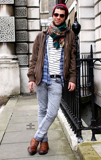
in regards to that doodle you made to show height difference between reader and the boys [I love your art btw (●♡∀♡)] - I can't picture myself in reader's style, I'm currently going through my goth phase in my 20s lmao; picture a big bitch with tattoos and messy hair who's listening to nothing but 2000s hits and screamo bands - so I'd like to request a headcanon of how Daitou would react to a gender-neutral reader like this :D I also like to incorporate the idea of them once being in a famous band that he's a fan of! (sorry if this seems like a lot, I have a huge imagination hehe)
but if he's more into the cute and helpless type, I'll just walk my ass out the door and yeehaw my way into another yandere's arms ✌😔
That's on me for not drawing the reader inserts as cartoonish cinder blocks :') In truth I'm a little bit embarrassed seeing how many likes that doodle has gotten, it was something I put together in a hurry and the clothing was meant to be baggy, shapeless, with not too many folds for the sake of simplicity. I myself am more of a pilgrim goth, just to emphasize the randomness of the choice.
Drawing reader inserts always leaves me a little anxious. If I use a light shade of gray, will people think I'm excluding poc? Will plus sized readers feel like they've been disregarded? What about masculine readers? As someone who's demiromantic I always struggle taking appearance or gender into consideration, because to me it has no influence whatsoever. Which is hard to express when you want to offer blank slate visuals as an extra to the story.
What I'm trying to say is that all of my characters would like you for who you are. Sure, they find your looks cute, but it's not the defining reason. Maybe you have similar traits to them, maybe you're the complete opposite and they find it intriguing. You could be a buff man and Daitou would be just as grateful to have someone who isn't afraid of him. I usually stick to a female reader for bigger stories to avoid messing it up long term, but in the grand scheme of things it makes no difference. I always imagine reader to be a shapeless blob that provides the dialogue I need for the story mood. There's no concrete preference or type for any of my OCs. I mean, ideally you'd like them back and not hang them upside down above a BBQ pit but I feel these are sensible requirements (?).
And now for the actual headcanons since my ramble is over.
First encounter is comically awkward but for reasons you’re unaware of yet. You’re obviously used to people staring at you (more so in a country like Japan), so you were expecting the curious glance every now and then. On the other hand, being under scrutiny, from a man even more unusual looking than you at that, is odd. Mildly uncomfortable. You’re shifting yourself from one leg to another, hoping to be done with the introductions soon.
On his end, Daitou is anxiously fidgeting and trying his best to focus. He’s seen this face before and he can’t shake off the familiar feeling. Where the hell…He obviously can’t downright gawk at you, and he isn’t sure how to politely formulate a question. After several sheepish peeks, it finally dawns on him: weren’t you part of that band he really likes? No, what would the chances be? Then again, how many people out there would look exactly like you? Is it rude to ask? He has no idea. He resumes his mumbled description of the apartment and hands you the papers to be signed.
Back at his place, he finally digs through his merch and sprawls out the available clues. “I didn’t know you were into this kind of music”, Kazuya comments as he looks over the man’s shoulder. He’d come over to ask about the new tenant. “I’m pretty sure it’s them.” He concludes, confidently placing his index over a CD cover. “Huh? Who? The tenant?” Kazuya holds back his chuckle. “Why would a celebrity show up for a shady apartment offer? You’re tripping, man.”
“I’m sorry, this is getting ridiculous.” You finally exclaim, annoyed by the persistent stares of the now two men facing you. You’re standing in front of the apartment building, arms crossed, huffing at the tall scarred man and his blonde friend. “No, I’m sure of it. Even the tattoo is the same.” Daitou turns to whisper to Kazuya, oblivious to your complaints. In turn, Kazuya lightly elbows him, mouthing something about being rude. “Just ask them, man.” He adds, this time louder. “Ask me what??” You groan. “W-were you…um…in this band by any chance?” Daitou manages to blurt out, searching his pocket for the CD case and ceremoniously laying it under your eyes.
Ah. It finally clicks and you exhale, relieved. You confirm their suspicions and show them some backstage photos to solidify your claim. You ask Daitou if he wants an autograph or something, then swiftly scribble your signature on a piece of paper and hand it out to him. He holds it with a wide, childish grin. “You’re a weird one, you know? You could’ve just asked. I guess I didn’t expect to find a fan in the wild, especially here.” Daitou carefully folds the souvenir, eyes lidded with nostalgia. “Oh yes, it’s great. Drowns out the screams.”
268 notes
·
View notes
Note
how do you feel about march eridan?
Ok disclaimer before I get into it, trolls wearing dresses = great and fantastic; in fact, given that the gender differences in troll culture are so much less significant, ALL the male trolls should own some femme-ass clothes, even if it's as simple as just having a skirt version of their pants, and it's a little lame that we didn't get that.
That said, March Eridan specifically kind of annoys me because it has 0 basis in canon (aside from some shoutouts in things like ministrife sprites) but has taken over Eridan discussions so wholly that it's become widely accepted as part of his character that he's really into femme stuff when the opposite is true, and he's got some pretty major characterization tied up in the fact that he does lean so masc, and what specific type of masc he tends to present as.
So first of all, Eridan dresses up to emulate Dualscar, and this is very obvious and straightforward; if you've read the big essay I have pinned to my blog, you know that this is all a part of his basic "I have to be a big bad sea dweller or Something Bad Will Happen" suite of issues.
Thus, we can ALSO assume that the choices he made that aren't made to emulate Dualscar are reflective of his ACTUAL taste in clothing. For example, blue pants instead of purple and black - I believe that this is because Eridan likes to dress up in the blood colors of his dates; he wears a lot of blue because he's hatedating Vriska (and never quite seems to get 100% over her), and we also see this in the rings on his fingers - half of which are fuchsia, for Feferi.

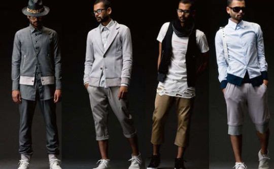
So that leaves us with the glasses, shoes, and scarf. And we know why he dresses like that! It's because he's a hipster. (The scarf has an added benefit of being associated with harry potter-style wizards).
CCG: PAST YOU, PRESENT YOU, FUTURE YOU
CCG: AND ABOVE ALL, UGLY SCARFNECKED DOUCHEBAG HIPSTER YOU
CCG: WAIT I FORGOT, ALL OF THE YOUS ARE THAT YOU
And very specifically, a masc hipster from the era - the glasses and the ugly-ass shoes are dead giveaways. The slicked-back hair is reminiscent of that fashion style, too. He is also a douchebag. This too is important. He draws from character archetypes of the time that were generally agreed upon to be the most punchable people in existence; his introduction calls him "KIND OF A TOOL" and he consistently acts according to that. Like, I mean, just LOOK at those shades. Those are not the shades of somebody you want to be trapped in a conversation with.
A fairly accurate Eridan fashion board would look something like this:
And, like, it kind of matters that he dresses like this specific breed of pretentious male douchebag; on a meta level, that's the impression he's supposed to give the audience, and on a diegetic level, he CHOOSES to look like this because he has these kinds of interests, but is relegating them to secondary accessories.
We never hear him talk about liking hipster shit; we have to hear it from Karkat and glean it from his design. This is because, as I've talked about before, he actively distances himself from things that make him happy, things that he'd enjoy. The constant push-pull between his ACTUAL interests, and the ones he thinks he has to have because he's supposed to be a big nasty sea dweller, is a huge part of his characterization - for example, the way he keeps claiming that magic and wizards are fake and shitty, but has no less than 6 wizard statues in his respiteblock alone, and cared about his crappy wands enough to bring them onto the meteor.
So that's one of my other issues with March Eridan and the general fanon that he'd be really into femme clothes (and, by extension, fashion) - he wouldn't be forthcoming about it, even if it was true. He has a deep sense of shame and insecurity surrounding what few interests he actually has, because they feel stupid, ridiculous, and frivolous, next to the intense anxiety he has about playing the role society gave him. He's got a very strong sense of duty that makes it very difficult for him to relax and actually enjoy something. Which, you know, probably feeds into his hipster-ness - a movement often defined more by what it doesn't approve of than what it does.
Canon Eridan, when he has a choice of what to wear, overwhelmingly chooses masculine clothing with hipster connotations. And this matters, it's part of his characterization, it says something about him, the same way that it's important that Karkat dresses very simply and baggily (we all know how many insecurities Karkat has about his body) or that Sollux's bifurcation is shown in his clothes. So please please please don't misunderstand my dislike of March Eridan as me saying I don't want him in dresses; I purely dislike it because it's usually SUCH a misread of his character.
And to prove it, here's my other gripe with March Eridan stuff: all the dresses shown in the not-canon "official" artworks don't even flatter his bodytype. Why do his custom mannequins in Pesterquest have CURVES when his Pesterquest sprite doesn't?????
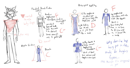
Please, I'm begging you, there are guides for dressing this body type, and even historical fashions that deliberately try to emulate this body type, please if you're going to dress him femme and HC that he enjoys fashion, please put him in clothes that flatter him please
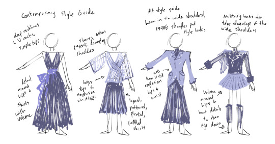
I think Eridan should own some femme clothes, because on Alternia, there are very few differences between the genders, he's rich enough to afford it, and he clearly has more of an interest in fashion in general - but I think the fact that he has a clear canon preference for masculine styles is significant, and I'm really annoying, so it kind of does bothers me that this is a controversial opinion. That being said, I don't want to tell people what they Should and Should Not do, because that's lame. Who cares. He's a fictional character, let people draw him in dresses. Would be very happy if this post causes people to draw him in different styles of dresses though :pray:
#I'm not going to tag this#because also people playing around with putting Eridan in dresses is 100% harmless#and i'm not going to ruin the fun by going But The Canon Says -#i'm just really really really annoying about canon and i kind of assume people follow me for that reason#but please dont let my annoyingness hamper your fun#if you enjoy putting eridan in dresses then by all means keep doing it#peace and love and rise above
153 notes
·
View notes
Text
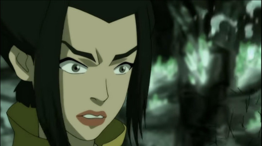
Why & How Katara is the Strongest Waterbender
The ATLA fandom is funny. Because if there's one member of the Gaang whose skills are continuously doubted, it's Katara's.
No one hesitates in saying that Toph is the strongest Earthbender in the world. Aang has always been maintained as a natural prodigy. Sokka's strategic intelligence and cleverness are never in question. Most people are positive that Zuko would have beaten Azula if she hadn't targeted Katara and hail him as a swords master.
But for some reason, it's always Katara whose proficiency is either called into question or severely downplayed.
Some are skeptical about the legitimacy of her becoming a master in a short time. Others are certain that her victories are due to plot manipulation. Both of these arguments that ATLA is a kids' show which pushed it into giving her the win.
(Funny how ATLA is the greatest piece of media ever read until it comes to anything pertaining Katara's character lmao)
So I wanted to take a minute to talk about the progression of her waterbending skills and how she became Master Katara.
Pre North Pole
The first time we really see Katara practice waterbending is in The Waterbending Scroll when she decides to show Aang her limited very skill set. She noticeably has a difficult time with her bending, whereas he seems to pick it up rather quickly.
As we know, Katara has never met another waterbender before. She has no idea what their bending is supposed to look or feel like. And that's reflected in the moves she shows Aang.
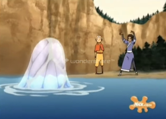
I want to draw attention to Katara's stance here. She's stiff, even a little awkward. She's standing where more like an Earthbender. We see this repeated when she's practicing the Water Whip.

Even later when she does perform the Water Whip correctly, there are still traces of this.

You know how Iroh learned to redirect lightning watching Waterbenders? Well, my assumption (at this point I'm 80% sure it's meant to canon) is that Katara learned most of her bending by watching Aang and the Earthbenders they met around the world.
It makes sense, right? They would have been the closest thing to Waterbenders she could have learned from. She even asked Aang to teach her in the first episode. So the start of her bending began with incorporating the forms of Air and Earth.
And we see the results of that in her fight with Pakku.
Fighting Pakku
Katara's fight with Pakku is a great demonstration of his visually. He's a master, so he's already proficient at "push and pull." Katara is not. She's done it before, but it's not her go-to style when she's fighting. And we can see it in this fight.

Again, her stance is firm. She either blocks his attacks or bats them away. She doesn't reinforce and redirect them like he does hers. She isn't fighting like a Waterbender, she's fighting like an Earthbender.
Not to say this is a bad thing. Pakku himself even admits that she's good even though they both know she can't beat him.
Why am I bringing this up? Because one thing about Katara that's overlooked is her adaptability. When she didn't have a waterbending teacher, she made do with observing Earthbenders. She picked up Pakku's teachings even better than Aang had. And going forward from here it really begins to shine in her bending.
She completely dominates Pakku's other students and Zuko (twice). Why? What makes her so special compared to men who have been training their whole lives?
Because water is the element of change. By being so proficient in adapting (not just in her bending, but openly embracing different things and experiences and people), Katara unknowingly embraced the mentality of her element.
(It's actually a funny twist of fate because you could make the point that the North held its other Waterbenders back by being so bound to and unflinching in their traditions. It would explain why none of Pakku's students even stood a chance against her)
If you think about it, you could draw parallel to Yue explaining the history of Waterbending to Katara to the Sun Warriors explaining fire as an element to Zuko. In both cases, you can see that they're able to see and understand their element in a new light. Although it's more of a realization moment for Katara as she already knew about pushing and pulling and it's more of a lesson for Zuko who was taught something completely different.
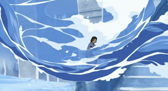
Katara vs Azula (Round 1)
You know how I said people attribute her wins due to plot manipulation because ATLA is a kids' show? Well it seems like Katara vs Azula is the scene they focus on the most for that.
But let's be real, this isn't a fluke. The show purposely draws attention to Katara prowess and skills during this fight.
Azula is someone who's always in control. She's someone who goes into fights with full confidence. But she is completely thrown off by Katara's abilities here.
And this is something that persists throughout the entire fight. Katara completely overpowers her. At no point during the fight did Azula have the upper hand against her.
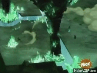

And remember, this is Azula's fight. She's the one who imprisoned Katara and Zuko. She's the one who attacked Katara and Aang to begin with. Sure, she was probably counting on her manipulation of Zuko working and him backing her, but there was no guarantee that he would be able to get away from Aang long enough to help her.
And right after this, Aang really struggles against Azula. He doesn't own the fight nearly as well as Katara does.
So, we know it isn't a fluke. The creators intentionally made Katara outclass Azula here. She's canonically the superior bender between the two of them. And that's not a small feat by any means. Azula at this time is one of the best Firebenders alive, probably fourth (after Ozai, Iroh, and Jeong Jeong (she could possibly be above Jeong Jeong)).
So what was the reason for this? Why was Katara able to outclass Azula so effortlessly?
Well here's where Katara's mastery of the meaning of her element comes into play again. She understands and excels in the concept behind water. Always changing, always adapting. She embraces water to its fullest capabilities (which also includes incorporating other elements into it; water would actually be the best element to do this with). The entire fight, she's switching stances and forms and keeping Azula on the evade. Whatever Azula throws back is dealt with without an issue.
And as we know, Azula (and most Firebenders) misunderstand fire as an element. She uses it solely as a destructive force, but it's also energy, life, and passion. This is also part of the reason Zuko lost so easily in the Northern Water Tribe; he also had the same issue. Katara's proficiency in water as not just a weapon, but an element, gave her the advantage over Azula she needed.
Katara vs Hama
A debate that comes up a lot is who's the better bender between Katara and Amon. To that I have always said Amon was taught Bloodbending, Katara just did it.
Let me reiterate: NO ONE TAUGHT KATARA BLOODBENDING. Hama explained the concept to her, yes, but never actually taught her. In fact, she did not expect her to pick it up without guidance. In her own words, "You should've learned the technique before you turned against me."
This was a technique that took Hama decades to learn. Tarrlok and Noatak were trained relentlessly. And Katara just... Did it. No guidance and no build up. This supports that Katara's adaptability and versatility in her bending is unmatched. She's able to comprehend and perform advance concepts with no training or teaching.
Now that we got that out of the way, this fight is so comprable to Katara vs Pakku. This is the second time she's fought a master and we can see how much she's improved. So much so that she doesn't even struggle against Hama.

At this point, she's mastered "push and pull." She's able to take everything Hama throws at her and send it right back with little to no effort.
But she takes it a step further.
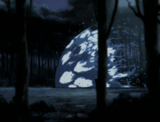
Instead of redirecting, Katara completely stops Hama's onslaught. This undoubtedly is something she picked up from Earthbenders. It certainly isn't a Waterbending technique, yet somehow she made it into an effective move.
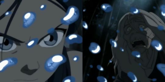
Look at Hama's face. She's completely thrown off by this. This was not something she ever expected out of any Waterbender. She was completely unprepared for Katara to be able to outmatch and overpower her.
Katara completely surpassed her, solidified by using the technique she invented against her.
I was going to talk about Katara and Azula's second fight, but there isn't much to add there. I already compared the difference in their skills talking about the first fight, and the Agni Kai is an escalation of that. The outcome of the Agni Kai was already decided and confirmed in the catacombs.
And that my friends is how and why Katara is the best Waterbender in the world
#master katara#katara of the southern watertribe#katara analysis#give my girl her due respect#katara is the greatest waterbender in the world#no i won't be taking criticism#argue with the wall#katara deserved better
124 notes
·
View notes
Text
Just saw Kung Fu Panda 4. Here are some thoughts.
Plot was... okay. Nothing super special, but it was fine enough for the kind of story the movie was trying to tell. And there were some great imagery and animation moments. I honestly don't get all the complaints about the animation. I saw one thing on TV tropes say it'd because it's not something like Puss in Boots Two or The Bad Guys, but I'm honestly fine with it not being like those. I feel like if all animated movies used that style, people would just start to complain that they're all the same.
Zhen was fine as a character. Bit of the usual "thief with a heart of gold" type character, but while I do think her changing was a bit fast, I can get why it happens. Po's the first person to show her genuine kindness with little alterior motive, and combined with a later betrayl, I can see her motivation for becoming a better person. Her voice acting wasn't too bad, but I think it could've been better in some dramatic moments. Also, while the movie doesn't draw attention to it, I do think there's a lot of parallel that could be drawn between her and Po, not just with how they grew up but also in their parental figures. Not to mention, they ultimately aren't THAT different as characters. They're both goofy people but grew up being looked down on by others and seem to use humor or goofiness as a defense mechanism. Just that she uses snark whereas he uses his big happy personality.
I REALLY like Po in the movie. Not just because he's his usual big fun self, but because he's still just as, if not more competent as he was in the previous movies. A big issue I had with the How To Train Your Dragon franchise was how Hiccup seemed to keep being less competent or capable in the movies. But no. Po's still able to kick ass and is the skilled warrior he should be after three movies of fighting. And I do think his fear of losing his dragon warrior title is understandable since that HAS been a big part of his identity across all three movies. Some might say that it's odd he's so afraid of change since he became a teacher in the last movie, but that was just adding on to his the responsibilities he already had. I would say his arc of becoming a spiritual leader was neglected some by the end and could've used a bit more focus.
Po's dad's are great. At first, I thought their subplot was just a comedic b-plot, but I liked how they ended up getting their and providing Po emotional support. And again, while it's not given much focus, their relationship and how they encourage Po creates a nice parallel between Zhen and her parental figure.
The Chameleon as a villain isn't THAT interesting, but she's not terrible. Personality wise, she's okay, but nothing spectacular. I do think her backstory was interesting, and, like the past three villains, her backstory mirrors Po's in a way. Which I honestly kind of wished they'd focused on a little more. I think it would've given her more depth that she's hinted to have.
Yes, the Furious Five aren't in this move for 99 percent of it. But.....I think it works. Because the whole point of the movie is about Po and Zhen. Them building their trust and relationship to get to the point they are by the end of the movie. And having the Furious Five their might have made things feel overstuffed.
Ultimately, I think it's a good movie. Nothing AMAZING but it's good and It does pick up more in the second half. Overall I'd say this around a 7.5 out of ten if I had to describe it.
82 notes
·
View notes
Note
Hello, dear one🌻 is it a problem if I ask for a Todo Aoi and Uraume headcanons about how would they react with an artist fem!reader that sees them as her muse?
If you don't want to write it, it's fine <3 and if you don't have the time, that's fine too!
Have a wonderful day🩵
Hi Sunny, don't worry, it's definetely something I want to write [I love these characters so much that I would eat them]
The design of love
Pairing: Aoi Todo x Reader; Uraume x Reader
Warnings: none
Content: F!Reader, placed in the Heian era in the Uraume's part
a/n: I think I love writing about underrated characters because most of them are actually my favourites ahahah
♡•°○●ᥫ᭡●○°•ᥫ᭡•°○●ᥫ᭡●○°•ᥫ᭡•°○●ᥫ᭡●○°•♡
Aoi Todo
Good luck when he will find your sketchbook. Oh, you really thought you were actually hiding it well?
By mistake you had forgotten it on your bed, and that day you had invited him to your house... well with a little difficulty, but you had promised him that immediately afterwards you would go to Takada-chan's event.
There would be a moment when you'd leave him alone in your room.
When he saw the sketchbook he was curious, in short, it seemed as if it had been put there especially for him.
He opened it and what did he find? Drawings of different hair styles and bodies... oh, but most of that drawings just look like him.
He flipped through a bit, seeing depictions of people, and... Oh my god, there's one that actually looks like Takada!
He didn't expect you were that good at drawing, why were you hiding it to him? Ah, right, you drew him most of the time.
While he continued to flip through your drawings you entered back in the room andata noticed what he was doing. Your face suddenly became all red and you tried to take your sketchbook away from him.
"Why? I was watching them" he mumbled a little confused. "You shouldn't watch them, it isn't yours" you said embarassed.
He chuckled at the view of your blush "What is there to be so ashamed of?" He took back your sketchbook, which slipped gently from your hands, and he started looking at it again. Sometimes he stopped to watch the drawings that seemed to resemble him for some reason, with a smile printed on his face.
"You should show me more your drawings"
♡•°○●ᥫ᭡●○°•ᥫ᭡•°○●ᥫ᭡●○°•ᥫ᭡•°○●ᥫ᭡●○°•♡
Uraume
Uraume had already noticed how your drawings always had the same colors, white and red, but they thought they were just your favourites colors, and the fact that most of them were rappresentation of landscapes made them think it was normal.
But your sketchbook? That said something completely different.
To put it simply, you had drawn their face several times. And always the same colors, red and white.
"What is that, Y/N-san?" They showed you the sketchbook and your face was red that you thought you were going to explode. "I-It's nothing! Give it back please!" You replied.
Uraume simply gave it back to you. Unlike Todo, they didn't seem extremely interested in the content of your drawings. In fact, they probably care more about Sukuna-sama than you, but that didn't mean you weren't important to them!
They actually liked the way you draw, even if the colors where always the same. It made them think that in a certain way they were important to you too.
After a few days you came to them, asking them if it was possible to burn your sketchbook. You were really embarrassed that they had found it and you wanted to get rid of it as soon as possible.
"Why would you do that? Do you think they are not made well? I can say that they are beautiful" she asked. And you stuttered.
They realized that maybe they shouldn't check the inside, since it was like a very special object to you. An object that represented your love for nature and Uraume.
Somehow Uraume convinced you not to burn your drawings and even encouraged you to continue. If they were what inspired you to draw, they were more than happy.
"Pretty..."
#jujustu kaisen#jjk#jujutsu kaisen x reader#jjk x reader#aoi todo#todo aoi#jjk todo#todo x reader#uraume#jjk uraume#uraume x reader
54 notes
·
View notes
Text
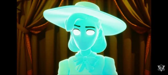
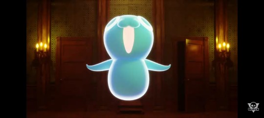
Since a new TADC teaser came out, I really wanted to do an analysis of this post by gooseworx.
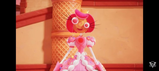
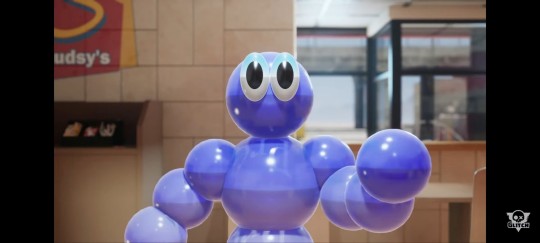
To start off with, in the quick flash of new characters we see in the trailer, 3 of them are seen in the teaser image - those being the cowgirl ghost, the candy princess, and the bubble man. The only character we don't see is the frog-looking character.
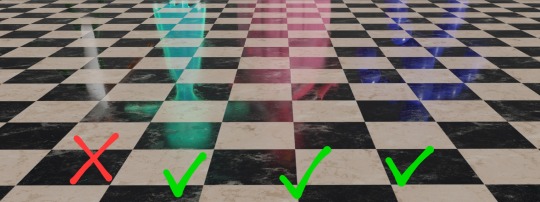
While not obvious by the reflection, the round part of the ghosts head is likely a hat, as seen in the teaser on the cowgirl ghost. I am fairly sure that both of these ghosts are the same character based on the dress silhouette of the reflection, and the design of the upper body of the ghost in the teaser. (If I am wrong about the ghost's gender and/or pronouns, I will edit this post.) I find it incredibly interesting that this is the most humanistic character yet on TADC.
The next character, the candy princess, has a silhouette that is very easy to match to the reflection. The only major difference is that her gloves and upper part of her skirt are a darker pink, but that could be due to lighting. She is very likely the princess of Candy Canyon Kingdom. If not, she's definitely royalty of some sort because of her crown. I did see a few people think that she was going to be similar to a betty spaghetti toy, but now that we see her in her natural setting, it seems like her arms are more like cake pops. The rest of her body seems to be a neat amalgamation of cake and other candies.

I don't have much to say about the bubble man, other than he appears to be a customer at Spudsy's - where Jax is being forced to work for minimum wage. If you look closely, you can see Jax's reflection in the bubble man's face. His (or it's? again if I'm wrong I'll change it later) reflection counterpart is a much darker blue, which again could be lighting, but it could also mean that other customers at Spudsy's are bubble people. (Also I love how Spudsy's is a ripoff/homage of McDonald's, hopefully it'll make for some good satire of the fast food industry).
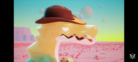
While we don't see the frog character from Gooseworx' teaser image, a lot of people theorized that it is some sort of gummy frog or reptile, which makes sense when it comes to one of the other characters announced in the teaser trailer.

The gummy gator appears to be in the Candy Canyon Kingdom, and looks to be some sort of cowboy or guide. He has a white belly similar to the frog, which is why I think they exist in the same storyline/location. Something hard to see in the trailer is that he starts fading to green from yellow around his shoulders. It's hard to tell what he's holding, but it's very possible it is reigns.
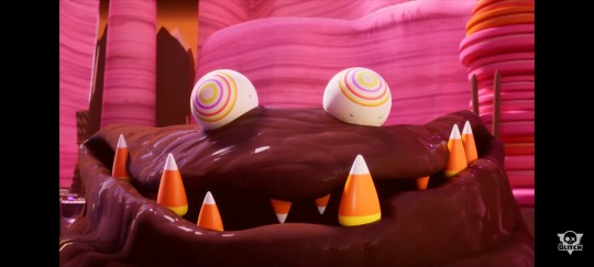
Another character from Candy Canyon Kingdom is the chocolate ooze monster, who looks similar in style to the gloink queen. I love the details of candy corn teeth and jawbreaker eyes. It's difficult to tell if this will be the big boss of Candy Canyon Kingdom, or just an obstacle for the TADC crew.
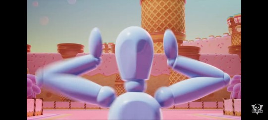
A fourth character from the Candy Canyon Kingdom is revealed in the teaser, and that is the periwinkle drawing mannequin. It seems to be the only character from the CCK that is not made of candy, which leads to some questions. In the teaser it is screaming its head off, so it's likely it is running from the chocolate ooze monster.
Going back to the cowgirl ghost, another cute little ghost appears. It doesn't really have any defining features other than its puppy-like face, but its a ghost, so it works. This is the only other character in the western ghost town story revealed in the teaser. Though the gummy gator looks like a cowboy, I think the ghosts appear in a different location from the Candy Canyon Kingdom.
The last character I haven't talked about is the tape recorder. It doesn't really look like an animate character, but if TADC has taught me anything, inanimate objects can always become animate characters. It's hard to tell what storyline it's from, but based on the lighting, it's from the western ghost town storyline. One of the most unnerving things about it is that it is one of the most realistic looking characters in the entire show.

Overall, 4 characters were revealed for the Candy Canyon Kingdom storyline, 3(ish) characters for the western ghost town storyline, and 1 character for the Spudsy's storyline. I personally don't think all of these storylines and characters will appear in the same episodes, unless the TADC crew is split up like in ep 1. The Candy Canyon Kingdom and the Spudsy's storylines definitely don't, because Jax can be seen in the wagon, along with (at least) Pomni, Gangle, and Kinger, in the large image shot of CCK in the teaser. (I have no clue what kind of gummy animal is pulling the wagon.)

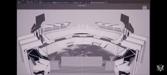
I also wanted to briefly talk about the unfinished location that Caine showed in the teaser. My first thought was that it was a baseball stadium, but after further inspection the field seems a bit off to be a baseball field. Regardless it definitely is set up to be a performance space, whether it be a theatre or arena of sorts. From the design, I don't think it connects to the other locations revealed in the trailer.
If you've made it this far, thanks for reading my theories on this teaser! If you have any thoughts, please comment or reblog to let me know!
#the amazing digital circus#tadc#the amazing digital circus spoilers#tadc spoilers#pomni#caine#jax#the amazing digital circus new characters#tadc new characters#gooseworx#glitch productions#spoilers#star says#not art
64 notes
·
View notes
Note
would you happen to have any tips for the most actual barebones beginner ever? like… everything looks like it was drawn by a child and nothing seems to look better -type beginner? it’s frustrating and I see people give advice like drawing a little guy youre obsessed with a little in order to get better but i find it so hard to draw anything that looks like it WASNT drawn by a four year old. like how do i actually get better and even sort of reach the actual beginner stage, start developing my own styles and such, and actually feel like drawing often would actually help?
hmmm, i'd say try to not overwhelm yourself. when you start out it's easy to get paralyzed by all you can and have to learn. accept the fact that you cannot learn everything and practice takes time. but time will pass anyway.
focus on what you want to achieve. start with a small, loose goal to keep you on track. what do you want to draw? is it characters? objects? animals? backgrounds? comics? why and how do you want to draw them? it doesn't have to be your end goal which is why i say loose. because at some point you might find out you don't actually like drawing animals and want to draw landscapes instead. this doesn't mean the time you spent is a waste though because you learned something about yourself.
your goal can be as shallow and silly as you want it to be as long as you have a direction to start with. when i was 14 all i ever wanted was to draw "hot people" and started from there LMAO. i knew i wanted to draw characters so i studied how to draw people. collected art that depicted my preference of what i found attractive. when i started i drew only heads. i didn't know how to draw bodies but once i found myself in a happy spot, i tried to expand by practicing anatomy. bit by bit you learn to draw everything else if you keep pushing with the drive.
this doesn't mean that this goal is the only thing you should be doing, by the way. that's one way to burn out fast. play and draw with other things as you go while keeping your goal in mind. change and adapt as you see fit. as people, we grow by experiencing different things. this is the same with art. this goal is just there to help guide you when you feel lost.
one thing i really advocate is to NOT let styles control you. it will come to you naturally because as you learn you'll figure out what you want and don't want to have in your art. like, it's fine to have an ideal style but if you focus on style before fundamentals you are easily going to crash into endless frustration because you won't understand what you're doing at all.
be kind to yourself, most of all. there'll be no doubt that you'll find yourself frustrated and miserable. that's just part of being an artist. but you should avoid calling your work mediocre and childish. you are already in the "beginner stage" so stop putting yourself lower than that. berating yourself will not do you any good. give yourself a pat on the back for each drawing you've done and reflect on what you want to improve on.
life is short and i believe that celebrating the privilege of creating can go a long way. best of luck and happy drawing :)
51 notes
·
View notes
Note
WAIT wait wait this just occurred to me. If a catgirl (or doggirl, or indeed any creature-human with ears sticking up out of their head) was muslim, would their nekomimi need to be covered? Or could they have hijabs with holes in the top for their little kitty ears? Inquiring minds want to know bc given the propensity of cats to lie on prayer mats, I absolutely think many catgirls would be muslim.
All cats are Muslim 😌
To answer your question, though, there’s two answers to it:
1. There’s no rule because like, the Quran doesn’t really talk about cobsiderations for catgirls or fantasy races, I doubt any scholars have made rulings on it, and you could not pay me to go ask a local Imam his thoughts about it ñflgldñglfllgkg
2. That being said, I don’t often draw anthros, but I do tend to draw lots of fantasy characters, many of which have elven ears or something similar. I commonly draw them as having holes for their ears/horns/etc because it seems the most practical and comfortable in some situations, but it would depend on the anatomy (even with elven ears, for example, there’s different shapes and sizes, so a half-elf or someone with smaller ears probably would be fine without holes, whereas someone with large elf ears or animal ears wouldn’t easily be able to). Not to invoke real religion talk into silly hijabi catgirl discussions but faith isn’t meant to be a burden, and I think in this hypothetical, having to wear a scarf that covers and pins down your ears seems seems unnecessary and uncomfortable.
For my fantasy characters with different anatomy, I tend to put a lot of thought into how they veil, though I tend to do that with every character but it’s fun to come up with the logistics of say, wearing a niqab when you have horns. I’d add some images and compare designs for various characters of mine and why they have their specific style of hijab and the considerations, but I am on mobile right now and technically I should be working.
As a side note, at this point I feel like I should have an FAQ with this sorta question in it because over the years I have been asked a shocking amount of questions about islamic catgirl modesty 😂
24 notes
·
View notes
Text

2023: for the "record", my favorite experiences with comics this year--
#5: Junji Ito's Dark Paradox. This was the year the Viz App became available, and that had a lot of great classic experiences over there-- switching between Ranma 1/2 and Cross Game has been ridiculous. Hall of fame, excellent material. Junji Ito's Dark Paradox was the first manga I checked out on there, and it's just ... it's just a fun "bad dream" of a comic, you know? I have a very particular range of horror that works for me, and this is in that range, something like Phantasm where there's a goofiness but the nightmare logic of it carries you through...? American comics are so bad at horror, though-- they're so bad at it that there are American comic creators who wrote entire essays about how "horror doesn't work in comics." And then you read these Japanese things and it's like... the entire continental United States, not even in the race! Not even in the race!
#4: Osamu Tezuka's Paper Fortress. It's not available legitimately as far as I know-- I think it's just too short and maybe too tough a read. It's his war memoir, and it's just... it's a rough little comic. There's an innocence to his style, that he knows how to use against a reader-- you can see that in a lot of his comics-- and I think it really becomes especially tough with Paper Fortress. If you saw Godzilla Minus One, and if you saw Boy and the Heron, I think you have to read Paper Fortress to really complete the trilogy. It's an essential third part of that trilogy. I'm not a Tezuka expert, like other people-- there are big ones I haven't read... but for me, I think it's Tezuka's best comic, or the best I've seen.
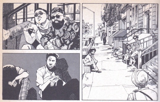
#3: Katsuhiro Otomo's Sayonara Nippon, which I wrote about at numbing length over here. It's the greatest action comics artist of all time, but doing a hang-out, edgelord comedy (with nods to R. Crumb!) set in Harlem that is probably unprintable now because of its, uh, "political incorrectness", let's go with that, let's use that phrase. It held my attention, haha. But despite the parts I have a discomfort with, it's Otomo-- he's one of the best to ever do it, for me-- and it's Otomo doing something I'd never seen him do. I had a good time. I don't necessarily recommend it.
#2: Fumi Saimion's Tokyo Love Story. Another scanlation-only deal-- I don't think it's available legitimately. I misidentified it as a josei comic, while it's technically seinen-- either way, it's just a comic about young adults trying to figure themselves out romantically. I think you'd call it a "manic pixie dreamgirl" story, but Saimon's a woman, so-- I think a manic pixie dreamgirl lands differently when it has a woman creator. Maybe that's a mistake on my part, but-- I see that more as a kind of wish fulfilment, and interesting as such, I guess?
But I don't know-- for me, it's just how Saimon draws... It's so loose, but it's just enough. It's not burdensome at all, when you look at it. So you just get to be with the characters-- the art's never trying to get in the way. It's the kind that makes you want to draw because it doesn't seem impossible to draw-- like, "oh drawing's fun." I see comics now, American comics, and none of them make drawing look fun-- they all make drawing seem like work. All the lighting effects, you know?? What kid is at home with a pen saying to themselves, "Oh I can do that" and copying a drawing with that much lighting going on, where you can't see the lines because they're all holding colors, etc. When I look at these comics... it's certainly not "lazy art" or "bad art." It's just that you get to be with the characters.
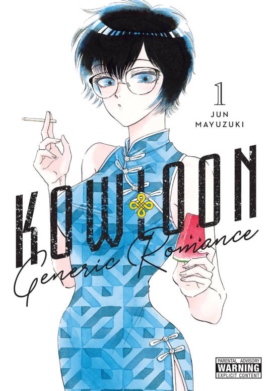
And then easy #1, mentioned briefly here, is Kowloon Generic Romance, particularly the first volume, which is available legitimately (rare for this list haha!), and is just... It fucking knocked me out, man. It's hard to articulate the why of it, but it's like... if I made comics more often, it's something I wish I could make. It's off the charts horny, which I don't think I could do in a comic, not as unashamedly as that. But it's just got this-- it's just the vibes are immaculate, man.
Like, I think the thing that unites all the comics I've mentioned... comics having a breath of life to them. Where ... you feel like you're watching people that exist. I think when you're a kid, you get that from comics, and a lot of the angry people you see online are people for whom "Spiderman is no longer alive" because they can't keep it up as they get older, and their imaginations wither, and they think the reason why is "politics" and not... you know, the sad clawing of mortality against their flesh.
But like-- Kowloon Genric Romance, it's not just that the characters are breathing but they're like... hanging out in apartments, smoking cigarettes, being hornballs, swooning, feeling nostalgiac. They're alive and they're in a Wong Kar Wai movie?? That is ... That's pretty gnarly, to me.
There's a science fiction element that was dragging it down in the last volume I read (I think a couple came out since then, I'm behind, but). But it's just-- it's very much a manga set to Citypop-- you can hear the soundtrack in your head, and I bet if I compared notes to other people who read it, our soundtracks would overlap significantly. It demands it, you know? It's just... It's vibes. It's just so good at vibes...
Worst Comic: the Viz App has Hot Gimmick and Hot Gimmick is a mess. I had a fun time with it because the wrong choices have a sort of... they're almost funny because it's like "why the hell did they make this like this" quality to it. But that is trash. I can't defend it. It's kind of unacceptable. I read every page.
Honorary Mentions: like I said, Cross Game and Ranma 1/2. I thought Yasuda Kasumi's drawings on Fool Night were very very pretty. I thought Wild Strawberry started strong in that respect too, though it's lost my attention fast when it became more of a standard shonen. I'm very confused by One Piece lately but continue to enjoy that and Chainsaw Man (where I'm very behind as I figured out I enjoy it more binging it a little).
I decided to be a manga guy about 3 years ago, and get American comics out of my life, and stop writing about them, and blah blah blah, but that said, I continue to be very involved with the comics, in all kinds of weird ways, whether it's stuff I can't talk about, making notes for future projects, trying to get into "drawing shape" again (that is *not* going well), etc. I had a very, very good year as a reader this year, too-- that hasn't always been true, but ... I feel like as a reader, this was a year far above average for me, or what little I settled for as average prior to 2020. I hear things are rough out there but I hope that's true for other people, too. Anyways, that was my year.
36 notes
·
View notes
Text
Sception Reads Cass Cain #21
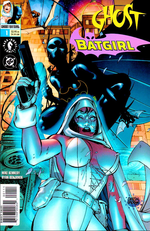

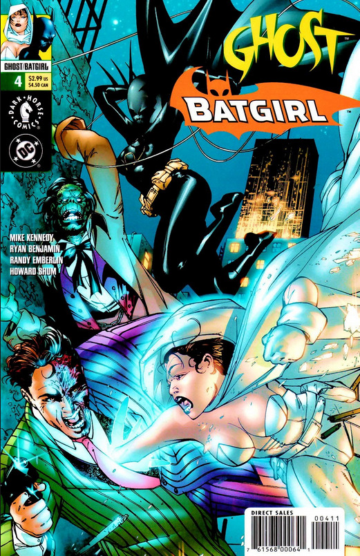
Ghost / Batgirl #1-4
Words: Mike Kennedy
Pictures: Ryan Benjamin
Additional Work: Randy Emberlin, Howard Shun
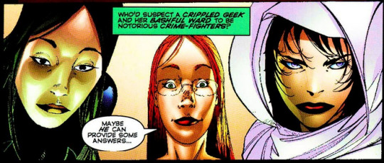
One impression I used to have that going back to look at ~all~ of Cass's early appearances has forced me to reconsider is the idea that she didn't appear outside of her own books very much. While later on that is more the case, early on she does have a fair few guest appearances and cross overs, including in this bit of non-canon dual publisher cross promotion with Elisa Cameron, aka Ghost, a Dark Horse character with a solo that had been running since 1995.
The miniseries pits long time Batman villain Harvey Dent against brand new Ghost antagonist Malcolm Greymater - a (fictional) confederate general turned zombie libertarian corpse reanimator - in a conflict over Greymater poaching some of Dent's employees (ie reanimating goons that Dent killed). Babs, Cass, and Elisa get caught in the middle and are forced to work together after following separate threads of a bombing by Two Face and bodies stolen by Greymater only to be sold off into unsavory employment after failed reanimation experiments.
I don't want to go through the whole thing with a plot summary - it's four issues of non-canon stuff after all. But as a stand alone story it works fairly well, worth a read if you're a fan of early Cass. In particular there's solid characterization of Harvey Dent and what it's like to work for him - pretty bad actually. You can see why he'd get upset at someone trying to poach his guys, working conditions for goons in Gotham are terrible, if word got around of better conditions in Arcadia (Ghost's hometown) or wherever else then Batman's villains could easily find themselves suffering a labor shortage. The mere idea of that is funny enough to me that I can't help but like this little mini series, and it's an idea I'd love to see brought back. Goons On Strike - now there's a solid idea for an ongoing Gotham event crossover.
Anyway, Ghost/Batgirl is definitely a higher fantasy story than we usually see from Cass, at least back in the early days, but there's a focus on the individual lives and humanity of the underlings working for the villains that's very grounded and down to earth. That fits in really well next to the "street level" focus of Cass's early solo title. As for the book's cross-promotional function, it does make me curious about Ghost, though probably not enough so to go back and look at her solo title. I like her villain here, but Malcolm Greymater and his crew seem to be more or less exclusive to this crossover? Comicvine is telling me he maybe appears in a single issue outside of this, so that's kind of disappointing.
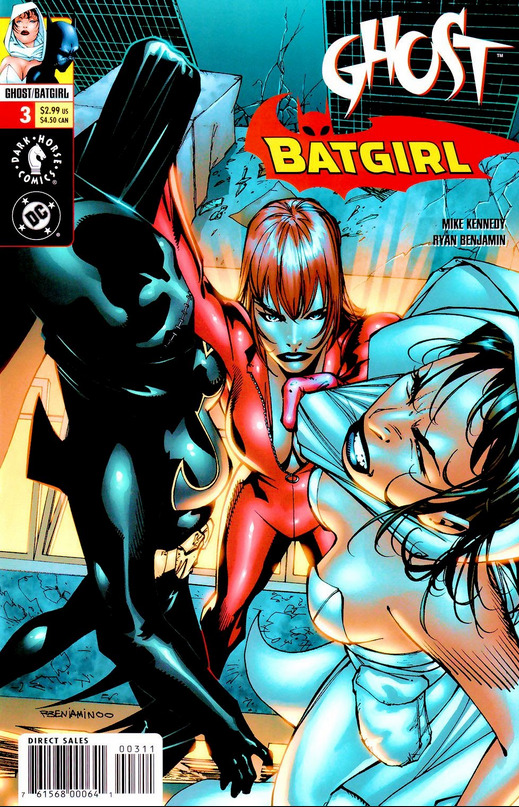
So setting aside the story, how's our girl in this? Well, first of all, she's being drawn by new hands. In costume she's mostly fine.
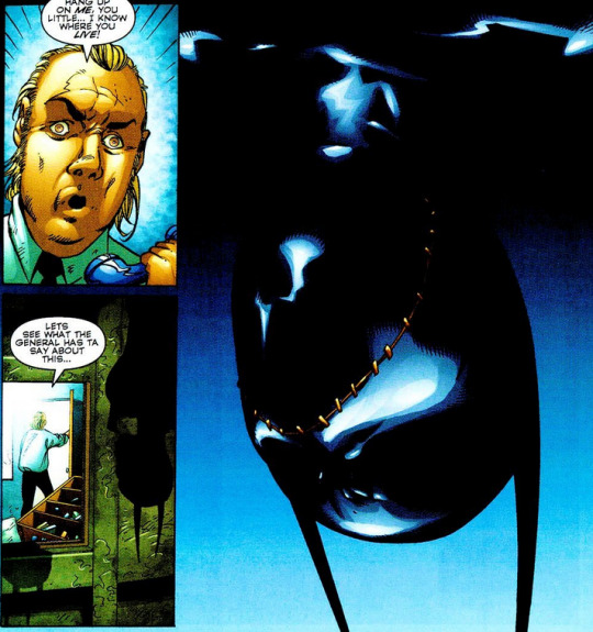

Sleek and spooky, glossy black. The details of her form are sometimes lost in the darkness, which loses some specificity in the action panels, but in a way that mostly works aesthetically. My only real complaint here is that her facial expression doesn't really show through the mask. You don't get a sense of what she's thinking or feeling in costume, she's just this dark angry spooky form, not so much a person or a character. As I've said in the past, though, that's as much or more a criticism of her costume design as it is of how any particular artist draws her in it.
It's also worth noting that, as with Cass's early pairing with Azrael, her costume contrasts very nicely with Ghost's. White with round hood and billowing cape vs. Cass all black and pointy. Aesthetically it's a great fit.
Out of costume, though...
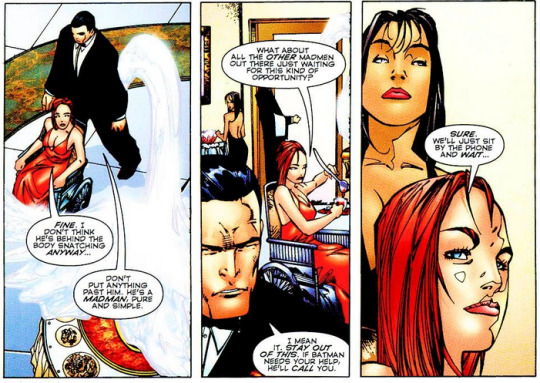

I don't know. Just doesn't quite look like Cass to me? I know, I know, comic character facial features don't have the same specific canon as their costumes do, different artists have different styles so characters will look different, and there's definitely a stylistic element here that isn't gelling with me. The overall shape of the head is too thin, maybe, making her look a bit older than she should, where I'm used to Scott's more rounded face, stronger jaw, bushier eyebrows, shorter, poofier hair.
Scott's style, at least at the time, also just packs in more emotional expression, which is absolutely critical for a silent protagonist.
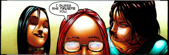
By contrast Benjamin's Cass, when she's not in costume, is often just standing a bit behind Babs with a sort of blank, neutral expression while Babs interacts with other characters or the audience for her.
...
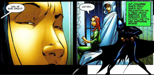
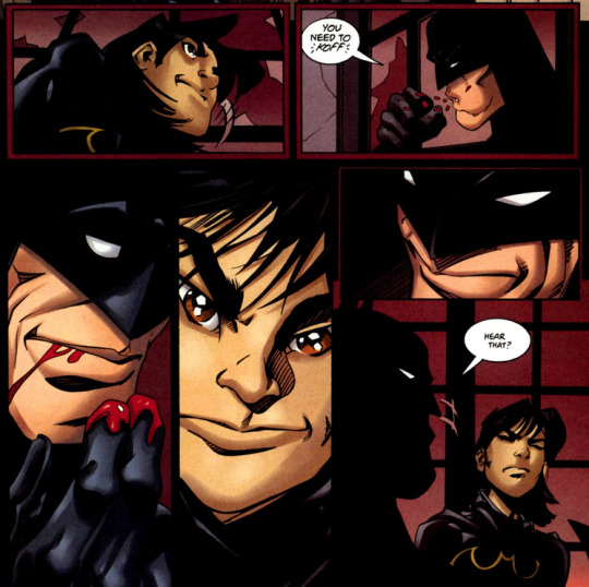
Which also kind of brings us to the writing for Cass here. Ghost / Batgirl is probably the best example yet that silent Cass was a mistake, because yeah, the creators of this book just do not know how to convey her character to the reader without words. The first image starts with Cass looking out over the wreckage of a bombing, and of course there's pseudo noir internal monologue all over it, because how else do you start a bat-book, only Cass can't narrate so Babs provides the narration even though she isn't even in that scene.

Babs goes along on the adventure mostly so the writers have someone who can talk for Cass, or even in some panels quite literally talk over Cass.
Cass is an intimidating physical presence in costume, but in this book she functions more as an extension of Babs than as a person in her own right.
...
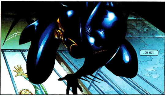
It's not all bad, though. In particular there's this one bit introducing an additional ability for Cass that makes perfect sense with her backstory and yet sadly I don't think is ever mentioned again in a canon Batgirl story:
Cass gets poisoned, but she survives, and recovers remarkably quickly, because she has a natural resistance to many poisons and venoms built up from repeat exposure to tiny amounts when she was a child, because of course that's something David would do. You could just imagine little Cass and David having drinking contests to see who could take the most poison before passing out, or even sneakily poisoning each other as a little game of escalating pranks.
...
So yeah, overall a nice little stand alone series with maybe not the best depiction of Cass, but one that is illustrative of why the major change to have her start speaking, while I still don't like how it was done, was probably for the best.
34 notes
·
View notes
Text
(Characters are from @canisalbus)
Something very different from what i usually draw and from my last Vaschete fanart. I love those guys so i really wanted to make more fanart, but i didn't know what to draw exactly.
Here, i tried to paint Machete, Vasco and Smollchete in the style of the character portraits in Disco Elysium. I don't think i quite achieved that effect, but i still liked the end results.
Smollchete is further away from the usual character portraits in DE, but it was on purpose because i wanted to emphasize how he's just a little guy. And the little guy gets smaller and smaller...
In retrospective (because i finished this art a few days ago) Disco Elysium's style of painting doesn't really seem to mix the colors, which i did a lot here, specially on Machete. Also not a lot of gradients like i did on Vasco. They also shade with much more wild and different colors.
I'm going to put all the rest of my madman ramblings below. It's long and your mileage may vary if you played Disco Elysium or not (no spoilers tho.)
---
Okay, so... As i had the idea of making these disco elysium style portraits but with the gay catholic dogs, i had just beaten Disco Elysium. And so, as i was doing my things in my day to day life, waiting for the opportunity to actually draw them, i kept thinking about skill interactions with the boys, like if your main character talked to them and had enough points in the skill.
Things like Half-light identifying Machete as a brutal and hardened survivor just by looking at his eyes, but Physical Instrument doesn't believe that because Machete looks like just a spindly noodle. And Half-light would be like no bro, trust me, this guy is hardcore.
Shivers or Spirit-de-Corps would tell you how Machete is treated among his fellow bishops and how he's either vilified or seen as a tool. And at that Inland Empire would pipe in saying “He is treasured. But not here.” because yeah we love him. Despite almost everyone in his world hating his guts
Also yeah Reaction Speed clocking Machete as super paranoid. Specially considering maybe in this universe you'd be investigating one of his assassination attempts or maybe even something sinister that Machete had done.
Reaction Speed: “His eyes dart across the room, checking if you have any backup. Then, a twitch of the ear, followed by a sideways glance."
Logic: "He is making sure he isn't being flanked.”
Inland Empire: “But he's all alone...”
I also feel like Rhetoric would have a field day with Machete. Like, finally, a worthy opponent.
Empathy would get the feeling that despite his reputation, that there is someone else behind Machete's bug eyes, someone other than Machete, the pale eminence. If you have enough points in a skill, it would try to pipe in saying who they think it is, judging Machete (e.g: Authority: "A man superior to you."; Pain Threshold: "It's just sweet pain all the way to the bone."; Half-Light: "A survivor."; Encyclopedia: "The inside lining of the eye is covered by special light-sensing cells that are collectively called the retina. It converts light into electrical impulses. Behind the eye, your optic nerve carries these impulses to the brain. The macula is a small extra-sensitive area in the retina that gives you central vision.") concluding with Drama: "No one he'd want you to know, sire."
That would trigger a dialogue option for an Empathy white check to try and see who's actually behind Machete's eyes and see beyond his reputation and demeanor. I'd imagine you would get a +2 if you talked to Vasco before. And if you pass the check, the screen would go white and Machete's model and portrait would change to Smollchete and you'd be able talk to him for a moment, the little guy, and learn a little bit more about his backstory, stuff that he hides behind the Machete persona. That's why i painted Smollchete too. I don't think Empathy has this same kind of metaphysical effect like others skill in-game, but i thought it would be cool.
Talking to Vasco for the first time would just straight up heal you 1 morale. No skill check necessary. Here, have some free morale.
Your Encyclopedia would recognize his coat of arms and maybe deduce that Vasco is a diplomat or a politician. Then your Composure would tell you straighten your posture and put up your serious face, Suggestion would tell you to flatter him while adressing him strictly formally, but the two of them would be thrown off-kilter as Vasco starts acting very casual and down-to-earth. Maybe Authority would judge his attitude to be unfitting of someone in such position. Idk. This is all random ramblings that were bouncing in my head that i needed to let out.
Hope this isn't too weird, i just had a lot of time between having the idea to draw this and actually sitting down to draw it, so these ideas were just popping up in my head. I wish i could've just put those in the tags, but it waaaay exceeds the tag limit.
#art#my art#dingergum#furry#canisalbus#fanart#machete#vasco#disco elysium#there are 2 variations of Machete's background image and as i write this tag#i'm just staring at both of my options#unsure which one to pick
14 notes
·
View notes
Text
The Ink Demonth 2023 - Day 12. Angel
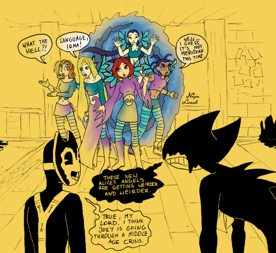
Day 12. Angel
Crossover: W.I.T.C.H. (comics)
This could be true, if it weren't for the fact that Joey is probably canonically gay (but I'm not sure if it's a fact).
And now a bit of history. Comics W.I.T.C.H. in Poland were published for about ten years from 2002 and were extremely important to me. I bought this newspaper from the first to the last issue - I skipped maybe 3-4 issues when I was on vacation and couldn't find a shop that had the current press (I'll fill these holes someday). For me, this series was extremely important and played a big role for many reasons - firstly, it was how I learned to draw human figures and my style still somewhat resembles the style of W.I.T.C.H. Secondly - reading this comic coincided with the moment when I first started to suffer from depression and reading about magic, about friendship that works and that friends don't stab you in the back - made it easier for me to cope with reality. Finally, thirdly - I was then very into magic and I was looking for it in a more interesting form than the one presented in Harry Potter (where magic, by the way, is very boring and monothematic). In each issue, apart from the next part of the comics, there were interesting horoscopes from different parts of the world, methods of fortune telling and interesting facts about various magical things. This was the beginning of my collection of myths, spells, creatures and magical plants. But then the comic stopped being published, and then that nasty French series came out, which is one big abomination - and I completely forgot about W.I.T.C.H. for many, many years...
But then, some time ago, my dad, who was cleaning out my old room (where he has his "office"), found a huge pile of my magazines and decided to bring them to me - among them were all my issues of W.I.T.C.H. magazine. When my daughter saw it, she was immediately delighted and asked if I could read it to her. Reading comics is difficult and unattractive to the listener, so I thought she would get boring quickly - but no... we're halfway through the first saga (about Merdian) and Ursa keeps asking for more. And when I read it to her, I take a sentimental journey back to my childhood, I'm moved again by the stories, I laugh at the jokes, I discover that I look at the characters differently, but like them the same, although for completely different things.
That's why I decided to include such an important element that made me who I am now in this year's Ink Demonth - and the slogan Angel seemed more than appropriate. Interestingly, the previous entry also fit here, and in order to include the Phantom of the Opera, I had to find another place for it, because - yes - it lost to W.I.T.C.H. However, this inconspicuous comic book for teenagers had a greater impact on me, my character, interests and who I am today - than the musical I saw several years ago or the book I read only this year. Sad but true.
I must admit that I had fun drawing and colouring this. And if someone asks: my favourite character is Will - not only because she is redhead and is (like me) a Capricorn, but many threads from her story were similar to mine. This hasn't changed. However, today I look more kindly at Cornelia, whom I once disliked, and a little less favorably at Irma, whom I once liked very much (the way she treats Martin at the beginning is terrible).
While drawing them, I realized how unfairly Hay Lin is treated - her guardian outfit is the worst and least highlights her charms. However, after upgrading the outfits, she gains the most, while Cornelia's and Will's outfits are terrible.
By the way, Taranee, what did they do to your hair, tell me?
By the way, it was even fun to do something similar to the SATIM comic - was this comic always so electric yellow? It was very difficult for me to adapt to this...
Bendy and the Ink Machine (c) Joey Drew Studios Inc.
W.I.T.C.H. (c) Disney Italy
Sammy and the Ink Machine (c) Nayia Lovecat
#The Ink Demonth#Bendy and the Ink Machine#Sammy and the Ink Machine#BATIM#SATIM#WITCH#Will Vandom#Irma Lair#Taranee Cook#Cornelia Hale#Hay Lin#Bendy#Ink Bendy#Ink Demon#Sammy#The Ink Demonth 2023#crossover
34 notes
·
View notes
Text
The Issue with "Foefic"
For as long as humans have created things, others have looked at the fruits of their labour and thought, "I can do that better." Drawing inspiration from something you see and think you could improve upon is not wrong, it is how innovation works when it comes to creating tools, art, cooking. However, some people mean it in a malicious way. A way that teeters on jealousy and, if I may, clout-thirsty.

Lore Rekindled is a "retelling" of the (unfortunately) Eisner award winning webcomic Lore Olympus. From what I saw on the post introducing it, it is "better drawn and better written." I, like many, have issue with Lore Olympus. The writing is lacking and absolutely not award-worthy, and it even misses the mark as a cheesy harlequin romance. Persephone's characterization has no consistency. The art, while striking and easily recognizable, leaves a lot to be desired, especially when it comes to backgrounds. I don't consider it noteworthy, but it is heavily pushed by Naver's Webtoon, and that is probably why it keeps winning awards. With how low my opinion of Lore Olympus was, I dived into Lore Rekindled hoping to find something with more substance.
I did not find that substance.
LR suffers in different ways than LO. It assumes that you have read or are at least familiar with the major characters of Lore Olympus, which is understandable. The characters are re-written and interact strangely. Many of the characters in LO are meant to come off as "old money," and this shows in their lifestyles, fashion, and way they speak. The characters in LR all appear to have the same voice. If I were to print out a transcript of this comic and read it out loud, they would all be indistinguishable. LR is "better drawn," but what I think they meant is it is less toony. The backgrounds are better most of the time, but the panelling is boring and lacks the dynamicism seen in the original work. The plot is, if I'm being honest, just AU fanfiction (derogatory).
When I also learned that this creator had an original comic, I was very interested to see what it brought to the table. As I understood it, LR was a side project. So you can imagine my surprise when I looked at both the old and the new Project Reaper and it is just objectively a worse comic. The the majority of the cast has same-face syndrome, and seem to live in a cool-tone hell with no furniture most of the time. The concept of how to dress and style characters seems to be locked into what a 15 year old thinks is badass, but that fits for the story. The plot and dialogue reads like something a middle-schooler would make as an RP scenario with friends. The colouring is lazy dodge and burn, which just emphasizes that the author does not care about cultivating a space or atmosphere or world for these characters to live in. They are just toys to mash together to make your angsty super cool comic that you're going to pitch to Dark Horse for REAL, GUYS. And the first comic for this series is written right to left. In the author's defense, they were a teen when they started the original comic.

So how does someone whose average panel looks like the example above come to the conclusion that they can make a better comic? It's simple: Project Reaper is original, but LR has base material you can go off of. Anyone can read a comic and think "I would do THIS for this panel, and I would do THAT for this character introduction." I did it reading both of these comics. But if I were handed only the script for either of these projects, it would not come as easily. Lore Rekindled only looks "better" because it has Rachel's work to build off of. This goes back to what I was saying at the beginning, that the "I could do that but GOOD" view isn't doing you any favours, especially when you aren't doing your own IP well.
I think writing a little hate piece once in a while is good. Draw a hate piece if you really need to (though I would just show it to friends, personally.) Consuming a little media you hate is also good. As a creator, it is important to see and understand why you hate something, what you would change, and what little glimmers of good are in an otherwise pile of garbage. It helps you grow, to realize your tastes, and what not to do in your own work. Critically acclaimed writer Alan Moore agrees! But to have a whole comic with a regular update schedule redrawing something you hate is... It's giving "look at my sonichu comic redraw!" It is loser behavior.
Plenty of people create media out of spite, and I encourage it. I do it too. But the work should be your own. You need to put this energy into your IP. If you keep being a "hater," you'll never guess what you attract. Other haters! And those haters will like you, for now. But one of these days, someone will go through your list of essays and think, "oh, but I don't see any fat people in YOUR work that aren't plus-size model attractive." All it takes is one comment or take that a similarly-minded reader doesn't like and there could be a master list about you!
I am, of course, not saying you can't make derivative works at all. The doujinshi market is full of fan creations, and every art site you go to will be full of fanart. But the difference between LR and these works (generic sexy flavour of the month artists aside,) is that they are made with love. With passion for the original work. I think back to Homestuck AUs because, while I may not have liked them, these creators were doing it out of love for the characters. I follow a few guys on twitter who have been drawing a picture of their anime wife every day for over 10 years. That's love! Then you have more transformative works like Hello from Halo Head, of which some of it's characters are off-brand animal crossing characters. I love that. I think it's neat that the creator loved that little cat twink enough to bring him into their comic in a new form.
I think the point of this post is that you can use spite as a motivator, but it should be for your own creations. We have a limited time on this planet, and even less time where our hands are still able to pick up a pen. Put this towards your passion for the medium, for the stories in your heart. It's rough out there for creators, and it can be hard to find an audience in the ever-churning seas of the internet. But, please, don't put all your effort into "foefiction." That is cringe. And, if you're going to anyways, it'd better actually be good.
PS B^u

21 notes
·
View notes
Note
Could you explain why idolomantises’s designs fall flat like vivs designs?
Just wondering because I love hearing anything character design related lmfao
Oh me too! I could talk about character designs all day!
I think while having very different styles, idolomantises and viviziepop’s designs both suffer from characters who don’t communicate what the character is or reflect the given world building (sometimes they’d just don’t fit at all?)
Vivziepop overcompensates this by having characters with ridiculous amounts of details that usually muddys whatever the concept is, not helped by her preference for thin body types and colour scheme of “red, red and MORE RED”
idolomantises meanwhile just, goes with the most obvious and generic direction without considering any visual symbolism that one can do with more finer details, or if there is detail it doesn’t actually add anything
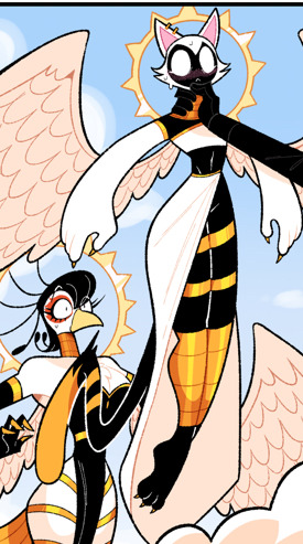

Sera and the angels are a good starting point here in that Sera is the one with the most obvious Angel design with rings floating (I personally think the bird and cat look more Egyptian than anything else, though that’s not an actual design issue here)
Now I will say having Sera’s eyes being in her rings while her actual face is blank is clever but besides that? They’re all just wearing very thigh revealing dresses/robes with random golden bands , the ones on their thighs has got to be painful. Sera has the worst in that her skin and clothing are the same shade of white , so her skin just blends into her outfit
Which seems very conflicting with the fact that 1) Angels/Heaven’s views are so very anti sex that they place kissing and cuddling next to kink acts

And 2) Sera is so awkward and inexperienced with sex as a concept that Lili , her wife, laughs at her for being awkward about kissing her (I also do not like Lili but I’m sticking with design criticisms for now)
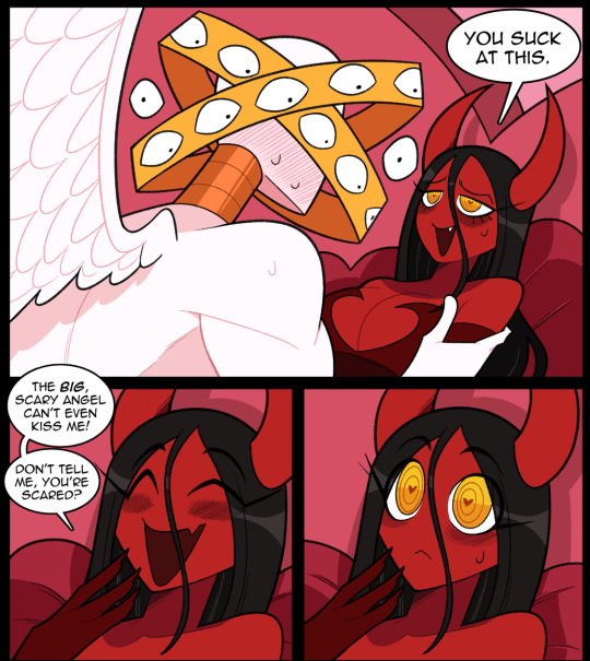
“Skin tight , flowy and thigh revealing robe with thigh bracelets” does not at all communicate that about Sera’s character or her environment. I don’t think you have to dress the angels as nuns to properly communicate their anti sex views, and a little fan service isn’t entirely wrong either . I think one could easily write out the conflicting thigh lore with an excuse that angels don’t see the naked body as sinful, and thus only a sinful pervert would think exposed thighs was sexual! But from what I’ve seen that isn’t the direction idolomantises is doing


But taking inspiration from both classical paintings and modern fashion, there was more that can be done with Sera and other angels besides “put a chalk white character who is very awkward with sex in a chalk white robe that high lights her thighs!”
Giving the angels revealing designs also makes the contrast between heaven and hell weaker as both angels and demons end up having similar design elements wow that sounds kinda familiar
Ignoring my own personal feelings about her, Lili’s a decent design in that you look at her and immediately go “ah yes, sexy demon lady”, she is straight to the point
maybe too straight to the point
See, Lili’s design isn’t an issue until you compare her to how idolomantises draws environments in hell and how he designs other demons

You know , for someone who’s well know to be critical of Vivziepop, you’d think he realise how much he is also guilty of over using red
”well , demons are from hell what did you expect?”

Idk, maybe some better values?
Oh, notice how the pink demon actually sticks out more than the main character?
I unironically prefer Mara over Lili and it’s weird she (or least her pink design/palette) wasn’t (used for) the main character considering her pinkness and Sera’s white and gold palette make the lesbian flag

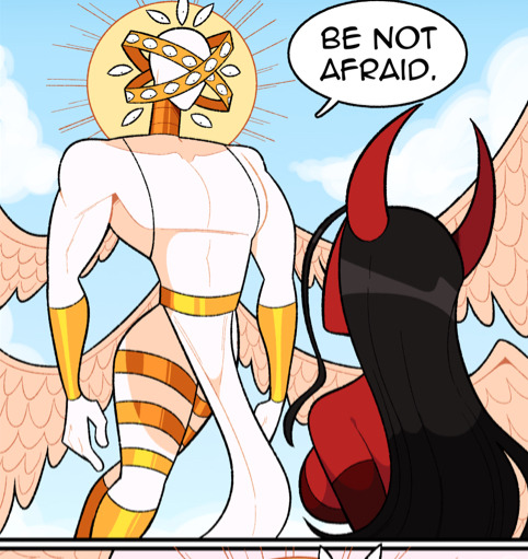
Which is literally the logo of the comic these characters are from
13 notes
·
View notes
Last Seen Blogs
egg-celsior
sense of impending doom intensifies
kazumaple
yujin!?
504py
Soapy
scribofabulas
Scriptor
rwbylife21
Gods Help These Precious Children