jortschronicles
Ashildr's Arts & Sciences
Doña Áshildr Inn Hárfagri |
Barony of Namron, Principality of Vindheim, Kingdom of Ansteorra
16 posts
Don't wanna be here? Send us removal request.
Last Seen Blogs
iamtrashhenceiamhere
shit's wack

pelipper
japanese lunchtime rush

our-pokemon-league
Our Pokemon League

bookfreemovies-blog
Untitled

opashoo
Always Late to the School of Horses
Text
Dressing the Despencers pt 3: The End of An Era
Part 1 | Part 2
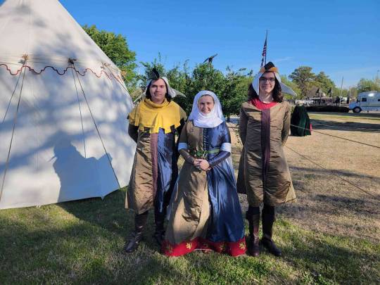
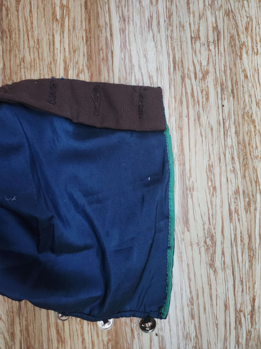
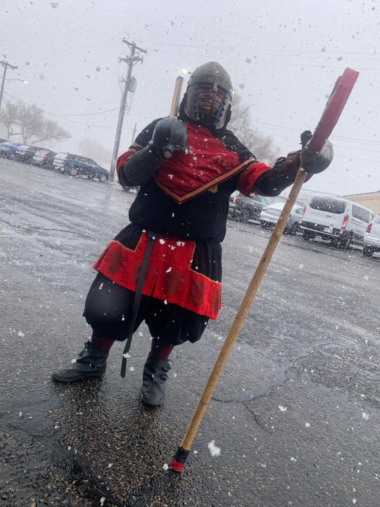
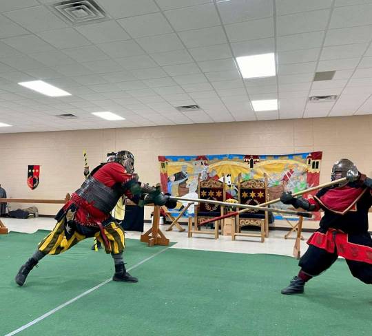
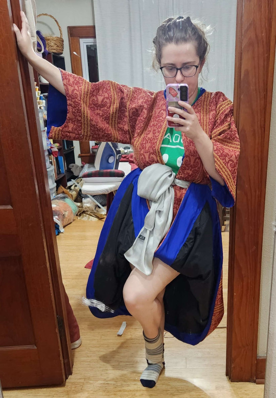
I had to accept that due to time constraints and a sum total of 1 hour to fit two people, my dreams of fully buttoned full length cotehardies would not be fulfilled. However, I am very satisfied with the way things turned out. My cuffs were long enough and sleeves snug enough to prevent riding up, and did not need the planned emergency Glamorgan chevronelly cuff. The mens' cotes were kept long (just below and just above the knee) for personal taste of the wearers. Both boys were put in hoods, though I seem to have failed to catch a picture with Thomas le Despencer in a hood. I have a habit of leaving my phone in the cast tent, so I am not surprised. The yellow dagged hood was my first foray into dagging and I am OBSESSED.
As both of the boys playing Edward and Thomas le Despencer were new to the historical costuming scene, neither were comfortable with the snug fit in the torso of a good cotehardie and requested an expansion to fit more like T-shirts. Due to the short time remaining, I opted to go for a stripe of dark brown linen down the front opening to ensure a semi-unified look. Unfortunately the literal last minute nature of this change resulted in some puckering down the front of each cotehardie that makes my eye twitch. I was terribly sad as this decision came after I'd installed what felt like thousands of buttonholes down the front of Edward's cotehardie.
Alas, some concessions must be made for the hellish clash of the impending deadline of an event and the limited available time for fittings with students. I have very mixed feelings about the results of this project, as I feel I did not make these costumes up to my standards, but I am incredibly proud of what I managed with the restrictions and barriers I encountered.
Some highlights:
To maximize the length of the sleeve and reduce the bulk, I applied a piece of 3/8" polysatin bridal ribbon to the serged edge with the tiniest back stitches I've ever done, then folded the ribbon to the inside and whip stitched it in place to secure the edge and hide the serging. To prevent the thin satin from tearing where I applied my (machine) buttonholes, I took a scrap of linen, folded it in half, and applied it to the buttonhole edge as a facing to take the majority of the strain of the buttons off the fashion fabric.
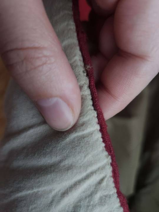
At the suggestion of Countess Christyana at LPT, I made a long strip of craft felt to apply to the inside of my hem, backing the lions. I found this gave a body to the bronze and blue fabrics that they did not have previously, giving me a much better silhouette, as well as stiffened the edge of the dress and helpfully preventing me from tripping over my own two feet. I wore it with just the craft felt basted in to one dress rehearsal before applying a facing of scrap muslin to the interior edge. This encased the felt, preventing it from picking up every blade of grass in the state of Oklahoma.
Regrettably I have no pictures of the process of inserting the felt, but my process was simple. First, I applied the felt as a facing, turning it towards the interior edge. This I basted fairly loosely to the seam allowance where the red trim is attached to the bottom of the dress.
I then cleaned up the edge where the "grass guard" met the felt met the red embroidered band with some small whip stitches to give a crisp, clean finish.
After three days in a variety of weather conditions, the interior lining did relax a little as seen below, and will require some cleanup.
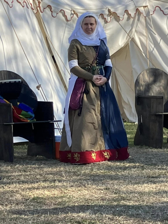
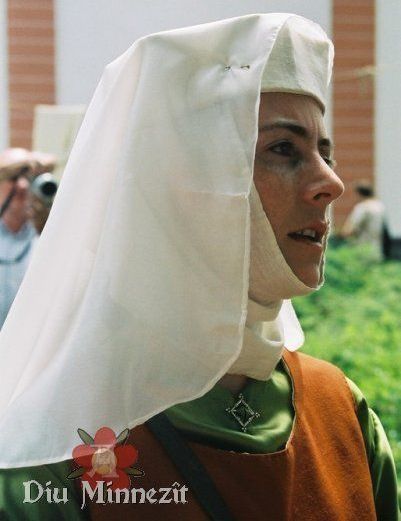
Pictured: Baroness Elizabeth Despencer attending the court of His Majesty Edward III, wondering why, exactly, one of the privateers has been handed the sword of state. (it was for a bit, we promise)
Also seen above, I purchased 14 badges of Prince Edward of Woodstock for the members of Prince Edward's Court (court 2) to wear, as a gift to the wonderful cast members who variously learned and developed new skills, stepped out of their comfort zones, and maybe let me turn them into human barbie dolls a little bit.
I really enjoyed wearing this outfit for three days through the course of the Norman Medieval Fair. I was incredibly worried about the polyester fabrics causing me to overheat, but found the linen lining and tight fitting torso prevented the polyester from building the dreaded heat pocket of humidity, and I stayed fairly cool and dry throughout the weekend. I found a personal preference for the structure and bulk of a wimple and veil when the face edges of both are folded, providing protection from the dust on the wind and the blazing sun. I cheated and safety pinned the bottom edge of my wimple together in the back, though the rest was secured by a single pin through the crossed upper edges to my brigitta cap and held tight by the pair of pins that attached my veil. Dancing in this garb made me feel more regal than I ever have in my life.
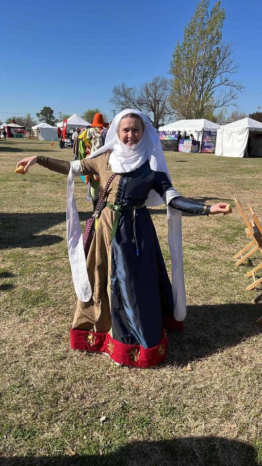
Pictured: a happy baroness with croissants. Fed nobility is happy nobility!
Unfortunately due to mental and physical health issues, I will not be returning as costuming director to the cast.
What comes next?
A klappenrock for a commission
Lesbian Minoan ;)
Coordinating Roman and Greek for myself and my consort
an attempt at a little viking cap!
a nap, probably.
#society for creative anachronism#historical costuming#historical reenactment#norman medieval fair#medieval#sca#arts & sciences#a&s#14th century#cotehardie#kirtle#medieval costuming#cote
6 notes
·
View notes
Text
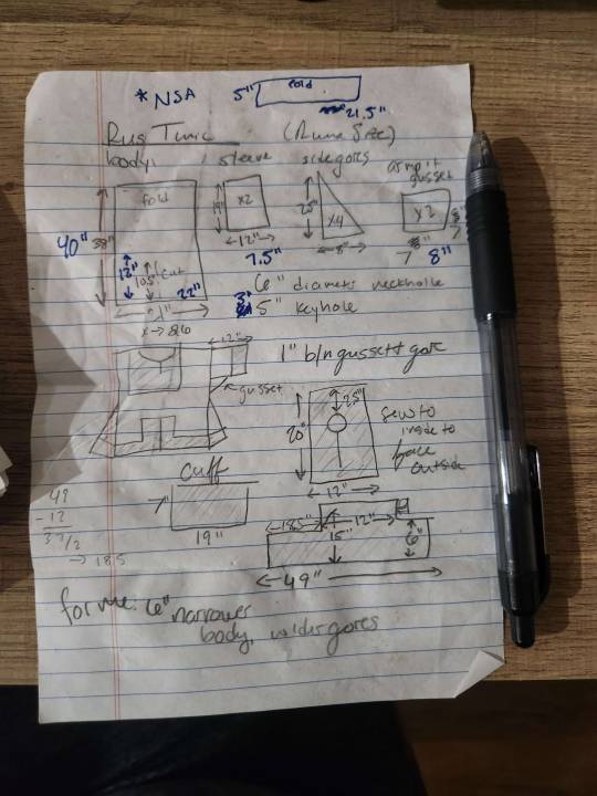
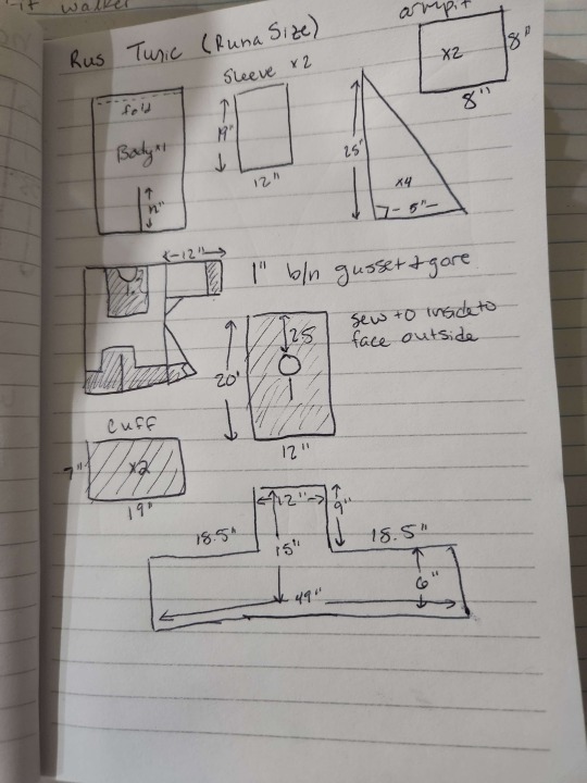
T Tunic Assembly
Notes created for the cast of the Medieval Fair of Norman intended as a good starting point for costumers made nervous by curved lines.
Meaurements and suggested cutting layout for this tunic are here

Cut out 4 body panels, 2 sleeves, 2 gussets, and some* gores.
Sew 2 body pieces down the long edge. This makes your back panel. **Optional for skirt volume: sew butt gore into back seam**
Sew the other 2 body pieces down long edge. This makes the front panel
Sew the front panel to the back panel at the shoulders
Trace a circle with a 3" radius (6" diameter) with the center 1" down the front center seam (This places 2/3 of the circle on the front panels and 1/3 on the back panels). Cut this out & seam rip ~2-4" down the center seam of the front. This makes the keyhole neckline we use for trying on our mockup.
Center one of the sleeves along the shoulder seam. Repeat for the other side.
Sew the gusset (armpit) into the right angle formed by the sleeve and the body. Repeat for the other side.

7. Attach gores to the body panels as depicted in diagram on left. If gores are in multiple pieces (i.e. 4 or more right triangles, as instructed in the prior post, see diagram on right.)
8. Fold tunic in half and start sewing along the outside edge. Gussets should be folded diagonally making armpit "triangles" when viewed from the front.
You now have a T tunic! start fitting and making adjustments as desired. Consider the following suggestions:
pinch and pin along the sleeve to tighten the fit. mark and trim if the sleeve is too long.
pinch and pin under the widest part of the chest and along any part of the torso with too much ease.
mark how wide you want your neck to be, if wider than the keyhole neckline.
consider moving your gores up or down to start at your natural waist or hip.
Consider narrowing or shortening gusset if it has too much of a bat wing. Gussets can also be a "kite" shape with the long narrow end pointing down the arm and the short end into the body.
#society for creative anachronism#sca#historical costuming#14th century#cotehardie#kirtle#tunic#t tunic#t-tunic#sewing#diagrams
10 notes
·
View notes
Text
Loose Fitting Cotehardie AKA the T tunic starting point
Notes created for the cast of the Medieval Fair of Norman intended as a good starting point for costumers made nervous by curved lines.

MEASUREMENTS:
A. shoulder to hem + 1"
B. bust (widest part of torso)
C. (B + 4)/4 "
D. shoulder to wrist + 1"
E. circumference of arm @ the shoulder +1"
F. waist to hem + 1"
G. 6-12"
H. 4-6"
Assembly Notes:
Hypotenuse of gore goes to the body panel, right angles of gores go to each other
Top of gores start around natural waist, bottom rib, or top of hip
May be easier to assemble gores in pairs before attaching to the body
Offset the circle for the neck hole so that 1/3 of the circle is on the back panels (neck hole ~6" in diameter)
Closure can go to natural waist or to hem
This can be used as a basis for a more fitted garment
Additional Notes:
Using gores and body panels cut in this manner is one of the most efficient ways to use fabric if you're trying to be conservative with yardage
While it appears gores went into front, center, and side seams in period, many modern wearers prefer the "flatter" front effect of forgoing the front gores
Doing just side gores and no butt gores can give a "flat stanley" appearance
Remember to round out your hems after assembling!
#society for creative anachronism#historical costuming#sca#14th century#cotehardie#historical reenactment#kirtle#tunic#t tunic#t-tunic
1 note
·
View note
Text
Dressing the Despencers, pt 2
Part 1
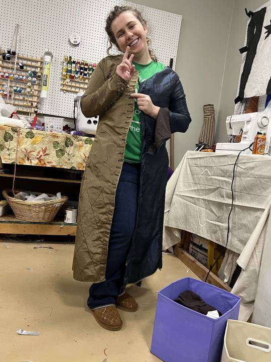
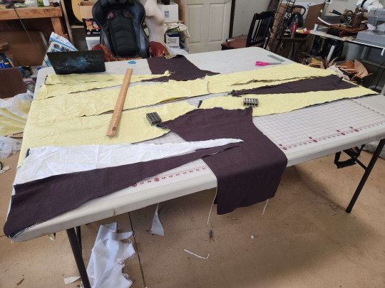
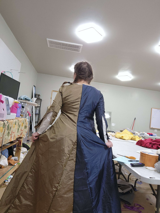
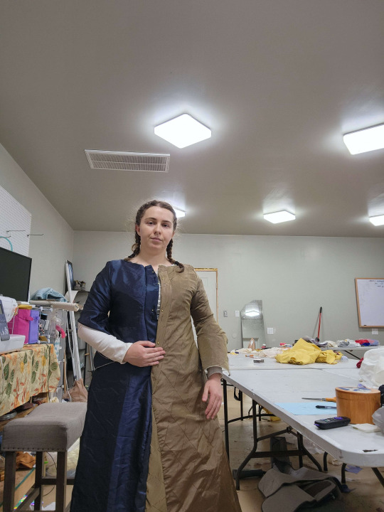
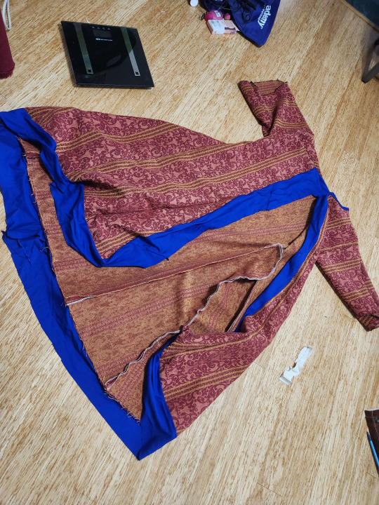
And so it continues. With the supportive underkirtle complete and worn at an event (under a different kirtle of mine) to make it relax the rest of the way, I got the measurements for our Edward and Thomas Despencer and started marking and cutting materials. While I originally believed I would have more than enough of the bronze patterned fabric, I was proven quite wrong and resorted to piecing together several gores and small extensions in the front of the body for Elizabeth and Edward Despencer. The planned change in the last post (bronze body with blue sleeves for Edward and green sleeves for Thomas) was shifted again, back to my ideal of particolor for the married couple and coordinating for the brother in law. I also realized halfway through marking that I was 2 gores and a sleeve shy of enough of the blue, which led to much wailing and gnashing of teeth. I found a similar-enough-at-a-distance blue satin at OKC fabric market, pictured on the right. Flash makes the differences obvious, but there will be very few flash photos taken of this. It'll be fine. I'll be fine. I'm so normal about this.


Because all 3 outfits have similarly sized pieces in similar fabrics, I've taken to organizing them in 3 individual cubes to keep everything straight. It has been a real game changer, and I would recommend it to everybody.

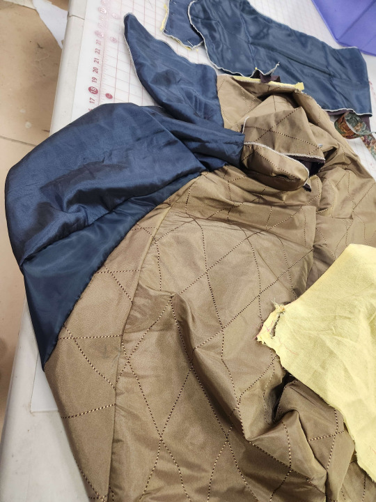
Having cut out and serged everybody's blue and bronze fabric, I dug through my stash of scrap linen to make the lining. I worry the bronze especially won't hang exactly right without lining. Additionally, I'm making the cotes for Edward and Thomas Despencer for a pair of high school seniors who, while I hope they wear an undertunic at the NMF, I plan and prepare for them not to do so. For reasons I cannot fathom, I chose not to serge the lining pieces for Edward Despencer's cote, seen below. Yay, hand finishing.
I usually bag line lined garments, but I also usually make garments in 2 layers of linen. I didn't want a bag lined garment to sag weirdly, so I sandwiched each seam, treating the lining and outer together as one piece of fabric each.
The picture below has two notable features: first, the blue of the body and the blue of the gore are the two different blues. This was proof of concept enough for me to accept the differences aren't terribly noticeable. Second, I did not bother pattern matching the various pieces of of any of the garments. Working from two extremely limited quantities of fabric, I found myself in the position I'd imagine many tailors in period would know well. Laying out pattern pieces over and over, I found the only way to effectively and efficiently use as much of my material as possible is to squeeze things in where I can (while still respecting the grain). I would like to find documentation on this speculation, but I would not be surprised if it is more period to not pattern match fabrics for anything less than a royal coronation garment. And the Despencers, while being played as nouveau riche landed nobility and close friends of the heir apparent, do not have pattern matching and wasting fabric money.
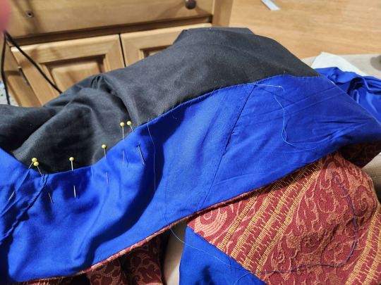
With Edward Despencer's cote largely assembled and waiting until I can do one more test fitting before I add button holes, I started assembling my/Elizabeth Despencer's outer gown. By this time, I decided for the remaining two Despencers to only line the 4 body panels, since that will help the drape enough in my humble opinion.
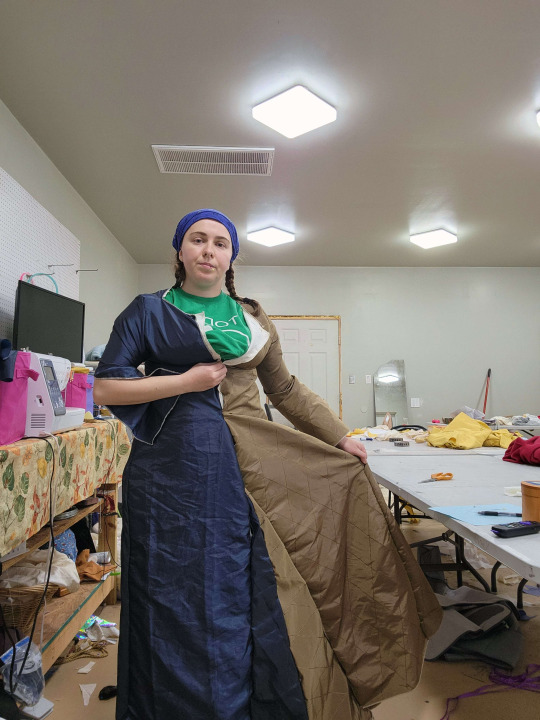


Don't worry, those gores get scooted up to a better height. I found myself working from Morgan Donner's example of a supportive kirtle, where her gores start where the flare of the bodice in the 4 body panels stops and turns into the straight lines to the floor. I still haven't quite figured out why mine looked so bad and noticeable in comparison to hers (seen below), but my best guess is the difference in drape of material, the fact that Mistress Donner is significantly smaller / less beefy in the hips than I, or that I just straight up placed them wrong.

I do love how much space the dress makes me take up though. It makes the transition from street to court feel a lot easier, I'm playing nobility and I take up space.
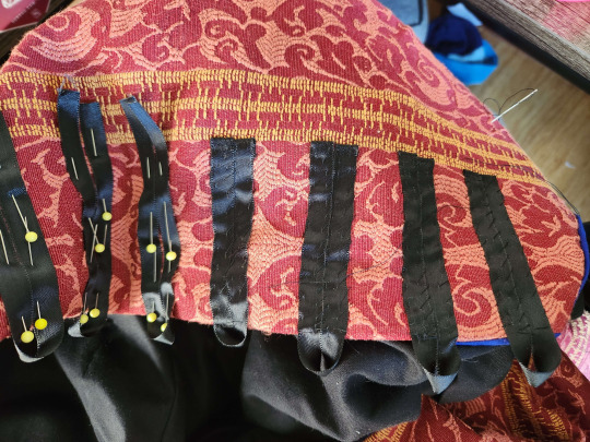
Tragedy struck and I realized I was short about an inch across the bust. Still not sure how I managed that, but it was time for a fix. Piecework is period, and I maybe panicked a little and overdid the width, but I added plackets to both sides of the front closure to give me more working room.
Then came the buttons, which I purchased from Bad Baroness buttons. I. Am. Obsessed. I wanted enough to do my front closure to the waist, both boys all the way to the hem, and sleeves for everybody. So I overdid it and bought 150. On my bodice, I spaced them about a button and a half apart to avoid gapping. Because the fabric doesn't play nice with chalk, I ran loose basting stitches to mark my button holes before I made them. Rather than using my wife's fancy new brother with an automatic buttonhole function, I learned how to use the button hole stitches on my old Janome (finally.) Overall, not a bad experience, and it means I don't need to borrow a machine to do buttonholes.

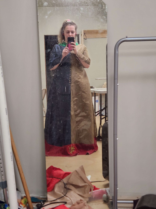
Then came what has been the most stressful point so far. Mistress Elizabeth Caton and Countess Amelot Lisette joined us for an unrelated sewing weekend extravaganza, and I took advantage of their expertise to help with fitting. Thus, the gores got moved up, and the sides taken in more. I really over did it with those front plackets RIP. But tragedy of tragedies, in moving the gores up, I left the dress 4 inches too short in places. Upon consultation with my trusted countesses and friends, we reverted to the original design with the red band and lions at the bottom. I was hesitant to do this because of the cast's restriction of true crimson to the royal family for readability reasons, and because it's not something I see much of in period depictions. However, the rest of the costuming committee reminded me of my own "10 foot squint rule", where if the costume isn't overwhelmingly crimson at 10 feet and squinting, it's fine. And this contemporary depiction of Mary of Waltham (Princess Mary) has a surcoat that appears to have a contrasting band at the bottom which may match gores going up the sides. The decision was made to cut myself some slack and get this workable ASAP.


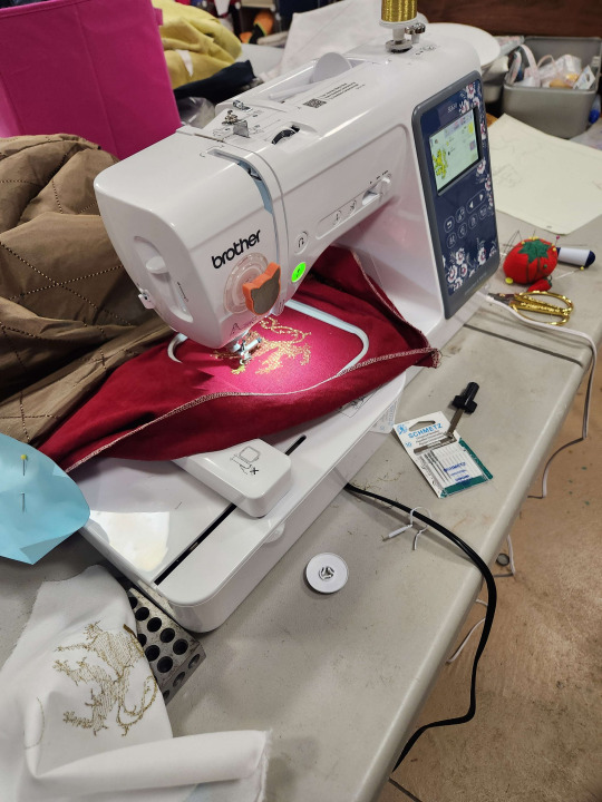
Much appreciation to Halldora for loaning me her machine and helping me embroider these godforsaken Burghersh lions.
What comes next?
I need to finish the lions on Elizabeth's dress and hem the excess.
I need to add buttons and buttonholes to Elizabeth's sleeves
If the sleeves are too short, I may add contrast red cuffs of the same fabric as the hem, or gold cuffs and embroider them with the Glamorgan chevronelly in the Despencer arms
Buttons down the front of Edward Despencer, and close his sleeves. It's been fitted, and I had to add the button placket of despair to his garb as well.
Seam finishing for Edward :) since I didn't serge the lining for some reason :) I hate myself :) i've at least already started this.
Assemble and line Thomas's cote. I will definitely need a button placket on his too, I girlbossed too close to the sun and made the chests just a wee bit too tight for their comfort. For Thomas's, I'm going to embrace the pieced look and use some dark brown linen for the center closure.
Dye and attach the false sleeves for Thomas, they're going to be a lovely green :)
Hems and necklines for everyone!!
If i have time and spoons, I would LOVE to put some mammen scrollwork embroidery on at least one of the boys' cotes.
I am attending Ansteorra's Laurel's Prize Tournament this coming weekend and hope to have enough done on the Despencers' clothes to present them, so fingers crossed!
#arts & sciences#a&s#sca#society for creative anachronism#historical costuming#wip#norman medieval fair#medieval costuming#historical reenactment#medieval garb#kirtle#cotehardie#cote#14th century
7 notes
·
View notes
Text
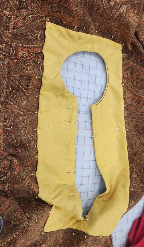
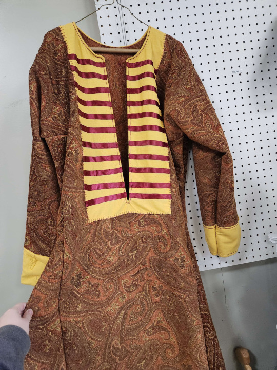
Dragging a Viscount into Early Period
My first hack at more elaborate men's Rus has been prompted by a favorite Viscountess of mine dragging her fighter into early period.
I was given a pile of fabric for pre-determined aspects: a chenille upholstery fabric for the body, a buttery yellow linen for the facings, and a cream linen for the pants. For full disclosure, this piece is a commission that I'm doing at a reduced rate in hopes of getting my name out there on a pretty prominent figure in my region.
I used the calculations for measurements and layout given to me by Dvorianka Anastasiia which are derived from the patterning work done by Mistress Talana the Violet of blessed memory. It is similar to a variation of the style 5 tunic as categorized by The Renaissance Tailor, with trapezoidal gores in both the skirt and armpit, leading to an overall sleeker fit to the body than the standard square armpit gore. As some measurements had changed since Anastasiia last took them, I stressed myself out until I realized I have unlimited power at my fingertips: basic scripting. I wrote a short program to take hard coded measurements and spit out the exact dimensions of the pattern pieces, which felt a little bit like overkill and also not impressive at all.
With pieces patterned, cut out, and (mostly) serged, I delved into construction. I have learned from experience my preferred method of construction is starting by attaching the two body rectangles at the shoulders, attaching and turning the neckhole facing, and then assembling everything flat as follows.

This makes lining up and turning the facing significantly easier for me to do, and hides raw edges within the seams. Starting with the neckhole, however, means there's less fabric for me to fight while I turn a particularly annoying facing.
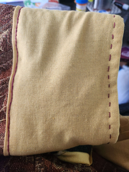
With the facing laid out on the body fabric, consultation with some of my apprentice siblings determined deep burgundy is the way to go for all the accents. I decided on split stitch around the neckhole and buttonhole stitch around the edges of the neckline, but quickly decided I prefer the split stitch for the rest of the decorative stitching on the garment.

For the sleeve cuffs, I pinned them in place, ran a quick line of running backstitch along the tops of the cuffs to secure them in place, then did split stitch at the top of the cuffs and a running stitch around the opening to keep the edge tidy while still not using visible machine stitching.
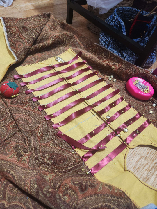
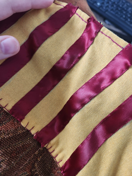
One thing the recipient of this garment expressed is that the striped facing secured with buttons or toggles is an ideal look, and luckily I have a significant quantity of the Vindheim buttons from Bad Baroness in stash. I do not have sufficient woven or braided trim in truly appropriate quantity or style for this garment to be aggressively period, but with the fabric we're already taking liberties and the ribbons look nice and appear to be a popular substitute for strips of silk tape performing the same function in our area. I laid the ribbon out at inch and a half intervals and made sure my lines would be straight on both sides. I turned the ends of the ribbons in and secured them with a whip stitch in a matching thread.
With my facing done and the worst of the neckhole dealt with, I seamed the rest of the garment into an actually clothing-shaped piece of fabric and let it hang for a day while working on other projects.
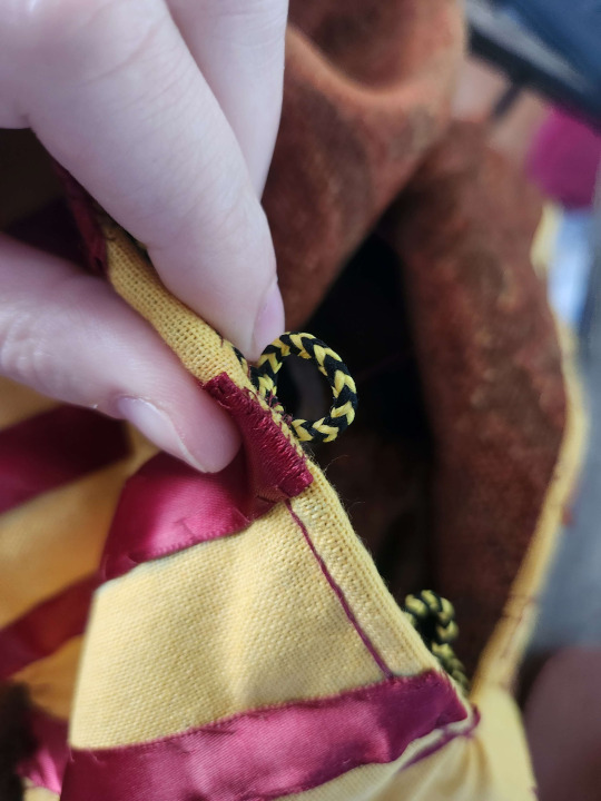
I decided to use a "looped cord" method of button loops, using a cord from an old site token that happens to look an awful lot like the cord used for an award the recipient has received. Starting from the bottom of the neckhole, on the wearer's right side, I've tacked the cord down under the edge of the garment, securing the loops aggressively.
Sometime soon I will get clearer pictures of this garment on the recipient.

The more I look at this garment and all other Rus-ish garments i've made and seen, I think I may need to round the gores into the "skirt" of the tunic more dramatically. I can no longer find the artistic depiction that originally gave me the impression, but until this point i've been letting the right angles of the skirt remain as initially cut, giving an angular overall silhouette but the rounding may be necessary for the right look.
#arts & sciences#a&s#sca#society for creative anachronism#historical costuming#rus costuming#garb#rus and norse#tunics
8 notes
·
View notes
Text
Dressing the Despencers

Another post that's more of a costuming diary than anything else, to be added to as I get further in the process.
BACKGROUND
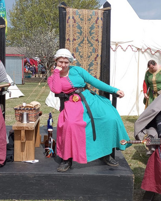
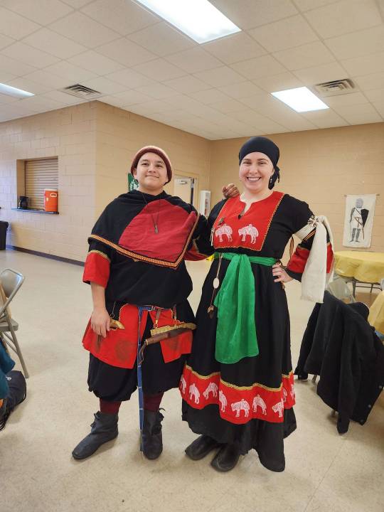
Since 2016 in the Medieval Fair of Norman (my gateway drug to the SCA) I have been cast as a street character named Margery Arkewright, the ditzy, excitable, joyful shepherdess of Avalon best known for her frequent proclamations that she is the Best Shepherdess in All of Avalon (the only shepherdess there) and her inability to keep track of her sheep. I could probably write an entire book about the development of Margery as a character from "<Mundane Name> - peasant townswoman" to the beloved sheep lady, and how that growth has helped me find myself as a person, but that's for another post. The original goal of Margery was to be as brightly colored and loud as I could be allowed. Pictured below are the original outfit I made in 2016 (with the wool blend felt "cloak" i regularly wore when chilly or to just have a huge storage pocket), and the updates to the outfit as of 2023. Even in that short time, I've grown as a costumer and amateur historian. If nothing else, I know how to put my sleeves in right and I know how to cover my hair so it doesn't get icky at the fair.


Being Margery has been a joy, but Margery takes a lot of energy that I just don't have anymore. In discussion with my casting director, we've put Margery on the shelf for a year or so to age like a fine wine, so when she comes back I can be a little less bouncy and not have it be as much of a shock. As far as the town is concerned, Margery is off trying to woo one of those muscley Bretons in the fleet of Captain Jeanne di Clisson. She'll be back.
On top of everything, I accidentally stepped into the position of Costuming Director at least in an interim. I've been handed certain goals to push for improved costuming standards across the board, as well as implementing some specific standards to improve readability to the audience.
DESIGN
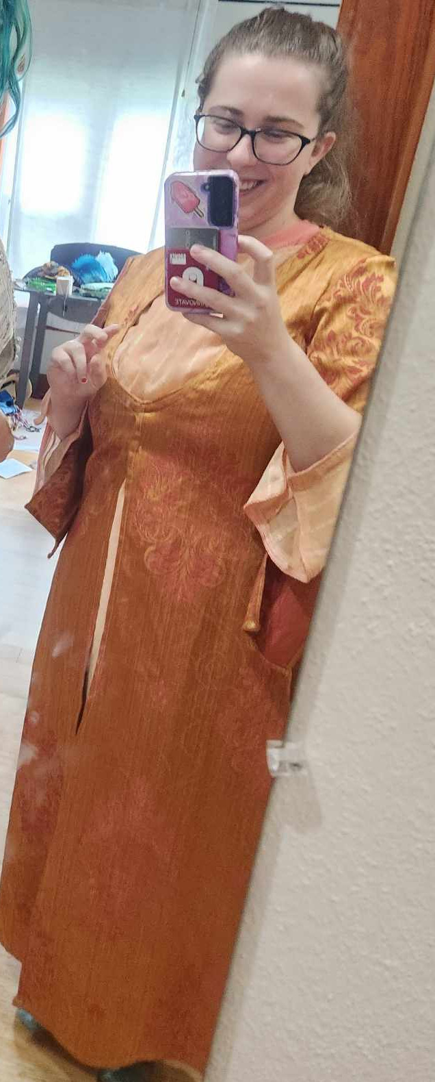
In the meantime, I'm taking a step back to play a member of the court of Edward of Woodstock, Crown Prince of England, war hero and darling of the kingdom. For the time being, I am Baroness Elizabeth Burghersh, First Baroness Despencer. I decided to take the chance to really up my 14th century garb game with some Noblewomen's garb. I knew I had some lovely navy blue satin in stash that had just the right drape I wanted, and dug around to find some fabric with similar drape so I could make some particolor.
<insert picture of test wash>
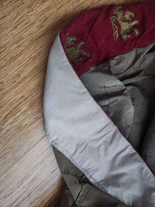
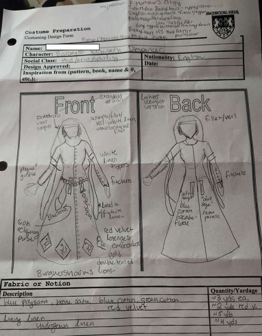
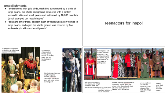
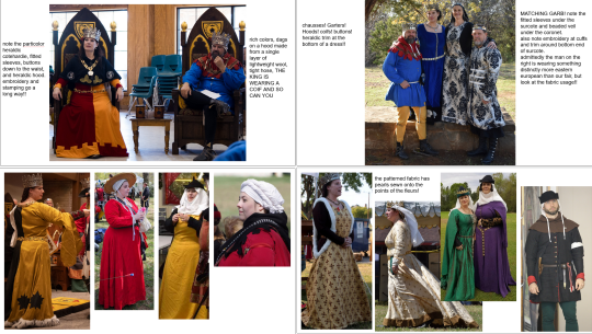
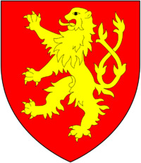
I wanted to incorporate some of Elizabeth's armory as in 1369 (9 years after the medieval fair of norman is set) she inherits the title of Baroness Burghersh and is a heraldic heiress in her own right. I also have some red polycotton velvet that i wouldn't want to wear all over, but I would be more than willing to wear it on hems or cuffs. Some of the big pushes we're making in costuming direction are more heraldic designs, more silhouette varieties, more historical cuts and designs, more couples with coordinated outfits, and restricting large swaths of true crimson to the immediate royal family to improve readability to the public. My initial design below includes gold double-queued lions from the Burghersh along the hem. Shortly after, I adjusted the design to my formal submission (to my committee, I don't like the idea of approving my own stuff) on the right: the lions on lozenges, fitchets in the gown, tippets, and a wimple.
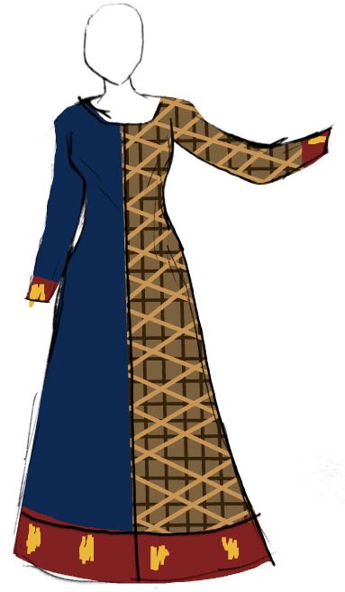
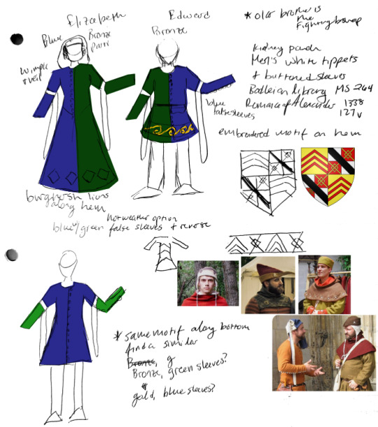
As it currently stands, a pair of new cast members are playing my "husband", Baron Edward Despencer and his brother, Thomas Despencer. Due to their inexperience with both med fair and costuming, I offered to make at least one tunic for Edward in exchange for creative control of the outfits. Due to a very limited quantity of this blue satin, I'm going for a particolor gown for myself buttoned halfway down, and using what's left on the false sleeves for Edward's cotehardie. I want to use a similar-- probably not the same-- bronze on the cotehardie for Thomas, and use green false sleeves. I really wanted to incorporate their family arms, but dear god they're miserable to depict.

I included headwear options to provide the boys with some suggestions and some embroidery options to dress up their cotehardies. The second version, below, should be a hot day version on the off chance we have a truly miserably hot day at fair. Fewer layers, and all linen.
I've got hand me down tippets and an oval linen veil to use for a wimple / veil combo, that I added a gorget of a 2x3'linen rectangle using this method to secure.
Halldora obtained a light weight, barely opaque creamy white silk for me to make a new wimple / veil combo that has more of the drape I really want to have. My problem is I'm obsessed with the fillet + gorget style of wimple with ramshorns braids, but some kind of scalp covering is practically mandatory with our role in the NMF. Sunburn on the scalp is miserable, and direct sun on the scalp can exacerbate symptoms of heat exhaustion, and I'm not looking for my third heatstroke.

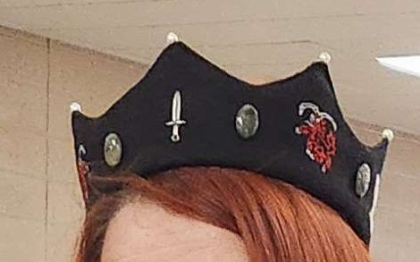
Barring this, I am working with the other directors to obtain new and improved crowns for our royal family to justify a fancied up filette/barbette combo inspired by the fabric coronets our court baron/esses in Ansteorra tend to wear. While the pointed coronets of Ansteorran court nobility may be out of period for my goal here, I think adding some embroidery, pearls, cabochons, and the embroidered horribleterrible despencer arms (seen at the top of this post) may dress up Elizabeth Despencer even more. This is all pending new crowns for our royal family, of course, as a big goal is readability and identifiability for the average patron.


CONSTRUCTION
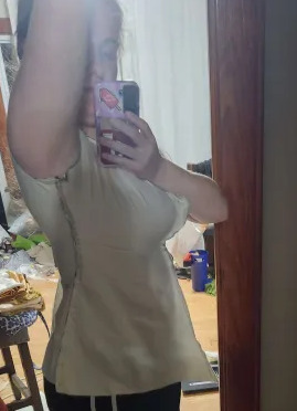
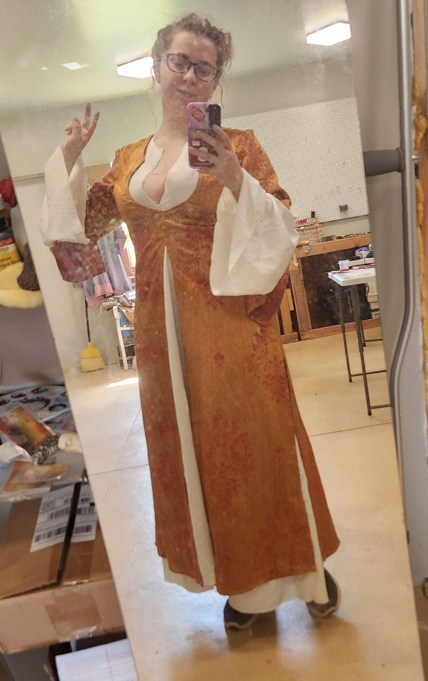
I have begun drafting the undergown using Morgan Donner's supportive kirtle tutorial. As someone who hates shapes and struggles with tailoring, the first pass at this was already impressively fitted. By round 2, I made the armscye a little larger. For the third round of fitting, I added a small kite shaped gusset to the armpit and rolled the shoulders back further onto my body.

I made one last sanity check that the blue polysatin had sufficient yardage to make both Elizabeth and Edward Despencer coordinating outfits, and was satisfied with the resulting layout. One whole gore to go on the side, and two half gores, one each for the front and back.

In a fit of utter hubris, I decided I would completely hand sew this supportive underkirtle, a little bit to prove a point but also largely so I had something to work on during NMF rehearsals and Pathfinder games. I am using a single layer of medium weight linen, with a second layer of the same around the torso for reinforcement and to make everything lie just a little nicer. At the advice of Asa in Blindi, I have been finishing seams as I work, especially along edges I already know to be fitted as needed. One final double check on fitting before I secure sleeve seams, which will be obnoxious to undo--


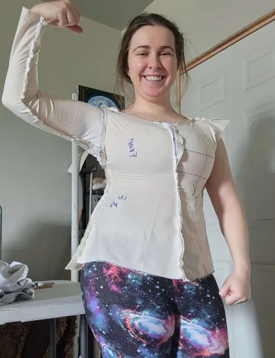
I'm satisfied. It's not perfect, and I'll tighten the cuff some more and get rid of the back pucker on the outer garment, but I'm rather pleased with this. I did not think i would do gores in the front as historically I don't really like the silhouette it gives me, but this outfit was just begging for full, huge skirts, so I scurried back to the workshop to piecework another gore together, just for the front. Now I'm working on the eyelets, which I'm poking through with a sharp bone awl and widening with a us7 knitting needle. I'm sewing each eyelet with 2 strands of dmc embroidery floss.
I'd originally wanted to lucet some lacing for this gown but mastering tension on crochet thread is eluding me, so I am doing a 7 strand kumihimo braid in white size 10 crochet thread, using these aglets to cap either end rather than my nice ones from Bad Baroness.

Things I've learned so far:
The smallest measurement on my torso is NOT where I thought it is
French seams make hand sewing less miserable to do
Waxing your thread (with a little cake of beeswax) is worth every second and makes life so much easier. And periodically you should run a flame over the sides of the cake so it doesn't start flaking and falling apart
It's worth working with shorter pieces of thread you have to secure more often, i now max out at 2/3 of my armspan for thread lengths
knots are for scrubs, sew 2 stitches in the opposite direction of your intended seam and live your best life
#arts & sciences#a&s#sca#society for creative anachronism#historical costuming#wip#medieval costuming#historical reenactment#medieval garb#kirtle#cotehardie#14th century
4 notes
·
View notes
Text
Coronet V: Sheep and Bears
Armiger Runa Bjarki fought for me at Vindheim's fifth coronet tournament, after fighting for me for the first time at Vindheim's fourth coronet tournament.
This will be a bit more of a costuming diary than anything, detailing my process from design, to drafting, to learning new arts, to the finished project, and what I learned along the way.
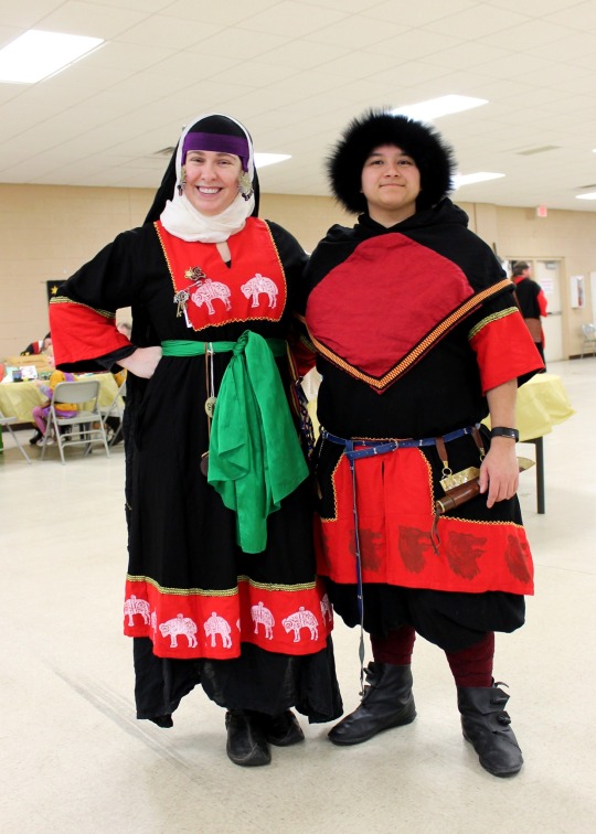

Our arrangement began prior to Vindheim's 4th coronet tournament, arranged by my wife and Runa's teacher much in the style of an arranged marriage. Runa would fight for me in exchange for me making our coronet garb, giving me an excuse to step up my garb game and enjoy some pomp and circumstance and giving Runa a growing closet of fancier garb. Our arrangement stipulated that I get to make Runa wear Pink, sometimes at least.
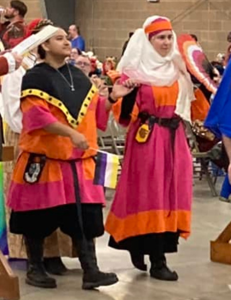
Our first outfits were pink and orange with black accents, which is TECHNICALLY Vindheim colors (dark Or, light gules, and sable :P) and includes the pink and orange which I have become associated with in the kingdom. These outfits would not have been possible without Dvorianka Anastasiia and Boiarynia Koia, who loaned me veils and undergowns, gave me instructions on drafting and assembly, and zhuzhed me incessantly day of to make sure the Rus impression was both up to their standards of accuracy and made me feel pretty.
A fun fact about this procession, we were the first ostensibly f/f entrant couple in a Vindheim coronet tournament, we were dressed as lesbian flags, and our procession was riddled with pride flags. Overall, a good day.
I created the following patterns for Runa's and my outfits, respectively:
Our arms:

Time passed, the second coronet tournament was fast approaching, and per our agreement, the next set of outfits would be Vindheim/ Free Company / Runa's own colors. Rather than struggling with pens and sketching over and over and over, this time I simply made "dress up dolls" in GIMP to present design ideas to my fighter, which included the following:
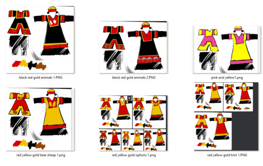
I cannot recommend this process enough. I just sketch outlines of my design on paper, upload into GIMP, adjust levels and brightness, then set the alpha channel to white. Under the lines layer, I make a series of layers in neon colors of each of the "sections" of color I might want to adjust, which allows me to bucket fill to make different designs.
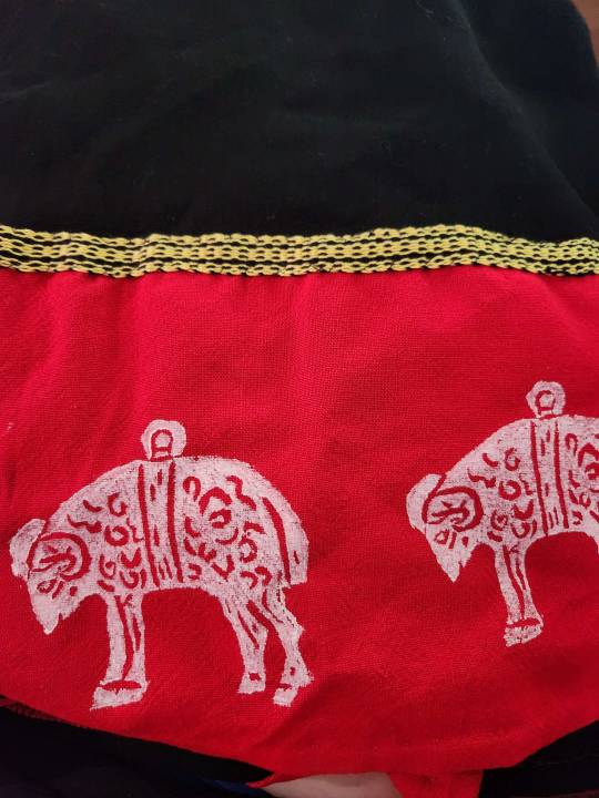
After selecting a design, I obtained stamp carving supplies and sent them to Runa for her to carve my fleece and her bear, the animate charges in our arms, to be applied to the final product.
I commissioned trim by trade from a local to me, Lady Kenda, to accent the borders of the red facings. I only asked for 6 yards. This would prove to be a mistake, although the trim itself was LOVELY

My first attempts to use the stamps were...fraught. Many inappropriate jokes were made about the sheep, in particular. Koia and Anastasiia troubleshooted the problem remotely and provided better paint, respectively, resulting in the superior stamping on the right.


Not a single picture I've taken captures the depth and warmth of the brown in the bears, unfortunately. In natural light, they're clear, vibrant, and a warm coffee brown. In every photo i've taken, they're barely there. With stamping conquered, so began the cutting, serging, and assembly.

I used the crimson and the black linen from OKC fabric market, which are both soft, mid-weight linens with an apparently short staple, but are plenty affordable for my needs. After cutting and labeling all t he pieces with chalk, I ran them through the serger to keep the pieces from fraying while I work. This also let's me be lazy and not do any seam finishing at the end of the proecess, when I may be very pressed for time.
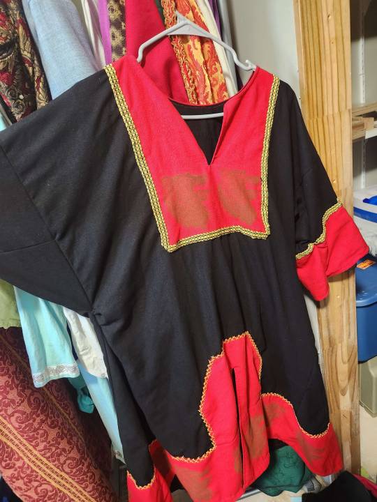
I prefer to attach the two body pieces at the shoulders and apply the neck facing ASAP, as it's easier to cut and turn before the entire tunic is assembled. I also attached the facing to the cuffs before attaching the cuffs. I lay everything flat, attaching gores to the sides of the gown and tunic, then I run one seam each up from the hem to the cuff. The exception to this is the side on which I include my pocket, since I like to have my phone, emergency meds, eye drops, and lip balm on me at events. Runa's tunic does not have this pocket, but her pants have both the cell phone pocket and the Jameson pocket. I should make a post about these pants at some point ;)


I didn't bother turning in the edges on much of the facings of my gown, anticipating applying trim over the top. Then I looked at how much trim I had left, and quickly decided to trim both of our sleeves, the bottom of my skirt, and the neck facing on Runa's tunic.

To the places I did not actually add trim, I embroidered the edge with a tacked herringbone stitch to add visual interest. Luckily, it turns out this particular design delights my fighter, is fairly strong, and has a very pleasant texture to the little hamsters in the brain.

Overall, I'm incredibly satisfied with this result and look forward to wearing so much Rus in the future. I finally feel comfortable enough with the construction of both of these tunics to offer them on commission locally.
Some more glamor shots:
Endless thanks to Dvorianka Anastasiia Dmitrieva Sokolova and Boiarynia Koia Karasova, my Rus Mamas and tolerators of many midnight questions about stamping and styling.
So what am I on to next? Med Fair cotehardies. I'm currently handsewing the supportive underdress for my own impression. Fingers crossed I maintain my sanity!!
26 notes
·
View notes
Text
Clothing of the 14th Century: an unreasonably deep dive

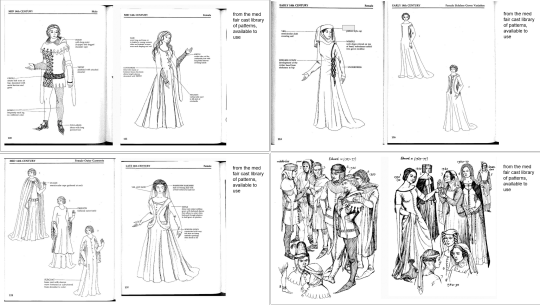

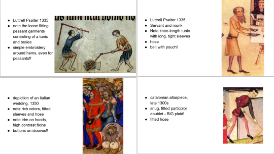
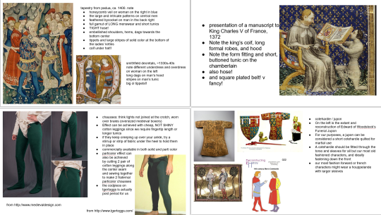

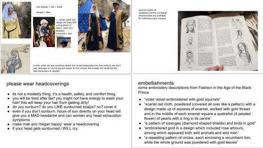


Hosting the costuming presentation for the Norman Medieval Fair on this blog so it can be shared to the mailing list.
#arts & sciences#a&s#sca#society for creative anachronism#nmf#norman medieval fair#historical costuming
136 notes
·
View notes
Text
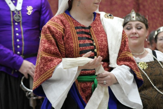
Of Belt Favors and Letters
The Queen's Champion tournament of Nicolette Deuville II is this coming weekend (November 11, 2023) and for it, I have created two gifts for my inspirations. First, a belt favor for my wife. Second, a letter of intent for my queen.
This isn't my first time making a belt favor, but it's my first time making a sizeable belt favor for my wife. I made it for the Queen's Champion tournament of Nicolette Deuville II, in hopes that it brings my wife luck and glory. <3
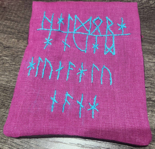
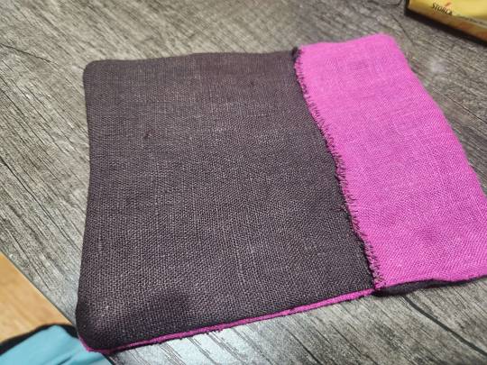
It is embroidered on a leftover piece from my first dress I ever made for reenactment and the first dress I ever wore to an SCA event. The text is based on the Setre comb inscription dating to about 600 AD. The text on the comb appears to read
hal maR
mauna
alunaalunana
Ever since I came across it, I've been entranced by Ottar Grønvik's translation of this inscription:
Stone-maiden
may thrive
achieve everything, enjoy everything
As my wife's SCA name is Halldóra, I've always wanted to interpret this poem into a gift for her. I used a single strand of cotton-wool blend yarn rather than using embroidery floss to call back to the embroidery texture of the Bayeux tapestry. As I did not have any large blocks of space to fill with the Bayeux couched satin stitch, I did this project in split stitch and a single couched line for the center line of the A section of the inscription

For my letter of intent, I wanted to do something that felt more appropriate to the persona of Áshildr Inn Hárfagri, so I decided to try my hand at carving leather. First, to draft and translate my letter itself.
While my letters of intent are usually rather wordy, since I would be trying a new craft for the first time I wanted to keep it short and sweet. I decided upon "My queen, my sword is yours" and began researching an appropriate sign off.
I came across the Einangsteinan inscript on the Einang stone, which is typically interpreted to read "ek (gu)dagastiR runo faihido" or "I Gudgæst wrote these runes." Substituting my own name for Gudgæst's, I now had a signoff of "ek ashildR runo faihido."

I wish past me did a better job of copying notes down somewhere present me would find them with regards to spelling my own name in runes as I've done this before for the Letter of Intent for the QC tournament of Toryn Sevenstitches II.

Make note that the "d" in Áshildr is spelled with a teiwaz rather than a dagaz. I thought that was interesting and not a choice I would have made casually, so I re-researched this difference. The Vatn Runestone, pictured below, appears to read rhoaltR ...something. rhoaltR is commonly interpreted in this case to be Roald, from Hróaldr. With the inverted algiz used as the R following the hard consonant at the end of the name, I consider this sufficient evidence of how to appropriately write a -dR name in runic inscription.

Then came the translation.
My Queen > dróttning mín (first person singular feminine possessive) > drotning min
My sword is yours > sverðsins (singular def. gen declension of sverð) mín er þín (second person gen. posessive) > swerþsins min er þin
I Áshildr carved these runes > ek Áshildr runo faihido > ek ashiltR runo faihido

As my queen's arms include a wolf in chief, I also carved a wolf into the leather. I used a pencil to sketch the runes and wolf onto the leather, then carved with an Xacto knife and a scalpel. I have found I prefer the straighter lines I accomplished with the xacto knife and found the ergonomics superior, but the scalpel produced clearer, easier to read marks against the undyed leather.
While this was meant to reflect the runic inscriptions in stone, this is obviously not stone. I chose to do this in leather rather than on paper or canvas because the three dimensional nature of carving, how runestones such as the Jelling, Einang, and Vatn stones were carved, is better represented in a thick material such as leather rather than painted on to canvas or drawn on paper. Carving these runes and this design gave me a greater appreciation for the straight lines of the Futhark runes and for the artistry, skill, and patience of those long-dead runewrights. Gudgæst, Roald, though long gone from this world, live forever in the carvings they left behind.
"Deyr fę,
deyia frǫndr,
deyr sialfr it sama;
ec veit einn
at aldri deýr:
domr vm dꜹþan hvern."
#arts & sciences#a&s#sca#society for creative anachronism#leatherwork#leather carving#embroidery#runes#futhark#futhark runes
15 notes
·
View notes
Text
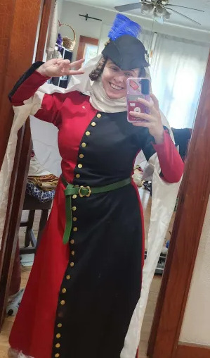
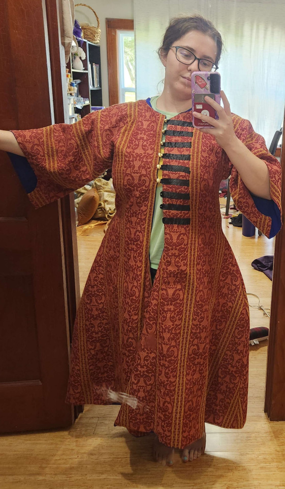
Eclipse Coronation Ottoman
At the start of the reign of Gabriel III and Sonja III, I made them a promise. During their reign, in honor and imitation of all the fancy and beautiful clothing they produce, I would cut into a fabric that scared me and attempt to make something wearable.
Prior to Pennsic, my lovely wife picked up some garb for us at a SCA yard sale. this included the following rust/gold ghawazee that a local of mine (recently laurel) informed me is about 200-300 years post period, but would be an OK time saver for garbing myself up for Pennsic. With that knowledge safe in hand, I planned and started to sew a gomlek, with the intention of creating a single-layer supportive undergarment to reduce the number of layers worn on hot afternoons at pennsic. This would be my first ever supportive garment! As you can see in the following photos, the supportive garment was a success.
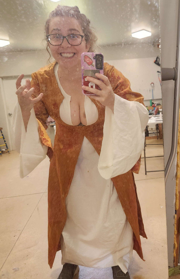
I began my research with Ottoman Turkish Garb, An Overview of Women's Clothing by Baroness Katja Davidova Orlova Khazarina. This document was recommended to me by Baroness Dominique Michelle le Vasseur. With a bit more of an idea of what I was doing (but only a bit, I was roaring full speed ahead) I used the gomlek pattern found on Turkish Costume by Vanessa Giddings. I made the gomlek from a light-medium weight white linen from stash. I serged each edge of the pieces before pinning together to prevent fraying and to buy me some time to properly finish the seams when I got home from pennsic.
Notably, this is where I made my first mistake. After making the gomlek, I decided to attempt to make it supportive just in case I didn't finish a zibin before pennsic (reader-- she didn't finish the zibin). After making the gomlek according to the Giddings pattern, I then pinched and pinned along the seam between the front body and the front gore to force a little more lift and create a "shelf" on which the breasts could rest. Because I made t his supportive, I'm glad I used a just shy of medium weight linen rather than a more appropriate looser weave, because it gave the garment the body to support the breasts.
As I was in the last leg of time crunch before Pennsic, I wanted this linen to relax as much as it was going to as fast as possible. So i threw on the gomlek, some leggings, and a lazy turban, then did some intense yard work for ~2 hours. My breasts never moved from their assigned seats, the garment relaxed comfortably, and I could move just fine in it. I then finished the gomlek off with a quick button loop and faux-pearl headed button at the neckline, though it has no structural purpose due to how I altered the garment.
With a heart full of ambition and a head empty of reason, I attacked a plan to finish a brand new entari, zibin, and an extra gomlek prior to pennsic. I accomplished none of that.
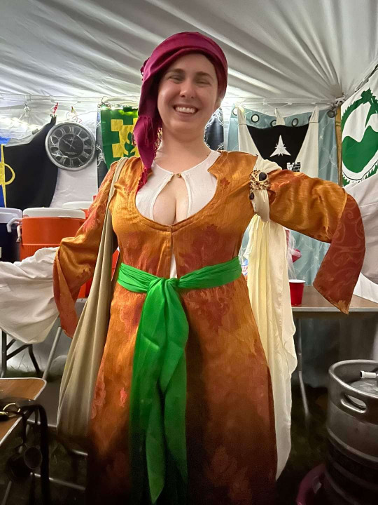
The following picture shows how I wore this for Pennsic: Gomlek, the post-period ghawazee, lazy turban, some shalwar off amazon recommended by Viscountess Caterina Giovanni, my apprentice belt, and some Rus boots as I was advised to wear ankle support in the Bog.
Upon my return home, I started planning the Entari, with the goal of having a gomlek and entari to wear to Namron Protectorate for Domi's laurel elevation (reader-- she didn't finish any of it in time). I selected from stash a black cotton for the lining and a red and rust upholstery fabric for the outer layer. This was chosen for the similarity, to my eye, between the repeating pattern in the stripes on the upholstery fabric and the patterns present on some extant entaris and in court portraiture. ORIGINALLY I had selected a bright blue silk i was certain I had in stash but my box o' saris was nowhere to be found.
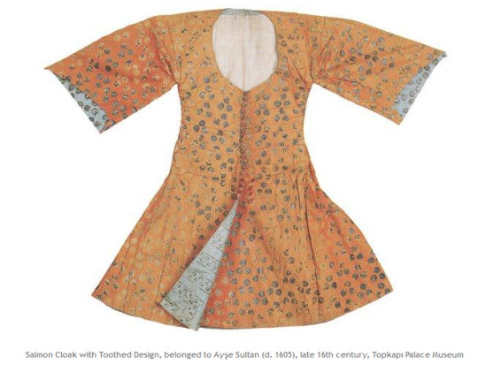
The above portraits, miniatures, and extants were accessed through the Ottoman Turkish Garment Database. The prevalence of red / blue color combos in the portraits and extants, as well as vibrant colors across the board, inspired my choices. As you can see in each of the extants as well as the art, the inside edge of the garment is faced in a color different from the lining and the outer layer. In many of the portraits, the bottom edge of the garment is turned out as if caught in motion, displaying this vibrant facing. The entaris come in different lengths but tend to be in the knee to floor range, while a hip to knee length undergarment appears to be worn as a middle layer.
The center bottom quilted kaftan in red and gold (belonging to Selim I, garment c. 1512-1520) inspired my choice of fabric, as seen below.
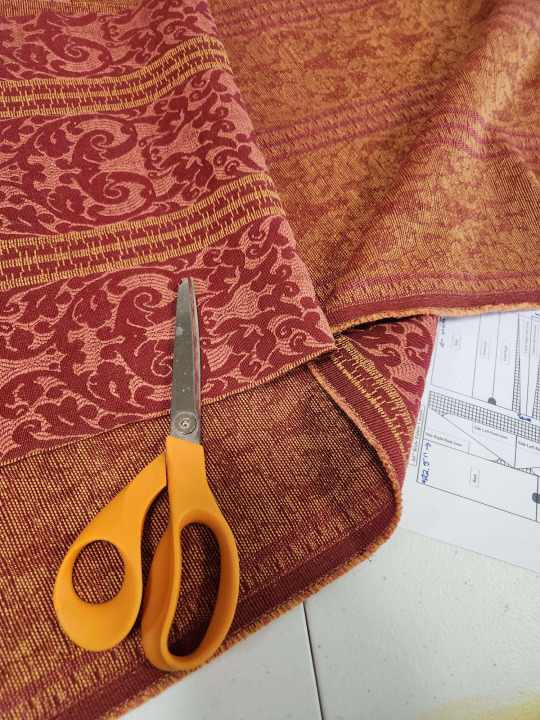
Fabric selected, then began the cutting. I used the pattern, cutting diagram, and notes from Kelebek's Persian and Turkish Clothes and drafted out onto my lining layer. Because the gomlek worked up so easily, I just used the black cotton liner as my muslin for this garment. As seen below, it fit pretty well from the outset and the notes and diagrams proved helpful in making sure everything lined up right. Gores are my nightmare. Seen below, the garment as it stood had REALLY prominent hip bumps.
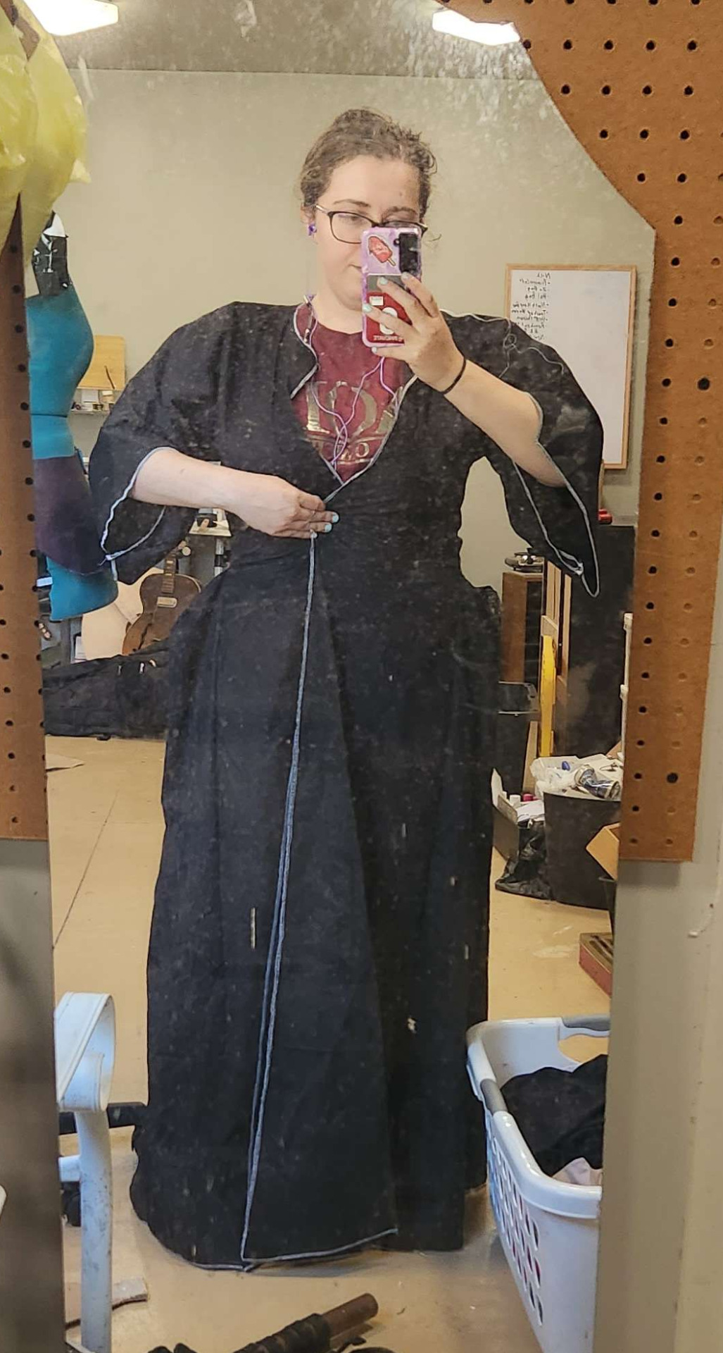
We know that prominent hip bumps were part of the fashion just judging from the art and extant garments (including one amusing extant of Hanzade Sultan's zibins with an attached note deriding the poor quality of the hip bumps) but after repeating the pattern onto my outer fabric, they started bothering me. I was pretty sure I had them sitting too low, or some part of the slope wasn't quite right.
Protectorate was fast approaching, and I had little time to make major adjustments and fiddle with a lot of trial and error. I made some quick adjustments, smoothing the slope of the hip bums into more of a 15 degree angle than the 45ish degree angle they were sitting at prior. Around the same time i started fretting about the hip bumps, I realized my box o' saris was AWOL and began to panic. After fruitless hours scouring the house and workshop, no luck. For my own mental health, I put the project aside to handle AFTER Protectorate, but before Coronation. I had a promise to keep, after all.
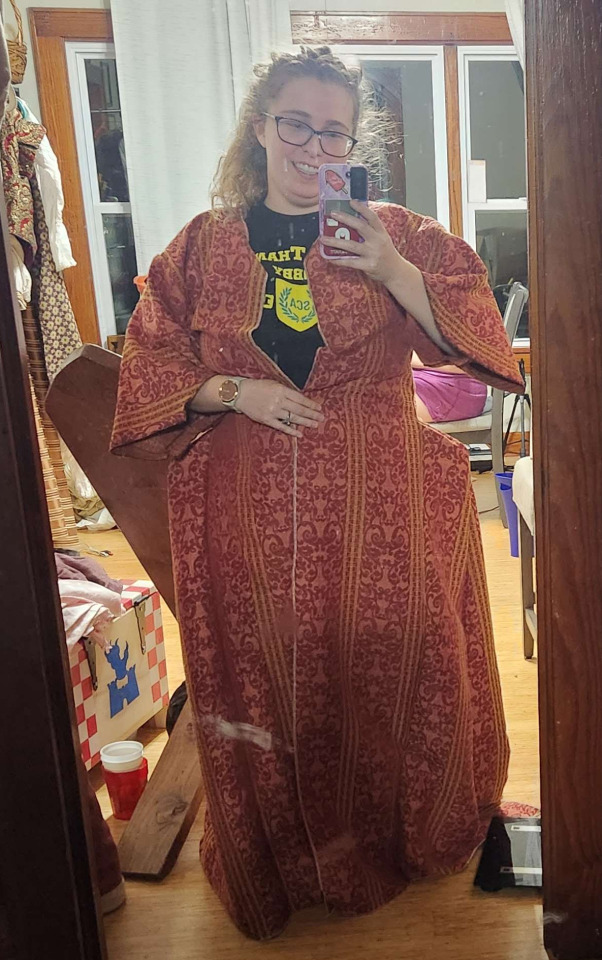
I returned home from Namron Protectorate and got to work. With my silks still missing, I selected a soft but bright blue polycotton with a nice sheen from stash and made my bias facing.
It wasn't perfect, but time was short and the fabric was bright. You can also see from this photo the adjustments I made to the hip bump. I left the original shape intact, just folded and gently tacked down inside the body so I have the chance to fix it in the future, when I feel more able and comfortable. And so, the handsewing of the Entari began with Coronation just days away. I finished tacking in the lining, which is only attached to the outer shell by the facing, fun fact, and did a quick try on to make sure it all sat the way I wanted. I was very satisfied with the result. In the future, though, I would probably face the sleeves BEFORE I seam down the underside, because that was the only part of the facing truly miserable to line up and attach.
Then came the last minute fastenings. I'd wanted to weave some trim to make proper button / loop pairs down the front, but didn't have the time. Suggestions from my locals mostly relied on me having not yet put the body, facing, and lining together. I made do, dug through my ribbon supply, and grabbed some shiny polysatin 3/8" ribbon I usually use for making ribbon roses. I cut them into 9" lengths, folded in half, lined up with the yellow vertical stripe down the front, tucked the ends under, and tacked them down securely. For the buttons, I used some Vindheim buttons from Bad Baroness. For a last minute closure I literally finished 2 hours before driving down to coronation, not bad if I do say so myself.
On the day of, I added a long, sleeveless undercoat that for sanity's sake, we'll call a zibin. I need to make one of those rather soon, don't I? I received the coat second hand at Mooneschadowe Trade Days in exchange for a monmouth cap, with the encouragement of Viscountess Mama Cat. I wore a small embroidered hot pink hat over a pink-and-rust silk and pashmina scarf that my lovely wife got for me at Pennsic as a gift, with a veil pinned over the top. The veil is actually one of my spare white scarves, my big "floofy" one that gives my siblings in the order scarf envy. I ordered it from the same place I got my green apprentice belt sash, my wife gets cadet scarves, and both of us get a variety of veils. Mama cat helped me make sure everything sat right on the outfit and helped me get the veil just right. The peacock feather pin is from Sonja III's Queen's Champion tournament, the favor she gave to all the competing fighters. I am wearing the handwoven silk scarf I was made in, a twin to my Doña's and her Queen's white scarves, and it has a subtle Ansteorran Star woven into one end. The pin (hidden because the wind was fighting me while we watched the eclipse) is purple and gold (my heraldic colors), a twin to the silver and deep blue pin the Ansteorran Cadets got for HRH's Nicolette's gift, which she used to pin her Queen's White Scarf in place upon her ascension to the throne.
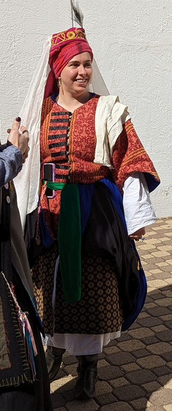
What feels most important to me, though, is this picture. The Order of the White Scarf is charged with protecting the Queen's White Scarf in the interregnum, with the newest white scarf present protecting it personally and the oldest white scarf present taking it from the arm of the Queen stepping down and putting it upon the arm of our new Queen. We pass it through the circle, some of us pressing it to our forehead or hearts, some of us giving it a good squeeze, some of us kissing it. To myself and much of the rapier community of Ansteorra, this is more than a scrap of fabric on a brass hat's arm. This is the memory of what Don Tivar and Countess Tessa of the Gardens did for us so long ago, legitimizing our community and uplifting us. This is the memory of brothers, sisters, and friends come and gone, of Queens who, for a moment or a lifetime, became one of us, became the head of our order. This is the hope of every cadet who dreams of bleaching their scarf, of every fencer who imagines themselves in the shoes of Errol Flynn or Cyrano. A good Queen inspires us to do better, do more, and reach further, and a great Queen makes our Order stronger with just her presence.
None can compare with bright honor rare
We go as the swift arrow flies
To stand in the strife, to hazard our lives
For a glance from Your Majesty’s eyes
There are certainly adjustments I would make if I were to do this again, notbly find my box o' saris and use a silk facing, among others. I would like to make some non-supportive gomleks in a much lighter fabric and some supportive zibins as well. I would prefer in the future to attach the facing BEFORE i sew down the underside of the sleeve so i feel SLIGHTLY less murderous while sewing. And because of how I roll, in the future I would definitely add a pocket or twelve. I intend to replace the ribbon button loops with some woven trim loops, or at the very least add some matching ribbon bars to the button side for a little more visual balance.
This project would not have been possible without the support of Baroness Dominique Michelle le Vasseur and Viscountess Caterina Giovanni, and the inspiration of the lovely and kind Countess Jacquette d'Anjou, whose conversations and costuming at Gulf XXXI finally kicked me into high gear on this.
#sca#arts & sciences#a&s#society for creative anachronism#historical costuming#ottoman clothing#turkish clothing#entari#zibin#gomlek#tarpus#salwar#sca garb#sca costuming
16 notes
·
View notes
Text
Monmouth caps and awesome hats
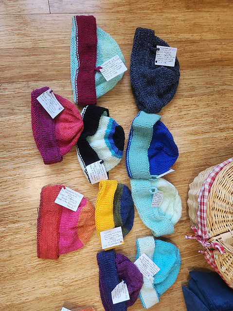
Those of you who know me in person or on facebook may know that last year, Mistress Elsa got me into the deep dark black hole wonderful world of knitting monmouth caps! I started this as a way to fidget when nervous and burn up some scrap yarn, but this has definitely spiralled out of control with 112 hats made and two (in different sizes) sitting on the needles. I've made a variety of colors, sizes, and patterns, including developing a pattern for the Ansteorran and Vindheim stars on the crown of the hat. I've found this ongoing project rewarding, especially since I started giving the completed hats to my baroness to distribute at her own leisure. There's something pretty magical about seeing your creations in the wild. I do not see this project ending anytime soon.
I have a small number of garb projects in time out for their sins and crimes (mostly, not working exactly the way i want them to right then and there). Foremost of these are my lined Rus Coat and the Neapolitan dress. The neapolitan dress is an experiment in creating a kirtle entirely from scraps of other projects, and the gores just happen to look an awful lot like neapolitan ice cream. the rus coat is in time out as the liner, mill ends of the fleecy liner carhartt uses in jackets, is not cooperating with the outside shell and i got frustrated by fitting issues. this will be picked up again when i feel more confident and less stressed about being warm.
My current ongoing project is creating an ottoman outfit from the ground up. I made a supportive gomlek which fits well and stress tested it at Pennsic. My next step is a zibin or entari, and I think i have just the right fabric picked out for each. I get excited about starting new periods bc I want all the pretty headwear, but have to restrict myself to only starting a new period when I've finished 1 full outfit for the one I was last working on. My pink and orange rus was finished in time for vindheim's 4th coronet tournament, so on to turkish!
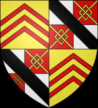
the final project on my immediate docket is a new cotehardie and surcote to wear for the medieval fair of norman. For mental health and physical health reasons, I will be putting the fictional character of Margery Arkewright, greatest shepherdess in Avalon, on the shelf for a couple of years and will in the meantime join a court. I'm currently looking at Elizabeth de Burghersh, Baroness Despencer and as a result, need to make fancier garb. I've got the polysatin shell from some old blackout curtains I intend to line with a light linen and make my cotehardie, and some lovely bronze and black curtain material i'd like to make a surcote from. If I'm a little short on either material, I'm planning on doing a simple particolor between the two. Since we're trying to make more of a push for heraldic wear among the court of Edward III and his family, I looked into what arms might have been associated with her. She married into the Despencer family, whose arms are...something, alright

luckily, from what I can tell it looks like she inherited the barony of berghersh in her own right, and the associated arms are something I can work with
If everything works out, I'm considering a strip of red silk around the cuffs of the cotehardie with the lion embroidered at the wrist? If i have enough pretty red fabric (i may have a cheap velvet somewhere...) I may put a strip of velvet at the bottom of the surcote with the lions repeated around the hem. Just gotta fancy it up a little, ya know?
All that being said, that's my current WIPs, plans, and updates. I need to make some more garb for some locals so they're not fighting in denim and so they have more outfits to wear to different events.
4 notes
·
View notes
Text
WIP: Sion Relic-Purse V - revenge of the birds
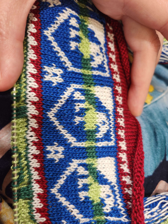
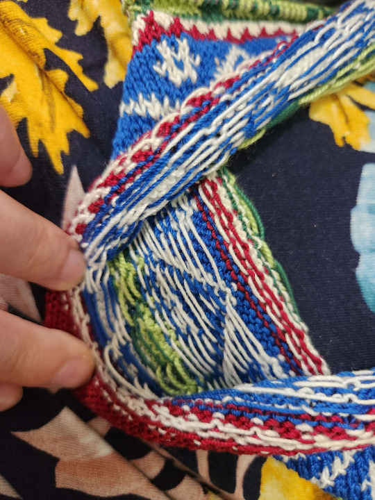
Apparently it's time for me to start another incredibly punishing knitting project and break out the crochet thread. I picked Sion V, as I haven't done this pattern yet and the birdies are DARLING. The extant is supposed to be frankly garishly colored, beige and blue birdies alternated with red and green birdies, and purple and white interstitial bands.
“Each band is composed of identical shields, with a small star at the bottom of the space between each two shields. The bands of shields are staggered by a lateral half-drop; each carries a bird. The bands alternate: one band of beige with the shields outlined and decorated in blue, one band of red with shields in green; all bands counter-changed with stripes across the middle of the shields in which the colors are reversed. The bands of shields are separated by a narrow saw-tooth design in violet and white.”
-Richard Rutt, on Sion V
I chose to change some of the colors for the preferences of the modern-day recipient while still maintaining the spirit of the wildly colored original. I swapped the beige for more white, the red for a different shade of green, and the violet for a lovely maroon. I did all this color swapping and planning in GIMP 2.8, comparing an approximation of the extant's coloration and different combinations of the colors I'd like to use. All in all I'm delighted with the way the colors are coming out.
Considering this is my third sion bag and it's been more than 3 years since my first, I'm not surprised that my tension is a lot more consistent and resulting in a lovely texture on the front of the design. I've only bothered tacking down floats on stretches of 9 or more, which only occur at 2 points in the pattern. I'd love to see a picture of the inside of the extant, to know if the artisan tacked ANY floats down, or relied on their own consistency of stitching. Is the bag lined? I have so many questions and have struggled finding answers.
I originally cast on August 15, 2023, on 2.00mm needles and 10 crochet thread. My original plan was with 18 repeats, as the extant seems to have that many. However, 18 repeats of an 18 stitch large pattern resulted in 324 stitches, a number that I struggled to keep on the needles and seemed overall unwieldy after knitting 15 rows. I then tried 15 repeats (270), which was similarly unwieldy. I settled on 12 repeats at 216 stitches (or 54 on each needle), having knit and ripped out more than 2000 stitches in the search for the Right Count.
Somewhere along the way, I seem to have knit two stitches together between the bottom of the first stripe of blue shields and the top of the first stripe of green shields. After much searching, no culprit showed, so I've included a sneaky m1L near the BOR jog. Fixing dumb mistakes is period, look at the Pourpoint of Charles de Blois.
I also finally made a needle cozy for my 8 inch us0s, since they dont fit in the cozy i use for my 6 inch sock needles. No more stitches slipping and dropping!!!
You may notice my birdies face the opposite direction of those on the shields. I encourage you not to notice this fact. One thing this project has proven to me is that even when I think i understand the geometry involved in a knitting project, I am bound to make mistakes.
When I finish this, I think I'd like to submit it for competition unlined to show off the floats, then I'd like to line it before giving it to the recipient for use. I don't want anybody worried about messing up the bag by using it.
#sca#arts & sciences#a&s#society for creative anachronism#historical knitting#knitting#colorwork knitting#wip#thank you for tolerating my rambly WIP post
21 notes
·
View notes
Text
to do
As this blog is under construction, there's a short list of things i'd like to post about / make record of, if for nothing else so i can remember what i've already done.
Post the papers i've submitted
document the outfits i've completed, including my notes on what to adjust. I'd like to know what I HAVE made, as well as notes I've jotted down in obscure places to make it easier next time
a short list of current projects
a list of my current planned projects, notes, dates, all that jazz
start blogging about progress on projects!
0 notes
Text
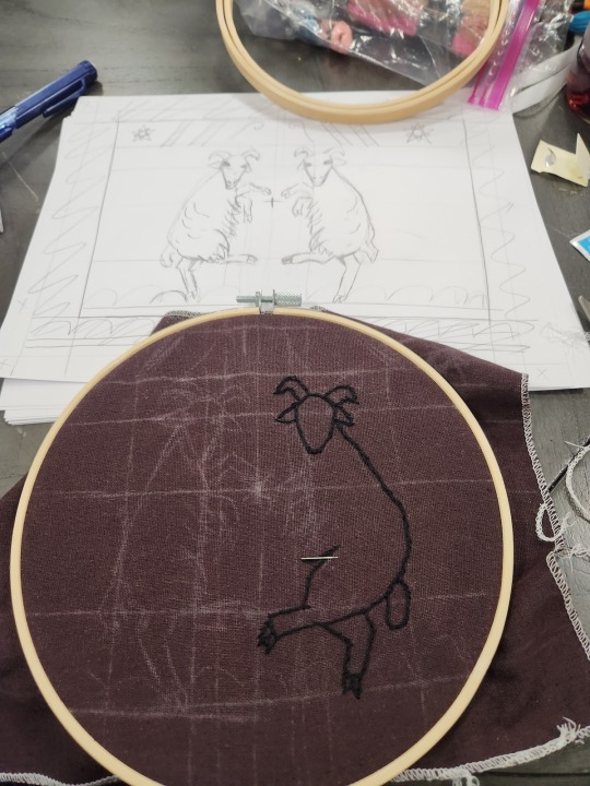
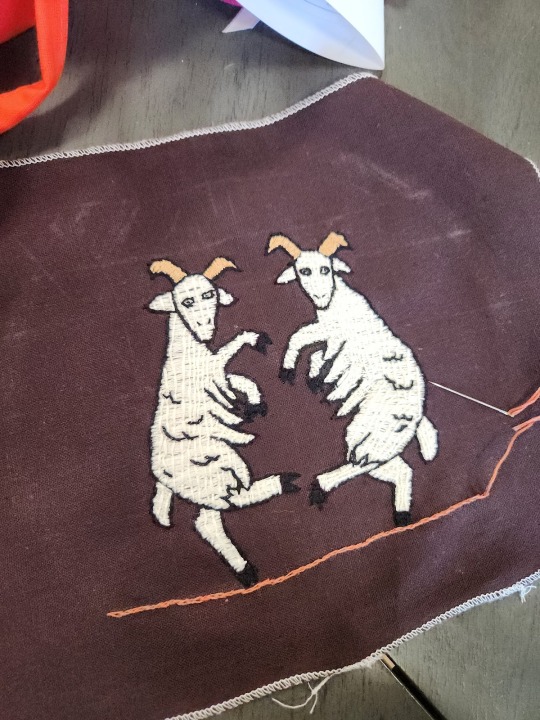
The Malevolent Sheep
Embroidered Livestock Who Hate Everyone, But Me Most of All For Bringing Them Into This World
By Doña Ashildr inn Harfagri, 2023
Presented at Castellan
Purpose
The purpose of this paper is not to document a perfect and period reproduction, but to document my thought process and learning process as I attempt to add to an impression of a 14th century English peasant designed for the casual eye.
I play an English shepherdess in 1360 in the fictional town of Avalon for the Medieval Fair of Norman. Due to the timing of this event, weather can be unpredictable, and occasionally very cold and wet. I am in possession of a wool hood from Hobbitronics featuring the crossed trumpets badge of heralds. While this is a delightful hood and definitely one of my warmest pieces, the costuming director and myself have determined the crossed trumpets are not appropriate for the character of Margery Arkewright and more importantly, do not add to the air of perceived authenticity for the visiting patrons. An important note is that certain concessions of historicity are made in order to create a more coherent and easily understandable experience for the patrons of the fair. For example, we restrict all uses of true (not rusty) red to the King and his immediate family to add visual cohesion and allow patrons to more easily identify King Edward III, Queen Philippa, their children, and their children’s spouses.
With that in mind, I began to research decorative motifs and patterns appropriate to the time. Two documents referenced early on were The Luttrell Psalter (approx 1320-1340) and the
Belleville Breviary, a prayer book owned by Captain Jeanne de Clisson, Lioness of Brittany. The latter was particularly intriguing as an inspiration, as the Captain is portrayed as a cast member though she had died in 1359. However, both of these resources are ink on parchment, rather than decoration on fabric. Lady Asa in Blindi pointed out that though aesthetics may be similar, motifs likely differ.
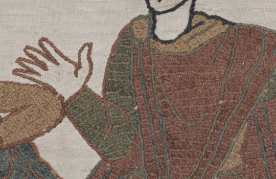
Thus, the Bayeux Tapestry was chosen for inspiration. Though the date of the Tapestry’s completion is murky with the earliest written reference to it dating to a 1476 inventory of the Bayeux Cathedral, it was likely completed in the 11th century, three centuries prior to the date of the Norman Medieval Fair. However, the popularity of the Bayeux Tapestry in online meme culture with an apparent peak around 2018 (Know Your Meme) in conjunction with the popularity of “bardcore” remixes of popular modern songs starting around 2020 with album art featuring images from the Bayeux Tapestry is hoped to have made the imagery of the tapestry more familiar to the average person. For this reason, even though the tapestry predates the target period by approximately three centuries, the design was based on that of the tapestry.
The sheep were designed to mimic the style of animals portrayed in the Bayeux Tapestry and other contemporary pieces, particularly with the near-heraldic postures in what should otherwise be normal scenes.
Below the sheep is a straight line and added grass hillocks inspired by Scene 51, as seen below. Above the sheep is another decorative strip, with a straight line in the same color again, above which there are two pairs of diagonal bars leaning towards each other as seen in Scene 35 (also below) of the tapestry. On either side of these diagonal bars are the 10 point mullets of Ansteorra and between them are two bendwise, stylized shepherds crooks leaning towards each other. Though there is no evidence in the tapestry of either mullets of 5 lesser and 5 greater points or shepherds crooks, they were selected for recognizability and for keeping in theme. Margery Arkewright is recognizable as “The Sheep Lady” of the Fair, so the shepherds crooks were chosen.


The sheep have been lovingly nicknamed “Bonald the Devourer” (left) and “John Wick” (right) through the course of the design.
Materials
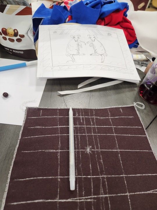
Approx 11”x9” dark brown linen, pre washed
J&P Coats cotton embroidery floss, various colors
Chalk Pencil
Concessions of authenticity in materials are made due to supply availability and cost restrictions. I frankly do not have the money to make and dye embroidery floss, yarn, or linen fabric for an experimental piece I expect to see a lot of wear. The actual Bayeux Tapestry is embroidered onto a base fabric of a tabby-woven linen that appears to be undyed, and is embroidered with wool yarn dyed in various colors. In my Bayeux Tapestry themed patch for this hood, I used a commercially dyed brown linen in a tabby weave, and performed the embroidery with embroidery floss also in various commercially dyed colors.
Methods
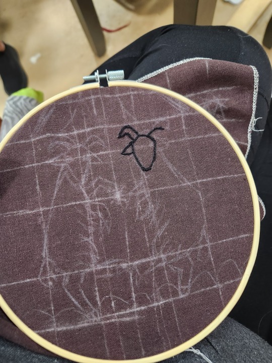
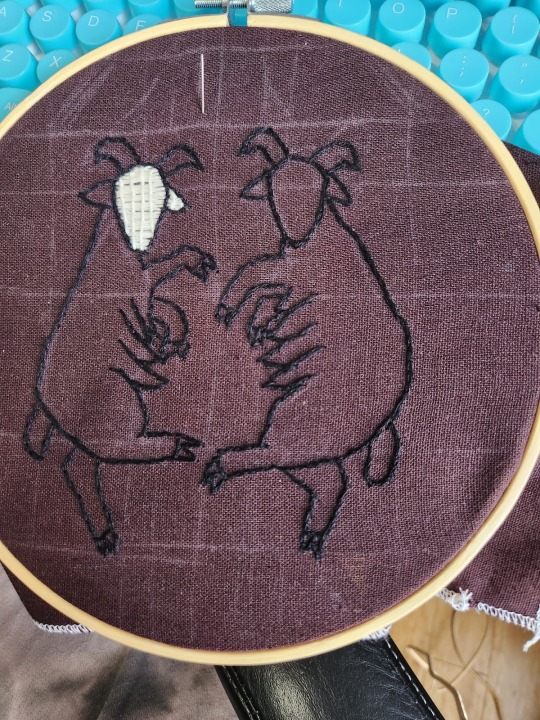
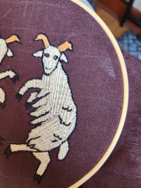
First the design was sketched out on scratch paper. The fabric then selected was a scrap of dark brown linen. This was chosen because in part earth tones read to the casual audience as “medieval,” “rustic,” and “peasant,” and because in the target decade green and brown were taking off as the most fashionable colors a person could wear. Rather than using modern pattern transfer methods, the design was transferred to the fabric by gridding, using a piece of string as the straight edge and measure. The sheep are outlined in stem stitch as are most of the figures in the tapestry, though they are embroidered in black for visibility on the dark brown fabric.
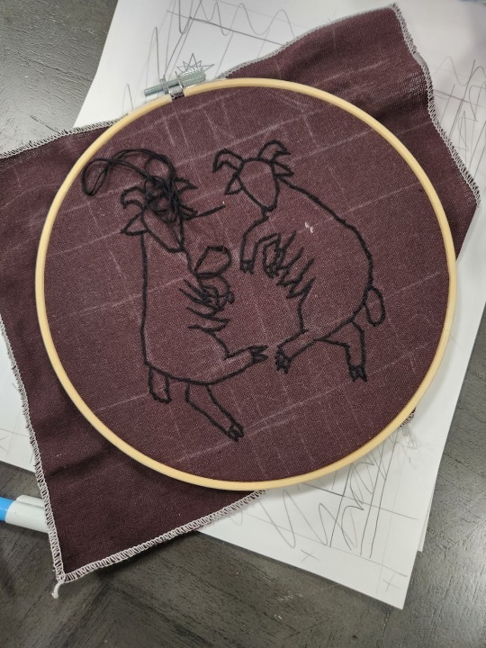
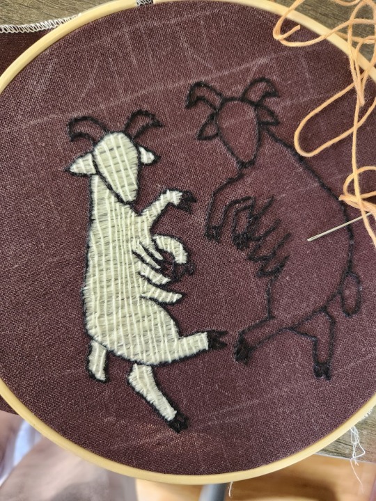
Then the laid stitch found throughout the tapestry was first tested on the head of Bonald (left sheep) before being applied to the rest of the body. The laid stitch consists of first setting down satin stitch across an area, then applying slightly more spaced out stitches covering the full length of the area perpendicular to the satin stitches, which are then tacked down as seen below. After first application, I compared again to the laid work of the tapestry and added several more columns to better reflect the density seen in the Bayeux Tapestry. The same direction was maintained for the satin stitch across almost the entire body of this sheep aside from the tail, belly tufts, and ears. On the next sheep I experimented with a little more directionality and texture which is also found in the tapestry, which prevented me from having to make a single satin stitch cover quite as much area. Upon trying both methods, I can see the appeal of the variety of directions reducing the overall length of any one satin stitch, which can become unwieldy and tangle or pull the piece taut.
On the horns of each sheep, I experimented using surface couching, which was used in the 14th century. I chose to do this because at first pass, surface couching and laid work appear very similar, and at least to have similar results. At this time, I had finished the first sheep and not started the body on the second, so I was dissatisfied with the density of stitches in the white body of the sheep and was investigating new ways to increase my coverage. Upon finishing the horns, I determined that surface couching produces a very different overall effect to laid work, with denser stitches, but a much less economical use of thread.
After the horns and bodies were done, I added detail to the sheep in stem stitch to better define the fluffy wool. The folds in the fabric on several figures in the tapestry were done in what appears to be stem stitch and act as break points in many cases for the direction of the laid work. Due to the clarity of the folds and details, I had assumed they were applied after the fill color, but after having finished my piece I believe the internal details were applied prior to the fill color.
Following the completion of the sheep, I began embroidering the borders of the top section, the bottom line, and the borders of the diagonals in a soft orange color that reminded me of madder-dyed wool. This also seemed a close match to the color used on said borders in various sections of the tapestry. It was when I started working on the diagonals that I realized I was not, in fact, sewing a stem stitch as I’d thought, but sewing a split stitch. This realization explained several discrepancies I’d noticed in the visual texture of my linework and the linework in the tapestry. The diagonals are sewn in a stem stitch.
The next stage I sewed was the Ansteorran stars, with much wailing and gnashing of teeth. As my chalk lines kept rubbing off before I could get to the stars, I free handed the stars themselves. The first attempt to outline then fill the star like the sheep went sideways as the star did not come out with 5 even points. I eventually settled on sewing the 5 greater points with laid work and the 5 lesser points with satin stitch.
What would I change?
If I were to do this again, I would seek out a more densely woven linen and use either wool yarn as was used in the tapestry itself or the full 6 strands of my embroidery floss for visual density. I believe the fullness and volume of wool yarn will better mimic the appearance of the period piece. I would add more internal detail to break up the longer sections of satin stitch, and I would lay down the detail before adding the fill color. This seems to be the method used in the tapestry, shown in the detail from Scene 51 below.

In the transition from the neck to the spaces of the neck between sections of mane, and in the crook of the horse’s shoulder, the direction and angles of the laid work change. This seems to indicate that the internal detail (horse’s shoulder) was applied before the fill color, and that the particular direction of the laid work can be broken up to better fill a space.
Overall, I believe this project was a success. The goal was not perfect periodicity or reproduction, but to better make a useful piece of garb fit the ambiance designed for the casual (non-medievalist) patron. The patch covers the obtrusively modern machine embroidery and in doing so, helps create the Magic and the Dream for those visiting the Medieval Fair of Norman. I learned a new stitch that I have gone on to use in other hand embroidery projects for the security and economy of materials. I made several mistakes that gave me a better firsthand understanding of this historical piece and have improved and expanded my embroidery skills.
Navigate Bayeux Tapestry scene by scene https://www.bayeuxmuseum.com/en/the-bayeux-tapestry/discover-the-bayeux-tapestry/explore-online/
Bayeux Tapestry Meme Generator https://htck.github.io/bayeux/#!/
Bardcore https://en.wikipedia.org/wiki/Bardcore
Hobbitronics Hood Listing - https://www.hobbitronics.com/hoods.html
Referenced https://cottesimple.com/articles/medieval-embroidery-on-clothing/ for stitching methods
History of Medieval Tapestry Memes https://knowyourmeme.com/memes/medieval-tapestry-edits
Appendix
36 notes
·
View notes
Text
Sion Reliquary Bag

Lady Áshildr inn Hárfagri
November 6, 2021
presented at axeman xvi
Summary
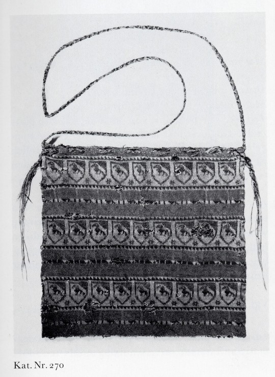
Knitting is an old form of textile production, with extant knitted artifacts dated to the 11th century. Our earliest examples of knitting are intricate, well-made pieces made with a mastery indicating a much earlier date of origin. The earliest knit pieces found in Europe are dated to the 13th century in Spain and Estonia. Five knitted purses were found in Sion, Switzerland dated to the 14th century. Knit in silk thread, in the round, and with a "fair isle" type multicolor patterning, these purses have been reproduced and studied by many artisans of the SCA. In this reproduction, I knitted a bag based on Sion relic-purse I, substituting mercerized cotton crochet thread at a larger gauge and to different dimensions to achieve a specific purpose.
Introduction
I have wanted to participate in Arts & Sciences for some time, but could not bring myself to put in the effort necessary for a project just for me. So in true Legion of Swashbucklers fashion, I determined the ultimate means to drum up the effort for a documentable A&S project would be a gift for the Queen of Ansteorra, Her Royal Majesty Elizabeth I, using my experience with knitting.
Knitting as we know it originated sometime before the 11th century, with our earliest artifacts being knitted short row heel socks from Egypt (Tissus d'Égypte). The earliest known knitted artifacts outside Egypt were knitted cushion covers and gloves belonging to Prince Fernando de la Cerda, some time before 1275CE (Rutt).
Five knitted purses were found in Sion, Switzerland dated to the 14th century, first described by Brigitta Schmedding (Schmedding). These bags are knitted from the top down from silk thread, closed with a three-needle bind off, and used two to three colors at a time to make a pattern. Each bag seems to be closed with a fingerloop braid and have a fingerloop braid strap.
I made this bag once before for HE Sara Asshton of York in the 2020 Sable Swap (pictured in Appendix A) and used lessons learned from that project to improve my approach to this project.
Method / Design
For the construction of this bag, I used Aunt Lydia's Classic 10 Crochet Thread in Dark Royal, Golden Yellow, White, and Black on Hiya Hiya US0 2mm double pointed needles.
I used double pointed needles as they are depicted in early "knitting Madonna" paintings such as Master Bertram of Minden's Visit of the Angel, dated to the 15th c and shown below.
Most "knitting Madonna" paintings seem to depict a 3-and-1 arrangement of double pointed needles, with the stitches spread evenly across three needles with one working needle, but I opted to use a 4-and-1 arrangement to better divide my stitches across much shorter, modern needles.
I used mercerized crochet cotton in place of silk for cost and durability concerns. As this bag is to be a gift for HRM Elizabeth, I want it to be a bag she can use and clean without fear of damaging delicate silk or expensive fibers. From prior experience knitting with both cotton and with silk, my joints and fingers suffered far worse with the silk than with the cotton. Because the readily available cotton (Classic 10) is a greater weight than the original silk, I used larger needles and produced a larger gauge than the original item. My gauge worked out to be 5 stitches/cm and 5 rows/cm as opposed to the 7 rows/cm and 5-6 stitches/cm according to Schmedding (using Knytir's translation). T
I cast on the project on August 9 with 14 repeats of the 12 stitch pattern, preferring the Sion I Chart interpretation in DesMoines's pattern to the chart in Lady Tola Knityr's interpretation. Progress pictures found in appendix B. The bag is only made long enough to hold a large phone, and as such does not have the number of rows or requisite tassels that the reliquary bag has.
There is a noticeable difference in gauge from the bottom to the top of the bag. The original is consistent throughout and bound off with a 3 needle bind off. Midway through production I found my gauge with 3-strand colorwork improving, which unfortunately changed the overall gauge. I chose to reverse the construction of the bag such that the firmest, most accurate gauge is at the top of the bag which will receive the most stress from the ties. The loose gauge at the beginning of the project is the result of knowing how an uneven but too-tight gauge makes colorwork "pucker" in an unsightly fashion, and that floats too loose but unseen on the back side of the product are typically more tolerable than too-tight floats with puckering.
Ends are left untrimmed inside the bag to allow repair options, as the cotton is slippery and I do not trust its ability to stick to itself should I simply weave in the ends and trim. If this bag begins to unravel, I wish to fix it.
The fingerloop braid closure is left off pending the presentation of the gift to the recipient, as it affects the fabric and if she has no interest in the drawstring closure there seems no point in needlessly altering the fabric itself.
Conclusion
If I ever try to knit 3 strand color work again, throw this paper at me.
Bibliography
DesMoines, Anne. Reliquary Style Pouches.
(downlaoded May 2020)
Knytir, Tola. Sion Knitted Purse.
(accessed November 1, 2021). Found in part here
20-knit-purses-in-14thc-switzerland/
Rutt, Richard. A History of Handknitting. Interweave, 1987.
Schmedding, Brigitta. Mittelalterliche Textilien in Kirchen Und KloÌstern Der
Schweiz: Katalog. Bern: StaÌmpfli, 1978
Tissus d'Égypte: témoins du monde arabe, VIIIe. - XVe. siècles. Collection
Bouvier, Exposition 1993-1994, Musée d'art et d'histoire à Genève. 1994,
Institut du monde arabe à Paris.
APPENDIX A
APPENDIX B

August 10, 2021


October 15, 2021


October 20, 2021


October 28, 2021
Blocking the Final Product October 28, 2021
Thank you for reading this kthxbai
#sca#society for creative anachronism#arts & sciences#knitting#historical knitting#sion reliquary bag#colorwork knitting#fair isle#knitting in the round#a&s#submitted A&S entry#A&S paper
3 notes
·
View notes
Text
Statement of Purpose
At time of writing (august 2023), the purpose of this blog is to share and document my A&S journey with others interested in the arts and sciences.
1 note
·
View note