
llyr-nicolas
Keith Taylor
a place for all my personal and class work
28 posts
Don't wanna be here? Send us removal request.
Last Seen Blogs
charitybell
Innocence Juiced Box
amberann
🖤

iwanttobepaperthin
Waiting to be weightless
loi-jieun
Loisims
Text
Ad Campaign WIP - Body Text
I will consider all the necessary information to include in my promotional work and get a clear idea of what I'm working with when creating art for my brand and how it can all be best expressed either textually or pictorially. Though visuals and presentation hold more importance in board game advertisements, I will try to incorporate a slogan alongside the game title. With this direction, I can hopefully successfully express the type of board game I'm creating and what it's about through visual storytelling and a memorable slogan reflecting my brand image.
4 notes
·
View notes
Photo


Ad Campaign WIP - Poster
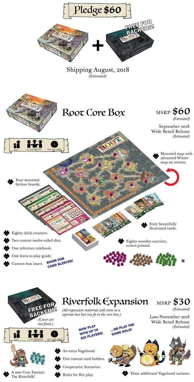
For board games, advertising is done a bit differently. The advertisement is the box. Board games tend to be a word of mouth thing, and not much money is put into advertising because it could be better spent developing the game. If the game has better development, it will have a better chance of being reviewed in articles or social media. For most board games, a campaign page on Kickstarter is essentially its advertisement. As I've learned in the community, if you like board games, usually you have to go out and seek the information yourself to stay in the loop of what's new and popular.
I've picked two examples of board game Kickstarters to show, as they give a clear structure of what should be developed before/when making a successful Kickstarter campaign. Though I don't have a list of testimonials or help from publishers' to show on the page, I do have the means to work on the other elements needed to make the Kickstarter campaign.
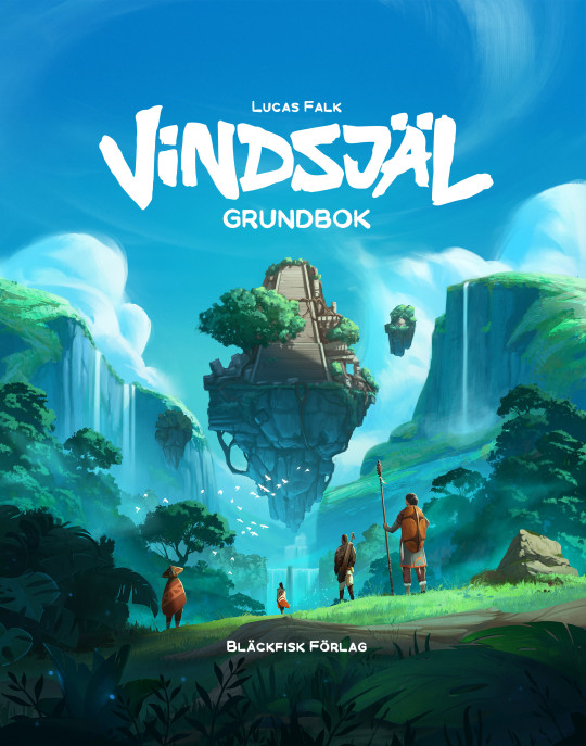
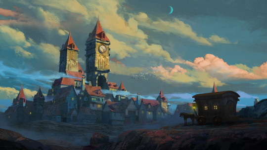
For the project, since it revolves around an ad campaign poster, I was thinking of creating promotional art to create intrigue around the lore/worldbuilding I put into my game when developing it. As inspiration for promotional art, I included some official art from a tabletop role-playing game and a map from an RPG game.

I was also thinking of creating a mock up of the board game box, card decks, and other small mechanics within my game to include more information on a Kickstarter page.
Sources:
Francesca Baerald
Samuel Inkiläinen
0 notes
Photo


For my sketches, I experimented with different border designs around my title logo. I mixed certain decorative elements of the 10 fonts I chose and incorporated them in the typeface for "Innsbury." Since Innsbury is the name of the fictional town in the board game, I took inspiration from antique shop signs, and it would give the title a more old-timey historic look.
Above the borders, I'm still somewhat unsure about the final font choice for "Calamity at," but I've settled on this current typeface design so far. I played around with the size and baseline spacing. Calamity, being an event causing great and often sudden damage or distress, I tried to go for a more chaotic look by adjusting the baseline in the second picture. Though I feel the smaller size works better and makes the town's name stand out more.
Before I work on the final touches, I want to add decorative symbols along the sign borders to see what would work or if it would be too busy. When I start working in Adobe Illustrator, I want to add some texture within the sign borders and make the town's name look like it was engraved into the wood.
0 notes
Photo


These are the images I chose that I feel best capture the mood of my brand.
Sources:
- Darkest Dungeons
- Roman Kuteynikov on Artstation
- Roman Kuteynikov on Artstation
- Stuart NG on Artstation
- Jedd Chevrier on Artstation
0 notes
Photo
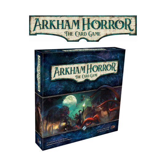

Since I am focusing more on doing a brand design for a board game rather than a company/organization, I chose 5 different games that have been a source of inspiration for me for what I want to achieve with this project.
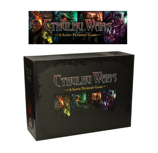
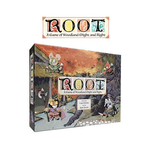
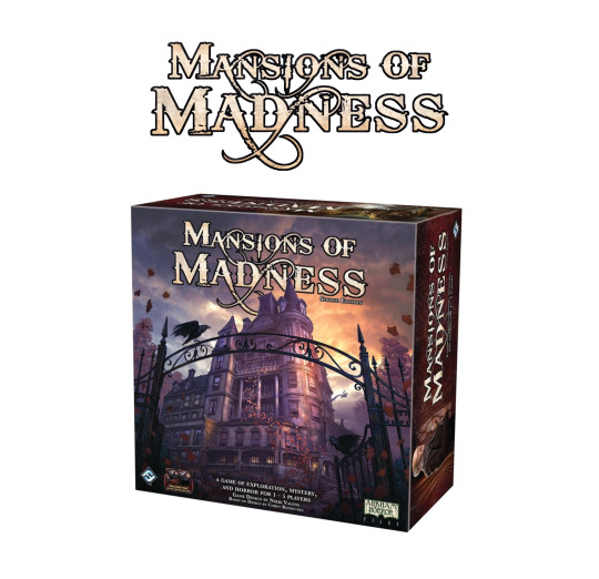
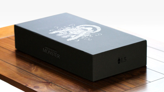
Petersen Games created Cthulhu Wars and other roleplaying games to provide quality products with a depth of gameplay for the hobby community inspired by H.P. Lovecraft stories. The creators of Root, Leder Games, also have a similar mission: to make games that are exciting to play that artistic and socially conscious. Fantasy Flight Games, the creators of Arkham Horror and Mansion of Madness, have earned themselves a reputation for innovative and immersive gameplay and top-quality components. Lastly, the game Kingdom Death was developed by Adam Poots to create a better gameplay system within the rules of roleplaying games. The goal each of these developers had has shown in the careful creation of these 5 games.
I am looking to create something similar to these games, a historic fiction board game influenced by monsters and horror. These games have designs and aesthetics similar to my idea or have elements in their core gameplay that inspired how I plan to structure my board game. Root was a big inspiration for the specific gameplay and structure I chose to pursue, as it is a very strong example of how to properly execute a design where four players with different goals and abilities fight for control of an area.
0 notes
Photo

These are 10 fonts I chose from the site DaFont. All of them are listed below. For my project, I plan to create brand designs for a board game idea I started outside of Design class.
Calamity at Innsbury is a historical fiction board game centred around a town in the English countryside that begins to attract ghouls and monsters alike, aiming to exploit the town's citizens for their own devious ends. The name came from both researching a list of English towns and as a nod to Lovecraftian horror. Since a large portion of English towns end with the word "-bury," I combined that with "Innsmouth," a fictional town from one of H.P. Lovecraft's novels. I wanted a descriptive title of what will happen and what the game is all about. I chose "calamity," a sudden disaster or destruction, as I found the word has a distinct feeling of boldness and urgency that captures the essence of the game's story.
These fonts each have elements that I want to attempt to work together to create an original font for my board game title.
Some of the fonts have a more Gothic typeface that I wanted to incorporate in my brand design as it gives a more historic look that fits with my idea. The other fonts I included are bolder and have an eccentric display reminiscent of classical horror fonts seen on movie posters. For example, the ends of letters on the Dark Tales font look almost like they're scratched off, giving it a rougher but bold look, which I think fits in with the board game's monster and horror elements.
Fonts in order:
Blackwood castle
Bleeding freaks
Captain redemption
Carta magna
Dark tales
Deutsch gothic
Dusk demon
Gotharctica
Jmh beda
Kelmscott
0 notes
Quote
[...] above the noise of the water the sound of his song and the sweet thrilling of the harp were echoed in the stone and multiplied,and went forth and rang in the night-clad hills, until all the empty land was filled with music beneath the stars.
Tolkien, J.R.R.. "Of Tuor and His Coming to Gondolin." Unfinished Tales of Númenor and Middle-earth. Edited by Christopher Tolkien. Allen & Unwin, 1980.
0 notes
Quote
Truly, Water is become now fairer than my heart imagined, neither had my secret thought conceived the snowflake, nor in all my music was contained the falling of the rain.
Tolkien, J.R.R.. The Silmarilion. London, George Allen & Unwin, 1977. Page 20.
0 notes
Text
Font Sculpture
When evaluating the direction I wanted to take with my designs, I first considered the immediate impression each of the letters had on me and used that as a starting point.
The right angle in the capital L gave me very harsh and aggressive feelings and reminded me of the wiring’s sharp turns on a circuit board. I chose to create this design in black and white because I felt that the stark contrast between colours would help communicate my original idea. My design started purely two-dimensional, but I decided to use the lines to create a cube in perspective as I worked on it. So I used a series of concentric squares made by the Ls to create a vanishing point within the cube, giving the impression that it has an infinite interior. My process involved mainly using the selection tool and manipulating the letter’s shape by adjusting the anchor points and scale. I didn’t want the composition to become overly complicated and used the repetition of simple shapes to make it look balanced and symmetrical. While the final product is entirely different from my work in progress, I think it still communicates my initial idea of a complex and inscrutable object with harsh angles.
The letter S’s flowing curve immediately conjures ideas of flowing water, which was an obvious inspiration. After seeing that a classmate shared my original concept of water flowing into a pit, I decided to create a design in the form of a swelling wave. The curves of each S was warped to create the shape of the wave and its wake. For this design, I spent a lot of time using the puppet warp tool, simplifying forms that needed smoothing, and the mesh tool with envelope distort. Playing with the S’s shape and scale, I used repeating patterns among the wave curves so the form wouldn’t become overbearing and would appear more unified.
Contemplating the letter O immediately draws up images of outer space and the moon. I decided to create this design in black and white to capture the moon’s defiant light and stars against an otherwise pitch-black sky. I started with a large and thin letter O to create the night sky’s edge, with a smaller thin O in the centre whose blank space represents the moon. I filled the space between these two rings with many small O’s, altering the inner section’s anchor points to create asteroid shapes representing the stars in the sky. After making 2 to 3 asteroid shapes with this method, I put them next to each other in a pattern and then repeated that pattern randomly to fill in the rest of the sky. I created ellipse rings to represent the ripples of a pond over and underlapping them with the blank space representing the moon, inverting the colours to represent the moon reflecting off the pond. To amplify this ripple effect, I used the warp tool on the reflection of the moon. Overall I am happiest with this piece since I feel it creates the greatest impact with its concept and stark colours while being relatively simple and balanced in composition.
The dip in the letter U immediately reminded me of a running droplet, like the drips of wax down the side of a burning candle. I wanted to create a melting sculpture with many different coloured layers melting and dripping down the side of a pillar, in the shape of an inverted U, with smaller Us representing the drips at the edge of each melting layer. Ultimately, I settled for a sphere with the same melting layers effect for a simpler, less time-consuming project. I deformed upright U’s to create each layer’s linework, using the curves’ bottom to represent the dripping layers. Most of my time was spent using the puppet warp tool and adjusting anchor points to fix angles.
0 notes


Photo

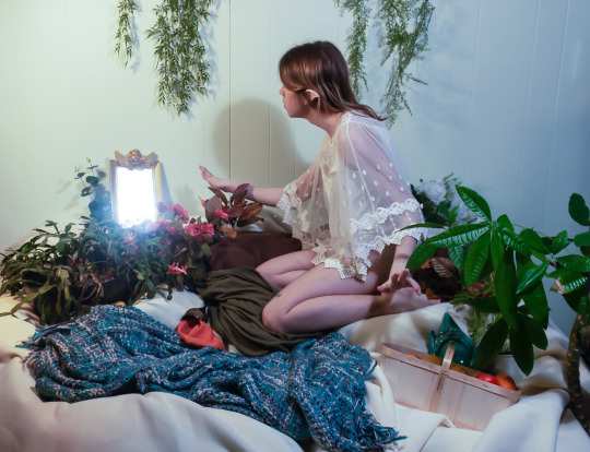

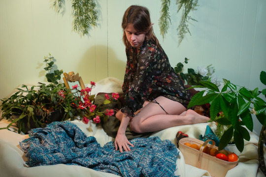

Collective Theme “The Happening”
I interpreted “The Happening” as taking significant situations, events, or dreams, and recreating them to convey a similar atmosphere and what it represents through mise en scene.
In my project, my dream of a fantasy world with magical beings will be recreated. The aesthetic aspects and fantastical creatures that are a part of fantasy worlds is something that interests a lot of people who exist on the fringe of society. Feeling isolated from the “normal” world, they align themselves more with things that are literally not of this world.
While taking these photos, I didn't have the equipment and props I initially planned to use. I made do with the small amount of space I had and borrowed various objects around my family's house. Most of what I originally planned changed due to being in quarantine.
My theme originally started out a bit differently, but I changed it to fit in more with the significant impact recent events have had on me. Being forced to stay inside all the time can take a toll on anybody, and resonating with this sentiment strongly, my photos convey how constantly being inside, and possibly alone, start to make you dream about the outside world. No one knows when it will all end and to some, dreams and plans of going outside, seeing friends and family, all feel like a fantasy at this point. To reflect this concept in my photos, I used whatever house materials I could find, staging a fantasy reality that I find myself dreaming about frequently now.
1/30 s, f/4.0, ISO 640
1/30 s, f/4.0, ISO 400
1/30 s, f/5.6, ISO 6400
1/30 s, f/4.0, ISO 1000
1/40 s, f/4.0, ISO 1600
1 note
·
View note