#I would have added the computer version too but if I'd drawn this before this blog was made I would have made it more insert inclusive
Text
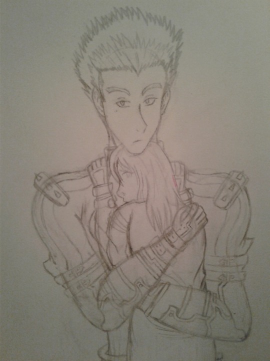

#Sfw#My art#Now And Forever#NAF#Millions Knives#Zemirah Indira Millions#When will I make his hair not fluffy? XD Your guess is as good as mine.#I would have added the computer version too but if I'd drawn this before this blog was made I would have made it more insert inclusive#And the colors I used for the computer version are not viewer inclusive as they are specific.#Listen let me know if you want me to make more insert inclusive art in the future because I will try if you want me to.#And I was so worried with my OKAF art that people would take that character as the canon look for OKAF's reader character. It is not.#And if you wanna draw and share your fanart of scenes from my fics with me please do! And insert yourself or your oc if you really wanna!#Because that's how it's meant to be! Whoever I use in these images where the appearance is defined does not have to be canon for you!#Put yourself or your oc in there! I tend to give these inserts the easiest hair I can draw so it's usually really short or long and flowy a#it's kinda awkward showing people in my personal life this kind of art and not having a defined look for the insert character.#I get “is that a guy or a girl?” “why are they bald?” “where's her hair?” questions. XP And I don't wanna have to explain reader-inserts#to them. But I can remedy that by taking a picture of and posting the inclusive version before I slap on some hair and stuff if you all#would prefer.
4 notes
·
View notes
Note
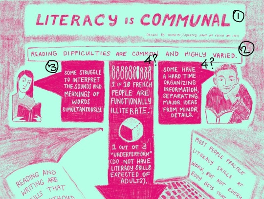
hey!! hope you don’t mind me contacting you - I saw in a tag that you found my literacy comic hard to read and really appreciated hearing that. organizing information clearly and accessibly is something I’m always trying to work on. I made the comic with my own visual/reading needs in mind, but I obviously only have my limited and personal experience!
I didn’t expect the comic to get traction before I edited in a transcript today, so I’m very grateful someone added an ID.
no pressure to answer, but if you have the bandwidth, do you mind telling me what made the comic hard for you to read? (layout, size or style of lettering, style of writing, color contrast, or something else?)
if you have extra bandwidth, besides including plaintext ID, do you have any suggestions about what tends to make things easier to read for you?
just gathering info for future projects, but I completely get if you’re not feeling like answering in detail. thanks so much either way! hope your day is going well.
hi! would like to start off by saying: i totally don't mind at all, and i'm glad you've decided to send this in, really.
link to the comic mentioned
[rest of the answer under the cut]
i should probably mention that i am in no way an expert in comicking or layout, just someone who struggles with reading comics sometimes, so definitely feel free to take all of this with a grain of salt
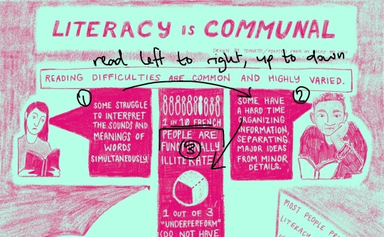
i'd say that the first thing that jumps out at me is that it's a lot of small text. it does read better on a computer screen (which is what i assume it was originally drawn on/meant to be read from) but on a phone screen, it really is hard to read
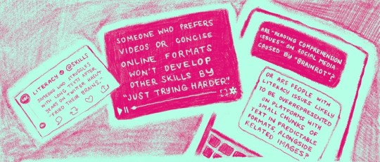
^ especially this section from the second page. while i do think the panelling here is quite smart, the text in the leftmost panel (the "tweet") and the rightmost panel (the "text messages") is far too small to read comfortably compared to the rest of the text, especially since they're both tilted

^ another textbox that's a little hard, also because of the slight odd angle combined with the size of the text
^ although, i found this one comparatively easier to read. the larger text really does help.
another thing that made it more difficult for me to read was that the order of textboxes was obscured by the layout sometimes, most obviously in the first page
^ after looking at this page for a while, it's obvious that the rightmost panel is supposed to be read, then the middle panel. but at a glance, it's not really visually clear, and the flow of the text is already a little harder to follow
it might be clearer to shift things around a little like this:
where either the entire middle panel begins lower, or the text and images start a little lower down.
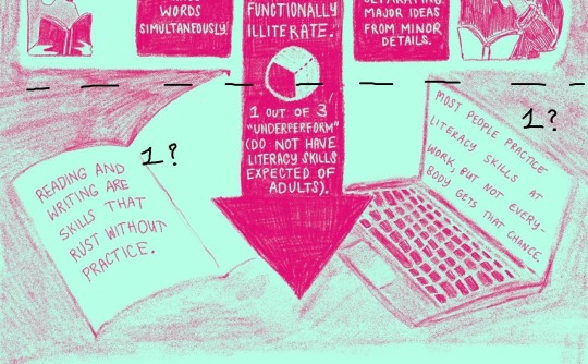
^ similarly for this panel, it's a small thing, but the order is slightly obscured because the left panel (the first panel) is noticeably lower than the right panel (the second panel)
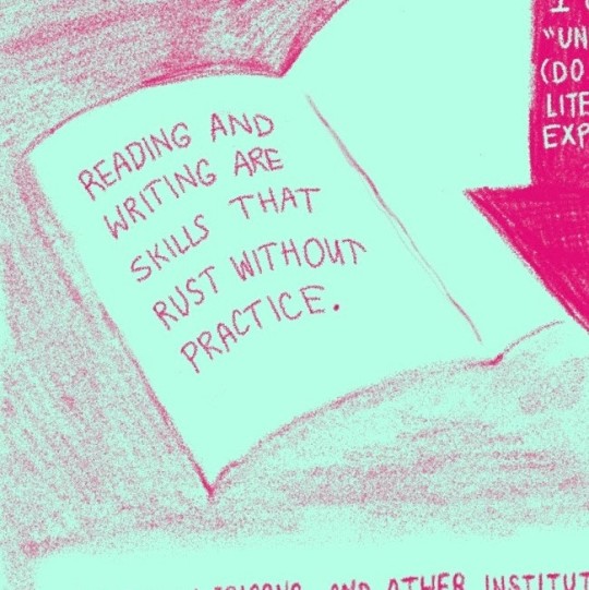
i've spent a lot of time picking apart your comic.... so i'd like to at least end off by saying that i really did enjoy it, even if it was a little difficult to visually latch onto for me! it is really lovely to look at visually, the colours are pleasing, i love the texture, and i was definitely happy to see an adapted version of that essay (which i just so happened to read recently. funny how that works)
anyway. once again i'm glad you decided to send this ask in, and i'm very, very happy to help. i sincerely hope that you found this helpful!
#leologisms#ask#oh. apologies if these images are tiny. they were hastily screenshotted and scribbled over in ms paint
1 note
·
View note
Text
Business Card Project - Part 1
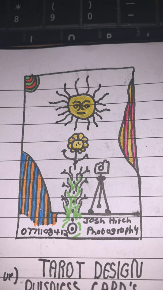
Around the time this module started, I got back into contact with someone by the name of Josh Hitchcock who I met and worked with back in college. We met when we were 16 and worked on several projects with each other during our year studying photography together, I learned a lot from Josh and we’ve stayed loosely in contact ever since leaving school but haven’t collaborated on anything for around 5 years despite having always had similar interests, styles and aesthetics. Josh is also still pursuing his passions and talents in visual communication and is beginning to build a portfolio with the aim of applying for a BA, just like I was doing this time last year. Alongside getting himself prepared to do a degree, he has been expanding his online presence and slowly establishing a business and brand identity for himself. He reached out to me originally to ask if I could potentially create him a logo that he could use across all of his platforms which he needed fairly quickly as he was building a website, unfortunately I couldn’t meet the turnaround deadline and so he commissioned someone else to do a logo, later reaching out to me again to ask if I might be able to create business cards instead.
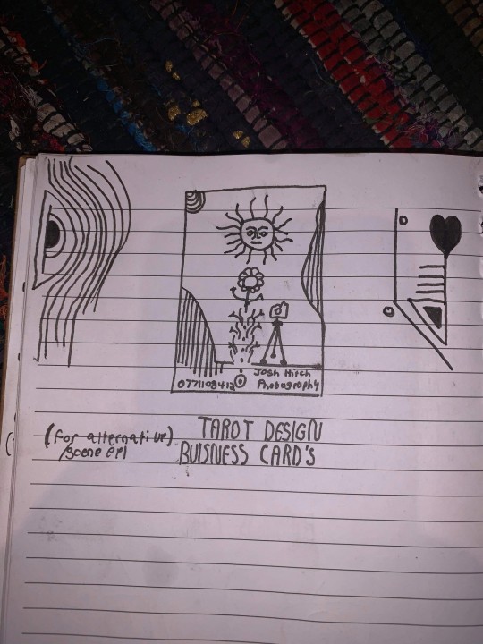
Josh had already started sketching out ideas and so he sent me his drawings as a starting point for the design
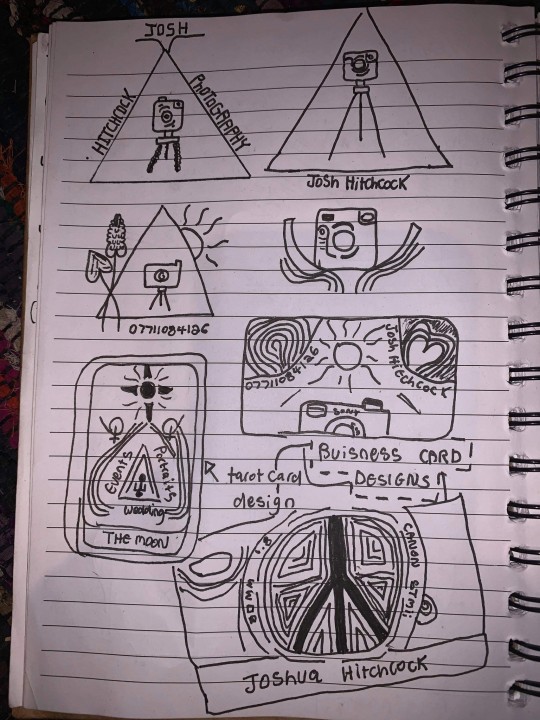
After some discussion and a little bit of time, Josh came to the decision that this was his favorite prospective card design and even began experimenting with it's colors.
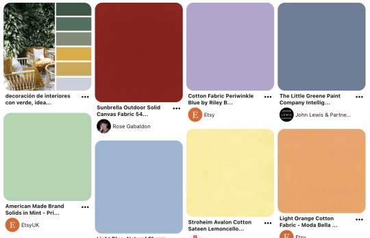
It was at this point that I asked him to create a Pinterest board to help gather all of the ideas together which he promptly delivered on. Pinterest’s description of the board “Clean, simple doodles. Photography orientated based on nature and ancient art. A perfect combination of tech, nature and aesthetic.” sums it up perfectly. This was a really strong starting point for the overall design as it includes everything from small decorative graphic details such as flowers, vines and suns; to a concise range of colors for the palette of the art itself. The board isn’t overcrowded, it's clearly well thought through and does good job of clearly communicating the kind of style that I was expected to reflect in my design.
Coincidentally around the same time I started this project, I decided to treat myself to an iPad Pro and Apple Pencil to support my University work, these have become increasing popular in the art world because they are incredibly powerful creative tools, I chose to invest in it mainly for it’s capabilities in creating digital art using the Adobe suite and Procreate using the pencil which is exclusive to iOS and has is slowly becoming the standard for digital drawings.
Having recently attended the Illustrator workshop, I thought that I would experiment with using this software both on my iPad and computer as I figured if I could learn to use them in conjunction with one another from the get go, I would be in a better position overall later on; but in doing so, I threw myself two learning curves at once as I was not only dabbling in software I wasn’t comfortable with but also using that software on a device that I am a complete beginner to which was a definite challenge for myself.
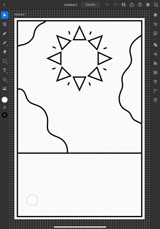
I started out by doing a Google search to find out what the standard size is for business cards and found out that is generally 3.5 x 2 inches (1050 x 600 pixels at 300 DPI, which is the standard DPI for printing). This is how I decided to set my document up which is what gives me the white rectangular shape that you see me working on to start off with.
To begin the design, I picked out my favorite things from Josh's sketch which were the wavy line details and the bohemian style sun. I created some simple outlines using the line tools on iPad Illustrator starting with the border and dividing horizontal line where I intended the design to end, from this I was able rough out where patches of lines would go and add the sun. For the sun, I originally tried to draw one with wavy points but I was struggling to get it proportionate, even when I'd figured out how to use the reflect tool to make my drawing symmetrical, it seemed to be throwing the design off and so I threw this idea out and went for a pointed sun design instead. I chose triangles for the points as a subtle reference to the exposure triangle which is a rule that dictates camera settings when it comes to photography so it ties in with the business well and was also a concept that Josh was trying to reflect in his logo. I achieved the geometrically accurate shape of the points around the sun by creating the very top triangle and then using the Radial Reflect tool whilst using my iPad which automatically created the rest of the points for me with even spacing and perfect symmetry; all I had to do then was resize the points as I pleased. Once I had done this, I decided to repeat the process but with a small line between each point to give it an extra beaming sunshine look, this also fits in with how some of the sun's and graphics are drawn on the Pinterest board that I'm referring to as I design this.
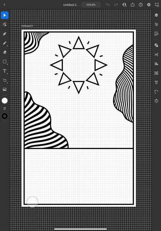
Once the outlines were complete, I started experimenting with filling in the patches with lines, this is an effect that is featured on the album art of one of my favorite albums of all time, Currents by Tame Impala which I previously learned how to do using a vector pack from Spoon Graphics as I did work inspired by it for my University portfolio. Although I have used these particularly line textures before, I have only used them in Photoshop and not Illustrator so I haven't actually used the vector versions of them up until this point. I inserted these into my work using my computer as that's where they were saved, I was able to use Adobe Cloud to sync my work between my PC and iPad making it easy and convenient to switch between the two whilst working. Adjusting the waves worked similarly to how it does when I use them in Photoshop, I just added them in as a layer and then used direct selection mode to delete the extra lines around the outlines and border that I’d drawn in leaving me with what you see above. At this point, I sent what I’d done so far to Josh so that I could begin to get his feedback and make sure that what I was doing was in line with his vision.
Whilst I was waiting for him to reply, I started experimenting with adding color to the design hoping that it would help us visualize it better; I used colors directly from the Pinterest board for my palette by taking a screenshot of the webpage, opening it up in Illustrator, swatching all of the colors and adding them to my Color Library so that they could be easily accessed whenever I needed them.
At this point, I just filled in the colors according to what made sense to me, blue for the sky, yellow for the sun and something contrasting for the wavy lines, honestly, I chose orange because it’s my favorite color and I really like the way that the purple looks next to it, especially against the blue background where it appears slightly more subtle whilst still being effective at breaking up the image in the way that it needs to.
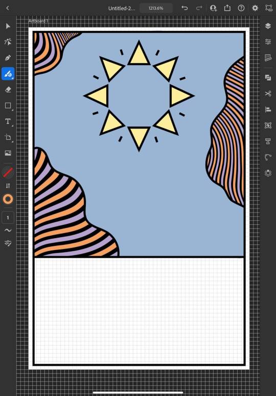
I continued to add colour, changing every other point on the sun to be red to give it more dimension and incorporate more of the colours from the chosen scheme; I then added green to the bottom section which I chose because I thought it would represent grass and fit in with the sun and sky theme that seemed to be emerging. I also added some small stars as I was experimenting with the shape tools dotting them into some small empty spaces on the design so that they line up in a triangular shape which is another subtle reference to the expose triangle.
Then I started experimenting with adding text and social media icons, Josh had told me that he wanted his name, website and social media information on the card, we decided to leave his phone number out as he only has a personal mobile number and didn’t want to risk handing it out to strangers. I chose this Art Deco style font for the name because I liked the lines in it and thought it went well with the lines in the top half of the design which are probably my favourite thing about it at this point. I didn’t use the same font for the website because it doesn’t look as good when it’s small, you can’t really see the lines and it made the website hard to read so instead I chose this glyph font which I thought Josh would like based on some of the imagery from the Pinterest board; I was unsure about this choice at first but it quickly grew on me as it’s subtle and yet it makes the website look bold on the bottom of the image which draws your eye down to it when you’re reading the information. I also added some social shapes to the front keeping Josh updated on my progress as I went along.
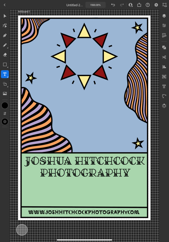
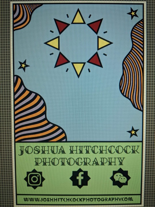
It was at this point that I started to receive some feedback from him, he was really happy with the first impressions of the design but did want to make a few changes. He started out by asking if I could change the green on the bottom to the orange colour in the waves with the hope of giving the card a more uniform look which we both agreed looked much better. He then asked me if I’d started designing the back which I hate to admit that I hadn’t actually thought about at this point and so we started discussing the layout; collectively agreeing to move the social media information to the back of the card and have that there along with some sort of bio which I much preferred the idea of as I wasn’t too keen on how the social shapes looked on the front of the card and I was worried about how I was going to fit all of the contact details on without making it look messy.

Originally we thought it might be nice to add some floral details to the front of the card where the space had now been freed up but we quickly decided that this didn’t look quite right.
0 notes
Last Seen Blogs

stylefit-fashion
Untitled
frostypops26
Ramblings And Musings Of A Lonely Little Loon
miraculousmarifan
MDC Fan

thebpress
Untitled

yallashoot-1
yalla shoot