#Risograph type specimen
Text
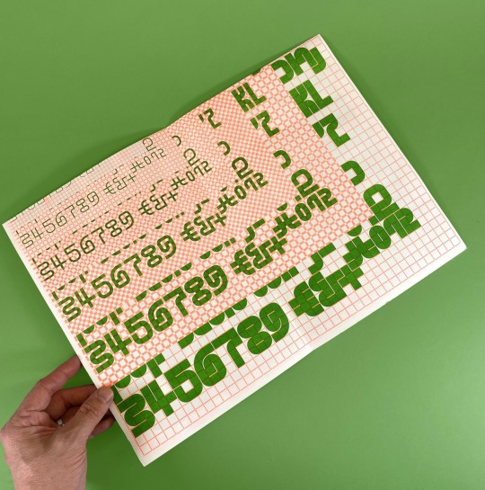
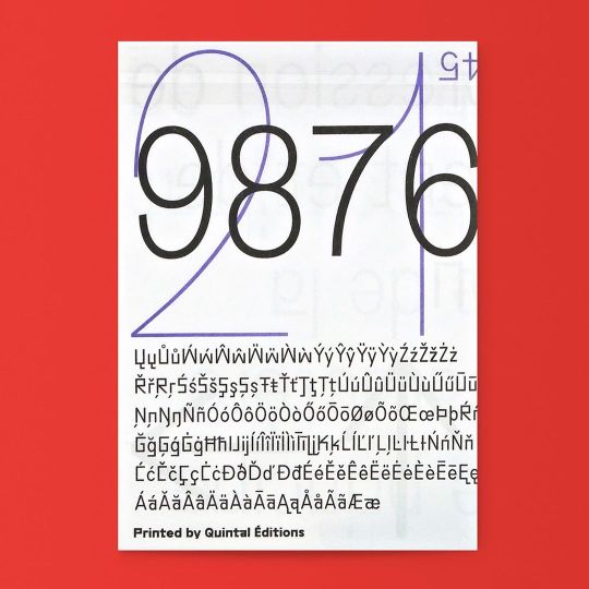
Harber Type Specimen (A2 version) by Benoît Bodhuin
Harber is a dot matrix design with variable axes for weight, slant, volume, noise, and optical size.
Published by Benoît Bodhuin, 2023
1 double-sided sheet, 5-color Risograph, 16.5 × 23.4 inches
Ships folded, dimensions 8.3 × 11.7 inches
#type specimen#Risograph type specimen#Harber typeface#Benoit Bodhuin#variable type#type design#dot matrix typeface#Draw Down Books
39 notes
·
View notes
Text
Project Moodboard
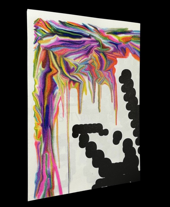
I have put together an initial moodboard which gives an idea of how I see my type specimen book coming together. I think I'll incorporate risograph printing to emphasise to heritage aspect of my inspiration material. I'm also thinking I'll use pink to lean into the femme vibe, but pair it with yellow to create a feeling of urgency and protest.
0 notes
Text
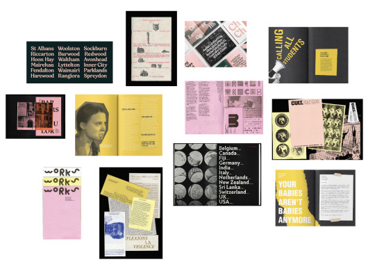
Design Portfolio Brainstorm (WIP)
Some Key Points I Want My Portfolio to Reflect About Me:
I want my design portfolio to reflect who I am and what I really enjoy making, that is why I am aiming for a more Illustrator/Graphic Design portfolio. I want the design system of my portfolio to be friendly, bold as well as cute. I think my point of difference would be illustration and my past experiences with some freelance commissions. I would like for this portfolio to me a multi-platform project so I will be aiming to create a PDF/EPUB, a website and a Behance showcase. For the printed version of my portfolio, I would really like to experiment with the risograph printer and make some sort of fun feature with it.
Skills:
- Illustrator
- Graphic Designer
- Adobe Suite (InDesign, Illustrator, Photoshop)
- Clip Studio Pro
Personality:
- Friendly
- Communicative
- Curious
- Reliable
- Determined
- Detail-oriented
Key Words that Describe my Design:
- Illustrative
- Iterative
- Light-hearted
Projects I am thinking of Including:
- Contertina
- Animation/Poster Diptych
- Nunito Type Specimen + Animations
- POP Publication
- Design Directory Publication
- Freelance/Hobby Illustration
0 notes
Text
Colour Choices
For my assigned typeface, during the research, I noticed a recurring theme around how the font is friendly, cheerful, playful and welcoming to encourage people to utilise it, and not be intimidating in any way whilst in use. This is mainly attributed the rounded edges of each letter, as well as the symmetrical shapes and simplicity continued throughout the design.
Initially, I thought about possibly utilising a bright energetic colour, such as orange or pink to encapsulate the 'fun'. But as I further experimented and research into colour psychology and connotation, I found that blue may in fact be a better match for this typeface. Blue is described to be a colour which evokes feelings of peace, trustworthiness, loyalty and calm - but with the electric shade of blue which I am choosing to use, this will also bring in feelings of excitement, engagement, and energy.
One thing I have also realised is that the general printers which we use for regular printing projects may not be able to achieve the correct hue, for what I am envisioning - however, my friend did utilise the risograph printer last semester and was able to print with the most brilliant shades of ink. So I may look into using that.
For the base colour of my type-specimen-booklet I am thinking of utilising a cream coloured paper, as this is far less intimidating that plain white cardstock, and has a slightly warmer feel to it which I enjoy. The cream colour also provides a nice contrast to the blue I am working with.
0 notes
Text
What is a type specimen book?
the presentation of a certain typeface to display its design and/or use.
Type specimen booklets normally contain
Typeface name
Multiple weights/widths/sizes of the typeface (as available)
Type specs including classification (serif/sans serif etc), type designer, date released, foundry, a brief description of key typeface characteristics, where it works well and where it doesn’t (best on screen, for display only, used as body copy, etc), and where it might be seen in public
At least one typeface that pairs well with it (you can find suggestions online or you can make your own). You can use other typefaces on your specimen sheet.
A six-word memoir (Write your own or find one online. Ex: “Not quite what I was planning.” Be sure to credit the author if you don’t write your own memoir.)
One randomly assigned typography term (ex: ascender, kerning, x-height). Give the definition and show an example within your composition.
Design with only two colors (choose between red, black, blue, yellow, pink). The final set of pages will be printed commercially with a Risograph. We will use an industrial sewing machine to bind books for every student to keep.
https://teachingresource.aiga.org/project/type-specimen-book/
0 notes
Video
Risograph type specimen in collaboration with @quintaleditions 🌱5 bucks only, available on their website and at @printedmatterinc ✨ https://www.instagram.com/p/B6NzeGLBUPb/?igshid=7y0hftzxidq2
0 notes
Text
Post-Mortem for Panza
PROCESS
I’ve continued my combo of working in Glyphs, getting feedback at Type Thursday events and in one on one meetings with people to get this typeface across the finish line. The design is ~finished~ and the specimen is 90% there. Proud to say there are numbers, diacritics, punctuation, and full latin support. Still only one weight and style, however :) but overall the type design has progressed beyond what I’d hoped.
The specimen book is going to be risograph printed at Cold Cube Press (link) here in Seattle. Very excited to see how the design translates to the textured look of the risograph — in fluo-pink and yellow ink. For the design of the specimen book there was both the desire to show the typeface in a variety of point sizes and use-cases, but also to amplify the inherent playfulness of the font with large expressive spreads and color palette. The basic recipe is to show letters wrapped up in each others’ arms in expressive ways, and show its use in body type settings as well.
FINAL SOLUTION
In the end, I ended up with usable typeface with full Latin support and all the characters you could type on a keyboard (there are more glyphs to build out eventually — like copyright symbols, foreign currencies, and so on). The design is, as I’ve described, “an eccentric workhorse” and performs well from display down to body type use.
The specimen is a playful illustration of different sizes and settings of the typeface, and serves as a personality piece in its own right.
NEXT STEPS
First, I would love to finish the kerning pairs, and build out the full Unicode glyph set and finish the kerning pairs. Then — I’d love to build out more weights and styles for the design. I’d start with working on a bolder weight before I went straight into something more challenging like italics, or a condensed or expanded styles.
Then? Another typeface. Something with a totally different personality.
And there are a few things I would do differently going into another typeface design. First, I would keep better copies of my sketches, both digitally or in notebooks. I would ideally have a small notebook completely dedicated to the new typeface idea. I could then better track the ups, downs, and changes of the work as it approached its final form. I would also (depending on the design) spend more time refining and testing different vertical metrics before deciding on one and going ahead. I don’t have any issues with Panza’s vertical metrics, but I think I breezed through that portion, and got a little lucky on gut instinct. Those relationships are critically important to the unique character of each typeface.
There will naturally be a lot less exploratory time in the next type design process that I go through because I will know the program a lot better and will work more efficiently, and more quickly understand things like optical adjustments needed and other similar decisions, and just the opportunities and pitfalls inherent in the relationships between each piece of the alphabet.
0 notes
Text

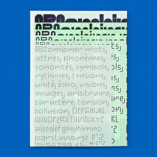
Standard Type Specimen
www.draw-down.com
A Riso-printed type specimen of the Standard typeface, designed by French graphic designer and type designer Benoît Bodhuin @benoit-bodhuin
Published by Benoît Bodhuin
Note that this is a second edition of this design, in new colors (orange/green)
1 double-sided sheet, 2-color Risograph, 16.5 × 23.4 inches
Ships folded, dimensions 8.3 × 11.7 inches
66 notes
·
View notes
Photo
Standard Type Specimen / Benoît Bodhuin Available at www.draw-down.com A grid-inspired typeface, designed in Standard (6 weights) and Pickle Standard (3 styles). The first drafts of the typeface were based on a grid with guidance from architect Nicolas Gautron. The typefaces are drawn to obey and emancipate the grid at the same time, striving for an elegant balance between the straight lines, which adhere to the grid, and the curves that offer an irregular personality. #QuintalÉditions #Risograph #TypeSpecimen #BenoîtBodhuin #Design #GraphicDesign #typeface https://www.instagram.com/p/B8ym7mMnlJW/?igshid=18w0a8ff7hifd
54 notes
·
View notes
Photo
GroteskRemix Type Specimen by Benoît Bodhuin Available at www.draw-down.com A remix of a Grotesk typeface drawn in six styles for Benoît Bodhuin's own website, now available as a variable font adaptable for a variety of situations. #Risograph #BenoîtBodhuin #QuintalÉditions #Grotesk #typeface https://www.instagram.com/p/B81LBWBH5er/?igshid=u0u9p00nster
39 notes
·
View notes
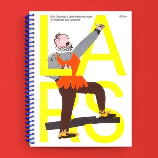
Photo

Last Copies! BD Lars Illustrated Type Specimen / Available at www.draw-down.com / A typeface specimen for BD Lars, a sans-serif typeface created to be impartial and versatile by Danish type foundry Bold Decisions (Mads Wildgaard & Kristoffer Halse Sølling). Richly illustrated by William Davey, an illustrator from the South West of Wales whose work draws on narrative and humor. Davey's interest in British culture and its eccentricities is on display in this volume, which provides both technical and playful insight into the typeface's legibility and universality. Designed by Mads Wildgaard & Kristoffer Halse Sølling. Softcover, 60 pages, #Risograph #graphicdesign #typography #typespecimen #BoldDecisions
9 notes
·
View notes
Photo
BD Lars Illustrated Type Specimen / Available at www.draw-down.com / A typeface specimen for BD Lars, a sans-serif typeface created to be impartial and versatile by Danish type foundry Bold Decisions (Mads Wildgaard & Kristoffer Halse Sølling). Richly illustrated by William Davey, an illustrator from the South West of Wales whose work draws on narrative and humor. Davey's interest in British culture and its eccentricities is on display in this volume, which provides both technical and playful insight into the typeface's legibility and universality. Designed by Mads Wildgaard & Kristoffer Halse Sølling. Softcover, 60 pages, #Risograph #graphicdesign #typography #typespecimen #BoldDecisions
45 notes
·
View notes
Last Seen Blogs

nordelphysioclinic
Untitled

mrscutequel
Mrs. Cute Quel

the-used-bitch
Dark Fantasies

bitmeyenyazit
Bitmeyen Yazıt

andagames
Andagii Games (AndaGames!)